Embed Size (px)
Citation preview

AUTHOR
2 Mathew Verdouw, CMT, CFTe 1st August 2016
The subjective works of WD Gann from the early part of the twentieth century are not normally associated with one of the modern pillars of twenty first century Technical Analysis, Market Breadth. After all, the concept of Market Breadth requires an enormous amount of computational power basing calculations on objective data, while Gann drew all his charts by hand and was mostly concerned with geometry, angles, timing and ratios which could be subjective. So how can these two seemingly opposed methods be brought together? That is what I hope to answer here today and in the process I hope that you, like me, will see that there is a whole new world of analytical research just waiting to be delved into. Part of my study for the CMT designation involved an examination of Market Breadth. Many of the typical measures were covered in the texts, from Advance Decline to various breadth oscillators. While reading about breadth and coming to an understanding that a standard measure of breadth was the Advance Decline line, with the premise being that if most of the members of an Index are closing higher, then the market will have upward pressure; I was thinking about the fluctuations that happen on a daily basis and wondering how we could smooth the data. The light bulb then went on in my head about using Gann Swing charts as an alternative measure of breadth. Why Gann Swing Charts? They are often one of the most overlooked methods that Gann documented and they have always been a great way to measure the trend of a chart while filtering out much of the noise, in fact Gann referred to them as his “Main Trend Indicator”. To me it seemed logical to use what was referred to as the Main Trend Indicator in a method that has as its goal determining overall market trend! Let’s take a step back and review the theory behind both of these methods before we get to the part of combining them.
Breadth Theory The best place to start is with the Advance Decline Oscillator. The value is simply achieved by taking all the members of the Index and comparing the members that are advancing versus the members that are declining. The reason this so important is that it has been found that at market tops, it is the heavy weights of the stock market that are getting the “late money” and due to their size they continue to take the Index higher. What is not so evident is that all the small caps are usually the first to change trend at a turning point in the market. Market Breadth aims to alert the analyst of these changes before it is evident in the trend of the Index.
3 Mathew Verdouw, CMT, CFTe 1st August 2016
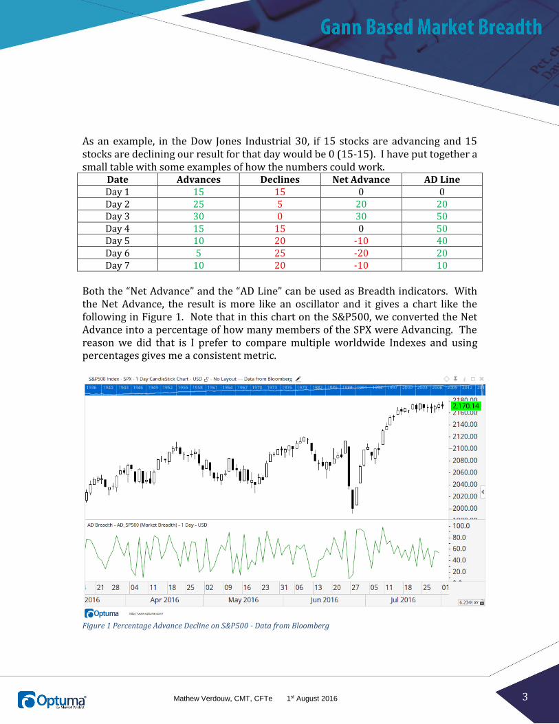
As an example, in the Dow Jones Industrial 30, if 15 stocks are advancing and 15 stocks are declining our result for that day would be 0 (15-15). I have put together a small table with some examples of how the numbers could work.
Date Advances Declines Net Advance AD Line Day 1 15 15 0 0 Day 2 25 5 20 20 Day 3 30 0 30 50 Day 4 15 15 0 50 Day 5 10 20 -10 40 Day 6 5 25 -20 20 Day 7 10 20 -10 10
Both the “Net Advance” and the “AD Line” can be used as Breadth indicators. With the Net Advance, the result is more like an oscillator and it gives a chart like the following in Figure 1. Note that in this chart on the S&P500, we converted the Net Advance into a percentage of how many members of the SPX were Advancing. The reason we did that is I prefer to compare multiple worldwide Indexes and using percentages gives me a consistent metric.
Figure 1 Percentage Advance Decline on S&P500 - Data from Bloomberg
4 Mathew Verdouw, CMT, CFTe 1st August 2016
The final column in our table is the AD Line. This is sometimes more correctly called the Cumulative Advance Decline line where today’s value is based on yesterday’s value and the result of the net advances.
𝐴𝐷𝑡 = 𝐴𝐷𝑡−1 + ∑ 𝐴𝑑𝑣𝑡 − ∑ 𝐷𝑒𝑐𝑡
With the AD Line, the actual value has little reflection to the number of securities as the value can grow to be a very large positive or negative number. Rather, the analyst is looking at the plot and determining if there are divergences between the Index and the AD Line.
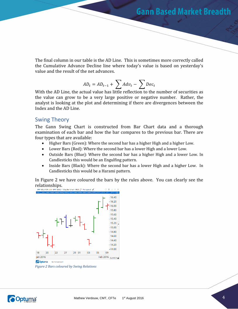
Swing Theory The Gann Swing Chart is constructed from Bar Chart data and a thorough examination of each bar and how the bar compares to the previous bar. There are four types that are available:
Higher Bars (Green): Where the second bar has a higher High and a higher Low.
Lower Bars (Red): Where the second bar has a lower High and a lower Low.
Outside Bars (Blue): Where the second bar has a higher High and a lower Low. In
Candlesticks this would be an Engulfing pattern.
Inside Bars (Black): Where the second bar has a lower High and a higher Low. In
Candlesticks this would be a Harami pattern.
In Figure 2 we have coloured the bars by the rules above. You can clearly see the relationships.
Figure 2 Bars coloured by Swing Relations

5 Mathew Verdouw, CMT, CFTe 1st August 2016
The simplest rules for Swings are that for a one bar Swing to be up, we need to have a higher bar (green bar) and then the swing will stay up until we get a lower (red) bar. There are special rules for how the inside and outside bars are handled. An outside bar (blue) can be considered as two bars, first one that continues in the direction of the trend and then a second that is in the opposite direction. The rules can get much more complicated but we’ll keep with the basics for this paper.
Figure 3 Gann Swing Overlay
In Figure 3 we have added the Gann Swing as an overlay and you can see how the bars define the direction of the swings. As soon as there is a red (lower) bar, the swing turns down. This image also shows how the blue (outside) bar extended the up swing before turning down. Gann Swings are further complicated by stipulating further rules that we will only turn the swing when there has been three higher bars or three lower bars. A bit like Three White Soldiers and Three Black Crows in Candlesticks. Requiring the extra bars in each direction allows us to smooth out the changes in trend. As with all smoothing, it can introduce delays but also saves us from choppy markets.

6 Mathew Verdouw, CMT, CFTe 1st August 2016
Figure 4 shows the same chart with a two bar Gann Swing overlay. The smoothing result is clearly shown in this chart with the swings not whip-sawing so often. This is what we are after in our breadth measure.
Figure 4 2 Bar Gann Swing Overlay
This is a very quick overview of Gann Swing Charts, there are detailed videos on our www.optuma.com site that go into much more detail. Hopefully this will be enough so you can follow what we discovered with our Market Breadth analysis.
Putting it all together Unfortunately, I had no easy way to build this at the time the idea to try it first hit me. Since one of my roles is to design new work for Optuma, I set about designing a Breadth Engine that would allow anyone to use any technical indicator as a measure of market breadth (and allow me to test my theories). As with many software projects, this one had to be left on the shelf while other projects with higher priorities were getting completed. Finally in late 2013, we were able to do a proof of concept and then early in 2014 I was able to run the first tests of Gann Swing based Market Breadth The results are very interesting. I’ll run through the process so you can see how I put it all together.
7 Mathew Verdouw, CMT, CFTe 1st August 2016
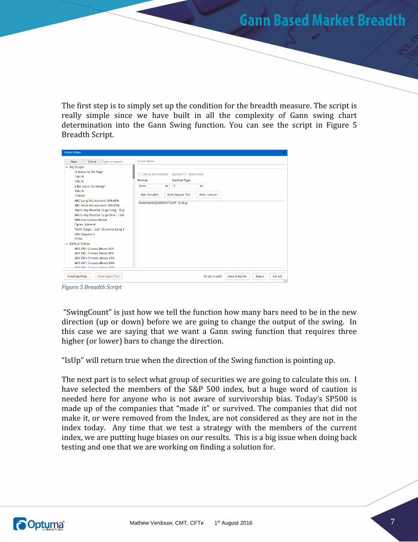
The first step is to simply set up the condition for the breadth measure. The script is really simple since we have built in all the complexity of Gann swing chart determination into the Gann Swing function. You can see the script in Figure 5 Breadth Script.
Figure 5 Breadth Script
“SwingCount” is just how we tell the function how many bars need to be in the new direction (up or down) before we are going to change the output of the swing. In this case we are saying that we want a Gann swing function that requires three higher (or lower) bars to change the direction. “IsUp” will return true when the direction of the Swing function is pointing up. The next part is to select what group of securities we are going to calculate this on. I have selected the members of the S&P 500 index, but a huge word of caution is needed here for anyone who is not aware of survivorship bias. Today’s SP500 is made up of the companies that “made it” or survived. The companies that did not make it, or were removed from the Index, are not considered as they are not in the index today. Any time that we test a strategy with the members of the current index, we are putting huge biases on our results. This is a big issue when doing back testing and one that we are working on finding a solution for.
8 Mathew Verdouw, CMT, CFTe 1st August 2016
Figure 6 Breadth Properties
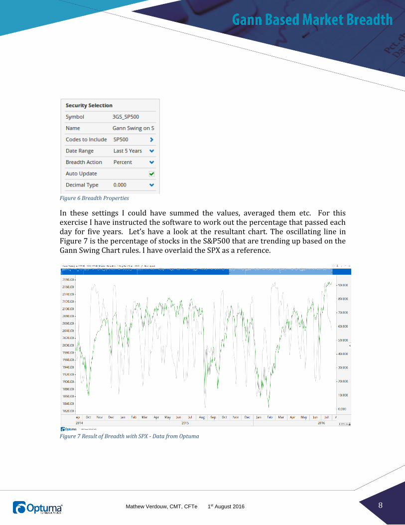
In these settings I could have summed the values, averaged them etc. For this exercise I have instructed the software to work out the percentage that passed each day for five years. Let’s have a look at the resultant chart. The oscillating line in Figure 7 is the percentage of stocks in the S&P500 that are trending up based on the Gann Swing Chart rules. I have overlaid the SPX as a reference.
Figure 7 Result of Breadth with SPX - Data from Optuma

9 Mathew Verdouw, CMT, CFTe 1st August 2016
At this point it may look a little underwhelming, but the power of market breadth has more to do with the extremities and how they correlate to changes in trend. To show this we need to add a script plot at the bottom of the chart. Here is the script that we are using for it:
𝑆𝑊𝐼𝑇𝐶𝐻(𝐶𝐿𝑂𝑆𝐸( ) > 75, 𝐶𝐿𝑂𝑆𝐸( ) < 25) This simply means that we want to be true if the value of the breadth is above 75% and then we do not want to change to false until we get below 25%. Let’s have a look at the chart in Figure 8.
Figure 8 Breadth, SPX and Switch Plot
The instances where the result is true has a significant correlation to the times when the S&P 500 Index was in a bull market. To make it a little clearer, I have overlaid the switch result on the chart in Figure 9.

10 Mathew Verdouw, CMT, CFTe 1st August 2016
Figure 9 SPX & Switch Plot Overlay
You can see that there is a lag in the method, i.e. the green zones start days after the bottom of the market. This is to be expected since we need to wait for three higher bars before the swing turns and then we need 75% of the index members to be up before we switch.
11 Mathew Verdouw, CMT, CFTe 1st August 2016
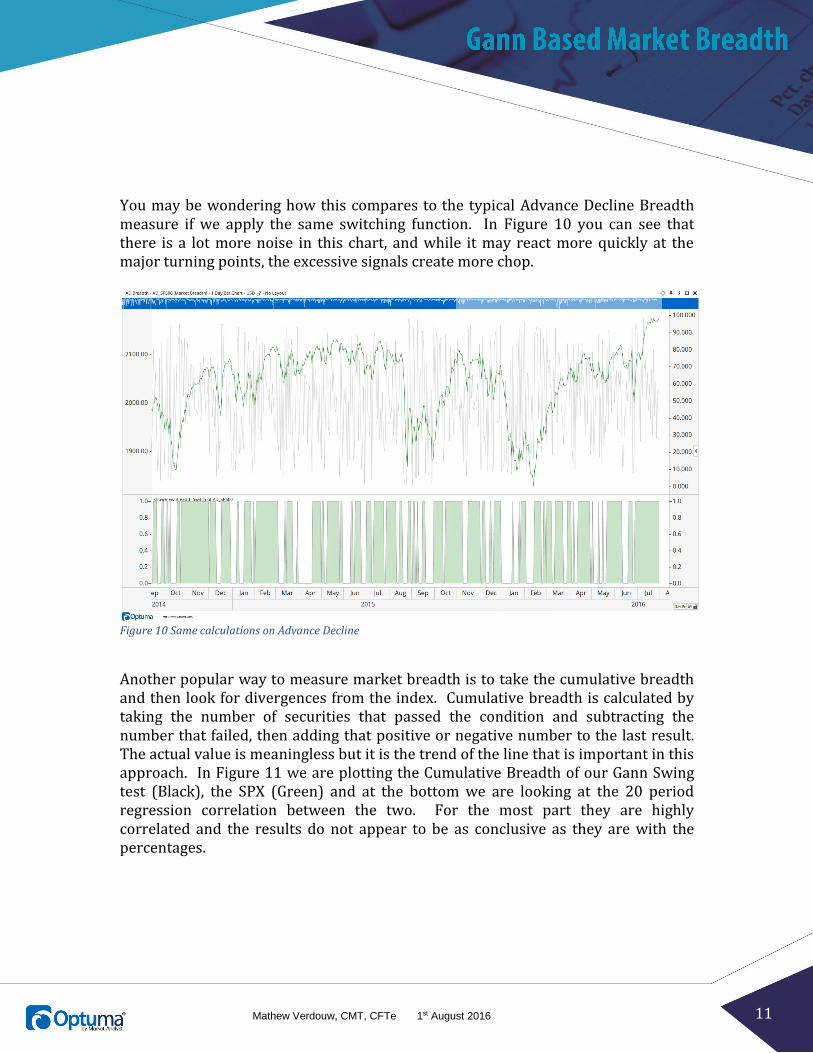
You may be wondering how this compares to the typical Advance Decline Breadth measure if we apply the same switching function. In Figure 10 you can see that there is a lot more noise in this chart, and while it may react more quickly at the major turning points, the excessive signals create more chop.
Figure 10 Same calculations on Advance Decline
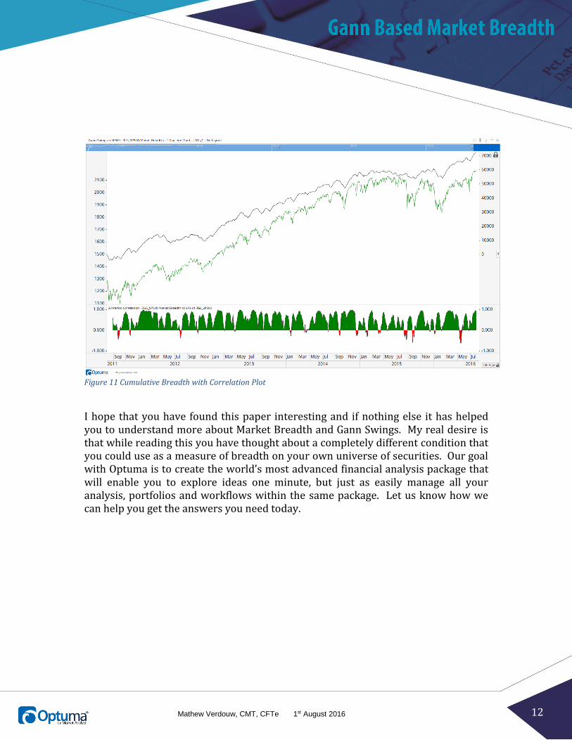
Another popular way to measure market breadth is to take the cumulative breadth and then look for divergences from the index. Cumulative breadth is calculated by taking the number of securities that passed the condition and subtracting the number that failed, then adding that positive or negative number to the last result. The actual value is meaningless but it is the trend of the line that is important in this approach. In Figure 11 we are plotting the Cumulative Breadth of our Gann Swing test (Black), the SPX (Green) and at the bottom we are looking at the 20 period regression correlation between the two. For the most part they are highly correlated and the results do not appear to be as conclusive as they are with the percentages.
12 Mathew Verdouw, CMT, CFTe 1st August 2016
Figure 11 Cumulative Breadth with Correlation Plot
I hope that you have found this paper interesting and if nothing else it has helped you to understand more about Market Breadth and Gann Swings. My real desire is that while reading this you have thought about a completely different condition that you could use as a measure of breadth on your own universe of securities. Our goal with Optuma is to create the world’s most advanced financial analysis package that will enable you to explore ideas one minute, but just as easily manage all your analysis, portfolios and workflows within the same package. Let us know how we can help you get the answers you need today.