Embed Size (px)
Citation preview
Australian Housing Outlook 2013 - 2016Prepared by BIS Shrapnel for QBE LMIOctober 2013

DISCLAIMER: The information contained in this publication has been obtained from BIS Shrapnel Pty Limited and does not necessarily represent the views or opinions of QBE Lenders’ Mortgage Insurance Limited (QBE LMI). This publication is provided for informational purposes only and is not intended to constitute legal, financial or other professional advice and has not been provided with regard to the investment objectives or circumstances of any particular reader. While based on information believed to be reliable, no guarantee is given that it is accurate or complete and no warranties are made by QBE LMI as to the accuracy, completeness or usefulness of any of the information in this publication. The opinions, forecasts, assumptions, estimates, derived valuations and target price(s) (if any) contained in this material are as of the date indicated and are subject to change at any time without prior notice. The information referred to may not be suitable for specific investment objectives, financial situation or individual needs of recipients and should not be relied upon in substitution for the exercise of independent judgment. Recipients should obtain their own appropriate professional advice. Neither QBE LMI nor other persons shall be liable for any direct, indirect, special, incidental, consequential, punitive or exemplary damages, including lost profits arising in any way from the information contained in this material. This material may not be reproduced, redistributed, or copied in whole or in part for any purpose without QBE LMI’s prior expressed consent. QBE Lenders’ Mortgage Insurance Limited ABN 70 000 511 071.
Table of Contents
Introduction 51. Executive summary 62. Economic outlook 73. Buyer activity 144. Rental markets 215. Rental yields 236. Housing affordability 247. Demand 26Capital city forecasts 31Forecast comparison 40About 46
4 Australian Housing Outlook 2013-16
5October 2013
Introduction
At a time of increased attention on the housing market, where there is alternating concern about a boom or a bust, I’m delighted to share with you the latest Australian Housing Outlook. The report, exclusively researched and compiled by BIS Shrapnel for QBE LMI, provides for an analysis of drivers within the housing market and a forecast of trends over the next three years.
The Australian housing market saw a return to growth in 2012/13 following two successive years of declines. While the effects of the global financial crisis continued to have an impact on the global economy, Australia’s GDP grew at a robust 3.4% in 2012. BIS Shrapnel has forecast a continuation of growth within the housing market in 2013/14. This growth is expected to be concentrated in capital cities with the greatest deficiency in housing stock, namely Perth (forecast to grow by 8.0% in 2013/14), Sydney (6.5%), Darwin (4.6%) and Brisbane (4.5%). In contrast moderate growth is forecast for Melbourne (3%), Adelaide (1.8%), Hobart (1.4%), and Canberra (0.5%).
The current interest rate easing cycle, which began in November 2011, did not have the immediate impact that previous easing cycles have had on the housing market. Though a number of confluent factors were involved, BIS Shrapnel indicate that the relatively low level of affordability at the start of this period dampened the impact of rate cuts on the housing market. However considerable improvements in affordability over 2012, juxtaposed against a background of record low interest rates, led to an increase in turnover throughout the housing market. The increase in activity was primarily driven by investors and non-first home buyers, with New South Wales being a prime example where lending to investors increasing by 28% in 2012/13.
QBE LMI has been supporting the mortgage industry for over 45 years and we continue to do so through the provision of flexible products that offer lenders the security and confidence they need to respond to the changing needs of borrowers. Our sponsorship of the Australian Housing Outlook report has continued for over 10 years as part of our ongoing commitment to deliver insights into the trends in the mortgage industry. This year’s report provides some interesting insights into the key drivers of the Australian housing market, and reflects our continued confidence in the fundamental strength and resilience of our broader economy and the housing market in particular. I hope you find it as informative as I have.
Jenny Boddington Chief Executive Officer QBE LMI
6 Australian Housing Outlook 2013-16
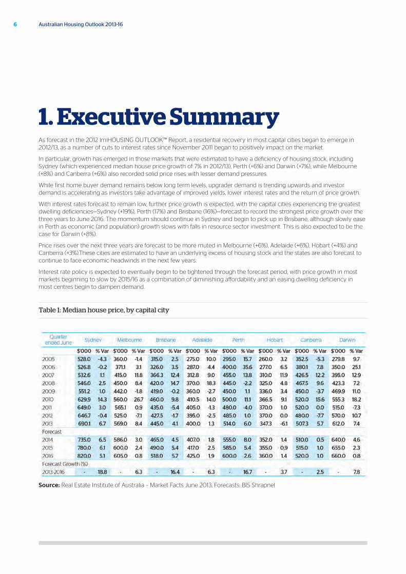
1. Executive SummaryAs forecast in the 2012 lmiHOUSING OUTLOOK™ Report, a residential recovery in most capital cities began to emerge in 2012/13, as a number of cuts to interest rates since November 2011 began to positively impact on the market.
In particular, growth has emerged in those markets that were estimated to have a deficiency of housing stock, including Sydney (which experienced median house price growth of 7% in 2012/13), Perth (+6%) and Darwin (+7%), while Melbourne (+8%) and Canberra (+6%) also recorded solid price rises with lesser demand pressures.
While first home buyer demand remains below long term levels, upgrader demand is trending upwards and investor demand is accelerating as investors take advantage of improved yields, lower interest rates and the return of price growth.
With interest rates forecast to remain low, further price growth is expected, with the capital cities experiencing the greatest dwelling deficiencies—Sydney (+19%), Perth (17%) and Brisbane (16%)—forecast to record the strongest price growth over the three years to June 2016. The momentum should continue in Sydney and begin to pick up in Brisbane, although slowly ease in Perth as economic (and population) growth slows with falls in resource sector investment. This is also expected to be the case for Darwin (+8%).
Price rises over the next three years are forecast to be more muted in Melbourne (+6%), Adelaide (+6%), Hobart (+4%) and Canberra (+3%).These cities are estimated to have an underlying excess of housing stock and the states are also forecast to continue to face economic headwinds in the next few years.
Interest rate policy is expected to eventually begin to be tightened through the forecast period, with price growth in most markets beginning to slow by 2015/16 as a combination of diminishing affordability and an easing dwelling deficiency in most centres begin to dampen demand.
Table 1: Median house price, by capital city
Source: Real Estate Institute of Australia – Market Facts June 2013, Forecasts: BIS Shrapnel
7
2.1 State of play
Over the last five years, a key driver of the Australian economy has been the second round of projects in the mining investment boom. With resources investment now having peaked, however, its contribution to growth will be reduced over the next two to three years. This will require the Australian economy to rely on other drivers to take up the baton to maintain growth.
The increased capacity resulting from the mining investment boom will underwrite strong increases in mining production, contributing positively to growth. An emerging residential recovery in New South Wales, Western Australia, the Northern Territory, and Queensland (albeit to a lesser extent), will also make a contribution via higher building levels, while the downturns in the other states should stabilise given the current low interest rate environment.
A mining production and housing recovery will not in and of themselves be sufficient to offset declining resources investment. For the Australian economy to pick up growth above 3%, non-mining business investment will need to come through, which is expected to be another two years away.
The non-mining-related industries continue to suffer from the aftermath of the global financial crisis (GFC). Faced with weakening demand and profits as well as competitiveness challenges from the high dollar, businesses deferred investment and cut costs to improve profits. This conservatism and deleveraging has seen many businesses rebuild their balance sheets, although they are unlikely to invest until capacity constraints emerge.
At the same time, all levels of government are in fiscal repair mode. Long-term expenditure commitments (i.e. education and disability reforms) are locked in with pressure on government revenue in a soft economy. As a result, infrastructure spending, being the easiest to defer, is likely to bear the brunt of spending cuts.
With commodity prices holding up, prices should still support the investment decisions for the commencement of selected large projects slated for the next 12 months. Combined with the current pipeline of work, this is expected to result in an orderly decline in mining construction rather than a rapid fall that would impact more negatively.
2. Economic outlook
October 2013
8 Australian Housing Outlook 2013-16
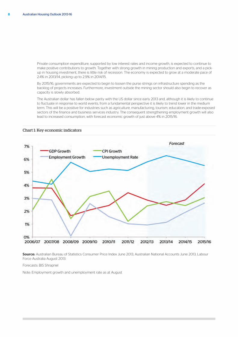
Private consumption expenditure, supported by low interest rates and income growth, is expected to continue to make positive contributions to growth. Together with strong growth in mining production and exports, and a pick-up in housing investment, there is little risk of recession. The economy is expected to grow at a moderate pace of 2.4% in 2013/14, picking up to 2.9% in 2014/15.
By 2015/16, governments are expected to begin to loosen the purse strings on infrastructure spending as the backlog of projects increases. Furthermore, investment outside the mining sector should also begin to recover as capacity is slowly absorbed.
The Australian dollar has fallen below parity with the US dollar since early 2013 and, although it is likely to continue to fluctuate in response to world events, from a fundamental perspective it is likely to trend lower in the medium term. This will be a positive for industries such as agriculture, manufacturing, tourism, education, and trade-exposed sectors of the finance and business services industry. The consequent strengthening employment growth will also lead to increased consumption, with forecast economic growth of just above 4% in 2015/16.
Chart 1: Key economic indicators
Source: Australian Bureau of Statistics Consumer Price Index June 2013, Australian National Accounts June 2013, Labour Force Australia August 2013.
Forecasts: BIS Shrapnel
Note: Employment growth and unemployment rate as at August
9October 2013
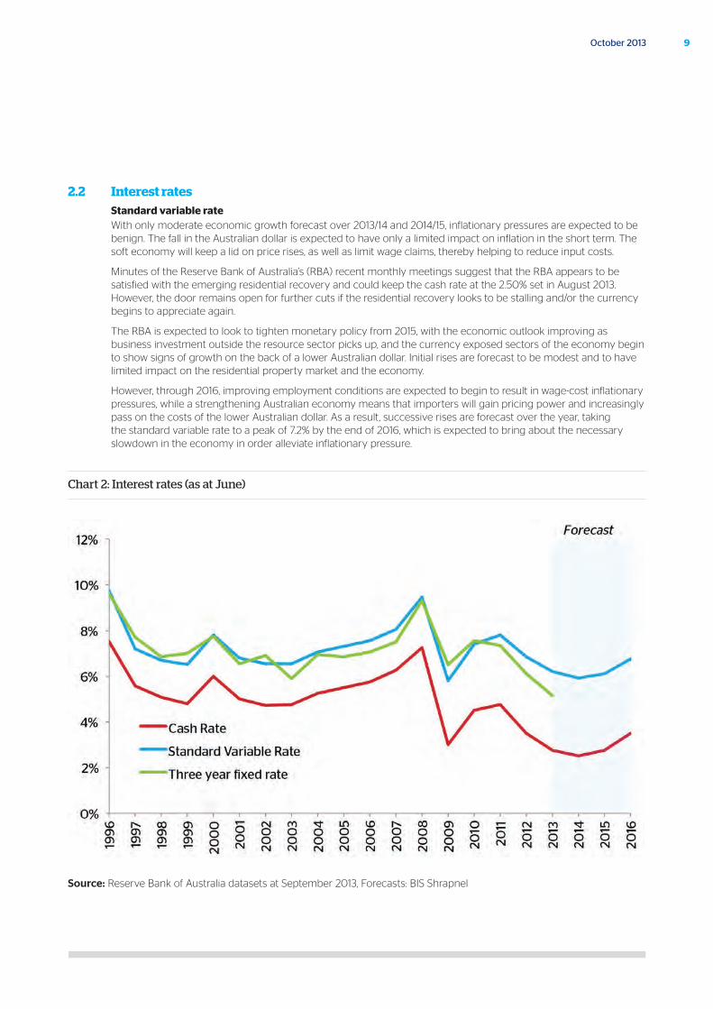
2.2 Interest rates Standard variable rate
With only moderate economic growth forecast over 2013/14 and 2014/15, inflationary pressures are expected to be benign. The fall in the Australian dollar is expected to have only a limited impact on inflation in the short term. The soft economy will keep a lid on price rises, as well as limit wage claims, thereby helping to reduce input costs.
Minutes of the Reserve Bank of Australia’s (RBA) recent monthly meetings suggest that the RBA appears to be satisfied with the emerging residential recovery and could keep the cash rate at the 2.50% set in August 2013. However, the door remains open for further cuts if the residential recovery looks to be stalling and/or the currency begins to appreciate again.
The RBA is expected to look to tighten monetary policy from 2015, with the economic outlook improving as business investment outside the resource sector picks up, and the currency exposed sectors of the economy begin to show signs of growth on the back of a lower Australian dollar. Initial rises are forecast to be modest and to have limited impact on the residential property market and the economy.
However, through 2016, improving employment conditions are expected to begin to result in wage-cost inflationary pressures, while a strengthening Australian economy means that importers will gain pricing power and increasingly pass on the costs of the lower Australian dollar. As a result, successive rises are forecast over the year, taking the standard variable rate to a peak of 7.2% by the end of 2016, which is expected to bring about the necessary slowdown in the economy in order alleviate inflationary pressure.
Chart 2: Interest rates (as at June)
Source: Reserve Bank of Australia datasets at September 2013, Forecasts: BIS Shrapnel
Other lending ratesMortgage interest rates are typically reported in terms of the standard variable rate. However, banks and other lenders also offer alternative lower interest rate options to borrowers, which in turn result in increased affordability (or greater purchasing power).
Since 2010, the gap between three-year fixed rates and the standard variable rate has widened. In August 2013, the three-year fixed rate was, on average, 85 basis points below the standard variable rate, or around 5.1%, making this form of borrowing increasingly attractive. In the seven months to July 2013, fixed rate loans comprised 17% of owner occupier lending, compared to 12% in the same period a year earlier. Moreover, the 2013 Mortgage Barometer Report (prepared by GfK Australia for QBE LMI) reported that 24% of surveyed participants intending to purchase a property are looking at a fixed rate mortgage, while a further 45% are giving them greater consideration1.
Banks have for some time also offered variable rates at a discount to clients who have a large loan and represent a lower risk, largely to compete against the lower headline interest rates of some of the non-bank financiers. These are typically marketed as “professional packages”. The magnitude of the discount can vary depending on the quality of the borrower and size of the loan, although the RBA quotes an indicative discount of 85 basis points on the standard variable rate (i.e. a variable rate of 5.1%).
While there is no data on the percentage of loans that are “professional packages”, typically they will apply to those in stable employment and on higher incomes.
Professional packages were originally offered to borrowers who worked in a limited range of (and presumably very safe from a lender’s point of view) professional occupations. The RBA began collecting, and reporting, on discounted variable rates in 2004 – presumably in response to such offers becoming more broadly available.
As indicated in Chart 3, while national housing affordability at the standard variable rate is at its best level since 2002 (outside of the 2009 record low variable rate period), those on the discounted rate are finding affordability is at its best level since 1999.
1 The 2013 Mortgage Barometer was prepared exclusively for QBE LMI by GfK Australia, based upon a survey of 1,017 Au stralian target market respondents (current mortgage holders and those intending to buy residential property, either as an investment or home, in the next five years). The survey was developed by GfK Australia in consultation with QBE LMI, and fieldwork was conducted via an online panel from May 1 to May 13, 2013.
10 Australian Housing Outlook 2013-16
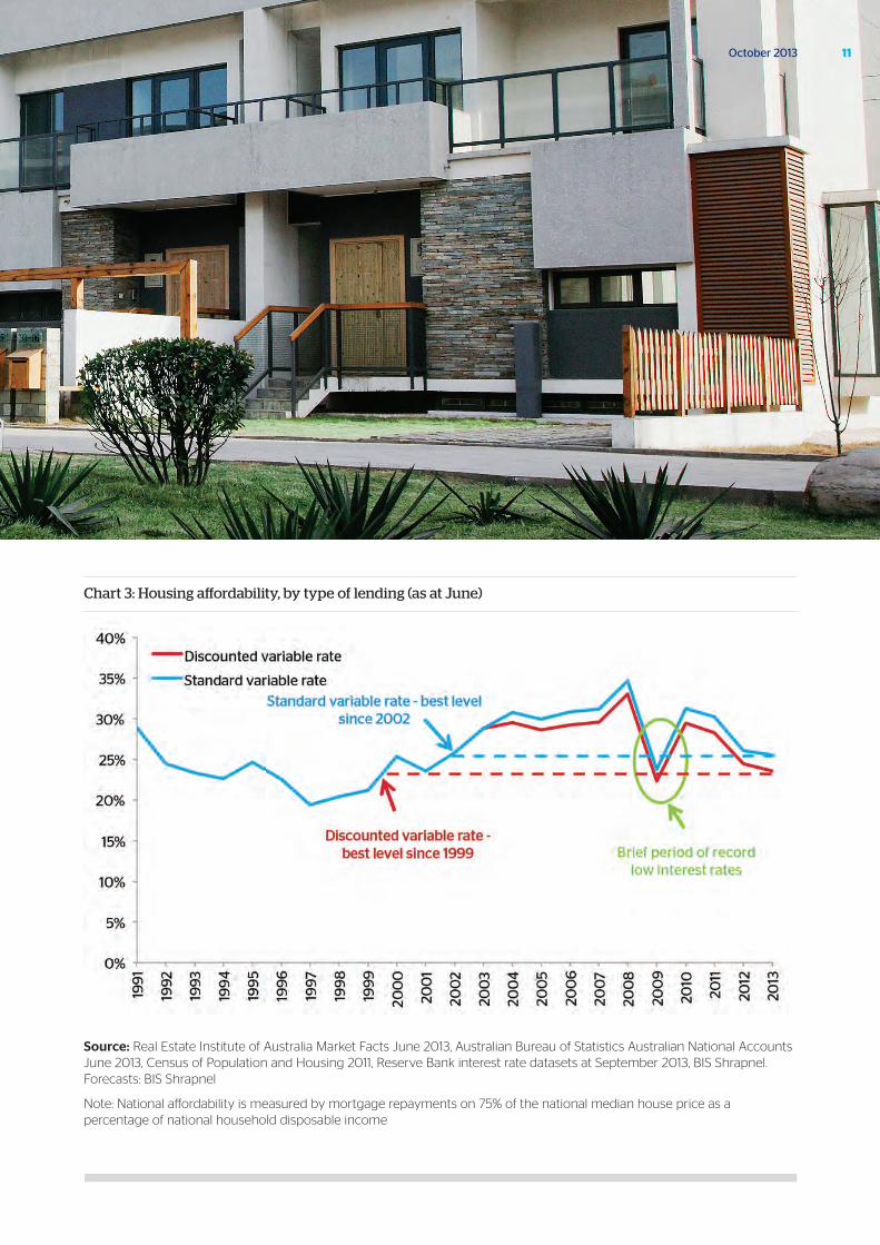
Chart 3: Housing affordability, by type of lending (as at June)
Source: Real Estate Institute of Australia Market Facts June 2013, Australian Bureau of Statistics Australian National Accounts June 2013, Census of Population and Housing 2011, Reserve Bank interest rate datasets at September 2013, BIS Shrapnel. Forecasts: BIS Shrapnel
Note: National affordability is measured by mortgage repayments on 75% of the national median house price as a percentage of national household disposable income
11October 2013
12 Australian Housing Outlook 2013-16
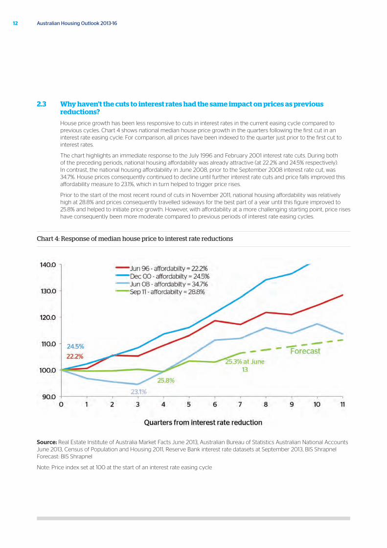
2.3 Why haven’t the cuts to interest rates had the same impact on prices as previous reductions?
House price growth has been less responsive to cuts in interest rates in the current easing cycle compared to previous cycles. Chart 4 shows national median house price growth in the quarters following the first cut in an interest rate easing cycle. For comparison, all prices have been indexed to the quarter just prior to the first cut to interest rates.
The chart highlights an immediate response to the July 1996 and February 2001 interest rate cuts. During both of the preceding periods, national housing affordability was already attractive (at 22.2% and 24.5% respectively). In contrast, the national housing affordability in June 2008, prior to the September 2008 interest rate cut, was 34.7%. House prices consequently continued to decline until further interest rate cuts and price falls improved this affordability measure to 23.1%, which in turn helped to trigger price rises.
Prior to the start of the most recent round of cuts in November 2011, national housing affordability was relatively high at 28.8% and prices consequently travelled sideways for the best part of a year until this figure improved to 25.8% and helped to initiate price growth. However, with affordability at a more challenging starting point, price rises have consequently been more moderate compared to previous periods of interest rate easing cycles.
Chart 4: Response of median house price to interest rate reductions
Source: Real Estate Institute of Australia Market Facts June 2013, Australian Bureau of Statistics Australian National Accounts June 2013, Census of Population and Housing 2011, Reserve Bank interest rate datasets at September 2013, BIS Shrapnel Forecast: BIS Shrapnel
Note: Price index set at 100 at the start of an interest rate easing cycle
13October 2013
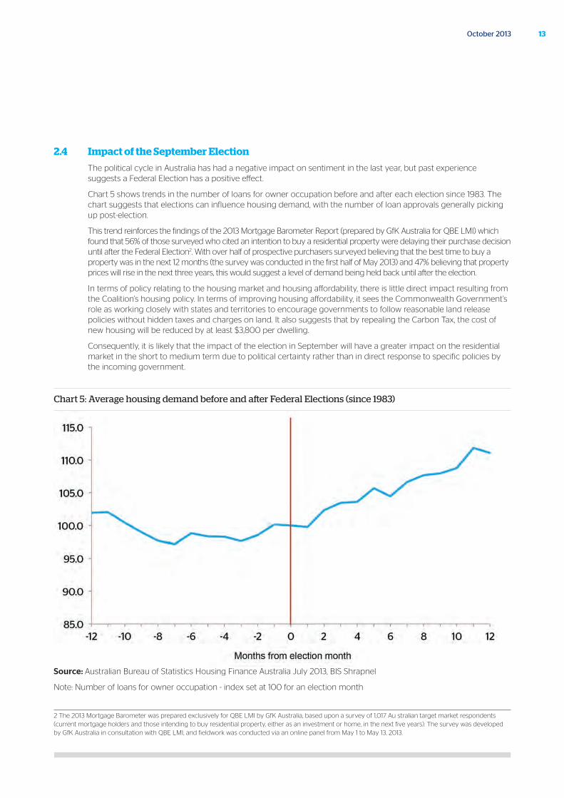
2.4 Impact of the September Election
The political cycle in Australia has had a negative impact on sentiment in the last year, but past experience suggests a Federal Election has a positive effect.
Chart 5 shows trends in the number of loans for owner occupation before and after each election since 1983. The chart suggests that elections can influence housing demand, with the number of loan approvals generally picking up post-election.
This trend reinforces the findings of the 2013 Mortgage Barometer Report (prepared by GfK Australia for QBE LMI) which found that 56% of those surveyed who cited an intention to buy a residential property were delaying their purchase decision until after the Federal Election2. With over half of prospective purchasers surveyed believing that the best time to buy a property was in the next 12 months (the survey was conducted in the first half of May 2013) and 47% believing that property prices will rise in the next three years, this would suggest a level of demand being held back until after the election.
In terms of policy relating to the housing market and housing affordability, there is little direct impact resulting from the Coalition’s housing policy. In terms of improving housing affordability, it sees the Commonwealth Government’s role as working closely with states and territories to encourage governments to follow reasonable land release policies without hidden taxes and charges on land. It also suggests that by repealing the Carbon Tax, the cost of new housing will be reduced by at least $3,800 per dwelling.
Consequently, it is likely that the impact of the election in September will have a greater impact on the residential market in the short to medium term due to political certainty rather than in direct response to specific policies by the incoming government.
Chart 5: Average housing demand before and after Federal Elections (since 1983)
Source: Australian Bureau of Statistics Housing Finance Australia July 2013, BIS Shrapnel
Note: Number of loans for owner occupation - index set at 100 for an election month
2 The 2013 Mortgage Barometer was prepared exclusively for QBE LMI by GfK Australia, based upon a survey of 1,017 Au stralian target market respondents (current mortgage holders and those intending to buy residential property, either as an investment or home, in the next five years). The survey was developed by GfK Australia in consultation with QBE LMI, and fieldwork was conducted via an online panel from May 1 to May 13, 2013.
14 Australian Housing Outlook 2013-16
3.1 Current trends
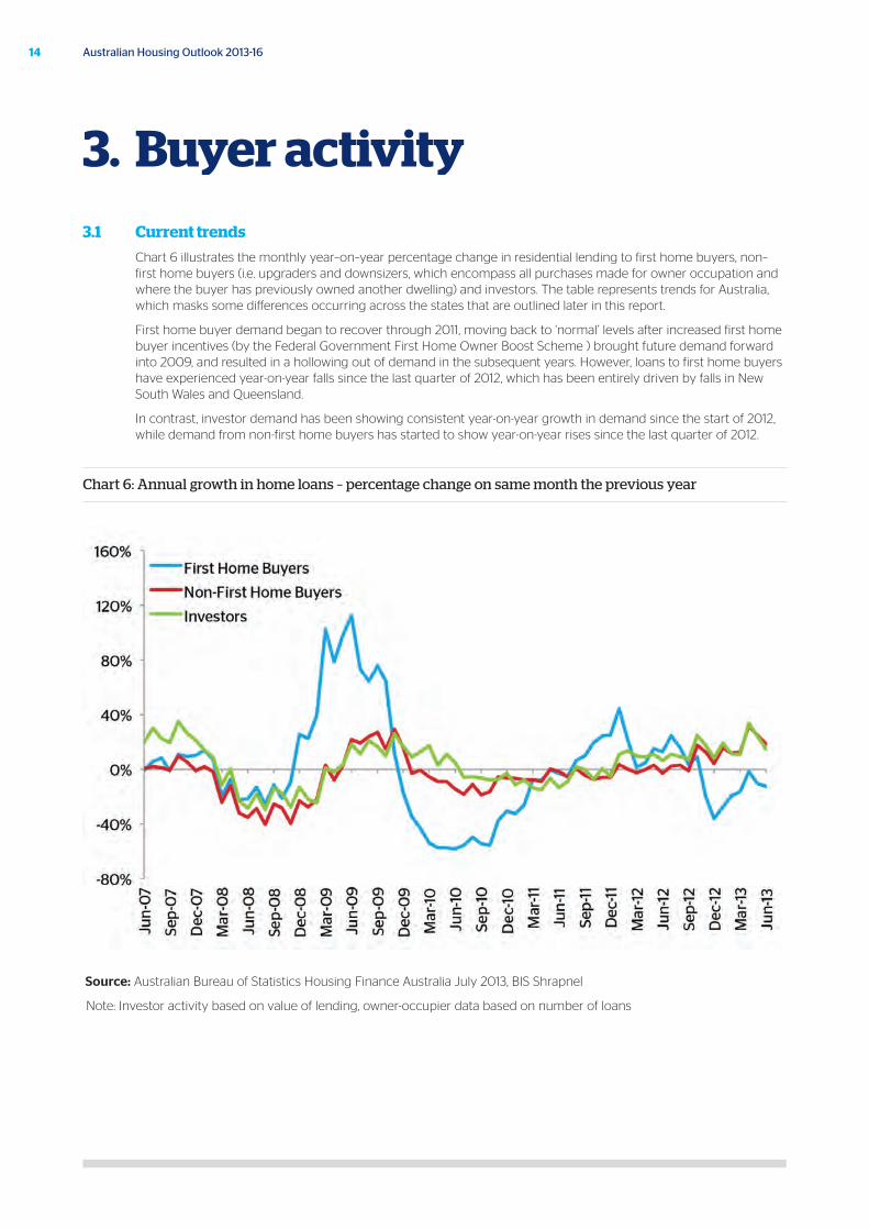
Chart 6 illustrates the monthly year–on–year percentage change in residential lending to first home buyers, non–first home buyers (i.e. upgraders and downsizers, which encompass all purchases made for owner occupation and where the buyer has previously owned another dwelling) and investors. The table represents trends for Australia, which masks some differences occurring across the states that are outlined later in this report.
First home buyer demand began to recover through 2011, moving back to ‘normal’ levels after increased first home buyer incentives (by the Federal Government First Home Owner Boost Scheme ) brought future demand forward into 2009, and resulted in a hollowing out of demand in the subsequent years. However, loans to first home buyers have experienced year-on-year falls since the last quarter of 2012, which has been entirely driven by falls in New South Wales and Queensland.
In contrast, investor demand has been showing consistent year-on-year growth in demand since the start of 2012, while demand from non-first home buyers has started to show year-on-year rises since the last quarter of 2012.
Chart 6: Annual growth in home loans – percentage change on same month the previous year
Source: Australian Bureau of Statistics Housing Finance Australia July 2013, BIS Shrapnel
Note: Investor activity based on value of lending, owner-occupier data based on number of loans
3. Buyer activity
15October 2013
3.2 First home buyers Incentives available
First home buyer demand is important as it creates demand for entry-level properties, which then facilitates broader demand by encouraging current occupiers to upgrade. As a result, governments have often used incentives to promote first home buyer demand during times of market weakness.
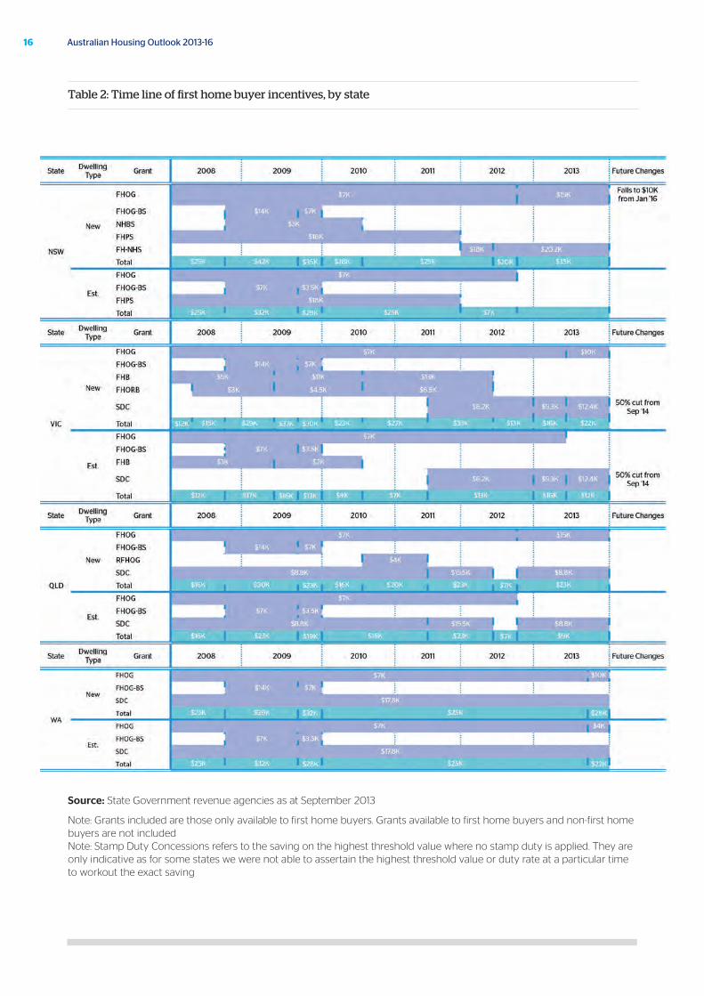
Table 2 shows the total State and Federal Government incentives offered to first home buyers since 2007. The table refers to grants available specifically to first home buyers and not broader grants and incentives that first home buyers can also take advantage of. Where stamp duty concessions are offered, the maximum concession is indicated. Purchase price thresholds for grant eligibility have changed in this time and the incentives indicated are for dwellings that have been purchased at a price below the relevant threshold at the time.
Most grants in total value were at their highest during the worst of the GFC in 2009 (ranging between $20,000 and $40,000 depending on whether a new or established dwelling was purchased). Some states increased their incentives after 2009 to ease the transition of the removal of the Federal Government First Home Owner Boost Scheme at the end of 2009.
The most recent changes to first home owner incentives have been to tilt them in favour of purchasers of new dwellings rather than existing dwellings in order to promote construction. However, with most first home buyers opting for the established dwelling stock, the shift of first home buyers into new dwellings at a greater rate is expected to be moderate.
It should be noted that the size, composition and timing of any incentives to first home buyers does not create new demand (as everyone can only be a first home buyer once) but rather affects the timing of demand. Temporary grants and incentives bring forward future demand, leaving a smaller pool of buyers immediately after. The removal of grants may not only bring demand forward to beat the expiry date, but also delays subsequent demand, as the next round of first home buyers need to take more time to save what they would have otherwise received in grants.
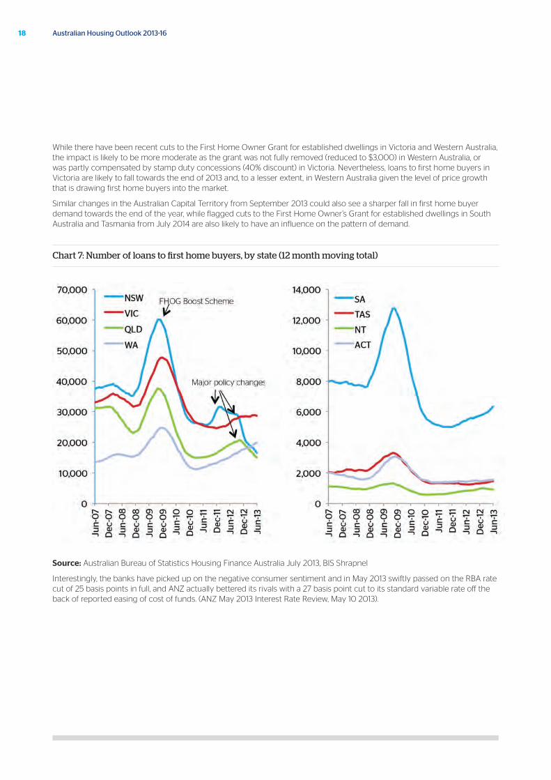
After the expiry of the Federal Government First Home Owner Boost Scheme at the end of 2009, the general trend has been falls in first home buyer demand through to the middle of 2011, followed by a slow recovery as first home buyer numbers moved back to ‘normal’ volumes. Nevertheless, first home buyer activity still remains below pre-GFC levels, apart from in Western Australia where the number of loans to first home buyers in 2012/13 has surpassed both New South Wales and Queensland.
First home buyer demand in New South Wales and Queensland has been influenced by further adjustments to first home buyer incentives. As depicted in Chart 7, demand in New South Wales surged at the end of 2011, prior to stamp duty exemptions for established dwelling purchasers being removed. Demand in New South Wales and also Queensland was then boosted in the September 2012 quarter by the removal of the existing $7,000 First Home Owner Grant for purchasers of existing dwellings from October 2012. As a result, first home buyer demand is now at new lows in both states, particularly in New South Wales, where successive changes have come at the expense of future demand.
16 Australian Housing Outlook 2013-16
Source: State Government revenue agencies as at September 2013
Note: Grants included are those only available to first home buyers. Grants available to first home buyers and non-first home buyers are not included Note: Stamp Duty Concessions refers to the saving on the highest threshold value where no stamp duty is applied. They are only indicative as for some states we were not able to assertain the highest threshold value or duty rate at a particular time to workout the exact saving
Table 2: Time line of first home buyer incentives, by state
17October 2013
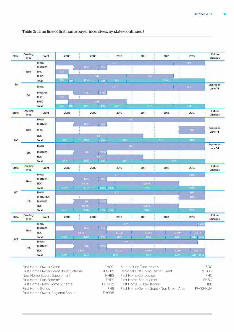
Table 2: Time line of first home buyer incentives, by state (continued)
First Home Owner Grant FHOG First Home Owner Grant Boost Scheme FHOG-BS New Home Buyers Supplement NHBS First Home Plus Scheme FHPS First Home - New Home Scheme FH-NHS First Home Bonus FHB First Home Owner Regional Bonus FHORB
Stamp Duty Concessions SDC Regional First Home Owner Grant RFHOG First Home Concession FHC First Home Bonus Grant FHBG First Home Builder Bonus FHBB First Home Owner Grant - Non Urban Area FHOG-NUA
18 Australian Housing Outlook 2013-16
While there have been recent cuts to the First Home Owner Grant for established dwellings in Victoria and Western Australia, the impact is likely to be more moderate as the grant was not fully removed (reduced to $3,000) in Western Australia, or was partly compensated by stamp duty concessions (40% discount) in Victoria. Nevertheless, loans to first home buyers in Victoria are likely to fall towards the end of 2013 and, to a lesser extent, in Western Australia given the level of price growth that is drawing first home buyers into the market.
Similar changes in the Australian Capital Territory from September 2013 could also see a sharper fall in first home buyer demand towards the end of the year, while flagged cuts to the First Home Owner’s Grant for established dwellings in South Australia and Tasmania from July 2014 are also likely to have an influence on the pattern of demand.
Chart 7: Number of loans to first home buyers, by state (12 month moving total)
Source: Australian Bureau of Statistics Housing Finance Australia July 2013, BIS Shrapnel
Interestingly, the banks have picked up on the negative consumer sentiment and in May 2013 swiftly passed on the RBA rate cut of 25 basis points in full, and ANZ actually bettered its rivals with a 27 basis point cut to its standard variable rate off the back of reported easing of cost of funds. (ANZ May 2013 Interest Rate Review, May 10 2013).
19October 2013
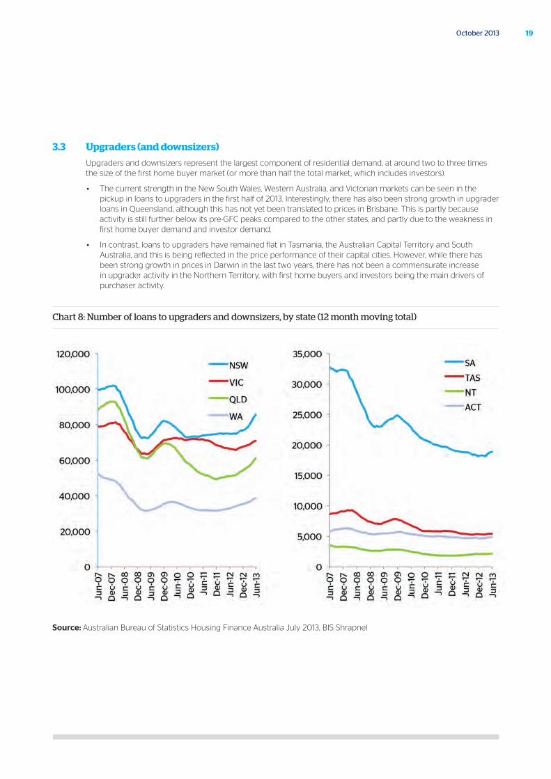
3.3 Upgraders (and downsizers)
Upgraders and downsizers represent the largest component of residential demand, at around two to three times the size of the first home buyer market (or more than half the total market, which includes investors).
• The current strength in the New South Wales, Western Australia, and Victorian markets can be seen in the pickup in loans to upgraders in the first half of 2013. Interestingly, there has also been strong growth in upgrader loans in Queensland, although this has not yet been translated to prices in Brisbane. This is partly because activity is still further below its pre-GFC peaks compared to the other states, and partly due to the weakness in first home buyer demand and investor demand.
• In contrast, loans to upgraders have remained flat in Tasmania, the Australian Capital Territory and South Australia, and this is being reflected in the price performance of their capital cities. However, while there has been strong growth in prices in Darwin in the last two years, there has not been a commensurate increase in upgrader activity in the Northern Territory, with first home buyers and investors being the main drivers of purchaser activity.
Chart 8: Number of loans to upgraders and downsizers, by state (12 month moving total)
Source: Australian Bureau of Statistics Housing Finance Australia July 2013, BIS Shrapnel
20 Australian Housing Outlook 2013-16
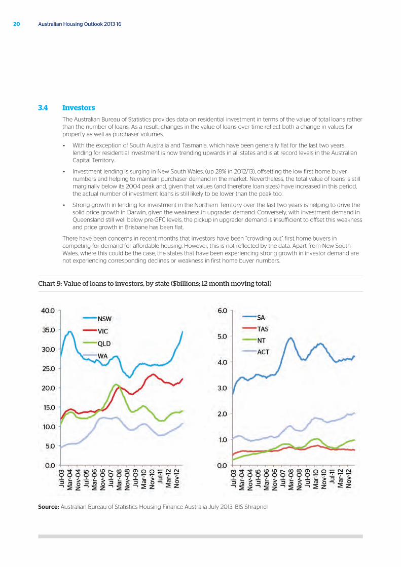
3.4 Investors
The Australian Bureau of Statistics provides data on residential investment in terms of the value of total loans rather than the number of loans. As a result, changes in the value of loans over time reflect both a change in values for property as well as purchaser volumes.
• With the exception of South Australia and Tasmania, which have been generally flat for the last two years, lending for residential investment is now trending upwards in all states and is at record levels in the Australian Capital Territory.
• Investment lending is surging in New South Wales, (up 28% in 2012/13), offsetting the low first home buyer numbers and helping to maintain purchaser demand in the market. Nevertheless, the total value of loans is still marginally below its 2004 peak and, given that values (and therefore loan sizes) have increased in this period, the actual number of investment loans is still likely to be lower than the peak too.
• Strong growth in lending for investment in the Northern Territory over the last two years is helping to drive the solid price growth in Darwin, given the weakness in upgrader demand. Conversely, with investment demand in Queensland still well below pre-GFC levels, the pickup in upgrader demand is insufficient to offset this weakness and price growth in Brisbane has been flat.
There have been concerns in recent months that investors have been “crowding out” first home buyers in competing for demand for affordable housing. However, this is not reflected by the data. Apart from New South Wales, where this could be the case, the states that have been experiencing strong growth in investor demand are not experiencing corresponding declines or weakness in first home buyer numbers.
Chart 9: Value of loans to investors, by state ($billions; 12 month moving total)
Source: Australian Bureau of Statistics Housing Finance Australia July 2013, BIS Shrapnel
21October 2013
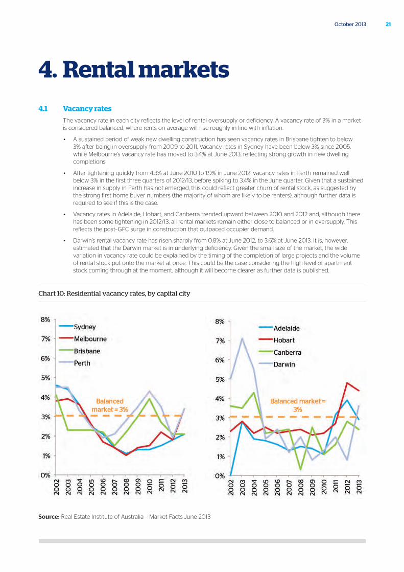
4.1 Vacancy rates
The vacancy rate in each city reflects the level of rental oversupply or deficiency. A vacancy rate of 3% in a market is considered balanced, where rents on average will rise roughly in line with inflation.
• A sustained period of weak new dwelling construction has seen vacancy rates in Brisbane tighten to below 3% after being in oversupply from 2009 to 2011. Vacancy rates in Sydney have been below 3% since 2005, while Melbourne’s vacancy rate has moved to 3.4% at June 2013, reflecting strong growth in new dwelling completions.
• After tightening quickly from 4.3% at June 2010 to 1.9% in June 2012, vacancy rates in Perth remained well below 3% in the first three quarters of 2012/13, before spiking to 3.4% in the June quarter. Given that a sustained increase in supply in Perth has not emerged, this could reflect greater churn of rental stock, as suggested by the strong first home buyer numbers (the majority of whom are likely to be renters), although further data is required to see if this is the case.
• Vacancy rates in Adelaide, Hobart, and Canberra trended upward between 2010 and 2012 and, although there has been some tightening in 2012/13, all rental markets remain either close to balanced or in oversupply. This reflects the post–GFC surge in construction that outpaced occupier demand.
• Darwin’s rental vacancy rate has risen sharply from 0.8% at June 2012, to 3.6% at June 2013. It is, however, estimated that the Darwin market is in underlying deficiency. Given the small size of the market, the wide variation in vacancy rate could be explained by the timing of the completion of large projects and the volume of rental stock put onto the market at once. This could be the case considering the high level of apartment stock coming through at the moment, although it will become clearer as further data is published.
Chart 10: Residential vacancy rates, by capital city
Source: Real Estate Institute of Australia – Market Facts June 2013
4. Rental markets
22 Australian Housing Outlook 2013-16
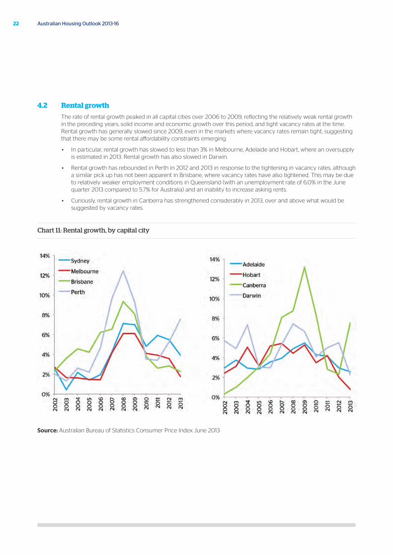
4.2 Rental growth
The rate of rental growth peaked in all capital cities over 2006 to 2009, reflecting the relatively weak rental growth in the preceding years, solid income and economic growth over this period, and tight vacancy rates at the time. Rental growth has generally slowed since 2009, even in the markets where vacancy rates remain tight, suggesting that there may be some rental affordability constraints emerging.
• In particular, rental growth has slowed to less than 3% in Melbourne, Adelaide and Hobart, where an oversupply is estimated in 2013. Rental growth has also slowed in Darwin.
• Rental growth has rebounded in Perth in 2012 and 2013 in response to the tightening in vacancy rates, although a similar pick up has not been apparent in Brisbane, where vacancy rates have also tightened. This may be due to relatively weaker employment conditions in Queensland (with an unemployment rate of 6.0% in the June quarter 2013 compared to 5.7% for Australia) and an inability to increase asking rents.
• Curiously, rental growth in Canberra has strengthened considerably in 2013, over and above what would be suggested by vacancy rates.
Chart 11: Rental growth, by capital city
Source: Australian Bureau of Statistics Consumer Price Index June 2013
23October 2013
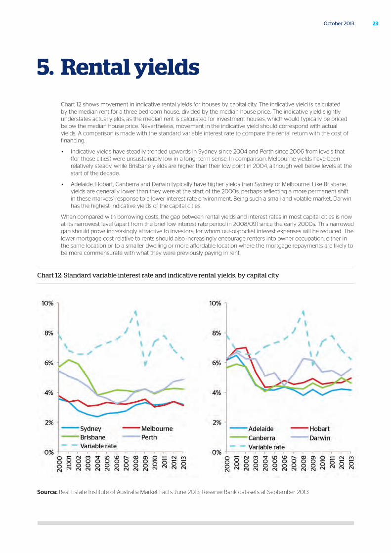
5. Rental yieldsChart 12 shows movement in indicative rental yields for houses by capital city. The indicative yield is calculated by the median rent for a three bedroom house, divided by the median house price. The indicative yield slightly understates actual yields, as the median rent is calculated for investment houses, which would typically be priced below the median house price. Nevertheless, movement in the indicative yield should correspond with actual yields. A comparison is made with the standard variable interest rate to compare the rental return with the cost of financing.
• Indicative yields have steadily trended upwards in Sydney since 2004 and Perth since 2006 from levels that (for those cities) were unsustainably low in a long- term sense. In comparison, Melbourne yields have been relatively steady, while Brisbane yields are higher than their low point in 2004, although well below levels at the start of the decade.
• Adelaide, Hobart, Canberra and Darwin typically have higher yields than Sydney or Melbourne. Like Brisbane, yields are generally lower than they were at the start of the 2000s, perhaps reflecting a more permanent shift in these markets’ response to a lower interest rate environment. Being such a small and volatile market, Darwin has the highest indicative yields of the capital cities.
When compared with borrowing costs, the gap between rental yields and interest rates in most capital cities is now at its narrowest level (apart from the brief low interest rate period in 2008/09) since the early 2000s. This narrowed gap should prove increasingly attractive to investors, for whom out-of-pocket interest expenses will be reduced. The lower mortgage cost relative to rents should also increasingly encourage renters into owner occupation, either in the same location or to a smaller dwelling or more affordable location where the mortgage repayments are likely to be more commensurate with what they were previously paying in rent.
Chart 12: Standard variable interest rate and indicative rental yields, by capital city
Source: Real Estate Institute of Australia Market Facts June 2013, Reserve Bank datasets at September 2013
24 Australian Housing Outlook 2013-16
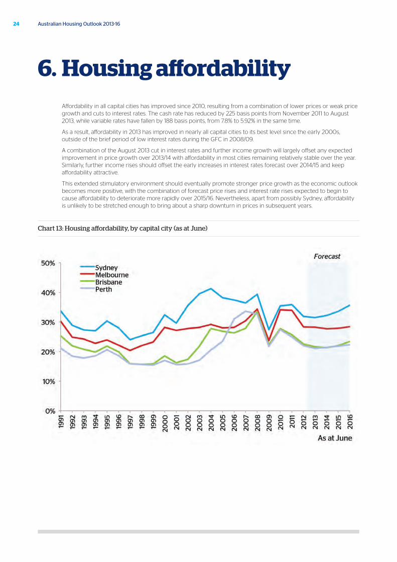
Affordability in all capital cities has improved since 2010, resulting from a combination of lower prices or weak price growth and cuts to interest rates. The cash rate has reduced by 225 basis points from November 2011 to August 2013, while variable rates have fallen by 188 basis points, from 7.8% to 5.92% in the same time.
As a result, affordability in 2013 has improved in nearly all capital cities to its best level since the early 2000s, outside of the brief period of low interest rates during the GFC in 2008/09.
A combination of the August 2013 cut in interest rates and further income growth will largely offset any expected improvement in price growth over 2013/14 with affordability in most cities remaining relatively stable over the year. Similarly, further income rises should offset the early increases in interest rates forecast over 2014/15 and keep affordability attractive.
This extended stimulatory environment should eventually promote stronger price growth as the economic outlook becomes more positive, with the combination of forecast price rises and interest rate rises expected to begin to cause affordability to deteriorate more rapidly over 2015/16. Nevertheless, apart from possibly Sydney, affordability is unlikely to be stretched enough to bring about a sharp downturn in prices in subsequent years.
Chart 13: Housing affordability, by capital city (as at June)
6. Housing affordability
25October 2013
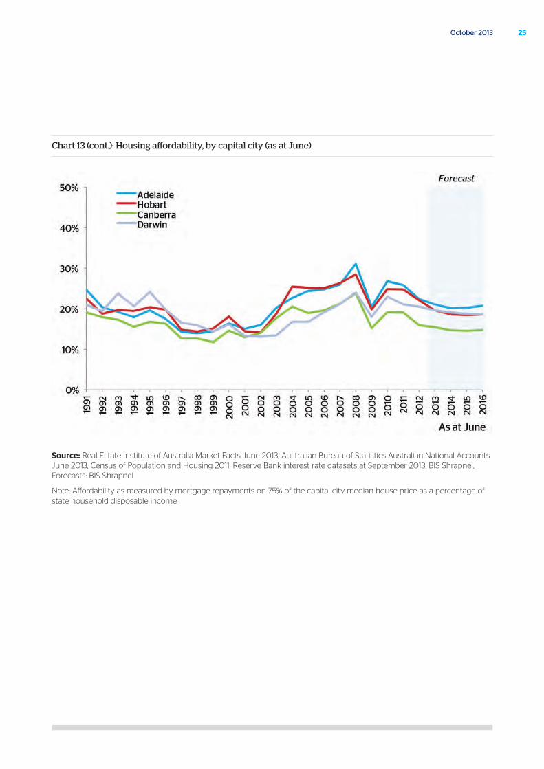
Chart 13 (cont.): Housing affordability, by capital city (as at June)
Source: Real Estate Institute of Australia Market Facts June 2013, Australian Bureau of Statistics Australian National Accounts June 2013, Census of Population and Housing 2011, Reserve Bank interest rate datasets at September 2013, BIS Shrapnel, Forecasts: BIS Shrapnel
Note: Affordability as measured by mortgage repayments on 75% of the capital city median house price as a percentage of state household disposable income
26 Australian Housing Outlook 2013-16
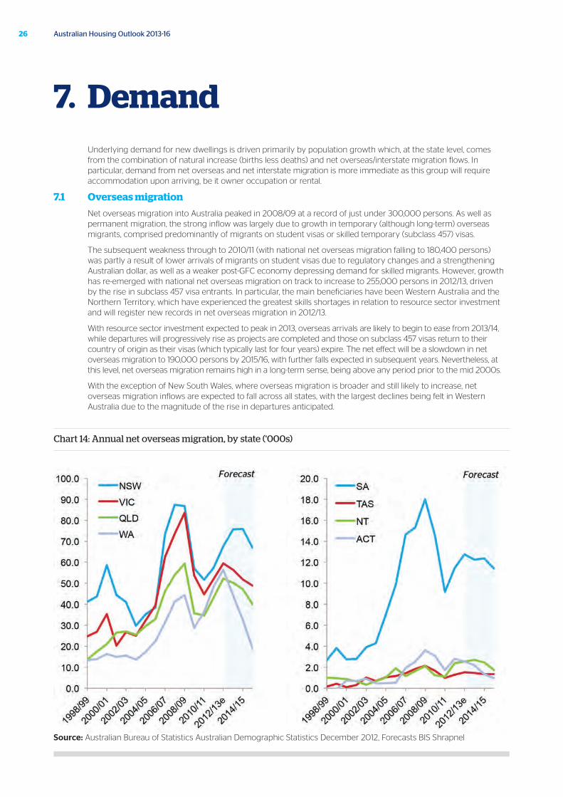
Underlying demand for new dwellings is driven primarily by population growth which, at the state level, comes from the combination of natural increase (births less deaths) and net overseas/interstate migration flows. In particular, demand from net overseas and net interstate migration is more immediate as this group will require accommodation upon arriving, be it owner occupation or rental.
7.1 Overseas migration
Net overseas migration into Australia peaked in 2008/09 at a record of just under 300,000 persons. As well as permanent migration, the strong inflow was largely due to growth in temporary (although long-term) overseas migrants, comprised predominantly of migrants on student visas or skilled temporary (subclass 457) visas.
The subsequent weakness through to 2010/11 (with national net overseas migration falling to 180,400 persons) was partly a result of lower arrivals of migrants on student visas due to regulatory changes and a strengthening Australian dollar, as well as a weaker post-GFC economy depressing demand for skilled migrants. However, growth has re-emerged with national net overseas migration on track to increase to 255,000 persons in 2012/13, driven by the rise in subclass 457 visa entrants. In particular, the main beneficiaries have been Western Australia and the Northern Territory, which have experienced the greatest skills shortages in relation to resource sector investment and will register new records in net overseas migration in 2012/13.
With resource sector investment expected to peak in 2013, overseas arrivals are likely to begin to ease from 2013/14, while departures will progressively rise as projects are completed and those on subclass 457 visas return to their country of origin as their visas (which typically last for four years) expire. The net effect will be a slowdown in net overseas migration to 190,000 persons by 2015/16, with further falls expected in subsequent years. Nevertheless, at this level, net overseas migration remains high in a long-term sense, being above any period prior to the mid 2000s.
With the exception of New South Wales, where overseas migration is broader and still likely to increase, net overseas migration inflows are expected to fall across all states, with the largest declines being felt in Western Australia due to the magnitude of the rise in departures anticipated.
Chart 14: Annual net overseas migration, by state (‘000s)
Source: Australian Bureau of Statistics Australian Demographic Statistics December 2012, Forecasts BIS Shrapnel
7. Demand
27October 2013
28 Australian Housing Outlook 2013-16
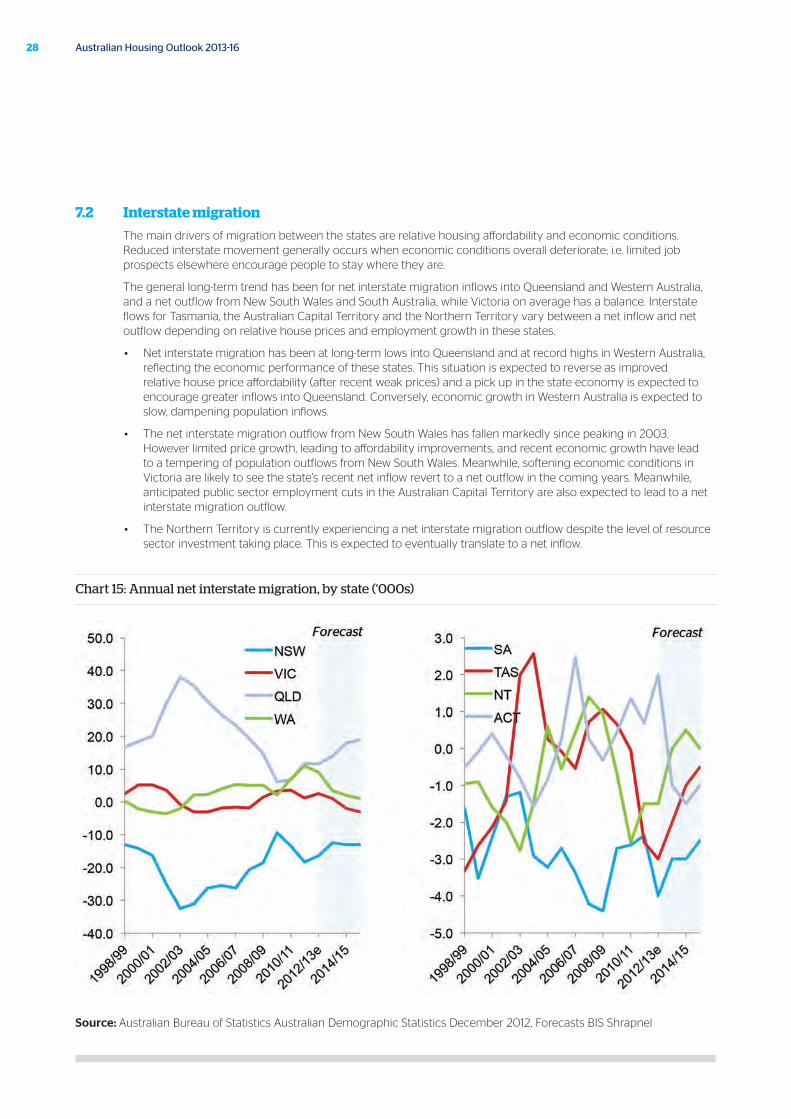
7.2 Interstate migration
The main drivers of migration between the states are relative housing affordability and economic conditions. Reduced interstate movement generally occurs when economic conditions overall deteriorate; i.e. limited job prospects elsewhere encourage people to stay where they are.
The general long-term trend has been for net interstate migration inflows into Queensland and Western Australia, and a net outflow from New South Wales and South Australia, while Victoria on average has a balance. Interstate flows for Tasmania, the Australian Capital Territory and the Northern Territory vary between a net inflow and net outflow depending on relative house prices and employment growth in these states.
• Net interstate migration has been at long-term lows into Queensland and at record highs in Western Australia, reflecting the economic performance of these states. This situation is expected to reverse as improved relative house price affordability (after recent weak prices) and a pick up in the state economy is expected to encourage greater inflows into Queensland. Conversely, economic growth in Western Australia is expected to slow, dampening population inflows.
• The net interstate migration outflow from New South Wales has fallen markedly since peaking in 2003. However limited price growth, leading to affordability improvements, and recent economic growth have lead to a tempering of population outflows from New South Wales. Meanwhile, softening economic conditions in Victoria are likely to see the state’s recent net inflow revert to a net outflow in the coming years. Meanwhile, anticipated public sector employment cuts in the Australian Capital Territory are also expected to lead to a net interstate migration outflow.
• The Northern Territory is currently experiencing a net interstate migration outflow despite the level of resource sector investment taking place. This is expected to eventually translate to a net inflow.
Chart 15: Annual net interstate migration, by state (‘000s)
Source: Australian Bureau of Statistics Australian Demographic Statistics December 2012, Forecasts BIS Shrapnel
29October 2013
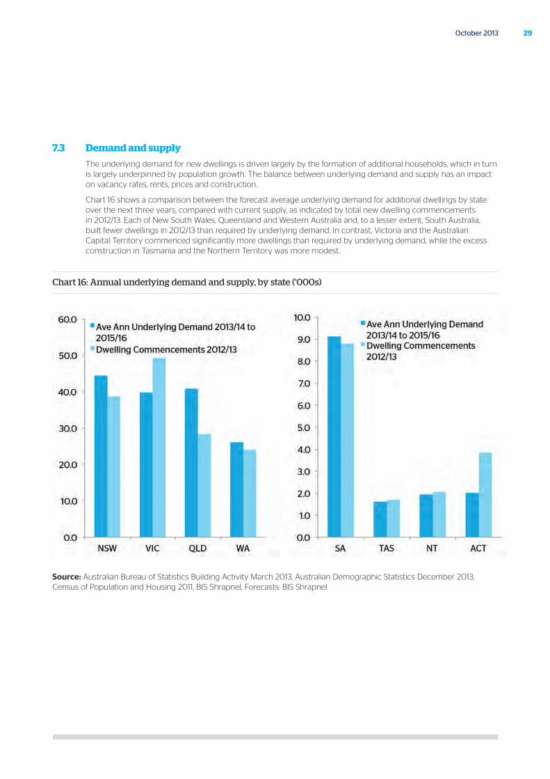
7.3 Demand and supply
The underlying demand for new dwellings is driven largely by the formation of additional households, which in turn is largely underpinned by population growth. The balance between underlying demand and supply has an impact on vacancy rates, rents, prices and construction.
Chart 16 shows a comparison between the forecast average underlying demand for additional dwellings by state over the next three years, compared with current supply, as indicated by total new dwelling commencements in 2012/13. Each of New South Wales, Queensland and Western Australia and, to a lesser extent, South Australia, built fewer dwellings in 2012/13 than required by underlying demand. In contrast, Victoria and the Australian Capital Territory commenced significantly more dwellings than required by underlying demand, while the excess construction in Tasmania and the Northern Territory was more modest.
Chart 16: Annual underlying demand and supply, by state (‘000s)
Source: Australian Bureau of Statistics Building Activity March 2013, Australian Demographic Statistics December 2013, Census of Population and Housing 2011, BIS Shrapnel, Forecasts: BIS Shrapnel
30 Australian Housing Outlook 2013-16
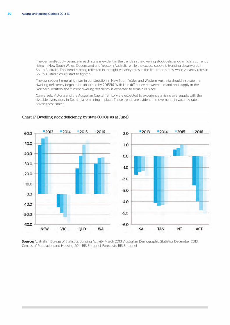
The demand/supply balance in each state is evident in the trends in the dwelling stock deficiency, which is currently rising in New South Wales, Queensland and Western Australia, while the excess supply is trending downwards in South Australia. This trend is being reflected in the tight vacancy rates in the first three states, while vacancy rates in South Australia could start to tighten.
The consequent emerging rises in construction in New South Wales and Western Australia should also see the dwelling deficiency begin to be absorbed by 2015/16. With little difference between demand and supply in the Northern Territory, the current dwelling deficiency is expected to remain in place.
Conversely, Victoria and the Australian Capital Territory are expected to experience a rising oversupply, with the sizeable oversupply in Tasmania remaining in place. These trends are evident in movements in vacancy rates across these states.
Chart 17: Dwelling stock deficiency, by state (‘000s, as at June)
Source: Australian Bureau of Statistics Building Activity March 2013, Australian Demographic Statistics December 2013, Census of Population and Housing 2011, BIS Shrapnel, Forecasts: BIS Shrapnel
31October 2013
Capital city forecasts
32 Australian Housing Outlook 2013-16
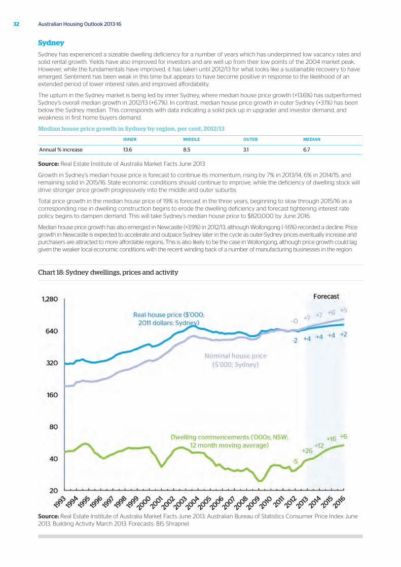
Sydney
Sydney has experienced a sizeable dwelling deficiency for a number of years which has underpinned low vacancy rates and solid rental growth. Yields have also improved for investors and are well up from their low points of the 2004 market peak. However, while the fundamentals have improved, it has taken until 2012/13 for what looks like a sustainable recovery to have emerged. Sentiment has been weak in this time but appears to have become positive in response to the likelihood of an extended period of lower interest rates and improved affordability.
The upturn in the Sydney market is being led by inner Sydney, where median house price growth (+13.6%) has outperformed Sydney’s overall median growth in 2012/13 (+6.7%). In contrast, median house price growth in outer Sydney (+3.1%) has been below the Sydney median. This corresponds with data indicating a solid pick up in upgrader and investor demand, and weakness in first home buyers demand.
Median house price growth in Sydney by region, per cent, 2012/13
INNER MIDDLE OUTER MEDIAN
Annual % increase 13.6 8.5 3.1 6.7
Source: Real Estate Institute of Australia Market Facts June 2013
Growth in Sydney’s median house price is forecast to continue its momentum, rising by 7% in 2013/14, 6% in 2014/15, and remaining solid in 2015/16. State economic conditions should continue to improve, while the deficiency of dwelling stock will drive stronger price growth progressively into the middle and outer suburbs
Total price growth in the median house price of 19% is forecast in the three years, beginning to slow through 2015/16 as a corresponding rise in dwelling construction begins to erode the dwelling deficiency and forecast tightening interest rate policy begins to dampen demand. This will take Sydney’s median house price to $820,000 by June 2016.
Median house price growth has also emerged in Newcastle (+3.9%) in 2012/13, although Wollongong (–1.6%) recorded a decline. Price growth in Newcastle is expected to accelerate and outpace Sydney later in the cycle as outer-Sydney prices eventually increase and purchasers are attracted to more affordable regions. This is also likely to be the case in Wollongong, although price growth could lag given the weaker local economic conditions with the recent winding back of a number of manufacturing businesses in the region.
Chart 18: Sydney dwellings, prices and activity
Source: Real Estate Institute of Australia Market Facts June 2013, Australian Bureau of Statistics Consumer Price Index June 2013, Building Activity March 2013. Forecasts: BIS Shrapnel
33October 2013
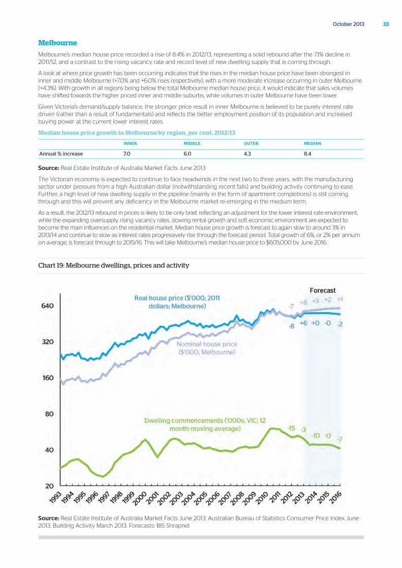
Melbourne
Melbourne’s median house price recorded a rise of 8.4% in 2012/13, representing a solid rebound after the 7.1% decline in 2011/12, and a contrast to the rising vacancy rate and record level of new dwelling supply that is coming through.
A look at where price growth has been occurring indicates that the rises in the median house price have been strongest in inner and middle Melbourne (+7.0% and +6.0% rises respectively), with a more moderate increase occurring in outer Melbourne (+4.3%). With growth in all regions being below the total Melbourne median house price, it would indicate that sales volumes have shifted towards the higher priced inner and middle suburbs, while volumes in outer Melbourne have been lower.
Given Victoria’s demand/supply balance, the stronger price result in inner Melbourne is believed to be purely interest rate driven (rather than a result of fundamentals) and reflects the better employment position of its population and increased buying power at the current lower interest rates.
Median house price growth in Melbourne by region, per cent, 2012/13
INNER MIDDLE OUTER MEDIAN
Annual % increase 7.0 6.0 4.3 8.4
Source: Real Estate Institute of Australia Market Facts June 2013
The Victorian economy is expected to continue to face headwinds in the next two to three years, with the manufacturing sector under pressure from a high Australian dollar (notwithstanding recent falls) and building activity continuing to ease. Further, a high level of new dwelling supply in the pipeline (mainly in the form of apartment completions) is still coming through and this will prevent any deficiency in the Melbourne market re-emerging in the medium term.
As a result, the 2012/13 rebound in prices is likely to be only brief, reflecting an adjustment for the lower interest rate environment, while the expanding oversupply, rising vacancy rates, slowing rental growth and soft economic environment are expected to become the main influences on the residential market. Median house price growth is forecast to again slow to around 3% in 2013/14 and continue to slow as interest rates progressively rise through the forecast period. Total growth of 6%, or 2% per annum on average, is forecast through to 2015/16. This will take Melbourne’s median house price to $605,000 by June 2016.
Chart 19: Melbourne dwellings, prices and activity
Source: Real Estate Institute of Australia Market Facts June 2013, Australian Bureau of Statistics Consumer Price Index June 2013, Building Activity March 2013. Forecasts: BIS Shrapnel
34 Australian Housing Outlook 2013-16
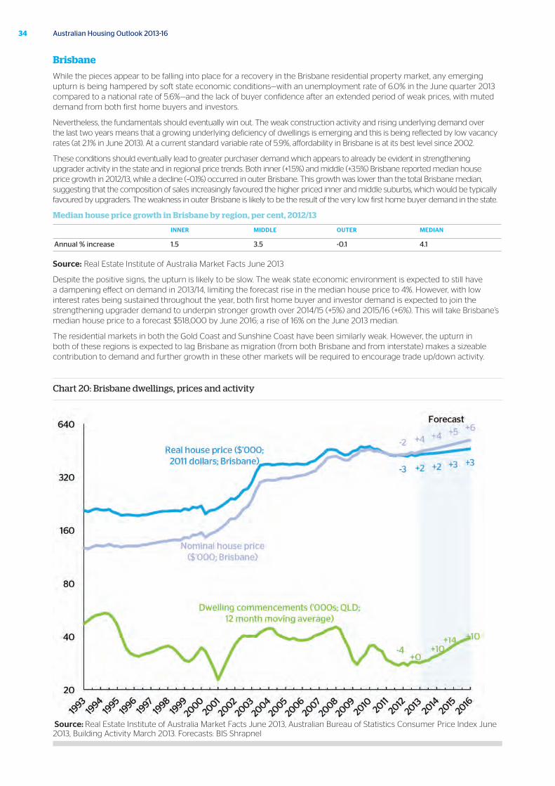
Brisbane
While the pieces appear to be falling into place for a recovery in the Brisbane residential property market, any emerging upturn is being hampered by soft state economic conditions—with an unemployment rate of 6.0% in the June quarter 2013 compared to a national rate of 5.6%—and the lack of buyer confidence after an extended period of weak prices, with muted demand from both first home buyers and investors.
Nevertheless, the fundamentals should eventually win out. The weak construction activity and rising underlying demand over the last two years means that a growing underlying deficiency of dwellings is emerging and this is being reflected by low vacancy rates (at 2.1% in June 2013). At a current standard variable rate of 5.9%, affordability in Brisbane is at its best level since 2002.
These conditions should eventually lead to greater purchaser demand which appears to already be evident in strengthening upgrader activity in the state and in regional price trends. Both inner (+1.5%) and middle (+3.5%) Brisbane reported median house price growth in 2012/13, while a decline (–0.1%) occurred in outer Brisbane. This growth was lower than the total Brisbane median, suggesting that the composition of sales increasingly favoured the higher priced inner and middle suburbs, which would be typically favoured by upgraders. The weakness in outer Brisbane is likely to be the result of the very low first home buyer demand in the state.
Median house price growth in Brisbane by region, per cent, 2012/13
INNER MIDDLE OUTER MEDIAN
Annual % increase 1.5 3.5 -0.1 4.1
Source: Real Estate Institute of Australia Market Facts June 2013
Despite the positive signs, the upturn is likely to be slow. The weak state economic environment is expected to still have a dampening effect on demand in 2013/14, limiting the forecast rise in the median house price to 4%. However, with low interest rates being sustained throughout the year, both first home buyer and investor demand is expected to join the strengthening upgrader demand to underpin stronger growth over 2014/15 (+5%) and 2015/16 (+6%). This will take Brisbane’s median house price to a forecast $518,000 by June 2016; a rise of 16% on the June 2013 median.
The residential markets in both the Gold Coast and Sunshine Coast have been similarly weak. However, the upturn in both of these regions is expected to lag Brisbane as migration (from both Brisbane and from interstate) makes a sizeable contribution to demand and further growth in these other markets will be required to encourage trade up/down activity.
Chart 20: Brisbane dwellings, prices and activity
Source: Real Estate Institute of Australia Market Facts June 2013, Australian Bureau of Statistics Consumer Price Index June 2013, Building Activity March 2013. Forecasts: BIS Shrapnel
35October 2013
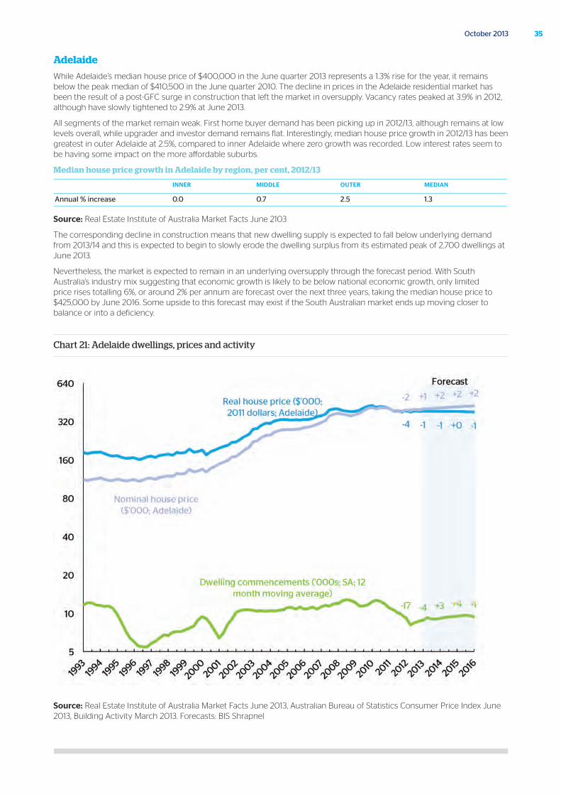
Adelaide
While Adelaide’s median house price of $400,000 in the June quarter 2013 represents a 1.3% rise for the year, it remains below the peak median of $410,500 in the June quarter 2010. The decline in prices in the Adelaide residential market has been the result of a post-GFC surge in construction that left the market in oversupply. Vacancy rates peaked at 3.9% in 2012, although have slowly tightened to 2.9% at June 2013.
All segments of the market remain weak. First home buyer demand has been picking up in 2012/13, although remains at low levels overall, while upgrader and investor demand remains flat. Interestingly, median house price growth in 2012/13 has been greatest in outer Adelaide at 2.5%, compared to inner Adelaide where zero growth was recorded. Low interest rates seem to be having some impact on the more affordable suburbs.
Median house price growth in Adelaide by region, per cent, 2012/13
INNER MIDDLE OUTER MEDIAN
Annual % increase 0.0 0.7 2.5 1.3
Source: Real Estate Institute of Australia Market Facts June 2103
The corresponding decline in construction means that new dwelling supply is expected to fall below underlying demand from 2013/14 and this is expected to begin to slowly erode the dwelling surplus from its estimated peak of 2,700 dwellings at June 2013.
Nevertheless, the market is expected to remain in an underlying oversupply through the forecast period. With South Australia’s industry mix suggesting that economic growth is likely to be below national economic growth, only limited price rises totalling 6%, or around 2% per annum are forecast over the next three years, taking the median house price to $425,000 by June 2016. Some upside to this forecast may exist if the South Australian market ends up moving closer to balance or into a deficiency.
Chart 21: Adelaide dwellings, prices and activity
Source: Real Estate Institute of Australia Market Facts June 2013, Australian Bureau of Statistics Consumer Price Index June 2013, Building Activity March 2013. Forecasts: BIS Shrapnel
36 Australian Housing Outlook 2013-16
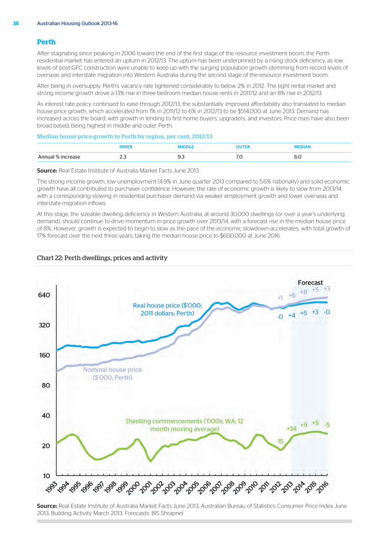
Perth
After stagnating since peaking in 2006 toward the end of the first stage of the resource investment boom, the Perth residential market has entered an upturn in 2012/13. The upturn has been underpinned by a rising stock deficiency, as low levels of post-GFC construction were unable to keep up with the surging population growth stemming from record levels of overseas and interstate migration into Western Australia during the second stage of the resource investment boom.
After being in oversupply, Perth’s vacancy rate tightened considerably to below 2% in 2012. The tight rental market and strong income growth drove a 13% rise in three bedroom median house rents in 2011/12 and an 8% rise in 2012/13.
As interest rate policy continued to ease through 2012/13, the substantially improved affordability also translated to median house price growth, which accelerated from 1% in 2011/12 to 6% in 2012/13 to be $514,000 at June 2013. Demand has increased across the board, with growth in lending to first home buyers, upgraders, and investors. Price rises have also been broad based, being highest in middle and outer Perth.
Median house price growth in Perth by region, per cent, 2012/13
INNER MIDDLE OUTER MEDIAN
Annual % increase 2.3 9.3 7.0 6.0
Source: Real Estate Institute of Australia Market Facts June 2013
The strong income growth, low unemployment (4.9% in June quarter 2013 compared to 5.6% nationally) and solid economic growth have all contributed to purchaser confidence. However, the rate of economic growth is likely to slow from 2013/14, with a corresponding slowing in residential purchaser demand via weaker employment growth and lower overseas and interstate migration inflows.
At this stage, the sizeable dwelling deficiency in Western Australia, at around 30,000 dwellings (or over a year’s underlying demand), should continue to drive momentum in price growth over 2013/14, with a forecast rise in the median house price of 8%. However, growth is expected to begin to slow as the pace of the economic slowdown accelerates, with total growth of 17% forecast over the next three years, taking the median house price to $600,000 at June 2016.
Chart 22: Perth dwellings, prices and activity
Source: Real Estate Institute of Australia Market Facts June 2013, Australian Bureau of Statistics Consumer Price Index June 2013, Building Activity March 2013. Forecasts: BIS Shrapnel
37October 2013
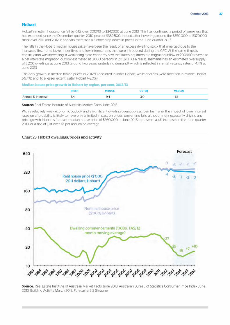
Hobart
Hobart’s median house price fell by 6.1% over 2012/13 to $347,300 at June 2013. This has continued a period of weakness that has extended since the December quarter 2010 peak of $382,500. Indeed, after hovering around the $350,000 to $370,000 mark over 2011 and 2012, it appears there was a further step down in prices in the June quarter 2013.
The falls in the Hobart median house price have been the result of an excess dwelling stock that emerged due to the increased first home buyer incentives and low interest rates that were introduced during the GFC. At the same time as construction was increasing, a weakening state economy saw the state’s net interstate migration inflow in 2009/10 reverse to a net interstate migration outflow estimated at 3,000 persons in 2012/13. As a result, Tasmania has an estimated oversupply of 3,200 dwellings at June 2013 (around two years’ underlying demand), which is reflected in rental vacancy rates of 4.4% at June 2013.
The only growth in median house prices in 2012/13 occurred in inner Hobart, while declines were most felt in middle Hobart (–9.4%) and, to a lesser extent, outer Hobart (–3.0%).
Median house price growth in Hobart by region, per cent, 2012/13
INNER MIDDLE OUTER MEDIAN
Annual % increase 3.4 -9.4 -3.0 -6.1
Source: Real Estate Institute of Australia Market Facts June 2013
With a relatively weak economic outlook and a significant dwelling oversupply across Tasmania, the impact of lower interest rates on affordability is likely to have only a limited impact on prices; preventing falls, although not necessarily driving any price growth. Hobart’s forecast median house price of $360,000 at June 2016 represents a 4% increase on the June quarter 2013, or a rise of just over 1% per annum on average.
Chart 23: Hobart dwellings, prices and activity
Source: Real Estate Institute of Australia Market Facts June 2013, Australian Bureau of Statistics Consumer Price Index June 2013, Building Activity March 2013. Forecasts: BIS Shrapnel
38 Australian Housing Outlook 2013-16
Canberra
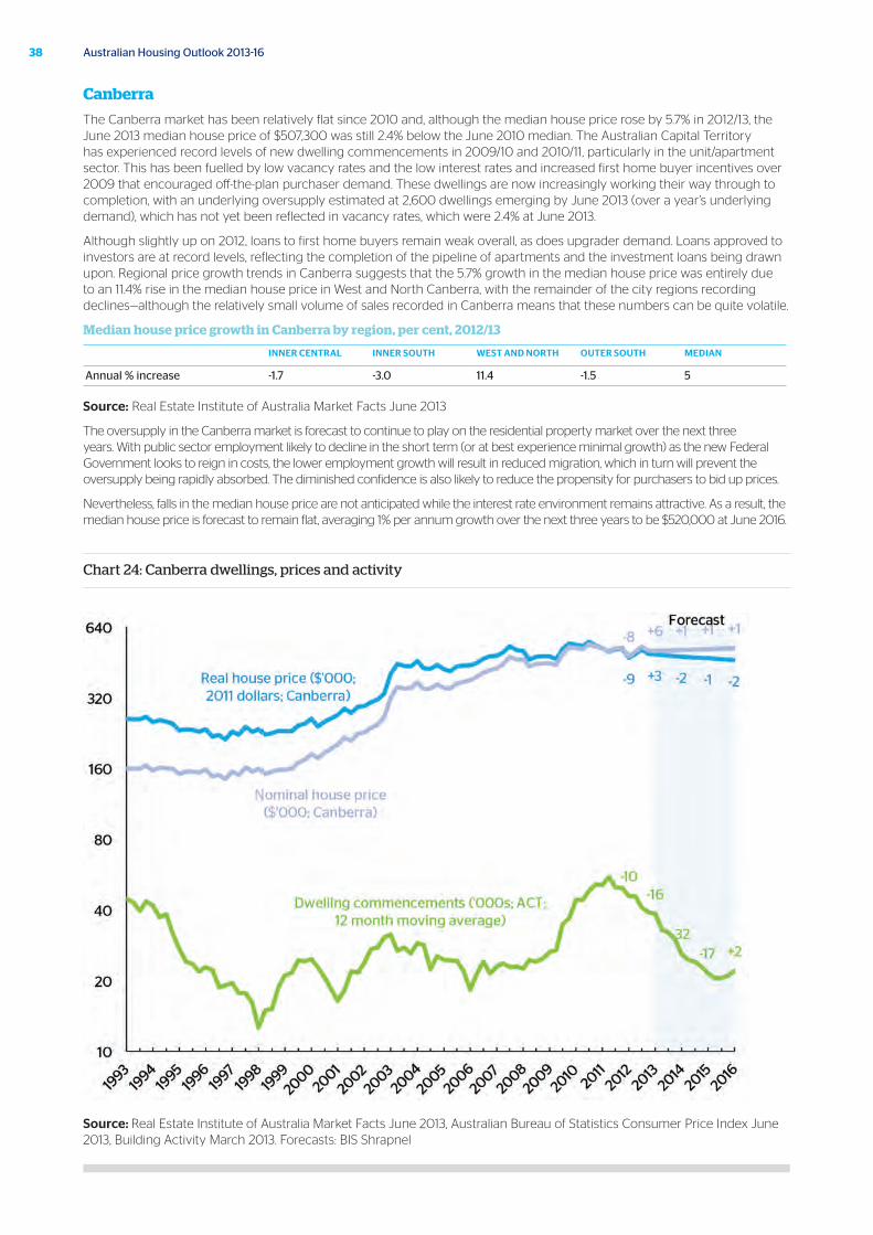
The Canberra market has been relatively flat since 2010 and, although the median house price rose by 5.7% in 2012/13, the June 2013 median house price of $507,300 was still 2.4% below the June 2010 median. The Australian Capital Territory has experienced record levels of new dwelling commencements in 2009/10 and 2010/11, particularly in the unit/apartment sector. This has been fuelled by low vacancy rates and the low interest rates and increased first home buyer incentives over 2009 that encouraged off-the-plan purchaser demand. These dwellings are now increasingly working their way through to completion, with an underlying oversupply estimated at 2,600 dwellings emerging by June 2013 (over a year’s underlying demand), which has not yet been reflected in vacancy rates, which were 2.4% at June 2013.
Although slightly up on 2012, loans to first home buyers remain weak overall, as does upgrader demand. Loans approved to investors are at record levels, reflecting the completion of the pipeline of apartments and the investment loans being drawn upon. Regional price growth trends in Canberra suggests that the 5.7% growth in the median house price was entirely due to an 11.4% rise in the median house price in West and North Canberra, with the remainder of the city regions recording declines—although the relatively small volume of sales recorded in Canberra means that these numbers can be quite volatile.
Median house price growth in Canberra by region, per cent, 2012/13
INNER CENTRAL INNER SOUTH WEST AND NORTH OUTER SOUTH MEDIAN
Annual % increase -1.7 -3.0 11.4 -1.5 5
Source: Real Estate Institute of Australia Market Facts June 2013
The oversupply in the Canberra market is forecast to continue to play on the residential property market over the next three years. With public sector employment likely to decline in the short term (or at best experience minimal growth) as the new Federal Government looks to reign in costs, the lower employment growth will result in reduced migration, which in turn will prevent the oversupply being rapidly absorbed. The diminished confidence is also likely to reduce the propensity for purchasers to bid up prices.
Nevertheless, falls in the median house price are not anticipated while the interest rate environment remains attractive. As a result, the median house price is forecast to remain flat, averaging 1% per annum growth over the next three years to be $520,000 at June 2016.
Chart 24: Canberra dwellings, prices and activity
Source: Real Estate Institute of Australia Market Facts June 2013, Australian Bureau of Statistics Consumer Price Index June 2013, Building Activity March 2013. Forecasts: BIS Shrapnel
39October 2013
Darwin
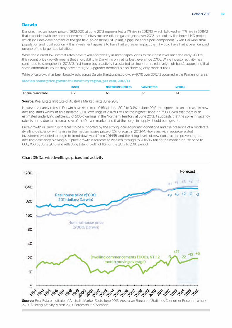
Darwin’s median house price of $612,000 at June 2013 represented a 7% rise in 2012/13, which followed an 11% rise in 2011/12 that coincided with the commencement of infrastructure, oil and gas projects over 2012, particularly the Inpex LNG project which includes development of the gas field, an onshore LNG plant, a pipeline and a port component. Given Darwin’s small population and local economy, this investment appears to have had a greater impact than it would have had it been centred on one of the larger capital cities.
While the current low interest rates have taken affordability in most capital cities to their best level since the early 2000s, this recent price growth means that affordability in Darwin is only at its best level since 2006. While investor activity has continued to strengthen in 2012/13, first home buyer activity has started to slow (from a relatively high base), suggesting that some affordability issues may have emerged. Upgrader demand is also showing only modest rises
While price growth has been broadly solid across Darwin, the strongest growth (+9.7%) over 2012/13 occurred in the Palmerston area.
Median house price growth in Darwin by region, per cent, 2012/13
INNER NORTHERN SUBURBS PALMERSTON MEDIAN
Annual % increase 6.2 6.5 9.7 7.4
Source: Real Estate Institute of Australia Market Facts June 2013
However, vacancy rates in Darwin have risen from 0.8% at June 2012 to 3.4% at June 2013, in response to an increase in new dwelling starts which, at an estimated 2,100 dwellings in 2012/13, will be the highest since 1997/98. Given that there is an estimated underlying deficiency of 500 dwellings in the Northern Territory at June 2013, it suggests that the spike in vacancy rates is partly due to the small size of the Darwin market and that the surge in supply should be digested.
Price growth in Darwin is forecast to be supported by the strong local economic conditions and the presence of a moderate dwelling deficiency, with a rise in the median house price of 5% forecast in 2013/14. However, with resource-related investment expected to begin to trend downward from 2014/15, and the rising levels of new construction preventing the dwelling deficiency blowing out, price growth is forecast to weaken through to 2015/16, taking the median house price to 660,000 by June 2016 and reflecting total growth of 8% for the 2013 to 2016 period.
Chart 25: Darwin dwellings, prices and activity
Source: Real Estate Institute of Australia Market Facts June 2013, Australian Bureau of Statistics Consumer Price Index June 2013, Building Activity March 2013. Forecasts: BIS Shrapnel
Forecast Comparison
40 Australian Housing Outlook 2013-16
41October 2013
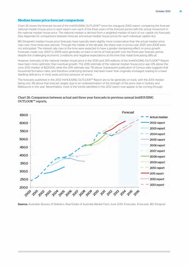
Median house price forecast comparison
Chart 26 shows the forecast record of the lmiHOUSING OUTLOOK™ since the inaugural 2002 report, comparing the forecast national median house price in each report over each of the three years of the forecast period with the actual movement in the national median house price. The national median is derived from a weighted median of each of our capital city forecasts (See Appendix for comparisons between forecast and actual median house prices for each individual capital city).
BIS Shrapnel’s median house price forecasts have typically been slightly more conservative than the actual median price rises over most three-year periods. Through the middle of the decade, the sharp rises in prices over 2007 and 2008 were not anticipated. The interest rate rises at the time were expected to have a greater dampening effect on price growth. Forecasts made over 2007 to 2009 were generally on track in terms of total growth over the three-year forecast period, despite the challenging economic conditions and negative expectations at the time that made forecasting difficult.
However, forecasts of the national median house price in the 2010 and 2011 editions of the lmiHOUSING OUTLOOK™ Report have been more optimistic than eventual growth. The 2010 estimate of the national median house price was 12% above the June 2012 median of $521,000, while the 2011 estimate was 7% above. Subsequent publication of Census data suggests that household formation rates, and therefore underlying demand, had been lower than originally envisaged, leading to a lower dwelling deficiency in most areas and less pressure on prices.
The forecasts published in the 2012 lmiHOUSING OUTLOOK™ Report are so far generally on track, with the 2013 median being only 3% above that forecast, largely due to an underestimation of the strength of the price rises in Sydney and Melbourne in the year. Nevertheless, most of the trends identified in the 2012 report now appear to be coming through.
Chart 26: Comparison between actual and three year forecasts in previous annual lmiHOUSING OUTLOOK™ reports,
Source: Australian Bureau of Statistics, Real Estate of Australia Market Facts June 2013. Forecasts:, Forecasts: BIS Shrapnel
42 Australian Housing Outlook 2013-16
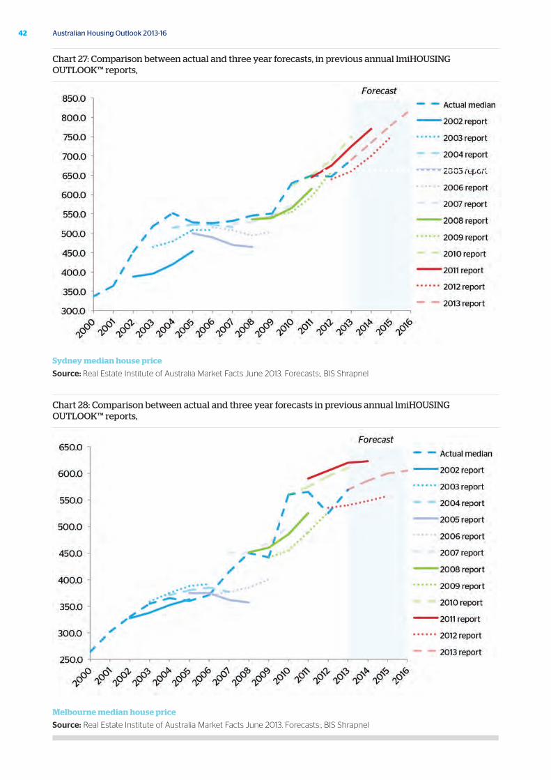
Chart 27: Comparison between actual and three year forecasts, in previous annual lmiHOUSING OUTLOOK™ reports,
Sydney median house price
Source: Real Estate Institute of Australia Market Facts June 2013. Forecasts:, BIS Shrapnel
Chart 28: Comparison between actual and three year forecasts in previous annual lmiHOUSING OUTLOOK™ reports,
Melbourne median house price
Source: Real Estate Institute of Australia Market Facts June 2013. Forecasts:, BIS Shrapnel
43October 2013
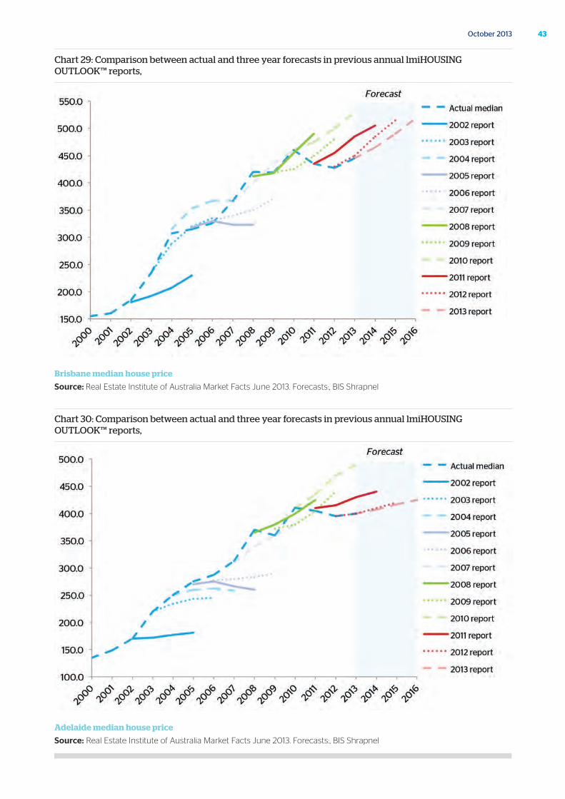
Chart 29: Comparison between actual and three year forecasts in previous annual lmiHOUSING OUTLOOK™ reports,
Brisbane median house price
Source: Real Estate Institute of Australia Market Facts June 2013. Forecasts:, BIS Shrapnel
Chart 30: Comparison between actual and three year forecasts in previous annual lmiHOUSING OUTLOOK™ reports,
Adelaide median house price
Source: Real Estate Institute of Australia Market Facts June 2013. Forecasts:, BIS Shrapnel
44 Australian Housing Outlook 2013-16
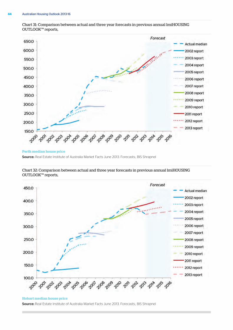
Chart 31: Comparison between actual and three year forecasts in previous annual lmiHOUSING OUTLOOK™ reports,
Perth median house price
Source: Real Estate Institute of Australia Market Facts June 2013. Forecasts:, BIS Shrapnel
Chart 32: Comparison between actual and three year forecasts in previous annual lmiHOUSING OUTLOOK™ reports,
Hobart median house price
Source: Real Estate Institute of Australia Market Facts June 2013. Forecasts:, BIS Shrapnel
45October 2013
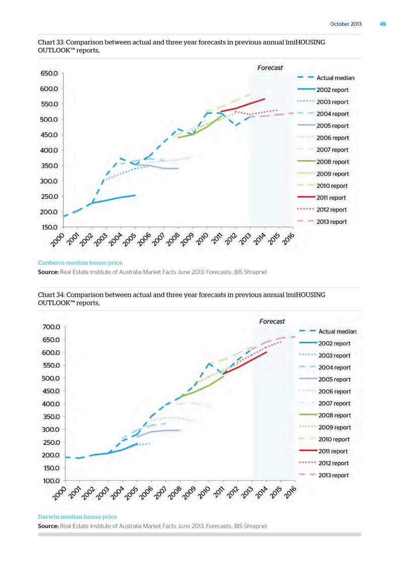
Chart 33: Comparison between actual and three year forecasts in previous annual lmiHOUSING OUTLOOK™ reports,
Canberra median house price
Source: Real Estate Institute of Australia Market Facts June 2013. Forecasts:, BIS Shrapnel
Chart 34: Comparison between actual and three year forecasts in previous annual lmiHOUSING OUTLOOK™ reports,
Darwin median house price
Source: Real Estate Institute of Australia Market Facts June 2013. Forecasts:, BIS Shrapnel
46 Australian Housing Outlook 2013-16
BIS Shrapnel
BIS Shrapnel is Australia’s leading provider of industry research, analysis and forecasting services. BIS Shrapnel helps clients better understand the markets in which they operate, through reliable and detailed market data, analysis of developments and drivers and thoroughly researched forecasts.
BIS Shrapnel compiles accurate, clearly explained and detailed information on industry sectors, markets and industries in which their clients operate. Analysis includes market size and segmentation data, market shares, consumer attitudes and supplier reputation information, as well as both business-to-business and consumer research.
Over the company’s 49-year history, BIS Shrapnel has built up a strong level of expertise and unique methodologies for forecasting that have maintained it as a leader in its field.
QBE LMI
Operating for over 45 years, QBE LMI has combined its risk management expertise, depth and breadth of market knowledge and financial strength to serve the evolving needs of our clients through all stages of the economic cycle.
Our products and services support the mortgage industry by reducing the inherent credit risk in mortgage lending. We are committed to protecting mortgage lenders, giving them the security and confidence to be responsive to changing needs of borrowers and offer higher Loan to Value ratio loans both now and in the future.
Our strong reputation for service and innovation and ability to identify, develop and roll-out flexible products and services, means we can adapt and evolve with our clients’ developing needs and help them securely grow their business.
We provide lenders’ mortgage insurance to the lending industry in Australia and Hong Kong, and operate as a wholly owned subsidiary of the QBE Insurance Group.
QBE – some key facts
Our parent, QBE, is one of Australasia’s leading companies. These core facts about QBE give you an idea how their involvement supports the confidence in QBE LMI’s offering:
• QBE Group is a top 25 company in the global insurance and reinsurance market
• The QBE Group has been listed on the Australian Stock Exchange for over 30 years
• QBE operates in all key insurance markets
• QBE has offices in 48 countries in Asia Pacific, the Americas and Europe
• QBE employs over 17,000 staff worldwide
About

47October 2013

J4455
QBE Lenders’ Mortgage Insurance Limited
82 Pitt St, Sydney NSW 2000 Australia
t +61 2 9231 7777www.qbelmi.com