Embed Size (px)
Citation preview
8/8/2019 Artists of SXU
http://slidepdf.com/reader/full/artists-of-sxu 1/21
1
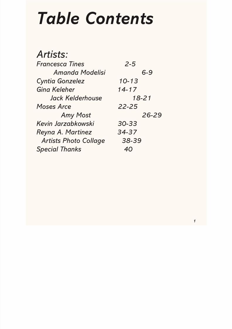
Table Contents
Artists:Francesca Tines 2-5
Amanda Modelisi 6-9Cyntia Gonzelez 10-13
Gina Keleher 14-17 Jack Kelderhouse 18-21Moses Arce 22-25
Amy Most 26-29Kevin Jarzabkowski 30-33
Reyna A. Martinez 34-37 Artists Photo Collage 38-39Special Thanks 40
8/8/2019 Artists of SXU
http://slidepdf.com/reader/full/artists-of-sxu 2/21
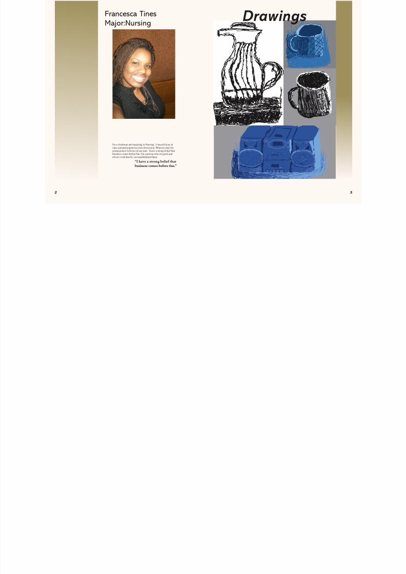
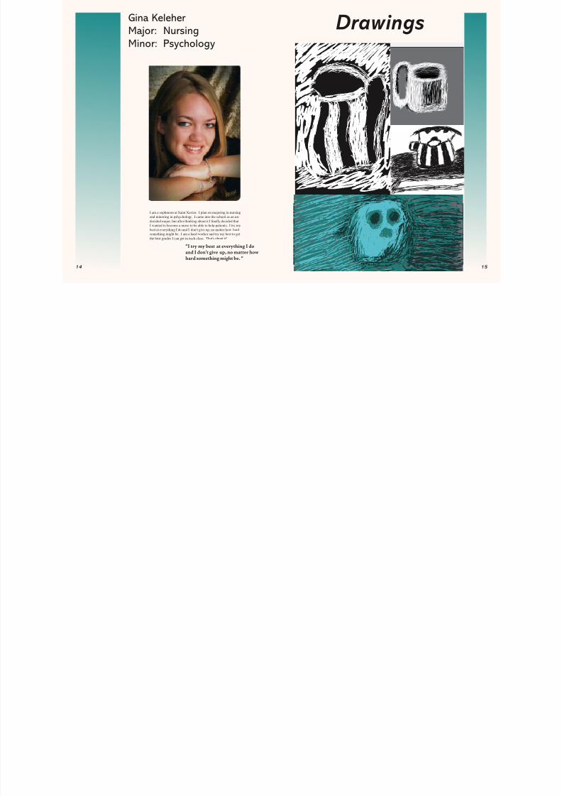
I'm a freshman and majoring in Nursing. I stayed focus inclass and participated in class discussion. When its time forgroup project I always do my part. I have a strong belief thatbusiness comes before fun. I'm a person who set goals and
always work hard to accomplishment them.
Francesca TinesMajor:Nursing Drawings
“I have a strong belie thatbusiness comes be ore un.”
8/8/2019 Artists of SXU
http://slidepdf.com/reader/full/artists-of-sxu 3/21
8/8/2019 Artists of SXU
http://slidepdf.com/reader/full/artists-of-sxu 4/21
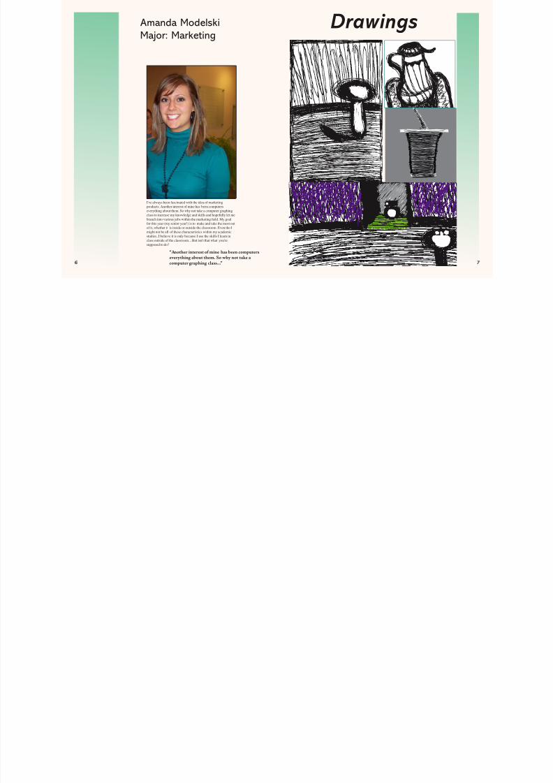
Amanda ModelskiMajor: Marketing
I've always been fascinated with the idea of marketingproducts. Another interest of mine has been computerseverything about them. So why not take a computer graphingclass to increase my knowledge and skills and hopefully let mebranch into various jobs within the marketing eld. My goalfor this year (my senior year!) is to make and take the most outof it, whether it is inside or outside the classroom. Even tho Imight not be all of these characteristics within my academicstudies, I believe it is only because I use the skills I learn inclass outside of the classroom... But isn't that what you'resupposed to do?
Drawings
“Another interest o mine has been computerseverything about them. So why not take acomputer graphing class...”
8/8/2019 Artists of SXU
http://slidepdf.com/reader/full/artists-of-sxu 5/21
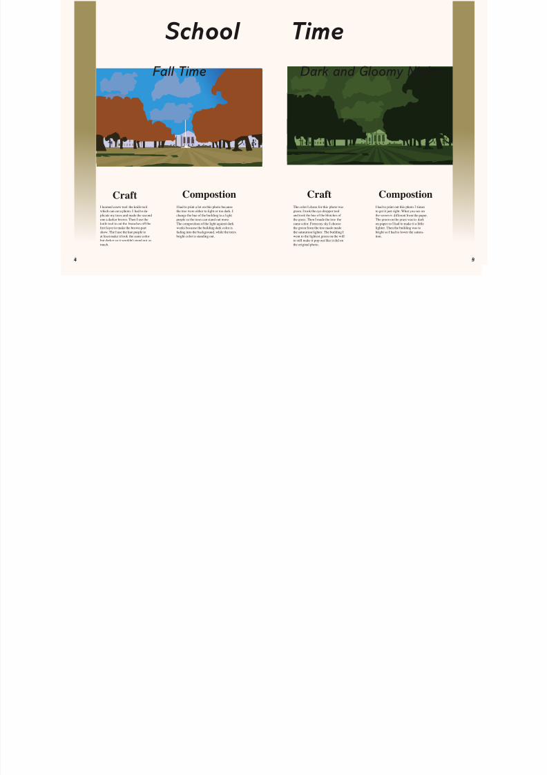
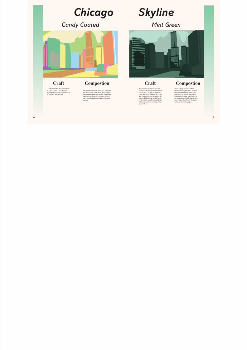
Adobe Illustrator. This illustrationis 'crazy colors'. I used the colorscheme of 'ice cream' colors becauseit was light, fun and airy.
I was going for a look of colorful, light andairy. The typical colors of the metal seem toput a damper on the city skyline. This livensit up.I believe the yellows balance the sky'sgreen to really make the shapes of the build-ings pop.
Craft Craft CompostionCompostion
Candy Coated
My previous illustration in AdobeIllustrator. Was told to transform ourpicture into a mono-chrome design.I was able to use various color toolsand formats to adjust the hues in thepicture. Picked out a speci c greenin the picture to elaborate and designall the other colors occurring to thisgreen I chose.
I tried to keep the same patternthroughout this photo has I had withprevious illustrations- where yourmain focus is the river running upto the main building with the sky inthe background. I think that the sky'scolors add to the effect of the pictureand make the buildings pop.
Chicago SkylineMint Green
8/8/2019 Artists of SXU
http://slidepdf.com/reader/full/artists-of-sxu 6/21
0
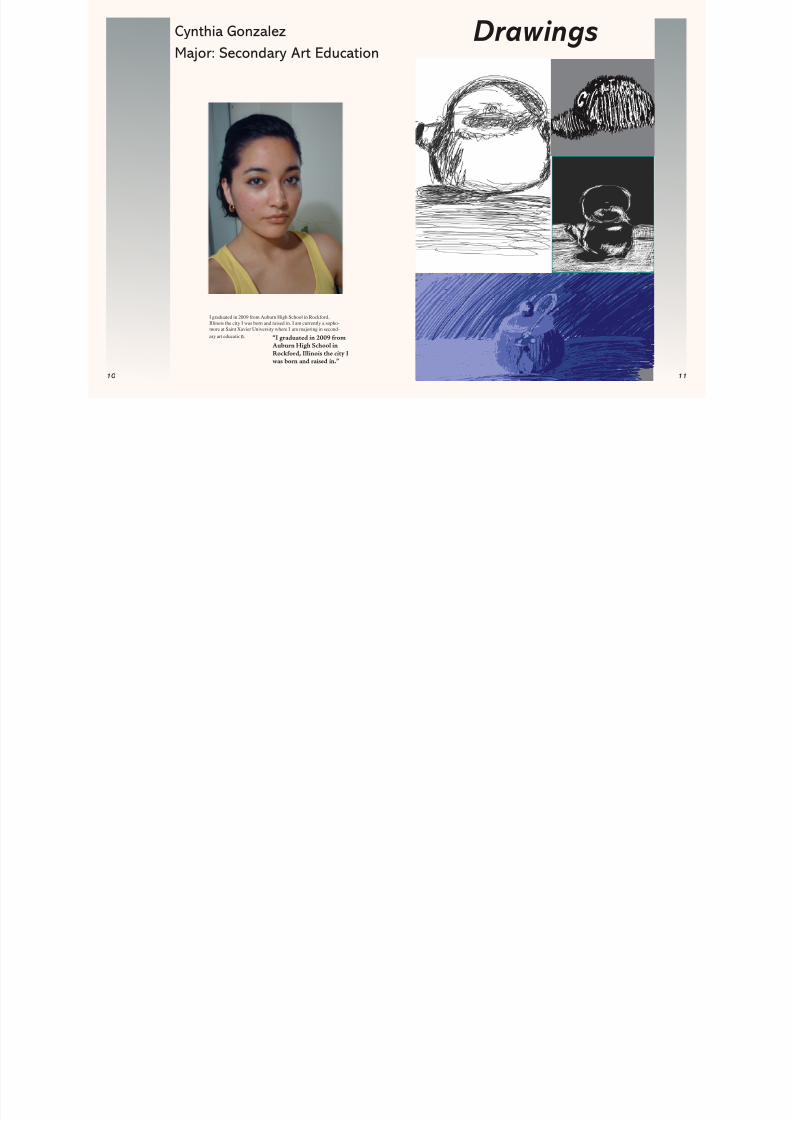
Cynthia GonzalezMajor: Secondary Art Education
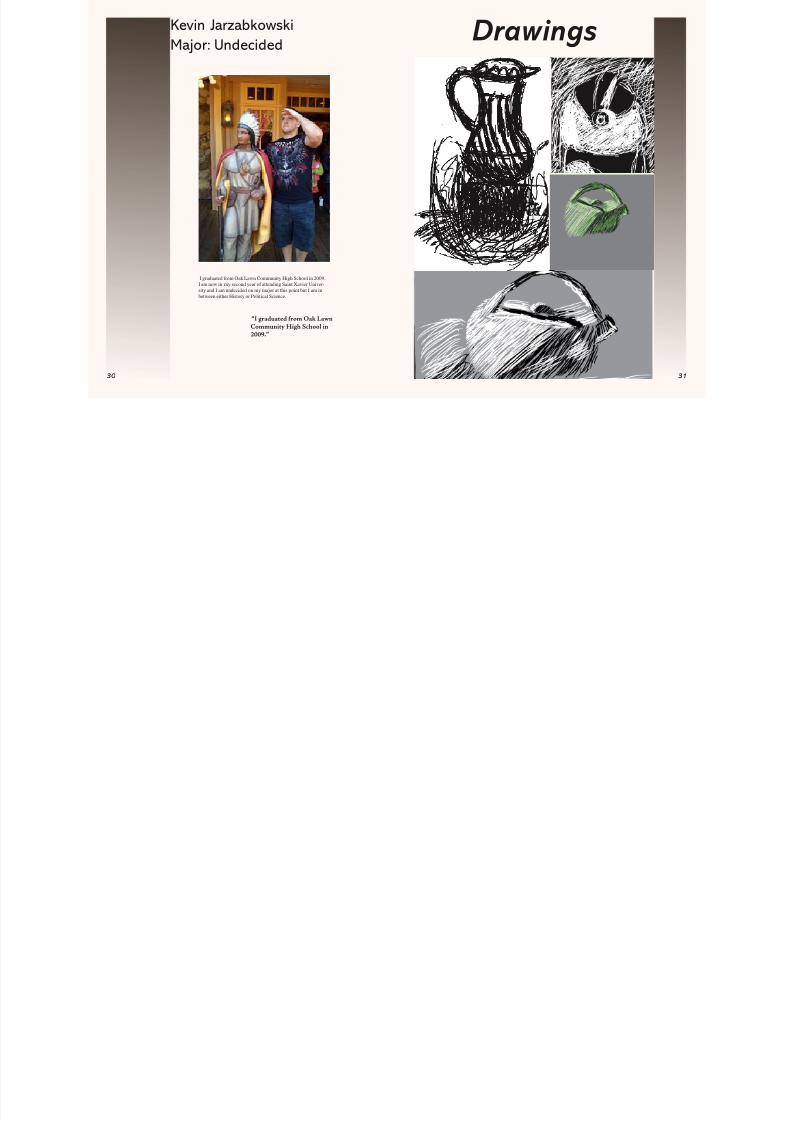
I graduated in 2009 from Auburn High School in Rockford,Illinois the city I was born and raised in. I am currently a sopho-more at Saint Xavier University where I am majoring in second-ary art educatio n.
Drawings
“I graduated in 2009 romAuburn High School inRock ord, Illinois the city Iwas born and raised in.”
8/8/2019 Artists of SXU
http://slidepdf.com/reader/full/artists-of-sxu 7/21
2
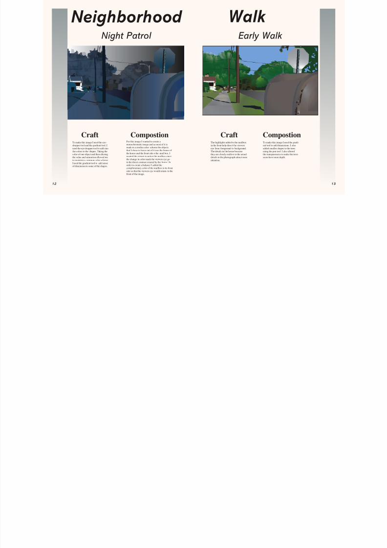
Craft CompostionThe highlights added to the mailboxin the front help direct t he viewerseye from foreground to background.The details in t he house becausethey are closely realtive to the actualdetails in the photograph attract moreattention.
To make this image I used the gradi-ent tool to add dimensions. I alsoadded smaller shapes to the treesusing the pen tool. I also alteredthe transparencies to make the treesseem have more depth.
Craft Compostion
Walk
To make this image I used the eye-dropper tool and the gradient tool. Iused the eye dropper tool to add sim-ilar colors to the shapes. Taking thecolor of one object and then alteringthe value and saturation allowed meto maintain a common color scheme.I used the gradient tool to add senseof dimension to some of the shapes.
For this image I wanted to create amonochromatic image and so most of it ismade in a similar color scheme the objectsthat I chose to leave out of it was the frame of the house and the front side o the mail box. Iwanted the viewer to notice the mailbox sincethe change in color made the viewers eye goto the direct contrast created by the house. Inorder to create a balance I added thecomplimentary color of the mailbox to its frontside so that the viewers eye would return to thefront of the image.
Neighborhood Night Patrol Early Walk
8/8/2019 Artists of SXU
http://slidepdf.com/reader/full/artists-of-sxu 8/21
8/8/2019 Artists of SXU
http://slidepdf.com/reader/full/artists-of-sxu 9/21
6
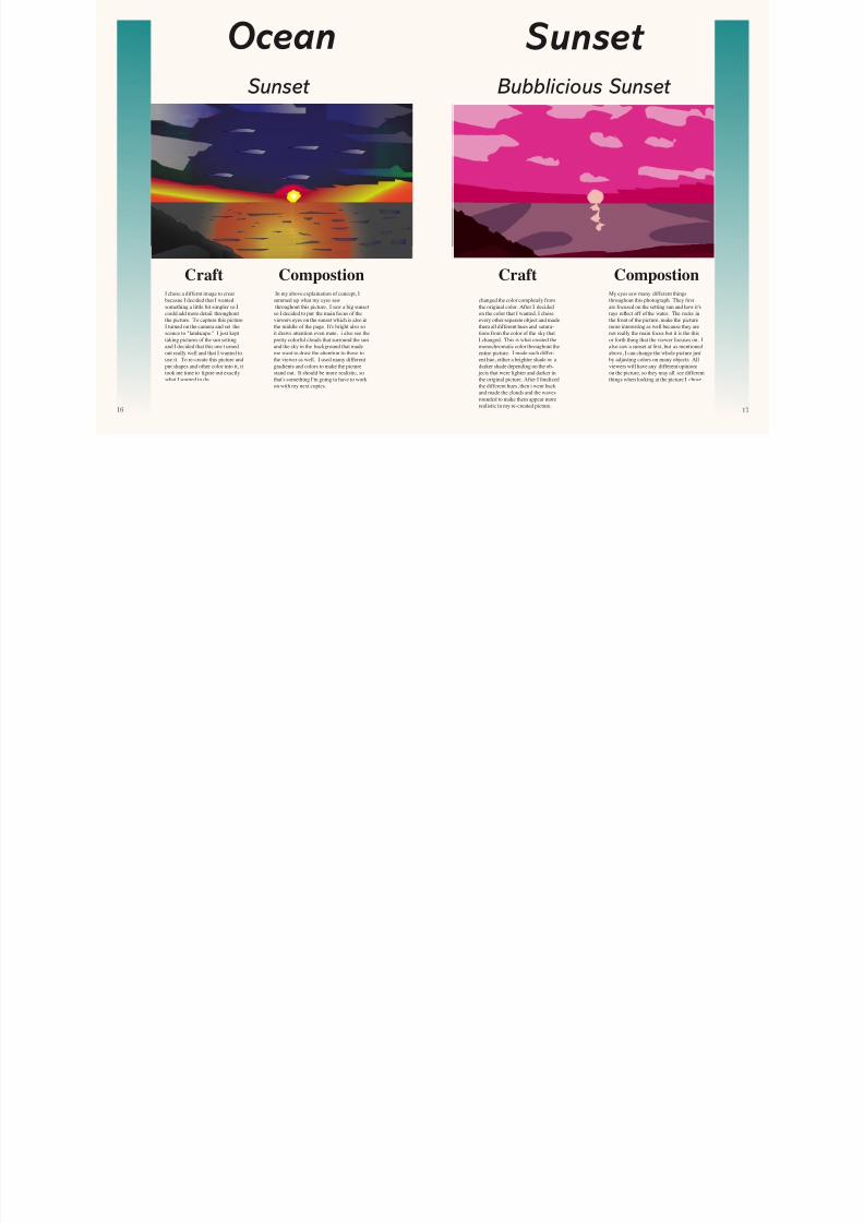
Then I chose the sky layer rst andchanged the color completely fromthe original color. After I decidedon the color that I wanted, I choseevery other separate object and madethem all different hues and satura-
tions from the color of the sky thatI changed. This is what created themonochromatic color throughout theentire picture. I made each differ-ent hue, either a brighter shade or adarker shade depending on the ob-
jects that were lighter and darker inthe original picture. After I nalizedthe different hues, then i went backand made the clouds and the wavesrounded to make them appear morerealistic in my re-created picture.
My eyes saw many different thingsthroughout this photograph. They rstare focused on the setting sun and how it'srays re ect off of the water. The rocks inthe front of the picture, make the picturemore interesting as well because they are
not really the main focus but it is the thisor forth thing that the viewer focuses on. Ialso saw a sunset at rst, but as mentionedabove, I can change the whole picture justby adjusting colors on many objects. Allviewers will have any different opinionson the picture, so they may all see differentthings when looking at the picture I chose.
I chose a differnt image to creatbecasue I decided that I wantedsomething a little bit simpler so Icould add more detail throughoutthe picture. To capture this pictureI turned on the camera and set the
scence to "landscape." I just kepttaking pictures of the sun settingand I decided that this one t urnedout really well and that I wanted touse it. To re-create this picture andput shapes and other color into it, ittook me time to gure out exactlywhat I wanted to do.
In my above explaination of cancept, Isummed up what my eyes sawthroughout this picture. I saw a big sunset
so I decided to put the main focus of theviewers eyes on the sunset which is also inthe middle of the page. It's bright also so
it draws attention even more. i also see thepretty colorful clouds that surround the sunand the sky in the background that mademe want to draw the attention to those tothe viewer as well. I used many differentgradients and colors to make the picturestand out. It should be more realistic, sothat's something I'm going to have to workon with my next copies.
Sunset OceanSunset Bubblicious Sunset
Craft Craft CompostionCompostion
8/8/2019 Artists of SXU
http://slidepdf.com/reader/full/artists-of-sxu 10/21
8
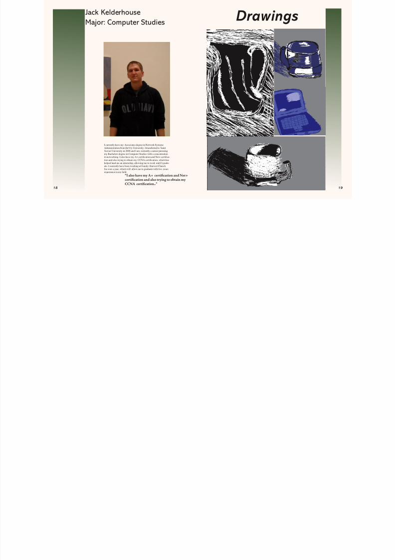
Jack KelderhouseMajor: Computer Studies
I currently have my Associates degree in Network SystemsAdministration from DeVry University. I transferred to SaintXavier University in 2008 and I am currently a senior pursuingmy Bachelors degree in Computer Studies with a concentrationin networking. I also have my A+ certi cation and Net+ certi ca -tion and also trying to obtain my CCNA certi cation, which hashelped land me an internship, allowing me to work until I gradu-ate. I currently have been working at Family Harvest Churchfor over a year, which will allow me to graduate with two yearsexperience in my eld.
Drawings
“I also have my A+ certifcation and Net+certifcation and also trying to obtain myCCNA certifcation..”
8/8/2019 Artists of SXU
http://slidepdf.com/reader/full/artists-of-sxu 11/21
0
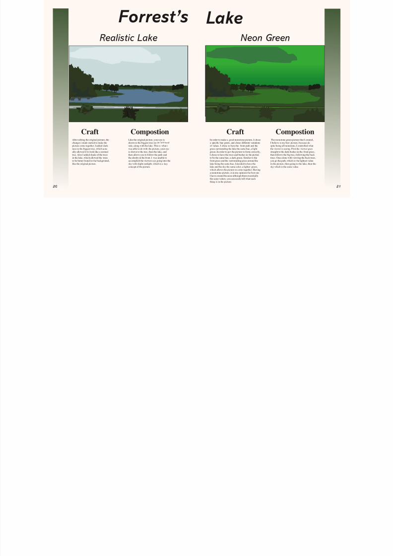
After editing the original picture, thechanges i made started to make thepicture come together. I added dark-ness to the biggest tree, which actu-
ally allowed it to look like a normaltree. Also I added shade of the treesin the lake, which allowed the treesto be better found in t he background,like the original picture.
Like the original picture, your eye isdrawn to the biggest tree on t he left handside, along with the lake. This is what iwas able to do with the picture, your eye
is drawn to the tree, then the lake, andthen allows you to follow the path andthe shrubs in the front. I was unable toaccomplish the viewers eye going into thesky with slight sunlight, which is a keyconcept of the picture.
In order to make a good monotone picture, I chosea speci c hue green, and chose different variationsof values. I chose to have the front path and thegrass surrounding the lake the same hue, a light
green. In order to get the picture to form correctly,I chose to have the trees and bushes in the pictureto be the same hue, a dark green. Similar to thefront grass and the surrounding grass around thelake being the same hue, I decided to have thelake and the sky the same color, a lighter green,which allows the picture to come together. Havinga monotone picture, is in my opinion t he best oneI have created because although there essentiallythe same values, you can easily tell what eachthing is in the picture.
The monotone green picture that I created,I believe is my best picture, because de-spite being all monotone, I controlled whatthe viewer is seeing. First the viewer goes
straight to the dark bushes in the front grass,then follows the big tree, following the backtrees. Once done with viewing the back trees,you go the path, which is t he lightest valuein the picture, then going to the lake, then thesky which is the same value.
CraftCraft CompostionCompostion
Lake Realistic Lake Neon Green
Forrest’s
8/8/2019 Artists of SXU
http://slidepdf.com/reader/full/artists-of-sxu 12/21
2
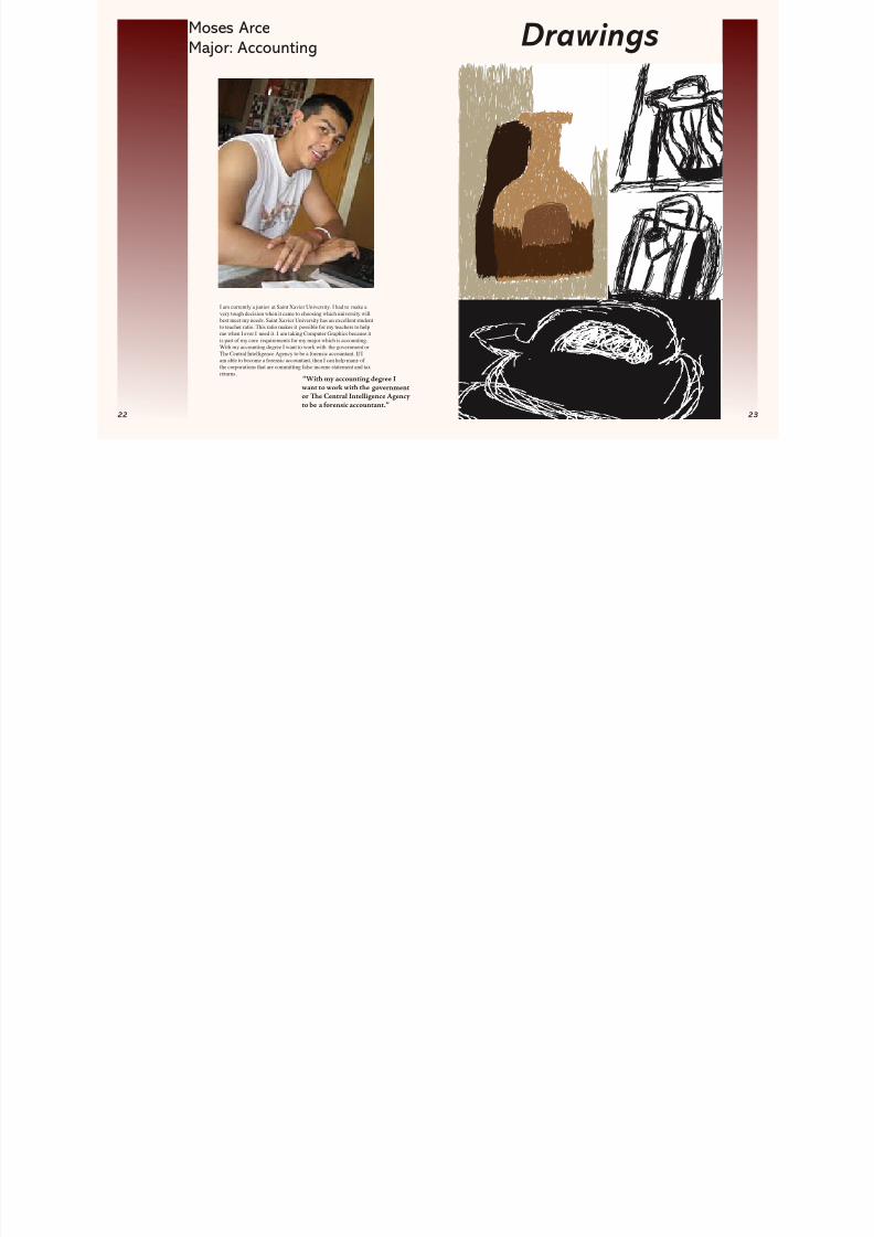
Moses ArceMajor: Accounting
I am currently a junior at Saint Xavier University. I had to make avery tough decision when it came to choosing which university willbest meet my needs. Saint Xavier University has an excellent studentto teacher ratio. This ratio makes it possible for my teachers to helpme when I ever I need it. I am taking Computer Graphics because itis part of my core requirements for my major which is accounting.With my accounting degree I want to work with the government orThe Central Intelligence Agency to be a forensic accountant. If Iam able to become a forensic accountant, then I can help many of the corporations that are committing false income statement and taxreturns.
Drawings
“With my accounting degree Iwant to work with the governmentor Te Central Intelligence Agencyto be a orensic accountant.”
8/8/2019 Artists of SXU
http://slidepdf.com/reader/full/artists-of-sxu 13/21
8/8/2019 Artists of SXU
http://slidepdf.com/reader/full/artists-of-sxu 14/21
6
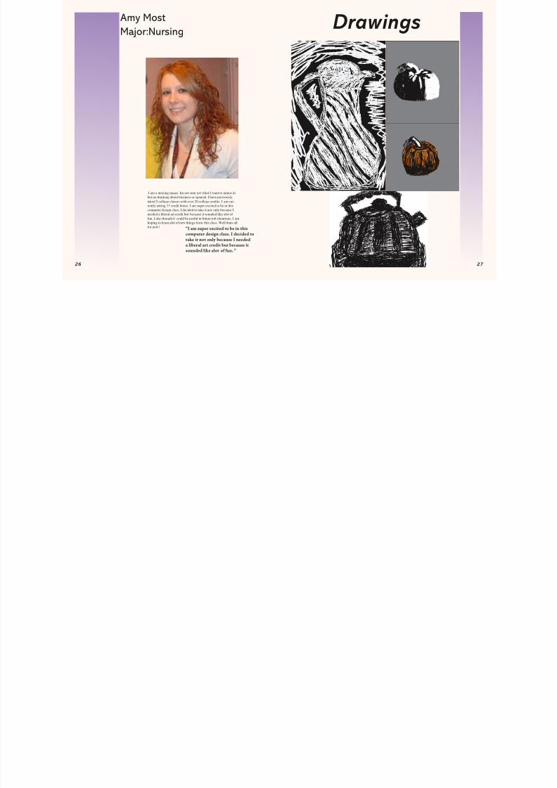
Amy MostMajor:Nursing
I am a nursing major. Im not sure yet what I want to minor inbut im thinking about business or spanish. I have previouslytaked 5 college classes with over 20 college credits. I am cur-rently taking 17 credit hours. I am super excited to be in thiscomputer design class. I decided to take it not only because I
needed a liberal art credit but because it sounded like alot of fun. I also though it could be useful in future job situations. I amhoping to learn alot of new things from this class. Well thats allfor now!
Drawings
“I am super excited to be in thiscomputer design class. I decided totake it not only because I neededa liberal art credit but because itsounded like alot o un. “
8/8/2019 Artists of SXU
http://slidepdf.com/reader/full/artists-of-sxu 15/21
8
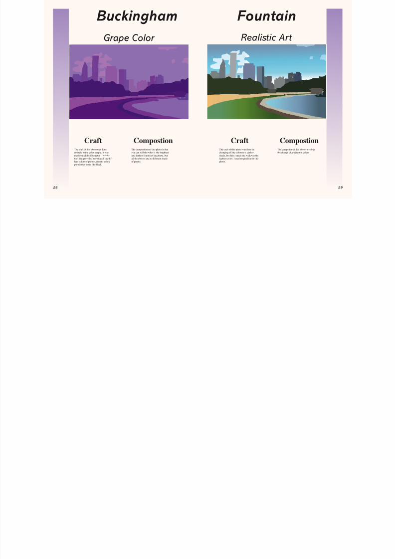
The craft of this photo was done
entirely in the color purple. It wasmade on adobe illustrator. I used atool that provided me with all the dif-fent colors of purple ,even to a darkpurple that looks like black.
The composition of this photo is that
you can still she what is the brightestand darkest feature of the photo, butall the objects are in different shadeof purple.
The craft of this photo was done by
changing all the colors to a darkershade, but then i made the walkway thelightest color. I used no gradient in t hisphoto.
The compstion of this photo involves
the change of gradient in colors
CraftCraft CompostionCompostion
Buckingham FountainGrape Color Realistic Art
8/8/2019 Artists of SXU
http://slidepdf.com/reader/full/artists-of-sxu 16/21
8/8/2019 Artists of SXU
http://slidepdf.com/reader/full/artists-of-sxu 17/21
2
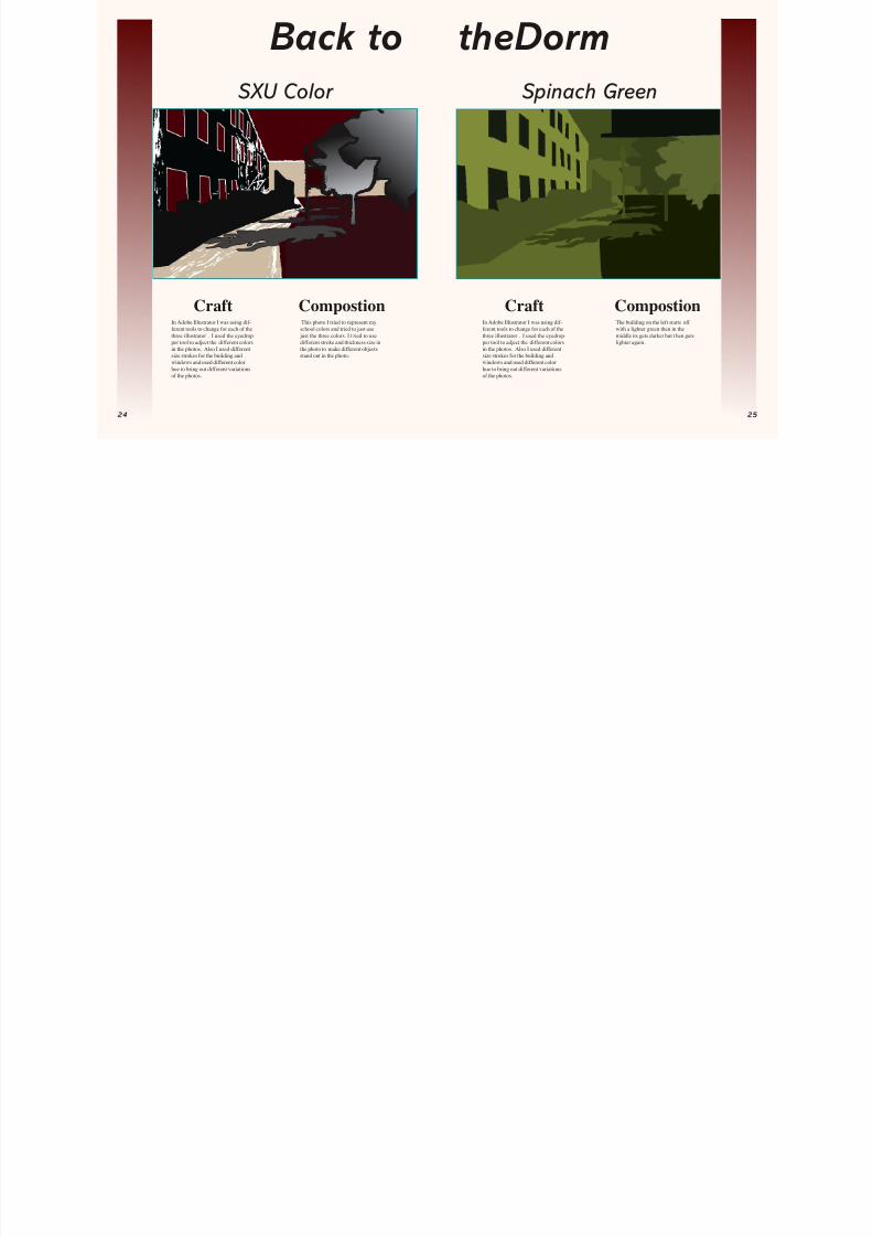
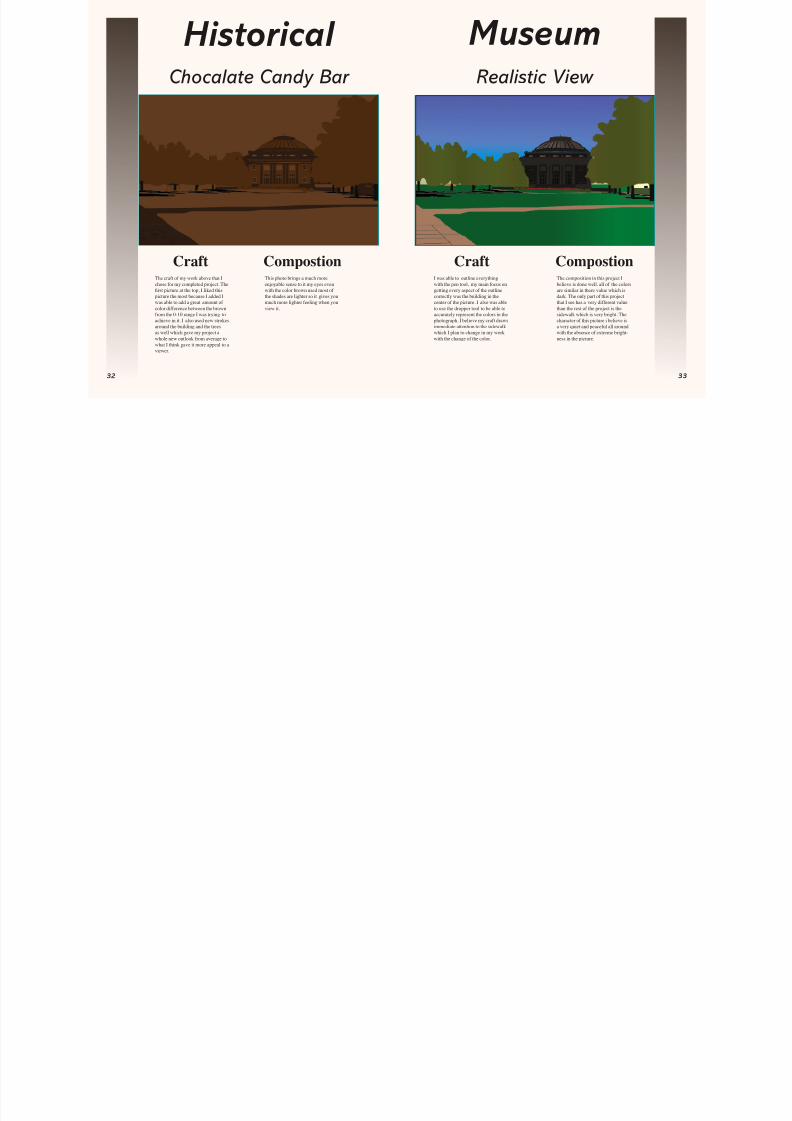
CraftCraft Compostion CompostionI was able to outline everythingwith the pen tool, my main focus ongetting every aspect of the outlinecorrectly was the building in thecenter of the picture. I also was ableto use the dropper tool to be able toaccurately represent the colors in thephotograph. I believe my craft drawsimmediate attention to the sidewalkwhich I plan to change in my workwith the change of the color.
The composition in this project Ibelieve is done well. all of the colorsare similar in there value which isdark. The only part of this projectthat I see has a very different valuethan the rest of the project is thesidewalk which is very bright. Thecharacter of this picture i believe isa very quiet and peaceful all aroundwith the absence of extreme bright-ness in the picture.
The craft of my work above that Ichose for my completed project. The
rst picture at the top, I liked thispicture the most because I added Iwas able to add a great amount of color difference between the brownfrom the 0-10 range I was trying toachieve in it. I also used new strokesaround the building and the treesas well which gave my project awhole new outlook from average towhat I think gave it more appeal to aviewer.
This photo brings a much moreenjoyable sense to it my eyes evenwith the color brown used most of the shades are lighter so it gives youmuch more lighter feeling when youview it.
Historical Museum Chocalate Candy Bar Realistic View
8/8/2019 Artists of SXU
http://slidepdf.com/reader/full/artists-of-sxu 18/21
4
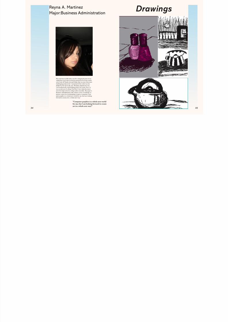
Reyna A. MartinezMajor:Business Administration
My experience in McAuley was life changing because in mysophomore year I discovered my passion for art. In my senioryear I took AP Studio Art and I think that was one of my mostchallenging projects, but I am proud of the work I accom-plished by the end of the year. McAuley prepared me very
well academically while helping achieve my goals. Now, inmy second year of college I feel like I have made the transi-tion from high school to collage rather smoothly. My major isBusiness Administration with a minor in Art. I would like topursue a career in event planning or open a r estaurant. Com-puter graphics is a whole new world for me, but I am lookingforward to create art in a whole new way!
Drawings
”Computer graphics is a whole new worldor me, but I am looking orward to create
art in a whole new way!”
8/8/2019 Artists of SXU
http://slidepdf.com/reader/full/artists-of-sxu 19/21
6
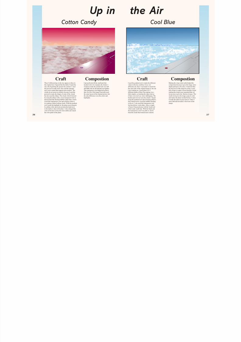
Making the wing wider really helped thecomposition because it gave the image moredepth and kept it off center. I made the bluesky the focus of the image by using a varia-tion of hues to make it more dramatic.I triedmaking the clouds more separated then allin one area to give the illusion of space. Thesmall circle gives the image a pop of colorand makes the plane not that boring. I choseto make the plane in gray tones to make itmore dull and not make it the focus of theimage.
I used the gradient tool t o make the differentvalues in the sky combine. It was notdif cult to do, but it was harder to match thehue and value of the original image to the oneI am working on. I used about 4 or 5different shades of blue.The airplane was alittle simpler, yet making the edges look asif there were real was more challenging. Thehardest parts for me were the clouds. I beganusing the gradient tool when forming ellipses,but it turned out to look like bubbles oatingin the air. I also used the transparency toolbut that did not work either. After a coupleof hours I began playing with the brush toolwhich made small dots. With the brush andthe transparency tool I was able to slowlyform the clouds that looked more realistic.
There 5 different hues in the sky oppose to three inthe original one. I gured that the darker I made thesky n the beginning the greater the contrast. I usedthe pen tool to make more lines and the transpar-ency tool to make them appear more realistic. Theclouds do not seem too realistic because I used thepen tool to make the shapes of some of the cloudsbut also used the ellipse. The clouds which I formedby using the ellipse with a more transparent look tothem looked like oating bubbles rather than clouds.I used the transparency tool and a thicker stoke totry making a better looking clouds. With the gradienttool I made the highlight on the plane more dramaticby adding white and used an intensi ed pink nextto the darkest value in the plane. I also changed thecolor of the lines to become more subtle and matchthe color pallet of the plane.
Craft CraftCompostion CompostionI just perfected all the small part thatneeded work, for example, the clouds. Iwanted to make the clouds look very fulland uffy but not all bunched up together.The transparency tool helped me achievethat. For all of the image I basically usedthe same layout of the original picture, butthe only difference were the colors andhighlights.
Up inCotton Candy Cool Blue
the Air
8/8/2019 Artists of SXU
http://slidepdf.com/reader/full/artists-of-sxu 20/21
8
8/8/2019 Artists of SXU
http://slidepdf.com/reader/full/artists-of-sxu 21/21
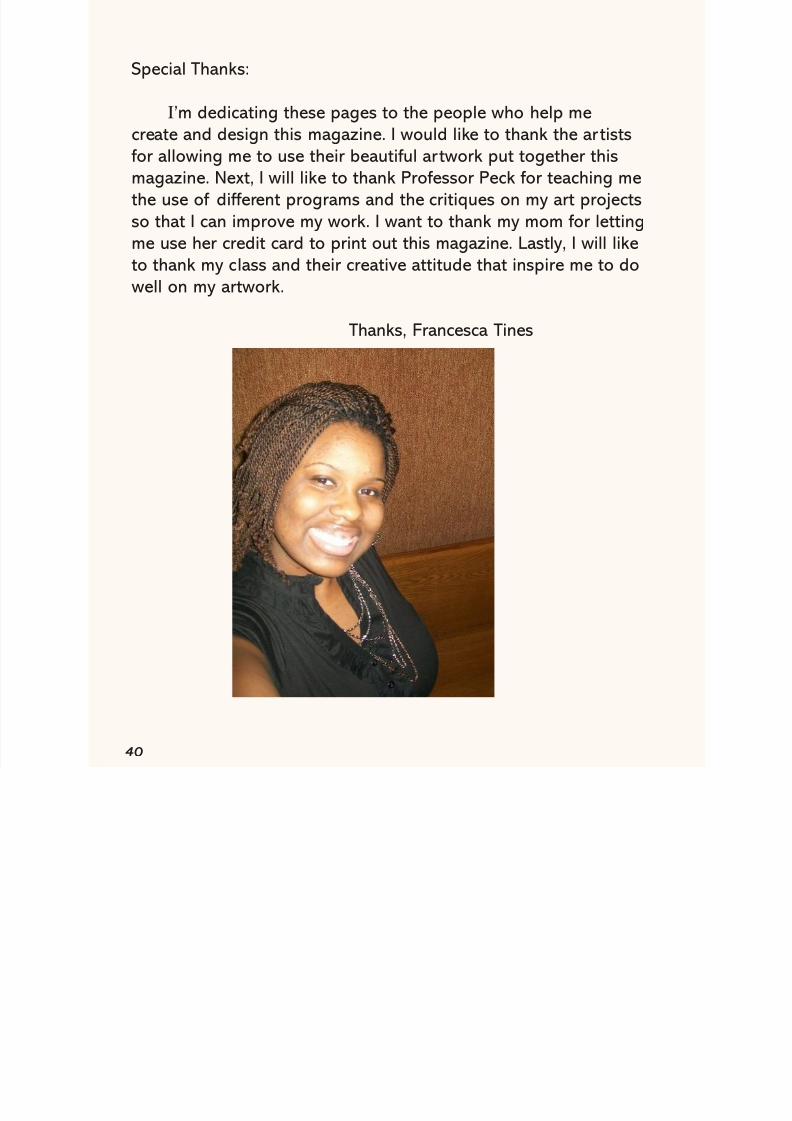
Special Thanks:
I’m dedicating these pages to the people who help mecreate and design this magazine. I would like to thank the ar tistsfor allowing me to use their beautiful artwork put together thismagazine. Next, I will like to thank Professor Peck for teaching methe use of different programs and the critiques on my art projectsso that I can improve my work. I want to thank my mom for lettingme use her credit card to print out this magazine. Lastly, I will liketo thank my class and their creative attitude that inspire me to do
well on my artwork.
Thanks, Francesca Tines