Embed Size (px)
DESCRIPTION
Creative Services Portfolio of I'm a professional creative who has had over seven years experience in the design industry working as both the Art Director of Bang-On T-Shirts and as the Artistic and Creative Director of Ion Magazine. I have put together a portfolio that showcases some of the projects that I have been involved in at these two companies over this time… Hello. My name is Danny.
Citation preview

PortfolioofCreativeServices
Danny Fazio

Hello. My name is Danny.
I'm a professional creative who has had over seven years experience in the design industry working as both the Art Director of Bang-On T-Shirts and as the Artistic and Creative Director of Ion Magazine. I have put together a portfolio that showcases some of the projects that I have been involved in at these two companies over this time…


About Bang-On T-Shirts Bang-On is youth driven, street and lifestyle t-shirt company focussed around a unique retail concept; 'Custom T-Shirts, While you Wait'. Customers can choose from hundreds of images, select any garment they choose and watch as it gets made right in front of them.

About Bang-On T-Shirts Bang-On is youth driven, street and lifestyle t-shirt company focussed around a unique retail concept; 'Custom T-Shirts, While you Wait'. Customers can choose from hundreds of images, select any garment they choose and watch as it gets made right in front of them.

In my position at the Art Director, I was responsible for leading a team in develop-ing all of the many different visual touch-points for the brand, including Applied Graphics, Retail Communication, as well as Web & Print Marketing. I helped to grow the company from one single retail location to over 30 corporate stores worldwide as well as over 150 wholesalers.
In my position at the Art Director, I was responsible for leading a team in develop-ing all of the many different visual touch-points for the brand, including Applied Graphics, Retail Communication, as well as Web & Print Marketing. I helped to grow the company from one single retail location to over 30 corporate stores worldwide as well as over 150 wholesalers.

Art Direction Applied Graphics
Bang-On is a fashion for-ward t-shirt company that creates high quality heat transfers to be applied in on of it's over 30 unique retail locations.
Since the conception of the company, I lead a team of designers, in building up a catalogue of over 800 origi-nal and Licensed t-shirt designs.

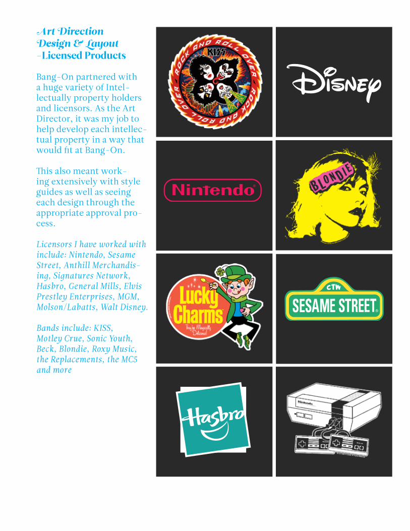
Art Direction Design & Layout-Licensed Products
Bang-On partnered with a huge variety of Intel-lectually property holders and licensors. As the Art Director, it was my job to help develop each intellec-tual property in a way that would fit at Bang-On. This also meant work-ing extensively with style guides as well as seeing each design through the appropriate approval pro-cess.
Licensors I have worked with include: Nintendo, Sesame Street, Anthill Merchandis-ing, Signatures Network, Hasbro, General Mills, Elvis Prestley Enterprises, MGM, Molson/Labatts, Walt Disney.
Bands include: KISS, Motley Crue, Sonic Youth, Beck, Blondie, Roxy Music, the Replacements, the MC5 and more

®

Art Direction + Design & LayoutPrint Marketing
We would need various marketing materials to be used to communicate the Bang-On Brand to potential new Bang-On wholesale customers as well as show-case new and products to existing Wholesale.
2008 Catalogue—Front Cover
This was a catalogue that we produced to showcase all of our t-shirt designs. The orig-inal catalogue was designed in 2006 and was so popular that we kept on re-using and just adjusting the content.
2008 Catalogue—Details
The design throughout the catalogue has a poppy retro feel, but brings in a gritty edge by using halftone graph-ics.
A lot of the source material for our models were found in old vintage t-shirt catalogues!

2009 Catalogue—Front Cover
This was a 150 page catalogue that we produced in China. The catalogue consolidated all of our existing products into one big book. This in-cluded all our accessories lines as well as, blank and printed apparel.
I really liked the idea of bringing back the mixtape metaphor for the cover. As the company moved away from doing just t-shirts, the tape metaphor also helped showcase the 'mix' of differ-ent product lines we were starting to carry.
2009 Catalogue—Details
We wanted to give the cata-logue a rough cut and paste DIY feel. Much like the mix-tape, the scrapbook feel reinforces the cornerstone of the Bang-On brand which is customization.
Design elements are used throughout the book
'Mix Tape' Promo Package
This was a promotional item that was made to look like a 80s mixtape. The package consisted of a die-cut card (in the shape of a cassette), a info booklet all housed in an actual cassette tape box with a mix tape style cover explaining a little bit about what Bang-On did.
We felt like the metaphor of the mixed tape perfectly matched the customization culture of Bang-On. At the time, we were selling a lot of retro tees so we used 80s Teen Mags as inspiration for the booklet.

Art Direction for Web Marketing
Whenever we would release a new set of transfers we would launch a unique web campaign. Here are just some of the ones we created:
Astrology Pin-Uphttp://bang-on.com/astrology-pinups.html
Bang-On Has Issueshttp://bang-on.com/issues
Bang-On's So Gangstahttp://bang-on.com/sogangsta
Bang Your Headhttp://bang-on.com/bangyourhead/
Killer Kidshttp://bang-on.com/killerkids/
Megasize Lettershttp://bang-on.com/megasize_letters.html
Pattern Teeshttp://bang-on.com/patternshirts.html
Icon Teeshttp://bang-on.com/icontees/
School of Rockhttp://bang-on.com/school-of-rock.html


Art Direction + Design & LayoutRetail Communications
As the art director, I worked hard to properly extend the Brand across various touch points and communicate with our customers.
2008 Catalogue—Front Cover
I developed a book as a way to display all of our t-shirt designs. This included creat-ing different categories for different designs as well as an information system to orga-nize them through a unique code system.
In addition, we created spe-cial stickers to inform cus-tomers about special finishes (neon, mettalic, Glow-in-the-dark)
2008 Catalogue—Details
As our t-shirt designs got bigger, we started to find the books weren't enough to show what the large designs really looked like on a shirt.
For this reason, I worked with a box making company to create this unique diaply unit. The unit consists of a die-cut cardboard t-shirt and a col-lapsible stand.
To produce the prints, we first had the shirts flooded with color by the manufacturer then designs would be later screenprinted on in our pro-duction facilities.
10.0"
16.5"
0.25"
1.0"
1.5" die cut handle
Artwork 9.5" x 15.5" (including microdots)
Polynova Industries Inc.BANG-ON10”x16.5”Diecut Handle
3 COLOR SPOT
Clear FilmBACK
May 4, 2006
Black
White
485
Work Order #: 27666
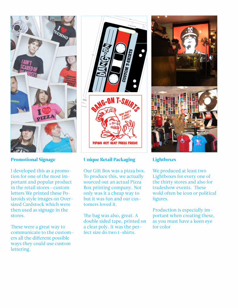
Unique Retail Packaging
Our Gift Box was a pizza box. To produce this, we actually sourced out an actual Pizza Box printing company. Not only was it a cheap way to but it was fun and our cus-tomers loved it.
The bag was also, great. A double sided tape, printed on a clear poly. It was the per-fect size do two t-shirts.
Lightboxes
We produced at least two Lightboxes for every one of the thirty stores and also for tradeshow events. These wold often be icon or political figures.
Production is especially im-portant when creating these, as you must have a keen eye for color
Promotional Signage
I developed this as a promo-tion for one of the most im-portant and popular product in the retail stores—custom letters We printed these Po-laroids style images on Over-sized Cardstock which were then used as signage in the stores.
These were a great way to communicate to the custom-ers all the different possible ways they could use custom lettering.

ION is a glossy, monthly street magazine bringing out the best from the underground focussing on the latest in trend driven fashion, music, art and culture. Celebrating it's sixth year, ION continues to stay the top of cutting edge.
About Ion Magazine

ION is a glossy, monthly street magazine bringing out the best from the underground focussing on the latest in trend driven fashion, music, art and culture. Celebrating it's sixth year, ION continues to stay the top of cutting edge.
About Ion Magazine
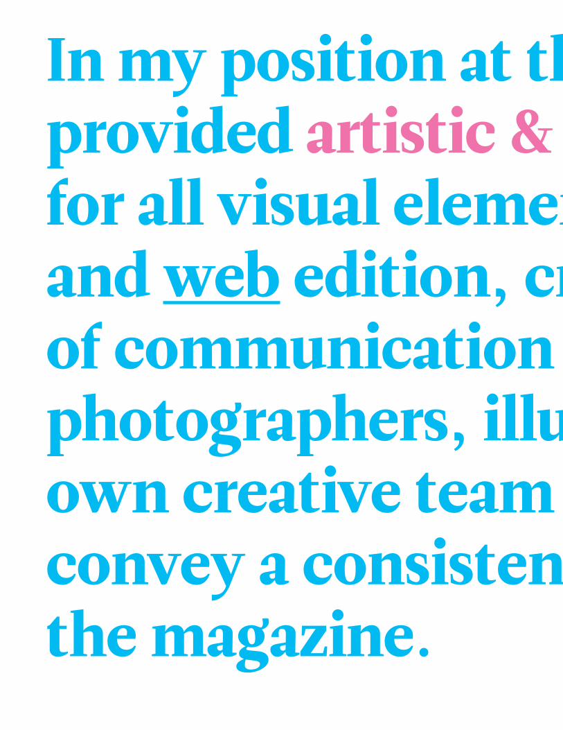
In my position at the magazine, I've provided artistic & creative direction for all visual elements of the street and web edition, creating strong lines of communication with contributing photographers, illustrators, and our own creative team of designers to convey a consistent voice throughout the magazine.

In my position at the magazine, I've provided artistic & creative direction for all visual elements of the street and web edition, creating strong lines of communication with contributing photographers, illustrators, and our own creative team of designers to convey a consistent voice throughout the magazine.

Art Direction Street Edition2005-2008
As the art director, it was my responsibility to over see the design and produc-tion of the magazine.
I led a small team of de-signers and also worked extensively with outside contributors such as pho-tographers ans illustrators.
Under my guidance, with a limited budget, we have produced over 1600 pages of content over the course of three years. All the while, we have maintained a cutting edge, award win-ning design aesthetic.


Creative Direction Street EditionRedesign 2009
In 2009, we embarked on a redesign to shift the over-all visual direction of the magazine.
As the Creative director, my role has been to take a bigger picture look at the book and nd make some changes that reflect this more wholistic view.
Seeing as the magazine is about underground cul-ture, I recognized the need to have the imagery reflect this. All Photography, Il-lustration, Typography and Design has become much less produced and slick looking creating more of a street culture atmosphere throughout the overall book.
Through my creative direc-tion, we are able to main-tain a strong and consis-tent voice page afte page.


Art Direction Web Edition
As the artistic and creative director, it was my goal to maintian the same visual look of the print edition in an online setting.
Using wordpress as the Content Management sys-tem, we designed an online version of the magazine.
Through this process I have learned about information architecture and asset cre-ation for the site as well as maintaing the backend.
ION Magazine Onlinehttp://ionmagazine.ca


