Embed Size (px)
Citation preview

1
APPLICATION OF COST MATRICES AND COST CURVES TO ENHANCE DIAGNOSTIC HEALTH MANAGEMENT METRICS FOR GAS TURBINE ENGINES
Craig R. Davison Chris Drummond
Gas Turbine Laboratory
Institute for Aerospace Research National Research Council Canada
Ottawa, Ontario, Canada
Institute for Information Technology National Research Council Canada
Ottawa, Ontario, Canada
INTRODUCTION
In the past 10 years, interest has grown in defining statistically based suites of metrics for gas
turbine engine diagnostic systems. As more diagnostic systems are developed, researchers
require techniques to compare their algorithm to others. Organizations purchasing or funding
research require metrics to evaluate competing products on a level playing field and to establish a
convincing business case. Davison and Bird [1] provided an overview of diagnostic metrics and
proposed a technique to generate confidence intervals for them.
Diagnostic algorithm development is being performed by original equipment manufacturers
(OEMs), small and medium businesses, research institutes and universities. While OEMs may
have access to large quantities of operational data it is not always well correlated to the true state
of the engine and access to these data sets by other developers can be extremely limited.
Developers often use results from computer engine models to test their algorithms. This
technique can produce a wide range and large quantity of data, but the correlation to reality may
be uncertain. Currently NASA is leading an initiative to produce a computer model which
incorporates realistic fault implantation, operating condition variations and sensor errors. This
will produce simulated operating data for a commercial aircraft engine for benchmarking

2
diagnostic algorithm performance [2]. This will provide a useful generic tool for comparing
algorithms, but may not be applicable to a particular user’s operating conditions.
An alternate technique for algorithm testing uses data from implanted faults. While this is
real engine data, it is usually acquired in a sea level test cell and is not representative of actual
operating conditions. It also has a small sample size, due to the cost of performing such tests,
resulting in a large uncertainty, which is often not quantified. This makes comparing algorithms
difficult. Ideally the size of the confidence interval would be used to guide the required number
of tests. However, as a minimum, the confidence interval corresponding to the sample size
chosen should be presented. Failure to provide the confidence interval could result in a superior
algorithm being discarded.
The fault distribution applied can also have a significant effect on an algorithms performance.
During fault implantation studies the implantation rate is rarely, if ever, representative of the true
fault occurrence rate. In addition, different operating environments result in different fault
occurrence rates. The practical result being that an algorithm may have greater success in
different operating environments, or on engines that generate different fault distributions.
Modifying the confusion matrix to represent the expected fault distribution allows a more
realistic assessment of the diagnostic algorithm under the expected operating conditions.
Similarly, the cost of fault occurrence and misdiagnosis impacts the algorithms value. A
misdiagnosis with little effect on the bottom line will be a low priority for the end user, but a
traditional confusion matrix does not account for this factor. Cost matrices allow algorithms to
be compared based on such costs. They are easily applied to traditional confusion matrices
allowing evaluation of a particular algorithm across a range of cost scenarios.

3
Receiver operating characteristic (ROC) curves suffer from many of the same problems as the
traditional confusion matrix. This is not surprising as ROC curves are based on the decision
matrix, which is a simple two case version of the confusion matrix. The ROC curve presents the
decision matrix across a range of settings. Further details on ROC curves can be found
throughout the literature, for example DePold et al. [3], and Davison and Bird [1], who examine
them with relation to engine health, or Webb and Ting [4], who provide a broader discussion.
Cost curves have been presented by the artificial intelligence community as an improved
technique for assessing algorithm performance across a range of settings. Cost curves present
ROC data but over a range of fault distributions and costs [5, 6]. This allows an algorithm to be
assessed for applicability to a particular cost or fault distribution.
In addition, cost curves provide a simple visual comparison for two competing algorithms,
and to the simple classifiers (all fault or all no fault). Cost curves allow simple averaging
techniques to be applied to improve data quality, and confidence intervals to be generated for
comparison purposes.
NOMENCLATURE C Cost matrix D Mean cost matrix F Fault probability vector F Number of fault types FP False positive rate L Laplace corrected confusion matrix MSC Mean subjective cost score NEC Normalized expected cost P Confusion matrix as proportion of total diagnosis PCC Percent correct classification PCF Probability cost function Q Confusion matrix normalized by fault proportion TP True positive rate U Upper limit

4
V Normalized cost matrix cij Element in cost matrix dij Element in mean cost matrix fi Element in fault probability vector lij Element in Laplace corrected confusion matrix s Sample standard deviation n Number of samples pij Element in confusion matrix as proportion of total diagnosis p+ Proportion of fault cases qij Element in confusion matrix normalized by fault proportion vij Element in normalized cost matrix z Cumulative standard normal distribution � Significance level of the test (1-Confidence/100) � Constant in calculation of normalized cost matrix � Laplace corrector Operators • Element by element matrix multiplication � Boolean multiplication
COST AND CONFUSION MATRICES The use of confusion matrices to demonstrate the ability of a diagnostic algorithm to
differentiate faults is widespread and well understood. Table 1 presents a sample confusion
matrix. The diagonal (in grey) represents faults correctly identified and the off diagonals
represent faults misclassified. The no fault case can either be retained or removed from the
matrix. More details on varieties of confusion matrices and metrics available to summarize them
are given by Davison and Bird [1].

5
Table 1: Multiple fault confusion matrix No-
fault F1 F2 F3 F4 True State
No-fault A B C D E F1 F G H I J F2 K L M N O F3 P Q R S T F4 U V W X Y
Predicted State
Correcting for Fault Distribution Often, during development, testing and evaluation, fault distributions are assumed that are
unrepresentative of what is experienced in service. This may be due to lack of knowledge of the
true conditions or limitations in testing. Even fault distributions obtained from in-service data
will change with the operating environment and duty cycle of the engines.
To correct for changes in fault distributions the original distribution must first be eliminated
from the confusion matrix. This is achieved by dividing each element by the sum of the entries
in the column containing it, as given by equation 1. The new distribution is then applied by
multiplying each column by the corresponding element in the fault probability vector as per
equation 2. The fault probability vector contains the proportion of faults in element j
corresponding to the column j in the confusion matrix. The sum of the elements in the fault
probability vector is 1.
�=
= F
kkj
ijij
p
pq
1
(1)
jijij fqp =′ (2)
Equation 2 produces a new confusion matrix with a distribution representative of the one
expected in service. Unfortunately, algorithm validation with actual performance data is often

6
very limited, due to the expense of operating and degrading an engine. Small sample sizes from
fault implantation studies can result in large confidence intervals on the results.
Bootstrap techniques can be applied to obtain the confidence intervals on the confusion
matrices and their corresponding metrics. This can be used to guide the number of samples
required to obtain an acceptable confidence interval. Details on applying bootstrap techniques to
diagnostic metrics can be found in Davison and Bird [1] and the general application and theory in
Davison and Hinkley [7].
Cost Matrix The confusion matrix adequately describes the ability of the algorithm to discriminate faults,
and, if it has been adjusted for the expected fault distribution, should be representative of its
performance in service. However, the confusion matrix does not allow for the costs involved
with each element of the confusion matrix. The cost matrix is identical in size to the confusion
matrix, with each corresponding element representing the cost of that outcome in the confusion
matrix. If a profit is generated by the outcome the value is negative. The utility matrix is
equivalent to the cost matrix, but provides the benefit or profit of each element in the confusion
matrix. It is simply the negative of the cost matrix. The cost matrix is more appropriate for
diagnostics analysis as no profit is expected and the user’s objective is to minimize the expense
incurred.
The cost of each diagnostic outcome will depend on both the application and user. Orsagh et
al. [8], and Osborn and Yu [9] provide some of the costs associated with gas turbine diagnostic
systems and their misdiagnosis. In general, if the cost of the diagnostic system is considered a
constant and not incorporated as an outcome of the diagnosis then a correct diagnosis of no fault
will cost nothing as the aircraft continues to function as planned and no action is required. The

7
correct diagnosis of a fault incurs the cost of both investigation and repair. The incorrect
diagnosis of a fault incurs the cost of investigation to determine that no fault is occurring.
The incorrect diagnosis of no fault has potentially the highest cost as it could include
unscheduled down time and secondary damage to the engine. The incorrect isolation of the fault
type will incur additional investigation costs. The value of a diagnostic algorithm is not truly
known without incorporating these costs into the metrics.
The mean cost matrix combines the cost matrix and confusion matrix, essentially resulting in
a confusion matrix weighted by the costs. The mean cost matrix is produced by performing an
element wise multiplication of the cost matrix and the confusion matrix as per equation 3.
PCD •= (3)
As with the confusion matrix, the resulting mean cost matrices can be difficult to compare as
they contain many values. The obvious solution is to sum the mean cost matrix as per equation
4. This will yield the mean cost per diagnosis, under the fault distribution assumed for the
generation of the confusion matrix. A change in the fault distribution can have a very significant
effect on the mean total cost. The value in has little meaning across different applications and
users due to the variations in fault distribution and costs.
��= =
=F
i
F
jijd
1 1
Cost TotalMean (4)
The mean subjective cost score (MSC) is proposed as an alternative to the simple mean total
cost. It was developed by McDonald [10] and is normalized such that it returns a 0 when all
faults are correctly classified and 1 when the faults are evenly distributed among all possible
outcomes. It is calculated by equation 5. The normalized cost matrix (V) is found by re-scaling

8
the cost matrix as per equation 6. The beta coefficients in equation 6 are obtained by
simultaneously solving equations 7 and 8, which satisfy the limits 0 and 1 as specified above.
��= =
−=F
i
F
jijijvpMSC
1 1
1 (5)
CV 12 �� −= (6)
��
���
�−= �=
F
iiii cf
1121 ββ (7)
���
����
�−= � �
= =
F
i
F
jjii cf
F 1 112
10 ββ (8)
If the costs are assumed to be equal for all correct diagnoses, and equal, but greater than the
correct cost, for misdiagnoses the MSC reduces to a metric for the confusion matrix alone, given
by equation 9. Other standard confusion matrix metrics, such as the Kappa coefficient, could
also be applied to the mean cost matrix to obtain a metric for the cost.
� �= ≠=−
=F
i
F
ijjijp
FF
MSC1 ,11
(9)
While the mean total cost has the most direct relation to the in-service cost, and is useful
when examining an algorithm for a particular application, the MSC is applicable across
applications with the same relative cost differentials, but not necessarily the same absolute costs.
The reporting of MSC and the normalized cost matrix also allows the merit of an algorithm to be
demonstrated without revealing true operating costs, much as a normalized performance map
provides compressor operating trends without revealing the actual performance parameters.
Laplace Correction for Missing Data Test data sets do not usually contain a complete representation of the confusion matrix. The
low probability of the off diagonal elements occurring requires a very large data set to accurately

9
capture the true distribution of the complete population. Applying a Laplace correction to the
mean cost matrix compensates for the missing data and improves the confidence interval on the
resulting cost value [11].
In addition to improving the confidence interval on the average metric, we apply the Laplace
correction to obtain improved confidence intervals on the entries in the confusion matrix,
including zero value entries that otherwise would not have a confidence interval. Many zero
values occur during an algorithm test program since enough faults cannot be implanted to capture
all the possible misdiagnoses. It is impossible to know which, if any of the zero entries, would
have a non-zero value in the complete population. A confidence interval can be assigned,
however, to provide an indication of the variability.
The Laplace corrected matrix is produced with equation 10. Practically, this has the effect of
adding � events to every cell in the confusion matrix. Whereas the usual assumption is an initial
zero distribution in the confusion matrix, the Laplace correction assumes a uniform non-zero
distribution (equal to the � value in equation 10). Increasing the value in the confusion matrix
element decreases the effect of the Laplace correction. Increasing sample size also decreases the
effect of the correction.
Margineantu and Dietterich [11] show that when calculating the overall cost a Laplace
correction factor (�) between 0 and 0.5 improves the confidence interval for the bootstrap
technique, bringing the confidence closer to the stated value. They did not, however, examine
the confidence intervals for individual entries in the confusion matrix.
λ
λ2Fn
n+
+= PL (10)

10
Our work shows that the Laplace correction also improves the confidence intervals on the
individual entries in the confusion matrix. Starting with the confusion matrix presented in Table
2, which contains a range of proportions representing the true occurrence rates in a population,
new matrices with sample sizes of: 20, 40, 80, 200 and 1000 were produced. 1000 matrices
were generated for each sample size and the confidence intervals generated. The fraction of the
confidence intervals containing the value from the original matrix divided by the confidence
level should equal one. If it is less than one the confidence interval is too small and greater than
one it is to large.
Table 2: Laplace test confusion matrix A B C D a 0.5 0.0002 0.001 0.01 b 0.05 0.2 0.0001 0.001 c 0.005 0.02 0.1 0.0002 d 0.0005 0.002 0.01 0.1
Figure 1 plots the fraction of confidence intervals that contain the true value across a range of
� values for a sample size of 20. The confidence intervals, for all but the 0.1 proportion, are far
too small without the Laplace correction. Despite starting at different fractions the small
proportions all reach the true confidence level (y axis equals 1) at nearly the same Laplace
correction of 0.035. After this point the fraction quickly increases to a value of 1.05, where the
confidence interval always contains the true value. Figure 2 is a similar plot for a sample size of
200. Increasing the sample size by a factor of 10 has shifted the curves up. The 0.01 proportion
curve matches the 0.1 curve in Figure 1, the 0.001 matches the 0.01 curve and so on. The
curves, however, still reach one at nearly the same Laplace correction value.
The optimal Laplace correction does changes with confidence interval, however. Figure 2
includes a curve for the 90% confidence level. Although it begins at the same level as the

11
corresponding 95% confidence curve it does not begin to climb until much later. The optimal �
value at the 90% level is 0.063 almost double that required at the 95% confidence level. Further
work is required to fully define the optimal Laplace correction values at various sample sizes,
expected values and confidence levels.
Figure 1: Accuracy of 95% confidence intervals with sample size of 20
Figure 2: Accuracy of 95% confidence intervals with sample size of 200

12
Example To demonstrate the utility of these functions an example case will be presented. The data are
entirely notional but labels relevant to a gas turbine diagnostic system have been attached. The
full data set consisted of 440 operating points where a fault occurred:
Bleed Valve Fault (FB) – 238 occurrences
Compressor fault (FC) – 50 occurrences
LP Turbine fault (FL) – 96 occurrences
HP Turbine fault (FH) – 56 occurrences
Sample data sets, which might be generated from a fault implantation study, where simulated
based on the full data set. Equal numbers of each fault were implanted, producing an even fault
distribution. The algorithm was assumed to behave the same in the test and service environments
and, therefore, the fault diagnoses were randomly selected from the set of diagnoses for the
corresponding fault in the full operating data set. Sample sizes of 5, 10 and 20 for each fault
were generated. The larger samples included the data from the smaller samples, as if the larger
data set was being built on the smaller, as would be expected in an actual test program.
Increasing the number of implanted faults decreases the confidence interval on the resulting
metrics. While not surprising, the confidence intervals for test data sets are often not presented.
The method of applying the bootstrap is given by Davison and Bird [1]. For this example 1000
bootstrap samples were taken and a further 200 bootstrap samples per sample taken, to obtain the
variance.
The bootstrap technique allows a confidence interval to be produced. Alternately, it can be
used to determine the number of fault implantations required to obtain the desired confidence
interval. Although cost is often the driving force behind the study size, this allows the cost

13
benefit of increasing the sample size to be examined, and could even result in a decision to
reduce the sample size.
Figure 3 demonstrates the change in confidence interval and the value of the MSC as the
number of implanted faults is increased. Equation 9 was used to calculate the MSC. The results
from the Laplace corrected data set are also shown. A lambda value of 0.25 was chosen because
Margineantu and Dietterich [11] found this came close to achieving a true 95% confidence
interval and erred by producing a larger confidence interval than required, resulting, in a
conservative result. For comparison the result from the original data set, adjusted to match the
implanted fault distribution, is also presented. Variation can be very significant for small
numbers of implanted faults since the chance of having a sample from all the possible off
diagonal combinations is low.
The confidence interval from the Laplace corrected matrix always contains the MSC for the
full data set. The values for the uncorrected data are not as well behaved and at the 5 sample
level the confidence interval does not intersect the confidence interval for the full data set.
Similar patterns were found for the Kappa coefficient and percent correct classification (PCC).
Figure 3: Confidence intervals on MSC for Laplace corrected (�=0.25) and original confusion matrices produced with increasing number of implanted faults

14
Figure 4 compares the size of the confidence interval for each sample size, both for the
evenly distributed fault implantation and with the fault implantation rates adjusted to represent
the fault distribution in the full data set. The Laplace corrected confidence intervals show a
consistent decrease in range with sample size, as we would expect.
The uncorrected data displays more erratic behavior. The confidence interval initially
increases in size because the increase in samples from five to ten introduces more variability into
the data set than is compensated for by the larger sample size. The increase demonstrates that the
confidence interval at the 5 sample size is too small. The introduction of the Laplace correction
establishes a more representative variability in the very small sample sizes. As the sample size
increases, the influence of the correction decreases and the sizes of confidence intervals
converge.
This demonstrates the caution required when dealing with small sample sizes. For the
bootstrap technique to accurately predict the variance and confidence interval the sample must be
representative of the population. If the off diagonal elements in the confusion matrix are small
then the chances of all possibilities being represented in the implanted fault set are low. This
reduces the overall variability in the data set and consequently the confidence interval.

15
1.0
1.5
2.0
2.5
3.0
3.5
4.0
4.5
5.0
5.5
5 10 15 20
Faults Implanted
Nor
mal
ised
Con
fiden
ce In
terv
al
MSC Even Fault MSC Even Fault Corr. MSC MSC Corr. Figure 4: MSC confidence interval for Laplace corrected (�=0.25) and uncorrected confusion matrices normalized by confidence interval for the full data set
Comparing Tables 3 through 5 further demonstrates the small sample size problem. Tables 3
and 4 are the confusion matrices for a data set with 10 of each type of fault implanted. Table 5 is
the confusion matrix for the full data set, adjusted for even fault distribution. Using element
(1,1) as an example the adjustment is made as follows:
1. As per equation 1 calculate q11:
882.0023.00041.0477.0
477.0
11
1111 =
+++==
�=
F
kkp
pq
2. As per equation 2 calculate the adjusted value. For even fault distribution the new
distribution is f=1/F.
221.04882.011
11111 ====′Fq
fqp
The bold zero values in Table 3 and 4 correspond to the small, but non-zero, bold values in
Table 5. The lack of an example in the implanted data set results in no variance or confidence
interval being determined for that value. The bootstrap technique assumes it is always zero,
which the full data set shows is incorrect.

16
Applying a Laplace correction on the confusion matrix resulted in the intervals on the zero
values given in Table 4. A � value of 0.035 was chosen because our tests showed this produced
near 95% confidence intervals across a range of proportions. The optimal correction factor is
different when calculating confidence intervals on individual confusion matrix entries and when
looking at aggregate metrics for the entire matrix. The Laplace correction is applied to the matrix
and the bootstrap samples are then drawn from the proportions in the corrected matrix. Using
element (1,2), a zero value, in Table 3 as an example the Laplace correction is made by applying
equation 10. The zero value is now a small value that can be sampled. This increase is
compensated for by a reduction in the larger values. For example element (1,1) goes from 0.200
to 0.198.
( )
( ) 0009.0035.0440035.0400
2212
12 =+
+=+
+=λλ
Fnnp
l
Table 3: Confusion matrix generated with 10 faults implanted for each fault type including 95% confidence interval
FB FC FL FH Total
FB 0.200 0.350 0.100 0 NA 0 NA 0.025 0.075
0.000 0.225
FC 0.050 0.125 0.000 0.250 0.400
0.125 0 NA 0 NA 0.300
FL 0 NA 0 NA 0.225 0.350 0.100 0.025 0.075
0.000 0.250
FH 0 NA 0 NA 0.025 0.075 0.000 0.200 0.325
0.100 0.225
Total 0.250 0.250 0.250 0.250 0.875

17
Table 4: Confusion matrix generated with 10 faults implanted for each fault type with Laplace corrected 95% confidence interval (�=0.035)
FB FC FL FH
FB 0.200 0.325 0.100 0 0.025
0.000 0 0.025 0.000 0.025 0.075
0.000
FC 0.050 0.125 0.000 0.250 0.400
0.125 0 0.025 0.000 0 0.025
0.000
FL 0 0.025 0.000 0 0.025
0.000 0.225 0.350 0.100 0.025 0.075
0.000
FH 0 0.025 0.000 0 0.025
0.000 0.025 0.075 0.000 0.200 0.325
0.075 Table 5: Confusion matrix generated from full data set adjusted for even fault distribution including Laplace corrected 95% confidence interval (�=0.035)
FB FC FL FH Total FB 0.221 0.264
0.186 0.055 0.077 0.034 0 0.002
0.000 0.013 0.025 0.005 0.289
FC 0.019 0.032 0.007 0.190 0.227
0.155 0 0.002 0.000 0.013 0.025
0.005 0.222
FL 0 0.002 0.000 0.005 0.014
0.000 0.240 0.282 0.202 0.054 0.075
0.032 0.298
FH 0.011 0.020 0.002 0 0.002
0.000 0.010 0.020 0.002 0.170 0.209
0.134 0.191
Total 0.250 0.250 0.250 0.250 0.820
Presenting the confusion matrix and the corresponding summary metrics for even fault
distribution allows easy discrimination of the algorithm’s ability to identify a particular fault.
Normalizing each column by the fault frequency generates a matrix with a diagonal of ones for
perfect fault discrimination. However, this does not convey all the important information. The
actual fault proportion is a critical parameter in the overall effectiveness of the algorithm. As an
extreme example, 100% diagnosis of a fault which never occurs is no use.
The effect of the fault distribution on the resulting summary metrics is demonstrated in Table
6. The result for the Laplace corrected matrix is given in brackets and differs only slightly from
the uncorrected value, as the sample size is large enough to reduce the significance of the
correction. The MSC was calculated with equation 5. The calculation of PCC, kappa and
confidence of rejection with a detailed example are provided by Davison and Bird [1]. With a

18
high level of confidence the results for the even fault distribution present an inferior picture of
the algorithms performance compared to the results based on the actual fault distribution.
Similarly, the cost of diagnosis or miss-diagnosis can strongly affect the overall value of an
algorithm to the operator. Using the cost matrix presented in Table 7, the MSC was recalculated
and is shown under “Adjusted for Cost” in Table 6. The addition of the cost data significantly
reduced the MSC once again. The evenly distributed data dropped from 0.24 to 0.18 while the
distributed data showed a smaller change going from 0.19 to 0.16. This provides a 21%
confidence level that the MSC has improved.
Comparing the original evenly distributed data without cost to the actual fault distribution
with cost, we are almost 99% confident the MSC has improved. If only the evenly distributed
data had been examined, a superior algorithm for the desired application could be rejected.
In this example, the cost has a slightly larger effect than the fault distribution on the MSC.
Based on this limited sample, applying the cost matrix will improve the result even if the fault
distribution is not representative of operational reality. We can also compare the mean total cost.
For the evenly distributed case, this results in a cost of 18.9 and of 13.2 for the actual fault
distribution (these correspond to the MSCs of 0.18 and 0.16).

19
Table 6: MSC, PCC and Kappa with 95% confidence intervals and confidence for rejection of Actual Distribution without Cost, being greater than value. Results in parenthesis have Laplace correction applied (�=0.25)
No Cost Adjustment Adjusted for Cost
Even Dist. Actual Dist. Even Dist. Actual Dist.
Value 0.24 0.19 0.18 0.16 Lower 0.19 (0.20) 0.15 (0.15) 0.14 (0.15) 0.12 (0.12) Upper 0.29 (0.29) 0.23 (0.24) 0.23 (0.23) 0.21 (0.22)
MSC
Conf. 95% (94%) 45% (44%) 21% (16%) Value 0.82 0.86
Lower 0.79 (0.78) 0.83 (0.82) Upper 0.86 (0.85) 0.89 (0.88)
PCC
Conf. 5% (6%) Value 0.76 0.78
Lower 0.71 (0.70) 0.73 (0.73)
Confidence of rejection that even dist., no cost
MSC > Actual dist., cost adjusted MSC
Upper 0.81 (0.80) 0.83 (0.82) Kappa
Conf. 27% (29%) 1.3% (1.2%)
Table 7: Cost matrix
FB FC FL FH FB 3 18 25 33 FC 11 15 32 38 FL 13 27 22 39 FH 17 34 41 30
COST CURVES ROC curves are used to evaluate diagnostic system performance across a range of threshold
settings. This allows the algorithm’s performance to be assessed across a range of possible
usage. Cost curves have been presented in the artificial intelligence community as an alternative
to ROC curves [5, 6]. Cost curves offer several advantages over ROC curves:
1) Misclassification costs and fault probabilities can be incorporated into the performance
assessment.
2) For given costs and probabilities an algorithm can be readily compared to a trivial
classifier.
3) The performance of two algorithms can easily be compared.

20
4) An average value for several evaluations of an algorithm can be found.
5) Confidence intervals can be readily generated.
The ROC curve is based on the decision matrix, for example Table 8. The rates are found by
dividing each element in a column by the sum of the column. This removes the fault distribution
from the analysis. The false positive rate is then plotted on the x-axis (C/(A+C) in Table 8)
versus the true positive rate on the y-axis (D/(D+B)) across a range of threshold settings in the
algorithm under evaluation.
Table 8: Decision matrix No-
fault Fault True State
No-fault A B
Fault C D Predicted State
A+D=Proportion of cases diagnosed correctly A= True Negative Proportion B= False Negative Proportion C= False Positive Proportion D= True Positive Proportion
The cost curve replaces each point on the ROC curve with a line spanning the proportion of
fault occurrence from zero to one. Using the element labels in Table 8 for both the decision
matrix and the associated cost matrix the x-axis for the cost curve is the probability of a fault
occurring, times cost and normalized, referred to as the probability cost function (PCF) and
defined as follows:
( )
matrixdecision from proportion actual oft independen assigned cases
(fault) positive of Proportion
1
=−+
=
+
++
+
p
CpCpCp
PCFCB
B
(11)

21
The y-axis is the normalized expected cost (NEC) given by:
( )( ) ( )
( ) CB
CB
CB
CCA
CB
DB
B
CpCpCpFPCpTP
CpCp
CpPP
PCp
PPP
NEC
++
++
++
++
−+−+−=
−+
−+
++=
111
1
)1(
(12)
For each point on the ROC curve two points on the line can be obtained by setting p+ to 0 and
1. If the misdiagnosis costs are equal but greater than the equal diagnosis costs (logical statement
13 is satisfied), then the plot is simplified. Equation 11 becomes equation 14, which is just the
assigned probability of a fault occurring, and equation 12 becomes 15, which is the error rate.
( ) ( ) ( ) : then if ABCBDA CCCCCC >== �� (13) += pPCF (14)
( ) ( )++
++
−+−=
−+
++
=
pFPpTP
pPP
Pp
PPP
NECCA
C
DB
B
11
)1( (15)
Figure 5 shows a sample ROC curve. The points labeled A and F represent the extreme,
simple, classifiers. Point A assigns everything to no-fault and F to fault. These are converted to
cost curve lines A and F in Figures 6 and 7. Anything under the triangle formed by lines A and F
is superior to using the simple classifiers; anything that falls above lines is inferior. Any
classifier resulting in a NEC above 0.5 will be improved by just swapping the labels. In other
words, any case classified as a fault should be classified as no-fault and vice-versa.
Line D in Figure 6 corresponds to point D in Figure 5 and we can immediately see the range
of PCF for which the algorithm, with the appropriate threshold settings to achieve point D,
outperforms the simple classifiers. The objective on the cost curve plot is to approach an
expected cost of 0, which equates to always getting the answer correct.

22
Figure 7 plots the cost curves for both the algorithms presented in Figure 5. The lines
corresponding to the points on the “algorithm 1” ROC curve are presented and labeled. This cost
curve was formed by tracing the lines with the smallest NEC. Forming the cost curve in this way
produces the best case curve. Unfortunately, to achieve this curve in reality requires the
proportion of faults and costs to be known prior to operation, so that the correct thresholds can be
set. However, this plot provides guidance in determining the optimal threshold settings to
maximize performance across an expected range of fault occurrence. It also allows poor settings
to be isolated. Line B, for example, is always inferior to other settings as no segment of it forms
part of the optimal cost curve.
A cost curve can be generated from a single decision matrix. This produces a single line and
its performance across the range of costs can be assessed. The line can be compared to the lines
produced for the decision matrices from other algorithms, or ones using different thresholds, to
determine which is optimal for the expected cost for a particular application. The cost curve
immediately shows under which costs each algorithm is superior and the cost at which it is
beneficial to switch algorithms.
Figure 5: Sample ROC curve

23
Figure 6: Sample cost curve for single threshold setting showing simple classifiers and 90% confidence intervals
Figure 7: Cost curves for algorithm 1 and 2
Summary of Cost Curve Production To produce a cost curve for a single decision matrix:
1. Set p+=0 resulting in a PCF=0 (equation 11) and a NEC=FP (equation 12)
2. Set p+=1 resulting in a PCF=1 (equation 11) and an NEC=1-TP (equation 12)
3. Connect the two points produced above
The steps above can be repeated for each threshold setting. The best performance can be
defined by tracing the line segments closest to NEC=0. For a given PCF the line with the lowest
NEC will represent the optimal combination of algorithm and threshold settings.

24
Averaging and Confidence Intervals It is important to be able to use statistical techniques to improve the quality of data obtained
either in service or during development. Perhaps the most basic technique is averaging.
However, there is no agreement on the optimal technique for averaging ROC curves.
The cost curve can be averaged by taking the mean NEC for each PCF value. The average
cost curve is then the average NEC, assuming that the optimal classifier settings have been used
for the given PCF [6]. Once the average cost curve has been generated equations 11 and 12 can
be inverted to find the true and false positive rates and produce an average ROC curve.
An analytical technique has been presented for generating a confidence interval at any point
on the cost curve [12]. Equation 16 provides the variance. This assumes that the sample
represents the fault distribution in the population and that the distribution of the diagnosis is
Gaussian. Once the variance is known a confidence interval on the NEC can be found for any
PCF value with equation 17.
( ) ( ) ( )FPFPPCFTPTPPCFs −−+−= 111 222 (16)
nsz
NECL
nsz
NECU
2/
2/
α
α
−=
+= (17)
Applied to a single cost line, the result can be seen in Figure 6, labeled as the analytical upper
and lower confidence intervals. Alternately, a bootstrap technique can be applied. The decision
matrix is sampled the required number of times to produce a set of cost lines. Stratified sampling
was performed forcing each sample to have the same fault distribution as the original. This
assumes that the sample represents the fault distribution in the population as with equation 16.

25
At each point along the PCF axis, the upper and lower confidence interval cost lines are chosen
as per equation 18. nlower and nupper are the position of the line in the set of bootstrap sampled
lines, ordered from lowest to highest NEC, at the particular PCF.
( )( )
samples bootstrap ofnumber
21
2
=
−==
n
nn
nn
upper
lower
αα
(18)
The bootstrap confidence interval is also shown in Figure 6. As is typical in gas turbine
diagnostics, the sample set has relatively few positive examples (10%) resulting in a larger
confidence interval as PCF approaches 1, and the positive examples form the majority of the
available data. The analytical technique was less successful at portraying this trend.
At low PCF values, the analytical and bootstrap are very similar since nearly all the samples
are contributing to the NEC calculation. At higher PCF values, the number of samples
contributing to the NEC calculation decreases and the bootstrap confidence interval spreads out
to reflect this. If the decision matrix is based on a sample set with equal numbers of fault and no
fault cases (even distribution), the confidence interval generated is very close to the analytical
technique as shown in Figure 6.
If the bootstrap technique is applied to all the cost curve lines generating the optimal cost
curve, an overall confidence interval can be generated. The result is shown in Figure 8. We can
now see not only which algorithm is superior but have some idea of how much better it is. The
effect of not using stratified sampling and hence not forcing the same fault distribution each time
was examined and found to be insignificant with these data sets.
The analytical version of the confidence interval was also generated. This is a relatively
simple process. The confidence interval was calculated at the intersection of the cost lines. As
26
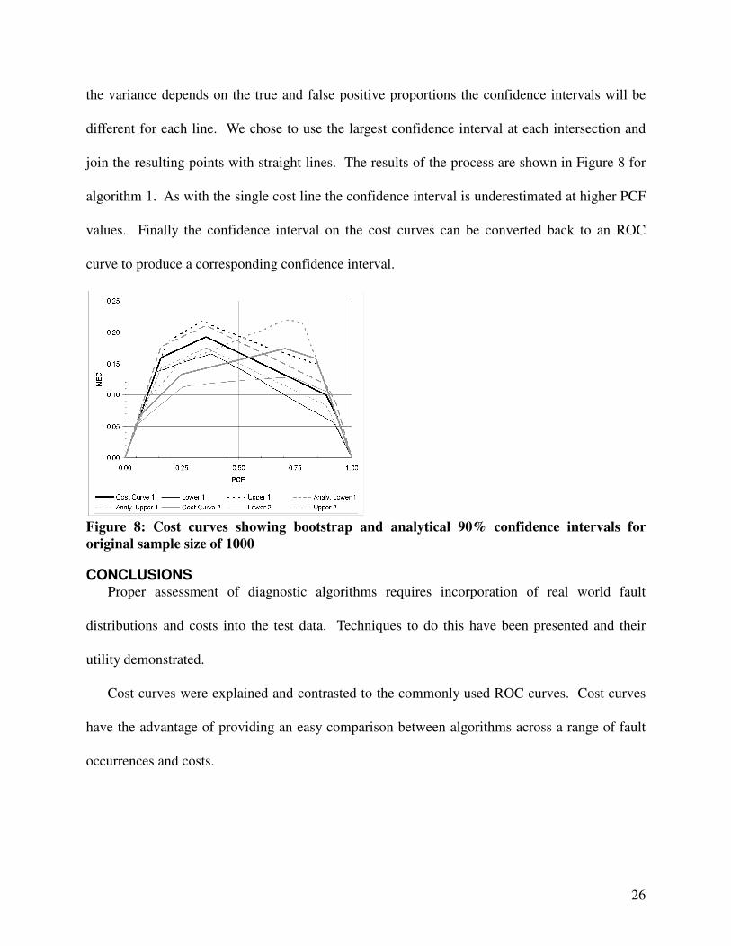
the variance depends on the true and false positive proportions the confidence intervals will be
different for each line. We chose to use the largest confidence interval at each intersection and
join the resulting points with straight lines. The results of the process are shown in Figure 8 for
algorithm 1. As with the single cost line the confidence interval is underestimated at higher PCF
values. Finally the confidence interval on the cost curves can be converted back to an ROC
curve to produce a corresponding confidence interval.
Figure 8: Cost curves showing bootstrap and analytical 90% confidence intervals for original sample size of 1000
CONCLUSIONS Proper assessment of diagnostic algorithms requires incorporation of real world fault
distributions and costs into the test data. Techniques to do this have been presented and their
utility demonstrated.
Cost curves were explained and contrasted to the commonly used ROC curves. Cost curves
have the advantage of providing an easy comparison between algorithms across a range of fault
occurrences and costs.
27
Further work is required in determining the optimal Laplace correction for individual
confusion matrix elements to obtain the desired confidence interval. The correction varies with
confidence level and this needs to be examined.
REFERENCES [1] Davison, C. R. and Bird, J. W., 2008, “Review Of Metrics And Assignment Of Confidence
Intervals For Health Management Of Gas Turbine Engines”, ASME GT2008-50849, ASME
Turbo Expo 2008, June 2008, Berlin, Germany.
[2] Simon, D.L.; Bird, J.W.; Davison, C.R.; Volponi, A. and Iverson, R.E., 2008,
“Benchmarking Gas Path Diagnostic Methods: A Public Approach”, ASME GT2008-
51360, ASME Turbo Expo 2008, June 2008, Berlin, Germany.
[3] DePold, H.; Siegel, J. and Hull, J., 2004, “Metrics for Evaluating the Accuracy of
Diagnostic Fault Detection Systems”, ASME GT2004-54144, IGTI Turbo Expo 2004, June
2004, Vienna, Austria.
[4] Webb, G.I. and Ting, K.M., 2005, “On the Application of ROC Analysis to Predict
Classification Performance under Varying Class Distributions,” Machine Learning, January
2005, Vol. 58 (1), pp.25-32.
[5] Drummond, C. and Holte, R.C., “Explicitly Representing Expected Cost: An Alternative to
ROC Representation”, Proceedings of KDD-2000, Sixth ACM SIGKDD International
Conference on Knowledge Discovery and Data Mining, August 20-23, 2000, Boston, MA,
pp.198-207.
[6] Drummond, C. and Holte, R.C., “Cost curves: An improved method for visualizing
classifier performance”, Machine Learning, October 2006, Vol. 65 (1), pp. 95-130.

28
[7] Davison, A.C. and Hinkley, D.V., 1997, Bootstrap Methods and their Applications,
Cambridge University Press, Cambridge, U.K.
[8] Orsagh, R.F.; Roemer, M.J.; Savage, C.J. and Lebold, M., “Development of Performance
and Effectiveness Metrics for Gas Turbine Diagnostic Techniques,” Aerospace, 2002 IEEE
Conference Proceedings, 2002, Vol. 6, pp. 2825-2834.
[9] Osborn, M. and Yu, L.J., 2007, “Decision Support for Remote Monitoring and Diagnostics
of Aircraft Engine Using Influence Diagrams,” ASME GT2007-28331, IGTI Turbo Expo
2007, May 2007, Montreal, QC.
[10] McDonald, R.A., “The Mean Subjective Utility Score, A Novel Metric for Cost-Sensitive
Classifier Evaluation”, Pattern Recognition Letters, 2006, Vol. 27, pp. 1472-1477.
[11] Margineantu, D.D. and Dietterich, T.G., “Bootstrap Methods for the Cost-Sensitive
Evaluation of Classifiers”, Proceedings of the Seventeenth International Conference on
Machine Learning, 2000, pp. 582-590.
[12] Dugas, C. and Gadoury, D., “Positive Exact Distributions of Cost Curves”, Proceedings of
the 25th International Conference on Machine Learning, Helsinki, Finland, 2008.