Embed Size (px)
DESCRIPTION
Money and Sustainability: Appendix F Data taken from The State of Food Insecurity in the World: Addressing Food Insecurity in Protracted Crisis (Rome: FAO, 2010). Data taken from Wikipedia as well as Eurostat, Combating poverty and social exclusion: a statistical portrait of the European Union 2010 (Brussels: European Union, 2010). 1 2
Citation preview
Money and Sustainability: Appendix F
Many different definitions of poverty are in
use. For example, the European Union defines
poverty in relative terms as an income level of
less than 50% of the average income. In
contrast, the US and the World Bank define poverty in
absolute terms as an income below a fixed minimum
level. By using the latter definition one finds a silver
lining in some of the worldwide poverty statistics of the
recent decades. In particular, if one uses the lower
threshold levels ($1 per day), the past decades have seen
significant drops in the most extreme poverty. This is
much less clearly the case if one uses a higher threshold
level (e.g. $10 per day).
Over 80% of the world population lives on less than $10 a
day; over 50% live on less than $2 a day; over 20%, on
less than $1.25 dollars a day. In 2008, 17% of the people
in developing countries were starving, and the number
of undernourished people in the world remains close to one billion.1 In the European Union, the
number of people at risk of poverty was 84 million in 2007, or 17% of the population. If tax-based
social transfers—that is, government-sponsored programmes—were not in place, this would add
another 34% of people in poverty.2 Toynbee’s historical research shows, however, that one of the
two major types of social crisis that threaten civilisations arises from excessive concentration of
wealth, i.e. from relative tensions, and not from an absolute minimum level of poverty.
1 Data taken from The State of Food Insecurity in the World: Addressing Food Insecurity in Protracted Crisis (Rome: FAO,
2010).
2 Data taken from Wikipedia as well as Eurostat, Combating poverty and social exclusion: a statistical portrait of the
European Union 2010 (Brussels: European Union, 2010).
Concentration of Wealth
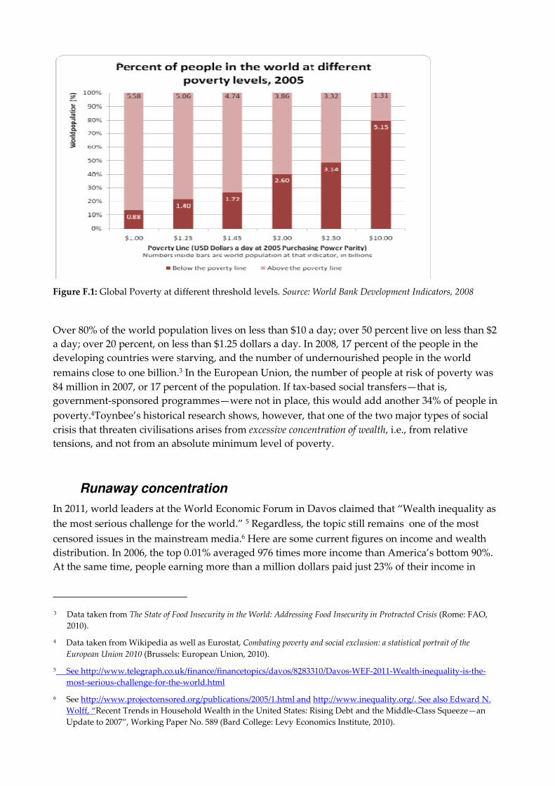
Figure F.1: Global Poverty at different threshold levels. Source: World Bank Development Indicators, 2008
Over 80% of the world population lives on less than $10 a day; over 50 percent live on less than $2
a day; over 20 percent, on less than $1.25 dollars a day. In 2008, 17 percent of the people in the
developing countries were starving, and the number of undernourished people in the world
remains close to one billion.3 In the European Union, the number of people at risk of poverty was
84 million in 2007, or 17 percent of the population. If tax-based social transfers—that is,
government-sponsored programmes—were not in place, this would add another 34% of people in
poverty.4Toynbee’s historical research shows, however, that one of the two major types of social
crisis that threaten civilisations arises from excessive concentration of wealth, i.e., from relative
tensions, and not from an absolute minimum level of poverty.
Runaway concentration
In 2011, world leaders at the World Economic Forum in Davos claimed that “Wealth inequality as
the most serious challenge for the world.” 5 Regardless, the topic still remains one of the most
censored issues in the mainstream media.6 Here are some current figures on income and wealth
distribution. In 2006, the top 0.01% averaged 976 times more income than America’s bottom 90%.
At the same time, people earning more than a million dollars paid just 23% of their income in
3 Data taken from The State of Food Insecurity in the World: Addressing Food Insecurity in Protracted Crisis (Rome: FAO,
2010).
4 Data taken from Wikipedia as well as Eurostat, Combating poverty and social exclusion: a statistical portrait of the
European Union 2010 (Brussels: European Union, 2010).
5 See http://www.telegraph.co.uk/finance/financetopics/davos/8283310/Davos-WEF-2011-Wealth-inequality-is-the-
most-serious-challenge-for-the-world.html
6 See http://www.projectcensored.org/publications/2005/1.html and http://www.inequality.org/. See also Edward N.
Wolff, “Recent Trends in Household Wealth in the United States: Rising Debt and the Middle-Class Squeeze—an
Update to 2007”, Working Paper No. 589 (Bard College: Levy Economics Institute, 2010).

federal tax.7 1% of the world population own 40% of the global assets. The richest 2% of the world
population own more than 51% of the world’s assets, while the richest 10% own 85%. At the same
time, 50% of the world population own less than 1% of the world’s assets.8 On a global scale, the
so-called established wealthy (people who own over $5 million in net assets), representing 0.1% of
global households, have increased their ownership of all private wealth from 19% in 2008 to 21% in
2010. The highest wealth concentrations are found in the Middle East, Africa and North America.9
Similarly, the top 1% of households in these countries accounts for 70 to 90% of all their respective
countries’ private financial and real-estate ownership.10
The resulting socio-political tensions will predictably become more explosive whenever the cost of
basic necessities rises, as has recently became clear in 2008 when street riots broke out in many
poor places in the wake of globally soaring food prices. Recent hikes in food prices alone are
expected to add a net 44 million to the population that lives below the $1.25 poverty line.11
Current data reveal that the share of total income going to the richest 10% of the US population has
never been so high (see Figure F.2).12
Figure F.2: Income share in the US going to the top 10%
7 See http://www.thenation.com/image/extreme-inequality-chart.
8 Data taken from Wikipedia as well as Eurostat, Combating poverty and social exclusion: a statistical portrait of the
European Union 2010, op. cit.
9 Data taken from Jorge Becerra, Peter Damisch, Bruce Holley, Monish Kumar, Matthias Naumann, Tjun Tang and
Anna Zakrzewski, Global Wealth 2010: Regaining Lost Ground—Resurgent Markets and New Opportunities, (Boston:
Boston Consulting Group, 2010).
10 Some claim that this systematic debt build-up in third-world countries and the corresponding concentration of
wealth are in fact the result of a conscious, deliberate imperialist strategy that started as early as the mid-1950s and
got into full swing from the 1970s onwards. See John Perkins, Confessions of an Economic Hit Man, op. cit.
11 This is the net between the 68 million additional people who fell into poverty and the 24 million food producers who
were able to escape extreme poverty thanks to these same price increases. See Poverty Reduction and Equity Group,
Poverty Reduction and Economic Management (PREM) Network, (Washington, D.C.: World Bank, 2011).
12 Emmanuel Saez, “Striking it Richer. The Evolution of top incomes in the USA”, Working Paper (UC Berkeley:
Institute for Research on Labor and Employment, 2010). [http://elsa.berkeley.edu/~saez/saez-UStopincomes-2008.pdf]

Two thirds of the total income gains in the US during the period 2002 to 2007 went to the top 1% of
US households. This income bracket grew more than ten times faster than the income of the
bottom 90% of households. The last time this happened was in the 1920s. In contrast, the total
number of individuals living in poverty has never been higher in the past 50 years, as illustrated
in Figure F.3.13
Figure F.3: Absolute headcount in poverty (upper line) and poverty rate (lower line) as a percentage of the
US population
This goes hand in hand with the well-known phenomenon of an eroding middle class. The bottom
line is that the distribution of wealth is increasingly uneven in almost all countries of the world.14
The government’s ability, or lack of will, to tax and redistribute capital income and assets has been
weakened—a fact which is linked both to potential capital migration and to the
internationalisation of business groups. Businesses and wealthy individuals will migrate to
wherever the best tax deals reside. As more nations worldwide compete for direct investment, the
threat of a trans-national group closing down a facility is ever present and, as a direct
consequence, feeds a continuous “race to the bottom” among states.
13 We are presenting a lot of data from the US in this section. There are two reasons for this. First, the data are more
readily available on a consistent basis than in Europe. Second, and more importantly, the social safety nets which
explain the biggest differences between the US and Europe are now under direct assault from the austerity
programmes that Europe is implementing at present. By looking at the United States, we are probably looking at
what may well be Europe’s medium-term future if we remain on the monetary path we are now embarked on.
14 One should not assume that the level of income is automatically related to happiness. The perceived happiness with
high income is more transitory. Individual perspectives and options as well as social contacts determine the amount
of perceived subjective happiness on the long run. See Daniel Kahneman, Anne B. Krueger, David Schkade, Norbert
Schwartz and Arthur A. Stone, “Would You Be Happier If You Were Richer? A Focused Illusion”, Science 312 (23
June 2006), pp. 1908-1910.

The United Nations Development Programme (UNDP) has developed the Human Development
Index (HDI) first published in 1990. The HDI takes into account different variables beyond simple
GDP measures. In addition to income, the most recent version of this metric considers inequality,
life expectancy and school enrolment. Figure F.4 illustrates the significant impact of excessive
wealth concentration on living standard, education and health status in different regions of the
world.
Figure 5.9: Economic and social losses due to inequality. The numbers inside the bars (in %) represent the
share of total losses due to inequality attributable to each HDI component.15
Societal implications
Countries with lower income gaps do better along almost all relevant social and ecological
dimensions. If one looks at income inequality in relation to a compounded social well-being
indicator including childhood mortality, obesity, mental disorders, drug abuse, homicide, crime
rate, social mobility, social trust, working hours, and ratio of developmental aid, one sees that this
compound index and the inequality indicator are positively correlated. This means that the higher
the income inequality in a region or nation, the worse the outcome for inhabitants (see Figure F.5).
15 Source: HDRO, 2010, Human Development Report, UN. The impact of the crisis on the Millenium Development Goals
is well reported in The MDGs after the Crisis: Global Monitoring Report 2010 (Washington, D.C.: World Bank).

Figure 5.10: Income inequality and compound index of social indicators: The higher the inequality the worse
the social indicators become.16
This is Appendix F to
Money and Sustainability: The Missing Link.
To read more about the book or to order a copy, visit:
http://bit.ly/TPMissingLink
16 Richard Wilkinson and Kate Pickett, The Spirit Level: Why More Equal Societies Almost Always Do Better (London: Allen
Lane, 2009).