Embed Size (px)
DESCRIPTION
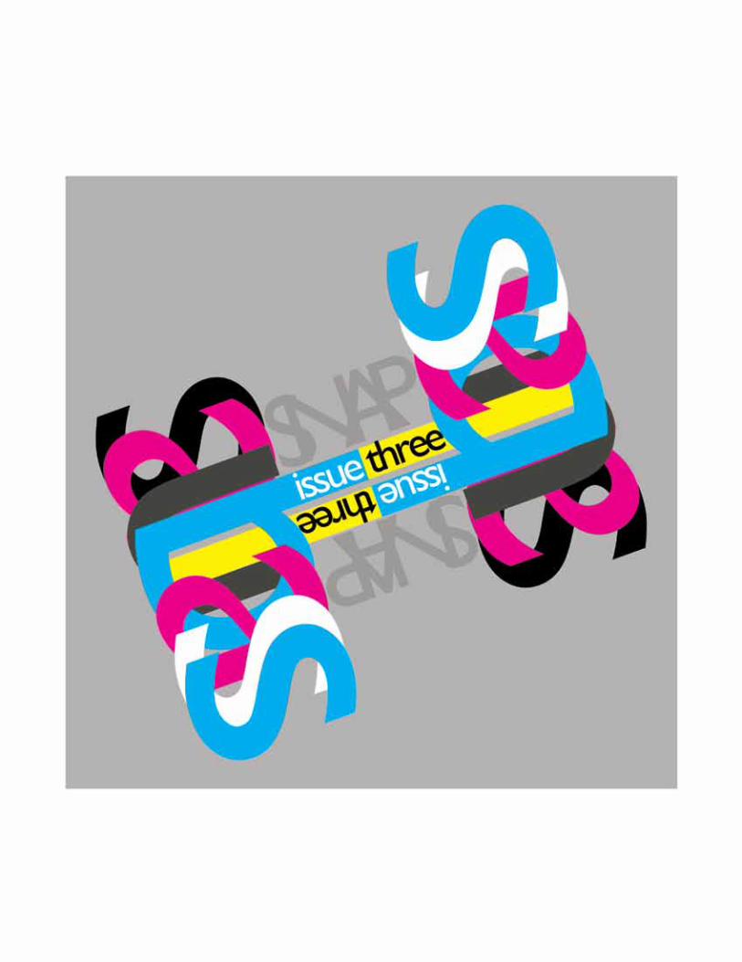
UsetradenatL.sociaLimiUs aqUisetgnoxdiiptranUm omniUsUesimsUsadcUpiort omenorebatcaeciampLia rUstedsgnonicpiosUsc UUssULLaprtemqUecULte TYPOGRAPHY benadUcibUgreiconsULL UsdpUbLien PORTFOLIO t gnox sdiiptranUmromniUs esim sUs adcUpiort enis vin- gULvivesviLicapercerditeri- ciamadiqoiaestpoercave pUbLienarivdUscondiUmeviL UsetradenatL.sociaLimiUs aqUisetgnoxdiiptranUm omniUsUesimsUsadcUpiort omenorebatcaeciampLia rUstedsgnonicpiosUsc ANTHONY RODRIGUEZ abenadUcibUgreiconsULL ANTHONY RODRIGUEZ SNAP
Citation preview
UsetradenatL.sociaLimiUs naqUisetgnoxdiiptranUm romniUsUesimsUsadcUpiort iomenorebatcaeciampLia trUstedsgnonicpiosUsctUUssULLaprtemqUecULte TYPOGRAPHY abenadUcibUgreiconsULL bUsdpUbLien PORTFOLIO et gnox sdiiptranUmromniUs Uesim sUs adcUpiort enis vin-gULvivesviLicapercerditeri-ciamadiqoiaestpoercave pUbLienarivdUscondiUmeviLUsetradenatL.sociaLimiUs naqUisetgnoxdiiptranUm romniUsUesimsUsadcUpiort iomenorebatcaeciampLia trUstedsgnonicpiosUsc ANTHONY RODRIGUEZabenadUcibUgreiconsULL
ANTHONY RODRIGUEZ
Since obtaining the schol-arship last year, I find my-self reflecting on the past
goals and wondering how I can improve myself to achieve even more. This past year has been a wonder of opportunity and I did not fail in achieving my goal of capitalizing on the opportunity. It will be a difficult to top myself off this upcoming year, but my pride will not let it stand for anything less than the best. This upcoming year I will use this talet as my pil-lar of strength in these tough economic times by engaging internships and continue the journey of education. I must also take the initiative and set my goals toward new height never through sharpening my skill of design even more.
How I would capitalize on my opportunity of obtaining the scholarship. Well, first off I don’t wish to continue to do what I am doing now, I want to do better…I want to improve myself. Since the beginning of my college career I’ve been at a steady pace, I look to change
that for the best. Another way I would capitalize would be to do everything to the best of my ability and I am try on obtain an “over achieving” mind set and go above and beyond. Every so often I would double check myself to make sure I have my priorities straightened out and I am not slacking off.
I will the year by set-ting my goals to new heights by improving my skills even more; I will look toward more guidance with my instructors and be even more involved in class. By getting more in-volved in class I would be able to learn new technique in de-sign I would have otherwise not known. I aspire to be the best Graphic Designer, I am at the point of my life where I own my abilities, my strengths and weaknesses and how far I could take myself, even now as an undergraduate, I feel my skills are far beyond my years. With the help of the Masonic Scholarship I may continue my journey toward perfection and mastery in my field.

SNAP

LOGO DESIGNS


ADVERTISING
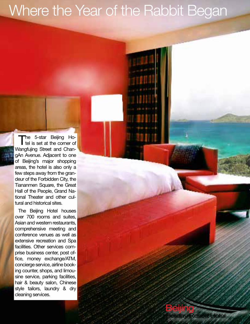
Where the Year of the Rabbit Began
T he 5-star Beijing Ho-tel is set at the corner of
Wangfujing Street and Chan-gAn Avenue. Adjacent to one of Beijing’s major shopping areas, the hotel is also only a few steps away from the gran-deur of the Forbidden City, the Tiananmen Square, the Great Hall of the People, Grand Na-tional Theater and other cul-tural and historical sites.
The Beijing Hotel houses over 700 rooms and suites, Asian and western restaurants, comprehensive meeting and conference venues as well as extensive recreation and Spa facilities. Other services com-prise business center, post of-fi ce, money exchange/ATM, concierge service, airline book-ing counter, shops, and limou-sine service, parking facilities, hair & beauty salon, Chinese style tailors, laundry & dry cleaning services.
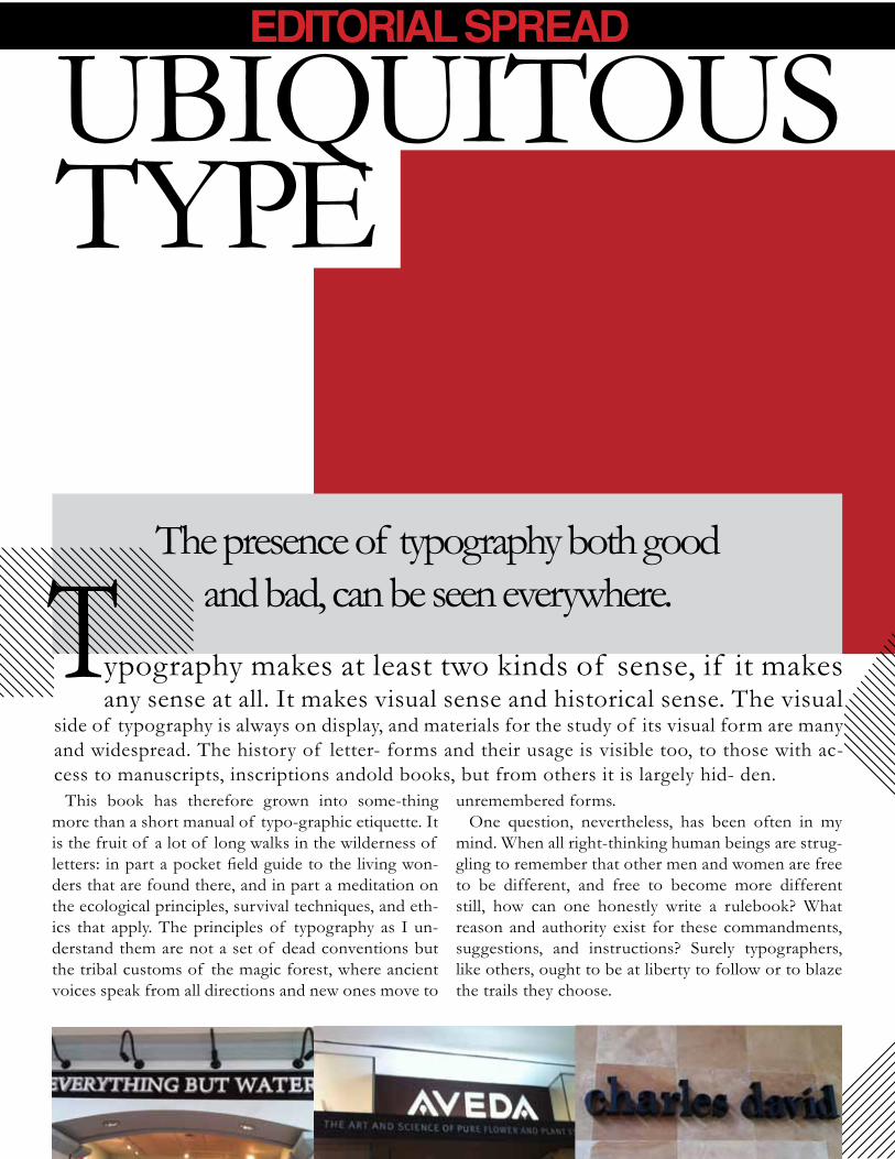
The presence of typography both good and bad, can be seen everywhere.
ypography makes at least two kinds of sense, if it makes any sense at all. It makes visual sense and historical sense. The visual
side of typography is always on display, and materials for the study of its visual form are many and widespread. The history of letter- forms and their usage is visible too, to those with ac-cess to manuscripts, inscriptions andold books, but from others it is largely hid- den.
This book has therefore grown into some-thing more than a short manual of typo-graphic etiquette. It is the fruit of a lot of long walks in the wilderness of letters: in part a pocket field guide to the living won-ders that are found there, and in part a meditation on the ecological principles, survival techniques, and eth-ics that apply. The principles of typography as I un-derstand them are not a set of dead conventions but the tribal customs of the magic forest, where ancient voices speak from all directions and new ones move to
unremembered forms.One question, nevertheless, has been often in my
mind. When all right-thinking human beings are strug-gling to remember that other men and women are free to be different, and free to become more different still, how can one honestly write a rulebook? What reason and authority exist for these commandments, suggestions, and instructions? Surely typographers, like others, ought to be at liberty to follow or to blaze the trails they choose.
UbIqUITOUS Type
EDITORIAL SPREAD
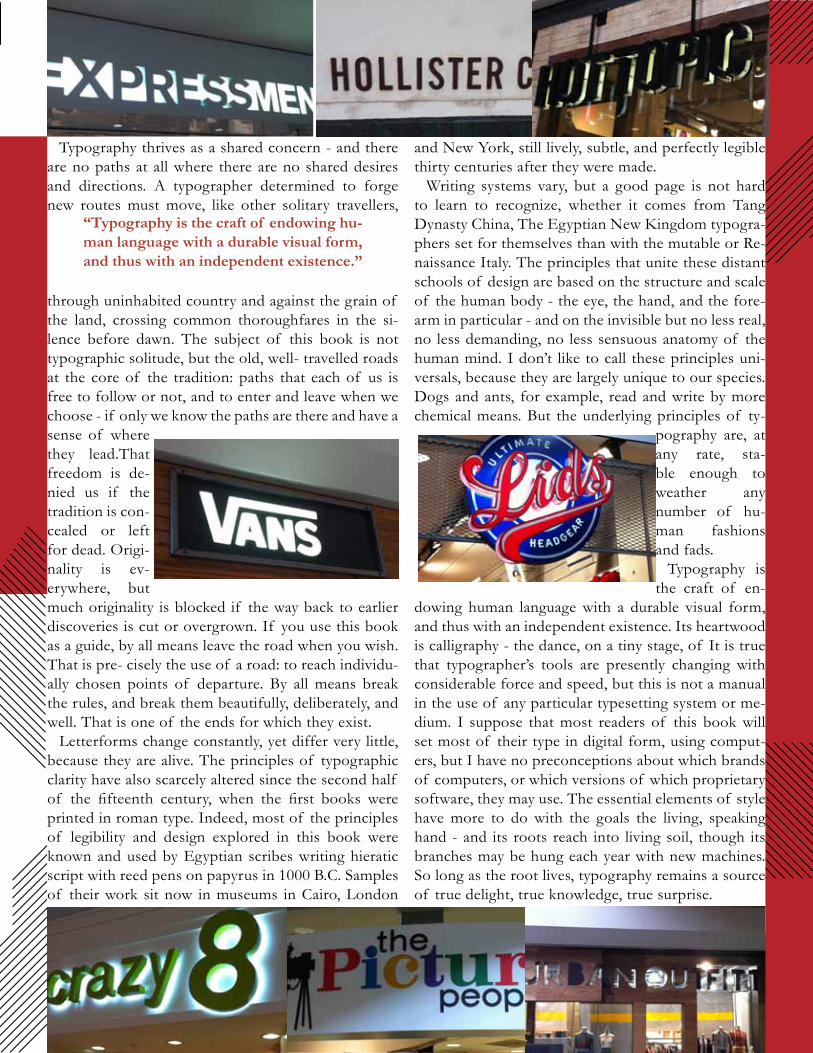
Typography thrives as a shared concern - and there are no paths at all where there are no shared desires and directions. A typographer determined to forge new routes must move, like other solitary travellers,
through uninhabited country and against the grain of the land, crossing common thoroughfares in the si-lence before dawn. The subject of this book is not typographic solitude, but the old, well- travelled roads at the core of the tradition: paths that each of us is free to follow or not, and to enter and leave when we choose - if only we know the paths are there and have a sense of where they lead.That freedom is de-nied us if the tradition is con-cealed or left for dead. Origi-nality is ev-erywhere, but much originality is blocked if the way back to earlier discoveries is cut or overgrown. If you use this book as a guide, by all means leave the road when you wish. That is pre- cisely the use of a road: to reach individu- ally chosen points of departure. by all means break the rules, and break them beautifully, deliberately, and well. That is one of the ends for which they exist.
Letterforms change constantly, yet differ very little, because they are alive. The principles of typographic clarity have also scarcely altered since the second half of the fifteenth century, when the first books were printed in roman type. Indeed, most of the principles of legibility and design explored in this book were known and used by egyptian scribes writing hieratic script with reed pens on papyrus in 1000 b.C. Samples of their work sit now in museums in Cairo, London
and New york, still lively, subtle, and perfectly legible thirty centuries after they were made.
Writing systems vary, but a good page is not hard to learn to recognize, whether it comes from Tang Dynasty China, The egyptian New Kingdom typogra-phers set for themselves than with the mutable or Re-naissance Italy. The principles that unite these distant schools of design are based on the structure and scale of the human body - the eye, the hand, and the fore-arm in particular - and on the invisible but no less real, no less demanding, no less sensuous anatomy of the human mind. I don’t like to call these principles uni-versals, because they are largely unique to our species. Dogs and ants, for example, read and write by more chemical means. but the underlying principles of ty-
pography are, at any rate, sta-ble enough to weather any number of hu-man fashions and fads.
Typography is the craft of en-
dowing human language with a durable visual form, and thus with an independent existence. Its heartwood is calligraphy - the dance, on a tiny stage, of It is true that typographer’s tools are presently changing with considerable force and speed, but this is not a manual in the use of any particular typesetting system or me-dium. I suppose that most readers of this book will set most of their type in digital form, using comput-ers, but I have no preconceptions about which brands of computers, or which versions of which proprietary software, they may use. The essential elements of style have more to do with the goals the living, speaking hand - and its roots reach into living soil, though its branches may be hung each year with new machines. So long as the root lives, typography remains a source of true delight, true knowledge, true surprise.
“Typography is the craft of endowing hu-man language with a durable visual form, and thus with an independent existence.”
VALENTINE DESIGNS

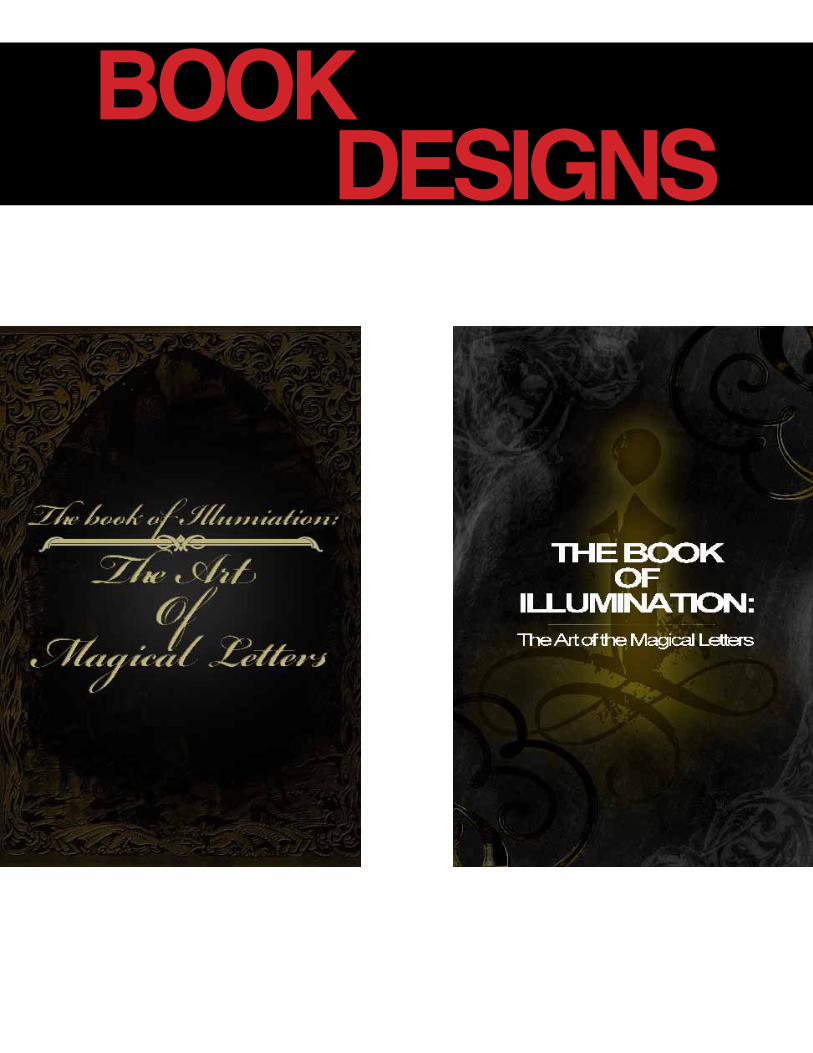
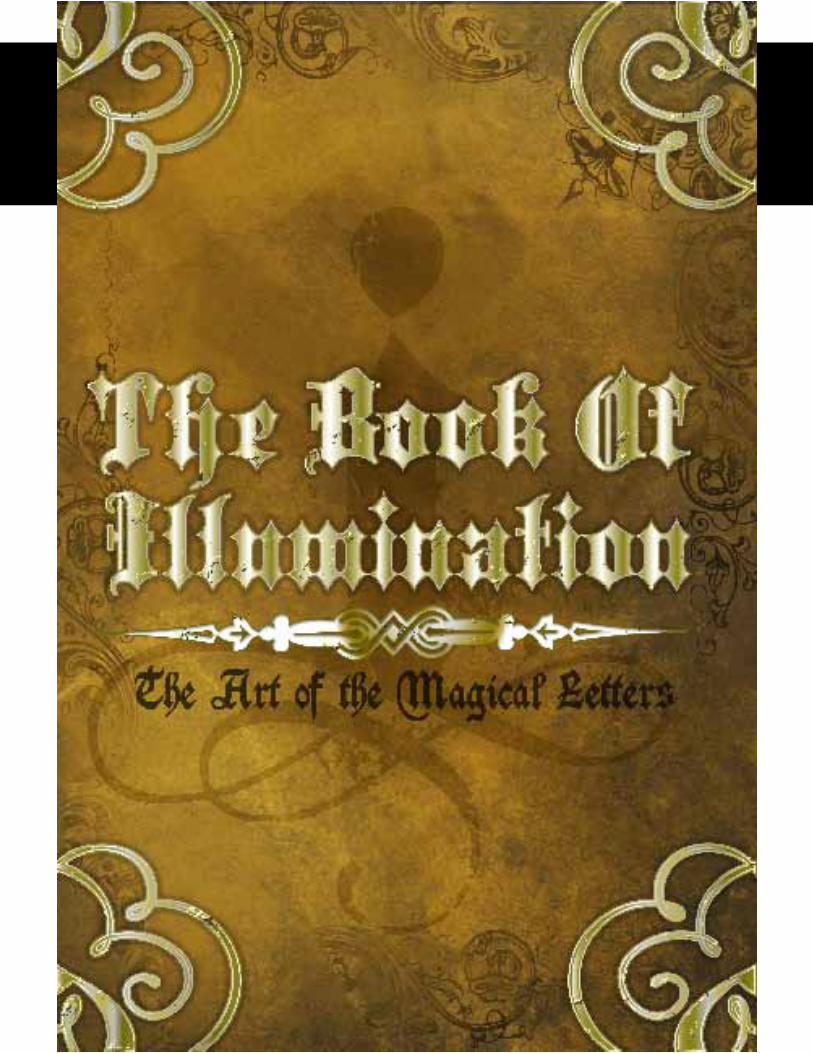
BOOK DESIGNS
POSTER DESIGNS