Embed Size (px)
DESCRIPTION
There are no pull quotes on the front cover meaning that it is very hard to say what any of the articles in the magazine will be about. We will only know that they are about a certain band. The main image follows the house style as the only colours in the image are re, white and black. This applies for the banner ‘Lacuna Coil’; it follows all the conventions of the house style. Analysis of OUTLINE Front Cover
Citation preview

Analysis of OUTLINE Front Cover
Outline has a reasonably plain front cover in the sense that it isn’t cluttered. It has a single main image of Lacuna Coil who are the highlight of the magazine which suggests that Outline isn’t a very popular or well known magazine; because Lacuna Coil aren’t either.
The masthead is written in black; lower and upper case and has different shades of red inside the ‘O’ of Outline. This seems to be the house style for the magazine; red, white and black.
The main image follows the house style as the only colours in the image are re, white and black. This applies for the banner ‘Lacuna Coil’; it follows all the conventions of the house style.
There are no pull quotes on the front cover meaning that it is very hard to say what any of the articles in the magazine will be about. We will only know that they are about a certain band.
The skyline is a flash that says what’s inside October’s issue of Outline. It has Bowling for Soup and Architects in bigger, red, bold writing and the less important features are on the left of this flash; Dollyrots, My Passion, Cinema and Audioline. These features are smaller texts and are in grey writing.
Some could argue that even though the front cover doesn’t really have a left third the flash almost does. It contains the important information on the left and the less important features have been positioned on the right.
The front cover has a rather large red 112 beside the masthead; it is the issue number. Outline magazine have made a point of making sure the reader realises what issue number it has.
‘Free Norwich listings guide’ is one of very few hints as to what’s going to feature in the magazine meaning Outline must want their readers to know that the magazine contains listings guide. I believe because it is a local magazine this is a

good thing as there aren’t many local music magazines in Norwich and one’s that are sold nationwide don’t target individual places.
The fact that Outline is a free magazine could explain why there isn’t a left third. A left third is used to help sell the magazine; so; Outline don’t need to have as much information on their front cover as music magazines that cost money because people are more likely to have something free, rather than pay for it.

Analysis of OUTLINE Contents Page
The contents page tends to be on the first page (after front cover) of the magazine but Outlines contents page is after 2 pages of advertisements. I believe that because it is a local magazine there are a lot more businesses that are able to advertise because the readers don’t have to travel long distances. The fact that it is also free means they rely on people advertisements so they can afford to publish it.
The contents page follows the house style of the magazine because it has used the same colours and fonts for the title and the issue number. It has a patterned background that is very subtle.
Half of the contents page has been taken up by a letter written to the readers from the author Lenore describing Norwich as one of the best cities for music. The writer’s letter gives advice of what the better articles in the magazine are.
The page numbers are on the right hand side at the bottom of the article. Outline doesn’t number every page in the magazine but they have put the most popular articles in the contents page.
The box has a red background and black and white writing. It follows the house style but it varies it enough for it to stand out because of the bright red background; it is the biggest statement on the page even if it isn’t the biggest feature.
The top right of the contents page is a contribution section which states who done what in the making of the magazine. It is in very small print which suggests that it is a necessity rather than a popular feature in the sense that people don’t want to turn to the contents page to find out who took a certain picture; they want to know where a certain article is in the magazine.
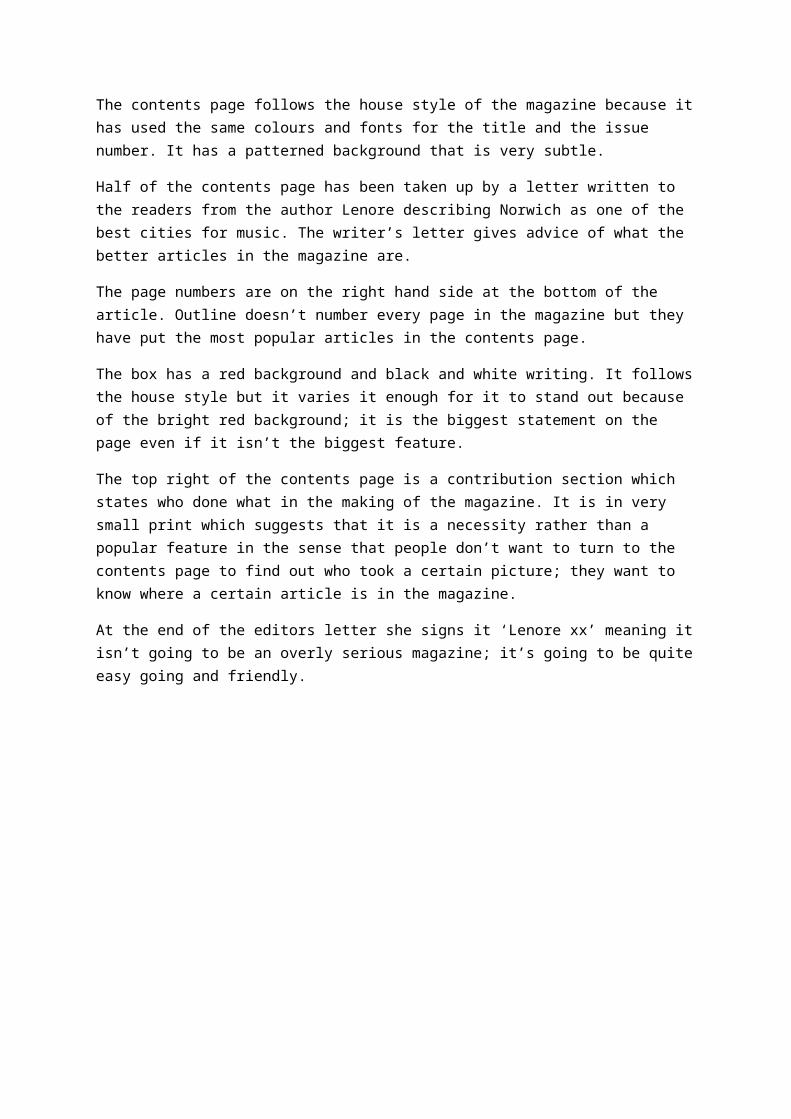
At the end of the editors letter she signs it ‘Lenore xx’
meaning it isn’t going to be an overly serious magazine; it’s going to be quite easy going and friendly.
Analysis of OUTLINE Double Page Spread
The DPS is laid out with a main image on the top left of the article. It is the Bowling for Soup band all in the shower together naked. This shows that it is going to be a quite rock and roll article that is going to be quite wild and rebellious.
There is a smaller image at the top of the article with the band in bed together. They’re all looking very comfortable with the closeness meaning they are a very tight band in the sense they are good friends and get on well and enjoy working with each other.
The main bulk of the article is on the right half of the first page and almost the whole of the second page. There are 4 columns that are flush left.

There is no drop cap in the article but instead there are headings of questions the band were asked. The headings are in red which means the article follows the house style of the magazine.
The article is a yellow background which doesn’t follow the re, black and white theme. This could be related to the nature of the band because; by reading the article it is clear that the ban are ‘off the rails’ and very rebellious.
The Standfirst is on the bottom left of the article in the flash. It has a blue background that stands out from the article. It is the first thing that attracts the reader meaning they tend to go to this part of the article first.
There is a pull quote on the top right of the article that refers to another music article ‘Mick Jagger’ meaning the band aren’t just interested in there own music.
The tone and register is quite preppy and contains slang meaning it is quite an easy read. The whole article is written as if the band is talking so arguable the whole article is based on quotes from Bowling for Soup.
The band name is situated under the lead image which can be classed as information of the picture in the sense that it is telling the reader who is in the image. The name of the band is in white font with a red border. This follows the house style of the magazine so it helps relate the article to the magazine.
The red flash in the bottom right hand corner has information about the bands upcoming tour; it is related to the band but not the article.
Overall the entire article is quite rock and roll and manages to make the reader relate to the band and have a very good idea of their characters and views on life as a music artist.