Embed Size (px)
Citation preview

An Overview of ODS Statistical Graphics in SAS® 9.3Robert N. Rodriguez, SAS Institute Inc., Cary, NC
ABSTRACT
ODS Statistical Graphics (ODS Graphics for short) provides functionality for creating statistical graphics. ODS Graphicsis available in the Base SAS®, SAS/STAT®, SAS/ETS®, and SAS/QC® products. More than 80 statistical proceduresuse this functionality, and they produce graphs as automatically as they produce tables. In addition, Base SAS proce-dures use this functionality to produce plots for exploratory data analysis and for customized statistical displays.
This paper presents the essential information you need to get started with ODS Graphics in SAS 9.3. ODS Graphicsis an extension of ODS (the Output Delivery System), which manages procedure output for display in a variety ofdestinations, such as HTML and RTF. Consequently, many familiar features of ODS for tabular output apply equally tographs.
When ODS Graphics is enabled, graphs and tables are integrated in your ODS output destination. ODS Graphicsproduces graphs in standard image file formats, and the consistent appearance and individual layout of these graphsare controlled by ODS styles and templates, respectively.
Since the default templates for procedure graphs are provided by SAS software, you do not need to know the detailsof templates to create statistical graphics. However, with some understanding of the underlying Graph Template Lan-guage, you can modify the default templates to make changes to graphs that are permanently in effect each time yourun the procedure. Alternatively you can make immediate changes by using the ODS Graphics Editor, a point-and-clickinterface with which you can customize titles, annotate points, and make other enhancements.
INTRODUCTION
Effective graphs are indispensable for modern statistical analysis. They reveal patterns, differences, and uncertaintythat are not readily apparent in tabular output. Graphs provoke questions that stimulate deeper investigation, and theyadd visual clarity and rich content to reports and presentations.
With SAS 9.3, a SAS/GRAPH® software license is no longer required for ODS Graphics. The only SAS licensesrequired to use ODS Graphics are a Base SAS license and a license for the product that contains the procedure thatyou want to use. See the list on page 11.
Depending on a number of factors, ODS Graphics might or might not be enabled by default. ODS Graphics is typicallyenabled by default in the SAS windowing environment; ODS Graphics is typically disabled by default when you invokeSAS in other ways. However, these defaults can be changed in a number of ways. You can change the default in theSAS windowing environment by selecting Tools I Options I Preferences from the menu at the top of the main SASwindow. Then on the Results tab, select the Use ODS Graphics check box to enable ODS Graphics by default or clearthe check box to disable ODS Graphics by default.
You can also enable ODS Graphics by specifying the following statement:
ods graphics on;
Usually, ODS Graphics is enabled once at the beginning of your SAS session, and it stays enabled for the durationof the session. You might want to consider disabling ODS Graphics if your goal is solely to produce computational ortabular results, because ODS Graphics uses additional resources.
When ODS Graphics is enabled, statistical procedures that support ODS Graphics create appropriate graphs, eitherby default or when you specify procedure options for requesting specific graphs. These options are documented in the“Syntax” section of the procedure chapter in the SAS/STAT, SAS/ETS, and SAS/QC user’s guides and in the Base SASstatistical procedures guide. The “Details” section of the procedure chapter includes a subsection titled “ODS Graphics”that lists the available graphs, and many of these graphs are illustrated in the “Examples” section.
1

The following statements illustrate how you can create a default plot for a simple linear regression analysis:
proc reg data=sashelp.Class;ods select ParameterEstimates FitPlot;model Weight=Height;
quit;
Figure 1 shows the output produced by the REG procedure for this example. The output consists of a table of parameterestimates and a fit plot, as requested with the ODS SELECT statement. Both the table and the plot are part of the defaultoutput (not shown here) produced by the REG procedure for a simple linear regression analysis. The default graphsalso include regression diagnostics plots and a residuals plot. Note that the fit plot is accompanied by an inset thatprovides information relevant to the fit.
Figure 1 HTML Output with HTMLBlue Style in the SAS Windowing Environment
2

This example demonstrates how procedures that support ODS Graphics take advantage of computational results toenrich their graphs. With traditional graphics, creating a fit plot such as this one would require hundreds of lines ofadditional SAS program statements.
The output in Figure 1 is displayed in the default ODS style for the HTML destination in the SAS windowing environment.This style, HTMLBLUE, is new in SAS 9.3. ODS styles control the colors, fonts, and general appearance of all graphsand tables.
SAS provides other styles that are recommended for use with statistical graphics.
The following statements use the JOURNAL style to produce HTML output for the regression example. The JOURNALstyle is a gray-scale style that is especially useful for graphs that will appear in journals and other black-and-whitepublications.
ods html style=journal;
proc reg data=sashelp.Class;ods select ParameterEstimates FitPlot;model Weight=Height;
quit;
ods html close;
Figure 2 shows the output.
Figure 2 HTML Output with JOURNAL Style
3

GRAPH GALLERY
Statistical procedures that use ODS Graphics produce a rich variety of graphs. This section illustrates a few of themany graphs that are available, either by default or by request with the PLOTS= option, which is usually available in theprocedure statement. For more details, see the “Syntax” and “ODS Graphics” sections of the procedure chapters in theuser’s guides. The graphs shown here were created with the HTMLBLUE style for visual consistency.
Figure 3 displays a default panel of regression diagnostic plots that is created by the REG procedure. Similar diagnosticpanels are available with other linear models procedures, and the plots in the panels can be displayed individually.
Figure 4(a) displays a default plot of response values versus covariate values that is created by the GLM procedurewhen you specify an analysis of covariance model with one or two CLASS variables and one continuous variable. Thelines represent the fitted relationship within each classification level. Figure 4(b) displays a default grouped box plot ofresponse values that is created by the GLM procedure when you specify a one-way analysis of variance model.
Figure 4(c) and Figure 4(d) display optional surface and contour plots for nonparametric bivariate density estimates thatare created by the KDE procedure.
Figure 4(e) displays an optional prediction plot that is created by the KRIGE2D procedure. Figure 4(f) displays anenhanced Shewhart chart that is created by the SHEWHART procedure.
Figure 5 displays an optional scatter plot matrix of scores that is created by the PRINCOMP procedure.
The next section explains the basics of creating and managing graphs with ODS Graphics. For a comprehensiveintroduction to ODS Graphics, see Chapter 21, “Statistical Graphics Using ODS,” in the SAS/STAT User’s Guide. Foran introduction to ODS Graphics template modification, see Chapter 22 in the same book. These chapters are referredto as Chapter 21 and Chapter 22 throughout this paper.
Figure 3 REG Procedure
4

(a) GLM Procedure (b) GLM Procedure
(c) KDE Procedure (d) KDE Procedure
(e) KRIGE2D Procedure (f) SHEWHART
Figure 4 Graph Gallery
5

Figure 5 PRINCOMP Procedure
A PRIMER ON ODS STATISTICAL GRAPHICS
You can enable ODS Graphics by specifying the following statement:
ods graphics on;
ODS Graphics remains enabled for all procedure steps until you disable it with the following statement:
ods graphics off;
As explained later in this paper, you use ODS GRAPHICS statement options to specify characteristics of your graphs,such as size, image format, and image filename. For details, see the “Syntax” section of Chapter 21.
After you have invoked ODS Graphics, creating graphical output with procedures is as simple as creating tabular output.You can control your output in the following ways:
� ODS destination statements (such as ODS HTML or ODS RTF) specify where you want your graphs displayed.See the section “ODS Destination Statements” of Chapter 21 for a list of the supported destinations.
� Procedure options and defaults determine which graphs are created. For procedures that support ODS Graphics,these options are described in the “Syntax” section of the procedure chapter of the SAS/STAT, SAS/ETS, andSAS/QC user’s guides and the Base SAS statistical procedures guide. You usually request nondefault graphswith the PLOTS= option in the procedure statement.
� ODS SELECT and ODS EXCLUDE statements select and exclude graphs from your output. As with tables, yourefer to graphs by name in these statements. In the procedure chapters, the names of available graphs are listedin the “ODS Graphics” subsection of the “Details” section.
� The ODS OUTPUT statement creates SAS data sets from the data objects that are used to make plots.
� ODS styles control the general appearance and consistency of all graphs and tables.
� ODS templates modify the layout and details of each graph; see Chapters 21 and 22 for more information.
6

NOTE: A default template is provided for each graph, so you do not need to know anything about templates tocreate statistical graphics.
You can also access individual graphs, control the resolution and size of graphs, and modify your graphs as explainedlater in this paper.
GRAPH STYLES
ODS styles control the overall appearance of graphs and tables. They specify colors, fonts, line styles, and otherattributes of graph elements. The following styles are recommended for statistical work:
� The HTMLBLUE style is a color style that is recommended for use in Web pages or color print media. SeeFigure 1 for an example. The HTMLBLUE style inherits most of its attributes from the STATISTICAL style, whichinherits from the DEFAULT style. The HTMLBLUE style has a brighter appearance than its parents with colorcoordination between the tables and graphs. The dominant color is blue. The HTMLBLUE style is one of thedefault styles for the HTML destination (depending on SAS option and registry settings). It is an all-color style;groups of observations are distinguished by color instead of by line style or symbol changes. Most other stylessimultaneously vary colors, line styles, and marker symbols to show group membership. If you need an alternativeto the HTMLBLUE style that varies colors, lines, and markers, use the HTMLBLUECML style or some other style.
� The HTMLBLUECML style is a color style that is recommended for use in Web pages or color print media. It in-herits most of its attributes from the HTMLBLUE style. Groups of observations are distinguished by simultaneouscolor, line style, and symbol changes. If you need an alternative to the HTMLBLUECML style that is all-color, usethe HTMLBLUE style instead.
� The DEFAULT style is a color style. Most other styles inherit some of their elements from this style. The DEFAULTstyle is one of the default styles for the HTML destination (depending on SAS registry and other option settings).Groups of observations are distinguished by simultaneous color, line style, and symbol changes.
� The STATISTICAL style is a color style. Groups of observations are distinguished by simultaneous color, linestyle, and symbol changes. The STATISTICAL style inherits elements from the DEFAULT style.
� The ANALYSIS style is a color style with a somewhat different appearance from the STATISTICAL style. TheANALYSIS style inherits elements from the DEFAULT style.
� The JOURNAL family of styles (JOURNAL, JOURNAL2, and JOURNAL3) consists of black-and-white or gray-scale styles that are recommended for graphs that appear in journals and in other black-and-white publications.See Figure 2 for an example.
� The RTF style is used to produce graphs to insert into a Microsoft Word document or a Microsoft PowerPointslide. It is the default style for the RTF destination.
� The LISTING style is similar to the DEFAULT style, but with a lighter background. It is the default style for theLISTING destination.
You specify a style with the STYLE= option in an ODS destination statement. For example, the following statementrequests RTF output produced with the JOURNAL style:
ods rtf style=Journal;
Similarly, the following statement sets the style for the LISTING destination:
ods listing style=HTMLBlue;
Note that the style specified with the STYLE= option in the ODS LISTING statement applies only to graphs. The legacySAS monospace format is used for tables.
ACCESSING INDIVIDUAL GRAPHS
For most ODS destinations (including HTML, RTF, and PDF), graphs and tables are integrated in the output, and youview your output with an appropriate viewer, such as a Web browser for HTML.
A graph is created for every open destination. When you open a new destination, you should close all destinations thatyou do not need. This makes your jobs run faster and with fewer resources, because fewer graphs are produced.
If you are writing a paper or creating a presentation, you need to access your graphs individually. There are variousways to do this, depending on the ODS destination. Three particularly useful methods are as follows:
7

� If you are viewing RTF output, you can simply copy and paste your graphs from the viewer into a Microsoft Worddocument or a Microsoft PowerPoint slide.
� If you are viewing HTML output, you can copy and paste your graphs from the viewer, or you can right-clickthe graph and save it to a file. Note that RTF has a higher default resolution than HTML. You can increase theresolution in HTML by specifying the ODS HTML IMAGE_DPI=300 statement. See the section “SPECIFYINGTHE SIZE AND RESOLUTION OF GRAPHS” on page 8.
� You can save your graphs in image files and then include them into a paper or presentation. For example, youcan save your graphs as PNG (portable network graphics) files and include them in a paper that you are writingwith LATEX or in an HTML document.
You can specify the graphics image format and the filename in the ODS GRAPHICS statement. For example, the follow-ing statements, when submitted before a procedure step that produces multiple graphs, save the graphs in PostScriptfiles named myname.ps, myname1.ps, and so on:
ods listing close;ods latex file="test.tex" path="C:\myfiles" gpath="C:\myfiles\ps";ods graphics on / imagefmt=ps imagename="myname";
Chapter 21 provides details about the filetypes available with various destinations, how they are named, and how theyare saved.
If you are using the LISTING destination and the SAS windowing environment, you can also copy your graphs from thedefault image viewer and paste them into a Microsoft Word document or a Microsoft PowerPoint slide.
SPECIFYING THE SIZE AND RESOLUTION OF GRAPHS
Two factors to consider when you are creating graphs for a paper or presentation are the size of your graph andits resolution. For best results, you should specify the size of the graph as it will appear in the document (rather thanresizing the graph after it has been produced). You can specify the size in the ODS GRAPHICS statement, as illustratedby the following examples:
ods graphics on / width=6in;ods graphics on / height=4in;ods graphics on / width=4.5in height=3.5in;
When only one dimension is specified, most graphs are produced with a default width/height aspect ratio of 4/3.
The default resolution of graphs created with the HTML and LISTING destinations is 100 DPI (dots per inch), whereasthe default with the RTF destination is 200 DPI. You can change the resolution with the IMAGE_DPI= option in anyODS destination statement, as in the following example:
ods html image_dpi=300
An increase in resolution often improves the quality of the graphs, but it also increases the size of the image file.Chapter 21 provides more information about graph size and resolution.
MODIFYING YOUR GRAPHS
Although ODS Graphics is designed to automate the creation of high-quality statistical graphics, you might occasionallyneed to modify your graphs. There are two ways to proceed:
� You can use the ODS Graphics Editor, which provides a point-and-click interface, to make changes that are data-dependent and immediate. This approach is recommended if you are making ad hoc changes to a specific graphthat you have created and are preparing for a paper or presentation.
� You can modify the ODS graph template for a plot to make changes that are persistent—in other words, appliedeach time you run the procedure.
The next two sections discuss these approaches.
8

MODIFYING YOUR GRAPHS WITH THE ODS GRAPHICS EDITOR
You can use the ODS Graphics Editor to customize titles and labels, annotate data points, add text, and change graphelement properties such as fonts, colors, and line styles. After you have modified your graph, you can save it as a PNGimage file or as an SGE file, a special SAS filetype that preserves the editing context. You can open previously savedSGE files with the Graph Editor and resume editing.
1. Temporarily Enable Creation of Editable Graphs by Using an ODS Statement
You can enable the creation of editable graphs within a SAS session by submitting one of the following statements:
ods listing sge=on;ods html sge=on;
You can disable the creation of editable graphs by submitting one of the following statements:
ods listing sge=off;ods html sge=off;
You can use other destinations as well.
2. Permanently Enable Creation of Editable Graphs across SAS Sessions
You can create a default setting that enables or disables the creation of editable graphs across SAS sessions via the‘ODS Graphics Editor’ setting in the SAS Registry. You can change this setting in the SAS windowing environment asfollows:
1 Open the Registry Editor by entering regedit on the command line.
2 Select SAS_REGISTRY I ODS I GUI I RESULTS.
3 In the Value Data field, click ODS Graphics Editor to open the Edit String Value window, and type On to enable thecreation of editable graphs or type Off to disable it.
4 Click OK.
Creating editable graphs takes additional resources, so you might not want to permanently enable this feature.
Figure 6 shows how you can invoke the ODS Graphics Editor. Figure 7 shows the ODS Graphics Editor window for theeditable diagnostic plot created by the ROBUSTREG procedure. In Figure 8, various tools in the ODS Graphics Editorhave been used to modify the title and annotate a particular point. The edited plot can be saved as a PNG file or as are-editable SGE file by selecting File I Save As.
Figure 6 Invoking the ODS Graphics Editor for an Editable Plot
9

Figure 7 Diagnostic Plot before Editing
Figure 8 Diagnostic Plot after Editing
For details about the tools available in the ODS Graphics Editor, see the SAS ODS Graphics Editor: User’s Guide.Note that the ODS Graphics Editor does not permit you to make structural changes to a graph (such as moving thepositions of data points). The Editor provides you with a point-and-click way to make one-time changes to a specific
10

graph, whereas modifying the graph template, discussed in the next section, provides you with a programmatic way tomake template changes that persist every time you run the procedure.
MODIFYING YOUR GRAPHS BY EDITING GRAPH TEMPLATES
Graphs produced with ODS Graphics are constructed from two underlying components: a data object supplied by aprocedure at run time and a compiled graph template that is designed to work with this data object. Together, the dataobject and the template form an output object that ODS displays in one or more output destinations, using a particularstyle.
A graph template is simply a program, written in the Graph Template Language (GTL), that specifies the layout anddetails of a graph. SAS provides a default template for every graph produced by all statistical procedures. Thesetemplates are complete descriptions of how the graphs are to be produced. Consequently, most of the default graphtemplates provided by SAS are lengthy and complex.
Ordinarily, you do not need to know anything about templates or the GTL in order to create graphs with procedures thatuse ODS Graphics. However, with moderate knowledge of the GTL, you can edit graph templates to make changesthat are applied when you rerun the procedure. For instance, you can modify titles and axis labels, and you can addfootnotes with project information. Example 2 on page 15 illustrates this type of modification. Kuhfeld (2009) providesa tutorial introduction to this approach, and further details are given in Chapter 22.
A second reason for learning the GTL is that you can use it to create highly customized displays by writing your owngraph templates; see the section “STATISTICAL GRAPHICS PROCEDURES” on page 12.
STATISTICAL PROCEDURES THAT SUPPORT ODS GRAPHICS IN SAS 9.3
The following statistical procedures support ODS Graphics in SAS 9.3:
SAS/STAT SAS/QC SAS/ETSANOVA NPAR1WAY ANOM ARIMABOXPLOT ORTHOREG CAPABILITY AUTOREGCALIS PHREG CUSUM COPULACLUSTER PLM MACONTROL ENTROPYCORRESP PLS MVPCHART ESMFACTOR POWER MVPMODEL EXPANDFMM PRINCOMP PARETO MODELFREQ PRINQUAL RELIABILITY PANELGAM PROBIT SHEWHART SEVERITYGENMOD QUANTREG SIMILARITYGLIMMIX REG Base SAS SYSLINGLM ROBUSTREG CORR TIMEIDGLMPOWER RSREG FREQ TIMESERIESGLMSELECT SEQDESIGN UNIVARIATE UCMKDE SEQTEST VARMAXKRIGE2D SIM2D X12LIFEREG SURVEYFREQ OtherLIFETEST SURVEYLOGISTIC HPFLOESS SURVEYPHREG HPFENGINELOGISTIC SURVEYREGMCMC TPSPLINE SAS RiskMDS TRANSREG DimensionsMI TTESTMIXED VARCLUSMULTTEST VARIOGRAMNLIN
For details about the specific graphs available with a particular procedure, see the “Syntax” and “ODS Graphics”sections of the procedure chapter in the SAS/STAT, SAS/ETS, and SAS/QC user’s guides and the Base SAS statisticalprocedures guide.
11

PROCEDURES THAT SUPPORT ODS GRAPHICS AND TRADITIONAL GRAPHICS
A number of procedures that support ODS Graphics also produced traditional graphics in previous SAS releases. Theseinclude the Base SAS UNIVARIATE procedure; the SAS/STAT BOXPLOT, LIFEREG, LIFETEST, and REG procedures;and the SAS/QC ANOM, CAPABILITY, CUSUM, MACONTROL, PARETO, RELIABILITY, and SHEWHART procedures.All of these procedures continue to produce traditional graphics, but in some cases they do so only when ODS Graphicsis not enabled. For more information about the interaction between traditional graphics and ODS graphics in theseprocedures, see the chapters for these procedures in their respective user’s guides.
Note that traditional graphs are saved in SAS graphics catalogs and are controlled by the GOPTIONS statement. Incontrast, ODS Graphics produces graphs in standard image file formats (not graphics catalogs), and the appearanceand layout of these graphs are controlled by ODS styles and templates, respectively.
STATISTICAL GRAPHICS PROCEDURES
Statistical procedures that support ODS Graphics create graphs in the context of a specific analysis. However, statisticalgraphics are also essential for exploring data and for constructing specialized displays for novel analyses. Thesesituations require general-purpose graphical tools for creating stand-alone plots.
Base SAS provides a family of statistical graphics procedures that are designed to meet these needs. The followingprocedures use ODS Graphics functionality and provide a convenient syntax for creating a variety of plots directly fromdata:
� SGSCATTER creates single-cell and multi-cell scatter plots and scatter plot matrices with optional fits and ellipses.See Figure 15 for an example.
� SGPLOT creates single-cell plots with a variety of plot and chart types. See Figure 12 for an example.
� SGPANEL creates single-page or multi-page panels of plots and charts conditional on classification variables.See Figure 9 for an example.
These procedures, which are collectively referred to as the “SG procedures,” can produce density plots, dot plots,needle plots, series plots, horizontal and vertical bar charts, histograms, and box plots. They can also compute anddisplay loess fits, polynomial fits, penalized B-spline fits, reference lines, bands, and ellipses. Graphs produced withthe SG procedures and statistical procedures have a consistent appearance that is determined by the ODS style.Heath (2008, 2009) provides introductions to the SG procedures, which are documented in the SAS Graph TemplateLanguage: User’s Guide.
For situations that require highly customized displays that are not available with the SG procedures, you can writeyour own graph templates, taking advantage of the power of the Graph Template Language. You can then applythese templates to your data and render the graphs with the SGRENDER procedure. This use of the Graph TemplateLanguage is outside the scope of this paper, but Matange (2008) provides a tutorial introduction and Chapter 22provides an overview and examples. For complete documentation of the Graph Template Language, see the SASGraph Template Language: Reference and the SAS Graph Template Language: User’s Guide.
You do not need to enable ODS Graphics in order to use the SG procedures. However, the options available in theODS GRAPHICS statement are applicable to these procedures.
EXAMPLE 1: STATISTICAL GRAPHICS FOR A LINEAR MODEL ANALYSIS
This example illustrates the start-to-finish use of ODS Graphics in an analysis in which the SGPANEL procedure createsa preliminary display of the data and the SAS/STAT GLM procedure creates a specialized display that adds informationto the statistical analysis.
12

The following statements create a data set that contains a response variable y and two classification variables, a andb:
data measure;drop i abEffect;do a = 1 to 3;
do b = 1 to 3;if ((a = 3) & (b = 3)) then abEffect = 3;else abEffect = 1;do i = 1 to 10;
y = abEffect + rannor(1);output;
end;end;
end;run;
proc sort data=measure; by b;run;
The next statements use the SGPANEL procedure to plot the means of y for levels of a in a display that is paneled bythe levels of b. This is often referred to as a “means plot” or a “two-factor interaction plot.”
title "Two-Factor Interaction Plot";proc sgpanel data=measure;
panelby b / columns=3 spacing=5;vline a / response=y stat=mean limits=both
markerslegendlabel= "Cell Means with 95% Confidence Limits";
discretelegend;run;title;
The display, shown in Figure 9, suggests the presence of an interaction effect, which should be included in a follow-upanalysis of variance.
Figure 9 Interaction Plot Produced with the SGPANEL Procedure
13

The next statements carry out the analysis of variance with the GLM procedure. The LSMEANS statement requestsleast squares means (LS-means) for the interaction of a and b. The option PDIFF=ALL requests p-values for all pairwisedifferences of the LS-means.
proc glm data=measure;ods select ModelANOVA DiffPlot;class a b;model y = a|b / ss3;lsmeans a*b / pdiff=all;
run; quit;
The ANOVA table, shown in Figure 10, indicates that the main and interaction effects are significant.
Figure 10 ANOVA Results from the GLM Procedure
The GLM Procedure
Dependent Variable: y
Source DF Type III SS Mean Square F Value Pr > F
a 2 11.19595624 5.59797812 6.42 0.0026b 2 18.09492619 9.04746309 10.37 <.0001a*b 4 14.27143232 3.56785808 4.09 0.0045
When you specify an LSMEANS statement with the PDIFF= option, PROC GLM produces a default plot appropriate forthe LS-means comparison. For PDIFF=ALL, the procedure produces a diffogram, which displays all pairwise LS-meansdifferences and indicates which are significant. The diffogram, shown in Figure 11, gives you more information aboutthe interaction by telling you which of the cell mean differences are significant.
Figure 11 LS-Means Diffogram Produced with the GLM Procedure
This display is related to the mean-mean scatter plot of Hsu and Peruggia (1994); also see Hsu (1996). Diffograms arealso available with the GLIMMIX procedure. For more details and examples, see the chapter “The GLIMMIX Procedure”in the SAS/STAT User’s Guide.
14
EXAMPLE 2: STATISTICAL GRAPHICS FOR A SURVIVAL STUDY
This example illustrates ODS Graphics by using a combination of SG procedures and statistical procedures in thecontext of a survival study. The UIS data set used here is a subset of data from the University of MassachusettsAmherst Aids Research Unit Impact Study (UIS). This study consisted of two concurrent randomized trials of residentialtreatment for drug abuse, and the purpose was to compare treatment programs of different planned durations designedto reduce drug abuse. For additional background, see Hosmer and Lemeshow (1999).
The following statements create the UIS data set, which contains 628 observations and 12 variables. The responsevariable time is the survival time in days (measured from admission) in which a participant avoids returning to drug use.The censoring indicator variable censor has a value of 1 if a participant returned to drug use, and a value of 0 otherwise.For each participant, the variable treat indicates the treatment randomization assignment (0=Short and 1=Long), andthe variable site indicates the treatment site (0=A and 1=B). There were 444 participants at Site A who received eithera 3-month (short) or 6-month (long) treatment. There were 184 participants at Site B who received either a 6-month(short) or 12-month (long) treatment.
data UIS;input id age becktota hercoc ivhx ndrugtx race treat site lot time censor;label censor = "Returned to Drug Use"
time = "Time to Return to Drug Use (Days)"treat = "Treatment"site = "Treatment Site";
if ivhx=2 then ivhx=1;ndrugfp1 = 1/((ndrugtx+1)/10);ndrugfp2 = 1/((ndrugtx+1)/10) * log((ndrugtx+1)/10);
datalines;1 39 9 4 3 1 0 1 0 123 188 12 33 34 4 2 8 0 1 0 25 26 1
... more lines ...
;
The following statements group the data so that you can examine the times by combinations of treatment and site. Thevariable EventType indicates whether a participant returned to drug use.
data grouped;set UIS;length EventType $ 9;label EventType="Type";if (treat=0 and site=0) then do; Group="Short*Site A"; Treatment="Short"; end;else if (treat=0 and site=1) then do; Group="Short*Site B"; Treatment="Short"; end;else if (treat=1 and site=0) then do; Group="Long*Site A"; Treatment="Long"; end;else do; Group="Long*Site B"; Treatment="Long"; end;if (censor=0) then EventType = 'Censored';else EventType = 'Event';
run;
The next statements use the SGPLOT procedure to plot the survival times for all combinations of treatment and site:
proc sgplot data=grouped;title "Survivorship Data for Long and Short Treatments";footnote justify=left italic "Source: Applied Survival Analysis, Hosmer and Lemeshow";xaxis grid label = "Time to Return to Drug Use (Days)";yaxis label = " ";scatter x=time y=Group / group=EventType transparency=0.5;
run;
title;footnote;
The SGPLOT procedure plots time for the four combinations of treatment and site, as shown in Figure 12. Note thatthe ODS GRAPHICS ON statement is not required with the SG procedures. Values of Group are displayed along the Yaxis, and values of Time are displayed along the X axis. The GROUP= option differentiates groups of observations witha different color for each level of Eventtype. The actual colors (blue for Event and red for Censored) are determined bythe HTMLBLUE style. The TRANSPARENCY= option controls the density of the circles by specifying their degree oftransparency.
15

Figure 12 Display of Survival Times Produced with the SGPLOT Procedure
Figure 12 shows that the longer survival times are mostly censored.
Specialized methods are needed to analyze the data. The product-limit (Kaplan-Meier) estimator is commonly used todescribe the survivor function. The following statements use the LIFETEST procedure to create a plot of two product-limit functions for each site (one for each treatment program). First, the data are sorted by the variable Site so thatPROC LIFETEST can create survival curves for different sites in separate plots.
proc sort data=UIS;by site;
run;
proc lifetest data=grouped plots=survival(cb=hw test atrisk=0 to 1500 by 250);ods select SurvivalPlot;time time * censor(0);strata Treatment;by site;
run;
The PLOTS= option requests a graph of product-limit curves with 95% Hall-Wellner confidence bands, in addition tothe number of subjects at risk at times specified with the ATRISK= option.
Figure 13 shows the graph of the estimated survivor functions for Site A, which reveals that the long program partic-ipants survive longer than the short program participants. In other words, participants in the short program return todrug use earlier than those in the long program. The numbers of subjects at risk shown in Figure 13 are consistentwith this conclusion. The p-value for the log-rank test (p=0.0047) indicates a significant difference in the survivorshipbetween the long and short programs. Similar conclusions can be drawn from the display for Site B (not shown here).
16

Figure 13 Survival Plot for Site A Produced with the LIFETEST Procedure
The LIFETEST procedure, like other statistical procedures that use ODS Graphics, provides a PLOTS= option formodifying its graphs. When these options are not sufficient, you can modify the template for a graph to make changesthat persist each time you run the procedure; see Chapter 22 for details. You begin by determining the template name,as illustrated by the following statements:
ods trace output;proc lifetest data=grouped plots=survival(cb=hw test atrisk=0 to 1500 by 250);
ods select SurvivalPlot;time time * censor(0);strata Treatment;by site;
run;ods trace off;
The trace output results (not shown here) show that the template name is Stat.Lifetest.Graphics.ProductLimitSurvival.The following statements display the template (not shown here):
proc template;source Stat.Lifetest.Graphics.ProductLimitSurvival;
run;
The next statements modify the template by changing the default title of the survival plot from “Product-Limit SurvivalEstimate” to “Kaplan-Meier Plot.” This example uses a modularized template that is available in the SAS sample library.If you are using the SAS windowing environment, select Help I Getting Started with SAS Software. Select theContents tab. Expand Learning to Use SAS, expand SAS Sample Programs, and expand SAS/STAT. Select Sam-ples. Search for and select PROC LIFETEST Template. Complete details are provided in Example 22.3, “CustomizingSurvival Plots,” of Chapter 22, which also covers general aspects of managing templates that have been edited.
%SurvivalTemplateRestore
%let TitleText0 = "Kaplan-Meier Plot";
%let TitleText1 = &titletext0 " for " STRATUMID;%let TitleText2 = &titletext0;
%SurvivalTemplate
proc lifetest data=grouped plots=survival(cb=hw test atrisk=0 to 1500 by 250);ods select SurvivalPlot;time time * censor(0);strata Treatment;by site;
run;
17

The modified survival plot is shown in Figure 14. This particular modification can also be made with the ODS GraphicsEditor, which is recommended for making changes to a specific graph as opposed to making persistent changes.
Figure 14 Modified Survival Plot Produced with the LIFETEST Procedure
The following statements delete the modified template from SASUSER.TEMPLAT and revert to the default template inSASHELP.TMPLMST, which is where the SAS templates are stored. Chapter 21 describes how you can use the ODSPATH statement with template libraries that you create.
proc template;delete Stat.Lifetest.Graphics.ProductLimitSurvival;
run;
In order to account for the risk factors in the UIS data, the following statements fit a proportional hazards model andcreate an output data set that contains 10 weighted Schoenfeld residual variables, W1–W10, one for each effect.
proc phreg data=grouped noprint;class ivhx(ref="1");model time * censor(0) = age becktota ndrugfp1 ndrugfp2 ivhx race treat
site age*site race*site;output out=out1 wtressch=w1-w10;
run;
The output from the PHREG procedure is not shown here. You can evaluate the adequacy of the model by plottingthe weighted Schoenfeld residuals against the survival times for each independent variable. Since the survival timesare skewed, it is helpful to apply a log transformation to time before making the plots. This is done with the followingstatements:
data plot;set out1;log_time = log(time);label log_time = "log(Time)";
run;
18
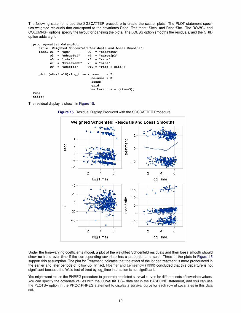
The following statements use the SGSCATTER procedure to create the scatter plots. The PLOT statement speci-fies weighted residuals that correspond to the covariates Race, Treatment, Sites, and Race*Site. The ROWS= andCOLUMNS= options specify the layout for paneling the plots. The LOESS option smooths the residuals, and the GRIDoption adds a grid.
proc sgscatter data=plot;title 'Weighted Schoenfeld Residuals and Loess Smooths';label w1 = "age" w2 = "becktota"
w3 = "ndrugfp1" w4 = "ndrugfp2"w5 = "ivhx3" w6 = "race"w7 = "treatment" w8 = "site"w9 = "agesite" w10 = "race * site";
plot (w6-w8 w10)*log_time / rows = 2columns = 2loessgridmarkerattrs = (size=5);
run;title;
The residual display is shown in Figure 15.
Figure 15 Residual Display Produced with the SGSCATTER Procedure
Under the time-varying coefficients model, a plot of the weighted Schoenfeld residuals and their loess smooth shouldshow no trend over time if the corresponding covariate has a proportional hazard. Three of the plots in Figure 15support this assumption. The plot for Treatment indicates that the effect of the longer treatment is more pronounced inthe earlier and later periods of follow-up. In fact, Hosmer and Lemeshow (1999) concluded that this departure is notsignificant because the Wald test of treat by log_time interaction is not significant.
You might want to use the PHREG procedure to generate predicted survival curves for different sets of covariate values.You can specify the covariate values with the COVARIATES= data set in the BASELINE statement, and you can usethe PLOTS= option in the PROC PHREG statement to display a survival curve for each row of covariates in this dataset.
19
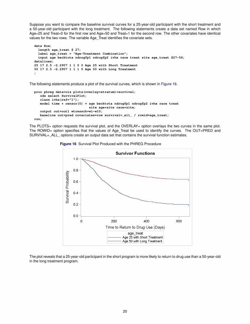
Suppose you want to compare the baseline survival curves for a 25-year-old participant with the short treatment anda 50-year-old participant with the long treatment. The following statements create a data set named Row in whichAge=25 and Treat=0 for the first row and Age=50 and Treat=1 for the second row. The other covariates have identicalvalues for the two rows. The variable Age_Treat identifies the covariate sets.
data Row;length age_treat $ 27;label age_treat = "Age-Treatment Combination";input age becktota ndrugfp1 ndrugfp2 ivhx race treat site age_treat $27-56;
datalines;25 17 2.5 -2.2907 1 1 0 0 Age 25 with Short Treatment50 17 2.5 -2.2907 1 1 1 0 Age 50 with Long Treatment;
The following statements produce a plot of the survival curves, which is shown in Figure 16.
proc phreg data=uis plots(overlay=stratum)=survival;ods select SurvivalPlot;class ivhx(ref="1");model time * censor(0) = age becktota ndrugfp1 ndrugfp2 ivhx race treat
site age*site race*site;output out=out1 wtressch=w1-w10;baseline out=pred covariates=row survival=_all_ / rowid=age_treat;
run;
The PLOTS= option requests the survival plot, and the OVERLAY= option overlays the two curves in the same plot.The ROWID= option specifies that the values of Age_Treat be used to identify the curves. The OUT=PRED andSURVIVAL=_ALL_ options create an output data set that contains the survival function estimates.
Figure 16 Survival Plot Produced with the PHREG Procedure
The plot reveals that a 25-year-old participant in the short program is more likely to return to drug use than a 50-year-oldin the long treatment program.
20

CONCLUSIONS
The following table summarizes ways in which you can use ODS Graphics in SAS 9.3.
Task What Do You Use? What Is Involved?
Creating graphs for statisticalanalyses
Statistical procedures that supportODS Graphics
ODS Graphics must be enabled;graphs created by default or withprocedure options
Creating stand-alone graphs forexploration of data or for customizeddisplays
Base SAS SGPLOT, SGPANEL,SGSCATTER procedures
Procedure syntax
Changing overall appearance ofgraphs and tables ODS styles STYLE= option in ODS destination
statement
Enhancing specific graphs forpresentation or paper ODS Graphics Editor
Request editable graphs, invokeEditor, then use point-and-clickinterface
Making persistent, programmaticchanges in graphs
Default ODS graph templatesupplied by the SAS System
Modify default graph template withGraph Template Language andcompile with TEMPLATE procedure
Creating highly customized graphs(outside scope of this paper)
User-written graph template
Write template with Graph TemplateLanguage, compile with TEMPLATEprocedure, then apply to data withSGRENDER procedure
REFERENCES
Heath, D. (2008), “Effective Graphics Made Simple Using SAS/GRAPH SG Procedures,” in Proceedings of the SASGlobal Forum 2008 Conference, Cary, NC: SAS Institute Inc.URL http://www2.sas.com/proceedings/forum2008/255-2008.pdf
Heath, D. (2009), “Secrets of the SG Procedures,” in Proceedings of the SAS Global Forum 2009 Conference, Cary,NC: SAS Institute Inc.URL http://support.sas.com/resources/papers/proceedings09/324-2009.pdf
Hosmer, D. W. and Lemeshow, S. (1999), Applied Survival Analysis, New York: John Wiley & Sons.
Hsu, J. C. (1996), Multiple Comparisons: Theory and Methods, London: Chapman & Hall.
Hsu, J. C. and Peruggia, M. (1994), “Graphical Representation of Tukey’s Multiple Comparison Method,” Journal ofComputational and Graphical Statistics, 3, 143–161.
Kuhfeld, W. F. (2009), “Modifying ODS Statistical Graphics Templates in SAS 9.2,” in Proceedings of the SAS GlobalForum 2009 Conference, Cary, NC: SAS Institute Inc.URL http://support.sas.com/resources/papers/proceedings09/323-2009.pdf
Kuhfeld, W. F. (2010), Statistical Graphics in SAS: An Introduction to the Graph Template Language and the StatisticalGraphics Procedures, Cary, NC: SAS Press.
Matange, S. (2008), “Introduction to the Graph Template Language,” in Proceedings of the SAS Global Forum 2008Conference, Cary, NC: SAS Institute Inc.URL http://support.sas.com/resources/papers/sgf2008/gtl.pdf
ACKNOWLEDGMENTS
I am grateful to Anne Baxter, Jeff Cartier, Warren Kuhfeld, Ann Kuo, and Ying So for valuable assistance in the prepa-ration of this paper.
21

RECOMMENDED READING
To get started using ODS Graphics with one of the statistical procedures listed on page 11, begin with the examplesand the “Syntax” section of the procedure chapter in the SAS/STAT, SAS/ETS, and SAS/QC user’s guides and the BaseSAS statistical procedures guide. Each chapter provides a section titled “ODS Graphics” that lists the available graphs.To get started with the statistical graphics procedures, see the SAS ODS Graphics: Procedures Guide. Chapter 21,“Statistical Graphics Using ODS,” of the SAS/STAT User’s Guide covers the general functionality of ODS Graphics. Alsosee Chapter 22, “ODS Graphics Template Modification.”
Kuhfeld (2010) provides an introduction to ODS Graphics, the GTL, and the SG procedures.
CONTACT INFORMATION
Robert N. RodriguezSAS Institute Inc.SAS Campus DriveCary, NC 27513(919) [email protected]
SAS and all other SAS Institute Inc. product or service names are registered trademarks or trademarks of SAS InstituteInc. in the USA and other countries. ® indicates USA registration.
Other brand and product names are trademarks of their respective companies.
22