Embed Size (px)
Citation preview
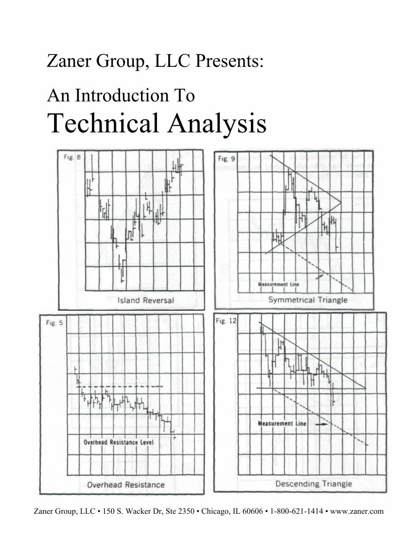
Zaner Group, LLC Presents:
An Introduction To Technical Analysis
Zaner Group, LLC • 150 S. Wacker Dr, Ste 2350 • Chicago, IL 60606 • 1-800-621-1414 • www.zaner.com
An Introduction to Technical Analysis There are two schools of thought that are used
to analyze commodity prices: fundamental analysis and technical analysis. Fundamental analysts believe that specific factors affecting supply and demand will determine the economic value or price of a commodity. Technical analysts study the behavior pattern of prices and are not concerned about supply and demand statistics. Technicians or chart analysts believe if recent price behavior or formations resemble those which have occurred in the past, the current formations could react or reoccur in a similar way; therefore, technicians can act on this assumption that has been derived from the past.
This study will be strictly concerned with technical analysis and the chart techniques used therein.
Learning to use charts and following them can help you several ways:
—Charts offer a visual picture of past price action —They illustrate the three most pertinent items of
each day's action—the high, low and close. —Charts keep the trader aware of market activity
on a daily basis —The rules of charting can frequently alert you to a
potential latent change in the fundamentals
Technical Analysis, like many things, takes time to learn and apply. The purpose of this brief writing is to introduce you to just a few of the methods of technical analysis. All three of the methods of analysis noted below can be used in as simple a manner as the analyst wishes. There is an enormous volume of material available regarding technical analysis. Therefore, it is necessary to mention a few points regarding:
1. Bar Charts are particularly helpful when used in conjunction with other chart techniques. Used alone, a false breakout from a flag, triangle, or pennant could be discouraging to a beginner chartist.
2. Moving Averages only reflect what has occurred in the past. Moving averages are a simple and effective way to gauge the direction of the tide in the commodity market— but not necessarily how far the tide will flow. They are only trend-following indicators.
3. Point and Figure Charts are most helpful when exclusively observing the size of each reversal and noting how far the price must move counter to the present trend to constitute a reversal. The more volatile a commodity is, the larger the reversal size should be.
Bar Charts
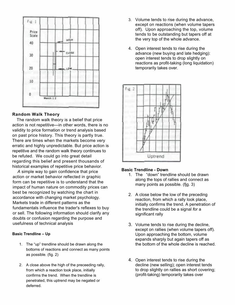
Bar charts have become the most widely used charts because of their simple construction. Bar charts are a series of vertical lines on graph paper, with each vertical line representing the trading range for a particular day. The price is plotted along the vertical axis with the days of trading plotted on the horizontal axis. The daily high and low prices are then plotted on this graph and a line is drawn to connect these two points. This line represents that daily trading range. The final step is the drawing of a horizontal line or "tick mark" through or along the right side of that trading range (vertical line) which represents the close for that day. The graph paper displayed is called a 10x5 box scale. The vertical box scale represents the price scale; the horizontal scale represents a five-day trading week. (Fig 1)
Random Walk Theory
The random walk theory is a belief that price action is not repetitive—in other words, there is no validity to price formation or trend analysis based on past price history. This theory is partly true. There are times when the markets become very erratic and highly unpredictable. But price action is repetitive and the random walk theory continues to be refuted. We could go into great detail regarding this belief and present thousands of historical examples of repetitive price behavior.
A simple way to gain confidence that price action or market behavior reflected in graphic form can be repetitive is to understand that the impact of human nature on commodity prices can best be recognized by watching the chart in accordance with changing market psychology. Markets trade in different patterns as the fundamentals influence the trader's reflexes to buy or sell. The following information should clarify any doubts or confusion regarding the purpose and usefulness of technical analysis
Basic Trendline – Up
1. The “up” trendline should be drawn along the
bottoms of reactions and connect as many points as possible. (fig. 2)
2. A close above the high of the preceeding rally,
from which a reaction took place, initially confirms the trend. When the trendline is penetrated, this uptrend may be negated or deferred.
3. Volume tends to rise during the advance, except on reactions (when volume tapers off). Upon approaching the top, volume tends to be outstanding but tapers off at the very top of the whole advance.
4. Open interest tends to rise during the advance (new buying and late hedging): open interest tends to drop slightly on reactions as profit-taking (long liquidation) temporarily takes over.
Basic Trendline - Down
1. The “down” trendline should be drawn along the tops of rallies and connect as many points as possible. (fjg. 3)
2. A close below the low of the preceding
reaction, from which a rally look place, initially confirms the trend. A penetration of the trendline could be a signal for a significant rally
3. Volume tends to rise during the decline,
except on rallies (when volume tapers off). Upon approaching the bottom, volume expands sharply but again tapers off as the bottom of the whole decline is reached.
4. Open interest tends to rise during the
decline (new selling); open interest tends to drop slightly on rallies as short covering; (profit-taking) temporarily takes over

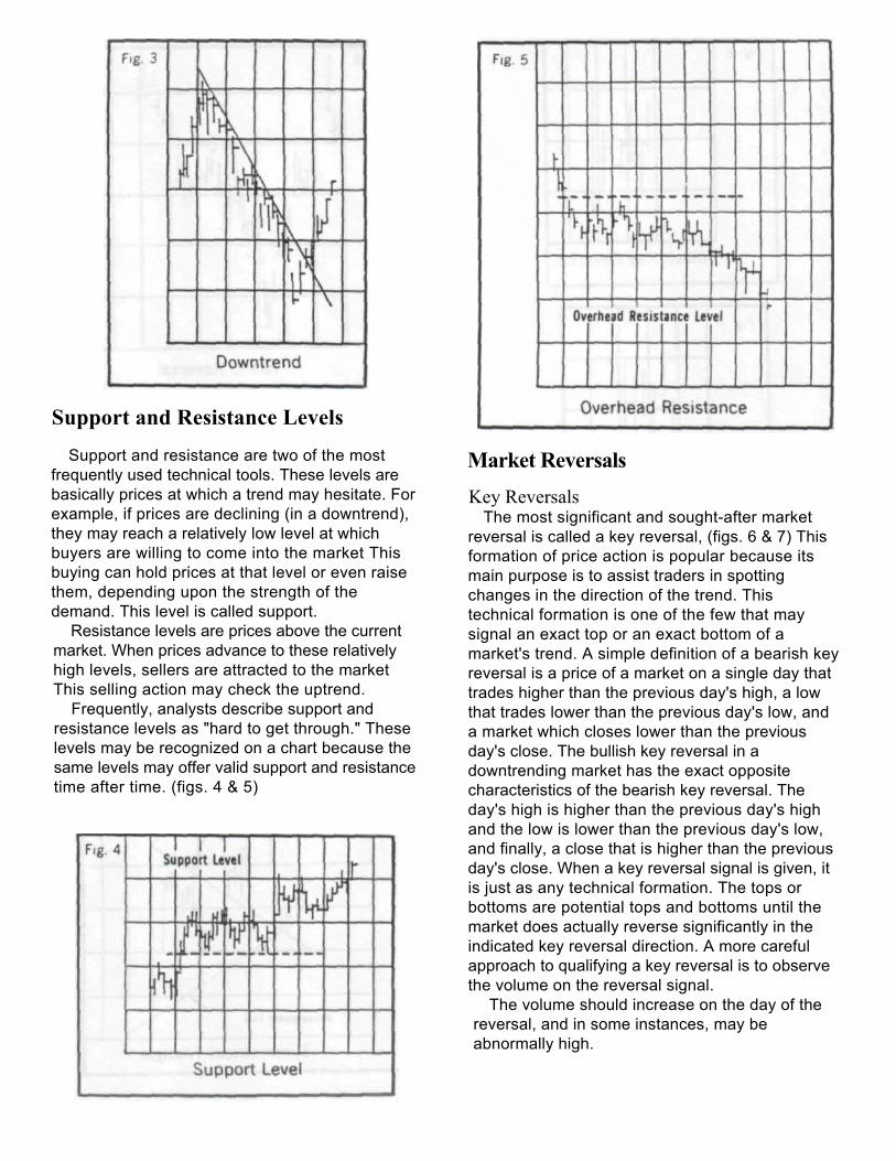
Support and Resistance Levels
Support and resistance are two of the most frequently used technical tools. These levels are basically prices at which a trend may hesitate. For example, if prices are declining (in a downtrend), they may reach a relatively low level at which buyers are willing to come into the market. This buying can hold prices at that level or even raise them, depending upon the strength of the demand. This level is called support.
Resistance levels are prices above the current market. When prices advance to these relatively high levels, sellers are attracted to the market This selling action may check the uptrend.
Frequently, analysts describe support and resistance levels as "hard to get through." These levels may be recognized on a chart because the same levels may offer valid support and resistance time after time. (figs. 4 & 5)
Market Reversals
Key Reversals The most significant and sought-after market
reversal is called a key reversal, (figs. 6 & 7) This formation of price action is popular because its main purpose is to assist traders in spotting changes in the direction of the trend. This technical formation is one of the few that may signal an exact top or an exact bottom of a market's trend. A simple definition of a bearish key reversal is a price of a market on a single day that trades higher than the previous day's high, a low that trades lower than the previous day's low, and a market which closes lower than the previous day's close. The bullish key reversal in a downtrending market has the exact opposite characteristics of the bearish key reversal. The day's high is higher than the previous day's high and the low is lower than the previous day's low, and finally, a close that is higher than the previous day's close. When a key reversal signal is given, it is just as any technical formation. The tops or bottoms are potential tops and bottoms until the market does actually reverse significantly in the indicated key reversal direction. A more careful approach to qualifying a key reversal is to observe the volume on the reversal signal.
The volume should increase on the day of the reversal, and in some instances, may be abnormally high.
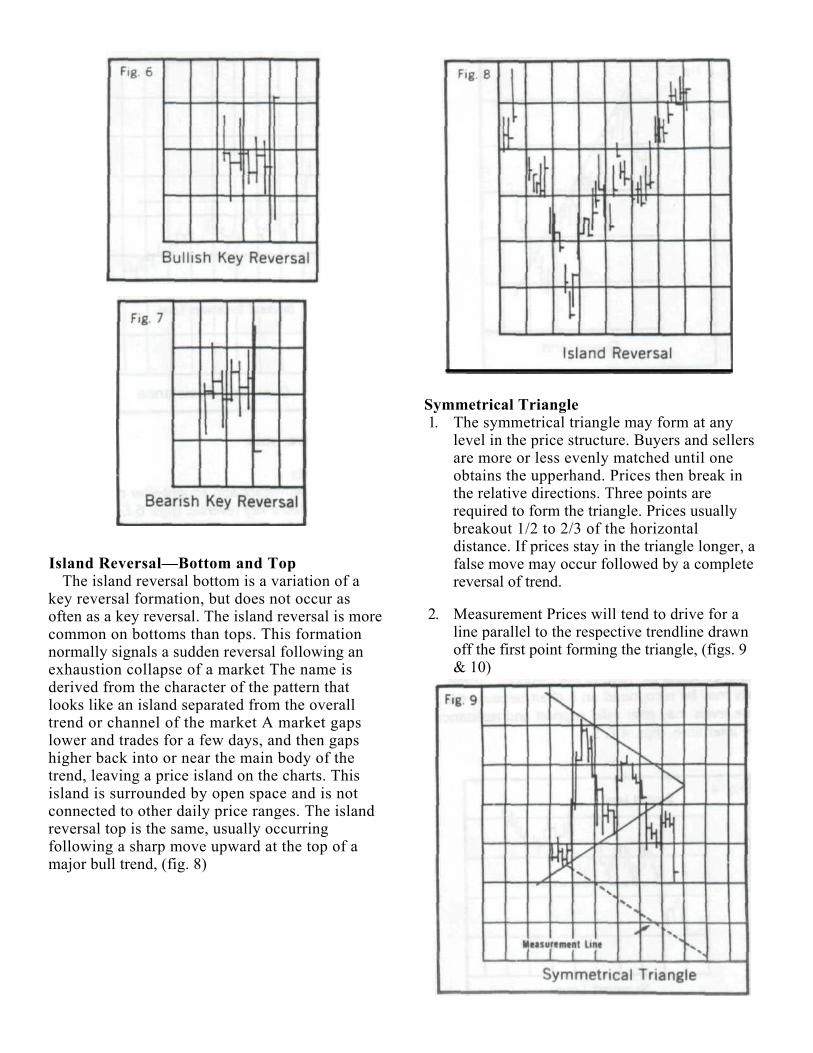
Island Reversal—Bottom and Top The island reversal bottom is a variation of a
key reversal formation, but does not occur as often as a key reversal. The island reversal is more common on bottoms than tops. This formation normally signals a sudden reversal following an exhaustion collapse of a market The name is derived from the character of the pattern that looks like an island separated from the overall trend or channel of the market A market gaps lower and trades for a few days, and then gaps higher back into or near the main body of the trend, leaving a price island on the charts. This island is surrounded by open space and is not connected to other daily price ranges. The island reversal top is the same, usually occurring following a sharp move upward at the top of a major bull trend, (fig. 8)
Symmetrical Triangle 1. The symmetrical triangle may form at any
level in the price structure. Buyers and sellers are more or less evenly matched until one obtains the upperhand. Prices then break in the relative directions. Three points are required to form the triangle. Prices usually breakout 1/2 to 2/3 of the horizontal distance. If prices stay in the triangle longer, a false move may occur followed by a complete reversal of trend.
2. Measurement Prices will tend to drive for a line parallel to the respective trendline drawn off the first point forming the triangle, (figs. 9 & 10)
Support and Resistance Levels
Support and resistance are two of the most frequently used technical tools. These levels are basically prices at which a trend may hesitate. For example, if prices are declining (in a downtrend), they may reach a relatively low level at which buyers are willing to come into the market This buying can hold prices at that level or even raise them, depending upon the strength of the demand. This level is called support.
Resistance levels are prices above the current market. When prices advance to these relatively high levels, sellers are attracted to the market This selling action may check the uptrend.
Frequently, analysts describe support and resistance levels as "hard to get through." These levels may be recognized on a chart because the same levels may offer valid support and resistance time after time. (figs. 4 & 5)
Market Reversals
Key Reversals The most significant and sought-after market
reversal is called a key reversal, (figs. 6 & 7) This formation of price action is popular because its main purpose is to assist traders in spotting changes in the direction of the trend. This technical formation is one of the few that may signal an exact top or an exact bottom of a market's trend. A simple definition of a bearish key reversal is a price of a market on a single day that trades higher than the previous day's high, a low that trades lower than the previous day's low, and a market which closes lower than the previous day's close. The bullish key reversal in a downtrending market has the exact opposite characteristics of the bearish key reversal. The day's high is higher than the previous day's high and the low is lower than the previous day's low, and finally, a close that is higher than the previous day's close. When a key reversal signal is given, it is just as any technical formation. The tops or bottoms are potential tops and bottoms until the market does actually reverse significantly in the indicated key reversal direction. A more careful approach to qualifying a key reversal is to observe the volume on the reversal signal.
The volume should increase on the day of the reversal, and in some instances, may be abnormally high.
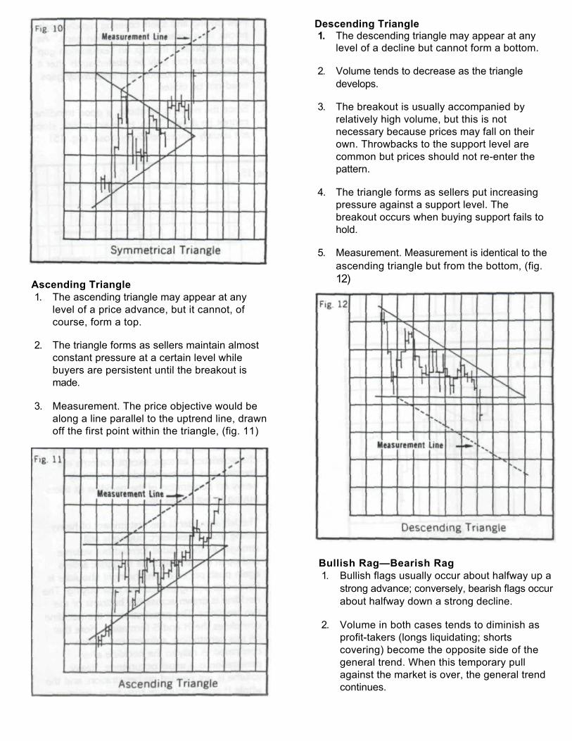
Ascending Triangle 1. The ascending triangle may appear at any
level of a price advance, but it cannot, of course, form a top.
2. The triangle forms as sellers maintain almost constant pressure at a certain level while buyers are persistent until the breakout is made.
3. Measurement. The price objective would be along a line parallel to the uptrend line, drawn off the first point within the triangle, (fig. 11)
Descending Triangle 1. The descending triangle may appear at any
level of a decline but cannot form a bottom.
2. Volume tends to decrease as the triangle develops.
3. The breakout is usually accompanied by relatively high volume, but this is not necessary because prices may fall on their own. Throwbacks to the support level are common but prices should not re-enter the pattern.
4. The triangle forms as sellers put increasing pressure against a support level. The breakout occurs when buying support fails to hold.
5. Measurement. Measurement is identical to the ascending triangle but from the bottom, (fig. 12)
Bullish Rag—Bearish Rag 1. Bullish flags usually occur about halfway up a
strong advance; conversely, bearish flags occur about halfway down a strong decline.
2. Volume in both cases tends to diminish as profit-takers (longs liquidating; shorts covering) become the opposite side of the general trend. When this temporary pull against the market is over, the general trend continues.
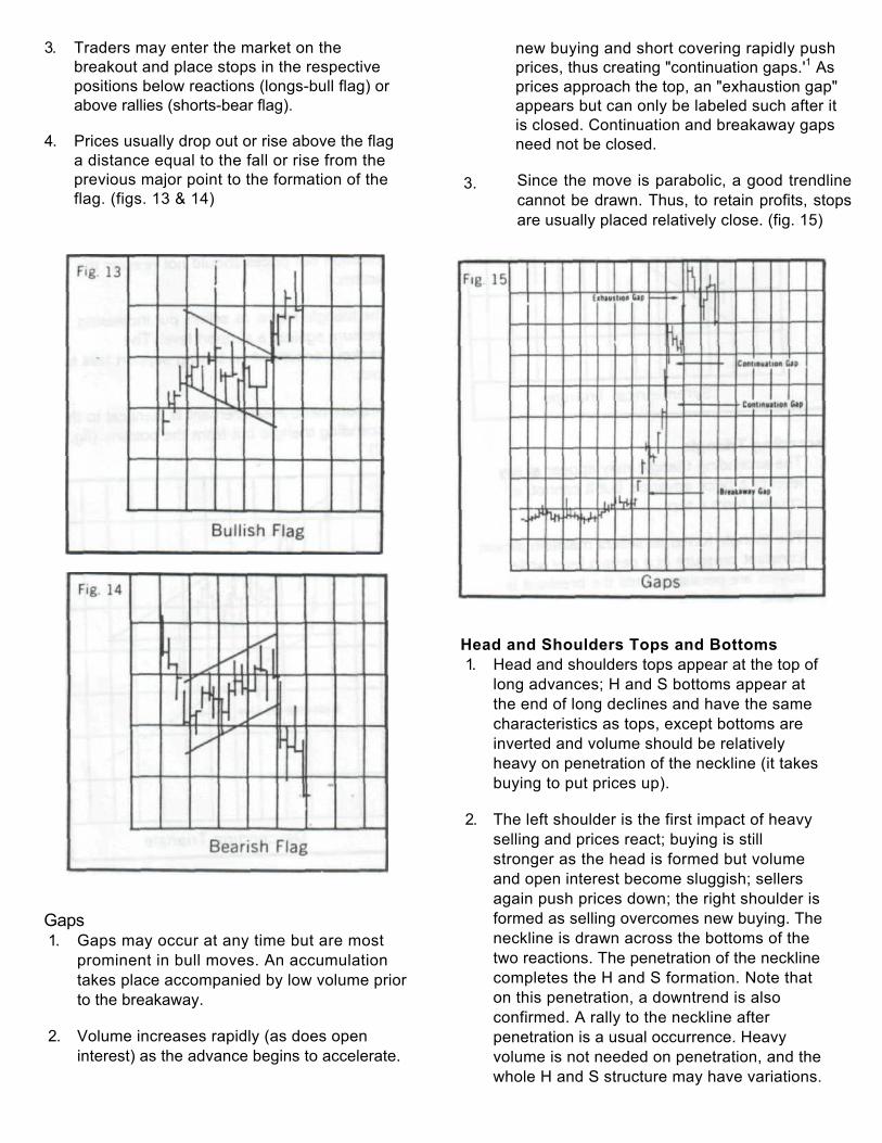
3. Traders may enter the market on the breakout and place stops in the respective positions below reactions (longs-bull flag) or above rallies (shorts-bear flag).
4. Prices usually drop out or rise above the flag a distance equal to the fall or rise from the previous major point to the formation of the flag. (figs. 13 & 14)
3.
new buying and short covering rapidly push prices, thus creating "continuation gaps.'1 As prices approach the top, an "exhaustion gap" appears but can only be labeled such after it is closed. Continuation and breakaway gaps need not be closed.
Since the move is parabolic, a good trendline cannot be drawn. Thus, to retain profits, stops are usually placed relatively close. (fig. 15)
Gaps 1. Gaps may occur at any time but are most
prominent in bull moves. An accumulation takes place accompanied by low volume prior to the breakaway.
2. Volume increases rapidly (as does open interest) as the advance begins to accelerate.
Head and Shoulders Tops and Bottoms 1. Head and shoulders tops appear at the top of
long advances; H and S bottoms appear at the end of long declines and have the same characteristics as tops, except bottoms are inverted and volume should be relatively heavy on penetration of the neckline (it takes buying to put prices up).
2. The left shoulder is the first impact of heavy selling and prices react; buying is still stronger as the head is formed but volume and open interest become sluggish; sellers again push prices down; the right shoulder is formed as selling overcomes new buying. The neckline is drawn across the bottoms of the two reactions. The penetration of the neckline completes the H and S formation. Note that on this penetration, a downtrend is also confirmed. A rally to the neckline after penetration is a usual occurrence. Heavy volume is not needed on penetration, and the whole H and S structure may have variations.
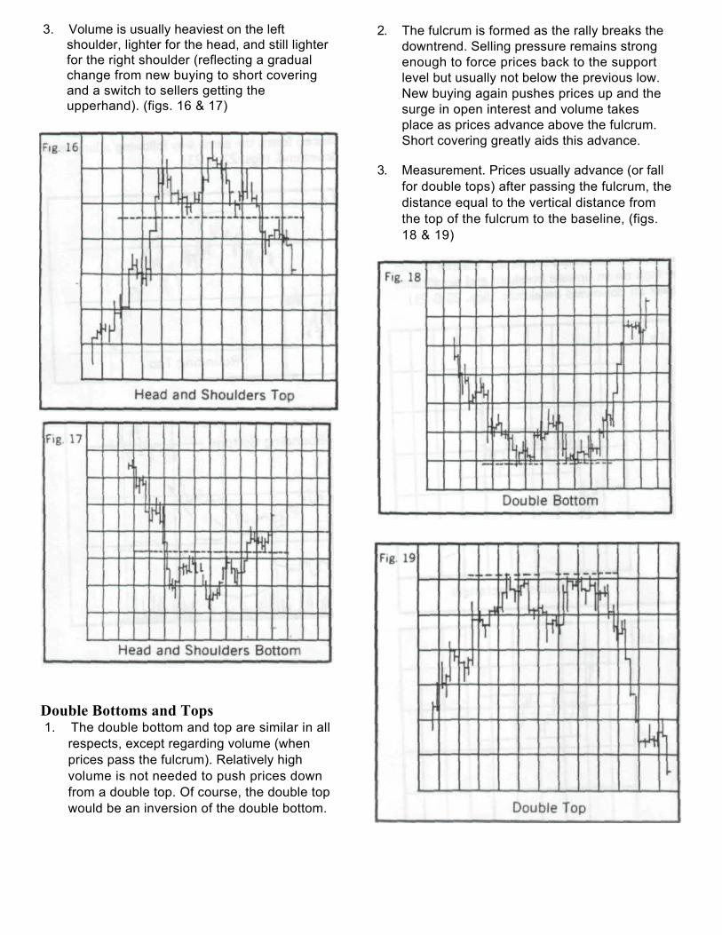
3. Volume is usually heaviest on the left shoulder, lighter for the head, and still lighter for the right shoulder (reflecting a gradual change from new buying to short covering and a switch to sellers getting the upperhand). (figs. 16 & 17)
Double Bottoms and Tops 1. The double bottom and top are similar in all
respects, except regarding volume (when prices pass the fulcrum). Relatively high volume is not needed to push prices down from a double top. Of course, the double top would be an inversion of the double bottom.
2. The fulcrum is formed as the rally breaks the downtrend. Selling pressure remains strong enough to force prices back to the support level but usually not below the previous low. New buying again pushes prices up and the surge in open interest and volume takes place as prices advance above the fulcrum. Short covering greatly aids this advance.
3. Measurement. Prices usually advance (or fall for double tops) after passing the fulcrum, the distance equal to the vertical distance from the top of the fulcrum to the baseline, (figs. 18 & 19)
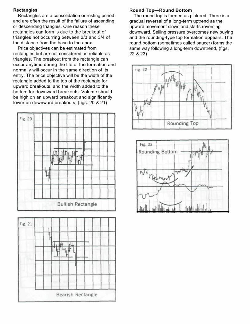
Rectangles Rectangles are a consolidation or resting period
and are often the result of the failure of ascending or descending triangles. One reason these rectangles can form is due to the breakout of triangles not occurring between 2/3 and 3/4 of the distance from the base to the apex.
Price objectives can be estimated from rectangles but are not considered as reliable as triangles. The breakout from the rectangle can occur anytime during the life of the formation and normally will occur in the same direction of its entry. The price objective will be the width of the rectangle added to the top of the rectangle for upward breakouts, and the width added to the bottom for downward breakouts. Volume should be high on an upward breakout and significantly lower on downward breakouts, (figs. 20 & 21)
Round Top—Round Bottom The round top is formed as pictured. There is a
gradual reversal of a long-term uptrend as the upward movement slows and starts reversing downward. Selling pressure overcomes new buying and the rounding-type top formation appears. The round bottom (sometimes called saucer) forms the same way following a long-term downtrend, (figs. 22 & 23)
Volume and Open Interest
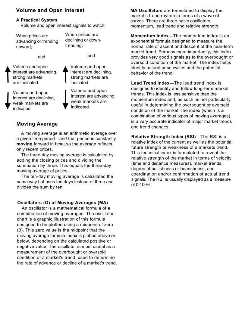
A Practical System Volume and open interest signals to watch:
When prices are advancing or trending upward;
and
Volume and open Volume and open interest are advancing, interest are declining, strong markets strong markets are are indicated. indicated.
Volume and open interest are declining, weak markets are indicated.
Moving Average
A moving average is an arithmetic average over a given time period—and that period is constantly moving forward in time, so the average reflects only recent prices.
The three-day moving average is calculated by adding the closing prices and dividing the summation by three. This equals the three-day moving average of prices.
The ten-day moving average is calculated the same way but uses ten days instead of three and divides the sum by ten.
MA Oscillators are formulated to display the market's trend rhythm in terms of a wave of curves. There are three basic oscillators: momentum, lead trend and relative strength.
Momentum Index—The momentum index is an exponential formula designed to measure the normal rate of ascent and descent of the near-term market trend. Perhaps more importantly, this index provides very good signals as to the overbought or oversold condition of the market. The index helps identify natural price cycles and the potential behavior of the trend.
Lead Trend Index—The lead trend index is designed to identify and follow long-term market trends. This index is less sensitive than the momentum index and, as such, is not particularly useful in determining the overbought or oversold condition of the market The index (which is a combination of various types of moving averages) is a very accurate indicator of major market trends and trend changes.
Relative Strength Index (RSI)—The RSI is a relative index of the current as well as the potential future strength or weakness of a markets trend. This technical index is formulated to reveal the relative strength of the market in terms of velocity (time and distance measures), market trends, degree of bullishness or bearishness, and coordination and/or confirmation of actual trend signals. The RSI is usually displayed as a measure of 0-100%.
Oscillators (O) of Moving Averages (MA) An oscillator is a mathematical formula of a
combination of moving averages. The oscillator chart is a graphic illustration of this formula designed to be plotted using a midpoint of zero (0). This zero value is the midpoint that the moving average formula index is plotted above or below, depending on the calculated positive or negative value. The oscillator is most useful as a measurement of the overbought or oversold condition of a market's trend, used to determine the rate of advance or decline of a market's trend.
When prices are declining or down-trending;
and
Volume and open interest are advancing,
weak markets are indicated.
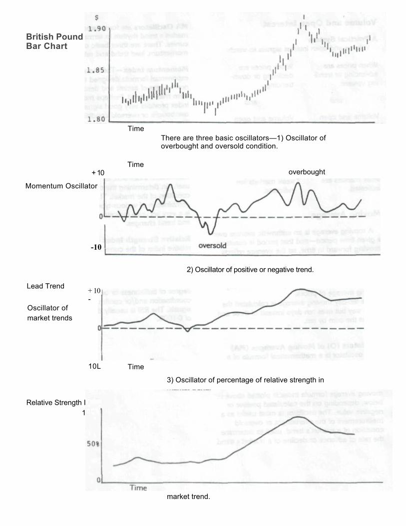
Time There are three basic oscillators—1) Oscillator of overbought and oversold condition.
+ 10
Momentum Oscillator
Time overbought
2) Oscillator of positive or negative trend.
Lead Trend
Oscillator of market trends
+ 10 -
10L Time
3) Oscillator of percentage of relative strength in
market trend.
British Pound Bar Chart
-10
Relative Strength Index 100%
Point and Figure Charting
Point and Figure Charting is popular among technicians and is probably the oldest type of charting. Point and figure analysis is one of the charting tools used in the development of good market judgment. It measures possible changes in price of a particular commodity and can be used as a timing guide for the buyer or seller, as a price movement indicator, or as a risk limiter through stops.
"Point and Figure" procedure is referred to as a method of technical analysis because it relates to market technique. It portrays all the significant intra-day market actions. The value of such charts is in the recognition of patterns which in the past have afforded reliable references.
Studies of fundamental factors which contribute to value are tremendously important to the professional market operator. Indeed, they are basic. But such statistical studies find it hard to measure professional and speculator psychology. This is a most unstable element of market forces, yet it probably carries more weight in making commodity prices at any given time than all the other market influences put together. Real values are not reflected in the market whenever investors and speculators are lacking. The matter of timing is of extreme importance and it is here that technical studies, such as Point and Figure methods, will be of inestimable value.
Point and Figure Charting—Technique Point and figure charting records a price
change unit selected for an individual commodity.
Price changes are recorded each time the price unit changes in either direction from the previous unit recorded.
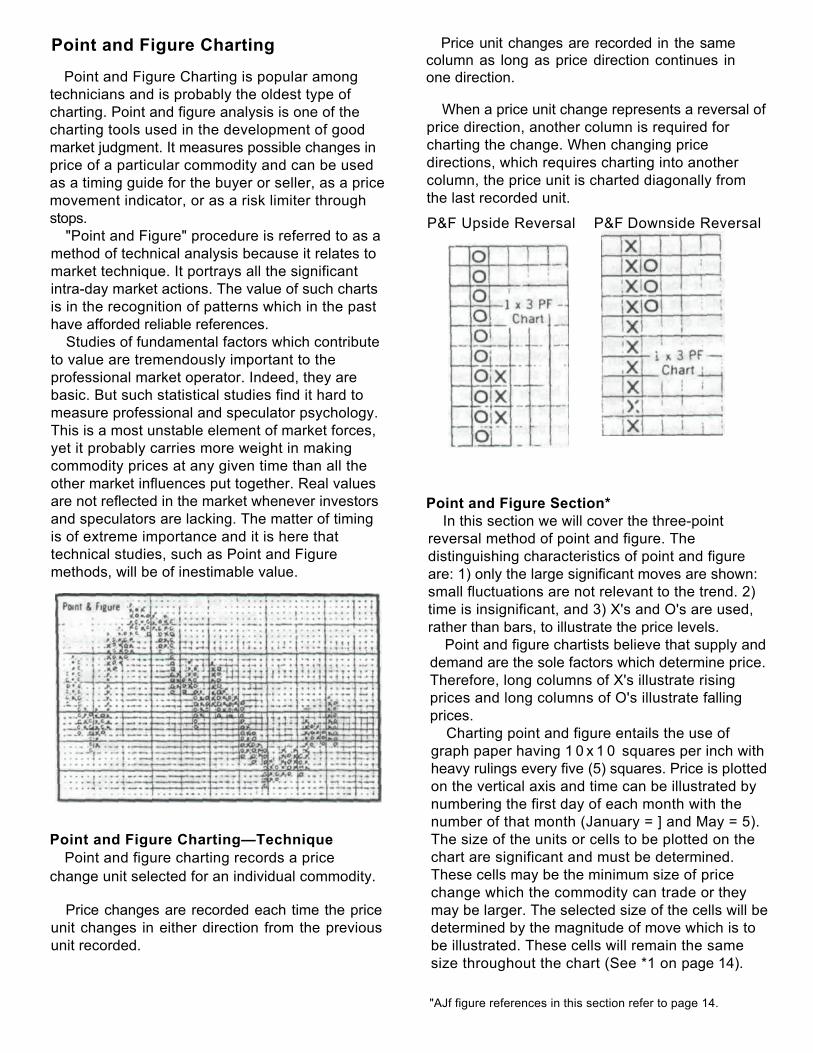
Price unit changes are recorded in the same column as long as price direction continues in one direction.
When a price unit change represents a reversal of price direction, another column is required for charting the change. When changing price directions, which requires charting into another column, the price unit is charted diagonally from the last recorded unit.
P&F Upside Reversal P&F Downside Reversal
Point and Figure Section* In this section we will cover the three-point
reversal method of point and figure. The distinguishing characteristics of point and figure are: 1) only the large significant moves are shown: small fluctuations are not relevant to the trend. 2) time is insignificant, and 3) X's and O's are used, rather than bars, to illustrate the price levels.
Point and figure chartists believe that supply and demand are the sole factors which determine price. Therefore, long columns of X's illustrate rising prices and long columns of O's illustrate falling prices.
Charting point and figure entails the use of graph paper having 1 0 x 1 0 squares per inch with heavy rulings every five (5) squares. Price is plotted on the vertical axis and time can be illustrated by numbering the first day of each month with the number of that month (January = ] and May = 5). The size of the units or cells to be plotted on the chart are significant and must be determined. These cells may be the minimum size of price change which the commodity can trade or they may be larger. The selected size of the cells will be determined by the magnitude of move which is to be illustrated. These cells will remain the same size throughout the chart (See *1 on page 14).
"AJf figure references in this section refer to page 14.
Upon selection of the size of cells to work with, we can begin plotting the chart. The daily high and low prices of the commodity are the values we need to monitor. If the trading range is more than three cells and the closing price is above the center of the trading range, enter the appropriate number of X's. If the close is below the center of the trading range, enter O's. In the instance that three (3) cells are not spanned, we would place dots in the cells within the trading range and wait until the next day to begin. These three examples are for the beginning day of charting only.
Mow that we have established the first day's entry, we need to gain an understanding of the three-box reversal method. In the bull market we will have a column of X's; thus we will watch the high of the day. Should this high surpass the previous days high by enough points to fill in one or more cells with X's, we will do so. In the case that the high of the day is not higher than the previous day's high, we will check the low for the day. When the low is more than three cells below the previous day's high, a reversal is signaled and we would place an O in the next column to the right and one cell below the highest X.
Now a bear market is indicated on the day following the reversal; the low of the day is checked to see if a new low is made. If there is a new low below the previous day's low, O's will be placed in these cells which have now been filled. The O's will continue downward until we have a three-point reversal; then the O's will be plotted as X's.
If this is the case, we will illustrate it by placing an X in the next column to the right and one cell above the lowest O. Should neither a new low nor a three-point reversal occur, there will be no new entry for that day.
Therefore, we can conclude that whether in a bull or bear market, the columns will continue in one direction until a three-point reversal occurs.
As a point and figure chartist, you will encounter various chart formations which you will need to recognize. With this method, as in every method, there are complex chart formations that will occur. It is the author's opinion that there are too many formations to cover in an introductory paper; therefore, we will concern ourselves with buy and sell signals only.
The Buy Signals (see figures on last page): 1. The Double-Top Signal, a column of X's,
followed by a column of O's, followed by a column of X's, with the third column of X's rising one cell higher than the first column of X's.
2. The Double-Top Signal with an Ascending Bottom: This formation has an identical top to the double-top formation. The bottom is different from the double-top formation in that the bottom of the most recent column of O's is above the bottom O of the previous column of O's.
3. The Breakout of a Triple-Top Signal consists of three columns of X's and two columns of O's. The first two columns of X's will end at the same price level, with the third or current column of X's rising one cell above the previous X.
4. The Ascending Triple-Top Signal is three columns of X's and two columns of O's. The tops of the X columns will be higher than the previous columns of X's. The formation will be more bullish if the bottom of the O columns is also rising.
5. The Spread Triple-Top Signal occurs with four columns of X's and three columns of O's. This is a result of the price not being able to form a breakout from a triple top. Given a little time, the price will breakout later to complete the spread triple-top formation.
6. The Upside Breakout of a Bullish Triangle Signal occurs when prices encounter a descending resistance line as well as an ascending support line. The formation is complete when the upward breakout occurs. The formation is bullish because the last signal before entering the triangle is bullish. 7. The Upside Breakout above a Bullish Resistance Line occurs when prices are rising under a bullish resistance line and prices are eventually thrust through the resistance line. 8. The Upside Breakout above a Bearish Resistance Line occurs with a resistance line at a 45° angle from left to right The signal takes place when the price breaks through the resistance line and rises one cell above the preceding X column.
The Sell Signals: The Sell Signals are simply buy signals turned
over. They are illustrated in Figures 9 through 16. There are a few pointers we can pick out from these inverse signals. The simple sell signal with a declining top is more bearish than its precursor (the simple sell signal) as a result of the declining resistance line’s pressure. As commodity traders, we will find that the simple formations of three to four columns will occur more often than the more complex signals of five or more columns. As a result, if the trader waits for the building of complex signals, he is apt to miss any opportunities to turn a profit Therefore, the commodity trader should be prepared to act on these simple signals in order to maximize profits. The common occurrence of these simple signals holds true for both the bull and bear market.
See Figures on Next Page…
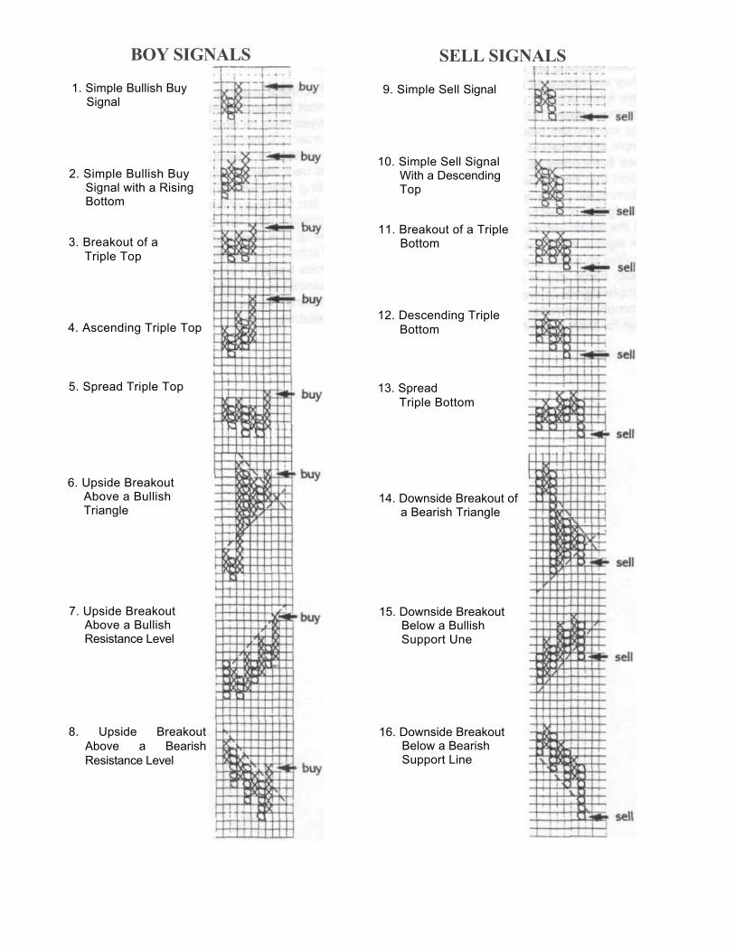
BOY SIGNALS
1. Simple Bullish Buy Signal
2. Simple Bullish Buy Signal with a Rising Bottom
3. Breakout of a Triple Top
4. Ascending Triple Top
5. Spread Triple Top
6. Upside Breakout Above a Bullish Triangle
7. Upside Breakout Above a Bullish Resistance Level
8. Upside Breakout Above a Bearish Resistance Level
SELL SIGNALS
9. Simple Sell Signal
10. Simple Sell Signal With a Descending Top
11. Breakout of a Triple Bottom
12. Descending Triple Bottom
13. Spread Triple Bottom
14. Downside Breakout of a Bearish Triangle
15. Downside Breakout Below a Bullish Support Une
16. Downside Breakout Below a Bearish Support Line
Author's Comments
Technical analysis, no matter how effective, cannot be considered as absolute. Other types of analysis may be employed to refine this research approach. Other specifics are: What is the percentage of speculative trade compared to the total trade open interest? Has the volume of trading changed significantly from the average for the last few years? Is the market moving in sympathy with other commodities? Are prices moving in a seasonal trend direction?
Technical research can be a powerful tool; a serious trader's success can be considerably enhanced by developing an unbiased technical approach that proves to have a consistent degree of reliability.
Important Disclaimers
Trading in futures, forex and/or options is volatile and extremely risky and therefore is not suitable for many members of the public. You should carefully consider whether trading is appropriate for you in light of your experience, objectives, financial resources and other relevant circumstances. This introduction of technical analysis is for information only and is not a solicitation to purchase or sell any futures contract. Zaner Group, LLC accepts no responsibility for errors, mistakes or omissions.
© Zaner Group, LLC – All rights reserved. No duplication allowed without prior written authorization. Zaner Group, LLC • 150 S. Wacker Dr, Ste 2350 • Chicago, IL 60606 • 1-800-621-1414 • www.zaner.com