Embed Size (px)
Citation preview

Department of informatics
Human Computer Interaction
Master thesis 1-year level, 15 credits
SPM 2013.XX
An Adaptable Usability Checklist for MOOCs
A usability evaluation instrument for Massive Open Online Courses
Inka Frolov Sara Johansson
Abstract
The purpose of this study was to develop a list of usability guidelines, i.e. a usability checklist, which can assist in evaluating the usability of Massive Open Online Courses (MOOCs) user interfaces. Interviews were conducted to help understand their context of use and to find design focus points for the evaluation of MOOCs interface. These design focus points were then inspected for usability issues with Jakob Nielsen’s usability inspection method - heuristic evaluation - using author’s own set of 10 usability heuristics. The study reveals two main findings. Firstly, the context of use of MOOCs differs from a regular university course in the manner of how users perceive and approach them. And secondly, the usability checklist has to be adaptable and up-to-date in order to support the constant change of context of use of MOOCs. The combination of both findings is what makes this study not just another checklist, but a valid contribution to the understanding of MOOCs and the research field in HCI.
Keywords: MOOC, usability, heuristic evaluation, adaptable checklist, user experience
(UX), user interface (UI), guidelines

1
1. Introduction
In recent years there has been an increase in the number of users participating in Massive
Open Online Courses (MOOCs). According to the New York Times, 2012 was “the year of the
MOOC”, a year when people massively started taking in MOOCs from all over the world,
reaching millions in user numbers within the course of just five years (Pappano, 2012).
Starting in 2008, Stephen Downes and George Siemens, both researches within the field of
online education, gave an online course named “Connectivism and Connective Knowledge”
(CCK08) at University of Manitoba. A pioneer course to today’s format of courses referred to
as “MOOCs” (McAulay, Stewart, Siemens and Cormier, 2010).
As for the core idea of MOOCs, it is brilliant; they are available for free to anyone, at any
time. MOOCs are neither age limited nor restricted to a specific location, they only require an
internet connection along with an e-mail or a social media account. It seems like Massive
Open Online Courses have opened a world of higher education to people who have no, or
minimal, economical resources to study at a university or college.
Today, in 2014, stories are flooding the Internet about people who have benefited or had
had a life-changing experience due to their participation in MOOCs. The following is an
example of one of the testimonies, presented in a post by a participant of a course (EdX.org,
2014).
Figure 1: Story of a participant in a course “Was Alexander Great?” at EdX.org (2014)
MOOCs’ massive popularity triggered numerous researches on investigating their value from
educational perspective. The existing research on MOOCs focuses mainly on who is taking
them rather than focusing on why they are popular, what services they provide and how
users feel about them. Furthermore, none of these studies investigate MOOCs from the
usability1 perspective and in what way design of MOOCs impacts how they are used.
The implications of usability features on online learning environments have been studied
in the past, identifying that unsatisfactory learners’ user experience has been largely
contributed to the poor design and usability issues of user interfaces (Zaharis and
Poylymenakou, 2009). So as a result, users would have to overcome the challenges in the
design rather than focus on learning the content.
Bevan and Macleod (1994) state that usability presents a “function of the context in which
the product is used” (Bevan and Macleod, 1994: p. 138). According to them evaluating
1 For an explanation of usability, see section 3. Related Research

2
usability of an interface demands understanding of the characteristics of the context of use
(who, when, where, what, how) as well as the characteristics of the online learning
environment (online application, learning tool) (Bevan and Macleod, 1994). Therefore, in
order to assess the usability aspect of an interface, designers need a tool which they can rely
on to find possible or existing issues in a design (Moore, Dickson-Deane, Galyen, Vo and
Charoentham, 2008). More specific, in the case of MOOCs, designers need a tool that
supports a user-friendly design suitable for massive number of diverse users - one of the
main characteristics of MOOCs.
Inspired by this fact, to our knowledge, there has been no such tool created for MOOCs so
far. Therefore, the purpose of this study is to develop a list of usability guidelines, i.e. a
usability checklist, that can assist in creating or evaluating the usability of MOOCs’
interfaces. The purpose will be addressed by answering the following questions:
What is a user experience of a MOOC?
How can the usability of MOOCs user interface be enhanced?
Firstly, to help us understand characteristics of MOOCs and their context of use,
qualitative interviews were conducted in order to answer the first research question and
possibly to provide some insights into the second one. Secondly, an inspection of the MOOCs
was done by usability evaluation using the same usability principles as existing tools for
online learning environments, which will be revised in this study, resulting in an answer to
the last research question.
Hopefully, the outcome of the study could also lead to enhancing the effectiveness of a
MOOC as a learning tool - and as Zaharias, Vassilopoulou and Poulymenakou (2002: p.
1056) outline it - becoming ”educationally beneficial” for its massive users.
1.1. Delimitation
We argue that there are two factors affecting the user experience of MOOCs; firstly, the
content (educational material) of the course and, secondly, its user interface. Content is
related to the field of education, whereas user interface is covered by human-computer
interaction (HCI). This study is conducted within the latter, the field of human-computer
interaction, and hence, it will not investigate the pedagogical aspect of the content. Instead it
will focus on the user interface2 (UI) in relation with the user experience3 (UX) within
MOOCs. Additionally, the study will only investigate MOOCs within the higher education.
2 In terminology for information technology the term user interface (UI) describes everything that is
designed to be interacted with a human being, ranging from a display screen or keyboard to how software or a website encourages interaction and responds to it. In a way UI brings structure to the interaction between the users and the system, presenting users with content within the context of the user interface. Development of new technologies, new applications, and constant advancement of human-computer interaction techniques are the ones that stimulate developments of interfaces in order to constantly improve users’ computing experience (Schneiderman, 1997). 3 Two decades ago the term “user experience” (UX) became popularized in the field of human-computer interaction as well as in interaction design (Hassenzahl and Tractinsky, 2006). It was and still is affiliated with a wide variety of various meanings such as usability, user interface, interaction experience/design, general experience etcetera (Forlizzi and Battarbee 2004). It deals with emotions, beliefs and mental sets of users that are invoked when they interact with an interactive system in a specific context or situation (Hoonhout, Law, Roto and Vermeeren, 2011).

3
2. Background
Although MOOCs were introduced in 2008, with a peak of users in 2012, our knowledge
about them is still at a very early stage. Making understanding of why, how and how come
the MOOCs are used and by what means they affect their users, still a big challenge. Being
such a new phenomenon, one must wonder if all this hype is generated from their substantial
contribution to the intellectual development, or if it is a result of a promise of new emerging
technology.
The phenomenon could partially be explained by Gartner’s Hype Cycle model (Linden and
Fenn, 2003), referring to its phase “Peak of Inflated Expectations”, the highest point on the
curve, where the hype around the technology is at the top and users do not, yet, consider the
usability issues of the product.
Figure 2: Gartner’s “Hype Cycle” (Janes and Succi, 2012)
Next phase is the “Trough of Disillusionment” where technology loses its status right before
entering the “Slope of Enlightenment”, a stage that we speculate is a suitable interpretation
of the present use of MOOCs.
According to Gartner’s Hype Cycle this phase is an evaluating phase, assesing and
revealing the benefits of the technology and its disadvantages, and brings information about
how it should be used together with the level of its usefulness (Janes and Succi, 2012;
Lowendahl, 2010).
Thus so far, to our knowledge, there have been few studies done in investigating the
usefulness of MOOCs. Therefore, according to Karsenti (2013) it would be careless to
speculate about the satisfaction level of user experience with them. Statistics show high
numbers of users registering for MOOCs worldwide, and Internet is buzzing with articles and
blogs referring to their educational benefits, indicating that their popularity is
unquestionable. However, the research that does exist shows that, in general, MOOCs’

4
success rate is poor, with low completion rates4 and high dropout numbers, which is
surprisingly in contradiction with their popularity and high number of users (Christensen,
Steinmetz, Alcorn, Bennett, Woods and Emanuel, 2013; Collins, 2013; Ho, Reich, Nesterko,
Seaton, Mullaney, Waldo and Chuang, 2014; Perna and Ruby, 2013).
Moreover, due to the lack of studies regarding MOOCs context of use and their usability,
neither guidelines nor a standardised way of developing and evaluating have been suggested.
That makes the user interface design a “no man’s land” where every MOOC is designed
according to its creators’5 own standards, resulting in various qualities. A MOOC or, in
general, any online course can challenge users in ways that has nothing to do with the level of
difficulty of course’s content. As a consequence, users are forced to learn how to use the
application before they can start fulfilling their educational goals.
Experiences taught us that designing a product demands a detailed understanding of its
users and the context in which the product is going to be used (Hassenzahl, 2008), which is
at outmost importance when it comes to online learning environments.
Zaharias, Vassilopoulou and Poulymenakou (2002) argue that there is a need to consider
how usability of online learning environments, or lack thereof, affects the interaction
between the users and the interface. Kop, Fournier and Mak additionally emphasize that “it
is not enough to introduce tools to create an effective learning environment, one should also
design for building of connections, collaborations between resources and people” (2011: p.
76).
Poor design results in poor usability and poor usability can have a negative impact on user
experience and even more, on their accomplishments and completions of tasks within the
MOOCs. Design that is difficult to grasp or makes users waste their time causes unnecessary
frustration and displeasure, making it complicated to use and learn, and in the end dismays
users from continuous interaction and makes them leave or give up (Bevan and Macleod,
1994).
In the use of a typical product, users keep on returning to it in order to build up their
knowledge of use - they are learning about the interface. In contrary, the interface of an
instructional learning environment must be comprehended quickly, since it is not often used
for a longer period of time (Zaharias, Vassilopoulou and Poulymenakou, 2002). As every user
interface should be developed based on the context of use, the same applies to online
learning environments. These environments should have a clear interface that is not hard to
comprehend, misleading, or cognitively tiring (Mehlenbacher, Bennett, Bird, Levy, Lucas,
Morton and Whitman, 2005).
As we have repeatedly mentioned there is lack of research regarding the context of use in
MOOCs, and to our knowledge there has been no studies done on usability of MOOCs. There
have been, however, researches on usability evaluation instruments for online learning
environments such as e-learning6 and online courses, which lead to a number of evaluation
tools, such as checklists, theoretical or practical frameworks, and guides (see section 3.2.1
Evaluation instruments for online courses and e-learning).
4 Completing a MOOC by fulfilling all the obligations
5 Developer or a designer
6 See Welsh, Wanberg, Brown and Simmering (2003), Downes (2005).

5
It is hazardous to assume that the instruments researched in those studies are also
applicable to MOOCs. But according to Moore et al. (2008), creating the instruments anew,
without making use of already existing instruments that have been tailored specifically for
related environments, would be like reinventing the wheel again. However, they are useful in
online learning environments and in order to be applicable to other types of courses, they
need to be altered accordingly (Moore, Dickson-Deane, Galyen. and Chen, 2009).
We argue that being delivered online is one of the intertwining characteristic between
online courses and MOOCS, in addition to the similarity of the notion open, as in open online
courses (see Figure 3). However, the outweighing difference - and one of our arguable
reasons to why we cannot apply the existing instruments on MOOCS - is the key notion of
MOOCs being massive. In other words, they are created to support a massive amount of
participants interacting simultaneously, what the other online courses are incapable of it.
M
O
O
C
O
O
C
O
C
Massive
Open
Online
Course
Figure 3: Overview of different concepts in online learning environments
3. Related research
The following section discusses the history and definitions of MOOCs. Moreover, it mentions
instruments for evaluating usability of user interfaces and ends with presenting four previous
studies conducted with usability heuristics on online learning environments.
3.1. Defining MOOCs
Most of the literature seem to agree that the term MOOC was coined in relation to the course
“Connectivism and Connective Knowledge” (CCK08), taught by Siemens and Downes. In his
blog entry in 2012, Downes (2012) brings further clarity to it, stating that the ideas of
MOOCs have been around for a while. It was only when their course, CCK08 - which was
offered to 24 students on campus but unexpectedly got an attendance of a couple of thousand
other students - launched, the final format came together, leading up to today’s definition of
MOOCs (Downes, 2008; Siemens, 2013). Downes furthermore argues that the key to
CCK08’s success was the interaction and distribution between the participants and teachers
on different social media platforms, enabled through the software he developed (Downes,
2008; 2012).

6
Downes’ statement (2012) about the concept being in the air in 2008 but not yet
launched, gives a better understanding to why it is hard to find specifics about the birth of
MOOCs. MOOCs are not a concept that has popped up out of nowhere, but rather has been
evolving under the surface for quite a while. This vagueness resulted in diverse definitions of
MOOCs in articles and platforms. Platforms are online web applications that offer MOOCs
from different providers, i.e. universities. As an example, MIT and Harvard offer a selection
of their courses at EdX.org7, and Stanford offers a variety of courses at Coursera8.
Massive Open Online Course in itself is not self-explanatory; what defines it as massive?
According to McAuley et al (2010) the name massive is contributed to the high enrolment
numbers. Is massive then when there are a hundred participants? Or a thousand? Ten
thousand? When Stanford offered a course on artificial intelligence the participant number
was over 160.000, whilst some courses only enrolled a handful of students (Rodriguez,
2012). According to Marques (2013) massive is defined by enrolling more participants than
there are assistants and teachers able to interact or communicate with. Educause learning
initiative (2011) states that “massive” rather refers towards the number of potential
participants than the actual size of the class. Defining a scale for massive is rather relative,
states Siemens (2013) mentioning participants’ practice to use the diversity of those high
numbers and form much smaller networks or groups.
Open indicates that it could be open as a door, without a login – or suggests that it is for
free with no demands of payment, and available to take at any time. Vollmer (2012)
emphasises that “open” refers to being “open licensed”. He cites Justin Reich who states that
the MOOCs are open in two aspects, firstly, as with “open registration”9 and secondly, that
the material and content are under a Creative Commons license and, thus, enabling others to
remix and reuse (Vollmer, 2012). Although MOOCs are mainly not openly licensed
participants can access the course’s content and participate without any costs (Siemens,
2013). Marques (2013) further clarifies by saying a lot of MOOCs today have copyrighted
material that are only available between the period of the course’s starting and the ending
dates but inaccessible until the next time they are offered. She also adds that the pioneer
MOOCs were intended to be open in a sense of Connectivism10 where the relation between
the participants were of a more open way than in traditional classrooms (Marques, 2013).
This is also what Siemens and Downes (Downes, 2008; Siemens, 2013) wanted to reflect
when creating the CCK08-course.
Online indicates that the courses are one hundred percent online and that there are no
physical meetings. We argue that it is important to specify the notion since some online
courses, particularly the ones offered at universities, often require physical meetings and are,
thus, only offered, for instance, 80% online (Allen and Seaman, 2013).
Course is usually associated with a course at university and according to McAuley et al.
(2010) MOOCs have all the similar characteristics of a traditional course, for example a
predefined timeline and weekly topics for consideration. However, they also differentiate in
other aspects such as: they are not obligatory to finish, have no formal accreditation and are 7 http://www.edx.org
8 http://www.coursera.com
9 I.e. anyone can enrol
10 See Siemens (2004), in relation to MOOCs (Clarà and Barberà, 2013)

7
generally without predefined expectations for partaking (McAuley et. al., 2010). However,
they provide the traditional course material (videos, problem sets and readings) in the spirit
of open education resources (Siemens, 2013). The open licensed content is primarily
structured and ordered, enabling the possibility of remixing the resources (Siemens, 2013;
Wikipedia, 2014c).
3.1.1. Defining a MOOC in this study
Due to numerous interpretations it is not an easy task to define MOOCs. Therefore, for the
purpose of this study, we have constructed our own definition, modifying the existing
definition by McAuley et al. (2010). In this study we define a Massive Open Online Course as:
A short course that is delivered online, no physical presence needed.
Does not have any entry requirements - it can be taken by anyone from anywhere
online.
Supports unlimited number of participants.
Has to be free of charge (although some additional fees can occur for extra material or
additional help from the lecturers or teaching assistants).
It is self-directed, self-paced or time limited (has a start and end date).
It consists of video lectures and/or readings, examinations in a form of assignments,
exams, experiments etc.
Supports interactivity among the learners through online forums or other social
media platforms in the spirit of connectivism.
Its content meets high academic standards.
Can include a Statement of Accomplishment, although it is not obligatory.
3.2. Defining usability evaluation
Usability has been one of the major topics of research throughout the years. As a result large
amounts of literature about usability principles, investigated usability aspects and identified
criteria for measuring and evaluating usability in connection to user interface design and the
context of use have been produced (Dringus and Cohen, 2005).
Usability is a widely accepted concept within the field of HCI (Green and Pearson, 2006).
It is a term coined in the 90’s by Jakob Nielsen, an acclaimed web usability expert, whose
definition of usability is one of the most commonly cited along with the ISO’s11. Nielsen
(2012) defines usability as a quality attribute that assesses how error free, memorable and
efficient user interfaces are utilized, pointing at its five quality components: learnability,
efficiency, memorability, error recovery, and satisfaction. Whereas ISO 9241-11 defines it as
“the extent to which a product can be used by specified users to achieve specified goals with
effectiveness, efficiency and satisfaction in a specified context of use” (as cited in Green and
Pearson, 2006: p. 66).
However, the difficulty with usability is to identify the characteristics of needed attributes
and features when specifying and measuring the usability due to their subjectiveness to the
context of use (Bevan and Macleod, 1994). One method for finding usability issues in user
interfaces or addressing their specifications that have not been implemented yet, is heuristic
11 The International Organisation for Standardization

8
evaluation (Nielsen and Molich, 1990; Nielsen, 1994b). As one of many usability inspection
methods heuristic evaluation is an informal method for evaluating a user interface to judge
its compliance with established usability principles (Nielsen, 1994b). It involves a small
group of evaluators that examine an interface to find any violations of those established
principles - the “heuristics” - relying on evaluators’ judgment and experience. The method
was mainly developed for evaluators with average knowledge in usability principles and low
level of expertise in usability evaluation processes (Nielsen, 1992) and according to Nielsen’s
recommendations the number of evaluators should be between three and five (Nielsen and
Molich, 1990).
Presently, one of the most frequently practiced usability principles for the heuristic
evaluation are usability heuristics, created by the same author in collaboration with Rolf
Molich in 1990 (Nielsen and Molich, 1990). The heuristics were later revised and refined by
Nielsen and the emendation developed into today’s most known set of 10 usability heuristics
for usable design (Feldstein and Neal, 2006; Nielsen, 1995), described in more detail in
Appendix 1.
1. Visibility of system status 6. Recognition rather than recall
2. Match between system and the real world 7. Flexibility and efficiency of use
3. User control and freedom 8. Aesthetic and minimalist design
4. Consistency and standards 9. Help users recognize, diagnose, and recover from
errors
5. Error prevention 10. Help and documentation
Table 1: Nielsen’s (1995) set of 10 usability heuristics for design. More detailed list with
the usability heuristics and their individual descriptions can be found in the Appendix 1
While the traditional usability is mainly associated with system’s performance and its
effortless interaction, the field of user experience is the one that deals with researching and
evaluating experiences that users have through the use of a system (Hoonhout, Law, Roto
and Vermeeren, 2011). According to Hassenzahl and Tractinsky (2006) the perspective
within the field of HCI broadened its primary objectives in order to enrich the quality of life
by designing for pleasure instead of only designing for the absence of problems with the use
of a system. It widened from the traditional view that was primarily focused on task oriented
usability approaches onto user experience that was focusing on how to enhance the quality of
users’ experiences, instead of just preventing usability issues of a interactive system
(Hassenzahl and Tractinsky, 2006). The use of a system happens in a specific situation, and
this context of use impacts the user experience, however, at the same time contributes to it by
iluminating variety factors that influence its users’ experiences (Hoonhout et al., 2011).
Understanding that relation between the context and the user experience, recognizing that
user experience may change when the context changes, can facilitate in designing for a wide
variety of experiences, in a variety of contexts and for a variety of users (Hassenzahl and
Tractinsky, 2006).

9
3.2.1. Evaluation instruments for online courses and e-learning
The strategies on how to approach the usability evaluation in online learning environments
have been covered by a substantial part of the literature, resulting in many attempts of
exemplifying characteristics of usability features by dialogs principles, guidelines and
checklists, and analytic procedures (Bevan and Macleod, 1994). Additionally, many efforts
and researches have been devoted to the development of evaluation instruments for online
courses or courses in e-learning.
In 2002 Reeves, Benson, Elliott, Grant, Holschuh, Kim B., Kim, H., Lauber and Loh
(2002) investigated usability of a commercial e-learning program “GMP - Basics” designed
by a company that specializes in e-learning programs. The evaluation of the program was
based on a modified version of Nielsen’s 10 usability heuristics. Concluding that the method
was not ample enough to inspect e-learning programs, they created their own checklist with a
set of 15 points (Reeves et al., 2002).
In 2005 Dringus and Cohen (2005) created an adaptable usability checklist for evaluating
usability of online courses. The checklist was used to evaluate usability of “WebCT”, a LRM
system, from both, students’ and faculty member’s perspective. It contains 13 heuristic
categories based on Nielsen’s heuristics and is considered, by the authors, as an onset of an
extended list of usability guidelines for online learning environments (Dringus and Cohen,
2005).
In the same year Mehlenbacher et al. (2005) presented their own set of categorical
questions for evaluating e-learning environments. One of their hypothesis was that the
traditional terminology in usability could be widened and introduced into context of e-
learning by understanding their correlation. Authors developed their usability instrument as
an assisting tool for researchers and developers in order to recognize the usability issues of e-
learning environments. Method used in their study was also heuristic evaluation, based on
Nielsen’s heuristics.
The same method was also employed by Ssemugabi and De Villiers (2007) who developed
the framework for evaluation of web-based e-learning applications in 2007. Their aim was to
narrow the gap between the fields of HCI and educational computing. Prior to creating the
list they conducted a literature study focusing on three categories; web-specific design,
general interface design and instructional design where each contained principles relating to
aspects of usability and learning (Ssemugabi and De Villiers 2007). The research resulted in
a list of 20 heuristics which were, according to the authors (Ssemugabi and De Villiers,
2007), successfully used to evaluate an online course.

10
4. Methodology
Figure 4: Demonstration of the connection between methods used in the study, addressing
the RQ1: “What is a user experience of a MOOC?”, and RQ2: “How can the usability of
MOOCs user interface be enhanced?”
Three methods were used in this study; interviews, surveys, and heuristic evaluation.
The purpose of the interviews was to gain insights in understanding the context and
provide supplementary information about the user experience with MOOCs. They were
complemented by surveys, conducted by the authors, in order to gather basic demographic
data about the participants.
The purpose of heuristic evaluation was to find usability issues within existing platforms
for MOOCs in order to create an usability checklist specifically for MOOCs. The evaluation
process was performed in compliance with the heuristic evaluation protocol (Nielsen, 1992;
1994a; 1994b) but was modified and refined by the authors of this study. The modifications
involved having lower number of evaluators than in Nielsen’s recommendations and the
overall goal was not to produce a list of recommended improvements that could solve
usability problems found. Instead to create a usability evaluation checklist for MOOCs
constructed as an instrument in order to assist in discovering usability issues in platforms’
and MOOCs user interfaces. During the evaluation the authors focused only on a specific part
of the user interface at a time. Focus points for the evaluation of MOOCs’ user interface
design were addressed by implementing 10 design usability heuristic principles established
by Jakob Nielsen (1995).
Primarily, the interviews were considered to be implemented as a complementary method
to the heuristic evaluation in order to understand how usability issues influence the use of
MOOCS and cause changes in users’ behaviour. Similarities between usability issues, that
were found, and gained insights from the participants would then provide the basis for the
structure of the usability checklist for MOOCs. Consequently, the evaluation of platforms was
meant to be done parallel to the interviews or even prior to them.
However, after conducting the evaluation of the first platform it became evident that the
evaluation will have to be utilized differently. Due to the magnitude of the evaluation process
11
and MOOCs’ extensive structure, the evaluation focused only on design points and defined
tasks instead of focusing on the whole user interface. These design points and tasks were
defined based on the data gathered in the interviews.
4.1. Interviews
4.1.1. Interview participants
When recruiting the participants for the interviews the distinction between an online
course or a MOOC was not made. The level of experience with MOOCs was not important,
although it was mandatory that the interviewee had participated at least once in a MOOC
whereas the date of their participation or the number of MOOCs taken did not play a role.
A majority of the participants were acquaintances of either one or both authors which
could have had an impact on the formality of the interview process. Nevertheless, a formal
relationship between the interviewee and interviewers was maintained throughout the whole
interview process, while at the same time inspiring a relaxed atmosphere and a feeling of
familiarity which may have encouraged the participants to be more forthcoming and open to
participate in the communication.
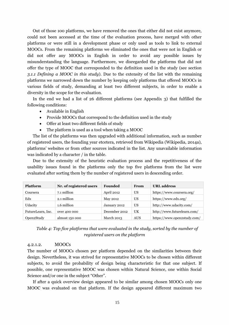
There were seven interview participants within age range between 21 – 40, where only two
are over 30. They all have a higher education, whereas one of the participants is currently in
the process of acquiring a Bachelor degree. Six participants are students, out of which one is
an undergraduate student, and one is currently unemployed.
Four subjects were taking MOOCs at the time of the interviews.
Participant Current
occupation Age (in years)
Level of education Currently taking a MOOC
Nr. of MOOCs taken
Platforms
Rank of overall
experience of taking online
courses (1-6)?
A Graduate student
21-30 Bachelor's degree No > 8 Coursera, Khan Academy
5
B Student 21-30 High school / Gymnasium
No > 8 Coursera, EdX, Khan Academy, Udemy
6
C Graduate student
21-30 Bachelor's degree Yes > 8 Coursera, EdX 5
D Graduate student
21-30 Master's degree Yes < 3 Coursera, Open Learning
4
E Graduate student
21-30 Bachelor's degree No > 8 Coursera 5
F Graduate student
31-40 Master's degree Yes < 3 Coursera, Udacity 1
G Unemployed 31-40 Bachelor's degree Yes > 8 Coursera, EdX, Open2Study
6
Table 2: A table overview of the participants
Surveys were used as a complementary method to gather basic demographic data about the
participants, thus avoiding unnecessary length of the interviews and to get an overview of the
participants’ use of MOOCs. Additionally, the results from the survey offered an
understanding about the level of participant’s experience and facilitated the preparation for
the personal interview. They enabled the interviewer to get acquainted with the extent of

12
participants’ use of MOOCs prior to the interview and to understand how familiar with
MOOCs the interviewee actually was.
The survey consisted of 13 questions structured as multiple choice, or as open questions.
“How many MOOCs have you taken?” is an example of a multiple choice, whereas question
“What is your occupation?” represents an open question. Some of the questions were
mandatory so the participants could not submit the survey until all they were answered.
Although common practice for conducting the surveys is to offer the participants the
possibility of staying anonymous, in this study they were asked to state their name in the
survey in order to indicate which data corresponds to whom. Therefore, names of
participants are known only to the authors.
4.1.2. The structure of the interview
According to Gillham, Ritchie & Lewis, when in a qualitative research study “depth of
meaning is important and the research is primarily focused in gaining insight and
understanding” (as cited in Newton, 2010: p. 1). Semi-structured interview method should be
applied to gain the data that is aimed towards, especially in a situation where the outcome of
the interviews is somewhat unknown to the researches due to lack of studies done about the
subject. Therefore, all interviews were semi-structured maintaining a fixed format and the
order of the questions throughout all the interviews.
All interview questions were always complemented with follow-up questions, which’s
content depended on what the participant answered, and we argue that the study benefited
relevant data from this format, with the following demonstration:
Figure 5: An extract from an interview with “A” on 24.4.2014
Due to using a survey as an additional instrument to the interviews, short complementary
questions were asked to get a more detailed description of the reasoning behind participant’s
choice of an answer.
4.1.2.1. Interview process
A free survey online application was used and filled out online by a participant prior to
partaking in an interview. The participants were able to access the survey by an URL address
and with an internet access. They received the URL address in an e-mail that was send to
them with the explanation of why to fill out the survey and with the instructions on how to do
it.

13
Seven interviews were conducted, including a pilot interview. All were done in a quiet
environment to avoid any unwanted interruptions or noise in the audio recording of the
interview. The secluded environment also insured participant’s engagement and inspired
interviewer’s undivided attention which may have increased the usefulness of the data
recorded. Every interview was conducted in person, each a 20-30 minute session, with one or
two interviewers. The last, seventh, interview was conducted as a video call using the
application Skype to make a distance call from Sweden to Slovenia and was the only one
conducted in Slovenian language, all the others were in English.
All interviews were transcribed and translated by the interviewer into English when
needed. The translation of the interview in Slovenian language may not be literal due to the
difficulty of translating from Slovenian, however, it was strived for to preserve the meaning
and the “voice” of the interviewee in the transcript. In order to protect the anonymity of the
participants alphabet letters from A to G were used when referring to them in the study.
Prior to the start of each interview, participants were informed about the purpose of the
study and that the data gathered from will be used in a research. Additionally, they were
promised a confidentiality of the interview process and all the data gathered from it, and
reminded that their participation is voluntary. Likewise, they were informed that the
interview will be audio recorded and learned that they can stop their participation at any
time or withdraw from the study.
Six interviews were, in addition to the audio recording, also recorded with a screen
recorder. We used a MacBook Pro laptop with a voice and screen recording feature except for
the seventh interview, which was done via Skype. For the seventh interview an Asus laptop
with a Skype’s voice recording feature was used as well as the participant’s personal
computer, though recorded only with audio. Additionally, some of the interviews were at the
same time recorded by a mobile phone as a precaution in case the sound recorded by the
laptop was affected by the participant’s use of the computer to the point that the
conversation would be incomprehensible.
Furthermore, the same laptop that was used to record the interviews, was offered to be
used at any time participants would express a need to show something instead of describing
it during the interview. At the same time it was also explained that the demonstration will be
screen recorded. The only exception was the Skype interview where the participant did not
have access to the laptop so a demonstration was not possible. Participants were all asked for
a verbal consent and reassured that all the data gathered is confidential and will only be used
in the study. It was also offered to approve the data before the study’s official publication. All
participants declined the offer.
After the pilot interview the questions in the interview guide were significantly altered and
rewritten in order to become more comprehensive. It seemed the questions were awkward
and the participant struggled with the flow of the interview. While trying to answer as openly
as possible the aim of the answer became blurred and unfocused. Once the changes in the
interview guide were implemented, the flow of the interview became smoother and
participants much more motivated and creative with their answers. The interview guide can
be found in the Appendix 2.

14
By implementing different follow-ups, depending on the direction of the interview, the
flow of the interview maintained undisrupted. Therefore, the message of the interview
became clear and sometimes even explained in more detail due to the follow-up. The
transcripts of the interviews were done within of few days from the time of the interview.
4.2. Heuristic evaluation
Evaluation process of five platforms was conducted within a period of three days, starting
with the pilot evaluation during which a number of weaknesses were discovered within the
scope of evaluation. The discovery implied the need to identify evaluation’s focus points in
order to specify the scope of evaluation more clearly. As a result, the evaluation process of the
remaining four platforms was focused on the design points and defined tasks, identified from
the interviews, as presented below:
A task of Taking the MOOC E.g. Searching, browsing, filtering
Course headings
Course interface
Course information page (enrolment)
Notifications & messages E.g. Received e-mails
Received feedback
Manipulation and organization of MOOCs E.g. Course dashboard
Wishlist
Course structure E.g. Course’s landing page (introduction, news updates,
syllabus …)
The layout of the course
Course information (deadlines, progress …)
Course material E.g. Lectures (video lectures, readings …)
Examination (assignments, experiments …)
Discussion E.g. Forum within the course
Other social media platforms (Facebook, Twitter …)
Office hours
Table 3: List of the design focus points and tasks
4.2.1. Limiting the evaluation pool/scope
4.2.1.1. MOOC platforms
There is no effective way of exactly knowing how many platforms are offering MOOCs on the
Web since there has not been any statistical research done about it. Therefore, we decided to
search the Internet for any websites that would offer a list of platforms available anywhere in
the world. During this search we came across two major websites, www.MOOCs.co that
publishes one of the leading online global directory of MOOCs platforms worldwide (MOOCs
Directory, 2014), and www.MOOC-list.com that provides an aggregator MOOCs from
different platforms (MOOC List, 2014). Putting the data from both directories together
resulted in a list with over 100 different platforms from all over the world.
15
Out of those 100 platforms, we have removed the ones that either did not exist anymore,
could not been accessed at the time of the evaluation process, have merged with other
platforms or were still in a development phase or only used as tools to link to external
MOOCs. From the remaining platforms we eliminated the ones that were not in English or
did not offer any MOOCs in English in order to avoid any possible issues by
misunderstanding the language. Furthermore, we disregarded the platforms that did not
offer the type of MOOC that corresponded to the definition used in the study (see section
3.1.1 Defining a MOOC in this study). Due to the extensity of the list with the remaining
platforms we narrowed down the number by keeping only platforms that offered MOOCs in
various fields of study, demanding at least two different subjects, in order to enable a
diversity in the scope for the evaluation.
In the end we had a list of 26 different platforms (see Appendix 3) that fulfilled the
following conditions:
Available in English
Provide MOOCs that correspond to the definition used in the study
Offer at least two different fields of study
The platform is used as a tool when taking a MOOC
The list of the platforms was then upgraded with additional information, such as number
of registered users, the founding year etcetera, retrieved from Wikipedia (Wikipedia, 2014a),
platforms’ websites or from other sources indicated in the list. Any unavailable information
was indicated by a character / in the table.
Due to the extensity of the heuristic evaluation process and the repetitiveness of the
usability issues found in the platforms only the top five platforms from the list were
evaluated after sorting them by the number of registered users in descending order.
Platform Nr. of registered users Founded From URL address
Coursera 7.1 million April 2012 US https://www.coursera.org/
Edx 2.1 million May 2012 US https://www.edx.org/
Udacity 1.6 million January 2012 US http://www.udacity.com/
FutureLearn, Inc. over 400 000 December 2012 UK http://www.futurelearn.com/
Open2Study almost 150 000 March 2013 AUS https://www.open2study.com/
Table 4: Top five platforms that were evaluated in the study, sorted by the number of
registered users on the platform
4.2.1.2. MOOCs
The number of MOOCs chosen per platform depended on the similarities between their
design. Nevertheless, it was strived for representative MOOCs to be chosen within different
subjects, to avoid the probability of design being characteristic for that one subject. If
possible, one representative MOOC was chosen within Natural Science, one within Social
Science and/or one in the subject “Other”.
If after a quick overview design appeared to be similar among chosen MOOCs only one
MOOC was evaluated on that platform. If the design appeared different maximum two

16
MOOCs per platform were evaluated. Which MOOCs were chosen to be evaluated depended
also on their availability at the time of evaluation and finally on authors’ personal choice.
4.2.2. Evaluation process
Every evaluation was done individually by each evaluator (authors of the study) with a
novice12 level of usability experience, evaluating one platform at the time. Each platform
required user registration in order to get access to MOOC’s content. Registration was
available with a valid Facebook or email account (some also offered other social media
connections) or a valid site’s username and password. For that purpose a Gmail account was
created in order to use its data in the mandatory platform’s registration process.
All platforms were evaluated online on a personal computer in the department of
Informatics’ computer lab at Umeå University. The evaluation process was done in different
web browsers. The choice of a browser depended on the access to a computer at the time of
the evaluation. The browsers used in the evaluation process were Google Chrome v. 34,
Mozilla Firefox 25.0.1 and Safari v. 6.1.3. Additionally, some of the evaluation stages were
also done in Internet Explorer 11 due to gathered information from the interviewees about
experiencing some technical difficulties and known compatibility issues (Wikipedia, 2014b)
with its rendering of web applications.
Evaluation of all the platforms was conducted from the user’s point of view, following the
path that was assumed a typical learner would follow when taking a MOOC. Each evaluation
cycle lasted approximately one hour per MOOC and was done twice on each platform. Any
found usability issue was written down in a notepad. When all the areas were evaluated the
notes were discussed by both evaluators and categorized with Nielsens (1995) 10 heuristics, ,
see section 3.2 Defining usability evaluation.
The whole process was repeated for every platform. Each new usability issue that was
found was discussed and added to the existing categorized list. During the evaluation process
the vagueness of Nielsen’s explanations of what exactly the 10 heuristics cover evolved into a
problem. Separation of what is considered to be a usability issue of a MOOC, and what is just
a result of a poor web design by disregarding the compliance with standard web usability
guidelines (Leavitt and Shneiderman, 2006; Usability.gov, 2014) and accessibility guidelines
(WCAG 2.0., 2008) had to be defined by authors. Therefore, it was decided to consider only
the usability issues specific for the MOOCs and disregard any design issues derived from
neglecting to comply with those web usability guidelines. Those issues were overlooked as
long as they did not cause major usability problems with the MOOC that would correspond to
a severity rating of level 3 or 413 on Nielsen’s rating scale for usability problems (Nielsen,
1993). I.e. a problem that affects the users’ interaction with the MOOC. The rate of severity
of a usability problem was determined by the evaluator.
All in all, design features that were considered in this study were
searching/browsing/filtering, interface of a course, notifications and feedback for users,
12
A novice evaluator has some knowledge of usability principles but is not a usability specialist and
has no usability expertise (Nielsen, 1992). 13
Level 3 indicated that the usability problem would be important to fix and of high priority, whereas
level 4 applied to problems that made a successful interaction with the MOOC almost impossible, and therefore, would be imperative to fix (Nielsen, 1993).

17
structure of a course and it navigability and so on. Whereas other numerous features were
left to future studies and evaluations.
4.3. The analysis process
The affinity diagram method (Courage and Baxter, 2005) was used to analyze and sort the
large amount of gathered data. Both the transcripts and the evaluation notes were analyzed
using a color coding technique with highlighting pens and Post-It notes marking any relevant
information to the purpose of the study. The video data was analyzed together with the
interview data and the transcripts.
Figure 6: Colour coding of gathered data with markers and Different colour Post-it
notes
Afterwards, a comparative analysis was done with four existing usability heuristics lists for
online or e-learning courses. The evaluation criteria for web-based learning (Ssemugabi and
De Villiers, 2007) consisted of too generalized guidelines and referred to web usability
guidelines, resulting in a list that could be applicable to any online environment.
Furthermore, the set of heuristics for evaluation of an e-learning program created in 2002
(Reeves et al., 2002) proved to be out-dated in regards to 21st century technology and its use.
The two checklists were developed for online learning environments, hence, for the purpose
of evaluating MOOCs users interface the two checklists were discarded as obsolete.
Therefore, a comparative analysis of the data from the diagramming was done with an
adaptable usability heuristic checklist for online courses by Dringus and Cohen (2005) and a
set of usability heuristics for e-learning design by Mehlenbacher et al. (2005).

18
Figure 7: Combined results from the data gathered from the interviews and heuristic
evaluation (colour coded)
Figure 8: Checklist guidelines corresponding to the results and categorized by Nielsen's
heuristics (represented here is N5: Error prevention)
4.4. Pre-understanding
The level of experience in usability of the authors as evaluators was at the level of a novice,
with basic knowledge about usability and heuristic evaluation, prior to the study. However,
as students in the HCI-field we have the competencies to design usable interfaces, which we
backup with experiences within the field of pedagogy. One of the authors has a background
in Computer Science and Math as a teacher and developer and the other has a bachelor as a
Behavioural Scientist with IT-environments and extensive experience in IT support.
The authors had also dissimilar experiences in taking the MOOCs; one had never
participated in them at all, whilst the other was participating in them at the time of
conducting this study but has not participated in them in the past. We argue that this fact has
contributed to the study since evaluation of MOOCs has been conducted from two different
perspectives.

19
5. Results
Results from both the evaluation and the interviews indicate that there is a need for a new
evaluation instrument designed specifically for MOOCs. Due to the large quantity of data that
was gathered in this study, the data was analyzed from two perspectives:
Context of use in MOOCs in relation to the interviews
Usability of MOOCs in relation to heuristic evaluation
Results from both perspectives are described in the following section.
5.1. Context of use in MOOCs
As already stated in section 4. Methodology, answers from the participants about user
interface of MOOCs, or any kind of interaction with the interface, were used to identify
design focus points in the design interface of MOOCs. The same data also defined the tasks
that were, in addition to the design points, used for the evaluation process of the platforms.
The design points and defined tasks can be found in section 4.2 Heuristic evaluation.
Results show user experience with MOOCs as very satisfactory. Most of the participants
marked their overall experience of taking online courses as good, two out of seven ranked it
with the highest rank (excellent), and only one participant ranked it as poor.
In contrary to the satisfactory user experience, the interaction with the user interface was
not as praised. The interaction aided participants to achieve their goals, however, the
easiness of the activities depended on a platform that offered the MOOCs participants
partook in.
Despite the small number of participants they reveal a variety of descriptions of their
context of use of MOOCs. As already stated in the study, MOOCs differ in the aspect of being
massive, but mostly, from the results gained in the interviews, the pattern of use appears to
be very different in comparison to other online learning environments. Based on the answers
from the participants the following three common characteristics of context of use have been
identified:
It’s a course but it is not the learning that is the main objective
Experience of freedom when interacting with the MOOCs
Overall interaction is based on interest
5.1.1. Learning as a secondary objective
In contrary to the online learning and e-learning, where participation is defined by the wish
to learn to receive a confirmation of the knowledge gained, participation in MOOCs is mostly
motivated by fun and enjoyment. The majority of participants describe the notion of taking
MOOCs as having fun; it is supposed to be entertaining, primarily, to be interesting. It’s
about social interaction, about fulfilling their interest, gaining new experiences and skills or
simply improving them. Three participants have compared taking MOOCs to having a hobby,
whereas most of them describe them as being a suitable way to pass the (free) time.
“[…] I enjoy spending my free time doing this [MOOCs]” (Interview with “C” on
25.4.2014)

20
“I think it’s like reading a book but in an interactive way. [...] The same
motivation.” (Interview with “B” on 25.4.2014)
5.1.2. The experience of freedom interacting with MOOCs
To all participants taking a MOOC signifies having freedom of deciding when to take them,
how to take them and whether or not they want to complete them at all. Six out of seven
comment on possibilities of simply rejecting the participation even though they have already
enrolled in the course or leaving the course behind without having or wanting to un-enroll or
unregister.
“Probably that I can do them at my own speed and in my own time. Having the
flexibility of it is really nice. […] But if I don’t want to I don’t have to. That’s
probably the best part, it’s like whenever I want to.” (Interview with “C” on
25.4.2014)
“[...] if I don’t un-enrol I still have access to the course material after the course
is finished.” (Interview with “B” on 25.4.2014)
Participants also approach MOOCs differently. Some respond to the concept as a course;
i.e. first watching all the lectures and then taking related exams, whilst others use it as an
interactive textbook, selectively browsing the content.
“[...]I use them for either specific lectures [...] I might just sit down and
occasionally watch a lecture or two very random and half passively not really
trying to learn something specific. [...] There have only been a couple of classes
that I actually do the exercises and the exams.” (Interview with “C” on
25.4.2014)
5.1.3. Pure interest as a base for interaction
Same attitude of freedom as towards the experience of taking a MOOC was also
demonstrated towards the completion of the course. The need to complete a course was
expressed only by one participant in order to obtain proof of gained knowledge. Since the
MOOCs are free, and in a sense non obligatory, the motivation to take them, as well as the
decision to complete them, is primarily based on interest rather than achieving a
confirmation of their knowledge.
“[...] it feels kind of good to have something to show for that you actually
finished but it’s mostly for myself so that I felt that I did it, basically [...] what
motivates me is that you can partake of it in any way that you please, you can
distribute the time yourself and do it whenever you feel like it or not complete it
because you don’t have to [...].” (Interview with “A” on 24.4.2014)
No matter how many various way participants have described the interaction with the
interface, and no matter what kind of goals they wished to achieve, the appeal of MOOCs
was, in all cases, based on pure interest of the participant. Meaning that the motivation to

21
take MOOCs is very different from the motivation behind the participation in a “real course”,
for example grading, choice of a course, etcetera.
5.2. Usability of MOOCs
Results obtained from the heuristic evaluation showed several usability issues that were
identified within the context of use of MOOCs and, therefore, can be perceived as being
specific for MOOCs learning environment. Other sets of issues were identified as violations of
guidelines that are recognized as web usability guidelines (Leavitt and Shneiderman, 2006;
Usability.gov, 2014) explicit for web environments and, hence, were not induced by
characteristics of MOOCs. The results also revealed inadequateness of reviewed checklists in
addressing some of the usability issues that were found during the evaluation.
Correspondingly to those findings, grounds for guidelines that address the usability issues
of MOOCs were divided into three categorizations;
(1) the existing checklists do not address MOOCs’ characteristics sufficiently,
(2) guidelines in the existing checklists are redundant due to the existence of web usability
guidelines, and lastly,
(3) existing checklists consist of irrelevant guidelines that do not address any of usability
issues.
5.2.1. Usability issues induced by MOOCs’ characteristics
Context of use revealed that interactivity between participants in the MOOCs is conducted
through the forums and other external social media platforms. This phenomenon of sharing
through social media did not exist prior to 2006 (Boyd and Ellison, 2007), hence, the
existing checklists do not address any usability issues triggered by this phenomenon.
Discovered usability issues relate to representations of the social media platforms,
addressing the use of recognizable icons and the way how a feedback is offered about the
consequences of the actions behind the icons (see Figure 9).
Figure 9: Top left image triggers issues with the recognizability of the icons, but offers a
good feedback about their actions using the word “Share”. Top right image represents quite
the opposite. Bottom left image gives understandable feedback, however, is too cluttered

22
and, therefore, somewhat confusing. Bottom left image is a better representation of the
feedback of the actions and the use of recognized icons.
Furthermore, users’ approach to the examinations requires immediate and clear feedback in
order to support the good user experience. Figure 10 shows a design of an assignment that
triggers usability issues regarding the clarity of the feedback. Blank input field (1) does not
provide information about what user entered as an answer. Field (2) is suppose to provide
feedback about the correctness of the answer, but remains blank so users cannot extract any
information from it. Lastly, (3) the correct answer is provided, however, users do not get any
additional information related to their answer.
Figure 10: Usability issues in feedback from a question in an assignment
Design in the Figure 11 is much more transparent since it (1) shows what answer was entered,
(2) gives prominent feedback about the correctness of the answer, and additionally, (3)
provides a deeper explanation in direct response to the answer.
Figure 11: Suitable feedback from a question in an assignment, causes no usability issues
5.2.2. Disregard of recognized web usability guidelines
As it was already stated in section 4.2.2 Evaluation process usability issues that violated
recognized web usability guidelines were not addressed in the evaluation except if they had
prominent impact on usability of the interface.
The results of the evaluation showed two major usability issues that were caused by the
disregard of the web usability guidelines, consistency (see Figure 12) and learnability (see
Figure 13).

23
Figure 12: Image displays the inconsistency in the same design where both labels refer to
the equivalent action. However, the labels differ depending where in the design a user is
located. The issue triggers unnecessary confusion and frustration from the user.
Figure 13: Label of the left button triggers multiple usability issues with understanding the
intent behind the button’s action, such as correlation between the title of the course and the
phrase “EECS149.1x”, recognizing their connection etcetera. Label on the right button
provides clear feedback about the consequences of the action (joining this free course). It
does not require any additional comprehension from the user.
5.2.3. Irrelevance of the guidelines in the existing checklists
Overall, the results revealed that several guidelines in the existing checklists were obsolete or
irrelevant to current usability issues with MOOCs.
Since the reviewed checklists were created almost a decade ago the irrelevance of the
guidelines can be attributed to the fact that the context of use has noticeably changed in the
last years (some changes were also observed in the findings on context of use in MOOCs).
Though the object of this study was not to reveal the nature of those changes, some of the
results did reveal distinctness in the context of use of MOOCs and the uniqueness of their
domain. One of the guidelines stated by Dringus and Cohen (2005) in their checklist reads:
“Does the user have to scroll beyond one screen?”. In 2006 Nielsen and Loranger (2006)
argued that this was an important usability issue to diminish since the users were not used to
scrolling at that time. However, according to a book written in 2012 by Reiss (2012)
minimizing scrolling is not necessary anymore since the context of use and the user
behaviour towards it has changed, i.e. today users do scroll.
Additionally, some of the existing guidelines addressed the usability issues explicit for the
online learning environments the checklists were created for. A guideline by Dringus and
Cohen (2005) addressed issues with the announcements, stating “Are “Announcements”
visibly presented on the course page? Are announcements current?”, resulting in guidelines’

24
inapplicability for the MOOCs since this feature does not exist in Massive Open Online
Courses. Other guidelines where discarded by the authors due to that they where developed
for another environment, hence the elements the guidelines where developed for did not
exist or had other purposes.
5.3. Usability checklist for MOOCs
All in all, based on the results from the study the adaptable usability checklist for MOOCS
has been developed (see Figure 14). The checklist is a draft version of a usability evaluation
instrument developed explicitly for evaluation of MOOCs.
Figure 14: A representative category of guidelines in the adaptable usability checklist for
MOOCs
Complete usability checklist can be found in the Appendix 4. The checklist consists of 60
issues, each faced by guidelines (with sub-guidelines) in the form of yes/no questions along
with a severity scale, which is to be used when the yes/no-tick is not applicable. The structure
is based on seven categories (“Course Outline”, “Course Material”, “Information and
Notification”, “Social Interaction and Discussion”, “Error Prevention”, “Other” and “General
Usability Guidelines”). The aim was to make a draft that is more user friendly than the
existing guidelines for online learning environments (see section 3.2.1 Evaluation
instruments for online courses and e-learning).

25
6. Reflections and limitations
During the study various limitations have been encountered. Reflections upon those as well
as different approaches that could have been taken are discussed in this section.
6.1. Interviews
Results of the study showed that the number of interviews conducted was high enough to
observe a common underlying context of use of MOOCs. The majority of participants
expressed similar views and descriptions of how they perceive and approach MOOCs. It
could be arguable whether seven participants were enough to understand the context of use
of millions of users. Nonetheless, since the object of the study was primarily to gain the
insights into how, when, why MOOCs are used to complement the method heuristic
evaluation, we argue, based on the results gained, that the number of conducted interviews
sufficed as a representative sample of MOOC users and their context of use.
However, to get a deeper understanding of the context of use of MOOCs, the number of
interviews would have to be significantly increased and the pool of participants expanded to
cover users of other nationalities, ages and perhaps education levels. Due to the fact that
MOOCs are used by millions, other methods could facilitate deeper understanding and
provide more thorough results in the study. More concretely, a quantitative method for
gathering data could be used instead of the qualitative one, constructing pointed questions
based on the insights gained from the interviews conducted in this study. Having different
participants could have introduced other characteristics of the context of use. Additionally, it
could identify other design focus points and define different tasks that would have been used
for the heuristic evaluation. In addition, according to Bevan and Macleod (1994), any change
in the context of use may have an impact on usability of an interface, therefore, altering the
usability evaluation of MOOCs.
Reflecting upon the interview process a dilemma of how to address design issues without
asking any leading questions has been present throughout the interviews. In order to avoid
being biased and remain neutral as an interviewer, i.e. not revealing one’s intent in front of a
participant, authors in the role of interviewers concentrated on not expressing any feelings or
excitement when participants answered something “of value”. In return, the participants
were only asked follow up questions, as described in section 4. Methodology.
In the interviews participants expressed good experience with MOOCs, which may be
contributed to the fact that all of them had, at some point, taken courses at Coursera (one of
the platforms). Seeing that Coursera is one of the most popular platforms with a high
number of registered users may had had a positive impact on users’ perception of the
platform. In addition, during the evaluation process the number of usability issues found
within the platform was the lowest. Thus, we assume that if participants would have instead
partaken in a less famous platform or with a poorer interface the user experience, as well as
context of use, could have been affected. Consequently, that could have influenced the base
for our design points and perhaps generated different results in the evaluation.

26
6.2. Heuristic evaluation
There are a few limitations with the heuristic evaluation method in itself; the evaluation
process does not guarantee discovery of every usability issue in an interface, and important
usability issues can sometimes be overlooked by the evaluation experts. Additionally, issues
can be sometimes identified without any suitable guideline to provide solutions for them.
Furthermore, some usability issues identified by an evaluator as important may not cause
any problems for the users of the interface and as such never bother them, but will still be
acknowledge as a usability issue (Nielsen and Molich, 1990). The latter may explain why
some of the more prominent usability issues found (e.g. navigation) in this study have not
been mentioned in the interviews at all.
Moreover, evaluating an interface always arises the question of bias and how big of an
impact the level of experience of an evaluator has on the process. When heuristic evaluation
is conducted by novice evaluators, Nielsen and Molich (1990) recommend to have a higher
number of evaluators and to execute a higher number of evaluation cycles in order to find an
acceptable amount of usability issues. Only two evaluators were conducting evaluation in this
study. However, to counteract that more than one interface was evaluated. More specifically,
five platforms were evaluated in order to affirm reliability of the study. And as it showed,
usability issues identified in the first two platforms were also found in the three latter, thus,
we argue that issues were not overseen despite the low number of evaluators and their level
of experience.
Additionally, bias of a current mindset of the evaluators may be seen as a possible element
of influence, since what is, and what is not, considered to be an issue is judged from a
personal perspective. However, due to evaluators’ attentiveness towards it it had proved to be
an element of strength in complementing each other rather than a drawback. The fact that
one of the evaluators had never taken a MOOC whilst the other was familiar with the process
proved to be a atrength as well. The different level of experience resulted in the variety of
issues that were identified by the less experienced evaluator and often overlooked by the
latter.
Due to the number of limitations of the method and potential bias of the findings other
methods for evaluating usability of the interfaces could have been more appropriate to apply.
Numerous studies have revealed that usability methods such as usability testing, cognitive
walkthroughs, think aloud, etcetera can be as efficient in identifying usability issues as
heuristic evaluation (Desurvire, Kondziela and Atwood, 1992; Jaspers, 2009), evaluating
systems with real users in actual context, revealing issues that may not have surfaced by
applying heuristic evaluation (Nielsen and Molich, 1990). According to Nielsen (1994b)
combining the methods to complement each other minimizes the probability of overlooking
usability issues. However, in order to gather applicable data that could be analyzed in
comparison to the existing evaluation instruments, methods used in this study were the same
as the ones used in those studies.
6.3. Limitations of the elimination process
Reflecting upon the elimination of the platforms altering its process might lead to an altered
list of platforms, as well as the sorting process. However, we argue that the reasons behind

27
sorting platforms according to the largest number of registered users are valid due to the fact
that those platforms have up to this point attracted the biggest number of users, making
them the most popular providers. And therefore, have most likely the biggest impact on the
perceivedness of MOOCs design, their use and people's experience with them. Additionally,
when asked about the platforms in the interviews most of the participants mentioned
platforms that are in the top tive and referring to them as the most known and probably the
best out there. That notion, we argue, is why we believe the best results from the study can be
achieved by evaluating the platforms that have the widest reach (when searching for MOOCs
they are in the top of the list with search results in Google) and the widest variety of offered
MOOCs and/or largest set of universities.
6.4. Time limitations
Due to the time limitations of the study we were not able to finish any of the MOOCs that
were evaluated. That could have impacted the number of potentially overlooked issues
during the evaluation process.
The literature research could also have resulted in more extensive number of evaluation
tools that could have been added in the compared analysis. Due to their drawbacks, such as
being conducted a decade ago and, therefore, obsolete, or providing hard to interpreted
guideline, some of the evaluation instruments could not contribute to the results of the study.
Therefore, an increased number of tools could have lead to more extensive list of guidelines.
6.5. Limitations of the checklists
According to Bevan and Macleod (1994) checklists often end up having too generalized or
hard to interpret guidelines which often results in unsatisfactory effectiveness of their
implementations. To acquire the results from the comparison analysis many interpretations
have had to be made in this study too by the evaluators. It proved to be difficult to
understand the guidelines that were expressed in general terms. Their dubious meanings
often resulted in explanations that relied solely on their interpretations and their background
knowledge. In order to avoid that kind of confusion in the developed checklist there was
special consideration given to the user friendly aspect - easy to learn and understand - of the
checklist. Following the HCI stance any guideline that was considered to be general was
broken down in sub-guidelines diminishing the need for interpretations and making the
checklist easier to comply with. Knowing that merely following the checklist does not warrant
a higher level of usability of a user interface (Bevan and Macleod, 1994), the scaffold of the
existing checklists was upgraded by added examples of violations that were found during the
evaluation process or identifying areas where an implementation of a specific guideline
would benefit the interface.

28
7. Conclusions
The concept of MOOCs is still a young phenomenon that has barely just started to develop
and evolve, seeing that year 2012 was the year of their peak. Considering that, it makes the
direction of where they are heading and how they are going to be shaped in future, is an area
that is so far little known about. And as such, arising questions - like “will the use of MOOCs
make them a new educational tool?”, “will they assist learners in higher education by
enabling an interactive way of learning?”, or “will they stay as more of an organised way of
watching YouTube lecture videos?” - that have yet to be answered.
The study conducted revealed two main conclusions about MOOCs; firstly, there is a
surprising difference in how users perceive and approach the MOOCs, and secondly, MOOCs
do need their own usability checklist. In order to become a relevant assisting tool their
checklist needs also to be adaptable and kept up-to-date.
7.1. Understanding of context of use in MOOCs
Findings of the study show that there is no established user pattern in the context of use of
MOOCs. Furthermore, there is a recognized difference between the users in how they
perceive and approach them. It has been revealed that the main motive behind taking them
is primarily based on interest rather than on “just learning”. It is fun they are seeking for in
the MOOCs. Users also stress the importance of having the feeling of control, i.e. being able
to drop out of a course, pick and choose which lectures to watch and which assignments to
do, without having to face any consequences.
7.2. The adaptable usability checklist
Results of the study showed that the context of use of MOOCs is still evolving. Due to that
and the fact that there has not been any specific user pattern established yet, it is of the
uttermost importance that the usability checklist for evaluation of MOOCs is adaptable and
kept up-to-date. The adaptability must facilitate the easiness of the alterations to the
checklist in order to fit the creators/designers/developers needs as well as the changes in
context of use that will most likely occur in the future. Therefore, it is important to
understand that the checklist presented in Appendix 4 is a draft and an idea how a usability
evaluation instrument for MOOCs could look like, based on the findings in this study.
Looking further to the future, will participants still be as forgiving in overlooking usability
issues of MOOCs in next couple of years? And if so, could that be attributed to the Hype
Cycle’s evaluation phase? Additionally, will severity of some usability issues, if left
unattended, going to influence the user experience in the future when the hype concept of
MOOCs will not be as impressive anymore?

29
8. Future research
In the following section are highlighted the important points that could be taken into account
in future research about usability of MOOCs.
8.1. Context of use - how MOOCs are used
To capture the core of how, why and when people take MOOCs more extensive research is
needed focusing specifically on the context of use. This study has only touched the surface of
the knowledge about the use of MOOCs. And since there are millions of users with different
motives participating in them every day, a more in-depth research would have been needed
to understand the use.
Findings in this study revealed that users do feel that they are involved in a course,
however, they do not approach it as such, i.e. taking a regular university course. Their main
objective is not being graded for their work, therefore, their approach is different based on
their knowledge that the consequences differ from the ones in regular high education
courses:
“[…] I know that I have deadlines for example [...] but I can skip it more easily.
[...] the consequences are different, that’s it. But yeah, of course I feel like I’m in
a course.” (Interview with “E” on 30.4.2014)
The participation in MOOCs is, as previously stated in section 7. Conclusions, more
related to interest rather than learning, which results in various ways of taking a MOOC:
“I use them for either specific lectures [...] I might just sit down and occasionally
watch a lecture or two very random and half passively not really trying to
learn something specific. [...] There have only been a couple of classes that I
actually do the exercises and the exams.” (Interview with “C” on 25.4.2014)
In order to redefine design for an online learning environment, where this context of use
would be supported, we argue that a large scale research would need to be conducted for
MOOCs. The results gained could then help to establish a user pattern, which in turn, could
help reveal motivations and appeals to why, how and when people take MOOCs. And thus,
contribute to existing knowledge on how to increase usability of MOOCs.
8.2. Usability of MOOCs
Since the evaluation instrument created within this study is a draf version and a first attempt
to make a usability evaluation tool for MOOCs, we argue that it would be beneficial for the
research to conduct a study where the instrument would be tested as an evaluation
instrument and later on evaluated, revised and adapted.
In the introduction (see section 1. Introduction) we have also voiced that, hopefully, the
evaluation instrument created within this study could assist in enhancing the MOOCs as a

30
learning tool. Hence, a research on how this instrument aids to eliminate usability issues and
with it affects on usability and the user pattern over a period of time could be conducted.

31
References
Allen I. and Seaman J. (2013). Changing Course: Ten Years of Tracking Online Education in the United States, Babson Survey Research Group, Sloan Survey Reports, The Sloan Consortium.
Bevan N. and Macleod M. (1994). Usability measurement in context, Behaviour and Information Technology 13: 132–145.
Boyd D. M. and Ellison N. B. (2007), Social Network Sites: Definition, History, and Scholarship. Journal of Computer-Mediated Communication, 13: 210–230
Christensen G., Steinmetz A., Alcorn B., Bennett A., Woods D. and Emanuel E. J. (2013). The MOOC Phenomenon: Who Takes Massive Open Online Courses and Why?. University of Pennsylvania, Available at: http://papers.ssrn.com/sol3/papers.cfm?abstract_id=2350964. (accessed 15.4.2014).
Clarà M. and Barberà, E. (2013). Learning online: massive open online courses (MOOCs), connectivism, and cultural psychology. Distance Education, 34(1), 129-136.
Collins E. D. (2013). SJSU Plus augmented online learning environment: Pilot project report. The Research and Planning Group for California Community Colleges. Available at: http://www.sjsu.edu/chemistry/People/Faculty/Collins_Research_Page/AOLE%20Report%20Final%20Version_Jan%201_2014.pdf. (accessed 20.4.2014).
Courage C. and Baxter K. (2005). Understanding Your Users: A Practical Guide to User Requirements Methods, Tools, and Techniques. Gulf Professional Publishing, Elsevier Inc. San Francisco, CA.
Desurvire H., Kondziela J. and Atwood, M. (1992). What is Gained and Lost When Using Evaluation Methods Other Than Empirical Testing (short paper version) . In: Proceedings of the ACM conference, CHI’92, collection of abstracts, pp. 125-126.
Downes S. (2005). E-learning 2.0. In: eLearn magazine.Education and Technology in Perspective. ACM Publication. Available at: http://elearnmag.acm.org/featured.cfm?aid=1104968 (accessed 13.6.2014).
Downes S. (2008) Places to go: Connectivism & Connective Knowledge. Innovate Journal of Online Education, Vol. 5, No. 1.
Downes S. (2012). The Rise of MOOCs. Available at: http://www.downes.ca/post/57911. (accessed 3.5.2014).
Dringus L.P. and Cohen M.S. (2005). An adaptable usability heuristic checklist for online courses, In: Proceedings of Frontiers in Education, 35th Annual Conference.
Educause learning initiative. (2011). 7 Things You Should Know About MOOCs . Available at: https://net.educause.edu/ir/library/pdf/ELI7078.pdf. (accessed 20.4.2014).
EdX.org. (2014). Was Alexander Great? The Life, Leadership, and Legacies of History’s Greatest Warrior. Available at: https://www.edx.org/course/wellesleyx/wellesleyx-hist229x-was-alexander-great-850#.U33D-N1AQQ8. (accessed 16.5.2014).
Feldstein M. and Neal L. (2006), Designing usable, self-paced e-learning courses: a practical guide., eLearn Magazine 2006 (8). Available at: http://elearnmag.acm.org/archive.cfm?aid=1165344. (accessed 20.4.2014).
Green D. and Pearson J. (2006). Development Of A Web Site Usability Instrument Based On ISO 9241-11. Journal Of Computer Information Systems, 47(1), pp. 66-72.
Hassenzahl M. (2008). User experience (UX): towards an experiential perspective on product quality. In: Proceedings of the 20th international Conference of the Association

32
Francophone D'interaction Homme-Machine. IHM '08, vol. 339. (2008) ACM, New York, NY, 11-15.
Hassenzahl M. and Tractinsky N. (2006). User experience-a research agenda.Behaviour & Information Technology, 25(2), 91-97.
Ho A. D., Reich J., Nesterko S., Seaton D. T., Mullaney T., Waldo J. and Chuang I. (2014). HarvardX and MITx: The first year of open online courses (HarvardX and MITx Working Paper No. 1).
Hoonhout J., Law Lai-Chong E., Roto V. and Vermeeren A.(2011). " Abstracts Collection Demarcating user experience". In: Dagstuhl Seminar Proceedings, no. 10373.
Janes A. and Succi G. (2012). The dark side of Agile software development. In: Proceedings of Onward! 2012. pp. 215-228.
Jaspers W., M. (2009). A comparison of usability methods for testing interactive health technologies: Methodological aspects and empirical evidence, International Journal of Medical Informatics, Volume 78, Issue 5, May 2009, 340-353.
Karsenti., T. (2013). The MOOC: What the research says. International Review of Technology in Higher Education, 10(2), 23-37.
Kop R., Fournier H. and Mak J.S.F. (2011). A Pedagogy of Abundance or a Pedagogy to Support Human Beings? Participant Support on Massive Open Online Courses. IRRODL, 12(7). 74–93.
Leavitt M. O. and Shneiderman B. (2006). Research-based web design & usability guidelines. US Department of Health and Human Services.
Linden A. and Fenn, J. (2003). Understanding Gartner's hype cycles. Strategic Analysis Report N R-20-1971. Gartner, Inc.
Lowendahl J. M. (2010). Hype Cycle for Education, 2010. In: Research (Gartner ed.). July 2010. Gartner.
McAulay A., Stewart B., Siemens, G. and Cormier, D. (2010). The MOOC model for digital practice. University of Prince Edward Island. Available at: http://www.elearnspace.org/Articles/MOOC_Final.pdf, (accessed 11.5.2014).
Marques J. (2013). ). What is a Massive Open Online Course Anyway? MN+R Attempts a Definition. Available at: http://moocnewsandreviews.com/what-is-a-massive-open-online-course-anyway-attempting-definition/. (accessed 15.4.2014).
Mehlenbacher B., Bennett L., Bird T., Ivey M., Lucas J., Morton J. and Whitman, L. (2005). Usable e-learning: A conceptual model for evaluation and design. In Proceedings of HCI International (Vol. 2005, p. 11th).
MOOC List. (2014). Available at: http://www.mooc-list.com. (accessed 5.4.2014).
MOOCs Directory. (2014). Available at: http://www.moocs.co. (accessed 5.4.2014).
Moore J. L., Dickson-Deane C., Galyen K. and Chen H. L. (2009). Refining an e-course usability evaluation tool. In: World Conference on Educational Multimedia, Hypermedia and Telecommunications Vol. 2009, No. 1, pp. 885-890.
Moore J. L., Dickson-Deane C., Galyen K., Vo N. and Charoentham, M. (2008) e-Learning Usability Instruments: What is being Evaluated? In: Proceedings from E-Learn 2008: Association for the Advancement of Computing in Education.
Newton N. (2010). The use of semi-structured interviews in qualitative research: strengths and weaknesses. Available at: http://academia.edu/Documents/in/Semi-Structured_Interviews. (accessed 5.4.2014).
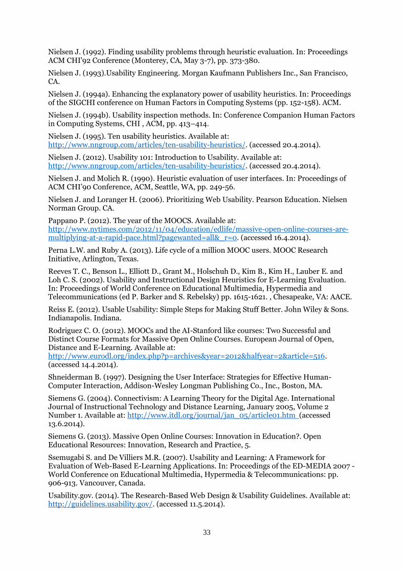
33
Nielsen J. (1992). Finding usability problems through heuristic evaluation. In: Proceedings ACM CHI'92 Conference (Monterey, CA, May 3-7), pp. 373-380.
Nielsen J. (1993).Usability Engineering. Morgan Kaufmann Publishers Inc., San Francisco, CA.
Nielsen J. (1994a). Enhancing the explanatory power of usability heuristics. In: Proceedings of the SIGCHI conference on Human Factors in Computing Systems (pp. 152-158). ACM.
Nielsen J. (1994b). Usability inspection methods. In: Conference Companion Human Factors in Computing Systems, CHI , ACM, pp. 413–414.
Nielsen J. (1995). Ten usability heuristics. Available at: http://www.nngroup.com/articles/ten-usability-heuristics/. (accessed 20.4.2014).
Nielsen J. (2012). Usability 101: Introduction to Usability. Available at: http://www.nngroup.com/articles/ten-usability-heuristics/. (accessed 20.4.2014).
Nielsen J. and Molich R. (1990). Heuristic evaluation of user interfaces. In: Proceedings of ACM CHI’90 Conference, ACM, Seattle, WA, pp. 249-56.
Nielsen J. and Loranger H. (2006). Prioritizing Web Usability. Pearson Education. Nielsen Norman Group. CA.
Pappano P. (2012). The year of the MOOCS. Available at: http://www.nytimes.com/2012/11/04/education/edlife/massive-open-online-courses-are-multiplying-at-a-rapid-pace.html?pagewanted=all&_r=0. (accessed 16.4.2014).
Perna L.W. and Ruby A. (2013). Life cycle of a million MOOC users. MOOC Research Initiative, Arlington, Texas.
Reeves T. C., Benson L., Elliott D., Grant M., Holschuh D., Kim B., Kim H., Lauber E. and Loh C. S. (2002). Usability and Instructional Design Heuristics for E-Learning Evaluation. In: Proceedings of World Conference on Educational Multimedia, Hypermedia and Telecommunications (ed P. Barker and S. Rebelsky) pp. 1615-1621. , Chesapeake, VA: AACE.
Reiss E. (2012). Usable Usability: Simple Steps for Making Stuff Better. John Wiley & Sons. Indianapolis. Indiana.
Rodriguez C. O. (2012). MOOCs and the AI-Stanford like courses: Two Successful and Distinct Course Formats for Massive Open Online Courses. European Journal of Open, Distance and E-Learning. Available at: http://www.eurodl.org/index.php?p=archives&year=2012&halfyear=2&article=516. (accessed 14.4.2014).
Shneiderman B. (1997). Designing the User Interface: Strategies for Effective Human-Computer Interaction, Addison-Wesley Longman Publishing Co., Inc., Boston, MA.
Siemens G. (2004). Connectivism: A Learning Theory for the Digital Age. International Journal of Instructional Technology and Distance Learning, January 2005, Volume 2 Number 1. Available at: http://www.itdl.org/journal/jan_05/article01.htm (accessed 13.6.2014).
Siemens G. (2013). Massive Open Online Courses: Innovation in Education?. Open Educational Resources: Innovation, Research and Practice, 5.
Ssemugabi S. and De Villiers M.R. (2007). Usability and Learning: A Framework for Evaluation of Web-Based E-Learning Applications. In: Proceedings of the ED-MEDIA 2007 - World Conference on Educational Multimedia, Hypermedia & Telecommunications: pp. 906-913. Vancouver, Canada.
Usability.gov. (2014). The Research-Based Web Design & Usability Guidelines. Available at: http://guidelines.usability.gov/. (accessed 11.5.2014).

34
Vollmer T. (2012). Keeping MOOCs open. Available at: http://creativecommons.org/tag/massive-open-online-course. (accessed 15.4.2014).
WCAG 2.0. (2008). Web Content Accessibility Guidelines. Available at: http://www.w3.org/TR/WCAG20/. (accessed 11.5.2014).
Welsh E. T., Wanberg C. R., Brown K. G. and Simmering M. J. (2003), E-learning: emerging uses, empirical results and future directions. International Journal of Training and Development, 7. pp. 245–258.
Wikipedia. (2014a). Wikipedia, the free encyclopedia. Available at: https://en.wikipedia.org/wiki/Main_Page. (accessed 10.4.2014).
Wikipedia. (2014b). Compatibility mode. Available at: http://en.wikipedia.org/wiki/Compatibility_mode (modified on 11 February 2014) (accessed 16.5.2014).
Wikipedia. (2014c). Massive open online course (MOOCs). Available at: https://en.wikipedia.org/wiki/MOOCs (modified on 31 May 2014). (accessed 2.4.2014
Zaharias P. and Poylymenakou A. (2009) Developing a Usability Evaluation Method for e-Learning Applications: Beyond Functional Usability, International Journal of Human-Computer Interaction,25:1,75 — 98.
Zaharias P., Vassilopoulou K. and Poulymenakou A. (2002) Online Learning Courses: A review and usability attributes,. In: World Conference on E-Learning in Corporate, Government, Healthcare, and Higher Education 2002, AACE, Montreal, Canada, pp. 1056-1062.

Appendix 1: Jakob Nielsens’s 10 usability heuristics for user interface design
i
Appendix 1: Jakob Nielsen’s 10 usability heuristics for user interface design (1995)
N1: Visibility of system status
The system should always keep users informed about what is going on, through appropriate
feedback within reasonable time.
N2: Match between system and the real world
The system should speak the users' language, with words, phrases and concepts familiar to
the user, rather than system-oriented terms. Follow real-world conventions, making
information appear in a natural and logical order.
N3: User control and freedom
Users often choose system functions by mistake and will need a clearly marked "emergency
exit" to leave the unwanted state without having to go through an extended dialogue. Support
undo and redo.
N4: Consistency and standards
Users should not have to wonder whether different words, situations, or actions mean the
same thing. Follow platform conventions.
N5: Error prevention
Even better than good error messages is a careful design which prevents a problem from
occurring in the first place. Either eliminate error-prone conditions or check for them and
present users with a confirmation option before they commit to the action.
N6: Recognition rather than recall
Minimize the user's memory load by making objects, actions, and options visible. The user
should not have to remember information from one part of the dialogue to another.
Instructions for use of the system should be visible or easily retrievable whenever
appropriate.
N7: Flexibility and efficiency of use
Accelerators -- unseen by the novice user -- may often speed up the interaction for the expert
user such that the system can cater to both inexperienced and experienced users. Allow users
to tailor frequent actions.
N8: Aesthetic and minimalist design
Dialogues should not contain information which is irrelevant or rarely needed. Every extra
unit of information in a dialogue competes with the relevant units of information and
diminishes their relative visibility.
N9: Help users recognize, diagnose, and recover from errors
Error messages should be expressed in plain language (no codes), precisely indicate the
problem, and constructively suggest a solution.
N10: Help and documentation
Even though it is better if the system can be used without documentation, it may be
necessary to provide help and documentation. Any such information should be easy to
search, focused on the user's task, list concrete steps to be carried out, and not be too large.

Appendix 2:Interview guide
ii
Appendix 2: Interview guide
Date of the interview: __________________
Interviewee information Filled out survey: Yes No
Purpose of the study The purpose of this study is to understand why and how people take the Massive Open Online Courses (MOOCs) and to frame their user experience.
Introduction
Check:
Still OK with participating in the research study?
They understand that it is voluntary
They know that they can withdraw their participation at any time and that later on can retract everything that was said
They agree with recording the interview
Explain:
The data and their participation is anonymous
Data will be used only for the study
Confirm that they consent. Express gratitude for their participation.
The interview
1. Discuss the answers from the participant´s survey. 2. Questions a. Describe the process of taking a MOOC - from beginning to the end
What do you do? How do you do it? What do you click at? Look at?
b. How do you decide which courses to take? What attracts you to a course? c. How do you choose the platforms? Why do you choose them?
Do you know of any other platforms? Have you looked at any others?
d. Can you describe what defines a good experience with a MOOC for you? Can you gives us an example? e. Can you describe a situation where you had a bad experience with a MOOC? What defines a bad experience? f. Have you ever felt that you didn't know how to continue in a MOOC? Or didn't know what was expected of you?
Contradictions? Weird stuff happening?
g. Have you ever experienced any technical issues? What happened? Would you still finish it?
h. Why do you take the MOOCs? What do you like about taking MOOCs? What do you dislike about taking MOOCs?

Appendix 3: List of 26 platforms for MOOCs, in alphabetical order
iii
Appendix 3: List of 26 platforms for MOOCs, in alphabetical order
Platform URL
1 Canvas Network
https://www.canvas.net/
2 Complexity Explorer
http://www.complexityexplorer.org/
3 Coursera
https://www.coursera.org/
4 CourseSites MOOCs
https://www.coursesites.com/webapps/Bb-sites-course-creation-BBLEARN/pages/mooccatalog.html
5 Eduson
https://www.eduson.tv/
6 Edx
http://www.edx.org/
7 Eliademy
https://eliademy.com/
8 FutureLearn, Inc.
http://www.futurelearn.com/
9 Instreamia
http://www.instreamia.com/
10 Iversity
http://www.iversity.org/
11 MOOC2Degree
http://www.mooc2degree.com/
12 NovoEd
https://novoed.com/
13
OERu (Open Educational Resources University)
http://oeruniversitas.org/
14 Open2Study
https://www.open2study.com/
15 OpenCourseWorld
http://opencourseworld.de/
16 OpenHPI
https://openhpi.de

Appendix 3: List of 26 platforms for MOOCs, in alphabetical order
iv
17 OpenLearning
https://www.openlearning.com/
18 OpenUpEd
http://www.openuped.eu/
19 Peer 2 Peer University (P2PU)
https://p2pu.org/en/
20 Saylor.org Academy
http://www.saylor.org/
21 Stanford University Stanford Online
http://see.stanford.edu/default.aspx
22 Udacity
http://www.udacity.com/
23 Udemy
https://www.udemy.com/
24 UneOpen
https://www.uneopen.com/
25 World Education University (WEU)
http://www.theweu.com/
26 World Mentoring Academy (WMA)
http://worldmentoringacademy.com/

Appendix 4:The Adaptable Usability Checklist for MOOCs
v
Appendix 4: The Adaptable Usability Checklist for MOOCs
COURSE OUTLINE
Guideline Yes / No Severity of the issue Comments
1. Is the “look and feel” of the platform professional, yet engaging?
Tips: Use colour scheme and typography with caution.
2. Is the course structure, i.e. the course outline, visible at all times
or easily reachable?
3. Is the flow of the course structure presented in a recognizable
manner?
Tips: Use proper labels for navigation within the course outline
and present proper order of navigational links for the outline.
4. Is the amount of course content displayed minimalistic
(uncluttered, enabled to be scanned)?
5. Is the amount of required mouse clicks reduced as far as
possible, especially for repetitive actions?
Tips: When reporting an issue about course material offer a

Appendix 4:The Adaptable Usability Checklist for MOOCs
vi
link close to the element to report the issue.
5a. Are redundant actions minimized?
6. Is there a webpage with an overview of all the courses a user is
registered for?
6a. When categorising the courses by their status, is there a
feedback displaying the amount of courses per category?
Tips: Use conventions, i.e. new email, e.g. “Completed (7)”.
6b. Is there an overview offered for any received letters of
confirmations for completion of a course?
7. Are users given feedback about the status of their courses?
Tips: Indicate if a course is in progress or in a process of
grading, has already completed or hasn’t started yet.
8. Is there a visual feedback available about a progress of each
course?
Tips: Indicate how far along a course is with a time progress
bar.

Appendix 4:The Adaptable Usability Checklist for MOOCs
vii
9. Is a visual feedback provided indicating user’s progress in a
course?
Tips: Inform users about what they have already completed
and what is still left for them to do.
9a. Are users given a possibility of marking course material as
completed?
Tips: Do not force users to recall if they have already viewed
the material.
10. Is critical information prominently displayed on the
overview page of the course, i.e. information page about a
course?
Tips: Use relevant keywords to describe the content of the
course, e.g. use keyword “free” when there is no tuition.
10a. Is a summary of the syllabus offered?
10b. Is it clear whether the user is provided with a
certificate/credit points?
10c. Is the demand for prior knowledge stated prominently?
Tips: State needed prerequisites for the course.

Appendix 4:The Adaptable Usability Checklist for MOOCs
viii
10d. Are start and end date of the course clearly displayed? Is it
clear to the user when the course starts?
10e. Do users know how long the course will last?
11. Is critical information prominently displayed on the landing
page of the course, i.e. on user’s typical starting point?
Tips: Display the upcoming examination’s deadlines,
important updates, user´s progress bar in the course.
11a. Are users invited to continue where they left off or guided to
start something new?
11b. Is the difference between what has to be done and what is
available in the course material prominently displayed?
Tips: Mark the mandatory course material and display it
clearly.
12. Are users locked in in a predefined structure of lectures and
examinations?
12a. Do users have the freedom of selecting which lectures and
courses to they want to go through?
12b. Are files and links between the video lectures and
examinations displayed clearly and meaningfully arranged?

Appendix 4:The Adaptable Usability Checklist for MOOCs
ix
Tips: Support “Next” and “Previous” actions in a sense of
turning pages in a book.
12c. Do users have access to examinations even after the
deadline has passed?
12d. Is access provided to the course content even after the
course has ended?
12e. Are users informed when their access to a course is
removed?
12f. Is it impossible to unregister users without their
confirmation or approval?
COURSE MATERIAL
Guideline Yes / No Severity of the issue Comments
13. Is it possible to download all course material?
Tips: Support the concept of MOOC by enabling access to all
the date, making it downloadable.
13a. Are files easy to download?
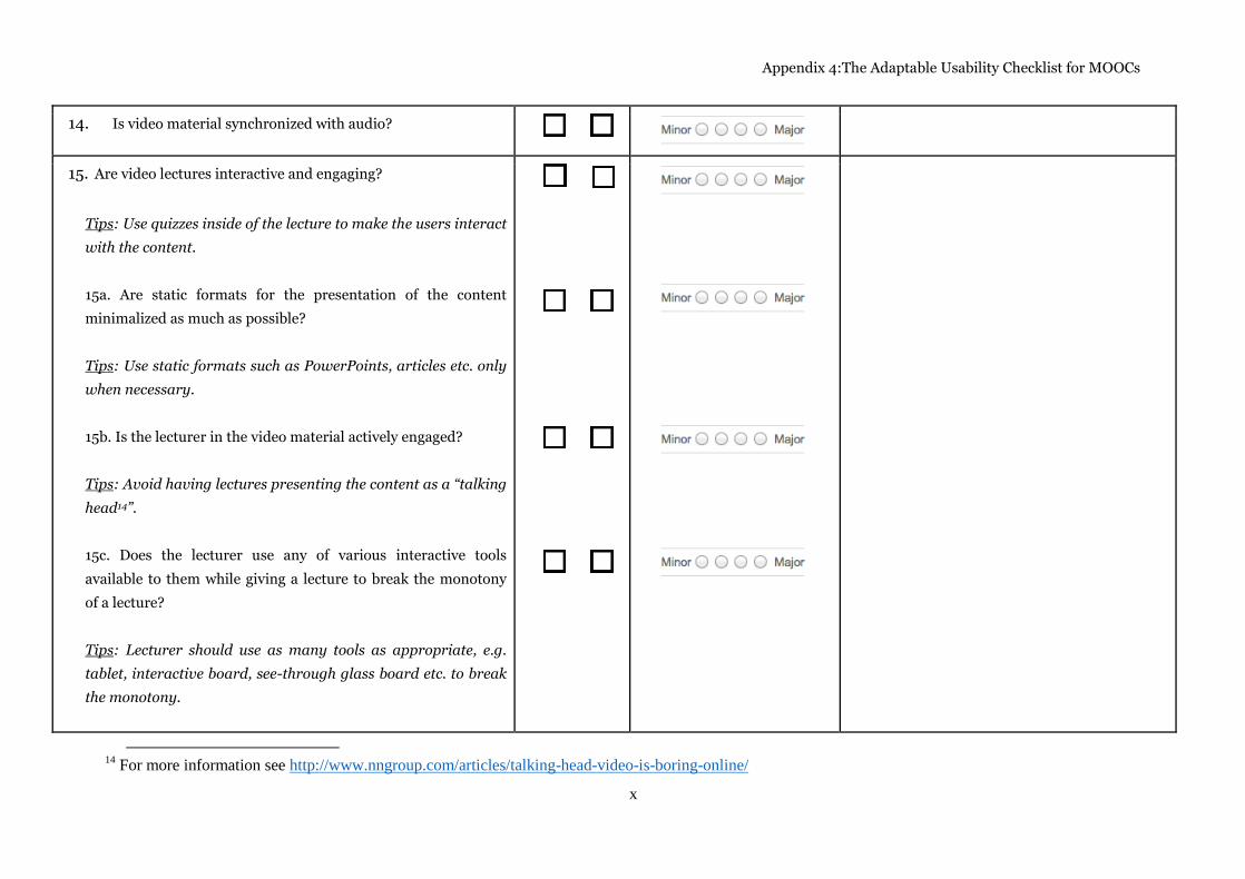
Appendix 4:The Adaptable Usability Checklist for MOOCs
x
14. Is video material synchronized with audio?
15. Are video lectures interactive and engaging?
Tips: Use quizzes inside of the lecture to make the users interact
with the content.
15a. Are static formats for the presentation of the content
minimalized as much as possible?
Tips: Use static formats such as PowerPoints, articles etc. only
when necessary.
15b. Is the lecturer in the video material actively engaged?
Tips: Avoid having lectures presenting the content as a “talking
head14”.
15c. Does the lecturer use any of various interactive tools
available to them while giving a lecture to break the monotony
of a lecture?
Tips: Lecturer should use as many tools as appropriate, e.g.
tablet, interactive board, see-through glass board etc. to break
the monotony.
14
For more information see http://www.nngroup.com/articles/talking-head-video-is-boring-online/

Appendix 4:The Adaptable Usability Checklist for MOOCs
xi
15d. Is the flow of a video lecture occasionally interrupted by an
interactive quiz or engaging content related question?
16. Is manipulation of the videos possible and easy to achieve?
Tips: Take advantage of existing media tools.
16a. Can the user adjust the speed of the video?
16b. Is a video full screen mode available?
16c. Can a video be bookmarked?
16d. Can a video be downloaded, and if so, are different formats
supported?
16e. Are alternatives offered for downloading?
Tips: Offer power point presentations or flash-video as an
alternative
16f. Are users forced into choices they have not made?
Tips: Most users do not want the video to auto-start, or the
video to be in HD directly due to various bandwidths.

Appendix 4:The Adaptable Usability Checklist for MOOCs
xii
16g. Are videos offered in different resolutions to support
various bandwidth?
16h. Are subtitles offered for the videos, even when in full screen
mode?
16i. Is there a possibility to download the subtitles for the
videos?
16j. Is the video interface provided with an appropriate back-
and next-button?
17. Does course material have progress bars?
17a. Is user informed how much time it will take to complete
examination?
17b. Is user informed how many questions are left to answer in
an assignment?
Tips: Inform the user about the number of all questions and
how many of those have already been answered, e.g. “You have
answered 2/10 questions”.
17c. Is user informed how long are video lectures?

Appendix 4:The Adaptable Usability Checklist for MOOCs
xiii
Tips: Display the length of the video next to the video lecture.
18. Is user always provided with contextual feedback when it is
relevant to the course material?
Tips: Always provide feedback in real time for examination.
18a. Is user always provided with feedback for wrong?
Tips: Inform user about the correctness of the answer and
preferably offer a hint.
18b. Is feedback given about previous attempts of answering?
18c. Are users encouraged and helped to improve their
knowledge?
Tips: Offer users opportunity to re-watch video lectures, have
multiple attempts to carry out an assignment, etcetera.
19. Is visual design used to replace text feedback, when
suitable?
Tips: An image of a checkmark may substitute text “Correct”
when an answer is correct.
19a. Are inactive actions or actions that cannot be performed
yet, visibly presented as such?

Appendix 4:The Adaptable Usability Checklist for MOOCs
xiv
Tips: An image of a cross can be used to indicate the
assignment is over its deadline or an action button can be
greyed out to mark as inactive.
20. Is feedback offered consistently when submitting an
assignment/quiz even if the deadline for the grading has
passed?
Tips: Respect consistency. The same type of feedback that is
offered before the deadline needs also be offered after the
deadline has passed.
20a. Are there alternatives provided to receive feedback on an
assignment to substitute feedback from a lecturer or peer review
after it cannot be obtained anymore?
Tips: Offer possibility to post an assignment in the forum to
receive feedback from peers.
21. Does feedback provide a distinction between messages that
address an error of input’s format and messages that address
error of the content?
Tips: Do not treat excess characters in an input as an error,
e.g. whitespace.
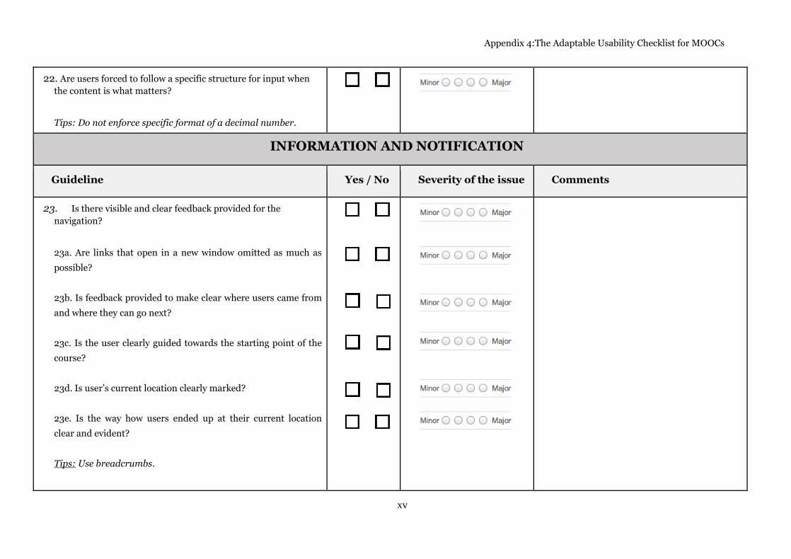
Appendix 4:The Adaptable Usability Checklist for MOOCs
xv
22. Are users forced to follow a specific structure for input when
the content is what matters?
Tips: Do not enforce specific format of a decimal number.
INFORMATION AND NOTIFICATION
Guideline Yes / No Severity of the issue Comments
23. Is there visible and clear feedback provided for the
navigation?
23a. Are links that open in a new window omitted as much as
possible?
23b. Is feedback provided to make clear where users came from
and where they can go next?
23c. Is the user clearly guided towards the starting point of the
course?
23d. Is user’s current location clearly marked?
23e. Is the way how users ended up at their current location
clear and evident?
Tips: Use breadcrumbs.

Appendix 4:The Adaptable Usability Checklist for MOOCs
xvi
23f. Is visual feedback provided about user’s location in a forum
or other social media platforms?
23g. Is visual feedback provided for already looked at courses?
Tips: Change the link colour of already visited courses in the
list of courses.
23h. Are courses in the search list clearly marked if a user has
already registered for them?
23i. Are users anchored to the location from where they have
derived from when searching or browsing?
Tips: Return users back to the same position in the list of
courses when they return back from inspecting a course.
24. Are users being notified about important actions, technical
issues, news and updates?
24a. Are users reminded about important dates in a course? And
if so, is it done in an appropriate time frame?
Tips: Notify the user about the start of a new week of the
course.

Appendix 4:The Adaptable Usability Checklist for MOOCs
xvii
24b. Are users informed about new courses and invited to
participate?
24c. Are users informed when a technical issue affects a course
as well as notified when the issue is resolved?
25. Is a calendar or similar provided to display information
about the dates in the course?
25a. Can a user personalizes the calendar to display information
about dates in different variations or formats?
25b. Can a user merge the course’s calendar with their personal
calendar?
Tips: Offer possibility of adding events to other calendars, such
as Google Calendar, Microsoft Exchange, iCal etcetera.
26. Does the platform support the feature for recommended
course?
26a. Are the recommended courses relevant for the user?
Tips: Make sure the feature uses a good algorithm. Otherwise
rather discard the feature.
27. Does the platform support flexibility for multiple types of
users?

Appendix 4:The Adaptable Usability Checklist for MOOCs
xviii
SOCIAL INTERACTION AND DISCUSSION
Guideline Yes / No Severity of the issue Comments
28. Are users encouraged to share and “spread the word” about the
courses? Is it effortless?
Tips: Use conventions for social media platforms.
29. Is the sense of being in a course with other users upheld
visually?
Tips: Use visual cues to inform user about other users’
activities, e.g. display twits or recent posts.
30. Are users invited and encouraged to participate in discussions,
however, not required to do so?
Tips: Use caution when forcing a user to participate in a
discussion in order to be able to complete the course or pass an
assignment.
31. Are social media platforms used to support the interactivity
between users, e.g. discussion?
31a. Is there a suitable platform for discussion offered within a
course, e.g. forum?
31b. Is credibility of posts in the discussion strengthened by

Appendix 4:The Adaptable Usability Checklist for MOOCs
xix
complementing posts with user’s profile picture, time stamps of
the post, display of upvotes and replies, etcetera?
Tips: Encourage users to use their real name in the discussions
instead of their username.
31c. Are relations between discussion in the course, e.g. lectures,
and discussion in the forum or on other platforms presented
clearly and evidently?
Tips: Position discussion thread that is related to the specific
course material in the vicinity of the material.
31d. Does the interaction inside the forum follow recognized
conventions? Is it transparent?
Tips: Do not force users to scroll to the end of a thread to leave
a comment or reply to the thread. Place the field to leave a
comment above all the other comments.
31d. Is the discussion flow of a single thread or multiple threads
within a forum or other social medial platforms easy to follow
and engage in?
32. Does the forum structure provide clear navigational
structure?
Tips: Use tree structure.

Appendix 4:The Adaptable Usability Checklist for MOOCs
xx
33. Is there an overview of activities in the discussion threads?
Tips: Display number of replies to a thread.
ERROR PREVENTION
Guideline Yes / No Severity of the issue Comments
34. Does the system offer an undo feature in every important
junction point?
Tips: Provide cancelation or skip function in a process of
enrolling.
35. Are help provided where users are likely to make mistakes?
36. Are actions that lead to exiting from an unfinished state clearly
labelled?
Tips: Offer to save the state of the system, or require a
conformation before exit.
36a. Can users effortlessly return to the closest relevant point in
the system after they have left it by their own choice?
Tips: Offer possibility of saving answers in an assignment
when user leaves the page.
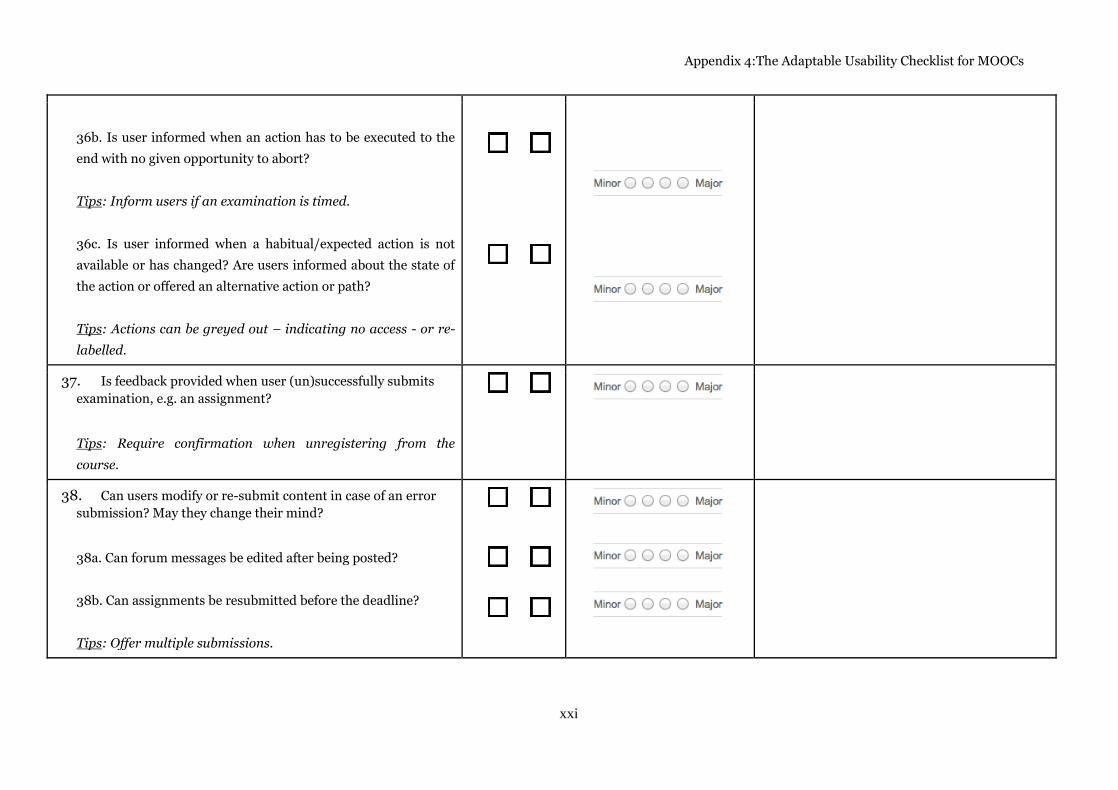
Appendix 4:The Adaptable Usability Checklist for MOOCs
xxi
36b. Is user informed when an action has to be executed to the
end with no given opportunity to abort?
Tips: Inform users if an examination is timed.
36c. Is user informed when a habitual/expected action is not
available or has changed? Are users informed about the state of
the action or offered an alternative action or path?
Tips: Actions can be greyed out – indicating no access - or re-
labelled.
37. Is feedback provided when user (un)successfully submits
examination, e.g. an assignment?
Tips: Require confirmation when unregistering from the
course.
38. Can users modify or re-submit content in case of an error
submission? May they change their mind?
38a. Can forum messages be edited after being posted?
38b. Can assignments be resubmitted before the deadline?
Tips: Offer multiple submissions.

Appendix 4:The Adaptable Usability Checklist for MOOCs
xxii
39. Are users provided with exit option to get out of an unwanted
situation?
39a. Are conventions followed when providing exit back to the
home page?
Tips: See usability web guidelines.
39b. Are conventions followed when providing a back button?
Tips: Support browser’s “back” feature.
39c.Can users unregister from a course? Is it effortless?
40. Is a confirmation required from the user before an action is
executed that could result in an unwanted outcome?
Tips: Require confirmation when unregistering from the
course.
41. Is it possible for users to exit without consequences from
somewhere they have mistakenly gotten themselves into?
Tips: Provide a cancel button in a warning/error message
42. Can users recover from error with solutions provided by the
system?
42a. Is more than one video player offered?

Appendix 4:The Adaptable Usability Checklist for MOOCs
xxiii
Tips: HTML5 player, Flash player, YouTube etc.
42b. Are users informed about the reasons why an error had
occurred?
Tips: If the browser does not support the action provide
information about suitable alternatives.
43. Do mandatory elements have descriptive labels or are
provided with understandable information? If not, are
meaningful default values offered?
Tips: Offer default values for tagging in the forums.
44. When various possibilities are offered are they all relevant
for the context?
Tips: Do not overwhelm user with too many choices, especially
if many users will not even know what distinguishes them.
45. Does the system automatically adapt current time zone
based on user’s location?
Tips: Inform user to change the time zone settings if the system
does not do it automatically.
45a. Can users manually set the settings for their time zone?

Appendix 4:The Adaptable Usability Checklist for MOOCs
xxiv
Tips: Inform users that they need to change the time zone
settings so countdown, if offered, to the deadlines can be
calculated accurately.
46. Are users supported by a sufficient help system, e.g. FAQ,
human support, system report of an issue?
46a. Is access to help documentation provided clearly?
46b. Do users need to look far to find help?
46c. Is it easy to establish a clear communication path to the
lecturer or other users?
Tips: Offer different way how to ask for help and how to
receive it, e.g. insure easy access to forum or e-mail address,
etcetera.
47. Are all critical functions and features of the platform
supported in all major browsers?
Tips: Display clear notification if special browser versions are
required or special technologies must be installed.
47a. Is user required to independently download and install
software or technical tools? If so, is the software easily
accessible?
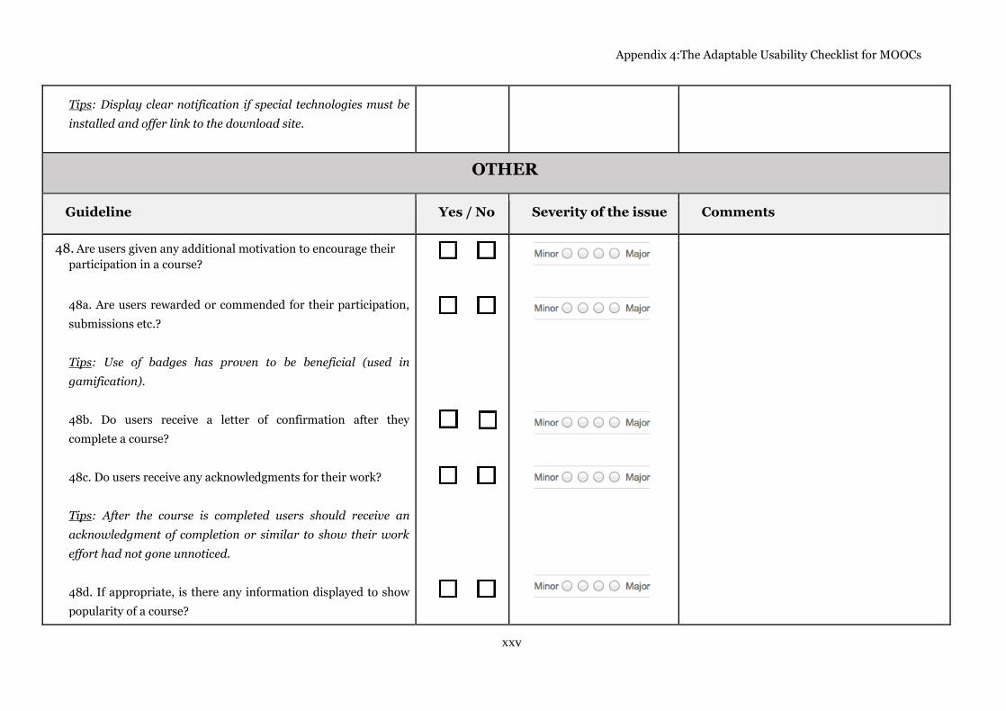
Appendix 4:The Adaptable Usability Checklist for MOOCs
xxv
Tips: Display clear notification if special technologies must be
installed and offer link to the download site.
OTHER
Guideline Yes / No Severity of the issue Comments
48. Are users given any additional motivation to encourage their
participation in a course?
48a. Are users rewarded or commended for their participation,
submissions etc.?
Tips: Use of badges has proven to be beneficial (used in
gamification).
48b. Do users receive a letter of confirmation after they
complete a course?
48c. Do users receive any acknowledgments for their work?
Tips: After the course is completed users should receive an
acknowledgment of completion or similar to show their work
effort had not gone unnoticed.
48d. If appropriate, is there any information displayed to show
popularity of a course?

Appendix 4:The Adaptable Usability Checklist for MOOCs
xxvi
Tips: Display number of users currently participating in a
course or number of users that have registered for it in the
past.
48e. Is credibility of the course implied?
Tips: If course is offered by a well-known provider, make that
information prominent. Link to the provider’s homepage, if it
exists.
49. Are users provided with familiar elements and recognized
order of actions in order to support recognition rather than the
need for recall?
50. Does the platform support other ways of finding courses,
except for browsing?
50a. Does the platform support filtering of the courses? If so, is
it possible to filter by subject, providers or status of the course?
50b. Does the platform support any sorting options, and does
any of those options include; alphabetical sort, sort by status of
the course (current, past, coming), dates, or providers?
50c. Is the sorting method used to sort the courses evident?
Tips: Make the order of the courses obvious, e.g. A-Z.

Appendix 4:The Adaptable Usability Checklist for MOOCs
xxvii
50d. Does the platform offer a save-option for found results, or
executed quires?
50e. Can users highlight courses they have registered on as
“favourites”, and if desired, group them together?
51. Are common words used when informing the user about an
expected action or outcome?
Tips: Use plain words like “Join a free course”.
52. Is education terminology used too often?
52a. When classroom metaphors or similar specific phrases
need to be used are they used appropriately, correlate to the
expected outcome and familiar to the target audience?
Tips: If a phrase “handouts” is used it should represent a sheet
or sheets of paper containing important information.
52b. When the use of terminology is called for is the meaning of
any uncommon words explained?
Tips: Offer an explanation of the uncommon word in a
Glossary and link the word to it; e.g. “midterm”, “finals”.

Appendix 4:The Adaptable Usability Checklist for MOOCs
xxviii
53. Can users exercise their control over settings in order to
customize the interface?
53a. Can users adjust their settings for e-mails and discussion
threads and posts?
GENERAL USABILITY GUIDELINES
Guideline Yes / No Severity of the issue Comments
54. Are links that open in a new window omitted as much as
possible?
Tips: Link to Facebook should open in a new window but the
action needs to be clearly indicated.
55. Is the course content written in a way that complies with
web usability guidelines?
Tips: Write for the web content, i.e. divide text into small
chunks, recall that users scan, do not style a word as a link if
it’s not, avoid phrase “read more”, and etcetera.
55a. Are descriptive names used for headings, video titles, links,
labels, and etcetera?
Tips: Do not use the course code as a primary description
symbol of the course, e.g. CourseName – CourseCode and not

Appendix 4:The Adaptable Usability Checklist for MOOCs
xxix
CourseCode – CourseName.
55b. Do headings, course titles and course material titles
correspond to the course content?
56. Does usage of recognized words, phrases, keywords,
symbols and icons follow conventions?
Tips: When referring to the home page of the website use
recognized word “Home” or a descriptive symbol.
56a. Are appropriate symbols used to convey correlated actions?
Tips: When referring to the home page of the website use a
descriptive symbol displaying a house.
57. Does usage of recognized words, phrases, keywords,
symbols and icons comply with consistency?
57a. Are the same words or symbols used to convey equivalent
meaning?
Tips: Do not use complete/finished to inform user that a course
is done.
58. Is the intended functionality of elements provided clearly
with a purpose or intent that matches the task?
58a. Is user informed about the format of a resource?

Appendix 4:The Adaptable Usability Checklist for MOOCs
xxx
Tips: When a resource is a PDF format use e.g. (PDF).
58b. Are buttons for call to action or other actions a user should
take made prominent/inviting/clickable?
58c. Are actions for enrolment in the course that have different
outcomes suitably separated?
Tips: Separate enrolment in a free course from enrolment in a
payable course.
59. Can a user tailor frequent actions?
Tips: Have the video player remember the functions used by
the user, e.g. which HD resolution was set or if auto-play of the
video was chosen.
60. Is support provided for users with disabilities?
Tips: Follow web accessibility guidelines15.
15
For more information see http://www.w3.org/TR/WCAG20/


![Geschäftsmodelle für MOOCs [?]](https://img.pdfslide.us/doc/110x75/54955dbeac7959042e8b4e25/geschaeftsmodelle-fuer-moocs-.jpg)