Embed Size (px)
Citation preview
1
Mathematics in the New Zealand Curriculum Second Tier
Strand: Statistical Thinking Thread: Statistical Investigations Level: Five
Achievement Objectives: Plan and conduct surveys and experiments using the statistical enquiry cycle by:
• determining the variables involved and selecting appropriate measures;
• considering sources of variation;
• collecting and cleaning data;
• selecting a range of displays, and by redefining categories and intervals, to find patterns, variations, relationships and trends in multivariate datasets;
• comparing samples and relating samples to possible populations, using measures of spread and centrality;
• presenting a report of findings.
Exemplars of student performance: Exemplar One: A Typical Investigation
Student K is investigating the question, “Are you a typical Year 9/10 student?”
She has set the context for the question in the following way:
“My grandmother believes that 13 and 14 year olds of today are very different to how they were when she was 13.
In the quarter century 1925-1950 activities such as inventing imaginative outdoor games, swimming, listening to the radio, reading books and comics, playing cards and board games, picnicking and going to films were common activities. Families had a wind up a gramophone and had 78 r.p.m. records to play on them. Bing Crosby and the Andrews Sisters were among the music artists of the day. Writing to penfriends and stamp collecting, along with handcrafts and embroidery, were amongst the hobbies of this era.
She accesses information on GROWING UP IN NEW ZEALAND 1925-1950 on NZine website
http://www.nzine.co.nz/index.html and looks under history/growing up in NZ for further articles.
2
K sets about finding answers to the problem, “What is a typical 13 or 14 year old nowadays?”
Her plan to solve the problem proceeds in the following ways:
1. She brainstorms ideas. For example:
• Physical attributes – hair and eye colour; height, arm span;
• Interests and hobbies – how much time spent watching television last night, sports played, favourite music artist
• School – age they expect to leave school, subjects taken • Personal – “Have you written a letter to a friend in the last year?”, “Do you have a cell phone?”, “How many text
messages did you send yesterday?”
2. K selects variables to determine some key characteristics of a typical 13 or 14 year old in 2006. She focuses on some of
the ideas from above, not all of them. For each characteristic she determines suitable measures. For example: How does she measure armspan?
She decides to measure from finger tip to finger tip in centimetres and recognises that everyone needs to be doing the
same measurement or this may be a source of variation. 3. She uses data cards to collect the data about each of the characteristics chosen. She uses the entire class as a sample
of all the students in her school.
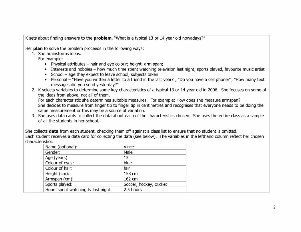
She collects data from each student, checking them off against a class list to ensure that no student is omitted. Each student receives a data card for collecting the data (see below). The variables in the lefthand column reflect her chosen characteristics.
Name (optional): Vince
Gender: Male
Age (years): 13
Colour of eyes: blue
Colour of hair: fair
Height (cm): 158 cm
Armspan (cm): 162 cm
Sports played: Soccer, hockey, cricket
Hours spent watching tv last night: 2.5 hours
3
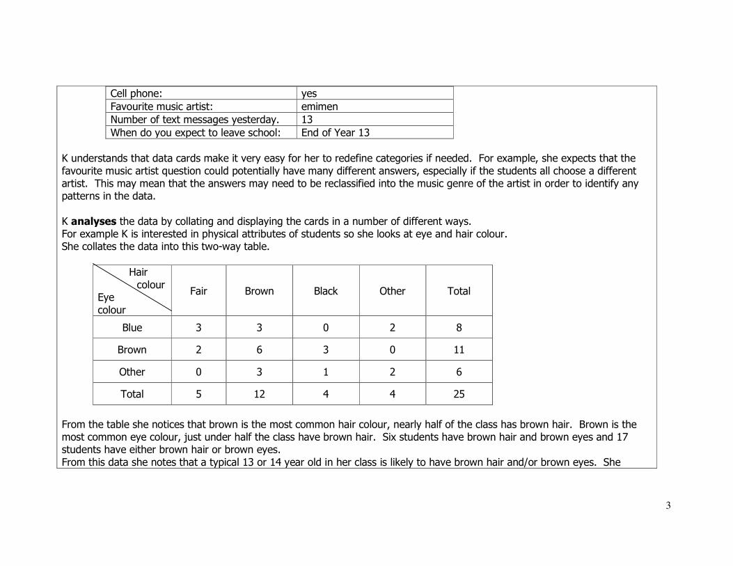
Cell phone: yes
Favourite music artist: emimen
Number of text messages yesterday. 13
When do you expect to leave school: End of Year 13
K understands that data cards make it very easy for her to redefine categories if needed. For example, she expects that the
favourite music artist question could potentially have many different answers, especially if the students all choose a different artist. This may mean that the answers may need to be reclassified into the music genre of the artist in order to identify any patterns in the data.
K analyses the data by collating and displaying the cards in a number of different ways. For example K is interested in physical attributes of students so she looks at eye and hair colour. She collates the data into this two-way table.
Hair
colour Eye
colour
Fair Brown Black Other Total
Blue 3 3 0 2 8
Brown 2 6 3 0 11
Other 0 3 1 2 6
Total 5 12 4 4 25
From the table she notices that brown is the most common hair colour, nearly half of the class has brown hair. Brown is the most common eye colour, just under half the class have brown hair. Six students have brown hair and brown eyes and 17 students have either brown hair or brown eyes.
From this data she notes that a typical 13 or 14 year old in her class is likely to have brown hair and/or brown eyes. She
4
wonders if a school in another part of the country would have similar results. She wonders if the typical hair and eye colour of
the boys would be different to the girls. She wonders if the typical hair and eye colour was the same in the 1925-1950 period.
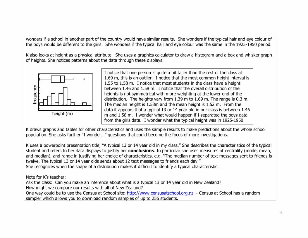
K also looks at height as a physical attribute. She uses a graphics calculator to draw a histogram and a box and whisker graph of heights. She notices patterns about the data through these displays.
height (m)
K draws graphs and tables for other characteristics and uses the sample results to make predictions about the whole school
population. She asks further “I wonder…” questions that could become the focus of more investigations.
K uses a powerpoint presentation title, “A typical 13 or 14 year old in my class.” She describes the characteristics of the typical
student and refers to her data displays to justify her conclusions. In particular she uses measures of centrality (mode, mean,
and median), and range in justifying her choice of characteristics, e.g. “The median number of text messages sent to friends is twelve. The typical 13 or 14 year olds sends about 12 text messages to friends each day.”
She recognizes when the shape of a distribution makes it difficult to identify a typical characteristic.
Note for K’s teacher: Ask the class: Can you make an inference about what is a typical 13 or 14 year old in New Zealand?
How might we compare our results with all of New Zealand? One way could be to use the Census at School site: http://www.censusatschool.org.nz - Census at School has a random
sampler which allows you to download random samples of up to 255 students.
I notice that one person is quite a bit taller than the rest of the class at 1.69 m, this is an outlier. I notice that the most common height interval is 1.55 to 1.58 m. I notice that most students in the class have a height
between 1.46 and 1.58 m. I notice that the overall distribution of the
heights is not symmetrical with more weighting at the lower end of the distribution. The heights vary from 1.39 m to 1.69 m. The range is 0.3 m.
The median height is 1.53m and the mean height is 1.52 m. From the
data it appears that a typical 13 or 14 year old in our class is between 1.46
m and 1.58 m. I wonder what would happen if I separated the boys data from the girls data. I wonder what the typical height was in 1925-1950.
frequency

5
How might we compare our results globally? Census at School also has links to other countries.
Further questions generated from this can lead to another statistical enquiry cycle. See the CensusatSchool activity, “Are you a masterpiece?,” as an example.
K’s work exemplifies Level Five because she independently enacts the Statistical Inquiry Cycle by posing a question,
determining the important variables involved (e.g. Gender, favourite sport, arm span, etc.) and selecting suitable measures for those characteristics. She uses a range of displays to find patterns in the data and to communicate her findings to her classmates. K makes use of statistical measures (mean, median, etc.) to describe typicality, often
acknowledging the effect of range through providing a typical interval rather that an exact value. She reports her findings in context with reference to patterns in the data.
Exemplar Two: The Da Vinci Mode
Student J has just read, “The Da Vinci Code” by Dan Brown. He knows about Leonardo Da Vinci’s famous drawing of the Vitruvian Man. He wonders if people really are in proportion, that their height matches their arm span.
From K’s data cards J draws a scattergraph of height and armspan on a graphics calculator.
height (m) screen shot of some of the data
J concludes that a line could be drawn through the middle of the points that would provide a predictor of people’s heights form
their arm spans and vice versa. He wonders if this is still true if he separates female data from male data. He reports his findings to the class using the scattergraph to illustrate his conclusion that most people are approximately square
within a range of about “10% either way”.
I notice that most of the data points seem to be along the diagonal. I notice that some people have the same height as
armspan and that most have armspans that are close to their height. I notice that generally the taller you are the longer your arm span is. I notice that some of the people at similar heights
have different arm spans, there is some variation. I can use
someone’s arm span to predict their height and vice versa.
arm
span (
m)

6
J’s work exemplifies Level Five because he finds a pattern of co-variation in the data using an appropriate display
(scattergraph). He is able to recognize and consider variation by providing an estimate of range (10%) while still being able to identify a correlation in the data and use it as a possible predictor of one variable value from the other. He
enacts the Statistical Inquiry Cycle by posing a question that can be answered from an existing multi-variate data set. J
also poses further “I wonder…” questions.
Exemplar Three: Birth of An Idea
Student C wonders, “My best friend and I have our birthdays in the same month. In my family of five, none of us have our birthdays in the same month.” She poses the following problem:
Problem: In a group of five people how likely it is that two or more people have the same birth month? Plan: In order to explore different combinations of birth months in groups of five people C creates a simulation. Since there are
twelve months in the year she uses the numbers 1-12 to represent the months, January, February, March, etc. She generates
100 samples of five random numbers (from 1-12). C’s teacher discusses her assumption, for example, that each month is equally likely to occur. She asks, “Does this assumption
reflect the real world situation?” C acknowledges that months have different numbers of days, e.g. February only has 28 days while December has 31 Days, and that this alters the relative chances slightly.
Teacher Note: In real life month of birth has a seasonal variation, with a peak in September for New Zealand, with more babies conceived in December than any other month!
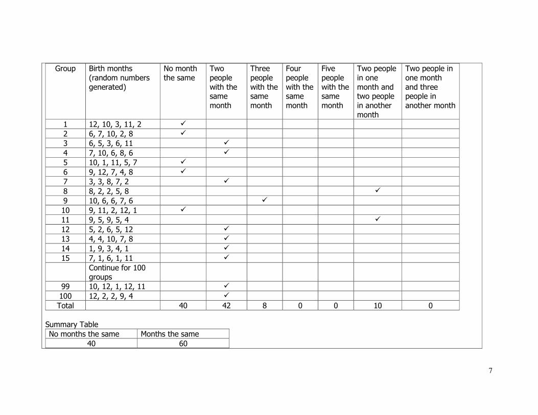
Data:
C records the combinations of months for each sample of five people. She records all of the data, not just the summary of the groups, because she is worried about losing information useful for answering further questions.
7
Group Birth months
(random numbers
generated)
No month
the same
Two
people
with the same
month
Three
people
with the same
month
Four
people
with the same
month
Five
people
with the same
month
Two people
in one
month and two people
in another
month
Two people in
one month
and three people in
another month
1 12, 10, 3, 11, 2 �
2 6, 7, 10, 2, 8 �
3 6, 5, 3, 6, 11 �
4 7, 10, 6, 8, 6 �
5 10, 1, 11, 5, 7 �
6 9, 12, 7, 4, 8 �
7 3, 3, 8, 7, 2 �
8 8, 2, 2, 5, 8 �
9 10, 6, 6, 7, 6 �
10 9, 11, 2, 12, 1 �
11 9, 5, 9, 5, 4 �
12 5, 2, 6, 5, 12 �
13 4, 4, 10, 7, 8 �
14 1, 9, 3, 4, 1 �
15 7, 1, 6, 1, 11 �
Continue for 100 groups
99 10, 12, 1, 12, 11 �
100 12, 2, 2, 9, 4 �
Total 40 42 8 0 0 10 0
Summary Table
No months the same Months the same
40 60
8
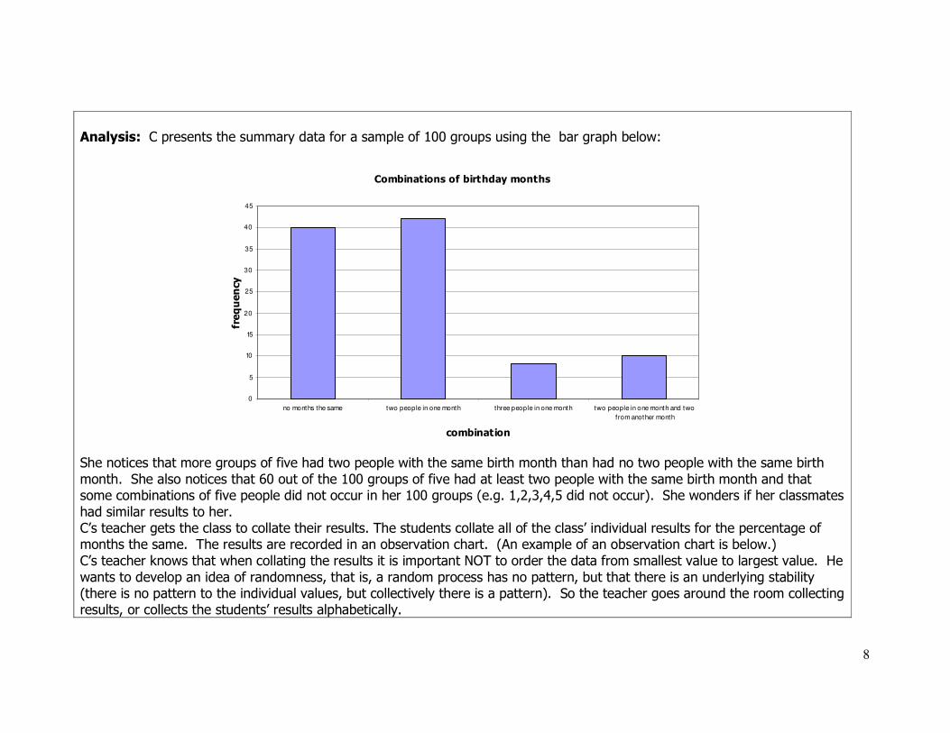
Analysis: C presents the summary data for a sample of 100 groups using the bar graph below:
Combinations of birthday months
0
5
10
15
20
25
30
35
40
45
no months the same two people in one month three people in one month two people in one month and two
from another month
combination
frequency
She notices that more groups of five had two people with the same birth month than had no two people with the same birth
month. She also notices that 60 out of the 100 groups of five had at least two people with the same birth month and that some combinations of five people did not occur in her 100 groups (e.g. 1,2,3,4,5 did not occur). She wonders if her classmates
had similar results to her. C’s teacher gets the class to collate their results. The students collate all of the class’ individual results for the percentage of months the same. The results are recorded in an observation chart. (An example of an observation chart is below.)
C’s teacher knows that when collating the results it is important NOT to order the data from smallest value to largest value. He
wants to develop an idea of randomness, that is, a random process has no pattern, but that there is an underlying stability (there is no pattern to the individual values, but collectively there is a pattern). So the teacher goes around the room collecting results, or collects the students’ results alphabetically.
9
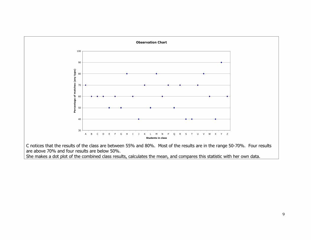
Observation Chart
30
40
50
60
70
80
90
100
A B C D E F G H I J K L M N P Q R S T U V W X Y Z
Students in class
Percentage of matches (any type)
C notices that the results of the class are between 55% and 80%. Most of the results are in the range 50-70%. Four results are above 70% and four results are below 50%.
She makes a dot plot of the combined class results, calculates the mean, and compares this statistic with her own data.

10
trial100
56 58 60 62 64 66 68 70 72 74 76 78
Collection 1 Dot Plot
Mean is 63.3
C noticed that the mean for all of the class’ results is 63.3%. Her percentage of matches was 60%, a little below the class
mean. She noticed that other people have different results to her, although two other people had the same results. She
predicts that if she were to do this again she would get a different result. C wondered, “What might the population of groups of one hundred look like?” She created an observation chart for groups of one hundred using a spreadsheet.
Observation Chart
30
40
50
60
70
80
90
100
A B C D E F G H I J K L M N P Q R S T U V W X Y Z
Students
Percentage of matches (any type)

11
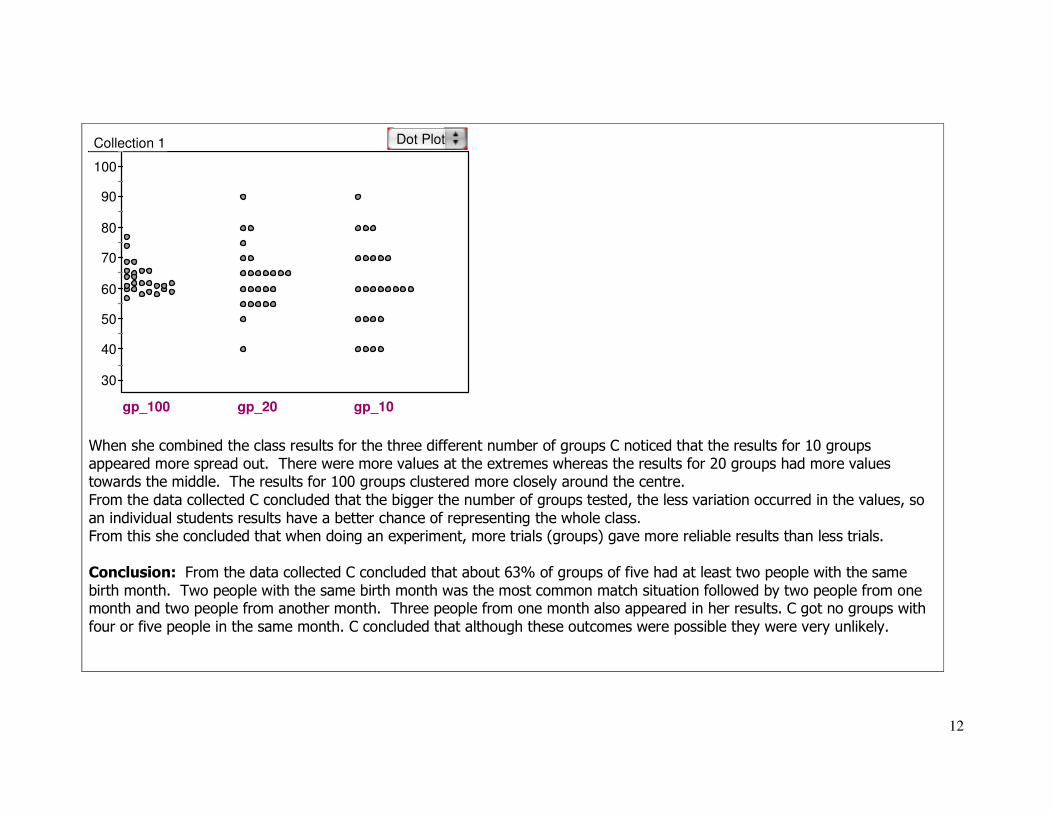
C noticed that the percentage of class matches for 10 groups was more spread out than for 100 groups. The range for 10 groups was 50%, whereas for 100 groups the range was 25%. She believed that the mean for 100 groups was a better
estimate of the probability than the mean for 10 groups. She compared the results of 10 and 100 groups to the percentage of matches for 20 groups. C drew up this observation chart.
Observation Chart
30
40
50
60
70
80
90
100
A B C D E F G H I J K L M N P Q R S T U V W X Y Z
Students in class
Percentage of matches (any type)
C noticed that the class matches for 20 groups were more spread out than for 100 groups, but less spread out than for 10 groups. C noticed that even though 10 groups and 20 groups have the same range (50%), most of the values for 20 groups
are between 55% and 70%, a smaller band than for 10 groups. 100 groups had the smallest band for most of the values.
12
30
40
50
60
70
80
90
100
gp_100 gp_20 gp_10
Collection 1 Dot Plot
When she combined the class results for the three different number of groups C noticed that the results for 10 groups appeared more spread out. There were more values at the extremes whereas the results for 20 groups had more values towards the middle. The results for 100 groups clustered more closely around the centre.
From the data collected C concluded that the bigger the number of groups tested, the less variation occurred in the values, so
an individual students results have a better chance of representing the whole class. From this she concluded that when doing an experiment, more trials (groups) gave more reliable results than less trials.
Conclusion: From the data collected C concluded that about 63% of groups of five had at least two people with the same
birth month. Two people with the same birth month was the most common match situation followed by two people from one month and two people from another month. Three people from one month also appeared in her results. C got no groups with
four or five people in the same month. C concluded that although these outcomes were possible they were very unlikely.
13
C’s work exemplifies Level 5 because she planned and conducted an experiment, with support from her teacher. In
doing so she selected a range of displays to find patterns in the data and compared the samples taken to possible
populations, giving particular attention to measures of centrality. She was able to detect differences in variation between the 10, 20 and 100 sample groups. C’s findings suggested she had an appreciation of how larger samples
reduced variation and gave better estimates of the population mean than smaller samples.
Exemplar Four: Hot and Cold
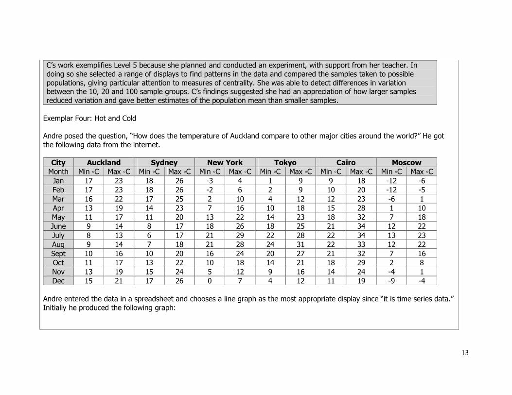
Andre posed the question, “How does the temperature of Auckland compare to other major cities around the world?” He got
the following data from the internet.
City Auckland Sydney New York Tokyo Cairo Moscow
Month Min ◦C Max ◦C Min ◦C Max ◦C Min ◦C Max ◦C Min ◦C Max ◦C Min ◦C Max ◦C Min ◦C Max ◦C
Jan 17 23 18 26 -3 4 1 9 9 18 -12 -6
Feb 17 23 18 26 -2 6 2 9 10 20 -12 -5
Mar 16 22 17 25 2 10 4 12 12 23 -6 1
Apr 13 19 14 23 7 16 10 18 15 28 1 10
May 11 17 11 20 13 22 14 23 18 32 7 18
June 9 14 8 17 18 26 18 25 21 34 12 22
July 8 13 6 17 21 29 22 28 22 34 13 23
Aug 9 14 7 18 21 28 24 31 22 33 12 22
Sept 10 16 10 20 16 24 20 27 21 32 7 16
Oct 11 17 13 22 10 18 14 21 18 29 2 8
Nov 13 19 15 24 5 12 9 16 14 24 -4 1
Dec 15 21 17 26 0 7 4 12 11 19 -9 -4
Andre entered the data in a spreadsheet and chooses a line graph as the most appropriate display since “it is time series data.”
Initially he produced the following graph:
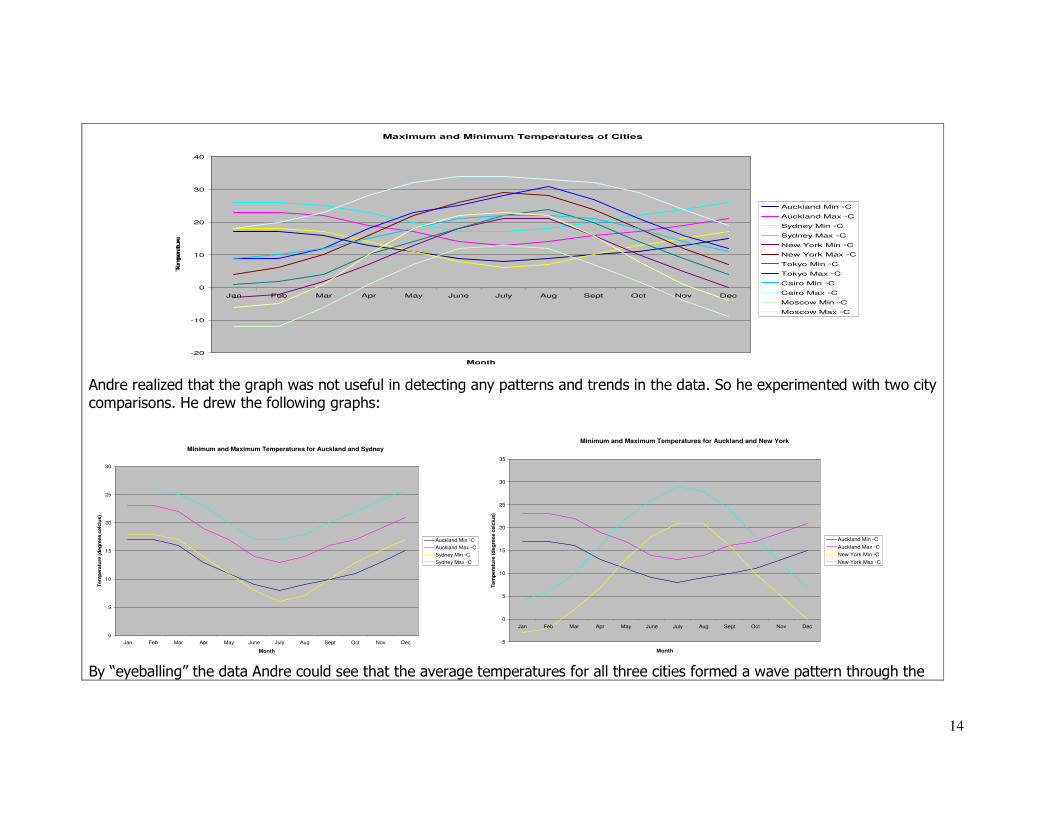
14
Maximum and Minimum Temperatures of Cities
-20
-10
0
10
20
30
40
Jan Feb Mar Apr May June July Aug Sept Oct Nov Dec
Month
Temperature
Auckland Min ◦C
Auckland Max ◦C
Sydney Min ◦C
Sydney Max ◦C
New York Min ◦C
New York Max ◦C
Tokyo Min ◦C
Tokyo Max ◦C
Cairo Min ◦C
Cairo Max ◦C
Moscow Min ◦C
Moscow Max ◦C
Andre realized that the graph was not useful in detecting any patterns and trends in the data. So he experimented with two city comparisons. He drew the following graphs:
Minimum and Maximum Temperatures for Auckland and Sydney
0
5
10
15
20
25
30
Jan Feb Mar Apr May June July Aug Sept Oct Nov Dec
Month
Tem
pera
ture
(d
eg
rees c
elc
ius)
Auckland Min ◦C
Auckland Max ◦C
Sydney Min ◦C
Sydney Max ◦C
Minimum and Maximum Temperatures for Auckland and New York
-5
0
5
10
15
20
25
30
35
Jan Feb Mar Apr May June July Aug Sept Oct Nov Dec
Month
Tem
pera
ture
(d
eg
rees c
elc
ius)
Auckland Min ◦C
Auckland Max ◦C
New York Min ◦C
New York Max ◦C
By “eyeballing” the data Andre could see that the average temperatures for all three cities formed a wave pattern through the
15
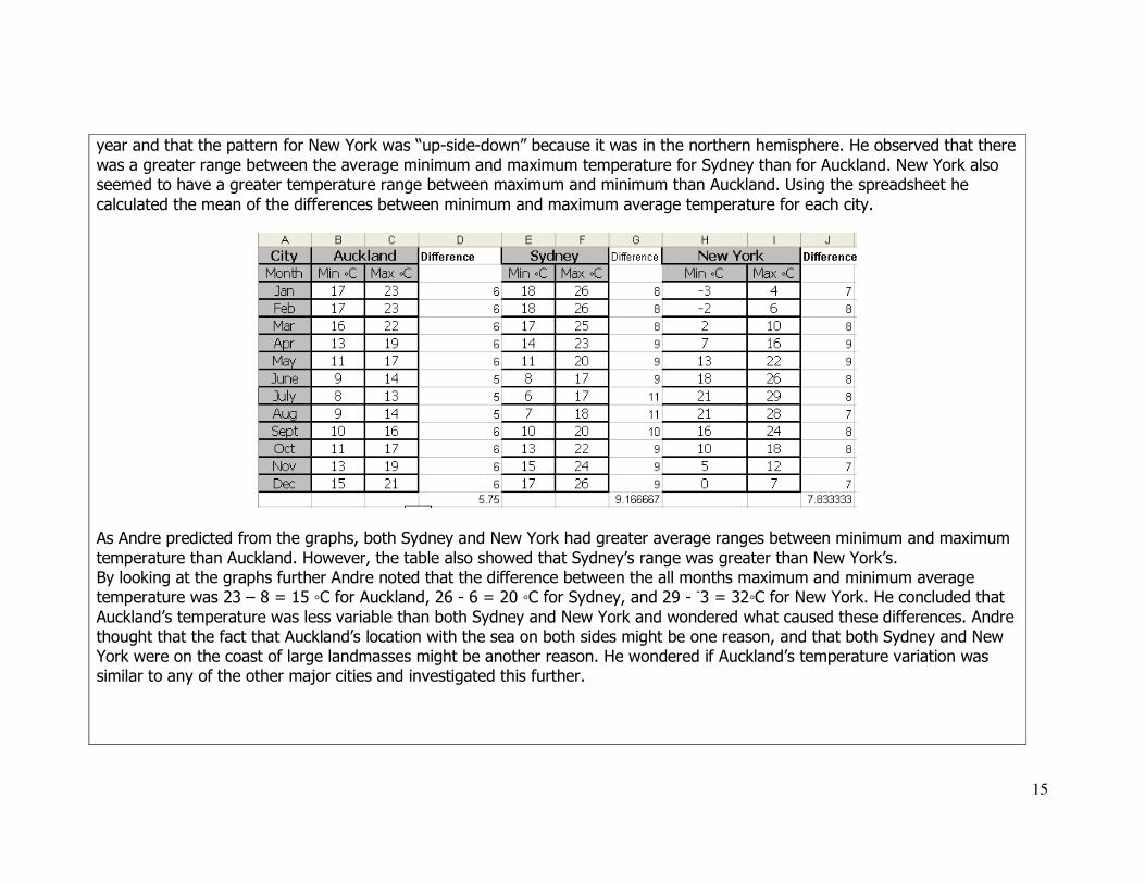
year and that the pattern for New York was “up-side-down” because it was in the northern hemisphere. He observed that there
was a greater range between the average minimum and maximum temperature for Sydney than for Auckland. New York also seemed to have a greater temperature range between maximum and minimum than Auckland. Using the spreadsheet he
calculated the mean of the differences between minimum and maximum average temperature for each city.
As Andre predicted from the graphs, both Sydney and New York had greater average ranges between minimum and maximum
temperature than Auckland. However, the table also showed that Sydney’s range was greater than New York’s. By looking at the graphs further Andre noted that the difference between the all months maximum and minimum average temperature was 23 – 8 = 15 ◦C for Auckland, 26 - 6 = 20 ◦C for Sydney, and 29 - -3 = 32◦C for New York. He concluded that
Auckland’s temperature was less variable than both Sydney and New York and wondered what caused these differences. Andre
thought that the fact that Auckland’s location with the sea on both sides might be one reason, and that both Sydney and New York were on the coast of large landmasses might be another reason. He wondered if Auckland’s temperature variation was similar to any of the other major cities and investigated this further.

16
Andre’s investigation exemplified Level Five because he posed a comparison question and answered it by accessing a pre-
existing dataset. He used a variety of appropriate displays to look for patterns, variations and trends in the data and used
mean as a measure of central tendency to support the differences he noted from the graphs. In his report, Andre suggested possible sources of the variation between cities and re-enacted the enquiry cycle to validate his ideas.
Important teaching ideas (working at):
Students at level five need to be able to plan and conduct surveys and experiments using the Statistical Enquiry Cycle (See
below). The cycle involves five sequential but related stages of a statistical investigation that, in turn, may create further questions for more investigation. Graphs and other displays are used to reason about the data and communicate findings.
Pose a question or make an assertion:
A problem/issue is used to start the enquiry cycle. The context is very important if students are to draw sensible conclusions
from the data and suggest reasons for any patterns, relationships, trends and variations they observe. Iither the problem will allow students to collect the data so they have an in-depth understanding of the context, or the problem will be based on a pre-existing data set where extensive background information about the context is available. There are three main types of
Statistically based questions:
1. “What’s typical?” (summary) questions, e.g. How much time do 14 year-old students spend on their cellphone each week? 2. Comparison questions, e.g. Do girls spend more time on their cellphone than boys?
3. Relationship questions, e.g. How is time spent on a cellphone related to the age of the user?
Pose a question or
make an assertion Plan a survey or
experiment
Gather the Data
Form Conclusions
Analyse the data

17
Plan:
Students need to be involved in all facets of the planning. They should be discussing ideas and planning about:
Determining the variables involved and selecting appropriate measures: – What questions are you going to ask and what data are you going to collect to solve your problem/answer your
question? – How are you going to collect the data?
– How are you going to record it? Students need to consider possible sources of variation within their results. These sources include:
- size of sample (larger samples usually result in proportionally more variation than larger samples)
- characteristics of the sample (gender, location, age, ethnicity, etc.)
- time, location and circumstances of the data collection (e.g. day/night, hot/cold weather) - sample variation that is due to variation of population itself (the aim of inference)
In collecting data students need to ensure that individual responses are recorded to allow the possibility of resorting, e.g.
redefining of the groups, relating different variables. While pre-selection of response categories makes the data analysis tidy
and easy, it often results in valuable information being lost and alternative analysis thwarted. Careful consideration is needed from students when choosing intervals for measurement or grouped data to avoid losing
valuable detail so that the big picture is clear. For example, If doing a survey of traffic volumes, by counting cars passing a
particular point in peak hour traffic, should the frequencies be organized in 1 minute, 5 minute , 15 minute, etc. intervals, in order to get the right picture (or story) of the data? This is a balancing act between defining more intervals/groups for one variable/dimension in order to find patterns while dealing with the resulting reduction in variation between intervals/groups.
Data:
Data can be recorded in a number of ways, for example:
Multivariate data cards – individual cards for each member of the population/sample to record all the desired information Multivariate tables – collating all the population/sample data into a table to allow sorting and redefining of categories Students need proficiency in using spreadsheets, databases, and statistical analysis software to collect their data for later
analysis.

18
Analysis:
Students should start their analysis by looking at the table of data and answering the following questions: Is there data you need to clean?
Dirty data is faulty data due to measurement or data entry errors. Dirty data is cleaned, either by finding out the correct data, or by eliminating it from the dataset. It is not always easy to determine if unusual or suspect data values are genuine or due to
a numerical or data entry error. How will you display the data?
Students need to select appropriately from a range of displays and connect these displays to detect patterns, relationships and trends in the data. Graphics calculators and computers are used as much as possible to create displays as they reduce preparation time considerably and allow the connection of multiple representations.
At level five students deal with displays of continuous data and simple co-variation while maintaining and enhancing their
repertoire of category data displays. Creation and interpretation of the following displays is expected at this level: Male Female
Left-handed 8 4
Right-handed 40 43
Ambidextrous 2 3
Two Way Frequency tables (For category data)
Multiple Dot Plot (For discrete numeric data)
Cellphone Minutes by Male and Female Students

19
Attitudes to Microchipping Dogs at Legend College
0
10
20
30
40
50
60
Strongly agree Agree Undecided Disagree Strongly disagree
Attitude
Perc
en
tag
e o
f S
tud
en
ts S
am
ple
d
2005
2006
Single and multiple bar graphs (for category data) Box Plot (For discrete and continuous numeric data)
Histogram (for continuous measurement data) Scattergraph or Scatterplot (For Bi-variate data)
Time Between Eruptions of Old Faithful Geyser
Ag e and P u lse R ate fo r S tudents
0
20
40
60
80
100
120
0 2 4 6 8 10 12 14 16 18
Ag e (Y ears )
Pu
lse R
ate
(b
eats
/M
inu
te)

20
Number of kilometres walked/run by teachers during one week
Highgate College Awatere High School 6 6 8
5 3 4 4
3 0 3 0 9 8 7 7 6 3 1 0 2 0 1 2 2 5 5 7 7 7 6 4 4 3 2 1 2 3 3 5 6 6 6 8 9
9 6 0 5 8
Back to back stem and Leaf Graph (Discrete numeric data)
Minimum and Maximum Average Temperatures for Moscow
-15
-10
-5
0
5
10
15
20
25
Jan Feb Mar Apr May June July Aug Sept Oct Nov Dec
Month
Tem
pera
ture
(degre
es celciu
s)
Moscow Min ◦C
Moscow Max ◦C
Single and Multiple Line Graph (Continuous time series data)

21
What statistical measures of the sample/s are useful in detecting differences, patterns, and relationships? Students should be using measures of spread and centrality and the shape of the distribution – these include mean, median,
Upper quartile (UQ), Lower quartile (LQ), Interquartile range (IQR), range, maximum and minimum - and relating these to sample and to possible population distributions.
The dot plot below shows the weight of schoolbag for student with lockers and without lockers. The measures of spread and centrality are shown.
Students should investigate how varying the sample size effects centrality and spread.
There are four key ideas students should consider when interpreting graphs;
1. Reading the data: “What do you notice from the graph? What trends are evident? What is a possible relationship between variables?” This involves eyeballing the data looking for patterns, variations, relationships, and trends. Patterns are similarities
in the data while variations are differences. Relationships are connections between variables, e.g one increases while the other
Minimum Maximum Median
Range = Maximum - Minimum
Lower Quartile Upper
Quartile
Inter
Quartile
Range 42-25=17
22
decreases. Trends are patterns over time. Students should not be restricting their relationship and trend spotting to linear
relationships as many real life contexts involve other types of relations such as cyclic, exponential, quadratic. 2. Reading between the data: “What is possibly missing from the data? How does this variable compare to a different variable?”
Important features of the data can be lost or hidden. 3. Reading beyond the data: “What if?” questions, making predictions about a trend over time, making an inference about a
typical value or conjecturing a relationship between variables. 4. Reading behind the data: “What is a possible cause of the variation?” Examine the data quality, the methodology of
collection, any bias that may have occurred through sampling and data collection methods, e.g Only basketball players were surveyed.
Conclusion:
Students at level five should be proficient at reporting findings. Findings must be discussed with reference to interpretations of graphs and tables, summary statistics, features such as shape of the distribution, e.g. symmetrical or skewed, clusters, gaps,
unimodal, bimodal, rectangular, and/or outliers (extreme or isolated datapoints).
Reports should attempt to answer the original question but should also acknowledge when a question has not been answered adequately. The data should be viewed in context, “Do these findings make sense with what I know about the world?”
Students need to choose the representations (displays) that communicate their findings best.
Important learning experiences at this level are:
• Use a variety of ways to display multivariate data to answer questions
• Taking samples that are representative (or not) and associating sampling with potential bias
• Calculating summary statistics for samples, to infer possible characteristics of the population.

23
Useful resources
Figure It Out (Learning Media) Statistics Level 3-4, pages 1-17
Statistics Year 7/8, Level 4, pages 1-16 Statistics Year 7/8, Level 4+, pages 1-16
[Comprehensive Teacher notes are provided for each student book. These notes have been distributed to schools and can also be accessed through http://www.tki.org.nz/r/maths/curriculum/figure/index_e.php
Numeracy Project Book 9: Teaching Number through Measurement, Geometry, Algebra, and Statistics, pages 41-52. nzmaths.co.nz units (This website is sponsored by the Ministry of Education) http://www.nzmaths.co.nz/statistics/Investigations/discretedata.aspx
http://www.nzmaths.co.nz/statistics/Investigations/timeseries5.aspx
http://www.nzmaths.co.nz/statistics/Investigations/Level5CensusAtSchool.aspx CensusatSchool (This website is sponsored by Statistics New Zealand and The University of Auckland) http://www.censusatschool.org.nz/
Digital Learning Objects (These are accessed through the Ministry of Education Digi-Store and are the result of a
collaborative project run by The Learning Federation, Australia) http://www.nzmaths.co.nz/LearningObjects/S4.aspx Other Website links:
http://illuminations.nctm.org/WebResourceList.aspx?Ref=2&Std=4&Grd=0 http://peabody.vanderbilt.edu/depts/tandl/mted/Minitools/Minitools.html
http://nlvm.usu.edu/en/nav/category_g_2_t_5.html