Embed Size (px)
Citation preview

‘ACOUSTIC’ MagazineCase Study Magazines

‘ACOUSTIC’ Magazine
‘’The UK’s only dedicated acoustic guitar magazine’’ It is mainly aimed at Acoustic Guitar Players It includes interviews with artists, gear tests, reviews & expert columns from respected acoustic players such as Martin Taylor, Martin Simpson, Gordon Giltrap, Doyle Dykes, Martin Barre of Jethro Tull fame.

‘ACOUSTIC’ Magazine: The Facts
Publishing Company: Oyster House Media Ltd. Editors Name: Pierre Benususan, Maartin Allcock, Doyle Dykes, Chris Gibbons, Simon Mayor, Gordon Giltrap and Julie Ellison
Date Of First Publication:
Frequency Of Publication: Bi-monthly
Price: £4.25
Distribution: WHSmith, HMV, Paper-shops, Online Newsletter, Online Delivery etc.
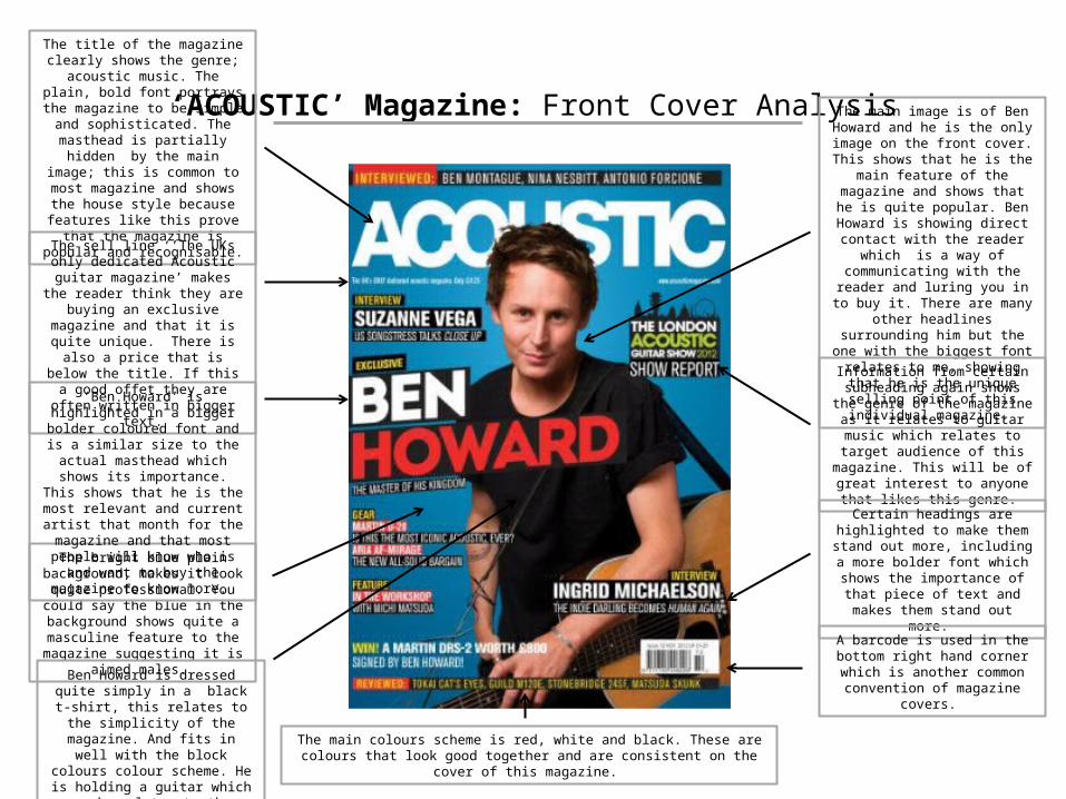
‘ACOUSTIC’ Magazine: Front Cover Analysis
The title of the magazine clearly shows the genre; acoustic music. The plain, bold font portrays the magazine
to be simple and sophisticated. The masthead is partially hidden by the main image; this is common to most magazine and shows the house style because features like this prove that
the magazine is popular and recognisable.
The sell line ‘’The UKs only dedicated Acoustic guitar magazine’ makes the
reader think they are buying an exclusive magazine and that it is quite
unique. There is also a price that is below the title. If this a good offet
they are often written in bigger text.
The bright blue plain background, makes it look quite professional. You could say the blue in the background shows quite a masculine feature to the magazine suggesting it is aimed
males.
The main image is of Ben Howard and he is the only image on the front
cover. This shows that he is the main feature of the magazine and shows
that he is quite popular. Ben Howard is showing direct contact with the
reader which is a way of communicating with the reader and
luring you in to buy it. There are many other headlines surrounding him but the one with the biggest font relates to me, showing that he is the unique
selling point of this individual magazine.
Information from certain subheading again shows the genre of the
magazine as it relates to guitar music which relates to target audience of this magazine. This will be of great
interest to anyone that likes this genre.
Certain headings are highlighted to make them stand out more, including a more bolder font which shows the importance of that piece of text and
makes them stand out more.
Ben Howard is dressed quite simply in a black t-shirt, this relates to the
simplicity of the magazine. And fits in well with the block colours colour
scheme. He is holding a guitar which again relates to the acoustic genre.
‘Ben Howard’ is highlighted in a bigger bolder coloured font and is a similar size to the actual masthead which shows its importance. This
shows that he is the most relevant and current artist that month for the magazine and that most people will
know who is and want to buy the magazine to know more.
A barcode is used in the bottom right hand corner which is another
common convention of magazine covers.
The main colours scheme is red, white and black. These are colours that look good together and are consistent on the cover of this magazine.

‘ACOUSTIC’ Magazine: Contents Page Analysis
Often there is a title ‘contents’ at the top of the page, however in this
magazine you can immediately tell that this is a contents page, so they may think it is not necessary to do a
title for the page.
The larger image at the top of the page, shows an article that may be the most popular, most interesting feature in the magazine. This often links to the front cover as well, with
the main heading on there, again showing the unique selling point of
that individual magazine.
Page numbers are commonly found on the image, next to each title of the page, to show you which page to go
to. This makes navigation easier.
The contents page is separated into different sections depending on
relevance. All of these have separate sub-headings which stand out on
the grey background in a bold font.
Although it looks like a lot of writing, it is a pretty simple writing
style, with a page number and a title, with a brief description of it. The pictures also link to the story.
The text is written in columns, like a newspaper. This makes it neater and
easier to read and navigate to the page. This is called ‘house style’.
Certain headings are highlighted to make them stand out more, including a more bolder font which shows the importance of that piece of text and
makes them stand out more.
Below the headings for each image and page, there is often a small article
with a brief description of what is going to be on that page. This lets the
reader know a bit more about that page, before flicking to that page.
Phrases within it can also add to the persuasion of buying the magazine, by making you want to read more.
The artists name is written in capitals in a larger font, which makes it stand out to other headings on this page,
again showing the importance of that article.
A frame of guitars going down the right hand side of the page, links to the genre, and also makes it look
more edgy and exciting rather than plain and boring.
As well as a main image on the contents page, there is a few smaller images dotted around the page. This gives another insight
into features of the magazine.
Although I am creating a one page contents, I can analyse this for inspiration. ‘Acoustic’ magazine always uses a double page spread for its contents.
The main colours scheme is white, grey and red, which links to the front cover of
the magazine so is consistent throughout.
There is branding at the top of the magazine, which names the
magazine again.
A small puff is used to emphasis the price of a guitar showing it is great
value. This is done in a circle puff to make it stand up and make people
notice it as a good buy.
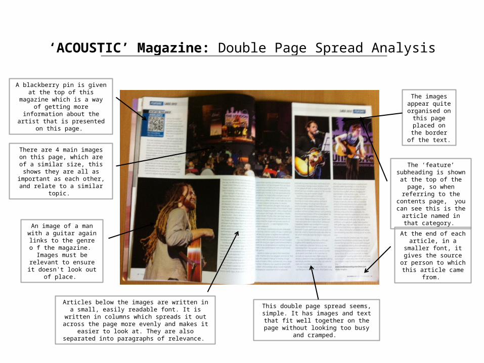
‘ACOUSTIC’ Magazine: Double Page Spread Analysis
There are 4 main images on this page, which are of a similar size, this shows
they are all as important as each other, and relate to a similar topic.
The images appear quite
organised on this page placed on
the border of the text.
This double page spread seems, simple. It has images and text that fit well together on the
page without looking too busy and cramped.
Articles below the images are written in a small, easily readable font. It is written in columns which spreads it out across the page more evenly and makes it easier to look at.
They are also separated into paragraphs of relevance.
The ‘feature’ subheading is shown at the top of the
page, so when referring to the contents page, you can see this is the article named
in that category.
At the end of each article, in a smaller font, it gives the source or person to which this article came
from.
A blackberry pin is given at the top of this magazine which is a way of
getting more information about the artist that is presented on this page.
An image of a man with a guitar again links to the genre
o f the magazine. Images must be relevant to ensure it
doesn't look out of place.

‘ACOUSTIC’ Magazine: What I Intend To Use Imitate In My Magazine
© I intend to use all common conventions used on the cover and contents page of magazines. (i.e. Masthead, main image, barcode)
© My masthead will be a bold font, with my main image overlapping a slight bit of it, but making sure it is still recognisable.
© I will have a main image of a man/woman sat with a guitar, which straight away shows the genre of the magazine.
© I will use a colour scheme that fits well with the theme and fonts.
© My contents and double page spread articles will be written in separate categories, in columns.
© I will use certain features such as gig dates and guitar sheet music, which fits in with the genre of my magazine.
© A blackberry pin is used at the top of a double page spread, which is a way of getting more information about this artist who is the feature of that article. This is a good idea of getting people more interested in the artist, so I will use this in my magazine.
© ‘Feature’ is the name of the subheading from the contents written on the double page spread showing which catagory it is has come from. This makes it easier for navigation so i will use it in my final design.