Embed Size (px)
Citation preview
Journal of Industrial and Intelligent Information Vol. 2, No. 3, September 2014
2102014 Engineering and Technology Publishingdoi: 10.12720/jiii.2.3.210-216
A User-Centered Evaluation of a University
Website
Hanan T. Basher, Dawn Mary Kristine C. Gacus, Rachell P. Mingo, and Aloha May H. Ambe Mindanao State University - Iligan Institute of Technology, Information Technology Department
Tibanga, Iligan City, Philippines
Email: {hbasher18, kriscabana, rachell.mingo92}@gmail.com, [email protected]
Abstract—Usability of a website used to be of very little or
no weight at all for the company or academe it represents.
With the changing time and increase of Internet users,
usability is now a major consideration as website, though
virtual, plays an important role for the company or
university it represents. This study illustrates the process of
assessing a university website. The value of doing usability
testing and how it enriches the user experience is presented.
Learning about the user and their satisfaction in all aspects
of the website is learned through the testing process. A five-
phased usability testing methodology is discussed that
resulted into qualitative and quantitative data for the
researchers study. These data were transformed into
information through analysis in accordance to the type of
data collected. These findings were then interpreted into
concrete website usability assessment. The result showed
that the methodology chosen and the test plan it produced
was able to output website usability problems that can help
assess and greatly improve a university website’s usability.
Lastly, study recommendations were presented being that
usability should be a never ending endeavor for a user-
concerned university.
Index Terms—human computer interaction, user-centered
evaluation, usability testing, user satisfaction, web usability,
user-centered design
I. INTRODUCTION
Website usability is a traditional concept in human-
computer interaction and if implemented correctly,
cultivates a positive attitude about the website in its user
group [1]. Universities from all over the globe are using
websites to promote their school and to attract students to
enroll. The websites have been the easy access for the
students and other audiences. It serves as a tool for the
students to discern certain information that they are
looking for.
In making the website, there are things that should be
considered. The website has to be visually appealing,
polished and organized. It has to cater the necessary
needs of the users and contain the information that the
users came in the website for.
Usability is the extent to which users can use a
computer system to achieve specified goals effectively
and efficiently while promoting feelings of satisfaction in
a given context of use [2].
Manuscript received January 15, 2014; revised March 14, 2014.
If the usability is not enough, important task can be
difficult and complex tasks cannot be done. It is the
breadth to which the users can manipulate computer
system to accomplish specified goals effectively and
efficiently while extending state of comfort to the users.
A university website is a comprehensive website that
caters to different type of users: current students, faculty,
staff, alumni, prospective students, parents, researchers to
name a few of these user types.
This target audience is common among university
websites. The audience and information presents an
opportunity to perform an in-depth usability for the
website and to present pragmatic findings and guidelines
which can be used to improve the university website.
II. PROBLEMS
A university that acknowledges the advancements of
the information age would aim to serve their stakeholders
better including services over the Internet. Thus their
website plays an important role as the face of the
university in the virtual world. University websites, such
as state universities in the Philippines, in particular, have
lapses on usability. Apart from the fact that usability is
not a primary concern in the websites’ development,
these websites cater to many user groups, hence lessen
users’ satisfaction. If the university website continues to
violate usability convention users will be continually
confused as to how to use the website and might result to
loss of revenue. Furthermore, university websites lack
local data and information for them to answer existing yet
still unknown usability problems.
III. OBJECTIVES
The researchers would develop and conduct usability
test that would determine a university website’s usability.
This includes establishing a baseline of user performance,
establishing and validating user performance measures,
and identifying potential design concerns to be addressed
in order to have a more usable university website which
focuses on user experience.
The researchers’ specific objectives are as follows:
In obtaining the general purpose of this research, the
researchers need to meet the following specific objectives:
To create a Test Plan that will be used to verify
and ensure if the website meets usability heuristic
principles.
Journal of Industrial and Intelligent Information Vol. 2, No. 3, September 2014
2112014 Engineering and Technology Publishing
To conduct usability testing on a university
website.
To evaluate and analyze the results of the data
gathered during the usability test.
To recommend a list of changes that could be
applied on the existing university website.
To evaluate the methodology used in assessing
usability.
IV. METHODOLOGY
The researchers performed the study on one university
website as the test subject. In this study, researchers
chose, Mindanao State University – Iligan Institute of
Technology Website (www.msuiit.edu.ph).
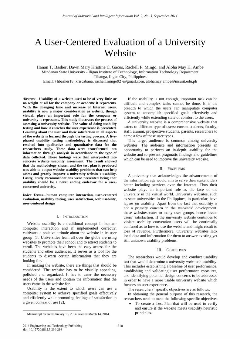
Figure 1. www.msuiit.edu.ph homepage
Fig. 1 is the homepage of the subject website at the
time of the study. This image was captured on February
7, 2013.
The researches distilled the testing process into five
phases. These phases are patterned from the process
presented in Carol Barnum’s Usability Testing Essentials
[3].
The first phase is Data Gathering. The researchers
collected data about the technology to be tested and its
users. In this phase, the researchers chose a website to be
the subject of the usability test.
The researchers collected information from the web
team so they can have a profile of the university website.
Interviews were done to existing website users to have a
starting point of the study. Base on the collected
information, the researchers decided to test five user
groups that are important stakeholders of the university
website: Prospective Student, Current Student, Alumni,
Faculty, and Staff. Initial interviews were done to have
initial insights of the work ahead.
Second phase is Designing the Test Plan which
includes the User Profiling, Team Roles, and the
Preparing the Test Documents. During this phase, the
researchers designed and wrote the test plan to serve as
the guide in conducting the test; activities before and after
the test, metrics to use, number of participants per user
group, and the test scenarios.
This phase also includes the profile of the target users
as participants and their set of qualifications.
There are five major roles in conducting the test:
moderator or test monitor, data loggers, observers, test
participants, and time keepers. These roles were
distributed to the researchers and volunteers to be part in
the testing team.
Screening questionnaires, background information
questionnaire, pre-test questionnaire, orientation script,
task scenarios and post-task questionnaire, data collection
instrument, post-test questionnaire, and debriefing
questionnaire are the test documents that were designed
and prepared before conducting the test.
Upon completion of the test plan, the researchers were
able to recruit the participants as part of the pre-testing
process; thus the third phase, Conducting the Test. Prior
to the actual testing day, participants are determined
through screening questionnaire distribution then
selecting who among them fit the user profiles.
In total, the researchers have fifty (50) participants; 10
per user group. This number is of ample amount to gain
insights from these different user groups according to
Jakob Nielsen, a renowned personality on web usability.
[4]
With the participants scheduled, the researchers
prepared then performed the actual testing: setting up the
room, meeting and greeting, gathering of background
information, orientation, performing actual testing, post-
testing, and debriefing.
The fourth phase is Analyzing the Findings/Results.
The researchers analyzed the results based on the
compiled data from all subjects and focused on recurring
problems, trends, and comments. The usability metrics
such as completion rates, time on task (TOT) and users’
subjective evaluations on rating scales was utilized in this
study.
The benchmarks for the above usability metrics are as
follow: average completion rate is 78% as resulted in the
study of Jeff Sauro, a user experience statistics expert, of
almost 1200 usability tasks [5], completion rate for per
user group is the statistical mean but as for the entire 50
participants, the median was used [6]. Also, user’s
subjective satisfaction rating was collected using Likert-
type response to questions.
Qualitative data, including the thought process through
thinking out loud by the participant, post-test
questionnaire open-ended questions, and interview, are
used to back up the performance data.
As means of collecting the users’ subjective evaluation,
following suit Carol M. Barnum and Laura A. Palmer’s
study, the researchers used Microsoft Corporation’s
product reaction cards during the post-test session [7].
Word cloud was used to present the answers made from
the product reaction cards as recommended by Barnum
[8].
The last phase is Presentation of Results and
Recommendations where the researchers presented the
quantitative data and qualitative data found. Usability
problems are distilled from the testing process. This is
presented and was prioritized based on severity and
frequency. Frequency is how often the usability problem
occurred all throughout the testing process. Severity is
the level to which the usability problem affected the users
[9].
Journal of Industrial and Intelligent Information Vol. 2, No. 3, September 2014
2122014 Engineering and Technology Publishing
Base on the report from the Presentation of Results
Phase, the researchers reviewed its steps and evaluated
the process of assessing a university website.
V. RESULTS AND DISCUSSION
The methods and procedures used during the testing
period provided a number of results both quantitative and
qualitative data. The methods themselves worked to
clearly demonstrate the intent of the study.
A. Quantitative Results
One of the three quantitative data collected was the
completion rate. A total of 330 tasks were done by all 50
participants. Of the 330 tasks, 234 were completed
giving the website’s average completion rate of 70.606%.
This number is below the general recommended average
completion rate of 78%.
Though below average, the website’s completion rate
is considerably close to the 50% percentile being that it is
better than 44% of all its tasks when computed base on
Sauro’s model on exponential nature of the cumulative
distribution using a quadratic regression equation which
fits well to the observed data (adj-R2 = 99.5%). [5]
Having more than 25 participants, the researchers used
the median of the entire 330 TOT to find the average
performance. It resulted to a median of 47 seconds.
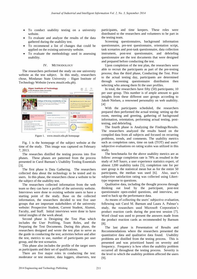
Figure 2. Time on task distribution.
Fig. 2 shows the distribution of TOT with respect to
the median. Each of the five user group’s TOT average
was derived by getting the mean of 10 participants in that
particular user group. It showed that per user groups’
performance were below the 47-second average:
prospective students TOT mean is 99.8 seconds, current
students’ TOT mean is 59.45 seconds, alumni’s TOT
mean is 67.24 seconds, faculty’s TOT mean is 53.75
seconds and staff’s TOT mean is 75.76 seconds.
The third quantitative data gathered is from the
subjective user response done using the post-test session.
The researchers asserted that the dominant rating
participants gave to each questions is satisfactory. Such
rating is collected from their response to the following
statements:
The website is easy to use.
The navigation of the website is easy to
understand.
Finding the information is easy.
The website gave you enough information.
The information is presented in an organized
manner.
I find the information reliable
I understand the content of the pages.
The typography (letter size, font-family) is easy to
read.
The links and buttons recognizable and functional
The contents are up to date
The website provides complete information.
I find the information useful and relevant.
They answer with the following rating scale: strong
agree, agree, undecided, disagree and strongly disagree.
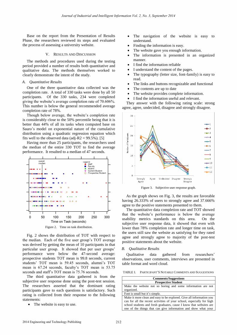
Figure 3. Subjective user response graph.
As the graph shows on Fig. 3, the results are favorable
having 26.333% of users to strongly agree and 37.666%
agree to the positive statements presented to them.
The quantitative data completion rate and TOT showed
that the website’s performance is below the average
usability metrics standards on this area. On the
subjective user response data, it showed that even with
lower than 78% completion rate and longer time on task,
the users still saw the website as satisfying for they rated
agree and strongly agree to majority of the post-test
positive statements about the website.
B. Qualitative Results
Qualitative data gathered from researchers’
observations, user comments, interviews are presented in
table format and word cloud.
TABLE I. PARTICIPANT’S NOTABLE COMMENTS AND SUGGESTIONS
Comments/Suggestions Prospective Student
Make the website not so boring and some information are not
organized.
Font is small but it’s simple.
Make it more clean and easy to be explored. Give all information you can for all the recent activities of your school, especially for high
school students and fresh graduates, cause I know that websites are one of the things that can give information and show what your
Journal of Industrial and Intelligent Information Vol. 2, No. 3, September 2014
2132014 Engineering and Technology Publishing
subjects have that give information and show what your subjects
have that its worthy to read. It’s not hard to use.
The background should be attractive enough to catch the attention of
the visitors.
The website is not clearly giving information, difficult to find.
Put some other pictures, information, or events inside the MSU-IIT website.
Current Student Keep the dean’s list updated right after every semester, since it is one
of the sections of the website that the students would likely visit and see.
The sites color should be darkened a little bit because it’s too bright.
Avoid too much text content in the homepage.
Rearrange the links so that it will be visible to the users.
Alumni More interaction for students to visit it often, like animation or
cinematics, color coordination for the eyes in order to be pleasing for
visitors.
There should be a page where you can process the document and can be sent to you using external carriers (LBC, FEDEX) for a more
comfortable and hassle free document processing.
It should have an updated content. Announcements and memorandums must be posted there in a timely manner. Enrolment
process must be applicable in the website to avoid long queue in
Dep’t & colleges.
The widgets are of good use; however, it somehow is confusing for the reason that all of them have the same color. If they will be
designated with colors – that are of course different – then it would
be easier to familiarize.
Keep information up to date. Apply online processes ex. Enrolment,
application of documents at the registrar
Fixed/organized content. Consistency in design.
Too many text.
The website is full of words. Pictures on the homepage would be
more effective. And try to move the widgets on the side, everything
seems to be in the center.
Bigger Font size
More picture in the home page
Faculty Map and directories now to get from one place to another, directory
of the voice over IP phones (local) in the institute. Because this is really useful for new students and new faculty and staff.
Improve the search bar, add more filters perhaps for data to be easily
sorted indexed and searched.
It should not look so cluttered. There are so many things, so many colors (shades in the homepage. It should look young, vibrant, boring
man gud tan-awon).
The news should be updated.
There should be a chat room.
There should be a sounding board so that students, faculty and staff don’t need to go to Facebook to air out their complaints and
suggestions.
Update the chancellor’s message to suit the Chancellor’s message not only on Institute’s activities but national and international
events/affairs. Feature Outstanding Faculty, Staff, and students in the
Spotlight.
I guess it is important to update this everytime (I mean monthly) so as to provide more information to the constituents. I believe there is a
need to really re-develop the website because it does not look like a
university website. The news should not only present the travels and activities of faculty members, though it is good, there should also be
an information about our extension activities. Update this please.
Make it a world-class website. Thanks!
Improve nodes, one page, no scroll, better photos, and current news.
Staff
I would suggest to provide additional information or or profile of
faculty and staff e.g. age and consistency on hyperlinks or additional tab download and then group according to cost center or colleges or
linkages. For Philhealth forms, pag-ibig, etc.
Make them lively
Change the color of the homepage
So far, I find it updated.
Maybe put some animation in the website.
Enlarge the font.
The participants’ comments will help the reader or the
web team concern visualize the severity of a problem and
the users’ insights [10]. Table I show some of the notable
comments that the researchers felt the web team should
know.
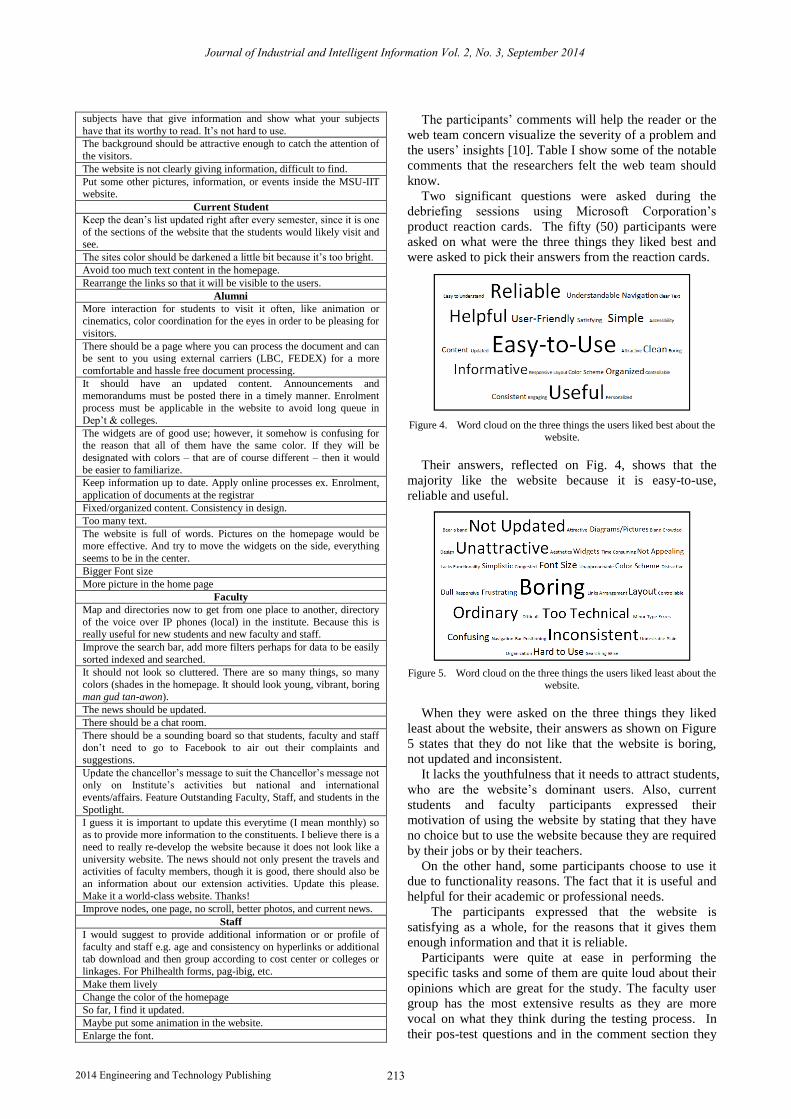
Two significant questions were asked during the
debriefing sessions using Microsoft Corporation’s
product reaction cards. The fifty (50) participants were
asked on what were the three things they liked best and
were asked to pick their answers from the reaction cards.
Figure 4. Word cloud on the three things the users liked best about the website.
Their answers, reflected on Fig. 4, shows that the
majority like the website because it is easy-to-use,
reliable and useful.
Figure 5. Word cloud on the three things the users liked least about the website.
When they were asked on the three things they liked
least about the website, their answers as shown on Figure
5 states that they do not like that the website is boring,
not updated and inconsistent.
It lacks the youthfulness that it needs to attract students,
who are the website’s dominant users. Also, current
students and faculty participants expressed their
motivation of using the website by stating that they have
no choice but to use the website because they are required
by their jobs or by their teachers.
On the other hand, some participants choose to use it
due to functionality reasons. The fact that it is useful and
helpful for their academic or professional needs.
The participants expressed that the website is
satisfying as a whole, for the reasons that it gives them
enough information and that it is reliable.
Participants were quite at ease in performing the
specific tasks and some of them are quite loud about their
opinions which are great for the study. The faculty user
group has the most extensive results as they are more
vocal on what they think during the testing process. In
their pos-test questions and in the comment section they
Journal of Industrial and Intelligent Information Vol. 2, No. 3, September 2014
2142014 Engineering and Technology Publishing
also expressed dissatisfaction and they gave suggestions
for the website.
C. Usability Problems Found
In this section the problems that were found during the
testing are all listed down. Each of the usability problem
is categorized base on problem frequency and severity of
its corresponding usability problem; where severity levels
are Level 1 – Prevented completion of task, Level 2 -
Frustrated participant and caused significant delay on a
task, Level 3 - Had a minor effect on usability and Level
4 - Caused no significant impact on performance, but
participant indicated a preference or a suggestion for
future changes [11].
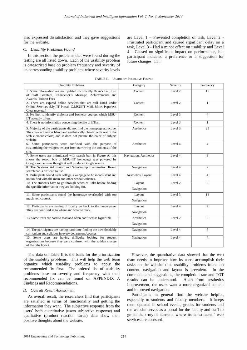
TABLE II. USABILITY PROBLEMS FOUND
Usability Problems Category Severity Frequency
1. Some information are not updated specifically Dean’s List, List
of Staff Grantees, Chancellor’s Message, Achievements and Awards, Tuition Fees
Content Level 2 15
2. There are expired online services that are still listed under
Online Services (My.IIT Portal, G.MSUIIT Mail, Mole, Paperless Clearance etc.)
Content Level 2 1
3. No link to identify diploma and bachelor courses which MSU-
IIT actually offers.
Content Level 3 4
4. There is no information concerning the life of IITian. Content Level 3 1
5. Majority of the participants did not find the homepage attractive. The color scheme is bland and aesthetically chaotic with rest of the
web element colors; and it does not picture the color of subject website.
Aesthetics Level 3 25
6. Some participants were confused with the purpose of
customizing the widgets, except from narrowing the contents of the site.
Aesthetics Level 4 4
7. Some users are intimidated with search bar. In Figure A, this
shows the search box of MSU-IIT homepage says powered by Google so the users thought it will produce Google results.
Navigation, Aesthetics Level 4 3
8. The Systems Admission and Scholarship Examination Result
search bar is difficult to use
Navigation Level 4 2
9. Participants found each college’s webpage to be inconsistent and
not unified with the main and other school websites.
Aesthetics, Layout Level 4 4
10. The students have to go through series of links before finding the specific information they are looking for.
Layout
Navigation
Level 2 5
11. Some participants found the homepage overloaded with too much text content.
Layout
Navigation
Level 3 14
12. Participants are having difficulty go back to the home page. They are confused as to where and what to click.
Layout
Navigation
Level 4 2
13. Some texts are hard to read and often confused as hyperlink. Aesthetics
Navigation
Level 2 3
14. The participants are having hard time finding the downloadable curriculum and syllabus in every department/courses
Navigation Level 4 5
15. Some users are having difficulty looking for student
organizations because they were confused with the sudden change of the tabs layout.
Navigation Level 4 4
The data on Table II is the basis for the prioritization
of the usability problems. This will help the web team
organize which usability problems to apply the
recommended fix first. The ordered list of usability
problems base on severity and frequency with their
recommended fix can be found on APPENDIX A
Findings and Recommendations.
D. Overall Result Assessment
As overall result, the researchers find that participants
are satisfied in terms of functionality and getting the
information they want. The subjective response from the
users’ both quantitative (users subjective response) and
qualitative (product reaction cards) data show their
positive thoughts about the website.
However, the quantitative data showed that the web
team needs to improve how its users accomplish their
tasks on the website thus usability problems found on
content, navigation and layout is prevalent. In the
comments and suggestions, the completion rate and TOT
results can be understood. Apart from aesthetics
improvement, the users want a more organized content
and improved navigation.
Participants in general find the website helpful,
especially to students and faculty members. It keeps
them updated in school events, grades for students and
the website serves as a portal for the faculty and staff to
go to their my.iit account, where its constituents’ web
services are accessed.
Journal of Industrial and Intelligent Information Vol. 2, No. 3, September 2014
2152014 Engineering and Technology Publishing
The participants also expressed their hope for the
availability of systems like online enrolment or online
document requests. Participants want these parts of the
website to be improved due the reason that they’ve
experienced some difficulties in these areas.
VI. CONCLUSION
It has been shown that the nature of a University
website is a different category of website from all other
websites, especially commercial website. There are few
factors to consider in developing a website. Some of them
are content, organization, navigation, aesthetics and most
importantly usability. There are different techniques that
had been used by the past researches like talk aloud
techniques, classification of usability problems and
sample sizes.
It can be assumed that test subject website intends to
provide all the necessary information and to preserve
good interface. This study compelled endeavor in
promoting the organization and its strive for excellence.
The primary aim was to conduct a usability testing to a
university website which helps in improving services in
order to satisfy clients and so this test can serve as a
concrete and organized user feedback for the web team.
This study served as benchmark for similar studies of this
kind.
The test produced results from multiple data sources.
The first data source was the task completion rate. These
results gave indications about which tasks the participants
failed to accomplish. The second source of data was the
timer sheet which results measured how long the
participant performed the task. The results also showed
which tasks that required a considerable amount of time.
The presence of these data sources made the
interpretation apparent and worthy.
From the data gathered, it showed that for most of the
tasks, participants actually have completed it successfully
though in a longer time frame. These process guides the
researchers in analyzing what are the specific information
that the participants have hard time looking for and which
specific area of the website. Lastly, the participants’
subjective experience with the system was measured in
order to find the tasks that participants were commonly
experiencing difficulties with.
Questionnaires were tallied and performed by
analyzing the results from each questions. Based on the
findings and the amount of data collected and analyzed,
the study clearly was successful at demonstrating the
positive and negative findings of the features of the
current phase of the university website.
In conclusion the methodology used works well for the
usability testing that the researchers performed. It guided
the researchers all throughout the usability testing process
and made the flow of the analysis in order. The process is
not bias or detrimental to test subject website.
Nonetheless, this is not the end of the testing;
guidelines in developing a university website, content-
wise and interface-wise, were created and can be
improved upon. Finally, the usability testing method does
require further assessment. The testing performed in this
study presents a solid basis for future testing and
developing a university website. If the recommendations
are considered, the testing may provide even more
accurate and relevant results.
VII. RECOMMENDATIONS
An important part of the usability study is being able to
follow up on the results. After the recommendations have
been implemented, the website should be tested again to
review the effectiveness of the changes. This is not the
end of usability studies at the University. There are a lot
of aspects to be considered when conducting a usability
testing. Some follow up studies will be based on the
results and some can be based on the guidelines. Using
the guidelines to develop university website, there should
be a follow up study using different University to see
how acceptable and repeatable the study based on test
plan and guidelines.
APPENDIX A FINDINGS AND RECOMMENDATIONS
Appendix A is the arranged usability problems
according to severity and frequency under Area of
Concerns column. This document also indicates the
recommended fix for each usability problem with the
usability principle behind the recommendation.
Illustrations are placed for a more clear understanding of
the usability problem. These information are arranged in
table-format.
ACKNOWLEDGMENT
The authors wish to thank the MSU-IIT web team for
their support on our usability study. Also, the authors
would like to thank their family and friends who
supported and guided them all throughout this study.
Most especially to the Almighty who made everything
possible.
REFERENCES
[1] D. Desai, “A comparative study of user preferences of a
personalized academic website,” MS thesis, Dept. Computer and Information Technology, Perdue Univ., West Lafayette, IN, 2012.
[2] Guidance on Usability, International Standards Organization
9241-11, 1998. [3] C. Barnum, Usability Testing Essentials, 30 Corporate Drive,
Suite 400, Burlington, MA 01803, USA: Elsevier Inc. 2011, ch. 6-9, pp. 107-304.
[4] J. Nielsen, Usability Engineering, San Francisco, CA: Academic
Press, Morgan Kaufmann, 1993, ch. 5, pp. 155-157. [5] Taxonomy User Testing, Office for National Statistics, Pimlico,
London, 2013, pp. 10. [6] J. Sauro and J. R. Lewis, "Average task times in usability tests:
What to report?" in Proc. SIGCHI Conference on Human Factors
in Computing Systems, Atlanta, GA., 2010, pp. 2347-2350. [7] C. Barnum and L. Palmer, “More than a feeling: Understanding
the desirability factor in user experience,” in Proc. CHI'10 Extended Abstracts on Human Factors in Computing Systems
Atlanta, GA., 2010, pp. 4703-4716,.
[8] C. Barnum, Usability Testing Essentials, 30 Corporate Drive, Suite 400, Burlington, MA 01803, USA: Elsevier Inc. 2011, ch. 9,
pp. 303.
Journal of Industrial and Intelligent Information Vol. 2, No. 3, September 2014
2162014 Engineering and Technology Publishing
[9] C. Barnum, Usability Testing Essentials, 30 Corporate Drive, Suite 400, Burlington, MA 01803, USA: Elsevier Inc. 2011, ch. 8
,
pp. 263-264.
[10] C. Barnum, Usability Testing Essentials, 30 Corporate Drive, Suite 400, Burlington, MA 01803, USA: Elsevier Inc. 2011, ch. 9,
pp. 297. [11] C. Barnum, Usability Testing Essentials, 30 Corporate Drive,
Suite 400, Burlington, MA 01803, USA: Elsevier Inc. 2011, ch. 9,
pp. 300.
Hanan T. Basher is a graduate of Bachelor of Science in Information Technology Major in
Multimedia Systems from MSU-Iligan
Institute of Technology, Iligan City, Philippines last November 2013. Born on
March 21, 1992 in United Arab Emirates and currently resides at Darusalaam Matampay,
Marawi City, Philippines.
She experienced her internship at Sutherland Global Services, Davao City, Philippines and
Iligan Computer Institute, Iligan City Philippines.
Ms. Basher is a member of Junior Information Technology Society
(JITS), MSU-IIT DOST Scholars Association (MIDSA) and MSU-IIT Muslim Students Association (MIMSA).
Dawn Mary Kristine C. Gacus
is a graduate
of Bachelor of Science in Information Technology Major in Multimedia Systems
from MSU-Iligan Institute of Technology, Iligan City, Philippines last November 2013.
Born on May 12, 1992 in Iligan City,
Philippines. She experienced her internship at Sutherland
Global Services, Davao City, Philippines and Iligan Computer Institute, Iligan City
Philippines.
Ms. Gacus
is a member of Junior Information Technology Society (JITS), and La Salle Academy Alumni Association (LSAA).
Rachell P. Mingo
is a graduate of Bachelor of Science in Information Technology Major in
Multimedia Systems from MSU-Iligan Institute of Technology, Iligan City,
Philippines last November 2013. Born on
June 26, 1992 in Iligan City, Philippines.
She experienced her internship at Pilmico
Foods Corporation, Iligan City, Philippines. She also has online work experience with
Kidis Creative Advertising of Adelaide
Australia as data entry
expert, website administrator, mobile website developer and team leader of development. She is currently employed
at JPMorgan Chase & Co. as a telephone banker. She is currently based
in Cebu City, Philippines.
Ms. Mingo
is a member of Junior Information Technology Society
(JITS), MSU-IIT DOST Scholars Association (MIDSA) and MSU-IIT Muslim Students Association (MIMSA).
Aloha May H. Ambe
is an assistant professor
in Mindanao State University –
Iligan
Institute of Technology, School of Computer Studies,
Iligan City, Philippines. She finished
her baccalaureate degree, Bachelor of Science in Information Technology Major in Business
Software Development, in the same school,
March of 2002. May 2006 was when she finished her master’s degree, Master in
Information Technology, in Ateneo de Manila University, Quezon City, Philippines.
She has been with MSU-IIT, Iligan City Philippines, since June 2003 as
a Faculty Member of the Information Technology Department. She began as an Instructor to Assistant Professor when she finished her
master’s degree. She is currently the chairperson of said department and was the School of Computer Studies’ graduate coordinator prior.
Prof. Ambe is a member of International Association of Computer
Science and Information Technology (IACSIT).