Embed Size (px)
Citation preview
ByBirol Özkaya
USER-CENTERED WEBSITE/SOFTWARE DEVELOPMENT
Goals of Human Computer InteractionTo develop or improve the followings in computerized systems:• Safety - "safety of users", "safety of data", or both• Utility - services that the system provides• Effectiveness - user’s ability to accomplish a desired goal
• Efficiency - how quickly users can accomplish their goals
• Usability - ease of learning and ease of use• Appeal - how well users like the system
Content OrganizationMajor component of the design phase for a website or software is organizing its contents.
Organizational Schemes:• Alphabetical• Chronological• Geographical• Topical• Task-Oriented• Audience-Specific• Hybrid (combination of multiple organizational
schemes)
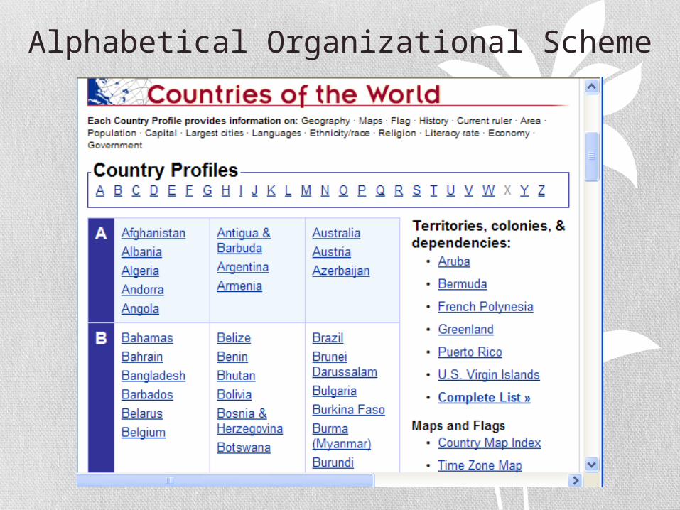
Alphabetical Organizational Scheme
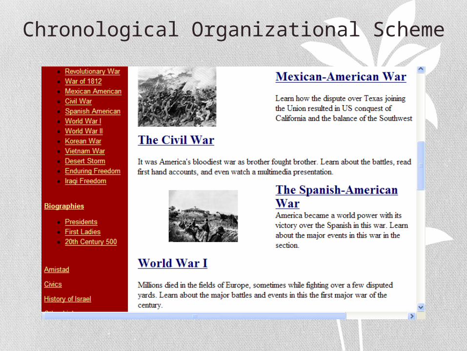
Chronological Organizational Scheme
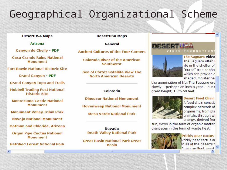
Geographical Organizational Scheme
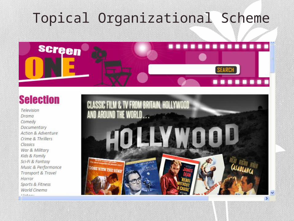
Topical Organizational Scheme
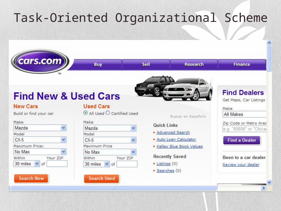
Task-Oriented Organizational Scheme
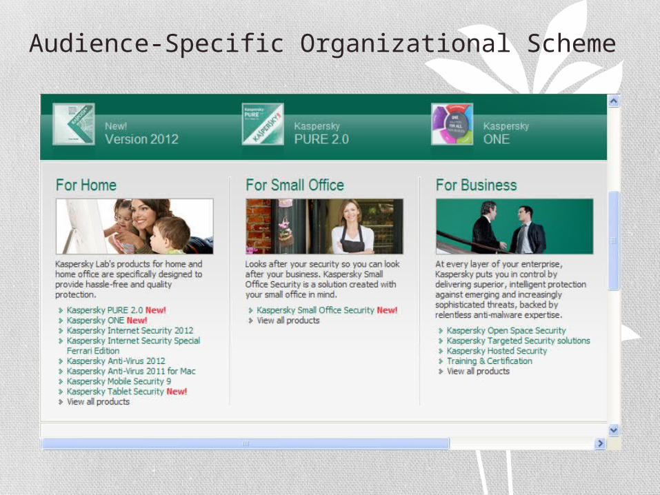
Audience-Specific Organizational Scheme
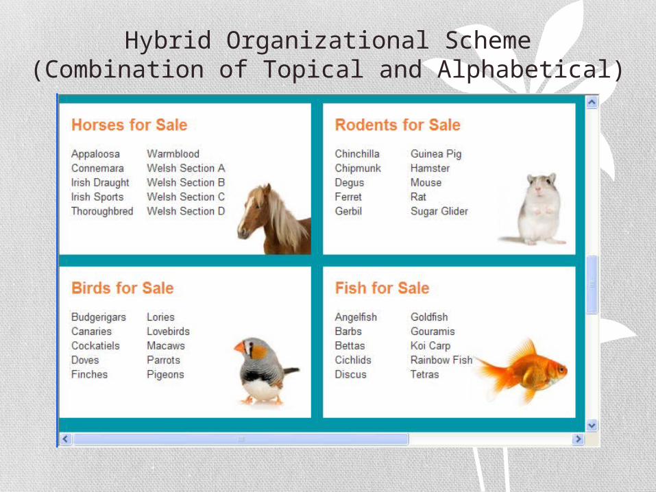
Hybrid Organizational Scheme (Combination of Topical and Alphabetical)
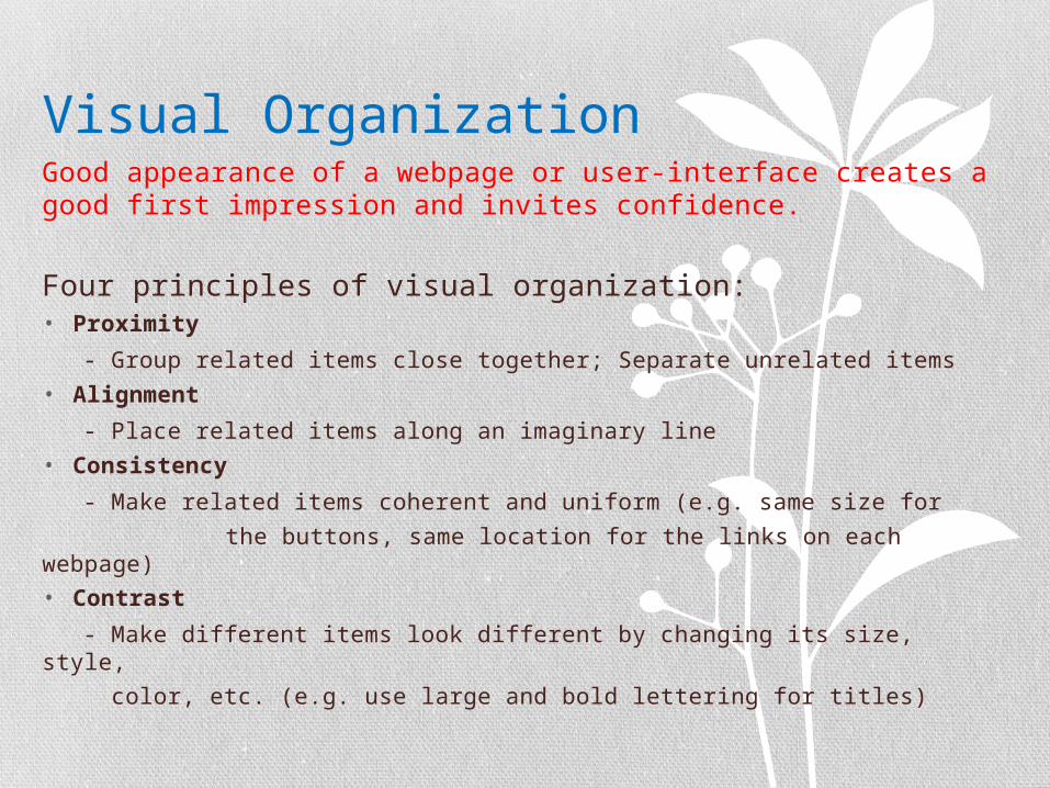
Visual OrganizationGood appearance of a webpage or user-interface creates a good first impression and invites confidence.
Four principles of visual organization:• Proximity
- Group related items close together; Separate unrelated items
• Alignment
- Place related items along an imaginary line
• Consistency
- Make related items coherent and uniform (e.g. same size for
the buttons, same location for the links on each webpage)• Contrast
- Make different items look different by changing its size, style,
color, etc. (e.g. use large and bold lettering for titles)
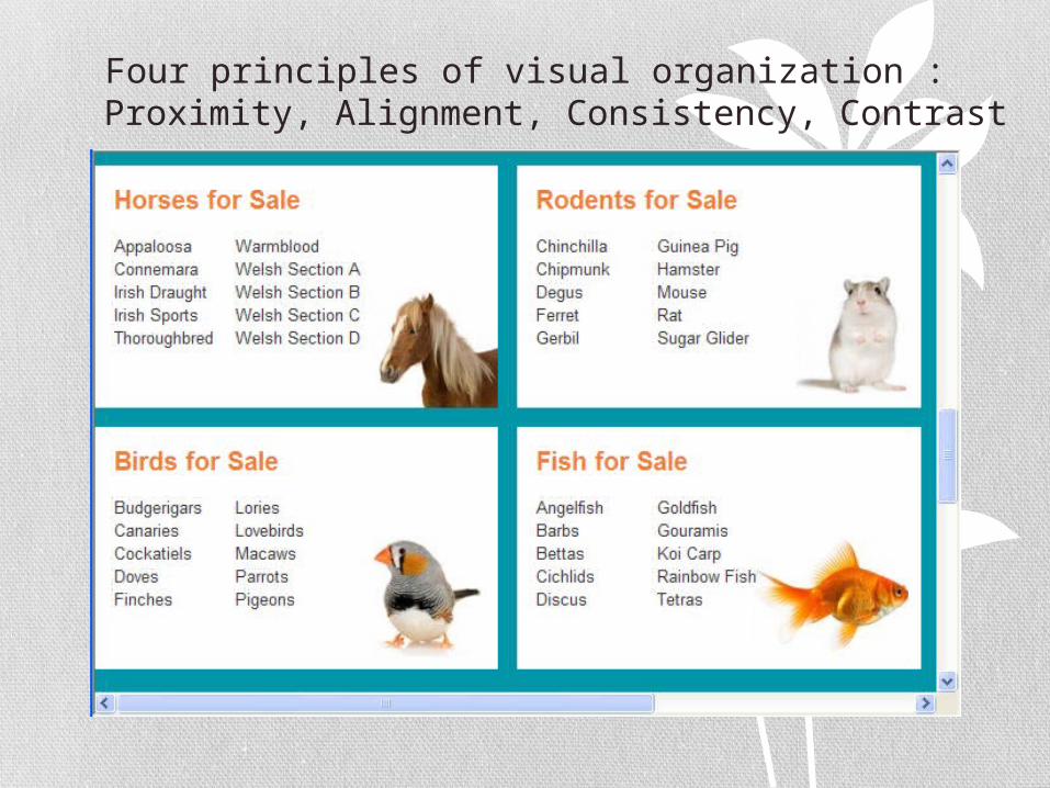
Four principles of visual organization : Proximity, Alignment, Consistency, Contrast
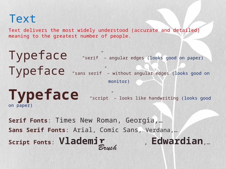
TextText delivers the most widely understood (accurate and detailed) meaning to the greatest number of people.
Typeface “serif” – angular edges (looks good on paper)
Typeface “sans serif” – without angular edges (looks good on
monitor)
Typeface “script” – looks like handwriting (looks good on
paper)
Serif Fonts: Times New Roman, Georgia,… Sans Serif Fonts: Arial, Comic Sans, Verdana,…
Script Fonts: Vlademir, , Edwardian,…
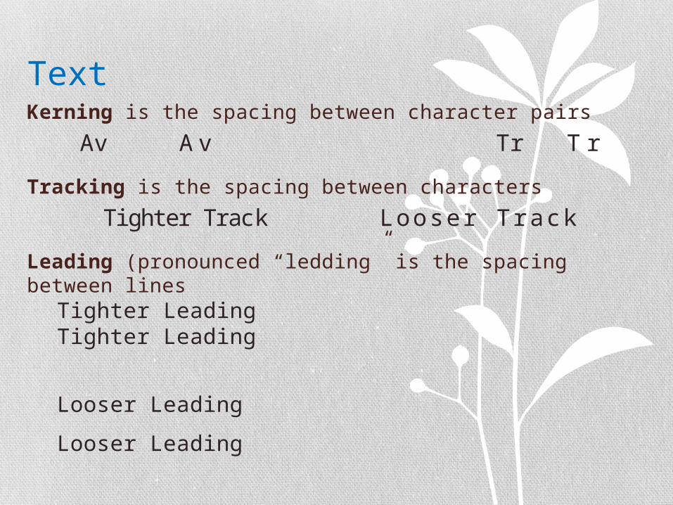
TextKerning is the spacing between character pairs
Av A v Tr T r
Tracking is the spacing between characters
Tighter Track Looser Track
Leading (pronounced “ledding” is the spacing between lines
Tighter LeadingTighter Leading
Looser Leading
Looser Leading

Choosing Text• For small type, use the most legible font available.
Can you read me? 10-point Arial font
Can you read me? 10-point Vlademir font
• In text blocks, adjust the leading for the most pleasing line spacing. Too tightly packed lines are difficult to read.
• In large-size headlines, adjust the tracking and kerning for the most pleasing character spacing. Don’t use big gaps between large letters.
KEYBOARDINGK E Y B O A R D I N G
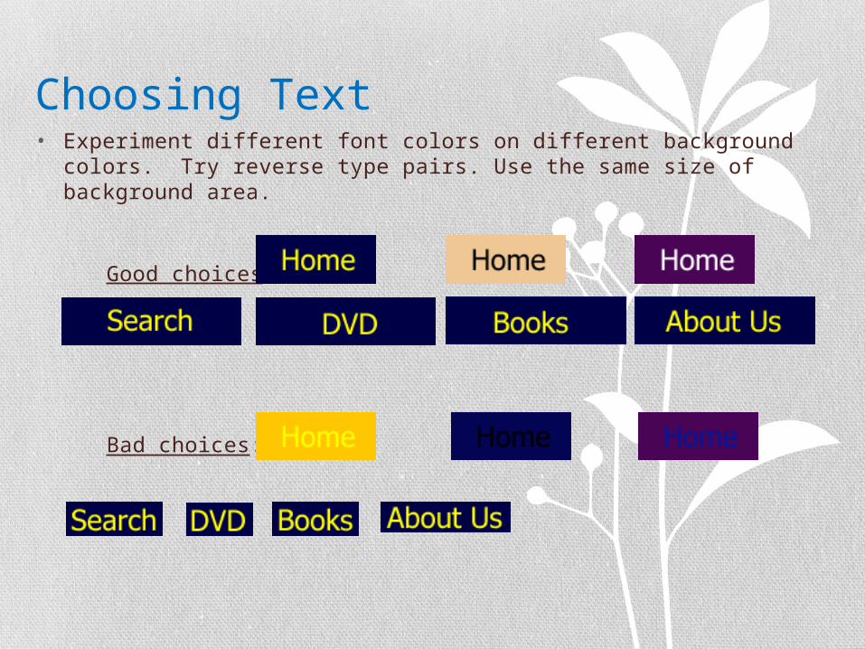
Choosing Text• Experiment different font colors on different background colors.
Try reverse type pairs. Use the same size of background area.
Good choices:
Bad choices:
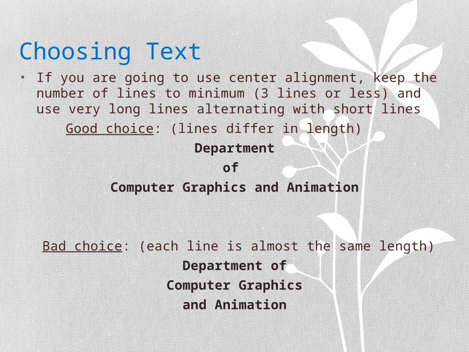
Choosing Text• If you are going to use center alignment, keep the number of
lines to minimum (3 lines or less) and use very long lines alternating with short lines
Good choice: (lines differ in length)
Department
of
Computer Graphics and Animation
Bad choice: (each line is almost the same length)
Department of
Computer Graphics
and Animation
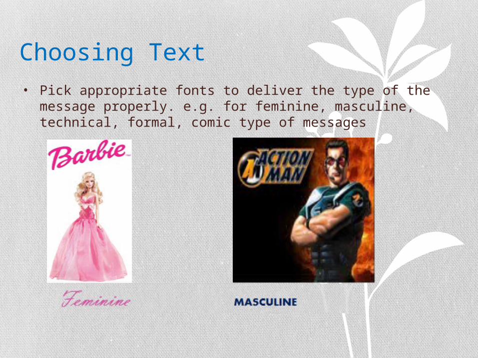
Choosing Text• Pick appropriate fonts to deliver the type of the message
properly. e.g. for feminine, masculine, technical, formal, comic type of messages
Try to learn about your users !The more you learn about your users and their work, the more likely it is that you will develop a user-friendly website or software.
Consider:• Age• Education• Cultural Differences• Physical Differences , etc. ….. of your users !
That’s All Folks
Thanks for Listeningand
Good Luck !!!