Embed Size (px)
Citation preview
Joel Filipe Rogão Pires
A DATA-DRIVEN APPROACH TO MOBILITY MODELLING OF
URBAN SPACES INFERRING COMMUTING ROUTES AND TRAVEL MODES
Dissertation in the context of the Masters in Informatics Engineering, specialization in
Intelligent Systems advised by the Professor Doctor Carlos Lisboa Bento and the Professor Doctor Marco Veloso and presented to Faculty of Sciences and Technology / Department
of Informatics Engineering.
September 2019
A D
ATA
-DR
IVEN
AP
PR
OA
CH
TO
MO
BIL
ITY
MO
DEL
LIN
G O
F U
RB
AN
SP
AC
ES
INFE
RR
ING
CO
MM
UTI
NG
RO
UTE
S A
ND
TR
AV
EL M
OD
ES
Joel
Fili
pe
Ro
gão
Pir
es
Faculty of Sciences and Technology
Department of Informatics Engineering
A Data-Driven Approach to Mobility
Modelling of Urban Spaces Inferring Commuting Routes and Travel Modes
Joel Filipe Rogão Pires
Dissertation in the context of the Masters in Informatics Engineering, specialization in
Intelligent Systems advised by the Professor Doctor Carlos Lisboa Bento and the Professor
Doctor Marco Veloso and presented to Faculty of Sciences and Technology / Department of
Informatics Engineering.
September 2019

ii
This page is intentionally left blank.
iii
Abstract
Cities are becoming more and more a magnet for diversity, creativity, and wellbeing.
Challenges related to increased density and complexity are being addressed by the
integration of smarter computational systems at the various levels of the urban fabric.
Data plays a crucial role in understanding urban flows and mobility patterns through the
development of models that are used to improve the transportation network, social
environment, and security in urban spaces. A type of data used to feed these models is the
Call Detail Records (CDRs) that provide information on the origin and destination of voice
calls at the level of the base stations in a cellular network. The low spatial resolution and
temporal sparsity of these data constitute challenges in using them for mobility
characterization and is a current topic of research for the Computer Science community.
Throughout this work, we study and compare different data sources for mobility
characterization (including CDRs). We assess the impact that the variance of four quality
parameters of CDR datasets have on the detection of commuting patterns: (1) density of the
base stations per square kilometer; (2) average number of calls made or received per day
per user; (3) regularity of these calls; (4) number of active days per user. We concluded that
we can infer the commuting patterns of 10.42% of the users in a CDR dataset by considering
users with a maximum of 7.5 calls per day. Considering users with higher activity in terms
of frequency of calls (more than 7.5 calls per day on average) does not result in a significant
improvement in the results. Including in our dataset users with a regularity of 16.8 days or
more, we can only avail a maximum of 0.27% of them to infer routes home to the workplace
or vice-versa. Conversely, if we have users with a regularity less than 16.8 in our dataset,
we can notice a significantly higher growth (that can go up to 11.1%) in the percentage of
users from which we can infer routes home to workplace or vice versa. We also found that
the higher the number of days of call activity of the users in our dataset, the bigger the
percentage of them from which we can infer commuting patterns (almost linear).
We also proposed an optimized approach to infer commuting patterns, including
origin/destination trips and the respective unimodal/multimodal modes (car, bus, train,
tram, subway, walking, and bicycle). We present results and conclusions obtained from data
on 5000 users, along fourteen months of communication, across the 18 Portuguese districts.
We did a more in-depth analysis of the mobility profile and characterization of three
Portuguese cities – Lisbon, Porto, and Coimbra. The two first cities are the larger ones with
various travel mode options, and the third one is a medium-size city where the private car
is the first mode of transport. Obtained estimations of the mode choice composition
(percentages per mode of transport) were validated with Portuguese censuses that were
used as ground truth. Then, our methodology reached an accuracy of 67%.
Keywords
Call Detail Records, Commuting Routes, Data Mining, Data Analysis, Mobile Data, Mobility
Modelling, Origin-Destination Matrices, Transportation Modes, Urban Spaces.
iv
Resumo
As cidades estão se tornando cada vez mais um íman para a diversidade, criatividade e
bem-estar. Desafios relacionados com o aumento da densidade e complexidade estão sendo
abordados pela integração de sistemas computacionais mais inteligentes nos vários níveis
do tecido urbano.
Os dados desempenham um papel crucial na compreensão dos fluxos urbanos e dos
padrões de mobilidade por meio do desenvolvimento de modelos usados para melhorar a
rede de transporte, o ambiente social e a segurança nos espaços urbanos. Um tipo de dados
usado para alimentar esses modelos é o CDR (Call Detail Record) que fornece informações
sobre a origem e o destino das chamadas de voz no nível das torres de telecomunicações em
uma rede móvel. A baixa resolução espacial e a esparsidade temporal desses dados
constituem um desafio ao utilizá-los para a caracterização da mobilidade e é um tópico atual
de pesquisa para a comunidade de Ciência da Computação.
Ao longo deste trabalho, estudámos e comparámos diferentes fontes de dados para a
caracterização da mobilidade (incluindo CDRs). Avaliámos o impacto que a variação de
quatro parâmetros de qualidade dos conjuntos de dados CDR têem na detecção de padrões
de deslocação pendular: (1) densidade das torres de telecomunicações por quilómetro
quadrado; (2) número médio de chamadas feitas ou recebidas por dia por utilizador; (3)
regularidade nessa atividade celular; (4) número de dias de atividade cellular por parte do
utilizador. Concluímos que podemos inferir os padrões de 10,42% dos utilizadores num
conjunto de dados CDR considerando utilizadores com um máximo de 7,5 chamadas por
dia. Considerar utilizadores com maior atividade em termos de frequência de chamadas
(mais de 7,5 chamadas por dia, em média) não resulta em uma melhoria significativa nos
resultados. Incluindo na nossa amostra de dados utilizadores com uma regularidade de
atividade de 16,8 dias ou mais, faz com que possamos aproveitar apenas um máximo de
0,27% deles para inferir rotas casa-trabalho ou vice-versa. Por outro lado, se tivermos
utilizadores com uma regularidade menor que 16,8 dias na nossa amostra, poderemos
observar um crescimento significativamente maior (que pode chegar a 11,1%) na
percentagem de utilizadores a partir dos quais podemos inferir rotas casa-trabalho ou vice-
versa. Também descobrímos que, quanto maior o número de dias de atividade celular dos
utilizadores no conjunto de dados, maior a percentagem deles a partir da quais podemos
inferir padrões de deslocação pendular (quase linear).
Também propusemos uma abordagem otimizada para inferir padrões de deslocação
pendular, incluindo viagens de origem/destino e os respectivos modos de transporte
unimodais/multimodais (carro, autocarro, comboio, elétrico, metro, a pé e bicicleta).
Apresentamos resultados e conclusões obtidos a partir de dados de 5000 utilizadores, ao
longo de catorze meses de comunicações, nos 18 distritos portugueses. Fizémos uma análise
mais aprofundada do perfil de mobilidade e caracterização de três cidades portuguesas -
Lisboa, Porto e Coimbra. As duas primeiras cidades são as maiores, e teem várias opções de
transporte, a terceira é uma cidade de tamanho médio, onde o carro particular é o principal
modo de transporte. As estimativas obtidas da composição da escolha do modo de
transporte (valor percentual por cada modo de transporte) foram validadas com censos
portugueses que foram utilizados como dados verdadeiros. A nossa metodologia atingiu
então uma precisão de 67%.

v
Palavras-Chave
Registos de Detalhes de Chamadas, Percursos Pendulares, Mineração de Dados, Análise de
Dados, Dados Móveis, Modelação da Mobilidade, Matrizes de Origen-Destino, Modos de
Transporte, Espaços Urbanos.

vi
This page is intentionally left blank.

vii
Acknowledgements:
I would like to thank my advisor Professor Carlos Lisboa Bento and my co-advisor Professor
Marco Veloso, for their patience and availability to continually guide me throughout this
journey. Thanks to Professor Santi Phithakkitnukoon for their accessibility and for
providing me with the necessary resources to make this study possible. Gratitude also goes
to my family that ultimately made this possible and always supported me even though
sometimes I was busy with this project instead of giving them the deserved attention.

viii
This page is intentionally left blank.
ix
Content
Chapter 1 Introduction .................................................................................................... 1
1.1 Motivation ................................................................................................................... 1
1.2 Objectives .................................................................................................................... 2
1.3 Internship .................................................................................................................... 2
1.3.1 Planning ................................................................................................................ 2
1.3.2 Tools ...................................................................................................................... 2
1.3.3 Work Methodology ............................................................................................... 3
1.4 Structure of the Document ......................................................................................... 3
Chapter 2 Data for Urban Spaces ..................................................................................... 5
2.1 Data Sources ................................................................................................................ 5
2.1.1 Opportunistic Data ................................................................................................ 5
2.1.1.1 Smartphones ......................................................................................... 6
2.1.1.2 Cellular Networks .................................................................................. 9
2.1.1.3 Location-Based Social Networks.......................................................... 12
2.1.1.4 Smart Cards ......................................................................................... 13
2.1.2 Non-Opportunistic Data ...................................................................................... 13
2.1.2.1 Static Data ........................................................................................... 14
2.1.2.2 Surveys ................................................................................................ 14
2.1.2.3 Dedicated Sensors ............................................................................... 15
2.2 Data Challenges ......................................................................................................... 15
2.2.1 Location Uncertainty .......................................................................................... 15
2.2.2 Oscillation ........................................................................................................... 16
2.2.3 Spatial Resolution ............................................................................................... 17
2.2.4 Temporal Sparsity ............................................................................................... 17
2.2.5 Signal Noise and Interference ............................................................................. 18
2.2.6 Data Fusion ......................................................................................................... 18
2.2.7 Big Data ............................................................................................................... 19
2.2.8 Ground-Truth ...................................................................................................... 19

x
2.2.9 Real-Time Dilemma ............................................................................................. 19
2.2.10 User Related Issues ........................................................................................... 20
Chapter 3 Mobility Modelling ......................................................................................... 22
3.1 Origin-Destination Flows and Activity Locations ....................................................... 22
3.2 Transport Mode Detection ........................................................................................ 27
3.3 Traffic Estimation ...................................................................................................... 29
3.4 Land Use Characterization ......................................................................................... 30
3.5 Social Behavior .......................................................................................................... 31
3.6 Limitations and Future Research ............................................................................... 34
Chapter 4 Data Analysis.................................................................................................. 37
4.1 Data Preparation ....................................................................................................... 37
4.2 Data Characterization ................................................................................................ 37
4.3 User Selection ............................................................................................................ 42
4.4 Finding Suitable Parameter Values to Subsample ..................................................... 46
4.5 Subsampling .............................................................................................................. 52
Chapter 5 Inferring Commuting Routes and Travel Modes .............................................. 55
5.1 Methodology ............................................................................................................. 55
5.1.1 Google Directions API ......................................................................................... 55
5.1.2 Interpolation of Route Points ............................................................................. 57
5.1.3 Attributing a Score to Each Route ....................................................................... 57
5.1.4 Selecting the Suitable Route ............................................................................... 59
5.2 Results and Discussion .............................................................................................. 60
5.2.1 Overview of the Commuting Patterns ................................................................ 60
5.2.2 Analysis of the Adopted Travel Modes ............................................................... 61
5.2.3 Validation ............................................................................................................ 66
Chapter 6 Conclusion ..................................................................................................... 70
6.1 Main Contributions .................................................................................................... 70
6.2 Challenges Faced ....................................................................................................... 72
6.3 Future Research......................................................................................................... 73
References .................................................................................................................... 75
Appendix A: Gantt Charts .............................................................................................. 81

xi
This page is intentionally left blank.

xii
Acronyms
AmILab Ambient Intelligence Laboratory
ANCD Average Number of Calls made/received per Day
ANN Artificial Neural Network
BSC Base Station Controller
BTS Base Transceiver Station
CDMA Code Division Multiple Access
CDR Call Detail Record
CISUC Center for Informatics and Systems of the University of Coimbra
CO2 Carbon Dioxide
GPS Global Positioning System
GSM Global System for Mobile Communications
LBS Location-Based Services
LBSN Location-Based Social Networks
LDA Latent Dirichlet Allocation
LTE Long-Term Evolution
NDAD Number of Different Active Days
NFC Near Field Communication
NMS Network Management System
MIAD Mobile Internet Access Data
MNO Mobile Network Operator
MSC Mobile Switching Centre
OD Origin-Destination
POI Point of Interest
RCA Regularity of the Call Activity
RFID Radio-Frequency Identification
SIM Subscriber Identity Module
SVM Support Vector Machines
TD Tower Density
UMTS Universal Mobile Telecommunications System

xiii
This page is intentionally left blank.
xiv
List of Images
Figure 2.1 – Overview of all useful data sources categories to characterize urban spaces. ... 6
Figure 2.2 – Set of sensors that we can find in a typical smartphone. ....................................... 8
Figure 2.3 – Typical Architecture of MNO’s. The figure is adapted from the work... ........... 10
Figure 2.4 – Some examples of CDRs. These records were taken directly from the… . ........ 11
Figure 2.5 – Other examples of CDRs. Records in blue are from the same user. These records
are represented on a map in the right region. The figure is originally from... ........................ 11
Figure 2.6 – Comparison in precision ranges among the main geolocation data sources. .... 17
Figure 2.7 – Places visited by a user during a day. The dashed segments… . ........................ 18
Figure 3.1 – General scheme of the framework used by Zhao et al. [37]. The figure is... ...... 23
Figure 3.2 – Visited places of two different data sources with the same temporal... ............. 24
Figure 3.3 – Visual representation of the method of Minimum Distance. Red lines... ............. 26
Figure 3.4 – Visualization of the interpolation of waypoints and the respective grid... ........ 26
Figure 3.5 - Method of Maximum Overlap. At green, we have a base station in which... .... 27
Figure 3.6 – Distinction between motorized and soft modes of transport. ............................. 28
Figure 3.7 – Different subgroups identified from users’ travel times. The figure is... ........... 29
Figure 3.8 – Red points refer to the locations of social ties, and r is the geo-social radius. The
contour line encloses the predicted travel scope. The figure is originally from... .................. 34
Figure 4.1 – Key statistics of the dataset. ..................................................................................... 38
Figure 4.2 – The first table of the dataset. .................................................................................... 38
Figure 4 3 – Second table of the dataset. ....................................................................................... 39
Figure 4.4 – Distribution of the cell towers across Continental Portugal (purple dots)... .... 39
Figure 4.5 – Distribution of the cell Towers across the Madeira Islands (blue dots). ............ 40
Figure 4.6 – Heatmaps of the density of the a) incoming calls (blue points) and... ................ 40
Figure 4.7 – Voronoi diagram of all the cell Towers across Continental Portugal. ................ 41
Figure 4.8 – The methodology to select the users from which we can infer commuting… .. 42
Figure 4.9 – Heatmaps of the density of the a) incoming calls (blue points) and… ............... 43
Figure 4.10 – Reasoning behind the calculation of travel times and intermediate towers. .. 44
Figure 4.11 – Scheme of the calculation of intermediate towers. ............................................. 45
Figure 4.12 – Some of the parameters calculated for each municipality and retrieved... ..... 46
Figure 4.13 – Scheme of the calculation of intermediate towers. ............................................. 47
Figure 4.14 – Distribution of the values of ANCD, RCA, and NDAD on a 3D plane. ........... 48
Figure 4.15 – Percentage of remaining users that satisfy certain criterion. The... .................. 49
Figure 4.16 – Percentage of remaining users that satisfy certain criterion. The... ................. 49
Figure 4.17 – Percentage of remaining users that satisfy certain criterion. The... .................. 50
Figure 4.18 - Variation of the percentage of the users with distinct home and workplace. .. 51
Figure 4.19 – Percentage of Users with intermediate towers during the various types... ..... 51
Figure 4.20 - Four different users (colored circles) make calls (arrows) between them… . . 54
Figure 5.1 – Scheme with every necessary step to implement the methodology of.... ........... 56
Figure 5.2 – Series of geocoordinates of an inferred commuting route a) given by... ........... 57
Figure 5.3 - Example of a misleading use of the travel time to choose the final route........... 58
Figure 5.4 – Generation of all possible routes. The size of the gray balls is proportional... .. 59
Figure 5.5 – Overview of all the travel modes and commuting routes of the users... ............ 60
Figure 5.6 - Distribution of the percentages of the use of private car and walking... ............ 62
Figure 5.7 - Distribution of the percentages of the use of private car and walking... ........... 62

xv
Figure 5.8 – Distribution of the percentages of the different travel modes in Coimbra. ....... 63
Figure 5.9 - Distribution of the percentages of the different travel modes in Porto. .............. 63
Figure 5.10 - Distribution of the percentages of the different travel modes in Lisbon. ......... 64
Figure 5.11 – Percentages of different types of travel modes in Coimbra. .............................. 65
Figure 5.12 - Percentages of different types of travel modes in Lisbon. .................................. 65
Figure 5.13 - Percentages of different types of travel modes in Porto. ..................................... 66

xvi
This page is intentionally left blank.

xvii
List of Tables
Table 4.1 - Statistical results throughout the selection of the initial subsample. ............. 52
Table 4.2 - List of chosen users for each municipality. ....................................................... 53
Table 5.1 – Number of different detected travel modes. .................................................... 61
Table 5.2 - Table with the different percentages of the travel modes in Lisbon... .......... 67
Table 5.3 - Table with the different percentages of the travel modes in Porto and... ..... 68
Table 5.4 - Table with the different percentages of the travel modes based on our... .... 68
Table 5.5 - Table with the different percentages of the travel modes based on our... .... 69
Table 5.6 - Table with the different percentages of the travel modes based on our... .... 69

xviii
This page is intentionally left blank.
Chapter 1 Introduction
This chapter explains the fundamental guidelines of this investigation’s internship. It starts
by discussing the motivation behind this study and established objectives. Then, it will be
taken into consideration more details about the internship procedures like planning along
the two semesters, used tools, and methodology of work. The last subsection describes the
structure of the document.
1.1 Motivation
Nowadays, modern cities face many challenges and concerns. How to make them more
ecofriendly? How to make them smarter? How to make them more attractive to people or
healthier for everyone? We are living in times where the concern about the environment and
climate changes is growing faster. When we talk about mobility, the worry is not only about
the environment but also on our health and other factors that make us rethink and research
about the principal reasons behind the choice of transportation modes. It is consensual that
the massive use of the individual modes of transportation is contributing strongly to
aggravate the impact of the problems mentioned above. In order to address these issues,
some campaigns to promote the use of public transportation were made like, for example,
giving free access to public transport for a determined period. Improving the infrastructures
and comfort of public transportation is also an essential factor to attract new users.
Nonetheless, it is crucial that public transports must help users reach the destination they
want. It becomes critical then to have an overview of the mobility patterns and the demand
for transportation of the users. That is where the opportunistic use of mobile data comes in -
to enable us to model the mobility behavior of the users. Ultimately, it allows us also to
characterize the demand for public transportation and to help public transport operators
transporters to perceive the needs and adjust their offer to the users.
The use of data-driven approaches is then crucial to improve urban spaces. Data is used to
create models used to predict urban behaviors. The modeling of urban spaces involves
creating models of their main constituents: citizens, transports, and land use. Those are
critical elements that interconnect with each other and turn a city into a living organism.
Using data to model this human-made organism is what sets it smarter and fluid. That is a
real challenge as the users of urban areas are increasing, the transport infrastructures are
snowballing, and land for different uses is more and more scarce. By modeling mobility in
urban spaces, it is possible to translate raw data extracted from those three urban elements
into crucial elements for decision-making to make urban spaces smarter, eco-friendlier,
healthier, and more attractive.

Chapter 1
2
1.2 Objectives
The fundamental goal within this work is to model mobility in urban spaces in a way that is
possible to characterize the offer and the demand for transport solutions in cities. With that
goal in mind, we want to, first of all, review the primary data sources that can be used to
model urban spaces and select the most appropriate sources to model mobility. Following
that, we need to understand fundamental approaches and the current state-of-the-art to infer
social behavior, travel patterns, and land uses through opportunistic data sources. Only then
can we find innovative ways and optimized methodologies to model mobility. It is also
objective of this project to use data mining techniques upon an available CDR dataset to infer
commuting patterns. In this sense, we want to know how good a CDR dataset needs to be to
enable us to infer those commuting patterns. We will examine that by assessing the impact
that the variance of four quality parameters of CDR datasets has in accomplish that task.
Ultimately, with all that in mind, we will apply techniques to automatically infer commuting
routes, along with the respective unimodal/multimodal travel modes (car, bus, train, tram,
subway, walking, and bicycle). The outcome of this project aims to provide decision-making
elements for various stakeholders (e.g., transport operators, urban decision-makers, citizens
in general). These elements comprise visualizations of the commuting routes adopted by the
users. It also includes statistics of the distribution of percentages of the different chosen travel
modes in any of the 18 districts of Portugal. Therefore, these results can help, for example,
transport operators to adapt the offer efficiently to the needs of the transportation of the
users. They can do that by rethinking bus lines, transport infrastructures, bus schedules, or
bus fleets. Is through these results that we will also characterize more-in-depth the mobility
profiles of three important Portuguese cities – Lisbon, Porto and Coimbra.
1.3 Internship
Specifics of the internship will be approached in this subsection. We describe the planning
of tasks, software and hardware that will be used, and methodology of work during the
semesters.
1.3.1 Planning
Plans and schedules were made, adjusted, and debated regularly. It was essential to know
where we were on the timeline, what time was left to do what remained and revise the plan
accordingly with new goals and unforeseen events. Risks were evaluated, and the respective
contingency plans were developed on a weekly basis. In Appendix A, it is possible to see the
main Gantt charts for the tasks accomplished during the semesters.
1.3.2 Tools
The tools and technologies used during the internship will be briefly described in the
following list:
• Microsoft Excel: It is a tool from Microsoft that is free for students. It was used primarily
to build the Gantt Charts.
Introduction
3
• Mendeley: It is too a free tool through which it was possible to store, highlight,
comment, search, and reference the necessary research articles for this study.
• Python: It is a free programming language that is equipped with multiple packages and
libraries of data mining and machine learning (like, for example, sklearn). Syntactically, it is
very close to pseudo-code and easy to understand. This tool was used to make the
exploratory analysis and apply the necessary algorithms on the dataset to infer commuting
patterns.
• ArcGIS: It was the only non-free software that was used and was licensed to the
AmILab laboratory. It constituted a crucial tool to render visualizations of geospatial data
directly into the world map. It is complete because it is armed with a panoply of algorithms
already implemented to make spatial calculations.
• Database Server: It was used to store the enormous amount of necessary data to be
managed, processed, and operated. It belongs to CISUC (Center for Informatics and Systems
of the University of Coimbra). It would be highly challenging if this work were dependent
only on the local storage and processing power.
1.3.3 Work Methodology
This internship took place at AmILab – Ambient Intelligence Laboratory at CISUC. All the
work was developed using a personal computer but accessing peripherals and the
installations of AmILab. We could also take advantage of servers, databases, research
articles, and licensed programs to CISUC laboratories as a researcher. Daily meetings,
usually in the evening, were made along with the advisors to make a daily briefing about
progress, the status of the project, faced challenges, and other issues that may have arisen
throughout the days. Every two weeks, a more formal meeting was held in which we
recapped the progress made and pondered the future steps to take. It was mutually agreed
that all the documentation would be written in English (including this report). Some
presentations prepared by each member of the team were presented sporadically. These
presentations aimed to clarify and explain progress to the whole team about the work that
each member was developing. It was essential that each member knew her/his role and
relevance and, simultaneously, understood more deeply the fields in which other members
were highly focused. The collaboration among the teammates was also valued, and, for that
reason, we had team building sessions. During the internship, other meetings with clients
and possible partners also happened. These meetings aimed to show the developments of
our research projects and the potentialities of the results achieved in exchange for external
collaborations and acquaintance of new and larger sources of opportunistic data. As already
highlighted, iterations and adjustments of the internship’s schedule plan were made and
discussed on a regular basis. We guaranteed in this way that we would not lose the notion
of the deadlines or the work that remained to be executed.
1.4 Structure of the Document
This document is divided into six chapters. This chapter is where we talk about the
structure, planning, and other specifications relative to the internship. In Chapter Two, we
will dive deep into the primary data sources that we can use in urban spaces in order to
Chapter 1
4
detect urban patterns. This exploration establishes an essential step in the State of the Art
because we need to understand which weaknesses, challenges, and highlights are related to
each data source. This understanding is vital so that we can choose a promising and suitable
data source upon which we can infer urban patterns and develop our algorithms. Chapter
Three also makes part of the State of the art. In this section, we look over some of the leading
modeling topics in urban spaces. This section is segmented in multiple subsections: the first
one focuses on inferring origin-destination flows and activity locations; the second one is
more centered in transport mode detections; the third one about traffic estimation; the
fourth addresses how the land use distribution affects the mobility modelling; and the fifth
examines how social behaviors determine our mobility behaviors. Each one of these
subsections will examine exciting contributions to the topic under analysis and will
scrutinize some promising modeling methodologies developed by some authors. The sixth
subsection assumes to be a critical reflection on the possible weaknesses or ways of
optimization of the analyzed methodologies along with possible groundbreaking
methodologies and new unexplored topics. It is in this subtopic that we will define the
innovative contributions of this project and the methods necessary to achieve them. The
following chapter – Chapter 4 - is where we develop data mining techniques and discover
patterns in our large CDR dataset. It includes the initial cleaning and preparation of the
dataset, followed by a detailed characterization of it. This chapter is critical because it is
where we make noteworthy contributions by assessing how the variance in quality
parameters of a CDR Dataset impacts the inference of commuting patterns of the users. We
then proceed with the downsampling of our dataset accordingly with the conclusions taken
from that assessment. Chapter Five describes the most relevant contributions of this study.
Commuting patterns will be inferred for 18 municipalities of Portugal through a novel
technique. In practice, that means that distributions of percentages of travel mode choices
in commuting routes (home to workplace and workplace to home) will be computed along
with the routes themselves. A posterior validation with Portuguese censuses is performed.
Chapter Six addresses the conclusions and observations. It serves as a recapitulation of the
work developed, the main results obtained, the scientific contributions produced, and some
challenges that we had to surpass. We also reflected about future topics related to this work
that can be further explored.
Chapter 2 Data for Urban Spaces
The capacity of improving urban spaces in a city relies pretty much on having large volumes
of data that can support decision-making and can provide valuable information to make
longstanding plans for the city. So, data is a sort of fuel for modern smart cities in a way that
empowers them to react to urban dynamics in an informed way. Security vulnerabilities,
urban planning, social flows, traffic congestion, population health, transportation veins, and
pollution threats are some of the most addressed and concerning issues that a city must be
able to respond and care about. On the other hand, data can provide insights to the “private
sector companies in everything from retail to insurance and advertising crave better urban
information on how to run their businesses” [1]. Visualizations of this data also aid to grant
answers to the challenging urban issues. Through modeling analysis using ubiquitous data,
it is possible to develop real-time visualizations of the urban patterns and flows.
Consequently, all this information can provide more solutions to current challenges like
“catastrophe planning”, “developing better tourist strategies”, and “studying the impact of
new urban development projects” [1].
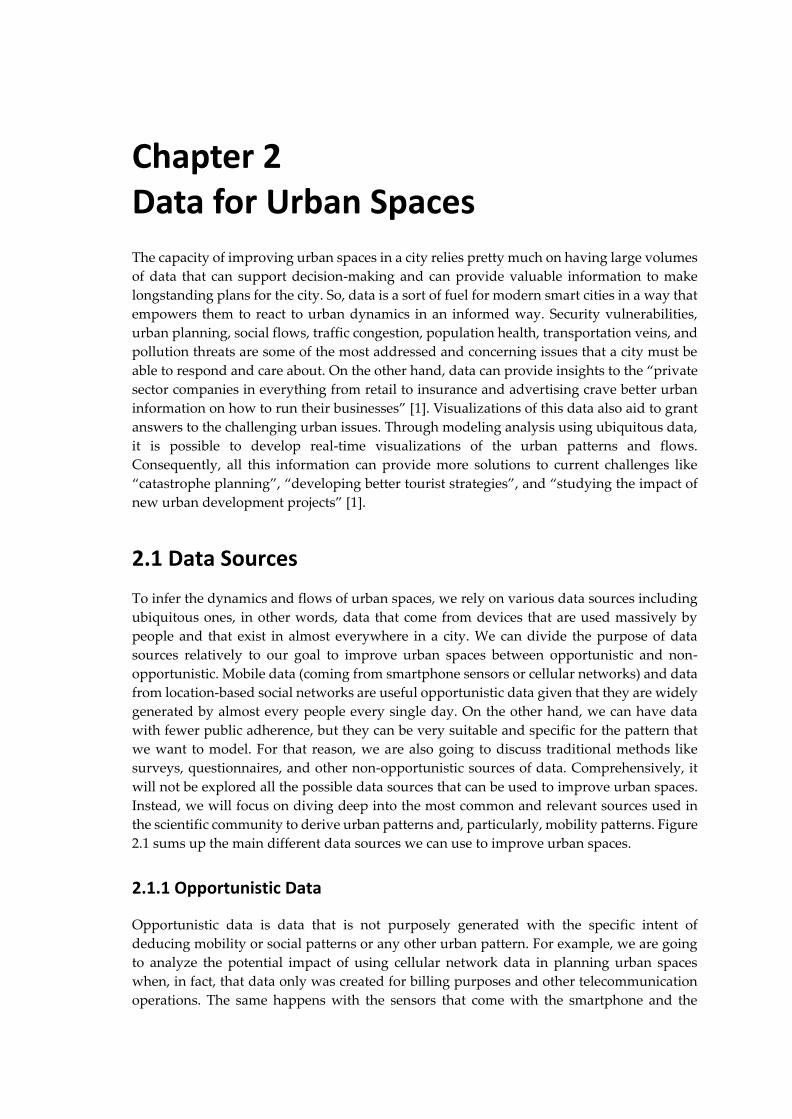
2.1 Data Sources
To infer the dynamics and flows of urban spaces, we rely on various data sources including
ubiquitous ones, in other words, data that come from devices that are used massively by
people and that exist in almost everywhere in a city. We can divide the purpose of data
sources relatively to our goal to improve urban spaces between opportunistic and non-
opportunistic. Mobile data (coming from smartphone sensors or cellular networks) and data
from location-based social networks are useful opportunistic data given that they are widely
generated by almost every people every single day. On the other hand, we can have data
with fewer public adherence, but they can be very suitable and specific for the pattern that
we want to model. For that reason, we are also going to discuss traditional methods like
surveys, questionnaires, and other non-opportunistic sources of data. Comprehensively, it
will not be explored all the possible data sources that can be used to improve urban spaces.
Instead, we will focus on diving deep into the most common and relevant sources used in
the scientific community to derive urban patterns and, particularly, mobility patterns. Figure
2.1 sums up the main different data sources we can use to improve urban spaces. 2.1.1 Opportunistic Data
Opportunistic data is data that is not purposely generated with the specific intent of
deducing mobility or social patterns or any other urban pattern. For example, we are going
to analyze the potential impact of using cellular network data in planning urban spaces
when, in fact, that data only was created for billing purposes and other telecommunication
operations. The same happens with the sensors that come with the smartphone and the
Chapter 2
6
geotagged information we can retrieve from location-based social networks.
Figure 2.1 – Overview of all useful data sources categories to characterize urban spaces.
The advantages of using opportunistic data instead of other traditional methods of collecting
data are abounding. First, using data from these ubiquitous devices is not so expensive as
surveys or questionnaires. The mobile phone is a very personal device that people use during
the entire day as well as some of the location-based social networks (like Facebook or Waze).
This fact means in practice that, by looking through this data, it is way easier to infer
behaviors, preferences, and other characteristics about the users than by looking through
surveys or questionnaires. These technologies are also widely spread and have a massive
percentage of adhesion, which means that we can reach a highly significant population
sample. We can also supervise the human movement on a daily, continuous, and real-time
basis. We have access to a great variety of sensors built in the smartphone and, consequently,
access much higher quality and quantity of datasets. Opportunistic data also allow us to do
much longer observations. This possibility is particularly useful, for example, to study the
impact of long-term changes like the change of the seasons or any personal change (like a job
change or a house moving) [2].
2.1.1.1 Smartphones
Nowadays, mobile phones are our footprints. We need them for many tasks throughout the
day and, therefore, we carry them almost the entire time. Mobile phone data generate
signatures of the interactions of human beings with each other. There are fundamentally two
Data for Urban Spaces
7
sources of mobile data: cellular network-based data and data from the smartphone sensors
[2]. Expectedly, they have different properties in what regards to granularity and other
factors that we are going to examine in the following sections.
It has been a long time since smartphones are not used anymore only to call or to receive/send
messages to another person. Smartphones are armed with many types of sensors and
applications that collect various types of data, like location-based data and other contextual
data [3]. That vast amount of data enables us to infer patterns of the user’s mobility and
sociability. Hence, the smartphone is an excellent device to apprehend our daily habits, what
we like or hate, how we feel, and infer many other patterns. If we can model human behavior,
we can consequently predict and improve the quality of the urban spaces that those humans
frequent. Consequently, this is fundamental to urban planning, to understand the dynamics
of the urban spaces and, for example, to plan the supply of public transportation once
citizens’ necessities are previously inferred.
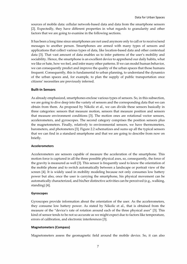
Built-in Sensors
As already emphasized, smartphones enclose various types of sensors. So, in this subsection,
we are going to dive deep into the variety of sensors and the corresponding data that we can
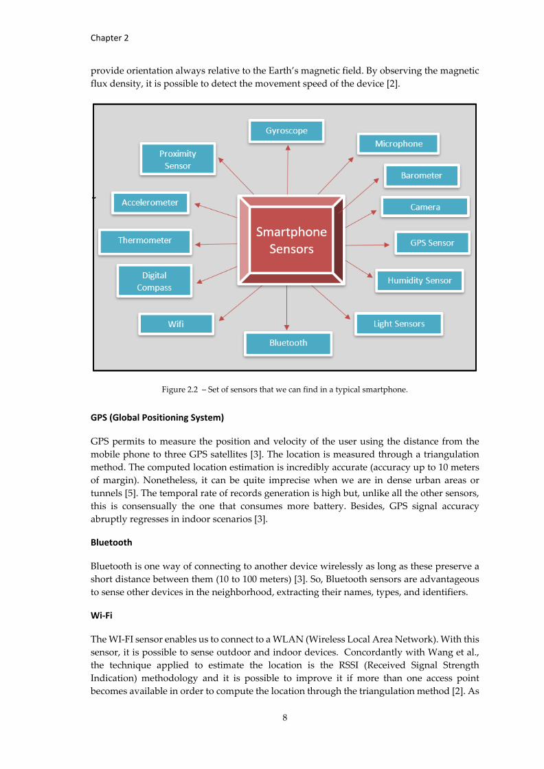
obtain from them. As proposed by Nikolic et al., we can divide these sensors basically in
three categories: sensors that measure motion, sensors that measure position and sensors
that measure environment conditions [3]. The motion ones are rotational vector sensors,
accelerometers, and gyroscopes. The second category comprises the position sensors plus
the magnetometers. Finally, relatively to environmental sensors, we have thermometers,
barometers, and photometers [3]. Figure 2.2 schematizes and sums up all the typical sensors
that we can find in a standard smartphone and that we are going to describe from now on
briefly.
Accelerometers
Accelerometers are sensors capable of measure the acceleration of the smartphone. This
motion force is captured in all the three possible physical axes, so, consequently, the force of
the gravity is measured as well [3]. This sensor is frequently used to know the orientation of
the mobile phone and to switch automatically between a landscape or portrait view of the
screen [4]. It is widely used in mobility modeling because not only consumes low battery
power but also, once the user is carrying the smartphone, his physical movement can be
automatically characterized, and his/her distinctive activities can be perceived (e.g., walking,
standing) [4].
Gyroscopes
Gyroscopes provide information about the orientation of the user. As the accelerometers,
they consume low battery power. As stated by Nikolic et al., that is obtained from the
measure of the “device’s rate of rotation around each of the three physical axes” [3]. This
kind of sensor tends to be not so accurate as we might expect due to factors like temperature,
errors of calibration, and electronic interferences [3].
Magnetometers (Compass)
Magnetometers assess the geomagnetic field around the mobile device. So, it can also
Chapter 2
8
provide orientation always relative to the Earth’s magnetic field. By observing the magnetic
flux density, it is possible to detect the movement speed of the device [2].
Figure 2.2 – Set of sensors that we can find in a typical smartphone.
GPS (Global Positioning System)
GPS permits to measure the position and velocity of the user using the distance from the
mobile phone to three GPS satellites [3]. The location is measured through a triangulation
method. The computed location estimation is incredibly accurate (accuracy up to 10 meters
of margin). Nonetheless, it can be quite imprecise when we are in dense urban areas or
tunnels [5]. The temporal rate of records generation is high but, unlike all the other sensors,
this is consensually the one that consumes more battery. Besides, GPS signal accuracy
abruptly regresses in indoor scenarios [3].
Bluetooth
Bluetooth is one way of connecting to another device wirelessly as long as these preserve a
short distance between them (10 to 100 meters) [3]. So, Bluetooth sensors are advantageous
to sense other devices in the neighborhood, extracting their names, types, and identifiers.
Wi-Fi
The WI-FI sensor enables us to connect to a WLAN (Wireless Local Area Network). With this
sensor, it is possible to sense outdoor and indoor devices. Concordantly with Wang et al.,
the technique applied to estimate the location is the RSSI (Received Signal Strength
Indication) methodology and it is possible to improve it if more than one access point
becomes available in order to compute the location through the triangulation method [2]. As
Data for Urban Spaces
9
it occurs in cellular network data (like CDRs or sightings data), the “ping-pong effect” (this
effect will be detailed in section 2.2.2) can happen in WI-FI as well [3]. The connections that
were made to WI-FI access points (or hotspots) can be opportunistically used latter to
discover urban patterns like the different visited places or the most visited metropolitan area
by the users.
Barometers
Barometers measure atmospheric pressure and can be used to detect how high the phone is
above sea level [3].
Thermometers
Thermometers measure ambient temperature [3].
Humidity Sensors
Humidity sensors measure air humidity [3].
Light Sensors
It is used, for example, to adjust the luminosity of the smartphone’s display automatically
[4].
Proximity Sensors
As the name already explains for itself, the smartphone can perceive the proximity to various
physical objects. For example, one of the possible applications is the capability that the phone
has of turning off the touchscreen when it senses that the face of the user is close to it [4].
Camera
This sensor also has a lot of practical uses. An example of that is the use of the camera to
track the user’s eyes movements with the purpose of launching some application or trigger
any other action.
Microphone
Although not so massively used in inferring urban patterns as other sensors like, for
example, accelerometers, it can be very opportune to detect surrounding noise and, with
posterior analysis, discern the user’s location or activity, for example, if the user is driving,
if he/she is in the supermarket or playing an instrument.
2.1.1.2 Cellular Networks
Cellular networks are fundamentally communication networks with a particularity of the
last link being wireless. These networks are dispersed among coverage areas or “cells”. In
every cell generally exists three transceivers. These transceivers grant network coverage to
the entire cell in order to afford transmission of voice and data. To prevent interference in
communications and provide a good quality of service, the frequencies of each cell differs
from the frequencies used in neighboring cells [6].
Chapter 2
10
Architecture
There are a few mobile communication standards. The most common system is GSM (Global
System for Mobile Communication), but there are other well-known mobile communications
standards like UMTS (Universal Mobile Telecommunications System) for 3G
communications and LTE (Long-Term Evolution) for 4G communications. The work of M.
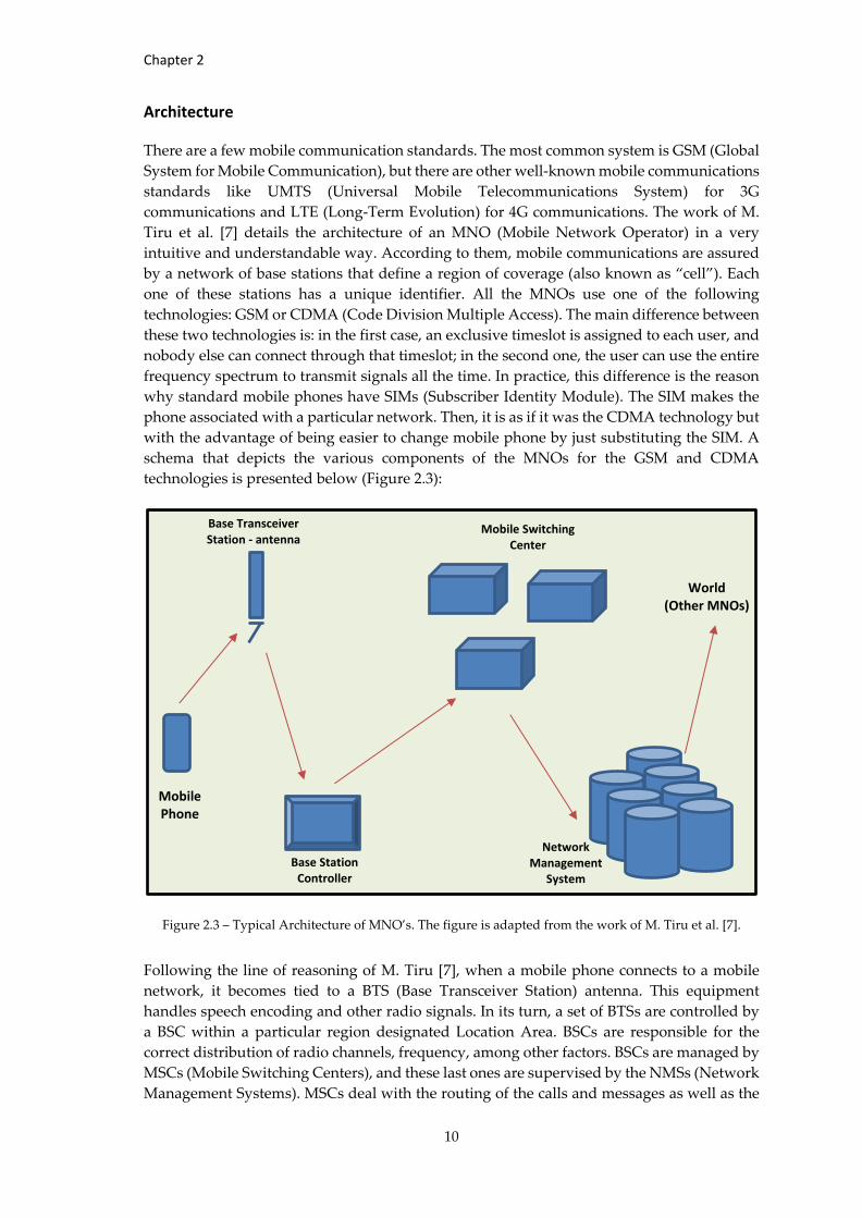
Tiru et al. [7] details the architecture of an MNO (Mobile Network Operator) in a very
intuitive and understandable way. According to them, mobile communications are assured
by a network of base stations that define a region of coverage (also known as “cell”). Each
one of these stations has a unique identifier. All the MNOs use one of the following
technologies: GSM or CDMA (Code Division Multiple Access). The main difference between
these two technologies is: in the first case, an exclusive timeslot is assigned to each user, and
nobody else can connect through that timeslot; in the second one, the user can use the entire
frequency spectrum to transmit signals all the time. In practice, this difference is the reason
why standard mobile phones have SIMs (Subscriber Identity Module). The SIM makes the
phone associated with a particular network. Then, it is as if it was the CDMA technology but
with the advantage of being easier to change mobile phone by just substituting the SIM. A
schema that depicts the various components of the MNOs for the GSM and CDMA
technologies is presented below (Figure 2.3):
Figure 2.3 – Typical Architecture of MNO’s. The figure is adapted from the work of M. Tiru et al. [7].
Following the line of reasoning of M. Tiru [7], when a mobile phone connects to a mobile
network, it becomes tied to a BTS (Base Transceiver Station) antenna. This equipment
handles speech encoding and other radio signals. In its turn, a set of BTSs are controlled by
a BSC within a particular region designated Location Area. BSCs are responsible for the
correct distribution of radio channels, frequency, among other factors. BSCs are managed by
MSCs (Mobile Switching Centers), and these last ones are supervised by the NMSs (Network
Management Systems). MSCs deal with the routing of the calls and messages as well as the
Mobile Phone
Base Transceiver Station - antenna
Base Station Controller
Mobile Switching Center
Network Management
System
World (Other MNOs)
Data for Urban Spaces
11
handovers between the plenty of Location Areas. On the other hand, it is in the NMSs that
all the central databases reside. These databases hold billing information, CDRs, and other
critical location data. This structure is valid for GSM and CDMA technologies. For other
protocols like 3G, or UTMS, the structure can have slightly different characteristics.
Types of Network-Based Data
According to Calabrese et al. [8], this kind of data source can be segmented into two
categories: event-driven data and network-driven data. The first one involves user
participation (making calls, sending messages, and accessing mobile internet). The second
one does not require it; the records are generated periodically without human intervention
(sightings data) [8]. From the reviewed literature, the types of network-based data most
regularly used to infer mobility patterns are CDRs and sightings data.
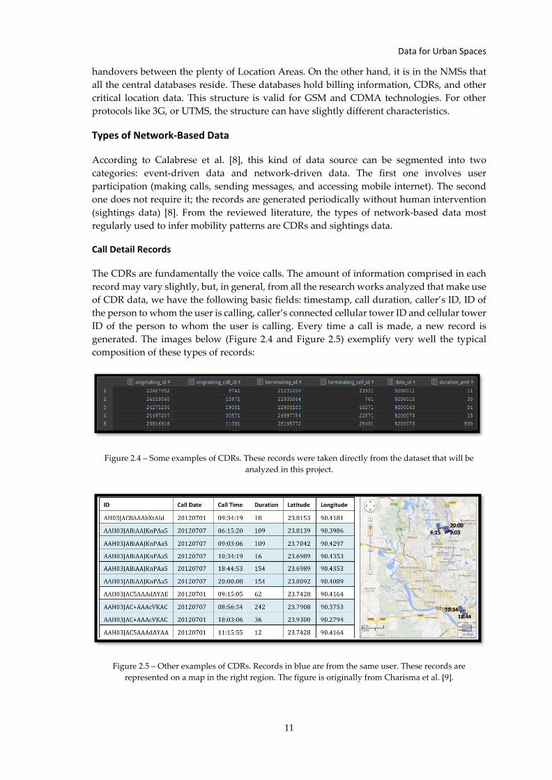
Call Detail Records
The CDRs are fundamentally the voice calls. The amount of information comprised in each
record may vary slightly, but, in general, from all the research works analyzed that make use
of CDR data, we have the following basic fields: timestamp, call duration, caller’s ID, ID of
the person to whom the user is calling, caller’s connected cellular tower ID and cellular tower
ID of the person to whom the user is calling. Every time a call is made, a new record is
generated. The images below (Figure 2.4 and Figure 2.5) exemplify very well the typical
composition of these types of records:
Figure 2.4 – Some examples of CDRs. These records were taken directly from the dataset that will be
analyzed in this project.
Figure 2.5 – Other examples of CDRs. Records in blue are from the same user. These records are
represented on a map in the right region. The figure is originally from Charisma et al. [9].
Chapter 2
12
Messages
SMSs constitute another kind of event-driven data. From the articles reviewed, it becomes
clear that this data source is not commonly used in the research community. The use of it can
happen as a complement to other data source. The limited use of this data is comprehensive
because its generation by the users is too scarce.
Mobile Internet Accesses
Mobile internet accesses are not so frequently used as CDRs, but it is too a valuable source
of data. As explained by Lorenzo et al. [10], mobile access data records differ from the CDRs
because they do not always require user initiation and intervention to generate them. Some
mobile applications regularly make use of mobile internet data without the user explicitly
activating it. Even when it is expressly activated, it repeatedly generates new records. So,
overall, the more significant advantages of this data source compared to, for example, CDRs
are: usually less sparse, more abundant, and more evenly distributed throughout the day.
These characteristics can have different impacts on the characterization of mobility or
sociability of the users, depending on the issue to be addressed or studied.
Sightings Data
This data source differentiates from the CDRs in two critical aspects as pointed out by Chen
et al. in [11]. First, many more records are generated because it is registered activity from
other network-driven interactions besides event-driven activities (like handover, signal
strength information, and switch rate of cells) [12]. The other difference is that, with this data,
we can get a significantly higher spatial precision (the real numbers and a real comparison
of spatial resolution will be explored later in section 2.2.3). That happens because the location
that we get is an estimation done by a triangulation method of multiple cells instead of the
geographical position of the cell that the caller is attached to (like what happens in CDRs)
[13].
A handover record happens when a device switches between two neighboring cell areas. It
is valid for active voice calls or mobile data accesses that did not suffer any interruption
while crossing the cells. It is important to mention also that the records can be “initiated
periodically or, while the cellphone equipment crosses the boundary of the Location Area”
[14].
The variance of the signal strength is something that can occur in the GSM signals but also
in WI-FI signals [2]. The fluctuation pattern of the cell identifiers plus the signal strength is
useful to compute the exact location of the cell phone and estimate the user’s speed [3].
Therefore, travel modes can be inferred based on speed thresholds. Presumably, these
methods are not the most accurate ones once “they can hardly distinguish transportation
modes with similar speeds, such as buses and cars” [15].
2.1.1.3 Location-Based Social Networks
LBSN’s (Location-Based Social Networks) constitute an up-and-coming data source because
they have millions of adherents. So, the development of urban pattern models becomes
facilitated once we have access to these platforms that store a vast amount of data relative to
events/places that people went/visited. In fact, the potential of using LBSN like Twitter,
Data for Urban Spaces
13
Facebook, Instagram, Flickr, Foursquare, among others, is enormous at the point that
becomes relatively easy to distinguish, for example, areas in a city considered more attractive
than others [16]. That occurs because people share information about their activities in real-
time, and they also reference the location where those activities take place.
Many works try to use these LBSN’s mainly to extract spots with a high circulation of people
in a city or identify spatio-temporal patterns. For example, the study of Leung et al. [17] tries
to detect important places in a city through a vast amount of geotagged photos that users
took and shared on Flickr. Mamei et al. [18] also try to use the same data source but to infer
the tourists’ routines. However, this data source also has the potential to support
applications that need to recommend physical locations to the user [19]. It is interesting how
popular travel routes can also be determined through geotagged information coming from
LBSN as it is shown by Wei et al. [20]. So, these studies demonstrate that “individual mobility
patterns are strongly related to land-use patterns as well as the built environment of a city”
[21].
2.1.1.4 Smart Cards
When we talk about smart cards, we talk about cards within a tiny electronic chip that is
recurrently used in public transportation to substitute tickets or magnetic cards. However,
they are also used in many divisions besides transportation like healthcare, human resources,
among others. This type of card is equipped with a little memory that can hold personal
information like identification, transportation fares, and other things [22]. So, these cards
have a very well-defined purpose which is usually the revenue collection or a way to provide
a more comfortable and secure validation of the legitimacy of access to a determined service
by a specific person. About the technical functioning of a smart card, Pellier et al. [22] detail
in a concisely and understandable manner when they explain that a ”contact card (usually a
memory card) is placed in direct contact with the reader“ while a smart card usually
”communicates with the reader by high-frequency waves similar to RFID (Radio-Frequency
IDentification)”. It continues by saying that “the energy needed is provided by the
electromagnetic field generated by the reader”. Usually, these contactless cards are armed
with NFC (Near Field Communication) technology.
There are some interesting researches that use this type of data that we would like to
highlight. For example, Morency et al. [23] implement data mining techniques on smart card
data collections to know the variability of public transportation use and determining the
frequency of use of bus stops. With a similar purpose, Bagchi et al. [24] attempt to reconstruct
users’ trips and examine patterns of travel in order to adjust future transport offering.
Furthermore, Trépanier et al. [25] use data mining methods to infer user behavior on public
transportation and get some performance indicators.
2.1.2 Non-Opportunistic Data
Now it is time to explore a little bit more about the non-opportunistic kinds of data sources.
As an opposed definition of opportunistic data, non-opportunistic data constitute all kinds
of data that come from sources specifically developed to collect data to inferring an urban
pattern or address an urban issue. So, in that sense, we are naturally going to talk about
surveys and questionnaires, static data that belong to the public or private domain, and
dedicated sensors.
Chapter 2
14
It is consensual across many reviewed research articles that opportunistic data allow us to
access a higher amount of data with a much less cost. However, non-opportunistic data are
useful if used as a complement to help us building or validating our models. The non-
opportunistic data give us so detailed and precise information at such extent that it can be
employed as a ground truth data. Nevertheless, using only this type of data is infeasible in
the most cases because, as stated before, we drastically loose variety of data, number of users
and the ability to do more extended observations [2].
2.1.2.1 Static Data
Combining data sources that belong to the public, private, or commercial domain as a
complement of other opportunistic data can be very useful. Many examples can be included
in this group, for instance, bus network maps, street network maps, and weather forecasts.
Institutions and entities (like municipalities or governments) plus online services (like Google
Maps or Bing Maps) and crowdfunded data platforms (like OpenstreetMaps or Waze) might
constitute free sources capable of providing valuable information. For example, according to
[1], “London has created the London Database, making all of its data freely available –
everything from bicycle rental locations, to house prices and locations of local playing
fields”. Another example is the fact that private companies are becoming open to the idea of
combining opportunistic data sources with their internal sales and customer data to identify
the best place to install their next store [1]. Static data can also be advantageous in knowing
the “users socio-economic and demographic profile” [26] that we may lack in most of the
previously explored data sources due to anonymization regulations.
So, in fact, if we can use transport street network maps as well as public transports’
schedules, we might see an exponential increase in the value of our information [3].
Recurrently, in this type of situation, it is used map-matching algorithms that match the
localization estimations provided by sensors (for instance GPS or accelerometers) and by
network-based methods with the nearest roads drawn on the transport network maps.
However, this works great if the transport network is not too ramified; otherwise, it will be
generated plenty of different alternatives for one trip [2]. Yuan et al. [27] tried precisely to
use transport network maps and to apply map-matching algorithms to infer the path
traveled by the users.
2.1.2.2 Surveys
Surveys are a traditional way to collect data that require direct or indirect interaction with
individuals. They are probably the most used type of data in scientific researches. There are
plenty of examples of surveys that collect a variety of information, from assessing the
number of people living in a nation, to evaluate the people’s reactions to a specific event or
people’s mobility choices. They can take the form of a questionnaire to be filled by the person
or can be a simple telephone interview. A survey of the entire population is also called a
“census” [28].
In the context of urban spaces, and as already mentioned before, surveys can be
advantageous if they are used as a complement to build our model or to validate it (they can
constitute a way to label data to train or test a model). We emphasize the use of them as a
complement because the surveys carry with them all the disadvantages that non-
opportunistic data have and that were already explained in section 2.1.2. However, it is
Data for Urban Spaces
15
opportune to recall the work of Nikolic et al. that elaborates a little bit more about the
infeasibility of relying only on surveys [2]. That work warns us of the fact that surveys
usually only “select a small proportion of people to represent the whole population”. Besides
that, for studies about mobility behaviors, it means that we will solely rely on “trips that take
place more frequently with a longer duration ” [2]. Doing that results in “ignoring some
occasional but still important trips as well as some short but frequently happening trips, such
as travelling to hospitals and walking to dine in nearby restaurants” [2]. It also results in
ignoring the occurrence of some irregularities in public transportation due to holidays,
strikes, or catastrophes. Furthermore, it is impossible to study the social behaviors of
unreachable people.
2.1.2.3 Dedicated Sensors
This section covers a wide range of sensors that are specifically developed to collect non-
opportunistic data. For example, when the goal is to detect mobility patterns, it is frequent
the use of traffic sensors. Traffic sensors are often installed with the intent of retrieving large
volumes of information about traffic streams on the roads. This retrieved information can be
counting the number of vehicles, counting the number of pedestrians, making real-time
monitoring of traffic status, and retrieving other useful information. Although this is an
effective system, it has functional limitations. Ideally, these sensors would be installed all
over the road network, but it is inviable due to “their expensive installation and maintenance
costs” [14]. So, in practical terms, we gain in the quality of data, but we lose dreadfully in
quantity and representativeness of the data. This dilemma is shared across the major of non-
opportunistic data sources.
We can also talk, for example, about sensors that are specifically built to collect information
about the atmospheric conditions like CO2 levels, temperature, humidity, and pressure. They
contribute to give us a highly detailed image of the atmospheric environment composition.
Though, thanks to the use of opportunistic data coming from smartphone sensors that can
measure similar factors, we can have a geographically broader perspective of the
atmospheric composition with a much less cost. GPS sensors on buses are another example
of dedicated sensors, in this case, with the particular purpose of knowing the exact real-time
location of the buses and, consequently, calculate arrival times and other valuable
information.
2.2 Data Challenges
Recurrently, we try to use data that was not generated specifically for the issue that we are
addressing in the study. So, it is just expectable that the data is not fully ready to be applied
to build the models that we want and that we might have to do some treatment, subsampling,
and other pre-processing methodologies first. Thereby, it is in this section that we are going
to scrutinize the most typical challenges that are faced in the research community that
obligates us to look and treat the datasets carefully before using them to infer urban patterns.
2.2.1 Location Uncertainty
This problem is mainly characteristic of sightings data and GPS data since their location
estimations are done by the triangulation method of cellular towers and satellites,
Chapter 2
16
respectively. For this reason, every location estimation generated is unique, and,
consequently, it becomes difficult to define the different activity locations. That causes
fluctuations in the location estimations that need to be aggregated in some clustering
technique [11].
Towards solving these fluctuations, Bian et al. suggested a model-based clustering method
[29]. Some new techniques aggregate traces by segmenting one trajectory into several
sequences of segments. Here, one trajectory of a user refers to the user’s available traces of
one day. In the trajectory-segmentation methods, an activity location is defined as a sequence
of consecutive traces bounded by both temporal and spatial constraints [30]. Finally, Wang
et al. suggested to apply a revised incremental clustering algorithm to agglomerate traces
[11].
There is only one problem with using clustering techniques to solve location uncertainty.
When we agglomerate the location estimations and find the activity location in different days
of traces, it becomes difficult to identify places that we daily frequent (as is the case of home
and workplaces). That occurs because, on a different day, we possibly end up with different
computed localizations for the same activity location. Nevertheless, Wang et al. [11] succeed
in solving this problem by applying the agglomerative clustering algorithm into the different
activity locations classified in multiple days. Another way of contour that problem is by
dividing the range area of the study into grids and consider all the identified clusters that
are circumscribed to a specific cell of the grid as the same activity location [31].
2.2.2 Oscillation
This problem can also be called “Ping-Pong effect” and affects W-FI and GSM signals (CDRs
and sightings data). This effect is responsible for alternating the association of the user’s
phone to different cell towers even when the user is not moving. That happens because of
load balances between different cells within a particular user’s range [11].
Typically, when oscillation occurs, a specific pattern is detected characterized by
intermittency and a loop of the locations in a teeny period (considering a short time window
as proposed by Wang et al. [32]) like, for example, L2-L3-L2-L3 or L2-L3-L4-L2 (L means location
here). If these locations are quite far from each other, it means that the user had to travel at
an incredible speed. If an unrealistic switching speed is detected (>= 400 km/h), then we are
in the presence of an oscillation [11]. Despite these facts, there is a certain level of risk
associated with removing these oscillating sequences because it may result in removing real
visited places that the user visited intermittently throughout the day. To mitigate that risk,
Wang et al. [11] alert us to the alternative of adding one more constraint beyond the
calculation of the switching speed. Then, two consecutive changes in location constitute an
oscillation if the angle formed by the change in the heading direction is equivalent to 180º.
So, in the face of oscillation, we need to decide which location will be trustworthy and again,
as pertinently remembered by Wang et al. [11], it should be the one that is visited most
frequently. A more recent approach from Wu et al. [32] suggested having not only the
visiting frequency but also the average distance to other locations as selecting factors to
decide which place is the real one. So, the best methodologies to deal with this question are
pattern-based and hybrid methods. According to Wang et al. [11], the first one “examines
trace sequences and the one that exhibits a specific switching pattern will be identified as the
Data for Urban Spaces
17
oscillation case”, while the second one “utilizes temporal and/or spatial information to
consider velocity or other measurements”.
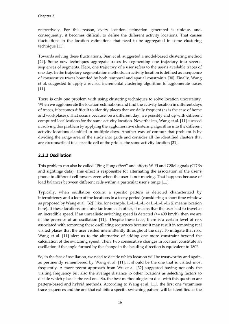
2.2.3 Spatial Resolution
Spatial resolution constitutes the principal worry in CDR data. CDRs are coarse-grained,
which means that they have a low spatial resolution of the location’s estimation. This
estimation depends on the cellular towers’ density, and it is reported to be approximately
300m on average in urban areas for sightings data [11]. However, For CDRs, this value varies
between 50 and 200 meters on high-density areas [3] and several kilometers on low-density
regions [11]. Figure 2.6 tries to illustrate a comparison in precision ranges among the primary
geolocation data sources. To contour this problem, particularly in CDRs and sightings data,
we can add different data as input like, for example, the strength of the signal. We can
subsample our dataset so that we can obtain only the records that take place in highly dense
urban areas.
Figure 2.6 – Comparison in precision ranges among the main geolocation data sources.
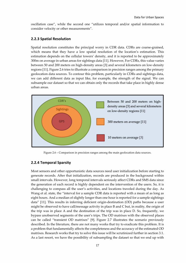
2.2.4 Temporal Sparsity
Most sensors and other opportunistic data sources need user initialization before starting to
generate records. After that initialization, records are produced in the background within
small intervals. However, long temporal intervals seriously affect CDRs and SMS data since
the generation of each record is highly dependent on the intervention of the users. So, it is
challenging to compass all the user’s activities, and locations traveled during the day. As
Wang et al. state, the “interval for a sample CDR data is reported with a mean of as long as
eight hours. And a median of slightly longer than one hour is reported for a sample sightings
data” [11]. This results in inferring deficient origin-destination (OD) paths because a user
might be observed to have call/message activity in place B and C but, in reality, the origin of
the trip was in place A and the destination of the trip was in place D. So, frequently, we
bypass unobserved segments of the user’s trips. The OD matrixes with the observed places
can be called “transient OD matrixes” [9]. Figure 2.7 illustrates the scenario previously
described. In the literature, there are not many works that try to eradicate this problem. It is
a problem that fundamentally affects the completeness and the accuracy of the estimated OD
matrixes. Research works that try to solve this issue will be scrutinized further in section 3.1.
As a last resort, we have the possibility of subsampling the dataset so that we end up with
CDR’s
Sightings
GPS
Between 50 and 200 meters on high-
density areas [3] and several kilometers
on low-density regions [11]
300 meters on average [11]
10 meters on average [3]
Chapter 2
18
only highly active users. Nonetheless, this is not the ideal solution because we might become
having significantly fewer data. We need to be careful if we are choosing excessively highly
active users also because when an extremely high number of calls are made, that could mean
that bots made them or we are dealing with a shared phone instead of a personal one [26].
2.2.5 Signal Noise and Interference
There is always a noise associated with cellular network-based data caused by signal drift.
What is usually done to solve this problem is applying “time order methods to ignore the
signal drifts” [2] and then, using clustering techniques, we can obtain the information that
matters from the raw data, just like how it is done in this research [33].
GPS signals are not immune to this and may also suffer from interference and faults
(depending on the local environment). Map-matching is a frequently used technique that
empowers us to surpass some errors, while others are not solvable and require us to
eliminate the records. Information coming from electromagnetic signals transmitted by all
kinds of sensors or cellular networks are subject to this kind of vulnerability.
Figure 2.7 – Places visited by a user during a day. The dashed segments represent unobserved places from
CDRs; the ones that are not dashed represent the observed places. The figure is originally from Charisma
et al. [9].
2.2.6 Data Fusion
Because we talk a little bit about data fusion in the previous section, it is time to explore more
deeply this method that already proved to be a great tool. This fusion of multiple inputs to
our model can include data from different smartphone sensors, different cellular network-
based data, and various location-based social networks. We can experience a boost in our
model’s performance with the usage of more data sources. Nevertheless, we cannot say that
the more data types we use, the more performance we get. In practice, that brings us some
problems regarding different data formats, different units, different scales, privacy issues,
Data for Urban Spaces
19
and other issues [2]. For that reason, the work review of Nikolic et al. [3] reports that “the
studies that use three or more smartphone sensors are quite rare”. The concern that lies
underneath this type of fusion is that it implies the association of multiple types of data of
the same individual. That is complicated to obtain because of the increasingly restrictive
anonymization policies.
Nonetheless, this does not necessarily constitute an obstacle to the improvement of the
algorithm. Many research works prove that point like, for example, the one by Charisma et
al. [9] that tries successfully to infer OD patterns by fusing CDRs with data coming from
traffic sensors. Another good example is the use of public transportation network data and
timetables to improve the performance of public transportation mode detection [3].
2.2.7 Big Data
We are talking about the uninterrupted generation of records of thousands and thousands
of mobile devices throughout the day. That massive generation imposes us an efficient and
smart way to not only store but also manage data in a way that we can treat it, process it, and
operate it. Then, it is required to develop some mechanism and adopt adequate tools to
outpace this barrier. If the volume of data reveals to be inviable to be managed locally, we
need to solve the problem by other means. Wang et al. [2] proposed an adjustment of spatial
and temporal resolution of the geolocation data in order to solve this issue. Zheng Yu [34]
suggests another two alternative solutions: (1) use clustering techniques to agglomerate
(almost) identical trajectories; (2) develop an appropriate data management framework.
Cloud solutions like Amazon Web Services and Google Cloud Platforms have proven to be
very useful nowadays in terms of storage, process, query, and application of algorithms on
significant volumes of data. In the work of Jundee et al. [35], for example, it is suggested to
use precisely the Google Cloud Platforms to store high volumes of CDRs.
2.2.8 Ground-Truth
A crucial part of building our models is their validation. We can validate our models by
introducing in them ground-truth data; in other words, data that is previously known to be
truthful. Therefore, it can be used to label data and test our model comparing the predicted
value directly with the real value. We can obtain ground-truth by fusing our initial data with
other data sources (data fusion). In this sense, we can use, for example, static data provided
by public or private institutions or companies. Another solution to find ground-truth data is
to do detailed surveys (or use available ones). It is possible too to ask the user to answer some
questions inside our app in order to label the data (without being too intrusive). We can also
rely on calculations like transport mode detection, travel times, routes, and other
computations of LBSs (Location-Based Services) like Google Maps API. Check if the
calculated OD-matrix fits the gravity models.
2.2.9 Real-Time Dilemma
We say that the system is a real-time one if, for the input that the user generates at every
moment, it can produce a predicted output. Not every data source may permit this kind of
prediction. For example, from the literature review, it was not found the development of a
real-time system to detect transportation modes based on just CDR data. The viability of a
Chapter 2
20
real-time system is highly dependent on the classification problem that we are addressing,
the types of data that are available, the fine-tuning of our model, the methodologies and
algorithms used, and the quality and quantity of the dataset. Nonetheless, real-time models
are not the ideal for every situation; in fact, there are plenty of scenarios in which we are only
interested in developing static models. One possible situation is the need for having a
periodic overview of the user's demands for travel modes and adjust the transport solutions
accordingly.
2.2.10 User Related Issues
Here, we will address additional issues that we need to have into consideration when we are
dealing with opportunistic data. These issues represent challenges whose responsibility is
more centered on user preferences than the treatment and processing of the data itself. These
preferences might impact the way we can compromise the degree of collaboration of the user
in our study and, conversely, the way the user can bias the obtained results.
Privacy and Security
The security and privacy of the users that provide the data is a growing worry in our days.
As this is a significant concern, data coming from the smartphone sensors or cellular
networks cannot identify a user at any circumstance. CDRs that are collected for billing
purposes by mobile operators suffer an alteration, namely, the anonymization of the user
identity in such a way that his/her cell phone number is hashed (a unique identifier is
generated) [36]. Even though this is important to protect the right of privacy that people
have, this is an obstacle in what concerns to, for example, the fusion of multiple types of data
of the same population (either to build or to validate our model). That is because we lose the
possibility of associate different data records from different sources to the same user that
produced them [2]. We also lose the possibility of knowing valuable information about the
social-economic status of the user.
Intrusiveness
When we depend on applications to send/receive user’s data, we need to be concerned about
intrusiveness. That means that we do not want to bother the user in such a way that he/she
would consider the generation of those data records uncomfortable, or stressful. The degree
of intrusiveness of smart card technologies, cellular network-based activities, or the use of
location-based social networks is considered acceptable. That is because the user is not
additionally bothered with any notification. Instead, the generation of records usually
happens with the spontaneous initiative of the user. Conversely, intrusiveness becomes a
concern when it is required the user to interact regularly with some third-party app that uses
smartphone sensors or to answer some questionnaires that serve as ground-truth or to install
some application that can burden them with an abundance of notifications. So, this is a
fundamental issue to have into account if we want a close collaboration with the users.
Mobile Activity Preferences
This issue mainly affects CDRs and SMSs data and, generally, it is an issue that is ignored in
the literature. We need to be conscious of the fact that the user can have some preferences in
what regards to the location where he wants to make a call [37]. For example, we might step
outside our workplace to receive or make a call so that we will not disturb other co-workers.
Data for Urban Spaces
21
Many more possible scenarios exist and would perfectly exemplify the issue of not always
receiving or making a call in the same location where we actually were. Besides that, the user
might want to avoid receiving/making calls or receiving/sending messages during a
particular hour of the day. That can bias the generation of records and guide us into
misleading interpretations.
Service Adoption
Smartphones are probably the most widespread and most personal gadgets that accompany
us. Location-based social networks like Facebook are also services that have a massively high
number of adherents. Notwithstanding, we must have in mind that there are still many
people that did not adhere to those services or gadgets yet. The same principle is valid to
data from cellular networks. The ownership of cellular networks is distributed among
multiple mobile operators. Thus, some users belong to a specific mobile operator and do not
belong to the others. There is also the possibility of the same user possessing more than one
smartphone or more than one SIM card that belongs to a certain mobile operator. All these
factors must be remembered when we want to extrapolate conclusions from our sample to
the entire region or country. Knowing the distribution of percentages of service adoption in
the region of the case study is very useful in these situations. We have also to be sure that
when we have mobile data, we are not using data from fixed or shared phones because, in
that case, we would infer erroneous patterns about the user.
Battery Consumption
Here we might focus our attention on the use of mobile access data and smartphone sensors
that require the user initialization initially but then reduces the temporal sparsity by
sending/receiving signals automatically at much shorter intervals. The immediate drawback
of this is the faster drain of the battery. GPS sensor is still the one that drains the battery faster
[7]. Therefore, there are some principles that deserve our attention when it comes to
developing an application that will make use of user’s smartphone sensors: (i) find a trade-
off between the sample rate and battery consumption; (ii) make sure that the sensors are only
activated when it is strictly necessary and, hence, avoid having the app running in
background when it is not needed. In general, applications are becoming very energy-
efficient in such a way that we do not need to avoid including or replacing any data source
in our research studies because of energy consumption. However, this question continues to
be very important because smartphones, nowadays, are more and more burdened with new
functionalities and higher resolution displays that do not help in any terms the preservation
of the battery’s consumption. Highly battery consuming ways of collecting data would result
in a weak collaboration of the user with our studies or much shorter observations of their
daily activities.
Middle-Trip Problem
This problem is characteristic of CDRs and SMSs. We must be careful when we plan to
identify activity locations once not every CDR or SMS is received/sent in a stopping point.
Instead, he/she might be in the middle of a trip [37]. So, to avoid making misleading
conclusions, we need to take more extended observations. Thus, the repetition of the call
activity in specific locations during determined days will tell us the central activity locations
of the user. Of course that this constitutes a problem when the goal is to infer places that
were visited sporadically.
Chapter 3 Mobility Modelling
Mobility models allow characterizing the movements of users concerning their location,
velocity and other mobility indicators during a temporal window. Models of human
mobility are relevant because, besides other fields, they ‘have broad applicability in mobile
computing, urban planning, and ecology’ [38]. There is an overabundance of articles that
try to model mobility in urban spaces using opportunistic data. Those works encompass key
topics like inferring of OD flows [39], detecting transportation modes [40] or identifying
activity locations [41]. The following subsections explore in more detail the current state-of-
the-art research techniques in five classic subtopics that permit us to estimate the mobility
of the users. The final subsection will serve us as a reflection about the limitations and ways
that the research in this field can evolve. It will also be addressed how this work makes
relevant scientific contributions to this subject.
3.1 Origin-Destination Flows and Activity Locations
A key component of mobility modelling is inferring the trips of the users. When we talk
about trips, we are talking about the travels between an origin point and a destination point
that end up with an activity. Calabrese et al. [42] explore the usage of sightings data in order
to calculate these OD flows. Wang et al. [43] make the same but using probabilities of
transportation mode choices, vehicles occupancy, and CDR data instead. Yang et al. [44]
showed that through generative algorithms like Bayes Nets and Markov random field
classification, it is possible to detect activity locations like home, work, shopping, leisure
and other places with reasonable accuracy.
Fusing CDRs with data coming from traffic sensors, Charisma et al. [9] are capable of
developing an OD matrix. The traffic counts of the different locations are used to validate
the origin-destination predictions. In order to determine the real origin-destinations, it was
necessary to scale a transient OD matrix to match the actual traffic flows. Here resides the
central assumption/limitation of this study: it overlooks “the heterogeneity in call rates from
different locations (e.g., more calls may be generated to and from railway stations compared
to and from offices with land telephone lines, etc.)”. Using non-supervised learning
algorithms, Augusto et al. [45] try to infer users’ trips from their CDRs and then, from the
travel behaviors, characterize the mobility of the population (for example, what is the
percentage of commuters or how many of them work far from home).
The study of Zhao et al. [37] is fascinating in the sense that it proposes a supervised learning
technique to obtain a more detailed characterization of the users’ trips. That implicates the
approach of an issue that has been grossly ignored by those who tried to characterize the
origin-destinations of the users’ travels. We are talking about detecting if there are unknown
visited places besides those that can be seen by looking through CDRs. Its solution relies on
a data fusion technique between CDRs, SMSs, and mobile internet accesses to form labeled
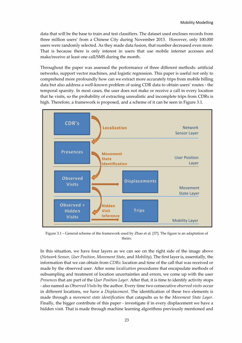
Mobility Modelling
23
data that will be the base to train and test classifiers. The dataset used encloses records from
three million users’ from a Chinese City during November 2013. However, only 100.000
users were randomly selected. As they made data fusion, that number decreased even more.
That is because there is only interest in users that use mobile internet accesses and
make/receive at least one call/SMS during the month.
Throughout the paper was assessed the performance of three different methods: artificial
networks, support vector machines, and logistic regression. This paper is useful not only to
comprehend more profoundly how can we extract more accurately trips from mobile billing
data but also address a well-known problem of using CDR data to obtain users’ routes - the
temporal sparsity. In most cases, the user does not make or receive a call in every location
that he visits, so the probability of extracting unrealistic and incomplete trips from CDRs is
high. Therefore, a framework is proposed, and a scheme of it can be seen in Figure 3.1.
Figure 3.1 – General scheme of the framework used by Zhao et al. [37]. The figure is an adaptation of
theirs.
In this situation, we have four layers as we can see on the right side of the image above
(Network Sensor, User Position, Movement State, and Mobility). The first layer is, essentially, the
information that we can obtain from CDRs: location and time of the call that was received or
made by the observed user. After some localization procedures that encapsulate methods of
subsampling and treatment of location uncertainties and errors, we come up with the user
Presences that are part of the User Position Layer. After that, it is time to identify activity stops
- also named as Observed Visits by the author. Every time two consecutive observed visits occur
in different locations, we have a Displacement. The identification of these two elements is
made through a movement state identification that catapults us to the Movement State Layer.
Finally, the bigger contribute of this paper - investigate if in every displacement we have a
hidden visit. That is made through machine learning algorithms previously mentioned and
Network Sensor Layer
User Position Layer
Movement State Layer
Mobility Layer
CDR’s
Presences
Observed + Hidden Visits
Observed Visits
Displacements
Trips
Localization
Movement State Identification
Hidden Visit Inference
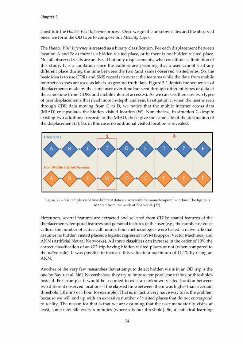
Chapter 3
24
constitute the Hidden Visit Inference process. Once we got the unknown sites and the observed
ones, we form the OD trips to compose our Mobility Layer.
The Hidden Visit Inference is treated as a binary classification. For each displacement between
location A and B: a) there is a hidden visited place, or b) there is not hidden visited place.
Not all observed visits are analyzed but only displacements, what constitutes a limitation of
this study. It is a limitation since the authors are assuming that a user cannot visit any
different place during the time between the two (and same) observed visited sites. So, the
basic idea is to use CDRs and SMS records to extract the features while the data from mobile
internet accesses are used as labels, as ground truth data. Figure 3.2 depicts the sequences of
displacements made by the same user over time but seen through different types of data at
the same time (from CDRs and mobile internet accesses). As we can see, there are two types
of user displacements that need more in-depth analysis. In situation 1, when the user is seen
through CDR data moving from C to D, we notice that the mobile internet access data
(MIAD) encapsulates the hidden visited location (W). Nonetheless, in situation 2, despite
existing two additional records in the MIAD, those give the same site of the destination of
the displacement (F). So, in this case, no additional visited location is revealed.
Figure 3.2 – Visited places of two different data sources with the same temporal window. The figure is
adapted from the work of Zhao et al. [37].
Hereupon, several features are extracted and selected from CDRs: spatial features of the
displacements, temporal features and personal features of the user (e.g., the number of voice
calls or the number of active call hours). Four methodologies were tested: a naïve rule that
assumes no hidden visited places; a logistic regression; SVM (Support Vector Machines) and
ANN (Artificial Neural Networks). All three classifiers can increase in the order of 10% the
correct classification of an OD trip having hidden visited places or not (when compared to
the naïve rule). It was possible to increase this value to a maximum of 11,1% by using an
ANN.
Another of the very few researches that attempt to detect hidden visits in an OD trip is the
one by Bayir et al. [46]. Nevertheless, they try to impose temporal constraints or thresholds
instead. For example, it would be assumed to exist an unknown visited location between
two different observed locations if the elapsed time between them was higher than a certain
threshold (10 mins or 1 hour for example). That is, in fact, a very naïve way to fix the problem
because we will end up with an excessive number of visited places that do not correspond
to reality. The reason for that is that we are assuming that the user mandatorily visits, at
least, some new site every x minutes (where x is our threshold). So, a statistical learning
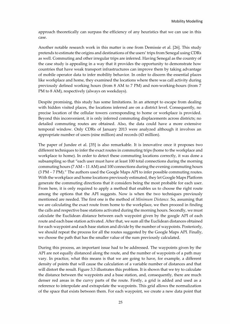
Mobility Modelling
25
approach theoretically can surpass the efficiency of any heuristics that we can use in this
case.
Another notable research work in this matter is one from Demissie et al. [26]. This study
pretends to estimate the origins and destinations of the users’ trips from Senegal using CDRs
as well. Commuting and other irregular trips are inferred. Having Senegal as the country of
the case study is appealing in a way that it provides the opportunity to demonstrate how
countries that have weak transport infrastructures can improve them by taking advantage
of mobile operator data to infer mobility behavior. In order to discern the essential places
like workplace and home, they examined the locations where there was call activity during
previously defined working hours (from 8 AM to 7 PM) and non-working-hours (from 7
PM to 8 AM), respectively (always on weekdays).
Despite promising, this study has some limitations. In an attempt to escape from dealing
with hidden visited places, the locations inferred are on a district level. Consequently, no
precise location of the cellular towers corresponding to home or workplace is provided.
Beyond this inconvenient, it is only inferred commuting displacements across districts; no
detailed commuting routes are obtained. Also, the data could have a more extensive
temporal window. Only CDRs of January 2013 were analyzed although it involves an
appropriate number of users (nine million) and records (43 million).
The paper of Jundee et al. [35] is also remarkable. It is innovative once it proposes two
different techniques to infer the exact routes in commuting trips (home to the workplace and
workplace to home). In order to detect these commuting locations correctly, it was done a
subsampling so that “each user must have at least 100 total connections during the morning
commuting hours (7 AM – 11 AM) and 100 connections during the evening commuting hours
(3 PM – 7 PM).” The authors used the Google Maps API to infer possible commuting routes.
With the workplace and home locations previously estimated, they let Google Maps Platform
generate the commuting directions that it considers being the most probable for each user.
From here, it is only required to apply a method that enables us to choose the right route
among the options that the API suggests. Now is when the two techniques previously
mentioned are needed. The first one is the method of Minimum Distance. So, assuming that
we are calculating the exact route from home to the workplace, we then proceed in finding
the calls and respective base stations activated during the morning hours. Secondly, we must
calculate the Euclidean distance between each waypoint given by the google API of each
route and each base station activated. After that, we sum all the Euclidean distances obtained
for each waypoint and each base station and divide by the number of waypoints. Posteriorly,
we should repeat the process for all the routes suggested by the Google Maps API. Finally,
we choose the path that has the smaller value of the sum previously calculated.
During this process, an important issue had to be addressed. The waypoints given by the
API are not equally distanced along the route, and the number of waypoints of a path may
vary. In practice, what this means is that we are going to have, for example, a different
density of points that will cause the calculation of a variable number of distances and that
will distort the result. Figure 3.3 illustrates this problem. It is shown that we try to calculate
the distance between the waypoints and a base station, and, consequently, there are much
denser red areas in the curvy parts of the route. Firstly, a grid is added and used as a
reference to interpolate and extrapolate the waypoints. This grid allows the normalization
of the space that exists between them. For each waypoint, we create a new data point that
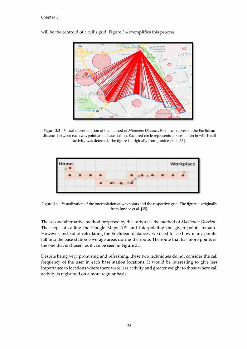
Chapter 3
26
will be the centroid of a cell’s grid. Figure 3.4 exemplifies this process.
Figure 3.3 – Visual representation of the method of Minimum Distance. Red lines represent the Euclidean
distance between each waypoint and a base station. Each red circle represents a base station in which call
activity was detected. The figure is originally from Jundee et al. [35].
Figure 3.4 – Visualization of the interpolation of waypoints and the respective grid. The figure is originally
from Jundee et al. [35].
The second alternative method proposed by the authors is the method of Maximum Overlap.
The steps of calling the Google Maps API and interpolating the given points remain.
However, instead of calculating the Euclidean distances, we need to see how many points
fall into the base station coverage areas during the route. The route that has more points is
the one that is chosen, as it can be seen in Figure 3.5.
Despite being very promising and refreshing, these two techniques do not consider the call
frequency of the user in each base station locations. It would be interesting to give less
importance to locations where there were less activity and greater weight to those where call
activity is registered on a more regular basis.
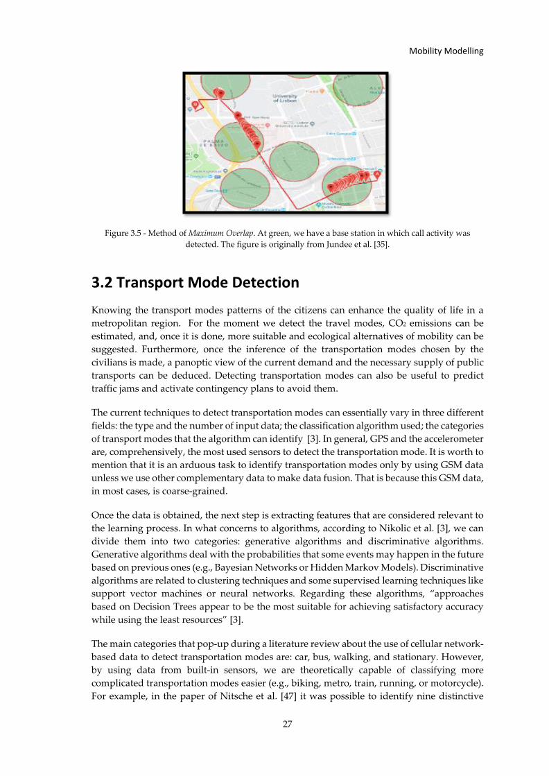
Mobility Modelling
27
Figure 3.5 - Method of Maximum Overlap. At green, we have a base station in which call activity was
detected. The figure is originally from Jundee et al. [35].
3.2 Transport Mode Detection
Knowing the transport modes patterns of the citizens can enhance the quality of life in a
metropolitan region. For the moment we detect the travel modes, CO2 emissions can be
estimated, and, once it is done, more suitable and ecological alternatives of mobility can be
suggested. Furthermore, once the inference of the transportation modes chosen by the
civilians is made, a panoptic view of the current demand and the necessary supply of public
transports can be deduced. Detecting transportation modes can also be useful to predict
traffic jams and activate contingency plans to avoid them.
The current techniques to detect transportation modes can essentially vary in three different
fields: the type and the number of input data; the classification algorithm used; the categories
of transport modes that the algorithm can identify [3]. In general, GPS and the accelerometer
are, comprehensively, the most used sensors to detect the transportation mode. It is worth to
mention that it is an arduous task to identify transportation modes only by using GSM data
unless we use other complementary data to make data fusion. That is because this GSM data,
in most cases, is coarse-grained.
Once the data is obtained, the next step is extracting features that are considered relevant to
the learning process. In what concerns to algorithms, according to Nikolic et al. [3], we can
divide them into two categories: generative algorithms and discriminative algorithms.
Generative algorithms deal with the probabilities that some events may happen in the future
based on previous ones (e.g., Bayesian Networks or Hidden Markov Models). Discriminative
algorithms are related to clustering techniques and some supervised learning techniques like
support vector machines or neural networks. Regarding these algorithms, “approaches
based on Decision Trees appear to be the most suitable for achieving satisfactory accuracy
while using the least resources” [3].
The main categories that pop-up during a literature review about the use of cellular network-
based data to detect transportation modes are: car, bus, walking, and stationary. However,
by using data from built-in sensors, we are theoretically capable of classifying more
complicated transportation modes easier (e.g., biking, metro, train, running, or motorcycle).
For example, in the paper of Nitsche et al. [47] it was possible to identify nine distinctive
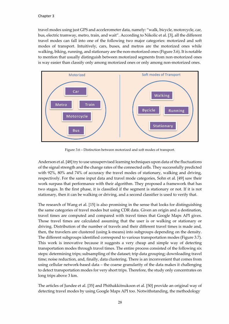
Chapter 3
28
travel modes using just GPS and accelerometer data, namely: “walk, bicycle, motorcycle, car,
bus, electric tramway, metro, train, and wait”. According to Nikolic et al. [3], all the different
travel modes can fall into one of the following two major categories: motorized and soft
modes of transport. Intuitively, cars, buses, and metros are the motorized ones while
walking, biking, running, and stationary are the non-motorized ones (Figure 3.6). It is notable
to mention that usually distinguish between motorized segments from non-motorized ones
is way easier than classify only among motorized ones or only among non-motorized ones.
Figure 3.6 – Distinction between motorized and soft modes of transport.
Anderson et al. [48] try to use unsupervised learning techniques upon data of the fluctuations
of the signal strength and the change rates of the connected cells. They successfully predicted
with 92%, 80% and 74% of accuracy the travel modes of stationary, walking and driving,
respectively. For the same input data and travel mode categories, Sohn et al. [49] saw their
work surpass that performance with their algorithm. They proposed a framework that has
two stages. In the first phase, it is classified if the segment is stationary or not. If it is not
stationary, then it can be walking or driving, and a second classifier is used to verify that.
The research of Wang et al. [15] is also promising in the sense that looks for distinguishing
the same categories of travel modes but using CDR data. Given an origin and a destination,
travel times are computed and compared with travel times that Google Maps API gives.
Those travel times are calculated assuming that the user is or walking or stationary or
driving. Distribution of the number of travels and their different travel times is made and,
then, the travelers are clustered (using k-means) into subgroups depending on the density.
The different subgroups identified correspond to various transportation modes (Figure 3.7).
This work is innovative because it suggests a very cheap and simple way of detecting
transportation modes through travel times. The entire process consisted of the following six
steps: determining trips; subsampling of the dataset; trip data grouping; downloading travel
time; noise reduction, and, finally, data clustering. There is an inconvenient that comes from
using cellular network-based data – the coarse granularity of the data makes it challenging
to detect transportation modes for very short trips. Therefore, the study only concentrates on
long trips above 3 km.
The articles of Jundee et al. [35] and Phithakkitnukoon et al. [50] provide an original way of
detecting travel modes by using Google Maps API too. Notwithstanding, the methodology
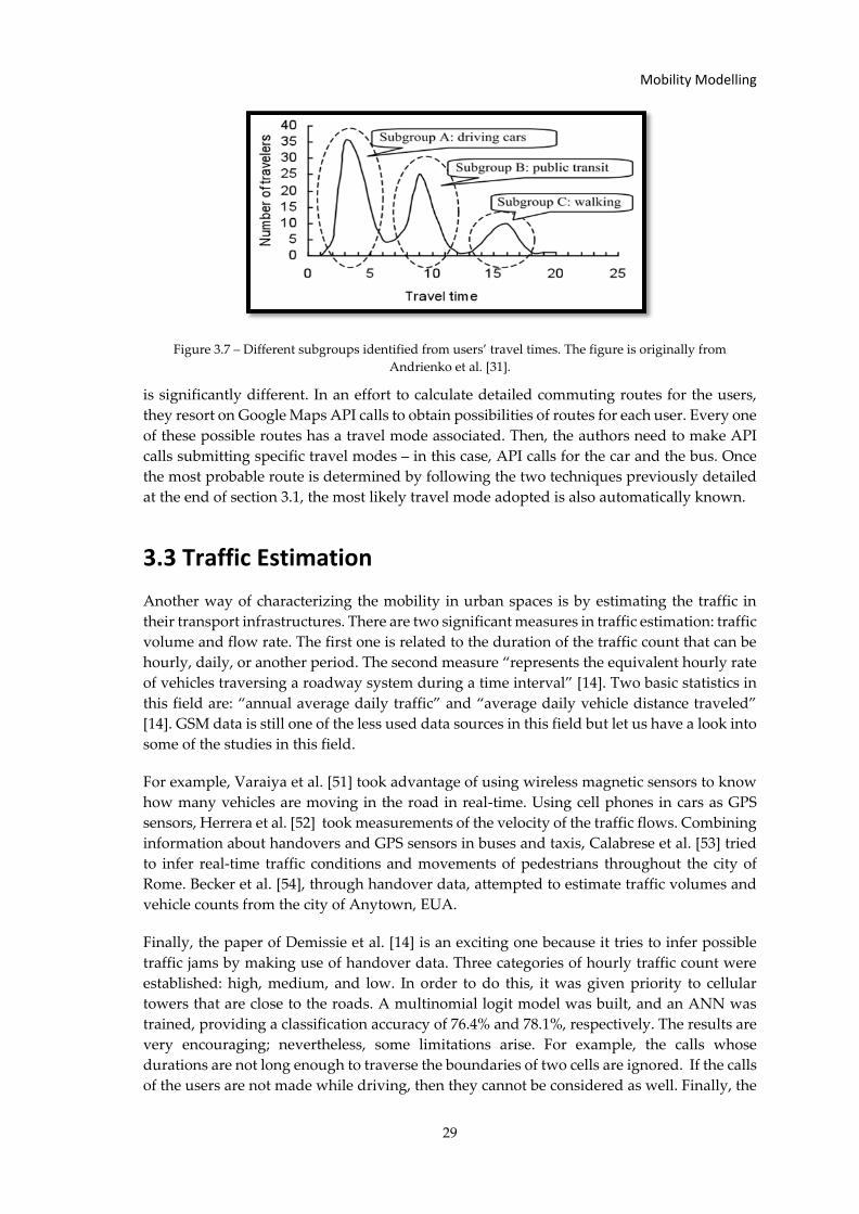
Mobility Modelling
29
Figure 3.7 – Different subgroups identified from users’ travel times. The figure is originally from
Andrienko et al. [31].
is significantly different. In an effort to calculate detailed commuting routes for the users,
they resort on Google Maps API calls to obtain possibilities of routes for each user. Every one
of these possible routes has a travel mode associated. Then, the authors need to make API
calls submitting specific travel modes – in this case, API calls for the car and the bus. Once
the most probable route is determined by following the two techniques previously detailed
at the end of section 3.1, the most likely travel mode adopted is also automatically known.
3.3 Traffic Estimation
Another way of characterizing the mobility in urban spaces is by estimating the traffic in
their transport infrastructures. There are two significant measures in traffic estimation: traffic
volume and flow rate. The first one is related to the duration of the traffic count that can be
hourly, daily, or another period. The second measure “represents the equivalent hourly rate
of vehicles traversing a roadway system during a time interval” [14]. Two basic statistics in
this field are: “annual average daily traffic” and “average daily vehicle distance traveled”
[14]. GSM data is still one of the less used data sources in this field but let us have a look into
some of the studies in this field.
For example, Varaiya et al. [51] took advantage of using wireless magnetic sensors to know
how many vehicles are moving in the road in real-time. Using cell phones in cars as GPS
sensors, Herrera et al. [52] took measurements of the velocity of the traffic flows. Combining
information about handovers and GPS sensors in buses and taxis, Calabrese et al. [53] tried
to infer real-time traffic conditions and movements of pedestrians throughout the city of
Rome. Becker et al. [54], through handover data, attempted to estimate traffic volumes and
vehicle counts from the city of Anytown, EUA.
Finally, the paper of Demissie et al. [14] is an exciting one because it tries to infer possible
traffic jams by making use of handover data. Three categories of hourly traffic count were
established: high, medium, and low. In order to do this, it was given priority to cellular
towers that are close to the roads. A multinomial logit model was built, and an ANN was
trained, providing a classification accuracy of 76.4% and 78.1%, respectively. The results are
very encouraging; nevertheless, some limitations arise. For example, the calls whose
durations are not long enough to traverse the boundaries of two cells are ignored. If the calls
of the users are not made while driving, then they cannot be considered as well. Finally, the
Chapter 3
30
study was “carried out on an urban road network, where the traffic flow is more likely to be
influenced by entry and exit roads, traffic control devices, intersections, and presence of
turning movements” [14].
3.4 Land Use Characterization
The land use in urban spaces is increasingly vital to be characterized once the tendency is
people living more and more in cities. When we consult the World Urbanization Prospects
of the United Nations [55], we see that the prospects for 2050, it is probable that 66% of the
entire world will leave in urban regions. So, it is crucial to study in detail the use of these
spaces and understand how they affect the mobility patterns and dynamics. With that
purpose in mind, it is essential to use sensing data so that we can prevent the high cost and
extremely time-consuming process of using surveys to do so. Using satellite remote sensing
datasets also has its limitations in what regards to urban planning. It becomes impracticable
to predict land utilization from the physical characteristics and, then, we are diminished to
infer the land cover [56]. We say that this is impracticable because frequently the same
infrastructure can be used for multiple and completely disparate purposes. An example of
that is the fact that nowadays, a ”residential place can function as a location for employment
or education” [57].
The multiple regions of cities can be analyzed for their particular use function and,
consequently, every one of these is characterized by the activities that occur in its area. The
cities nowadays can hold a plethora of functions that guarantee, for example, commercial,
mobility or residential uses. These different uses relate to various human activities like
commuting, shopping, working.
Many studies tried to characterize these urban land uses. Barnsley et al. [58], for example,
tried to characterize land use using remote sensing images and spatial metrics. Nevertheless,
cities are artificial living organisms, which means that they are dynamic; they are in constant
evolution, in unstoppable expansion, redevelopments, and reallocation of services and
people. People interact, and their activities occur in a plenty number of different POI’s
(Points of Interest). Remote sensing and field mapping methods are pretty useful to extract
texture and other physical properties of the land. However, using them is not the best way
to infer interaction patterns of socioeconomic contexts [59]. Here comes in the possibility of
trying location-awareness sensing data, POI data, and social media to have a more temporal
and spatial notion of the human occupation of the land at an individual level. Studies by Pei
et al. [60], Steiger et al. [61] and Yao et al. [62] are precisely focused on that potential. The
power of social media networks (like Facebook, Youtube, Twitter, Foursquare) that contain
valuable and massive geo-tag information provided by the users to infer land uses is also
demonstrated in the works of Bawa-cavia [63] and Thakur et al. [64].
Geo-located tweets have excellent potential to be very useful in characterizing urban land
use. Notwithstanding, it is complicated to deal with these data sources because they are
countless and disorganized. Soliman et al. [57] made use of 39 million geo-located tweets and
“two independent datasets of the City of Chicago: 1) travel survey and 2) parcel-level land
use map”. Zhan et al. [65] had a similar purpose because they derived temporal patterns
from Foursquare users’ activities information and associated them with different land uses.
Noulas et al. [66] tried to classify geographical areas also recurring to Foursquare data but
Mobility Modelling
31
without considering the temporal patters.
To detect land uses in China, Liu et al. [67] combined too Foursquare data with data from
OpenStreetMap. A land-use map of the city of Beijing was also elaborated by Hu et al. [68],
but this time by synthesizing POIs with Landsat images. Relying on the predictability of
users’ movements, Song [69] tries to classify land uses by analyzing spatial patterns in Twitter
data. Fusing POI type data with data about taxi pick-ups/drop-offs, Yuan et al. [70] inferred
various urban functions of the city of Beijing. To do that, they use LDA (Latent Dirichlet
Allocation) and Dirichlet multinomial regression. The article by Hobel et al. [71] stands out
from the others in the way that they were able to identify shopping areas by using features
like the number of ATM’s or the number of restaurants. The model was developed using
POIs from OpenStreetMaps.
3.5 Social Behavior
Social behavior is related to mobility patterns in the sense that social and other external
factors can influence, for example, our choice of transportation mode or our route choices.
Yuan et al. [27] correlate some mobility measures with the gender and the age of the users.
Among other interesting conclusions, it was discovered that adolescents and the elderly do
not travel as long distances as the middle-aged and youth people. Isaacman et al. [72]
concluded that people tend to travel more in the summer than in the winter. So, the seasons
can actually influence our amount of travel. Furthermore, Cho et al. [73] show us that long-
distance trips are way much influenced by our social ties when compared to short-distance
ones. Lu et al. [55] tried to study human migration patterns after a catastrophe that happened
in Bangladesh in May 2013. They used CDRs to characterize the quantity, direction, duration,
and seasonality of the migration. Blumenstock [74] was also able to infer internal migration
patterns through the analysis of CDRs.
According to Deville et al. [75], CDRs are, in fact, a great tool to predict population
movements. Calabrese et al. [59] also make use of CDRs, but this time to relate users’ calls
with their geographical locations. They discovered that 90% of people that called each other
were, indeed, covered by the same cell tower. The contributions of Wang et al. [76] and Tatem
et al. [77] are relevant to understand epidemiology phenomenon and virus propagations by
characterizing human mobility through the mobile operator data. Also, Eagle et al. [78] help
us understand how people adapt and change their behavior in communication to be more
similar to their new social environment. The discovers from this study constitute a critical
source of information to event management and congestion reduction.
With the purpose of examining the evolution of the tie strength, sociality levels and other
factors among users’ social ties during migration periods, Phithakkitnukoon et al. [79] made
use of 11 months of CDRs from Portugal. Valuable conclusions were discovered by Krings
et al. [80] as well. For example, the following formula to characterize the intensity of the
communications between two cities was obtained: the intensity is “proportional to the
product of the two populations divided by the square of the distance between the cities.”.
Besides that, it was observed that ”intra-urban communications scale superlinearly with city
population” [80].
In this line of reasoning, it is opportune to talk about discrete-choice models. These models
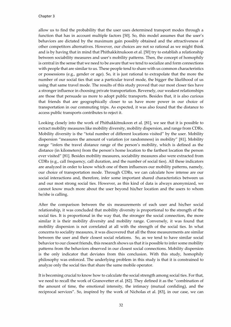
Chapter 3
32
allow us to find the probability that the user uses determined transport modes through a
function that has in account multiple factors [50]. So, this model assumes that the user’s
behaviors are dictated by the maximum gain possibly obtained and the attractiveness of
other competitors alternatives. However, our choices are not so rational as we might think
and is by having that in mind that Phithakkitnukoon et al. [50] try to establish a relationship
between sociability measures and user’s mobility patterns. Then, the concept of homophily
is central in the sense that we need to be aware that we tend to socialize and form connections
with people that are similar to us. These people tend to share with us common characteristics
or possessions (e.g., gender or age). So, it is just rational to extrapolate that the more the
number of our social ties that use a particular travel mode, the bigger the likelihood of us
using that same travel mode. The results of this study proved that our most closer ties have
a stronger influence in choosing private transportation. Reversely, our weakest relationships
are those that persuade us more to adopt public transports. Besides that, it is also curious
that friends that are geographically closer to us have more power in our choice of
transportation in our commuting trips. As expected, it was also found that the distance to
access public transports contributes to reject it.
Looking closely into the work of Phithakkitnukoon et al. [81], we see that it is possible to
extract mobility measures like mobility diversity, mobility dispersion, and range from CDRs.
Mobility diversity is the “total number of different locations visited” by the user. Mobility
dispersion “measures the amount of variation (or randomness) in mobility” [81]. Mobility
range “infers the travel distance range of the person’s mobility, which is defined as the
distance (in kilometers) from the person’s home location to the farthest location the person
ever visited” [81]. Besides mobility measures, sociability measures also were extracted from
CDRs (e.g., call frequency, call duration, and the number of social ties). All these indicators
are analyzed in order to know which one of them influences our mobility patterns, namely,
our choice of transportation mode. Through CDRs, we can calculate how intense are our
social interactions and, therefore, infer some important shared characteristics between us
and our most strong social ties. However, as this kind of data is always anonymized, we
cannot know much more about the user beyond his/her location and the users to whom
he/she is calling.
After the comparison between the six measurements of each user and his/her social
relationship, it was concluded that mobility diversity is proportional to the strength of the
social ties. It is proportional in the way that, the stronger the social connection, the more
similar it is their mobility diversity and mobility range. Conversely, it was found that
mobility dispersion is not correlated at all with the strength of the social ties. In what
concerns to sociality measures, it was discovered that all the three measurements are similar
between the user and their closest social relations. So, as we tend to have similar social
behavior to our closest friends, this research shows us that it is possible to infer some mobility
patterns from the behaviors observed in our closest social connections. Mobility dispersion
is the only indicator that deviates from this conclusion. With this study, homophily
philosophy was enforced. The underlying problem in this study is that it is constrained to
analyze only the social ties that share the same mobile operator.
It is becoming crucial to know how to calculate the social strength among social ties. For that,
we need to recall the work of Granovetter et al. [82]. They defined it as the “combination of
the amount of time, the emotional intensity, the intimacy (mutual confiding), and the
reciprocal services”. So, inspired by the work of Nicholas et al. [83], in our case, we can
Mobility Modelling
33
associate the amount of time of communicating through voice calls to the sociability
measurement that fits the Granovetter previous definition. To do so, we need to consider
the following ratio:
𝑠(𝑖) = 𝑐(𝑖)
1𝑁
∑ 𝑐(𝑖)𝑁𝑖=1
That formula means that the user social strength (s) with social tie i is equal to the amount of
time that the user spent talking with tie i - c(i) - divided by the amount of time that the user
spent talking with all their social ties (N). In order to compute this calculation correctly, it
was fundamental to consider social connections as those who maintain reciprocal calls with
the observed user. We say it is vital because there are often calls that we make sporadically
to some service or to someone that is not for sure our friend or acquaintance (to handle some
business, for example).
In what infer a social network concerns, CDRs may be positioned as one of the best
opportunistic data to use. That is a reasonable conclusion once the people to/from which we
make/receive calls mimic the closest as possible our real social network. For example, if we
took the data from social networks like Facebook or Instagram and based our social ties on
the so-called “friends” or “followers” in those platforms, we would end up overestimating
by far the actual number of user’s social ties.
Olivier et al. [36] also investigate the effects of weather conditions on our social interactions.
The weather has an impact on socio-economic activities. People may prefer to reside in a
determined zone because of the weather conditions around. Besides conditioning social
interactions, changes in weather conditions also influence mobility patterns. Along with
CDRs, a weather dataset was needed for this investigation. The dataset came from three base
stations in Lisbon that measured temperature, humidity, and pressure every 30 minutes. In
the end, it was concluded that weather conditions do not have a significant influence on
people’s average talk time. In extreme temperatures (excessively cold or warm) and
pressures (high and low) as well as humidity levels between 20%-100%, people are willing
to talk to a smaller number of social ties and maintain more connections with their strong
relationships.
Despite having valuable conclusions, this research has some issues. The influence of the
atmospheric parameters might depend on each other; however, only the importance of one
criterion at a time was explored. It could have been investigated the impact of the
simultaneous changes in multiple parameters of the weather conditions. Also, the study
ignores the fact that people might be inside some infrastructure and be shielded from certain
types of weather. It was neither considered the weather conditions of the person who was
connected to the observed individual. The fact that there are holidays, vacations, and other
social events that can influence the average talk time was not taken into consideration as
well.
The research developed by Olivier et al. [84] constitutes another great study about the socio-
geography of human mobility. In this study was discovered that 80% of the locations visited
are within a range of 20 km of the nearest users’ social ties. If we consider a geo-social radius
of 45 km, then we can say that the percentage increases to 90%. It is also surprising to know
that we tend to be geographically closer to our weak ties than our strong ties. In general, the
(1)
Chapter 3
34
more urbanely dense is our region, the more distant we are from our social ties and the
shorter are our geo-social radius; also, 80% of our travel scope will be within a 10 km geo-social
radius. Here, the geo-social radius is defined as being the geographical distance from social
ties. So, if the “places visited by the subject (or travel scope) are within x km from the subject’s
social ties”, then the geo-social radius will be x. This concept is appropriately depicted in
Figure 3.8.
Figure 3.8 – Red points refer to the locations of social ties, and r is the geo-social radius. The contour line
encloses the predicted travel scope. The figure is originally from Olivier et al. [84].
A more general and surprising conclusion of the study is that “although people tend to reside
near their strong ties, their mobility is biased towards the geographic locations of their weak
ties” [84]. This study, like the others, raises some issues. We are assuming that we
make/receive phone calls to every person that is our friend in the period under analysis,
which is not realistic. Also, we all have social ties to whom we speak on a regular basis, face-
to-face, and we do not need to call them. It was also assumed that people did not migrate or
did not change the homeplace, moving to another location during the period of the study.
People may also be residing temporarily in someplace because they are on vacation.
However, as vacation is just a short slice of people’s lives, it is quite unlikely that it has a
significant impact on the study.
3.6 Limitations and Future Research
At the end of the State of the Art, looking through all the literature reviewed, it is noticeable
that there are aspects that need to be worked in more detail or that need to be included in
the research agenda. These limitations constitute possible anchors from which research work
can be developed during this dissertation. So, this subsection will reflect on relevant issues
that can be further investigated in this dissertation that can help us automatically predict and
characterize mobility patterns and movement behaviors of the citizens in urban spaces.
For example, regarding transportation mode detection, no paper approaches mobility on the
water by trying to detect water transport modes, despite having a significant role in many
countries. To solve temporal sparsity of event-driven data of cellular networks, studies in
the field often end up with a small portion of the initial dataset due to the subsampling
process of the most highly active users. Consequently, studies that are supported by a high
volume of data are scarce.
Mobility Modelling
35
The methodology presented by Wang et al. [11] is promising and could be applied to a CDR
dataset instead of just sightings data. Zhao et al. [37] tell if there are hidden visited places or
not, but it is not capable of knowing the locations of those places. Knowing that would be
fundamental to obtain full OD flows. Relative to the work of Phithakkitnukoon et al. [63], it
would be interesting to have a deeper analysis of how geo-social radius varies with tie
strength and the number of ties.
The work of Olivier et al. [36] is another one that has room for improvements in different
ways. For example, the study can be extended to entire Portugal. By doing that we could see
if the conclusions taken are valid for other municipalities besides Lisbon. Also, many
parameters of the analyzed weather conditions depend on each other; however, only the
influence of one parameter at a time was explored. Moreover, it was ignored the weather
condition in the location of the individuals to whom the user is talking. Finally, the study
did not consider the effect of special events that can easily influence the duration of the calls
of the users (e.g., holidays or vacations). The duration of the calls may also vary depending
on factors like the day of the week or time of the day.
The work by Jundee et al. [35] proposes two different techniques to infer the exact routes in
commuting trips (home to the workplace and workplace to home) using only CDRs.
Nevertheless, the different frequencies of call activity in the different activated cellular
towers were not considered in any of these two techniques. This disregard can easily lead to
misleading results. Phithakkitnukoon et al. [50] proposed to follow the same methodology
and to fix precisely the issue above-mentioned. Nonetheless, this study comprises other
limitations. For example, it should have been supported on a higher volume of data. Also, it
is assumed that the users move using just one of the following transport modes - car or bus
– where, in fact, the user can walk, bicycling, use a subway, a train or a tram. Besides that,
the study is constrained to Lisbon. It would be interesting to model the commuting mobility
across the different municipalities of entire Portugal.
Moreover, it is not taken into consideration that the user can change the transport mode in
the middle of the trip. Furthermore, the calculation of the exact commuting routes can be
highly optimized by estimating travel times and “intermediate cell towers”. These
intermediate cell towers are those towers activated during a commuting trip that does not
correspond to the home or workplace location. Additionally, taking into account the
challenges that we have to face relative to the oscillation phenomenon and others, the pre-
process, and treatment of the data should be more elaborated. Finally, not forgetting the
challenges of temporal sparsity and spatial resolution of the CDRs, a more detailed series of
filters on the users’ data in the dataset was necessary.
Besides these limitations, the main methodology followed in this work of Phithakkitnukoon
et al. [50] is promising, so, during in this dissertation, we will approach an optimized version
of that methodology that will overcome specifically those seven limitations. Thus, this work
will be important for those who want to infer mobility patterns using CDRs and need to
know the suitable thresholds for multiple quality parameters of a CDR dataset. Once we
know these thresholds, we can process and subsample the dataset efficiently. It will also
provide an optimized methodology to infer commuting routes (home to the workplace and
vice-versa) and the respective transport modes chosen by the users. A model that can
generate the mobility profile of any district of Portugal will be developed. That mobility
profile will include the distribution of percentages of adoption of each of one of seven

Chapter 3
36
categories of travel modes (bus, car, train, tram, bicycle, walking, subway) by each user in
their commuting trips. Not only percentages about each one of these travel modes
(unimodal) but also the combinations between them (multimodal). Finally, the automatic
generation of the visualization of the users’ commuting routes will also be developed. We
believe that this new and optimized methodology constitutes a viable solution for
automatically providing elements of decision-making for different entities. For instance,
transport operators can quickly get an overview of the needs of transport of the users in their
commuting routes and adjust the offer accordingly to that.
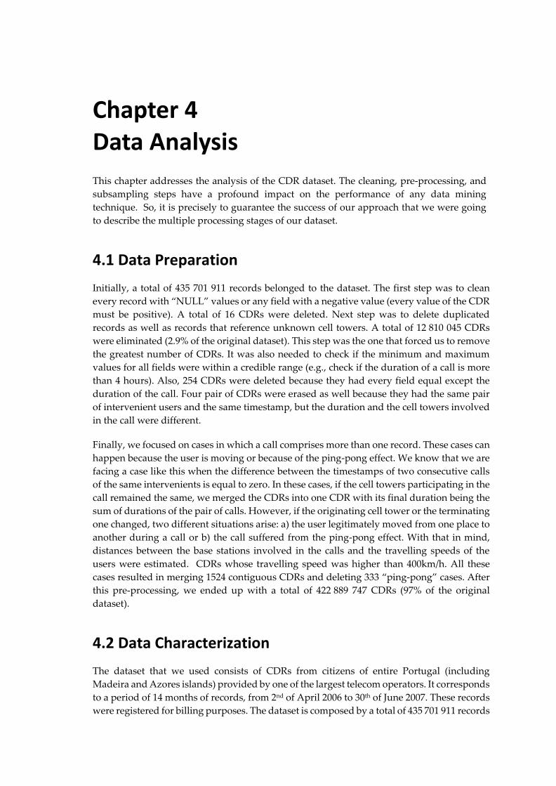
Chapter 4 Data Analysis
This chapter addresses the analysis of the CDR dataset. The cleaning, pre-processing, and
subsampling steps have a profound impact on the performance of any data mining
technique. So, it is precisely to guarantee the success of our approach that we were going
to describe the multiple processing stages of our dataset.
4.1 Data Preparation
Initially, a total of 435 701 911 records belonged to the dataset. The first step was to clean
every record with “NULL” values or any field with a negative value (every value of the CDR
must be positive). A total of 16 CDRs were deleted. Next step was to delete duplicated
records as well as records that reference unknown cell towers. A total of 12 810 045 CDRs
were eliminated (2.9% of the original dataset). This step was the one that forced us to remove
the greatest number of CDRs. It was also needed to check if the minimum and maximum
values for all fields were within a credible range (e.g., check if the duration of a call is more
than 4 hours). Also, 254 CDRs were deleted because they had every field equal except the
duration of the call. Four pair of CDRs were erased as well because they had the same pair
of intervenient users and the same timestamp, but the duration and the cell towers involved
in the call were different.
Finally, we focused on cases in which a call comprises more than one record. These cases can
happen because the user is moving or because of the ping-pong effect. We know that we are
facing a case like this when the difference between the timestamps of two consecutive calls
of the same intervenients is equal to zero. In these cases, if the cell towers participating in the
call remained the same, we merged the CDRs into one CDR with its final duration being the
sum of durations of the pair of calls. However, if the originating cell tower or the terminating
one changed, two different situations arise: a) the user legitimately moved from one place to
another during a call or b) the call suffered from the ping-pong effect. With that in mind,
distances between the base stations involved in the calls and the travelling speeds of the
users were estimated. CDRs whose travelling speed was higher than 400km/h. All these
cases resulted in merging 1524 contiguous CDRs and deleting 333 “ping-pong” cases. After
this pre-processing, we ended up with a total of 422 889 747 CDRs (97% of the original
dataset).
4.2 Data Characterization
The dataset that we used consists of CDRs from citizens of entire Portugal (including
Madeira and Azores islands) provided by one of the largest telecom operators. It corresponds
to a period of 14 months of records, from 2nd of April 2006 to 30th of June 2007. These records
were registered for billing purposes. The dataset is composed by a total of 435 701 911 records
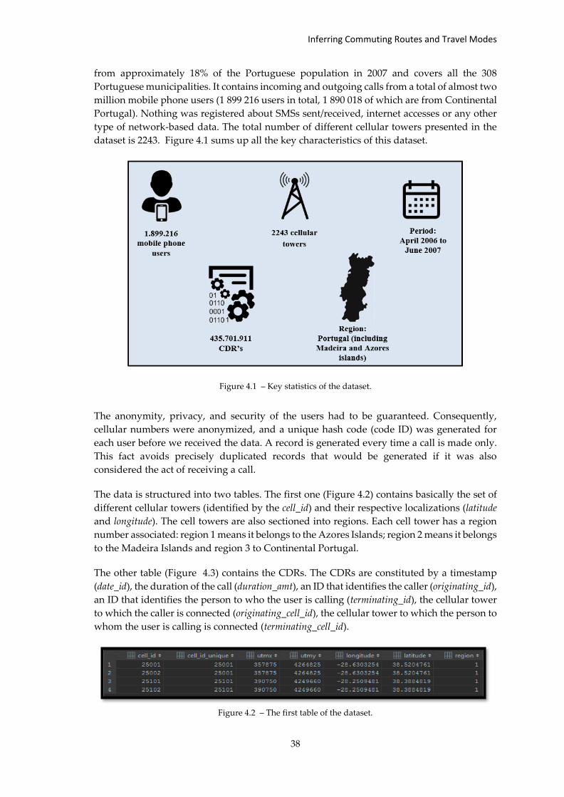
Inferring Commuting Routes and Travel Modes
38
from approximately 18% of the Portuguese population in 2007 and covers all the 308
Portuguese municipalities. It contains incoming and outgoing calls from a total of almost two
million mobile phone users (1 899 216 users in total, 1 890 018 of which are from Continental
Portugal). Nothing was registered about SMSs sent/received, internet accesses or any other
type of network-based data. The total number of different cellular towers presented in the
dataset is 2243. Figure 4.1 sums up all the key characteristics of this dataset.
Figure 4.1 – Key statistics of the dataset.
The anonymity, privacy, and security of the users had to be guaranteed. Consequently,
cellular numbers were anonymized, and a unique hash code (code ID) was generated for
each user before we received the data. A record is generated every time a call is made only.
This fact avoids precisely duplicated records that would be generated if it was also
considered the act of receiving a call.
The data is structured into two tables. The first one (Figure 4.2) contains basically the set of
different cellular towers (identified by the cell_id) and their respective localizations (latitude
and longitude). The cell towers are also sectioned into regions. Each cell tower has a region
number associated: region 1 means it belongs to the Azores Islands; region 2 means it belongs
to the Madeira Islands and region 3 to Continental Portugal.
The other table (Figure 4.3) contains the CDRs. The CDRs are constituted by a timestamp
(date_id), the duration of the call (duration_amt), an ID that identifies the caller (originating_id),
an ID that identifies the person to who the user is calling (terminating_id), the cellular tower
to which the caller is connected (originating_cell_id), the cellular tower to which the person to
whom the user is calling is connected (terminating_cell_id).
Figure 4.2 – The first table of the dataset.
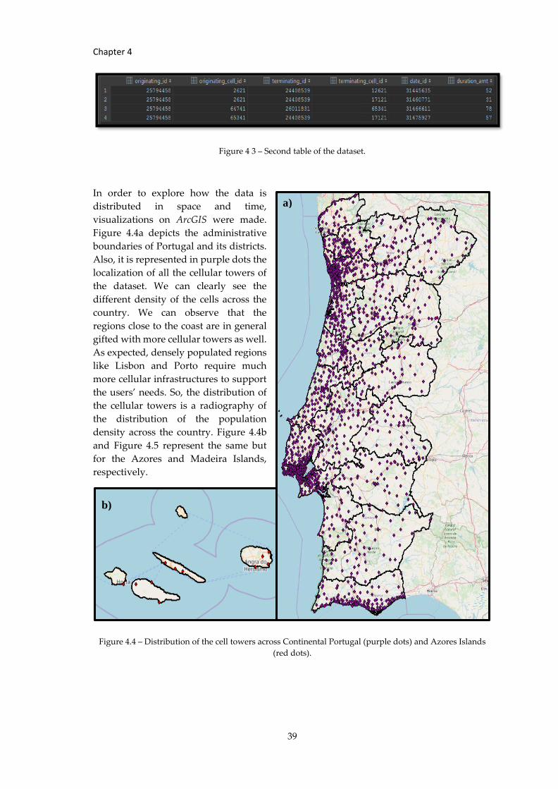
Chapter 4
39
Figure 4 3 – Second table of the dataset.
In order to explore how the data is
distributed in space and time,
visualizations on ArcGIS were made.
Figure 4.4a depicts the administrative
boundaries of Portugal and its districts.
Also, it is represented in purple dots the
localization of all the cellular towers of
the dataset. We can clearly see the
different density of the cells across the
country. We can observe that the
regions close to the coast are in general
gifted with more cellular towers as well.
As expected, densely populated regions
like Lisbon and Porto require much
more cellular infrastructures to support
the users’ needs. So, the distribution of
the cellular towers is a radiography of
the distribution of the population
density across the country. Figure 4.4b
and Figure 4.5 represent the same but
for the Azores and Madeira Islands,
respectively.
Figure 4.4 – Distribution of the cell towers across Continental Portugal (purple dots) and Azores Islands
(red dots).
a) b)
a)
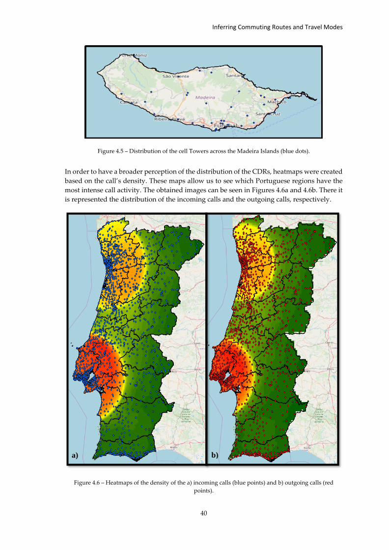
Inferring Commuting Routes and Travel Modes
40
Figure 4.5 – Distribution of the cell Towers across the Madeira Islands (blue dots).
In order to have a broader perception of the distribution of the CDRs, heatmaps were created
based on the call’s density. These maps allow us to see which Portuguese regions have the
most intense call activity. The obtained images can be seen in Figures 4.6a and 4.6b. There it
is represented the distribution of the incoming calls and the outgoing calls, respectively.
Figure 4.6 – Heatmaps of the density of the a) incoming calls (blue points) and b) outgoing calls (red
points).
a) b)
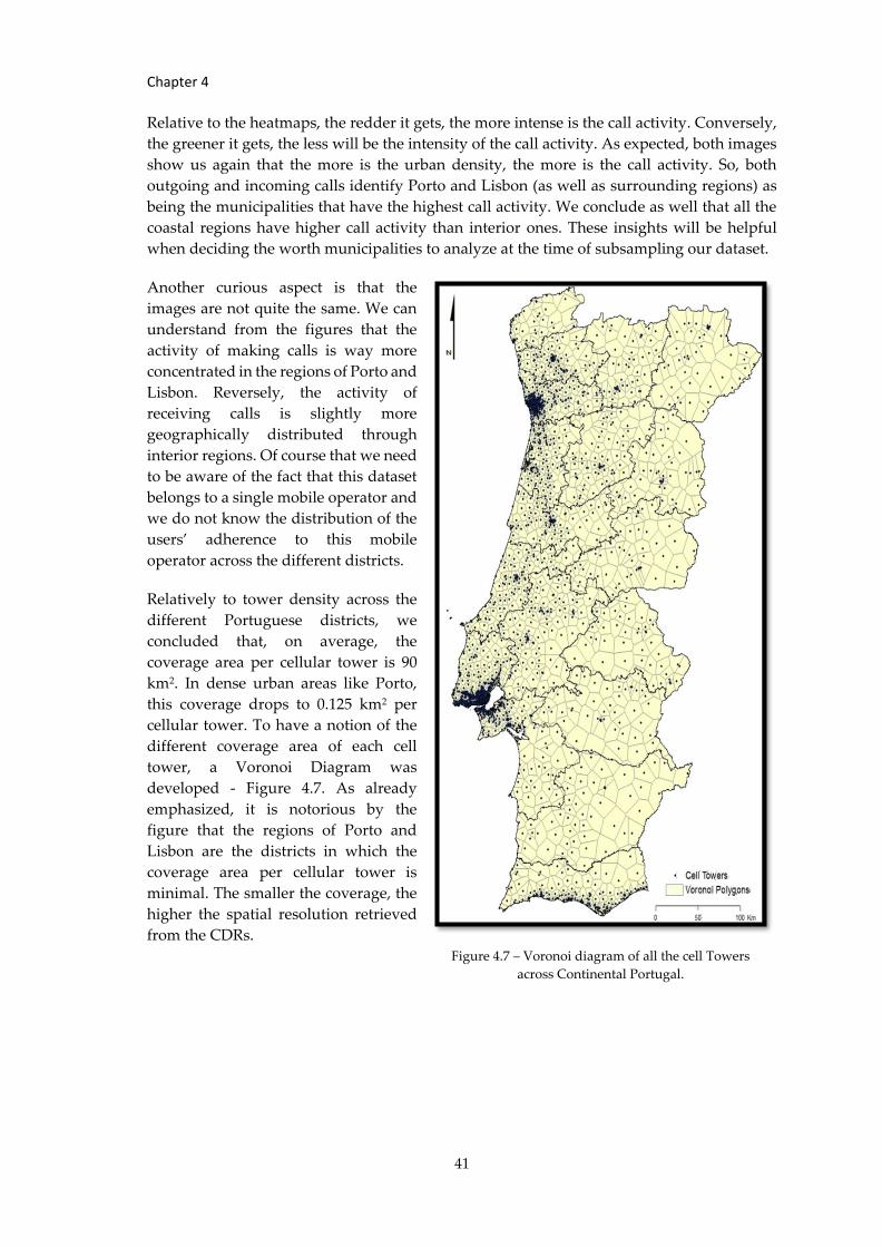
Chapter 4
41
Relative to the heatmaps, the redder it gets, the more intense is the call activity. Conversely,
the greener it gets, the less will be the intensity of the call activity. As expected, both images
show us again that the more is the urban density, the more is the call activity. So, both
outgoing and incoming calls identify Porto and Lisbon (as well as surrounding regions) as
being the municipalities that have the highest call activity. We conclude as well that all the
coastal regions have higher call activity than interior ones. These insights will be helpful
when deciding the worth municipalities to analyze at the time of subsampling our dataset.
Another curious aspect is that the
images are not quite the same. We can
understand from the figures that the
activity of making calls is way more
concentrated in the regions of Porto and
Lisbon. Reversely, the activity of
receiving calls is slightly more
geographically distributed through
interior regions. Of course that we need
to be aware of the fact that this dataset
belongs to a single mobile operator and
we do not know the distribution of the
users’ adherence to this mobile
operator across the different districts.
Relatively to tower density across the
different Portuguese districts, we
concluded that, on average, the
coverage area per cellular tower is 90
km2. In dense urban areas like Porto,
this coverage drops to 0.125 km2 per
cellular tower. To have a notion of the
different coverage area of each cell
tower, a Voronoi Diagram was
developed - Figure 4.7. As already
emphasized, it is notorious by the
figure that the regions of Porto and
Lisbon are the districts in which the
coverage area per cellular tower is
minimal. The smaller the coverage, the
higher the spatial resolution retrieved
from the CDRs.
Figure 4.7 – Voronoi diagram of all the cell Towers
across Continental Portugal.
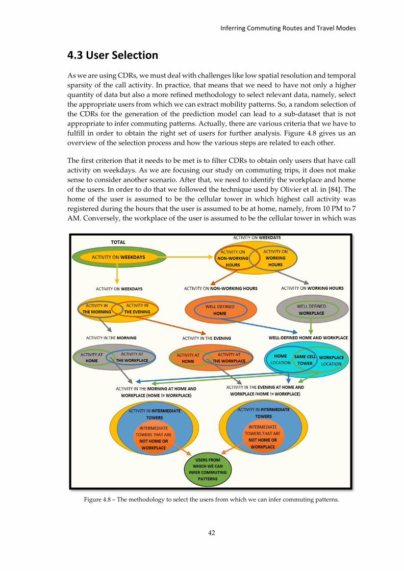
Inferring Commuting Routes and Travel Modes
42
4.3 User Selection
As we are using CDRs, we must deal with challenges like low spatial resolution and temporal
sparsity of the call activity. In practice, that means that we need to have not only a higher
quantity of data but also a more refined methodology to select relevant data, namely, select
the appropriate users from which we can extract mobility patterns. So, a random selection of
the CDRs for the generation of the prediction model can lead to a sub-dataset that is not
appropriate to infer commuting patterns. Actually, there are various criteria that we have to
fulfill in order to obtain the right set of users for further analysis. Figure 4.8 gives us an
overview of the selection process and how the various steps are related to each other.
The first criterion that it needs to be met is to filter CDRs to obtain only users that have call
activity on weekdays. As we are focusing our study on commuting trips, it does not make
sense to consider another scenario. After that, we need to identify the workplace and home
of the users. In order to do that we followed the technique used by Olivier et al. in [84]. The
home of the user is assumed to be the cellular tower in which highest call activity was
registered during the hours that the user is assumed to be at home, namely, from 10 PM to 7
AM. Conversely, the workplace of the user is assumed to be the cellular tower in which was
Figure 4.8 – The methodology to select the users from which we can infer commuting patterns.
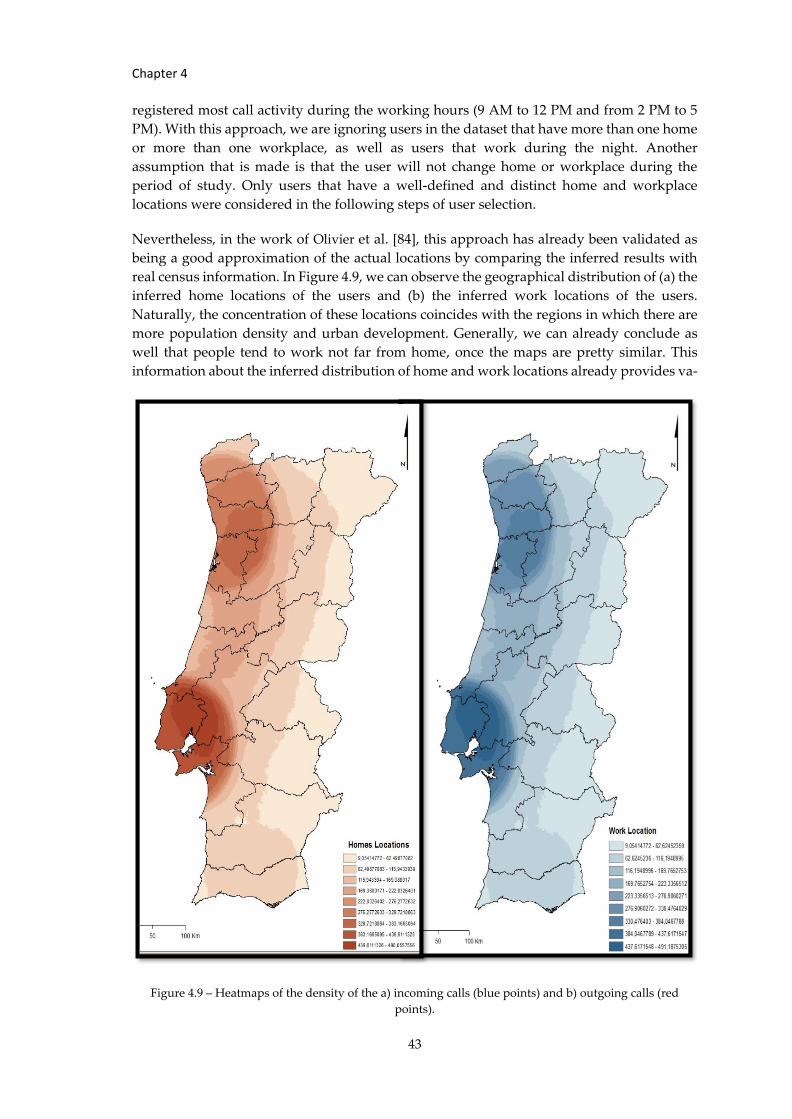
Chapter 4
43
registered most call activity during the working hours (9 AM to 12 PM and from 2 PM to 5
PM). With this approach, we are ignoring users in the dataset that have more than one home
or more than one workplace, as well as users that work during the night. Another
assumption that is made is that the user will not change home or workplace during the
period of study. Only users that have a well-defined and distinct home and workplace
locations were considered in the following steps of user selection.
Nevertheless, in the work of Olivier et al. [84], this approach has already been validated as
being a good approximation of the actual locations by comparing the inferred results with
real census information. In Figure 4.9, we can observe the geographical distribution of (a) the
inferred home locations of the users and (b) the inferred work locations of the users.
Naturally, the concentration of these locations coincides with the regions in which there are
more population density and urban development. Generally, we can already conclude as
well that people tend to work not far from home, once the maps are pretty similar. This
information about the inferred distribution of home and work locations already provides va-
Figure 4.9 – Heatmaps of the density of the a) incoming calls (blue points) and b) outgoing calls (red
points).
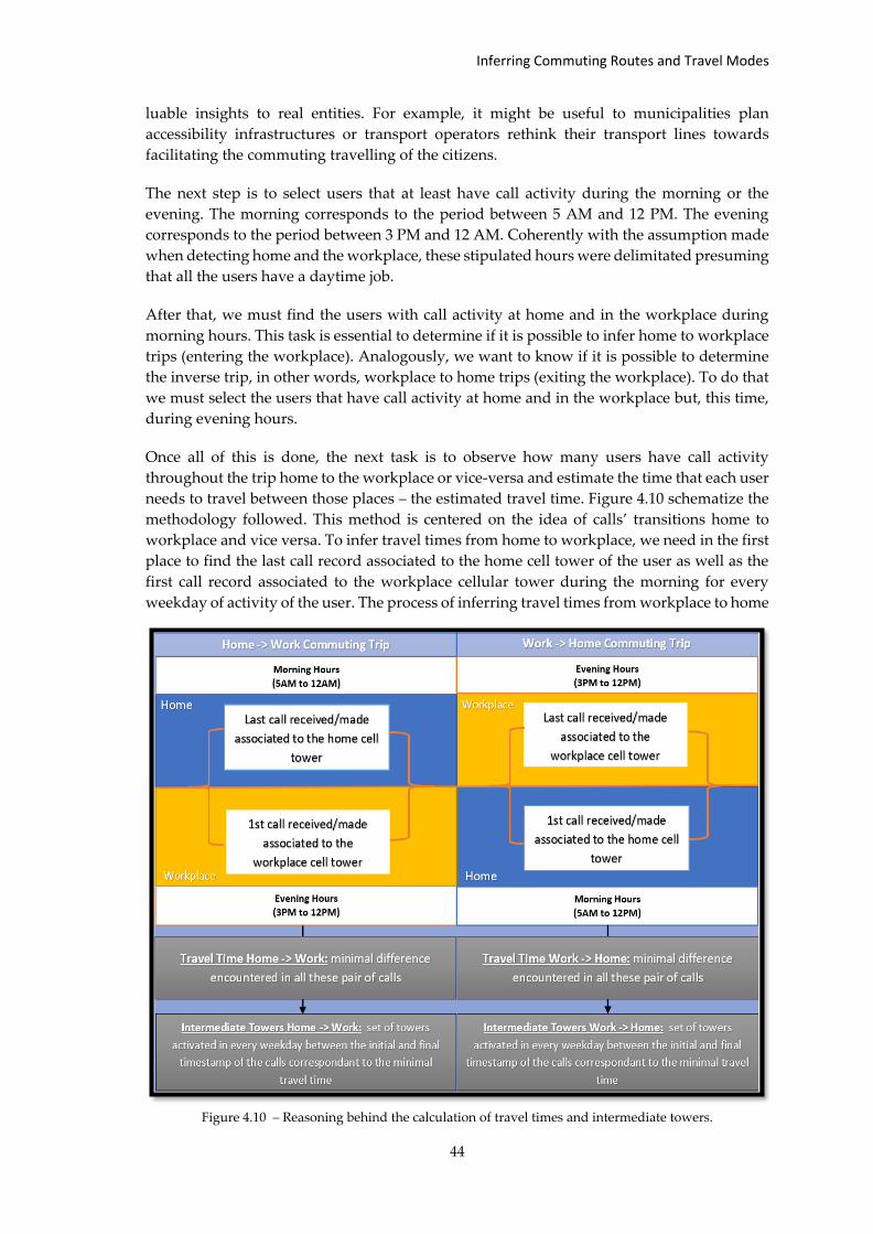
Inferring Commuting Routes and Travel Modes
44
luable insights to real entities. For example, it might be useful to municipalities plan
accessibility infrastructures or transport operators rethink their transport lines towards
facilitating the commuting travelling of the citizens.
The next step is to select users that at least have call activity during the morning or the
evening. The morning corresponds to the period between 5 AM and 12 PM. The evening
corresponds to the period between 3 PM and 12 AM. Coherently with the assumption made
when detecting home and the workplace, these stipulated hours were delimitated presuming
that all the users have a daytime job.
After that, we must find the users with call activity at home and in the workplace during
morning hours. This task is essential to determine if it is possible to infer home to workplace
trips (entering the workplace). Analogously, we want to know if it is possible to determine
the inverse trip, in other words, workplace to home trips (exiting the workplace). To do that
we must select the users that have call activity at home and in the workplace but, this time,
during evening hours.
Once all of this is done, the next task is to observe how many users have call activity
throughout the trip home to the workplace or vice-versa and estimate the time that each user
needs to travel between those places – the estimated travel time. Figure 4.10 schematize the
methodology followed. This method is centered on the idea of calls’ transitions home to
workplace and vice versa. To infer travel times from home to workplace, we need in the first
place to find the last call record associated to the home cell tower of the user as well as the
first call record associated to the workplace cellular tower during the morning for every
weekday of activity of the user. The process of inferring travel times from workplace to home
Figure 4.10 – Reasoning behind the calculation of travel times and intermediate towers.
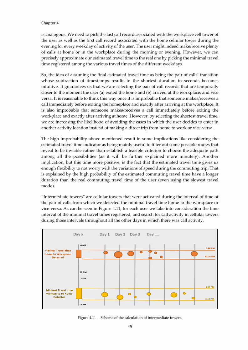
Chapter 4
45
is analogous. We need to pick the last call record associated with the workplace cell tower of
the user as well as the first call record associated with the home cellular tower during the
evening for every weekday of activity of the user. The user might indeed make/receive plenty
of calls at home or in the workplace during the morning or evening. However, we can
precisely approximate our estimated travel time to the real one by picking the minimal travel
time registered among the various travel times of the different weekdays.
So, the idea of assuming the final estimated travel time as being the pair of calls’ transition
whose subtraction of timestamps results in the shortest duration in seconds becomes
intuitive. It guarantees us that we are selecting the pair of call records that are temporally
closer to the moment the user (a) exited the home and (b) arrived at the workplace; and vice
versa. It is reasonable to think this way once it is improbable that someone makes/receives a
call immediately before exiting the homeplace and exactly after arriving at the workplace. It
is also improbable that someone makes/receives a call immediately before exiting the
workplace and exactly after arriving at home. However, by selecting the shortest travel time,
we are increasing the likelihood of avoiding the cases in which the user decides to enter in
another activity location instead of making a direct trip from home to work or vice-versa.
The high improbability above mentioned result in some implications like considering the
estimated travel time indicator as being mainly useful to filter out some possible routes that
reveal to be inviable rather than establish a feasible criterion to choose the adequate path
among all the possibilities (as it will be further explained more minutely). Another
implication, but this time more positive, is the fact that the estimated travel time gives us
enough flexibility to not worry with the variations of speed during the commuting trip. That
is explained by the high probability of the estimated commuting travel time have a longer
duration than the real commuting travel time of the user (even using the slowest travel
mode).
“Intermediate towers” are cellular towers that were activated during the interval of time of
the pair of calls from which we detected the minimal travel time home to the workplace or
vice-versa. As can be seen in Figure 4.11, for each user we take into consideration the time
interval of the minimal travel times registered, and search for call activity in cellular towers
during those intervals throughout all the other days in which there was call activity.
Figure 4.11 – Scheme of the calculation of intermediate towers.
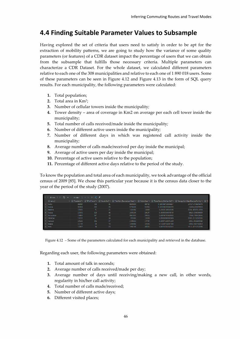
Inferring Commuting Routes and Travel Modes
46
4.4 Finding Suitable Parameter Values to Subsample
Having explored the set of criteria that users need to satisfy in order to be apt for the
extraction of mobility patterns, we are going to study how the variance of some quality
parameters (or features) of a CDR dataset impact the percentage of users that we can obtain
from the subsample that fulfills those necessary criteria. Multiple parameters can
characterize a CDR Dataset. For the whole dataset, we calculated different parameters
relative to each one of the 308 municipalities and relative to each one of 1 890 018 users. Some
of these parameters can be seen in Figure 4.12 and Figure 4.13 in the form of SQL query
results. For each municipality, the following parameters were calculated:
1. Total population;
2. Total area in Km2;
3. Number of cellular towers inside the municipality;
4. Tower density – area of coverage in Km2 on average per each cell tower inside the
municipality;
5. Total number of calls received/made inside the municipality;
6. Number of different active users inside the municipality;
7. Number of different days in which was registered call activity inside the
municipality;
8. Average number of calls made/received per day inside the municipal;
9. Average of active users per day inside the municipal;
10. Percentage of active users relative to the population;
11. Percentage of different active days relative to the period of the study.
To know the population and total area of each municipality, we took advantage of the official
census of 2009 [85]. We chose this particular year because it is the census data closer to the
year of the period of the study (2007).
Figure 4.12 – Some of the parameters calculated for each municipality and retrieved in the database.
Regarding each user, the following parameters were obtained:
1. Total amount of talk in seconds;
2. Average number of calls received/made per day;
3. Average number of days until receiving/making a new call, in other words,
regularity in his/her call activity;
4. Total number of calls made/received;
5. Number of different active days;
6. Different visited places;
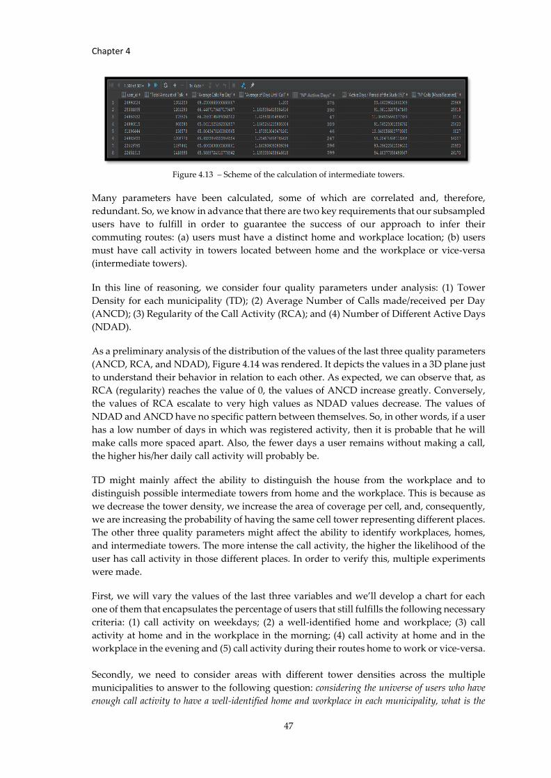
Chapter 4
47
Figure 4.13 – Scheme of the calculation of intermediate towers.
Many parameters have been calculated, some of which are correlated and, therefore,
redundant. So, we know in advance that there are two key requirements that our subsampled
users have to fulfill in order to guarantee the success of our approach to infer their
commuting routes: (a) users must have a distinct home and workplace location; (b) users
must have call activity in towers located between home and the workplace or vice-versa
(intermediate towers).
In this line of reasoning, we consider four quality parameters under analysis: (1) Tower
Density for each municipality (TD); (2) Average Number of Calls made/received per Day
(ANCD); (3) Regularity of the Call Activity (RCA); and (4) Number of Different Active Days
(NDAD).
As a preliminary analysis of the distribution of the values of the last three quality parameters
(ANCD, RCA, and NDAD), Figure 4.14 was rendered. It depicts the values in a 3D plane just
to understand their behavior in relation to each other. As expected, we can observe that, as
RCA (regularity) reaches the value of 0, the values of ANCD increase greatly. Conversely,
the values of RCA escalate to very high values as NDAD values decrease. The values of
NDAD and ANCD have no specific pattern between themselves. So, in other words, if a user
has a low number of days in which was registered activity, then it is probable that he will
make calls more spaced apart. Also, the fewer days a user remains without making a call,
the higher his/her daily call activity will probably be.
TD might mainly affect the ability to distinguish the house from the workplace and to
distinguish possible intermediate towers from home and the workplace. This is because as
we decrease the tower density, we increase the area of coverage per cell, and, consequently,
we are increasing the probability of having the same cell tower representing different places.
The other three quality parameters might affect the ability to identify workplaces, homes,
and intermediate towers. The more intense the call activity, the higher the likelihood of the
user has call activity in those different places. In order to verify this, multiple experiments
were made.
First, we will vary the values of the last three variables and we’ll develop a chart for each
one of them that encapsulates the percentage of users that still fulfills the following necessary
criteria: (1) call activity on weekdays; (2) a well-identified home and workplace; (3) call
activity at home and in the workplace in the morning; (4) call activity at home and in the
workplace in the evening and (5) call activity during their routes home to work or vice-versa.
Secondly, we need to consider areas with different tower densities across the multiple
municipalities to answer to the following question: considering the universe of users who have
enough call activity to have a well-identified home and workplace in each municipality, what is the
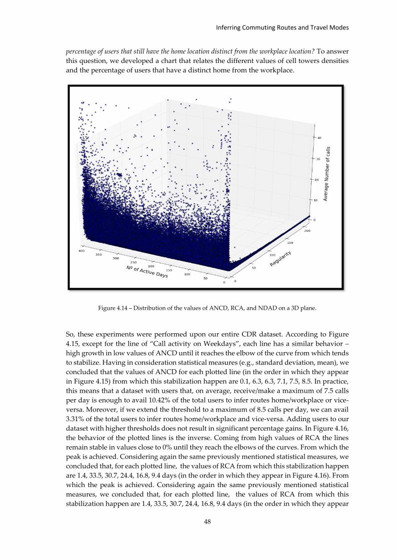
Inferring Commuting Routes and Travel Modes
48
percentage of users that still have the home location distinct from the workplace location? To answer
this question, we developed a chart that relates the different values of cell towers densities
and the percentage of users that have a distinct home from the workplace.
Figure 4.14 – Distribution of the values of ANCD, RCA, and NDAD on a 3D plane.
So, these experiments were performed upon our entire CDR dataset. According to Figure
4.15, except for the line of “Call activity on Weekdays”, each line has a similar behavior –
high growth in low values of ANCD until it reaches the elbow of the curve from which tends
to stabilize. Having in consideration statistical measures (e.g., standard deviation, mean), we
concluded that the values of ANCD for each plotted line (in the order in which they appear
in Figure 4.15) from which this stabilization happen are 0.1, 6.3, 6.3, 7.1, 7.5, 8.5. In practice,
this means that a dataset with users that, on average, receive/make a maximum of 7.5 calls
per day is enough to avail 10.42% of the total users to infer routes home/workplace or vice-
versa. Moreover, if we extend the threshold to a maximum of 8.5 calls per day, we can avail
3.31% of the total users to infer routes home/workplace and vice-versa. Adding users to our
dataset with higher thresholds does not result in significant percentage gains. In Figure 4.16,
the behavior of the plotted lines is the inverse. Coming from high values of RCA the lines
remain stable in values close to 0% until they reach the elbows of the curves. From which the
peak is achieved. Considering again the same previously mentioned statistical measures, we
concluded that, for each plotted line, the values of RCA from which this stabilization happen
are 1.4, 33.5, 30.7, 24.4, 16.8, 9.4 days (in the order in which they appear in Figure 4.16). From
which the peak is achieved. Considering again the same previously mentioned statistical
measures, we concluded that, for each plotted line, the values of RCA from which this
stabilization happen are 1.4, 33.5, 30.7, 24.4, 16.8, 9.4 days (in the order in which they appear
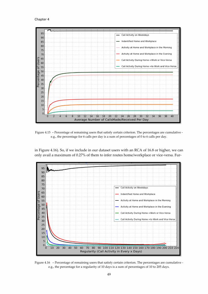
Chapter 4
49
Figure 4.15 – Percentage of remaining users that satisfy certain criterion. The percentages are cumulative -
e.g., the percentage for 6 calls per day is a sum of percentages of 0 to 6 calls per day.
in Figure 4.16). So, if we include in our dataset users with an RCA of 16.8 or higher, we can
only avail a maximum of 0.27% of them to infer routes home/workplace or vice-versa. Fur-
Figure 4.16 – Percentage of remaining users that satisfy certain criterion. The percentages are cumulative -
e.g., the percentage for a regularity of 10 days is a sum of percentages of 10 to 205 days.
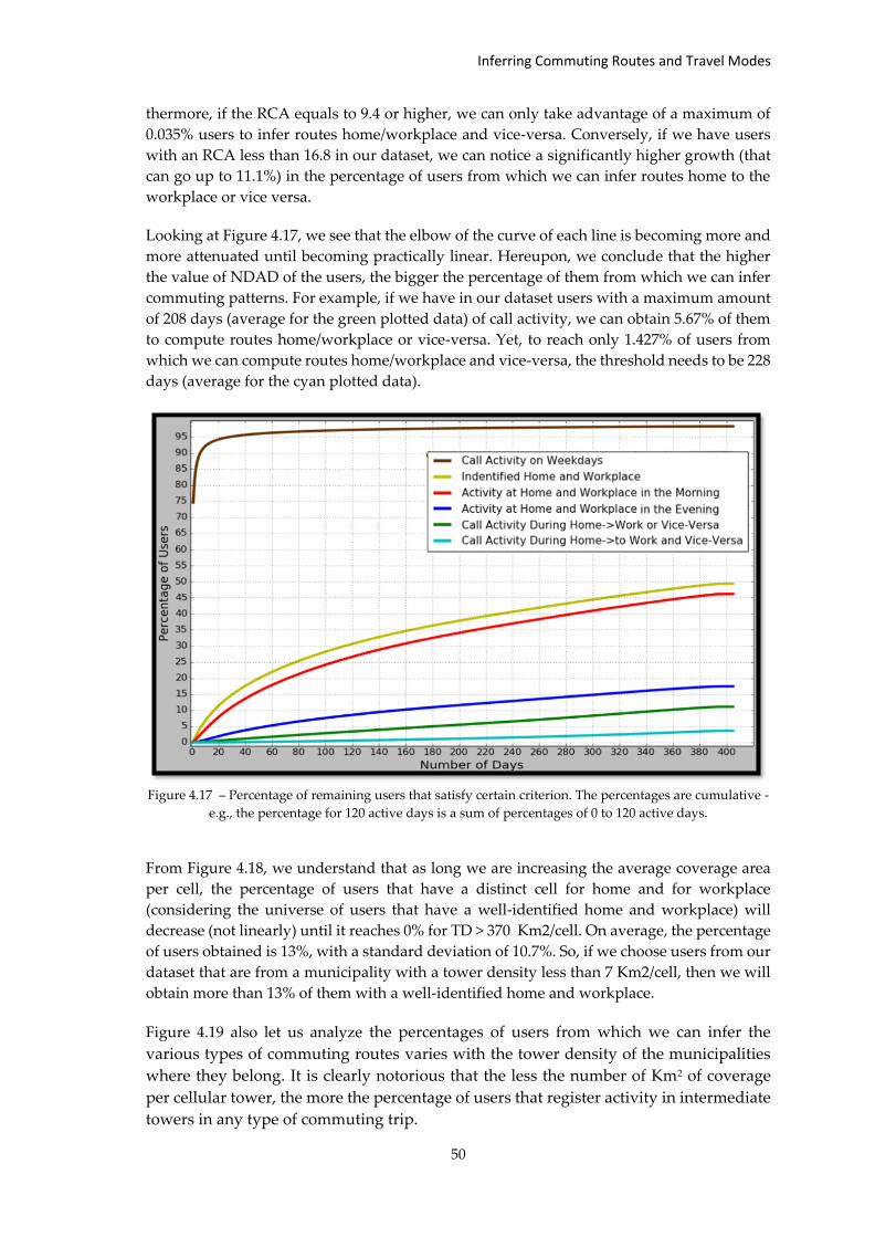
Inferring Commuting Routes and Travel Modes
50
thermore, if the RCA equals to 9.4 or higher, we can only take advantage of a maximum of
0.035% users to infer routes home/workplace and vice-versa. Conversely, if we have users
with an RCA less than 16.8 in our dataset, we can notice a significantly higher growth (that
can go up to 11.1%) in the percentage of users from which we can infer routes home to the
workplace or vice versa.
Looking at Figure 4.17, we see that the elbow of the curve of each line is becoming more and
more attenuated until becoming practically linear. Hereupon, we conclude that the higher
the value of NDAD of the users, the bigger the percentage of them from which we can infer
commuting patterns. For example, if we have in our dataset users with a maximum amount
of 208 days (average for the green plotted data) of call activity, we can obtain 5.67% of them
to compute routes home/workplace or vice-versa. Yet, to reach only 1.427% of users from
which we can compute routes home/workplace and vice-versa, the threshold needs to be 228
days (average for the cyan plotted data).
Figure 4.17 – Percentage of remaining users that satisfy certain criterion. The percentages are cumulative -
e.g., the percentage for 120 active days is a sum of percentages of 0 to 120 active days.
From Figure 4.18, we understand that as long we are increasing the average coverage area
per cell, the percentage of users that have a distinct cell for home and for workplace
(considering the universe of users that have a well-identified home and workplace) will
decrease (not linearly) until it reaches 0% for TD > 370 Km2/cell. On average, the percentage
of users obtained is 13%, with a standard deviation of 10.7%. So, if we choose users from our
dataset that are from a municipality with a tower density less than 7 Km2/cell, then we will
obtain more than 13% of them with a well-identified home and workplace.
Figure 4.19 also let us analyze the percentages of users from which we can infer the
various types of commuting routes varies with the tower density of the municipalities
where they belong. It is clearly notorious that the less the number of Km2 of coverage
per cellular tower, the more the percentage of users that register activity in intermediate
towers in any type of commuting trip.
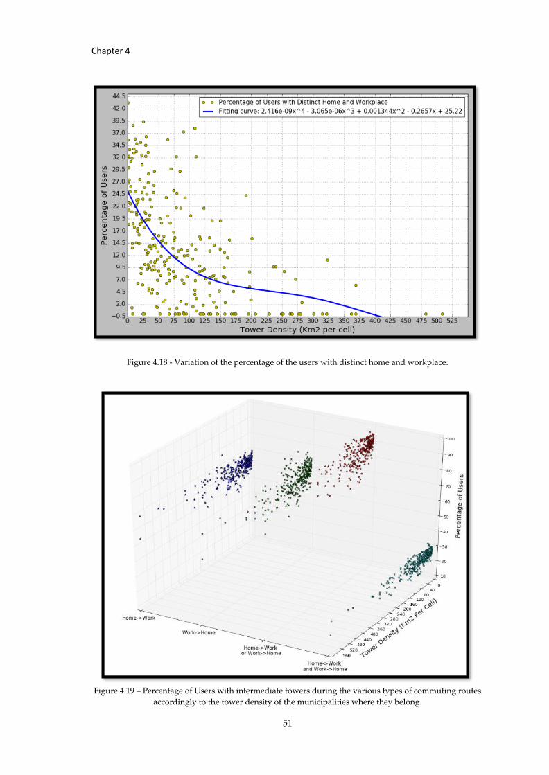
Chapter 4
51
Figure 4.18 - Variation of the percentage of the users with distinct home and workplace.
Figure 4.19 – Percentage of Users with intermediate towers during the various types of commuting routes
accordingly to the tower density of the municipalities where they belong.
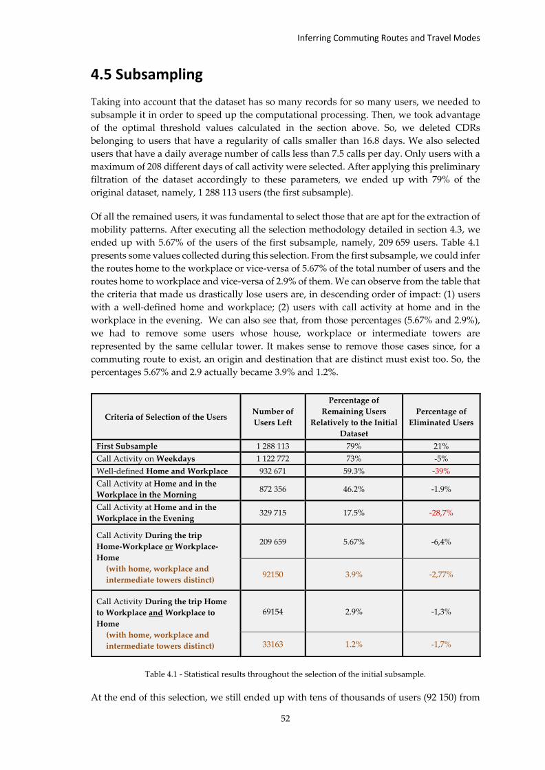
Inferring Commuting Routes and Travel Modes
52
4.5 Subsampling
Taking into account that the dataset has so many records for so many users, we needed to
subsample it in order to speed up the computational processing. Then, we took advantage
of the optimal threshold values calculated in the section above. So, we deleted CDRs
belonging to users that have a regularity of calls smaller than 16.8 days. We also selected
users that have a daily average number of calls less than 7.5 calls per day. Only users with a
maximum of 208 different days of call activity were selected. After applying this preliminary
filtration of the dataset accordingly to these parameters, we ended up with 79% of the
original dataset, namely, 1 288 113 users (the first subsample).
Of all the remained users, it was fundamental to select those that are apt for the extraction of
mobility patterns. After executing all the selection methodology detailed in section 4.3, we
ended up with 5.67% of the users of the first subsample, namely, 209 659 users. Table 4.1
presents some values collected during this selection. From the first subsample, we could infer
the routes home to the workplace or vice-versa of 5.67% of the total number of users and the
routes home to workplace and vice-versa of 2.9% of them. We can observe from the table that
the criteria that made us drastically lose users are, in descending order of impact: (1) users
with a well-defined home and workplace; (2) users with call activity at home and in the
workplace in the evening. We can also see that, from those percentages (5.67% and 2.9%),
we had to remove some users whose house, workplace or intermediate towers are
represented by the same cellular tower. It makes sense to remove those cases since, for a
commuting route to exist, an origin and destination that are distinct must exist too. So, the
percentages 5.67% and 2.9 actually became 3.9% and 1.2%.
Table 4.1 - Statistical results throughout the selection of the initial subsample.
At the end of this selection, we still ended up with tens of thousands of users (92 150) from
Criteria of Selection of the Users Number of
Users Left
Percentage of
Remaining Users
Relatively to the Initial
Dataset
Percentage of
Eliminated Users
First Subsample 1 288 113 79% 21%
Call Activity on Weekdays 1 122 772 73% -5%
Well-defined Home and Workplace 932 671 59.3% -39%
Call Activity at Home and in the
Workplace in the Morning 872 356 46.2% -1.9%
Call Activity at Home and in the
Workplace in the Evening 329 715 17.5% -28,7%
Call Activity During the trip
Home-Workplace or Workplace-
Home
(with home, workplace and
intermediate towers distinct)
209 659 5.67% -6,4%
92150 3.9% -2,77%
Call Activity During the trip Home
to Workplace and Workplace to
Home
(with home, workplace and
intermediate towers distinct)
69154 2.9% -1,3%
33163 1.2% -1,7%
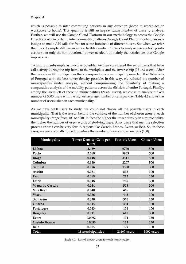
Chapter 4
53
which is possible to infer commuting patterns in any direction (home to workplace or
workplace to home). This quantity is still an impracticable number of users to analyze.
Further, we will use the Google Cloud Platform in our methodology to access the Google
Directions API in order to infer commuting patterns. Google Cloud Platform only gives us a
budget to make API calls for free for some hundreds of different users. So, when we refer
that the subsample still has an impracticable number of users to analyze, we are taking into
account not only the computational power needed but mainly the restrictions that Google
imposes us.
To limit our subsample as much as possible, we then considered the set of users that have
call activity during the trip home to the workplace and the inverse trip (33 163 users). After
that, we chose 18 municipalities that correspond to one municipality in each of the 18 districts
of Portugal with the best tower density possible. In this way, we reduced the number of
municipalities under analysis, without compromising the possibility of making a
comparative analysis of the mobility patterns across the districts of entire Portugal. Finally,
among the users left of these 18 municipalities (24 667 users), we chose to analyze a fixed
number of 5000 users with the highest average number of calls per day. Table 4.2 shows the
number of users taken in each municipality.
As we have 5000 users to study, we could not choose all the possible users in each
municipality. That is the reason behind the variance of the number of chosen users in each
municipality (range from 100 to 500). In fact, the higher the tower density in a municipality,
the higher the number of users worth of studying there. Also, users that met the selection
process criteria can be very few in regions like Castelo Branco, Évora, or Beja. So, in these
cases, we were actually forced to reduce the number of users under analysis (100).
Municipality Tower Density (Cells per
Km2)
Possible Users Chosen Users
Lisboa 2.459 9770 500
Porto 2.268 5933 500
Braga 0.148 3511 500
Coimbra 0.110 2207 500
Setúbal 0.096 1300 300
Aveiro 0.081 898 300
Faro 0.069 212 150
Leiria 0.048 765 300
Viana do Castelo 0.044 503 300
Vila Real 0.040 466 300
Viseu 0.036 445 300
Santarém 0.030 370 150
Guarda 0.015 354 100
Portalegre 0.013 101 100
Bragança 0.011 610 300
Évora 0.0092 194 150
Castelo Branco 0.0090 163 150
Beja 0.005 129 100
Total 18 municipalities 24667 users 5000 users
Table 4.2 - List of chosen users for each municipality.
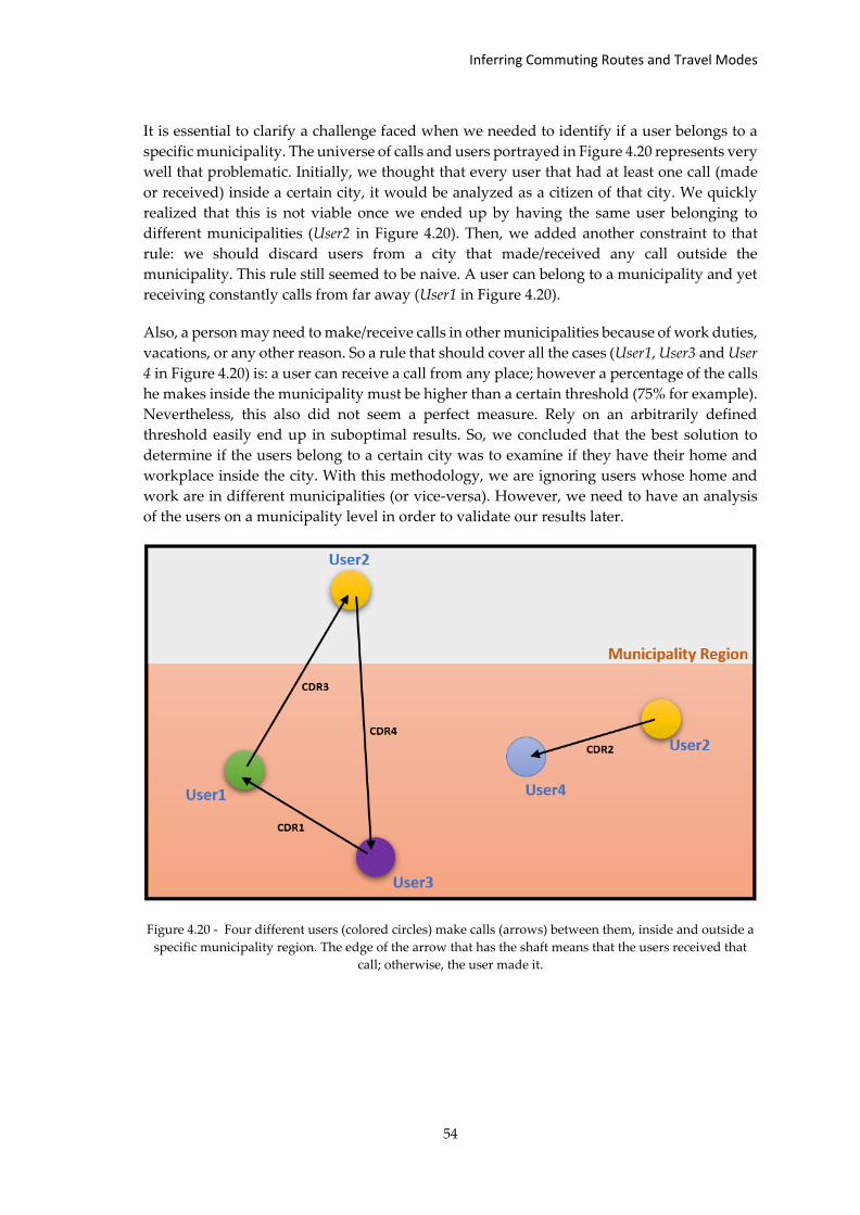
Inferring Commuting Routes and Travel Modes
54
It is essential to clarify a challenge faced when we needed to identify if a user belongs to a
specific municipality. The universe of calls and users portrayed in Figure 4.20 represents very
well that problematic. Initially, we thought that every user that had at least one call (made
or received) inside a certain city, it would be analyzed as a citizen of that city. We quickly
realized that this is not viable once we ended up by having the same user belonging to
different municipalities (User2 in Figure 4.20). Then, we added another constraint to that
rule: we should discard users from a city that made/received any call outside the
municipality. This rule still seemed to be naive. A user can belong to a municipality and yet
receiving constantly calls from far away (User1 in Figure 4.20).
Also, a person may need to make/receive calls in other municipalities because of work duties,
vacations, or any other reason. So a rule that should cover all the cases (User1, User3 and User
4 in Figure 4.20) is: a user can receive a call from any place; however a percentage of the calls
he makes inside the municipality must be higher than a certain threshold (75% for example).
Nevertheless, this also did not seem a perfect measure. Rely on an arbitrarily defined
threshold easily end up in suboptimal results. So, we concluded that the best solution to
determine if the users belong to a certain city was to examine if they have their home and
workplace inside the city. With this methodology, we are ignoring users whose home and
work are in different municipalities (or vice-versa). However, we need to have an analysis
of the users on a municipality level in order to validate our results later.
Figure 4.20 - Four different users (colored circles) make calls (arrows) between them, inside and outside a
specific municipality region. The edge of the arrow that has the shaft means that the users received that
call; otherwise, the user made it.
Chapter 5 Inferring Commuting Routes and Travel Modes
Having analyzed and process our dataset, we can implement a methodology to inter
mobility patterns in urban spaces. Throughout this chapter, it will be described the
techniques applied to automatically infer commuting routes for the users as well as the
chosen unimodal/multimodal modes of travel (car, bus, train, metro, tram, walk, or bike).
The outcome of this methodology aims to provide decision-making elements for various
entities (e.g., transport operators). These elements comprise commuting routes
visualizations and statistics of the distribution of percentages of the most varied means of
transport adopted in any of the 18 districts of Portugal.
5.1 Methodology
The necessary steps to implement this methodology are summarized in Figure 5.1 and will
be detailed in this section. As previously described, we already made a proper selection of
the users and calculated their home location, their workplace location, their intermediate
towers, and their estimated travel times. All those elements are fundamental to continue with
the inference methodology, so, we stored them in tables in a PostgreSQL database. They were
later retrieved and provided to Google Directions API through a Python script.
5.1.1 Google Directions API
The Google Directions API has an algorithm that returns directions of movement given the
geocoordinates of an origin and a destination. It is also possible to specify a desired travel
mode among the following nine: driving, walking, bicycling, bus, train, subway, tram, and
rail.
The directions of movement are given as a textual description of the movement or as a set of
geocoordinates that guide the user to the destination. Therefore, API calls containing the
geocoordinates inferred of the user’s home and workplace and a specific travel mode were
performed to every user of our sample and for each of the nine travel modes. The use of
Google Maps API reveals to be opportune once that Google holds one of the vastest set of
data about the most varied kinds of mobility elements (from subway entries/exits to bus
schedules and bicycle paths and many more). All the knowledge about these elements
reveals to be crucial to detect the viable travel modes to adopt in each path (including the
possibility of changing the travel mode, opting for a multimodal trip). It is also relevant to
make a correct map matching of the geocoordinates to the available roads network map
relatively to a specific mode of transport.
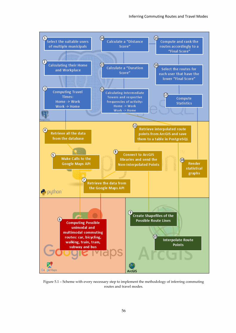
Inferring Commuting Routes and Travel Modes
56
Figure 5.1 – Scheme with every necessary step to implement the methodology of inferring commuting
routes and travel modes.
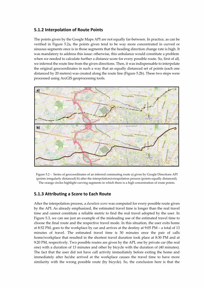
5.1.2 Interpolation of Route Points
The points given by the Google Maps API are not equally far-between. In practice, as can be
verified in Figure 5.2a, the points given tend to be way more concentrated in curved or
sinuous segments once is in those segments that the heading direction change rate is high. It
was mandatory to address this issue: otherwise, this unbalance would constitute a problem
when we needed to calculate further a distance score for every possible route. So, first of all,
we inferred the route line from the given directions. Then, it was indispensable to interpolate
the original geocoordinates in such a way that an equally distanced set of points (each one
distanced by 20 meters) was created along the route line (Figure 5.2b). These two steps were
processed using ArcGIS geoprocessing tools.
Figure 5.2 – Series of geocoordinates of an inferred commuting route a) given by Google Directions API
(points irregularly distanced) b) after the interpolation/extrapolation process (points equally distanced).
The orange circles highlight curving segments in which there is a high concentration of route points.
5.1.3 Attributing a Score to Each Route
After the interpolation process, a duration score was computed for every possible route given
by the API. As already emphasized, the estimated travel time is longer than the real travel
time and cannot constitute a reliable metric to find the real travel adopted by the user. In
Figure 5.3, we can see just an example of the misleading use of the estimated travel time to
choose the final route and the respective travel mode. In this situation, the user exits home
at 8:52 PM, goes to the workplace by car and arrives at the destiny at 9:05 PM – a total of 13
minutes of travel. The estimated travel time is 50 minutes once the pair of calls
home/workplace that resulted in the shortest travel duration took place at 8:30 PM and at
9:20 PM, respectively. Two possible routes are given by the API, one by private car (the real
one) with a duration of 13 minutes and other by bicycle with the duration of (40 minutes).
The fact that the user did not have call activity immediately before exiting the home and
immediately after he/she arrived at the workplace causes the travel time to have more
similarity with the wrong possible route (by bicycle). So, the conclusion here is that the
a)
b)
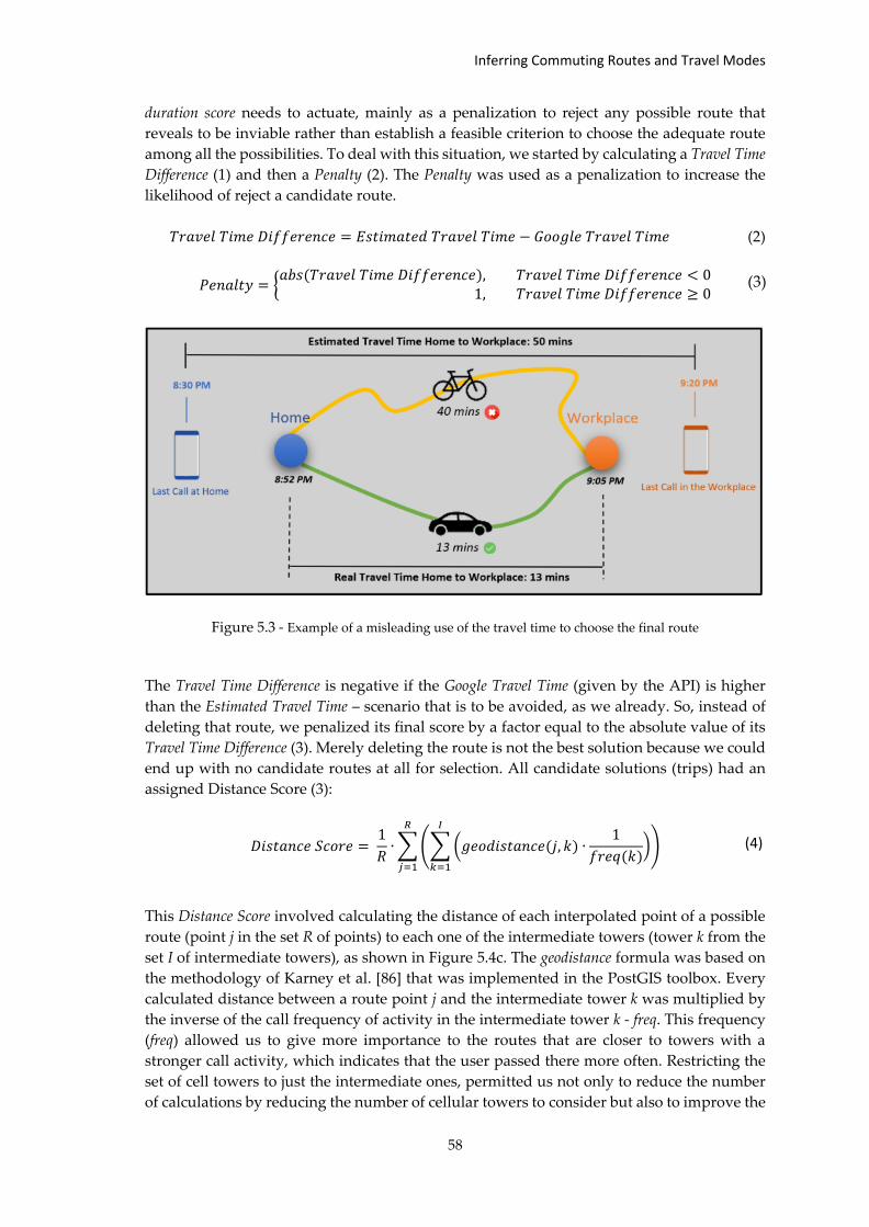
Inferring Commuting Routes and Travel Modes
58
duration score needs to actuate, mainly as a penalization to reject any possible route that
reveals to be inviable rather than establish a feasible criterion to choose the adequate route
among all the possibilities. To deal with this situation, we started by calculating a Travel Time
Difference (1) and then a Penalty (2). The Penalty was used as a penalization to increase the
likelihood of reject a candidate route.
𝑇𝑟𝑎𝑣𝑒𝑙 𝑇𝑖𝑚𝑒 𝐷𝑖𝑓𝑓𝑒𝑟𝑒𝑛𝑐𝑒 = 𝐸𝑠𝑡𝑖𝑚𝑎𝑡𝑒𝑑 𝑇𝑟𝑎𝑣𝑒𝑙 𝑇𝑖𝑚𝑒 − 𝐺𝑜𝑜𝑔𝑙𝑒 𝑇𝑟𝑎𝑣𝑒𝑙 𝑇𝑖𝑚𝑒 (2)
𝑃𝑒𝑛𝑎𝑙𝑡𝑦 = {𝑎𝑏𝑠(𝑇𝑟𝑎𝑣𝑒𝑙 𝑇𝑖𝑚𝑒 𝐷𝑖𝑓𝑓𝑒𝑟𝑒𝑛𝑐𝑒), 𝑇𝑟𝑎𝑣𝑒𝑙 𝑇𝑖𝑚𝑒 𝐷𝑖𝑓𝑓𝑒𝑟𝑒𝑛𝑐𝑒 < 0
1, 𝑇𝑟𝑎𝑣𝑒𝑙 𝑇𝑖𝑚𝑒 𝐷𝑖𝑓𝑓𝑒𝑟𝑒𝑛𝑐𝑒 ≥ 0
Figure 5.3 - Example of a misleading use of the travel time to choose the final route
The Travel Time Difference is negative if the Google Travel Time (given by the API) is higher
than the Estimated Travel Time – scenario that is to be avoided, as we already. So, instead of
deleting that route, we penalized its final score by a factor equal to the absolute value of its
Travel Time Difference (3). Merely deleting the route is not the best solution because we could
end up with no candidate routes at all for selection. All candidate solutions (trips) had an
assigned Distance Score (3):
𝐷𝑖𝑠𝑡𝑎𝑛𝑐𝑒 𝑆𝑐𝑜𝑟𝑒 = 1
𝑅∙ ∑ (∑ (𝑔𝑒𝑜𝑑𝑖𝑠𝑡𝑎𝑛𝑐𝑒(𝑗, 𝑘) ∙
1
𝑓𝑟𝑒𝑞(𝑘))
𝐼
𝑘=1
)
𝑅
𝑗=1
This Distance Score involved calculating the distance of each interpolated point of a possible
route (point j in the set R of points) to each one of the intermediate towers (tower k from the
set I of intermediate towers), as shown in Figure 5.4c. The geodistance formula was based on
the methodology of Karney et al. [86] that was implemented in the PostGIS toolbox. Every
calculated distance between a route point j and the intermediate tower k was multiplied by
the inverse of the call frequency of activity in the intermediate tower k - freq. This frequency
(freq) allowed us to give more importance to the routes that are closer to towers with a
stronger call activity, which indicates that the user passed there more often. Restricting the
set of cell towers to just the intermediate ones, permitted us not only to reduce the number
of calculations by reducing the number of cellular towers to consider but also to improve the
(4)
(3)
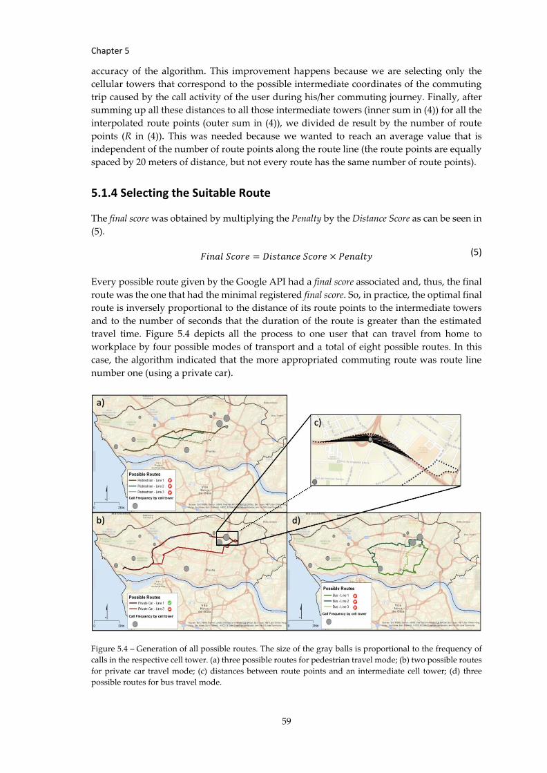
Chapter 5
59
accuracy of the algorithm. This improvement happens because we are selecting only the
cellular towers that correspond to the possible intermediate coordinates of the commuting
trip caused by the call activity of the user during his/her commuting journey. Finally, after
summing up all these distances to all those intermediate towers (inner sum in (4)) for all the
interpolated route points (outer sum in (4)), we divided de result by the number of route
points (R in (4)). This was needed because we wanted to reach an average value that is
independent of the number of route points along the route line (the route points are equally
spaced by 20 meters of distance, but not every route has the same number of route points).
5.1.4 Selecting the Suitable Route
The final score was obtained by multiplying the Penalty by the Distance Score as can be seen in
(5).
𝐹𝑖𝑛𝑎𝑙 𝑆𝑐𝑜𝑟𝑒 = 𝐷𝑖𝑠𝑡𝑎𝑛𝑐𝑒 𝑆𝑐𝑜𝑟𝑒 × 𝑃𝑒𝑛𝑎𝑙𝑡𝑦
Every possible route given by the Google API had a final score associated and, thus, the final
route was the one that had the minimal registered final score. So, in practice, the optimal final
route is inversely proportional to the distance of its route points to the intermediate towers
and to the number of seconds that the duration of the route is greater than the estimated
travel time. Figure 5.4 depicts all the process to one user that can travel from home to
workplace by four possible modes of transport and a total of eight possible routes. In this
case, the algorithm indicated that the more appropriated commuting route was route line
number one (using a private car).
Figure 5.4 – Generation of all possible routes. The size of the gray balls is proportional to the frequency of
calls in the respective cell tower. (a) three possible routes for pedestrian travel mode; (b) two possible routes
for private car travel mode; (c) distances between route points and an intermediate cell tower; (d) three
possible routes for bus travel mode.
(5)
a)
b) d)
c)
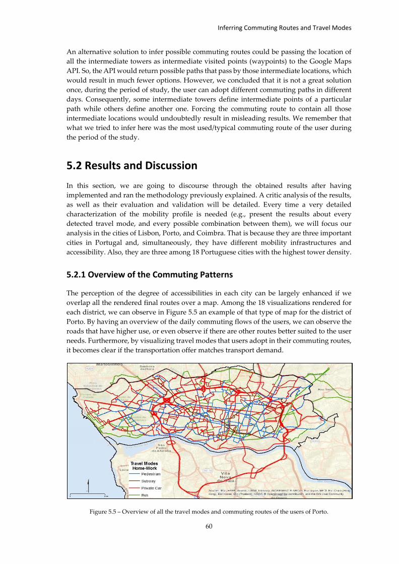
Inferring Commuting Routes and Travel Modes
60
An alternative solution to infer possible commuting routes could be passing the location of
all the intermediate towers as intermediate visited points (waypoints) to the Google Maps
API. So, the API would return possible paths that pass by those intermediate locations, which
would result in much fewer options. However, we concluded that it is not a great solution
once, during the period of study, the user can adopt different commuting paths in different
days. Consequently, some intermediate towers define intermediate points of a particular
path while others define another one. Forcing the commuting route to contain all those
intermediate locations would undoubtedly result in misleading results. We remember that
what we tried to infer here was the most used/typical commuting route of the user during
the period of the study.
5.2 Results and Discussion
In this section, we are going to discourse through the obtained results after having
implemented and ran the methodology previously explained. A critic analysis of the results,
as well as their evaluation and validation will be detailed. Every time a very detailed
characterization of the mobility profile is needed (e.g., present the results about every
detected travel mode, and every possible combination between them), we will focus our
analysis in the cities of Lisbon, Porto, and Coimbra. That is because they are three important
cities in Portugal and, simultaneously, they have different mobility infrastructures and
accessibility. Also, they are three among 18 Portuguese cities with the highest tower density.
5.2.1 Overview of the Commuting Patterns
The perception of the degree of accessibilities in each city can be largely enhanced if we
overlap all the rendered final routes over a map. Among the 18 visualizations rendered for
each district, we can observe in Figure 5.5 an example of that type of map for the district of
Porto. By having an overview of the daily commuting flows of the users, we can observe the
roads that have higher use, or even observe if there are other routes better suited to the user
needs. Furthermore, by visualizing travel modes that users adopt in their commuting routes,
it becomes clear if the transportation offer matches transport demand.
Figure 5.5 – Overview of all the travel modes and commuting routes of the users of Porto.
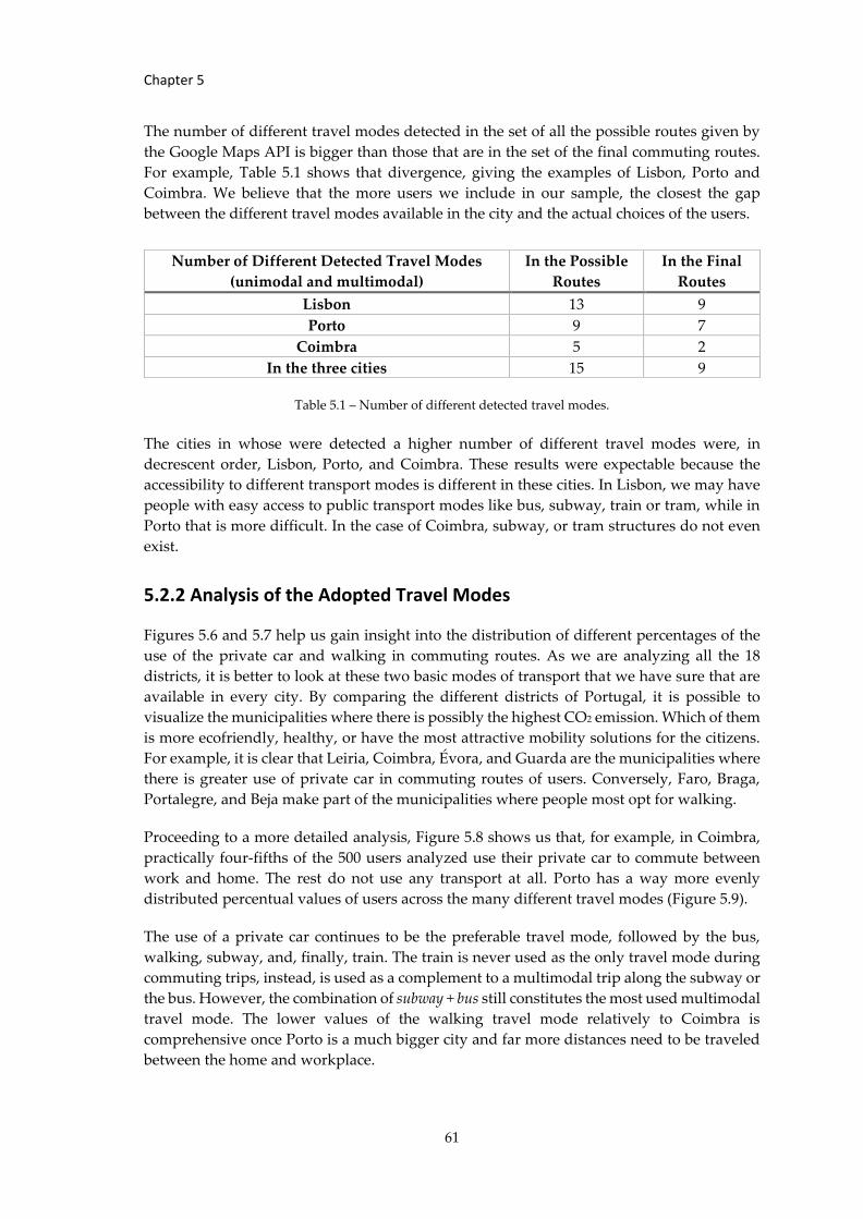
Chapter 5
61
The number of different travel modes detected in the set of all the possible routes given by
the Google Maps API is bigger than those that are in the set of the final commuting routes.
For example, Table 5.1 shows that divergence, giving the examples of Lisbon, Porto and
Coimbra. We believe that the more users we include in our sample, the closest the gap
between the different travel modes available in the city and the actual choices of the users.
Table 5.1 – Number of different detected travel modes.
The cities in whose were detected a higher number of different travel modes were, in
decrescent order, Lisbon, Porto, and Coimbra. These results were expectable because the
accessibility to different transport modes is different in these cities. In Lisbon, we may have
people with easy access to public transport modes like bus, subway, train or tram, while in
Porto that is more difficult. In the case of Coimbra, subway, or tram structures do not even
exist.
5.2.2 Analysis of the Adopted Travel Modes
Figures 5.6 and 5.7 help us gain insight into the distribution of different percentages of the
use of the private car and walking in commuting routes. As we are analyzing all the 18
districts, it is better to look at these two basic modes of transport that we have sure that are
available in every city. By comparing the different districts of Portugal, it is possible to
visualize the municipalities where there is possibly the highest CO2 emission. Which of them
is more ecofriendly, healthy, or have the most attractive mobility solutions for the citizens.
For example, it is clear that Leiria, Coimbra, Évora, and Guarda are the municipalities where
there is greater use of private car in commuting routes of users. Conversely, Faro, Braga,
Portalegre, and Beja make part of the municipalities where people most opt for walking.
Proceeding to a more detailed analysis, Figure 5.8 shows us that, for example, in Coimbra,
practically four-fifths of the 500 users analyzed use their private car to commute between
work and home. The rest do not use any transport at all. Porto has a way more evenly
distributed percentual values of users across the many different travel modes (Figure 5.9).
The use of a private car continues to be the preferable travel mode, followed by the bus,
walking, subway, and, finally, train. The train is never used as the only travel mode during
commuting trips, instead, is used as a complement to a multimodal trip along the subway or
the bus. However, the combination of subway + bus still constitutes the most used multimodal
travel mode. The lower values of the walking travel mode relatively to Coimbra is
comprehensive once Porto is a much bigger city and far more distances need to be traveled
between the home and workplace.
Number of Different Detected Travel Modes
(unimodal and multimodal)
In the Possible
Routes
In the Final
Routes
Lisbon 13 9
Porto 9 7
Coimbra 5 2
In the three cities 15 9
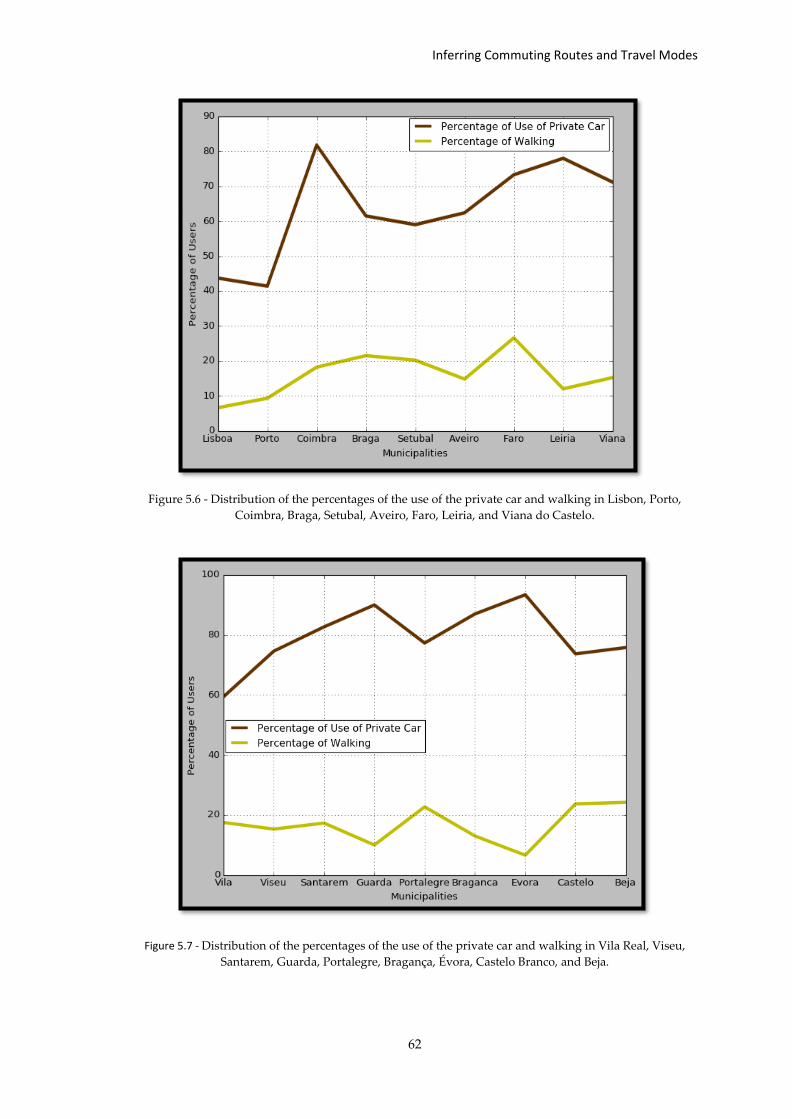
Inferring Commuting Routes and Travel Modes
62
Figure 5.6 - Distribution of the percentages of the use of the private car and walking in Lisbon, Porto,
Coimbra, Braga, Setubal, Aveiro, Faro, Leiria, and Viana do Castelo.
Figure 5.7 - Distribution of the percentages of the use of the private car and walking in Vila Real, Viseu,
Santarem, Guarda, Portalegre, Bragança, Évora, Castelo Branco, and Beja.
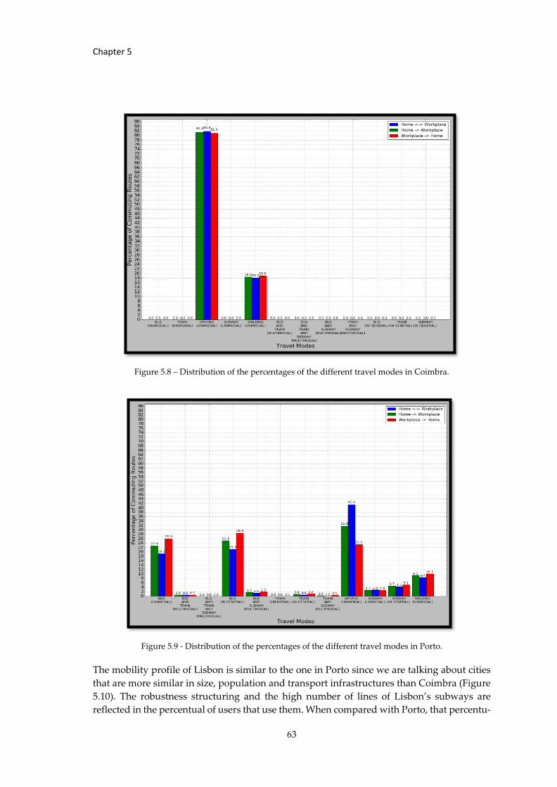
Chapter 5
63
Figure 5.8 – Distribution of the percentages of the different travel modes in Coimbra.
Figure 5.9 - Distribution of the percentages of the different travel modes in Porto.
The mobility profile of Lisbon is similar to the one in Porto since we are talking about cities
that are more similar in size, population and transport infrastructures than Coimbra (Figure
5.10). The robustness structuring and the high number of lines of Lisbon’s subways are
reflected in the percentual of users that use them. When compared with Porto, that percentu-

Inferring Commuting Routes and Travel Modes
64
Figure 5.10 - Distribution of the percentages of the different travel modes in Lisbon.
al value more than doubled and is higher than the percentage of users that do not use any
travel mode at all (walking). However, the bus is still the second preferred travel mode after
the private car. As Lisbon is bigger than Porto, we now begin to have some users that need
the train to travel between home and workplace. We begin to have the rising of users that
need to use three travel modes (two changes of travel mode – Bus, Train and Subway). The
combination subway + bus still constitutes the most used multimodal travel mode.
In all the three analyzed cities, the train is consistently the travel mode that exhibits the lower
percentual values, and that fact could be highly biased because of the nature of our
experiments. These experiments were done on a municipal level and, consequently, only
users with a well-identified home and workplace inside the municipality were qualified to
the study. Considering that the train is more used to interconnect different cities, its rare use
becomes understandable.
Figures 5.11-5.13 depicts the various percentages of users that make use (in their commuting
trips) of private travel modes (private car and bicycling – walking is not included); public
transport modes (train, tram, subway, bus); unimodal travel modes or multimodal travel
modes.
Despite of the fact that there are only two public transport modes in Coimbra (bus and train),
the absence of values for the use of public travel modes – as seen in Figure 5.11 - may indicate
that there is still much room to improve the public transport access ways linking residential
areas and business areas (the most fundamental access ways). As discussed in Figure 5.8, the
users in Coimbra mainly use a private car or no travel model at all in their commuting routes,
so, it is comprehensible that the percentage of multimodal travel mode is inexistent (a
multimodal trip is only viable if it involves public transport modes). As we will see later, the
percentages of the different travel modes in Coimbra were the ones that most deviated from
the groud-truth data. We believe that if we analyzed more users in Coimbra, the slice of them
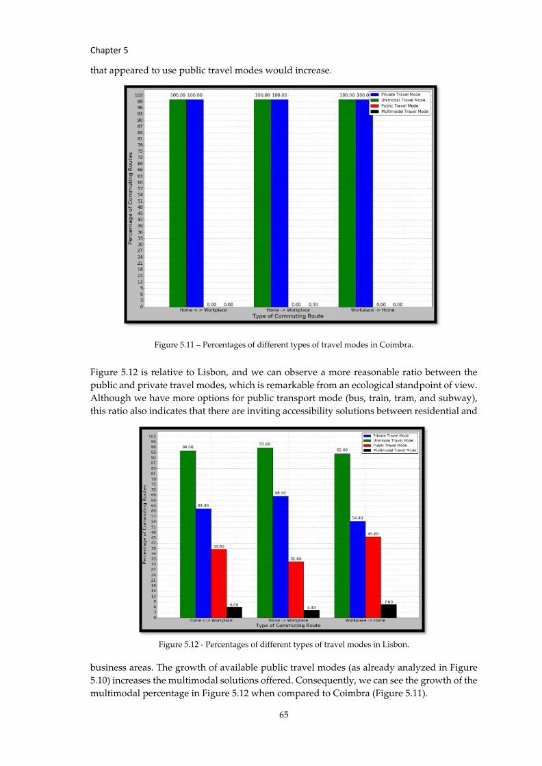
Chapter 5
65
that appeared to use public travel modes would increase.
Figure 5.11 – Percentages of different types of travel modes in Coimbra.
Figure 5.12 is relative to Lisbon, and we can observe a more reasonable ratio between the
public and private travel modes, which is remarkable from an ecological standpoint of view.
Although we have more options for public transport mode (bus, train, tram, and subway),
this ratio also indicates that there are inviting accessibility solutions between residential and
Figure 5.12 - Percentages of different types of travel modes in Lisbon.
business areas. The growth of available public travel modes (as already analyzed in Figure
5.10) increases the multimodal solutions offered. Consequently, we can see the growth of the
multimodal percentage in Figure 5.12 when compared to Coimbra (Figure 5.11).
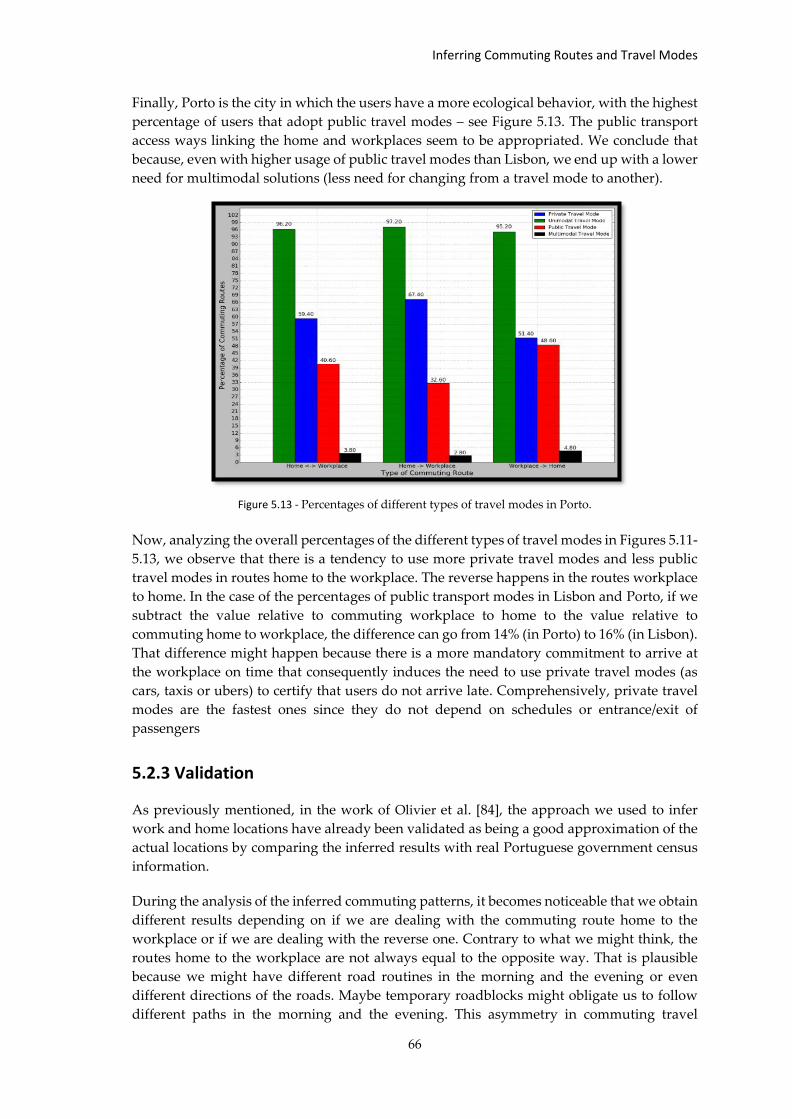
Inferring Commuting Routes and Travel Modes
66
Finally, Porto is the city in which the users have a more ecological behavior, with the highest
percentage of users that adopt public travel modes – see Figure 5.13. The public transport
access ways linking the home and workplaces seem to be appropriated. We conclude that
because, even with higher usage of public travel modes than Lisbon, we end up with a lower
need for multimodal solutions (less need for changing from a travel mode to another).
Figure 5.13 - Percentages of different types of travel modes in Porto.
Now, analyzing the overall percentages of the different types of travel modes in Figures 5.11-
5.13, we observe that there is a tendency to use more private travel modes and less public
travel modes in routes home to the workplace. The reverse happens in the routes workplace
to home. In the case of the percentages of public transport modes in Lisbon and Porto, if we
subtract the value relative to commuting workplace to home to the value relative to
commuting home to workplace, the difference can go from 14% (in Porto) to 16% (in Lisbon).
That difference might happen because there is a more mandatory commitment to arrive at
the workplace on time that consequently induces the need to use private travel modes (as
cars, taxis or ubers) to certify that users do not arrive late. Comprehensively, private travel
modes are the fastest ones since they do not depend on schedules or entrance/exit of
passengers
5.2.3 Validation
As previously mentioned, in the work of Olivier et al. [84], the approach we used to infer
work and home locations have already been validated as being a good approximation of the
actual locations by comparing the inferred results with real Portuguese government census
information.
During the analysis of the inferred commuting patterns, it becomes noticeable that we obtain
different results depending on if we are dealing with the commuting route home to the
workplace or if we are dealing with the reverse one. Contrary to what we might think, the
routes home to the workplace are not always equal to the opposite way. That is plausible
because we might have different road routines in the morning and the evening or even
different directions of the roads. Maybe temporary roadblocks might obligate us to follow
different paths in the morning and the evening. This asymmetry in commuting travel
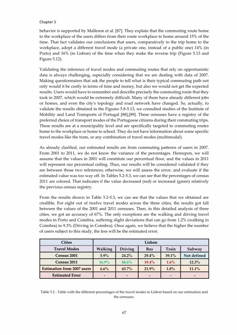
Chapter 5
67
behavior is supported by Malleson et al. [87]. They explain that the commuting route home
to the workplace of the users differs from their route workplace to home around 15% of the
time. That fact validates our conclusions that users, comparatively to the trip home to the
workplace, adopt a different travel mode (a private one, instead of a public one) 14% (in
Porto) and 16% (in Lisbon) of the time when they make the reverse trip (Figure 5.13 and
Figure 5.12).
Validating the inference of travel modes and commuting routes that rely on opportunistic
data is always challenging, especially considering that we are dealing with data of 2007.
Making questionnaires that ask the people to tell what is their typical commuting path not
only would it be costly in terms of time and money, but also we would not get the expected
results. Users would have to remember and describe precisely the commuting route that they
took in 2007, which would be extremely difficult. Many of them have already different jobs
or homes, and even the city's topology and road network have changed. So, actually, to
validate the results obtained in the Figures 5.8-5.13, we consulted studies of the Institute of
Mobility and Land Transports of Portugal [88],[89]. These censuses have a registry of the
preferred choice of transport modes of the Portuguese citizens during their commuting trips.
These results are at a municipality level and are specifically targeted to commuting routes
home to the workplace or home to school. They do not have information about some specific
travel modes like the tram, or any combination of travel modes (multimodal).
As already clarified, our estimated results are from commuting patterns of users in 2007.
From 2001 to 2011, we do not know the variance of the percentages. Hereupon, we will
assume that the values in 2001 will constitute our percentual floor, and the values in 2011
will represent our percentual ceiling. Thus, our results will be considered validated if they
are between those two references; otherwise, we will assess the error, and evaluate if the
estimated value was too way off. In Tables 5.2-5.3, we can see that the percentages of census
2011 are colored. That indicates if the value decreased (red) or increased (green) relatively
the previous census registry.
From the results shown in Table 5.2-5.3, we can see that the values that we obtained are
credible. For eight out of twelve travel modes across the three cities, the results got fall
between the values of the 2001 and 2011 censuses. Then, in this detailed analysis of three
cities, we got an accuracy of 67%. The only exceptions are the walking and driving travel
modes in Porto and Coimbra, suffering slight deviations that can go from 1.2% (walking in
Coimbra) to 9.3% (Driving in Coimbra). Once again, we believe that the higher the number
of users subject to this study, the less will be the estimated error.
Table 5.2 - Table with the different percentages of the travel modes in Lisbon based on our estimation and
the censuses.
Cities Lisbon
Travel Modes Walking Driving Bus Train Subway
Census 2001 5.9% 24.2% 29.4% 39.1% Not defined
Census 2011 16.9% 48.6% 19.4% 1.6% 12.3%
Estimation from 2007 users 6.6% 43.7% 21.9% 1.8% 11.1%
Estimated Error - - - - -
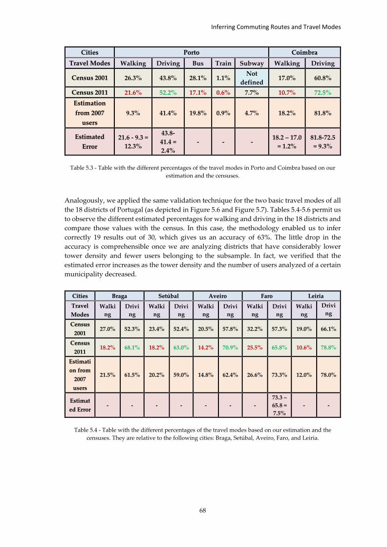
Inferring Commuting Routes and Travel Modes
68
Table 5.3 - Table with the different percentages of the travel modes in Porto and Coimbra based on our
estimation and the censuses.
Analogously, we applied the same validation technique for the two basic travel modes of all
the 18 districts of Portugal (as depicted in Figure 5.6 and Figure 5.7). Tables 5.4-5.6 permit us
to observe the different estimated percentages for walking and driving in the 18 districts and
compare those values with the census. In this case, the methodology enabled us to infer
correctly 19 results out of 30, which gives us an accuracy of 63%. The little drop in the
accuracy is comprehensible once we are analyzing districts that have considerably lower
tower density and fewer users belonging to the subsample. In fact, we verified that the
estimated error increases as the tower density and the number of users analyzed of a certain
municipality decreased.
Table 5.4 - Table with the different percentages of the travel modes based on our estimation and the
censuses. They are relative to the following cities: Braga, Setúbal, Aveiro, Faro, and Leiria.
Cities Porto Coimbra
Travel Modes Walking Driving Bus Train Subway Walking Driving
Census 2001 26.3% 43.8% 28.1% 1.1% Not
defined 17.0% 60.8%
Census 2011 21.6% 52.2% 17.1% 0.6% 7.7% 10.7% 72.5%
Estimation
from 2007
users
9.3% 41.4% 19.8% 0.9% 4.7% 18.2% 81.8%
Estimated
Error
21.6 - 9.3 =
12.3%
43.8-
41.4 =
2.4%
- - - 18.2 – 17.0
= 1.2%
81.8-72.5
= 9.3%
Cities Braga Setúbal Aveiro Faro Leiria
Travel
Modes
Walki
ng
Drivi
ng
Walki
ng
Drivi
ng
Walki
ng
Drivi
ng
Walki
ng
Drivi
ng
Walki
ng
Drivi
ng
Census
2001 27.0% 52.3% 23.4% 52.4% 20.5% 57.8% 32.2% 57.3% 19.0% 66.1%
Census
2011 18.2% 68.1% 18.2% 63.0% 14.2% 70.9% 25.5% 65.8% 10.6% 78.8%
Estimati
on from
2007
users
21.5% 61.5% 20.2% 59.0% 14.8% 62.4% 26.6% 73.3% 12.0% 78.0%
Estimat
ed Error - - - - - - -
73.3 –
65.8 =
7.5%
- -
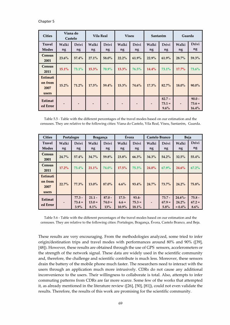
Chapter 5
69
Table 5.5 - Table with the different percentages of the travel modes based on our estimation and the
censuses. They are relative to the following cities: Viana do Castelo, Vila Real, Viseu, Santarém, Guarda.
Table 5.6 - Table with the different percentages of the travel modes based on our estimation and the
censuses. They are relative to the following cities: Portalegre, Bragança, Évora, Castelo Branco, and Beja.
These results are very encouraging. From the methodologies analyzed, some tried to infer
origin/destination trips and travel modes with performances around 80% and 90% ([39],
[48]). However, these results are obtained through the use of GPS sensors, accelerometers or
the strength of the network signal. These data are widely used in the scientific community
and, therefore, the challenge and scientific contribute is much less. Moreover, these sensors
drain the battery of the mobile phone much faster. The researchers need to interact with the
users through an application much more intrusively. CDRs do not cause any additional
inconvenience to the users. Their willingness to collaborate is total. Also, attempts to infer
commuting patterns from CDRs are far more scarce. Some few of the works that attempted
it, as already mentioned in the literature review ([26], [50], [81]), could not even validate the
results. Therefore, the results of this work are promising for the scientific community.
Cities Viana do
Castelo Vila Real Viseu Santarém Guarda
Travel
Modes
Walki
ng
Drivi
ng
Walki
ng
Drivi
ng
Walki
ng
Drivi
ng
Walki
ng
Drivi
ng
Walki
ng
Drivi
ng
Census
2001 23.6% 57.4% 27.1% 58.0% 22.2% 61.9% 22.9% 61.9% 28.7% 59.3%
Census
2011 15.1% 73.1% 15.3% 70.9% 13.3% 76.5% 14.4% 73.1% 17.7% 73.6%
Estimati
on from
2007
users
15.2% 71.2% 17.5% 59.4% 15.3% 74.6% 17.3% 82.7% 18.0% 90.0%
Estimat
ed Error - - - - - - -
82.7 –
73.1 =
9.6%
-
90.0 -
73.6 =
16.4%
Cities Portalegre Bragança Évora Castelo Branco Beja
Travel
Modes
Walki
ng
Drivi
ng
Walki
ng
Drivi
ng
Walki
ng
Drivi
ng
Walki
ng
Drivi
ng
Walki
ng
Drivi
ng
Census
2001 24.7% 57.4% 34.7% 59.8% 23.8% 66.3% 34.3% 54.2% 32.5% 55.4%
Census
2011 17.2% 73.4% 21.1% 74.0% 17.5% 75.3% 24.0% 67.9% 24.6% 67.2%
Estimati
on from
2007
users
22.7% 77.3% 13.0% 87.0% 6.6% 93.4% 24.7% 73.7% 24.2% 75.8%
Estimat
ed Error -
77.3 -
73.4 =
3.9%
21.1 -
13.0 =
8.1%
87.0 -
74.0 =
13%
17.5-
6.6 =
10.9%
93.4-
75.3 =
18.1%
-
73.7 -
67.9 =
5.8%
24.6%-
24.2%
= 0.4%
75.8 -
67.2 =
8.6%
Conclusion
70
Chapter 6 Conclusion
In this chapter, it will be described the main contributions produced during the internship
as well as recapping the work that was developed and the obtained results from it. We will
also mention the challenges encountered and how we managed to surpass them. Finally,
topics that deserve further investigation will also be discussed.
6.1 Main Contributions
In this research internship, we addressed the inference of commuting patterns – travel times,
route choice, and travel mode choice - from CDRs. At the end of this research, we understand
that CDRs offer a great and viable way to infer these mobility patterns in urban spaces,
especially if is not required real-time monitoring. We focused on commuting trips since the
travel between home and workplace constitutes one of the most relevant travelling behaviors
in our daily routines with substantial impacts on the decisions to be made on urban mobility.
Comparing this work with previous studies in the field, this one (1) supported a higher
volume of data; (2) detected a wider variety of travel modes and their possible combinations
(3) made use of intermediate cell towers activated along the commuting trip, estimated travel
times and different ranking of the possible routes; (4) provided an enhanced approach for
preparation and subsampling of the dataset.
At an early stage of our work on the State of the Art, we familiarized with the main sources
of data that we can use in urban spaces to detect urban patterns. This exploratory work
established an essential step to understand which are the main weaknesses, challenges, and
strengths related to each data source. This understanding was vital for choosing a promising
and appropriate data source that would enable us to infer urban patterns and develop the
necessary algorithms.
Furthermore, some of the main topics of mobility modeling in urban spaces were analyzed.
Such topics included: inference of origin-destination flows; deduction of activity locations,
estimation of road traffic, detection of travel modes, analysis of social behavior, and
characterization of urban land use and occupation. In each of these subsections, the relevant
scientific contributions to the topic under consideration were examined, as well as some
promising modeling methodologies developed by some authors. This analysis was then
critical to have a panoptic vision of the possible weaknesses and ways of optimizing the
existing methodologies. It was also important to come up with new ideas of possible
innovative techniques and new unexplored topics to address during this internship.
Insights acquired from the State of the Art were applied to a CDR dataset of citizens from
the Portuguese territory, including the islands of Madeira and Azores. Some preliminary
statistical analysis was developed for familiarization with the dataset. Visualizations of the
distribution of cell towers throughout the country and heat maps showing the different cell
Chapter 6
71
activity density of different users of the dataset were rendered. Also, the development of
Voronoi diagrams allowed us to perceive how the coverage area of each cell tower is
distributed among the different Portuguese districts. Once this thorough characterization
was done, the natural subsequent step was the selection of the appropriate users from which
we can extract mobility patterns. In fact, there are several criteria that we need to fulfill in
order to get the right set of users. That process is something that other studies in this field
had to do, but we approached it in a very optimized, complete, and innovative way.
Succinctly, instead of a random selection, we make sure that all the users that we selected
have: a well-identified and distinct home cell tower and workplace cell tower; cal activity in
these two places during the morning and the evening; call activity while they are moving to
their home or their workplace.
While applying this series of criteria or filters to select the appropriate users to proceed with
our methodology, a scientific paper was written and later published [90]. The scientific paper
included the content of section 4.4 and, therefore, tried to evaluate how the variation in four
quality parameters of a CDR dataset affects the inference of users' commuting mobility
patterns. After the experiments, we concluded that subsampling the dataset to including
users that, on average, receive/make a maximum of 7.5 calls per day is enough to infer
commuting routes of 10.42% of them. Adding users with more than 7.5 calls per day into the
subsample does not result in a significant increase in that percentage value. Including in our
subsample users with a daily call activity, we can infer commuting routes of 11.1% of them.
Increasing the number of days without calling, we observe a steep descent of this percentage
down to 0.27% that is when we include users with a regularity up to 16.8 days. From this
value, the percentages stabilize. Moreover, the more the number of active days of the users
we include in our subsampling, the higher is the percentage of them from which we can infer
commuting patterns. If a dataset is constituted by users with a maximum amount of 208 days
of call activity allows us to infer commuting patterns of 5.67% of the users.
These conclusions are relevant for those who want to infer mobility patterns using CDRs and
need to know which are the most suitable thresholds for multiple quality parameters are in
order to subsample the data. It also gives an overview of the quality of the results, knowing
in advance the characteristics of the dataset. For a given set of characteristic variables of the
dataset or subset, it is shown to be possible to estimate the percentage of users that we can
ignore or carry on throughout the detection of commuting patterns.
With these insights in mind, we subsampled our dataset. This subsample was further limited
to 5000 users from the 18 different districts of Portugal due to API restrictions and the need
to reduce computational processing. With all that done, we could infer the commuting
mobility patterns through an innovative methodology. This technique essentially consisted
of using the Google Maps API to provide us the potential commuting routes and their modes
of transport, once have we inferred and provide to the API the selected users and their
respective home and work locations. Then we created formulas that try to give a score to
each one of these candidate routes and find the most appropriate one (and the associated
travel mode). These formulas are new in the way that they consider some indicators
previously calculated like the estimation of travel times, the cellular towers that were
activated during the trips, and the frequency of call activity on those cellular towers.
After running the algorithm for the 5000 users, some metrics and statistics were calculated.
Through those statistics, a characterization and a comparative analysis of the mobility profile
Conclusion
72
of the cities was done. The distribution of different percentages of adhesion to different
modes of transport (and their combinations) was analyzed. Those results were validated
with census data that were used as a ground truth. These censuses are 2001 and 2011 reports
from the Institute of Mobility and Land Transport (IMTT). Initial and vaster results of the
percentages of adoption of private car and walking in the 18 districts of Portugal were taken.
After comparing with the ground-truth, we obtained 63% of accuracy once they were inside
the interval of percentual values given by the Portuguese censuses. However, when we
focused and detailed our inference in cities with more users and higher tower density, we
noticed that 67% of the estimated percentages of the different travel modes were correct.33%
of the percentual values obtained were still very close to the real percentages (the deviation
went from 1.2% to 12.3% in the worst case). These last ones were relative to the walking and
driving modes in Porto and Coimbra. These are exciting results as CDRs are there, available
to any mobile operator, generally at a national level of coverage.
Graphs were rendered with the intention to assess which cities use most private, public,
unimodal, or multimodal transportation. Having a straight way to infer percentages of use
of private, public, unimodal and multimodal modes of transport, like we did for the three
Portuguese main cities – Lisbon, Coimbra, Porto – it is of crucial relevance to decision-makers
and cause a social impact in terms of going in the direction of a more sustainable mobility in
urban areas. Thus, it is possible to know which cities are greener and healthier for their
citizens. It is also possible to perceive the efficiency of current public transport infrastructures
by analyzing the percentage of users who were forced to take multimodal solutions.
Finally, visualizations of the routes and means of transport adopted by users' commuting
routes were overlapped on the map of each municipality. These visualizations provide a
more general idea of regions of each city where each mode of transport is predominant. For
example, it allows a carrier to have access to information about where users travel mostly
using private transportation and, accordingly, to adjust the network of transports to motivate
to shift to the more sustainable public transport. It also allows having an overview of the
areas of the city in which exist more flow of people and vehicles. All these inferred results
about the commuting patterns ended up by being the main focus of a second paper
developed throughout the second semester [91].
6.2 Challenges Faced
Looking closely at the Gantt diagrams that depict the foreseen planning and the achieved
planning (Figure A.1 and Figure A.2), we see that there are discrepancies. Some of these
discrepancies are justifiable because there have been changes in the objectives of the
internship. Initially, it was intended that, in addition to inferring mobility patterns, we would
infer social patterns. For instance, through the CDRs, we intended to infer our social ties and
their respective strength as well as the influence that our social ties have in our choice of
mode of transport in our commuting trips. However, a more-in-depth investigation allowed
us to conclude that discovering these social patterns through CDRs is not appropriate. One
simple reason for that is that we can have strong social ties that we see every day and to
whom we do not even make a call. We may even be great friends with someone that is very
distant and to whom we rarely. So, the total call duration of our calls to our social ties is not
a very good indicator of the strength of our relationship with them.
Chapter 6
73
Having our goal been adjusted, the steps we needed to reach it were also redefined according
to the gradual clarification we were getting and the challenges we were facing as we moved
forward through the internship. Some of these challenges are related to the dataset itself.
Once it is a dataset of CDRs, a more thorough and painstaking effort on data preparation,
processing, cleaning, and selection had to be done. Despite multiple advantages (which will
be described throughout the report), CDRs have some challenges related to low spatial
resolution, temporal sparsity, and oscillation that led us to focus much of our time on this
phase of data processing. A major challenge that accompanied the entire implementation
phase was dealing with massive amounts of data. It was necessary to manipulate, store, and
perform complex calculations upon more than 400 million records. This issue resulted in
several weeks of waiting just to produce the outcomes of the methodology applied to 5 000
users.
In addition, the local computational power proved to be insufficient, so we had to resort to
AmILab databases. Weeks of processing the algorithms conditioned the number of users
under analysis as emphasized. However, it was another issue that had the most
responsibility in this regard - the fact that we had to deal with the Google Directions API.
Google now charges the API calls from a specific limit of calls. This issue not only forced us
to limit the number of users being analyzed but principally forced us to be very careful about
unnecessary and experimental calls we might make during the development of the python
code.
Finally, a significant challenge that is common in other studies that attempt to infer mobility
patterns from opportunistic data is to obtain ground-truth data to validate the results
obtained. After relentless searching for various sources that could validate our results, we
were finally able to get census from the Institute of Mobility and Land Transports whose
content met the goals of our work.
6.3 Future Research
It is important to recap some assumptions made during this study. Ideally, every analyzed
user has a single phone with a single SIM that belongs to the mobile operator with which we
are dealing. However, there are other scenarios. We need to be aware that, first of all, despite
being the most widespread gadget, not everyone in Portugal has a phone. The ownership of
the cellular towers belongs to multiple mobile operators. We had access to a dataset of a
particular mobile operator that gave us data of a considerable representative amount of
Portuguese users – about 20% Portuguese population. There is also the possibility of the
same user having more than one smartphone. Even if it has only one smartphone, it can have
more than one SIM that belongs or not to the same mobile operator. We also do not have a
guarantee that we are not dealing with shared phones (e.g., a phone shared between a couple
or between family members).
Moreover, we assumed that during the period, not a single user changed the smartphone or
the SIM card during the period of the study. Furthermore, there is the possibility that users
decided to not make or receive calls in their workplace or home, moving to another place
instead. Also, as already mentioned in this report, when we tried to infer home and
workplace locations, we considered that every user has a daytime job. When we are
calculating the percentages of users choosing a private car, we are assuming that the sampled

Conclusion
74
users do not know each other, so it is impossible that more than one analyzed user travels in
the same car (as a passenger or as a driver).
So, in the end, there is still considerable room for future improvement of this work. Future
researches can take the path of trying to deconstruct some of the above-described
assumptions. Combining new data for ground truth to validate the results more accurately
is also something for further exploitation. It would also be interesting extending this
approach to other places besides home and workplace and considering more complex
travelling patterns. These conclusions and insights are contextualized to the Portuguese
reality. It would be pertinent to see similar experiments in other countries for comparative
analysis.
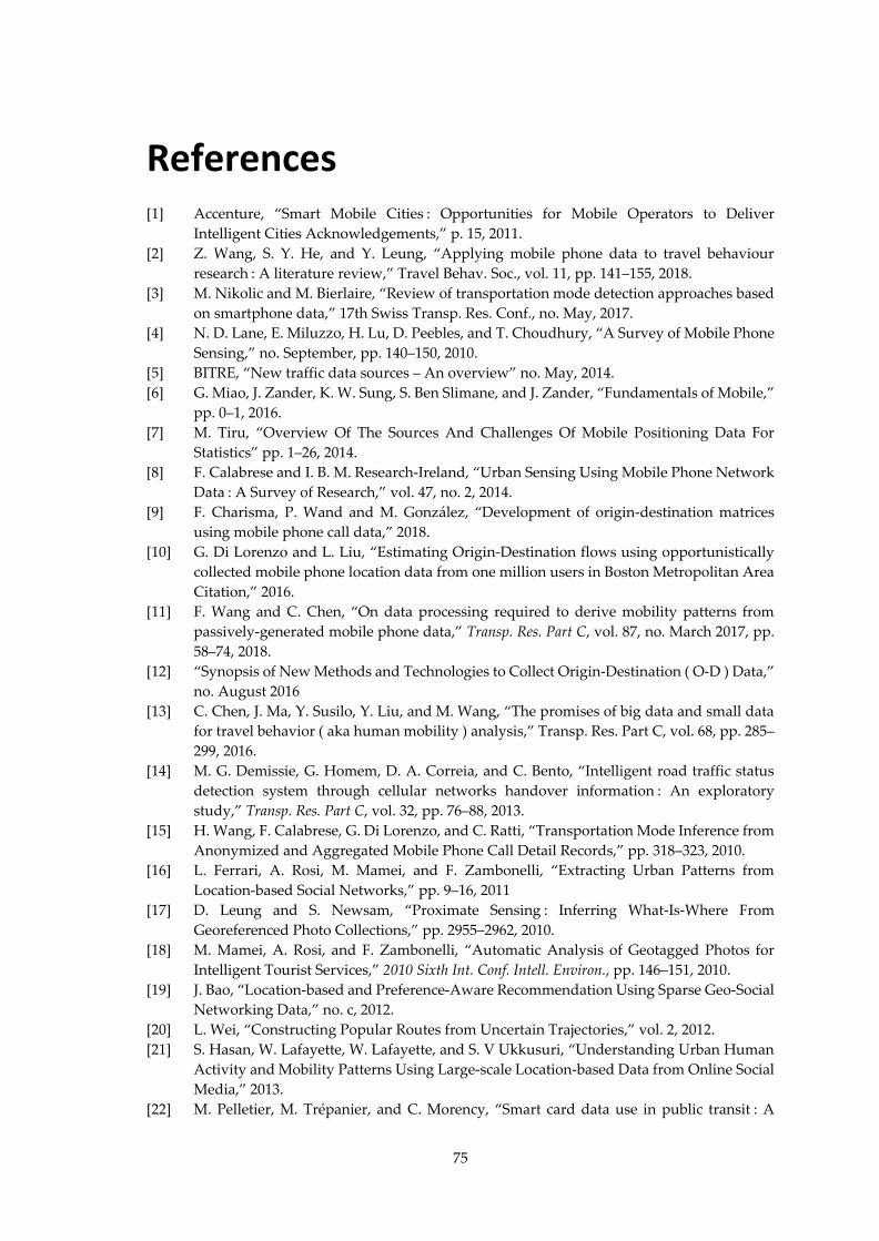
75
References
[1] Accenture, “Smart Mobile Cities : Opportunities for Mobile Operators to Deliver
Intelligent Cities Acknowledgements,” p. 15, 2011.
[2] Z. Wang, S. Y. He, and Y. Leung, “Applying mobile phone data to travel behaviour
research : A literature review,” Travel Behav. Soc., vol. 11, pp. 141–155, 2018.
[3] M. Nikolic and M. Bierlaire, “Review of transportation mode detection approaches based
on smartphone data,” 17th Swiss Transp. Res. Conf., no. May, 2017.
[4] N. D. Lane, E. Miluzzo, H. Lu, D. Peebles, and T. Choudhury, “A Survey of Mobile Phone
Sensing,” no. September, pp. 140–150, 2010.
[5] BITRE, “New traffic data sources – An overview” no. May, 2014.
[6] G. Miao, J. Zander, K. W. Sung, S. Ben Slimane, and J. Zander, “Fundamentals of Mobile,”
pp. 0–1, 2016.
[7] M. Tiru, “Overview Of The Sources And Challenges Of Mobile Positioning Data For
Statistics” pp. 1–26, 2014.
[8] F. Calabrese and I. B. M. Research-Ireland, “Urban Sensing Using Mobile Phone Network
Data : A Survey of Research,” vol. 47, no. 2, 2014.
[9] F. Charisma, P. Wand and M. González, “Development of origin-destination matrices
using mobile phone call data,” 2018.
[10] G. Di Lorenzo and L. Liu, “Estimating Origin-Destination flows using opportunistically
collected mobile phone location data from one million users in Boston Metropolitan Area
Citation,” 2016.
[11] F. Wang and C. Chen, “On data processing required to derive mobility patterns from
passively-generated mobile phone data,” Transp. Res. Part C, vol. 87, no. March 2017, pp.
58–74, 2018.
[12] “Synopsis of New Methods and Technologies to Collect Origin-Destination ( O-D ) Data,”
no. August 2016
[13] C. Chen, J. Ma, Y. Susilo, Y. Liu, and M. Wang, “The promises of big data and small data
for travel behavior ( aka human mobility ) analysis,” Transp. Res. Part C, vol. 68, pp. 285–
299, 2016.
[14] M. G. Demissie, G. Homem, D. A. Correia, and C. Bento, “Intelligent road traffic status
detection system through cellular networks handover information : An exploratory
study,” Transp. Res. Part C, vol. 32, pp. 76–88, 2013.
[15] H. Wang, F. Calabrese, G. Di Lorenzo, and C. Ratti, “Transportation Mode Inference from
Anonymized and Aggregated Mobile Phone Call Detail Records,” pp. 318–323, 2010.
[16] L. Ferrari, A. Rosi, M. Mamei, and F. Zambonelli, “Extracting Urban Patterns from
Location-based Social Networks,” pp. 9–16, 2011
[17] D. Leung and S. Newsam, “Proximate Sensing : Inferring What-Is-Where From
Georeferenced Photo Collections,” pp. 2955–2962, 2010.
[18] M. Mamei, A. Rosi, and F. Zambonelli, “Automatic Analysis of Geotagged Photos for
Intelligent Tourist Services,” 2010 Sixth Int. Conf. Intell. Environ., pp. 146–151, 2010.
[19] J. Bao, “Location-based and Preference-Aware Recommendation Using Sparse Geo-Social
Networking Data,” no. c, 2012.
[20] L. Wei, “Constructing Popular Routes from Uncertain Trajectories,” vol. 2, 2012.
[21] S. Hasan, W. Lafayette, W. Lafayette, and S. V Ukkusuri, “Understanding Urban Human
Activity and Mobility Patterns Using Large-scale Location-based Data from Online Social
Media,” 2013.
[22] M. Pelletier, M. Trépanier, and C. Morency, “Smart card data use in public transit : A
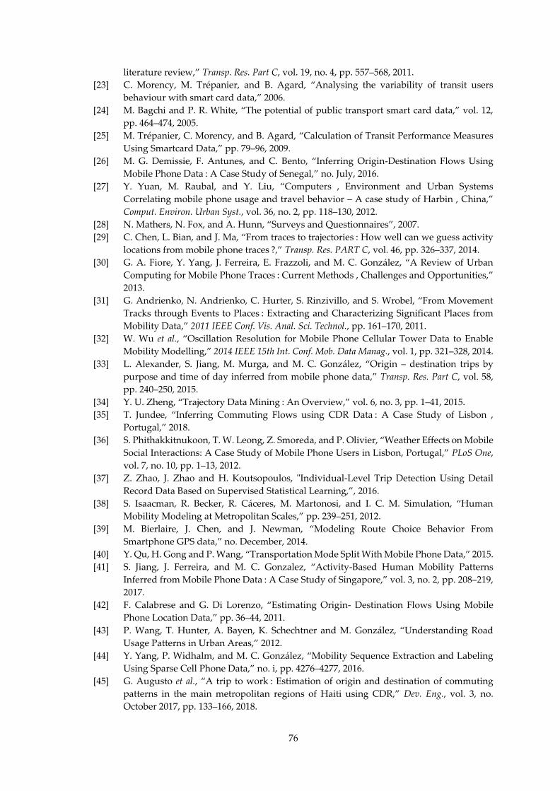
76
literature review,” Transp. Res. Part C, vol. 19, no. 4, pp. 557–568, 2011.
[23] C. Morency, M. Trépanier, and B. Agard, “Analysing the variability of transit users
behaviour with smart card data,” 2006.
[24] M. Bagchi and P. R. White, “The potential of public transport smart card data,” vol. 12,
pp. 464–474, 2005.
[25] M. Trépanier, C. Morency, and B. Agard, “Calculation of Transit Performance Measures
Using Smartcard Data,” pp. 79–96, 2009.
[26] M. G. Demissie, F. Antunes, and C. Bento, “Inferring Origin-Destination Flows Using
Mobile Phone Data : A Case Study of Senegal,” no. July, 2016.
[27] Y. Yuan, M. Raubal, and Y. Liu, “Computers , Environment and Urban Systems
Correlating mobile phone usage and travel behavior – A case study of Harbin , China,”
Comput. Environ. Urban Syst., vol. 36, no. 2, pp. 118–130, 2012.
[28] N. Mathers, N. Fox, and A. Hunn, “Surveys and Questionnaires”, 2007.
[29] C. Chen, L. Bian, and J. Ma, “From traces to trajectories : How well can we guess activity
locations from mobile phone traces ?,” Transp. Res. PART C, vol. 46, pp. 326–337, 2014.
[30] G. A. Fiore, Y. Yang, J. Ferreira, E. Frazzoli, and M. C. González, “A Review of Urban
Computing for Mobile Phone Traces : Current Methods , Challenges and Opportunities,”
2013.
[31] G. Andrienko, N. Andrienko, C. Hurter, S. Rinzivillo, and S. Wrobel, “From Movement
Tracks through Events to Places : Extracting and Characterizing Significant Places from
Mobility Data,” 2011 IEEE Conf. Vis. Anal. Sci. Technol., pp. 161–170, 2011.
[32] W. Wu et al., “Oscillation Resolution for Mobile Phone Cellular Tower Data to Enable
Mobility Modelling,” 2014 IEEE 15th Int. Conf. Mob. Data Manag., vol. 1, pp. 321–328, 2014.
[33] L. Alexander, S. Jiang, M. Murga, and M. C. González, “Origin – destination trips by
purpose and time of day inferred from mobile phone data,” Transp. Res. Part C, vol. 58,
pp. 240–250, 2015.
[34] Y. U. Zheng, “Trajectory Data Mining : An Overview,” vol. 6, no. 3, pp. 1–41, 2015.
[35] T. Jundee, “Inferring Commuting Flows using CDR Data : A Case Study of Lisbon ,
Portugal,” 2018.
[36] S. Phithakkitnukoon, T. W. Leong, Z. Smoreda, and P. Olivier, “Weather Effects on Mobile
Social Interactions: A Case Study of Mobile Phone Users in Lisbon, Portugal,” PLoS One,
vol. 7, no. 10, pp. 1–13, 2012.
[37] Z. Zhao, J. Zhao and H. Koutsopoulos, "Individual-Level Trip Detection Using Detail
Record Data Based on Supervised Statistical Learning,”, 2016.
[38] S. Isaacman, R. Becker, R. Cáceres, M. Martonosi, and I. C. M. Simulation, “Human
Mobility Modeling at Metropolitan Scales,” pp. 239–251, 2012.
[39] M. Bierlaire, J. Chen, and J. Newman, “Modeling Route Choice Behavior From
Smartphone GPS data,” no. December, 2014.
[40] Y. Qu, H. Gong and P. Wang, “Transportation Mode Split With Mobile Phone Data,” 2015.
[41] S. Jiang, J. Ferreira, and M. C. Gonzalez, “Activity-Based Human Mobility Patterns
Inferred from Mobile Phone Data : A Case Study of Singapore,” vol. 3, no. 2, pp. 208–219,
2017.
[42] F. Calabrese and G. Di Lorenzo, “Estimating Origin- Destination Flows Using Mobile
Phone Location Data,” pp. 36–44, 2011.
[43] P. Wang, T. Hunter, A. Bayen, K. Schechtner and M. González, “Understanding Road
Usage Patterns in Urban Areas,” 2012.
[44] Y. Yang, P. Widhalm, and M. C. González, “Mobility Sequence Extraction and Labeling
Using Sparse Cell Phone Data,” no. i, pp. 4276–4277, 2016.
[45] G. Augusto et al., “A trip to work : Estimation of origin and destination of commuting
patterns in the main metropolitan regions of Haiti using CDR,” Dev. Eng., vol. 3, no.
October 2017, pp. 133–166, 2018.
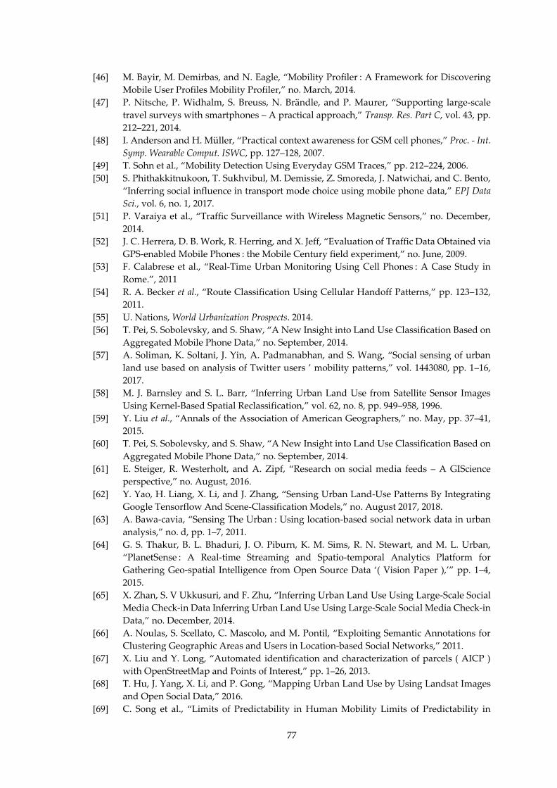
77
[46] M. Bayir, M. Demirbas, and N. Eagle, “Mobility Profiler : A Framework for Discovering
Mobile User Profiles Mobility Profiler,” no. March, 2014.
[47] P. Nitsche, P. Widhalm, S. Breuss, N. Brändle, and P. Maurer, “Supporting large-scale
travel surveys with smartphones – A practical approach,” Transp. Res. Part C, vol. 43, pp.
212–221, 2014.
[48] I. Anderson and H. Müller, “Practical context awareness for GSM cell phones,” Proc. - Int.
Symp. Wearable Comput. ISWC, pp. 127–128, 2007.
[49] T. Sohn et al., “Mobility Detection Using Everyday GSM Traces,” pp. 212–224, 2006.
[50] S. Phithakkitnukoon, T. Sukhvibul, M. Demissie, Z. Smoreda, J. Natwichai, and C. Bento,
“Inferring social influence in transport mode choice using mobile phone data,” EPJ Data
Sci., vol. 6, no. 1, 2017.
[51] P. Varaiya et al., “Traffic Surveillance with Wireless Magnetic Sensors,” no. December,
2014.
[52] J. C. Herrera, D. B. Work, R. Herring, and X. Jeff, “Evaluation of Traffic Data Obtained via
GPS-enabled Mobile Phones : the Mobile Century field experiment,” no. June, 2009.
[53] F. Calabrese et al., “Real-Time Urban Monitoring Using Cell Phones : A Case Study in
Rome.”, 2011
[54] R. A. Becker et al., “Route Classification Using Cellular Handoff Patterns,” pp. 123–132,
2011.
[55] U. Nations, World Urbanization Prospects. 2014.
[56] T. Pei, S. Sobolevsky, and S. Shaw, “A New Insight into Land Use Classification Based on
Aggregated Mobile Phone Data,” no. September, 2014.
[57] A. Soliman, K. Soltani, J. Yin, A. Padmanabhan, and S. Wang, “Social sensing of urban
land use based on analysis of Twitter users ’ mobility patterns,” vol. 1443080, pp. 1–16,
2017.
[58] M. J. Barnsley and S. L. Barr, “Inferring Urban Land Use from Satellite Sensor Images
Using Kernel-Based Spatial Reclassification,” vol. 62, no. 8, pp. 949–958, 1996.
[59] Y. Liu et al., “Annals of the Association of American Geographers,” no. May, pp. 37–41,
2015.
[60] T. Pei, S. Sobolevsky, and S. Shaw, “A New Insight into Land Use Classification Based on
Aggregated Mobile Phone Data,” no. September, 2014.
[61] E. Steiger, R. Westerholt, and A. Zipf, “Research on social media feeds – A GIScience
perspective,” no. August, 2016.
[62] Y. Yao, H. Liang, X. Li, and J. Zhang, “Sensing Urban Land-Use Patterns By Integrating
Google Tensorflow And Scene-Classification Models,” no. August 2017, 2018.
[63] A. Bawa-cavia, “Sensing The Urban : Using location-based social network data in urban
analysis,” no. d, pp. 1–7, 2011.
[64] G. S. Thakur, B. L. Bhaduri, J. O. Piburn, K. M. Sims, R. N. Stewart, and M. L. Urban,
“PlanetSense : A Real-time Streaming and Spatio-temporal Analytics Platform for
Gathering Geo-spatial Intelligence from Open Source Data ‘( Vision Paper ),’” pp. 1–4,
2015.
[65] X. Zhan, S. V Ukkusuri, and F. Zhu, “Inferring Urban Land Use Using Large-Scale Social
Media Check-in Data Inferring Urban Land Use Using Large-Scale Social Media Check-in
Data,” no. December, 2014.
[66] A. Noulas, S. Scellato, C. Mascolo, and M. Pontil, “Exploiting Semantic Annotations for
Clustering Geographic Areas and Users in Location-based Social Networks,” 2011.
[67] X. Liu and Y. Long, “Automated identification and characterization of parcels ( AICP )
with OpenStreetMap and Points of Interest,” pp. 1–26, 2013.
[68] T. Hu, J. Yang, X. Li, and P. Gong, “Mapping Urban Land Use by Using Landsat Images
and Open Social Data,” 2016.
[69] C. Song et al., “Limits of Predictability in Human Mobility Limits of Predictability in
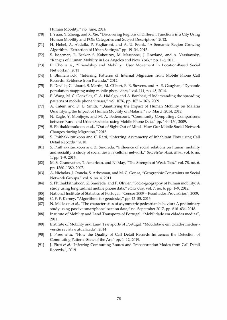
78
Human Mobility,” no. June, 2014.
[70] J. Yuan, Y. Zheng, and X. Xie, “Discovering Regions of Different Functions in a City Using
Human Mobility and POIs Categories and Subject Descriptors,” 2012.
[71] H. Hobel, A. Abdalla, P. Fogliaroni, and A. U. Frank, “A Semantic Region Growing
Algorithm : Extraction of Urban Settings,” pp. 19–34, 2015.
[72] S. Isaacman, R. Becker, S. Kobourov, M. Martonosi, J. Rowland, and A. Varshavsky,
“Ranges of Human Mobility in Los Angeles and New York,” pp. 1–6, 2011
[73] E. Cho et al., “Friendship and Mobility : User Movement In Location-Based Social
Networks.”, 2011
[74] J. Blumenstock, “Inferring Patterns of Internal Migration from Mobile Phone Call
Records : Evidence from Rwanda,” 2012.
[75] P. Deville, C. Linard, S. Martin, M. Gilbert, F. R. Stevens, and A. E. Gaughan, “Dynamic
population mapping using mobile phone data,” vol. 111, no. 45, 2014.
[76] P. Wang, M. C. González, C. A. Hidalgo, and A. Barabási, “Understanding the spreading
patterns of mobile phone viruses,” vol. 1076, pp. 1071–1076, 2009.
[77] A. Tatem and D. L. Smith, “Quantifying the Impact of Human Mobility on Malaria
Quantifying the Impact of Human Mobility on Malaria,” no. March 2014, 2012.
[78] N. Eagle, Y. Montjoye, and M. A. Bettencourt, “Community Computing : Comparisons
between Rural and Urban Societies using Mobile Phone Data,” pp. 144–150, 2009.
[79] S. Phithakkitnukoon et al., “Out of Sight Out of Mind--How Our Mobile Social Network
Changes during Migration,” 2018.
[80] S. Phithakkitnukoon and C. Ratti, “Inferring Asymmetry of Inhabitant Flow using Call
Detail Records,” 2018.
[81] S. Phithakkitnukoon and Z. Smoreda, “Influence of social relations on human mobility
and sociality: a study of social ties in a cellular network,” Soc. Netw. Anal. Min., vol. 6, no.
1, pp. 1–9, 2016.
[82] M. S. Granovetter, T. American, and N. May, “The Strength of Weak Ties,” vol. 78, no. 6,
pp. 1360–1380, 2007.
[83] A. Nicholas, J. Onnela, S. Arbesman, and M. C. Gonza, “Geographic Constraints on Social
Network Groups,” vol. 6, no. 4, 2011.
[84] S. Phithakkitnukoon, Z. Smoreda, and P. Olivier, “Socio-geography of human mobility: A
study using longitudinal mobile phone data,” PLoS One, vol. 7, no. 6, pp. 1–9, 2012.
[85] National Institute of Statistics of Portugal. “Censos 2009 – Resultados Provisórios”, 2009.
[86] C. F. F. Karney, “Algorithms for geodesics,” pp. 43–55, 2013.
[87] N. Malleson et al., “The characteristics of asymmetric pedestrian behavior : A preliminary
study using passive smartphone location data,” no. September 2017, pp. 616–634, 2018.
[88] Institute of Mobility and Land Transports of Portugal. “Mobilidade em cidades medias”,
2011.
[89] Institute of Mobility and Land Transports of Portugal, “Mobilidade em cidades médias -
versão revista e atualizada”, 2014
[90] J. Pires et al. “How the Quality of Call Detail Records Influences the Detection of
Commuting Patterns State of the Art,” pp. 1–12, 2019.
[91] J. Pires et al. “Inferring Commuting Routes and Transportation Modes from Call Detail
Records,”, 2019

79
Appendices

80
This page is intentionally left blank.
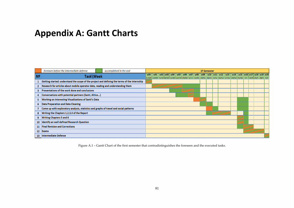
81
Appendix A: Gantt Charts
Figure A.1 – Gantt Chart of the first semester that contradistinguishes the foreseen and the executed tasks.
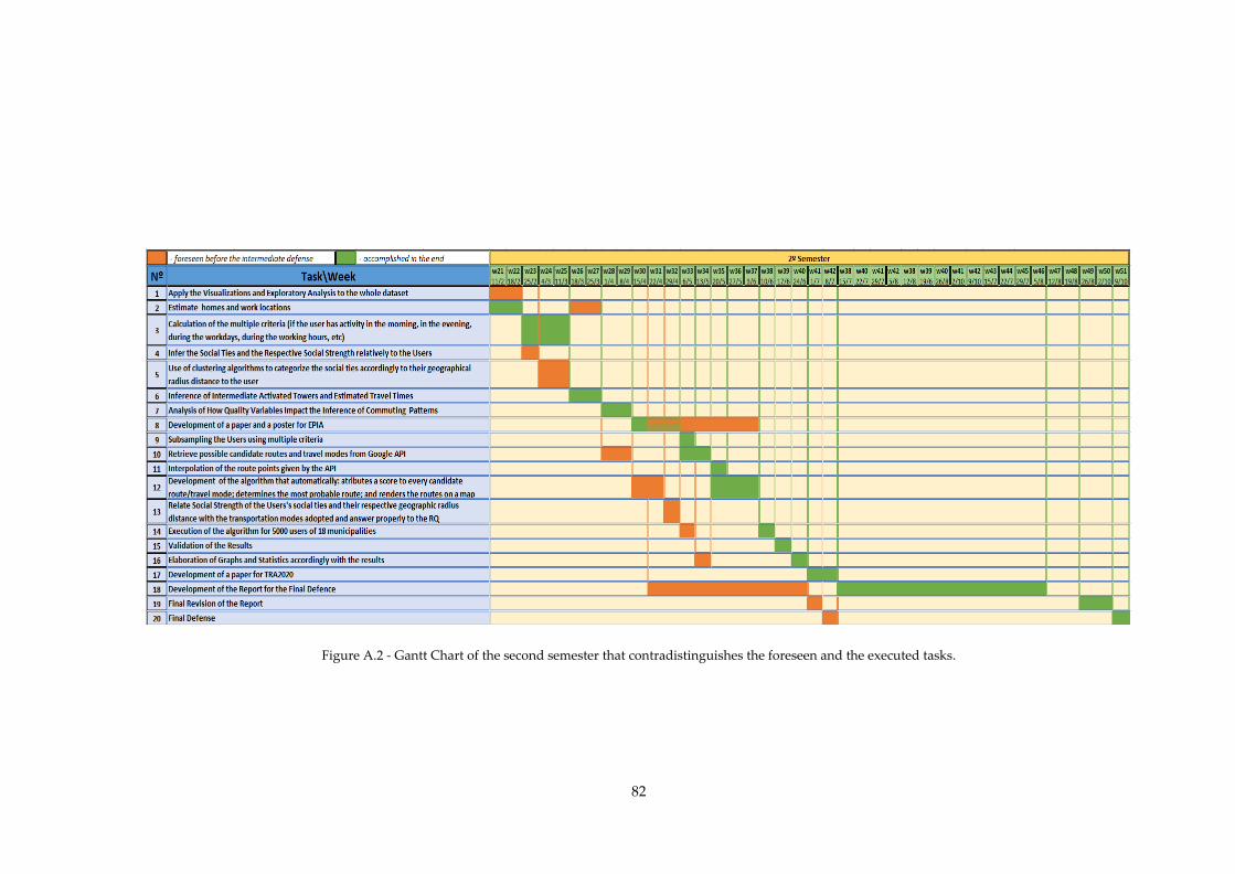
82
Figure A.2 - Gantt Chart of the second semester that contradistinguishes the foreseen and the executed tasks.