Embed Size (px)
Citation preview
A Primer on Visual AnalyticsBy Sean M. McNee, Ph.D., Computing Research Scientist, Attenex Corporation
© 2009 FTI Consulting, Inc.
1FTI TECHNOLOGY
Editor’s NoteThis is the second part of a three-part series on search technology and e-discovery. In the first paper, we outlined some of the inherent problems that search technology can cause for e-discovery matters – such as finding too much or too little information.
For this second article, FTI asked one of its PhD researchers to provide an introduction on the concept of visual analytics, which at its core, is focused on helping individuals understand data easier and faster through visual representations of information. Using academic research as well as practical examples from the e-discovery process, this paper helps explain how visual analytics is ideally suited to e-discovery and the many benefits it can deliver to users, including the ability to understand and act on data more easily than with a linear review tool.
The third paper will outline how intelligent combinations of visual analytics and concept clustering can help legal teams mitigate inherent risks of keyword search strategies and, in fact, restore keyword search to a more proper place within the e-discovery process.
2FTI TECHNOLOGY
IntroductionKnowledge workers, analysts, and legal professionals now deal with vast amounts of electronic information. The amount of new information stored on paper, film, and magnetic and optical media doubled between 1999 and 2002 [Lyman 2003]. Today, analyst firm IDC estimates that the digital universe will double in size every 18 months [Gantz 2008]. This information overload affects knowledge workers’ ability to perform the core function of their jobs: analyzing information. Workers become fatigued and stressed, and their productivity drops. Indeed, one analysis claims information overload is responsible for $650 billion dollars of lost productivity and innovation in 2007 [Lohr 2007]. One way to alleviate this overload is to change the nature of the problem by using the most sophisticated information processing system in our brains: vision.
There are many ways visual processing helps the information overload problem. We are focusing on a particular information task: analysis, a.k.a. executing the analytic reasoning process: reviewing large amounts of data, finding connections across data, and acting on these discoveries. This ranges from air-traffic controllers watching and guiding airline flights, to CIA intelligence analysts looking for terrorist activities, to lawyers performing document review in the discovery phase of litigation. In all of these cases, the defining acts of the knowledge worker performing analysis are discovering insights across the data and making decisions based on their insights and on the data.
By embedding visual information processing inside an analytic reasoning framework, visual analytics helps information workers get back to what they do best: discovering profound insights and making effective decisions. In this white paper, we will introduce visual analytics; discuss its relationship to other known concepts, such as information visualization; describe some benefits and drawbacks; and conclude with a discussion of why organizations with information workers should care about visual analytics. Throughout this paper, we will use examples of how these concepts can be applied to real-world work scenarios, including the e-discovery review process.
3FTI TECHNOLOGY
What is Visual Analytics?The discipline of visual analytics was formed to support analytic reasoning through the use of information visualizations as a form of external cognition [Thomas 2005]. For example, a research scientist could visualize citations across scientific publications to spot research trends. As such, visual analytics is related to several other disciplines, including information visualization, content analytics, and visual search. Before reviewing these connections, we first will formally define visual analytics.
Definition of Visual Analytics
The formal definition of visual analytics is the use of interactive information representations to shape and control an analytic reasoning process.
There are four parts to this definition:
1. Interactive information representations
2. The analytic reasoning process
3. Shaping the information flow in an analytic reasoning process
4. Controlling the analytic reasoning process
We will discuss each of these in turn.
Interactive information representations
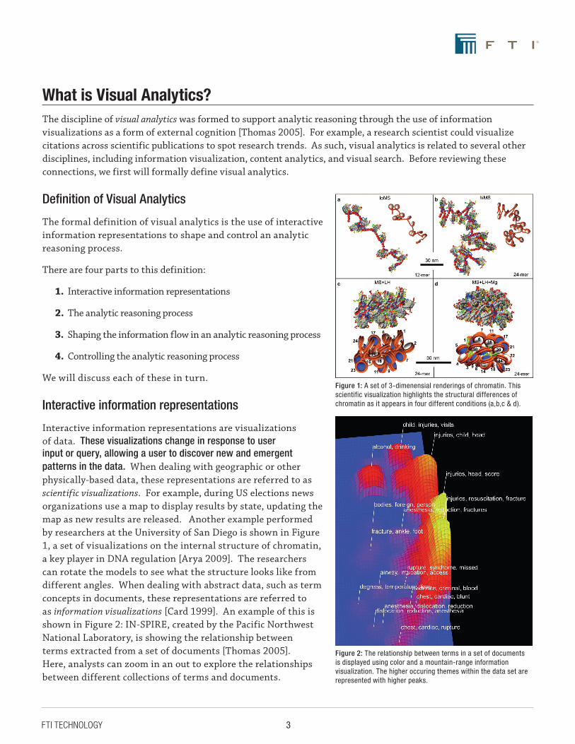
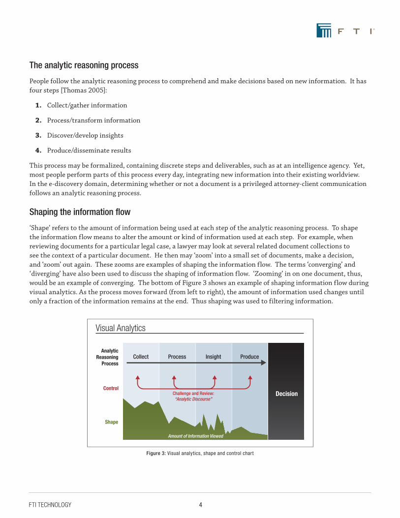
Interactive information representations are visualizations of data. These visualizations change in response to user input or query, allowing a user to discover new and emergent patterns in the data. When dealing with geographic or other physically-based data, these representations are referred to as scientific visualizations. For example, during US elections news organizations use a map to display results by state, updating the map as new results are released. Another example performed by researchers at the University of San Diego is shown in Figure 1, a set of visualizations on the internal structure of chromatin, a key player in DNA regulation [Arya 2009]. The researchers can rotate the models to see what the structure looks like from different angles. When dealing with abstract data, such as term concepts in documents, these representations are referred to as information visualizations [Card 1999]. An example of this is shown in Figure 2: IN-SPIRE, created by the Pacific Northwest National Laboratory, is showing the relationship between terms extracted from a set of documents [Thomas 2005]. Here, analysts can zoom in an out to explore the relationships between different collections of terms and documents.
Figure 2: The relationship between terms in a set of documents is displayed using color and a mountain-range information visualization. The higher occuring themes within the data set are represented with higher peaks.
Figure 1: A set of 3-dimenensial renderings of chromatin. This scientific visualization highlights the structural differences of chromatin as it appears in four different conditions (a,b,c & d).
4FTI TECHNOLOGY
The analytic reasoning process
People follow the analytic reasoning process to comprehend and make decisions based on new information. It has four steps [Thomas 2005]:
1. Collect/gather information
2. Process/transform information
3. Discover/develop insights
4. Produce/disseminate results
This process may be formalized, containing discrete steps and deliverables, such as at an intelligence agency. Yet, most people perform parts of this process every day, integrating new information into their existing worldview. In the e-discovery domain, determining whether or not a document is a privileged attorney-client communication follows an analytic reasoning process.
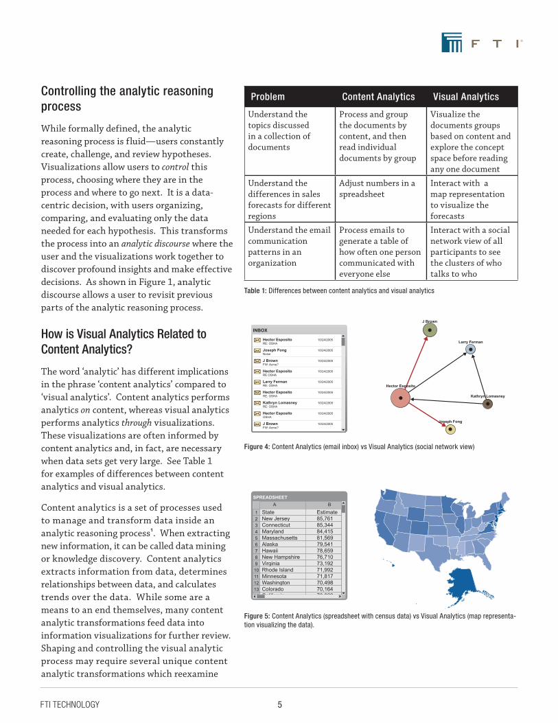
Shaping the information flow
‘Shape’ refers to the amount of information being used at each step of the analytic reasoning process. To shape the information flow means to alter the amount or kind of information used at each step. For example, when reviewing documents for a particular legal case, a lawyer may look at several related document collections to see the context of a particular document. He then may ‘zoom’ into a small set of documents, make a decision, and ‘zoom’ out again. These zooms are examples of shaping the information flow. The terms ‘converging’ and ‘diverging’ have also been used to discuss the shaping of information flow. ‘Zooming’ in on one document, thus, would be an example of converging. The bottom of Figure 3 shows an example of shaping information flow during visual analytics. As the process moves forward (from left to right), the amount of information used changes until only a fraction of the information remains at the end. Thus shaping was used to filtering information.
Visual Analytics
Analytic Reasoning
Process
Decision
Collect Process Insight Produce
Shape
Amount of Information Viewed
ControlChallenge and Review: “Analytic Discourse”
Figure 3: Visual analytics, shape and control chart
5FTI TECHNOLOGY
Controlling the analytic reasoning process
While formally defined, the analytic reasoning process is fluid—users constantly create, challenge, and review hypotheses. Visualizations allow users to control this process, choosing where they are in the process and where to go next. It is a data-centric decision, with users organizing, comparing, and evaluating only the data needed for each hypothesis. This transforms the process into an analytic discourse where the user and the visualizations work together to discover profound insights and make effective decisions. As shown in Figure 1, analytic discourse allows a user to revisit previous parts of the analytic reasoning process.
How is Visual Analytics Related to Content Analytics?
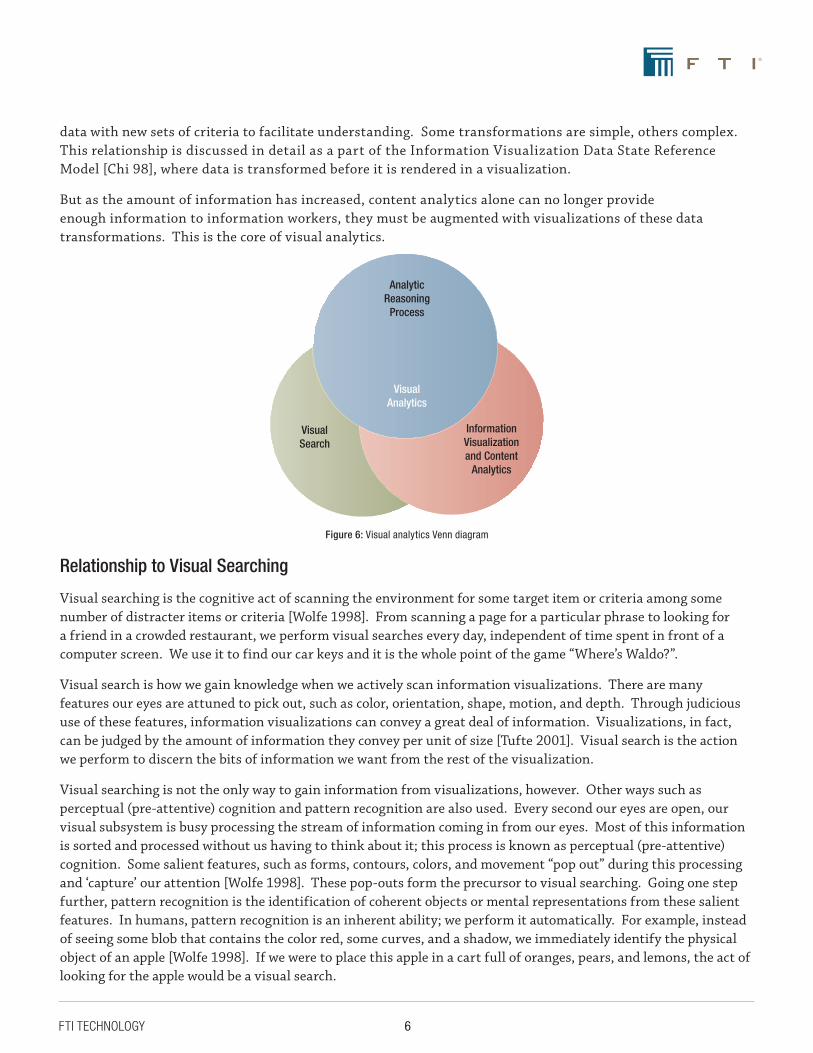
The word ‘analytic’ has different implications in the phrase ‘content analytics’ compared to ‘visual analytics’. Content analytics performs analytics on content, whereas visual analytics performs analytics through visualizations. These visualizations are often informed by content analytics and, in fact, are necessary when data sets get very large. See Table 1 for examples of differences between content analytics and visual analytics.
Content analytics is a set of processes used to manage and transform data inside an analytic reasoning process1. When extracting new information, it can be called data mining or knowledge discovery. Content analytics extracts information from data, determines relationships between data, and calculates trends over the data. While some are a means to an end themselves, many content analytic transformations feed data into information visualizations for further review. Shaping and controlling the visual analytic process may require several unique content analytic transformations which reexamine
Content Analytics vs. Visual Analytics
INBOX
Hector Esposito 10/24/2005RE: OSHA
Joseph Fong 10/24/2005Noise
J Brown 10/24/2005FW: Acme?
Hector Esposito 10/24/2005RE OSHA
Larry Ferman 10/24/2005RE: OSHA
Hector Esposito 10/24/2005RE: OSHA
Kathryn Lomasney 10/24/2005RE: OSHA
Hector Esposito 10/24/2005OSHA
J Brown 10/24/2005FW: Acme?
Hector Esposito
Joseph Fong
J Brown
Larry Ferman
Kathryn Lomasney
Content Analytics vs. Visual Analytics
SPREADSHEET
State EstimateNew Jersey 85,761Connecticut 85,344Maryland 84,415Massachusetts 81,569Alaska 79,541Hawaii 78,659New Hampshire 76,710Virginia 73,192Rhode Island 71,992Minnesota 71,817Washington 70,498Colorado 70,164California 70,029
1234567891011121314
A B
Problem Content Analytics Visual Analytics
Understand the topics discussed in a collection of documents
Process and group the documents by content, and then read individual documents by group
Visualize the documents groups based on content and explore the concept space before reading any one document
Understand the differences in sales forecasts for different regions
Adjust numbers in a spreadsheet
Interact with a map representation to visualize the forecasts
Understand the email communication patterns in an organization
Process emails to generate a table of how often one person communicated with everyone else
Interact with a social network view of all participants to see the clusters of who talks to who
Table 1: Differences between content analytics and visual analytics
Figure 4: Content Analytics (email inbox) vs Visual Analytics (social network view)
Figure 5: Content Analytics (spreadsheet with census data) vs Visual Analytics (map representa-tion visualizing the data).
6FTI TECHNOLOGY
data with new sets of criteria to facilitate understanding. Some transformations are simple, others complex. This relationship is discussed in detail as a part of the Information Visualization Data State Reference Model [Chi 98], where data is transformed before it is rendered in a visualization.
But as the amount of information has increased, content analytics alone can no longer provide enough information to information workers, they must be augmented with visualizations of these data transformations. This is the core of visual analytics.
Relationship to Visual Searching
Visual searching is the cognitive act of scanning the environment for some target item or criteria among some number of distracter items or criteria [Wolfe 1998]. From scanning a page for a particular phrase to looking for a friend in a crowded restaurant, we perform visual searches every day, independent of time spent in front of a computer screen. We use it to find our car keys and it is the whole point of the game “Where’s Waldo?”.
Visual search is how we gain knowledge when we actively scan information visualizations. There are many features our eyes are attuned to pick out, such as color, orientation, shape, motion, and depth. Through judicious use of these features, information visualizations can convey a great deal of information. Visualizations, in fact, can be judged by the amount of information they convey per unit of size [Tufte 2001]. Visual search is the action we perform to discern the bits of information we want from the rest of the visualization.
Visual searching is not the only way to gain information from visualizations, however. Other ways such as perceptual (pre-attentive) cognition and pattern recognition are also used. Every second our eyes are open, our visual subsystem is busy processing the stream of information coming in from our eyes. Most of this information is sorted and processed without us having to think about it; this process is known as perceptual (pre-attentive) cognition. Some salient features, such as forms, contours, colors, and movement “pop out” during this processing and ‘capture’ our attention [Wolfe 1998]. These pop-outs form the precursor to visual searching. Going one step further, pattern recognition is the identification of coherent objects or mental representations from these salient features. In humans, pattern recognition is an inherent ability; we perform it automatically. For example, instead of seeing some blob that contains the color red, some curves, and a shadow, we immediately identify the physical object of an apple [Wolfe 1998]. If we were to place this apple in a cart full of oranges, pears, and lemons, the act of looking for the apple would be a visual search.
Analytic Reasoning
Process
Information Visualization and Content
Analytics
Visual Search
VisualAnalytics
Figure 6: Visual analytics Venn diagram
7FTI TECHNOLOGY
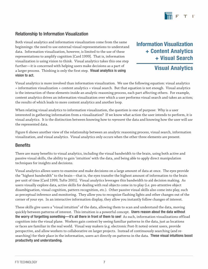
Relationship to Information Visualization
Both visual analytics and information visualization come from the same beginnings: the need to use external visual representations to understand data. Information visualization, however, is limited to the use of these representations to amplify cognition [Card 1999]. That is, information visualization is using vision to think. Visual analytics takes this one step further—it is concerned with helping users make decisions as a part of a larger process. Thinking is only the first step. Visual analytics is using vision to act.
Visual analytics is more involved than information visualization. We use the following equation: visual analytics = information visualization + content analytics + visual search. But that equation is not enough. Visual analytics is the interaction of these elements inside an analytic reasoning process, each part affecting others. For example, content analytics drives an information visualization over which a user performs visual search and takes an action; the results of which leads to more content analytics and another loop.
When relating visual analytics to information visualization, the question is one of purpose: Why is a user interested in gathering information from a visualization? If we know what action the user intends to perform, it is visual analytics. It is the distinction between knowing how to represent the data and knowing how the user will use the represented data.
Figure 6 shows another view of the relationship between an analytic reasoning process, visual search, information visualization, and visual analytics. Visual analytics only occurs when the other three elements are present.
Benefits
There are many benefits to visual analytics, including the visual bandwidth to the brain, using both active and passive visual skills, the ability to gain ‘intuition’ with the data, and being able to apply direct manipulation techniques for insights and decisions.
Visual analytics allows users to examine and make decisions on a large amount of data at once. The eyes provide the “highest bandwidth” to the brain—that is, the eyes transfer the highest amount of information to the brain per unit of time [Card 1999, Tufte 2001]. Visual analytics leverages this bandwidth to aid decision making. As users visually explore data, active skills for dealing with real objects come in to play (i.e. pre-attentive object disambiguation, visual cognition, pattern recognition, etc.). Other passive visual skills also come into play, such as perceptual inference and monitoring. They allow you to recognize flashing lights and other changes out of the corner of your eye. In an interactive information display, they allow you instantly follow changes of interest.
These skills give users a “visual intuition” of the data, allowing them to scan and understand the data, moving quickly between patterns of interest. This intuition is a powerful concept. Users reason about the data without the worry of forgetting something—it’s all there in front of them to see! As such, information visualizations offload cognition into the visual plane. Workers gain context by seeing familiar patterns in the data, just as locations or faces are familiar in the real world. Visual way makers (e.g. electronic Post-It notes) orient users, provide perspective, and allow workers to collaborative on larger projects. Instead of continuously searching (and re-searching) for their place in the information, users act directly on patterns in the data. These visual intuitions boost productivity and understanding.
Information Visualization + Content Analytics
+ Visual Search
Visual Analytics
8FTI TECHNOLOGY
We can go one step further. We know the analytic reasoning process and the context within which the information worker is working. By integrating these elements into the visualization, users can not only manipulate data for discovery but also for decision making. This extends our visual metaphor: connect actions and decisions directly to the relevant bits of information (i.e. flag an item for further review, mark an item as a lawyer/client privileged communication, etc.). That is, integrate the process with the visualization. As long as we follow the tenets of direct manipulation, that interactions are predictable, understandable, and reversible [Card 1999], visual analytics becomes a powerful way to make decisions.
Getting It Right
Visual analytics provides a powerful set of tools to analyze information, but they cannot be applied correctly without a deep understanding of the domain, of the information workers context, and of the data used in the visualization. They must be applied with great care to solve a specific problem.
Graphic designers and information architects draw from many visual metaphors to create information visualizations [Tufte 2001]. When dealing with abstract data, data which does not have direct physical mappings (i.e. legal documents as opposed to GPS coordinates), many different metaphors are possible. Any given visualization will highlight particular aspects of the data at the expense of others [Card 1999]. The question becomes one of determining which aspects are salient to the information worker’s current process/context and translating that to the correct visualization.
Putting aside a particular visualization choice for now, an analytic reasoning system should make use of an information worker’s current process and context. If the software makes incorrect assumptions about context, it may provide the wrong affordances (e.g. user interfaces) for dealing with the data, limiting interactivity and preventing the user from shaping the data appropriately. If process integration is too tight, it forces users down a narrow path, limiting process control and cutting off analytic discourse. For example, consider an email visualization tool. But what if the visualization automatically “refreshed” itself every time you received a new email? You might be looking at an interested pattern in the visualization when the entire screen changes because a new email arrived. The analytic reasoning system assumed you wanted the “freshest” visualization possible, which might not be your desire when looking though email patterns.
Finally, there is the data itself. Before data can be viewed in an information visualization, it has to be organized and pre-processed. Moreover, there are concerns of data storage, access rights, and privacy issues. When dealing with legal information, for example, which people are allowed to view visualizations of attorney-client privileged information? All of these concerns, however, contain a large assumption: the data itself is clean. Data is inherently messy, with some parts missing, contradictory, and duplicated. The processing engine behind a visualization is as important as the visualization itself.
9FTI TECHNOLOGY
Why care about Visual Analytics?
Searching vs. Browsing
In information seeking behavior, there are two main modes of seeking information: searching and browsing [Marchionini 1995]. Searching implies that the information exists, and seeker just has to find it. Often, the seeker either already knows or has a good idea what the information is. The seeker only needs to recover it. Browsing, on the other hand, contains no such beliefs about the data, instead the user seeks to discover what information potentially exists. Many existing interfaces focus on one aspect at the expense of the other (e.g. search boxes are poor for browsing).
Increasingly, patterns and relationships between documents provide the key insights needed to make effective decisions. Visual analytics lets users see and act on these relationships, some of which are not obvious at first inspection. For example, a set of emails might not seem relevant until viewed as a diagram of sender-recipient relationships. Often, these latent relationships are discovered serendipitously, as the information worker explores the data. This browsing behavior is a key benefit. Users can act directly on these relationships as they are discovered—making the best decisions possible because they have the right relationship information at the right time.
Improving the Process-Centric View
Information visualization cares about rendering data and making it accessible for people to interpret. Visual analytics cares about the interpretations of rendered data people make and their ensuing actions. In essence, information visualization is about ‘how’, as in, ‘how do I display it?’, whereas visual analytics is about ‘why’, as in ‘why am I looking at it?’. Visual analytics cares about process.
This is powerful from several different perspectives:
1. The information worker’s perspective Visual analytics makes the worker more productive, integrating knowledge discovery tasks with analytic reasoning tasks, keeping the worker focused on the right bits of information at the right time. It does this by integration actions into the interactive information visualizations; the worker doesn’t have to leave the visualization tool to take action.
2. The manager/director perspective Visual analytics provides transparency into the processes used by your information workers so everyone knows what is going on. Decisions made by the information workers can be aggregated and visualized for managers and key stakeholders. Vitally important information can be quickly propagated to critical resources for a more nuanced analysis and action plan.
3. The workflow perspective Visual analytics allows organizations to reflect upon, streamline, and standardize their analytic processes while insuring each information worker has the freedom to ‘play’ within this context. Because the actions are linked to the visualizations, the workflow is prescribed at the individual worker’s level. From this base level, organizations can create standardized workflows to integrate and manage this data throughout the core business needs.
10FTI TECHNOLOGY
The most powerful perspective, however, is one of increasing productivity. So far, we have discussed visual analytics in the context of an analytic reasoning process. The larger question is one of business process: how does visual analytics integrate into existing business processes? Because visual analytics is process-centric, an organization can define requirements, goals, and metrics around it. For example, visualization tools can make reviewers more productive inside a larger e-discovery process. This metric can be empirically measured, proving the worth of visual analytics inside the e-discovery process. Any organization looking to succeed with visual analytics should to do the same.
This connection goes both ways: first, as discussed above, we can place visual analytics inside larger business processes; second, we can place business context inside visual analytics. We can link insights to appropriate business process and make decisions are within a larger context than what the visualization can provide—the organizational context. For example, in e-discovery reviewers can mark, tag, and annotate documents. Other reviewers can read these annotations to make connections to the larger review context, to say, send documents to domain specialists for expert review, putting related documents into specialized business processes as they are discovered.
11FTI TECHNOLOGY
ConclusionsVisual analytics puts power in the information worker’s hands. The worker shapes and controls the analytic reasoning process, choosing what information to review, how to review it, and what action to take because if it. The interactive information visualizations make this possible through the power of visual processing, visual intuition, direct manipulation, and offloaded cognition. By seeing the data, the worker better understands not only a given document, but the context of that document in all of the data. The worker literally sees the big picture and doesn’t mistake the trees for the forest—he or she can see both. Plus, they can play with the picture, discovering new relationships between documents, gaining deeper insights.
The true power of visual analytics comes not from vision, but from action. Visual analytic tools allow information workers to act on these insights. When placed in a transparent business process, these actions lead to increased organizational awareness and productivity. Local insights and decisions can be gathered and organized, and from this deep collection of knowledge, organizations can make more effective global decisions. Because visual analytics is process-centric, it can be integrated into business processes and its effectiveness can be empirically measured via appropriate business metrics.
But it all comes from the individual knowledge worker. A true visual analytic tool gives each worker the freedom to explore data and act on what they find. By letting them shape and control the analytic reasoning process, visual analytics lets information workers do what they do best: discover profound insights and make effective decisions, visually.
12FTI TECHNOLOGY
References1. G. Arya, and T. Schlick. “A Tale of Tails: How Histone Tails Mediate Chromatin Compaction in Different
Salt and Linker Histone Environments”. J. Phys. Chem. A, 113 (16), pp. 4045-4059, 2009. DOI: 10.1021/jp810375d
2. S.K. Card, J.D. Mackinlay, and B. Shneiderman. ReadingsinInformationVisualization. San Diego, CA: Morgan Kaufmann Academic Press, 1999.
3. E.H. Chi, J.T. Riedl. “An Operator Interaction Framework for Visualization Systems.” In Proceedings of the IEEE Symposium on Information Visualization (InfoVis ‘98), pp. 63--70. IEEE Press, 1998.
4. J.F. Gantz, C. Chute, A. Manfrediz, S. Minton, D. Riensel, W. Schlichting, and A. Toncheva. “The Diverse and Exploding Digital Universe”, 2008. Retrieved from http://www.emc.com/collateral/analyst-reports/diverse-exploding-digital-universe.pdf, accessed August, 2009.
5. S. Lohr. “Is Information Overload a $650 Billion Drag On the Economy?” New York Times, December 20, 2007: Bits Blog. Retrieved from http://bits.blogs.nytimes.com/2007/12/20/is-information-overload-a-650-billion-drag-on-the-economy, accessed August, 2009.
6. P. Lyman, and H.R. Varian, “How Much Information”, 2003. Retrieved from http://www.sims.berkeley.edu/how-much-info-2003, accessed August, 2009.
7.G. Marchionini, InformationSeekinginElectronicEnvironments, Cambridge, UK: Cambridge University Press, 1995.
8. J.J. Thomas and K.A. Cook. IlluminatingthePath:TheResearchandDevelopmentAgendaforVisualAnalytics. Los Alamitos, CA: IEEE Computer Society, 2005.
9. E.R. Tufte. TheVisualDisplayofQuantitativeInformation,SecondEdition. Cheshire, CT: Graphics Press LLC, 2001.
10.J.M. Wolfe. “Visual Search” in Attention. H. Parshler (ed.) London, UK: University College London Press, 1998.