Embed Size (px)
Citation preview

Usability through visualisation A case study of ISO 26262 at Scania R&D Sofia Johansson
Master of Science Thesis Stockholm, Sweden 2017

TRITA-number: MMK 2017: 113 IDE 295

“Good design is a lot like clear thinking made visual.”
- Edward Tufte


Usability through visualisation
A case study of ISO 26262 at Scania R&D
by
Sofia Johansson
Master of Science Thesis MF 217X, 30 credits,
CDEPR, TIPDM, 2017
KTH Industrial Engineering and Management
Machine Design


i
Master of Science Thesis MF 217X
CDEPR, TIPDM, 2017
Usability through visualisation
A case study of ISO 26262 at Scania R&D
Sofia Johansson
Approved
Examiner
Claes Tisell
Supervisor
Liridona Sopjani
Commissioner
Scania
Contact person
Marcus Törnqvist
ABSTRACT
The average person today is more informed compared to the most informed people 25 years
ago, however, he or she knows a lower percentage of all available information than those in the
80’s. In today’s society, information is flowing everywhere and through all mediums. Research
shows that this constantly accessible information is hampering our daily work– if not presented
in an accessible way. This thesis has investigated this particular issue with ISO 26262 as case.
ISO 26262 is a standard concerning the safety within E/E –systems and is currently
being adopted at Scania. However, the users think the standard, which is originally presented
in a pdf document, is both time –and resource inefficient, and also the content of ISO 26262 is
presented in such manner that it can be interpreted in multiple ways, and is experienced as a
“wall of text”. By carrying out several user interactions, it was discovered that the most critical
issue for the users was looking for information and that the standard would be more user
friendly if presented in a website. Adjustments of the text and layout within the standard were
made based on the conducted literature study, such as a stronger hierarchy of the content,
spacing and construction of sections. The approach of the project was based on service design,
in order to maintain focus on the user and usage, which during the user interactions were
discovered to be the two main areas that had to be investigated, problematised and solved. The
user and usage areas were therefore iteratively implemented through all four stages of the
approach; exploration, creation, reflection and implementation, which led the final result of a
website and its construction, links and layout. The assumed most critical parts of the final
website were implemented in order to ensure a fulfilment of the main criteria generated from
the user interactions. However, if more time had been available, the website could have been
user tested once more, in order to find further critical aspects and ensure their fulfilment.

ii

iii
Examensarbete MF 217X
CDEPR, TIPDM, 2017
Användarbarhet genom visualisering
En fallstudie av ISO 26262 på Scania forskning och utveckling
Sofia Johansson
Godkänt
Examinator
Claes Tisell
Handledare
Liridona Sopjani
Uppdragsgivare
Scania
Kontaktperson
Marcus Törnqvist
SAMMANFATTNING
Genomsnittspersonen är idag mer informerad jämfört med de mest informerade personerna 25
år sedan, men trots det så vet han eller hon en lägre andel av all tillgänglig information, jämfört
med de mest informerade på 1980-talet. I dagens samhälle flödar information överallt och
genom alla typer av medium. Forskning visar att detta ständiga informationsflöde kan störa oss
i vårt dagliga arbete – om den inte presenteras för oss på ett tillgängligt sätt. Denna uppsats har
undersökt just detta problem, med ISO 26262 som fallstudie. ISO 26262 är en standard som
behandlar säkerheten i E/E –system, som för tillfället är under tillämpning av anställda hos
Scania. De anställda tycker dock att standarden, som tillgängliggörs i ett pdf dokument, är för
tids- och resurskrävande. Innehållet i ISO 26262 är också presenterat på ett sätt som gör
standarden öppen för olika tolkningar, och de anställda upplever dokumentet som en ”vägg av
text”. I detta projekt har flera användarundersökningar genomförts, och under dessa fastställdes
det mest kritiska momentet för användarna till att leta upp information i standarden, och för att
göra ISO 26262 mer användarvänligt föredrogs en hemsida. Ändringar i texten har gjorts, med
grund i den litteraturstudie som genomförts, där till exempel hierarkin i texten har förstärkts,
mellanrum har anpassats och upplägget av kapitel och delkapitel har ändrats. Arbetssättet under
projektet har grundats i tjänstedesign, för att bibehålla fokus på användare och användning,
vilka genom användarundersökningarna upptäcktes vara de två huvudområdena att vidare
undersöka. Dessa två områden arbetades igenom på ett iterativt sätt, inkluderande dom fyra
huvudstegen; utforskning, skapning, reflektering och implementation, vilket resulterade i
konstruktionen av en hemsida samt dess layout. Den slutgiltiga hemsidan antas uppfylla de
huvudkriterierna som upptäcktes under användarundersökningar, men om mer tid hade funnits
så kunde hemsidan ha blivit användartestats en gång till, och på så vis säkerställa att alla kritiska
aspekter upptäckts och åtgärdats.

iv

v
FOREWORD
I would like start thanking my friend Ida Krüger for introducing the software Adobe Muse, and
Google for learning me how to use it. Furthermore, I would like thanking my industrial
supervisor, Marcus Törnqvist, for always finding the time to helping me, and everyone at
RESA/RESS for welcoming me and letting me be a part of the group. And finally I want to
thank my KTH supervisor, Liridona Sopjani, for guiding me and helping me throughout this
whole thesis work.

vi

vii
NOMENCLATURE
ISO
International Organization for Standardization
E/E –systems
Electric – and/ or Electronic systems
ASIL
Automotive Safety Integrity Level
QM
Quality Management
R&D
Research & Development
RSS
Really Simple Syndication
CS
Central Secretariat
KTH
The Royal Institute of Technology

viii
ix
TABLE OF CONTENTS
ABSTRACT I
SAMMANFATTNING III
FOREWORD V
NOMENCLATURE VII
TABLE OF CONTENTS IX
ONE. INTRODUCTION 1
ONE.ONE. BACKGROUND 3
TWO. LITERATURE STUDY 7
TWO.ONE. INFORMATION DESIGN 7
TWO.TWO. VISUAL COMMUNICATION 11
THREE. METHODOLOGY 15
FOUR. METHOD AND RESULT 25
FOUR.ONE. EXPLORATION 25
Exploring the standard 22
Exploring the user of the standard 26
FOUR.TWO. CREATION 28
User 28
Usage 29
Highlights from the user journey results 32
Deriving design guidelines 36
Transforming the standard 37
Concepts 38
FOUR.THREE. REFLECTION 41
FOUR.FOUR. IMPLEMENTATION 44
FIVE. FINAL DESIGN 47
FIVE.ONE. DISCUSSION 57
FIVE.TWO. CONCLUSIONS AND RECOMMENDATIONS 60
REFERENCES 63
APPENDIX A SURVEY QUESTIONS 65
APPENDIX B SURVEY RESULT 69
APPENDIX C PERSONAS 79
APPENDIX D CONCEPTS 81
APPENDIX E FORM 83
APPENDIX F FORM RESULT 85
APPENDIX G FINAL DRAFT 89

x

xi

xii

1
O N E . INTRODUCTION
The average person today is more informed than the most informed people 25 years ago, yet he
or she knows less of available information compared to those in the 80’s (Spira, 2011, p.1).
This is mainly because of the enormous information exchange done out today, and the time
limits set up by and within the society. Also, organisations, companies, governments and other
profit-driven institutions today are aiming for time-efficient and continuous workflows. There’s
a growing trend of using standardised solutions with the aim of obtaining higher performance
and easier trading of products, knowledge and services worldwide. However, much time and
resources are spent on the implementation of standards, recommendations and requirements,
which in the meantime often may contradict their initial purpose; time –and recourses
efficiency. This thesis was conducted with Scania as the commissioner, and with the aim of
improving the communicative –and informative design of the standard ISO 26262.
Although standardisation has enabled the improvement of many operations, particularly in
organisational operations, the information within the standards and the communication of their
content is often complex to interpret for all stakeholders. One reason for this –as in the studied
case of ISO 26262 in this thesis, may be the importance of the presented content to be
implemented by any stakeholder.
The focus of this thesis is the context of how standards communicate and interact with the users.
Since the aim of using standard is to improve and increase efficiency of the work process, the
use of standards is vast among organisations. By using and implementing standards,
organisations and companies are provided with a framework including requirements and
recommendations connected to the specific area of the standard. These requirements and
recommendations are designed both in general and in specific, in order to ensure quality, safety,
and operational procedures that allow organisations to operate better internally and with
external partners or suppliers. In a way, the standards today are considered a language or a code
for communication between people, products, processes, and operations. The standards are
mostly concerning business and technology, but lately numerous standards have been
developed in the field of environmental issues as well.
This thesis work uses a standard as a case to explore and understand the user experience when
interacting with the standard and how to improve it through design. The case of this thesis was
commissioned by Scania, one of the largest manufacturing organisations in Sweden, regarding
one particular standard –ISO 26262. At Scania, issues have emerged regarding the
interpretation of the standard by various employees and management groups, as well as the time
consumed to access, read, use and implement the standard effectively in addition to other
resources being consumed when misunderstandings and confusions occurred. Scania, therefore,
identified a need to investigate and look for a more user friendly solution for the involved parties
and users.

2
From a users’ perspective, the overall problem of the current form of ISO 26262 is how the
content of the standard is presented. Thus, to problematise this for the purpose of this thesis, an
argument can be made that complex processes and standardisations presented in text
documents often hamper time efficient information search and consistent interpretation by
different stakeholders and parties. The time consuming layout and complex construction as
well as the organisation of the information within the standard serves as problem identified and
hence became an objective of this thesis. A deeper exploration with regards to users’ experience
and through this; the possibility of visualisation of information are proposed with the aim to
provide a solution that simplifies the use of the standard for all stakeholders and henceforth,
improve their everyday work. The resulting research question is formulated as: How can we
communicate extensive information in order to improve clarity and understanding for the users,
as well as their overall impression and experience?

3
O N E . O N E . BACKGROUND
In this thesis, possibilities of visualising the standard are explored in terms of transforming
large amount of information, using the standard ISO 26262 as a case, towards a more efficient
solution and better experience for its users. To get into perspective, an overview of standards
and particularly the standard ISO 26262 as the case of this thesis is provided in this sub chapter.
ISO is an abbreviation for International Organization for Standardization. The organisation
aims to improve efficient work processes and ensure product –and service quality for the users.
This for example could mean cut costs for companies, product or service quality insurances for
customers and easier trade between governments and countries. The standard ISO 26262 itself
contains a framework regarding the safety within electric – and/ or electronic systems (E/E –
systems). This by having four (five) levels of safety (ASIL:s (Automotive Safety Integrity
Levels) and QM (Quality Management)), which are applicable by different clauses within the
document. The current version of the standard applies to passenger cars (<3500kg), but is under
development to also include heavy vehicles (>3500kg). The new version of ISO 26262 is to be
released in 2018, and is therefore not presented in this thesis report.
The purpose of ISO 26262 is to enhance and present the safety requirements and
recommendations of E/E –systems. The standard is used by several development groups at
Scania and it is therefore important that the information is interpreted in the same manner by
all involved parties. This to ensure that the desired fulfilment of the standard is kept regardless
of the interpreter. Furthermore, the standard is composed of over 650 pages, mostly text, and
these pages are in turn constituted of clauses, one or two sentences long. This type of
presentation is perceived as cluttered by the employees at Scania, who find it time consuming
to find the information they search for. Therefore, the purpose of the thesis is to simplify the
everyday work for the employees at Scania, involving ISO 26262. The overall aim of the master
thesis project is to define an environment and/ or a visualisation, in which the employers are
able to find, and interpret the given content of ISO 26262 in a simple and consistent manner.
The thesis work was conducted during a period of 20 weeks. The work was carried out at
Scania, in the system architecture development group (RESA/RESS), with Scania as the
commissioner and KTH (the Royal Institute of Technology) as examiner and publisher. Scania
is a part of Volkswagen Truck & Bus GmbH, and has a total of 44,000 employees worldwide,
with their head office located in Södertälje, Sweden. The core values of Scania, which are
customer first, respect for the individual and quality, are to be included in the master thesis
project during the whole project. RESA/RESS systemises functionality in the vehicle electrical
systems and constitutes functional architects, hardware architects, safety architects and release
coordinators. The development group investigates possible modulation through systematic
design of the hardware –and function architecture. This also includes overall safety principles,
which is something that the development group are working with continuously. RESA/RESS
is located in the R&D (Research and Development) facilities at Scania.

4
The approach of this thesis is based on a design method; including user interactions, literature
study and concept testing, involving the employees at Scania as participants, which combined
led to the decisions of the final outcome of this work. The project had a base in message design,
information design and communication design. These areas are elaborated further in the
following chapters. In addition, the project has determined a number of delimitations, mainly
due to lack of time:
the standard used in this project is yet a draft, and can eventually be changed, or items
could be added or removed in the future. This implied that the content of the
visualisation would have to preferably be easily changeable by the employees at Scania,
who are using the standard. The changeability and updating of content within the
visualisation could have been accomplished by the choice of tool or platform, i.e. by
implementing the result in an already easy-to-update tool the user could themselves
update the content when/ if the ISO 26262 is updated. This aspect when selecting tool,
however, did not have a major part in the thesis work.
the standard has not been studied in detail, and instead the main focus has been in the
construction and layout of the standard.
the final product is to be adapted to a digital platform, and does not follow the brand
language of Scania.
the final result was implemented, partly, in order to demonstrate how it should be done.
The overall project was divided into three phases, in order to distinguish different needs
throughout the thesis work. These phases included an investigation regarding the standard itself,
how to transform the current presentation of the standard towards a more user-friendly
environment and the final design of the result. However, the phase in which the main focus lied
in was the transformation. This since within the literature study conducted, no previous research
regarding how to transform an ISO –standard towards a more user friendly layout has been
found. Furthermore, this phase was assumed to be a critical moment for achieving a satisfying
result in relation to Scania’s requirements. More about the methods used in the project can be
found in chapter THREE. METHODOLOGY.

5
T W O . LITERATURE STUDY
In order to visualise information, a message has to be created, sent, delivered and presented.
When creating a message, information is transformed and taken from one environment and put
in another. Information design is one of the areas aiming to create and send the message, i.e.
visualising the information. Visual communication on the other hand, considers how this
message can be delivered and presented.
According to the book Information Design 1 Message Design (Pettersson, a2015), the meaning
and interpretation of the concept ‘information’ is changing over time. For a long period, the
term was used synonymously with data, details, facts and intelligence, but today it may also
refer to, according to Pettersson (a2015), data processes in computers or internal structures of
processes, among other things. The new Shorter Oxford English Dictionary on Historical
Principles (Brown, 1993, p. 1364) discusses that the concept of information could even mean
inspiration and accusations.
One kind of nowadays used information is empirical studies, which yet alone is not telling the
whole story; one example of this is brought up in the book Why Society is a Complex Matter,
Meeting Twenty-first Century Challenges with a New Kind of Science (Ball, 2012, p. 10). Ball
is in the book discussing the matter of empirical studies, with traffic routes as an example, a
case which shows how heavily particular routes are, but not telling why. Another use of
information is to visualise and track projects, such as those described in the article by Flyvebom,
Madsen and Rasche (2017, p. 35-42). Flyverbom, Madsen and Rasche are analysing the two
cases of; monitoring food prices in Indonesia and tracking malaria in Kenya. Their analysis
shows that how data is visualised depends somewhat on the underlying visualisation and who
is interpreting it. These statements could be interpreted as that in order to present information
truly, it is important to include the whole picture and underlying dependencies, and maybe even
more important; always base decisions in gathered data.
Even though the average person today is more informed than the most informed people 25 years
ago, he or she knows less of available information compared to those in the 80’s (Spira, 2011,
p.1). Spira continues with discussing the overload of information today, such as; e-mails,
messages, reports, news, web sites, RSS (Really Simple Syndication) feeds, blogs, wikis,
instant messages, text messages, Twitter and video conferencing. He (Spira, 2011) proposes the
idea that the constant flow and input of information is disturbing our work, and Ball (2012)
discusses the need of aggregating and sifting processes in order to actually gain knowledge
from information. In additional to this, most of the available information today is presented in
lists and tables, which makes it seem unorganised and complex, and there is commonly up to
the information designer to reorganise the information to make it more available and user
friendly (Pettersson, a2015).
When working as any kind of designer, there are several design classifications that could be
helpful in the work. In design studies, one of these classifications presented divides the area
into six families and five design genera, each containing design species or design disciplines
(Pettersson, b2015). Pettersson (b2015) continues saying that information design is one of the
five design genera within the message design family, together with graphic design, instruction
design, mass design and persuasion design. The message design family, according to Pettersson
(a2015), one of the contributors to the area of information design, can also be divided into six
base disciplines; art and aesthetic, cognitive, communication, design, information and
language.

6
Communication is another area, often interacting with information design and message design
is, according to Pettersson (a2015), the interplay between two or more persons. In this kind of
information exchange, a signal is produced, transmitted, received and deciphered (Pettersson
(a2015). Communication overall, is constructed the same way for both humans and animals,
where the signals could be oral, visual and/ or fragrant, but most frequently a coalesce of all.
One model representing this concept is the Shannon and Weaver communication model
(Pettersson, a2015), presented in Fig. 2.1. This model was originally developed to represent the
telecommunication system, but is today accepted to describe most communication, even
communication design. The signal in the model can, and probably will, be influenced by noise.
The noise is in the original model actual noise, but can today be translated to previous
experience or prerequisites for interpretation among the receiver, such as what the receiver has
read or seen, which will affect what he or she interprets from the signal (Pettersson, a2015).
Fig. 2.1. Overview of the Shannon and Weaver communication model (Pettersson, a2015).
7
T W O . O N E . INFORMATION DESIGN
Information design deals with the concept of how to create a message. When a message is
developed, the information is transformed, from one environment to another, which for example
can be from text to images, from experiences to text or from data sheets to infographics.
According to the book Information Design 1 Message Design, information design comprises:
“analysis, planning, presentation and understanding of a message – its contents, language and
form. The main objective for information design is to provide information materials needed by
the interpreter in order to perform specific tasks” (Pettersson, a2015, p. 99).
In addition, information design intends to combine workability and usability, and if well
designed; the result will fulfil the requirements of aesthetic, economic, ergonomic and also the
subject matter requirements (Mullet and Sano, 1995). Mullet and Sano (1995, p.2) discusses
that the goal of information design is to create a message, which can be faithfully delivered and
correctly interpreted. Moreover, it should influence towards a desired behavioural outcome,
after the message has been interpreted, understood and analysed by its receiver.
Information design concerns the analysis, planning, presentation and understanding of a
message and its content, language and form. Through these aspects aesthetic, economic,
ergonomic and subject matter requirements are fulfilled, regardless of its environment and
medium (Pettersson, a2015). Further, Robin Kinross in his book Modern Typography,
describes information design by saying that “abstract has its limits, and theories about design
depend in part on their translation into real products” (Mijksenaar, 1997, p.14). This
conceptualisation of information design goes in line with the description of visual information
in the book Visual Function: An Introduction to Information Design by Paul Mikjsenaar (1997),
where the concept is described as a neighbour to industrial design, graphic design, morphology
and experimental psychology. Mijksenaar continues with describing information design with
two questions; Designing what? and Which form?. By doing so, the author discusses if the main
focus in a design process should be on the product itself, or the use of it. He argues that the
description of information design should be as precise as possible, in order to simplify
interdisciplinary collaboration between areas, principles and disciplines (Mijksenaar, 1997).
This would, according to Mijksenaar, in successful cases, mean that the combined result adds
up to more than the sum of its parts.
On the other hand, information visualisation has also traditionally been used for analysing and
understanding of complex data and processes, this usually includes detection of patterns and
trends, which later could be used for decision making (Mijksenaar, 1997). Mijksenaar continues
arguing that since the information visualisation originated from science and research, the
method has mainly focused on the achievement of scientific goals and optimising analysis and
therefore, the use of information visualisation has been considered as a neutral and impartial
method. But, according to Vande Moere and Patel, this neutral and impartial view of
information has been modified over the recent years, towards a “democratized” practical, as it
is described in the paper The Physical Visualization of Information: Designing Data Sculptures
in an Educational Context (Vande Moere, Patel, 2009). This modification is caused based in
three characteristic changes; the first main change is the possibility for novices to develop
visualisations through easy-used, open and free computer software, the second influence for
this new trend is the increasing number of available data sets and the third is a new focus of the
use of visualisations. This last change aims towards the field of, among others, art and design,
which has an interest of using innovative concepts in order to visualise knowledge and meaning,
otherwise hidden in the large amount of data (Vande Moere, Patel, 2009).
8
Sack et al. (2007), also noticed the trend of including the artistic aspect when creating
information visualisation. They noticed that the area of anti-sublime information visualisation
is commonly described by art and has therefore outgrown science and engineering. Sack et al.
(2007) continue with that this does not mean that the art in this case is pretty and beautiful in
an aesthetic point of view, but instead fulfils its purpose of the commissioner and is interpreted
as desired
According to Pettersson (a2015), the overall concept of information is largely varied and
included many areas, disciplines, principles or knowledge areas, and the view of information is
depending on how the message is created, presented, distributed and so on. In addition to that,
Pettersson continues with that the baggage of the recipient, i.e. for example skills, knowledge
or previous experiences, do affect how he or she will receive the message. Furthermore, since
the information is sometimes data collections, often stored in lists or tables, it is the information
designer’s task to organise, structure and present the data in such way that that the interpretation
fulfils the wanted message (Pettersson, a2015). This is one only way to create a satisfying
information visualisation out of the source data. The information designer must therefore,
distinguish what information is the essential and is to be the basis for decision making. He or
she should investigate what the need for this information visualisation is, and by that identify
potential source of information. Furthermore, it is the information designer’s responsibility to
ensure that the presented information is correct so as to prevent misunderstandings (Pettersson,
a2015). However, it is worth noting that social and cultural meanings may have an additional
effect on how the information is perceived and understood though these dimensions are not
further elaborated here.
When looking into how information can be organised and presented, Nicholas Oresme is one
of the originally, and often mentioned, designer since he was one of those introducing graphical
representations (Mijksenaar, 1997). This by his idea of presenting data as vertical columns
along a horizontal axis, from left to right, today known as the Cartesian Coordinate System.
Another important contributor in the area is William Playfair, who started to not only use
graphics for empirical data but also statistics, Playfair, together with others, has developed
almost all the graphical forms used today (Mijksenaar, 1997).
H. Wainer discusses this matter in the paper Graphical Visions from William Playfair to John
Tukey, in which he points out the similarities and differences between data analyses and
graphical representations. Playfair and Tukey describes their “three points of agreement” as
H. Wainer describes it, as the importance of impact, that understanding graphs is not always
automatic and finally that “a graph can show us things easily that might not have been seen
otherwise”. These points of agreement could be summarised as that in order to present data in
a satisfying manner, the outcome must be perceivable for the viewer.

9
As illustrated in Fig. 2.1.1. the design visualisation development is divisible into four stages;
the collection of data, the pre-processing stage in which the information usually is reduced, the
mapping of the selected data towards a visual representation and finally the receiver (Ware,
2013). According to Ware, the longest loop in the development of a visualisation is the data
gathering, which takes place in the start and is followed by the data being explored and
transformed. Both the physical and social environment plays a role in the data gathering and
analysing stages of the development, however the social environment is a subtler influence
which is complex and open to multiple interpretations. Both the physical and social
environment are important to include when for example analysing results from user
interactions.
Fig. 2.1.1. Illustrative representation of the visualisation development division.
The most critical question, according to Ware (2013), is how to transform data into something
that is understandable and can thereby serve as basis for decision making. There are several
guidelines which together are trying to answer this question; for example, the human sensory
capabilities should be taken into account in such manner that the data presented can be quickly
perceived (Ware, 2013). In addition, graphical symbols should be standardised in all aspects of
the desired application and if several tools or methods can perform the same task, the quickest
and already known should be used. If there is a need for developing new tools, they must be in
proportion to the benefits they are expected to generate (Ware, 2013).

10
Marcus Vitruvius Pollio (80 B.C. – 15 A.D.), presented in the first century three principles for
good architectures in his book De Architecture. These principles were described as firmitas,
utilitas and venustas, which mean solid, useful and beautiful. The principles have afterwards
been used and adapted into many design areas, and one example of this is the three information
graphic principles Lankow has presented: soundness, utility and beauty. In his interpretation of
the three principles, the soundness means that the information must be complete, correct and
valuable for the receiver and the utility refers if the design result meets the objectives. The third
principle, beauty, connotes that design has to be appealing and appropriate. By compiling the
principles of different design areas, six overall principles and six questions, that the designer
need to answer were derived (Pettersson, a2015):
Design activity
What is the problem?
Analysis What is the purpose and function of the design?
Historical references
How can I communicate my idea?
Skills
What skills do I need for this design?
Technology
How will the best design or product be made?
Evaluation
Is this the best solution I can come up with?
These are questions to always consider when dealing with general design, and in addition to
those, the message must be explained clearly, the volume of information should be minimised
and also overall design of information must have a structured layout (Pettersson, c2015).
Other aspects to consider when dealing with information design are those discussed in
Information Design 1 Message Design (Pettersson, a2015): The message should be consistent
and have proximity, be chinking and aligned, the hierarchy of the content must be clear, the
content must be structured and developed in order to balance the eye flow, and finally the
message must be clear. This means that the layout of information design should follow the same
language i.e. the headlines should look the same and it is important to have enough (not too
much or too little) space in between the elements of the content, reflecting their relationship.
More important parts should be emphasized by the means of for example bolder font or by
placement. The message must have a clear structure and the eyes of the receiver must always
be able to follow the intended path, including a starting point, route and end point. And finally,
the message, content, and presentation, must be adapted to the audience and the receiver,
including the choice of words, terms, illustrations et cetera (Pettersson, a2015).
11
T W O . T W O . VISUAL COMMUNICATION
“The circle is the first, perfect shape. The equidistant arrangement of the outer points from the
centre, defining and ideal, are impossible to achieve by human hand. The space speaks of
potential – the tension between what is achieved and what could be achieved. From the circle,
we derive ideals and focus, both the halo of saints and the cross-haired target in gun sights.”
(Klanten, Bourquin, Tissot, Ehmann, 2009, p. 11)
In addition to information design, a message also needs to be communicated, and reach the
audience through a medium or form. Visual communication as such, deals with how the
message should be delivered and presented. According to Connie Malamed (in Pettersson,
a2015), the visual principles could be summarised in six areas. These areas include, among
other, an analysis of perception, i.e. how humans experience different images which can help
the designer to compile the graphics in order to achieve the desired result. In order to create a
successful message, the realism of the design should often be reduced, but still, the abstract
message must have a concrete presentation in order for the receiver to fully understand the
presented content (Malamed, 2015). Malamed also suggests that information graphics are
essential to help an audience understand information if it is of quantitative or complex, or both
forms. The concept of information graphics, according to Malamed, is referring to abstract
representations. By using this technique, data is transformed into a story, which supports its
own persuasive point (Malamed, 2015).

12
Another designer and author who also reused and rephrased the three principles of Vitruvius is
Paul Mikjsenaar, who in his book Visual Function: An Introduction to Information Design,
describes the principles as reliability, utility and satisfaction. Mikjsenaar also developed a
diagram to be able to measure and compare these aspects for a specific product or design. He
used each quality as an axis (or thermometer) in a three-axis-system (Mijksenaar, 1997). A draft
from the book visualising this system is presented in Fig. 2.2.1.
Fig. 2.2.1. Draft from Visual Function: An Introduction to Information Design (Mijksenaar, 1997) showing the
measure system for the three principles of reliability, utility and satisfaction.
The diagram is presented to the left in Fig. 2.2.1. which is applied to the route signpost, to the
right in the figure. The circle in the middle is representing the average level, and the three axis
are representing each principle, filled with colour corresponding to amount of that principle.
However, Mikjsenaar does state that no product or design should fall exactly on the mark of
the circle, since there is always room for improvements.
The book Visual Function: An Introduction to Information Design also discusses two main
questions to be considered during the design development: Designing what? and Which form?
The first question; Designing What?, is dealing with the specific information the designer use
when creating a message, this has, however, nowadays room for a wider perspective since
information is flowing everywhere and it would therefore be better to discuss the design
instructions (Mijksenaar, 1997). The second questions; Which form?, is derived from the
expression function can take any form, which itself is a modification of the well-known form
follows function. Form follows function is discussed in almost every publication within the area
and is therefore a big influence in all design making and has also a significant role when dealing
with informative –and communicative design

13
In order to develop an effective informative design, the use of both images and text or narration
is often one of the best alternatives (Malamed, 2015). Malamed discusses in his book; Visual
Design Solutions: Principles and Creative Inspiration for Learning Professionals, how by using
both these elements, the learning experience for the receiver will be enhanced and meaningful.
To do so, Malamed continues with describing how the designer can use visuals as
representations, which are explained in text or narrations, it is also possible to use analogies in
order to add unfamiliar concepts or present several items, connected somehow, to be
remembered in association with each other. By leveraging content and layout, the content will
be perceived as structured, and the layout should also have a focus on the aesthetics in order to
motivate and inspire the receiver (Malamed, 2015). Furthermore, by using visual
representations, there are no assumptions or need for the receivers or audience to speak the
same language. Moreover, the designer may include some emotions in the message, as for
example by placing one pleasant image side by side with an unpleasant. (Pettersson, a2015)
Even though the aesthetics may not seem to be the major priority in information –and
communication design, the enjoyment derived from a satisfying design cannot be ignored
(Malamed, 2015). The positive feeling that an appealing design brings is comparable with how
useful the information within the design is when it comes to how to motivate the receiver.
According to the book The Design of Everyday Things (Norman, 2013), the receiver is
immediately affected by the design, and thereby is either attracted or repelled. This has today
led to that an elegant and seamless design and a beautiful interface in webpages and applications
are considered as a part of an effective implementation. Another example is how certain colours
and shapes could be used in instructional materials in order to provoke positive feelings (Um,
Plass, Hayward and Homer, 2012).

14
15
T H R E E . METHODOLOGY
In order to realise the gathered theoretical knowledge, a foundation for the thesis was set in
the Shannon and Weaver communication model (1949), but with some adjustments. By doing
so, message design could apply, in which a service design approach was used, in order to
maintain focus on the users.
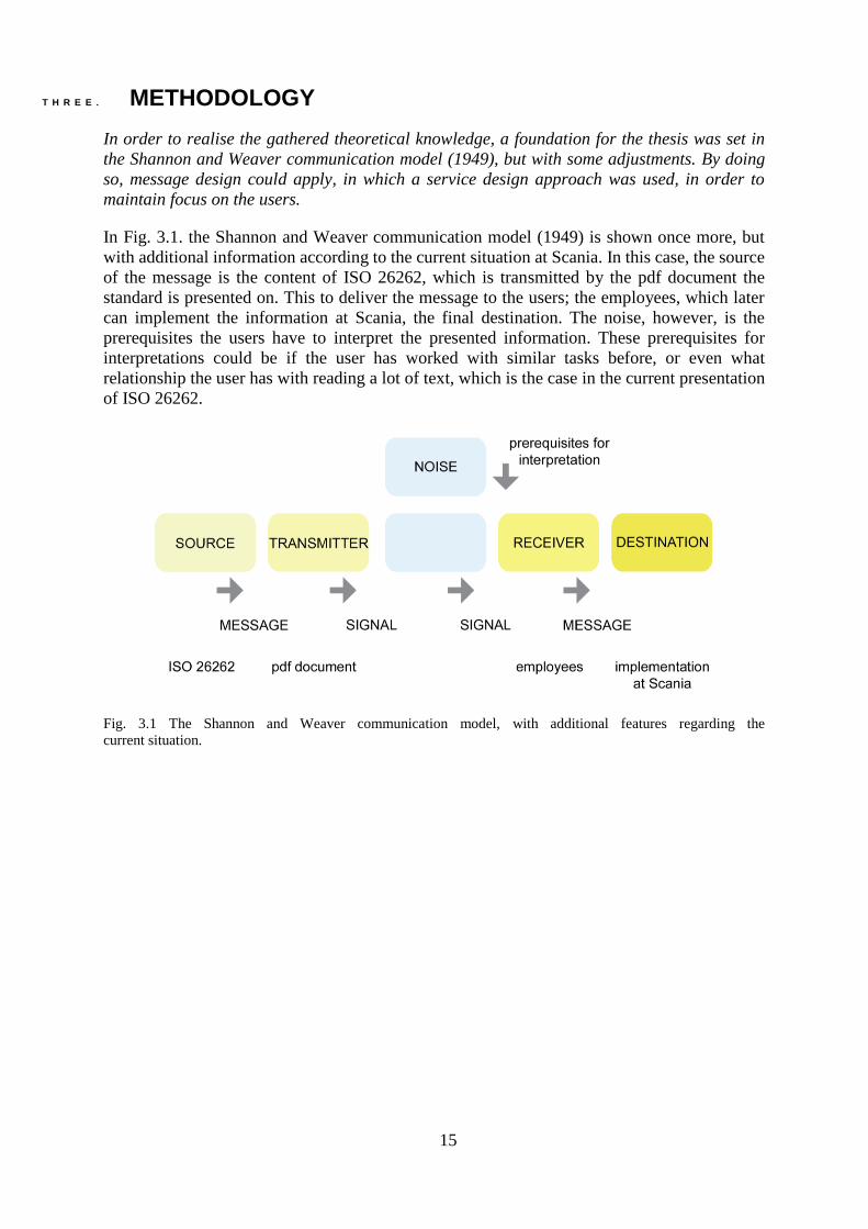
In Fig. 3.1. the Shannon and Weaver communication model (1949) is shown once more, but
with additional information according to the current situation at Scania. In this case, the source
of the message is the content of ISO 26262, which is transmitted by the pdf document the
standard is presented on. This to deliver the message to the users; the employees, which later
can implement the information at Scania, the final destination. The noise, however, is the
prerequisites the users have to interpret the presented information. These prerequisites for
interpretations could be if the user has worked with similar tasks before, or even what
relationship the user has with reading a lot of text, which is the case in the current presentation
of ISO 26262.
Fig. 3.1 The Shannon and Weaver communication model, with additional features regarding the
current situation.

16
Since this thesis has a delimitation of not studying the standard in detail, the source for this
project is instead the actual pdf document, which will be transmitted by the thesis solution. The
noise, receiver and destination in the thesis project is the same as for the current situation, as
shown in Fig. 3.2.
Fig. 3.2. The Shannon and Waver communication model, with additional features for the thesis project.
By studying Fig. 3.3. it becomes obvious that the project and user interactions needs to have
two main focus areas; the user and the usage, as presented in Fig. 3.3. Even though the thesis
solution is included in the usage area, it is unavoidable to include the user in the research.
Fig. 3.3. The Shannon and Waver communication model, with additional features for the thesis project and
highlighting of what parts focus on the user and usage.

17
A service design approach was applied, in order to maintain focus on the users, and to concretise
the two main areas, user and usage, the project was divided into three phases; ISO 26262, the
transformation and the visual communication. The overall methodology is presented in
Fig. 3.4.
Fig. 3.4. Overview of the methodology of the project.
In service design process approach, there are four iterative stages toward designing for an
outcome: exploration, creation, reflection, and implementation which are lenses to approach
the design process (Stickdorn and Schneider, 2011). In the book This is Service Design
Thinking the authors describe the phases as not linear, whereby iterations are highly encouraged
as a way to reflect and inform decision making throughout the process. In each of these phases,
the project intended to achieve a goal which would enable deeper understanding and moving
forward as learning was enhanced in terms of what the issues with the standard were and how
the users were interacting with it (Stickdorn and Schneider, 2011).

18
In the exploration stage, the focus was the ISO standard itself, how it is structured and
presented, how it is being used, the context of use, what type of users are working with it and
in what ways, in order to understand problems and challenges with the current version. Here
data were collected by analysing the standard (the actual document) and a survey sent out to
users. The survey was developed with the aim of gathering knowledge on the user’s integration
approach when working with the standard. Also their expectations, impression and feelings
were asked about. The results of this phase informed the steps in the next stage: creation.
In the creation stage, a focus was put onto understanding the user insights gained from the data
collected through the survey and elaborate how to transform the current version of ISO 26262
towards a more user friendly presentation. Personas and user journey maps were used as tools
in this stage, to gain deeper insights, also the literature study regarding information design,
communication design and message design were used.
The personas were based on the results from the survey, i.e. a pattern was discovered regarding
how frequently the users worked with the standard. In order to further analyse these personas,
and investigate how their journey throughout the standard looked like, each persona was further
studied by the development of user journey maps. By using journey maps, a deeper insight was
gained regarding the user’s travel throughout the standard, and also critical moments and
appreciated aspects of the current version could be found. The user journey maps where
developed based on guidance available in the Adaptive Path (http://www.adaptivepath.com/),
with some influences from the book This is Service Design Thinking (Stickdorn and Schneider,
2011) and lecture material provided by Transformator Design. In Fig. 3.5. an overall picture of
the user journey map presented by Transformator Design is shown. The merge of these different
aspects of user journey maps was done in order to embrace all aspects of the user and usage of
the standard.
Fig. 3.5. Overview of the user journey map used in this project. (Transformator Design)

19
In Fig. 3.6. the additional bullet blocks taken from Adaptive Path, which were used in this
project are highlighted in yellow. By using the bullet blocks from Adaptive Path in additional
to the more traditional bullet blocks presented by Transformator Design, a deeper understanding
for what the different personas think and feel was gained, and also why was that.
Fig. 3.6 The additional bullet blocks used in the project are highlighted in yellow (Adaptive Path)
The journeys were developed in direct connection to the survey results, and included the
journey stages of; opening the standard, looking for information and information found. The
bullet blocks; thinking, seeing, hearing, feeling, doing, device, time, relationship, place and key
opportunities are from the Adaptive Path (http://www.adaptivepath.com/), but with
interpretations suitable for this project. The blocks; quote, touch-points, problems and needs,
good stuff, insights and emotional curve are inspired from the book This is Service Design
Thinking (Stickdorn and Schneider, 2011) with Transformator Design as example.

20
The analysis derived from personas and user journeys provided direct input to the development
of three concepts which emerged from the user insights. The three concepts were fully data
driven as problems and issues with the current version of the standard became apparent. In
addition to the data collection, an important data source was the literature review which
provided input for the development of concepts. This contributed with what possible content to
enhance in order to improve the usability and smoothen the accessibility of the standard for
different user segments. These input aspects provided clear guidelines toward transforming the
content of – and information within the standard into what the users needed and had pointed
out. The three concept prototypes were then brought to the users during a workshop, which was
organised in order to do user testing. The concepts were showcased to the users, who were
asked to evaluate each concept based on a form they filled out while being presented the
solutions.
In the third stage, reflection, results from the workshop were analysed and based on users’
preferences, and what aspects to include in the implementation were discovered. Here
reflections were made regarding the input from the users and all the recommendations provided
by them, therefore, the decision making process until the end was purely user driven and co-
designed. Regarding the three phases, the third stage included an overall reflection of the so-
far derived results from the transformation, before the work of visual communication could
start.
In the final stage, implementation, the final concept developed to suit Scania’s employees’
context was taken for implementation. The workshop was used as a trigger material for users
to highlight the strength and weaknesses of the proposed concepts, such as colours and fonts,
whereby by their evaluation of one of the concepts had been favoured most with elements
adopted from the two other concepts. Furthermore, the knowledge gained during the literature
study regarding presentation of message and communication design were implemented.
Due to the high iterative nature between and throughout the stages and phases, more in depth
description of the methods used are elaborated in the result section in order to make sense of
both the process and its results.

21
F O U R . METHOD AND RESULT
From the data driven user insights, design guidelines were developed, which later where
implemented in the final result and design. In this chapter, the service design approach,
including the sub-phases of exploration, creation, reflection and implementation, are
described, along with the theoretical input regarding information design, communication
design and message design. These elements were merged, which in the end resulted in a final
concept according to the needs of the users.
Since the process has been highly iterative, the service design approach’s sub-phases are
divided into further steps. This because the project focused on both the user and usage, i.e. who
is using the standard and how it is used, in what context, what parts of the standard and also
how the users are feeling regarding the standard. The phases ISO, transformation and visual
communication, which are included in the service design approach, are also further elaborated
in this chapter.
F O U R . O N E . EXPLORATION
Since the project has focused on both the user and the usage of the standard, the exploration
stage includes analyses of the standard itself but also its uses. In order to do so, the overall
construction of the standard, and also its original had to be investigated. By analysing the
survey, participation in formal and informal meetings and having continuous conversations
with the industrial supervisor, it was revealed that all chapters in the standard are used, and had
to be easily accessible for the employees.

22
Exploring the standard
In order to fully understand the users, their needs, the exploration stage started out with an
investigation of ISO and ISO 26262 in particular. By doing this, a deeper understanding of the
construction of the standard was gained, as well as a foundation for all user interactions was
built. Furthermore, an analysis of the impression of the standard, i.e. the overall layout was
done.
“International Standards are the backbone of our society, ensuring the safety and
quality of products and services, facilitating international trade and improving the environment
in which we live in.”
The quote above is from the website of ISO (https://www.iso.org/home.html). There are over
21 000 ISO standards available, and they are developed by a committee of experts, technical
committee, within each filed of the standards (https://www.iso.org/home.html). At the website
of ISO, the development of a new standard is described as a 6 step process; first, the standard
is proposed to the technical committee, and if the proposal is accepted several groups of experts
discuss the matter and prepares a draft. The draft is then shared with the technical committee
and the ISO CS (central secretariat). If the technical committee and ISO CS reached consensus
the draft is then shared with all the national members of ISO. A voting among the members is
done, and if the draft is approved, the standard becomes official. An overview of the ISO
standard development is presented in Fig. 4.1.1.
Fig. 4.1.1. Overview of the development of an ISO standard.

23
According to the ISO website, in the process of developing new ISO standards, there are four
key principles. The first one is that there must be a need in the market, which the standard will
fulfil and responds to. The second one is that it must be a global expertise that sets the
foundation for the standards. This means that the ISO standards are developed by groups,
worldwide, as parts of the technical committee. Another key principle in the development of
ISO standards, the third one, is who are included in the technical committee, which are both
experts within the concerned industry, but also the user, government, academia etc. The fourth
key process is that the standards are consensus based; the opinion of all stakeholders are taken
into account. The ISO standards are constructed by chapters and clauses for the different areas
which are to be analysed and implemented. The standards also provide a list of work products,
which are the results of what to be produced when working with that specific standard.
ISO 26262 consists of 12 chapters, each covering different areas. The overall aim of the
standard is to simplify the safety evaluation and execution of the E/E systems. The standard
includes different levels of safety, Automotive Safety Integrity Level (ASIL), which are possible
to use in four different levels; A, B, C and D, where D is the highest safety level. The clauses
within the standard are adapted to the different ASIL’s, where for example one clause is a
requirement for ASIL C but a recommendation for ASIL A.

24
Each chapter within the standard includes clauses (containing requirements and
recommendations depending on ASIL), prerequisites, work products and objectives
(ISO 26262). The standard is constructed in a process-flow-manner, which means that the work
products in one chapter is usually the prerequisites in the following. In Fig. 4.1.2. the overall
flow and layout of the standard is presented, as it is visually described in ISO 26262 as well,
and in which the numbers represent the chapters within the standard.
Fig. 4.1.2. Overview of the process flow of ISO 26262.

25
In Fig. 4.1.3. a print screen of the current pdf document is presented, along with highlighted
problems regarding the overall layout. These pinpointed areas are directly connected to the
insights gained from the literature study.
Fig. 4.1.3. Print screen of the current version of the standard, with highlighted problem areas.
In the numbered list below, the highlighted numbers are explained:
1. The sentences have too little white space in between, and also the same problem applies
for the letters.
2. Since the clauses have a width layout, some words have a lot of space in between and
some too little, this makes it cluttered for the reader to differentiate each clause.
3. The line number together with the note explanation and actual text are one two many
things in order to let the user focus on what is important.
4. The headings are not highlighted enough in order to structure the overall page.
As mentioned in the literature study, two successfully designed sections can add up to more
than its sums, this is something that also applies if the features are not successfully done. Which
is the case for this document, all these small misdoings make the whole page look unstructured
and it becomes difficult for the reader to focus on the actual content.

26
Exploring the user of the standard
The project started out with a survey, in order to gain knowledge of both who the users were
and also how they related to the standard, the survey is presented in APPENDIX A. In total there
were nineteen participants who responded to the survey, and the result of the survey is available
in APPENDIX B. The respondents had various fields of experience and years of experience,
overall and within Scania, as presented in Fig. 4.1.4. The average total work experience was
eighteen years, and the mean of number of years the users had been employed at Scania was
nine.
Fig. 4.1.4. Years of experience for the survey participants.
0 5 10 15 20 25 30 35 40
YEARS OF EXPERIENCE
years within field of expertice years within Scania

27
All the participants had their own preferences regarding the standard, and also what chapters
within ISO 26262 was the most important to them. Therefore, all chapters of ISO 26262 should
be enhanced and highlighted but there were, however, some parts within the chapters which
where used more frequent; prerequisites, objectives and work products. Those parts have been
lifted in the final concept, in order to simplify the information search for the users. Also, it has
been understood that for the novice users, the pdf document is experienced as a “wall of text”
where the interviewee refers to the feeling of being overwhelmed with text, which hampers
both the learning –and receiving process and also their ability to understand the content,
according to insights gained from the literature study. And therefore an intuitive division of the
different parts and chapters are needed. From the survey, it was also discovered that the
employees preferred to discuss the standard during meetings, rather than working with it alone,
which was the basis for the development of some kind of communication platform. Also, the
standard is constructed in a process-flow manner, i.e. the chapters should be evaluated in the
order presented in the pdf document, which is why, that flow is important to keep in the design
process.
The survey results showed that most of the participated employees work differently with ISO
26262. The overall frequency of usage of the standard is irregular between almost every day to
very seldom, and their overall first impression of the standard was that it was complex and
huge. According to the survey, the standard is mainly used during meetings, but there are
occasions in which the employees work with it alone, either in projects involving other people
or standalone work tasks.
In particular, one important survey question for the thesis work was if there were any raised
questions when the users worked with the standard, and if so, what the questions were about.
This especially generated a lot of answers with a huge spread. None of the participants wrote
that there were never any questions. The questions the employees had regarding ISO 26262,
could be summarized with, how to interpret the standard, how to use and implement the
standard and how to communicate the standard which implies that the usage of the standard
overall was questioned by the employees. In addition, there are a lot of detailed technical
questions, which need to be discussed further at Scania. For example, one of the respondents
stated:
“… A lot of questions have been raised. One topic that we struggle with is the mapping of
different requirement/test levels.”
Additional questions were asked in the survey regarding how the employees are using the
standard, i.e., how they approach the standard and what they are looking for when using it. By
dividing the users into three personas, patterns and clusters appeared regarding what the users
are looking for, how they approach the standard and also what they want and need and these
results are presented in the next phase since they were basis for creating the concepts of
visualisations.

28
F O U R . T W O . CREATION
The results from the exploration stage informed the steps in the next stage: creation. The
creation stage can be understood in two ways: users and usage of the standard. Because both
the type of user and how they use the standard is critical for the way information will be
acquired and interpreted, it was important to understand the standard from these two
perspectives.
User
By using the results of the survey, three personas were created, Bertil, Ida and Jerry as fictional
characters of the three user groups found from the survey, illustrated in Fig. 4.2.1. The personas
groups emerged depending on the amount of time and frequency the users worked with the
standard as this was the most useful way to cluster users for the purpose of this thesis. The
personas Bertil was assumed to be of the type; experienced user, Ida an intermediate user and
Jerry a novice user.
Fig. 4.2.1. An illustration of the three personas created from the result of the survey.
In the personas, several differences were discovered in their work approach and also in what
situations they experienced trouble when working with the standard. The persona named Bertil,
uses the standard almost every day, and he usually knows what information he is looking for
but is in general thinking that it is time consuming to find the information within the standard.
Ida is an irregular user of ISO 26262, and uses it more seldom than Bertil, but still needs the
standard in her work. This causes stress since she doesn’t always remember how to approach
the standard which results in discomfort to use it. Jerry is a novice user of ISO 26262, and
hasn’t worked with the standard yet, but will probably start using it in the nearest future.
Clustering the users in these three different personas meant that looking at their usage of the
standard is also important to understand how their experience is and at what point of usage they
face challenges as well as positive or negative emotions towards the use of the standard.
A deeper explanation of the personas is presented in APPENDIX C.

29
Usage
In order to further investigate the personas and gain deeper knowledge of their experience with
ISO 26262, three user journey maps were developed, one for each personas. The journey was
focusing on the use of the standard, and was therefore divided into three steps; opening (and
also accessing) the standard, looking for information and information found. The bullet blocks,
discussed in previous chapter, were selected in order to follow the users through their journey
and discover in more detail the problems, and thereby what needs the users had. This resulted
in several user insights:
For the experienced users (persona Bertil), the first step of opening the standard is divided into
two separate situations, i.e. one for the first impression, and one for now. These users,
nowadays, often know what chapters they are looking for, and can therefore go “directly” to
the information they are searching for. When these users are looking for information, he or she
is discussing the content of ISO 26262 during meetings, but is also working alone, and both
these occasions are raising questions, mostly regarding how to implement the standard. This
kind of user thinks that the work with ISO 26262 is time –and resource consuming. The user
journey map for the experienced users is presented in Fig. 4.2.2.
Fig. 4.2.2. User journey map for the experienced users.

30
The intermediate users (persona Ida) works with the standard, time to time, and are therefore
experiencing that he or she are forgetting important information between those occasions. The
Ida users don’t have a specific approach for finding information with ISO 26262. Instead the
users are sometimes looking for work products, objectives or prerequisites, other times he or
she are looking for specific chapters, information regarding a predetermined ASIL or
information which will help them determine what ASIL to use. One of the biggest problems for
the Ida users is that he or she doesn’t feel like he or she has enough knowledge about the
standard, which causes the user to rely on others and have a hard time to use the standard
overall. The user journey map for the intermediate users is presented in Fig. 4.2.3.
Fig. 4.2.3. User journey map for the intermediate users.

31
The novice users (persona Jerry) on the other hand, has not yet worked with the standard him-
or herself but have heard of it during formal and informal meetings and will probably start using
the standard this year (2017). Since the user hasn’t worked with the standard, the information
in this section is based on his or her impression he or she got from others. One of the biggest
wishes, or needs, for the Jerry users is guidelines for how to use and implement the standard.
The user journey map for the novice users is presented in Fig. 4.2.4.
Fig. 4.2.4. User journey map for the novice users.

32
Highlights from the user journey results
From the three user journeys analysis, one bullet block, which had a main focus, was the
problems and needs where different issues with the standard could be pointed out and thus
needs were identified as well. By compiling aspects of the user journey maps, useful insights
were discovered in this block for each different user group. Also by comparing the problems
and needs to what touch-point1 they were related to, the insights could be implemented in the
right place. Below are presented the two user segments’ (experienced and intermediate users)
problems and needs with regards to the standard. The aspects of the novice users were not
considered as a major factor when developing the user insights and design guidelines, since
they have not used the standard yet. The result of the touch-points, problems and needs during
the user journey for the experienced user are presented in Table 4.2.1.
Table 4.2.1. Presentation of the touch-point, problems and needs discovered for the experienced user.
Opening the standard Looking for information Information found
First impression Now Discussing the standard
Working alone
Meetings
Work products
Chapters
Touch-points First
impression
Some chapters
Problems and needs
Problem:
Too much
Need:
Summary
Problem:
Understand
Questions when working along
Apply
Other people
Need:
Easier
Feedback/ chat
Structure
Common language
Problem:
Resource consuming
ASIL
Time consuming
Relationship between parts
Communication with supplier
Need:
Easier workflow
Summary of choosing ASIL
Easier and faster to find relevant info
Clear structure
Common language
1 All situations and contexts the users are in contact with the standard.
33
In addition, the touch-points, problems and needs for the intermediate user were investigated.
These are presented in Table 4.2.2.
Table 4.2.2. Presentation of the touch-point, problems and needs discovered for the intermediate user.
Opening the standard Looking for information Information found
Touch-points
Opens the standard
Starts to read
Discuss the standard in meetings
Working alone
Working alone
Meetings
Chapter 2,3 and 4
Work products
ASIL determination
Problems and needs
Problem:
Complex
Do not know before what to look for
Uses it too rarely, forgets
Other people
Nobody knows what it will mean to Scania
Need:
Clear structure, summary
More knowledge
Structure of when to use the standard
Presentation?
Problem:
Definitions
Rely on other people
Interpretations
How to approach the standard?
Need:
Explanation
Trust/ getting own opinion
Common language
Guidelines
Problem:
Not knowing enough
Some parts difficult
Applying
Other people
Need:
Summary/ other people
Summary
Structure
Common language
Definition explanation
34
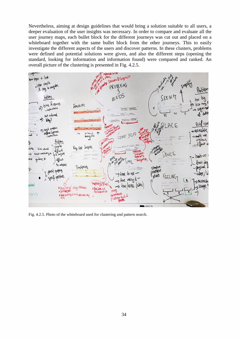
Nevertheless, aiming at design guidelines that would bring a solution suitable to all users, a
deeper evaluation of the user insights was necessary. In order to compare and evaluate all the
user journey maps, each bullet block for the different journeys was cut out and placed on a
whiteboard together with the same bullet block from the other journeys. This to easily
investigate the different aspects of the users and discover patterns. In these clusters, problems
were defined and potential solutions were given, and also the different steps (opening the
standard, looking for information and information found) were compared and ranked. An
overall picture of the clustering is presented in Fig. 4.2.5.
Fig. 4.2.5. Photo of the whiteboard used for clustering and pattern search.
35
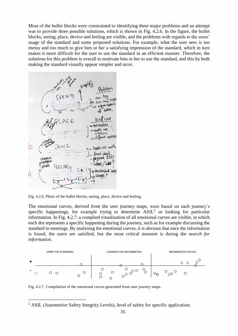
Most of the bullet blocks were constrained to identifying three major problems and an attempt
was to provide three possible solutions, which is shown in Fig. 4.2.6. In the figure, the bullet
blocks; seeing, place, device and feeling are visible, and the problems with regards to the users’
usage of the standard and some proposed solutions. For example, what the user sees is too
messy and too much to give him or her a satisfying impression of the standard, which in turn
makes it more difficult for the user to use the standard in an efficient manner. Therefore, the
solutions for this problem is overall to motivate him or her to use the standard, and this by both
making the standard visually appear simpler and nicer.
Fig. 4.2.6. Photo of the bullet blocks; seeing, place, device and feeling.
The emotional curves, derived from the user journey maps, were based on each journey’s
specific happenings, for example trying to determine ASIL2 or looking for particular
information. In Fig. 4.2.7. a complied visualisation of all emotional curves are visible, in which
each dot represents a specific happening during the journey, such as for example discussing the
standard in meetings. By analysing the emotional curves, it is obvious that once the information
is found, the users are satisfied, but the most critical moment is during the search for
information.
Fig. 4.2.7. Compilation of the emotional curves generated from user journey maps.
2 ASIL (Automotive Safety Integrity Levels), level of safety for specific application.

36
Deriving design guidelines
By compiling the results derived from the user journey maps and emotional curves, a list of
design guidelines emerged. The design guidelines are presented in Table 4.2.3. and the
guidelines were used later in the development of the three proposed concepts.
Table 4.2.3. First version of design guidelines used in the development of concept.
Bullet blocks Problems Design guidelines
THINKING
Complex
Difficult to integrate
Difficult to understand
Simple
Clear
Accessibility
Increased understanding
Guidance
Time reduced
SEEING
Too big
Too many pages
Organisation of data
Motivate to use – visual appearance
Simple
HEARING General questions
Specific questions
FEELING Inconsistent interpretations
Usage
Structure
Presentations
Visuals
DOING
Lot of questions
Structure
Approach
Easier start (fewer alternatives?)
Whole life chain (one pic?)
Get to the point quicker
DEVICE
“Hands on” work
Front desk
Physical ISO
Where/ what
Integrate
User friendly
Accessibility
TIME
Time to use it
Time using it
Time/ access (when)
Easy to use
Not time consuming
RELATIONSHIP
Structure/ layout
Interpretations/ opinions
Communication
Chat
Overview of the standard
Easier navigation
PLACE
Accessible
Multi use interface
Different context
Portable/ app
Easy accessible
QUOTE
Communication
Unclear
Too much
Chat
Better structure
Visually lighter
TOUCH-POINTS
A lot of places
Not having an overview of the standard
Many different kinds of environments and different kind of people
Possibility to “quick look-ups”
Portable
Usable by several people at the same time and individually
PROBLEMS AND NEEDS
Find info fast
Communication
Interpretation
Easy navigation
User friendly navigation tool
GOOD STUFF Introduction
Questions
KEY OPPORTUNITIES/ INSIGHTS
Structure
Communication
Consistent interpretations
JOURNEY
Time & resources implementation
Not informed, why?
Questions and different approaches
Inconsistent
Simple introduction
Easy to navigate

37
Transforming the standard
In parallel to the user data analysis, the pdf document of the standard was reviewed as a
message; received, analysed and changed –the transformation phase. The current version of
ISO 26262, the received message, contains 650 pages of text, divided in chapter and clauses.
These sections of massive text, were then meant to be transformed, into something more user
friendly, easy accessible and also presented in such way that the reader gets some help in the
work process. A word cloud generated from the frequency of words in the design guidelines is
presented in Fig. 4.2.8.
Fig. 4.2.8. Word cloud generated from the design guidelines.
By compiling and comparing the design guidelines, two kinds of need groups were discovered.
First there were those who know what they are looking for, and want to find it as quick as
possible. The other need group were those not really knowing what they are looking for and
were therefore in need of some sort of guidance and directions, or communicate somehow with
the standard. Three concepts were created, with a foundation in the user need groups, each
presented in both a website version and application version, which were later tried out in a
workshop at Scania. Due to time constrains, no further investigation of most appropriate tool
or environment was possible. But since the design guidelines overall indicated that there was a
need for interaction and walkthrough the standard, either a web based or application based tool
was assumed to be an appropriate choice. The concepts had three different levels of quick
finding and guidance within the standard, which in practice were presented by the number of
initial choices in the webpage or application. Furthermore, the concepts were not made in order
to represent the final product in layout, fonts and colours, i.e. the structure of the concepts were
the main focus.

38
Concepts
With basis in the need groups, three concepts were developed. Each with different levels of
how quick the information could be found and how much guidance and communication the
concept provided to the users. The concepts were presented as both a webpage and application,
in order to investigate what the users would prefer. The users were showed the concept in a
film, during which they filled in a form that had been given to them in advance. The different
levels of rapidity of finding information and guidance were mainly done by the construction of
the webpages and applications, with focus in number of clickable options.
In Fig. 4.2.9. a draft from the concept believed to be quickest, concept one, is presented, with
multiple choices and thereafter possibilities to make fast selections depending on what the user
was looking for.
Fig. 4.2.9. Print screen of some parts of concept one.

39
Concept one has eight main clickable options available in the top menu; home, ASIL known,
ASIL determination, chapters, work products, prerequisites, definitions and me. Overall for all
the three concepts, the menu content was almost the same, i.e. in the selection prerequisites,
which is present in all concepts, the user could find the same information. A deeper explanation
of the three concepts is presented in APPENDIX D.
Concept two was assumed to be intermediately fast -and structured, this by having fewer menu
choices but still enough for fast direction within the standard. The four main menu selection in
this standard are; home, ISO 26262, ASIL and me, with similar content as in concept one.
A draft from concept two is presented in Fig. 4.2.10.
Fig. 4.2.10. Print screen of some parts of concept two.

40
Concept three had a slightly different approach, being the one believed to be most structured
and easy. This partly because the concept’s alikeness with the pdf document currently used.
The starting of concept three was a replica of the process flow map presented in the pdf
document, with most frequently used sections presented under each chapter, a print screen of
this is presented in Fig. 4.2.11.
Fig. 4.2.11. Print screen of some parts of concept three.

41
F O U R . T H R E E . REFLECTION
After three concepts were visualised, a workshop with the users was organised in order to
evaluate the alternatives where users would give feedback and input. The workshop was carried
out during the thesis work’s midterm presentation at Scania, in which a movie of all three
concepts was showed. In the movie, all functions of the concepts were presented, and while
looking, the users had been given a form to fill in including questions for each concepts, such
as for example “would this concept suit your needs, why, why not?”. This form is presented in
APPENDIX E. During the movie, several questions were asked by the participants, and in order
to fully allow the users to regard the different concepts, the movie was showed once more. After
the movie was presented, an overall discussion regarding all concepts were held, from which
notes were taken. Even though the construction of the concepts were the main focus of the
workshop, small changes in between them were created as trigger material during the workshop.
The concepts had different colour combinations and shapes, in order to see how it would affect
the users, and also the chapters were presented without name in two of the application versions,
to evaluate if the user would react on it. The save-function-button had different visual
appearing, in order to see if the users understood the meaning of it. Also some graphical
symbols were used to understand if the users would want something like it or preferred text.
The forms that were handed out during the work shop, were afterwards gathered and analysed.
In the end of the form, a selection between the concepts were possible for the users, i.e. which
concept would suit their needs the best, and the result is presented in Fig. 4.3.1. And the
complete result from the survey is presented in APPENDIX F.
Fig. 4.3.1. Result from work shop, answering what concept would suit the need of user the best.
CONCEPT 2 WEB35%
CONCEPT 2 APP0%
CONCEPT 1 WEB45%
CONCEPT 1 APP5%
CONCEPT 3 WEB10%
CONCEPT 3 APP5%

42
As visible in the pie chart in Fig. 4.3.1., concept one and concept two with web as preferred
platform were most favoured by the participants. There were, however, quite a lot of comments
regarding the front page in concept three, which appeared to be very appreciated. In order to
analyse the results from the workshop, and compiling what would work for the users in concept
one and web, the mind maps in Fig. 4.3.2. were created.
Fig. 4.3.2. Mind maps created from the result of the work shop, regarding the most popular concepts one web and
two web.
Some of the desired functions were recurring in both concepts one and two; search, structure,
overview and bookmarks. This means that those functions would have to be enhanced in the
final concept. The final concept would be a merge of concept one and two, with some additional
features from concept three.
The main focus in the development of the final concept, the message itself, was the structure
and simplicity. In addition to the gained design guidelines from the survey, the observations
during meetings and such showed that the user needed some kind of path to follow within the
standard, both in order to introduce the novice users but also to guide the more experienced. In
addition, a clear path for the eyes was needed within the standard, in order to avoid the “wall
of text” as the employees described the pdf document including ISO 26262. The overall and
unofficial “talk” about the standard mostly were about how complex the standard was and
looked, and was mainly described with a sigh. Therefore, it was also important to introduce the
standard in a way that was not experienced as big or heavy, even though the content might not
have to change as much.

43
Furthermore, during the discussion after the workshop, several of the users pointed out that they
did not like the idea of not having the names of for example the chapters visible, and there was
also a need for additional cross connections in between the pages in the website. There were
mixed feelings regarding the chat/ forum application, where half of the users loved it and the
other half did not see the point of it at all. It has therefore been decided that instead of
developing a new communication tool, the final concept and product will include a link to
Scania’s current internal communication platform, in which a new topic of ISO 26262 will be
created. Also, a need for a simple explanation and introduction towards the standard was
discovered, which would be included in the final concept, as well as a designation between
what is informative and normative information.

44
F O U R . F O U R . IMPLEMENTATION
A draft from the first iteration of the final concept development is presented in
Fig. 4.4.1. The final concept was based upon seven main tabs; HOME, INTRO, ASIL, ISO
26262, EXPERIENCE, ME and SEARCH. The final concept is a merge of concept one and
two, with some additional features and functions, inspired from the workshop input, such as
additional quick selections of informative and normative data. A deeper explanation of the draft
is presented in APPENDIX G.
Fig. 4.4.1. First iteration of final concept.
45
The visualisation of the final concept, meaning the presentation of the message focused on the
layout of the website and its webpages. This included colours, fonts, white spaces, images and
illustrations. The final visualisation focused on presenting the content as easily and light as
possible, in order to prevent the experienced “wall of text” the user felt and thought about the
pdf document.
The tabs and selectable options were to have another font compared to the informative text, in
order to distinguish those. The informative text was also given a roman type font, with dark text
on a lighter background, since this is a more natural environment for the reader, and also this is
the easier way to read for the eye (http://www.srf.nu/globalassets/tillganglig-text/text-som-fler-
kan-lasa.pdf). Furthermore, the content in the pdf document will not be changed in turns of
choice of words, but in size, space and also the text was “cleaned up”, as for example to always
start sentences with a capital. This will help the reader to more easily follow through the text
and also it gives a nicer look.
To get the readers’ attention, the website is constructed upon contrasting colours, not as much
as possible, but for example blue and white. This to always keep the interest of the reader and
also enhance the more important parts. The resulting website is presented in the next chapter;
FIVE. FINAL DESIGN.

46

47
F I V E . FINAL DESIGN
The delivered message, which in this project is the website, has a light approach with enhanced
white spacing and focus on the internal message; the content of ISO 26262. The website is built
upon links between the different chapters, sub chapters and clauses in order to simplify the
work and enhance guidance within the standard for the employees and users.
The final result, the website, was developed using the software Adobe Muse, which allows the
web designer to construct the site without any advanced programming skills and thereafter
exported as a HTML-file. The HTML-file will later be further developed by employees at
Scania with deeper knowledge of HTML, and when finished, uploaded at Scania’s own servers,
in order to not be public available. The site was built upon a fixed width, and not responsive, in
order to simplify scrolling items and to make sure the text always was readable. The minimum
screen size the user should have in order to use the site as efficient as possible is 24 inch, but
no maximum size was set. Once uploaded, the website works in both Windows and Mac,
browser does not matter. As described in previous chapter, the final website had six selectable
tabs in the top row, see Fig. 5.1. Overall the website contains a lot of cross links between
chapters and pages, as requested from the users, which simplifies the use and navigation within
the site.
Fig.5.1. Print screen of homepage at the final website.
The illustration in the background of the website is an abstract representation of the overall
structural flow image, presented in the pdf document. This since the structural flow presented
in the visuals shows the overall construction of ISO 26262, and was also very popular during
the workshop discussion.

48
The first tab, INTRODUCTION, contains three subpages, either the user can click on the text
introduction, or choose to get some information regarding ISO overall, or inputs about how he
or she should use the standard. The first question “what is ISO 26262?” includes some
information about the standard in general, and also why the employees should (must) use and
implement the standard. The next question “how to use ISO 26262” helps the employees in
their work with the standard, by shortly letting the reader know how the standard is constructed
and how to implement it in the users’ work. This by explaining the work flow of the standard
and letting the users know how the different chapters are related to each other. These two
sections are not considered further in this thesis, instead the focus is solely on ISO 26262. The
whole introduction page was implemented based on the user insights and collected user data,
this since an introduction to the website was one of the expressed desires. The subpages become
visible once the user hoovers the tab introduction, and there is also a slight colour difference,
which applies for all the menu options, (from R:220, G:220, B:220 to R:255, G:255, B:255)
when the selections are hovered or active. The two selectable pages within the tab
INTRODUCTION are presented in Fig. 5.2.
Fig. 5.2. Print screen of the two selectable sub pages within the tab introduction.

49
A print screen of the introduction page is visible in Fig. 5.3., where contact information to the
expert group of ISO 26262 is presented. The web filler image in the background is fixed, i.e.
when scrolling the page only the content of the page is moving, which apply for all pages of
the website. On the left of the page, a table of content is visible, and depending on what page
the user has active, the content adapts. Also the table of content has a slight colour change,
depending on the active page, with the same colour scheme as the main menu. The actual group
of expertise has been anonymised and are therefore in Fig. 5.3. represented by illustrations.
Fig. 5.3. Print screen of the introduction page.
The top menu and the table of contents have fixed placements, i.e. if the user scrolls the page,
these two elements do not move. All elements of the site have same proportions, regardless of
what page the user is active. This in order to maintain a structured layout and keep the path for
the eyes of the user.
The next tab; ASIL, is presenting the different safety levels that the standard is built upon. Since
the survey relieved that the employees did not always know what ASIL to use when
implementing the standard, the users are able to choose between all specific requirements and
recommendations for a chosen ASIL, or gather information which will help them to determine
what safety level to use. Since most of the requirements and recommendation in the standard
apply for all safety levels, these will be presented along with the ASIL specific ones, in order
to simplify and fastening the information search for the users. The determination of ASIL, is
including both downloadable documents, matrices and contact information to more knowledge
users.

50
The known page for the ASIL part has six further selectable pages, one for each ASIL
(including QM) and one named overall. The overall page contains all the requirement that
should apply, regardless of what ASIL the user implements. If the user for example is working
with ASIL A, all the requirements presented in the page overall and in ASIL A should be
considered. These selections are presented in Fig. 5.4.
Fig. 5.4. Print screen of the page called ASIL A, within the ASIL - known selection.

51
The tab named ISO 26262, includes both the standard as it is presented in the pdf document
(with some adjustments, such as spacing, fonts and the structure of sentences) and is also
highlighting some of the more frequent used sub parts of the standard. The selectable sub parts
in the website are, except the chapters, prerequisites, objectives, work products and the
informative and normative sections, which is visible in Fig. 5.5. The chapters become visible
when hovering the chapter option.
Fig. 5.5. Print screen of selectable options within the tab ISO 26262.
The highlighted sub parts, were selected with basis in the data gathered from the survey and
workshop. In the user interactions, it was discovered that the employees most frequently were
looking for information regarding the prerequisites, objectives, work products and also what
the difference was between informative and normative parts. These separate and highlighted
parts are presenting their specific content, ordered as the chapter to keep the structure. Also the
parts are visualised in the same order as they are meant to be implemented, i.e. the prerequisites
are supposed to be analysed first, and is to be followed by the objectives and work product.
Often, the work products in previously chapter are the same as the prerequisites in the following
one, which is another reason for those parts to be ordered in the same structure as the original
standard.

52
When the user activates the ISO 26262 tab, the picture representing the overall flow-structure
of the standard presents. This layout is presented in the pdf document of the standard, and also
appreciated by the users as a way in towards the different chapters. The chapter presented in
the picture has links to each specific chapters, which allows the user to go straight to them, or
one of the sub chapter presented. The same picture is represented in each chapter of ISO 26262,
as presented in Fig. 5.6 (print screen of chapter 3).
Fig. 5.6. Print screen of the chapter selection in the website.

53
When the user clicks on one of the chapters, either from the overall pic or from the main menu,
the chapter is presented as visible in the example of chapter 3 in Fig. 5.7. When the user clicks
on one of the selections in the table of contents to the left in the page, the actual
chapter 3 (with white background) automatically scrolls down or up to that part of the chapter.
Fig. 5.7. Print screen of chapter 3 within the website.

54
An example of how the page looks when selecting a sub part is presented in Fig. 5.8, where the
fix menu and table of contents is visible. The table of content is fixed in order to further simplify
navigation within the website –and page for the user. Also how all text referring to another part
of the standard is linked in the site is visible in Fig. 5.8., these kind of links are, however,
presented in a more intuitive and recognisable manner. This to ensure the users can use them
without any further consideration. All the links in the website are constructed such, that the new
page are opened in the same window. This since, to give the user the option of choice they want
to just redirect within the page or right-click and then select to open the page in a new window.
When clicking on a section in the table of contents, the active choice lights up in order to further
let the user know where he or she is, and by that have an easier navigation.
Fig. 5.8. Print screen of section 2 and 3, within chapter 3.

55
In Fig. 5.9. the middle of the page objectives is presented, whereas also the objectives in the
table of content is lighten up. Also, parts of the text are numbered, each representing a
modification which has been done, in order to lighten the document up. Underneath the Figure,
a list of what number representing which modification is presented. These modifications, or
changes, are applied for all text in the website.
Fig. 5.9. Print screen of page objectives, with numbered text layout changes.
1. All headings have been emphasised, both by size and with a bold type. This to easier
structure the content of the standard.
2. All sub chapters have also been given a bold font, with the same purpose.
3. In the document, there are a lot of dotted lists, both by number, letters and dots. These have
all been place further in, compared to the rest of text. This to further distinguish those and
separate the text.
4. The with of the text has been decreased, this since the document contains a lot of single
sentence clauses, which makes the appearance of the standard seems cluttered. The text has,
however, been given an increased space between both clauses, sections and rows.
5. The font is consistent, all pages through.
6. All sentences have been given a capital in the beginning and dot in the end.

56
Overall, the major change of the text in the website, compared to the pdf document is
consistency. All chapters have the same heading, all dotted list are presented in the same manner
and so on. This to clean up the text and ease the impression for the user. In Fig. 5.10 a
comparison between the pdf document and website is presented, by the means of print screens.
Furthermore, it was decided to differentiate the clauses and notes by placement of sub heading,
i.e. the numbered sub-heading is placed above the text and the notes notification is placed
aligned with the text in the website. The two print screens are taken at the same chapter and
section, in order to be able to compare them.
Fig. 5.10. Comparison of the pdf document, to the left, and the website, to the right.
In the selection experience, in the main menu, the users can choose between either adding their
own finished projects or search for other’s. By doing so, the employees help each other with
the implementation, and approach of the standard, as well as definitions.
In the tab ME, the user can save bookmarks, takes notes or be directed to the Scania intranet
where a forum is to be set up. In the forum the users can discuss the standard, even though they
are working alone for example. However, in order to create these two sections, it required a
higher level of HTML programming skill, than what was available during the project, since
these applications are not able to be done by the mean of Adobe Muse. They are therefore left
to be finished by Scania. Also not all chapters and ASIL are implemented in the website in the
time of the end of this master thesis.

57
F I V E . O N E . DISCUSSION
In this project, a service design approach and several methods or tools have been merged in
order to explore and transform the standard into something more communicative and user
friendly. No direct applicable literature was found, and instead the main focus was on
information design with a service design approach. In order to improve ISO 26262, and
standards in general, further research in the specific areas is necessary.
In the commission description provided by Scania, the major problems regarding the concerned
standard were time and interpretations. This means; the time and resources necessary to
implement the standard, and that different employees and development groups at Scania
interpreted the standard differently. There was, however, another finding during the user
interactions which were handled as a third problem; namely the employees’ impression and
feeling regarding the standard. Many of the asked users described the standard as a “wall of
text” or with a sigh, which was another reason for work delays and hampered implementations
at Scania. Therefore, in general, the user experience of the standard was determined as time
consuming and difficult. With these insights, the final design intends to improve the user
experience in several ways. For instance, small gestures such as enhanced space in between
chapters, clauses, sentences and even words in the text, plus a division of the chapters which
allows the users to find information faster are introduced.
The theoretical investigation done in this project was of significant use during the user
interactions and final implementation. However, no literature directly applicable literature was
found regarding how to visualise, or present, an ISO –standard. This is believed to have a basis
in the importance of delivering those exact requirements and recommendations presented in the
standard. There were, however, studies reviewed which contributed with useful insights for the
stages of creation and reflection, such as the articles of Flyvebom, Madsen and Rasche and
Ball, from which conclusions could be drawn regarding the importance of including the whole
picture and base decisions in gathered data. Furthermore, the six overall principles, and
questions, presented by Pettersson (a2015) were kept in mind during the whole project, even if
not answered directly. The combination of these principles and the service design approach,
allowed a main focus on the users, but with a result which both is a product and service. The
literature study regarding the implementation, and especially Information Design 1 Message
Design (Pettersson, a2015) regarding text placement and layout can be confirmed within the
user insights gathered in this project as well. Users pointed out at the difficulties in
comprehending information clearly when little hierarchy and organization is explicitly visible
to the user. As such, it was useful to base decisions on the suggestions of the literature and user
learning simultaneously.
On the other hand, in order to apply message design, one major factor is the noise signal, i.e.
what previous experiences and prerequisites for interpreting the users have. This may, and is
often not, the same for all users, which in practice would mean that all users need different
solutions, which of course in most situations is impossible. However, the more time spent on
this part of a project, the better the result will fit the users which is also suggested by literature
reviewed.

58
Since the user interaction participants in this work are the same people as the actual users and
receiver of the information and final result, the users during the survey and workshop were
dedicated and committed. This is assumed to be of favourable nature for the project, and the
data driven insights from the user interactions have therefore played a major part during the
whole project. However, the thesis work had an iterative form in which the standard was
explored at the same time as the survey was analysed, and in order to fully take advantages of
the user interactions, the standard should have been analysed ahead. The same applies for the
used software Adobe Muse, which was explored during the implementation of the website.
Nevertheless, the project resulted in having a combined methodology but with main focus on
service design. Service design is not either directly applicable on how to transform such big
data into something more visual, but maintained the focus on the users and towards delivering
a design that would enhance user experience of the standard. During the thesis project, the
service design approach was used through the stages of exploration, creation, reflection and
implementation. This approach originally aims for designing services, though, as it showed to
be an effective process in this project as well. By adapting those stages to this particular case,
useful user insights could be derived, and especially during the exploration and creation stages.
This since it allowed the project to have a consistent focus on the user, and also the usage, of
the standard.
With basis in the literature study, especially regarding how information is interpreted, it can be
assumed that the result presented in this thesis provides a more consistent interpretation of the
standard. This since the text arrangements itself has been improved by spacing, fonts and a
stronger hierarchy, which helps the reader to distinguish information. Petterson (c2015) also
discusses how a consistent layout improve consistent interpretations, which is the case in this
thesis work. In addition, the overall construction of the standard has been presented in such way
that the users more easily can guide themselves within the standard, which was one of the
findings during the user interactions.
The user insights and design guidelines in this project are, however, believed to be true, and
also the most critical phase of the project was the transformation. Due to extensive and deep
technical details in the case, ISO 26262, and also the importance of transmitting those exact
requirements and recommendations, a transformation towards a fully visual result seemed
impossible. Instead the focus lied on how the text in the document was supposed to be delivered,
the structure of it and what impression the overall standard should give, hence improve the user
experience of the standard.
Overall, the gathered data from the user interactions has lied as foundation for all parts of the
project, and can therefore be referred to as a co-design. This is visible in for example the derived
design guidelines, which were the focus during the development of the concepts. Also the final
design has a basis in the user interactions, hence all parts from the implementation was derived
from the workshop and its discussion with the participants. This is assumed to be advantageous
when discussing the overall project and final outcome, however, by extending the user
interactions, and also preforming a deeper literature study, the result would probably fulfil the
needs of user further.

59
The final outcome of the project is assumed to improve the economical, social and
environmental aspects of ISO 26262 work at Scania. This since, by using the website, there is
no need for the users to print the (650 pages) pdf document, which in some cases is the current
situation. This is also an economical benefit, even though a minor one. But, by reducing the
time consumption, the project is believed to be of a major economical improvement overall.
Furthermore, the employees, the users, will have a more welcoming and pleasure experience
when working with ISO 26262.
The resulting website fulfils its purpose, but there is room for improvements. The site was
chosen to not be of responsive type, i.e. it does not adapt the size of screen it is presented on.
This choice was done after a smaller investigation in the matter, in which it was concluded that
if the resulting website was including a lot of scrolling, the function would flow better with a
fixed site. In order to confidently determine it, both options should be tested by users and also
a more extensive analysis should be done regarding what size the website would be adapted for
if that was the best case. However, in this project there was not enough time to accomplish such
studies. In addition, considerations were made regarding the accessibility of the standard
through a mobile app so that users can quickly refer to it, though during evaluation of concepts,
user preferences showed a smaller likeliness of this option.

60
F I V E . T W O . CONCLUSIONS AND RECOMMENDATIONS
Several conclusions have been drawn during this project, such as the service design approach
being a good alternative when working on communicating big data, but there is a need for
further research within the area of communicating ISO –standards. Also message design is a
good starting point when dealing with how design communicates, but does not fully embrace
this particular problem. Below, the research question is presented and answered regarding its
fulfilment. The conclusions are divided into the phases of the project, in order to highlight
critical elements.
How can we communicate extensive information in order to improve clarity and understanding
for the users, as well as their overall impression and experience?
When dealing with communication and complex information, which may affect the
user’s processes and activities during their daily work negatively, it is important to
investigate the underlying problems of how the users receive and interpret, as well as
interact, with the information.
In a project such this, it is very important to include both user and usage in the study
and user interactions. This since both these areas are included in the work of using ISO
26262, and neither can therefore be ignored or be regarded as less important.
When dealing with complex information, presented by text, the found literature does not
specifically address how to transform the information into visuals, and therefore more
research in terms of methods and tools regarding how to do so are needed. This to
enable the designer to solve the problems found in the user interactions, such as those
addressed in this thesis.
The development of personas and user journey maps through iterations is a good way
of finding problematic areas and critical moments in a case like this.
An extensive investigation regarding platform and/ or tool is needed in order to fully
reach a satisfactory result.
In order to come up with, and implement, a higher satisfaction regarding the result,
another iteration of the implementation should have been preformed. Such as user test
of the website afterwards it has been implemented. This would provide insights
regarding how intuitive the website is, and also how it is experienced (if it still seems
like a “wall of text” for the users or of the changes actually provides a smoother
impression).
By carefully weight spacing, headings, sizes and fonts in a text section, it is possible to
improve the level of gained knowledge for the readers, however, according to the
literature study, these text sections should be accompanied by images in order to even
further increase the user satisfaction.

61
In the literature study, it was suggested to maintain a focus in message design, in order to
investigate how the standard could be communicated. In the study, it was revealed that by
distinguishing sections in text, the content will appear easier for the receiver. Also, text could
be replaced by visuals, but due to the extensive nature of the standard, and also the details of
it’s requirements and recommendations, it is critical that the users can interpret the information
“correct” and it is therefore difficult to visualise without loosing essential aspects of the
standard.
A fruitful part of this project has been the simultaneous process of interacting with users and
deriving user insights from the survey and workshop with the analysis of the standard.
However, to improve understanding and interpretation of the standard beyond user experience,
more time and resources are needed in order to understand noise, as is called in information
design, and how people interpret information. A deeper analysis of the user should be
performed, in order to investigate their previously experience regarding similar situations. This
would extend to exploring cognitive processes and psychology which are outside the scope of
the thesis. Nevertheless, being a complex form of important information for many
organizations, looking further into the standards and how they are communicated and
interpreted perhaps would lead to enhanced efficiencies within operations of organizations
dependent on executing different standards.
The implementation of the final design followed the guidelines from the research findings, as
much as possible, and the result is sufficiently satisfying within the requirements of Scania’s
employees. But, in order to fully fulfil the needs, deeper research should be performed in the
area of communicating complex data visually. This means; it is probably possible to
communicate complex data and information visually, but the research area needs to be further
developed in order to do so in a smooth way which satisfies all stakeholders.

62

63
REFERENCES
Spira. (2011).
OVERLOAD! HOW MUCH INFORMATION IS HAZARDOUS TO YOUR ORGANISATION.
New Jersey. John Wiley & Sons.
Pettersson. a2015
Information Design 1 Message Design
Tullinge. Institute of Infology.
Brown. (1993)
The New shorter Oxford English dictionary on historical principles
Oxford. Claredon.
Ball. (2012)
Why Society is a Complex Matter: Meeting Twenty-first Century Challenges with a New Kind
of Science
Berlin. Springer.
Flyverbom, Madsen and Rasche. (2017)
Big data as governmentality in international development: Digital traces, algorithms, and
altered visibilities; The Information Society An International Journal
vol. 33. NO. 1. p. 35–42.
Pettersson. (b2015)
Basic ID-concept
Tullinge. Institute of Infology.
Mullet and Sano. (1995)
DESIGNING VISUAL INTERFACES, COMMUNICATION ORIENTED TECHNIQUES
New Jersey. Prentice Hall.
Mijkseenar. (1997)
Visual Function, An Introduction to Information Design
Rottingdam. 101 Publishers.
Vande Moere and Patel. (2009)
The Physical Visualization of Information: Designing Data Sculptures in an Educational
Context, Visual Information Communication
Boston. Springer.
H. Wainer
Graphical Visions from William Playfair and John Tukey; Statistical Science
vol. 5.NO. 3 p. 340-346.
Sack. et al. (2010)
Aesthetics of Information Visualization
Santa Cruz. University of California.
64
Ware (2013)
Information Visualization, PERCEPTION FOR DESIGN. third. ed.
Waltham. Elsevier.
Vitrivius Pollo; translated: Gwilt (1874)
De Architecture
London. Lockwood & Co.
Lankow (2013)
INFOGRAPHICS, THE POWER OF VISUAL STORYTELLING
New Jersey. John Wiley & Sons.
Pettersson (c2015)
Information Design 3 Image Design
Tullinge. Institute of Infology.
Klanten, Bourquin, Tissot and Ehmann. (2008)
DATA FLOW, VISUALISING INFORMATION IN GRAPHIC DESIGN
Berlin. Gestalten.
Malamed (2015)
VISUAL DESIGN SOLUTIONS, Principles and Creative Inspiration for Learning
Professionals
New Jersey. John Wiley & Sons.
Norman (2013)
The Design of Everyday Things
New York. Basic Books.
Plass, Heidig, Hayward, Homerand and Um. (2014)
Emotional Design in Multimedia Learning: Effects of Shape and Color on Affect and
Learning; Learning and Instructions
New York. Elsevier.
Stickdorn and Schneider (2011)
THIS IS SERVICE DESIGN THINKING
Amsterdam. BIS Publishers.
Adaptive Path
(http://adaptivepath.com/)
reviewed: 2017-03-15
Information från synskadade riksförbund, text som fler kan läsa – tips om typografi och
layout
(http://www.srf.nu/globalassets/tillganglig-text/text-som-fler-kan-lasa.pdf)
reviewed: 2017-04-12

65
APPENDIX A SURVEY QUESTIONS
SURVEY (approx. 5-10 min, both sides of the papers!)
This survey is formulated by Sofia Johansson, master student at KTH (Royal Institute of Technology) in
Stockholm, who is doing her master thesis at Scania with the aim of visualising ISO 26262. None of the questions
are compulsory, which means that you only answer the ones you want. In the end of the survey, you are able to
choose if you want your answers to be confidential, however, the statistical result of this survey will be used in the
thesis report and presentation, and therefore be publicly published.
1. What is your title at Scania?
2. How many years of experience do you have within Scania?
3. How many years of experience do you have in your work field in total?
4. How familiar are you with ISO-26262?
very, works with it daily
somewhat, works with it time to time
heard about it
never heard of
other comment(s):
If you haven’t heard about ISO 26262, you are allowed to leave and grab a coffee.
If you haven’t worked with ISO 26262, you can skip question 10-14.
5. What was your first impression of ISO 26262 when you looked at it (or heard about it)? (describe it with three words)
6. If you have worked with/ looked at ISO 26262; did you find it easy to interpret the standard in the beginning?
yes very (still is)
no, but I understand it now
not at all
other comment(s):
7. In what contexts are you working (or will start working) with the standard:
(multiple choices are possible)
alone – individual projects
in meetings
alone, but in projects involving more people
I will not start working with ISO 26262
other comment(s):

66
8. Are there any questions raised regarding how to interpret ISO 26262? (multiple choices are possible)
yes, when I’m working alone with it
yes, when we discuss it during meetings
I think other people have a hard time understanding it
no, never
I don’t know
other comment(s):
9. If it are raised questions, or discussions, regarding the interpretation of ISO 26262, what were
they about?
10. When working with ISO 26262, what are you looking for within the standard? (multiple choices are possible)
I’m looking for information, which will help me determine ASIL
I know what ASIL I’m having and are looking for the specific info regarding that ASIL (all chapters)
I know what ASIL I’m having and what chapter(s) to read through
I usually know exactly what clauses to look for
I know what chapter(s) or clauses to look for but the ASIL is not determined yet
I’m looking for what work products I’m supposed to deliver
I’m looking for what prerequisites I’m supposed to have before continuing
I usually read through the whole standard, looking for my information
other comment(s):

67
11. When working with ISO-26262, how do you “enter” (or approach) the standard? (multiple choices are possible)
I usually start out with choosing the relevant chapter(s) (ASIL is predetermined).
I usually start out with finding relevant clause(s) (ASIL and chapter(s) are predetermined)
I usually start out with determining what ASIL to use
I usually start out with choosing the relevant chapter(s) (ASIL will be determined later).
I usually start out with finding relevant clause(s) (ASIL and chapter(s) will be determined later)
I usually start out with looking what prerequisites I should have (ASIL is predetermined, but not relevant chapters)
I usually start out with looking what prerequisites I should have (ASIL and relevant chapter(s) are predetermined)
I usually start out with looking what prerequisites I should have (ASIL and relevant chapter(s) are predetermined)
I usually start out with looking what work products are expected (ASIL and relevant chapter(s) are predetermined)
I usually start out with analysing the objectives (ASIL is predetermined, but not relevant chapters)
I usually start out with analysing the objectives (ASIL and relevant chapter(s) are predetermined) I usually start out with looking what work products are expected (ASIL and relevant chapter(s) are to be determined)
I usually start out with analysing the objectives (ASIL and relevant chapter(s) are to be determined)
I usually start out with analysing the objectives (ASIL and relevant chapter(s) are to be determined)
other comment(s):
12. When working with the standard, what chapters are of most interest for you? (multiple choices
are possible)
1
2
3
4
5
6
7
8
9
10
11
12
other comment(s):

68
13. When working with the standard, what are you experiencing working well?
14. When working with the standard, what are you experiencing working badly?
15. Are you comfortable with your answers being used as for example quotes in the final thesis
report and presentation (publicly published)?
yes, you can even use my name name:
yes, but I want to be anonymous
no
16. Would you like to continue to participate in this thesis project? (interviews and user tests)
yes, name: email:
no

69
APPENDIX B SURVEY RESULT
0 5 10 15 20 25 30 35 40
System Architect
Technical Manager
Safety Architect
System Architect
Technical Manager System Architecture
System Architect
Safety Architect
System Architect
System Architect
Technical Manager
System Architect
System Architect
STC Release Coordinator
System Architect
Development engineer
Senior Test Engineer
Object Manager
Test Engineer
YEARS OF EXPERIENCE
years within field of expertice years within Scania

70
”Just att man jobbar med den "ibland" gör att det inte kontinuitet i arbetet och man glömmer bort vissa saker.
Jag vill kunna förenkla se nedbrytningen av kraven som kommer från "safety goal" till lägsta "element"”
“Det talas mycket om ISO 26262, men det är rätt oklart exakt vad standarden kommer att innebära för Scanias
utveckling. ISO 26262 används ofta som ett "slagträ" för projekt som rör spårbarhet, test och verktygskedja, det
vill säga, projekten syftar till att göra många olika saker, men klämmer man in "ISO 26262" i abstracten så är det
lättare att driva igenom dem.”
“Will work with it during 2017 ->”
“I am in a focus group for interpreting the standard to Scania way of software verification. I could work with it
every day but have other task to do as well."
WHAT WAS YOUR FIRST IMPRESSION OF ISO 26262 WHEN YOU LOOKED AT IT (OR HEARD ABOUT IT)? DESCRIBE IT WITH THREE WORDS.
HOW FAMILIAR ARE YOU WITH ISO 26262?
very, works with it daily somehwat, works with it time to time
heard about it never heard of

71
”Vissa delar är lätta att begripa och vissa inte alls.”
“not look at it”
“N/A the standard was in worse condition then.”
“I haven't worked with it just "bläddrat" igenom.”
“NA”
“We were sitting two hours a week for several months with 4-5 different Scania.”
“We focus on the software verification bit and that part we think we understand; other parts”
“Not so much.”
“Well, not read it fully. Just had an overview course.”
“Depending on subject/part. Parts outside my working area are not easy to understand.”
“Understanding the standard might be an overstate, meant as I feel I have good understanding
of parts of the standard but not all”
DID YOU FIND IT EASY TO INTERPRET THE STANDARD IN THE BEGINNING?
yes very (still is) no, but I understand it now not at all

72
“and in projects”
”Se kommentar under 4. Notera! Jag har aldrig läst standarden, utan har fått lära mig begrepp som krävs för
mina projekt (av RESA safety)”
“Will be during this in 2017.”
“Marcus said we should not use it, just be prepared for the future. Since there are more critical activities we have
not used it in any project. Just brief discussions.”
“Are there individual projects?”
IN WHAT CONTEXT ARE YOU WORKING (OR WILL START WORK) WITH THE STANDARD? MULTIPLE CHOICES ARE POSSIBLE
alone - induvidual projects
in meetings
alone, but in projects involving morepeople
I will not start working with ISO26262
ARE THERE ANY QUESTIONS RAISEDREGARDING HOW TO INTERPRET ISO 26262?
MULTIPLE CHOICES ARE POSSIBLE
yes, when I'm workingalone with it
yes, when we discuss itduring meetings
I think other peoplehave a hard timeunderstanding it
no never
I don't know

73
“Personally, I think the international team that created the standard disagreed in many areas.
To find a compromise that they could all accept, the standard was consciously written so vague
that different interpretations are possible. There will always be a lot of questions if you try to
follow the standard completely.”
“Every one will have a hard time with it until Scania decides how to work with it. And add on
the new resources. We need to add 50-100% manpower in many areas.”
“The intention of a standard is not to define an exact work formula, therefor it need to be
interpreted, hence questions are raised and discussed.”
IF IT IS RAISED QUESTIONS, OR DISCUSSIONS, REGARDING THE INTERPRETATION OF ISO 26262, WHAT WHERE THEY ABOUT?
“Definition of an item.”
“What the concepts corresponds to at Scania. How we would realise a certain recommended practice efficiently.”
2How to apply it mostly. How to interpret it's affect on a problem/ task/ project/ issue.”
”Mest gällande HW delen, hur ska vi tolka det som leverantörer förstår är "HW ready". Internt sker förändringar
i tolkningen som inte alltid kommuniceras.”
”Hur ska vi tänka för att se till helhet/ totallösning? Iteration under produktutveckling är nödvändig för att få bra
totallösning. Tänk om - Tänk rätt.”
”Omfattning av hur vi ska tillämpa på Scania”.
”Otydligheter i texten. Många länkar, svårhittad information. Måste man "göra såhär". Vad är FIT i förhållande
till våra krav på tillgänglighet?”

74
“How to analyse safety-systems/ redundancy.”
”Exakt vad innebär ISO 26262 för vårt projekt/ verksamhet. Exakt hur skiljer sig mjukvarakodning/ test sig åt om
man följer ISO 26262 gentemot "vanlig" Scaniautveckling?”
“Many things.”
“What is required to fulfil it.”
”Främst definitioner.”
“Tool chain.”
“Pretty much everything but especially: The item definition - for some aspects it is most practical to define the
item as a vehicle function while for other aspects it is more practical to define the item as a vehicle system. It is
practically almost impossible to apply the standard if the item is always seen as a vehicle function. To decide
under what circumstances the item definition should be based on functional architecture and under which it should
be based on the physical architecture was the object of many intense discussions. The detail of safety goals. Some
argue that a safety goal can be somewhat vague and general since it is not a requirement while others mean that
the safety goal should be as precise as a requirement only not allocated to a system. Incorporation of cables and
electronics components. If an electric actuator, such as a brake valve, must be actuated in a safety-critical situation
then how to handle the cabling ASIL? Is it enough to detect a short-circuit, for example? What if the short-circuit
occurs exactly in the critical situation? How about safety-measures that reduces the exposure? In the standard, it
is stated that safety-measures should not be considered when calculating E,S,D to get the ASIL. However, if you
have ASIL C and introduce a safety measure that reduces the exposure how do you handle that? Do you reduce
the ASIL level? Can you make a decomposition where the safety measure, if it fulfils a certain ASIL, may be a
part? (E.g. ASIL C = ASIL A safety measure + ASIL B ordinary handling)? Or is it completely a waste of time and
money to introduce a safety measure that reduces the exposure to risk situations? And a lot more in many
discussions internally at Scania and externally with other vehicle manufacturers…”
"If there are questions raised? … A lot of questions have been raised. One topic that we struggle with is the
mapping of different requirement/test levels.”
“Well, how to work with the standard in a reasonable and smart way? (It will hurt Scania a lot if this is not
implemented in a very smart way) From when should we work with the standard? How to handle already designed
parts? (we are NOT doing wear models as car. CEPS instead) Shall we use car version or will there be a truck
version? How to make the interface to other group companies? (If MAN is not use the std in the same way we will
have a hard time to use common parts/SW…) Will there be new roles needed at Scania? How could we track
requirements? ähh, hör av dig istället orkar inte skriva fler…. :-)”
“How to use it at Scania. But also sometime what is actually meant in the standard.”
“What is an item? Information of nominative parts of the standard?”

75
”Se kommentar på 7.”
“N/A as I am working with how Scania should interpret the standard.”
“Not working active…yet(?)”
WHEN WORKING WITH ISO 26262, WHAT ARE YOU LOOKING FOR WITHIN THE STANDARD?
MULTIPLE CHOICES ARE POSSIBLE
I'm looking for information,which will help me determineASIL
I know what ASIL I'm havingand are looking for the specificinfor regarding that ASIL (allchapters)
76
WHEN WORKING WITH ISO 26262, HOW DO YOU "ENTER" (OR APPROACH) THE STANDARD? MULTIPLE
CHOICES ARE POSSIBLE
I usually start out with choosing therelevant chapter(s) (ASIL is predetmined)
I usually start out with finding relevantclause(s) (ASIL and chapter(s) arepredetermined)
I usually start out with determining whatASIL to use
I usually start out with choosing therelevant chapter(s) (ASIL will bedetermined later)
I usually start out with finding relevantclause(s) (ASIL and chapter(s) will bedetermined later)
I usually start out with looking whatprerequisites I should have (ASIL ispredetermined, but not relevantchapter(s))
I usually start out with looking whatprerequisites I should have (ASIL andrelevant chapter(s) are predetermined)
I usually start out with looking what workproducts are expected (ASIL and relevantchapter(s) are predetermined)
I usually start out with analysing theobjectives (ASIL is predetermined, but notrelevant chapter(s))
I usually start out with analysing theobjectives (ASIL and relevant chapter(s)are predetermined)
I usually start out with looking what workproducts are expected (ASIL and relevantchapter(s) are to be determined)
I usually start out with analysing theobjectives (ASIL and relevant chapter(s)are to be determined)
”Se kommentar på 7.”
“N/A as I review the results.”
“Not working active…yet(?)”

77
”Har inte koll på de övriga.”
”Se kommentar på 7 – jag har ej läst standardaren.”
“Not working active…yet(?)”
WHEN WORKING WITH THE STANDARD, WHAT ARE YOU EXPERIENCING WORKING WELL?
“You easily find overlooked risks.”
”Komplex, men bra ändå.”
“The key concepts like making a hazard analysis,
making sure that you handle the risks and document how you handle them.”
“Marcus’ and Anna’s support”
1
2
3
45
6
7
8
9
1011 12
WHEN WORKING WITH THE STANDARD, WHAT CHAPTER(S) ARE OF MOST INTEREST FOR YOU? MULTIPLE
CHOICES ARE POSSIBLE

78
WHEN WORKING WITH THE STANDARD, WHAT ARE YOU EXPERIENCING WORKING BADLY?
“Mapping of the standard to Scania’s processes and artefacts is not defined yet. That leads to
many misunderstandings
and confusion.”
“It is time and resource consuming.”
”De som sägs kunna den presenterar sin kunskap som en absolut sanning. Personligen har jag
inte tid att lägga på skaffa mig en egen uppfattning i många fall. Mycket som hänger i luften
och är obesvarat.”
”Otydlig. Svårhittad information. Tolkningsbar, dvs inte tvetydligt info”.
“Conflicting arguments in different paths suppliers’ interpretation is not ours and often quoting
standard wrongly.”
“When people think that they can follow the standard to the letter and focus on that rather than
fulfilling the key ideas and principles of the standard.”
“Not working active…yet(?)”
“Hard to understand how the different parts relate to each other. Hard to understand and
follow the "life" of the different work packages and how they relate to the different work
packages.”

79
APPENDIX C PERSONAS
Personas 1 – Bertil
Bertil has worked at Scania for 7 years, but has work within his field in expertise for almost 17 years. He is very
familiar with ISO 26262, and almost works with it daily, he has some other tasks but are mainly focusing on the
standard. His first impression of ISO 26262 was that the standard was very big, a lot of pages with text. He thought
that the standard was both unnecessary and complicated. He thought that the standard was hard to understand and
interpret in the beginning, but now he has some chapters/ areas which is more relevant for him and those he knows
now.
He usually works with the standard together with other people, sometimes he works with it alone, but still in
projects involving other people, and sometimes they discuss the standard during meetings. There is always
something to discuss regarding the standard, and there are often questions that arises when he works alone with
the standard. But Bertil is not alone, he thinks other people often have a hard time understand the standard. Bertil
also thinks that it is impossible to not have questions and discussions regarding the standard, since it is not defined
exactly. Most of the questions are about how to apply what the standard says into Scania, for example if the
standard says “item” what is that at Scania? But he also thinks that sometimes they have trouble understanding the
standard at all.
Since Bertil has quite good knowledge of the chapters that he is working with, he usually is looking for what work
products he should deliver within those chapters. Also he is looking within those chapters to find out what ASIL
he should have.
So he often starts with selecting relevant chapters, then he looks for what clauses, work products and ASIL he
should use / have/ look into.
The chapters Bertil are most frequently using is 3, 4 and 5. And he thinks that ISO 26262 is good to find those
overlooked risks, but that it is hard to understand how different parts of the standard relate to each other and to
follow the life of a product. He also thinks it is hard to refer to the standard when dealing with suppliers, since
they interpret the standard differently. And finally Bertil thinks it is very time- and resource consuming to find
information and use ISO 26262.
Personas 2 – Ida
Ida has worked in her filed of expertise for 17,3 years, but has only been at Scania for 5,5 years. She uses ISO
26262 sometimes, not every day but need to know (more or less) some parts of it. But it is hard Ida thinks, since
there is a time gap between those times she uses the standard, and therefore she forgets some things. She also
thinks it is a lot of talk about the standard, but feels like nobody really know what exactly the standard will mean
for Scania. Instead that people are using the standard as a “bat” since it is easier to proceed with projects if the
standard is involved.
Ida thinks ISO 26262 is very complex and heavy. The standard is extensive, and also a work in progress, which
makes Ida feel like it is easy to interpret the standard differently. She thinks that some parts of the standard are
easier than others, and also she has spent some time on the standard, on those parts that are important for her. But
she rarely has projects in which she is supposed to work with the standard alone, instead they mostly discuss it
during meetings. And during those meetings, and also when she is sitting alone with the standard (but in projects
involving other people), there are questions raised regarding the standard. She thinks that the team producing the
standard were disagreed on a lot, which made the standard very vague and makes interpretations possible. Most
of the questions is about the definitions within the standard, item for example. She has a hard time understanding
how to apply the standard at Scania, and what the standard exactly means for her projects.
Ida doesn’t relay have a clear structure when looking into the standard, sometimes she uses it to determine ASIL,
other times she knows what ASIL to use but not what work products and prerequisites she should have and deliver.
Other times, she is just looking for any information regarding her ASIL. Sometimes she even starts to looking for
what work products she is supposed to deliver, before she knows what ASIL and chapters she is going to use.
But most of the time, she uses the chapter 2, 3 and 4.

80
Ida thinks that ISO 26262 is good to make hazard analysis and how to handle risks and documents. But her major
problem is other people; that they think that their opinion is the right one, and since she doesn’t have the time to
fully read and understand the standard herself, she, more or less, have to relay on those, even though many of them
think they can follow the standard to the letter rather than fulfilling the key ideas and principles.
Personas 3 – Jerry
Jerry has worked within his filed for almost 21 years, and at Scania for a little more than 16 years. He has not
worked with ISO 26262 himself, but heard about in meetings and from colleagues. And his impression of the
standard is that it seems very hard to implements, and he is not sure how to handle it. He thinks the standard looks
very big, unclear and to some extent it seems very academic. He would like a “crisp” summary of the standard.
He does not at all feels like the standard is easy to interpret.
Jerry is probably going to start using the standard in 2017, but was told that for the moment they shouldn’t use it,
but be prepared for the future. Jerry has also participated in meetings, in where they have discussed the standard,
and he thinks that the idea of the standard is not to be crystal clear, and therefore there is a need for interpretations,
questions and discussions. He also thinks that when he starts using the standard, it will mostly be in meetings.
Jerry’s greatest issue regarding the standard is how to use it? How to get a full solution and he would like some
iterations even during the product development to ensure that the requirements are fulfilled. He is not sure how to
work with the standard in a smart and reasonable way, and not how to handle already designed parts. He thinks
that maybe there is a need for new roles at Scania.

81
APPENDIX D CONCEPTS
For concept one and two; in the tab called ASIL known, the user was given a new second menu,
including all chapters and ASIL levels. By selecting wanted chapter or level, the ASIL
requirements and recommendations were presented. By clicking on ASIL determination the
user was given the alternatives of either download helpful tools for the determination of ASIL
or in the platform calculate what ASIL he or she should use by the means of several matrices.
In the chapter selection, all chapters were presented, when the user chose one of them, all the
sub chapters were presented, and so on, until right clause, recommendation or requirement was
found.
In both work products and prerequisites, the user was given the alternative of all chapters and
ASIL levels, and when choosing one, the selected information was presented. In the section
called definition, the user was given the choice of either search for an already determined
definition or add one him –or herself. This since several users during the user interaction had
been emphasising that one of the major issues with the pdf document was that they do not know
what the terms refer to within Scania’s context. By letting the user, themselves, add their
definitions, bit by bit, a whole new database for all used definitions would be build up. Lastly
the tab named me was presenting a choice of saved, forum or notes. The forum was created
with basis in that the users thought that it was more helpful to discuss the standard in meetings,
rather than sit by themselves and trying to figure it out. In the save function, the user is able to
find fast the information they have been saving, before, which could be either chapters, clauses,
work products, forum conversations, or special notes and examples.
For concept three; the choice of reading the whole text or specific areas, such as work products
or objectives, were made after the chapter selection. Also the presented clauses in the homepage
were clickable, and led directly to those recommendations and requirements. No forum was
presented in this concept, but it was possible to save the most useful information.

82

83
APPENDIX E FORM
1. What personas do you see yourself most as? 2. What do you think about concept 1?
a. What is good? b. What is bad?
3. How would this concept suit you? a. Easy to use b. Complex and difficult c. Very good for my needs
4. Would you like web or app? 5. What do you think about concept 2?
a. What is good? b. What is bad?
6. How would this concept suit you? a. Easy to use b. Complex and difficult c. Very good for my needs
7. Would you like web or app? 8. What do you think about concept 3?
a. What is good? b. What is bad?
9. How would this concept suit you? a. Easy to use b. Complex and difficult c. Very good for my needs
10. Would you like web or app? 11. Which of all the 6 concept do you like the most? 12. Other comments

84

85
APPENDIX F FORM RESULT
1. What personas do you see yourself most as?
1. What do you think about concept 1?
a. What is good?
b. What is bad?
28%
39%
33%
Bertil Ida Jerry

86
1. How would this concept suit you?
a. Easy to use marks: 14
b. Complex and difficult marks: 1
c. Very good for my needs marks: 5
2. Would you like web or app? a. Web marks: 13
b. App marks: 5
3. What do you think about concept 2?
a. What is good?
b. What is bad?
4. How would this concept suit you?
a. Easy to use marks: 10
b. Complex and difficult marks: 6
c. Very good for my needs marks: 9
5. Would you like web or app? a. Web marks: 18
b. App marks: 1
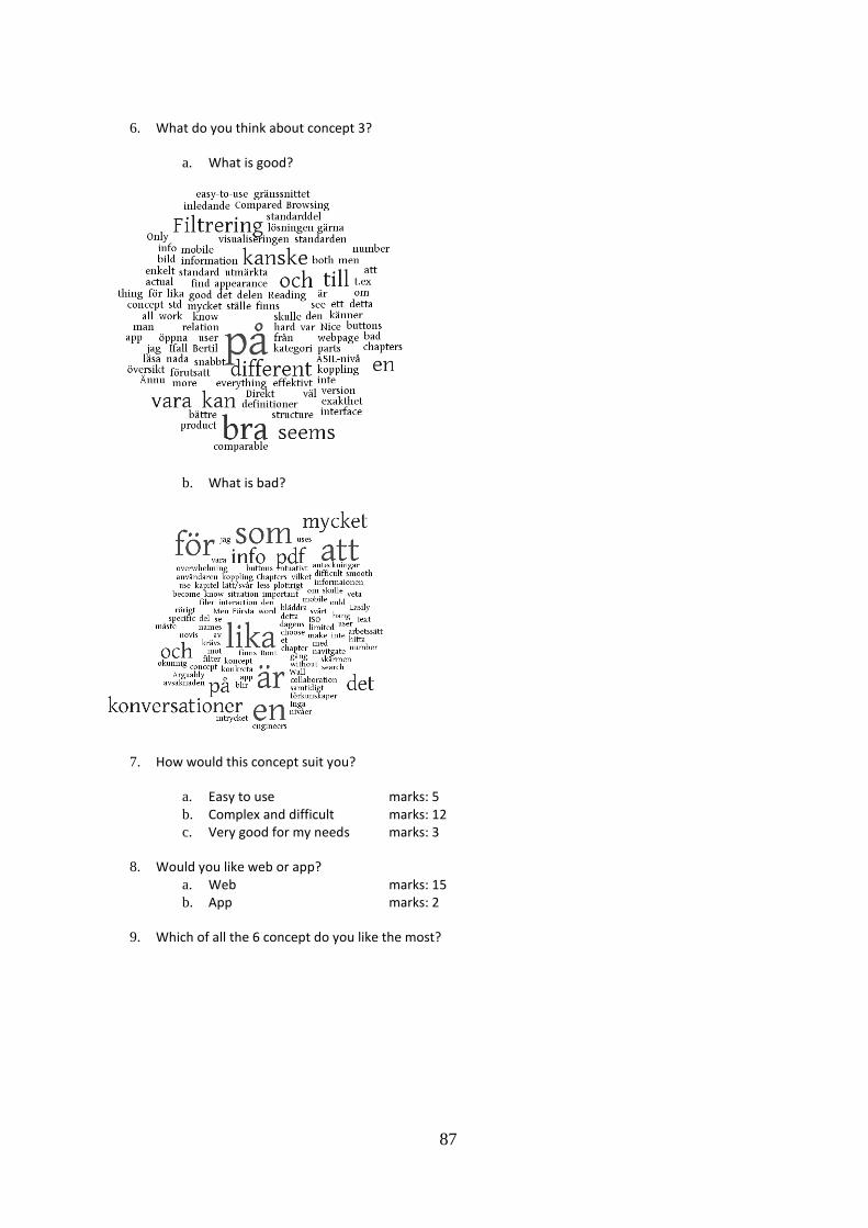
87
6. What do you think about concept 3?
a. What is good?
b. What is bad?
7. How would this concept suit you?
a. Easy to use marks: 5
b. Complex and difficult marks: 12
c. Very good for my needs marks: 3
8. Would you like web or app? a. Web marks: 15
b. App marks: 2
9. Which of all the 6 concept do you like the most?

88
10. Other comments
”Would be nice to be able to go from work products to seeing necessary requirements to
create work products.”
”App kan ha stor nytta då man sitter på ett möte och vill kolla upp något snabbt. Vid
dagligt jobb vid skrivbordet är webbaserat interface bäst. Alla koncept bygger mer eller
mindre på att användaren vet i vilket kapitel viss info finns, kanske bättre att utgå från
Scanias utvecklingsprocess (t.ex. releaseprocess el. SOP-processen) och länka til relevanta
stycken i standarden?”
”****s kommentar, du får gärna återkoppla: Föredrar webbsidorna, för lite samtidigt
information. Fundera viare på att hela tiden marera informativt/ normativt. Fundera på
hur mycket arbete det går åt att realisera de olika alternativen.”
”Koncept 2 med koncept 3s inledande bild? Gränssnittet måste vara snabbt, inte "delays"
”Tror det skulle vara bra att satsa på en "ISO for dummies", lite hög komplexitetsnivår på
alla 3 koncepten. Borde finnas nytta med att beskriva stegen i koncepten på hög nivå som
utgångspunkt i lite som browse&zoom koncept där man fokuserar på delar som är
intressanta just nu i den delen av utvecklingsfasen man befinner sig i. Mer fokus på
kommentarerna till deolika avsnitten. Det är nog som som kommer att bidra mest till att
man förstår vad man konkret skall göra.”
”Det bästa för mig vore att ha koncept 3 men med möjlighet för att göra anteckningar och
konversationer.”
”Möjlighet att "läsa std som PDF" viktigt men om koncept 2 mpste man kunna leta fram
information via alternativa vägar.”
”Having an app with latest standard with search and comment would be good.”
”Eftersom jag aldrig öppnat standarden är det svårt att ha en åsikt.”
”Technical issues/ constraints when it comes to implementations? Web/ mobile”
”Du har gjort det bra med tydligheter på vad som är vad inom koncept 1 och 2. Svårt att
missförstå något.”
CONCEPT 2 WEB…
CONCEPT 2 APP…
CONCEPT 1 WEB…
CONCEPT 1 APP…
CONCEPT 3 WEB…
CONCEPT 3 APP…

89
APPENDIX G FINAL DRAFT
The subpage INTRO, introduction, will guide the novice user towards a more pleasurable
experience with the standard, by shortly describing the purpose of ISO 26262 and what work
approach he or she should use in order to understand the overall information and flow. Also
contact information to the ISO 26262 responsible employees at Scania will be available.
The tab called ASIL, is almost the same as in the concepts, i.e. the user is able to choose either
a specific level or find information regarding how to determine the ASIL. The choice of
determining ASIL includes a link to previously projects, documents for download, determining
matrices and contact information for help. If the ASIL is known, the user is able to view both
the requirements for all ASIL levels and the specific ASIL level chosen, which is a major
difference compared to the current version of the standard, in which the requirements and
recommendations are spread throughout the whole document. The sub tab ISO 26262, the
picture representing the overall work flow of the process is presented, hence it was appreciated
during the workshop. The user also has the possibilities to specify the information searched for
by choosing prerequisites, objectives, work products, informative and normative. A need for
differentiation between informative and normative information was brought up during the
workshop, which is the reason for this specification.
The tab named EXPERIENCE is presenting previously carried out projects and used definitions,
which the users themselves are able to add. This will help future projects in order to determinate
the meaning of definitions at Scania and also how to proceed the projects.
ME includes, as in the concepts, bookmarks, forum and notes. Also a search box is added in the
main menu, which will help the users further to find their information.