Embed Size (px)
Citation preview
269
7 Socio-Economic StatusEditor: Guglielmo Weber
Income and Income ChangesDanilo Cavapozzi, Omar Paccagnella, Guglielmo Weber
Poverty and Persistent Poverty: Adding Dynamics to Familiar FindingsAntigone Lyberaki, Platon Tinios
Real and Financial Assets in SHARE Wave 2Dimitris Christelis, Tullio Jappelli, Mario Padula
ConsumptionViola Angelini, Agar Brugiavini, Guglielmo Weber
Inequality, Life-Course Transitions, and Income PositionSteven Gorlé, Karel van den Bosch
Expectations and AttitudesJoachim Winter
7.1
7.2
7.3
7.4
7.5
7.6
272
278
285
291
297
306

270
Socio-Economic Status
7.1 Income and Income Changes Danilo Cavapozzi, Omar Paccagnella, Guglielmo Weber
Income is a key measure in several economic, social and health research areas. It rep-resents an important measure of access to the economic resources, particularly when the interest is on poverty or inequality. It is to be stressed that the other key measure of access to economic resources - fungible wealth - is increasingly important in old age, but this is the topic of section 7.3.
The availability of longitudinal surveys is of fundamental importance to empirically as-sess how income reacts to age and other time-varying factors, most notably retirement. The second wave of SHARE thus helps shed light on how the socioeconomic character-istics of the elderly in Europe have evolved over time and evaluate the effects on income produced by such dynamics.
The first important issue to investigate concerns the level and the adequacy of the in-come resources available to households and individuals. We stress in this chapter that an important role is played by household-level income sources, such as some welfare state benefits, imputed rent from owner-occupied housing and home-production of food.
A second issue we investigate is how individual incomes are affected by retirement. We exploit the longitudinal nature of SHARE to investigate whether leaving the labour market entails a drop in income, and whether income changes are of similar magnitude among the retired as among the employed.
What income is in the 2006 wave of SHARE?As in the 2004 wave, the SHARE 2006 questionnaire collects income information at
the individual level (questions addressed to all respondents about earnings, pensions and regular transfers) and at the household level (questions asked only to one respondent in each household about interest and dividends, rents, housing benefits received as well as an estimate of all income of non-eligible individuals who live in the household). Total household income is the sum of the individual incomes for all respondents plus household level income items. Finally, it is noteworthy that, unlike the 2004 wave, the 2006 wave of SHARE collects income amounts after taxes.
The raw income data require some adjustments before they can be used. First, imputa-tions are needed for missing income items. Secondly, a correction must be made for dif-ferences in purchasing power across countries. To this end, we use OECD PPP exchange rates (that apply also within the Euro area) to turn nominal incomes into real incomes. When 2004 and 2006 data are compared, the PPP-adjustments take into account also country variations in inflation for these years (Germany is used as the benchmark).
The issue of imputation is particularly relevant for income. In fact, household income is the sum of a very large number of items: for most of these, we have an exact record provided by the respondent, but for some others such amount is not available. However, when respondents refused or were not able to provide an exact answer to a question on a particular income or asset component, they were routinely asked unfolding brackets ques-tions (was this income higher/lower than a certain threshold?). These answers place the income in a certain range, but an exact value needs to be imputed. Imputations in release 1 of Wave 2 were made using a conditional hot-deck procedure: missing income items were randomly replaced with income records from households from the same country and either in the same income range (where available) or with a family respondent with

271
Income and Income Changes
the same sex and age (where such range was not available). A more refined imputation method will be used in release 2, see section 8.7.
In Figure 1 we compare country median household income according to three, possible definitions: the household income variable discussed above, its sum with imputed rent from owner-occupied housing (see Paccagnella and Weber, 2005, for details), and finally the widest possible definition that also includes self-production of food (a newly added piece of information).
0
5000
10000
15000
20000
25000
30000
35000
SE DK DE NL BE FR CH AT IT ES GR PL CZ
Household income Household income + IR Household income + IR + home food production
Figure 1 Total household income – all 2006 wave respondents (in €)
The first definition is standard, and can be compared to what is available in other data sources (most notably SILC). However, it fails to consider the role played by housing wealth in supporting living standards. Comparing the first and second bars for each coun-try, we see that imputed rent plays a major role, particularly in Southern European coun-tries. A potentially important role is played by other components that are often neglected in surveys, such as home production of food, that is now recorded in SHARE. Even though this item is important in Southern European countries and Poland, we see from the third bar that it has a relatively small impact on the median.
As expected, cross-country differences are much smaller within 2004 wave countries (that did not include newly accessed Eastern European countries) than within 2006 wave countries: median incomes in Poland and Czech Republic are much smaller than in any other country. As described in Krüger (2007), this pattern is overall confirmed even when we look at the disposable income per-capita for the overall population of European Union households.
The first step in our analysis of how retirement affects income details the relationship between income and occupational status in the cross section.
In Figure 2 we focus on couples, and report median household income (excluding im-puted rent and home-production) for three groups: two-earner households (“Both mem-bers are workers”), one-earner households (“Only one member is a worker”) and zero-earner households (“Both members are out of work”). We restrict the sample to individuals who either currently work or did some paid work some time in the past – couples where one individual never worked are not considered.
Euro

272
Socio-Economic Status
This picture suggests that workers are better off than the retired – the median income of single-earned couples is sometimes higher, sometimes lower, than the median income of zero – earner households, possibly reflecting the more or less wide-spread presence of a pension for the retired individuals.
Figure 2 Median household income of couples by occupational status
A sharper picture on the effect of retirement on income can be obtained if we focus on individual incomes. We display in Figure 3 median individual incomes for 2006 wave respondents by employment status: the currently employed (“workers”), the newly retired (“left work less than 5 years ago”) and the long-term retirees (“left work 5+ years ago”). We consider only respondents aged 70 years or less in order to reduce the importance of age/cohort effects.
There is a common pattern in all countries: workers have the highest individual in-comes, while individuals out of work for a short time (less than 5 years) have higher in-comes than individuals out of work for a longer time. The magnitude of the differences is also interesting: in Sweden, Denmark and Greece there is a major difference in income for individuals who recently left their job, followed by Spain, Germany and Italy, while in the other countries the differences are not so large. These differences could be due to replace-ment rates, but could also be due to age or cohort effects (the employed are on average 5.5 years younger than the recent retirees, and therefore entered the labour market at a later stage).
Euro

273
Income and Income Changes
Figure 3 2006 wave median individual incomes by occupational status (in €)
Changes in Income Between the Two WavesBefore comparing 2004 wave and 2006 wave incomes, we should stress that 2004 wave
income components are before taxes, whereas the same 2006 wave items are reported af-ter taxes. For this reason, 2004 wave incomes were transformed from gross to net accord-ing to a procedure described in Paccagnella and Weber (2005) and based on OECD data about average tax and social security contribution rates by country as well as household composition.
In the rest of this chapter, we analyse individual net incomes in the 2004 and 2006 waves according to possible combinations of the occupational status in the two periods.
In Figure 4 we compare for all 2004 wave countries the median individual incomes in both waves for respondents who worked in both waves, for those who were retired in both waves and for those who worked in 2004 wave but were retired in 2006 wave. It is worth keeping in mind that workers have the highest individual incomes in every wave.
Figure 4 Median household income in the two waves by occupational status
Euro

274
Socio-Economic Status
However, while the median income for respondents who do not change their status did not change much between waves, the median income of respondents who retired between the two waves is much lower in 2006 wave compared to 2004 wave. It is also interest-ing to note that the income level of the newly retired (retired between the two waves) is higher than the income level of the long-term retirees (even if, as underlined in the previous section, some cohort effects can be present in these results). This picture does not change much after disentangling by macro-region.
The comparison of median incomes across waves is likely to be affected by the busi-ness cycle (time effects) and by any change in income definition across waves (most likely related to the gross-to-net transformation of 2004 wave income data mentioned before).
We overcome these potential problems by comparing median between-waves variations in log-income among the groups described above. Because of the relatively small number of individuals who retire we display the results for three major groups of countries: Nordic (Sweden and Denmark), Central European (France, Belgium, the Netherlands, Germany, Switzerland and Austria) and Southern (Italy, Spain and Greece).
The results are summarized in Figure 5. The general finding is that, except for South-ern countries, individuals who exit from work have a sizeable reduction of their incomes – accounting for PPP’s – greater than individuals who work in both waves. The largest drop is found for Central European countries: this is imprecisely estimated for the group of countries overall, but large and significant drops of 20% or more are estimated for the Netherlands and Belgium, The second largest, and significant, drop is estimated for Nordic countries, while a small and insignificant drop is estimated for Southern European countries. If the income age profiles in all these countries were flat for workers and for the retirees, these changes could be interpreted as replacement rates.
We should stress that these results are affected by the fact that in almost all countries the proportion of respondents who change their status (from worker in 2004 wave to retired in 2006 wave) is very low. Overall, this percentage is lower than 15%, but in some coun-tries, such as in Greece, this proportion is even lower than 7%. As new waves of SHARE data become available, the precision of the estimates should dramatically improve.
North Centre South Overall
Figure 5 Differences in median changes in individual incomes – newly retired versus workers

275
Income and Income Changes
Given that the time length between the SHARE interviews varies a lot (ranging from 11 to 40 months), it is preferable to compute annual variations, rather than simple between-wave differences. We find that in Central European countries the median individual income change for the retired is higher than for workers (2.45% with a standard error of .82). The relative income performance for the two groups is reversed in Nordic countries (but insignifi-cantly different from zero) and in Southern countries (-6.17%, with a standard error of .72).
ConclusionsWe have provided evidence on how income varies across countries and across occupa-
tional status. We have shown that
• there are important differences across European countries in terms of household income of the over fifties – with the Eastern European countries (particularly Poland) displaying the lowest median incomes, followed by Southern European countries.
• retirement also has different effects on income across groups of countries: in Central European countries retirement is associated with sizeable income drops, but is fol-lowed by positive income dynamics compared to those who remain employed. In Southern European countries the reverse is true: there are very small income drops at retirement, but pension incomes fall behind wages over time.
ReferencesKrüger A. 2007. Private Household Income in the European Union Regions. 2003. Statistics in Focus, Econom-
ics and Finance, General and Regional Statistics. Eurostat.
Paccagnella O. and G. Weber. 2005. Household Income. In Health, Aging and Retirement in Europe - First
results from the Survey of Health, Aging and Retirement in Europe, eds Börsch-Supan A., A. Brugiavini, H.
Jürges, J. Mackenbach, J. Siegrist and G. Weber, Mannheim: Mannheim Research Institute for the Econom-
ics of Aging, University of Mannheim.

276
Socio-Economic Status
7.2 Poverty and Persistent Poverty: Adding dynamics to familiar findingsAntigone Lyberaki, Platon Tinios
Poverty is most commonly defined in advanced countries as the situation in which an individual is unable to participate fully in what is socially accepted as the life of the commu-nity. If everything that matters could be obtained in markets, then the idea of ‘participating fully’ could be approximated as possessing a minimum level of income. Though this as-sumption obviously does not hold, financial poverty even if it does not exhaust all catego-ries of exclusion clearly would play a key role – as a sufficient if not necessary condition of exclusion. A ‘pragmatic approach’ has evolved whereby financial poverty is convention-ally linked to the shape of the lower end of the income distribution: thus a poverty line is drawn with reference to the income of the median individual (the person at the middle of the income distribution). Lines of 50% median and 60% median are in common use, while the latter has received most attention at the EU level, as the central ‘risk of poverty line’.
Be that as it may, poverty as a concept has proved a powerful mobilising force in for-mulating and implementing social policy. By introducing a dichotomous measure to a complex picture it can bring into stark focus issues that may have evaded notice if a more rigorous and continuous approach had been followed. The use of poverty in policy discus-sions has accorded it much weight as a bridge between the worlds of policy and those of research.
Analysing poverty in SHARE data as a distinct exercise thus carries added weight as it can link SHARE to the many discussions on social exclusion that are underway both in the EU and in the national contexts. It is important to know what the poverty picture in SHARE is, how it has evolved in time and how it compares with other data that are fre-quently used to examine poverty. This process of ‘translation’ – mapping points of contact and noting infelicities - is important in order to derive the maximum value added from a new and, in many respects, richer source, such as SHARE.
This paper marks the arrival of the second wave in SHARE by asking a number of questions linked to the dynamic analysis of poverty: First, has poverty increased between the first and second wave of SHARE? Second, what is the extent of ‘persistent poverty’ in SHARE and where is it concentrated? Third, who are the persistent poor? Fourth, can we find indications that persistent poverty has explanatory power?
Has Old Age Poverty Increased?The first step in the analysis is to see how SHARE compares with the ‘stylised facts’ of
poverty. To do this we must note that the analysis of low income in a survey like SHARE comes at the end of the data processing phase and is particularly vulnerable to extreme values at the bottom end.
The analysis for Wave 1 uses the weighted data for the entire sample of the over 50s in SHARE release 2. Given that the income concept relevant for poverty is net income, the net income correction reported in the FRB chapter on household income for Wave 1 was employed. (Paccagnella and Weber, 2005). Given the centrality of the income of the median individual, problems in modelling taxation in the middle of the income distribu-tion may well bias the poverty line upwards – more so in the Northern countries. Total household income was attributed in equal part to all household members. Wave 2 data employed weighted release 0 data. Given that Wave 2 income is net by construction, no adjustment was made to Wave 2 incomes. The initial definition of income used is cash in-

277
Poverty and Persistent Poverty: Adding dynamics to familiar findings
come, excluding imputed housing income of owner-occupiers. Poverty lines are computed on the basis of the median individual of the SHARE sample of over 50s, for each wave. Figure 1 reports the results.
Figure 1 Poverty rates in Wave 1 and Wave 2
Note: Based on SHARE median net equivalent income.
Figure 1 shows a clear fall in measured risk of poverty rates. Big falls are noted in Switzerland (7 percentage points), Belgium (5.6 points), Denmark (4.7 points), Spain (4.4 points) and Italy (4.3 points). The transition from gross to net income as the basic income concept is unlikely to account for this result alone, as those at the bottom of the income distribution will pay little tax. Those familiar with the picture of social exclusion from Eu-ropean data sources such as ECHP and lately, SILC (CEC, 2006; 2007) may be surprised by the picture emerging in Figure 1. ‘Risk of poverty’ rates are much higher, while the difference does not depend on the definition of the poverty line. There is also a smaller dispersion of poverty rates; the country rankings may also be unfamiliar. Though these comments should be borne in mind as a cautionary note against over-interpretation of the poverty results, the remainder of the paper shows that SHARE can lead to important new insights in poverty analysis.

278
Socio-Economic Status
What is the relationship of measured ‘objective’ poverty rates (based on income) with the subjective experience of poverty, as gauged by the respondents’ own assessment? Figure 2 contrasts the percentage of poor and non-poor who say that they ‘have difficulty in making ends meet’ whether ‘with great’ or ‘with some difficulty’. Even if one were to concede that objective poverty rates measure poverty with some noise, and allowing for national ‘styles’ in response, Figure 2 is clear that the poor (classified by income) experi-ence financial hardship to a greater extent than those classified as non-poor. Nevertheless, it is noteworthy that objective and subjective poverty track each other more in the South and East than elsewhere.
Figure 2 Being able to make ends meet by ‘objective’ poverty status, Wave 2
Note: Poverty line set at 60% of median equivalent income. p = poor; np = non poor.
One of the findings of Wave 1 was that cohabitation of the generations, either in the same household or in the same building was strongly correlated with poverty status in Southern Europe (and in Austria and Germany), lending weight to the suspicion that the mechanism at work was family solidarity supplementing social protection systems (Lybe-raki and Tinios, 2005). Figure 3 confirms this relationship for Wave 2 data, impressively so in the case of the new countries of Eastern Europe.

279
Poverty and Persistent Poverty: Adding dynamics to familiar findings
Figure 3 Family proximity and poverty for people over 65: (%) living in the same household and in the same building with the
nearest living child, by poverty status
Note: p= ‘poor’; np= ‘non-poor’. Based on SHARE median net equivalent income
Persistent Poverty in SHAREOnce the population of the two SHARE waves has been classified according to poverty
status, it is important to turn to the dynamic nature of poverty. To what extent is poverty persistent – i.e. are the same people classified as poor in both waves. An alternative expla-nation of tracking the poverty status of a given households may be based on an errors-in-variables justification: income is measured with an error. Using two different estimates of income (based on a slightly different definition) would improve the poverty status classifi-cation. Given the rather short time between waves 1 and 2, the latter interpretation gains weight. Figure 4 examines the longitudinal sample and looks at four categories of people: those poor in both waves, those in one or the other wave and those in neither wave.
Figure 4 Longitudinal assessment in poverty status, total population
Note: Based on SHARE 60% median net equivalent income.
Perc
ent

280
Socio-Economic Status
Figure 5 Percentage of the persistent poor, by Wave 1 age group.
Note: Based on SHARE 60% median net equivalent income.
There are a number of points to make: First, there is considerable turnover in the group of the poor, even in the SHARE age groups where income variation is thought to be rela-tively smaller; between 25% (SE) and 46% (CH) have had some experience of poverty.
The risk of poverty is thus more widespread than may first be thought. Second, the range of values of persistent poverty as well as the ranking of countries are closer to the SILC risk of poverty rates. Third, the extent to which poverty is persistent by age varies. Figure 5 notes the percentage of the poor in Wave 1 who are also poor in Wave 2 accord-ing to whether the Wave 1 age was larger or smaller than 65. The choice of 65 is significant as that is the point at which most workers have passed into retirement. Thus, the com-parison between the two groups would be affected by both the effect of social protection systems and differences in income variability once people have retired. If one assumes that income variability is lower amongst pensioners, then one would expect poverty to be more persistent among the old, as in DK, GR, and AT. The finding of the reverse effect in DE, NL, ES and CH might imply that the errors-in-variables explanation of persistent poverty may be more appropriate.
How is persistent poverty related to changes in important variables? Figure 6 examines the relationship between persistent poverty, poverty and changes in health status. The percentage of respondents replying that their health is ‘worse’ in Wave 2 is plotted against poverty status for different groups of countries and age. In Figure 6 we can discern a strong relationship between persistent poverty and health deterioration. This relationship is dif-ferentiated along two other dimensions:
• Poverty and age. The poverty-health deterioration relationship is much stronger for younger age groups (where the differences are significant for all countries than for the over-75s.
• The relationship is far stronger in the Nordic countries, weaker though still strong in the Continental countries and weaker in the South.
• The group who have experienced some poverty fall in the middle in all cases, though closer to the never-poor group.
Perc
ent

281
Poverty and Persistent Poverty: Adding dynamics to familiar findings
Figure 6 Persistent poverty and deterioration of health, by group of countries.
Note: Age groups defined according to Wave 1. Poverty status defined according to SHARE 60% median net equivalent
income.
The longitudinal information present in SHARE allows a more thorough investigation of the characteristics of the persistent poor. To approach this question technical issues such as the selection bias of being included in the longitudinal sample have to be dealt with; reporting the full results of that analysis is beyond the scope of this short note. Be that as it may, the conclusion emerges that persistent poverty (controlling for other ef-fects and for selection bias), increases with age and household size and decreases with education. However, even for individuals with the same characteristics, the relative risk of poverty differs widely between countries, possibly implying an important residual effect for the social protection systems.
Conclusions The analysis of the previous section gave a flavour of the kind of insights that SHARE
can bring:
• SHARE data conclude, for Wave 1 as well as for Wave 2 that financial poverty may be more serious than is thought. The investigation of non-financial dimensions thus acquires greater significance.
• Living close to one’s children, in the same household or the same building, remains a very important mechanism of social solidarity with an important poverty alleviation role, not only in the South but also in Germany.
• Persistent poverty appears to be linked closely to deterioration in health status.

282
Socio-Economic Status
ReferencesCommission of the European Communities (CEC), 2006, Joint Report by the Commission and Council on Social
Protection and Social Inclusion, Directorate of Employment, Social Policy, Health and Consumer Affairs.
Commission of the European Communities (CEC), 2007, Joint Report by the Commission and Council on Social
Protection and Social Inclusion, Directorate of Employment, Social Policy, Health and Consumer Affairs.
Lyberaki, A. and Tinios, P. 2005. Poverty and Social Exclusion: a new approach to an old issue, In Health,
Ageing and Retirement in Europe - First Results from the Survey of Health, Ageing and Retirement in Europe
eds Börsch-Supan A., A. Brugiavini, H. Jürges, J.Mackenbach, J.Siegrist and G. Weber, 302-309. Mannheim:
Mannheim Research Institute for the Economics of Aging, University of Mannheim.
Paccagnella, O. and Weber, G. 2005. Household Income. In Health, Ageing and Retirement in Europe - First
Results from the Survey of Health, Ageing and Retirement in Europe, eds. Börsch-Supan A., A. Brugiavini, H.
Jürges, J. Mackenbach, J.Siegrist and G. Weber, 296-301. Mannheim: Mannheim Research Institute for the
Economics of Aging, University of Mannheim.

283
7.3 Real and Financial Assets in SHARE Wave 2Dimitris Christelis, Tullio Jappelli, Mario Padula
The second wave of SHARE allows researchers to assess how households’ financial situ-ation and the assets and liabilities holdings have changed between 2004 and 2006, and also provides information about changes in ownership patterns of the different assets that make up household wealth. These comparisons are made easier by the fact that the assets mod-ules in Wave 1 and 2 share the same structure (for details on the asset section in Wave 1 of SHARE see Christelis, Jappelli and Padula, 2005, 2006). This chapter reports basic facts on wealth amounts, wealth composition, and financial asset ownership and their dynamics between Waves 1 and 2 of SHARE.
Financial wealth, real estate, and other assets and their evolution over time are key indicators of the well-being and quality of life of the elderly. Because of the demographic trends, the saving behaviour of the elderly and their portfolio holdings are central to the policy debate. While income and consumption are important determinants of current well-being, assets are a key indicator of future, sustainable consumption. SHARE allows the study of the composition of wealth around and after retirement, the distribution of wealth between real and financial assets, and the extent to which the wealth of the elderly is an-nuitized through pensions, social security, and health insurance.
There are a number of further reasons for considering wealth and its evolution over time as a key indicator of well-being in old age. Most people save for retirement, and reach retirement age with considerable amount of assets. These assets provide income for the elderly in the form of rents from real estate, interests on government and other bonds, dividends from stocks. The same assets can be spent during the retirement period and con-verted into a flow of consumption. Conversely, if people don’t save enough for retirement, they will not have enough resources to finance later consumption, a problem that has come to be known as adequacy of saving at retirement. Furthermore, wealth can provide a buffer to protect the elderly against health and other risks, which is very important at times when the length of life is increasing together with the cost of health care.
A related issue is the appropriate asset mix during retirement between low-risk saving vehicles, insurance policies, and risky financial assets. People do not rely solely on financial assets in order to provide for their old age but also on real assets, with housing being the most important among them. With respect to portfolio choice, the elderly face higher mortality and morbidity risks compared to the young, which should make the portfolio of the elderly different from that of the rest of the population. How large this difference is and how it varies across Europe depends on the public coverage of health care and the working and generosity of public pension systems. On these and related issues, SHARE provides fresh evidence in comparative fashion, both across countries as well as over time.
Asset AmountsAs in the first wave, SHARE respondents are asked about ownership and amounts
of assets grouped in the following categories: main residence, other real estate, bank ac-counts, bonds, stocks, individual retirement accounts, contractual savings for housing, whole and term life insurance, own business and vehicles. In addition, they are asked about any mortgage on the main residence and any debts other than the mortgage. All the aforementioned asset and liabilities (with the exception of term life insurance) are
Real and Financial Assets in SHARE Wave 2

284
Socio-Economic Status
included in the definition of total wealth, from which various aggregates are constructed, such as real assets and financial assets net of financial liabilities.
Figure 1 displays median net worth (defined as the sum of net financial and real assets) by country in both waves (the Czech Republic and Poland are present only in the second wave). All values are expressed in euro and are adjusted for differences in the price level across countries. As in Wave 1, the countries ranking the highest median net worth are Belgium, Switzerland and France, while the lowest net worth is observed in the two new SHARE participant countries from Eastern Europe. In some of those countries homeown-ership is widespread ranging from 80% in Belgium to just below 70% in France. This confirms that real assets account for a sizable share of net worth, as in Wave 1 of SHARE. The comparison with Wave 1 indicates the sizeable increases in net worth in Sweden, Denmark, the Netherlands, Belgium, Italy and Spain, ranging from 18,000 (Netherlands) to 37,000 euro (Italy).
Figure 1 Median Net Worth by Country
The change in the unconditional median value of the primary residence is shown in Figure 2, and it is clear that home values have increased from Wave 1 to Wave 2 for the aforementioned six countries. The most likely candidate for this increase is home values appreciation between 2002 and 2006, rather then changes in the number of homeowners which exhibit relatively minor fluctuations over the period, as shown by Kohli et al. (2008) or Angelini and Laferrère (2008).
Figure 3 reports average annual increases in home prices between 2002 and 2006: prices have increased very substantially in Spain (roughly by 16 percent per year), and considerably in Denmark, Belgium and France (between 10 and 12 percent). Sweden, Italy and Greece show slightly lower but still high annual rates of increase of 8 percent. The only country where there has been a home price decrease is Germany, while Switzerland and Austria experience only a weak appreciation of home values during the period con-sidered.

285
Real and Financial Assets in SHARE Wave 2
Figure 2 Median Home Value
Figure 3 Average Annual Growth of House Prices, 2002 – 2006
Note: Based on OECD and Hypostat.Data
Thus, between the two waves there has been a significant home value appreciation in most of the countries of the SHARE sample. In the survey, this increase is reflected in the substantial increase in net worth, particularly in the countries that exhibited the larg-est house price increases (such as Spain and Denmark). On the other hand, median net financial assets show substantial increases only in Sweden (11,000 euro), Denmark (22,000 euro) and Belgium (7,000 euro).
286
Socio-Economic Status
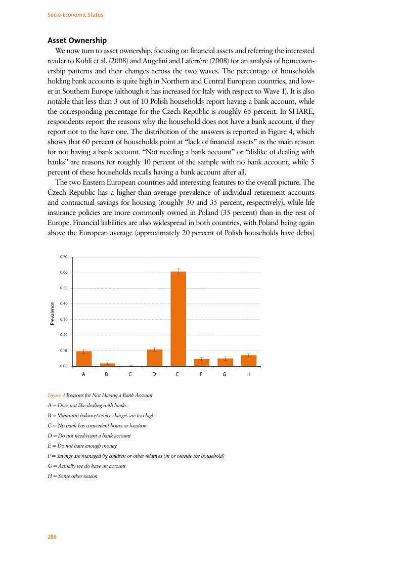
Asset OwnershipWe now turn to asset ownership, focusing on financial assets and referring the interested
reader to Kohli et al. (2008) and Angelini and Laferrère (2008) for an analysis of homeown-ership patterns and their changes across the two waves. The percentage of households holding bank accounts is quite high in Northern and Central European countries, and low-er in Southern Europe (although it has increased for Italy with respect to Wave 1). It is also notable that less than 3 out of 10 Polish households report having a bank account, while the corresponding percentage for the Czech Republic is roughly 65 percent. In SHARE, respondents report the reasons why the household does not have a bank account, if they report not to the have one. The distribution of the answers is reported in Figure 4, which shows that 60 percent of households point at “lack of financial assets” as the main reason for not having a bank account. “Not needing a bank account” or “dislike of dealing with banks” are reasons for roughly 10 percent of the sample with no bank account, while 5 percent of these households recalls having a bank account after all.
The two Eastern European countries add interesting features to the overall picture. The Czech Republic has a higher-than-average prevalence of individual retirement accounts and contractual savings for housing (roughly 30 and 35 percent, respectively), while life insurance policies are more commonly owned in Poland (35 percent) than in the rest of Europe. Financial liabilities are also widespread in both countries, with Poland being again above the European average (approximately 20 percent of Polish households have debts)
Figure 4 Reasons for Not Having a Bank Account
A = Does not like dealing with banks
B = Minimum balance/service charges are too high
C = No bank has convenient hours or location
D = Do not need/want a bank account
E = Do not have enough money
F = Savings are managed by children or other relatives (in or outside the household)
G = Actually we do have an account
H = Some other reason

287
Real and Financial Assets in SHARE Wave 2
Prevalen
ce
Figure 5 Transitions in Direct Stock Ownership
Notes: N_N denotes no ownership in either wave, while N_Y denotes no ownership in the first wave and ownership in the
second wave. The remaining two cases are defined analogously.
Asset Ownership TransitionsOne advantage of having multiple waves of the same survey is the possibility to com-
pare changes in ownership patterns of assets for households that appear in the survey more than once.
Figure 5 refers to bank accounts and shows that in Southern Europe there is a sizable proportion of households with transitions. In addition, for almost every country we ob-serve transitions into ownership, which could be due to financial market developments or increased willingness of households to report their ownership of financial assets. We also observe changes in bond ownership, especially in Sweden, Denmark, Germany, Belgium, Switzerland and Italy, the countries with the highest bond ownership in Wave 1 (for brev-ity, transitions for bank accounts and bonds are not reported in detail).
Figure 5 shows that there are substantial ownership transitions for direct stockholding, mainly for Northern and Central European countries, where financial markets are in gen-eral more developed than in Southern Europe. This is likely to be associated with greater familiarity with stocks in these countries, facilitating transactions in and out from the stock market. In Northern and Central Europe we also observe more frequent movements in and out of ownership of individual retirement accounts and life insurance policies, confirming the patterns found for stocks.
As for financial liabilities, Figure 6 shows that in all countries there is a substantial frac-tion of households that pays back debts or incurs new ones, with the former being more common than the latter. While paying back debts is perhaps to be expected to occur as people age, incurring new debts means that even in middle and older ages households need to borrow to purchase durable goods or to buffer adverse shocks like job loss or health problems.

288
Socio-Economic Status
Figure 6 Transitions in Incurring Debts
Notes: N_N denotes no ownership in either wave, while N_Y denotes no ownership in the first wave and ownership in the
second wave. The remaining two cases are defined analogously.
Summary• Even though the two waves of SHARE are not that far apart in time, we observe
substantial changes in household balance sheets, both in ownership and in amounts, between 2002 and 2006.
• Most of the changes in assets amounts are due to the house price boom, while most changes in financial asset ownership occur in Northern and Central Europe, a reflec-tion of the more developed state of financial markets therein.
• The newly added countries in Wave 2, the Czech Republic and Poland, exhibit av-erage or higher than average ownership of some financial assets, but relatively low household wealth in comparison to other European countries.
ReferencesChristelis, D., T. Jappelli and M. Padula. 2005. Wealth and Portfolio Composition. In The Survey on Health, Ag-
ing and Retirement in Europe – First Results from the Survey of Health, Ageing and Retirement in Europe, ed.
Boersch-Supan A., A. Brugiavini, H. Jürges, J. Mackenbach, J. Siegriest and G. Weber. Mannheim: Mann-
heim Research Institute for the Economics of Aging, University of Mannheim.
Christelis, D., T. Jappelli and M. Padula. 2006. Generated Asset Variables in SHARE Release 1. In The Survey
on Health, Aging and Retirement in Europe-Methodology, ed. Börsch-Supan A. and H. Jürges. Mannheim:
Mannheim Research Institute for the Economics of Aging, University of Mannheim.
Kohli, M., H. Künemund and C. Vogel. 2008. Staying or moving? Housing and residential mobility. In this
volume.
V. Angelini and A. Laferrère. 2008. Home, houses and residential mobility. In this volume.

289
Consumption
7.4 ConsumptionViola Angelini, Agar Brugiavini, Guglielmo Weber
In this section we ask the following questions: Is there a drop in consumption immedi-ately after retirement in the SHARE countries? Do recently retired households experience financial hardship?
The presence of a drop in expenditure around retirement is well documented for the UK (Banks, Blundell and Tanner, 1998) and for the US (Bernheim, Skinner and Weinberg, 2001) and is known as the retirement consumption puzzle (or retirement savings puzzle), as it apparently contradicts Modigliani’s life cycle model key prediction that consumers form intertemporal plans aimed at smoothing their standard of living over their life-cycle (Browning and Lusardi, 1996).
Recent papers stress that the drop in expenditure at retirement does not necessarily imply a drop in utility. For instance, work-related expenditure (transport to and from work, canteen meals and business clothing) is no longer needed. Also, home production of services (laundry, gardening, house-cleaning, cooking) may become advantageous, and the extra leisure time may allow consumers to shop more efficiently. This last channel has been stressed by Aguiar and Hurst, (2005) and (2008), in their careful analysis of food consumption around retirement.
Other possible reasons for this drop are myopic or perhaps time-inconsistent behaviour or unexpectedly low pensions or liquidity problems. For policy purposes, it is crucially important to ascertain whether the drop is associated with financial hardship: if the drop is the result of a change in preferences, for instance, it should not be a matter of concern for the policy maker.
In SHARE we have food consumption recall data (food at home and food outside), but also financial hardship questions (“difficulties with making ends meet” and “changes in financial situation”) that may relate closely to the more general concept of standard of living. In this chapter we compare how food consumption has changed over time for those who have retired between waves, and compare it to consumption changes for those who have stayed in employment and those who have stayed in retirement. We split the sample in three broad geographical areas: Nordic countries, Central European countries, and Mediterranean countries. We find significant, negative effects only for this last group.
We also use the 2006 wave, where a question is asked about changes in financial situ-ation, to assess whether retirement is associated with an increase in financial hardship. Finally, we show how employment/retirement correlates with the question on difficulties with making ends meet that is asked to all 2006 respondents, and therefore covers the two new SHARE East-European countries, Poland and the Czech Republic.
Food Consumption EvidenceTable 1 presents the evidence on the way food at home and total food changed across
waves for those households where at least one member left employment (“Outempl” – 864 observations in all) and those where none changed employment status, and at least one was in employment in both waves (“Inempl” - 2,265 observations). All values are PPP-adjusted and we do not consider households whose consumption has been imputed. North denotes Denmark and Sweden, South denotes Spain, Italy and Greece, and Central includes all remaining Wave 1 countries (France, Belgium, Netherlands, Switzerland, Germany and Austria). We consider the one-year equivalent of the percentage change in consumption be-

290
Socio-Economic Status
tween the two waves because there are significant differences in the time distance between interviews both within and across countries (from a minimum of 11 months to a maximum of 40).
FOOD-IN TOTAL FOOD NNorth 0.0005 0.0036 813
(0.0015) (0.0185)Central 0.0025 0.0133 1,448
(0.0077) (0.0176)South -0.0162 -0.0641* 738
(0.0162) (0.0337)TOTAL -0.0003 -0.0022 2,999
(0.00238) (0.0137)
Table 1 Difference in the percentage changes in food (medians) between the newly retired and the employed
We report results for the difference in the annual change in consumption between the two groups of households (newly retired and employed). For food at home, the newly re-tired do not experience larger drops than the control group. The evidence for total food is instead that there is a significant difference (6.4 percent) in the drop in Southern European countries. This annual drop corresponds to a 15.1 percent drop between the two waves for this part of Europe.
A similar picture emerges when we compare the newly retired to those who were re-tired in both periods (“Outout” - 6,654 observations). However, the control group is in this case much older on average, and this may make the comparison less clear cut (the average age is 61 for the “outempl” sample, 57 for the “inempl” sample and 69 for the “outout” sample).
Table 2 reports the annual change in the fraction of food consumed at home over total food for those households where at least one member left employment (“outempl”) and whose consumption of food outside the house was non-zero in the first wave. Newly re-tired households seem to substitute food-out for food-in. Indeed the fraction of food con-sumed at home over total food increases in all three geographical areas. However, a formal statistical test shows that the increase is significantly different from that of the employed only in Central Europe (see Lührmann, 2007, for Germany).
FOOD-IN OVER TOTAL FOOD NNorth 0.0111 146Central 0.0095 323South 0.0331 103TOTAL 0.0135 572
Table 2 Annual change in the fraction of food-consumed at home over total food for the newly retired
291
Consumption
The lack of precision of some of the estimates is due to the relatively small number of households who are observed to transit from employment into retirement. When we analyse the effect of retirement on consumption we want to track the same households over time, especially before and after retirement. When further waves of SHARE become available, we will be able to obtain more precise and robust findings.
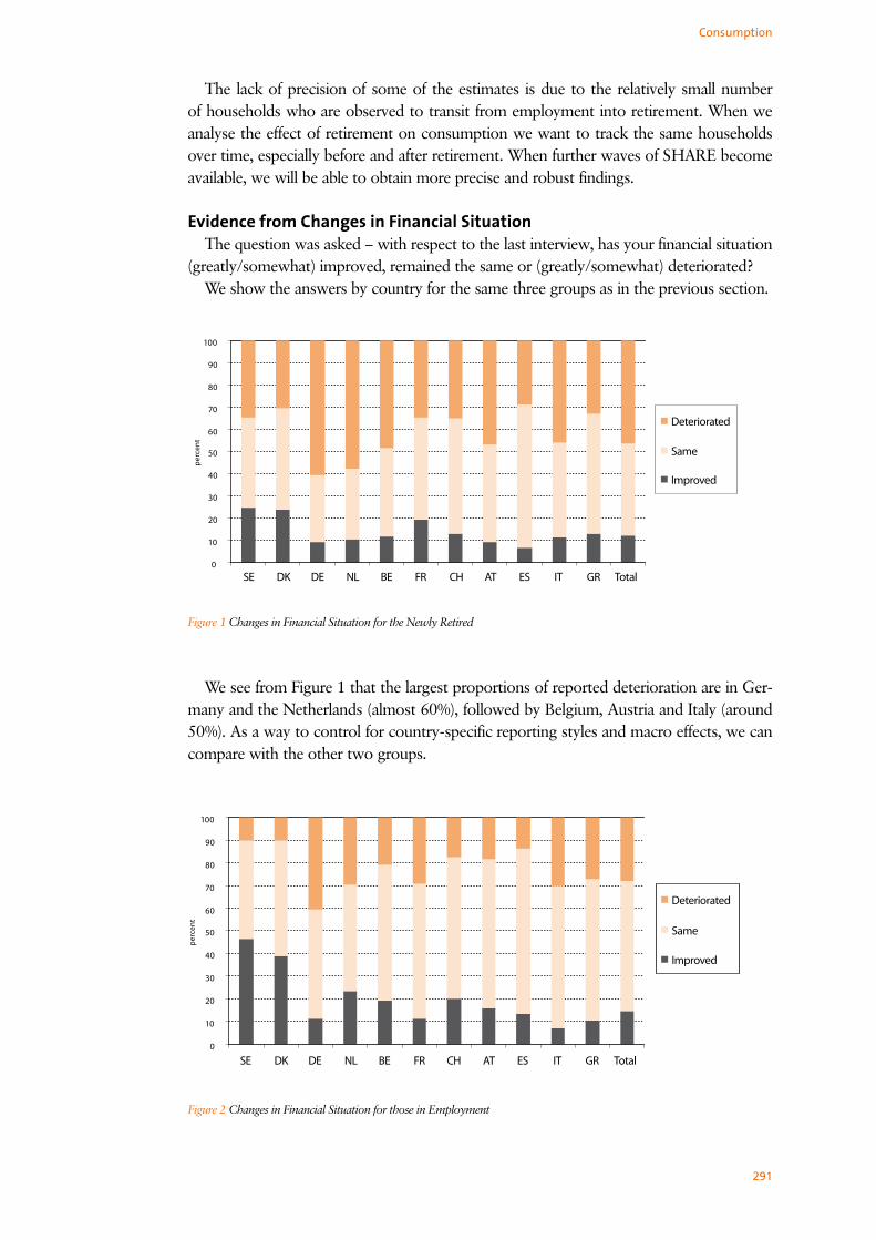
Evidence from Changes in Financial Situation The question was asked – with respect to the last interview, has your financial situation
(greatly/somewhat) improved, remained the same or (greatly/somewhat) deteriorated?We show the answers by country for the same three groups as in the previous section.
Figure 1 Changes in Financial Situation for the Newly Retired
We see from Figure 1 that the largest proportions of reported deterioration are in Ger-many and the Netherlands (almost 60%), followed by Belgium, Austria and Italy (around 50%). As a way to control for country-specific reporting styles and macro effects, we can compare with the other two groups.
Figure 2 Changes in Financial Situation for those in Employment

292
Socio-Economic Status
Figure 3 Changes in Financial Situation for the Retired
Figure 4 Households whose Financial Situation has Deteriorated (in percent)
Notes: Inempl = Employed in both waves; Outout = Not Employed in both waves, Outempl = Recently retired in Wave 2

293
We then focus on the proportion of households who report that their situation has somewhat or greatly deteriorated with respect to the last interview and we group coun-tries in three geographical areas: North, Centre and South.
A formal statistical test shows that both the group of newly retired and the group of households who were retired in both periods do significantly worse than those in con-tinued employment (note: and the group of newly retired does worse than the group of households who were retired in both period everywhere but the South).
How Well Do the Retired Fare?It is quite clear that retirement is associated with greater difficulties overall, but more
so in Southern European countries. A formal test confirms this result. There are no major differences according to the number of years individuals have been retired.
A final question we address here is how employment/retirement affects one’s ability to make ends meet. To this end, we use Wave 2 data, and show the proportions of households who find it difficult to make ends meet, comparing households where all members are in employment (EE) with households where all members are out of employment (RR).
Consumption
Figure 5 Households which find it Difficult to Make Ends Meet, by Employment Status (in Percent)
Note: EE = all Household Members in Employment, RR = all Household Members out of Employment
Conclusion
• If we look at food consumption and compare the drop in consumption of newly retired and employed households, there is a significant difference only in Southern Europe.
• If we focus on changes in the financial situation, newly retired households do sig-nificantly worse than those in continued employment also in Northern and Central Europe.
• In general, retirement seems to be associated with much higher self-reported financial hardship.

294
ReferencesAguiar, Mark and Erik Hurst 2005. Consumption versus Expenditure, Journal of Political Economy 113 (5):
919-848.
Aguiar, Mark and Erik Hurst 2008. Lifecycle Prices and Production, American Economic Review 97 (5): 1533-
1559.
Banks, James, Richard Blundell and Sarah Tanner 1998. Is There a Retirement-Savings Puzzle? American Eco-
nomic Review 88 (4): 769-788.
Bernheim, B. Douglas, Jonathan Skinner and Steven Weinberg 2001. What Accounts for the Variation in Re-
tirement Wealth Among U.S. Households?, American Economic Review 91 (4): 832-857.
Browning, Martin and Anna Maria Lusardi 1996 “Household Saving: Micro Theories and Micro Facts, Journal
of Economic Literature 34 (4): 1797-1855.
Lührmann, Melanie 2007. Consumer Expenditures and Home Production at Retirement: New Evidence from
Germany. MEA Discussion Paper 7120.
Socio-Economic Status

295
Inequality, Life-Course Transitions, and Income Position
7.5 Inequality, Life-Course Transitions, and Income PositionSteven Gorlé, Karel van den Bosch
Living standards of the elderly vary greatly, both between and within countries. This chapter will focus on evidence concerning inequality in income, consumption and assets in the SHARE countries. We will also use the opportunities of the panel to investigate in an exploratory way the impact of life-course transitions, such as retirement, widowhood and children that leave the parental home, on the income position of the elderly.
It may be noted that the analysis reported in this paper could only have been done using the SHARE data, as it is the only internationally comparable survey which collects data on all three dimensions just mentioned: income, consumption and assets, while also following persons over time. By contrast, for example the Survey of Income and Living Conditions (SILC), the current source of official reports on income, poverty and social exclusion, does not include consumption and wealth variables.
Definitions and MethodsIncome is defined as total annual equivalent net household income. As the same dis-
posable income represents a higher living standard for a single person than for a couple, we divide household income by the modified OECD equivalence scale. This equivalence scale has weights 1.0 for the first adult, 0.5 for all other adults, and 0.3 for children. The fact that these weights are much lower than one implies substantial economies of scale in the conversion of income into a household’s material standard of living. The working assumption is that all household members share equally in its standard of living. Note that consumption is defined as monthly equivalent household food consumption (at home and outside home) following Perelman et al. (2005). The modified OECD equivalence scale, which was developed for income and total consumption, may be less appropriate for food consumption; we use it nevertheless for lack of a generally accepted alternative. The asset variable is defined as equivalized household net worth. Missing values in all variables are imputed, so that we have valid values for all households in the SHARE sample. Extreme values are deleted from the net household income and consumption variables, following two rough-and-ready rules: 1) values below €100 (PPP-adjusted) are deleted; 2) values in excess of ten times the country median are deleted. While such values can be realistic in some circumstances, they would have an unduly large influence on the results. No extreme values were excluded from the wealth variable. All results are weighted by the household calibrated weights (whole sample), in order to make sure that they are representative for the populations of persons aged 50 and over.
We use two summary measures of inequality. Probably the most common measure of income inequality is the Gini coefficient, which is based on the Lorenz-curve. The Gini co-efficient can vary between 0 (complete equality) and 1 (extreme concentration: one house-hold has all). Following Gottschalk & Smeeding (2006) we also use percentile ratios to measure income and consumption inequality, in particular the P90/P10 ratio, i.e. the ratio of the 90th and the 10th percentile (P90/P10 for short). The 90th percentile is the income or consumption level below which we find 90 percent of the population, conversely the 10th percentile is the level below which we find 10 percent of the population. The P90/P10 measure gives in an intuitive way the distance between the top and bottom of the distribu-tion of income or consumption. In addition we present the 90th percentile and the 10th percentile as a percent of the median. The P90/Median and P10/Median measures provide

296
Socio-Economic Status
an indication where social distances are largest. Are persons or households at the bottom of the income distribution far removed from the average person in the middle? What is the distance between persons at the top and those in the middle? These percentile ratios turned out to be less useful for characterizing the distribution of wealth, mainly because households at the bottom of this distribution have zero or negative wealth.
Inequality The received view on income inequality in the ‘old’ countries of the European Com-
munity (EU15) is that it is lowest in the Northern countries, followed by the Central countries, and highest in the South of Europe. The results on income inequality presented in Figure 1 generally bear this out: income inequality is relatively low in Sweden and Den-mark, and high in Spain and Greece, with Central Continental European countries some-where in between. However, there are some important exceptions to this north-south gradient. Austria is the country with the lowest income inequality; Italy finds itself among the Continental countries. These results are broadly in agreement with those found for Wave 1 (Bonsang et al., 2005).
The percentile ratios provide useful clarifications and qualifications. In countries with the lowest level of income inequality – Austria, Sweden and Denmark – persons at the 10th percentile enjoy a living standard that is about half of that of the median person. Dif-ferences are also relatively small at the other end of the income distribution: persons at the 90th percentile enjoy a living standard that is less than twice that of the median person. By contrast, the P90/Median ratio is always higher than two in the other countries, rising to a high 2.68 in Greece. Interestingly, the lowest values for the P10/Median ratio are found in Germany and Switzerland, lower even than in the high-inequality countries Greece and Spain. In the former countries, the living standard of persons in the bottom ten percent of the income distribution is less than one-third of that of the median person.
The Eastern European countries Poland and the Czech Republic joined SHARE in the second wave, and it is interesting to compare them to the countries of the ‘old’ EU (and Switzerland). Their positions are strikingly different. Income inequality among the 50+ population in the Czech Republic is only slightly higher than in the Nordic countries, and lower than in almost all Continental countries. By contrast, Poland is characterized by very high income inequality, higher than in any other SHARE country. In particular, the P10/Median ratio is quite low, indicating that persons at the bottom of the income distribu-tion in Poland have a standard of living that is very low relative to the median (which is of course itself low, compared to living standards in the EU15). One reason for this may be that many older persons in Poland worked in the agricultural sector. We have not con-sidered here home production of food in either income or consumption, for the sake of comparability across waves, but note that the information is available in Wave 2 and this item may be important for Poland and Southern European countries.
The most obvious reason for the differences in income inequality reported here is the variety of pensions systems in European countries, varying from social-democratic in the Nordic countries, to Bismarckian ones in most central continental countries, while in the Southern countries pension systems are often called familistic, and depend strongly on the former profession. However, within any type one finds important differences in such cru-cial characteristics as minimum pensions, the degree of solidarity and so on. Moreover, the distribution of income among persons aged 50 and over also depends on a host of other factors: the extent and nature of second-pillar pensions, the employment rate (small even

297
Inequality, Life-Course Transitions, and Income Position
among persons aged 50 to 60 in some countries, significant even among the 65+ in oth-ers) and household formation (in the Southern and Eastern countries, many older people live together in one household with their adult children; this is rare in most Northern and Central European countries), to name a few of the most important.
The first thing to note about the results on food consumption inequality in Figures 1 and 2 is that it is much more limited than income inequality in all SHARE countries. The second thing is that the cross-country pattern is somewhat different from that found for income inequality. Again inequality is low in the Nordic countries, but for food consump-tion inequality they are followed by Greece and Spain. Germany also seems to have limited inequalities in food consumption. By contrast, Belgium and France move up in the ranking of countries if we look at this dimension of inequality.
Figure 1 Gini coefficients for inequality in household equivalent income, equivalent food consumption and equivalent assets.
Countries are ordered by the Gini for household income, from low to high

298
Socio-Economic Status
For the Czech Republic, the Gini and the P90/P10 ratio tell a quite different story: the Gini is high, while the P90/P10 ratio is the lowest of all countries. This indicates that the great majority of persons aged 50 and over in the Czech Republic enjoy levels of food consumption that are very far apart from each other, while small minorities are far below or above the average. As was the case for income inequality, Poland has the highest level of food consumption inequality. A striking finding for both the Czech Republic and Poland is that the 10th percentile is quite close to the median, resulting in values for P10/Median measure that are close to one. Apparently, households in lower half of the distribution
Figure 2 Percentile ratios for household equivalent income and equivalent food consumption. Bars represent P10/Median;
Lines represent P90/Median. Countries are ordered as in Figure 1
Consumption

299
Inequality, Life-Course Transitions, and Income Position
somehow manage to keep their level of food consumption near to the average level, per-haps by reducing other kinds of consumption. This is an indication that those households approach a kind of subsistence minimum in food consumption.
As expected, the Gini coefficients measuring inequalities in household wealth in Figure 1 are much larger than those for household income and consumption. Also, it is evident that inequality of household wealth shows cross-country patterns that are quite different from those of income and consumption inequality. Countries with strong wealth inequal-ity include Poland, Austria, Germany, The Netherlands and Sweden. On the other hand, for each of those countries one can find a neighbouring country where wealth inequality is much lower: the Czech Republic, Switzerland, Belgium and Denmark. It is also noteworthy that Spain and Greece, which have high levels of income inequality, are not characterized by extensive inequalities in wealth. As the home is for most older persons overwhelmingly the main component of their wealth, differences in the rate of owner-occupied housing is probably one reason for these patters, among many other factors.
Transitions and Income PositionInequality, implying large differences in the standard of living between persons living in
the same society, is often regarded as detrimental to social cohesion and inclusion. An-other aspect of social inclusion is income security: the degree to which one is protected from the risk of large income drops. Income security is also an important determinant of people’s sense of well-being; this is particularly true for older people, who have fewer options on the labor market, and are more dependent on the welfare state. The issue of income security addresses directly one of the two important goals of the welfare state: the guarantee of the acquired standard of living (the other being minimum income protection), in particular at the occurrence of certain social risks, such as sickness, invalidity, retirement, widowhood, unemployment. The analysis of income security requires of course panel data, which the second wave of SHARE provides.
In this section we look at three common transitions, which occur quite commonly in all countries, and which can easily have a large effect on the income and standard of living of individuals and families. These are retirement, widowhood and children leaving the par-ent’s home. Given that the income measures in Wave 1 and Wave 2 are not directly com-parable, we look at relative income positions, in particular the quintile distribution, which can be assumed to be robust regarding these changes in measurement, and also regarding the more general problems of measurement error and outliers. Our approach is conserva-tive: shifts in quintile position reflect major changes in a person’s position in the income distribution. The assumption is that errors and changes in measurement will not affect these big movements. However, a consequence of this approach is that we will not capture all income changes. As above, income is defined as equivalent net household income. For each of the three transitions, we compare the quintile position before and after. In addition we present the transition tables. The quintile position is always determined within each country separately, and for each transition with respect to a relevant subgroup. For retire-ment this is population aged between 50 and 70, for widowhood the population aged 65 or over, while for the transition where children leave their parent’s home this is the whole population of persons aged 50 or over.
Figure 3, panel A shows the results as regards retirement. In operational terms, persons are making this transition if they have defined themselves as ‘employed’ in wave one and as ‘retired’ in wave two. Perhaps rather surprisingly, on aggregate the income position

300
Socio-Economic Status
of these persons changes hardly, if anything, after retirement. However, as the transition Table 1 indicates, this aggregate stability hides a great deal of individual movement. A lot of persons move up or down the income distribution due to (or at least, coincidental with) retirement, often moving two or more quintiles. While one would have expected persons to experience a drop in income, and therefore a decline in income position, after retire-ment, it is rather surprising to find that for so many retirees the income position improves. Within the scope of this short contribution, it is impossible to go into the reasons for this unexpected finding.
Figure 3 Income quintile position before and after making three common transitions

301
Inequality, Life-Course Transitions, and Income Position
Figure 3, panel B shows the results regarding the transition from being married into widowhood. It is clear that widowhood for many persons implies a drastic fall in income and the living standard. Remember that the income measure used is equivalent income, where income is adjusted for the smaller household size. This implies that even a fairly large drop in disposable income does not necessarily lead to a decline in the equivalent income position. Nevertheless, after the transition into widowhood the proportion in the bottom quintile more than doubles, while the proportion in the top quintile is reduced by more than two-thirds. The transition matrix in Table 1 shows that a large number of persons suffer large drops in income; within the group previously in the top quintile, no less than 29 percent fall to the bottom quintile. On the other hand, the transition matrix also shows that the income position of a number of people improves after widowhood; this happens mainly for persons who were in the bottom quintile before widowhood. Such an improvement can occur when there is no fall in disposable income, or where the fall is compensated by a larger drop in equivalent household size.
A. RetirementIncome quintile Wave 2 Total
1 2 3 4 5Income quintile
Wave 11 40 14 19 15 12 1002 17 30 22 18 14 1003 15 17 34 20 14 1004 10 17 22 26 25 1005 13 9 16 22 40 100
B. WidowhoodIncome quintile Wave 2 Total
1 2 3 4 5Income quintile
Wave 11 48 22 15 4 11 1002 47 35 10 6 2 1003 38 22 22 11 7 1004 44 11 18 20 7 1005 29 23 21 14 13 100
C. Children leaving homeIncome quintile Wave 2 Total
1 2 3 4 5Income quintile
Wave 11 51 20 9 14 5 1002 25 28 25 13 9 1003 14 15 31 27 13 1004 20 9 18 24 29 1005 10 9 16 22 43 100
Table 1 Income quintile transition tables for persons making one of three common transitions

302
It goes without saying that the majority of persons making the transition into wid-owhood are women. The results presented here have therefore clear implications for in-equalities by gender in the standard of living of older people. Moreover, the income con-sequences of widowhood are mediated by gender differences on the labor market, which, depending on the pension system, can have a larger or smaller effect on the pensions (widowed) women are entitled to.
The third transition we look at is where all children leave their parent’s home. The ef-fect this has on the living standard of the parents can go both ways, depending on the income the child(ren) brought into their parent’s household. (Another important factor is the degree to which incomes and consumption are shared between parents and adult children, but on this we have no information.) If the child had no or little income, his or her departure will enhance equivalent income of the parents, as there are fewer ‘mouths to feed’. Perhaps for the reasons just noted, Figure 3, panel C shows that on average the income position of the former does not change much after the children have left. There is a slight net improvement among the middle groups (second to fourth quintile). It is note-worthy that the proportion in the bottom quintile remains clearly in excess of 20 percent, indicating that these households are in a worse income position, compared to households where there were no children present anyway. The transition matrix in Table 1 shows that households move both up and down the income distribution after children have left the home. In most cases, the shifts remain limited to a change of at most one quintile, which compared to the impact of widowhood, is not very not large.
ConclusionsThis chapter has focused on inequality in income, consumption and assets among per-
sons aged 50 and over in the SHARE countries, and has also looked at the impact of some life-course transitions on the income position of the elderly. As was found earlier, income inequality follows a rough north-south gradient, being relatively low in Sweden and Den-mark, and high in Spain and Greece, with the Central Continental European countries somewhere in between. Important exceptions are Austria, which is the country with the lowest income inequality, and Italy, which in terms of income inequality finds itself among the Continental countries. The positions of Poland and the Czech Republic, which joined SHARE in the second wave, are strikingly different. Income inequality among the 50+ population in the Czech Republic is only slightly higher than in the Nordic countries, and lower than in almost all Continental countries. By contrast, Poland is characterized by very high income inequality, higher than in any other SHARE country.
Food consumption inequality is much more limited than income inequality in all SHARE countries. Also, the cross-country pattern is somewhat different from that found for in-come inequality. Again inequality is low in the Nordic countries, but for food consumption inequality they are followed by Greece and Spain. As was the case for income, the Czech Republic has limited inequalities in food consumption, while Poland has again the highest level of inequality. Inequalities in household wealth are much larger than those in house-hold income and consumption. Also, inequality of household wealth shows cross-country patterns that are quite different from those of income and consumption inequality.
We have looked look at the effect of three common transitions, viz. retirement (employ-ment to retirement), widowhood and children leaving the parent’s home, on the income position (measured by income quintile) of older persons. Perhaps surprisingly, retirement coincides with large changes in income position, but downward and upward movements
Socio-Economic Status

303
occur in about equal proportions, cancelling each other out, when aggregating across all SHARE countries. The same is true, but less surprisingly, for the income position of the parents when children leave their home. By contrast, widowhood has large and mostly negative effects on the income position of persons who go through this transition. A sub-stantial proportion of widows (and widowers) move from the top to the bottom of the distribution.
ReferencesBonsang, E., S. Perelman and K. van den Bosch. 2005. Income, wealth and consumption inequality. In Health,
ageing and retirement in Europe - First results of the Survey of Health, Ageing and Retirement in Europe, eds.
Börsch-Supan, A, et al. 325-331. Mannheim: Mannheim Research Institute for the Economics of Aging,
University of Mannheim.
Gottschalk, P. and T. Smeeding. 2006. Empirical evidence on income inequality in industrialized countries. In
Handbook of income distribution. Vol.1, eds. Atkinson, A. and F. Bourguignon,. 261-305. Oxford/Paris:
Elsevier.
Inequality, Life-Course Transitions, and Income Position

304
Socio-Economic Status
7.6 Expectations and AttitudesJoachim Winter
Households’ beliefs about future events play a central role in forward-looking mod-els of decision-making. Examples of probability beliefs that may affect individual deci-sions related to aging abound. They include beliefs about mortality risks, beliefs about the future value of retirement portfolios of stocks, bonds, and – most importantly for PAYG systems – social security benefits, and beliefs about receiving or leaving bequests. Obtaining reliable measures of households’ beliefs with respect to future events has been at the centre of much research in survey design and analysis over the past decades (see Manski, 2004, for an overview of the literature). There is now a broad consensus that data about households’ beliefs should be obtained using probability formats (rather than using discrete response alternatives and verbal descriptors such as “very likely”, “likely”, and “somewhat unlikely”). In the United States, the Health and Retirement Study (HRS) has pioneered asking questions about subjective probability beliefs on a wide variety of topics, including general events (e.g., economic depression, stock market prices, weather); events with personal information (e.g., survival to a given age, entry into a nursing home), events with personal control (e.g., retirement, bequests). SHARE has endorsed this view: most expectations questions are about the probability individuals subjectively assign to relevant events. Such questions were included in both the 2004 and 2006 questionnaires (wave 1 and 2, respectively).
Elicitation of probabilistic expectations has several a priori desirable features. Perhaps the most basic attraction is that probability provides a well-defined numerical scale for responses and this makes it easier to compare responses across individuals. A second at-traction is that an empirical assessment of the internal consistency and external accuracy of respondents’ expectations is possible, since in principle one can compare subjectively reported probability with objective calculations of the relevant events (e.g. survival prob-abilities conditional on age). A third consideration is the usefulness of elicited expectations in predicting prospective outcomes. Several studies show that responses to probabilistic questions have predictive power for life-cycle decisions and in other domains relevant for older populations. For example, responses to a question about subjective mortality risk are generally predictive for subsequent mortality experience (Hurd and McGarry, 2002) and more predictive for savings behaviour than objective life table hazard rates (Hurd, McFad-den, and Gan, 1998).
SHARE elicits respondents’ expectations on a variety of topics which have been se-lected for their policy relevance for this particular segment of the population. They are: the future of the pension system, expectations about future living standards, expectations about individual survival, and expectations about bequests and transfers. Though the set of subjective probability questions asked is smaller than in recent HRS waves, they cover the main topics of concern for the elderly. The first part of the expectations section con-tains questions on expected bequests, retirement, survival, pension benefits, and standard of living. These questions remained largely unchanged between the first and second waves of SHARE, but the question on retirement expectations is new. The second part of the ex-pectations section changed from 2004 to 2006. The questions on how respondents would do with an unexpected gift were dropped. Instead, SHARE Wave 2 contains three new questions on the respondent’s attitudes: how much respondents trust in other people, on general political preference on a left-right scale, and on religious activity.

305
Expectations and Attitudes
The expectations questions in SHARE Wave 1 have been analyzed by Guiso, Tiseno, and Winter (2005) and Hurd, Rohwedder, and Winter (2008). They found that response behaviour was comparable to that observed in other major surveys such as the Health and Retirement Study. In this chapter, we analyze whether subjective probabilities reported in SHARE Wave 1 have predictive power for outcomes that occurred between Wave 1 and Wave 2, focusing on subjective probabilities of survival and the subjective probability of an improvement in the standard of living. We also analyze one of the attitudes questions, namely that on the respondent’s religious activity.
Subjective Survival ProbabilitiesFor many purposes, it is useful to obtain individuals’ subjective assessment of their mor-
tality risk. In order to construct a complete probability distribution of the uncertain event “time of death”, a sequence of probabilistic questions with different time horizons would be required. Due to space restrictions, waves 1 and 2 of SHARE contain only one such ques-tion, worded as follows: “What are the chances that you will live to be age T or more?” The target age, T, was chosen conditional on the respondent’s age. For respondents younger than 65, the target age is 75, for older respondents, the target age is set in five-year bands such that the distance from current to target age is between 10 and 15 years.
The most basic test that allows one to asses the predictive power of subjective survival probabilities is to compare average survival probabilities between those respondents who survived from Wave 1 to Wave 2 and those who deceased. Average survival probabilities are much smaller (mean=40.0, s.e.=1.26) for those who did not survive than for those who survived (mean=62.8, s.e.=0.20). The difference between these two averages is statistically significant at any conventional level.
This analysis can be refined by looking at how subjective probabilities of survival re-ported in Wave 1 vary with other covariates. Figure 1 does this by stratifying respondents by self-rated health status (SRHS), also reported in Wave 1, that is, at the same time as the subjective survival probabilities have been reported. We make two observations. First, as one moves from excellent to poor SRHS, subjective survival probabilities decline on average. Second, for each level of self-rated health status, average survival probabilities are smaller for those who deceased between waves 1 and 2 than for those who survived. In other words, subjective survival probabilities appear to be related to actual survival even after the effect of (self-rated) health has been controlled for. This finding is confirmed by a logit regression which has as its dependent variable whether a respondents survived from Wave 1 to Wave 2 (results not reported).

306
Socio-Economic Status
Perc
ent
0
10
20
30
40
50
60
70
80
90
excellent very good good fair poor
DeadAlive
Figure 1 Survival expectations, self-rated health, and actual survival
Note: This figure shows the means of the subjective survival probabilities reported in Wave 1 by self-rated health status (also in
Wave 1) and survival status to Wave 2
In summary, subjective survival probabilities reported by respondents in the first wave of SHARE predict actual survival. This result confirms findings from the existing literature on data from other surveys such as the HRS. For the economic analysis of many questions, being able to predict individual mortality is important, so this finding is very good news. It will be interesting to see whether subjective survival probabilities also predict health out-comes other than mortality and economic decisions that are related to future health and survival, such as saving, demand for certain insurance plans, and planning of bequests and inter vivos transfers. This is left to future research.
Expectations with Respect to One’s Standard of LivingAnother question that allows us to assess the predictive power of subjective probability
questions is more directly related to economic outcome. In Waves 1 and 2, respondents were asked for the probability “that five years from now your standard of living will be bet-ter than today.” We compare responses to this question as given in Wave 1 with responses to a retrospective question on how the respondent’s financial situation had changed be-tween waves that was asked in Wave 2. The latter question could be answered on a sym-metric five-point scale ranging from “greatly deteriorated” to “greatly improved”. This question is narrowly focused on the respondent’s financial situation while the expectations question concerns the overall standard of living, but we believe that the two concepts are still close enough so that they can be used to test predictive ability.
Figure 2 shows the means of the subjective probability question stratified by the re-sponse to the retrospective question on changes in the financial situation. There is a clear pattern: respondents who report that their financial situation improved greatly or at least somewhat between waves also gave higher probabilities that their standard of living would
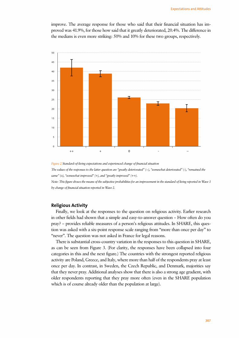
307
Expectations and Attitudes
5
0
10
15
20
25
30
35
40
45
50
++ + 0 - --
Figure 2 Standard-of-living expectations and experienced change of financial situation
The values of the responses to the latter question are “greatly deteriorated” (--), “somewhat deteriorated” (-), “remained the
same” (o), “somewhat improved” (+), and “greatly improved” (++).
Note: This figure shows the means of the subjective probabilities for an improvement in the standard of living reported in Wave 1
by change of financial situation reported in Wave 2.
improve. The average response for those who said that their financial situation has im-proved was 41.9%, for those how said that it greatly deteriorated, 20.4%. The difference in the medians is even more striking: 50% and 10% for these two groups, respectively.
Religious ActivityFinally, we look at the responses to the question on religious activity. Earlier research
in other fields had shown that a simple and easy-to-answer question – How often do you pray? – provides reliable measures of a person’s religious attitudes. In SHARE, this ques-tion was asked with a six-point response scale ranging from “more than once per day” to “never”. The question was not asked in France for legal reasons.
There is substantial cross-country variation in the responses to this question in SHARE, as can be seen from Figure 3. (For clarity, the responses have been collapsed into four categories in this and the next figure.) The countries with the strongest reported religious activity are Poland, Greece, and Italy, where more than half of the respondents pray at least once per day. In contrast, in Sweden, the Czech Republic, and Denmark, majorities say that they never pray. Additional analyses show that there is also a strong age gradient, with older respondents reporting that they pray more often (even in the SHARE population which is of course already older than the population at large).

308
Socio-Economic Status
0 10 20 30 40 50 60 70 80 90 100
CZ
PL
GR
ES
IT
AT
CH
BE
NL
DE
DK
SE
never
rarely
some
often
Figure 3 Religious activity by country
The displayed response categories for the question on frequency of prayer are defined as follows: “often” comprises the re-
sponses “more than once a day” and “once daily”; “some” comprises “a couple of times a week” and “once a week”; “rarely” is
“less than once a week”; and “never” is just this. The question was not asked in France.
Note: This figure shows the distribution of the responses to the question, “Thinking about the present, how often do you
pray?” (horizontal axis) by country.
never
rarely
some
often
0 10 20 30 40 50 60 70 80 90 100
75+
60-74
50-59
right
center
left
right
center
left
right
center
left
Figure 4 Religious activity by political orientation and age
The displayed response categories for the question on frequency of prayer are defined as follows: “often” comprises the re-
sponses “more than once a day” and “once daily”; “some” comprises “a couple of times a week” and “once a week”; “rarely” is
“less than once a week”; and “never” is just this.
Note: This figure shows the distribution of the responses to the question, “Thinking about the present, how often do you
pray?” (horizontal axis), stratified by self-assessed political orientation (constructed from responses on an eleven-point scale)
and by age group.

309
Finally, we compare the answers to the question on religious activity with those to an-other question that was asked as part of the expectations and attitudes section of SHARE Wave 2. Respondents were asked to report their political orientation on an eleven-point scale ranging from left to right. An interesting pattern that deserves more study emerges from Figure 4: The more often respondents pray, the further right they place themselves on a political scale. The figure also reflects that younger respondents tend to pray less often than older respondents, and the association between religious activity and political orientation holds within each of three broad age groups as well.
SummaryThe analysis of the responses to two of the subjective probability questions contained in
SHARE confirmed that they contain useful information about respondents’ expectations:
• Subjective survival probabilities vary with a known risk factor (self-rated health) and predict actual outcomes (mortality between waves).
• Responses to the question on expected changes in the standard of living in Wave 1 predict responses to a retrospective question on a household’s financial situation in Wave 2.
These findings imply that subjective probabilities are useful for subsequent economic analysis, in particular for intertemporal decisions in which an individual’s expectations about future events are crucial. Future research will study the responses to other subjec-tive expectations questions on economically quantities such as bequests; a particular focus will be to incorporate such variables in more structural models of intertemporal decisions. Interesting patterns also emerged from the analysis of a question on religious activity; this is a variable that will be explored much deeper in future analysis. Another attitude ques-tion which we did not have the space to analyze in this chapter was concerned with how much individuals trust others. Responses to these attitude questions will be important for the analysis of many economic behaviors since they promise to capture some portion of individual heterogeneity that so far has been left unmodeled.
References Guiso, L., A. Tiseno, and J. Winter. 2005. Expectations. In Health, Aging, and Retirement in Europe, ed.
Börsch-Supan A, A. Brugiavini, H. Jürges, J. Mackenbach, J. Siegrist, and G. Weber, 332–338. Mannheim:
Mannheim Research Institute for the Economics of Aging, University of Mannheim.
Hurd, M. D., D. McFadden, and L. Gan. 1998. Subjective survival curves and life-cycle behavior. In Inquiries in
the Economics of Aging, ed. D. A. Wise, 259–305. University of Chicago Press.
Hurd, M.D., Mc Garry, K., 2002. The predictive validity of subjective probabilities of survival, Economic Jour-
nal 112: 966–985.
Hurd, M.D., Rohwedder, S., Winter, J. 2008. Subjective probabilities of survival: An international comparison.
Unpublished manuscript.
Manski, C. F. 2004. Measuring expectations, Econometrica 72: 1329–1376.
Expectations and Attitudes