Embed Size (px)
Citation preview

6.1 Reading Circle, Bar and Line Graphs
A graph shows information visually. The type of graph usually depends on the kind of information
being disclosed.
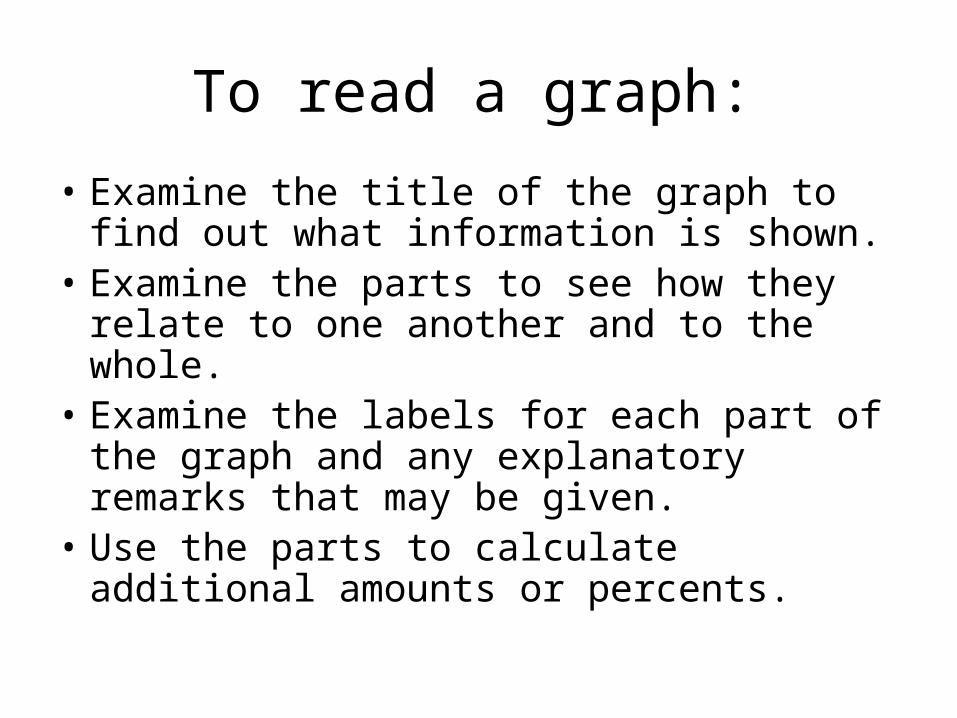
To read a graph:
• Examine the title of the graph to find out what information is shown.
• Examine the parts to see how they relate to one another and to the whole.
• Examine the labels for each part of the graph and any explanatory remarks that may be given.
• Use the parts to calculate additional amounts or percents.
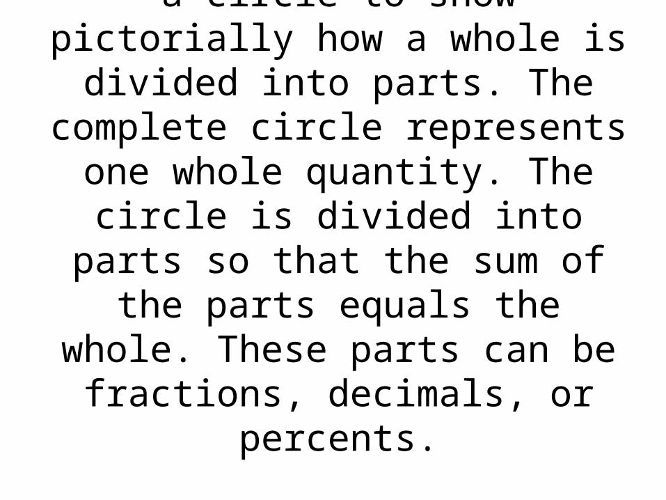
A circle or pie graph uses a circle to show pictorially how a whole is
divided into parts. The complete circle represents one whole
quantity. The circle is divided into parts so that the sum of the parts
equals the whole. These parts can be fractions, decimals, or percents.
Slide 5- 5 Copyright © 2008 Pearson Education, Inc.
Publishing as Pearson Addison-Wesley
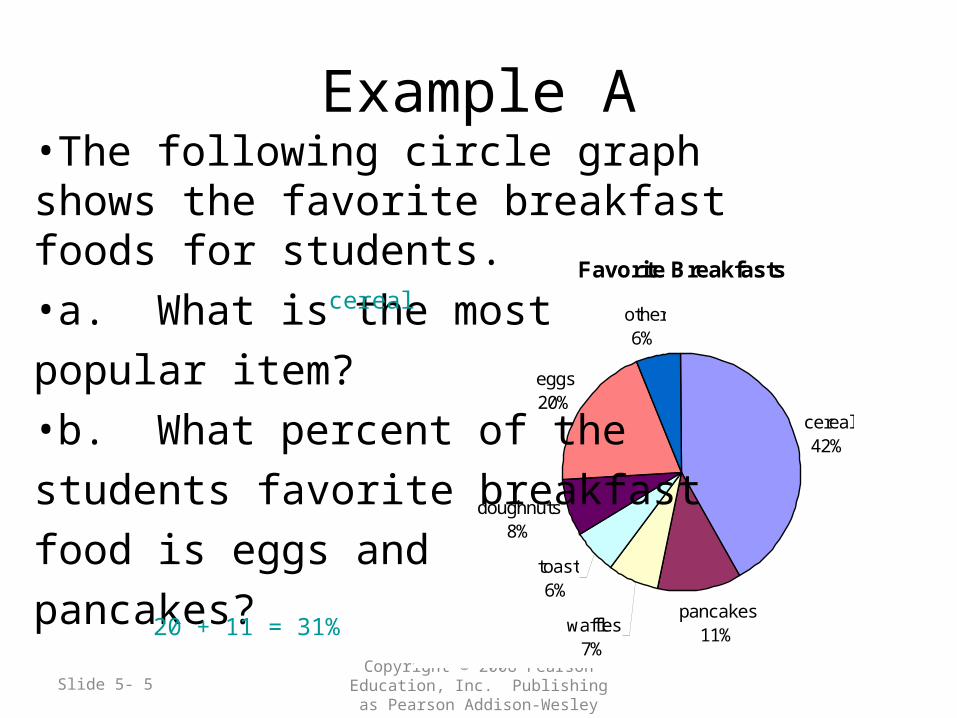
Favorite Breakfasts
cereal42%
pancakes11%waffles
7%
toast6%
doughnuts8%
eggs20%
other6%
Example A•The following circle graph shows the favorite breakfast foods for students.
•a. What is the most
popular item?
•b. What percent of the
students favorite breakfast
food is eggs and
pancakes?
cereal
20 + 11 = 31%
Slide 5- 6 Copyright © 2008 Pearson Education, Inc.
Publishing as Pearson Addison-Wesley
Favorite Breakfasts
cereal42%
pancakes11%waffles
7%
toast6%
doughnuts8%
eggs20%
other6%
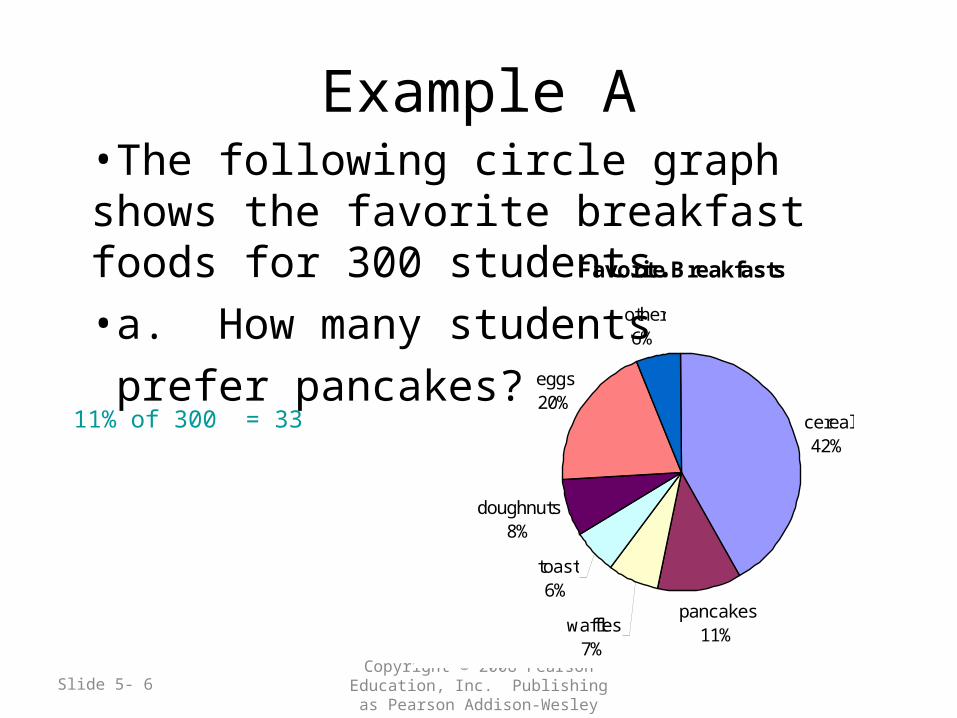
Example A•The following circle graph shows the favorite breakfast foods for 300 students.
•a. How many students
prefer pancakes?
11% of 300 = 33
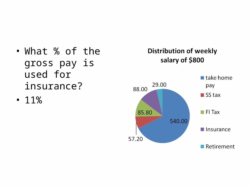
• What % of the gross pay is used for insurance?
• 11%
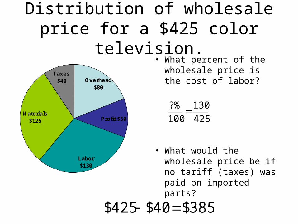
Distribution of wholesale price for a $425 color television.
Taxes$40
Materials $125
Labor $130
Overhead $80
Profit $50
• What percent of the wholesale price is the cost of labor?
• What would the wholesale price be if no tariff (taxes) was paid on imported parts?
%6.30425100130425
130
100
%?
385$40$425$
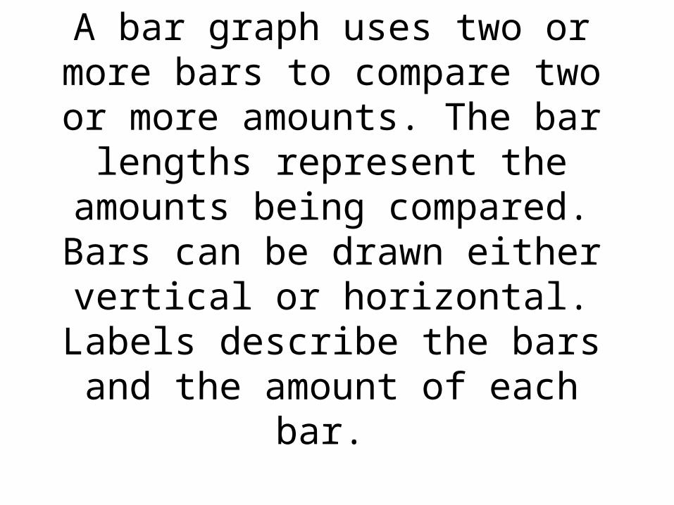
A bar graph uses two or more bars to compare two or more amounts.
The bar lengths represent the amounts being compared. Bars can
be drawn either vertical or horizontal. Labels describe the bars
and the amount of each bar.
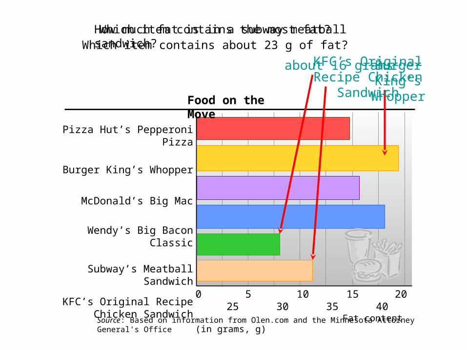
Pizza Hut’s Pepperoni Pizza
Burger King’s Whopper
McDonald’s Big Mac
Wendy’s Big Bacon Classic
Subway’s Meatball Sandwich
KFC’s Original Recipe Chicken Sandwich
Source: Based on information from Olen.com and the Minnesota Attorney General's Office
0 5 10 15 20 25 30 35 40 Fat content (in grams, g)
Food on the Move
How much fat is in a subway meatball sandwich?
about 16 grams
Which item contains the most fat?
Burger King’s Whopper
Which item contains about 23 g of fat?KFC’s Original Recipe
Chicken Sandwich
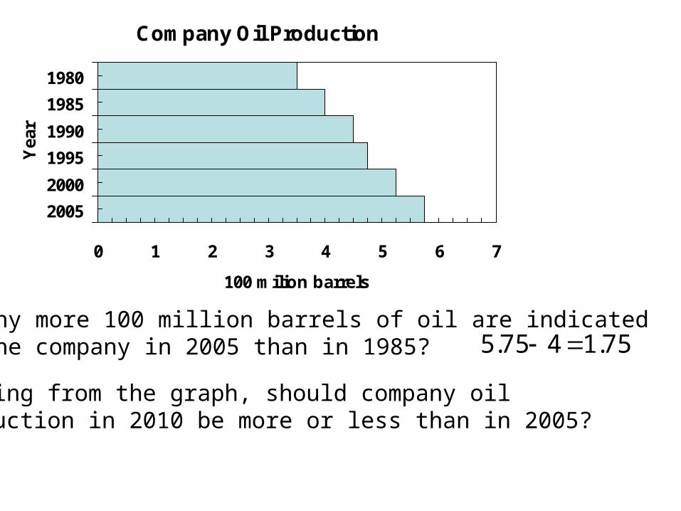
Company Oil Production
0 1 2 3 4 5 6 7
1980
1985
1990
1995
2000
2005
Yea
r
100 milion barrels
How many more 100 million barrels of oil are indicated for the company in 2005 than in 1985? 75.1475.5
Judging from the graph, should company oil production in 2010 be more or less than in 2005?
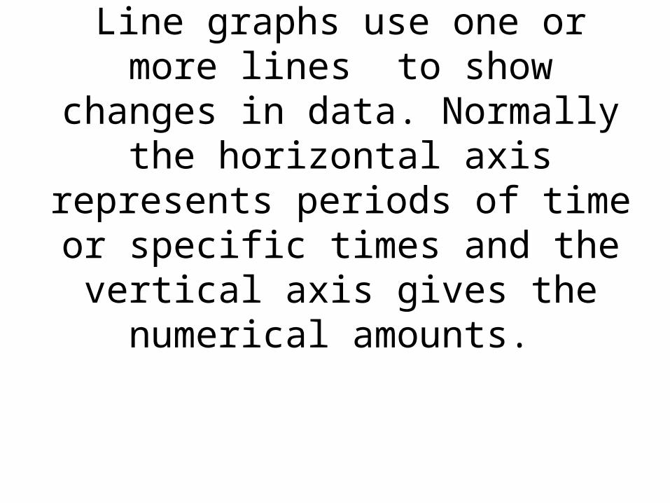
Line graphs use one or more lines to show changes in data. Normally
the horizontal axis represents periods of time or specific times and the vertical axis gives the
numerical amounts.
Slide 8- 13 Copyright © 2007 Pearson Education, Inc.
Publishing as Pearson Addison-Wesley
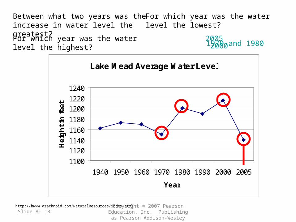
Lake Mead Average Water Level
1100
11201140
1160
1180
12001220
1240
1940 1950 1960 1970 1980 1990 2000 2005
Year
Hei
gh
t in
fee
t
For which year was the water level the lowest?
2005For which year was the water level the highest?2000
Between what two years was the increase in water level the greatest?
1970 and 1980
http://hwww.arachnoid.com/NaturalResources/index.html
Petroleum products supplied by type in the U.S.
Mill
ion
barr
els
per d
ay
What year was the motor gasoline supply 6,580,000 barrels of oil?
For which 10-year period was the increase in jet fuel the greatest?
1980
1960 to 1970
In 2000 the supply of jet fuel was what percent of the motor gasoline supply? 20.3%By what percent did jet fuel supplied increase from 1960 to 2000? 507.1 %
Slide 8- 15 Copyright © 2007 Pearson Education, Inc.
Publishing as Pearson Addison-Wesley
•Circle graphs, bar graphs, and line graphs provide three ways of representing a collection of data visually.
•Sometimes it is useful to describe a set of data numerically, using statistics.
•A statistic is simply a number that describes a set of data.
An average is an approximate number that is a central value of a
set of data. The most common average is the arithmetic mean or
statistical mean.
Slide 8- 17 Copyright © 2007 Pearson Education, Inc.
Publishing as Pearson Addison-Wesley
Average
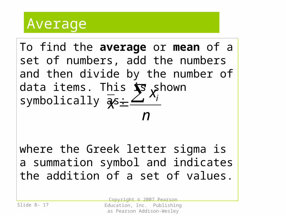
To find the average or mean of a set of numbers, add the numbers and then divide by the number of data items. This is shown symbolically as:
where the Greek letter sigma is a summation symbol and indicates the addition of a set of values.
n
xx i
Slide 8- 18 Copyright © 2007 Pearson Education, Inc.
Publishing as Pearson Addison-Wesley
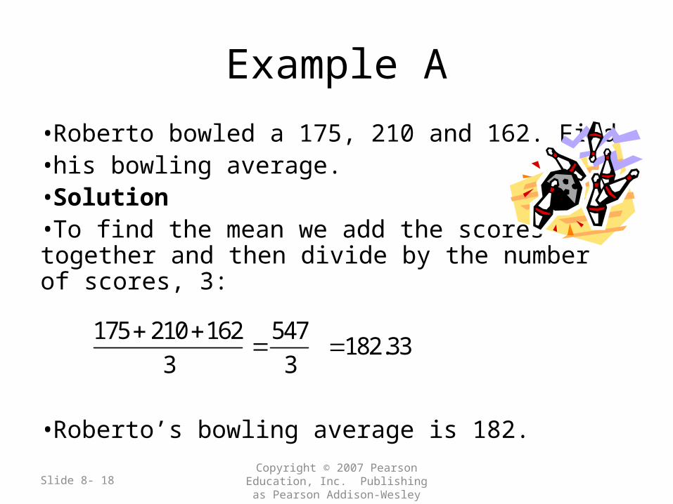
Example A
•Roberto bowled a 175, 210 and 162. Find •his bowling average.•Solution•To find the mean we add the scores together and then divide by the number of scores, 3:
•Roberto’s bowling average is 182.
175 210 162
3
547
3 182.33
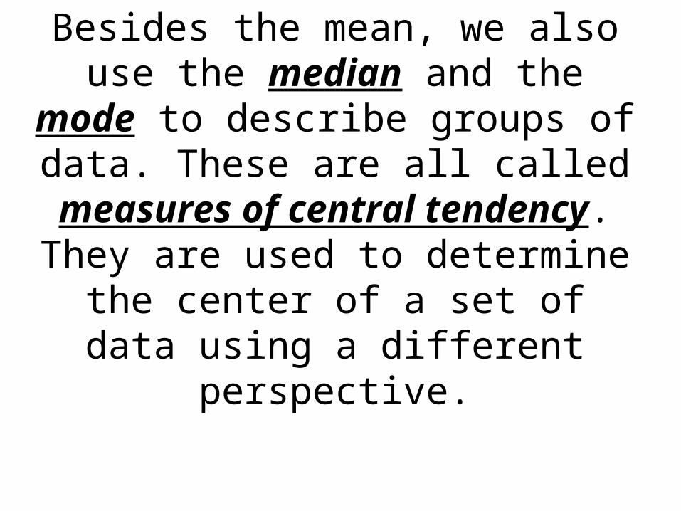
Besides the mean, we also use the median and the mode to describe groups of data. These are all called
measures of central tendency. They are used to determine the center of a set of data using a
different perspective.
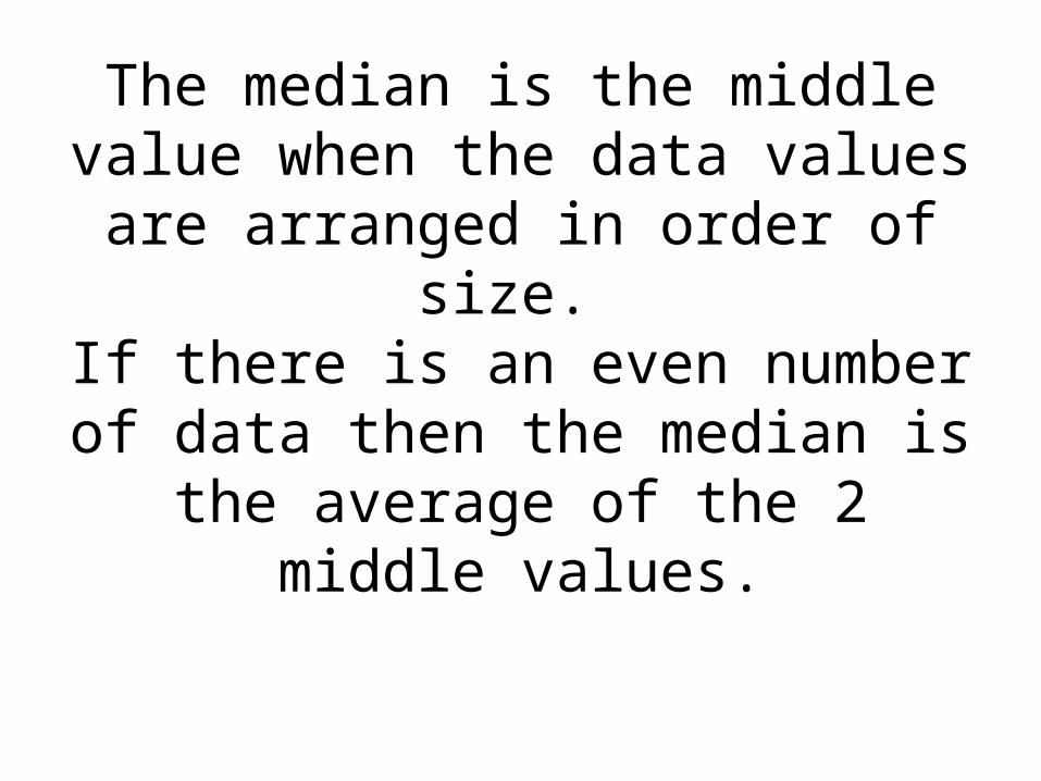
The median is the middle value when the data values are arranged
in order of size. If there is an even number of data then the median is the average of
the 2 middle values.
Slide 8- 21 Copyright © 2007 Pearson Education, Inc.
Publishing as Pearson Addison-Wesley
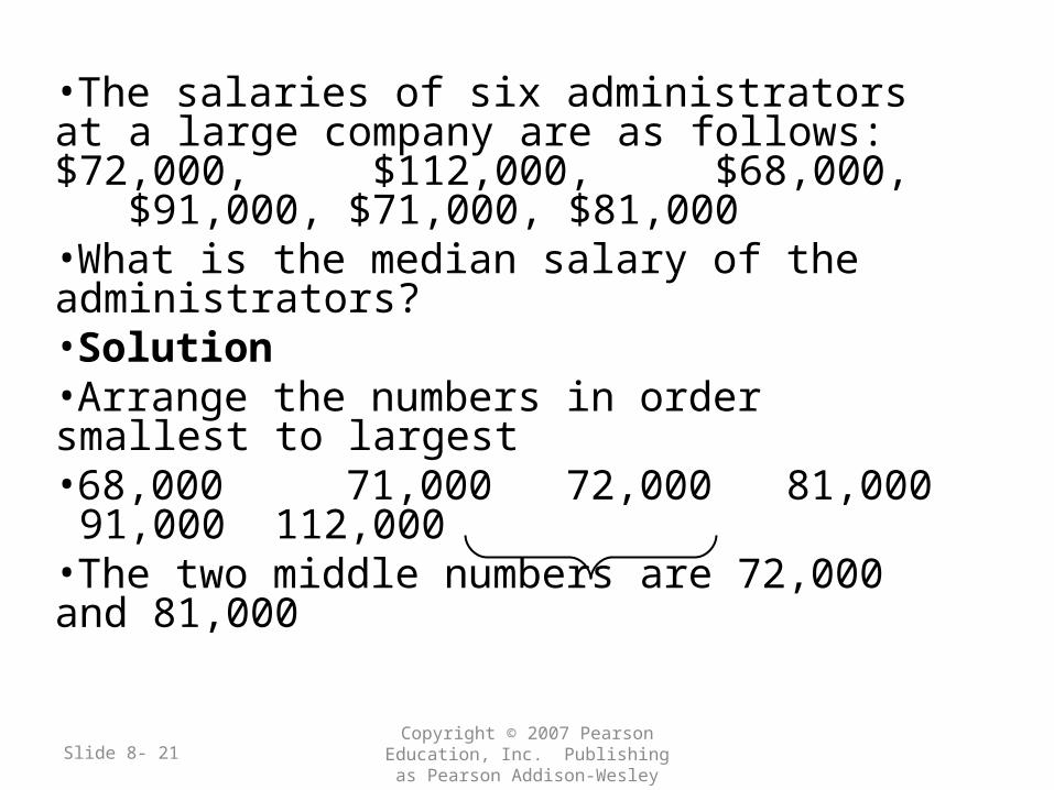
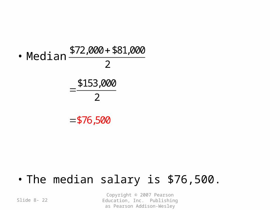
•The salaries of six administrators at a large company are as follows: $72,000, $112,000, $68,000, $91,000, $71,000, $81,000•What is the median salary of the administrators?•Solution•Arrange the numbers in order smallest to largest•68,000 71,000 72,000 81,000 91,000 112,000•The two middle numbers are 72,000 and 81,000
Slide 8- 22 Copyright © 2007 Pearson Education, Inc.
Publishing as Pearson Addison-Wesley
• Median
• The median salary is $76,500.
$72,000 $81,000
2
$153,000
2
$76,500
Slide 8- 23 Copyright © 2007 Pearson Education, Inc.
Publishing as Pearson Addison-Wesley
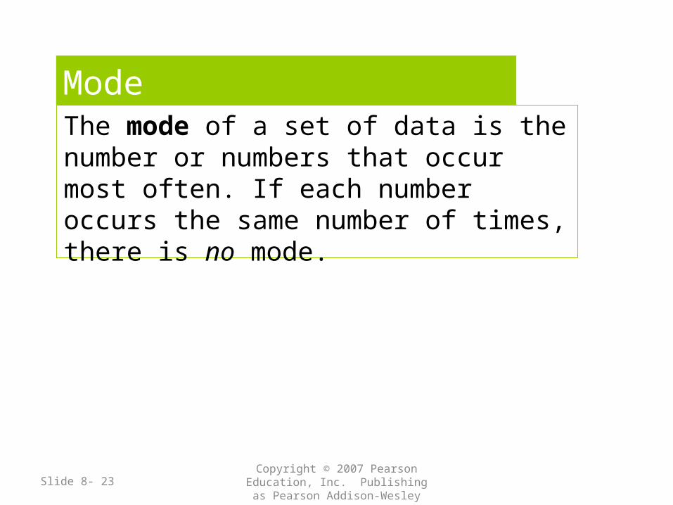
ModeThe mode of a set of data is the number or numbers that occur most often. If each number occurs the same number of times, there is no mode.
Slide 8- 24 Copyright © 2007 Pearson Education, Inc.
Publishing as Pearson Addison-Wesley
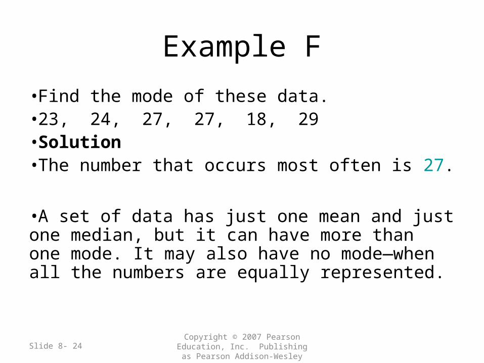
Example F
•Find the mode of these data.•23, 24, 27, 27, 18, 29•Solution•The number that occurs most often is 27.
•A set of data has just one mean and just one median, but it can have more than one mode. It may also have no mode—when all the numbers are equally represented.
Slide 8- 25 Copyright © 2007 Pearson Education, Inc.
Publishing as Pearson Addison-Wesley
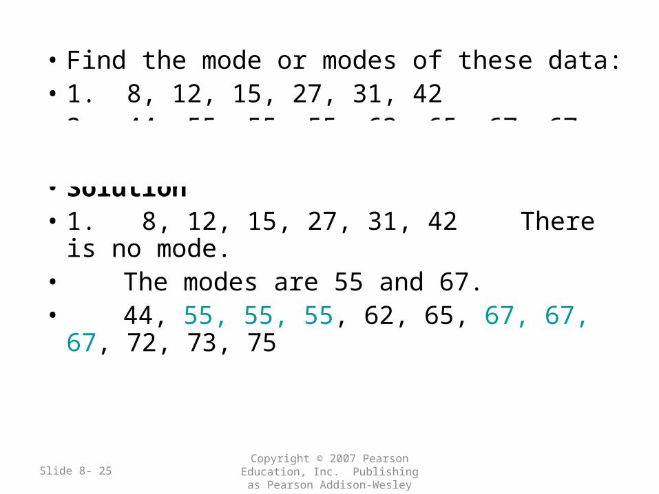
• Find the mode or modes of these data:• 1. 8, 12, 15, 27, 31, 42• 2. 44, 55, 55, 55, 62, 65, 67, 67, 67, 72, 73,
75• Solution• 1. 8, 12, 15, 27, 31, 42 There is no mode.• The modes are 55 and 67.• 44, 55, 55, 55, 62, 65, 67, 67, 67, 72,
73, 75


![arXiv:1111.7125v1 [stat.AP] 30 Nov 2011 · and generate testable hypotheses, visually guided exploratory analy- ... Some of the biclustering methods adopt a weighted bipartite graph](https://img.pdfslide.us/doc/110x75/5b8354de7f8b9a47588cfdfa/arxiv11117125v1-statap-30-nov-2011-and-generate-testable-hypotheses-visually.jpg)


![Genesis Disclosed eBook[1]](https://img.pdfslide.us/doc/110x75/577ce4091a28abf1038d8e66/genesis-disclosed-ebook1.jpg)