Embed Size (px)
Citation preview

4G LTE NETWORK DATA COLLECTION AND ANALYSIS ALONG
PUBLIC TRANSPORTATION ROUTES
by
Habiba Elsherbiny
A thesis submitted to the Department of Electrical and Computer Engineering
In conformity with the requirements for
the degree of Master of Applied Science
Queen’s University
Kingston, Ontario, Canada
May, 2020
Copyright © Habiba Elsherbiny, 2020

ii
Abstract
With the advancements in wireless network technologies over the past few decades and the deployment of
4G LTE networks, the capabilities and services provided to end-users have become seemingly endless.
Users of smartphones utilize high-speed network services while commuting on public buses and hope to
have a consistent, high-quality connection for the duration of their trip. Due to the massive load demand on
cellular networks and frequent changes in the underlying radio channel, users often experience sudden
unexpected variations in the connection quality. To overcome such a variation and maintain a consistent
connection, we need to predict these variations before they occur. This can be accomplished by analyzing
different network quality parameters at various times and locations and investigating the main factors that
affect the network’s performance and network QoS.
To this end, we conducted a network survey via Kingston Transit, in Kingston, Ontario, using the Android
network monitoring application G-NetTrack Pro from which we constructed a dataset of various client-side
wireless network quality parameters. The dataset consists of 30 repeated public transit bus trips, each lasting
no more than one hour. We studied two techniques for throughput analysis: regression predictive modelling
and time series forecasting. For regression predictive modelling, we deployed various machine learning
models on the collected data for throughput prediction and achieved the highest prediction performance
with the random forest model. For time series forecasting, we used statistical methods as well as deep
learning architectures. Our evaluation shows that the machine learning models had a higher throughput
prediction performance than the time series forecasting techniques.
In this thesis, we present an analysis of the collected data, where we investigate the effects of time and
location on the network’s measured throughput and signal strength. Also, we discuss and compare the
results of applying different throughput prediction techniques on the collected data.

iii
Acknowledgements
I would like to express my sincere gratitude to my supervisor Prof. Hossam Hassanein for his endless
guidance, support and constant feedback throughout this research work. Also, I would like to extend my
appreciation to my co-supervisor Prof. Aboelmagd Noureldin for his valuable suggestions and insights
during the planning and development of this research work.
I am deeply grateful to Prof. Hazem Abbas for his guidance and motivation, and for giving his time so
generously to help me complete this research work.
I also wish to thank Basia Palmer for her patient and accurate review of this thesis and her useful
suggestions.
I would like to thank all my colleagues in Queen’s Telecommunications Research Lab. In particular, I
would like to thank Ahmad Nagib for his generous help and support, Basma, Rawan, Sara and Mary for
their continuous encouragement.
To my parents, Ashraf and Amany, thank you for always believing in me in every step of my life. Words
can never describe how grateful I am to your endless love and support. I would like to extend my
appreciation to my brothers, Ahmad and Amr, who have always stood by my side and encouraged me
through hard times.
Last but not least, I wish to thank my Fiancé, Marwan, for being patient and supportive during my studies
and for always encouraging me to do better.

iv
Table of Contents
Abstract ................................................................................................................................................... ii
Acknowledgements ................................................................................................................................ iii
List of Figures ....................................................................................................................................... vii
List of Tables ......................................................................................................................................... ix
List of Abbreviations ............................................................................................................................... x
Chapter 1 Introduction ............................................................................................................................. 1
1.1 Problem Statement ......................................................................................................................... 1
1.2 Motivation and Objectives ............................................................................................................. 2
1.3 Thesis Contributions ...................................................................................................................... 3
1.4 Thesis Outline ................................................................................................................................ 4
Chapter 2 Background ............................................................................................................................. 5
2.1 Overview of Network Data Collection ........................................................................................... 5
2.1.1 Packet-based Data Collection .................................................................................................. 5
2.1.2 Flow-based Data Collection .................................................................................................... 6
2.1.3 Log-based Data Collection ...................................................................................................... 6
2.1.4 Data Collection Tools and Techniques..................................................................................... 6
2.2 LTE Networks Performance Metrics .............................................................................................. 7
2.3 Machine Learning ........................................................................................................................ 10
2.3.1 Supervised Learning.............................................................................................................. 10
2.3.2 Unsupervised Learning.......................................................................................................... 11
2.3.3 Reinforcement Learning ........................................................................................................ 11
2.4 Overview of Throughput Prediction ............................................................................................. 11
2.4.1 Connectivity Maps ................................................................................................................ 12
2.4.2 Online Throughput Estimation .............................................................................................. 12
2.5 Related Work ............................................................................................................................... 12
2.5.1 Data Collection ..................................................................................................................... 12
2.5.2 Throughput Prediction ........................................................................................................... 14
2.6 Summary ..................................................................................................................................... 15
Chapter 3 Data Collection and Exploration ............................................................................................ 16
3.1 Data Collection Goals .................................................................................................................. 16
3.2 Data Collection Factors ................................................................................................................ 16
3.3 Measurement Setup...................................................................................................................... 17
v
3.3.1 First Experiment.................................................................................................................... 18
3.3.2 Second Experiment ............................................................................................................... 19
3.4 Dataset Description ...................................................................................................................... 20
3.5 Limitation of our Approach .......................................................................................................... 21
3.6 Data Exploration .......................................................................................................................... 21
3.6.1 Signal Strength Variation ...................................................................................................... 21
3.6.2 Throughput Variation ............................................................................................................ 30
3.6.3 Correlation Analysis.............................................................................................................. 34
3.7 Summary ..................................................................................................................................... 36
Chapter 4 Throughput Modelling and Prediction .................................................................................... 37
4.1 Data Preprocessing ...................................................................................................................... 37
4.1.1 Outliers Detection and Removal ............................................................................................ 37
4.1.2 Filling in Missing Data .......................................................................................................... 40
4.1.3 Feature Scaling ..................................................................................................................... 42
4.1.4 Data Binning ......................................................................................................................... 42
4.2 Feature Selection ......................................................................................................................... 43
4.2.1 Univariate Selection .............................................................................................................. 44
4.2.2 Feature Importance ............................................................................................................... 44
4.2.3 Correlation Matrix with Heatmap .......................................................................................... 45
4.3 Machine Learning Models ........................................................................................................... 45
4.4 Hyperparameters Tuning .............................................................................................................. 52
4.5 Data Splitting ............................................................................................................................... 54
4.6 Time Series Forecasting ............................................................................................................... 55
4.6.1 Autoregressive Integrated Moving Average (ARIMA)........................................................... 56
4.6.2 Long Short-Term Memory (LSTM) ....................................................................................... 56
4.7 Evaluation Metrics ....................................................................................................................... 58
4.7.1 R2 score ................................................................................................................................ 58
4.7.2 Root Mean Square Error (RMSE) .......................................................................................... 58
4.8 Summary ..................................................................................................................................... 59
Chapter 5 Results and Discussion .......................................................................................................... 60
5.1 Experimental Setup ...................................................................................................................... 60
5.1.1 Data Collection and Preparation ............................................................................................ 60
5.1.2 Platform Used ....................................................................................................................... 61
5.2 Results of Machine Learning Models ........................................................................................... 61
vi
5.2.1 SVR ...................................................................................................................................... 62
5.2.2 KNN for Regression .............................................................................................................. 64
5.2.3 Ridge Regression .................................................................................................................. 66
5.2.4 Random Forest for Regression............................................................................................... 68
5.2.5 Model Comparison ................................................................................................................ 70
5.3 Results of Time Series Forecasting Models .................................................................................. 71
5.3.1 ARIMA Model ...................................................................................................................... 71
5.3.2 LSTM Model ........................................................................................................................ 73
5.4 Discussion ................................................................................................................................... 74
5.5 Summary ..................................................................................................................................... 74
Chapter 6 Conclusions and Future Directions ........................................................................................ 75
Future Directions ............................................................................................................................... 76
References............................................................................................................................................. 78
vii
List of Figures
Figure 1-1: Research framework structure................................................................................................ 3
Figure 3-1: The 23.64 km trajectory of the Kingston Transit Express Bus 502. ...................................... 18
Figure 3-2: Sample trip trajectory showing incomplete GPS recordings. ................................................ 19
Figure 3-3: Sample 9-am-trips (a) latitude and (b) signal strength variation per second........................... 22
Figure 3-4: Sample 12-pm-trips (a) latitude and (b) signal strength variation per second. ....................... 23
Figure 3-5: Sample 6-pm-trips (a) latitude and (b) signal strength variation per second. ......................... 24
Figure 3-6: Average signal strength map. ............................................................................................... 25
Figure 3-7: Operator’s cell tower locations in Kingston. ........................................................................ 26
Figure 3-8: Density plots for signal strength at (a) 9 am, (b) 12 pm, and (c) 6pm. ................................... 27
Figure 3-9: Variance of signal strength map for the 9-am-trip. ............................................................... 28
Figure 3-10: Variance of signal strength map for the 12-pm-trip. ........................................................... 29
Figure 3-11: Variance of signal strength map for the 6-pm-trip. ............................................................. 29
Figure 3-12: Throughput variation per second for sample bus 9-am trips. ............................................... 30
Figure 3-13: Throughput variation per second for sample 12-pm-trips.................................................... 31
Figure 3-14: Throughput variation per second for sample 6-pm-trips. .................................................... 31
Figure 3-15: Average throughput map. .................................................................................................. 32
Figure 3-16: : Density plots for throughput at (a) 9 am, (b) 12 pm, and (c) 6pm. .................................... 33
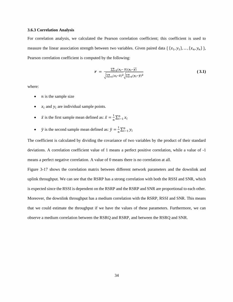
Figure 3-17: Correlation matrix of different features in the dataset. ........................................................ 35
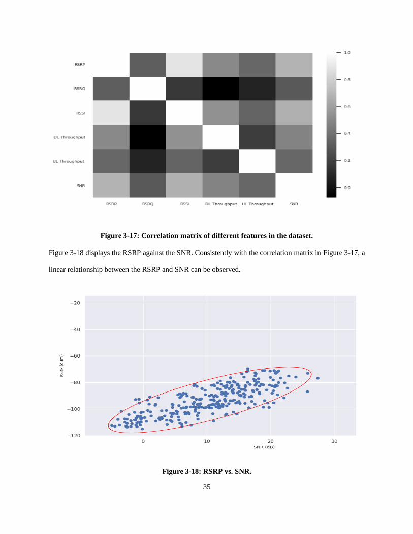
Figure 3-18: RSRP vs. SNR. .................................................................................................................. 35
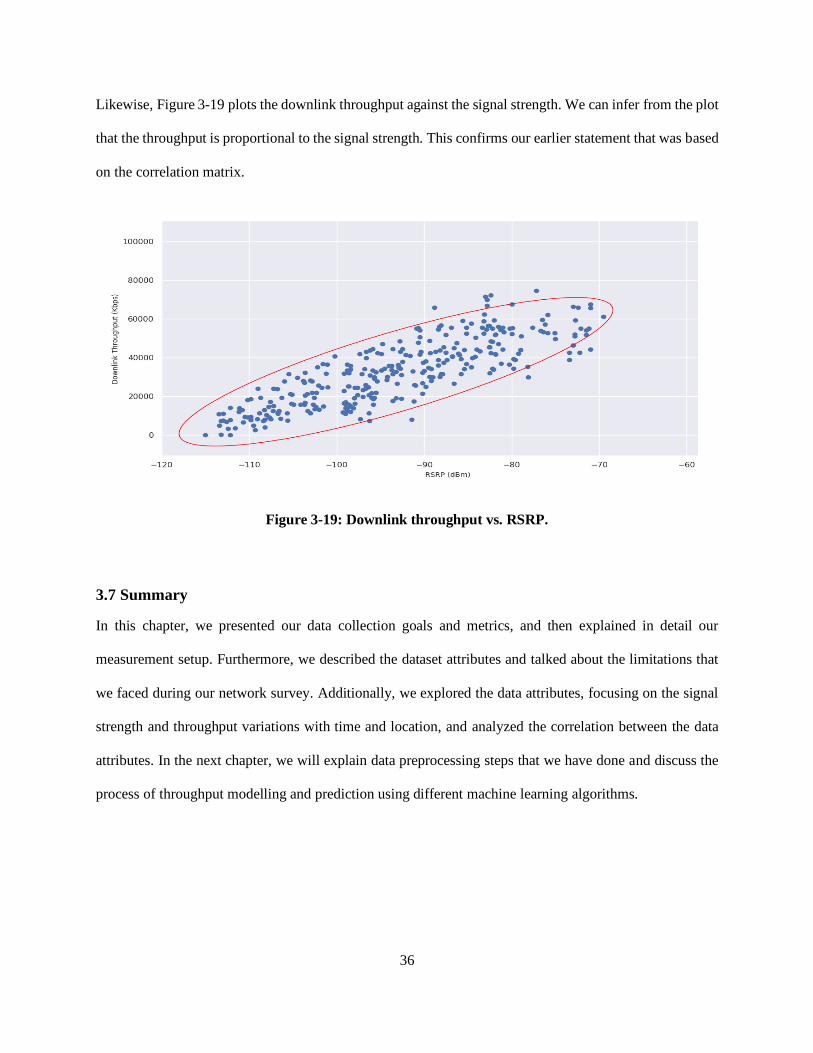
Figure 3-19: Downlink throughput vs. RSRP. ........................................................................................ 36
Figure 4-1: Linear regression example. .................................................................................................. 46
Figure 4-2: KNN Example for (a) regression, (b) classification. ............................................................. 48
Figure 4-3: SVR Algorithm. .................................................................................................................. 50
Figure 4-4: Random forest algorithm structure. ...................................................................................... 52
Figure 4-5: Structure of LSTM. ............................................................................................................. 57
Figure 4-6: Residuals in a linear model. ................................................................................................. 58
Figure 5-1: Throughput prediction pipeline. ........................................................................................... 61
Figure 5-2: SVR model predictions with C=10000, ε=0.01. ................................................................... 62
Figure 5-3: SVR model predictions with C=1000, ε=0.01. .................................................................... 63
Figure 5-4: SVR model predictions with C=10000, ε=0.001. ................................................................ 63
Figure 5-5: KNN model predictions with k=5. ...................................................................................... 64
viii
Figure 5-6: KNN model predictions with k=13. ..................................................................................... 65
Figure 5-7: KNN model predictions with k=17. ..................................................................................... 65
Figure 5-8: Ridge regression model predictions with α =0.1. .................................................................. 66
Figure 5-9: Ridge regression model predictions with α =1.5. .................................................................. 67
Figure 5-10: Ridge regression model predictions with α =10. ................................................................ 67
Figure 5-11: Random forest model predictions with number of trees=250. ............................................. 68
Figure 5-12: Random forest model predictions with number of trees=400. ............................................. 69
Figure 5-13: Random forest model predictions with number of trees=700. ............................................. 69
Figure 5-14: Throughput vs. Time. ........................................................................................................ 71
Figure 5-15: Autocorrelation plot of the time series. .............................................................................. 72
Figure 5-16: ARIMA model performance for time series throughput forecasting. ................................... 72
Figure 5-17: LSTM model architecture. ................................................................................................. 73
Figure 5-18: LSTM model performance for time series throughput forecasting. ..................................... 73
ix
List of Tables
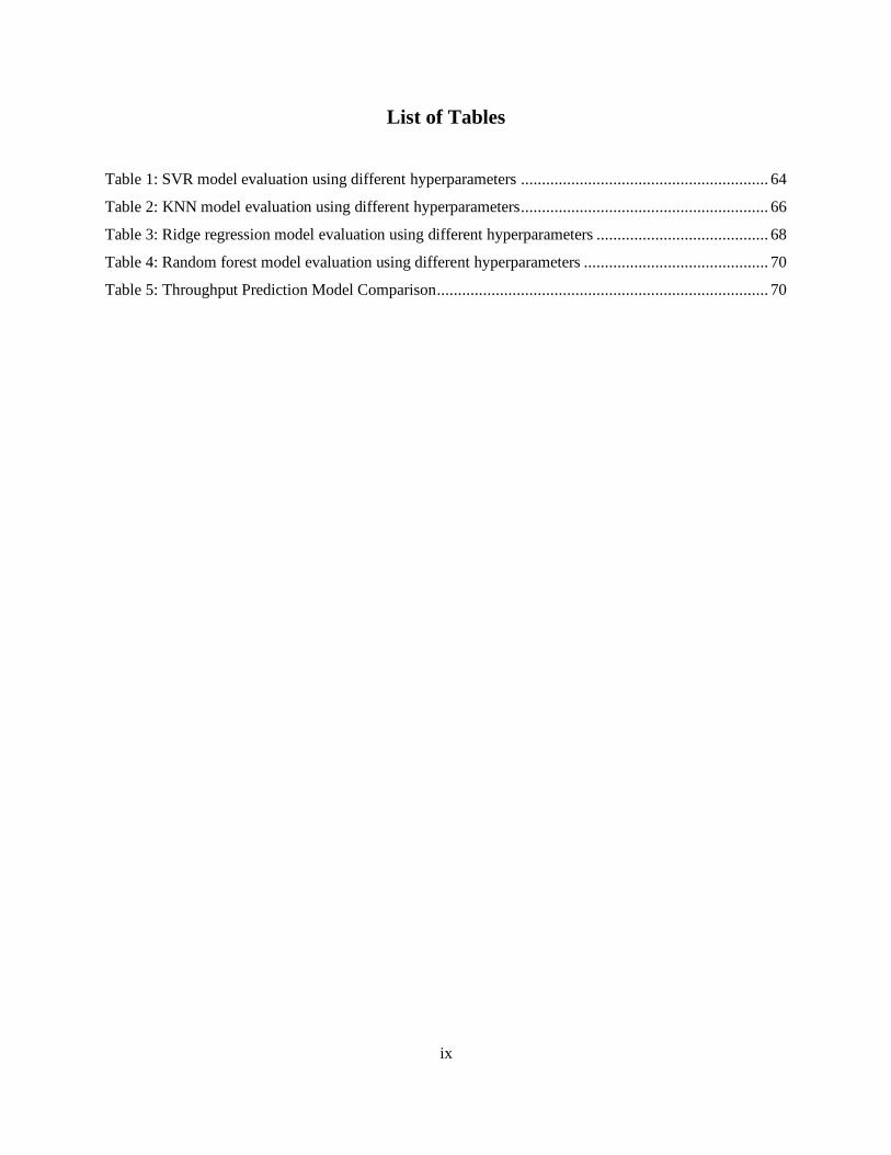
Table 1: SVR model evaluation using different hyperparameters ........................................................... 64
Table 2: KNN model evaluation using different hyperparameters ........................................................... 66
Table 3: Ridge regression model evaluation using different hyperparameters ......................................... 68
Table 4: Random forest model evaluation using different hyperparameters ............................................ 70
Table 5: Throughput Prediction Model Comparison ............................................................................... 70
x
List of Abbreviations
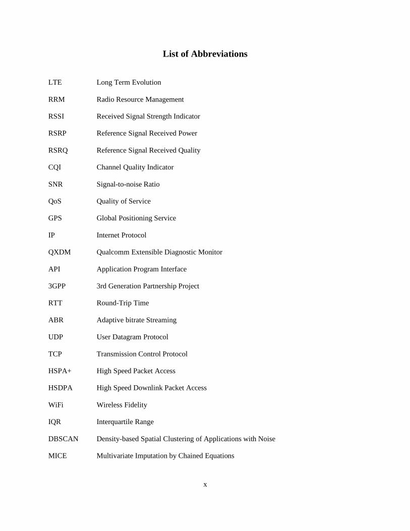
LTE Long Term Evolution
RRM Radio Resource Management
RSSI Received Signal Strength Indicator
RSRP Reference Signal Received Power
RSRQ Reference Signal Received Quality
CQI Channel Quality Indicator
SNR Signal-to-noise Ratio
QoS Quality of Service
GPS Global Positioning Service
IP Internet Protocol
QXDM Qualcomm Extensible Diagnostic Monitor
API Application Program Interface
3GPP 3rd Generation Partnership Project
RTT Round-Trip Time
ABR Adaptive bitrate Streaming
UDP User Datagram Protocol
TCP Transmission Control Protocol
HSPA+ High Speed Packet Access
HSDPA High Speed Downlink Packet Access
WiFi Wireless Fidelity
IQR Interquartile Range
DBSCAN Density-based Spatial Clustering of Applications with Noise
MICE Multivariate Imputation by Chained Equations

xi
SVM Support Vector Machines
SVR Support Vector Regression
SVC Support Vector Classification
KNN K-Nearest Neighbors
MSE Mean Squared Error
RMSE Root Mean Square Error
RAM Random Access Memory
RNN Recurrent Neural Networks
LSTM Long Short-Term Memory
ARIMA Autoregressive Integrated Moving Average

1
Chapter 1
Introduction
The past decade has witnessed a staggering evolution in cellular networks. Mobile wireless technologies
have undergone four distinct generations. From uncomplicated voice calls in the first generation to high-
speed, low latency and video streaming in the fourth generation. The increasing demand in network usage
has proven the necessity of further service enhancements. However, these enhancements were faced with
several obstacles. In this chapter, we shed light on the problems that prevent such improvements in cellular
networks and present our solutions to these problems.
1.1 Problem Statement
Over the years, there has been a dramatic increase in mobile network traffic. The technological
advancements in the 4G LTE networks have brought broadband speeds directly to smartphones, allowing
mobile users to access high-speed internet services such as online gaming and video streaming while on a
public transit bus. This has significantly increased the load on cellular networks, causing fluctuating loads
on the network traffic. To cope with this increasing demand, cellular network operators are constantly
looking ways to fulfill the client’s expectations. However, this task has many challenges; it requires
successful scheduling, network load balancing, and resource allocation. While taking into consideration
cell tower locations, network quality and time of day, the problem can be broken down to three main
aspects: the user’s location, the achieved network quality and the time of the day.
In the past few years, these three aspects have been studied extensively in the literature. The researchers
have taken different approaches to tackle the issues attached to these aspects. The most common issue faced
in the related work was the sparsity of cellular network data. Consequently, the usage of modern network
quality prediction techniques was limited, as most mechanisms require large amounts of data. To solve this
problem, researchers directed their efforts towards collecting their own data.

2
However, most of the data collection and analysis performed in the related work focused on 3G networks
[1, 2, 3]. In addition to the lack of 4G LTE networks analysis, most of the research conducted did not
investigate connectivity issues on public transportation.
We conducted a network survey along a 23.4 km public transit bus route covering both urban and suburban
areas in Kingston, Ontario. To consider the effect of time and road traffic conditions, we conducted the
measurements at three different times of the weekdays. To consider changing connectivity, we performed
a comprehensive analysis on the collected data and applied machine learning algorithms, as well as time
series forecasting approaches, for throughput prediction and forecasting1. Since throughput is a major
indicator of the network’s performance, the work done in the field utilized throughput prediction as one of
the means of ensuring a high network quality.
1.2 Motivation and Objectives
The motivation for this research is the need to predict the network throughput based on other network
parameters. This is an initial step that is required before tasks such as predictive resource allocation could
be carried out by network providers. It is also a crucial step for maintaining the network QoS.
For the following reasons, public transportation vehicles are attractive candidates for cellular network
analysis. Public transportation passengers generate massive amounts of mobile traffic, due to their intensive
consumption of data. The routes and stops are known in advance, which allowed us to observe the status of
the traffic during the bus trips and note any correlation with network quality of service (QoS).
To perform a precise analysis of 4G LTE networks availability within public transit buses, accurate and
reliable data is a necessity. As there is no publicly available dataset of 4G LTE network parameters in
Kingston, conducting a network survey of 4G LTE network data was required for this research.
1 The main difference between prediction and forecasting is that forecasting takes into consideration the time
dimension.
3
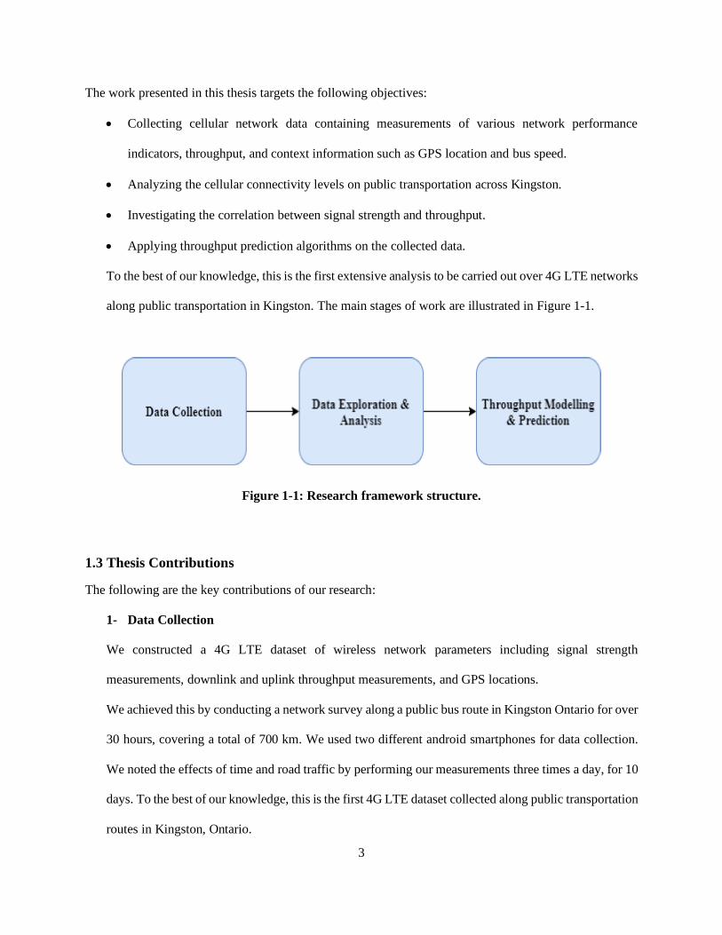
The work presented in this thesis targets the following objectives:
• Collecting cellular network data containing measurements of various network performance
indicators, throughput, and context information such as GPS location and bus speed.
• Analyzing the cellular connectivity levels on public transportation across Kingston.
• Investigating the correlation between signal strength and throughput.
• Applying throughput prediction algorithms on the collected data.
To the best of our knowledge, this is the first extensive analysis to be carried out over 4G LTE networks
along public transportation in Kingston. The main stages of work are illustrated in Figure 1-1.
Figure 1-1: Research framework structure.
1.3 Thesis Contributions
The following are the key contributions of our research:
1- Data Collection
We constructed a 4G LTE dataset of wireless network parameters including signal strength
measurements, downlink and uplink throughput measurements, and GPS locations.
We achieved this by conducting a network survey along a public bus route in Kingston Ontario for over
30 hours, covering a total of 700 km. We used two different android smartphones for data collection.
We noted the effects of time and road traffic by performing our measurements three times a day, for 10
days. To the best of our knowledge, this is the first 4G LTE dataset collected along public transportation
routes in Kingston, Ontario.

4
2- Data Analysis
We performed a thorough analysis on the collected measurements, and investigated the effects of time,
location, road traffic condition and number of passengers on the signal strength and throughput
measurements. Moreover, we studied the variations of the signal strength and throughput values at
different times of the day and analyzed the relationship between the different wireless network
parameters and the throughput.
3- Throughput Modelling and Prediction
To analyze the fluctuations in the network throughput measurements and anticipate them, we trained
various machine learning models for throughput prediction using the collected dataset. We evaluated
the models’ performance on test data from our measurements using multiple evaluation metrics.
Additionally, we performed a comparative analysis of the various models used.
1.4 Thesis Outline
The thesis is organized into six chapters. Chapter 1 provides an introduction, Chapter 2 gives an overview
about data collection mechanisms and techniques, throughput prediction methods, and presents an extensive
literature review. In Chapter 3, we explain our data collection approach and perform an analysis on the
collected data. Chapter 4 presents the pipeline for the throughput prediction models that we applied to the
data, as well as the preprocessing steps. Chapter 5 discusses and compares the experimental results of the
different models we used for throughput prediction. Lastly, Chapter 6 summarizes our findings, and
presents an insight regarding potential future research directions.

5
Chapter 2
Background
In this chapter, we present background information about the topics that will be discussed throughout this
thesis. In Section 2.1, we provide an overview about network data collection, explaining the different tools
and techniques that are commonly used for data collection. In Section 2.2, we discuss the main metrics used
for measuring network performance. In Section 2.3, we give a brief overview about the different types of
machine learning algorithms. In Section 2.4, we talk about two widespread techniques that are used for
throughput prediction. Finally, in Section 2.5, we discuss the related work conducted in the fields of data
collection and throughput prediction.
2.1 Overview of Network Data Collection
Over the years, there has been a growing interest in collecting and analyzing network data for numerous
reasons, such as network performance evaluation, resource allocation, traffic prediction, throughput
prediction, security analysis and intrusion detection. Accordingly, researchers have proposed and studied
various data collection mechanisms and techniques. In this section, we present three common mechanisms
for data network collection: packet-based data collection, flow-based data collection and log-based data
collection [4]. In addition, we describe the different tools and methods for collecting network data.
2.1.1 Packet-based Data Collection
In packet switched networks, the data is divided and encoded into packets. A source node typically sends
packets to a destination node. When the destination node receives the packets, it decodes them to retrieve
the data [4].
A common method for data collection in networks is packet capturing, which is the process of intercepting
a data packet that is passing through the data network. Packet capturing can be done by a packet analyzer,
also known as packet sniffer [5]. Packet capturing can be classified into two methods, active data collection

6
methods and passive collection methods. Active data collection methods work by injecting test data into
the network traffic and waiting for a response and then measuring the network performance parameters.
Passive data collection methods work by monitoring the network traffic using a monitoring tool [4]. The
monitoring tool is polled periodically, and information about the network performance is obtained.
2.1.2 Flow-based Data Collection
Another traditional method for network data collection is the flow-based collection. A network flow is made
up of a set of packets having the same features. Flow based data collection involves monitoring the network
flow at a certain location in the network. Any location can be used for flow monitoring, but the most
effective location is at a core network device. Flow monitoring methods are often based on five tuples: the
source IP address, the destination IP address, the source port, the destination port, and protocol type [4].
2.1.3 Log-based Data Collection
Log-based data collection works by monitoring the network log files, which are files that store records of
network events. Different network devices including hosts, mobile devices, routers, and data centers contain
log files. In log-based data collection, the network logs are first probed, and data is acquired from them.
Then, the data is parsed to extract important features from it. Finally, analysis is performed on the data,
often using pattern matching or machine learning approaches [4].
2.1.4 Data Collection Tools and Techniques
Several tools and techniques have been proposed for network data collection. Each tool has different
characteristics and choosing the right one depends on factors, such as the nature of the problem and the
budget. The following are three commonly used tools for network data collection:
1- Qualcomm eXtensible Diagnostic Monitor (QXDM)
QXDM is a tool developed by Qualcomm that can record various radio information in real time for
phones with Qualcomm chipsets [6]. To record data, a phone is connected using a USB cable to a laptop
that runs QXDM. The tool then communicates with the phone and records the traces containing radio

7
information [7]. An advantage of using this tool is that it can collect data with a granularity of
milliseconds. However, it requires expensive licenses and might not be easily deployed on low cost
hardware.
2- Android Smartphone
Android smartphones rely on the public Android API for obtaining information about various network
quality parameters. This approach is simple, inexpensive and can be used out-of-the-box. However, the
problem with this approach is that it has a maximum granularity of one second, which is less than that
of QXDM.
3- Crowdsourcing
Crowdsourcing is the process of using individuals or organizations to obtain goods and services [8]. In
crowdsourcing, the work is divided among participants who work together toward a common goal. In
the context of network data collection, crowdsourcing allows collecting massive amounts of data with
the help of volunteers who simply install an application on their devices and use it for conducting
measurements. This approach allows for more scenarios for collection but requires multiple volunteers.
Moreover, the more diversity might cause the data to have a high variance.
2.2 LTE Networks Performance Metrics
LTE is the 3GPP-standardized wireless cellular network that focuses on providing very high data rates,
high spectral efficiency, improved capacity and coverage, short round trip time, and spectrum flexibility
[9]. To assess the performance of LTE, several metrics should be taken into consideration. The following
are the main metrics that determine the performance and quality of the LTE networks:
1- Radio Resource Management Measurements
Radio Resource Management (RRM) is the system level management of radio transmission
characteristics in wireless communication systems [10]. RRM provides a set of measurements to ensure
the quality of the LTE networks. The RRM measurements are as follows:

8
• Received Signal Strength Indicator (RSSI): RSSI is an estimated measure of the total power in
a radio signal received by a client device, including the interference from neighboring cells and
other sources, and is measured in dB [11]. There are four main parameters related to the RSSI:
dynamic range, accuracy, linearity and average period [12]. The RSSI dynamic range states the
maximum and minimum received signal energy that the receiver can measure. The RSSI accuracy
defines the average error for each RSSI measurement, and the RSSI linearity specifies how the
RSSI plot deviates from a straight line versus the actual received input signal power. The average
period indicates the period of time during which the signal strength is measured and then averaged
to produce the RSSI value.
• Reference Signal Received Power (RSRP): RSRP is a cell-specific signal strength measurement
that indicates the power of the LTE reference signals over the bandwidth and narrowband and is
expressed in dBm. It is used for ranking different cells based on their signal strength and for making
handover or cell reselection decisions. Handover occurs when the RSRP value of the serving cell
falls below that of the neighboring cell by a predefined threshold for a certain period of time [12].
RSRP values range from -140 dBm to -44 dBm, where a larger value indicates a higher signal
strength and likewise a lower value indicates a lower signal strength.
• Reference Signal Received Quality (RSRQ): RSRQ is a cell-specific measurement that indicates
the quality of the received reference signal and is expressed in dB. When the value of the RSRP is
not enough to make reliable handover or cell reselection decisions, the value of the RSRQ is used
to give more information. The value of the RSRQ depends on the RSSI and the number of used
resource blocks, and is computed by:
𝑹𝑺𝑹𝑸 =(𝑵∗𝑹𝑺𝑹𝑷)
𝑹𝑺𝑺𝑰 (2.1)
where N is the number of resource blocks. The range of the RSRQ is defined from -19.5 dB to -3
dB, where the larger value indicates a higher signal quality and the smaller a lower signal quality.

9
• Channel Quality Indicator (CQI): CQI is a 4-bit integer that is sent from user equipment (UE)
to the eNodeB, which is the base station responsible for radio communications, resource
management and message scheduling in LTE networks. The eNodeB uses the CQI to indicate a
suitable downlink transmission data rate in order to ensure a stable connection between the network
and the UE. The CQI values range from one to 31, where larger values indicate a higher quality
and smaller values indicate a lower quality [11]. Furthermore, CQI is a quantized and scaled version
of the experienced SINR [9]. SNR/SINR stands for signal-to-noise ratio/ signal-to-interference-
plus-noise ratio and is defined as the ratio of the signal power to noise power, where the noise is
the sum of the interference power and background noise power.
2- Throughput
Throughput is a measure of the network’s actual data transmission rate [12]. Particularly, it measures
the percentage of messages or data packets that are successfully delivered over a communication
channel in a given time period. Throughput is measured in bits per second (bps) and can be divided into
downlink throughput and uplink throughput. Downlink throughput indicates the number of packets
successfully delivered in the downlink channel per unit time, while uplink throughput refers to the
number of packets successfully delivered in the uplink channel per unit time. Throughput can be further
classified into user throughput and average cell throughput. User throughput is a measure of the average
amount of data being received by a certain user in the network and average cell throughput is a measure
of the total throughput of all the users in the network.
In our work, we collected user throughput measurements and employed machine learning models to
predict the user throughput based on other network parameters. Thus, for the remainder of this thesis,
throughput will always refer to the user throughput.
3- Latency
Latency is a measure of how long it takes a data packet to travel from the source node in the network
to the destination node. Network latency is often measured by the round-trip time (RTT), which is the

10
time taken by a data packet to travel to a destination node and for an acknowledgment to be sent back
to the source node and is expressed in milliseconds (ms).
There are multiple factors that affect the network latency; the following are the more common factors:
• Packet Size: The time taken to send a large packet would be more than the time taken to send a
small packet.
• Packet Loss: Packet loss is the percentage of packets that get lost on the way from the source node
to the destination node, and therefore are not received in the destination node.
• Signal Strength: Signal strength affects the network latency; a weak signal could cause a high
latency.
• Transmission Media: The type of medium used to transmit the data packets can impact the
network latency, as some mediums have higher latency than others. For example, old copper cables
would have higher latency than fiber-optic cables [13].
2.3 Machine Learning
Machine learning has been shown to be successful in various fields, such as: computer vision, speech
recognition and natural language processing. Machine learning algorithms build a mathematical model of
training data in order to make predictions or decisions without being explicitly programmed to perform the
task [14]. Generally, machine learning algorithms fall into three categories: supervised learning,
unsupervised learning, and reinforcement learning
2.3.1 Supervised Learning
Supervised learning is the task of learning a function that maps the input features to desired output values
[15]. Supervised learning algorithms receive a labeled dataset, where each sample in the dataset has a
corresponding label or ground truth. Supervised learning can be further divided into classification and
regression:

11
• Classification: Classification models approximate a mapping from the input variables to a discrete
output variable [16]. A classification model classifies the inputs into one of two or more classes.
The performance of the model is often measured by the classification accuracy.
• Regression: Regression models approximate a mapping from the input variables to a continuous
output variable [17]. The performance of a regression model is measured in terms of errors made
in the model’s predictions.
2.3.2 Unsupervised Learning
Unsupervised learning algorithms receive a set of input variables with no output variable or label [18]. The
objective of unsupervised learning is to learn the underlying structure of the data and find an efficient
representation for it. Two common unsupervised learning tasks are clustering and dimensionality reduction:
• Clustering: Clustering groups samples into clusters based on their similarities [19]. Samples which
are similar to each other are grouped into the same cluster.
• Dimensionality Reduction: The idea of dimensionality reduction is to project samples from a
high-dimensional space onto a lower dimensional space without losing much information [20]. This
reduces the complexity of the data while retaining its structure.
2.3.3 Reinforcement Learning
Reinforcement learning is a class of machine learning where an agent interacts with the environment [21].
The goal of reinforcement learning is to train the agent in such a way that for a given environmental state,
it chooses the optimum action that yields the highest reward.
2.4 Overview of Throughput Prediction
A widely known problem in wireless networks is throughput prediction, as it can be useful in many
applications, such as adaptive bitrate (ABR) streaming [22] and resource allocation. Two common
techniques that have been proposed for performing throughput prediction are connectivity maps and online
throughput prediction described below.

12
2.4.1 Connectivity Maps
The concept of connectivity maps is based on network coverage maps, which indicate the strength of the
network coverage at different areas on the map. Similarly, connectivity maps indicate areas of high network
quality and areas of low network quality. To construct a connectivity map, we need to collect information
about various network quality parameters, such as RSSI, RSRP, RSRQ, SNR, and throughput, across the
different areas on the map. One way to do that is to use vehicles as probes that measure the network quality
[23]. Connectivity maps have been widely used for throughput prediction in the literature, as we will detail
further in Section 2.5.
2.4.2 Online Throughput Estimation
Another technique for throughput prediction is the online throughput estimation, which estimates the
instantaneous throughput based on the most recent measurements of the network quality metrics. This is
often achieved using machine learning algorithms, such as linear regression and random forests, which take
as input a set of network quality parameters along the corresponding throughput values and predict the
future throughput. We further discuss how this technique has been used in the related work in Section 2.5.
2.5 Related Work
Over the past decades advancements in cellular networks required accelerating research findings in several
fields. In this section, we focus on two major areas in the field of cellular networks: data collection and
throughput prediction. An overview of the related work in these areas is provided in the following
subsections.
2.5.1 Data Collection
To analyze the problem of changing wireless network connectivity levels in mobile settings, several data
collection campaigns have been reported in the literature. In [1], Xu et al. proposed a system interface called
PROTEUS that measures various network performance metrics, such as throughput, loss rate, and one-way
delay of the network. Their approach was proposed for 3G networks but was not tested on 4G LTE

13
networks. Abou-zeid et al. [2] also investigated wireless connectivity levels in 3G networks by conducting
a network survey along the same bus route in Kingston, Ontario that we used. They performed 33 repeated
bus routes, measuring the signal strength along with the GPS coordinates including a timestamp. They
analyzed how the geographical, spatial and environmental conditions such as traffic congestion affected the
signal strength variations. Another network survey was conducted on 3G networks by Margolies et al. in
[3]. Using Samsung Galaxy S II Skyrocket phones as their measuring devices along with the QXDM toolset,
they performed the measurements during different car trips, along highways and suburban roads, and also
performed stationary measurements for the purpose of control. Furthermore, they investigated the influence
of slow fading on the observed channel quality of 3G networks, which is experienced by vehicles moving
between different cell towers.
In [24], Lu et al. conducted measurements in HSPA+ networks using the QXDM toolset. The measurements
were conducted by connecting a mobile phone to a host laptop that runs the QXDM software and sending
UDP packets to a mobile phone. The Nexus 5 phones were their measuring probes, and they performed 24
experiments with different mobility patterns including stationary, walking and driving. Yao et al. [25]
conducted a network survey for eight months, performing 71 repeated car trips along a 23 km route in
Sydney, Australia, that consisted of different radio conditions, such as terrestrial and underwater tunnels.
Moreover, they relied on two different network operators for their measurements using HSDPA
technology.
In [26], Han et al. carried out a measurement study with 38 repeated car trips along a 5 km route in the
campus of Seoul National University, Seoul, South Korea. They measured the downlink throughput of
video streaming from 3G and 4G LTE networks. They considered the variations in location, time, humidity,
and speed. Through their study, they concluded that 3G networks are mostly affected by humidity and
location, while 4G LTE networks are affected by speed, time, and location.
Jin in [7] investigated 4G LTE by conducting an extensive measurement study in the US with seven
different mobile phones under various scenarios, different times of the day, different locations and different
14
mobility patterns, including stationary, walking, local city driving and highway driving. The author
collected a wide set of network parameters using the QXDM toolset.
Samba et al. in [27] used a crowdsourcing approach to collect network parameter measurements. Their
network survey was conducted by 60 different users in France, who collected a total of 5700 measurements.
Their measurements included the RSSP, RSRQ, throughput, distance to cell and speed, but they did not
include the GPS locations of the users. To measure the throughput, the users downloaded a 32 MB file.
In [23], Jomrich et al. conducted a network survey over three weeks, collecting over 74,000 throughput
estimates along with other network quality parameters, such as RSRP, RSRQ, CQI, and SNR. For
performing the measurements, they developed their own android application, and used multiple mobile
phones. To measure the throughput, they sent and received a packet train of 750 KB of data to a dedicated
server.
Lastly, Raca et al. [28] constructed a 4G LTE dataset consisting of various client-side network performance
metrics. The data was collected from two Irish mobile operators, using different mobility patterns:
stationary, walking, driving, riding in a bus and riding a train. They used the G-NetTrack Pro application
on an android phone for conducting the measurements. To measure the throughput, they continuously
downloaded and uploaded a 50 MB file.
2.5.2 Throughput Prediction
Over the years, several researchers have investigated the problem of throughput prediction. Kamakaris and
Nickerson have proposed the concept of using a connectivity map for throughput estimation in [29]. They
investigated the relationship between the signal strength and the throughput in Wi-Fi networks. The authors
found that the dynamic variations in the network conditions led to a short average lifetime of the
connectivity map predictions. In [30], Pögel and Wolf also proposed the concept of using a connectivity
map for predicting different network performance metrics, such as the RSSI, bandwidth and latency in a
vehicular context. They also performed several drive tests to collect measurements of network performance
parameters in an HSDPA network. Furthermore, in their later work [31], they used the data and information
15
they gathered previously to enhance different network services such as adaptive video streaming and the
handover between different network technologies.
In [1], Xu et al. used the system interface they developed, PROTEUS, for instantaneous throughput
prediction. PROTEUS uses the previous 20 seconds of observed network performance and relies on
regression trees for prediction. Liu et al. applied and compared seven different algorithms for mobile
networks throughput prediction [32]. They used trace-driven data from 3G/HSPA networks to train their
models. The measurements were collected in a stationary scenario and the model used the throughput during
each 300 seconds to predict the throughput for the next 300 seconds.
In [7], Jin investigated the problem of applying throughput prediction algorithms in 4G LTE networks.
They used the collected data using the QXDM toolset and developed LinkForcast, which is a machine
learning based framework for throughput prediction. The framework uses lower-layer information to
predict instantaneous link bandwidth. Samba et al. also performed throughput prediction in [27], using the
random forest algorithm. For throughput prediction, they relied on additional data from network operators
along with the data that they collected using a crowdsourcing approach. The additional data contained radio
access network measurements such as the average cell throughput, average number of users in each cell
and the connection success rate. The authors concluded that these additional measurements improved the
throughput prediction accuracy.
2.6 Summary
In this chapter, we presented background information regarding the work discussed in this thesis. We
explained the main concepts behind the work performed in the thesis and provided an overview about the
work done in the literature in the fields of data collection and throughput prediction. In the next chapter,
we explain our methodology for data collection and perform an analysis of the data we collected.

16
Chapter 3
Data Collection and Exploration
In this chapter, the procedure of data collection, visualization and exploration is presented. In Section 3.1,
we discuss our goals for data collection. In Section 3.2, we explain the various factors that influenced the
data collection procedure. Section 3.3 presents the measurement setup and Section 3.4 shows the description
of the dataset. In Section 3.5, we discuss the limitations of our procedure. Lastly, in Section 3.6, we present
the data visualization and exploration results.
3.1 Data Collection Goals
The following are our goals for data collection:
1. Construct a comprehensive 4G LTE dataset of wireless network parameters, downlink, and uplink
throughput and GPS location along a public transit bus route.
2. Analyze the cellular connectivity levels on public transportation in Kingston, Ontario.
3. Analyze the spatiotemporal correlation between signal strength and throughput.
4. Investigate the possibility of applying throughput prediction algorithms for anticipating locations
and times with high or low network throughput.
To achieve these goals, we conducted a network survey using public city buses.
3.2 Data Collection Factors
Before starting our network survey, there were several important factors that had to be taken into
consideration:
1- Network Parameters
For a thorough analysis of the network data and accurate throughput prediction, the dataset should include
different wireless network’s performance metrics such as RSRP, RSRQ, RSSI, SNR, downlink and uplink
throughput and some context information such as location and speed the bus was travelling.

17
2- Granularity
Granularity in network data collection refers to the intervals between different recorded measurements. A
high granularity means a small interval between data records, and a low granularity means a long interval
between data records. The measurement granularity is crucial for determining the accuracy of the
throughput prediction algorithms; the higher the granularity, the more accurate the throughput prediction
could be. Therefore, the data collection tool is required to have as high granularity as possible.
3- Trip Times
To account for discrepancies in the flow of road traffic as well as in the cellular network connectivity levels,
we should perform the measurements at different times of the day. Ideally, they should include peak traffic
hours as well as light traffic hours.
4- Bus Route
To be able to generalize our results on different areas across Kingston, the bus route should cover the major
areas of the city, passing through urban and suburban areas.
5- Cost
The cost of the data collection process, equipment, and software required is an important factor to consider,
especially for limited budgets.
3.3 Measurement Setup
To make our results comparable to other researchers’ work, we chose to use an Android phone as our
measuring tool. Principally, we used the G-NetTrack Pro Android application for obtaining the
measurements, since it is capable of measuring different network quality parameters, downlink, and uplink
throughput, as well as context-related information. The application has a one-second granularity; it logs
measurements every second. Further advantages of using this application are its simple design and low cost.
For throughput measurement, we continuously downloaded and uploaded a 10 MB file every two seconds,
and recorded the achieved throughput using the G-NetTrack Pro application. A limitation of this application

18
is that it uses transmission control protocol (TCP) for throughput measurement. As a result, the measured
throughput is impacted by external factors such as congestion window, retransmission, and packet loss.
To investigate the applicability of throughput prediction on public transportation, we conducted the
measurements along the Kingston Transit Express Bus 502 route (shown in Figure 3-1). The route has a
length of 23.64 km, with two major transfer points at Cataraqui Centre and Downtown Transfer Point. The
route from the Downtown Transfer Point to Cataraqui Centre is urban, while the route along Bayridge Drive
is suburban. We recorded the measurements by taking three bus trips every day (Monday to Friday) at: 9
am, 12 pm and 6 pm. Each trip was the same route, had the same starting and ending points, and too under
one hour to complete, starting and ending at the same times every day.
Figure 3-1: The 23.64 km trajectory of the Kingston Transit Express Bus 502.
Source: Reprinted from Kingston Transit, City of Kingston, retrieved from https://www.cityofkingston.ca.
3.3.1 First Experiment
We started our network suvey using a Samsung Galaxy S6 phone (LTE Category 6) on the 502 bus and
collected data starting at 9 am, 12 pm and 6 pm. After analyzing the first data set, we faced a major problem.
Although the phone was able to measure the different network quality parameters as well as the downlink
19
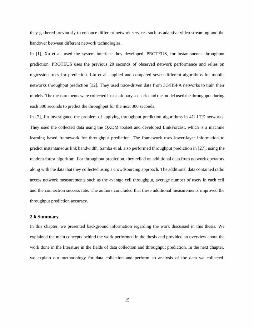
and uplink throughput, it was not able to record the GPS locations of the entire trip; there were several
missing GPS locations, as shown in Figure 3-2. This problem was due to the inaccurate GPS solution of the
Samsung Galaxy S6. To solve this problem, we had to use another device with a more robust GPS solution.
Figure 3-2: Sample trip trajectory showing incomplete GPS recordings.
3.3.2 Second Experiment
For the second experiment, to ensure our results are accurate and to compare different LTE categories, we
decided to use two different android phones. We used a Samsung Galaxy S9 (LTE Category 18) and a
Samsung Galaxy S10e (LTE category 20), which were both able to record the wireless network parameters
that we needed and did not have an issue with the GPS solution. The new phones also achieved higher
throughput readings than the Samsung Galaxy S6. For this experiment, we also collected data at 9 am, 12
pm and 6 pm. The analysis presented in this thesis is based on the data collected during the second
experiment.

20
3.4 Dataset Description
The following are the attributes of the dataset:
• Timestamp: timestamp of the measurement, precise time when the measurement is taken.
• Longitude: one of the GPS coordinates of the mobile device.
• Latitude: one of the GPS coordinates of the mobile device.
• Speed: speed of the bus at the time of measurement in km/h, calculated from the GPS data.
• Operator: the mobile country code (MCC) and mobile network code (MNC), which are used
together to identify a mobile network operator uniquely.
• CellID: cell ID of serving cell.
• LAC: location area code of serving cell, a unique identifier used by each public land mobile
network (PLMN) to update the location of mobile subscribers.
• NetworkTech: current technology, could be 2G, 3G, or 4G.
• RSSI: received signal strength indicator, a measure of the power present in a received radio signal
[33].
• RSRP: reference signal received power; this is the measure of power of the LTE reference signals
spread over the full bandwidth and narrowband.
• RSRQ: reference signal received quality, indicates the quality of the received reference signal.
• SNR: signal-to-noise ratio, which is the ratio of signal power to the noise power, expressed in
decibels.
• Downlink bitrate: current downlink bitrate at the time of measurement expressed in kbps.
• Uplink bitrate: current uplink bitrate at the time of measurement expressed in kbps.
• Height: height of the measuring device over ground level.
• N-Cellid – ID of neighboring cell.
• N-RSRP: RSRP of neighboring cell.
• N-RSRQ: RSRQ of neighboring cell.

21
3.5 Limitations of our Approach
Below are a few of the limitations that we encountered during our network survey:
1- Data Plan
As we mentioned earlier, for measuring the throughput, we had to keep downloading and uploading a 10
MB file every two seconds. This led to massive amounts of data being used, that by the end of our network
survey, our data usage was flagged.
2- Data from Network Operators
For privacy reasons, network operators often refuse to make their data public. For this reason, we only had
access to the operator’s client-side data. Network operators can offer information about the cellular network
performance, such as the average cell throughput, the average number of users, the connection success rate
and the Block Error Ratio [34]. We believe that having access to such measurements could have improved
the performance of throughput prediction algorithms.
3- Budget
Because of the limited budget and the data plan costs, we could not use more than two phones. Performing
the measurements with more than two phones could improve the accuracy of the measurements and
therefore lead to better prediction results.
3.6 Data Exploration
In this section, we explore the various attributes of the data, discuss their variation with respect to time and
location, and analyze the correlation between the features.
3.6.1 Signal Strength Variation
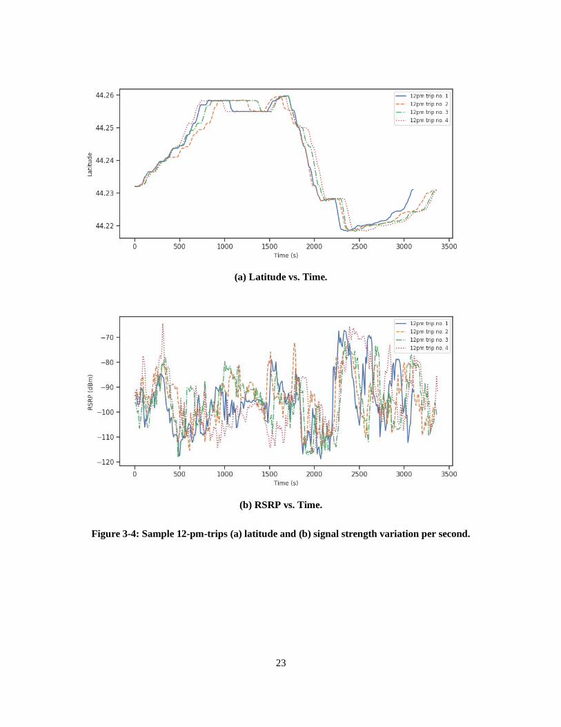
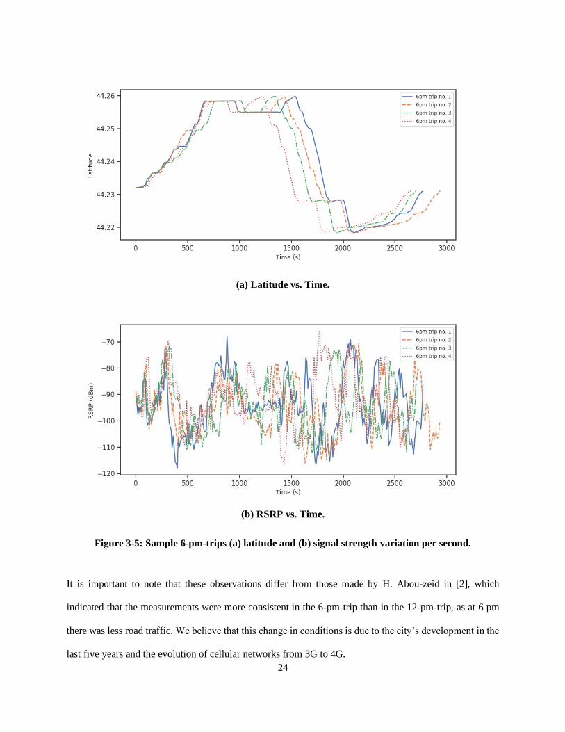
Shown in Figure 3-3, Figure 3-4, and Figure 3-5 are the sample latitude and signal strength (RSRP) vs. time
for the three trips. We display the latitude graphs on top of the signal strength graphs to show the signal
strength with respect to both time and location, and to show the effect of bus delays. The variations between
the trips could be caused by a variety of factors, like traffic lights, bus stops, road traffic levels, and the
behavior of different drivers. From Figure 3-3 to Figure 3-5, we can see that the 6-pm-trip exhibits more
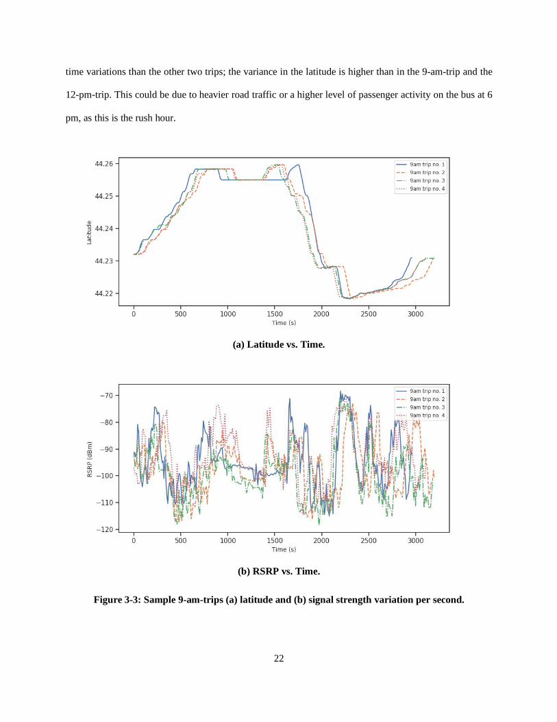
22
time variations than the other two trips; the variance in the latitude is higher than in the 9-am-trip and the
12-pm-trip. This could be due to heavier road traffic or a higher level of passenger activity on the bus at 6
pm, as this is the rush hour.
(a) Latitude vs. Time.
(b) RSRP vs. Time.
Figure 3-3: Sample 9-am-trips (a) latitude and (b) signal strength variation per second.
23
(a) Latitude vs. Time.
(b) RSRP vs. Time.
Figure 3-4: Sample 12-pm-trips (a) latitude and (b) signal strength variation per second.
24
(a) Latitude vs. Time.
(b) RSRP vs. Time.
Figure 3-5: Sample 6-pm-trips (a) latitude and (b) signal strength variation per second.
It is important to note that these observations differ from those made by H. Abou-zeid in [2], which
indicated that the measurements were more consistent in the 6-pm-trip than in the 12-pm-trip, as at 6 pm
there was less road traffic. We believe that this change in conditions is due to the city’s development in the
last five years and the evolution of cellular networks from 3G to 4G.

25
Moreover, we can observe two main consistent dips in the signal strength graphs at 500s and 2000s. These
correspond to GPS coordinates (44.24485680, -76.51957566) and (44.22804575, -76.58746690), which are
located at Princess Street near Kingston Center and Bayridge Drive, respectively. We can see that the
suburban area along Bayridge Drive suffers from a relatively long period of low signal.
From Figure 3-3 and Figure 3-4, one observes that there is not much variation in the latitudes as in Figure
3-5. The 9-am-trips and 12-pm-trips are much more consistent with respect to the location variance.
However, some minor variations due to context changes i.e., road traffic conditions and number of
passengers on the bus are normal.
Figure 3-6 shows a heat map of the average signal strength variation at different locations along the bus
route. We can see there are areas of poor signal, such as on the road to Cataraqui Centre on Princess Street
and on Bayridge Drive. On the other hand, areas with more demand such as Downtown, Cataraqui Centre,
Invista Centre, St. Lawrence College, are shown to have a higher signal strength. This is consistent with
the fact that there are cell towers located in each of these areas, as shown in the map in Figure 3-7, in order
to keep up with the cellular network demand.
Figure 3-6: Average signal strength map.

26
Figure 3-7: Operator’s cell tower locations in Kingston.
Source: Reprinted from Canadian Cellular Towers Map, by Steven Nikkel, retrieved from
https://www.ertyu.org/steven_nikkel/cancellsites.html/ Copyright 1997-2019 by Steven Nikkel.
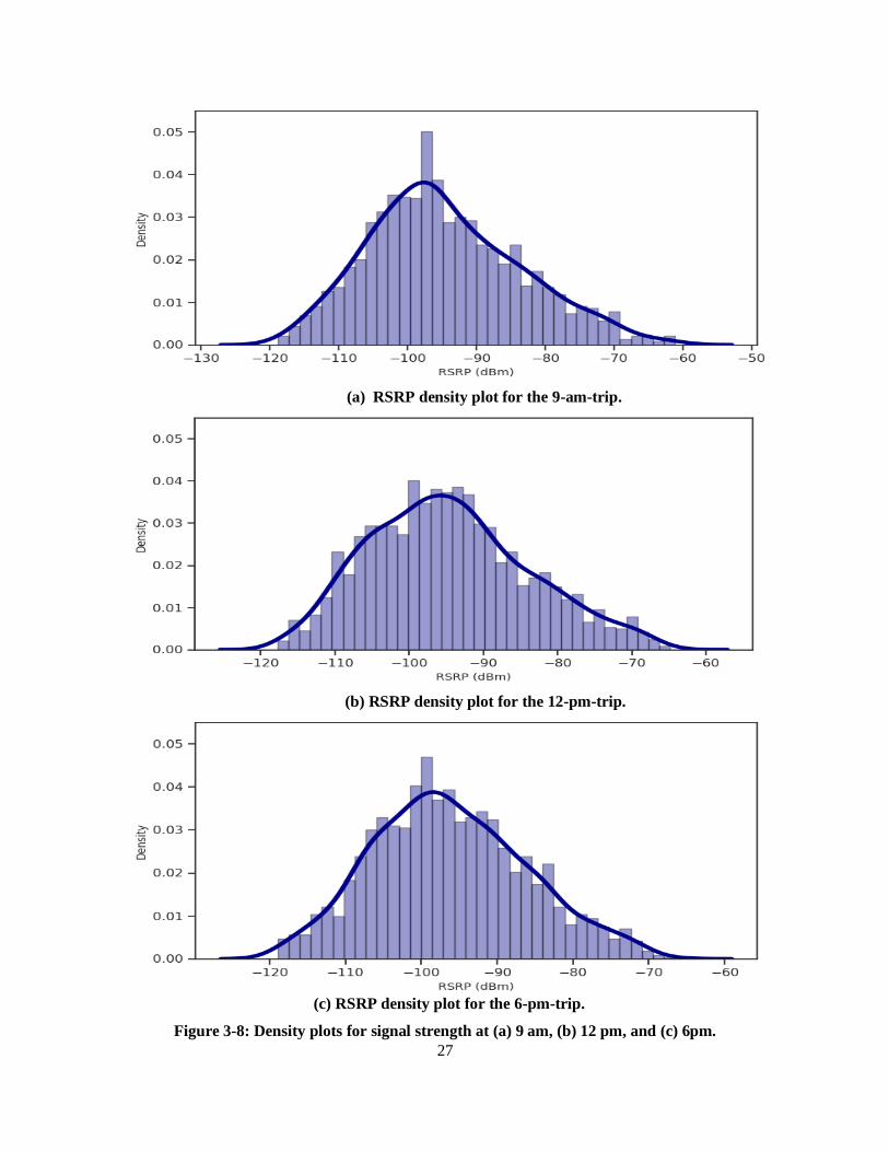
The density plots in Figure 3-8 represent the signal strength distributions at each of the three different times.
We can infer from these plots that at the 6-pm-trips have a lower signal strength mean. This is possibly
caused by increased road traffic at that time; busier traffic hours lead to a heavier network traffic, which in
turn reduces the signal strength. Conversely, the distributions for the 9-am-trips and 12-pm-trips have
noticeably higher signal strength values. Additionally, we can see that the signal strength at the three
different times of the day follows a Gaussian distribution [35], with a mean ranging from -93 to -96 dBm
and a standard deviation around 10.
27
(a) RSRP density plot for the 9-am-trip.
(b) RSRP density plot for the 12-pm-trip.
(c) RSRP density plot for the 6-pm-trip.
Figure 3-8: Density plots for signal strength at (a) 9 am, (b) 12 pm, and (c) 6pm.
28
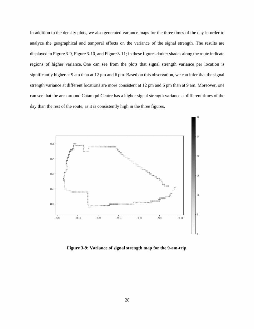
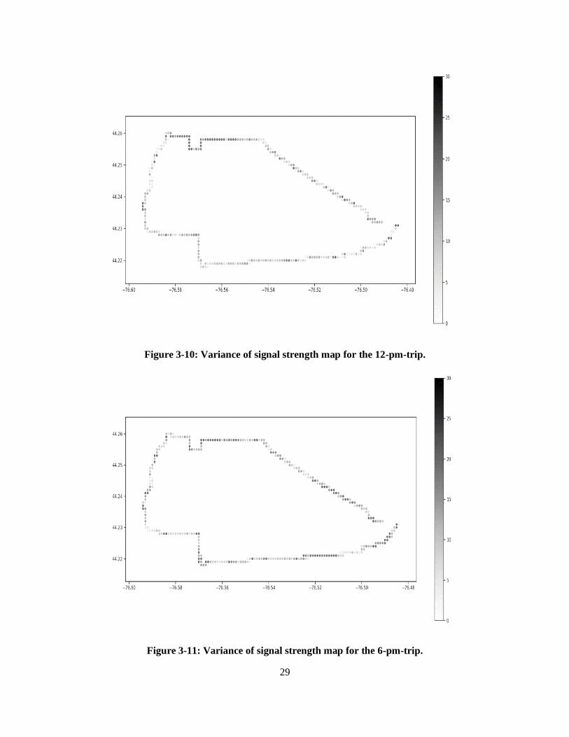
In addition to the density plots, we also generated variance maps for the three times of the day in order to
analyze the geographical and temporal effects on the variance of the signal strength. The results are
displayed in Figure 3-9, Figure 3-10, and Figure 3-11; in these figures darker shades along the route indicate
regions of higher variance. One can see from the plots that signal strength variance per location is
significantly higher at 9 am than at 12 pm and 6 pm. Based on this observation, we can infer that the signal
strength variance at different locations are more consistent at 12 pm and 6 pm than at 9 am. Moreover, one
can see that the area around Cataraqui Centre has a higher signal strength variance at different times of the
day than the rest of the route, as it is consistently high in the three figures.
Figure 3-9: Variance of signal strength map for the 9-am-trip.
29
Figure 3-10: Variance of signal strength map for the 12-pm-trip.
Figure 3-11: Variance of signal strength map for the 6-pm-trip.
30
3.6.2 Throughput Variation
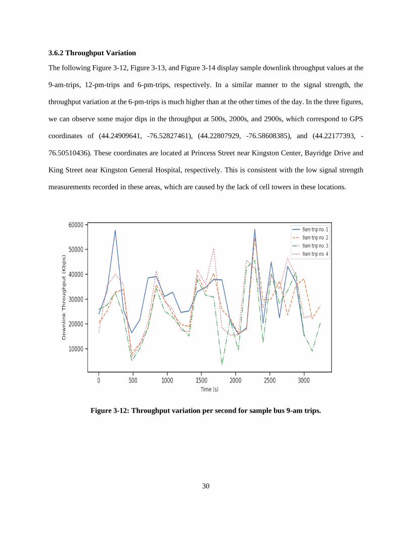
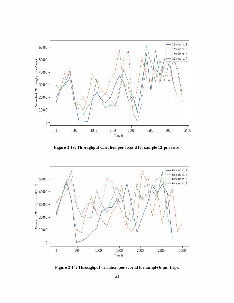
The following Figure 3-12, Figure 3-13, and Figure 3-14 display sample downlink throughput values at the
9-am-trips, 12-pm-trips and 6-pm-trips, respectively. In a similar manner to the signal strength, the
throughput variation at the 6-pm-trips is much higher than at the other times of the day. In the three figures,
we can observe some major dips in the throughput at 500s, 2000s, and 2900s, which correspond to GPS
coordinates of (44.24909641, -76.52827461), (44.22807929, -76.58608385), and (44.22177393, -
76.50510436). These coordinates are located at Princess Street near Kingston Center, Bayridge Drive and
King Street near Kingston General Hospital, respectively. This is consistent with the low signal strength
measurements recorded in these areas, which are caused by the lack of cell towers in these locations.
Figure 3-12: Throughput variation per second for sample bus 9-am trips.
31
Figure 3-13: Throughput variation per second for sample 12-pm-trips.
Figure 3-14: Throughput variation per second for sample 6-pm-trips.
32
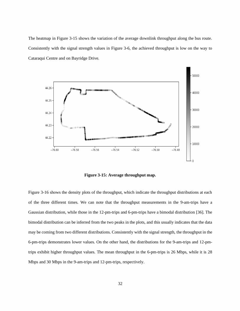
The heatmap in Figure 3-15 shows the variation of the average downlink throughput along the bus route.
Consistently with the signal strength values in Figure 3-6, the achieved throughput is low on the way to
Cataraqui Centre and on Bayridge Drive.
Figure 3-15: Average throughput map.
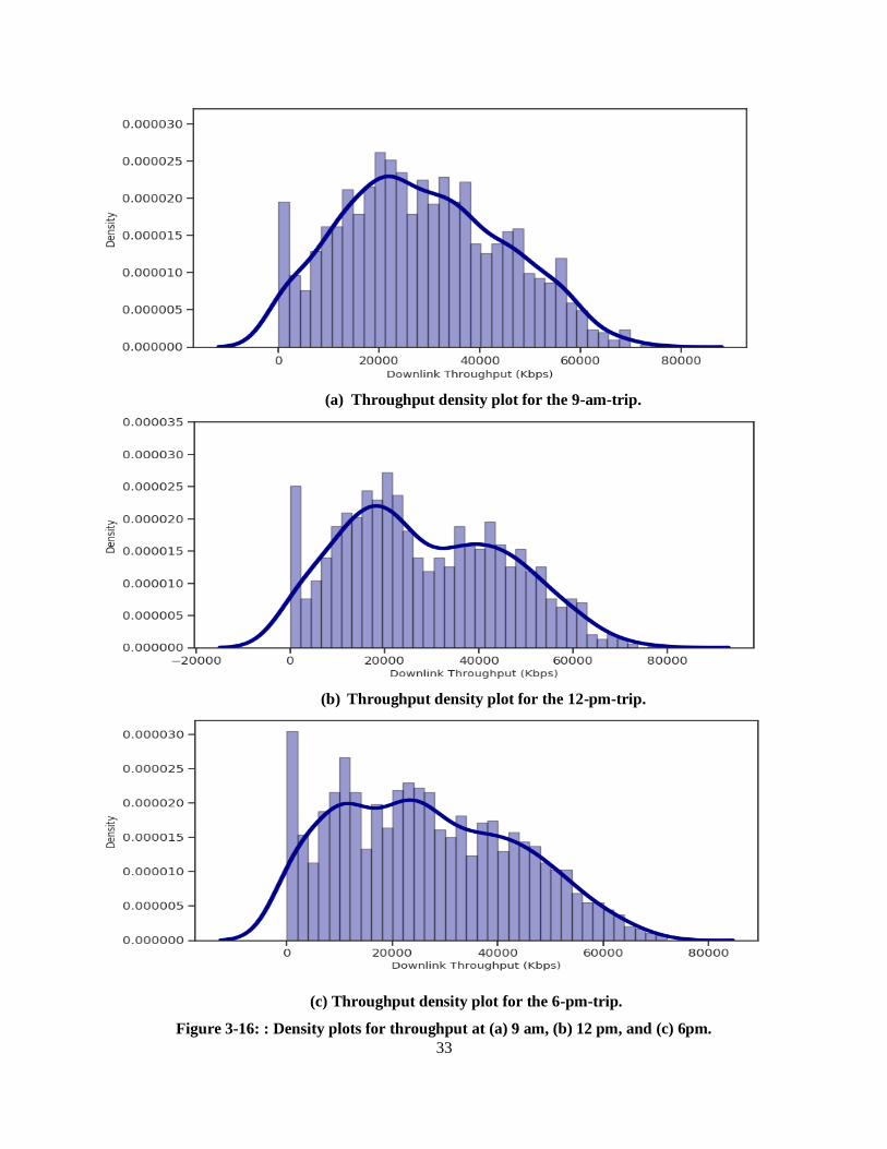
Figure 3-16 shows the density plots of the throughput, which indicate the throughput distributions at each
of the three different times. We can note that the throughput measurements in the 9-am-trips have a
Gaussian distribution, while those in the 12-pm-trips and 6-pm-trips have a bimodal distribution [36]. The
bimodal distribution can be inferred from the two peaks in the plots, and this usually indicates that the data
may be coming from two different distributions. Consistently with the signal strength, the throughput in the
6-pm-trips demonstrates lower values. On the other hand, the distributions for the 9-am-trips and 12-pm-
trips exhibit higher throughput values. The mean throughput in the 6-pm-trips is 26 Mbps, while it is 28
Mbps and 30 Mbps in the 9-am-trips and 12-pm-trips, respectively.
33
(a) Throughput density plot for the 9-am-trip.
(b) Throughput density plot for the 12-pm-trip.
(c) Throughput density plot for the 6-pm-trip.
Figure 3-16: : Density plots for throughput at (a) 9 am, (b) 12 pm, and (c) 6pm.
34
3.6.3 Correlation Analysis
For correlation analysis, we calculated the Pearson correlation coefficient; this coefficient is used to
measure the linear association strength between two variables. Given paired data { {𝑥1, 𝑦1}, … , {𝑥𝑛, 𝑦𝑛} },
Pearson correlation coefficient is computed by the following:
𝒓 = ∑ (𝒙𝒊− �̅�)(𝒚𝒊−𝒚)̅̅ ̅𝒏
𝒊=𝟏
√∑ (𝒙𝒊−�̅�)𝟐𝒏𝒊=𝟏 √∑ (𝒚𝒊−�̅�)𝟐𝒏
𝒊=𝟏
( 3.1)
where:
• 𝑛 is the sample size
• 𝑥𝑖 and 𝑦𝑖 are individual sample points.
• �̅� is the first sample mean defined as: �̅� =1
𝑛∑ 𝑥𝑖
𝑛𝑖−1
• �̅� is the second sample mean defined as: �̅� =1
𝑛∑ 𝑦𝑖
𝑛𝑖−1
The coefficient is calculated by dividing the covariance of two variables by the product of their standard
deviations. A correlation coefficient value of 1 means a perfect positive correlation, while a value of -1
means a perfect negative correlation. A value of 0 means there is no correlation at all.
Figure 3-17 shows the correlation matrix between different network parameters and the downlink and
uplink throughput. We can see that the RSRP has a strong correlation with both the RSSI and SNR, which
is expected since the RSSI is dependent on the RSRP and the RSRP and SNR are proportional to each other.
Moreover, the downlink throughput has a medium correlation with the RSRP, RSSI and SNR. This means
that we could estimate the throughput if we have the values of these parameters. Furthermore, we can
observe a medium correlation between the RSRQ and RSRP, and between the RSRQ and SNR.
35
Figure 3-17: Correlation matrix of different features in the dataset.
Figure 3-18 displays the RSRP against the SNR. Consistently with the correlation matrix in Figure 3-17, a
linear relationship between the RSRP and SNR can be observed.
Figure 3-18: RSRP vs. SNR.
36
Likewise, Figure 3-19 plots the downlink throughput against the signal strength. We can infer from the plot
that the throughput is proportional to the signal strength. This confirms our earlier statement that was based
on the correlation matrix.
Figure 3-19: Downlink throughput vs. RSRP.
3.7 Summary
In this chapter, we presented our data collection goals and metrics, and then explained in detail our
measurement setup. Furthermore, we described the dataset attributes and talked about the limitations that
we faced during our network survey. Additionally, we explored the data attributes, focusing on the signal
strength and throughput variations with time and location, and analyzed the correlation between the data
attributes. In the next chapter, we will explain data preprocessing steps that we have done and discuss the
process of throughput modelling and prediction using different machine learning algorithms.

37
Chapter 4
Throughput Modelling and Prediction
In this chapter, we explain the steps we carried out to apply machine learning models, as well as time series
forecasting approaches, on the collected data for throughput prediction. In Section 4.1, we present the
preprocessing steps that we did to prepare the data for the machine learning models. In Section 4.2, we
discuss the different techniques used for feature selection. In Section 4.3 and Section 4.4, we discuss the
various machine learning models that we applied for throughput prediction and the hyperparameters tuning
process, respectively. In Section 4.5, we describe different techniques for data splitting. In Section 4.5, we
explain time series forecasting and the different approaches that we used on the data. And lastly, in Section
4.6, we present the evaluation metrics that were used to assess the performance of the models.
4.1 Data Preprocessing
Raw data is often noisy and incomplete; therefore, machine learning models cannot be applied directly on
raw data. To ensure the accuracy and efficiency of the machine learning models, some preprocessing steps
need to be performed before the data can be fed to the models. In the next subsections, the preprocessing
steps used in this work are presented.
4.1.1 Outliers Detection and Removal
In statistics, an outlier is a data point that differs significantly from other observations [37]. Outliers can
be caused by measurement errors, sampling errors, data entry errors or can occur naturally. The presence
of outliers may affect the performance of the machine learning model, as the quality of the data determines
the quality of the prediction model. Therefore, it is often desirable to detect and remove outliers before the
data is passed to the model.
Outlier detection, also known as anomaly detection, is the process of finding data points that deviate
strongly from the rest of the data. There are multiple methods for detecting outliers; we present below the
most commonly used methods:

38
1- Z-score
The z-score measures the number of standard deviations above or below the mean a data point is, giving
indication of how far from the mean a data point is located [38]. The z-score of a data point can be calculated
using the following equation:
z=(x-μ)
σ ( 4.1)
where x is a data point, μ is the mean of all data points and σ is the standard deviation of all data points.
The z-score works well when the data has a Gaussian distribution. The outliers are considered the data
points that are located at the tails of the distribution, as they are viewed as too far from the mean to be
reasonable. To detect outliers, a threshold is specified for the value of the z-score. Usually, a value of 3 or
-3 is specified as the threshold, and a data point is detected as an outlier when its z-score is greater than 3
or less than -3.
An advantage of the z-score method is that it is very effective if the data has Gaussian distribution. A
disadvantage is that it is not practical to use in a high dimensional feature space.
2- The Interquartile Range (IQR) score
The IQR score is another widely used method for outlier detection. Unlike the z-score, the IQR score does
not assume a Gaussian distribution. The value of the IQR depends on the values of the first and third
quartiles [39]. The first quartile, denoted by Q1, is the median of the lower half of the dataset, and it holds
25% of the numbers in the dataset below it. Similarly, the third quartile, which is denoted Q3, is the median
of the upper half of the dataset and holds 25% of the numbers in the dataset above it. The IQR is defined as
the difference between the first and third quartiles and is calculated using the following formula:
IQR = Q3 − Q1 (4.2)
This technique for outlier detection works as follows: any value that lies above Q3 by 1. 5 × 𝐼𝑄𝑅 or below
Q1 by 1. 5 × 𝐼𝑄𝑅 is viewed as an outlier and can then be removed from the dataset.
The IQR method has an advantage that it does not depend on a specific distribution, as it uses percentiles.

39
3- The Density Based Spatial Clustering of Applications with Noise (DBSCAN)
Clustering techniques can be useful for detecting outliers. DBSCAN is a density-based clustering algorithm.
Clustering algorithms group similar data together into clusters. DBSCAN works by grouping points that
are close to each other, based on a distance measure, into clusters [40]. Outliers can then be found as clusters
with few data points. DBSCAN classifies data points into three types:
• Core point: a point that contains in its neighborhood a number of points equal to or above the
hyperparameter MinPts. The neighborhood radius is defined by the hyperparameter ɛ.
• Border point: a point is in the same cluster as the core points but are located much further away
from the center of the cluster.
• Outlier: a point that does not belong to any cluster.
The DBSCAN method has multiple advantages: it is very effective when the distribution of data is not
known, and it is practical to use when the feature space is multidimensional.
On the other hand, before the DBSCAN method is applied, the values of the dataset need to be scaled.
Moreover, it is difficult to select the optimal parameters MinPts and ɛ.
4- Isolation Forests
Another method used for outlier detection is isolation forests, which is a method based on binary decision
trees. Isolation forests depend on the idea that outliers are far away from the rest of the data points [41].
The concept of isolation forests is similar to random forests, although the objective is different. An isolation
forest is made up of multiple isolation trees. Each isolation tree is constructed in a top-down approach. The
algorithm runs as follows:
First, an attribute is selected randomly from the data, and the algorithms performs a binary split at a point
chosen randomly between the minimum and maximum ranges of that attribute. This process is repeated
until there is only a single point in each node. The idea is that points in dense regions will need more splits
than points in sparse regions. Accordingly, the outlier score of each point is equal to its depth in the isolation
tree. The average of the scores from different isolation trees is then calculated to obtain the final outlier

40
score. In this approach, outliers are defined as data points that can be isolated easily using random splits
[42].
The main advantage of the isolation forest method is that it is effective and robust, and the data does not
need to be scaled. Furthermore, the distribution of the data does not need to be known. On the other hand,
the disadvantage of this method is that it is difficult to visualize the results.
Since our data attributes have a Gaussian distribution, as we mentioned in Chapter 3, we used the z-score
method for outlier detection. More specifically, we used the z-score method implemented in Python’s
Scikit-Learn library [43] to remove the outliers.
4.1.2 Filling in Missing Data
Missing data are one of the most common sources of error in any code, and the machine learning models
do not work when the input data contains missing values. A simple way to deal with missing values is to
remove them completely, but that would decrease the amount of data significantly and would risk losing
valuable information. Accordingly, a more common solution is to impute the missing values. The following
are the commonly used imputation techniques:
1- Imputation with Zero/Most Frequent
Imputation with zero and imputation with most frequent are done by replacing the missing value in a column
with zero or with the most frequently occurring value in that column, respectively. This technique is often
done for categorical data and has an advantage of being easy and simple to understand and implement. On
the other hand, the technique does not preserve the correlations between variables, and might not be very
accurate.
2- Imputation with Mean/Median
Imputation with mean/median is done by replacing the missing values in a column with the mean/median
of the other values in that column. Unlike imputation with zero/most frequent, imputation with
mean/median only works on numerical data.
41
As with the imputation with zero/most frequent technique, imputation with mean/median is also easy and
simple to understand and implement. However, it does not preserve the correlations between different data
variables.
3- K Nearest Neighbors (KNN)
KNN is also a powerful imputation technique. In this technique, k neighbors are selected based on a certain
distance measure and their average is computed and used as an imputation estimate [44]. Imputation by
KNN has two hyperparameters that must be selected: the number of nearest neighbors (k) and the distance
metric. The distance metric depends on the type of data, whether it is numeric or categorical. Common
distance metrics for numeric data are the Euclidean [45], Manhattan [46] and Cosine [47] distances. On the
other hand, for categorical data, the Hamming distance [48] is often used, which counts how many times
the points in the two data vectors being compared differ, or the number of substitutions needed to convert
one of the data vectors into the other.
A major advantage of imputation by KNN is that it is much more accurate than the imputation by mean,
median or most frequent methods. On the contrary, it is sensitive to outliers and can be computationally
expensive.
4- Multivariate Imputation by Chained Equations (MICE)
Another powerful method for replacing missing values is imputation using MICE. This method creates
multiple imputations, instead of just one. The idea behind this method is that multiple imputations are more
effective than a single imputation, as multiple imputations can more accurately reflect the distribution of
the underlying data [49]. The MICE algorithm works by running multiple regression models and estimating
each missing data value based on the other observed values. The advantages of this imputation method are
that it is flexible, easy to use and can handle different data types.
Since we did not have a large amount of missing values in our dataset, we performed the mean imputation
using Pandas library.

42
4.1.3 Feature Scaling
Feature scaling is often required in machine learning when the data features have different ranges, especially
when tested models rely on the distance between the features. Therefore, features with larger range would
influence the result more than those with smaller range.
The following are a few more commonly used scaling techniques:
1- Z-score Normalization
Z-score normalization, also called standardization, is a scaling technique that transforms the distribution of
the data, causing it to have a mean of 0 and a standard deviation of 1. In this technique, each data point is
replaced by its z-score. As we mentioned earlier, the z-score can be computed using Equation 4.1.
2- Mean Normalization
Another feature scaling technique is the mean normalization, which causes the data to have values between
-1 and 1 and mean of 0. Mean normalization can be performed using the following formula:
𝒙′ =𝒙−𝒎𝒆𝒂𝒏(𝒙)
𝐦𝐚𝐱(𝒙)−𝐦𝐢𝐧 (𝒙) ( 4.3)
To perform mean normalization, it is necessary to know the maximum and minimum values of the data.
3- Min-Max Scaling
Min-Max scaling can also be used to scale data features. In Min-Max scaling, the features are scaled
between 0 and 1 [50]. The formula for Min-Max scaling is given by the following equation:
𝒙′ =𝒙−𝐦𝐢𝐧 (𝒙)
𝐦𝐚𝐱(𝒙)−𝐦𝐢𝐧 (𝒙) (4.4)
In this work, the z-score normalization method was used.
4.1.4 Data Binning
As we mentioned before, raw data tend to be noisy. Data binning or discretization is a preprocessing
technique that reduces the effect of noisy data [51]. This technique works by first sorting the data, dividing
the data values into bins with smaller intervals, and then replacing their values with a more general value
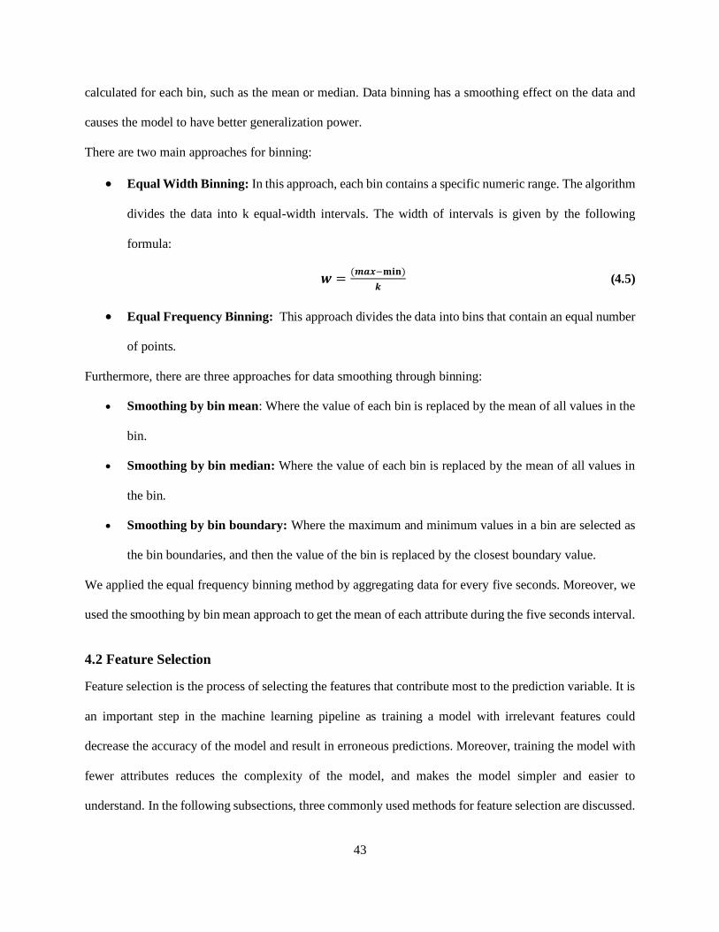
43
calculated for each bin, such as the mean or median. Data binning has a smoothing effect on the data and
causes the model to have better generalization power.
There are two main approaches for binning:
• Equal Width Binning: In this approach, each bin contains a specific numeric range. The algorithm
divides the data into k equal-width intervals. The width of intervals is given by the following
formula:
𝒘 =(𝒎𝒂𝒙−𝐦𝐢𝐧)
𝒌 (4.5)
• Equal Frequency Binning: This approach divides the data into bins that contain an equal number
of points.
Furthermore, there are three approaches for data smoothing through binning:
• Smoothing by bin mean: Where the value of each bin is replaced by the mean of all values in the
bin.
• Smoothing by bin median: Where the value of each bin is replaced by the mean of all values in
the bin.
• Smoothing by bin boundary: Where the maximum and minimum values in a bin are selected as
the bin boundaries, and then the value of the bin is replaced by the closest boundary value.
We applied the equal frequency binning method by aggregating data for every five seconds. Moreover, we
used the smoothing by bin mean approach to get the mean of each attribute during the five seconds interval.
4.2 Feature Selection
Feature selection is the process of selecting the features that contribute most to the prediction variable. It is
an important step in the machine learning pipeline as training a model with irrelevant features could
decrease the accuracy of the model and result in erroneous predictions. Moreover, training the model with
fewer attributes reduces the complexity of the model, and makes the model simpler and easier to
understand. In the following subsections, three commonly used methods for feature selection are discussed.

44
4.2.1 Univariate Selection
This method performs statistical tests that indicate which features have the strongest relationship with the
target variable. The Chi-square test is one example of these statistical tests and is often used to test the
association between two variables [52]. Basically, the Chi-square between each feature and the target is
calculated, and then features with best Chi-square scores are selected.
The Chi-square is calculated using the following equation:
𝒙𝒄𝟐 = ∑
(𝑶𝒊−𝑬𝒊)𝟐
𝑬𝒊 (4.6)
where c is the degrees of freedom, O is the observed value and E is the expected value.
When a feature has a high correlation with the target value, the observed count is far from the expected
count. Therefore, the features will have a high Chi-Square value. Having a high Chi-square value means
that the target value is dependent on the feature, and thus the feature can be selected for model training.
4.2.2 Feature Importance
The importance of each feature in the dataset can be computed using the feature importance property of the
model. The idea of feature importance is to calculate a certain score for each feature in the dataset, where
higher scores indicate that this feature contributes more toward the prediction of the target variable. Two
common techniques that are used for computing feature importance are: model specific feature importance
and permutation feature importance.
1- Model Specific Feature Importance
This technique is implemented by the random forest algorithm in Python’s Scikit-Learn library. In this
technique, the average reduction in impurity caused by each feature is calculated across all the trees in the
forest. Furthermore, the features that cause the nodes to split closer to the root will have a higher feature
importance value [53].
2- Permutation Feature Importance
Permutation feature importance measures the importance of a certain feature by permuting that feature and
then measuring the mean decrease in performance. A feature has a high importance value when the model’s

45
prediction performance decreases when the feature’s values are permuted, meaning that the feature
contributed to the model’s prediction. Along with the feature importance estimate, this technique also gives
a measure of uncertainty of that estimate. On the contrary, the main disadvantage of the permutation feature
importance is that it becomes computationally expensive when the feature space increases.
4.2.3 Correlation Matrix with Heatmap
Correlation is a statistical term that measures the association between variables [54]. A positive correlation
between two variables means that when one variable increases, the other increases as well. On the contrary,
a negative correlation means that when one variable increases, the other decreases.
Correlation analysis can help with feature selection, as a feature that has a high correlation with the target
variable can be selected as input to the model. Furthermore, features with high correlation with each other
can be linearly dependent, and therefore have a similar effect on the target variable. In that case, one of the
two features can be dropped.
In Chapter 3, we analyzed the correlation matrix of the different data variables and found that the features
with highest correlation with the throughput are the RSRP, RSSI, and SNR. In addition, the feature
importance property of the random forest model indicated that the most important features for throughput
prediction are ranked as follows: RSRP, RSSI, SNR, RSRQ, timestamp, longitude, and latitude. Therefore,
we only used these variables as input to the machine learning model and disregarded the remaining data
variables.
4.3 Machine Learning Models
In order to determine the best model that could be used on the collected data for throughput prediction, we
trained and tested various models on the data to compare their results. The evaluation and comparison are
presented in Chapter 5. All the models that we used were implemented in Scikit-Learn library in Python.
Specifically, the following are the machine learning models that we used in this work:
1- Ridge Regression
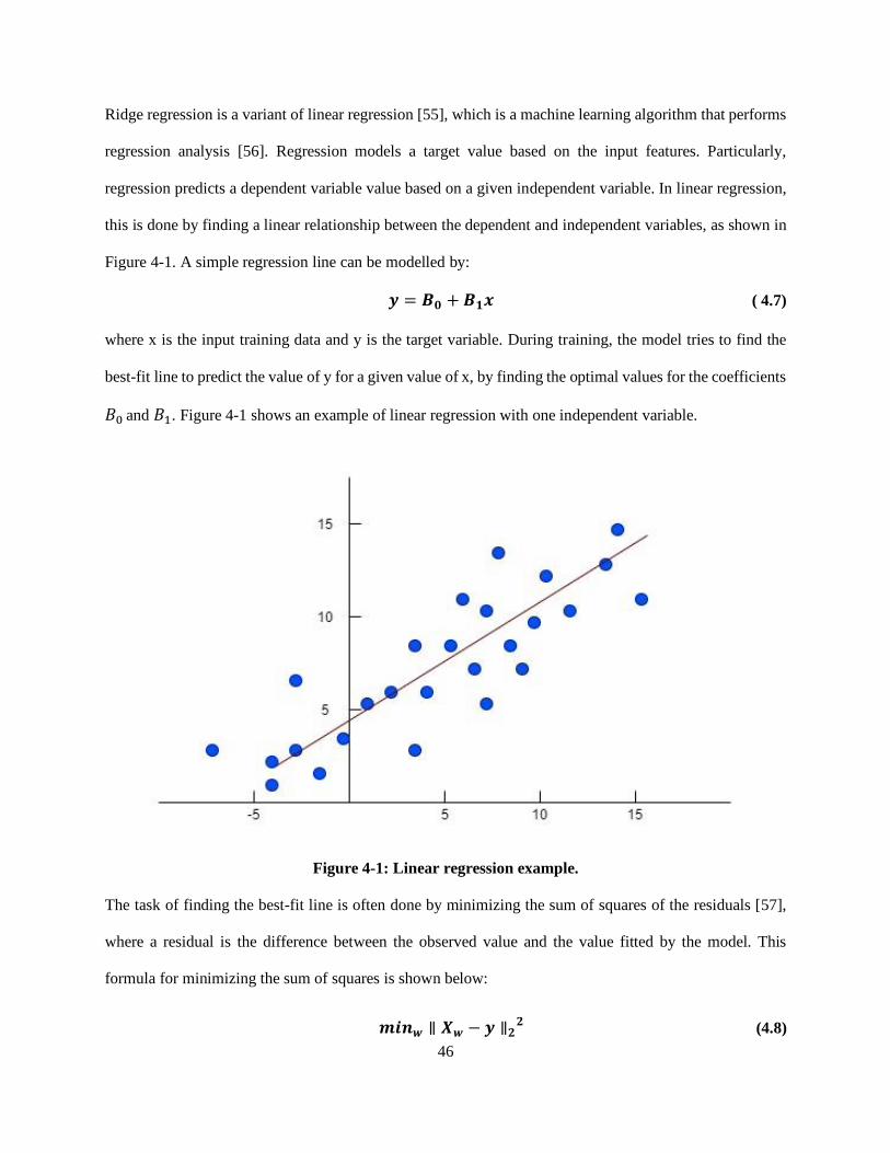
46
Ridge regression is a variant of linear regression [55], which is a machine learning algorithm that performs
regression analysis [56]. Regression models a target value based on the input features. Particularly,
regression predicts a dependent variable value based on a given independent variable. In linear regression,
this is done by finding a linear relationship between the dependent and independent variables, as shown in
Figure 4-1. A simple regression line can be modelled by:
𝒚 = 𝑩𝟎 + 𝑩𝟏𝒙 ( 4.7)
where x is the input training data and y is the target variable. During training, the model tries to find the
best-fit line to predict the value of y for a given value of x, by finding the optimal values for the coefficients
𝐵0 and 𝐵1. Figure 4-1 shows an example of linear regression with one independent variable.
Figure 4-1: Linear regression example.
The task of finding the best-fit line is often done by minimizing the sum of squares of the residuals [57],
where a residual is the difference between the observed value and the value fitted by the model. This
formula for minimizing the sum of squares is shown below:
𝒎𝒊𝒏𝒘 ∥ 𝑿𝒘 − 𝒚 ∥𝟐𝟐 (4.8)
47
Two common problems that occur in machine learning are underfitting and overfitting. Underfitting occurs
when the model does not learn enough from the data and cannot capture its underlying structure [58]. This
causes the model to have unreliable predictions and low generalization power. On the other hand, overfitting
occurs when the model is very flexible, and cannot generalize well from the training data to other unseen
data [59]. In other words, the model performs well on the training set, but has a very poor performance on
the test set. When there is collinearity between the data variables, i.e., the data variables are highly
correlated, the least squares method causes overfitting. Overfitting is a major concern, as it negatively
impacts the performance of the model. To prevent overfitting, regularization techniques are often used to
reduce the complexity of the model. There are two variants of linear regression that perform regularization:
• Lasso Regression: Performs L1 regularization [60], where the least squares method is modified to
also minimize the absolute sum of β through the shrinkage hyperparameter λ, as illustrated in the
following formula:
𝒂𝒓𝒈𝒎𝒊𝒏𝜷∈ℝ𝚸 ∥ 𝒚 − 𝑿𝜷 ∥𝟐𝟐+ 𝝀 ∥ 𝜷 ∥𝟏 (4.9)
where β is the coefficient vector [ 𝐵0, 𝐵1 ].
• Ridge Regression: performs L2 regularization, where the least squares method is modified to also
minimize the squared absolute sum of β through the shrinkage hyperparameter λ, as shown in the
following formula:
𝒂𝒓𝒈𝒎𝒊𝒏𝜷∈ℝ𝚸 ∥ 𝒚 − 𝑿𝜷 ∥𝟐𝟐+ 𝝀 ∥ 𝜷 ∥𝟐
𝟐 (4.10)
where β is the coefficient vector [ 𝐵0, 𝐵1 ].
We first trained a linear regression model for throughput prediction, but the model’s performance was not
satisfactory. This is attributed to overfitting. To prevent overfitting, we then trained a ridge regression
model and the model’s performance was significantly better than the linear regression’s one.
2- Regression using KNN
The KNN is a supervised learning algorithm that is commonly used in machine learning tasks for
classification and regression due to its simplicity and applicability in lots of real-world problems. It is a
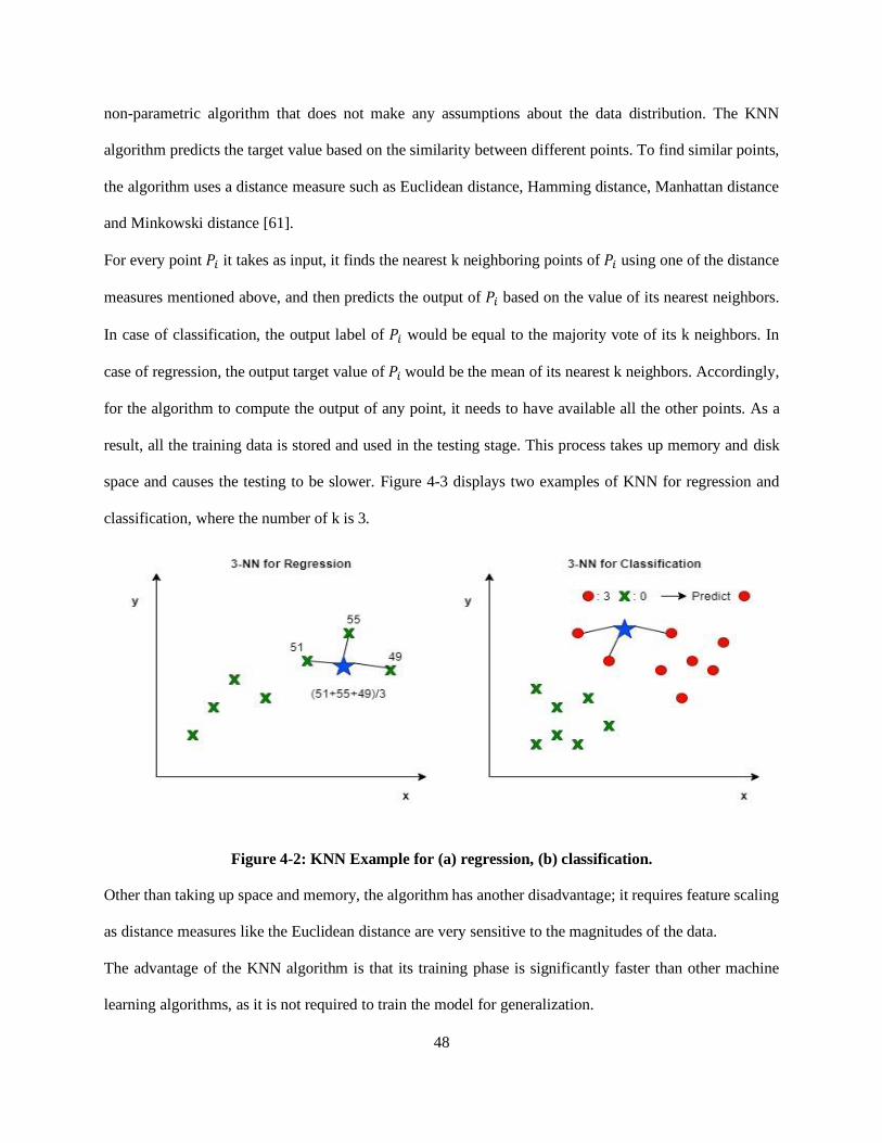
48
non-parametric algorithm that does not make any assumptions about the data distribution. The KNN
algorithm predicts the target value based on the similarity between different points. To find similar points,
the algorithm uses a distance measure such as Euclidean distance, Hamming distance, Manhattan distance
and Minkowski distance [61].
For every point 𝑃𝑖 it takes as input, it finds the nearest k neighboring points of 𝑃𝑖 using one of the distance
measures mentioned above, and then predicts the output of 𝑃𝑖 based on the value of its nearest neighbors.
In case of classification, the output label of 𝑃𝑖 would be equal to the majority vote of its k neighbors. In
case of regression, the output target value of 𝑃𝑖 would be the mean of its nearest k neighbors. Accordingly,
for the algorithm to compute the output of any point, it needs to have available all the other points. As a
result, all the training data is stored and used in the testing stage. This process takes up memory and disk
space and causes the testing to be slower. Figure 4-3 displays two examples of KNN for regression and
classification, where the number of k is 3.
Figure 4-2: KNN Example for (a) regression, (b) classification.
Other than taking up space and memory, the algorithm has another disadvantage; it requires feature scaling
as distance measures like the Euclidean distance are very sensitive to the magnitudes of the data.
The advantage of the KNN algorithm is that its training phase is significantly faster than other machine
learning algorithms, as it is not required to train the model for generalization.

49
3- Support Vector Machine Regression (SVR)
Support vector machine (SVM) is a supervised learning algorithm that can be used for both classification
(SVC) and regression (SVR). SVM uses a technique called the kernel trick to transform the data variables
into a higher dimensional space, and then finds the optimal boundary between the possible outputs based
on these transformations [63]. Before explaining how SVM works, we should first clarify some definitions.
A hyperplane is a separation line that helps classify different data points in the case of classification, or a
line that fits the data in the case of regression. Additionally, there are two other lines in SVM called the
boundary lines, and their function is to create a boundary. In classification, these boundary lines separate
the two classes. On the other hand, in regression, the boundary lines bound the points that are considered
for prediction between them. Another term we need to define is the support vectors, which are points that
are closest to the boundary, and can even lie on it.
In the case of classification, the SVC uses the kernel trick to convert a problem with data that is non-
separable into data that is separable. For example, if there are two classes in the data and the classes are
not linearly separable, the kernel trick can add one more dimension to the data, and then the algorithm can
find a hyperplane that could separate the two classes in the higher dimensional space.
In the case of regression, SVR uses the kernel trick to map the input into a higher dimensional feature space
and then constructs a linear regression model in this higher dimensional space [62].
In SVR, the distance between the hyperplane and the boundary line is denoted by ε. The goal is to find the
optimal value of ε that the support vectors lie within that boundary line. Figure 4-3 illustrates the concept
of SVR, where the hyperplane is shown by the solid line, and the boundary lines are shown by the dashed
lines in the figure.
The linear function is given by:
𝒚 = 𝒘𝒙 + 𝒃 (4.11)
where 𝑦 is the target variable, 𝑥 is the input variable, 𝑤 is the weight coefficient and 𝑏 is the bias.
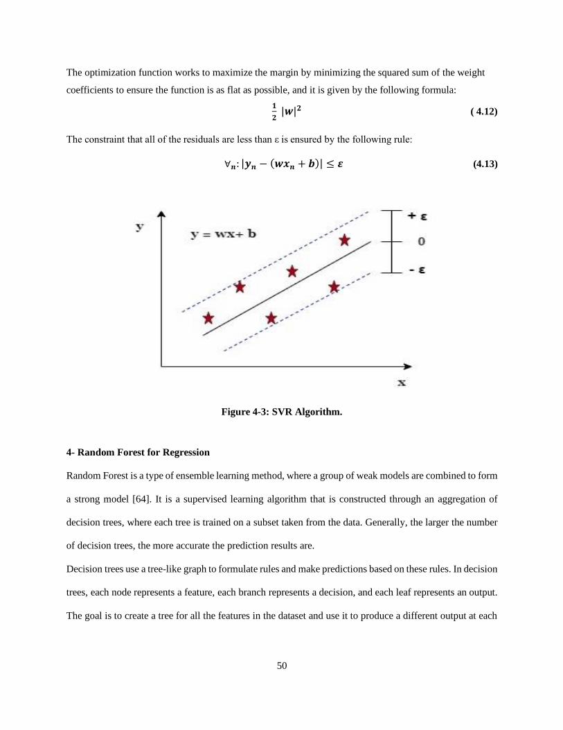
50
The optimization function works to maximize the margin by minimizing the squared sum of the weight
coefficients to ensure the function is as flat as possible, and it is given by the following formula:
𝟏
𝟐 |𝒘|𝟐 ( 4.12)
The constraint that all of the residuals are less than ε is ensured by the following rule:
∀𝒏: |𝒚𝒏 − (𝒘𝒙𝒏 + 𝒃)| ≤ 𝜺 (4.13)
Figure 4-3: SVR Algorithm.
4- Random Forest for Regression
Random Forest is a type of ensemble learning method, where a group of weak models are combined to form
a strong model [64]. It is a supervised learning algorithm that is constructed through an aggregation of
decision trees, where each tree is trained on a subset taken from the data. Generally, the larger the number
of decision trees, the more accurate the prediction results are.
Decision trees use a tree-like graph to formulate rules and make predictions based on these rules. In decision
trees, each node represents a feature, each branch represents a decision, and each leaf represents an output.
The goal is to create a tree for all the features in the dataset and use it to produce a different output at each

51
leaf. The output that is produced depends on the set of decisions made by the tree as it processes the input
feature vector.
The decision trees are constructed in a top-down approach that is also known as recursive binary splitting.
The construction begins at the top of the tree where the entire dataset is available, and then splits the
predictor space into two new branches down the tree. During construction, an important step is to identify
the feature that will be represented by the root node at each level. For efficient prediction, we need to split
the nodes at the most informative features [65]. In the case of classification, a commonly used metric that
is used in this step is the information gain [65], which is the decrease in entropy. Entropy is a measure of
the impurity in the data samples and is computed by Equation 4.14. Whenever we split a node, the entropy
changes. Information gain computes the difference between entropy before and after the split of node.
𝑬(𝒕) = − ∑ 𝒑(𝒊|𝒕) 𝒍𝒐𝒈𝟐 𝒑(𝒊|𝒕)𝒎𝒊=𝟏 (4.14)
where 𝑝(𝑖|𝑡) is the number of the samples that belong to class c for a certain node 𝑡.
In the case of regression, however, another metric is needed to accommodate for the continuous variables.
A metric that could be used in regression is weighted mean square error (MSE), which is given by:
𝑴𝑺𝑬 (𝒕) =𝟏
𝑵𝒕∑ (𝒚(𝒊) − �̂�𝒕)𝟐
𝒊 ∈ 𝑫𝒕 (4.15)
where 𝑁𝑡 is the number of training samples at node 𝑡, 𝐷𝑡 is the training subset at node t, 𝑦(𝑖) is the actual
target value, and �̂�𝑡 is the predicted target [65].
Decision trees are widely used due to their high accuracy and stability. Unlike linear models, they are
capable of mapping nonlinear relationships within the data attributes.
As we mentioned before, random forest is a collection of decision trees. It works by randomly picking a
number of sub-samples from the data samples to build each tree. Then, a number of features are selected
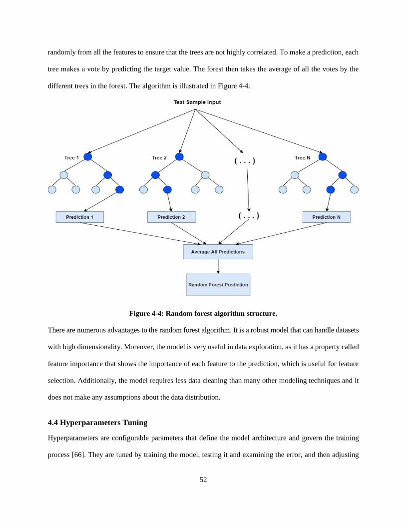
52
randomly from all the features to ensure that the trees are not highly correlated. To make a prediction, each
tree makes a vote by predicting the target value. The forest then takes the average of all the votes by the
different trees in the forest. The algorithm is illustrated in Figure 4-4.
Figure 4-4: Random forest algorithm structure.
There are numerous advantages to the random forest algorithm. It is a robust model that can handle datasets
with high dimensionality. Moreover, the model is very useful in data exploration, as it has a property called
feature importance that shows the importance of each feature to the prediction, which is useful for feature
selection. Additionally, the model requires less data cleaning than many other modeling techniques and it
does not make any assumptions about the data distribution.
4.4 Hyperparameters Tuning
Hyperparameters are configurable parameters that define the model architecture and govern the training
process [66]. They are tuned by training the model, testing it and examining the error, and then adjusting

53
the parameters. Moreover, hyperparameters are not learned automatically by the model, they have to be set
manually. Various methods have been proposed for hyperparameters tuning. The following are the most
used:
1- Grid Search
In this method, the set of hyperparameters are defined and then an extensive search is performed to search
through all combinations of hyperparameters to find the optimal one [67]. Moreover, the method determines
the optimal hyperparameter by measuring the performance using cross-validation. The grid search is a
simple, easy to use method, but it can be computationally expensive when the data has a high dimensional
space.
2- Random Search
Unlike grid search, where all different hyperparameter combinations are tested, this method pulls a set of
random values from the hyperparameter space until the optimal value is found [68]. The random search
method has a higher speed and performance level than the grid search. However, a disadvantage of this
method is that it is not affected by previous selections when choosing the next set of hyperparameters.
3- Bayesian Optimization
In this method, a probabilistic model is constructed between the hyperparameter values and the performance
measure using the test data [69]. Additionally, different hyperparameters combinations are tested and the
model is adapted based on the evaluation of these combinations.
Furthermore, different machine learning algorithms require different hyperparameters to be tuned. For each
algorithm below, we discuss the hyperparameters that need to be optimized.
• Ridge Regression: The hyperparameter that is used in ridge regression is the 𝛼, which corresponds
to shrinkage hyperparameter λ we described earlier. A larger value of 𝛼 reduces the model
complexity and prevents overfitting. However, after a certain point, increasing the value of 𝛼 may

54
lead to underfitting. Hyperparameter tuning in ridge regression involves balancing the
regularization strength in order to achieve the best possible model performance.
• KNN for Regression: Choosing the value of k affects the performance of the model. Increasing
the value of k reduces the noise and leads to smoother predictions but may cause underfitting. As
with ridge regression, the idea of hyperparameter tuning in KNN regression is to find the optimal
value of k that improves the performance of the model.
• SVR: The hyperparameters used in SVR training are the kernel function, 𝜀, and the regularization
parameter C, which penalizes misclassification and margin errors. As there are multiple
combinations of these hyperparameters, they are often tuned using the grid search. This approach
is based on the concept of exhaustive search; it tries out different hyperparameter combinations and
determines the optimal value of each hyperparameter.
• Random Forest for Regression: Hyperparameters in a random forest include the number of
decision trees in the forest and the maximum number of features considered by each tree for
splitting a node. Increasing the number of decision trees improves the accuracy of the model as it
considers the votes from various trees, but it can be computationally expensive. Moreover,
increasing the maximum number of features considered by each tree for splitting a node can lead
to a higher model performance as it causes the trees to have more features to select from the optimal
split, but this can cause overfitting
4.5 Data Splitting
To effectively evaluate the performance of machine learning models, cross-validation is commonly used.
In cross-validation, the dataset should be split into two subsets: a training set and a test set [70]. The training
set is the partition of the dataset that the model is trained on. The test set is the partition of the dataset that
the model has not seen before. Both the training set and the test set consist of some input features and a
target variable. The model is fit on the features and target variable from the training set and then the fitted

55
model is used to predict the target variable for the features in the test set. The test set should be large enough
to produce statistically meaningful results and should be representative of the entire dataset.
The dataset split ratio depends on two factors: the number of samples in the dataset and the type of model
that is trained, as some models require a large amount of data to train on.
There are three main methods for performing cross-validation: the holdout method, the k-fold cross-
validation and the leave-one-out cross-validation.
• Holdout Method: This approach of this method is to remove a subset of the dataset and then using
it to evaluate model trained on the rest of the data [71]. The error is an indication of how well the
model is going to perform on the test set. A common split ratio is 70%-30%, where the training set
consists of 70% of the dataset and test set consists of 30% of the dataset.
• K-Fold Cross-Validation: In this approach, the dataset is divided into k subsets. Next, the model
is trained on all subsets except for one, and then the model is evaluated on that one subset that was
not used in training. This process is repeated k times, where each time a different subset is used for
evaluation [72]. Thus, k-fold cross-validation performs the holdout method k times. This approach
is commonly used in small datasets to prevent overfitting, as it improves the generalization power
of the model.
• Leave-One-Out Cross-Validation: This approach is a special version of k-fold cross-validation.
In leave-one-out cross-validation, the number of folds is equal to the dataset samples [73].
Furthermore, the model is trained repeatedly, where each time one sample is selected as a test set,
and all the other samples are selected as a training set.
We trained and evaluated the models using the hold-out method with various data split ratios and reached
the best performance with a split ratio of 70% training set and 30% test set.
4.6 Time Series Forecasting
A time series is a collection of observations taken at consecutive points in time. The aim of time series
forecasting is to build a model to forecast future values of a time series based on the previous values. In

56
particular, the observations of a time series at time 𝑡 are used to forecast the future values of it at some
future time 𝑡 + ℎ [74]. Unlike regression predictive modelling, a time series adds an explicit order
dependence between the observations. Various techniques and mechanisms have been proposed for time
series forecasting. In our work, we used Autoregressive Integrated Moving Average (ARIMA) and Long
Short-Term Memory (LSTM) models [76].
4.6.1 Autoregressive Integrated Moving Average (ARIMA)
An ARIMA model is a class of statistical models and is one of the most commonly used techniques for time
series forecasting. Autoregressive models use a linear combination of the current observation and a number
of lagged observations to forecast future values of a variable. On the other hand, moving average models
use a linear combination of the residual errors to predict the forecast error at the next time step. ARIMA
models combine both approaches into one model to perform time series forecasting [75].
ARIMA models require the time series to be stationary. A stationary time series is one whose statistical
properties are not dependent on the time at which the series is observed [75]. One approach that could
convert a non-stationary time series to a stationary one is to compute the differences between successive
observations. This approach is called differencing and is often an important step in time series forecasting
using ARIMA models. Furthermore, ARIMA models have three parameters, namely p, d, and q, where p
is the number of lag observations, d is the degree of differencing, and q is the size of the moving average
window, also called the order of the moving average.
4.6.2 Long Short-Term Memory (LSTM)
LSTM is a type of recurrent neural networks (RNNs) [77] that is used in the field of deep learning. Unlike
feedforward neural networks, recurrent neural networks have feedback connections. These feedback
connections make the recurrent neural networks capable of handling sequence dependencies. LSTM
networks use special units in addition to the standard units of the RNN networks in order to capture long
term temporal dependencies. The architecture of LSTM networks includes a memory cell, which is used to
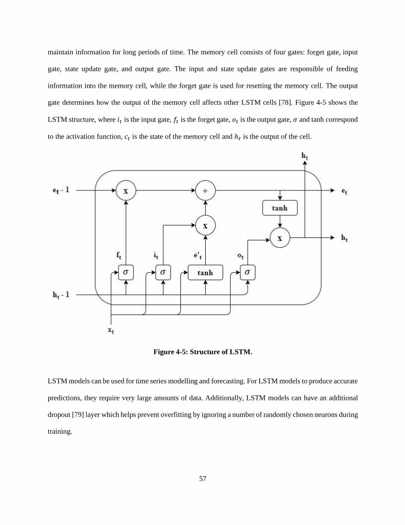
57
maintain information for long periods of time. The memory cell consists of four gates: forget gate, input
gate, state update gate, and output gate. The input and state update gates are responsible of feeding
information into the memory cell, while the forget gate is used for resetting the memory cell. The output
gate determines how the output of the memory cell affects other LSTM cells [78]. Figure 4-5 shows the
LSTM structure, where 𝑖𝑡 is the input gate, 𝑓𝑡 is the forget gate, 𝑜𝑡 is the output gate, 𝜎 and tanh correspond
to the activation function, 𝑐𝑡 is the state of the memory cell and ℎ𝑡 is the output of the cell.
Figure 4-5: Structure of LSTM.
LSTM models can be used for time series modelling and forecasting. For LSTM models to produce accurate
predictions, they require very large amounts of data. Additionally, LSTM models can have an additional
dropout [79] layer which helps prevent overfitting by ignoring a number of randomly chosen neurons during
training.

58
4.7 Evaluation Metrics
We evaluated the performance of the models using two well-known metrics: the 𝑅2 score and the root mean
square error (RMSE). In the following subsections, the two metrics are described.
4.7.1 𝑹𝟐 score
Also called the coefficient of determination, the 𝑅2 score is a goodness-of-fit measure for regression
models. It indicates the percentage of the variance in the dependent variable that can be explained by the
independent variables [80]. The 𝑅2 score measures the strength of the relationship between your model and
the dependent variable on a convenient 0 – 100% scale.
The 𝑅2 score is computed by:
𝑹𝟐 = 𝟏 −∑ (𝒚𝒊−�̂�𝒊)𝟐𝑵
𝒊=𝟏
∑ (𝒚𝒊−�̅�𝒊)𝟐𝑵𝒊=𝟏
(4.16)
where y is the actual value, 𝑦 ̂is the predicted value and �̅� is the mean of all y values. The 𝑅2 score has a
range from 0-1, where 0 indicates that the model doesn’t explain any of the variability of the response data
around its mean, and 1 indicates that the model explains all the variability of the response data around its
mean. Accordingly, a higher 𝑅2 score specifies that the model fits the data better.
4.7.2 Root Mean Square Error (RMSE)
The RMSE is the standard deviation of the prediction errors, also called the residuals [75]. In Figure 4-6,
we can see an example of a fitted linear model, where the residuals are the vertical lines showing the
difference between the actual data values and values predicted by the model.
Figure 4-6: Residuals in a linear model.

59
The RMSE is used to measure how the residuals are dispersed. Moreover, it can be used to compare the
prediction errors of different models to determine the model with the highest performance on the data.
The RMSE can be calculated by the following equation:
𝑹𝑴𝑺𝑬 = √∑ (𝑷𝒓𝒆𝒅𝒊𝒄𝒕𝒆𝒅𝒊−𝑨𝒄𝒕𝒖𝒂𝒍𝒊)𝟐𝑵
𝒊=𝟏
𝑵 (4.17)
Where 𝑃𝑟𝑒𝑐𝑖𝑑𝑡𝑒𝑑𝑖 corresponds to the model predictions, 𝐴𝑐𝑡𝑢𝑎𝑙𝑖 corresponds to the actual values of the
data samples, and N is the number of samples. Lower RMSE values indicate that the model fits the data
better
4.8 Summary
In this chapter, we described the preprocessing steps and explained how we performed feature scaling.
Moreover, we discussed the machine learning models that we trained and the hyperparameters tuning that
we have completed. Furthermore, we explained different time series forecasting methods and talked about
the evaluation metrics that we used to evaluate the performance of our models. In the next chapter, we will
present the results of training and testing the models for throughput prediction and compare them based on
the evaluation metrics that we mentioned in this chapter.

60
Chapter 5
Results and Discussion
In this chapter, we present the results of training different models on the collected dataset for throughput
prediction. In Section 5.1, we describe the experimental setup for our problem. In Section 5.2, we illustrate
the performance of each machine learning model and explain how different hyperparameters affect the
model performance. Moreover, we perform a comparative analysis between the different trained models.
In Section 5.3, we analyze the performance of the time series forecasting models. Lastly, in Section 5.4 we
discuss the results and describe different ways to improve the performance of our models.
5.1 Experimental Setup
In this section, we explain how we collected and prepared the data for applying machine learning algorithms
for throughput prediction. Additionally, we describe the platform on which we performed data
preprocessing and machine learning training and testing.
5.1.1 Data Collection and Preparation
As we mentioned in Chapter 3, the data was collected on a public transit bus in Kingston, Ontario, using
two Android smartphones: Samsung Galaxy S9 and Samsung Galaxy S10e. The measurements were taken
at three different times of the weekday, namely 9 am, 12 pm and 6 pm. After the data collection was
completed, we combined the data from both phones using the mean of each measurement. The reason for
this step was to reduce the variations and effects of noise in the data. To prepare the data for the machine
learning models, we performed multiple preprocessing steps. Outliers were removed using the z-score
method, missing values filled in using imputation with mean, then we scaled the features using z-score
normalization and performed equal frequency data binning to further reduce the effect of noise.
Subsequently, we selected the features to use for training by analyzing the correlation matrix. The features
selected were the RSRP, RSSI, RSRQ, SNR, timestamp, longitude, and latitude. To train the machine
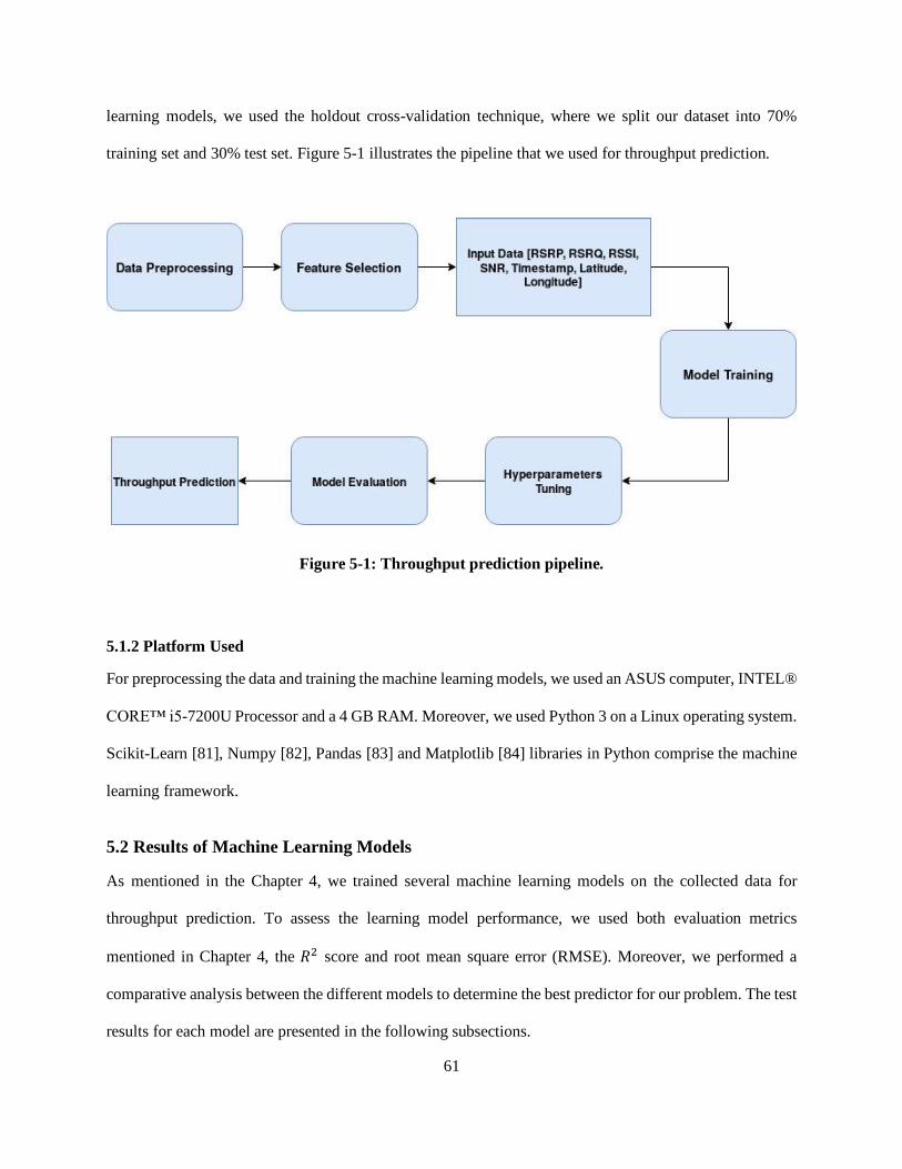
61
learning models, we used the holdout cross-validation technique, where we split our dataset into 70%
training set and 30% test set. Figure 5-1 illustrates the pipeline that we used for throughput prediction.
Figure 5-1: Throughput prediction pipeline.
5.1.2 Platform Used
For preprocessing the data and training the machine learning models, we used an ASUS computer, INTEL®
CORE™ i5-7200U Processor and a 4 GB RAM. Moreover, we used Python 3 on a Linux operating system.
Scikit-Learn [81], Numpy [82], Pandas [83] and Matplotlib [84] libraries in Python comprise the machine
learning framework.
5.2 Results of Machine Learning Models
As mentioned in the Chapter 4, we trained several machine learning models on the collected data for
throughput prediction. To assess the learning model performance, we used both evaluation metrics
mentioned in Chapter 4, the 𝑅2 score and root mean square error (RMSE). Moreover, we performed a
comparative analysis between the different models to determine the best predictor for our problem. The test
results for each model are presented in the following subsections.

62
5.2.1 SVR
The SVR algorithm contains various hyperparameters, namely C, which is the regularization parameter, the
kernel function and 𝜀. As there are various possible combinations of hyperparameters, we took advantage
of the grid search to determine the optimal combination. Based on the results from the grid search, we used
a radial basis function as the kernel function and a gamma value of one. In Figure 5-2, Figure 5-3, and
Figure 5-4, we show how changing the values of C and 𝜀 affects the model performance by plotting the
predictions made by the model on the test set along with the actual throughput values. The results are
summarized in Table 1. From the table, one can see how the value of C strongly impacts the performance
of the model.
Figure 5-2: SVR model predictions with C=10000, 𝜺=0.01.
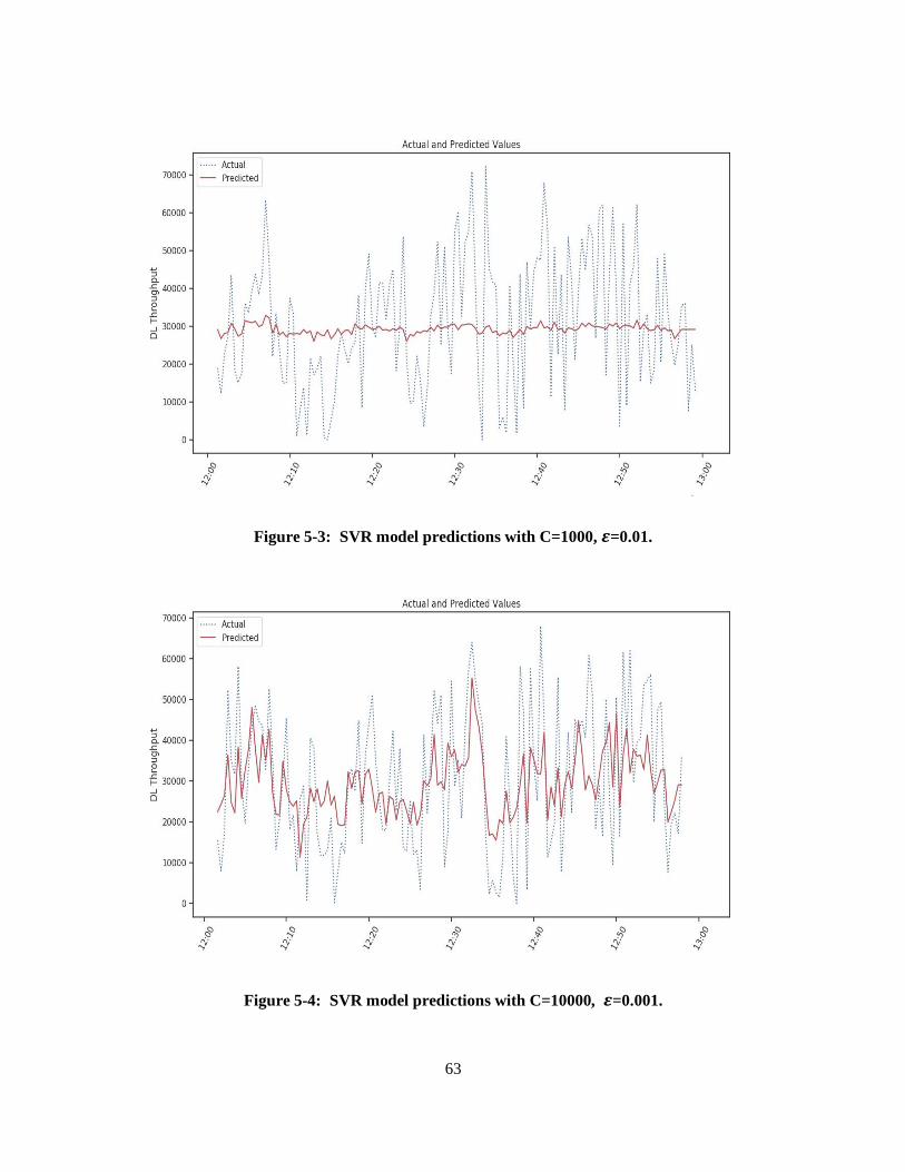
63
Figure 5-3: SVR model predictions with C=1000, 𝜺=0.01.
Figure 5-4: SVR model predictions with C=10000, 𝜺=0.001.
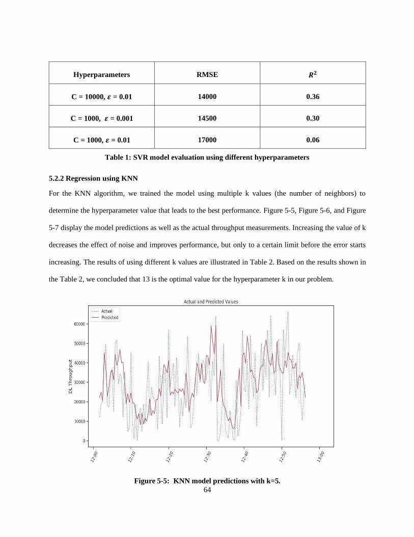
64
Hyperparameters RMSE 𝑹𝟐
C = 10000, 𝜺 = 0.01 14000 0.36
C = 1000, 𝜺 = 0.001 14500 0.30
C = 1000, 𝜺 = 0.01 17000 0.06
Table 1: SVR model evaluation using different hyperparameters
5.2.2 Regression using KNN
For the KNN algorithm, we trained the model using multiple k values (the number of neighbors) to
determine the hyperparameter value that leads to the best performance. Figure 5-5, Figure 5-6, and Figure
5-7 display the model predictions as well as the actual throughput measurements. Increasing the value of k
decreases the effect of noise and improves performance, but only to a certain limit before the error starts
increasing. The results of using different k values are illustrated in Table 2. Based on the results shown in
the Table 2, we concluded that 13 is the optimal value for the hyperparameter k in our problem.
Figure 5-5: KNN model predictions with k=5.
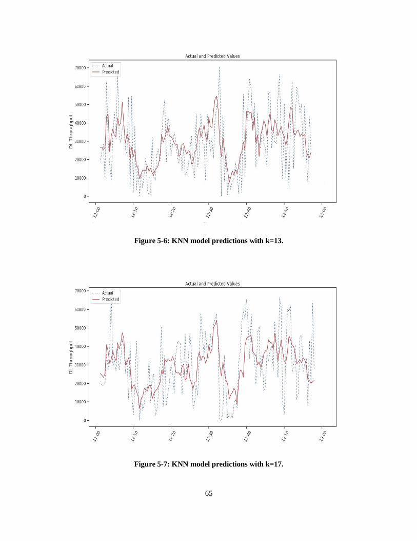
65
Figure 5-6: KNN model predictions with k=13.
Figure 5-7: KNN model predictions with k=17.
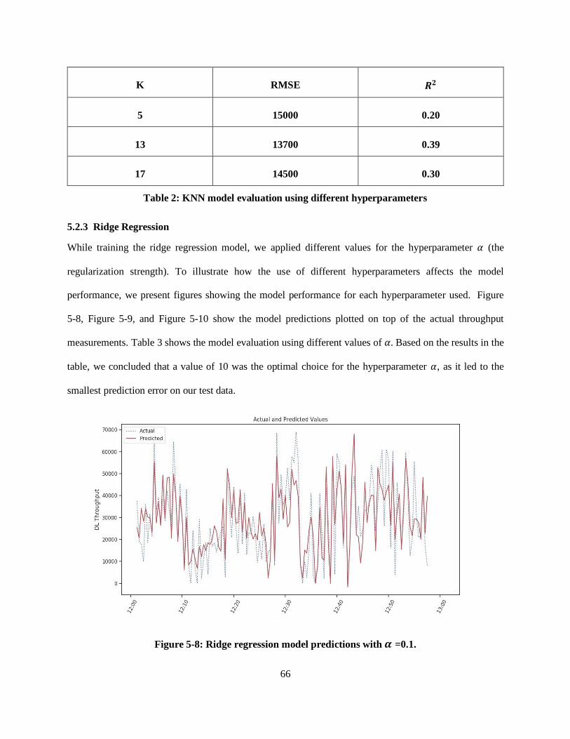
66
K RMSE 𝑹𝟐
5 15000 0.20
13 13700 0.39
17 14500 0.30
Table 2: KNN model evaluation using different hyperparameters
5.2.3 Ridge Regression
While training the ridge regression model, we applied different values for the hyperparameter 𝛼 (the
regularization strength). To illustrate how the use of different hyperparameters affects the model
performance, we present figures showing the model performance for each hyperparameter used. Figure
5-8, Figure 5-9, and Figure 5-10 show the model predictions plotted on top of the actual throughput
measurements. Table 3 shows the model evaluation using different values of 𝛼. Based on the results in the
table, we concluded that a value of 10 was the optimal choice for the hyperparameter 𝛼, as it led to the
smallest prediction error on our test data.
Figure 5-8: Ridge regression model predictions with 𝜶 =0.1.
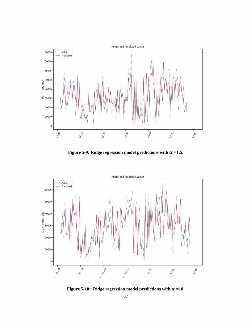
67
Figure 5-9: Ridge regression model predictions with 𝜶 =1.5.
Figure 5-10: Ridge regression model predictions with 𝜶 =10.
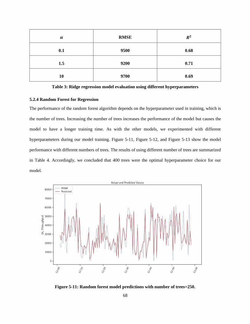
68
𝜶 RMSE 𝑹𝟐
0.1 9500 0.68
1.5 9200 0.71
10 9700 0.69
Table 3: Ridge regression model evaluation using different hyperparameters
5.2.4 Random Forest for Regression
The performance of the random forest algorithm depends on the hyperparameter used in training, which is
the number of trees. Increasing the number of trees increases the performance of the model but causes the
model to have a longer training time. As with the other models, we experimented with different
hyperparameters during our model training. Figure 5-11, Figure 5-12, and Figure 5-13 show the model
performance with different numbers of trees. The results of using different number of trees are summarized
in Table 4. Accordingly, we concluded that 400 trees were the optimal hyperparameter choice for our
model.
Figure 5-11: Random forest model predictions with number of trees=250.
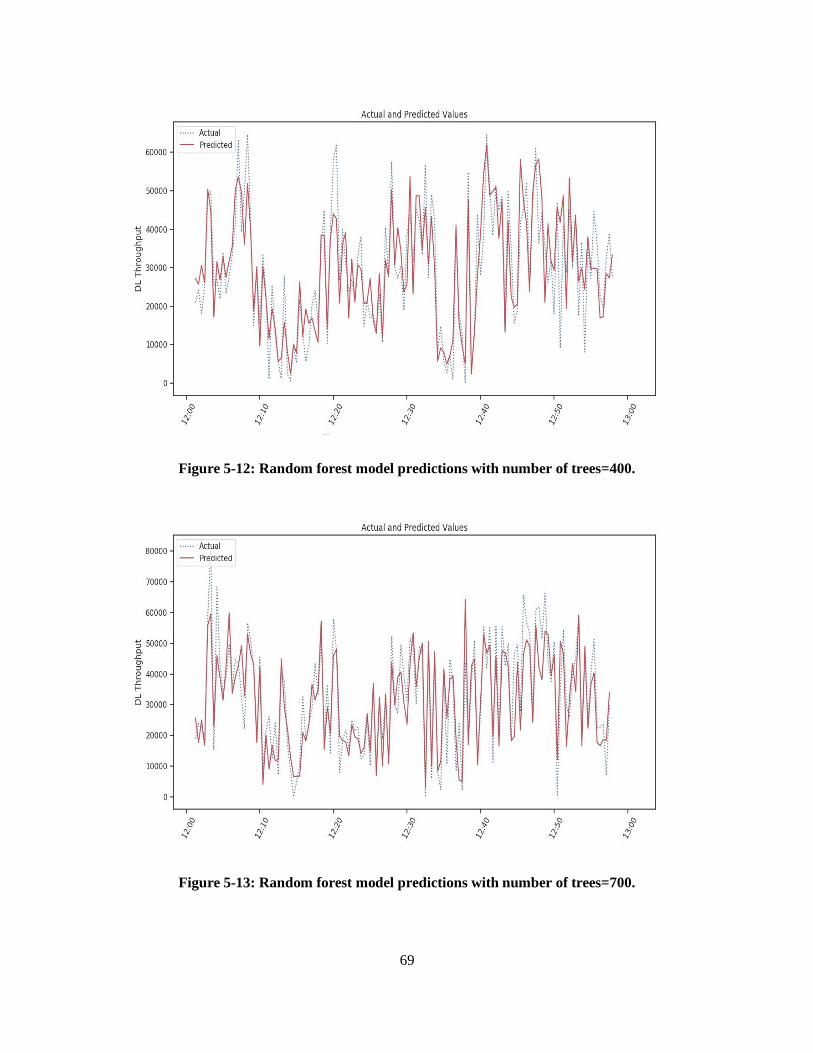
69
Figure 5-12: Random forest model predictions with number of trees=400.
Figure 5-13: Random forest model predictions with number of trees=700.
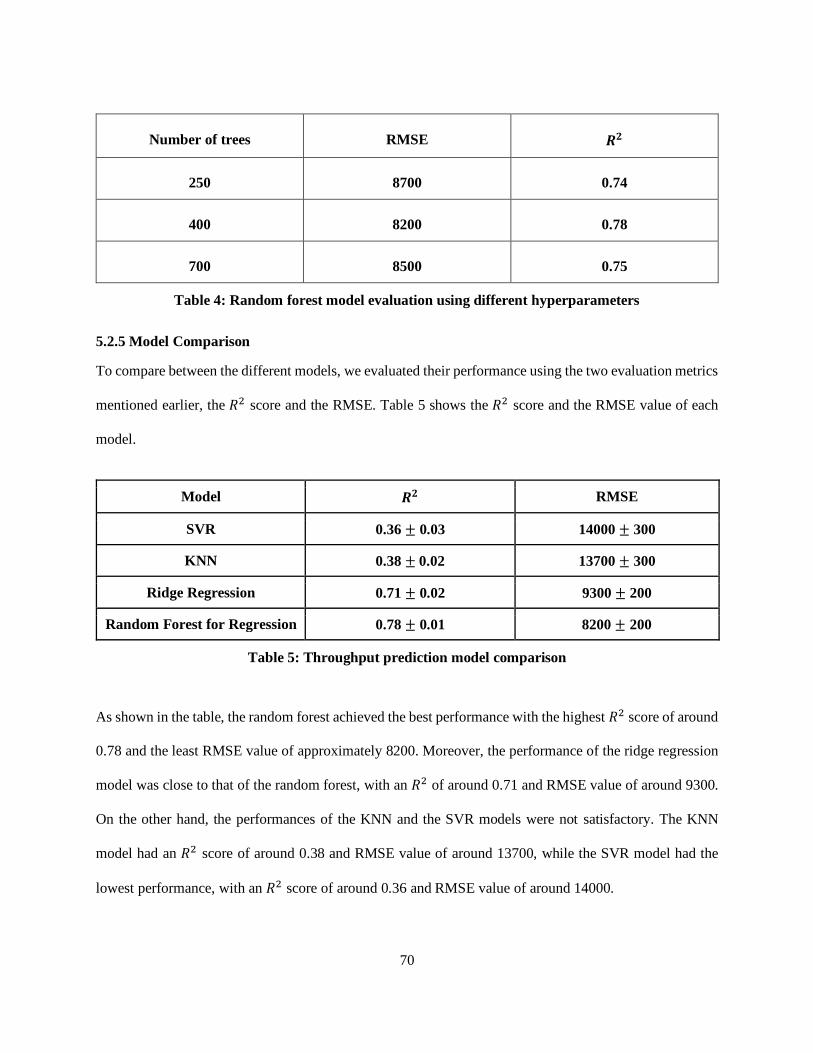
70
Number of trees RMSE 𝑹𝟐
250 8700 0.74
400 8200 0.78
700 8500 0.75
Table 4: Random forest model evaluation using different hyperparameters
5.2.5 Model Comparison
To compare between the different models, we evaluated their performance using the two evaluation metrics
mentioned earlier, the 𝑅2 score and the RMSE. Table 5 shows the 𝑅2 score and the RMSE value of each
model.
Model 𝑹𝟐 RMSE
SVR 0.36 ± 0.03 14000 ± 300
KNN 0.38 ± 0.02 13700 ± 300
Ridge Regression 0.71 ± 0.02 9300 ± 200
Random Forest for Regression 0.78 ± 0.01 8200 ± 200
Table 5: Throughput prediction model comparison
As shown in the table, the random forest achieved the best performance with the highest 𝑅2 score of around
0.78 and the least RMSE value of approximately 8200. Moreover, the performance of the ridge regression
model was close to that of the random forest, with an 𝑅2 of around 0.71 and RMSE value of around 9300.
On the other hand, the performances of the KNN and the SVR models were not satisfactory. The KNN
model had an 𝑅2 score of around 0.38 and RMSE value of around 13700, while the SVR model had the
lowest performance, with an 𝑅2 score of around 0.36 and RMSE value of around 14000.
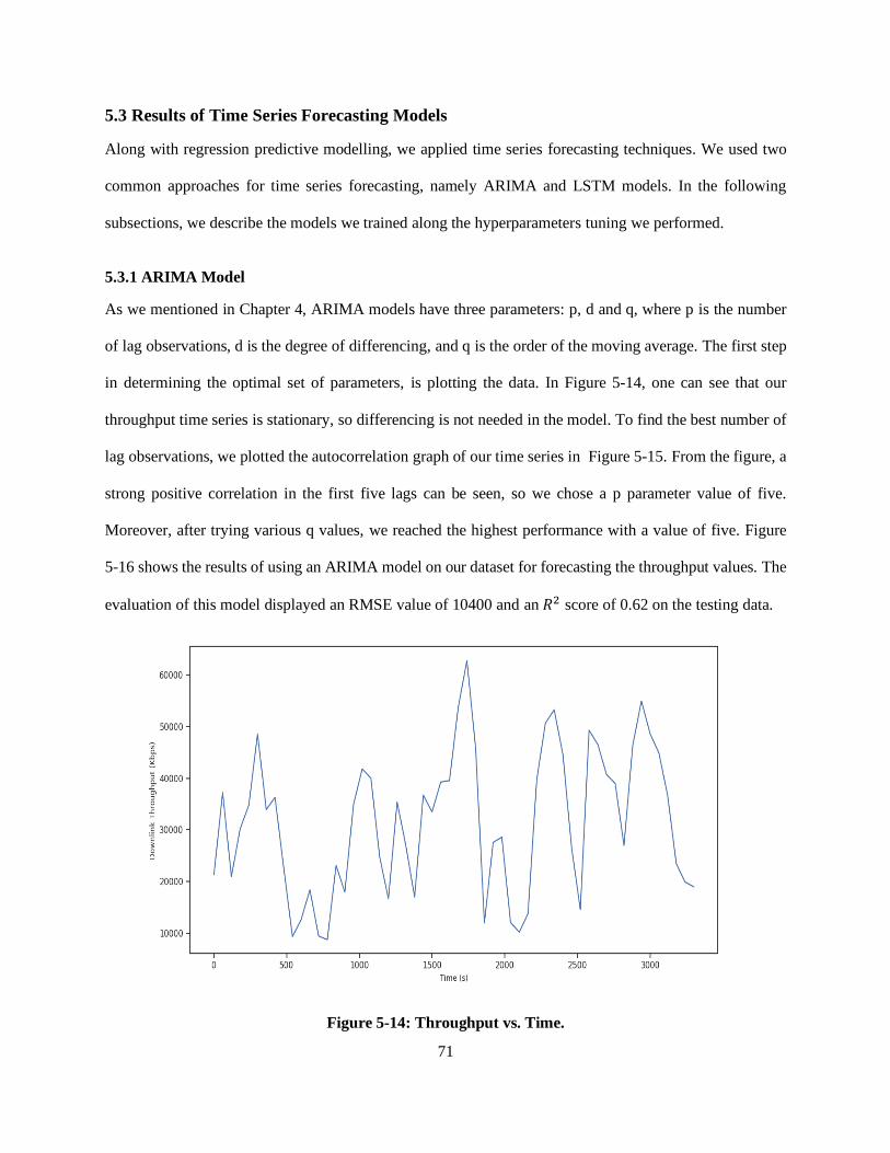
71
5.3 Results of Time Series Forecasting Models
Along with regression predictive modelling, we applied time series forecasting techniques. We used two
common approaches for time series forecasting, namely ARIMA and LSTM models. In the following
subsections, we describe the models we trained along the hyperparameters tuning we performed.
5.3.1 ARIMA Model
As we mentioned in Chapter 4, ARIMA models have three parameters: p, d and q, where p is the number
of lag observations, d is the degree of differencing, and q is the order of the moving average. The first step
in determining the optimal set of parameters, is plotting the data. In Figure 5-14, one can see that our
throughput time series is stationary, so differencing is not needed in the model. To find the best number of
lag observations, we plotted the autocorrelation graph of our time series in Figure 5-15. From the figure, a
strong positive correlation in the first five lags can be seen, so we chose a p parameter value of five.
Moreover, after trying various q values, we reached the highest performance with a value of five. Figure
5-16 shows the results of using an ARIMA model on our dataset for forecasting the throughput values. The
evaluation of this model displayed an RMSE value of 10400 and an 𝑅2 score of 0.62 on the testing data.
Figure 5-14: Throughput vs. Time.
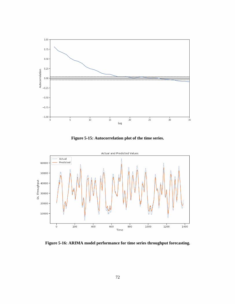
72
Figure 5-15: Autocorrelation plot of the time series.
Figure 5-16: ARIMA model performance for time series throughput forecasting.
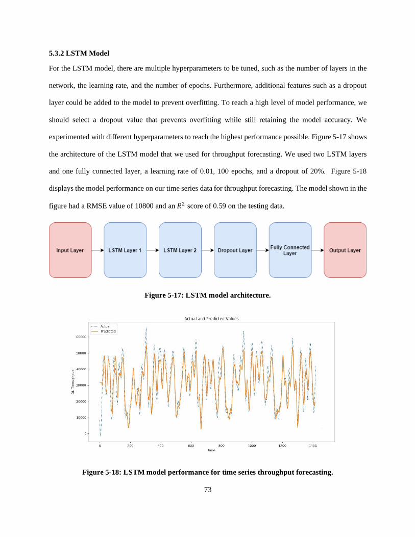
73
5.3.2 LSTM Model
For the LSTM model, there are multiple hyperparameters to be tuned, such as the number of layers in the
network, the learning rate, and the number of epochs. Furthermore, additional features such as a dropout
layer could be added to the model to prevent overfitting. To reach a high level of model performance, we
should select a dropout value that prevents overfitting while still retaining the model accuracy. We
experimented with different hyperparameters to reach the highest performance possible. Figure 5-17 shows
the architecture of the LSTM model that we used for throughput forecasting. We used two LSTM layers
and one fully connected layer, a learning rate of 0.01, 100 epochs, and a dropout of 20%. Figure 5-18
displays the model performance on our time series data for throughput forecasting. The model shown in the
figure had a RMSE value of 10800 and an 𝑅2 score of 0.59 on the testing data.
Figure 5-17: LSTM model architecture.
Figure 5-18: LSTM model performance for time series throughput forecasting.
74
5.4 Discussion
As we have seen in Table 5, the random forest model had the highest throughput prediction performance
on our dataset. The reason for this high performance is that random forests have a strong generalization
edge that prevents overfitting and improves the accuracy of the model. By choosing a few random sub-
samples to build each tree and selecting a random set of features, the random forest algorithm decreases the
correlation between the different trees and greatly reduces the variance in the predictions made by the
model.
For the time series forecasting, the ARIMA model had a slightly higher performance than the LSTM model
as the LSTM networks require a large amount of data. This is mainly because LSTMs have various units
that require weights to be trained.
We believe that we could achieve higher throughput prediction performance if we had access to additional
data from network operators as in the work of [29]. Training the models on data from network operators
along with our client-side data would significantly improve the prediction performance.
In addition, having a dataset with a higher granularity as in the related work in [7] would improve the
accuracy of the data and therefore lead to a higher prediction performance.
5.5 Summary
In this chapter, we have described how we collected and prepared the data for throughput prediction
algorithms. Furthermore, we explained how we experimented with different hyperparameters during the
training of the machine learning models for throughput prediction. Moreover, we evaluated the performance
of each model and performed a comparison between the different models in order to determine the optimal
one for our problem. Additionally, we presented the results of applying time series forecasting algorithms
on our data. Lastly, we discussed the results that we achieved and explained how we could further improve
the prediction performance.
75
Chapter 6
Conclusions and Future Directions
The advancements in the cellular network technologies over the past decade have brought endless services
and capabilities to the users. Smartphone users today rely on their phones for work as well as leisure
activities, such as online gaming and video streaming. This has increased the load on cellular networks,
causing the network traffic to increase. Cellular network operators are always looking for solutions to cope
with this rising demand by developing new mechanisms for resource allocation and load balancing. One
way to improve the network QoS is to predict the fluctuations in the network connectivity before they occur,
in order to take preventative actions. Accordingly, several researchers have proposed the concept of
throughput analysis as a method for determining the network quality in advance. Such an analysis requires
substantial amounts of network data. However, there is a noticeable deficiency in the 4G LTE network data
in the research community.
In this work, we executed a measurement study along routes taken by public transportation buses in
Kington, Ontario, collecting data during 30 different bus trips. We collected measurements of various 4G
LTE network parameters, downlink and uplink throughput, and context information such as GPS locations
and speed. To account for changes in the road traffic and network connectivity levels, we conducted the
measurements at three different times of the weekday: 9 am, 12 pm and 6 pm. Additionally, we performed
an in-depth analysis of the collected data to investigate the effects of the geographical area, time and
contextual factors such as bus stops and number of passengers on the network performance and quality. To
be able to anticipate the fluctuations in the network connectivity and enhance the QoS, we applied
throughput prediction techniques on our data. In particular, we performed multiple preprocessing steps on
our data and then trained and tested various machine learning algorithms for throughput prediction, namely
SVR, KNN, ridge regression, and random forest. Moreover, we deployed time series forecasting models on
the collected data for throughput prediction. We then compared the results of the different models deployed

76
by using different evaluation metrics in order to determine the optimal one for throughput prediction based
on our data.
Our analysis shows that there are significant fluctuations in the network connectivity at different times of
the day. At 6 pm, the mean signal strength and throughput measurements are notably less than at 9 am and
12 pm. Furthermore, the location variations at 6 pm were much higher than at the other two times of the
day. We believe this occur because there is more traffic on the road and more passengers on the bus at 6
pm, which in turn causes an increased network traffic at this time. From these observations we conclude
that the time of the day and the road traffic condition play an important role in controlling the network QoS.
Moreover, we showed that some locations along the bus route experience remarkably lower signal strength
and throughput values. This is mainly due to the lack of cell towers located in these areas, compared to
other areas along the bus route. We feel that network operators could greatly enhance the network
connectivity by deploying more towers at these locations.
For throughput prediction, we achieved the highest prediction accuracy using the random forest algorithm.
This result is mostly due to the fact that random forests add an additional layer of randomness to the features,
which greatly reduces the variance and causes the model to have a strong generalization power. Moreover,
the additional layer of randomness, added by the random forests, leads to a higher model performance on
unseen data and prevents overfitting.
Future Directions
The solution presented in this thesis can be further improved. In the following points, we suggest future
directions to research that could improve our solution, as well as further studies that could be conducted on
our dataset.
1. By collecting more measurements of cellular network parameters, the performance of the
prediction models can be greatly enhanced.
2. Acquiring additional data from network operators, such as average cell throughput and average
number of users per cell, could significantly benefit the throughput prediction models.

77
3. User movement prediction could be performed by investigating the correlation between mobility
and cellular network parameters.
4. Since the dataset contains information about the GPS locations of the device and serving cells and
channel parameters of the serving cell and neighboring cells, handover analysis could be applied
on the data.
5. The data could be used for predictive resource allocation mechanisms, such as content prefetching,
which rely on the user location awareness.
78
References
[1] Q. Xu, S. Mehrotra, Z. Mao, and J. Li, “PROTEUS: network performance forecast for real-time,
interactive mobile applications,” in Proc. of the 11th Annual International Conf. on Mobile
Systems, Applications, and Services, pp. 347–360, 2013.
[2] H. Abou-zeid, H. S. Hassanein, Z. Tanveer and N. AbuAli, “Evaluating mobile signal and location
predictability along public transportation routes,” IEEE Wireless Communications and Networking
Conference (WCNC), New Orleans, LA, pp. 1195-1200, 2015.
[3] R. Margolies, A. Sridharan, V. Aggarwal, R. Jana, N. K. Shankaranarayanan, V. A. Vaishampayan,
and G. Zussman, “Exploiting mobility in proportional fair cellular scheduling: Measurements and
algorithms,” in Proc. IEEE INFOCOM, pp. 1339–1347, 2014.
[4] D. Zhou, Z. Yan, Y. Fu, and Z. Yao, “A survey on network data collection”, Journal of Network
and Computer Applications, Journal of Network and Computer Applications, vol. 116, 15, pp. 9-
23, 2018.
[5] K. Connolly, Law of Internet Security and Privacy. Aspen Publishers, 2001, pp. 131-132.
[6] Qualcomm, Qualcomm eXtensible Diagnostic Monitor (QXDM Professional), 2008. [Online].
Available: http://www.qualcomm.com/media/documents/tags/qxdm. [Accessed: Jan. 25, 2020].
[7] R. Jin, Enhancing upper-level performance from below: Performance measurement and
optimization in LTE networks. Doctoral Dissertations, Univ. of Connecticut, United States, 2015.
[8] Wikipedia contributors, “Crowdsourcing”. Wikipedia, The Free Encyclopedia. [Online]. Available:
https://en.wikipedia.org. [Accessed: Feb. 9, 2020].
[9] F. Afroz, R. Subramanian, R. Heidary, K. Sandrasegaran, and S. Ahmed, “SINR, RSRP, RSSI and
RSRQ Measurements in Long Term Evolution Networks,” International Journal of Wireless &
Mobile Networks, pp. 113-123, 2015.
[10] G. Miao, J. Zander, K. Sung, and B. Slimane, “Fundamentals of Mobile Data Networks,”
Cambridge University Press, 2016.

79
[11] M. Sauter, From GSM to LTE: An Introduction to Mobile Networks and Mobile Broadband, 1st
ed., Wiley Publishing, 2011.
[12] S. Farahani, ZigBee Wireless Networks and Transceivers, 2008, pp. 225-246.
[13] M. Posinna. "Different types of fiber optic cables". HFCL, 2014.
[14] C. M. Bishop, Pattern Recognition and Machine Learning, New York: Springer, 2006.
[15] S. J. Russell and P. Norvig, Artificial Intelligence: A Modern Approach, 3rd Edition, Prentice Hall,
1995.
[16] E. Alpaydin, “Introduction to Machine Learning,” MIT Press, p. 9, 2010.
[17] R. D. Cook and S. Weisberg, “Criticism and Influence Analysis in Regression,” Sociological
Methodology, vol. 13. pp. 313–361, 1982.
[18] G. Hinton and T. Sejnowski, “Unsupervised Learning: Foundations of Neural Computation,” MIT
Press, 1999.
[19] R. C. Tryon. Cluster Analysis: Correlation Profile and Orthometric (factor) Analysis for the
Isolation of Unities in Mind and Personality, Edwards Brothers, 1939.
[20] S. T. Roweis and L. K. Saul, “Nonlinear Dimensionality Reduction by Locally Linear Embedding,”
Science, vol. 290 pp. 2323–2326, 2000.
[21] L. P. Kaelbling, M. L. Littman, and A. W. Moore, “Reinforcement Learning: A Survey,” Journal
of Artificial Intelligence Research, vol. 4, pp. 237–285, 1996.
[22] X. K. Zou, J. Erman, V. Gopalakrishnan, E. Halepovic, R. Jana, X. Jin, J. Rexford, and R. K. Sinha.
“Can Accurate Predictions Improve Video Streaming in Cellular Networks?” In Proc. of the 16th
International Workshop on Mobile Computing Systems and Applications (HotMobile ’15),
association for Computing Machinery, New York, USA, pp. 57–62, 2015.
[23] F. Jomrich, A. Herzberger, T. Meuser, B. Richerzhagen, R. Steinmetz, and C. Wille, “Cellular
Bandwidth Prediction for Highly Automated Driving - Evaluation of Machine Learning
Approaches based on Real-World Data,” in Proc. of the 4th International Conf. on Vehicle
80
Technology and Intelligent Transport Systems, vol.1, pp. 121-132, Funchal, Madeira, Portugal,
2018.
[24] F. Lu, H. Du, A. Jain, G. M. Voelker, A. C. Snoeren, and A. Terzis, “CQIC: Revisiting cross-layer
congestion control for cellular networks,” in Proc. of the 16th International Workshop on Mobile
Computing Systems and Applications, pp. 45– 50, 2015.
[25] J. Yao, S. S. Kanhere, and M. Hassan, “An empirical study of bandwidth predictability in mobile
computing,” in Proc. ACM WiNTECH, pp. 11–18, 2008.
[26] D. Han, J. Han, Y. Im, M. Kwak, T. T. Kwon, and Y. Choi, “MASERATI: Mobile adaptive
streaming based on environmental and contextual information,” in Proc. ACM WiNTECH, pp. 33–
40, 2013.
[27] A. Samba, Y. Busnel, A. Blanc, P. Dooze, G. Simon, “Instantaneous Throughput Prediction in
Cellular Networks: Which Information Is Needed?” in IFIP/IEEE International Symposium on
Integrated Network Management (IM), Lisbonne, Portugal, 2017.
[28] D. Raca, J.J. Quinlan, A.H. Zahran, C.J. Sreenan. "Beyond Throughput: a 4G LTE Dataset with
Channel and Context Metrics,” in Proc. of ACM Multimedia Systems Conference, Amsterdam, The
Netherlands, 2018.
[29] T. Kamakaris and J. V. Nickerson, “Connectivity maps: Measurements and applications,” in Proc.
of the 38th Annual Hawaii International Conf. on System Sciences, Big Island, HI, USA, pp. 307–
307, 2005.
[30] T. Pögel, and L. Wolf, “Prediction of 3G network characteristics for adaptive vehicular connectivity
maps (poster),” in Vehicular Networking Conf. (VNC), IEEE, pp. 121–128, 2012.
[31] T. Pögel, and L. Wolf, “Optimization of vehicular applications and communication properties with
connectivity maps,” in Local Computer Networks Conference Workshops (LCN Workshops), IEEE
40th, pp. 870–877, 2015.

81
[32] Y. Liu, and J. Y. Lee, “An empirical study of throughput prediction in mobile data networks,” in
Global Communications Conference (GLOBECOM), IEEE, pp. 1–6, 2015.
[33] M. Sauter, "Mobility Management in the Cell-DCH State," in GSM to LTE: An Introduction to
Mobile Networks and Mobile Broadband. John Wiley & Sons, pp. 160-160, 2010. [Online].
[34] D. Wu, Y. Li and Y. Sun, "Construction and Block Error Rate Analysis of Polar Codes Over
AWGN Channel Based on Gaussian Approximation," in IEEE Communications Letters, vol. 18,
no. 7, pp. 1099-1102, July 2014.
[35] M. Hazewinkel, "Normal distribution," in Encyclopedia of Mathematics, Springer
Science+Business Media B.V. / Kluwer Academic Publishers, 2001.
[36] S. McKillup, Statistics explained: An Introductory guide for life scientists, Cambridge: Cambridge
University Press, 2011.
[37] G. S. Maddala, "Outliers,” in Introduction to Econometrics, 2nd ed. New York: MacMillan. pp.
89-90, 1992.
[38] E. Kreyszig, Advanced Engineering Mathematics, 4th ed. Wiley. pp. 880-881, 1979.
[39] G. Upton, I. Cook, “Understanding Statistics,” Oxford University Press. p. 55, 1996.
[40] M. Ester, H.-P. Kriegel, J. Sander, and X. Xu, “A Density-Based Algorithm for Discovering
Clusters in Large Spatial Databases with Noise.,” in KDD, pp. 226–231, 1996.
[41] F. T. Liu, K. M. Ting, Z. H. Zhou, "Isolation Forest," in 2008 Eighth IEEE International Conf. on
Data Mining: 413–422, 2008.
[42] C. C. Aggarwal and S. Sathe, Outlier ensembles: An introduction. Springer. 2017.
[43] F. Pedregosa, G. Varoquaux, A. Gramfort, V. Michel, B. Thirion, O. Grisel, M. Blondel, P.
Prettenhofer, R. Weiss, V. Dubourg, J. Vanderplas, A. Passos, D. Cournapeau, M. Perrot, and E.
Duchesnay "Scikit-learn: Machine Learning in Python,” Journal of Machine Learning Research,
vol. 12, pp. 2825–2830, 2011.

82
[44] N. S. Altman, "An introduction to kernel and nearest-neighbor nonparametric regression," The
American Statistician, vol. 46, no.3, pp. 175–185, 1992.
[45] H. Anton, Elementary Linear Algebra, 7th ed., John Wiley & Sons, pp. 170–171, 1994.
[46] P. E. Black, Dictionary of Algorithms and Data Structures, 2006.
[47] A. Singhal, "Modern Information Retrieval: A Brief Overview," Bulletin of the IEEE Computer
Society Technical Committee on Data Engineering, vol. 24, no. 4, pp. 35--43, 2001.
[48] D. J. S. Robinson, An Introduction to Abstract Algebra. Walter de Gruyter, pp. 255–257, 2003.
[49] M. J. Azur, E. A. Stuart, C. Frangakis, P. J. Leaf, "Multiple imputation by chained equations: what
is it and how does it work?," International Journal of Methods in Psychiatric Research, vol. 20,
no. 1, pp. 40–49, 2011.
[50] A. Jain, K. Nandakumar, A. Ross, “Score normalization in multimodal biometric systems,” Pattern
Recognition, vol. 38, no. 12, pp. 2270-2285, 2005.
[51] S. Cannistra, "Small explanation of binning in image processing". [Online]. Available:
http://www.starrywonders.com/binning.html. [Accessed Feb. 10, 2020].
[52] K. Pearson, “On the criterion that a given system of deviations from the probable in the case of a
correlated system of variables is such that it can be reasonably supposed to have arisen from random
sampling,” The London, Edinburgh, and Dublin Philosophical Magazine and Journal of Science,
vol. 50, no. 302, pp. 157–175, Jul. 1900.
[53] S. Stringer, “Feature Importance – What’s in a name?” July, 2018, Medium. [Online]. Available:
https://medium.com/bigdatarepublic/feature-importance-whats-in-a-name-79532e59eea3.
[Accessed Feb. 10, 2020].
[54] T. C. Urdan, Statistics in plain English, Santa Clara University, 2016.

83
[55] A. N. Tikhonov, A. Goncharsky, V. V. Stepanov, A. G. Yagola, Numerical Methods for the
Solution of Ill-Posed Problems. Netherlands: Springer Netherlands, 1995.
[56] X. Yan, “Linear Regression Analysis: Theory and Computing,” World Scientific, pp. 1–2, 2009.
[57] T. J. Archdeacon, “Correlation and regression analysis: a historian's guide,” University of
Wisconsin Press. pp. 161–162, 1994.
[58] W.M.P. Van der Aalst, V. Rubin, H.M.W. Verbeek, B. F. Van Dongen, E. Kindler, and C. W.
Günther “Process mining: a two-step approach to balance between underfitting and overfitting,”
Softw Syst Model vol. 9, no. 87, 2010.
[59] P. Domingos, “A few useful things to know about machine learning,” Commun. ACM, vol. 55, no.
10, pp. 78–87, 2012.
[60] Tibshirani, Robert, "Regression Shrinkage and Selection via the lasso," Journal of the Royal
Statistical Society. Series B (methodological). Wiley, vol. 58, no. 1, pp. 267–88, 1996.
[61] Wikipedia contributors, “Minkowski distance”. Wikipedia, The Free Encyclopedia. [Online].
Available: https://en.wikipedia.org. [Accessed: Feb.10, 2020]
[62] H. Drucker, C. C. Burges, L. Kaufman, A. J. Smola, and V. N. Vapnik, "Support Vector Regression
Machines," in Advances in Neural Information Processing Systems 9, pp.155–161, 1996.
[63] C. Cortes and V. N. Vapnik "Support-vector networks," Machine Learning, vol. 20 no. 3, pp. 273–
297, 1995.
[64] H. TK, "The Random Subspace Method for Constructing Decision Forests," IEEE Transactions on
Pattern Analysis and Machine Intelligence, vol. 20, no.8, pp. 832–844, 1998.
[65] L. Li, “Classification and Regression Analysis with Decision Trees,” Towards Data Science, May
2019, [Online]. Available: .Https://towardsdatascience.com/https-medium-com-lorrli-
84
classification-and-regression-analysis-with-decision-trees-c43cdbc58054. [Accessed: Feb. 10,
2020].
[66] M. Claesen and B. De Moor, Hyperparameter Search in Machine Learning, The XI Metaheuristics
International Conference, 2015.
[67] R. Ghawi and J. Pfeffer, “Efficient Hyperparameter Tuning with Grid Search for Text
Categorization using KNN Approach with BM25 Similarity,” Open Computer Science, vol. 9, no.
1, pp. 160-180. 2019.
[68] J. Bergstra, and Y. Bengio, “Random Search for Hyper-Parameter Optimization,” Journal of
Machine Learning Research, vol. 13, pp. 281-305, 2012.
[69] J. Snoek, H. Larochelle, and R. P. Adams, “Practical Bayesian optimization of machine learning
algorithms,” in Proc. of the 25th International Conf. on Neural Information Processing Systems,
vol. 2, pp. 2951–2959, 2012.
[70] P. A. Devijver and J. Kittler, Pattern Recognition: A Statistical Approach. London, GB: Prentice-
Hall, 1982.
[71] J. Awwalu and F. Ogwueleka, “On Holdout and Cross Validation: A Comparison between Neural
Network and Support Vector Machine,” International Journal of Trend in Research and
Development, vol. 6, no.2, pp. 2394-9333, 2019.
[72] T. Fushiki, “Estimation of prediction error by using K-fold cross-validation,” Statistics and
Computing vol. 21, pp. 137–146, 2011.
[73] C. Sammut and G. I. Webb G.I. (eds.), “Leave-One-Out Cross-Validation”, Encyclopedia of
Machine Learning. Springer, Boston, MA, 2011.
[74] G. E. P. Box and G. M. Jenkins. Time Series Analysis: Forecasting and Control., Revised edition.
Holden-Day: San Francisco, 1976.

85
[75] R. J. Hyndman and G. Athanasopoulos, Forecasting: Principles and practice. Vic. Heathmont:
OTexts, 2014.
[76] S. Hochreiter and J. Schmidhuber, "Long Short-Term Memory," Neural Computation, vol. 9, no.
8, pp.1735–1780, 1997.
[77] S. Dupond, "A thorough review on the current advance of neural network structures," Annual
Reviews in Control, vol. 14, pp. 200–230, 2019.
[78] L. M. Camarinha-Matos, R. Almeida and J. OliveiraI (eds.) “Technological Innovation for
Industry and Service Systems,” 10th IFIP WG 5.5/SOCOLNET Advanced Doctoral Conference
on Computing, Electrical and Industrial Systems, DoCEIS, Costa de Caparica, Portugal, 2019.
[79] N. Srivastava, G. Hinton, A. Krizhevsky, I. Sutskever, and R. Salakhutdinov, “Dropout: a simple
way to prevent neural networks from overfitting”. Journal of Machine Learning Research, vol. 15,
no. 1 pp. 1929–1958, 2014.
[80] R. G. D. Steel and J. H. Torrie, Principles and Procedures of Statistics with Special Reference to
the Biological Sciences. McGraw Hill, 1960.
[81] F. Pedregosa, G. Varoquaux, A. Gramfort, V. Michel, B. Thirion and O. Grisel, “Scikit-learn:
Machine learning in Python,” Journal of Machine Learning Research, pp. 2825–2830, 2011.
[82] T. E. Oliphant, A guide to NumPy (Vol. 1). Trelgol Publishing, USA, 2006.
[83] W. McKinney, “Data structures for statistical computing in python,” in Proc. of the 9th Python in
Science Conf., vol. 445, pp. 51–56., 2010.
[84] J. D. Hunter, “Matplotlib: A 2D graphics environment,” in Computing in Science & Engineering,
vol. 9, no.3, pp. 90–95, May-June 2007.