Embed Size (px)
Citation preview
2.1 - 1Copyright © 2010, 2007, 2004 Pearson Education, Inc. All Rights Reserved.
Lecture Slides
Elementary Statistics Eleventh Edition
and the Triola Statistics Series
by Mario F. Triola
2.1 - 2Copyright © 2010, 2007, 2004 Pearson Education, Inc. All Rights Reserved.
Chapter 2Summarizing and Graphing
Data
2-1 Review and Preview
2-2 Frequency Distributions
2-3 Histograms
2-4 Statistical Graphics
2-5 Critical Thinking: Bad Graphs
2.1 - 3Copyright © 2010, 2007, 2004 Pearson Education, Inc. All Rights Reserved.
Section 2-1 Review and Preview
2.1 - 4Copyright © 2010, 2007, 2004 Pearson Education, Inc. All Rights Reserved.
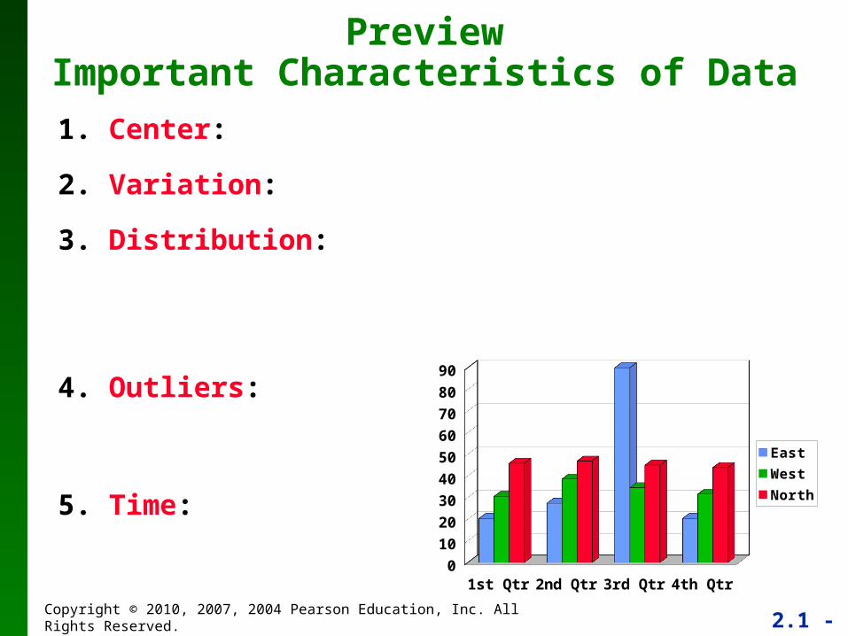
1. Center:
2. Variation:
3. Distribution:
PreviewImportant Characteristics of Data
1st Qtr 2nd Qtr 3rd Qtr 4th Qtr0
10
20
30
40
50
60
70
80
90
East
West
North
4. Outliers:
5. Time:
2.1 - 5Copyright © 2010, 2007, 2004 Pearson Education, Inc. All Rights Reserved.Copyright © 2010 Pearson Education
Section 2-2 Frequency Distributions
Copyright © 2010 Pearson Education
2.1 - 6Copyright © 2010, 2007, 2004 Pearson Education, Inc. All Rights Reserved.
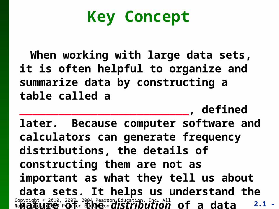
Key Concept
When working with large data sets, it is often helpful to organize and summarize data by constructing a table called a __________________________, defined later. Because computer software and calculators can generate frequency distributions, the details of constructing them are not as important as what they tell us about data sets. It helps us understand the nature of the distribution of a data set.
Copyright © 2010 Pearson Education
2.1 - 7Copyright © 2010, 2007, 2004 Pearson Education, Inc. All Rights Reserved.Copyright © 2010 Pearson Education
Frequency Distribution
(or Frequency Table)
Definition
2.1 - 8Copyright © 2010, 2007, 2004 Pearson Education, Inc. All Rights Reserved.
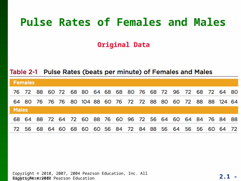
Pulse Rates of Females and Males
Original Data
Copyright © 2010 Pearson Education
2.1 - 9Copyright © 2010, 2007, 2004 Pearson Education, Inc. All Rights Reserved.Copyright © 2010 Pearson Education
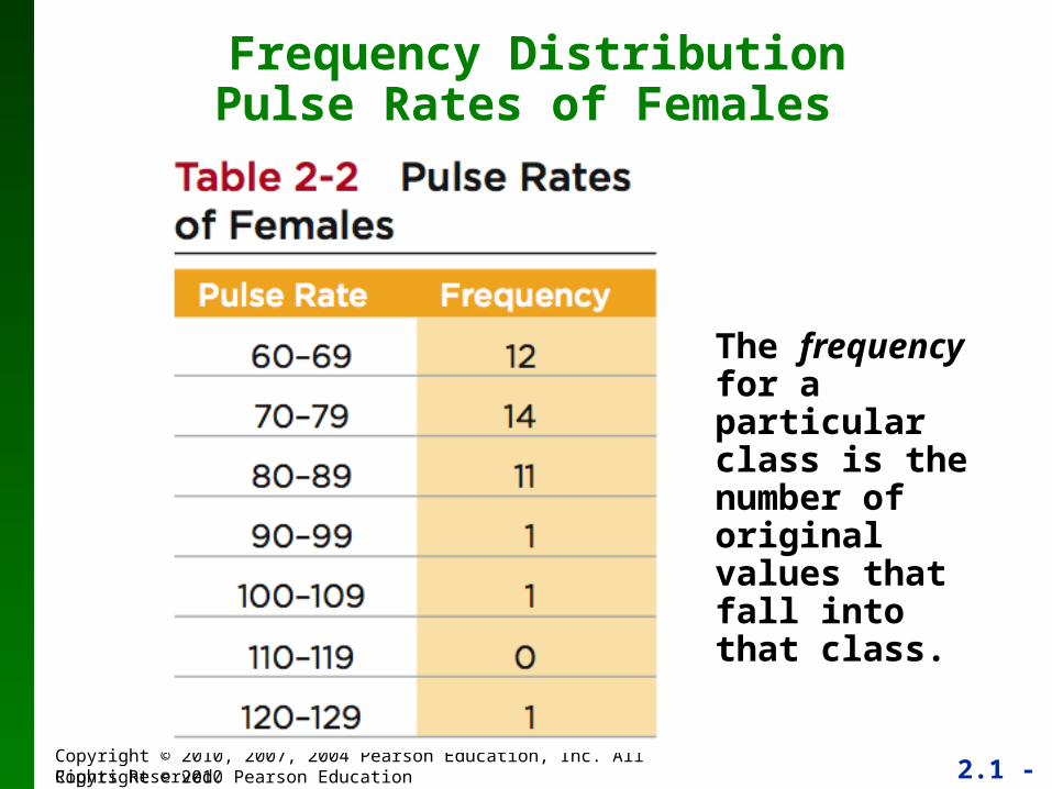
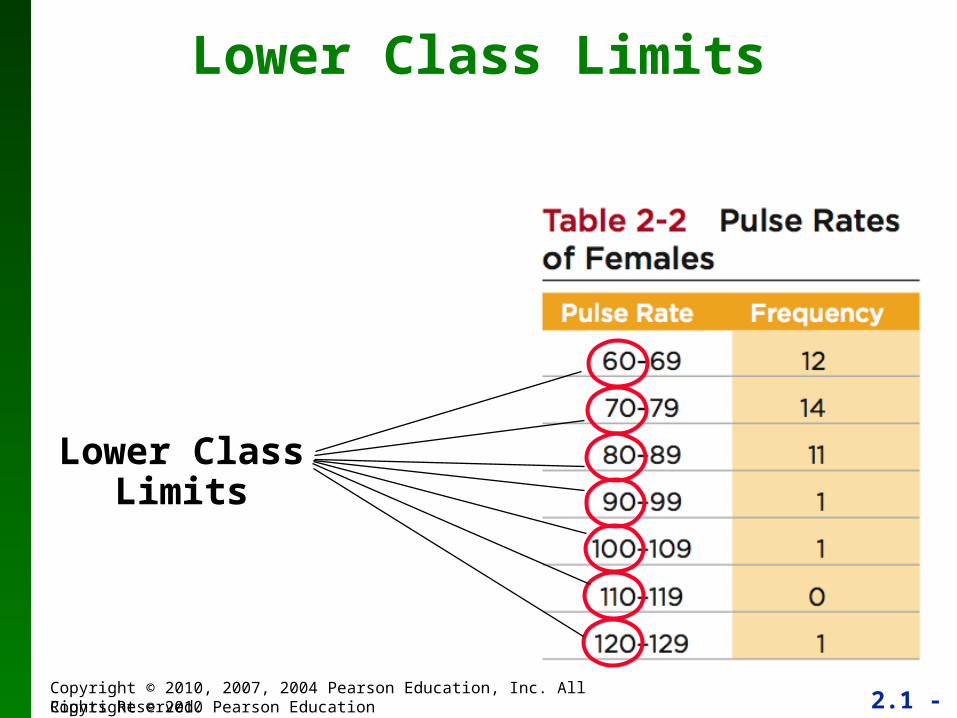
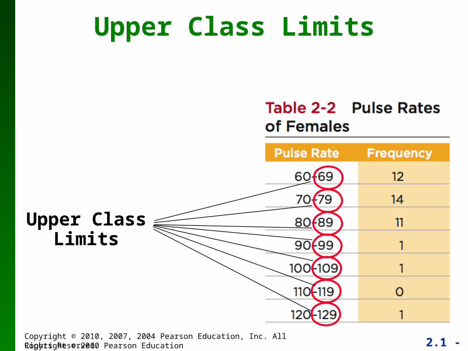
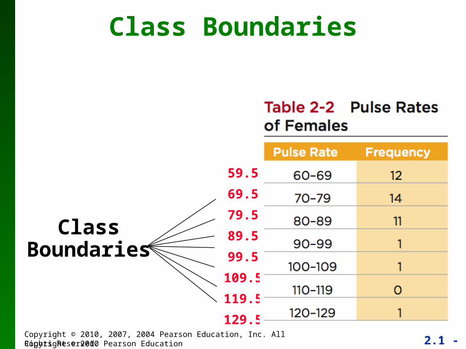
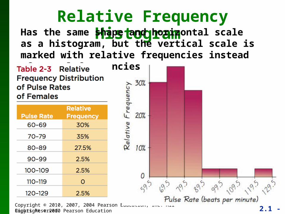
Frequency DistributionPulse Rates of Females
The frequency for a particular class is the number of original values that fall into that class.
2.1 - 10Copyright © 2010, 2007, 2004 Pearson Education, Inc. All Rights Reserved.Copyright © 2010 Pearson Education
Frequency Distributions
Definitions
2.1 - 11Copyright © 2010, 2007, 2004 Pearson Education, Inc. All Rights Reserved.Copyright © 2010 Pearson Education
Lower Class Limits
Lower ClassLimits
2.1 - 12Copyright © 2010, 2007, 2004 Pearson Education, Inc. All Rights Reserved.Copyright © 2010 Pearson Education
Upper Class Limits
Upper ClassLimits
2.1 - 13Copyright © 2010, 2007, 2004 Pearson Education, Inc. All Rights Reserved.Copyright © 2010 Pearson Education
Class Boundaries
ClassBoundaries
59.5
69.5
79.5
89.5
99.5
109.5
119.5
129.5
2.1 - 14Copyright © 2010, 2007, 2004 Pearson Education, Inc. All Rights Reserved.Copyright © 2010 Pearson Education
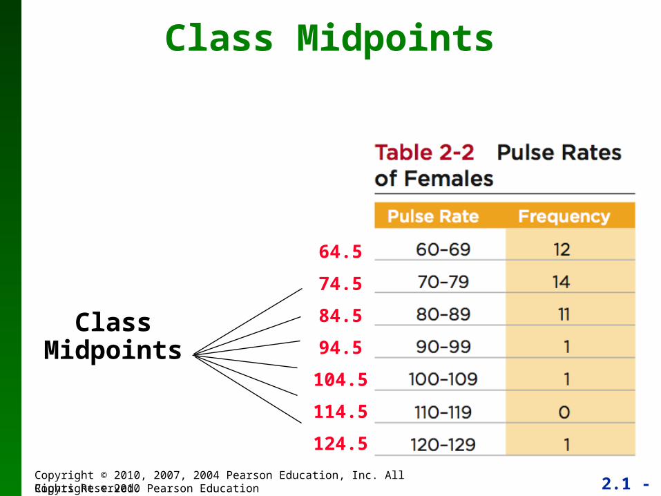
Class Midpoints
ClassMidpoints
64.5
74.5
84.5
94.5
104.5
114.5
124.5
2.1 - 15Copyright © 2010, 2007, 2004 Pearson Education, Inc. All Rights Reserved.Copyright © 2010 Pearson Education
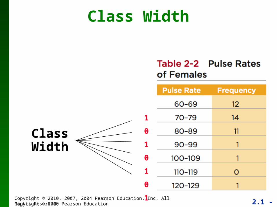
Class Width
Class Width
10
10
10
10
10
10
2.1 - 16Copyright © 2010, 2007, 2004 Pearson Education, Inc. All Rights Reserved.Copyright © 2010 Pearson Education
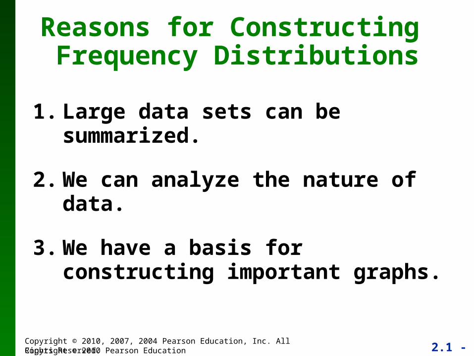
1. Large data sets can be summarized.
2. We can analyze the nature of data.
3. We have a basis for constructing important graphs.
Reasons for Constructing Frequency Distributions
2.1 - 17Copyright © 2010, 2007, 2004 Pearson Education, Inc. All Rights Reserved.Copyright © 2010 Pearson Education
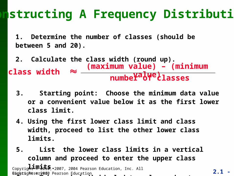
3. Starting point: Choose the minimum data value or a convenient value below it as the first lower class limit.
4. Using the first lower class limit and class width, proceed to list the other lower class limits.
5. List the lower class limits in a vertical column and proceed to enter the upper class limits.
6. Take each individual data value and put a tally mark in the appropriate class. Add the tally marks to get the frequency.
Constructing A Frequency Distribution
1. Determine the number of classes (should be between 5 and 20).
2. Calculate the class width (round up).
class width (maximum value) – (minimum value)
number of classes
2.1 - 18Copyright © 2010, 2007, 2004 Pearson Education, Inc. All Rights Reserved.Copyright © 2010 Pearson Education
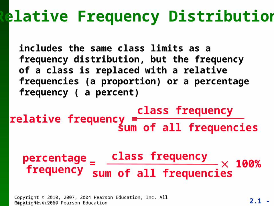
Relative Frequency Distribution
relative frequency =class frequency
sum of all frequencies
includes the same class limits as a frequency distribution, but the frequency of a class is replaced with a relative frequencies (a proportion) or a percentage frequency ( a percent)
percentagefrequency
class frequency
sum of all frequencies 100%=
2.1 - 19Copyright © 2010, 2007, 2004 Pearson Education, Inc. All Rights Reserved.Copyright © 2010 Pearson Education
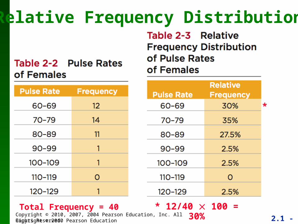
Relative Frequency Distribution
* 12/40 100 = 30%Total Frequency = 40
*
2.1 - 20Copyright © 2010, 2007, 2004 Pearson Education, Inc. All Rights Reserved.Copyright © 2010 Pearson Education
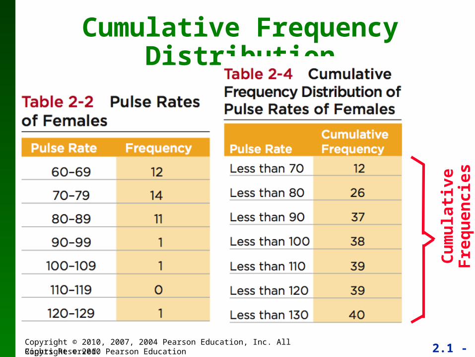
Cumulative Frequency Distribution
Cu
mu
lati
ve F
req
uen
cies
2.1 - 21Copyright © 2010, 2007, 2004 Pearson Education, Inc. All Rights Reserved.Copyright © 2010 Pearson Education
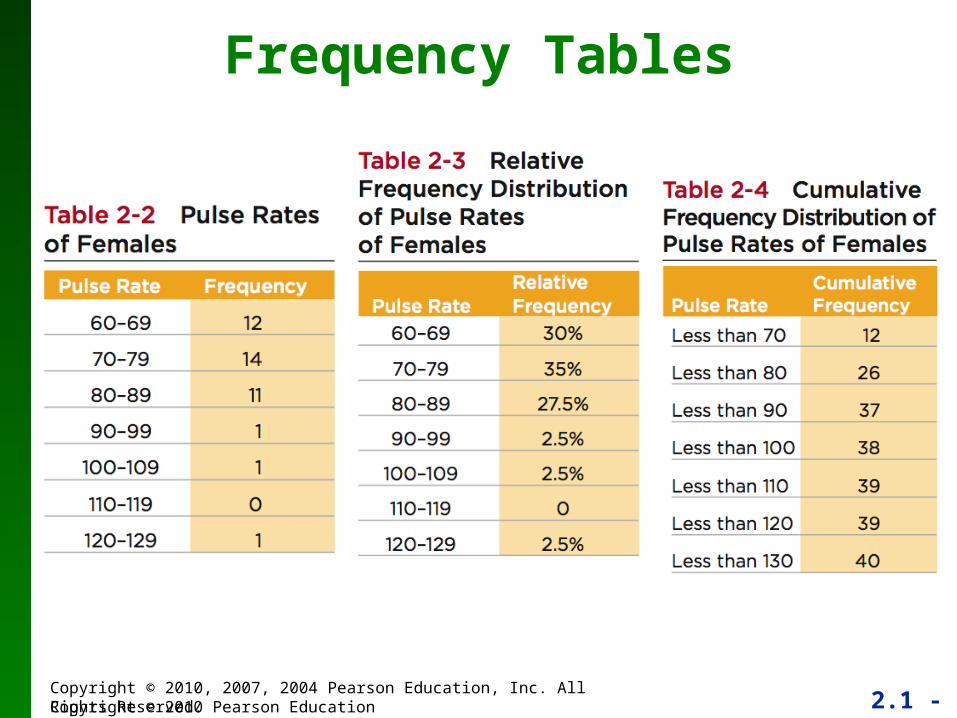
Frequency Tables
2.1 - 22Copyright © 2010, 2007, 2004 Pearson Education, Inc. All Rights Reserved.Copyright © 2010 Pearson Education
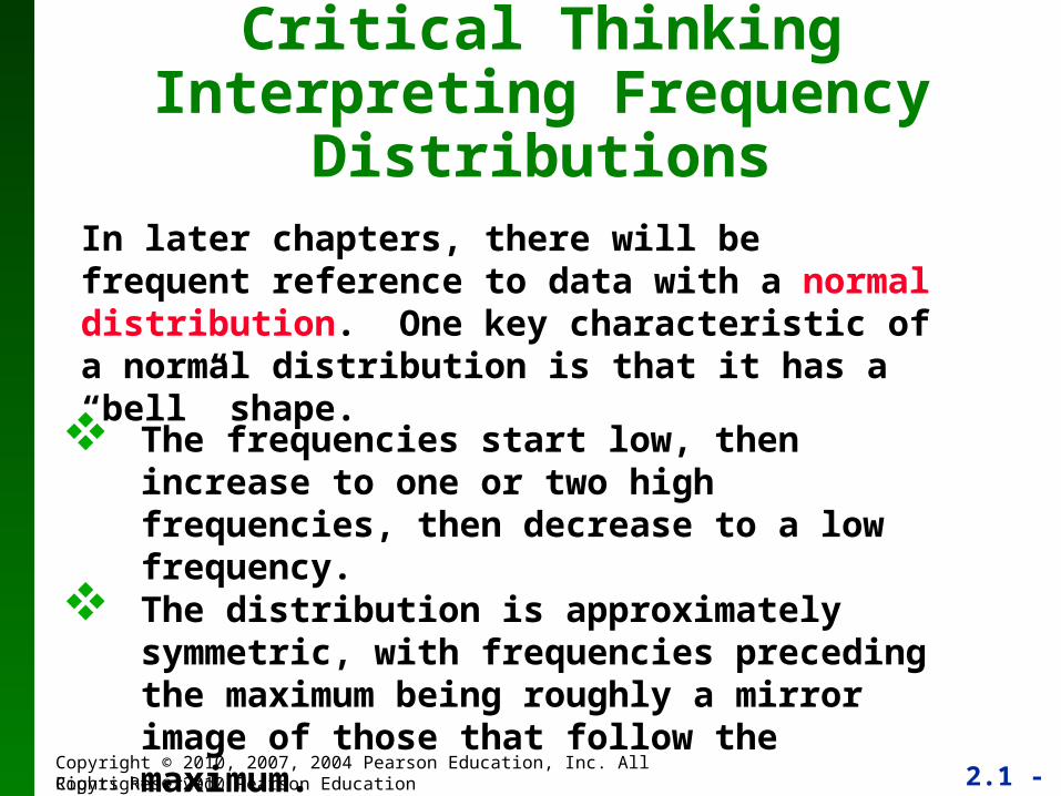
Critical Thinking Interpreting Frequency Distributions
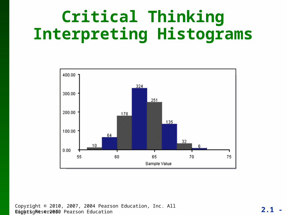
In later chapters, there will be frequent reference to data with a normal distribution. One key characteristic of a normal distribution is that it has a “bell” shape.
The frequencies start low, then increase to one or two high frequencies, then decrease to a low frequency.
The distribution is approximately symmetric, with frequencies preceding the maximum being roughly a mirror image of those that follow the maximum.
2.1 - 23Copyright © 2010, 2007, 2004 Pearson Education, Inc. All Rights Reserved.Copyright © 2010 Pearson Education
Gaps
Gaps
2.1 - 24Copyright © 2010, 2007, 2004 Pearson Education, Inc. All Rights Reserved.Copyright © 2010 Pearson Education
Recap
In this Section we have discussed
Important characteristics of data
Frequency distributions
Procedures for constructing frequency distributions
Relative frequency distributions
Cumulative frequency distributions
2.1 - 25Copyright © 2010, 2007, 2004 Pearson Education, Inc. All Rights Reserved.Copyright © 2010 Pearson Education
Section 2-3 Histograms
2.1 - 26Copyright © 2010, 2007, 2004 Pearson Education, Inc. All Rights Reserved.Copyright © 2010 Pearson Education
Key Concept
We use a visual tool called a _____________to analyze the shape of the distribution of the data.
2.1 - 27Copyright © 2010, 2007, 2004 Pearson Education, Inc. All Rights Reserved.Copyright © 2010 Pearson Education
Histogram
2.1 - 28Copyright © 2010, 2007, 2004 Pearson Education, Inc. All Rights Reserved.Copyright © 2010 Pearson Education
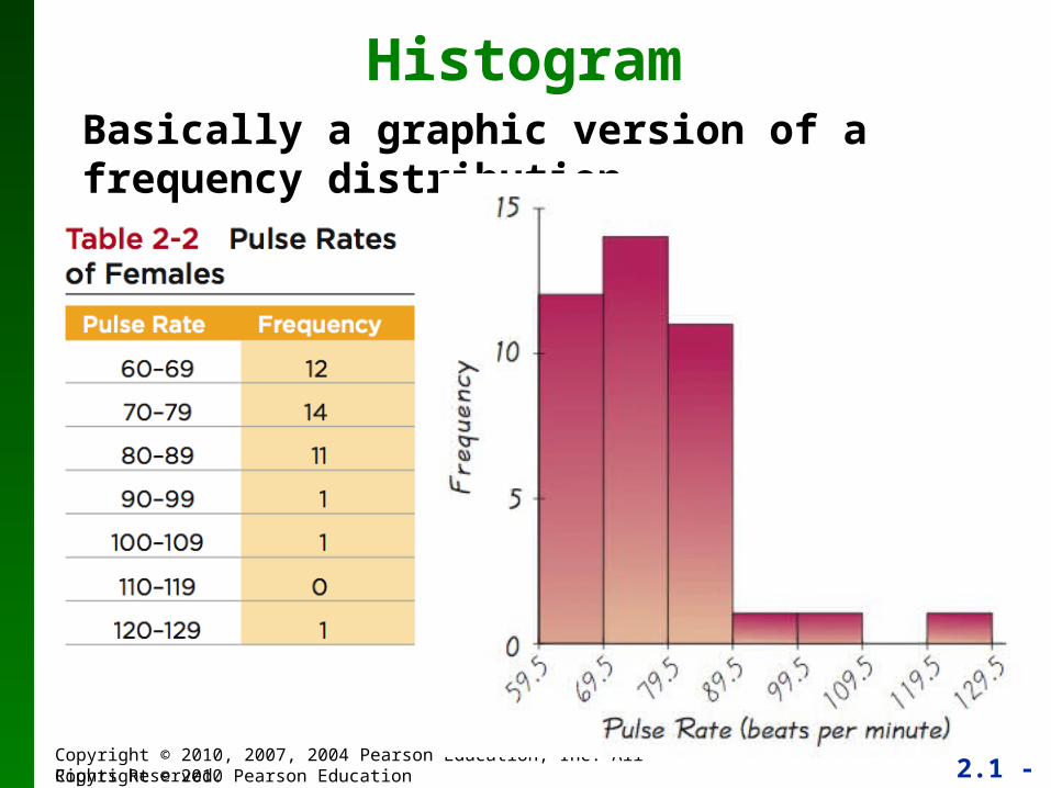
HistogramBasically a graphic version of a frequency distribution.
2.1 - 29Copyright © 2010, 2007, 2004 Pearson Education, Inc. All Rights Reserved.Copyright © 2010 Pearson Education
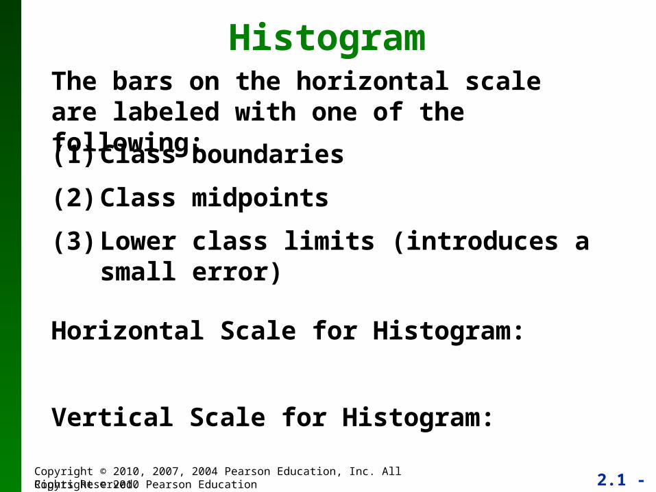
HistogramThe bars on the horizontal scale are labeled with one of the following:
(1) Class boundaries
(2) Class midpoints
(3) Lower class limits (introduces a small error)
Horizontal Scale for Histogram:
Vertical Scale for Histogram:
2.1 - 30Copyright © 2010, 2007, 2004 Pearson Education, Inc. All Rights Reserved.Copyright © 2010 Pearson Education
Relative Frequency Histogram Has the same shape and horizontal scale as a histogram, but the vertical scale is marked with relative frequencies instead of actual frequencies
2.1 - 31Copyright © 2010, 2007, 2004 Pearson Education, Inc. All Rights Reserved.Copyright © 2010 Pearson Education
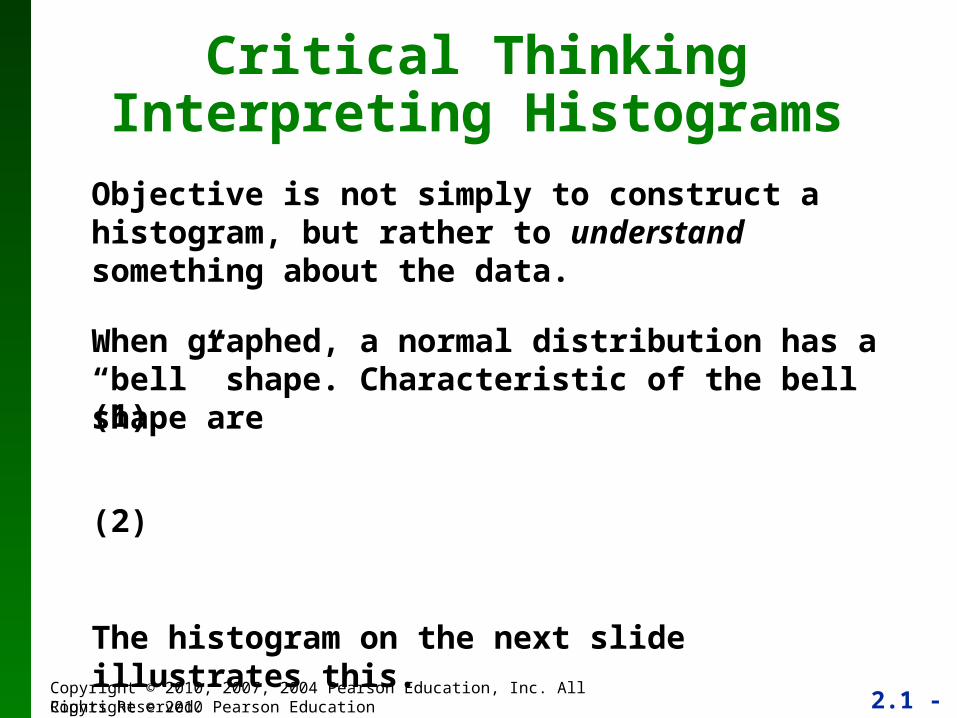
Objective is not simply to construct a histogram, but rather to understand something about the data.
When graphed, a normal distribution has a “bell” shape. Characteristic of the bell shape are
Critical ThinkingInterpreting Histograms
(1)
(2)
The histogram on the next slide illustrates this.
2.1 - 32Copyright © 2010, 2007, 2004 Pearson Education, Inc. All Rights Reserved.Copyright © 2010 Pearson Education
Critical ThinkingInterpreting Histograms
2.1 - 33Copyright © 2010, 2007, 2004 Pearson Education, Inc. All Rights Reserved.Copyright © 2010 Pearson Education
Recap
In this Section we have discussed
Histograms
Relative Frequency Histograms
2.1 - 34Copyright © 2010, 2007, 2004 Pearson Education, Inc. All Rights Reserved.
Section 2-4 Statistical Graphics
2.1 - 35Copyright © 2010, 2007, 2004 Pearson Education, Inc. All Rights Reserved.
Key Concept
This section discusses other types of statistical graphs.
Our objective is to identify a suitable graph for representing the data set. The graph should be effective in revealing the important characteristics of the data.
2.1 - 36Copyright © 2010, 2007, 2004 Pearson Education, Inc. All Rights Reserved.
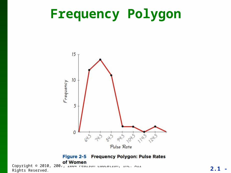
Frequency Polygon

2.1 - 37Copyright © 2010, 2007, 2004 Pearson Education, Inc. All Rights Reserved.
Relative Frequency Polygon
Uses relative frequencies (proportions or percentages) for the vertical scale.
2.1 - 38Copyright © 2010, 2007, 2004 Pearson Education, Inc. All Rights Reserved.
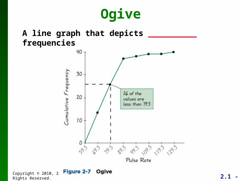
OgiveA line graph that depicts __________ frequencies
2.1 - 39Copyright © 2010, 2007, 2004 Pearson Education, Inc. All Rights Reserved.
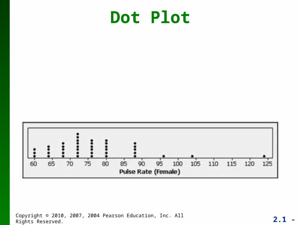
Dot Plot
2.1 - 40Copyright © 2010, 2007, 2004 Pearson Education, Inc. All Rights Reserved.
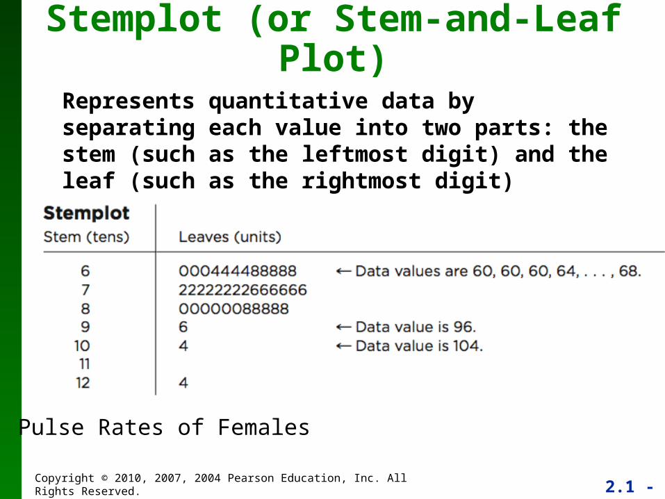
Stemplot (or Stem-and-Leaf Plot)
Represents quantitative data by separating each value into two parts: the stem (such as the leftmost digit) and the leaf (such as the rightmost digit)
Pulse Rates of Females
2.1 - 41Copyright © 2010, 2007, 2004 Pearson Education, Inc. All Rights Reserved.
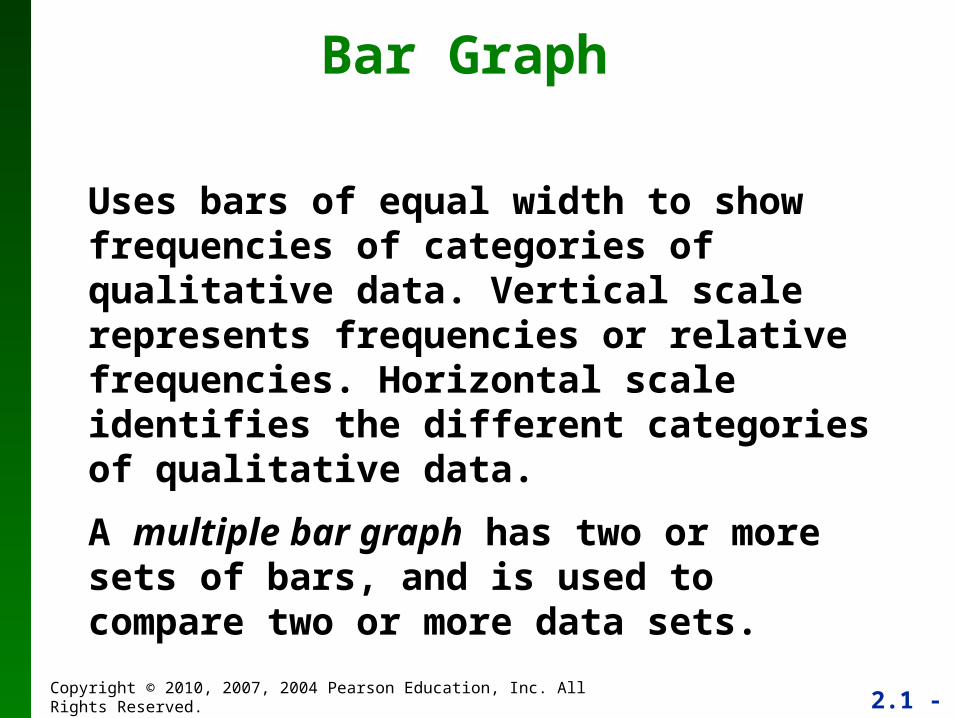
Bar Graph
Uses bars of equal width to show frequencies of categories of qualitative data. Vertical scale represents frequencies or relative frequencies. Horizontal scale identifies the different categories of qualitative data.
A multiple bar graph has two or more sets of bars, and is used to compare two or more data sets.
2.1 - 42Copyright © 2010, 2007, 2004 Pearson Education, Inc. All Rights Reserved.
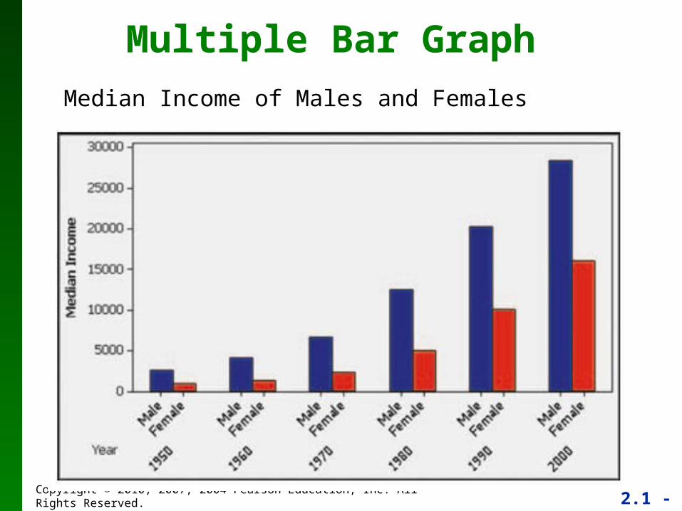
Multiple Bar Graph
Median Income of Males and Females
2.1 - 43Copyright © 2010, 2007, 2004 Pearson Education, Inc. All Rights Reserved.
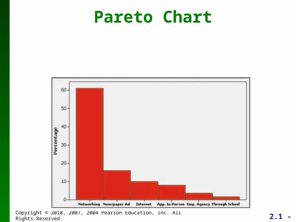
Pareto Chart
2.1 - 44Copyright © 2010, 2007, 2004 Pearson Education, Inc. All Rights Reserved.
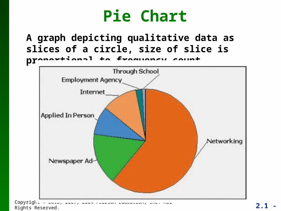
Pie ChartA graph depicting qualitative data as slices of a circle, size of slice is proportional to frequency count
2.1 - 45Copyright © 2010, 2007, 2004 Pearson Education, Inc. All Rights Reserved.
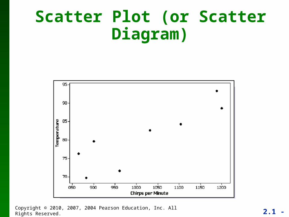
Scatter Plot (or Scatter Diagram)
2.1 - 46Copyright © 2010, 2007, 2004 Pearson Education, Inc. All Rights Reserved.
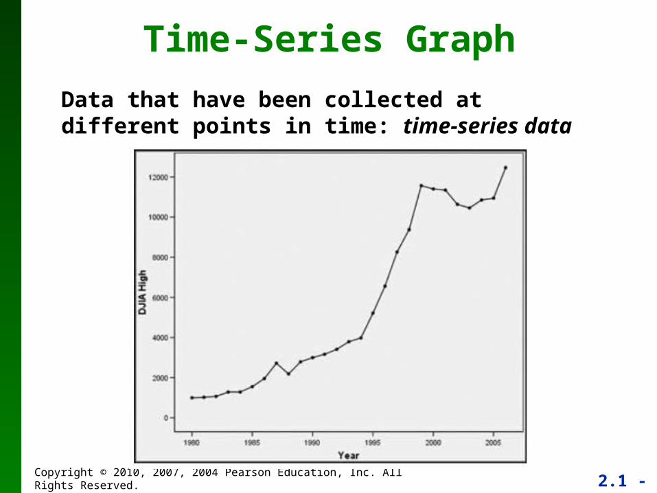
Time-Series Graph
Data that have been collected at different points in time: time-series data
2.1 - 47Copyright © 2010, 2007, 2004 Pearson Education, Inc. All Rights Reserved.
Important PrinciplesSuggested by Edward Tufte
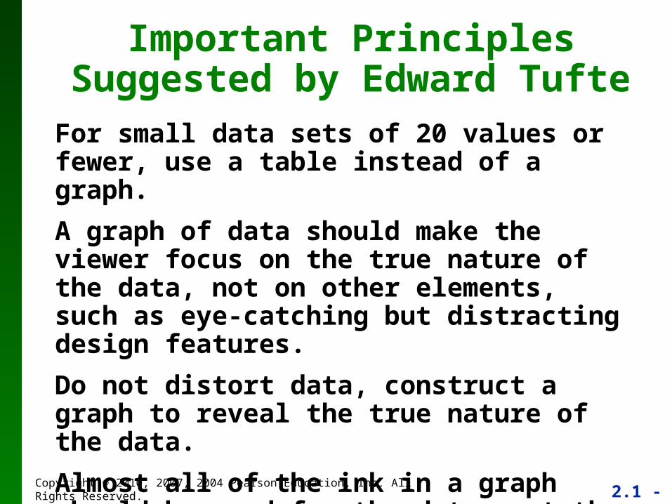
For small data sets of 20 values or fewer, use a table instead of a graph.
A graph of data should make the viewer focus on the true nature of the data, not on other elements, such as eye-catching but distracting design features.
Do not distort data, construct a graph to reveal the true nature of the data.
Almost all of the ink in a graph should be used for the data, not the other design elements.
2.1 - 48Copyright © 2010, 2007, 2004 Pearson Education, Inc. All Rights Reserved.
Important PrinciplesSuggested by Edward Tufte
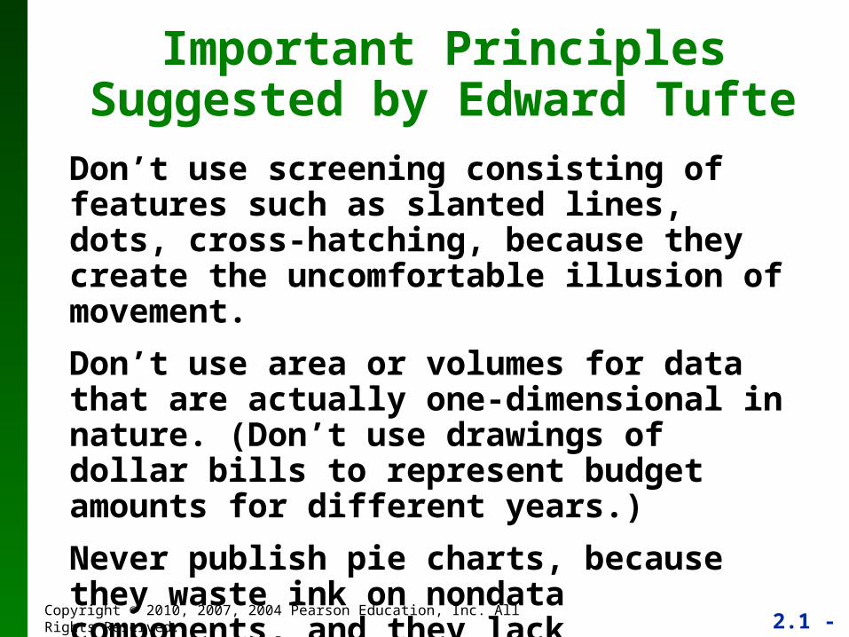
Don’t use screening consisting of features such as slanted lines, dots, cross-hatching, because they create the uncomfortable illusion of movement.
Don’t use area or volumes for data that are actually one-dimensional in nature. (Don’t use drawings of dollar bills to represent budget amounts for different years.)
Never publish pie charts, because they waste ink on nondata components, and they lack appropriate scale.
2.1 - 49Copyright © 2010, 2007, 2004 Pearson Education, Inc. All Rights Reserved.
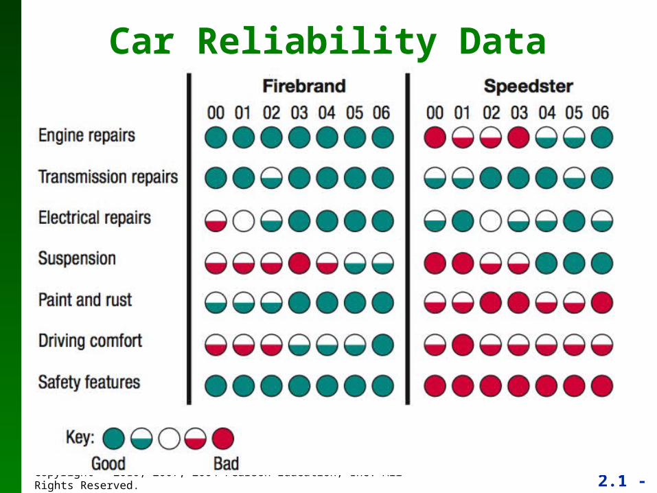
Car Reliability Data
2.1 - 50Copyright © 2010, 2007, 2004 Pearson Education, Inc. All Rights Reserved.
RecapIn this section we saw that graphs are excellent tools for describing, exploring and comparing data.
Describing data: Histogram - consider distribution, center, variation, and outliers.
Exploring data: features that reveal some useful and/or interesting characteristic of the data set.
Comparing data: Construct similar graphs to compare data sets.
2.1 - 51Copyright © 2010, 2007, 2004 Pearson Education, Inc. All Rights Reserved.
Section 2-5 Critical Thinking:
Bad Graphs
2.1 - 52Copyright © 2010, 2007, 2004 Pearson Education, Inc. All Rights Reserved.
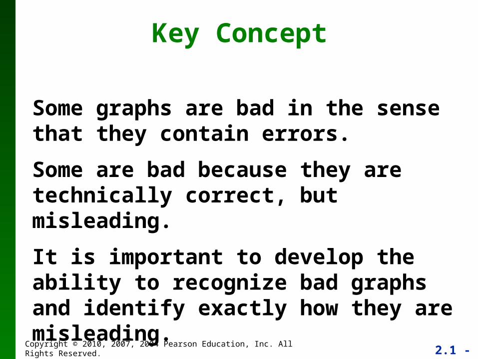
Key Concept
Some graphs are bad in the sense that they contain errors.
Some are bad because they are technically correct, but misleading.
It is important to develop the ability to recognize bad graphs and identify exactly how they are misleading.
2.1 - 53Copyright © 2010, 2007, 2004 Pearson Education, Inc. All Rights Reserved.
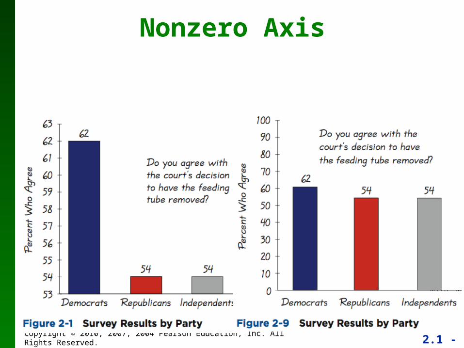
Nonzero Axis
2.1 - 54Copyright © 2010, 2007, 2004 Pearson Education, Inc. All Rights Reserved.
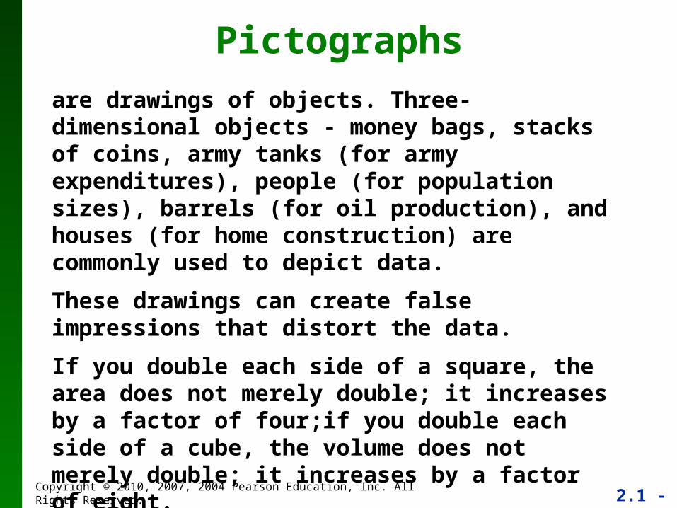
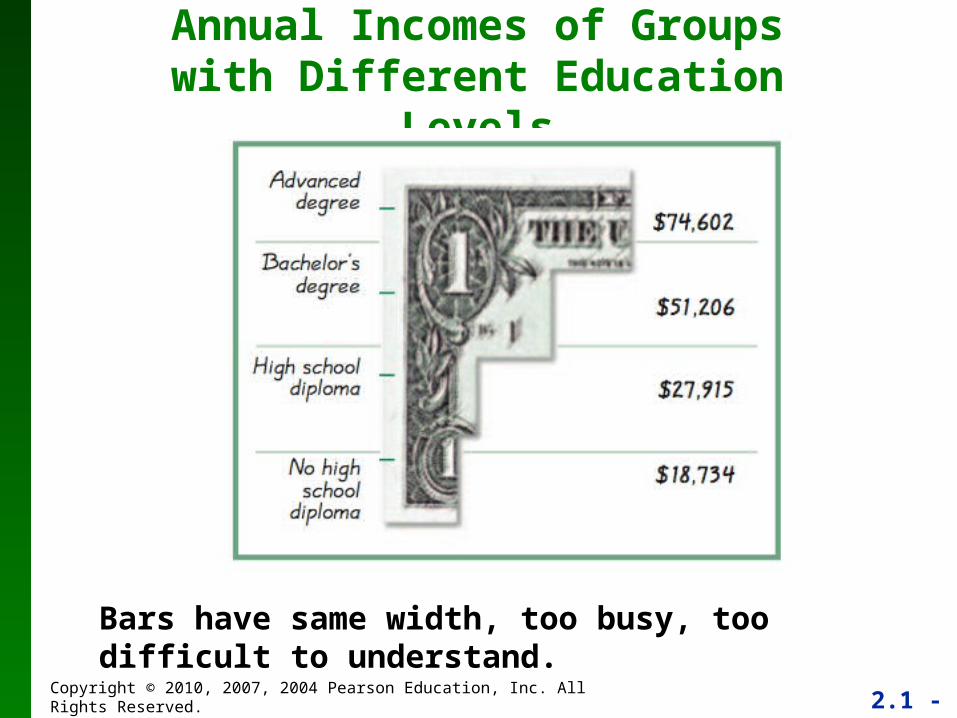
Pictographs
are drawings of objects. Three-dimensional objects - money bags, stacks of coins, army tanks (for army expenditures), people (for population sizes), barrels (for oil production), and houses (for home construction) are commonly used to depict data.
These drawings can create false impressions that distort the data.
If you double each side of a square, the area does not merely double; it increases by a factor of four;if you double each side of a cube, the volume does not merely double; it increases by a factor of eight.
Pictographs using areas and volumes can therefore be very misleading.
2.1 - 55Copyright © 2010, 2007, 2004 Pearson Education, Inc. All Rights Reserved.
Annual Incomes of Groups with Different Education Levels
Bars have same width, too busy, too difficult to understand.
2.1 - 56Copyright © 2010, 2007, 2004 Pearson Education, Inc. All Rights Reserved.
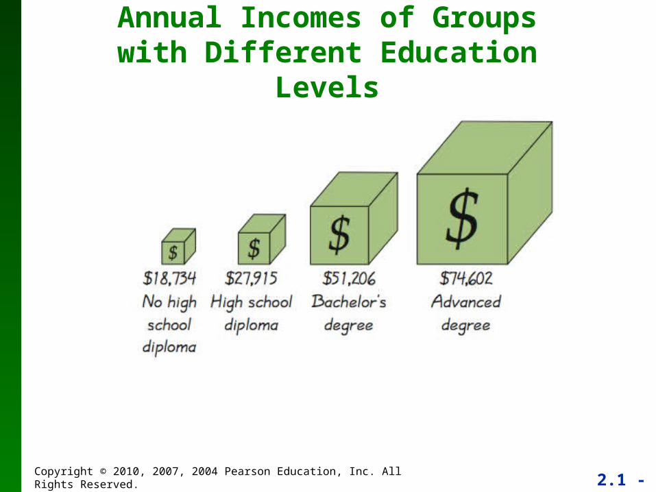
Annual Incomes of Groups with Different Education Levels
2.1 - 57Copyright © 2010, 2007, 2004 Pearson Education, Inc. All Rights Reserved.
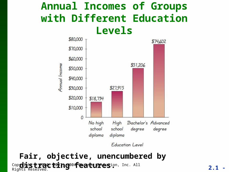
Annual Incomes of Groups with Different Education Levels
Fair, objective, unencumbered by distracting features.