Embed Size (px)
Citation preview

University of WollongongResearch Online
University of Wollongong Thesis Collection University of Wollongong Thesis Collections
2014
Questioning the hand-made letterform as apreferred visual language for environmentalconsciousnessDanielle HookerUniversity of Wollongong
Research Online is the open access institutional repository for theUniversity of Wollongong. For further information contact the UOWLibrary: [email protected]
Recommended CitationHooker, Danielle, Questioning the hand-made letterform as a preferred visual language for environmental consciousness, Master ofCreative Arts (Research) Graphic Design thesis, School of the Arts, English and Media, University of Wollongong, 2014.http://ro.uow.edu.au/theses/4176


1
QUESTIONING THE HAND-MADE LETTERFORM AS A PREFERRED
VISUAL LANGUAGE FOR ENVIRONMENTAL CONSCIOUSNESS.
A thesis submitted in fulfilment of the requirements for the award of the degree
MASTER OF CREATIVE ARTS (RESEARCH)
GRAPHIC DESIGN
from
SCHOOL OF THE ARTS, ENGLISH AND MEDIA UNIVERSITY OF WOLLONGONG
by
DANIELLE HOOKER, BA HONS GRAPHIC DESIGN

ii
Thesis Certification
I, Danielle Hooker, declare that this thesis, submitted in partial fulfilment of the
requirements for the award of Master of Creative Arts – Research, in the Faculty of Creative
Arts, University of Wollongong, is wholly my own work unless otherwise referenced or
acknowledged. The document has not been submitted for qualifications at any other
academic institution.
Danielle Hooker
29 May 2014

iii
Abstract
This research examines the attributes of hand-made graphic design, in particular lettering
design, when communicating values specifically associated with environmental concern.
The study is especially interested in establishing whether, rooted in the notions of
sustainability, the hand-made letterform is the most appropriate conceptual form for the
branding and communication of environmental and sustainability issues in the not-for-profit
sector. The research aims to develop broader methods and approaches of working with
environmental concern through graphic means and asks questions about the sense of urgency
and the values, effective or otherwise, transmitted using hand-made lettering. In brief, the
strength of this research is in addressing current tensions within visual communications
practice in an atmosphere of debate over sustainability and global warming.
Creative practice has in the past been somewhat absent from environmental discourse.
Slowly, the role of graphic design is being acknowledged as a contributing factor in
environmental awareness but less attention has been specifically made to the role of hand-
made and traditional graphic typographic techniques such as letterpress printing. The recent
popularity of the hand-made movement has both economic and environmental roots, and this
study suggests that the inspired engagement of hand-made lettering has the power to attract
and involve new audiences in discussion of environmental concern.
To help make a case for the hand-made letterform as a preferred visual language for
environmental consciousness and to form a model for contemporary practice, this research
pinpoints past incidents where hand-made lettering, outdated technology and typographic
styles with reference to the past have been used in a response to advances in technology,
consumption and consequently environmental concern. This study suggests that the hand-
iv
made letterform may help audiences question their place in nature and their responsibility
for the environment. The creative project attached to this study aims to test and examine the
ways that the hand-made may help to raise awareness of environmental issues using
accessible and engaging hand-made lettering in the branding and communication material
for ‘The Seed Library’, a not-for-profit seed saving organisation.

v
Acknowledgements
I would like to offer a special thank you to Dr Jon Cockburn who has offered persistent
guidance and to Gregor Cullen and Joanna Stirling for their invaluable creative support. I
also owe enormous thanks to my partner and my family for their love, tolerance and
encouragement over the past two years.

vi
Contents
Abstract
iii
Acknowledgements v
Table of Contents vi
Chapter 1: Introduction 1 - 3
Chapter 2: The craft contra technology polemic – a survey of literature on the
development of letterform from the late 19th century to the late 20th century
4 - 32
Chapter 3: Case studies 33 - 49
3.1 Case Study Method 33-34
3.2 Case Study 1: Illustrated Vogue Covers (1910-1930) 35 - 39
3.3 Case Study 2: Sniffin’ Glue by Mark Perry (1979) 40 - 44
3.3 Case Study 3: G magazine and Green Lifestyle magazine (2012) 45 - 49
Chapter 4: Design values 50 - 62
Chapter 5: Conclusion 63 - 65
Appendix 65
List of Illustrations 66 - 67
Bibliography 68 - 74

1
Chapter 1: Introduction
Creative practice has an important role to play in a sustainable future and this study suggests
that graphic design is capable of communicating and visually inspiring change, by capturing
and engaging those who might not otherwise be interested. In this role, hand-made visual
communications output may help question our place in nature and highlight our
responsibility to the environment, whilst the ubiquity of the digital age has promoted and
enhanced the appeal, honesty and romance of hand-made graphic design elements. The
evolution of the hand-made letterform is largely due to technological change, as the majority
of all pre-twentieth century handcrafted techniques and skills have been superseded, first by
the machine era and then by the digital age. Paradoxically, being superseded has freed the
hand-made from its previous obligations and the intimacy of these graphics is now able to
create reassuring groundings. Mike Press (2007, p. 252) notes that the hand-made can
provide “a set of culturally and economically relevant practices that could help to humanise
this dangerous new century”. For the purposes of this study hand-made lettering is defined
as typography that bears evidence of being made by hand or low-fi machine with as little use
of digital technology as possible.
The research reported here examines the use of hand-made typography within graphic
design that relates to the environment or more broadly sustainability. It is of particular
interest to establish whether, embedded in the very concept of ecology and sustainability,
there is a specific approach to assist its communication. The accompanying studio project
aims to demonstrate the application of the hand-made letterform as an appropriate
conceptual form for the branding and communication of environmental and sustainability
issues in the not-for-profit sector. This will be achieved through applying a hand-made
concept to a standard branding model for a not-for-profit seed library.

2
The next chapter in this study aims to establish the fundamental motivations that inform the
current resurgence in hand-made lettering and survey connections between artistic style and
the environment at various moments since the late 19th century. The chapter begins by
assessing the Arts and Crafts movement of the late 19th century, led by reformer William
Morris (1834-1896) who advocated a return to a medieval style in reaction to the industrial
revolution. Several decades later and in counterpoint, the avant-garde Italian Futurist
movement, with its rejection of past styles and aim of powering into the future, dismissed
the decorative and stylistically anachronistic, if not technologically superseded, nature of the
Arts and Crafts movement. In the late 1920s, ideas of modernism were voiced by Jan
Tschichold (1902-1974), whose work introduced discussion of the growth of modernism in
graphic design up until the late 1950s and the shift toward eclectic typographic design in the
1960s that saw revived lettering used rebelliously.
Three case studies of specific projects that use hand-made or outdated/revived typography
are analysed to help form a historical representation of the field. This begins with illustrated
covers from American Vogue, seen between 1910 and 1930 under the ownership of Condé
Nast (1873-1942). Nast developed a template for the magazine’s cover designs that
consisted of full-page, signed illustrations by a small selection of artists who incorporated
the word ‘Vogue’ in typographic experimentation, instead of using the typeset Bodoni which
had been the style under previous editors. During the remainder of Condé Nast’s association
with Vogue its preferences were reflected in the decisions of Edna Woolman Chase (1887-
1957), who was editor between 1914 and 1952. Sniffin’ Glue magazine, a handcrafted
‘fanzine’ created by Mark Perry in 1979 in the United Kingdom, is then studied to form an
understanding of the 1970s punk DIY ethos, its relationship to mass consumerism (and by

3
implication environmentalism) and how this was reflected in graphic design as a visual style.
Lastly, in Australia between 2009 and 2012, sales figures during the rebranding of G
magazine with a clean digitalised cover and masthead to Green Lifestyle with a more organic
cover design and hand-made style masthead are reviewed, which is used to suggest that the
hand-made style of design is more inclined to attract audiences with environmental
sensibilities.
The fourth chapter of this study focuses on hand-made graphic design in the current age,
aiming to establish the appropriateness and effectiveness of the use of analogue techniques
and visual styles in the communication of environmental consciousness. This chapter
documents the ethos of current environmental movements, and gives examples of creative
practice’s engagement with sustainability issues. This investigation examines the ways that
graphic designers who work by hand are today using digital technology to provide
innovative design solutions during a time of heightened environmental awareness. The
communication benefits and the appeal of the incorporation of hand-made graphics are also
explored. Conclusions are drawn in the final chapter.
The next chapter of this study documents moments in history that have sparked connections
between artistic style, environmental or sustainability issues and hand-made lettering using
an integrated literature review format. This has been written to synthesise existing literature
to establish new stances and insights for this project.

4
Chapter 2: The craft contra technology polemic – a survey of literature on
the development of letterform from the late 19th century to the late 20th
century
The use of hand-made techniques in graphic design is traced in this chapter as a component
of an integrative literature review. The purpose is to determine the extent to which hand-
made lettering has the ability to form relationships with environmental concerns,
technological change and mass production. Existing literature on the topic is reviewed and
synthesised with the aim of generating new knowledge and perspectives. An analysis of
selected eras when outdated production methods and styles were utilised in response to
technological change is necessary to reconceptualise a model for contemporary practice.
The literature review method aims to challenge and examine the effectiveness of hand-made
graphics in the communication of values associated with sustainability and the environment.
It is of particular interest to establish whether, embedded in the underlying concept of
sustainability, a hand-made visual approach is the most effective means of communication
and why. At various stages in more recent Western cultural history the effectiveness of
analogue techniques and outdated production methods has been reconsidered. This chapter
reports on shifts in direction in the use of hand-made graphics and critically examines the
main ideas and relationships between existing literature on the topic.
Common interpretations of modern hand-made design can conjure up notions of morality
and the joy of creating beautiful objects. This point of view can be traced back to the Arts
and Crafts movement (1834-1896) that flourished at the end of the 19th century when the
first phase of industrialisation caused widespread social upheaval brought on by rapid
urbanisation and environmental destruction. Emerging as a reaction to the capitalist

5
industrialisation and degradation of labour caused by the industrial revolution, the
movement questioned how we should live collectively and sustainably. Predominantly led
by William Morris, who was influenced by John Ruskin (1819-1900), a printing revival took
place with the aim of taking up the “fight for high standards” and for an “awareness of
aesthetic qualities” (Kinross 1992, p. 52). As part of this ‘fight’ William Morris aimed to
revitalise British decorative arts; he established Morris and Co. who produced high quality
household decorations and printed fine quality books at his Kelmscott Press. The ideas of
the Arts and Crafts movement, accompanied by anxiety over industrialisation, relates
directly to our current concerns for sustainability, with globalisation and with over-
consumption. It is therefore not unexpected that our reaction is similar.
Morris was an environmentalist and conservationist, with his work drawing heavily on
nature using traditional methods (Figure 1). Morris believed that good design did not have to
die as a result of industrialisation. The Arts and Crafts movement reacted against the
ugliness of commercial printing, and in doing so promoted traditional handcrafted methods
and advocated social, environmental and economic reform as a way of attacking the
industrial age.

6
Figure 1: Wreath, William Morris (1876)

7
Rosalind Blakesley (2006, p. 7) notes how the Arts and Crafts Movement promoted
antiquated handcrafted methods instead of the more up-to-date industrial processes which
were then available:
It was a movement about integrity, it was about respecting your materials, and the way you
used them, it was about showing how things were constructed, so that they never looked
different from what they really were. Equally it was about respecting the maker. Against a
background of the filth and degradation of industrialisation …
Within print production, new technology replaced block printing and hand copying,
allowing for the mass production of print and as a result a degradation of quality occurred
(Watts Lee 1982, p. 54). Morris held an “anti-industry position” and believed that “the only
way to stem the tide of urbanisation and industrialisation was through a return to cottage
crafts” (Alfondy 2008, p. xvii). The Arts and Crafts movement proposed an oppositional
ideal by promoting moral design; the industrial revolution had come with great cost to the
environment as cities polluted and destroyed the British countryside. John Ruskin (1890, p.
193) in The Crown of Wild Olive writes of this:
Our cities are a wilderness of spinning wheels instead of palaces; yet the people have not
clothes. We have blackened every leaf of English greenwood with ashes, and the people die
of cold; our harbours are a forest of merchant ships, and the people die of hunger.
The industrial revolution saw a large-scale switch from the production of goods in small-
scale independent and rural environments to mass production in factories. For centuries,
typography and printing had been limited to the publishing of books. The modern era
brought a new demand for eye-catching typography aimed at stimulating a desire for the

8
increasing availability of ready-made goods (Figures 2 and 3). Type-founders tried to
“invent every possible design permutation by modifying forms or proportions and applying
all manner of decoration to their alphabets” (Meggs & Purvis 2012, p. 149). With the
borrowing of styles from past eras, a visual diversity was established in the marketplace that
aimed to capture a slice of public attention. The same situation occurs today with many
companies and producers competing for shelf space.
The industrial revolution had given rise to unlimited dreams of progress and to a huge
increase in the exploitation of natural resources and the production of expanding volume.
After some period of time, this style of advertising became cluttered, commercial and banal.
Revolutionaries such as William Morris realised that this type of design was not good for the
environment, nor did it aid the value of design, therefore new sensibilities began to emerge.
Through the Kelmscott Press, Morris turned his attention to designing revival typefaces and
he particularly admired and studied the letterforms of Nicholas Jenson, who in the 15th
century developed movable type during the economic expansion of the European
Renaissance (Figure 4). He believed early printers “availed themselves of models which
were the result of the age-long perfecting labours of monastic and professional scribes”
(Watts Lee 1982, p. 54). Although, as Eskilson (2007, p. 32) points out, Morris “was unable
to offer a workable solution” to modern methods that were both cost-effective and efficient.
The Arts and Crafts movement emerged as a nostalgic longing for the past that had suddenly
been lost and it seems that Morris was interested in what constitutes the ‘good’ life. Today,
it could be argued, this ideal of a ‘good’ life remains a central value for many seeking to
obtain a sustainable future.

9
Figure 2: Anonymous Specimens of Decorative Typefaces (c.1850)

10
Figure 3: Decorative fonts by Johann Heinrich Meyer Foundry (1835)

11
Figure 4: The Defence of Guenevere and other Poems, William Morris, Kelmscott Press (1892)

12
Watts Lee (1892, p. 59) notes the nostalgic longing, mentioned above, when discussing the
work produced from Morris’ Kelmscott Press, and explains:
The books of which five have already been issued and two more promised, not only do much
to remove the reproach under which printers have so long lain, of having neglected the
traditions and methods handed down from the early days of the art; but they show to how
high a point beauty of form can be carried at the hands of a man of artistic perceptions by the
employment of the simplest means only.
Yet despite Morris’ vision, for most people “any lingering doubts over the benefits of
mechanised typesetting” had vanished (Kinross 1992, p. 56). The advantage of efficiency
and economy of the new technology could not be denied and so the machine was accepted,
although type foundries still looked to typographic designs from the past for inspiration.
Morris’ visions were admirable, but his solutions were inconsistent with the problems,
resulting in the narrow creation of art affordable only to the upper classes, as Ashbee (1987,
p. 389) explains:
As capitalist culture shifted from a culture of production to a culture of consumption, these
idealised producers in romanticized and recharged medieval guilds spent most of their time
producing beautiful works of art for the middle and upper class consumers.
It could be argued that by the late 20th and in the early 21st century, solutions to Morris’
concern with cost-effective yet high quality design at affordable prices for all levels of
society are now more achievable. In the computer age the assertion rings out: “Wired by
digital technology and fired by new conceptual directions and passions, contemporary craft
connects with the technological and cultural challenges of its age” (Press 2008, p. 252).

13
However, the conditions of 21st century industrial capitalism and mass production are
causing widespread environmental disaster. Unfortunately, in these circumstances, the hand-
made is in danger of becoming a marketing strategy for something it originally opposed. The
Arts and Crafts movement achieved longevity, continuing into the 1930s, but by this time its
forms had become a stylistic trend rather than fulfilling its original intentions of social
change. It could be argued the current ‘Green’ and hand-made design movement is heading
for the same outcome.
As a whole, what is most interesting is the objectives Morris had for the Kelmscott Press. He
hoped to re-awaken the lost ideals of typography and inspire higher standards design as a
reaction to the environmental damage caused by the industrial revolution. Under current
circumstances Morris’ ideals might be called a ‘green’ vision for the future. Morris’ position
is admirable but could not compete with the productivity of the industries he opposed.
However, Morris’ approach may be more successful if applied to digital technology, as we
are now able to do. For instance, new technology has made it cost and time-effective to
replicate traditional typography such as calligraphy, hand-rendered lettering and letterpress
printing with the speed, production and distribution advantages of digital technology. The
digital typeface ‘Zapfino’, notoriously over-used in stationery design, is one example among
many (Figure 5). Nevertheless, a negative result of the migration of popular hand-made
movement into digital production is that lettering designs that mimic the spirited quality of
pre-digital forms are often regarded as a retro pastiche.

14
Figure 5: Top: Zapfino typeface by Herman Zapf (1998)
Bottom: Wedding Stationery (2013)

15
The internet has made the history of type design readily accessible for all designers to use as
a reference and inspiration, and facilitates the revival of analogue styles coupled with digital
experimentation. Whilst improvements in digital technology make it easier to create and
reproduce a more ‘individual’ style, paradoxically the ‘hand-made’ is invariably sent to
digital mass-production to be circulated widely in print and this does not sit well with
Morris’ legacy. Today we surround ourselves with objects that are vehicles for self-
expression, including a combination of heightened green awareness, brought on by media
coverage, and a desire for diversity in design. In mass and personal consumption patterns,
hand-made approaches can become a symbol of certain points of view, evocative of a more
personal response to pressing social issues.
The Arts and Crafts movement, as already noted, instilled a sense of distrust in technology
that lasted into the 20th century. Yet in contrast, the strong and forward-looking Italian
Futurists of the early 20th century did not want a return to the medieval style that Morris
advocated. Irina Costache (1994) notes that the Futurists brought a new understanding to the
goals of applied arts as they redefined their tendency to match the times, rejecting the
traditional approaches of the Arts and Crafts movement. The beginning of the Futurist
movement occurred when Filippo Tommaso Marinetti (1876-1944) published the Manifesto
of Futurism in 1909 in Paris newspaper Le Figaro. The Futurists were a radical group of
Italian artists who associated themselves with the speed, aggression and noise of the early
20th century and rejected anything old. Marinetti (reprinted in Danchev (ed) 2011, p. 5-6)
makes clear Futurist propositions in this lengthy and evocative quote from the Manifesto of
Futurism:

16
We shall sing of the great multitudes who are roused up by work, by pleasure, or by
rebellion; of the many-hued, many-voiced tides of revolution in our modern capitals; of the
pulsating, nightly ardour of arsenals and shipyards, ablaze with their violent electric moons;
of railway stations, voraciously devouring smoke-belching serpents; of workshops hanging
from the clouds by their twisted threads of smoke; of bridges which, like giant gymnasts,
bestride the rivers, flashing in the sunlight like gleaming knives; of intrepid steamships that
sniff out the horizon; of broad-breasted locomotives, champing on the wheels like enormous
steel horses, bridled with pipes; and of the lissom flight of the aeroplane, whose propeller
flutters like a flag in the wind, seeming to applaud, like a crowd excited.
A movement predominantly founded by writers, Futurism proposed that art should celebrate
technology and the future, and as a metaphor in futurist writings, typography was employed
to visually simulate the sounds of machines and the energy of modern life. Marinetti called
for graphic design to jump off the page with kinetic energy, and he bent and twisted
typography breaking the symmetrical grid. One of the most prominent examples of “words
in freedom” is from Zang Tumb Tumb (Figure 6), Marinetti’s written and visual expression
of the siege of Turkey during the Balkan War in 1912 (Moma 2009). Bold and highly
contrasting wood type, dating from the fifth century and succeeded by Gutenberg’s movable
type in the 1450s, was used here and revived by the early 20th century avant-garde as a form
of experimentation (Cundy 1981, p. 350). Whilst it lacked connection with industrialism,
Marinetti used letterpress as an immediate form of experimentation.
The possibility of free experimentation is one of the key qualities that make hand-made
processes appealing to us still today. The Futurists advocated huge industrial growth and in
turn this became one of the most environmentally destructive times in history. These two

17
Figure 6: Zang Tumb Tumb: Adrianopoli Ottobre 1912: Parole in Libertà, Filippo
Tommaso Marinetti (1914)

18
forces, the socially and environmentally conscious Arts and Crafts movement and the
Futurist movement, have comparative oppositional values equivalent to those of the current
‘Green’ movement and the economically driven consumer focused digital age. If the digital
age were to write a manifesto, perhaps it would not be too dissimilar to Marinetti’s Futurist
Manifesto.
Unlike later work from the German Bauhaus School of Design (1919-1933), Futurist artists,
performers, and poets did not demonstrate (in any truly advanced form) modernist concerns
with engaging fabricated proficiency and simplicity (the exceptions being the Futurist
architects and filmmakers). In general terms, modernism took hold in the popular
imagination of advanced nations (especially those free of totalitarianism) during the 1930s,
with its main principle being to turn its back on the past and press forward into a new future.
The establishment of the post-World War I (1914-1918) international style during the 1920s
and 1930s neutralised the discourse of communication design. The Bauhaus, for instance,
sought and focused on values of rationalism and functionalism.
Magdalena Droste (2006) suggests that the Bauhaus (1919-1933) sparked the beginnings of
modernism. The school’s representative, Walter Gropius, established fundamental
characteristics of functionality that defined the Bauhaus, but also called for collaborations
between artist and craftspeople. His successors Hannes Meyer (1928-1930) and Ludwig
Mies van der Rohe (1930-1933) continued with the basic style established by Gropius, while
also challenging and redefining the Bauhaus style (Droste 2006, p. 7). Meggs and Purvis
(2012, p. 335) have also noted:

19
Much of the creative innovation in graphic design during the first decades of the twentieth
century occurred as part of modern-art movements and at the Bauhaus. The person who
applied these new approaches to everyday design problems and explained them to a wide
audience of printers, typesetters and designers was Jan Tschichold.
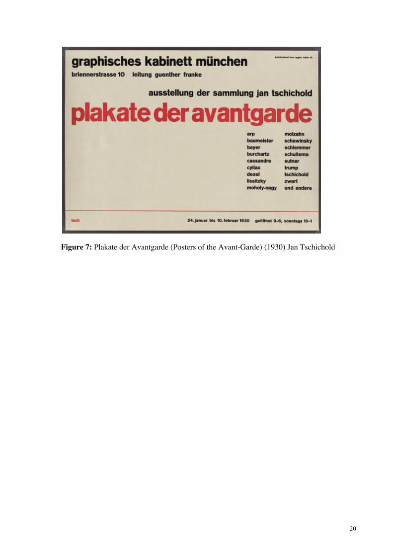
Jan Tschichold became the principal advocate of new typography when he published Die
Neue Typographie (The New Typography) in 1928. The book became a handbook for the
modernist movement in which he laid down the rules modern typographers should follow. In
essence this was clarity that included grid structures, asymmetrical layouts, sans-serif
typefaces, the use of photography and the elimination of decoration, which was very
different from the chaotic Futurist style (Figure 7).
In the 1920s, proficient guides were widely adopted and the concept of the graphic designer
as someone who rationally approaches a brief on behalf of the client was established. In
short, the modern architectural idea that ‘form ever follows function’ (Sullivan 1896,
pp.403-09) gained traction in a variety of design practices of the 1920s, that is further
extended by a commensurate enthusiasm for Taylorist and Fordist industrial efficiency.
Essentially modernist typography was categorised by a formalist visual language that could
be applied to all manner of situations, as Tschichold (1928, p. 15) states:
It is impossible for both the old and the new typography to continue to exist together, as
some think they can. The great period of design that is coming would not be one if the
Renaissance style continued to exist beside the modern.
20
Figure 7: Plakate der Avantgarde (Posters of the Avant-Garde) (1930) Jan Tschichold

21
Modernism did not end with postmodernism: they exist side-by-side. As Jencks (1989)
states postmodernism is both the “continuation of modernism and its transcendence” (p. 20).
However, in the mid 1960s, as a response to decades of conformity, a number of eclectic
movements began to challenge Tschichold’s legacy, giving rise to a reactive and/or nostalgic
form of postmodernism. During the 1960s and well beyond, modernist design was
interpreted as the conventional norm and the reaction to (if not rejection of) rigid modernist
conformity created underground movements that challenged modernism.
Nevertheless, Tschichold’s ideas have not faded completely and have been widely adopted
by contemporary design professionals, who predominantly work to achieve the most
efficient means of interaction using current digital technology. Postmodernism, often
simplistically defined as a break with modernism, saw graphic design switch from a concern
with reductivism to a focus on complexity, contradiction and decoration. New technological,
social and economic challenges redefined graphic design with several of the most prominent
features of postmodernism being the erasing of boundaries between high art forms and pop
culture as well as challenging ideas of timelessness often associated with modernist design
aspirations, as Poynor (2003, p. 11) notes:
Where modernism frequently attacked commercial mass culture, claiming from its superior
perspective to know what was best for the people, postmodernism enters into a complicitous
relationship with the dominant culture. In postmodernism, modernism’s hierarchical
distinctions between worthwhile ‘high’ culture and trashy ‘low’ culture collapse and the two
become equal possibilities on a level field.
The typographic design development of postmodernism is tied to significant advances in
technology, such as the invention of the Apple Macintosh computer, the internet and design

22
software packages, that increase the potential to engage directly in production and
consumption. The stripping of modernist formalities and revitalisation of past letterforms by
the computer knowledgeable youth challenged values laid down by previous generations.
Arguably, the outcome was a “shift from ‘depth’ to ‘surface’, from a sense of mission –
however ill-judged this may seem now – to a sense of fashion” (Heward 1999, p. 21). What
was once designated as low culture by the elitist attitudes of modernists was transformed
into a higher culture by experimental postmodernists. As a consequence, postmodernism is
often characterised as undisciplined self-indulgence, although in numerous cases the stylistic
devices of postmodernity displayed new ways of thinking.
Through the impact of computerisation, postmodern graphic design engages in a culture of
representation that plays with graphic styles, stylised representations and complex design
images. The principle of representation is important to this study, especially as it suggests
that hand-made graphic design, even when only simulating analogue methods of production,
provides visual experiences that connect with values of being environmentally friendly.
The postmodernism marked a departure from tradition, as it dissolved and combined the
past, present and possible future often in a combination of styles. For instance, the Push Pin
Studios, although established in the mid 1950s, from the mid 1960s combined Victorian Arts
and Crafts ideas and Art Nouveau and Art Deco styles with contemporary typography.
Conceptually the eclecticism of Push Pin Studios “was based on the idea that historical
forms could be revitalised and given new currency” (Heller & Anderson 2007, p. 13). Drew
and Sternberger (2005, p 74) on this point also claim that:

23
Push Pin studio advocated a more pluralistic and eclectic approach to design. The Push Pin
group embraced traditional illustration and historical typefaces, and were willing to create
Mélanges of styles that would have been virtually unthinkable to their modernism colleagues.
Push Pin’s use of revived typography can be seen in Seymour Chwast’s 1964 Art Tone
Studio India Ink packaging design (Figure 8). Here a large ‘A’ reflects the fluidity of Art
Nouveau lettering as new trends and ways of thinking saw designers endeavour to “reinsert
meaning and expression into design while at the same time applying a juxtaposition of styles
and layering of images” (Drew & Sternberger 2005, p. 136). Meggs and Purvis (2012, p.
460) assert that the “social activism of the late 1960s gave way to more self-absorbed,
personal involvement during the 1970s”. During this period there was a huge shift from
consumer goods being produced by labour to the domination of new technology. In design,
the environmental art movement emerged as a result of heightened activism. The
consequence of this was eclectic and hand-made typography, often “assembled out of bits
and pieces of art history, popular culture and personal experience” (Lupton & Miller 1996,
p. 198).
As part of the emerging American environmental consciousness Robert Rauschenberg
created the lithograph poster ‘Earth Day’ (1970), to popularise and celebrate the first Earth
Day where Americans campaigned across the country for environmental concerns (Figure
9). The poster was the first of its kind and the focal point, an American bald eagle, was on
the verge of extinction. Past styles were and still are used to create surface experiences that
“appear friendly, reliable, and trustworthy in contrast to [their] high-tech competitors”

24
Figure 8: Art Tone Studio Ink Packaging, Seymour Chwast (1964)

25
Figure 9: Earth Day poster, Robert Rauschenberg (1970)

26
(Heward 1999, p. 189). An important switch in postmodernism is when designers began to
be more than simply “mediators of information, but individuals who think creatively and
visually about our culture” Keedy (2013). Typically designers search for the new and the
next, yet increasingly the new has become old, and revived typefaces, dating back over a
century, have been used both to enliven the presence and to produce user friendly visual
experiences that contrast to the harshness of high modern styles.
In the 21st century optimistic ideas of modernism have failed to counteract negative events:
“visions of the future have not stood the test of time, the hope for better things to come has
receded” (Heward 1999, p. 31). Consumers and designers alike may reminisce wistfully
over better times, the bygone, that is then reinvented in design. The nostalgic impulse is
arguably a major contributing factor to the resurgence in the widespread use of hand-made
graphics. When using past production methods and styles, Keedy (2013) highlights the turns
of fashion in postmodern culture:
Designers today are representing our present era as if they were using a kaleidoscope to do it.
Or more precisely, a constantly mutating digital collage machine, filled with a bunch of old
“sampled” parts from the past, and decorated with special effects. Ultimately what we are left
with is a feeling of aggravated and ironic nostalgia. This electronic Deja-vu-doo is getting
old, again.
Through the fusion of genres and styles the notion of originality is put into jeopardy and, in
many cases, the recycling of past styles and genres leads to repetitive unoriginal design. On
the other hand to many designers and consumers the hand-made can provide an assortment
of alternative styles that form references to times where life seemed to be much simpler. The
hand-made letterform has become a branch of postmodern trend and could be (if not

27
already) referred to as a stylistic cliché, a response that reduces the credibility of the hand-
made when used to communicate environmental issues. The impact of advanced
technologies such as the Apple Macintosh computer and accessible software packages, has
resulted in many designers reconsidering and reconnecting with older or traditional methods.
With the aim of diversity in product output, not to mention the satisfaction of more
personalised skills acquisition, designers have sought to investigate work characterised by a
greater level of craftsmanship yet merge qualities of the hand-made with digitalisation
(Figure 10). It has been argued that the allure of hand-made graphics has gained in
popularity in spite of and as a reaction to significant advances in digital technology. The
sleekness of digital technology has renewed an interest in hand-made design with the
ornamental becoming fashionable again.
Grant Carruthers of Eye magazine explains that this may be because digital technology
“edits out all the imperfections, the unfiltered emotions, the unpredictabilities and the
vagaries of the human touch” (2005, no page). The craft argument is that digital precision
has removed the flaws and inconsistencies of touch once evident in analogue processes and
that these analogue imperfections of technique are registers of the unique human experience.
In a presentation entitled “Loving the Machine” (2011), Sarah Angliss, an award-winning
composer, engineer and historian of technology forcefully argued that increased levels of
new technology (and in her opinion dehumanisation) have made hand-made work appear
extraordinary to us. Angliss (2011) suggests that this visual style can help attract and engage
audiences through its ability to evoke feelings of warmth and nostalgia. She suggests that
when selecting hand-made products we are drawn to those that are obviously unbalanced,
those that emphasise having not been made by a machine.

28
Figure 10: Varoom: Relationships, Marian Bantjes (2010)

29
To further this point Ellen Lupton (2006) explains in depth reasons why the hand-made is so
attractive to both consumers and designers. She states that the hand-made provides an
alternative, contrasting visual style and moral values that express a unique distinctiveness,
free from pedestrian mass production. It is suggested in this study that a reaction to mass
production is a specific element of environmental concern. Lupton considers that hand-made
styles of design have emerged during events in history that have encouraged the reduction of
consumption, such as the post-war shortages of the 1950s and its ‘make do and mend’
principles.
Perhaps there is a trend in hand-made design (in response to the global financial crisis of
2008-2010) with consumers seeking simpler lifestyles and the reduction of waste materials
and financial cost. Discontent over the current financial climate, that has brought job losses
and the cheapening of mass produced items, is manifest in a concern for the impact of
capitalist production on the environment. For those who have lived in the digital era,
analogue design and its stimulating physicality can provide profound pleasure associated
with encountering the tangible and tactile. These qualities are able to counteract some of the
unrest and anxiety over the direction of the global market, while drawing comparison to the
Victorian Arts and Crafts movement.
Similarly, Atkinson (2006, p. 1) suggests that the most important reason for the popularity of
hand-made design is that many people wish to experience a more “individual aesthetic
unbound by the structure of mass production and passive consumption”. There are many
instances where digitalised handwritten style lettering is heavily circulated and over used,
but digital technology can also enable the reproduction and distribution of one off hand-

30
rendered lettering design (Figure 11). The domination of mass-produced and pedestrian
products in the market has caused a large-scale social phenomenon where individuals are
striving for alternatively made products.
Lance Hosey (2012) argues that there is an “aesthetic mandate” and an “imperative towards
beauty, pleasure and joy” embedded in the concept of environmental consciousness. Hosey
defines sustainability as a harmony between nature and culture, and states that style is
deeply embedded in both. According to Hosey (2012), most attempts to bring a style to
sustainability result in style clichés that all too often consist of “hemp shirts, rattan furniture,
Un-bleached paper, wood-pulp walls, wheat-board cabinets and the like” that create an
earthy look. Hosey (2012) suggests “If we come to associate sustainability with its trappings
rather than its principles, then the designs that result will risk looking quickly passé (…)
Sustainability should have style but not become a style”.
What is interesting about this view is Hosey’s suggestion that a hand-made or visual style
standing as an ecological sign can become a popular trend and the most obvious, but not
always the most efficient, response to design relating to environmental concerns. He
suggests that what is needed is not a specific style to communicate sustainability that
becomes some sort of cliché, but a “set of principles and mechanics for making design more
responsive and responsible, environmentally, socially and economically” (Hosey 2012).

31
Figure 11: Yulia Brodskaya, Papergraphic Illustrations for g2 (the Guardian) (2008)
32
On a smaller scale and community level the hand-drawn letterform may still be suitable. If
engaging in a popular trend is what it takes to stimulate a community into action, then
perhaps this is the most appropriate means of communication. However, from a design
perspective the creative project accompanying this thesis aims to steer clear from hand-made
style clichés, whilst establishing new and engaging techniques. The creative project seeks to
develop a design process for work that deals with environmental concern rather than
suggesting that the hand-made letterform is the most appropriate style.
The next chapter of this project analyses three separate case studies where hand-made
graphics have been used within publication design as a device to aid consumption. Two of
the three examples use hand-made devices as a tool to communicate environmental concern
and social issues. The case studies discuss why and how the hand-made was specifically
used, to establish why the attributes of the hand-made were particularly useful.
33
Chapter 3: Case Studies
3.1 Case study method
The following case studies provide examples of outdated ‘hand-made’ design elements,
typography and hand-lettering employed in production when other more technically
advanced alternatives were available. In three separate incidences set apart by decades, the
case study examples point to why and how hand-made techniques were utilised to increase
consumption. The first case study is the cover design of Vogue magazine between 1910 and
1930, the second is the design of Sniffin’ Glue magazine produced in the 1970s by Mark
Perry, and the third and final example is the re-branding of recent issues of the Australian
magazine Green Lifestyle.
A case study method is an appropriate tool for this study, allowing for the development and
identification of patterns of behaviour through individual and social theories across several
instances of the use of hand-made graphics. Such an approach is also able to provide the
opportunity to identify unique features and issues that require further investigation, whilst
examining each case in relationship to each other case. These studies aim to arrive at an
understanding of each occurrence studied and establish similarities between each of these
cases. Predefined observations or practices (such as magazine cover design) available for
analysis characterise the case study method, that is a flexible approach which in this instance
seeks to explain how and why hand-made approaches were used. These studies should,
where possible, examine the social theories of groups, subcultures and social changes and
the impact these forces have had on graphic design. Each case study relates to the overall
research objective, with the main purpose being to improve the function of the associated
creative work.

34
It is an unintentional outcome that all three of the studies examined are of publications
design. Yet these examples are useful, providing accessible information spanning a long
time period that are of key representations of design trends of the time. The studies aid this
paper in understanding the motivations behind using hand-made, outdated design and
technology at various stages of the last 100 years. These studies may be able to establish
several of the reasons for how and why the attributes of handmade design are appealing and
may be useful when addressing people with environmental sensibilities. The case studies
discussed also present a range of issues concerning quality of production, perceived value of
design and in at least one instance hint at a critique of mass production and consumerism.

35
3.2 Case Study 1: Illustrated Vogue Covers (1910-1930)
Vogue cover designs between 1910 and 1930 are used to provide an example of outdated
production methods prior to digital technology becoming widely available and used in the
print industry. In the case of the Vogue covers, outdated methods were used in reaction to,
but not in outright resistance to, the mechanical age. During the period between 1919 and
1930 it was not uncommon for Vogue cover designs and the ‘Vogue’ masthead lettering to
be creatively illustrated by hand, even though there were more technically advanced
alternatives available. This case study provides an example of how the appearance of hand-
made production methods carried a perception of higher value in contrast to more modern
alternatives.
The reproduced ‘one off’ illustrated Vogue covers led to them becoming collectable
artworks with popular appeal, with a perception of higher value due to their appearance of
hand-made production. The illustrated Vogue covers emphasised the play of a unique and
contrasting style in hand-made graphics that was able to achieve and suggests that the
magazine was more individual in nature than its mass produced reality would suggest. This
gave Vogue a presentation of higher value and worth to match its editorial intentions and
status on the newsstand in the newsagency for readers.
Vogue, originally a weekly gazette, was established on 17 December 1892. Its original cover
template, designed by Harry McVickers, conformed each issue to a template consisting of a
header of black and white illustrated figures in an Art Nouveau style, and typography
formally set in Bodoni (Figure 12). The second era of the publication came seventeen years
later in 1909, when the publication was taken over by Condé Nast, a young lawyer with a
vision of turning the small publication around and transforming it into the most popular

36
fashion magazine of all time. He took the gazette from a weekly publication to a fortnightly
magazine and at the same time revamped the cover style. “Nast meant to stamp his
magazine’s distinctive identity on the public mind, and the cover was his best instrument”
(Angeletti & Oliva 2006, p. 32). He achieved this through enlisting a range of artists to
create exciting and never seen before one off illustrations.
Between 1910 and the early 1930s, Vogue covers were designed and illustrated by a small
inclusive group of artists who created vibrant covers in various styles of illustration and
painting, incorporating the word ‘Vogue’ imaginatively into the composition. The early 20th
century was called the illustration era of magazine design, although photographic and
typesetting technology was then available, but not used by Vogue until the 1930s. This was
surprising, as most other typographic design of the 1920s and 1930s had been greatly
influenced by the emergence of the Constructivist movement, which had the intention of
creating a new technological society, promoting the language of science and the power of
speed in the machine age of the industrial revolution. Typographic form of the time was
angular and sleek, with a utilitarian form that embodied the tempo of machine and steam
age. The exception here was magazine editors, who had been quick to take advantage of
small emerging trends in illustration to promote fashion. Condé Nast set the following
guidelines for the design of Vogue, described by Angeletti and Oliva (2006, p. 32) as:
Vogue covers had to be in color; use only drawings, not photographs; use a limited roster of
artists, so readers would identify them with the magazine; bear the artists’ signatures;
systematically incorporate the word ‘Vogue’ in the design; and transmit elegance, refinement,
and social position.

37
During this time illustrations seen on magazine covers were particularly popular, and artists
such as Henri Matisse, Pablo Picasso and Salvador Dali used magazine illustration to build
personal followings through popular culture publications. Vogue covers under Condé Nast
featured some of the most beautiful examples of art of the era. Between 1910 and 1930
Vogue illustrators were given total creative freedom to draw the logo as they wished
(Figures 13 and 14). Each issue would be different, unique and collectable, using interesting
and playful techniques that formed part of the whole composition. Today the Vogue cover
consists of a template that has hardly changed since the 1950s (Figure 15) and has turned
full circle from the playfulness of illustration to the return of a simple logo set in Bodoni,
similar to that of the original design at the end of the 19th century.
Today the covers of major magazines have a standard layout used issue after issue, usually
with photographically illustrated images of celebrities printed on glossy paper. Our fast-
paced consumer culture has resulted in cheap, efficient magazine design, rife with
advertising campaigns. In the 21st century, magazines such as Vogue, Vanity Fair and
Cosmopolitan have become huge brands, with monthly United States circulations of 1.1
million for Vanity Fair, 2.7 million for Vogue in 2013 and 3 million for Cosmopolitan in
2013 (Conde Naste 2014, Vogue 2013, Cosmopolitan 2013). Yet these magazines are hardly
distinguishable from each other when stacked together on the newsagent’s shelf.
It important to note that Vogue covers under Condé Nast were successful collectable pieces
of design that were seen to have a high value because their design method was time
consuming and required in some eyes, higher skill to create. Nast’s intention was to
“transmit elegance, refinement, and social position" and this examination may imply that the
hand-made or design achieved through timely and costly methods appeals to those with

38
Figure 12: Vogue cover 1892 Figure 13: Vogue cover June 1927
Figure 14: Vogue cover July 1928 Figure 15: Vogue cover November 2012

39
higher sensibilities (Angeletti & Oliva 2006, p. 32). The design of Vogue covers under
Condé Nast separated them from design of a lower value and used outdated approaches to
achieve a higher value. In contrast to the example of Vogue is Sniffin’ Glue magazine,
discussed in the next case study. Established in the United Kingdom by Mark Perry, its
production exploits the lower associated value of the hand-made as part of the punk DIY
subculture of the 1970s.

40
3.3 Case Study 2: Sniffin’ Glue by Mark Perry (1979)
During the 1970s Sniffin’ Glue magazine was an important underground communication tool
for the punk subcultural movement and became a representation of the overall style and DIY
(do it yourself) ethos of the time. Sniffin’ Glue magazine is discussed here as a
representation of how the punk movement used hand-made graphic design as part of a social
movement that aimed to combat commercialism and undermine the domination of large
corporations. Punk subculture members displayed their individuality and unconventionality
through their sense of style, which in turn formed part of their lifestyle. Style itself is a
display of expression that shares part of its nature with something else, yet displays elements
of existing codes and identities. The clothes punk subculture members wore, the music they
listened to and the magazines they read (all consumer choices) formed a general lifestyle.
Mikula (2008, p. 193) defines subcultures as “value systems, beliefs, customs, practices,
cultural preferences and lifestyles distinct from, but interconnected to, those widely held in
mainstream culture”. The punk subculture expressed and represented themselves through the
combination of objects, activities and attitudes (Hebdige 1979, pp. 106-112).
Punk music arrived onto the scene as part of the subcultural movement of the same name in
the 1970s. Characterised by its anti-establishment and DIY ethos, it created a disruptive
force within society. Punk’s resistance to current society, as well as its alternative views, led
to the creation of several hand-crafted, self-published magazines, which became a
significant underground communication avenue for the movement. Sniffin’ Glue was a
monthly fanzine founded by Mark Perry, a former bank clerk, in 1979 that contributed in
forming an accurate representation of the British punk subculture. The fanzine achieved the
same ‘buzz’ of punk music visually through the use of hand-made techniques that “had an
impact on an overall idiosyncratic and distinctive visual style affiliated with punk zines”

41
(Triggs 2006, p. 69).
Teal Triggs (2006, p. 70) explains that the publication was deeply connected to the non-
professional do-it-yourself ethic of the time that had been fuelled by “substantial cultural,
social and political change”. Sniffin’ Glue was a communication tool for the thriving and
liberating, underground and alternative punk music culture. The independent approach of
this subculture helped to promote anti-consumerist ideals by encouraging the use of limited
and primitive means throughout daily life. This is very similar to the current ‘Green’
subculture that sees people seeking simpler and less conspicuously wasteful lives. Punk
defied convention and Sniffin’ Glue helped punk to establish its own graphic style and
attitude. Its DIY appearance “critiques mass production through the very hand-made quality
it embraces” (Triggs 2006, p. 69).
Sniffin’ Glue was hand-made and distributed by Mark Perry himself, using stapled A4
photocopied paper (Figure 16). Perry used his girlfriend’s work photocopier machine to
reduce printing costs, and the urgency and relevance of its content was emphasised by its
haphazard layouts (Perry 2000). Sniffin’ Glue creates a sense of radical bricolage through
visual style and content that begins to characterise the visual language of the punk
movement (Triggs 2006, p. 69). Graphics were created using a back-to-basics approach and
the letterforms were often cut and pasted from magazines, headings were usually hand-
scrawled in marker pen then scribbled out, and main body text

42
Figure 16: Sniffin’ Glue (cover) by Mark Perry (March 1977)

43
was typed on a child’s toy typewriter (Triggs 2006, p. 69). The liberating use of a typewriter
can be seen as “homologous with punk’s subterranean and anarchic style” (Hebdige 1979, p.
112). The typographic style helped stress the immediacy of its content and the fanzine itself
established a highly recognisable design style for the entire British punk movement. Mark
Perry’s amateurish typography was essential in retaining the DIY style for the punk
movement. The scrappy layouts took the whole punk ethos and applied it to magazine
design that was then distributed to the fans. There were no guidelines in terms of layout and
there was a complete disregard for graphic design rules as Perry was unaware of them. One
of the magazine’s main appeals was a real sense that the publication could have been created
by anyone. Although it appeared chaotic, the style was in fact ordered and meaningful in the
sense that it displayed signs and the style of the movement. The visual appearance of the
magazine enabled consumers to feel actively engaged with its production process and
expressed an individualistic approach free from mass production which was in line with
their anti-consumerist ethos. The punk subculture influenced more than just music, it was
deeply rooted in the identity of those involved and also evolved into a powerful political
force.
Sniffin’ Glue magazine represents a significant part of the punk subcultural movement, and
its graphic elements, typography and illustration reflect the appropriated style, rejection of
social norms and consumerism. It is useful to this study as it describes sensibilities,
individual choices and modes of expression that became part of a lifestyle. Today wide
ranging consumer choice means that we are seeing increasing pockets of style and collective
expression and the punk movement was one of these expressions. This may indicate that the
hand-made is popular amongst consumers with a disdain for the conventional that aligns
with environmental sensibilities, as part of their consumer preferences and lifestyle choices.

44
In modern culture today there is a growing group of environmentally aware people who have
formed a new ‘Green’ movement that has quickly become fashionable. Many individuals are
collectively stepping away from fixed consumerist trends and are consciously making
changes in pattern of behaviours to benefit the environment such as conscientious recycling
of household rubbish. However, the Green movement has perhaps become an exceptionally
stylised ‘fad’ and a commercialised trend in popular culture. The Green subculture
represents itself in clothing, food, packaging, magazines and books, similar to Sniffin’ Glue.
For instance, as discussed in the next case study, the popular Australian magazine Green
Lifestyle has become a representation of the Green movement, with its style represented in
the graphics, photography and typography of the magazine.

45
3.4 Case Study 3: G magazine and Green Lifestyle magazine (2012)
This case study examines the transformation of G magazine to Green Lifestyle and focuses
on its new, more sustainable look. This case study has been chosen to provide an example of
how hand-made lettering can lend itself to graphic design for food, health and lifestyle
products. The more natural visual nature of this ‘Green’ style leads us as consumers to
believe that the products showcased are better for us than those that appear mass-produced.
This study provides an example of the growing trend in ‘eco style’ graphics sweeping
through consumer culture. In the early 20th century, the German sociologist George Simmel
defined ‘style’ as “a general law of form that is also applied to other works” and that “it
shares its nature or a part of its design with others it thus points to a common root that lies
beyond the individual work” (Frisby & Featherstone) 1997, pp. 211-212). Taking into
account Simmel’s definition, the eco style graphics of Green Lifestyle play a role in
displaying the lifestyle, attitudes and ethos of the magazine itself and the current
environmental movement.
The sales of this magazine documented within the study suggest that the ‘eco style’ graphics
aided its consumption amongst consumers with a disposition towards healthy lifestyles and
green living. The importance of this study is that it suggests that in contemporary culture,
consumer purchasing choices form individual styles and experiences, and that consumers
with environmental sensibilities will have been drawn to the magazine’s new hand-made
design as part of a pre-existing style code. Likewise, this study also raises the question of
hand-made design as the latest style fad, but suggests instead that it is becoming a cultural
sign of the current environmental lifestyle movement.

46
In 2009 Australian publisher Nextmedia purchased the popular, leading publication G
magazine (Figure 17) that had been launched in 2006. In August 2012, the publisher
dramatically transformed the magazine into the now even more successful Green Lifestyle
magazine. Green Lifestyle is the “essential guide to simple and sustainable living” that
provides solutions to living lower-impact lifestyles and is also the dominant mainstream
publication on the issue of sustainability (Next Media, 2014). The rebranding of G magazine
to Green Lifestyle also came with a dramatic redesign including an updated masthead, a new
style of cover imagery and cover layout, a redesign of the inside page spreads, a change in
typographic style and a change in paper stock (Figure 18).
The publication now sports a hand-made style masthead consisting of printed style lettering
layered on an image of textured and torn paper, which is a strong contrast with the original
stark ‘G’ masthead. Although the lettering was created with the aid of digital technology, it
clearly references the hand-made and the real design method is perhaps not obvious or of
importance to the general consumer. The publication is also now printed on 100 per cent
post-consumer recycled stock, and its texture is very obviously different to other titles on the
newsstand, as is its cover imagery. The publication has yet to use photographs of humans,
landscapes or multiple images on their covers. Instead they only use simple, highly detailed
and heavily textured still life images. The features headings on the cover are either in a
hand-printed style lettering or hand-written style. A showstopper on the newsstand, its
design contrasts against many other titles. The publishers and designers embraced the latest
style trend and this representation of simplistic living has become very appealing in today’s
fast paced society.

47
Figure 17: G magazine (2011)
Figure 18: Green Lifestyle magazine (2013)

48
The effects of a new visual approach and re-branding are reflected in the publication’s
subscription sales. Based on information from personal email correspondence (2013) with a
representative from iSUBSCRiBE, Australia’s leading magazine subscriptions agent, Green
Lifestyle magazine saw sales increase from 271 subscriptions the year before the re-launch
to 345 subscriptions the year after the re-launch, despite a price increase from $35 to $49 for
12 months (Appendix 1).
Interestingly, between August 2012 and September 2013, Green Lifestyle magazine also saw
an increase in readership from the younger consumer with purchasers aged 18-24 years
increasing by over double. Appendix 1 shows that the refreshed look consisting of an
updated hand-made masthead, textural photography and name change (now with specific
reference to the environment) may have encouraged new audiences, and this was mostly in
the 25-34 year age range and then secondly in the 35-44 year age range. The profound
pleasure associated with encountering the tangible and tactile may be attracting new eyes
and most prominently young working adults. Personal communication with the Customer
Service Representative of iSUBSCRIBE suggests that 82% of Green Lifestyle readers are
highly educated and 60% are in a higher income bracket.
The demographic subscribing to Green Lifestyle suggests that a young professional age
range may be those most receptive to the current trend in hand-made design, which is
valuable research when designing for the creative project of this study. The creative work
aims to attract new audiences, particularly younger people who are able to carry with them
the knowledge gathered from one generation to the next. The style of graphic design
displayed in Green Lifestyle is appealing to consumers who are seeking to distance
themselves from mass culture and consumerism. There is new awareness in healthy, green

49
living and this is reflected in graphic design. Green Lifestyle magazine has utilised hand-
made design elements to create an individualistic appearance that distances itself from other
publications. Despite being a current trend, in this instance the hand-made is used to suggest
alternative, healthier lifestyles that in turn encourage ethical consumption from those who
purposefully or passively are involved in the green movement. The longevity of hand-made
style design as a trend or visual trope is questionable: when will the hand-made style simply
become unfashionable? It is therefore important for the creative project associated with this
study to very clearly avoid style clichés, especially those associated with obvious digitally
designed ‘hand-made’ graphics for fear of becoming passé.

50
Chapter 4: Design Values
Beginning in the 1990s, we have witnessed a technological revolution on a scale similar to
that of the industrial revolution of the nineteenth century. The majority of all hand-crafted
techniques and skills in graphic design have become outdated, first by the machine era that
influenced the Arts and Crafts movement and then by the digital age. Therefore the hand-
made is no longer the principle production method in graphic design nor does it have strict
production requirements. As a consequence, hand-made procedures and techniques are now
being used to enliven digital graphic design. Outdated methods and typography from past
eras are being revived and combined with hand-made techniques to provide alternative
visual styles.
As stated earlier in this study Ellen Lupton (2006) believes that a hand-made visual style has
emerged during events that have encouraged the reduction of consumption. Typographic
trends often give definition to particular moments in social, political and cultural history,
and even the most technically and academically acclaimed lettering evokes these
associations. Arguably, concerns about the rapid pace of technological change and
environmental deterioration associated with the current digital age are reflected in design
and typography.
The incremental impact of 19th, 20th and 21st century industrialism on global social and
environmental sustainability witnessed an increasing critical response on the part of
scientists and citizens toward the late 1960s and 1970s. The ecology movement, as defined
by David Sills (1975, p. 4), is based upon environmental protection against damage caused
by industrialisation, global warming and over-consumption. The movement emerged at the
end of the late 1960s as a values driven social movement and increased in motivation as

51
damage to our planet increased. Roderick Bamford (2011, p. 1) states that the hand-made
‘style’ has “emerged as an antidotal signifier to the combined impacts of hyper efficient
production and rampant ‘throw away’ consumerism”. Presently our planet can’t sustain
itself, and Tony Fry (2009, p. 3) in Design Futuring stresses “design’s continually growing
importance as a decisive factor in our future having a future”. He suggests that design is
concerned with the development of products, tools, machines, and activities that all have a
direct impact on ecology and states that we are currently designing in a way that reduces the
lifespan of our planet (Fry 2009, p. 2). It has been said that designers themselves “express
this concern through a nostalgic longing for the past, in an attempt to return to a seemingly
simpler yet primitive way of life” (Papenek 1995, p. 25). This information is useful to the
creative element of this study by stressing the importance of designing in less impacting
ways: hand-made graphic design may not in all cases have the most environmentally
friendly production method but could be a way to engage with such complex issues.
The aim of this study has been to establish whether these hand-made techniques, often
isolated from newer technologies, can support the communication of environmental concern
and play a role in the reduction of damage to our planet. As an example, a hand-made
typographic style with an interest in sustainability can be seen in ‘Project Winterfood’, a
community event created by students of the Virginia Commonwealth University (USA) and
posters for ‘Youth Food Nights’ by Sydney based Youth Food Movement. The design
students of Virginia Commonwealth University strived to promote positive change through
community service learning. Project Winterfood was a local food resource, art exhibition,
and community initiative held during December 2009 (Shea 2012, p. 44). The aim of the
project was to highlight the merits of buying and eating locally sourced and in-season food
in the community. To aid this effort, students created accompanying posters, flyers, a blog

52
and logo using custom designed lettering (Figure 17). Visitors to the event were educated in
the ways they could enjoy and share food produced by local organic growers and restaurants
that use locally sourced ingredients. The aim of the project was to share and preserve local
food culture, as well as to educate the community in how easy, beneficial, inexpensive and
fun it is to utilise local food options. The overall purpose of Project Winterfood was to
capture new attention, but particularly of “those who already enjoyed farm-fresh foods and
those who had heard the phrase ‘eating locally’ but had not had the chance to really discover
what it was all about.” (Shea 2012, p. 44).
Current directions in ecological awareness, social and cultural changes have fuelled a natural
and inevitable return to more primitive ways of life and production methods in design, with
distinct historic references and raw, earthy and organic lettering. An example of this can be
witnessed in the communication material for the ‘Real Food Nights’ event organised by the
Youth Food Movement (Figure18). Here the Youth Food Movement attempted to engage
the community culturally and politically. Enabled by technology these designers have
combined valuable form and content with the aim of simulating change, awareness and
education. The environmental movement of the 1960s developed responses to sustainability
issues that are still relevant in the 21st century. The current use of hand-made visual styles
has its roots in hand-craft practice of the 1960s and 1970s. This alternative approach “acts as
an antithesis of the prescribed design of the mass market place” (Lupton 2006, p. 1). There
are values and knowledge associated with non-digital practice and as Alfoldy (2008, p. 107)
states, they stand as forces against “capitalism and mass production, they are deeply
satisfying to makers; they forge intimate connections with users and consumers”.

53
Figure 17: ‘Project Winterfood’, Virginia Commonwealth University USA (2009)

54
Figure 18: ‘Real Food Nights’ poster by the Youth Food Movement (2013)

55
Today’s hand-made revolution is partly a direct result of technological change, and the result
can often have an alternative, warming appeal (Figure 19). Mike Press suggests the hand-
made is able to “humanise this dangerous new century that we have recently entered”,
providing a sense of humanity and a personal touch during a time when we have very little
human interaction with anything (Press 2007, p. 252). The punk subculture as described
earlier in the case study of Sniffin’ Glue magazine is echoed today as the hand-made aims to
combat the monotony of mainstream production. The hand-made movement has arguably
become a socialist movement that aims to combat commercialism and in many cases today,
consumers buy hand-made items to undermine the domination of large corporations and to
show their social consciences.
In an era of mass production and a digital sameness, there seems to be a growing awareness,
among both designers and consumers, of links between mass production, corporatisation and
issues of sustainability. Aided by new self-sustaining and low carbon footprint technology,
government initiatives and the press, many people around the world are engaging in DIY
activities in an effort to save money and to generate unique products from quality materials,
echoing in part the ethos of the Arts and Crafts movement, thus making way for a new trend
in hand-made sensibilities (Lupton 2006, p. 18). Hand-made design allows consumers to
actively engage with the design process at a number of levels. Ellen Lupton states that hand-
crafted objects and products enable consumers to “feel less dependent on the corporations
that manufacture and distribute most of the products and media we consume” and this has a
direct relationship with environmental concern (2006, p. 18). The increased volume and
saturation of designed and printed material has led to a trend of simple design that suggests
honesty, integrity, dedication to quality materials and packaging to encourage confidence in

56
Figure 19: Jack Daniel’s 3D Wood Type Poster (2012)

57
a product through hand-made sensibilities (Terashima 2010, p. 7). There is also a danger that
some organisations may take advantage of consumer demand for environmentally friendly
goods and services by using a hand-made style when designing and packaging their product.
Set alongside digital formats, this alternative approach to design can engage audiences and
capture attention; it implies a sense of nostalgia and supplies a stark contrast to the
principles of digital design. According to Levine (2008, p. xi), many people who engage in
craft activities believe that they are “reshaping how people consume and interpret the hand-
made” with their hand-made work aiming to make political statements. Essayist Andrew
Wagner (in Levine 2008, p. 2) suggests that craft is a “particular outlook on the world”,
often holding a set of anti-industrial and oppositional values to those of conventional design
for the mass marketplace. Small-scale and alternative design allows consumers “to feel less
dependent on the corporations that manufacture and distribute most of the products and
media we consume” (Lupton 2006, p. 18). In today’s struggling economy products packaged
with hand-made sensibilities make us believe the item and the company that produce it are
kinder and gentler than others and also seem to be used as a device to appeal to a growing
environmental subculture.
Typography is an important element of graphic design and communication, able to portray
mood and emotion, as designer Paula Scher states in an Eye magazine interview: “Words
have meaning and typography has feeling” (Walters 2010, p. xx). The increased use of hand-
made typography is in many cases, such as the masthead for Green Lifestyle magazine, a
reflection of heightened green awareness and a natural alternative to the mass of
conventional digital design. This response is also evident in the marketing material and
brand mark of ‘The Cake Crew’ and the packaging of ‘Twinings Tea Infusions Range’
58
(Figures 20 and 21). Here the reference to the hand-made makes these products appear both
good for us and for the environment whether they really are or not, therefore risking an
accusation of green washing.
The unadulterated and primitive techniques of hand-made lettering lend themselves well to
graphic design for food products, as the more natural visual style leads us to believe that the
product is good for our health. Enabled by the typographic history available on the internet,
many designers look to lettering styles from the past “to find alternatives outside computer
imposed perfection” (Heller & Anderson 2007, p. 9). Visual references to the past, outdated
lettering and production methods (Figure 22) achieve a charisma today that “highlights a
contemporary rough-hewn character” (Heller & Anderson 2007, p. 9). Karen Wilks (1990,
p. 12) writes about the charm of analogue techniques in the 1990 issue of Baseline
magazine:
Part of this appeal may be purely nostalgic (…) perhaps it is its polished appearance on
screen (…) or the fact that it is, at this level, design by program, lifeless step by step, no-risk
easy stages without any intuitive element.
The launch of new technology and impressive design software can enable fast production
and replication of pen strokes and print textures, yet it can also result in amateur imitation if
created by an unskilled designer. It is technology that has enabled the recent surge of hand-
made typefaces and lettering with reference to past eras, and has also led to the creation of
work that looks as if it were custom designed. When writing about the Arts and Crafts
movement, Francis Watts Lee (1892, p. 53) suggests that we as humans will always be
interested in design that “testifies that it has been a source of joy to the maker”. Exposing the

59
Figure 20: ‘The Cake Crew’ branding and logo design by Tobias Hall (2013)

60
Figure 21: Twinings Tea Infusions Range designed by BrandOpus (2013)

61
Figure 22: ‘Buttermilk’ (top) & ‘Minot’ by Jessica Hisch (2013)

62
production techniques and the touch of the maker through hand-made graphics creates a
narrative and depth that is directly evident to the viewer.
This chapter establishes that the hand-made movement has thrived because of recent times
of economic and environmental concern. The raw quality of genuine hand-made lettering
has enabled the consumer to connect to the human stories we are missing in our
technologically overloaded world. Hand-crafted and beautifully created lettering design
express genuine reference to what seems to us now as simpler times where we consumed
less. It is important to be aware of our changing relationship with technology with the trend
in hand-made lettering now resulting in an increase of simulated design. This has begun to
cause a rhetoric that devalues digitally created hand-made lettering and in contrast increases
the value of traditionally hand-made lettering design.
As the qualities of hand-made design become fashionable, manufacturers of mass-produced
items exploit this appeal. Capitalism and consumption are quickly becoming ecological
disasters and we are becoming increasingly wary of the consequence, therefore hand-made
design and a rejection of the digital aesthetic lends itself well to the design for sustainability
projects. Yet it can also be argued that the appeal of the hand-made is largely due to a desire
for diversity in visual experiences.

63
Chapter 5: Conclusion
This study began with discussion of values associated with the outdated Arts and Craft
printing technology in the mid to late 19th century, at a time when more efficient and
modern alternatives were available. It was also argued that outdated lettering styles and
techniques are often used in response to social change, increased consumption and therefore
environmental concern. Creating novelty out of the past, which in some cases provides a
return to quality craftsmanship and in postmodernist design a rebellion against conformity
including functional standardisation, is often linked to claims for reassessing and preserving
social values. The study has also addressed the characteristics of modernist design and its
eventual decline in the wake of postmodernism that saw a return to outdated lettering styles,
individualism and contradiction in cultural practice.
This study has suggested that as both consumers and designers we are drawn to design and
products that display a sense of tactility and crafted fabrication during times of political,
technological and environmental change. It appears that as humans we strive to feel and
experience the tangible and natural, and this has been heightened as a result of significant
advances in digital technology. To some extent all of us welcome the ‘real’ and
unadulterated and, as professionals, graphic designers usually enjoy working in a hands-on
manner. Perhaps digital technology has meant, as Foster puts it “They lost their touch with
their work – literally” (1999, p. 7).
Designers have begun to design beyond the limitations of technology, recognising that hand-
made design is able to appeal in an era where we are swamped by default-formatted
information. The automation of printing and design with limited human interaction often
results in predictable and cheap outcomes. Today it is the playful and tactile quality of the

64
hand-made that communicates directly and has established itself into a popular style,
although now currently under threat of becoming style rhetoric. Hand-made lettering, when
used as an image device, can function as both a carrier of information and as visual concept,
and by designing for audiences to both look at and read it asks for further consideration of
the messages intended for communication.
Hand-made design and new technology exist effectively now only with the help of one
another, yet most of us are well aware of the damage caused to the environment through
irresponsible industrial development on a global scale. Paradoxically, we are also capable of
using new technology to re-deploy those original hand-made forms that were otherwise
unable to survive commercially. In short, digital software, the internet and new printing
technology aid in the reproduction and distribution of hand-made graphics. Furthermore,
when communicating environmental issues, the hand-made is an appropriate means. After
all, it is heavy industry and unsustainable technology and practices such as over packaging
that are predominantly responsible for the current state of our planet. In contrast, the hand-
made, if sustainably used, creates a very coherent set of alternatives that are able to engage
audiences that might not otherwise take action. The implications of hand-made design do not
always directly impact sustainability, yet hand-made design does symbolise alternative
values as a way of being in the world. Hand-made design is an effective agent in community
sustainability; its visual nature is seen as being a more ‘natural’ alternative to new
technology and can be exploited to facilitate positive change.

65
Appendix 1: Email correspondence with iSUBSCRIBE (2013)
66
List of Illustrations
Figure 1: Wreath by William Morris, Kelmscott Press (1876) Art Gallery of South Australia Collection, www.artgallery.sa.gov.au/agsa/home/Collection/detail.jsp?ecatKey=14292, viewed 10 December 2013. Figure 2: Anonymous Specimens of Decorative Typefaces, c.1850 Eskilson, S (2007) Graphic Design: A New History, Laurence King Publishing, London, UK, p. 26. Figure 3: Decorative Fonts by Johann Heinrich Meyer Foundry (1835) Meggs, P and Purvis, A (2012) Meggs’ History of Graphic Design, John Wiley & Sons, Hoboken, New Jersey, p. 148. Figure 4: The Defence of Guenevere and other Poems by William Morris, Kelmscott Press (1892) Watts Lee, F (1892) ‘Some Thoughts upon Beauty in Typography Suggested by the Work of Mr. William Morris at the Kelmscott Press’, The Knight Errant, vol. 1, no. 2, July, pp. 53-63. Figure 5: Zapfino typeface by Herman Zapf (1998) www.fonts.com/font/linotype/zapfino, viewed 26 December 2013. Wedding Stationery (2013) www.documentsanddesigns.com/reception_accessories/Borders/Line_Borders_Menu_Cards.htm, viewed 6 January 2014. Figure 6: Zang Tumb Tumb: Adrianopoli Ottobre 1912: Parole in Libertà, Filippo Tommaso Marinetti (1914) www.moma.org/collection/browse_results.php?criteria=O:AD:E:3771&page_number=3&sort_order=1&template_id=1 viewed 19 November 2013. Figure 7: Plakate der Avantgarde (Posters of the Avant-Garde) (1930) Jan Tschichold www.moma.org/collection/object.php?object_id=7292 viewed 26 December 2013. Figure 8: Art Tone Studio Ink by Seymour Chwast www.aiga.org/medalist-seymourchwast/ viewed 8 October 2012. Figure 9: Earth Day poster, Robert Rauschenberg (1970) collections.vam.ac.uk/item/O76623/earth-day-22-april-1970-poster-rauschenberg-robert/ viewed 26 December 2013. Figure 10: Varoom: Relationships by Marian Bantjes (2010) www.bantjes.com/project/varoom-relationships viewed 6 March 2012. Figure 11: Yulia Brodskaya, Papergraphic Illustrations for g2 (the Guardian) (2008)

67
www.artyulia.com/index.php/News/4 viewed 18 May 2012. Figure 12: Vogue cover (1892) www.huffingtonpost.com/2010/12/13/vogues-earliest-covers-ph_n_794562.html#s206036&title=1892, viewed 16 November 2012 Figure 13: Vogue cover June 1927 www.condenaststore.com/-sp/Vogue-Cover-June-1927-Prints_i8483159_.htm, viewed 16 November 2012. Figure 14: Vogue cover July 1928 www.vogue.co.uk/magazine/archive/issue/1928/July, viewed 16 November 2012. Figure 15: Vogue cover November 2012 www.vogue.co.uk/magazine/archive/issue/2012/November, viewed 16 November 2012. Figure 16: ‘Sniffin’ Glue’ by Mark Perry, March 1977 Triggs, T (2006) ‘Scissors and Glue: Punk Fanzines and the Creation of a DIY Aesthetic’, Journal of Design History, vol. 19, no. 1. Figure 17: G magazine cover (2011) www.facebook.com/GreenLifestyleMag?group_id=0 viewed, 17 September 2013. Figure 18: Green Lifestyle magazine cover (2013) www.greenlifestylemag.com.au/, 17 September 2013. Figure 17: ‘Project Winterfood’ by Virginia Commonwealth University, USA (2009) www.osocio.org/message/project_winterfood/, viewed 9 December 2012 Figure 18: ‘Real Food Nights’ poster by the Youth Food Movement (2013) www.youthfoodmovement.org.au/events/reel-food-nights/, viewed 10 November 2013 Fig. 19: Jack Daniel’s 3D Wood Type Poster (2012) www.howdesign.com/how-design-blog/handmade-design-for-big-brands/, viewed 1 January 2014. Figure 20: ‘The Cake Crew’ branding and logo design by Tobias Hall (2013) www.behance.net/TobiasHall, viewed 1 January 2014. Figure 21: Twinings Tea Infusions Range designed by BrandOpus (2013) Design Week (2013) http://www.designweek.co.uk/news/brandopus-redesigns-twinings-tea-infusionsrange/3035532.article, viewed 1 January 2014. Figure 22: ‘Buttermilk’ (top) & ‘Minot’ by Jessica Hisch (2013) Hisch, J (2013) ‘Fonts’, http://jessicahische.is/sellingyoustuff, viewed 21 February 2013.

68
Bibliography
Alfoldy, S (ed) (2008) NeoCraft: Modernity and the Crafts, The Press of Nova Scotia, Canada. Angeletti, N & Oliva, A (2006) In “Vogue”: The Illustrated History of the World’s Most Famous Fashion Magazine, Rizzoli International Publications, New York, USA.
Angliss, S (2011) ‘Loving the Machine’, TEDx Talks, viewed 15 February 2012 at www.sarahangliss.com/talks/tedxbrighton. Art Gallery of South Australia (2013) Morris & Co., viewed 10 December 2013 at www.artgallery.sa.gov.au/agsa/home/Collection/detail.jsp?ecatKey=14292.
Ashbee, E (1987) ‘The Arts and Crafts Movement: Handmade Socialism or Elite Consumerism’, Contemporary Sociology, vol. 16, no. 3, pp. 388-390. Atkinson, P (2006) ‘Do It Yourself: Democracy and Design’, Journal of Design History, Spring 2006. Bamford, R (2011) ‘Ecology and the Aesthetics of Imperfect Balance’, craft + design enquiry, vol. 3 (n.pag), viewed 20 December 2012 at www.craftaustralia.org.au/cde/index.php/cde/article/view/22/21). Battersby, M (1971) Art Nouveau, Hamlyn, UK. Bell, J (2008) ‘Case Study’ in Doing Your Research Project: A guide for first-time researchers in education, health and social science, Open University Press, Berkshire, England, pp. 10-13.
Benedichte Meyer, C (2001) ‘A Case in Case Study Methodology’, Field Methods, vol. 13 no. 4, p. 329. Benjamin, A & McCallum, B (2008) A World Without Bees, Guardian Newspapers Ltd, United Kingdom.
Bennett, A (1999) ‘Subcultures or Neo-Tribes?: Rethinking the relationship between youth, style and musical taste?’, Sociology, vol. 33, no. 3, pp. 599-617. Blakeney, K (2009) ‘Art and Biology: How Discoveries in Biology influenced the Development of Art Nouveau’ Student Pulse, vol. 1, no. 12, viewed 20 October 2011 at www.studentpulse.com/a?id=90.
Blakesley, R (2006) The Arts and Crafts Movement, Phaidon Press Limited, London, UK. Bucher, S (2006) All Access: The Making of Thirty Extraordinary Graphic Designers, Rockport Publishers, USA.
Bridges, A (1983) Alphonse Mucha: The Complete Graphic Work, Academy Editions, London.

69
Carruthers, G (2005) ‘Handmade Graphics Refuse to Go Quietly’, Winter 2005 (n.pag.), viewed 20 October 2011 at www.eyemagazine.com/review/article/handmade-graphics-refuse-to-go-quietly.
Carson, R (1994) Silent Spring, Houghton Mifflin, Boston, USA.
Chen Design Associates (2006) Fingerprint, HOW Books, UK. Ciochetto, L (2010) ‘Green USP?’, viewed 10 September 2012 at www.eyemagazine.com/blog/post/green-usp. Conde Nast (2014) ‘Circulation Demographics, viewed 31 May 2014 at www.condenast.com/brands/vinity-fair/media-kit/print Conti, H (2010) ‘The Beauty of the Hand-drawn Typography Trend in Design’, viewed 10 April 2012 at speckyboy.com/2010/11/29/the-beauty-of-the-hand-drawn-typography-trend-in-design/ Cosmopolitan (2013) ‘Cosmopolitan Media Kit’, viewed 5 February 2013 at www.cosmomediakit.com/r5/showkiosk.asp?listing_id=360478&category_code=circ&category_id=27808 Costache, I (1994) ‘Italian Futurism and the Decorative Arts’, The Journal of Decorative and Propaganda Arts, vol. 20, pp. 182-195. Cranmer, J & Zappaterra, Y (2003) Conscientious Objectives: Designing for an Ethical Message, Rotovision, Switzerland. Crowley, D & Jobling, P (1996) Graphic Design, Reproduction and Representation Since 1800, Manchester University Press. Cundy, D (1981) ‘Marinetti and Italian Futurist Typography’, Art Journal, vol. 41, no. 4, p. 35. Dawes, B (2007) Analog in, Digital out, New Riders, UK. Drew, N & Sternberger, P (2005) By Its Cover: Modern American Book Cover Design, Princeton Architectural Press, New York, USA. Droste, M (2006) Bauhaus, Tashen, Germany. Eskilson, S (2007) Graphic Design: A New History, Laurence King Publishing, London, UK. Frisby, D. & Featherstone, M (eds) (1997) Simmel on Culture: Selected Writings, Sage, London. Fry, T (2009) Design Futuring: Sustainability Ethics and New Practice, Berg, Oxford, UK.

70
Gerber, A (2004) All Messed Up: Unpredictable Graphics, Laurence King Publishing, London, UK. Grady, J (1955) ‘Nature and the Art Nouveau’, The Art Bulletin, vol. 37, no. 3, pp. 187-192.
Green Lifestyle (2013) viewed 22 September 2013 at www.nextmedia.com.au/green-lifestyle/green-lifestyle-magazine.html.
Green Lifestyle (2013) viewed 22 September 2013 at www.facebook.com/GreenLifestyleMag?group_id=0
Guffey, E (2006) Retro: The Culture of Revival, Reaktion Books, London, UK.
Hebdige, D (1979) Subculture: The Meaning of Style, Routledge.
Heller, S & Fili, L (1999) Typology: Type Design from the Victorian Era to the Digital Age, Chronicle Books, San Francisco. Heller, S & Anderson, G (2007) New Vintage Type: Classic Fonts for the Digital Age, Watson-Guptil, UK. Hellige, H & Klanten, R (2008) Playful Type, Ephemeral Lettering and Illustrative Fonts, Gestalen, Berlin, Germany. Heward, T (1999) ‘Revivalism and the Cultural Shift: British Graphic Design Since 1945’, Design Issues, vol. 15, no. 3, pp. 17-33. Holland, D (2001) Design Issues: How Graphic Design Informs Society, Allworth Press, New York. Hosey, L (2012) ‘The Shape of Green: Aesthetic Imperatives’ viewed 12 August 2012 at places.designobserver.com/feature/the-shape-of-green-sustainability-and-aesthetics/34518/, Howes, D (2007) ‘Sensory Basket Weaving’, in Alfondy, S (ed), NeoCraft: Modernity and the Crafts, The Press of Nova Scotia, Canada, pp. 216-224. Jönsson, L (2007) ‘Rethinking Dichotomies: Crafts and the Digital’, in Alfondy, S, (ed) NeoCraft: Modernity and the Crafts, The Press of Nova Scotia, Canada, pp. 240-248. Jury, D (2004) Letterpress: The Allure of the Handmade, Rotovision, Switzerland. Keedy (2013) ‘Graphic Design in the Postmodern Era’, viewed 9 November 2013 at www.emigre.com/Editorial.php?sect=1&id=20. Kinross, R (1992) Modern Typography: An Essay in Critical History, Hyphen Press, London. Klein, N (2005) No Logo, Harper Perennial, London, UK. Lavin, M (2001) Clean New World: Culture, Politics, and Graphic Design, MIT Press, Massachusetts.

71
Leslie, T (2010) ‘Dankmar Adler’s Response to Louis Sullivan’s “The Tall Office Building Artistically Considered” in Architecture and the “Four Causes”, Journal of Architectural Education, vol. 64, pp. 83-93. Levine, F (2008) Handmade Nation: The Rise of DIY, Art, Craft, and Design, Princeton Architectural Press, New York, USA. Lugli, A (2006) Handmade, Gingko Press, Corte Madera. Lupton, E (2006) D.I.Y.: Design It Yourself, Princeton Architectural Press, London, UK. Lupton, E & Miller, A (1999) Design Writing Research, Phaidon Press, London, UK. Margoshes, D (1999) ‘The Conflict’, viewed 20 March 2012 at www.percyschmeiser.com/conflict.htm.
Marinetti, FT (2011) ‘The foundation and manifesto of futurism (1909)’, in A Danchev (ed), 100 Artists’ Manifestos, Penguin, London, pp. 1-8.
McKay, G (1998) DIY Culture: Party & Protest in Nineties Britain, Verso, London.
Meggs, P & Purvis, A (2012) Meggs’ History of Graphic Design, John Wiley & Sons, Hoboken, New Jersey, USA.
Mikula, M (2008) Key Concepts in Cultural Studies, Palgrave MacMillan, New York, pp. 193-194.
Moma (2009) ‘Futurism’ viewed 2 December 2013 at www.moma.org/interactives/exhibitions/2009/futurism/.
Moma (2013) Zang Tumb Tumb: Adrianopoli Ottobre 1912, viewed 12 December 2013 at www.moma.org/collection/browse_results.php?criteria=O:AD:E:3771&page_number=3&sort_order=1&template_id=1. Montague, P (2009) ‘The Global Spread of GMO Crops’, viewed at 20 March 2012 at permaculture.org.au/2009/04/17/the-global-spread-of-gmo-crops-2/.
Morris, K (2012) ‘Scripts’ viewed 20 February 2012 at www.keithmorris.com.au/keithmorris.com.au/Portfolio/Pages/Scripts_%28Roundhand,_Spencerian%29.html#4.
Morris, W (2013) ‘How we live and how we might live’ viewed 4 October 2013 at www.marxists.org/archive/morris/works/1884/hwl/hwl.htm .
Next Media (2013) ‘Green Lifestyle magazine’s award recognise eco leaders Olivia Newton John inducted into hall of fame’ viewed 31 May 2014 at www.nextmedia.com.au/news/next-media-green-lifestyle-magazine-awards-olivia-newton-john.html
Odling-Smee, A (2000) The New Handmade Graphics – Beyond Digital Design, Rotovision, UK. Packer, W (1980) Vogue Covers, Harmony Books, New York.

72
Papanek, V (1985) Design for the Real World: Human Ecology and Social Change, Academy Chicago Publishers, Chicago, USA. Papenek, V (1995) The Green Imperative: Ecology and Ethics in Design and Architecture, Thames and Hudson, London, UK.
Patterson, J (2010) ‘Kenneth Jansson Handmade Design Posters’, viewed 6 September 2011 at www.design.org. Perry, M (2000) Sniffin’ Glue: The Essential Punk Accessory, Sanctuary Publishing, London, UK. Perry, M (2007) Hand Job: A Catalog of Type, Princeton Architectural Press, New York. Poynor, R (2003) No More Rules: Graphic Design and Postmodernism, Laurence King, London. Press, M (2008) ‘Handmade Futures: The Emerging Role of Craft Knowledge in Our Digital Culture’, in Alfondy, S (ed), NeoCraft: Modernity and the Crafts, The Press of Nova Scotia, Canada, pp. 240-266. Radford, R (2003) Morris & Co: Designs & Patterns from the Art Gallery of South Australia, Gastel Printing Pty Ltd, Adelaide, South Australia. Rivers, C (2011) Handmade Type Workshop: Techniques for Creating Original Characters and Digital Fonts, Thames and Hudson, London, UK. Roach, J (2007) ‘“Doomsday” Vault Will End Crop Extinction, Expert Says’ viewed 3 March 2012 at news.nationalgeographic.com/news/2007/12/071227-seed-vault_2.html.
Rootes, C (2008) ‘1968 and the Environmental Movement in Europe’, in M Klimke and J Scharloth (eds), 1968 in Europe A Handbook on National Perspectives and Transnational Dimensions of 1960/70s Protest Movements, Palgrave Macmillan, New York. Ruskin, J (1890) The Crown of Wild Olive, HM Caldwell, New York. Salen, K (2000) ‘Surrogate Multiplicities: In Search of the Visual Voice-Over’, in Swanson, G (ed), Graphic Design & Reading: Explorations of an Uneasy Relationship, Allworth Press, New York, pp. 76-87. Scher, P (2005) Make it Bigger, Princeton Architectural Press, New York, USA. Schmutzler, R (1964) Art Nouveau, Thames and Hudson, London. Shea, A (2012) Designing for Social Change: Strategies for Community-based Graphic Design, Princeton Architectural Press, New York, USA. Shelling, S (2009) ‘The Look: The Art of the Craft’, The Westender, 2 July 2009.

73
Sherin, A (2008) Sustainable: A Handbook of Materials and Applications for Graphic Designers and Their Clients, Rockport publishers, Massachusetts, USA. Siegel, D & Morris, E (2010) Green Patriot Posters: Graphics for a Sustainable Community, Thames & Hudson, New York. Sills, D (1975) ‘The Environmental Movement and Its Critics’, Human Ecology, vol. 3, no. 1, pp. 1-41. Simmel (1908) reprinted in Frisby, D & Featherstone, M (eds) (1997) Simmel on Culture: Selected Writings, Sage, London, pp. 211-217. Skaggs, S (2000) ‘The Calligraphic Renaissance’, in Swanson, G (ed) 2000, Graphic Design & Reading: Explorations of an uneasy relationship, Allworth Press, New York, pp. 76-87. Sullivan, L (March 1896) ‘The Tall Office Building Artistically Considered,’ in Lippincott’s Magazine vol. 57, pp. 403-09.
Tate (2013) Futurist Exhibition, viewed 7 December 2013 at www.tate.org.uk/whats-on/tate-modern/exhibition/futurism.
Terashima, A (2010) New Eco-Style Graphics, Pie Books, Tokyo. Torraco, R (2005) ‘Writing Integrative Literature Reviews: Guidelines and Examples’ in Human Resource Development Review, vol. 4, no. 3, pp. 356-367. Triggs, T (2006) ‘Scissors and Glue: Punk Fanzines and the Creation of a DIY Aesthetic’, Journal of Design History, vol. 19, no. 1, pp. 69-74. Tschichold, J (1928) The New Typography: A Handbook for Designers, University of California Press, Berkeley, reprinted 1987. Walker, R (2007) ‘Handmade 2.0’, New York Times Magazine, 16 December, pp. 76-81. Walters, J (2010) ‘Reputations: Paula Scher’, Autumn 2010, (no.pag), viewed 9 January 2012 at www.eyemagazine.com/feature/article/reputations-paula-scher. Ward, B (1932-56) ‘The Crystal Goblet, or Printing Should Be Invisible’, reprinted in Swanson, G (ed) 2000, Graphic Design & Reading: Explorations of an uneasy relationship, Allworth Press, New York, pp. 90-94. Watts Lee, F (1892) ‘Some Thoughts upon Beauty in Typography Suggested by the Work of Mr. William Morris at the Kelmscott Press’, The Knight Errant, vol. 1, no. 2, July, pp. 53-63. Wilks, K (1990) ‘Craft’, Baseline 14: Sans Serif Issue, edited by Mike Daines, Esselte Letraset.
Willen, B & Strals, N (2009) Lettering and Type: Creating Letters and Designing Typefaces, Princeton Architectural Press, New York, USA.
74
Wray, A (2009) Handmade Graphics: Tools and Techniques Beyond the Mouse, RotoVision, Hove, UK. Vogue (2013) ‘Media Kit Print’, Condé Nast, viewed 05 February 2013 at www.condenast.com/brands/vogue/media-kit/print.