Embed Size (px)
Citation preview
During the postwar years, when Edward McKnight Kauff er and A. M. Cassandre were applying synthetic cubism’s planes to the poster in England and France, a formal typographic approach to graphic design emerged in Holland and Russia, where artists saw clearly the implications of cubism. Visual art could move beyond the threshold of pictorial imagery into the invention of pure form. Ideas about form and composing space from the new painting and sculpture were quickly applied to problems of design. It would be a mistake, however, to say that modern design is a stepchild of the fi ne arts. As discussed in chapter 12, Frank Lloyd Wright, the Glasgow group, the Vienna Secession, Adolf Loos, and Peter Behrens were all moving a heartbeat ahead of modern painting in their consciousness of plastic volume and geometric form at the turn of the century. A spirit of innovation was present in art and design, and new ideas were in abundance. By the end of World War I, graphic designers, architects, and product designers were energetically challenging prevailing notions about form and function.
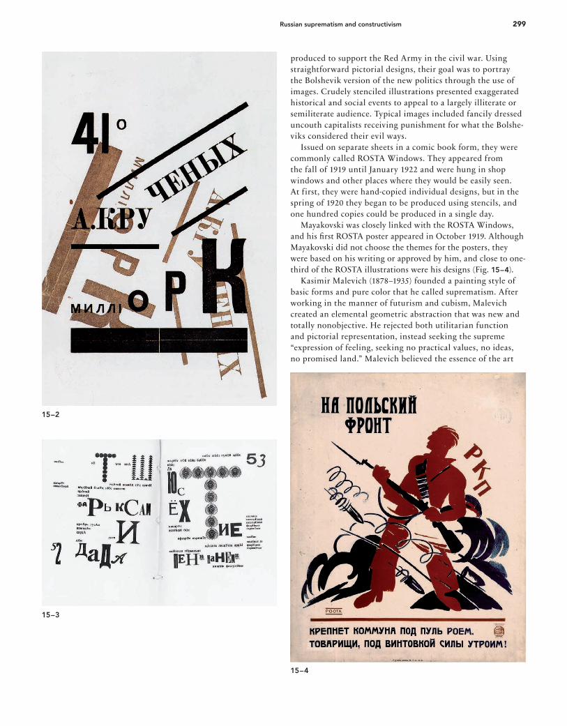
Russian suprematism and constructivismRussia was torn by the turbulence of World War I and then the Russian Revolution in the second decade of the twentieth century. Czar Nicholas II (1868–1918) was overthrown and executed along with his family. Russia was ravaged by civil war, and the Red Army of the Bolsheviks emerged victorious by 1920. During this period of political trauma, a brief f lower-ing of creative art in Russia had an international influence on twentieth-century graphic design. Beginning with Marinetti’s Russian lectures, the decade saw Russian artists absorb cubism and futurism with amazing speed and then move on to new innovations. The Russian avant-garde saw common traits in cubism and futurism and coined the term cubo-futurism. Experimentation in typography and design characterized their futurist publications, which presented work by the visual and literary art communities. Symbolically, the Russian futurist books were a reaction against the values of czarist Russia. The use of coarse paper, handicraft production methods, and handmade additions expressed the poverty of peasant society as well as the meager resources of artists and writers. The poet Vladimir Vladimirovich Mayakovski’s autobiographical play was printed in a dissonant futurist style designed by David and Vladimir Burliuk (Fig. 15–1), becoming a model for works by others, including Ilja Zdanevich (Figs. 15–2 and 15–3). The Bolsheviks began a news agency, the Russian Telegraph Agency (ROSTA) in 1917, immediately following the Rus-sian Revolution. Two years later ROSTA posters began to be
15 A New Language of Form
15–1
15–1. David and Vladimir Burliuk,
pages from Vladimir Mayakovski: A
Tragedy, 1914. In an effort to relate vi-
sual form to meaning, Russian futurist
graphic design mixed type weights,
sizes, and styles.
15–2. Ilja Zdanevich, insert cover
of Milliork, by Aleksei Kruchenykh,
1919. Zdanevich’s cover illustrates
the infl uence of Dada and futurism
on the Russian avant-garde.
15–3. Ilja Zdanevich, pages from
Le-Dantyu as a Beacon, 1923. The
Burliuk brothers and the Dadaists
inspired Zdanevich’s playscript design,
the lively movements of which are cre-
ated by mixing type sizes and styles
and building letters from letterpress
ornaments.
15–4. Vladimir Vladimirovich Maya-
kovski, ROSTA Window poster,
c. 1921. Such simple posters
spread the Bolshevik message to
the largely illiterate population.
16_9780470168738-ch15.indd 29816_9780470168738-ch15.indd 298 9/9/11 8:03 PM9/9/11 8:03 PM
299Russian suprematism and constructivism
produced to support the Red Army in the civil war. Using straightforward pictorial designs, their goal was to portray the Bolshevik version of the new politics through the use of images. Crudely stenciled illustrations presented exaggerated historical and social events to appeal to a largely illiterate or semiliterate audience. Typical images included fancily dressed uncouth capitalists receiving punishment for what the Bolshe-viks considered their evil ways. Issued on separate sheets in a comic book form, they were commonly called ROSTA Windows. They appeared from the fall of 1919 until January 1922 and were hung in shop windows and other places where they would be easily seen. At first, they were hand-copied individual designs, but in the spring of 1920 they began to be produced using stencils, and one hundred copies could be produced in a single day. Mayakovski was closely linked with the ROSTA Windows, and his fi rst ROSTA poster appeared in October 1919. Although Mayakovski did not choose the themes for the posters, they were based on his writing or approved by him, and close to one-third of the ROSTA illustrations were his designs (Fig. 15–4). Kasimir Malevich (1878–1935) founded a painting style of basic forms and pure color that he called suprematism. After working in the manner of futurism and cubism, Malevich created an elemental geometric abstraction that was new and totally nonobjective. He rejected both utilitarian function and pictorial representation, instead seeking the supreme “expression of feeling, seeking no practical values, no ideas, no promised land.” Malevich believed the essence of the art
15–2
15–3
15–4
16_9780470168738-ch15.indd 29916_9780470168738-ch15.indd 299 9/9/11 8:03 PM9/9/11 8:03 PM

300 Chapter 15: A New Language of Form
15–5. Kasimir Malevich, Black Square,
c. 1913. A new vision for visual art
is as far removed as possible from
the world of natural forms and
appearances.
15–6. Kasimir Malevich, Suprematist
Composition, 1915. A symphonic
arrangement of elemental shapes of
luminous color on a white fi eld be-
comes an expression of pure feeling.
15–7. Kasimir Malevich, cover of
Pervyi tsikl lektsii (First Circle of Lec-
tures), by Nikolai Punin. A suprematist
composition is combined with
typography, 1920.
15–5
15–6
15–7
15–8. El Lissitzky, PROUN 23, no. 6,
1919. Lissitzky developed visual ideals
about balance, space, and form in his
paintings, which became the basis for
his graphic design and architecture.
16_9780470168738-ch15.indd 30016_9780470168738-ch15.indd 300 9/9/11 8:03 PM9/9/11 8:03 PM

301Russian suprematism and constructivism
experience was the perceptual effect of color and form. To demonstrate this, perhaps as early as 1913 he made a composi-tion with a black square on a white background (Fig. 15–5), asserting that the feeling this contrast evoked was the essence of art. In works such as the 1915 Suprematist Composition (Fig. 15–6), and the cover of Pervyi tsikl lektsii (First Circle of Lec-tures) (Fig. 15–7), Malevich created a construction of concrete elements of color and shape. The visual form became the content, and expressive qualities developed from the intuitive organization of the forms and colors. The Russian movement was actually accelerated by the revolution, for art was given a social role rarely assigned to it. Leftist artists had been opposed to the old order and its conservative visual art. In 1917 they turned their energies to a massive propaganda effort in support of the revolutionaries, but by 1920 a deep ideological split developed concerning the role of the artist in the new communist state. Some artists, including Malevich and Kandinsky, argued that art must remain an essentially spiritual activity apart from the utilitar-ian needs of society. They rejected a social or political role, believing the sole aim of art to be realizing perceptions of the world by inventing forms in space and time. Led by Vladimir Tatlin (1885–1953) and Alexander Rodchenko (1891–1956), twenty-five artists advanced the opposing viewpoint in 1921, when they renounced “art for art’s sake” to devote themselves to industrial design, visual communications, and applied arts serving the new communist society. These constructivists called on the artist to stop producing useless things such as paintings and turn to the poster, for “such work now belongs to the duty of the artist as a citizen of the community who is clearing the field of the old rubbish in preparation for the new life.” Tatlin turned from sculpture to the design of a stove that would give maximum heat from minimum fuel; Rodchenko forsook painting for graphic design and photojournalism. An early attempt to formulate constructivist ideology was the 1922 brochure Konstruktivizm by Aleksei Gan (1893–1942). He criticized abstract painters for their inability to break the umbilical cord connecting them to traditional art and boasted that constructivism had moved from laboratory work to practical application. Gan wrote that tectonics, texture, and construction were the three principles of constructivism. Tectonics represented the unification of communist ideology with visual form; texture meant the nature of materials and how they are used in industrial production; and construction symbolized the creative process and the search for laws of visual organization. The constructivist ideal was best realized by the painter, architect, graphic designer, and photographer El (Lazar Markovich) Lissitzky (1890–1941), an indefatigable visionary who profoundly influenced the course of graphic design. At age nineteen, after being turned down by the Petrograd Academy of Arts because of ethnic prejudice against Jews, Lissitzky studied architecture at the Darmstadt, Germany, school of engineering and architecture. The mathematical and structural properties of architecture formed the basis for his art.
In 1919 Marc Chagall, principal of the art school in Vitebsk, located about 400 kilometers (250 miles) east of Moscow, asked Lissitzky to join the faculty. Malevich was teaching there and became a major influence on Lissitzky, who devel-oped a painting style that he called PROUNS (an acronym for “projects for the establishment [affirmation] of a new art”). In contrast to the absolute f latness of Malevich’s picture plane, PROUNS (Fig. 15–8) introduced three-dimensional illusions that both receded (negative depth) behind the picture plane (naught depth) and projected forward (positive depth) from the picture plane. Lissitzky called PROUNS “an interchange station between painting and architecture.” This indicates his synthesis of architectural concepts with painting; it also describes how PROUNS pointed the way to the application of modern painting concepts of form and space to applied design. This is seen in his 1919 poster “Beat the Whites with the Red Wedge” (Fig. 15–9). The space is dynamically divided into white and black areas. Suprematist design elements are transformed into political symbolism that even a semiliterate peasant can supposedly understand: Support for the “red” Bolshevik against the “white” forces of Aleksandr Kerensky is symbolized by a red wedge slashing into a white circle. Lissitzky saw the October 1917 Russian Revolution as a new beginning for mankind. Communism and social engineering would create a new order, technology would provide for society’s needs, and the artist/designer (he called himself a “constructor”) would forge a unity between art and technology by constructing a new world of objects to provide mankind with a richer society and environment. This idealism led him to put increasing emphasis on graphic design, as he moved from private aesthetic experience into the mainstream of communal life. In 1921 Lissitzky traveled to Berlin and the Netherlands, where he made contact with De Stijl, the Bauhaus, Dadaists, and other constructivists. In addition, he met the architect Hendricus Theodorus Wijdeveld (1885–1987) and designed
15–8
16_9780470168738-ch15.indd 30116_9780470168738-ch15.indd 301 9/9/11 8:03 PM9/9/11 8:03 PM

302 Chapter 15: A New Language of Form
and war; they saw Veshch as a meeting point for new works from different nations. Lissitzky’s Berlin period enabled him to spread the con-structivist message through frequent Bauhaus visits, important articles, and lectures. Major collaborations included the joint design and editing of a special double issue of Merz with Kurt Schwitters in 1924. The editors of Broom, a radical American magazine covering advanced literature and art, commissioned title pages and other graphics from Lissitzky. A Broom cover layout (Fig. 15–12) shows Lissitzky’s practice of making layouts on graph paper, which imposed the modular structure and mathematical order of a grid upon his designs. Advertisements and displays were commissioned by the Pelikan Ink Company (Fig. 15–13). Rebelling against the constraints of metal type-setting, Lissitzky often used drafting-instrument construction and paste-up to achieve his designs. In 1925 he predicted that Gutenberg’s system of printing would become a thing of the past and that photomechanical processes would replace metal type and open new horizons for design as surely as radio had replaced the telegraph. As a designer, Lissitzky did not decorate the book—he constructed it by visually programming the total object. In a 1923 book of Vladimir Mayakovski’s poems, For the Voice, also translated as For Reading Out Loud, Lissitzky designed exclusively with elements from the metal typecase, set by a German compositor who knew no Russian (Figs. 15–14
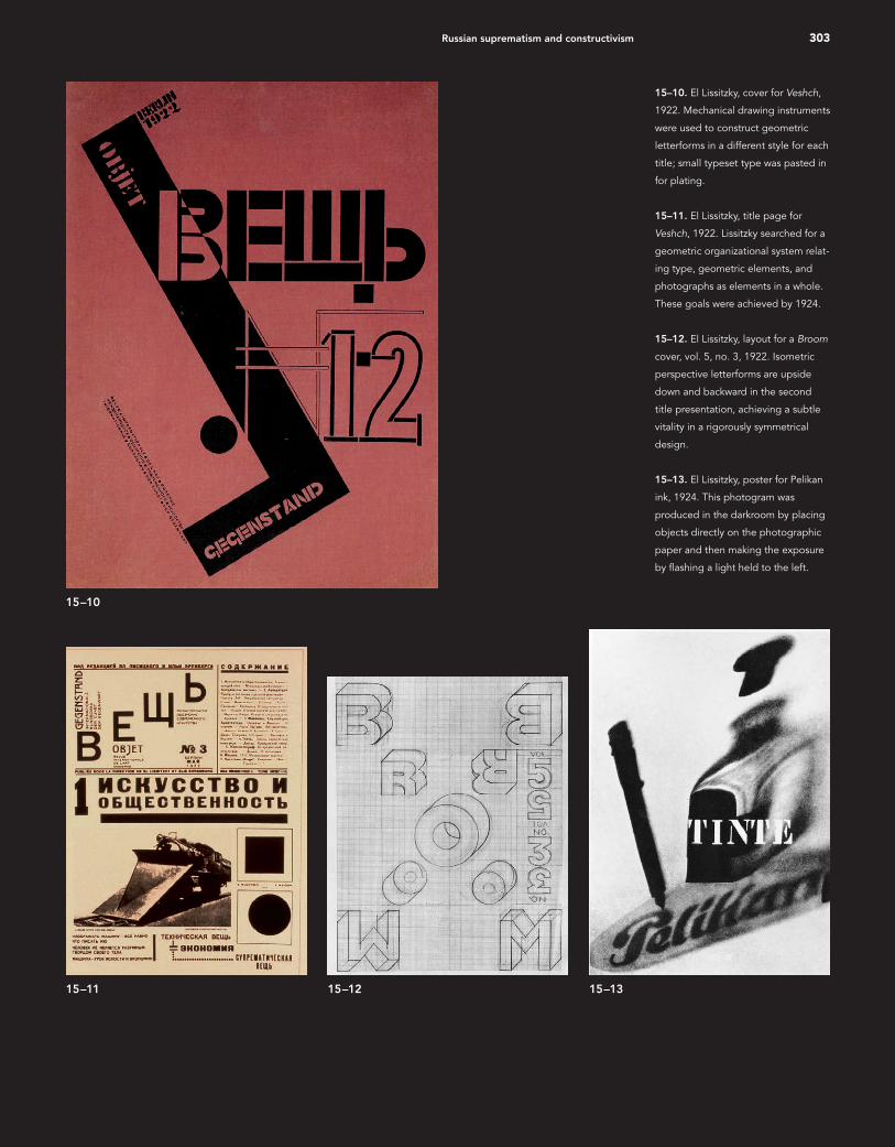
a cover for the magazine Wendingen in 1922 (see Fig. 15–59). Postwar Germany had become a meeting ground for eastern and western ideas advanced in the early 1920s. Access to excel-lent German printing facilities enabled Lissitzky’s typographic ideas to develop rapidly. His tremendous energy and range of experimentation with photomontage, printmaking, graphic design, and painting enabled him to become the main conduit through which suprematist and constructivist ideas f lowed into western Europe. Editorial and design assignments for several publications were important vehicles by which his ideas influenced a wider audience. During the early 1920s the Soviet government offered of-ficial encouragement to the new Russian art and even sought to publicize it through an international journal (Figs. 15–10 and 15–11). Editor Ilya Ehrenburg (1891–1967) was joined by Lissitzky in creating the trilingual journal Veshch (Russian)/Ge-genstand (German)/Objet (French). The title (meaning “object”) was chosen because the editors believed that art meant the creation of new objects, a process for building a new collective international approach led by young European and Russian artists and designers. Lissitzky constructed his cover designs on a dynamic diagonal axis with asymmetrical balancing of elements, the weight placed high on the page. Lissitzky and Ehrenburg realized that parallel yet isolated art and design movements had evolved during the seven-year period of separation when Europe and Russia were bled by revolution
15–9. El Lissitzky, “Beat the Whites
with the Red Wedge,” 1919. The
Bolshevik army emblem, a red wedge,
slashes diagonally into a white sphere
signifying Aleksandr Kerensky’s
“white” forces. The slogan’s four
words are placed to reinforce the
dynamic movement.
15–9
16_9780470168738-ch15.indd 30216_9780470168738-ch15.indd 302 9/9/11 8:03 PM9/9/11 8:03 PM
303Russian suprematism and constructivism
15–10
15–12 15–1315–11
15–10. El Lissitzky, cover for Veshch,
1922. Mechanical drawing instruments
were used to construct geometric
letterforms in a different style for each
title; small typeset type was pasted in
for plating.
15–11. El Lissitzky, title page for
Veshch, 1922. Lissitzky searched for a
geometric organizational system relat-
ing type, geometric elements, and
photographs as elements in a whole.
These goals were achieved by 1924.
15–12. El Lissitzky, layout for a Broom
cover, vol. 5, no. 3, 1922. Isometric
perspective letterforms are upside
down and backward in the second
title presentation, achieving a subtle
vitality in a rigorously symmetrical
design.
15–13. El Lissitzky, poster for Pelikan
ink, 1924. This photogram was
produced in the darkroom by placing
objects directly on the photographic
paper and then making the exposure
by fl ashing a light held to the left.
16_9780470168738-ch15.indd 30316_9780470168738-ch15.indd 303 9/9/11 8:03 PM9/9/11 8:03 PM
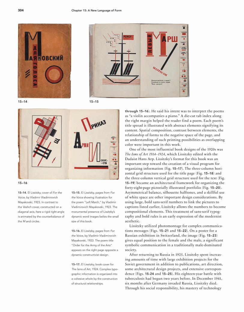
304 Chapter 15: A New Language of Form
15–15. El Lissitzky, pages from For
the Voice showing illustration for
the poem “Left March,” by Vladimir
Vladimirovich Mayakovski, 1923. The
monumental presence of Lissitzky’s
dynamic word images belies the small
size of this book.
15–16. El Lissitzky, pages from For
the Voice, by Vladimir Vladimirovich
Mayakovski, 1923. The poem title
“Order for the Army of the Arts”
appears on the right page opposite a
dynamic constructivist design.
15–17. El Lissitzky, book cover for
The Isms of Art, 1924. Complex typo-
graphic information is organized into
a cohesive whole by the construction
of structural relationships.
15–14 15–15
15–16
15–14. El Lissitzky, cover of For the
Voice, by Vladimir Vladimirovich
Mayakovski, 1923. In contrast to
the Veshch cover, constructed on a
diagonal axis, here a rigid right angle
is animated by the counterbalance of
the M and circles.
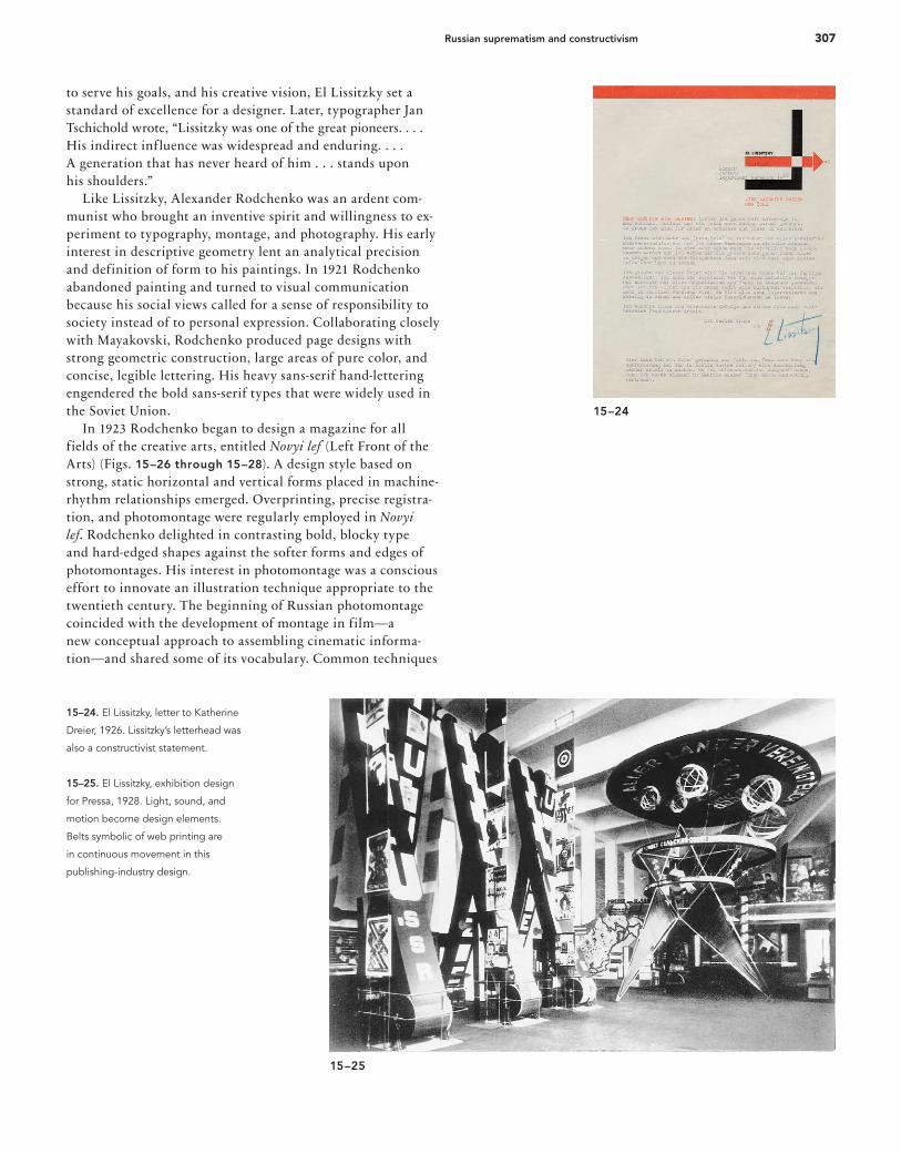
through 15–16). He said his intent was to interpret the poems as “a violin accompanies a piano.” A die-cut tab index along the right margin helped the reader find a poem. Each poem’s title spread is illustrated with abstract elements signifying its content. Spatial composition, contrast between elements, the relationship of forms to the negative space of the page, and an understanding of such printing possibilities as overlapping color were important in this work. One of the most influential book designs of the 1920s was The Isms of Art 1914–1924, which Lissitzky edited with the Dadaist Hans Arp. Lissitzky’s format for this book was an important step toward the creation of a visual program for organizing information (Fig. 15–17). The three-column hori-zontal grid structure used for the title page (Fig. 15–18) and the three-column vertical grid structure used for the text (Fig. 15–19) became an architectural framework for organizing the forty-eight-page pictorially illustrated portfolio (Fig. 15–20). Asymmetrical balance, silhouette halftones, and a skillful use of white space are other important design considerations. By using large, bold sans-serif numbers to link the pictures to captions listed earlier, Lissitzky allows the numbers to become compositional elements. This treatment of sans-serif typog-raphy and bold rules is an early expression of the modernist aesthetic. Lissitzky utilized photomontage for complex communica-tions messages (Figs. 15–21 and 15–22). On a poster for a Russian exhibition in Switzerland, the image (Fig. 15–23) gives equal position to the female and the male, a significant symbolic communication in a traditionally male-dominated society. After returning to Russia in 1925, Lissitzky spent increas-ing amounts of time with large exhibition projects for the Soviet government in addition to publications, art direction, some architectural design projects, and extensive correspon-dence (Figs. 15-24 and 15–25). His eighteen-year battle with tuberculosis had begun two years before. In December 1941, six months after Germany invaded Russia, Lissitzky died. Through his social responsibility, his mastery of technology
16_9780470168738-ch15.indd 30416_9780470168738-ch15.indd 304 9/9/11 8:03 PM9/9/11 8:03 PM

305Russian suprematism and constructivism
15–18. El Lissitzky, title page for The
Isms of Art, 1924. The graphic spirit
achieved by medium-weight sans-serif
type, mathematical division of the
space, white areas, and bold rules
established a typographic standard
for the modern movement.
15–19. El Lissitzky, text format for The
Isms of Art, 1924. Rigorous verticals
separate German, French, and English
texts, and horizontal bars emphasize
an important introductory quotation.
15–20. El Lissitzky, pictorial spread
from The Isms of Art, 1924. The grid
systems of the preceding typographic
pages are echoed in the placement of
the images, which are one, two, and
three columns wide.
15–17
15–19 15–20
15–18
16_9780470168738-ch15.indd 30516_9780470168738-ch15.indd 305 9/9/11 8:03 PM9/9/11 8:03 PM
306 Chapter 15: A New Language of Form
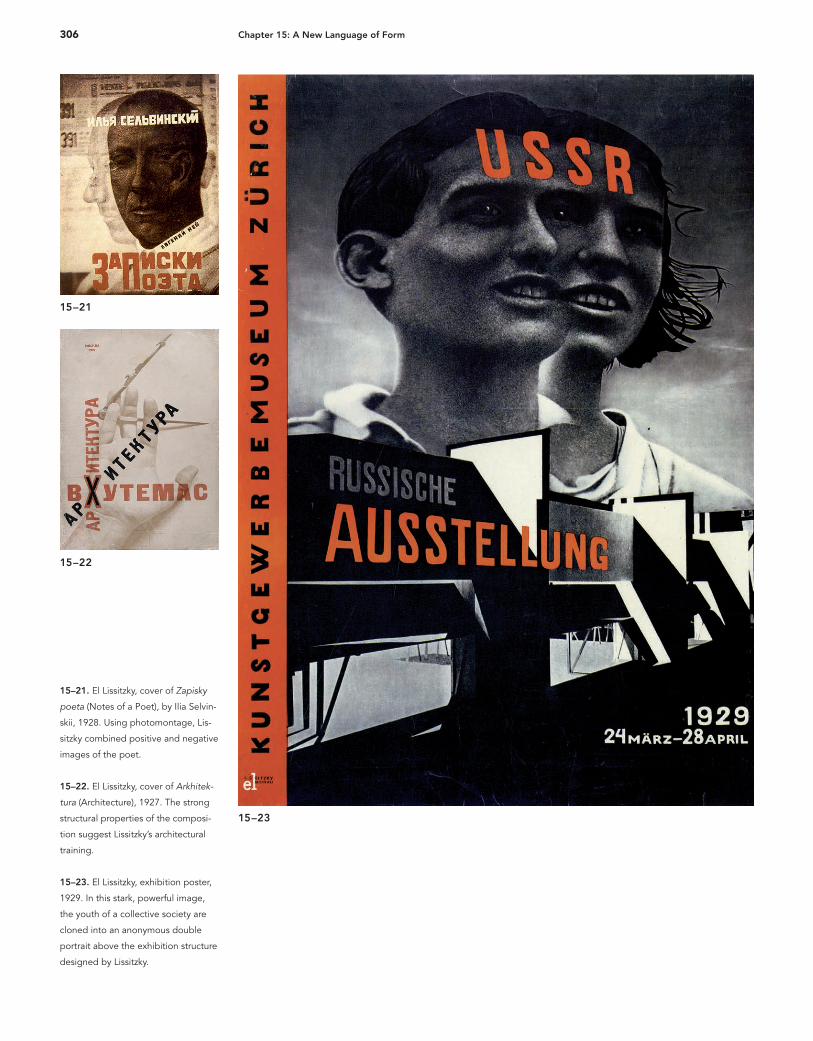
15–21
15–22
15–23
15–21. El Lissitzky, cover of Zapisky
poeta (Notes of a Poet), by Ilia Selvin-
skii, 1928. Using photomontage, Lis-
sitzky combined positive and negative
images of the poet.
15–22. El Lissitzky, cover of Arkhitek-
tura (Architecture), 1927. The strong
structural properties of the composi-
tion suggest Lissitzky’s architectural
training.
15–23. El Lissitzky, exhibition poster,
1929. In this stark, powerful image,
the youth of a collective society are
cloned into an anonymous double
portrait above the exhibition structure
designed by Lissitzky.
16_9780470168738-ch15.indd 30616_9780470168738-ch15.indd 306 9/9/11 8:03 PM9/9/11 8:03 PM
307Russian suprematism and constructivism
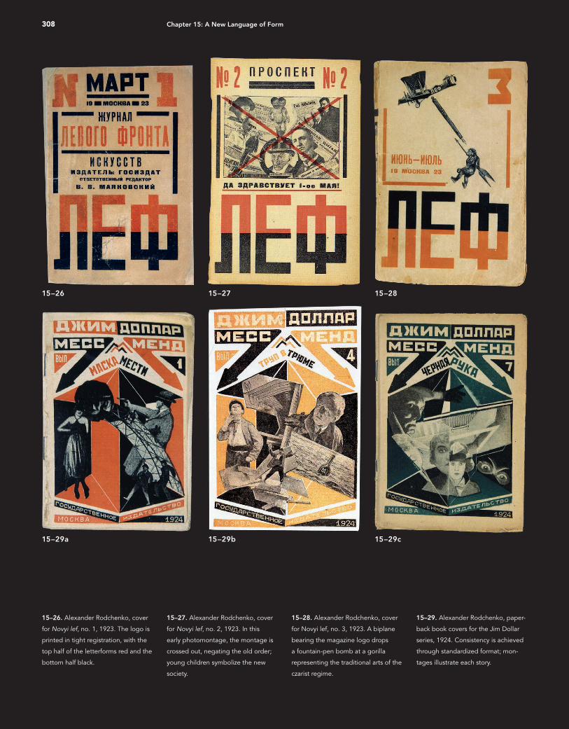
to serve his goals, and his creative vision, El Lissitzky set a standard of excellence for a designer. Later, typographer Jan Tschichold wrote, “Lissitzky was one of the great pioneers. . . . His indirect influence was widespread and enduring. . . . A generation that has never heard of him . . . stands upon his shoulders.” Like Lissitzky, Alexander Rodchenko was an ardent com-munist who brought an inventive spirit and willingness to ex-periment to typography, montage, and photography. His early interest in descriptive geometry lent an analytical precision and definition of form to his paintings. In 1921 Rodchenko abandoned painting and turned to visual communication because his social views called for a sense of responsibility to society instead of to personal expression. Collaborating closely with Mayakovski, Rodchenko produced page designs with strong geometric construction, large areas of pure color, and concise, legible lettering. His heavy sans-serif hand-lettering engendered the bold sans-serif types that were widely used in the Soviet Union. In 1923 Rodchenko began to design a magazine for all fields of the creative arts, entitled Novyi lef (Left Front of the Arts) (Figs. 15–26 through 15–28). A design style based on strong, static horizontal and vertical forms placed in machine-rhythm relationships emerged. Overprinting, precise registra-tion, and photomontage were regularly employed in Novyi lef. Rodchenko delighted in contrasting bold, blocky type and hard-edged shapes against the softer forms and edges of photomontages. His interest in photomontage was a conscious effort to innovate an illustration technique appropriate to the twentieth century. The beginning of Russian photomontage coincided with the development of montage in film—a new conceptual approach to assembling cinematic informa-tion—and shared some of its vocabulary. Common techniques
15–24
15–25
15–24. El Lissitzky, letter to Katherine
Dreier, 1926. Lissitzky’s letterhead was
also a constructivist statement.
15–25. El Lissitzky, exhibition design
for Pressa, 1928. Light, sound, and
motion become design elements.
Belts symbolic of web printing are
in continuous movement in this
publishing-industry design.
16_9780470168738-ch15.indd 30716_9780470168738-ch15.indd 307 9/9/11 8:03 PM9/9/11 8:03 PM
308 Chapter 15: A New Language of Form
15–26 15–27 15–28
15–29a 15–29b 15–29c
15–26. Alexander Rodchenko, cover
for Novyi lef, no. 1, 1923. The logo is
printed in tight registration, with the
top half of the letterforms red and the
bottom half black.
15–27. Alexander Rodchenko, cover
for Novyi lef, no. 2, 1923. In this
early photomontage, the montage is
crossed out, negating the old order;
young children symbolize the new
society.
15–28. Alexander Rodchenko, cover
for Novyi lef, no. 3, 1923. A biplane
bearing the magazine logo drops
a fountain-pen bomb at a gorilla
representing the traditional arts of the
czarist regime.
15–29. Alexander Rodchenko, paper-
back book covers for the Jim Dollar
series, 1924. Consistency is achieved
through standardized format; mon-
tages illustrate each story.
16_9780470168738-ch15.indd 30816_9780470168738-ch15.indd 308 9/9/11 8:03 PM9/9/11 8:03 PM
309Russian suprematism and constructivism
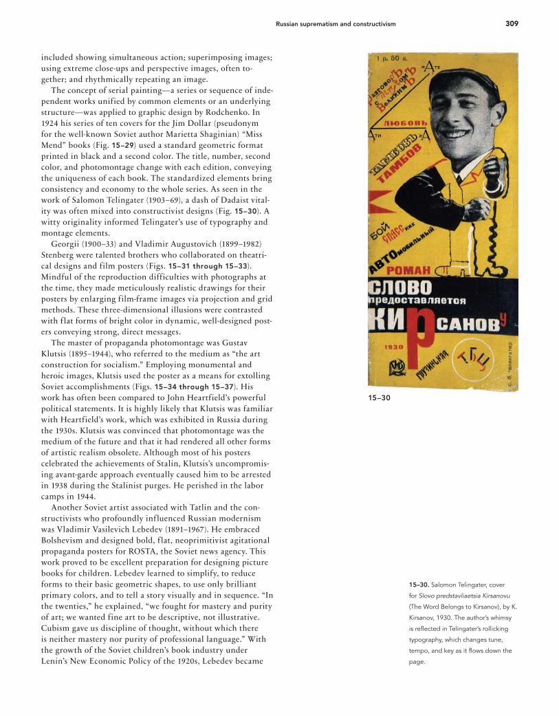
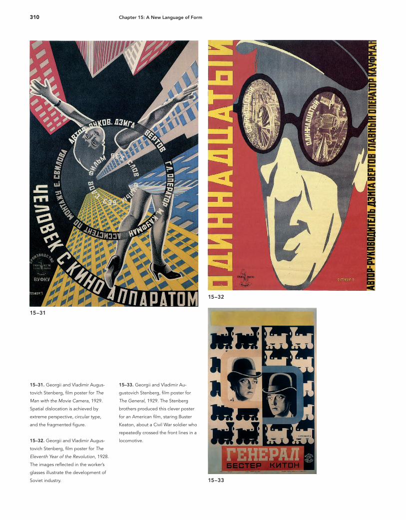
included showing simultaneous action; superimposing images; using extreme close-ups and perspective images, often to-gether; and rhythmically repeating an image. The concept of serial painting—a series or sequence of inde-pendent works unified by common elements or an underlying structure—was applied to graphic design by Rodchenko. In 1924 his series of ten covers for the Jim Dollar (pseudonym for the well-known Soviet author Marietta Shaginian) “Miss Mend” books (Fig. 15–29) used a standard geometric format printed in black and a second color. The title, number, second color, and photomontage change with each edition, conveying the uniqueness of each book. The standardized elements bring consistency and economy to the whole series. As seen in the work of Salomon Telingater (1903–69), a dash of Dadaist vital-ity was often mixed into constructivist designs (Fig. 15–30). A witty originality informed Telingater’s use of typography and montage elements. Georgii (1900–33) and Vladimir Augustovich (1899–1982) Stenberg were talented brothers who collaborated on theatri-cal designs and film posters (Figs. 15–31 through 15–33). Mindful of the reproduction difficulties with photographs at the time, they made meticulously realistic drawings for their posters by enlarging film-frame images via projection and grid methods. These three-dimensional illusions were contrasted with f lat forms of bright color in dynamic, well-designed post-ers conveying strong, direct messages. The master of propaganda photomontage was Gustav Klutsis (1895–1944), who referred to the medium as “the art construction for socialism.” Employing monumental and heroic images, Klutsis used the poster as a means for extolling Soviet accomplishments (Figs. 15–34 through 15–37). His work has often been compared to John Heartfield’s powerful political statements. It is highly likely that Klutsis was familiar with Heartfield’s work, which was exhibited in Russia during the 1930s. Klutsis was convinced that photomontage was the medium of the future and that it had rendered all other forms of artistic realism obsolete. Although most of his posters celebrated the achievements of Stalin, Klutsis’s uncompromis-ing avant-garde approach eventually caused him to be arrested in 1938 during the Stalinist purges. He perished in the labor camps in 1944. Another Soviet artist associated with Tatlin and the con-structivists who profoundly influenced Russian modernism was Vladimir Vasilevich Lebedev (1891–1967). He embraced Bolshevism and designed bold, f lat, neoprimitivist agitational propaganda posters for ROSTA, the Soviet news agency. This work proved to be excellent preparation for designing picture books for children. Lebedev learned to simplify, to reduce forms to their basic geometric shapes, to use only brilliant primary colors, and to tell a story visually and in sequence. “In the twenties,” he explained, “we fought for mastery and purity of art; we wanted fine art to be descriptive, not illustrative. Cubism gave us discipline of thought, without which there is neither mastery nor purity of professional language.” With the growth of the Soviet children’s book industry under Lenin’s New Economic Policy of the 1920s, Lebedev became
15–30
15–30. Salomon Telingater, cover
for Slovo predstavliaetsia Kirsanovu
(The Word Belongs to Kirsanov), by K.
Kirsanov, 1930. The author’s whimsy
is refl ected in Telingater’s rollicking
typography, which changes tune,
tempo, and key as it fl ows down the
page.
16_9780470168738-ch15.indd 30916_9780470168738-ch15.indd 309 9/9/11 8:03 PM9/9/11 8:03 PM
310 Chapter 15: A New Language of Form
15–31
15–32
15–33
15–31. Georgii and Vladimir Augus-
tovich Stenberg, fi lm poster for The
Man with the Movie Camera, 1929.
Spatial dislocation is achieved by
extreme perspective, circular type,
and the fragmented fi gure.
15–32. Georgii and Vladimir Augus-
tovich Stenberg, fi lm poster for The
Eleventh Year of the Revolution, 1928.
The images refl ected in the worker’s
glasses illustrate the development of
Soviet industry.
15–33. Georgii and Vladimir Au-
gustovich Stenberg, fi lm poster for
The General, 1929. The Stenberg
brothers produced this clever poster
for an American fi lm, staring Buster
Keaton, about a Civil War soldier who
repeatedly crossed the front lines in a
locomotive.
16_9780470168738-ch15.indd 31016_9780470168738-ch15.indd 310 9/9/11 8:03 PM9/9/11 8:03 PM
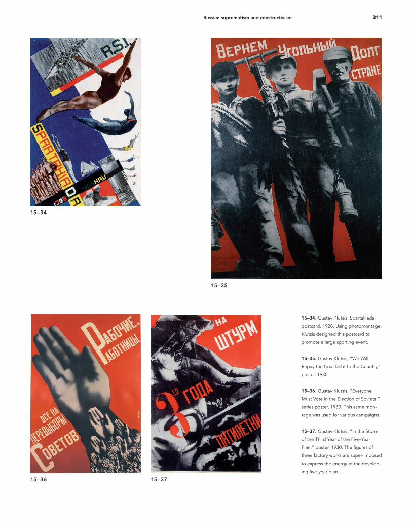
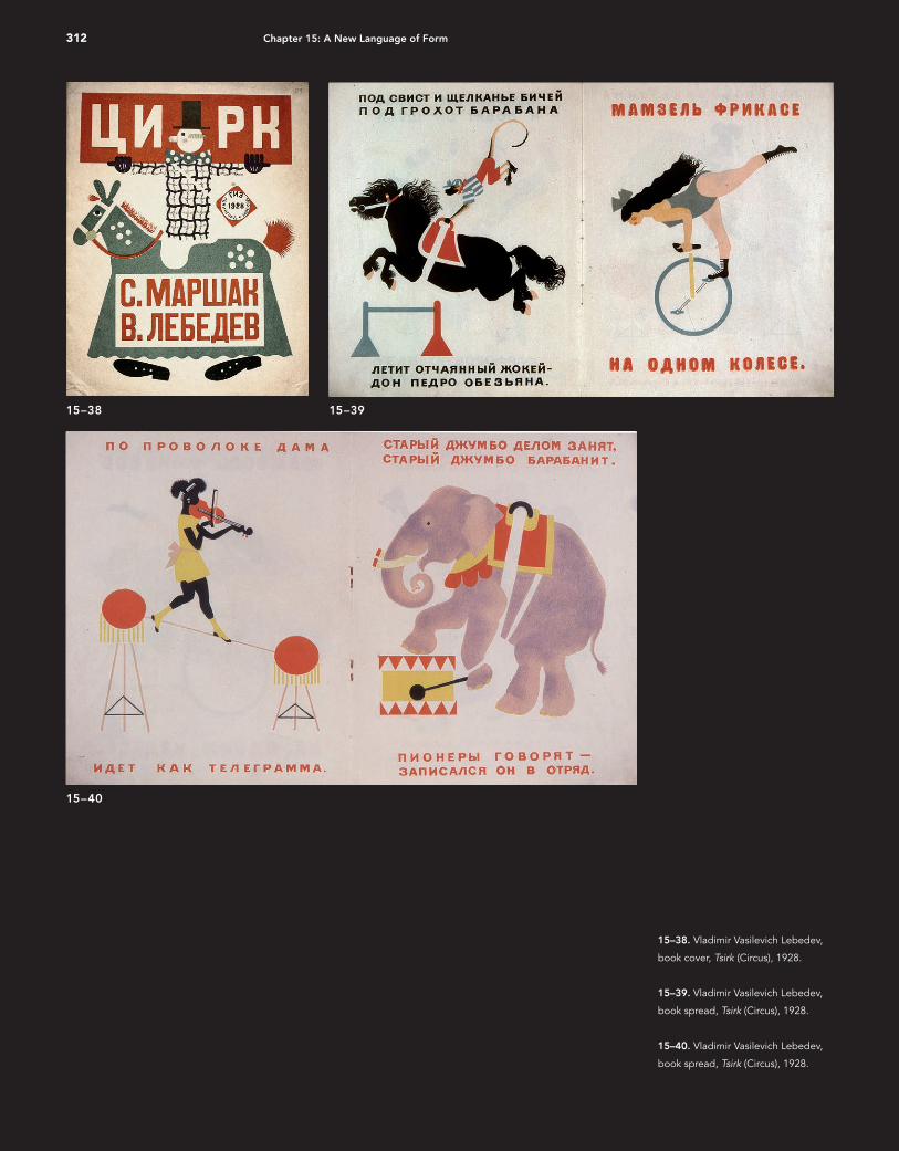
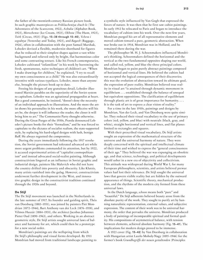
311Russian suprematism and constructivism
15–3715–36
15–35
15–34
15–34. Gustav Klutsis, Spartakiada
postcard, 1928. Using photomontage,
Klutsis designed this postcard to
promote a large sporting event.
15–35. Gustav Klutsis, “We Will
Repay the Coal Debt to the Country,”
poster, 1930.
15–36. Gustav Klutsis, “Everyone
Must Vote in the Election of Soviets,”
series poster, 1930. This same mon-
tage was used for various campaigns.
15–37. Gustav Klutsis, “In the Storm
of the Third Year of the Five-Year
Plan,” poster, 1930. The fi gures of
three factory works are super-imposed
to express the energy of the develop-
ing fi ve-year plan.
16_9780470168738-ch15.indd 31116_9780470168738-ch15.indd 311 9/9/11 8:03 PM9/9/11 8:03 PM
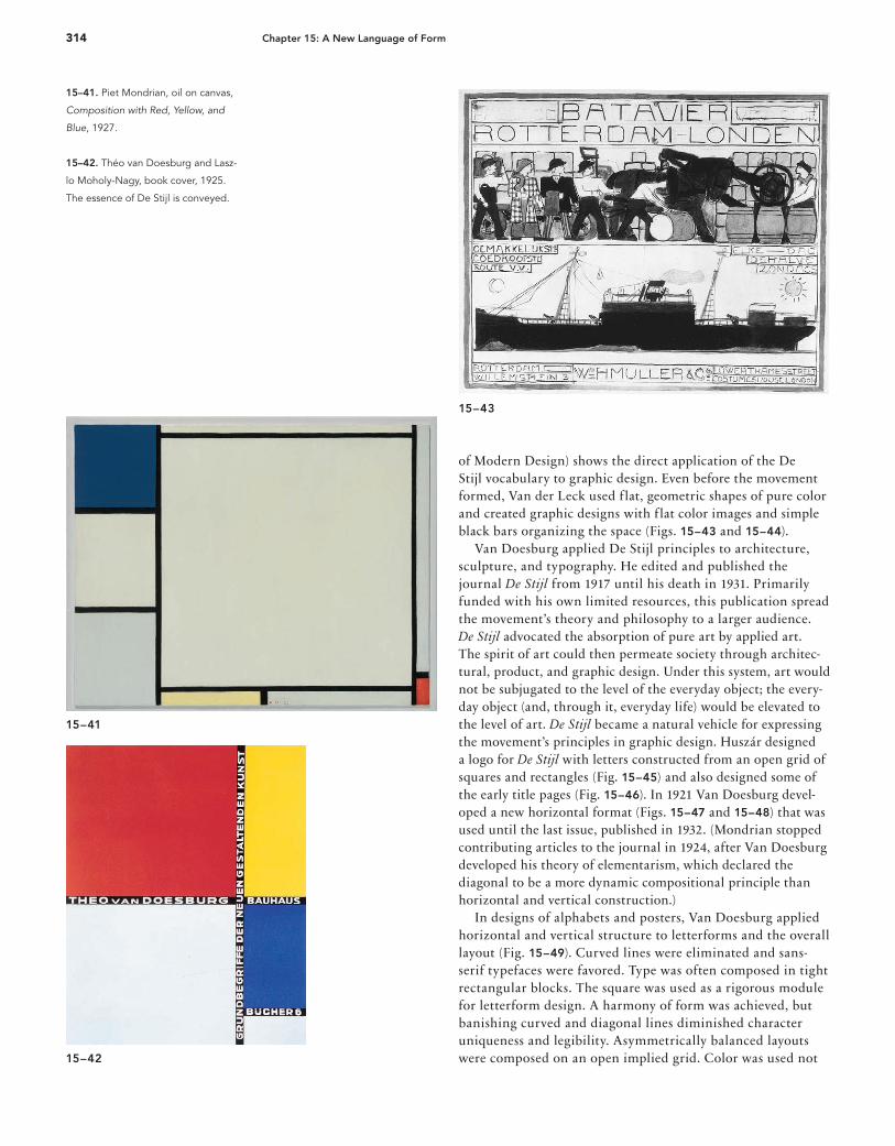
312 Chapter 15: A New Language of Form
15–38. Vladimir Vasilevich Lebedev,
book cover, Tsirk (Circus), 1928.
15–39. Vladimir Vasilevich Lebedev,
book spread, Tsirk (Circus), 1928.
15–40. Vladimir Vasilevich Lebedev,
book spread, Tsirk (Circus), 1928.
15–38 15–39
15–40
16_9780470168738-ch15.indd 31216_9780470168738-ch15.indd 312 9/9/11 8:03 PM9/9/11 8:03 PM
313De Stijl
the father of the twentieth-century Russian picture book. In such graphic masterpieces as Prikliucheniya chuch-lo (The Adventures of the Scarecrow, 1922), Azbuka (Alphabet Book, 1925), Morozhenoe (Ice Cream, 1925), Okhota (The Hunt, 1925), Tsirk (Circus, 1925) (Figs. 15–38 through 15–40), Vchera i segodnya (Yesterday and Today, 1925), and Bagazh (Baggage, 1926), often in collaboration with the poet Samuil Marshak, Lebedev devised a f lexible, modernist shorthand for figures that he reduced to their simplest shapes against a vast white background and relieved only by bright, f lat harmonious color and some contrasting texture. Like his French contemporaries, Lebedev cultivated “infantilism” in his work by borrowing the fresh, spontaneous, naive techniques of children’s art. “When I make drawings for children,” he explained, “I try to recall my own consciousness as a child.” He was also extraordinarily inventive with various typefaces. Lebedev, more than anyone else, brought the picture book up to date. Freeing his designs of any gratuitous detail, Lebedev illus-trated Marxist parables on the superiority of the Soviet system to capitalism. Lebedev was an agitational propagandist at heart. But a good communist, he insisted, “doesn’t deny the necessity of an individual approach to illustrations. And the more the art-ist shows his personality in his work, the more eff ective will his art be, the deeper it will infl uence the reader, the closer it will bring him to art.” The Communist Party thought otherwise. During the Great Purges of the 1930s, Pravda denounced Leb-edev’s picture books for their “formalism,” and he was forced to capitulate to the dictates of socialist realism, the state-supported style, by replacing his hard-edged designs with lush, benign fl uff . He always regretted the compromise. During the years immediately following the 1917 revolu-tion, the Soviet government had tolerated advanced art while more urgent problems commanded its attention, but by 1922, it accused experimental artists of “capitalist cosmopolitan-ism” and instead advocated social-realist painting. Although constructivism lingered as an influence in Soviet graphic and industrial design, painters like Malevich who did not leave the country drifted into poverty and obscurity. Like Klutsis, many artists vanished into the gulag. However, constructivism underwent further development in the West, and innova-tive graphic design in the constructivist tradition continued through the 1920s and beyond.
De Stijl The De Stijl movement was launched in the Netherlands in the late summer of 1917. Its founder and guiding spirit, Théo van Doesburg (1883–1931), was joined by painters Piet Mon-drian (1872–1944), Bart Anthony van der Leck (1876–1958), and Vilmos Huszár (1884–1931), the architect Jacobus Johannes Pieter Oud (1890–1963), and others. Working in an abstract geometric style, De Stijl artists sought universal laws of bal-ance and harmony for art, which could then be a prototype for a new social order. Mondrian’s paintings are the wellspring from which De Stijl’s philosophy and visual forms developed. By 1911 Mondrian had moved from traditional landscape painting to
a symbolic style influenced by Van Gogh that expressed the forces of nature. It was then that he first saw cubist paintings. In early 1912 he relocated to Paris and began to introduce the vocabulary of cubism into his work. Over the next few years, Mondrian purged his art of all representative elements and moved cubism toward a pure, geometric abstraction. When war broke out in 1914, Mondrian was in Holland, and he remained there during the war. The philosopher M. H. J. Schoenmakers influenced Mondri-an’s thinking. Schoenmakers defined the horizontal and the vertical as the two fundamental opposites shaping our world, and called red, yellow, and blue the three principal colors. Mondrian began to paint purely abstract paintings composed of horizontal and vertical lines. He believed the cubists had not accepted the logical consequences of their discoveries; this was the evolution of abstraction toward its ultimate goal, the expression of pure reality. Mondrian believed true real-ity in visual art “is attained through dynamic movement in equilibrium . . . established through the balance of unequal but equivalent oppositions. The clarification of equilibrium through plastic art is of great importance for humanity. . . . It is the task of art to express a clear vision of reality.” For a time in the late 1910s, paintings and designs by Mondrian, Van der Leck, and Van Doesburg were quite simi-lar. They reduced their visual vocabulary to the use of primary colors (red, yellow, and blue) with neutrals (black, gray, and white), straight horizontal and vertical lines, and f lat planes limited to rectangles and squares. With their prescribed visual vocabulary, De Stijl artists sought an expression of the mathematical structure of the universe and the universal harmony of nature. They were deeply concerned with the spiritual and intellectual climate of their time and wished to express the “general consciousness of their age.” They believed the war was expunging an obsolete age, and that science, technology, and political developments would usher in a new era of objectivity and collectivism. This attitude was widespread during World War I, for many European philosophers, scientists, and artists believed prewar values had lost their relevance. De Stijl sought the universal laws that govern visible reality but are hidden by the outward appearance of things. Scientific theory, mechanical produc-tion, and the rhythms of the modern city formed from these universal laws. In the Dutch language, schoon means both “pure” and “beautiful.” De Stijl adherents believed beauty arose from the absolute purity of the work. They sought to purify art by ban-ning naturalistic representation, external values, and subjective expression. The content of their work was to be universal har-mony, the order that pervades the universe. Mondrian produced a body of paintings of incomparable spiritual and formal qual-ity. His compositions of asymmetrical balance, with tension between elements, achieved absolute harmony (Fig. 15–41). The implications for modern design proved to be immense. A 1925 cover (Fig. 15–42) by Van Doesburg in collaboration with Hungarian artist Laszlo Moholy-Nagy (1895–1946) for the former’s book Grundbegriffe der neuen gestaltenden (Principles
16_9780470168738-ch15.indd 31316_9780470168738-ch15.indd 313 9/9/11 8:03 PM9/9/11 8:03 PM
314 Chapter 15: A New Language of Form
of Modern Design) shows the direct application of the De Stijl vocabulary to graphic design. Even before the movement formed, Van der Leck used flat, geometric shapes of pure color and created graphic designs with flat color images and simple black bars organizing the space (Figs. 15–43 and 15–44). Van Doesburg applied De Stijl principles to architecture, sculpture, and typography. He edited and published the journal De Stijl from 1917 until his death in 1931. Primarily funded with his own limited resources, this publication spread the movement’s theory and philosophy to a larger audience. De Stijl advocated the absorption of pure art by applied art. The spirit of art could then permeate society through architec-tural, product, and graphic design. Under this system, art would not be subjugated to the level of the everyday object; the every-day object (and, through it, everyday life) would be elevated to the level of art. De Stijl became a natural vehicle for expressing the movement’s principles in graphic design. Huszár designed a logo for De Stijl with letters constructed from an open grid of squares and rectangles (Fig. 15–45) and also designed some of the early title pages (Fig. 15–46). In 1921 Van Doesburg devel-oped a new horizontal format (Figs. 15–47 and 15–48) that was used until the last issue, published in 1932. (Mondrian stopped contributing articles to the journal in 1924, after Van Doesburg developed his theory of elementarism, which declared the diagonal to be a more dynamic compositional principle than horizontal and vertical construction.) In designs of alphabets and posters, Van Doesburg applied horizontal and vertical structure to letterforms and the overall layout (Fig. 15–49). Curved lines were eliminated and sans-serif typefaces were favored. Type was often composed in tight rectangular blocks. The square was used as a rigorous module for letterform design. A harmony of form was achieved, but banishing curved and diagonal lines diminished character uniqueness and legibility. Asymmetrically balanced layouts were composed on an open implied grid. Color was used not 15–42
15–43
15–41
15–41. Piet Mondrian, oil on canvas,
Composition with Red, Yellow, and
Blue, 1927.
15–42. Théo van Doesburg and Lasz-
lo Moholy-Nagy, book cover, 1925.
The essence of De Stijl is conveyed.
16_9780470168738-ch15.indd 31416_9780470168738-ch15.indd 314 9/9/11 8:03 PM9/9/11 8:03 PM

315De Stijl
15–44
15–45 15–46
15–43. Bart van der Leck, layout for
Batavier Line poster, 1915–16. In a
series of preliminary layouts, Van der
Leck struggled to bring order to the
design by dividing the space into
rectangles.
15–44. Bart van der Leck, Batavier
Line poster, 1916. Flat pure color and
bold horizontal and vertical spatial
divisions build the design. Because of
World War I, this poster could not be
used: the shipping lines between the
Netherlands and the United Kingdom
were severed. When it was eventually
employed during the 1920s the text
and colors were changed, infuriating
Van der Leck. This example is the fi rst
printing of the poster and refl ects the
original design of the artist.
15–45. Vilmos Huszár, cover design
for De Stijl, 1917. Huszár combined
his composition with type and Van
Doesburg’s logo to create a concise
rectangle in the center of the page.
15–46. Vilmos Huszár, title pages for
De Stijl, 1918. Huszár presented a
positive/negative fi gure/ground study
in spatial relationships. Restrained ty-
pography marked Apollinaire’s death.
16_9780470168738-ch15.indd 31516_9780470168738-ch15.indd 315 9/9/11 8:03 PM9/9/11 8:03 PM
316 Chapter 15: A New Language of Form
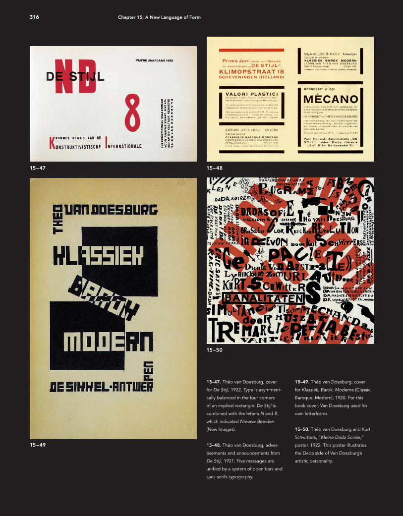
15–47. Théo van Doesburg, cover
for De Stijl, 1922. Type is asymmetri-
cally balanced in the four corners
of an implied rectangle. De Stijl is
combined with the letters N and B,
which indicated Nieuwe Beelden
(New Images).
15–48. Théo van Doesburg, adver-
tisements and announcements from
De Stijl, 1921. Five messages are
unifi ed by a system of open bars and
sans-serifs typography.
15–49. Théo van Doesburg, cover
for Klassiek, Barok, Moderne (Classic,
Baroque, Modern), 1920. For this
book cover, Van Doesburg used his
own letterforms.
15–50. Théo van Doesburg and Kurt
Schwitters, “Kleine Dada Soirée,”
poster, 1922. This poster illustrates
the Dada side of Van Doesburg’s
artistic personality.
15–47 15–48
15–49
15–50
16_9780470168738-ch15.indd 31616_9780470168738-ch15.indd 316 9/9/11 8:03 PM9/9/11 8:03 PM
317De Stijl
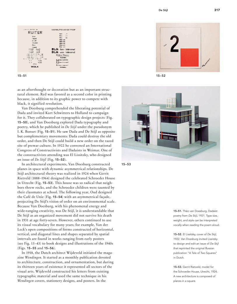
15–51 15–52
15–51. Théo van Doesburg, Dadaist
poetry from De Stijl, 1921. Type size,
weight, and style can be interpreted
vocally when reading the poem aloud.
15–52. El Lissitzky, cover of De Stijl,
1922. Van Doesburg invited Lissitzky
to design and edit an issue of De Stijl
that reprinted the original Russian
publication “A Tale of Two Squares”
in Dutch.
15–53. Gerrit Rietveld, model for
the Schroeder House, Utrecht, 1924.
A new architecture is composed of
planes in a square.
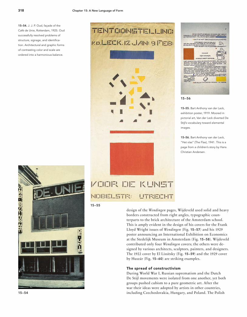
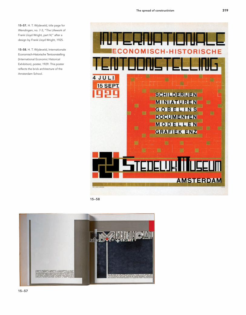
as an afterthought or decoration but as an important struc-tural element. Red was favored as a second color in printing because, in addition to its graphic power to compete with black, it signified revolution. Van Doesburg comprehended the liberating potential of Dada and invited Kurt Schwitters to Holland to campaign for it. They collaborated on typographic design projects (Fig. 15–50), and Van Doesburg explored Dada typography and poetry, which he published in De Stijl under the pseudonym I. K. Bonset (Fig. 15–51). He saw Dada and De Stijl as opposite but complementary movements: Dada could destroy the old order, and then De Stijl could build a new order on the razed site of prewar culture. In 1922 he convened an International Congress of Constructivists and Dadaists in Weimar. One of the constructivists attending was El Lissitzky, who designed an issue of De Stijl (Fig. 15–52). In architectural experiments, Van Doesburg constructed planes in space with dynamic asymmetrical relationships. De Stijl architectural theory was realized in 1924 when Gerrit Rietveld (1888–1964) designed the celebrated Schroeder House in Utrecht (Fig. 15–53). This house was so radical that neigh-bors threw rocks, and the Schroeder children were taunted by their classmates at school. The following year, Oud designed the Café de Unie (Fig. 15–54) with an asymmetrical façade, projecting De Stijl’s vision of order on an environmental scale.Because Van Doesburg, with his phenomenal energy and wide-ranging creativity, was De Stijl, it is understandable that De Stijl as an organized movement did not survive his death in 1931 at age forty-seven. However, others continued to use its visual vocabulary for many years; for example, Van der Leck’s open compositions of forms constructed of horizontal, vertical, and diagonal lines and shapes separated by spatial intervals are found in works ranging from early posters (see Fig. 15–43) to book designs and illustrations of the 1940s (Figs. 15–55 and 15–56). In 1918, the Dutch architect Wijdeveld initiated the maga-zine Wendingen. It started as a monthly publication devoted to architecture, construction, and ornamentation, but during its thirteen years of existence it represented all sectors of the visual arts. Wijdeveld constructed his letters from existing typographic material and used the same technique in his Wendingen covers, stationery designs, and posters. In the
15–53
16_9780470168738-ch15.indd 31716_9780470168738-ch15.indd 317 9/9/11 8:03 PM9/9/11 8:03 PM
318 Chapter 15: A New Language of Form
15–54
15–55
15–56
15–55. Bart Anthony van der Leck,
exhibition poster, 1919. Moored in
pictorial art, Van der Leck diverted De
Stijl’s vocabulary toward elemental
images.
15–56. Bart Anthony van der Leck,
“Het vlas” (The Flax), 1941. This is a
page from a children’s story by Hans
Christian Andersen.
design of the Wendingen pages, Wijdeveld used solid and heavy borders constructed from right angles, typographic coun-terparts to the brick architecture of the Amsterdam school. This is amply evident in the design of his covers for the Frank Lloyd Wright issues of Wendingen (Fig. 15–57) and his 1929 poster announcing an International Exhibition on Economics at the Stedelijk Museum in Amsterdam (Fig. 15–58). Wijdeveld contributed only four Wendingen covers; the others were de-signed by various architects, sculptors, painters, and designers. The 1922 cover by El Lissitsky (Fig. 15–59) and the 1929 cover by Huszár (Fig. 15–60) are striking examples.
The spread of constructivism During World War I, Russian suprematism and the Dutch De Stijl movements were isolated from one another, yet both groups pushed cubism to a pure geometric art. After the war their ideas were adopted by artists in other countries, including Czechoslovakia, Hungary, and Poland. The Polish
15–54. J. J. P. Oud, façade of the
Café de Unie, Rotterdam, 1925. Oud
successfully resolved problems of
structure, signage, and identifi ca-
tion. Architectural and graphic forms
of contrasting color and scale are
ordered into a harmonious balance.
16_9780470168738-ch15.indd 31816_9780470168738-ch15.indd 318 9/9/11 8:03 PM9/9/11 8:03 PM
319The spread of constructivism
15–57
15–58
15–57. H. T. Wijdeveld, title page for
Wendingen, no. 7-3, “The Lifework of
Frank Lloyd Wright, part IV,” after a
design by Frank Lloyd Wright, 1925.
15–58. H. T. Wijdeveld, Internationale
Economisch-Historische Tentoonstelling
(International Economic Historical
Exhibition), poster, 1929. This poster
refl ects the brick architecture of the
Amsterdam School.
16_9780470168738-ch15.indd 31916_9780470168738-ch15.indd 319 9/9/11 8:03 PM9/9/11 8:03 PM
320 Chapter 15: A New Language of Form
15–59
15–60
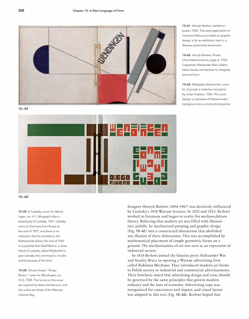
15–59. El Lissitsky, cover for Wend-
ingen, no. 4-1, lithograph after a
drawing by El Lissitsky, 1921. Lissitsky
came to Germany from Russia at
the end of 1921, and there is no
indication that he traveled to the
Netherlands before the end of 1922.
It is possible that Adolf Behne, a close
friend of Lissitsky, asked Wijdeveld to
give Lissitsky this commission, his dire
straits because of the time.
15–60. Vilmos Huszár, “Diego
Rivera,” cover for Wendingen, no.
10-3, 1929. The forms on this cover
are inspired by Aztec architecture, and
the colors are those of the Mexican
national fl ag.
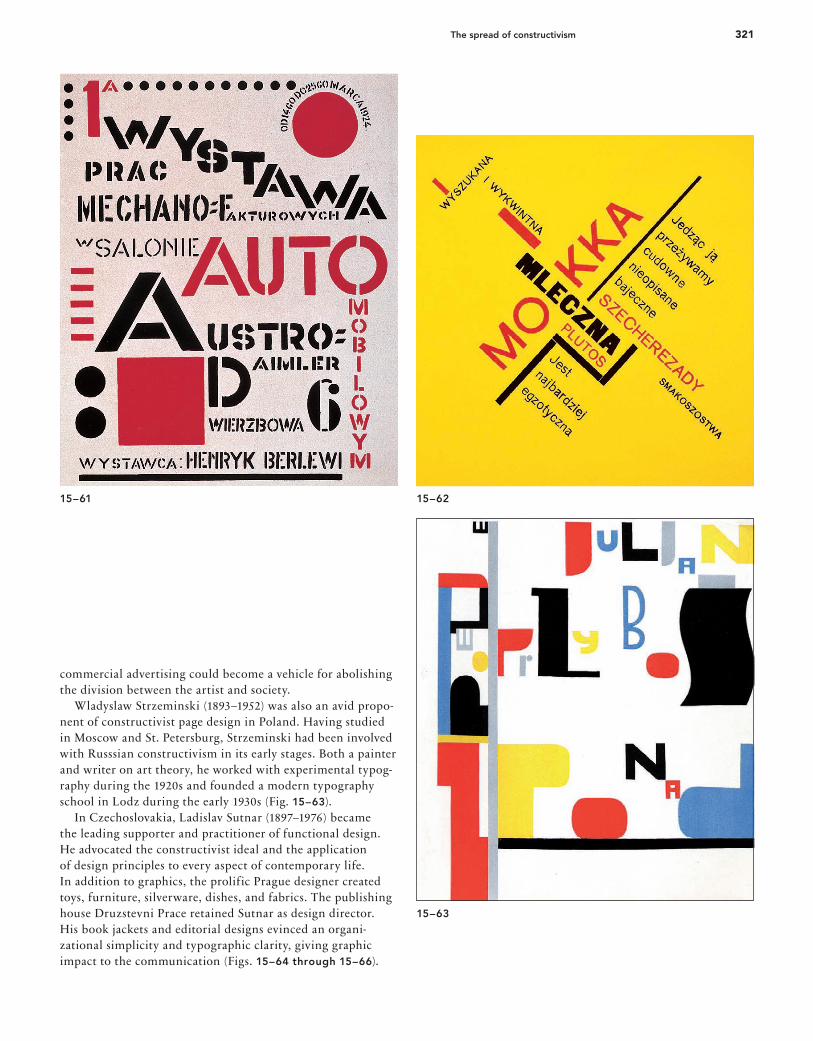
15–61. Henryk Berlewi, exhibition
poster, 1925. This early application of
mechano-faktura principles to graphic
design is for an exhibition held in a
Warsaw automobile showroom.
15–62. Henryk Berlewi, Plutos
Chocolates brochure, page 6, 1925.
Copywriter Aleksander Wat collabo-
rated closely with Berlewi to integrate
text and form.
15–63. Wladyslaw Strzeminski, cover
for Z ponad, a collection of poems
by Julian Przybos, 1930. The cover
design is indicative of Strezeminski’s
background as a constructivist painter.
designer Henryk Berlewi (1894–1967) was decisively influenced by Lissitzky’s 1920 Warsaw lectures. In 1922 and 1923, Berlewi worked in Germany and began to evolve his mechano-faktura theory. Believing that modern art was filled with illusion-istic pitfalls, he mechanized painting and graphic design (Fig. 15–61) into a constructed abstraction that abolished any illusion of three dimensions. This was accomplished by mathematical placement of simple geometric forms on a ground. The mechanization of art was seen as an expression of industrial society. In 1924 Berlewi joined the futurist poets Aleksander Wat and Stanley Brucz in opening a Warsaw advertising firm called Roklama Mechano. They introduced modern art forms to Polish society in industrial and commercial advertisements. Their brochure stated that advertising design and costs should be governed by the same principles that govern modern industry and the laws of economy. Advertising copy was reorganized for conciseness and impact, and visual layout was adapted to this text (Fig. 15–62). Berlewi hoped that
16_9780470168738-ch15.indd 32016_9780470168738-ch15.indd 320 9/9/11 8:03 PM9/9/11 8:03 PM
321The spread of constructivism
15–61
15–63
15–62
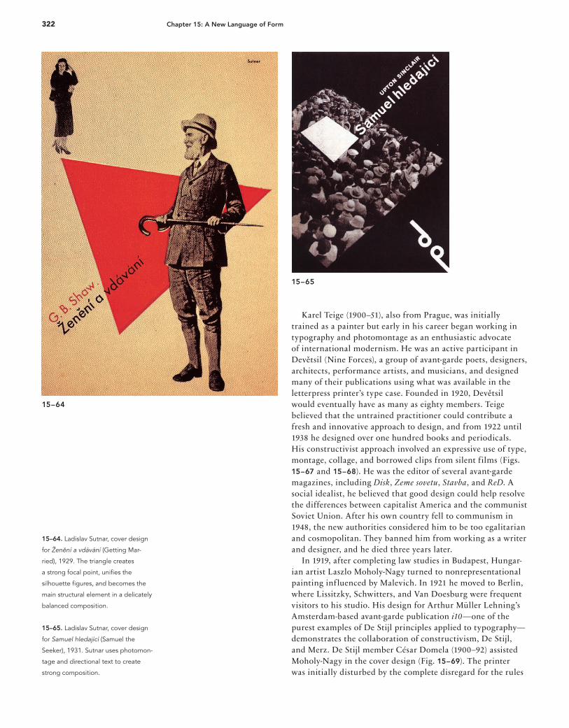
commercial advertising could become a vehicle for abolishing the division between the artist and society. Wladyslaw Strzeminski (1893–1952) was also an avid propo-nent of constructivist page design in Poland. Having studied in Moscow and St. Petersburg, Strzeminski had been involved with Russsian constructivism in its early stages. Both a painter and writer on art theory, he worked with experimental typog-raphy during the 1920s and founded a modern typography school in Lodz during the early 1930s (Fig. 15–63). In Czechoslovakia, Ladislav Sutnar (1897–1976) became the leading supporter and practitioner of functional design. He advocated the constructivist ideal and the application of design principles to every aspect of contemporary life. In addition to graphics, the prolific Prague designer created toys, furniture, silverware, dishes, and fabrics. The publishing house Druzstevni Prace retained Sutnar as design director. His book jackets and editorial designs evinced an organi-zational simplicity and typographic clarity, giving graphic impact to the communication (Figs. 15–64 through 15–66).
16_9780470168738-ch15.indd 32116_9780470168738-ch15.indd 321 9/9/11 8:03 PM9/9/11 8:03 PM
322 Chapter 15: A New Language of Form
15–64
15–65
15–64. Ladislav Sutnar, cover design
for Ženení a vdávání (Getting Mar-
ried), 1929. The triangle creates
a strong focal point, unifi es the
silhouette fi gures, and becomes the
main structural element in a delicately
balanced composition.
15–65. Ladislav Sutnar, cover design
for Samuel hledající (Samuel the
Seeker), 1931. Sutnar uses photomon-
tage and directional text to create
strong composition.
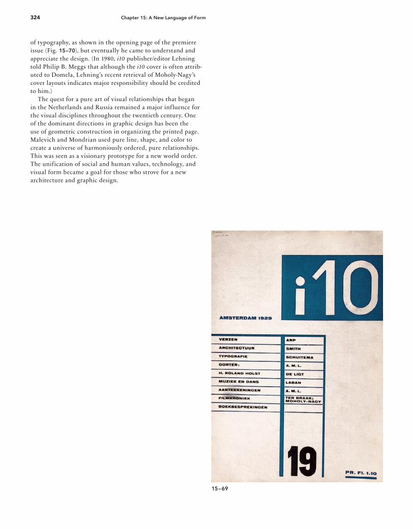
Karel Teige (1900–51), also from Prague, was initially trained as a painter but early in his career began working in typography and photomontage as an enthusiastic advocate of international modernism. He was an active participant in Devetsil (Nine Forces), a group of avant-garde poets, designers, architects, performance artists, and musicians, and designed many of their publications using what was available in the letterpress printer’s type case. Founded in 1920, Devetsil would eventually have as many as eighty members. Teige believed that the untrained practitioner could contribute a fresh and innovative approach to design, and from 1922 until 1938 he designed over one hundred books and periodicals. His constructivist approach involved an expressive use of type, montage, collage, and borrowed clips from silent films (Figs. 15–67 and 15–68). He was the editor of several avant-garde magazines, including Disk, Zeme sovetu, Stavba, and ReD. A social idealist, he believed that good design could help resolve the differences between capitalist America and the communist Soviet Union. After his own country fell to communism in 1948, the new authorities considered him to be too egalitarian and cosmopolitan. They banned him from working as a writer and designer, and he died three years later. In 1919, after completing law studies in Budapest, Hungar-ian artist Laszlo Moholy-Nagy turned to nonrepresentational painting influenced by Malevich. In 1921 he moved to Berlin, where Lissitzky, Schwitters, and Van Doesburg were frequent visitors to his studio. His design for Arthur Müller Lehning’s Amsterdam-based avant-garde publication i10—one of the purest examples of De Stijl principles applied to typography—demonstrates the collaboration of constructivism, De Stijl, and Merz. De Stijl member César Domela (1900–92) assisted Moholy-Nagy in the cover design (Fig. 15–69). The printer was initially disturbed by the complete disregard for the rules
16_9780470168738-ch15.indd 32216_9780470168738-ch15.indd 322 9/9/11 8:03 PM9/9/11 8:03 PM
323The spread of constructivism
15–66
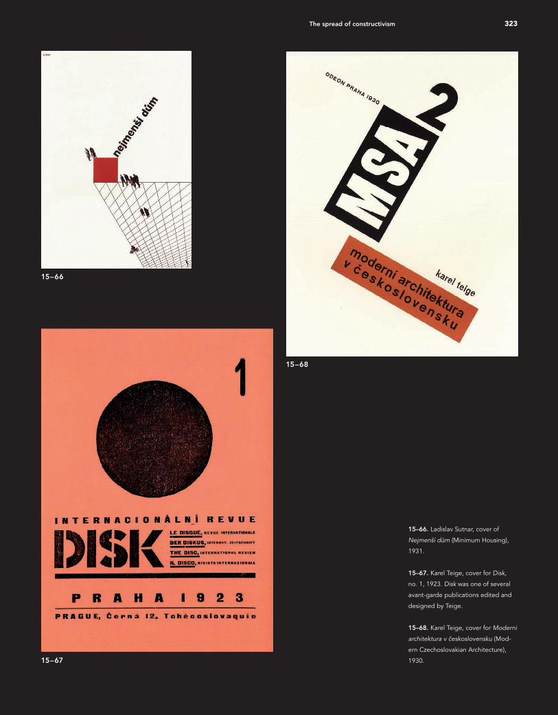
15–67
15–66. Ladislav Sutnar, cover of
Nejmenší dum (Minimum Housing),
1931.
15–67. Karel Teige, cover for Disk,
no. 1, 1923. Disk was one of several
avant-garde publications edited and
designed by Teige.
15–68. Karel Teige, cover for Moderni
architektura v ceskoslovensku (Mod-
ern Czechoslovakian Architecture),
1930.
15–68
16_9780470168738-ch15.indd 32316_9780470168738-ch15.indd 323 9/9/11 8:03 PM9/9/11 8:03 PM
324 Chapter 15: A New Language of Form
of typography, as shown in the opening page of the premiere issue (Fig. 15–70), but eventually he came to understand and appreciate the design. (In 1980, i10 publisher/editor Lehning told Philip B. Meggs that although the i10 cover is often attrib-uted to Domela, Lehning’s recent retrieval of Moholy-Nagy’s cover layouts indicates major responsibility should be credited to him.) The quest for a pure art of visual relationships that began in the Netherlands and Russia remained a major influence for the visual disciplines throughout the twentieth century. One of the dominant directions in graphic design has been the use of geometric construction in organizing the printed page. Malevich and Mondrian used pure line, shape, and color to create a universe of harmoniously ordered, pure relationships. This was seen as a visionary prototype for a new world order. The unification of social and human values, technology, and visual form became a goal for those who strove for a new architecture and graphic design.
15–69
16_9780470168738-ch15.indd 32416_9780470168738-ch15.indd 324 9/9/11 8:03 PM9/9/11 8:03 PM
325The spread of constructivism
15–69. Laszlo Moholy-Nagy, cover
design for i10, 1929. The designer
saw type as form and texture to be
composed with a rectangle, lines, and
spatial intervals to achieve dynamic
equilibrium. Clarity of communication
and harmony of form are achieved.
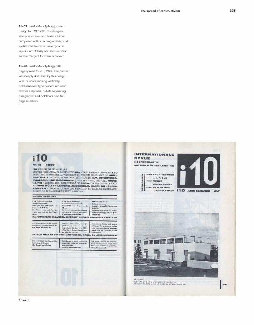
15–70. Laszlo Moholy-Nagy, title
page spread for i10, 1927. The printer
was deeply disturbed by this design,
with its words running vertically,
bold sans-serif type placed into serif
text for emphasis, bullets separating
paragraphs, and bold bars next to
page numbers.
15–70
16_9780470168738-ch15.indd 32516_9780470168738-ch15.indd 325 9/9/11 8:04 PM9/9/11 8:04 PM