Embed Size (px)
Citation preview

Steven LangfordGeography 90
TH 5:30-9:30Professor Jennings
Bucket List Map Creation
For my final project I decided to create a functional map for my personal ambitions. As a die-hard sports fan, road trip junkie, and avid outdoor adventure seeker, I have always loved making elaborate vacations happen. As a way of ensuring that throughout my lifetime I see both the core of huge cities as well as the beautiful open spaces in between, I made it my life goal to see all 30 MLB stadiums as well as all 56 National Parks. In this project I wanted a way to document my progress on those “bucket lists”. In order to visually depict this I needed to create a map for the continental US as well as the outlying states and territories which contain numerous National Parks. Thus, this map is a snapshot of my progress in these quests as well as serving as wall art for years to come.
To begin this project I first needed a base map of the United States and surrounding areas onto which I wanted to create my map. For this I shuffled through the countless options for basemaps in the Arc GIS catalog. Since the purpose of my map is to detail both details of city structures as well as park boundaries, varying in size, I chose a basic road map detailing major cities as well as several freeways throughout the country. This was not an easy process as I tangled with several other options, from basic country outlines to detailed TOPO maps. Ultimately I decided on the road map because of its informative labeling and color scheme. My next step was to find a data set online for National Park identification. I was able to find a fantastic data set from the National Parks website, detailed in the photo below:

After the initial download of the data set, I then had to extract the files and format them into conducive shape files that would apply to my map, pictured in the following image:
I then opened the files and they appeared as so onto my base map (of which I later changed on my map):

This initial data was a great source for park boundaries, but it contained an extensive amount of data on not only the National Parks, but also for all other federally owned lands. If I were to leave this data untouched, it would have been a very cluttered map and distracted from my original intent. Since I wanted to detail only my progress on National Park visits, I opened the attribute table on this data and selected only the National Parks using the tool select by attribute:
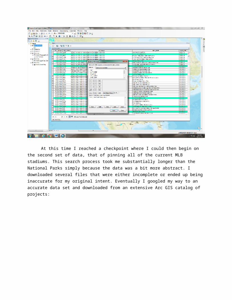
At this time I reached a checkpoint where I could then begin on the second set of data, that of pinning all of the current MLB stadiums. This search process took me substantially longer than the National Parks simply because the data was a bit more abstract. I downloaded several files that were either incomplete or ended up being inaccurate for my original intent. Eventually I googled my way to an accurate data set and downloaded from an extensive Arc GIS catalog of projects:
This user’s original project was a much more complex set of data as it detailed the historical location of since destroyed MLB stadiums, as well as current locations of stadiums. From this initial data download, I then opened the attribute table manually and selected the appropriate stadiums for my map. After selecting all of the desired locations, I created a new layer from my selection:

This layer was then divided into two new layers, both of which I selected manually from the attribute table. This seemed to be the most appropriate technique to divide the stadiums and National Parks into two categories, locations I’ve visited and locations yet to be seen. The different labels are located in the legend in the corner of the finished map.
Once I was able to separate the different layers I needed for visual categorization, I then spent an extensive amount of time in the labeling tools for my data sets. I wanted to both have a finished visual look to the data, but something that was going to look unique to my project and something that was “original”. This turned out to be a painstakingly tedious process as there is an endless amount of ways to label and visually display the information I wanted to be on my finished project. Eventually I ended on the following combination of colors and labels:
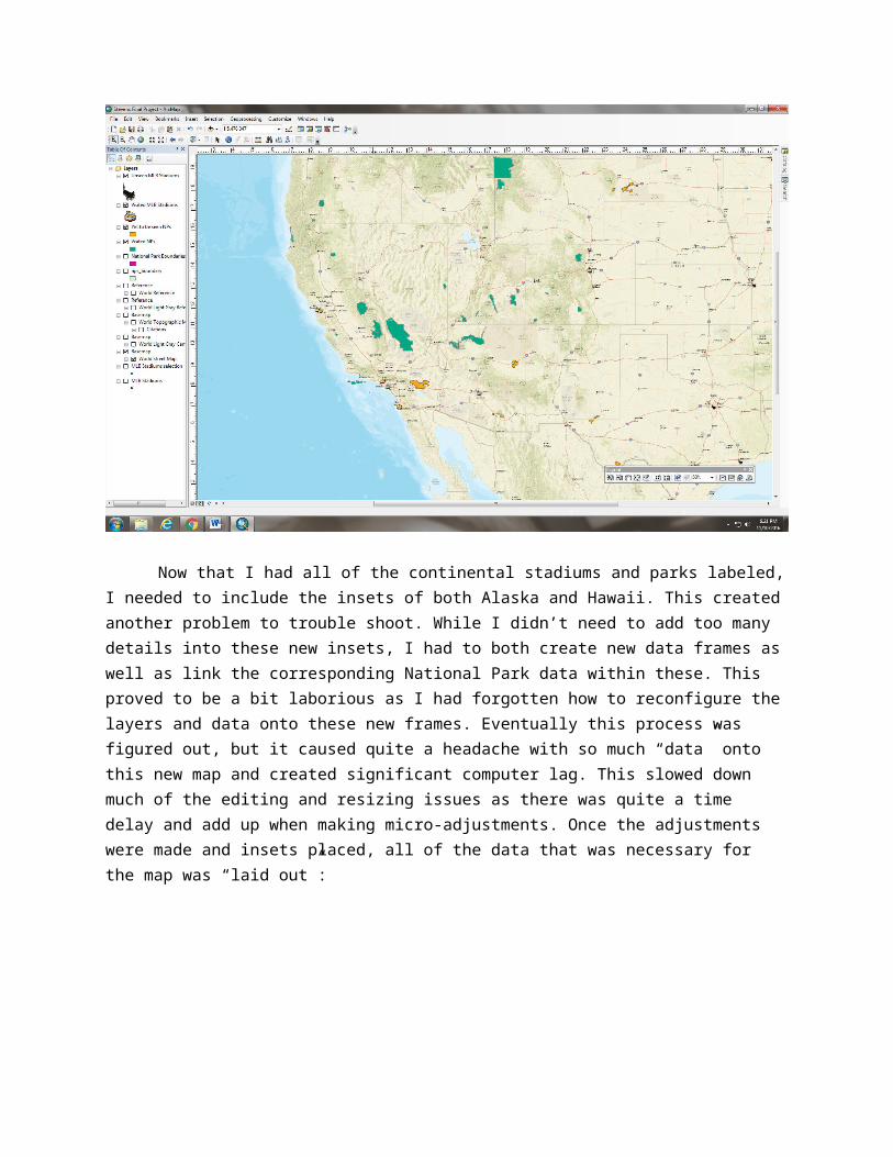
Now that I had all of the continental stadiums and parks labeled, I needed to include the insets of both Alaska and Hawaii. This created another problem to trouble shoot. While I didn’t need to add too many details into these new insets, I had to both create new data frames as well as link the corresponding National Park data within these. This proved to be a bit laborious as I had forgotten how to reconfigure the layers and data onto these new frames. Eventually this process was figured out, but it caused quite a headache with so much “data” onto this new map and created significant computer lag. This slowed down much of the editing and resizing issues as there was quite a time delay and add up when making micro-adjustments. Once the adjustments were made and insets placed, all of the data that was necessary for the map was “laid out”:

Now that all of the data was laid out onto my map, the last step was to finalize the layout and insert a legend. This final process was not too time consuming, but the final map came out like this:
Throughout this project I suffered many setbacks, the largest being data organization on my flash drive. For the first few weeks working on this project I did not have access to my personal flash drive so I was saving all of my progress onto the computer and then emailing myself the majority of the data. However, I did not have a full understanding of the data storage process. This caused me a lot of headaches as I essentially had to reconfigure my work for 2 straight weeks. With the assistance of the professor and fellow students I was able to gain a better understanding of saving layers vs data sets vs data points and many of the details in between. While I didn’t end up needing/using any of the more advanced tools we used throughout the semester, I did find a lot of walls simply throughout the formatting process. My goal in this project was to create a finished product that I could laminate and put on my wall, so much of my effort was put towards the aesthetics of the map.
As I created and edited this final project, I was afforded many learning opportunities. Much of the content throughout the semester was very challenging for me as I am a bit slower on the technical components of the ArcMap program, but this project allowed me to gain more comfort with many of its features at my own pace. I was able to learn much more about the editing process as well as the uploading of online data sets. This project allowed me a lot of room for original creativity while also collaborating with my peers to use new program features and capabilities. This project also taught me a lot about the importance of organization when working with such complex programs. Each file and title name should correspond to a specific process and step within each project completed. While much of the ArcMap program and capabilities remains foreign to me, I feel much better equipped to problem solve within it and create a detailed, finished product.
Creating this map has been a fleeting idea in my head for many years now and I was very excited for the opportunity to put the idea to use for our class. With the realities of working with detailed software like ArcMap, many of my initial visions for the product proved to be a bit more difficult than I anticipated. However, I thoroughly enjoyed his project as it provided me with great learning opportunities and opened my eyes to the vast world of GIS. I was very pleased with the challenges that this project presented and gave me great feelings of satisfaction to problem solve along the way. Overall, completing this project has given me an appreciation for the booming industry of GIS and I am very excited to use my knowledge learned in this class to understand the many uses of digital mapmaking.