Embed Size (px)
Citation preview
Presenting InformationWho needs to present information well?Bad information design confronts us every day. Posters and flyers force us to hunt for basic information such as where, when, who, what, and why. Reports lack clear formatting that would help us find information quickly; graphics appear in reports with no explanatory text or titles. We routinely hear talks that meander with no clear point, while slide decks inundate us with lengthy bulleted lists and distracting animation. Whether the presentation is numerical, visual, textual, or verbal, bad design choices hinder our ability to comprehend and use information.
As information professionals, we, of all people, ought to know better than to present information poorly. This course is one attempt to make sure we do. But mostly, it is an opportunity for us to have fun exploring new areas while learning how to be good presenters of information. If you think you’ll like learning how to design for vision and cognition, why white space is your friend, why tables look better with shading than with grid lines, and why “tell them where you’re going, tell them where you are, tell them where you’ve been” is a bit tired as a plan for talk outlines, this course is for you. Note this course is not a course on data visualization, which we offer separately at the iSchool; by including topics such as report writing and giving verbal presentations, this course is much broader than data visualization, and it tends to deal with smaller datasets.
Although our time together will be slanted towards gaining practical skills, we will build up these skills based on our understanding of fundamental theories in areas such as cognitive psychology and communication that explain how people perceive and construe sensory input. Thus, I welcome students who are curious about the theory behind and the techniques of presentation, who are keen to add to their professional toolkit, who can work independently (no group projects), and who, in class, are willing to contribute in a friendly, non-competitive manner to facilitate learning in an active and open class environment. My goal in offering this course is to prepare you for your professional career by helping you acquire the skills and
1
INF385T.1
PROFESSOR DIANE BAILEY
UTA [email protected].
edudo not leave vm
TA[name][room][email]
[phone]
COURSE INFOUnique #
Monday 12-3UTA 1.210A
Computer Lab Teaching Room
This room permits no food or drinks except
water in spill-proof containers, but you can leave your coffee in the main lab to drink during
break
knowledge needed to present information well in numerical, visual, textual, and verbal form.What materials do you need for this course?Hardware and software that the school will supply
With classes held in the computer lab, you’ll have full access to desktop machines and all the software that we will use in this course. You can also bring your laptop; the software that we will use is often freely downloadable. However, not all packages are available for or work well on Macs, which may mean you’ll need the desktops for some assignments.
Physical implements that you must supply (bring to class week 2)
Calculator (what is on your phone or laptop is fine). Wooden (preferred) or rigid plastic ruler.
Books that you must purchase (bring to class on appropriate day, used copies are fine)
Few, Stephen. 2013. Information Dashboard Design: Displaying Data for At-a-Glance Monitoring. Burlingame, CA: Analytics Press. (ok to buy his 2006 book with different subtitle from O’Reilly).
~$20
Reynolds, Garr. 2011. Presentation Zen: Simple Ideas on Presentation Design and Delivery. 2nd edition, Berkeley, CA: New Riders.
~$9
Roman, K. and Raphaelson, J. 2000. Writing that Works: How to Communicate Effectively in Business, 3rd Edition. Collins.
~$4
Williams, Robin. 2015. The Non-Designer’s Design Book, Fourth Edition. San Francisco, CA: Peachpit Press.
~$14
A grammar book of your choice. Here’s a favorite of mine: Thurman, Susan. 2003. The Only Grammar Book You’ll Ever Need: A One-Stop Source for Every Writing Assignment.
~$5
2
In this course, you will learn how to: Design tables and graphs
that fit and showcase the data
Design an information dashboard to display key metrics to managers, having worked with managers to gain data and understand needs
Master the basics of clean layout and design, and then apply your new skills in creating effective posters, infographics, reports, and slides
Give talks that allow people to hear and see your message
Assemble slide decks that illustrate your words, support your points, and transform your talk
Prepare succinct, information-rich reports that get read
Work with various graphical design and presentation software packages (specifically, Excel, Qlik, Photoshop, Word, and Piktochart), beginning with in-class tutorials followed by independent exploration and learning
Grasp theoretical underpinnings from fields such as cognitive psychology and communication so that you understand how the senses and brain work
Avon, Mass.: Adams Media.
total ~$48
Articles and book chapters that the school provides for you (find them on Canvas)
Cleveland, William S. 1984. Graphs in scientific publications. The American Statistician, 38(4): 261-269.Cleveland, William S. and McGill, Robert. 1985. Graphical perception and graphical methods for
analyzing scientific data. Science, 229(4716): 828-833.Grant, Elizabeth R. and Spivey, Michael J. 2003. Eye movements and problem solving: Guiding attention
guides thought. Psychological Science, 14(5): 462- 466.Heath, C. & Heath, D. 2008. Making your presentation stick. From their website:
http://heathbrothers.com/resources/.Hegarty, Mary. 2011. The cognitive science of visual-spatial displays: Implications for design. Topics in
Cognitive Science, 3:446-474.Kosslyn, Stephen M. 1989. Understanding charts and graphs. 1989. Applied Cognitive Psychology, 3:185-
226.McCabe, David P. and Catel, Alan D. 2008. Seeing is believing: The effect of brain images on judgments
of scientific reasoning. Cognition, 107: 343-352.Savoy, April, Proctor, Robert W., and Salvendy, Gavriel. 2009. Information retention from PowerPointTM
and traditional lectures. Computers & Education, 52: 858-867.Schwabish, Jonathan A. 2012. Infographics at the Congressional Budget Office. IEEE Conference on
Visual Analytics Science and Technology, Seattle, WA, 141-142.Smith, Laurence D., Best, Lisa A., Stubbs, D. Alan, Archibald, Andrea Bastiani, and Robertson-Nay,
Roxann. 2002. Constructing knowledge: The role of graphs and tables in hard and soft psychology. American Psychologist, 57(10): 749-761.
3
What are the assignments in this course?There are six creative products due in this course and three talks; among these nine assignments, none is a group project. My sense is that you do plenty of group projects in our program, and I want each of you to gain all the skills in this course, not rely on someone else for them. Therefore, I expect you to hand in assignments that reflect what you have learned and your individual effort, not others’ effort. I encourage you, however, to seek your peers’ help, advice, and feedback. For example, your peers may show you a software trick to solve a problem you cannot resolve on your own or they may critique your design and offer ideas to improve it. In short, I want to free you from the binds of collaboration and coordination that group projects typically entail while allowing you to learn from and with each other.
Follow instructionsIn the assignment descriptions, I tell you what you need to do, how to do it, what to hand in and how to do so, and what I will look for when grading your work. Read each set of instructions three times:
First, read the instructions at the beginning of the semester so that you know what to expect. Block out time on your calendar to do the work (maybe twice what you estimate). These dates will not change.
When the time comes to do the work, read the instructions a second time.
Before you hand in your work, read the instructions one last time to make sure
Tables and graphs
What to Do and How to Do It. You will receive a handout with instructions for designing a set of tables in Excel, constructing several graphs in Excel, and writing up a short explanation of your design choices. We will have a tutorial on Excel, which you must use for this assignment.
What to Hand in and How to Do So. Before class, submit to me by email (not Canvas) two items: a revised Excel spreadsheet for the tables and a slide deck (.ppt, .pptx, or .pdf) into which you will have pasted the charts. Neither of these items should exceed 1 MB in size. If yours exceed that size, seek help from the purple shirts to reduce them before sending to me. Bring to class a printed, stapled document with your design explanation. See the handout for details of what I require for each item. Heed well the box “Turn Stuff In On Time” in this syllabus: send files before class and bring your document at the beginning of class. I won’t repeat this warning in future assignment descriptions, and I do deduct half a grade if your work is not ready at the absolute beginning of class.
What I Will Look for When Grading. I will grade this assignment based on how well you follow the design principles for tables and graphs that we will discuss in class, including formatting for ease of reading and finding information. Your grade will suffer if you violate those principles and if you fail to heed the tips in the handout and the advice I give to you in class. For example, I will instruct you to order columns so that newest data are first; thus, if you fail to reorder the data columns, I will lower your grade. Similarly, the handout will provide information about data that are unnecessary for the decision-making task your design is meant to aid (e.g., cancelled or shared databases); inclusion of those data in your main table will also result in a lowered grade (you are to place them in separate tables). Likewise, if you submit for the correlation chart a chart that does not show the possible correlation between two variables as an x-y scatterplot with a linear trendline, or for the time series chart a chart that does not show change in a single variable over time, I will lower your grade.
4
Follow instructionsIn the assignment descriptions, I tell you what you need to do, how to do it, what to hand in and how to do so, and what I will look for when grading your work. Read each set of instructions three times:
First, read the instructions at the beginning of the semester so that you know what to expect. Block out time on your calendar to do the work (maybe twice what you estimate). These dates will not change.
When the time comes to do the work, read the instructions a second time.
Before you hand in your work, read the instructions one last time to make sure
Dashboard and dashboard written description
What to Do and How to Do It. You will design an information dashboard for an organization of your choice. The organization must be real. The organization must agree to your plan to build a dashboard for them and should be willing to provide you with the necessary information to do so. To convince an organization that they could use a dashboard for internal (staff) or external (public or client) use, you might show them some examples; just type “information dashboard” into Google images, or direct them to this one at a museum: http://dashboard.imamuseum.org/. Getting data, cleaning data, and understanding manager’s information needs take time, so start early in your search for an organization. Your dashboard must have a minimum of six tables and graphs (including maps); work out with the manager what they might be.
Our class tutorial will introduce you to Qlik, an information dashboard software application. You need not complete your assignment in Qlik; you may instead use Tableau (also a dashboard software), Excel, PowerPoint, or another program. However, I would note that employers favor experience with Qlik and Tableau; every year students tell me they got interviews based on this experience. No matter which software you use, your dashboard must render its charts, tables, and other graphics from actual data. Thus, for example, if you claim that a chart has a filter that allows displays of different data, you must show that to be true (e.g., include views of several possibilities if the views are from a large set, such as by year over a 20-year period, and all views if from a small set). Ultimately, you are responsible only for the front-end design of the dashboard and not for any back-end programming that would update information automatically.
What to Hand in and How to Do So. You will submit the dashboard design as a digital file by email (not Canvas) to me before class. If you use Qlik, send me the qvf file, which you will find in this directory on your machine: C:\Users\USERNAME\Documents\Qlik\Sense\Apps. If you use Tableau, save your dashboard as a packaged workbook and send me the twbx file; this file packages any needed data with your dashboard. Else, send your file as a .pdf exported from the dashboard software or other software that you employed.
Bring to class a printed, stapled written description of the dashboard’s details: what information it displays, why the dashboard displays information the way it does, and why the dashboard includes the information that it does (for example, what the information’s relevance to the organization is). Your description should begin with a one-paragraph description of the organization. You should include in your description a brief discussion of information that you considered for, but chose not to include on, the dashboard. In your description, use headings that reflect the items I list here to render my reading easier.
What I Will Look for When Grading. I will grade your work based on how well you address each of the items above in your written description in addition to the quality of the dashboard itself. I will judge a dashboard’s quality based on the readability of its components, the sense that a viewer can readily make of it, the perceived value that the organization would gain from it, the perceived appropriateness of the quantity and type of information that you display and the form (graph, table) in which you display it, and your attention to detail. I will not grade the description as a report (as a written presentation of information) because at this stage we will not yet have covered those skills. Nonetheless, a clear, logical description free of grammatical and typographical errors will aid your cause. I expect the written description (not counting the printed dashboard) to be at least three pages long and not more than five. Use 12-point font and minimum 1.15 line spacing.
5
6
Turn Stuff in On TimeI think that meeting deadlines is good preparation for a professional career: every design might benefit from extra time, but most deliverables at work need to done on time for a client, program, or project deadline. In addition, I have already set time aside on my calendar to grade each assignment in this course. When you hand your work in late, you require me to find a new time, just for you and separate from your classmates, to grade your work, which isn’t being respectful of my time. Thus, you will lose half a letter grade (e.g., A becomes A-, A- becomes B+, and so on) if your materials are not submitted before class, or in some cases as described below, ready by the very beginning of class on their due date. You will lose another half a grade per additional weekday late. When handing in your work, please do not tell me that your work is late or constructed inappropriately because a printer was not working in the lab, the software failed at the last minute, or you could not find a stapler. After
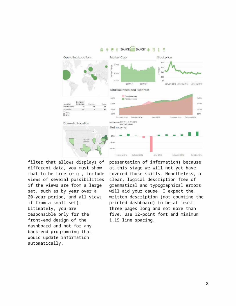
Student Chun-Wei Chen built
this dashboard
to show financial
information for his
favorite burger
joint.
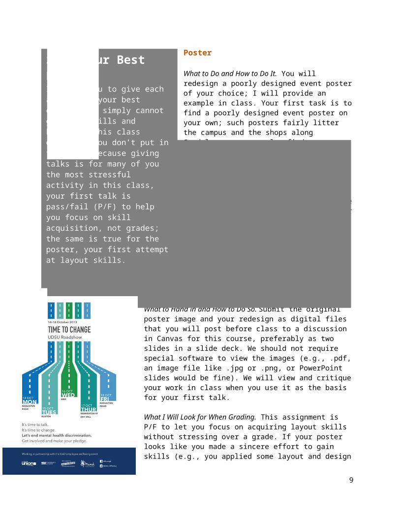
Poster
What to Do and How to Do It. You will redesign a poorly designed event poster of your choice; I will provide an example in class. Your first task is to find a poorly designed event poster on your own; such posters fairly litter the campus and the shops along Guadalupe; you may also find one online. Capture an image of the poster you wish to redesign via a camera picture or an online snapshot; make sure the image is clear. Redesign the poster following the design principles we will discuss in class as well as the ones in the reading assignment. In your redesign, convey the same basic information that the original poster did (you may remove extraneous information), but in a better way. You may use Photoshop, for which we will have a tutorial in class, or any other design software (PowerPoint is also fine).
What to Hand in and How to Do So. Submit the original poster image and your redesign as digital files that you will post before class to a discussion in Canvas for this course, preferably as two slides in a slide deck. We should not require special software to view the images (e.g., .pdf, an image file like .jpg or .png, or PowerPoint slides would be fine). We will view and critique your work in class when you use it as the basis for your first talk.
What I Will Look for When Grading. This assignment is P/F to let you focus on acquiring layout skills without stressing over a grade. If your poster looks like you made a sincere effort to gain skills (e.g., you applied some layout and design principles that we will have discussed in class), you will get a P, else, not.
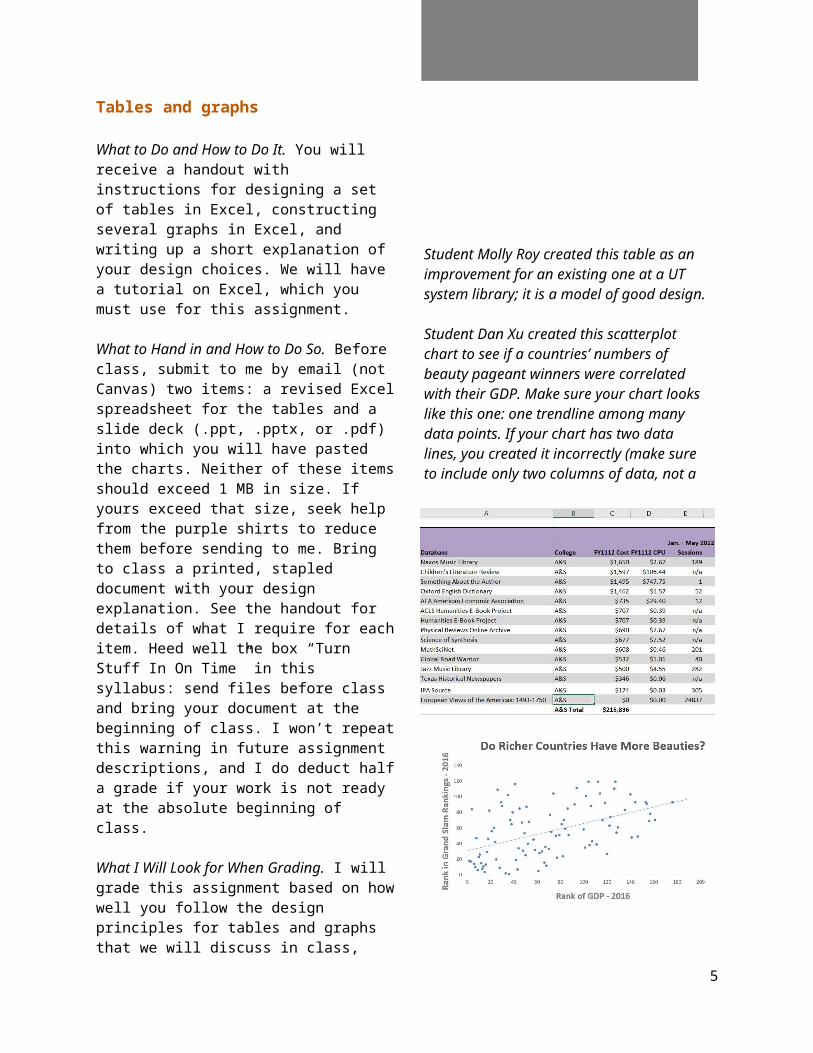
Student Serena Mistry created this poster as an improvement overa poorly designed poster that she saw.
7
Show Your Best EffortI expect you to give each assignment your best effort; you simply cannot gain the skills and knowledge this class offers if you don’t put in the time. Because giving talks is for many of you the most stressful activity in this class, your first talk is pass/fail (P/F) to help you focus on skill acquisition, not grades; the same is true for the poster, your first attempt at layout skills.
Assignment %Tables and Graphs 10%Dashboard and Description
20%
Poster (P/F) 5%
Infographic
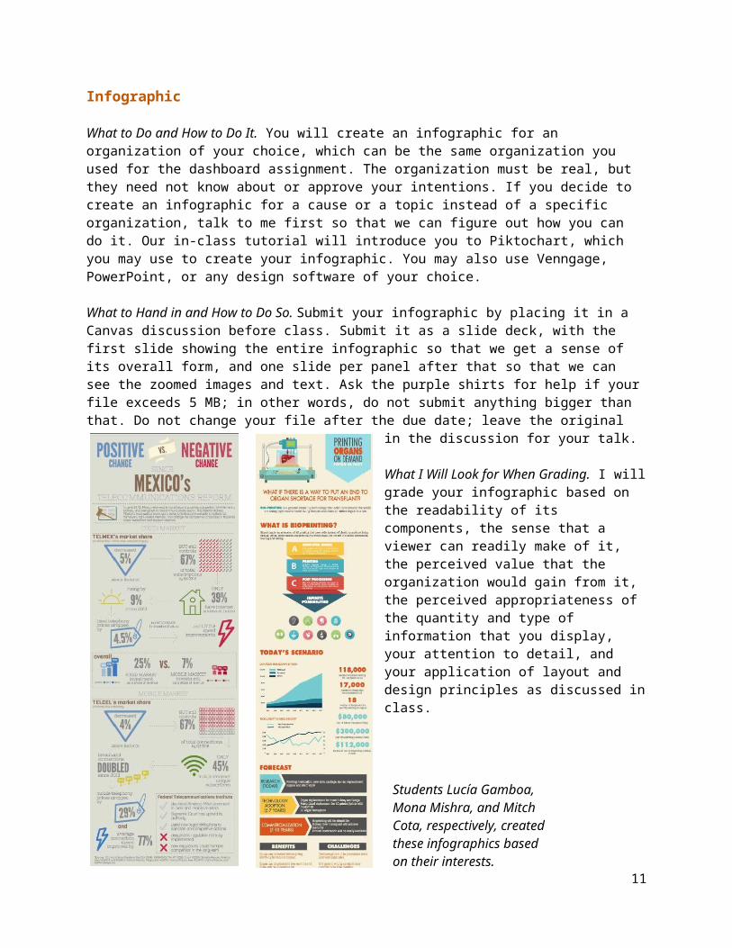
What to Do and How to Do It. You will create an infographic for an organization of your choice, which can be the same organization you used for the dashboard assignment. The organization must be real, but they need not know about or approve your intentions. If you decide to create an infographic for a cause or a topic instead of a specific organization, talk to me first so that we can figure out how you can do it. Our in-class tutorial will introduce you to Piktochart, which you may use to create your infographic. You may also use Venngage, PowerPoint, or any design software of your choice.
What to Hand in and How to Do So. Submit your infographic by placing it in a Canvas discussion before class. Submit it as a slide deck, with the first slide showing the entire infographic so that we get a sense of its overall form, and one slide per panel after that so that we can see the zoomed images and text. Ask the purple shirts for help if your file exceeds 5 MB; in other words, do not submit anything bigger than that. Do not change your file after the due date; leave the original in the discussion for your talk.
What I Will Look for When Grading. I will grade your infographic based on the readability of its components, the sense that a viewer can readily make of it, the perceived value that the organization would gain from it, the perceived appropriateness of the quantity and type of information that you display, your attention to detail, and your application of layout and design principles as discussed in class.
8
Students Lucía Gamboa, Mona Mishra, and Mitch Cota, respectively, created these infographics based on their interests.
Written Report
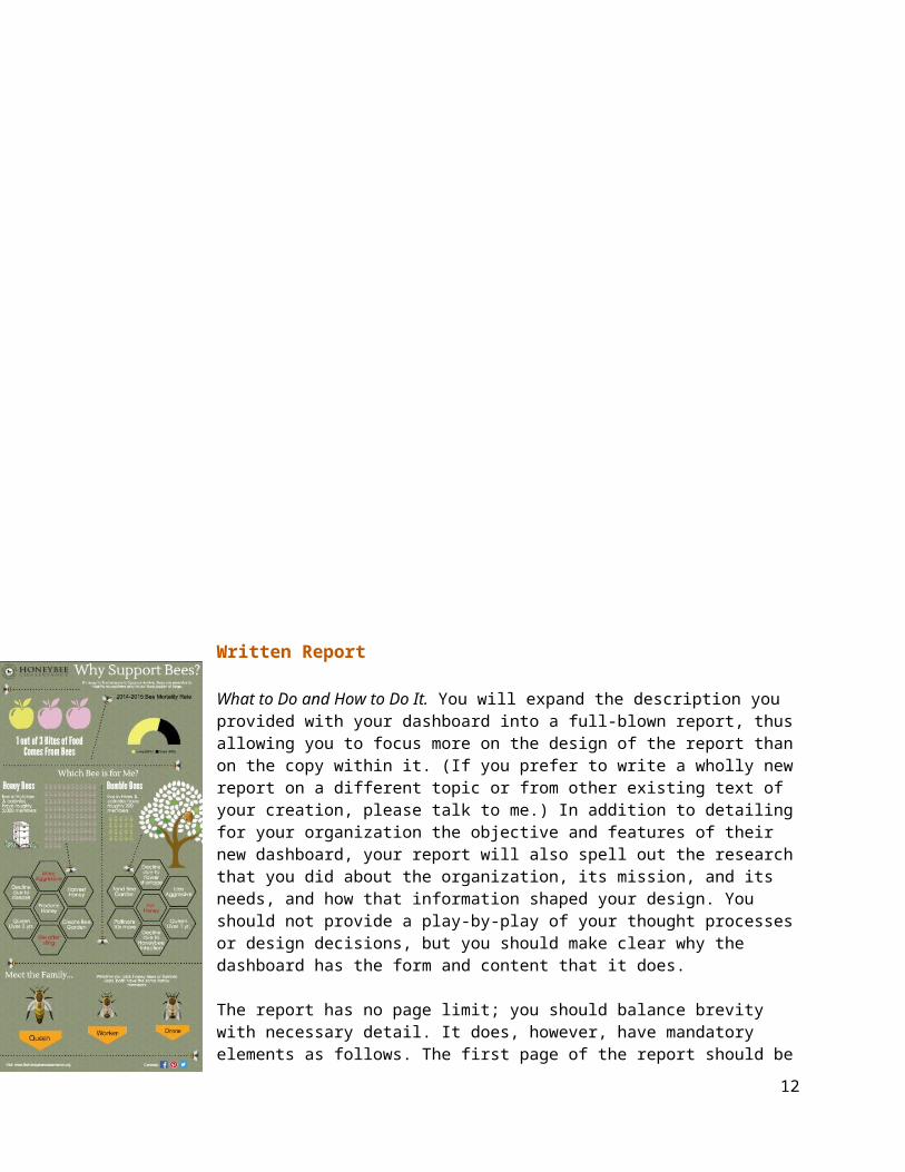
What to Do and How to Do It. You will expand the description you provided with your dashboard into a full-blown report, thus allowing you to focus more on the design of the report than on the copy within it. (If you prefer to write a wholly new report on a different topic or from other existing text of your creation, please talk to me.) In addition to detailing for your organization the objective and features of their new dashboard, your report will also spell out the research that you did about the organization, its mission, and its needs, and how that information shaped your design. You should not provide a play-by-play of your thought processes or design decisions, but you should make clear why the dashboard has the form and content that it does.
The report has no page limit; you should balance brevity with necessary detail. It does, however, have mandatory elements as follows. The first page of the report should be a cover page containing, at a minimum, the report title, your name, the date submitted, and the organization’s name. An executive summary labeled as such and no longer than one page, should directly follow the cover page. A table of contents should appear on the next page. Following the table of contents (perhaps on the same page if room permits) should be a list of figures (by label, title, and page number) and a list of tables (same information). We will discuss in class how to craft tightly written, informative executive summaries and design-rich, informative tables of content and lists of figures and tables. The balance of the report should feature orderly sections with subheadings. Use graphics such as tables and figures, all neatly titled and labeled, to help convey data-rich information. Attach with a paper clip to the front of the report a one-paragraph letter of transmittal addressed to a contact at the organization. We will discuss in class the format and purpose of this letter.
You must include in your report all the elements that appear in your dashboard (i.e., each table, map, and chart on the dashboard must be a separate table or figure in the report). Remember to follow the design guidelines we discussed early in the semester for the design and display of tables and charts. For example, do not repeat a title at the top of a chart (embedded in it) and the title below it with the label; instead, remove the embedded title. Choose line spacing and font sizes that best serve your design, but maintain one-inch margins.
Our in-class tutorial will introduce you to the desktop publishing features of Word. You may complete this assignment using Word or any desktop publishing software (e.g., Scribus, InDesign).
What to Hand in and How to Do So. Bring a printed copy of your report to class; do not email it to me. Staple your report, and, if possible, print it double-sided. A plastic cover or any binding other than a staple is not acceptable. Students often like to use color printing for this report, but routinely have problems with the printer before class. Do not put off printing your report until right before it is due.
What I Will Look for When Grading. I will grade your report based on solid writing (including good grammar), logical organization, coherent presentation, quality of content, good design (including recognition of design principles), and conformity to the specifications detailed here. As I will explain in class, I am not looking for a typical typed class paper. Rather, I am looking for a professional report, often with two columns and multiple graphical elements. The design of this syllabus should give you some sense of the type of design I am looking for in the sections of your report; I created this syllabus with Word.
9
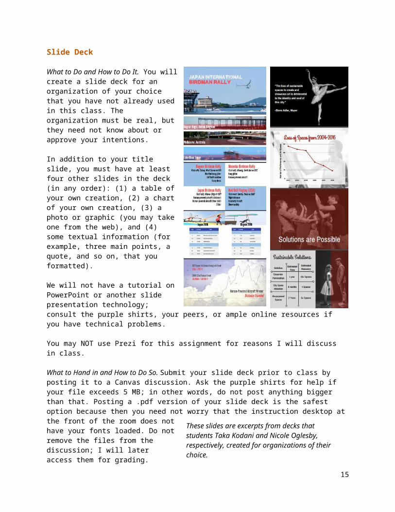
Slide Deck
What to Do and How to Do It. You will create a slide deck for an organization of your choice that you have not already used in this class. The organization must be real, but they need not know about or approve your intentions.
In addition to your title slide, you must have at least four other slides in the deck (in any order): (1) a table of your own creation, (2) a chart of your own creation, (3) a photo or graphic (you may take one from the web), and (4) some textual information (for example, three main points, a quote, and so on, that you formatted).
We will not have a tutorial on PowerPoint or another slide presentation technology; consult the purple shirts, your peers, or ample online resources if you have technical problems.
You may NOT use Prezi for this assignment for reasons I will discuss in class.
What to Hand in and How to Do So. Submit your slide deck prior to class by posting it to a Canvas discussion. Ask the purple shirts for help if your file exceeds 5 MB; in other words, do not post anything bigger than that. Posting a .pdf version of your slide deck is the safest option because then you need not worry that the instruction desktop at the front of the room does not have your fonts loaded. Do not remove the files from the discussion; I will later access them for grading.
What I Will Look for When Grading. I want to see you display a range of information that demands a range of presentation formats (e.g., text, charts, graphics, and photos, as noted above), yet forms a coherent set. I will further grade the designs based on the quality of your application of layout and design principles that we will have discussed in class, such as your use of white space, color, font type, placement, and so on, in addition to principles tailored to slide decks, such as font size, use of bullets, and color combinations.
10
These slides are excerpts from decks that students Taka Kodani and Nicole Oglesby, respectively, created for organizations of their choice.
11
12
Talk II (three minutes)
What to Do and How to Do It. Your talk will be the “reveal” of your infographic in which you will explain to us (the organization for which you prepared it) your design rationale. You will present your infographic via slide projection (no Prezi). Beginning with an overall view of the infographic followed by zoomed panels is a good approach.
What to Hand in and How to Do So. Same as Talk I.
What I Will Look for When Grading. I will grade the talk in terms of a strong introduction and conclusion, logical flow throughout, and use of body, voice, and affect.
Talk I (two minutes)
What to Do and How to Do It. You will give a talk in which you show us the “before” poster and your “after” poster (your redesign) and explain to us your design rationale. This talk is short, but it will provide ample time for us to discern the major issue on which you should focus in speaking.
What to Hand in and How to Do So. Place a slide deck (no Prezi) with only two slides, the before poster and the after poster, in the specified discussion folder on Canvas. Posting a .pdf version of your slide deck is the safest option because then you need not worry that the instruction desktop at the front of the room does not have your fonts loaded.
What I Will Look for When Grading. This talk is P/F, which means if you make an attempt that I deem conscientious (e.g., you are prepared and clearly have practiced), you will get a P, else, not. You will receive feedback from the class and me that will highlight what you did well and where you can improve, and we hope to videotape you so that you can watch later.
Talk III (four minutes, class size permitting)
What to Do and How to Do It. You will give a talk using your slide deck. You will not give a talk that explains your design choices in relation to the slide deck (as you did for the infographic); rather, you will give a talk that a person from the organization might give with the slide deck. You will construe the class as the audience appropriate for that talk.
What to Hand in and How to Do So. Same as Talks I and II.
What I Will Look for When Grading. Same as Talk II.
The ground rules Show Up, Speak Up, and Help OthersFor this course to work, you need to attend every class and to have completed the reading and any assignments so that you can actively engage in discussions. attendance, your willingness to discuss topics, and your genuinely collaborative and helpful behavior towards your classmates, I may consider these factors (positively or negatively) if your grade lies at a border.
Honor Yourself, Honor the University, Honor Us All The core values of The University of Texas at Austin are learning, discovery, freedom, leadership, individual opportunity, and responsibility. Each member of the university is expected to uphold these values through integrity, honesty, trust, fairness, and respect
13
The ground rules Show Up, Speak Up, and Help OthersFor this course to work, you need to attend every class and to have completed the reading and any assignments so that you can actively engage in discussions. attendance, your willingness to discuss topics, and your genuinely collaborative and helpful behavior towards your classmates, I may consider these factors (positively or negatively) if your grade lies at a border.
Honor Yourself, Honor the University, Honor Us All The core values of The University of Texas at Austin are learning, discovery, freedom, leadership, individual opportunity, and responsibility. Each member of the university is expected to uphold these values through integrity, honesty, trust, fairness, and respect
What will we be doing each week?Wk Topic Guiding Question Reading and Other Preparation
(to be done BEFORE class)In-Class Activity
Due(before or in class)
19/11
Intro “How do our eyes and mind work together to perceive information?”
Read Cleveland, “Graphs in Scientific Publications”
Read Grant and Spivey, 2003, “Eye Movements and Problem Solving”
Read McCabe and Castel, 2008, “The Effect of Brain Images on Judgments of Scientific Reasoning”
Student introsCognition and perception lectureTutorial: Excel
29/18
Graphical practice and integrity
“How do people exaggerate (and, let’s face it, cheat and lie) using charts and graphs, and how can we be honest communicators?”
Read Hegarty, 2011, “Visual-Spatial Displays”
Integrity lecture with measuring and Excel exercises
39/25
Tables and Graphs
“What are tables and graphs good for, and how do they look best?”
Read Smith et al., 2002, “The Role of Graphs and Tables in Hard and Soft Psychology”
Read Kosslyn, “Understanding Charts and Graphs”
Read Cleveland and McGill, “Graphical Perception”
HW handoutTable and chart lectures
410/2
Dashboards – Content and Design
“How can we arrange multiple tables and graphs to help people make decisions for, monitor progress of, or better understand an organization?”
Read Few, Information Dashboard Design, Ch. 2,4, 6
Dashboard lectureTutorial: Qlik
Tables and Graphs
14
Wk Topic Guiding Question Reading and Other Preparation(to be done BEFORE class)
In-Class Activity
Due(before or in class)
510/9
Dashboards – Analysis
“How do I wrangle my data into and analyze them with this software to achieve my dashboard objectives?”
Read Few, Information Dashboard Design, Ch. 12, 13
Dashboard workshop
610/16
Layout Design
“What are the design implications of how we perceive color? What is white space and why should I care about it?”
Skim Williams, Non-Designer’s Design Book, Ch. 1-6
Examine the poster sensibility slide show on Canvas
Color lectureTutorial: Photoshop
Dashboard
710/23
Talks – How to Present Verbally
“How do I plan for a talk, and then use my body, my voice, and my affect to deliver information well?”
Read Heath & Heath, “Making Your Presentation Stick”
Skim Williams, Non-Designer’s Design Book, Ch. 7, 10, to help with your poster
Speaking exercisesTED talk dissection
810/30
Talks – I “How does it feel to stand in front of the class and talk professionally?
Videotaped student talks with postersTalk debrief
Poster
911/6
Infographics
“How is an infographic different from a poster or a
Read Schwabish, 2012, “Infographics at the Congressional Budget Office”
Infographic sensibilityTutorial:
15
Wk Topic Guiding Question Reading and Other Preparation(to be done BEFORE class)
In-Class Activity
Due(before or in class)
dashboard?” Piktochart
1011/13
Reports: Getting the Content Down
“What are the standard elements in a report? Why is good writing important?”
Read your grammar book. Completely. Take your report copy (words only) to the writing
center for help.
Elements of a reportGrammar-a-thon
1111/20
Report Design: How to Display Content
“How can I combine everything I have learned so far to create a report that lends itself to comprehension and retention?”
Read Roman & Raphaelson, Writing that Works, Ch. 1-3, 7, 12-13 for help on your report
Tutorial: Word or InDesign
Infographic
1211/27
Talks – II “What is the one most critical thing I need to work on to be a better speaker?”
Take report copy (words only) to writing center. Student talks with infographics
1312/4
Slide Decks “How can I design slides that won’t bore or distract my audience?”
Read Savoy et al., 2009, “Information Retention from PowerPoint”
Skim Reynolds, Presentation Zen.
Slide workshop
Report
1412/11
Talks – III “What did I learn about speaking that I want to remember
Student talks
Slide Deck
16
Wk Topic Guiding Question Reading and Other Preparation(to be done BEFORE class)
In-Class Activity
Due(before or in class)
and practice?”
17

Well, that was fun! How do I keep learning? Handy Books (not required, but useful in everyday work)
1. Cairo, Alberto. 2013. The Functional Art: An Introduction to Information Graphics and Visualization. Berkeley, CA: New Riders.
2. Few, Stephen. 2004. Show Me the Numbers: Designing Tables and Graphs to Enlighten. Oakland, CA: Analytics Press.
3. Golombisky, Kim and Hagen, Rebecca. 2010. White Space is Not Your Enemy: A Beginner’s Guide to Communicating Visually through Graphic, Web, & Multimedia Design. Burlington, MA: Elsevier.
4. Kosslyn, Stephen M. 2006. Graph Design for the Eye and Mind. Oxford University Press.5. Murray, Daniel G. 2013. Tableau Your Data: Fast and Easy Visual Analysis with Tableau Software®.
Indianapolis, IN: John Wiley & Sons.6. White, Alex W. 2011. The Elements of Graphic Design, Second Ed. NY: Allworth Press.7. Williams, Robin. 1995. The PC is Not a Typewriter. San Francisco, CA: Peachpit Press. (or the
similarly titled Mac book)8. Wong, Dona M. 2010. The Wall Street Journal Guide to Information Graphics: The Do’s and Don’ts
of Presenting Data, Facts, and Figures. New York, NY: W.W. Norton.
Informative Books (not required, but useful in gaining scientific knowledge)
1. Changizi, Mark. 2009. The Vision Revolution: How the Latest Research Overturns Everything We Thought We Knew About Human Vision. Dallas, TX: Benbella Books.
2. Gregory, Richard L. 1997. Eye and Brain: The Psychology of Seeing, Fifth Ed. Princeton, NJ: Princeton University Press.
3. Hoffman, Donald D. 1998. Visual Intelligence: How We Create What We See. New York: W.W. Norton & Company.
4. Ware, Colin. 2013. Information Visualization: Perception for Design, Third Ed. Waltham, MA: Morgan Kaufmann.
5. Ware, Colin. 2008. Visual Thinking for Design. Burlington, MA: Morgan Kaufmann.
Fascinating Books (not required, but intriguing and helpful in developing understanding)
1. Frankel, Felice C., and DePace, Angela H. 2012. Visual Strategies: A Practical Guide to Graphics for Scientists & Engineers. Yale University Press: New Haven.
2. Meirelles, Isable. 2013. Design for Information: An Introduction to the Histories, Theories, and Best Practices behind Effective Information Visualizations. Beverley, MA: Rockport Publishers.
3. Tufte, Edward R. 2001. The Visual Display of Quantitative Information. Cheshire, CT: Graphics Press.
4. Tufte, Edward R. 1990. Envisioning Information. Cheshire, CT: Graphics Press.
18