Embed Size (px)
Citation preview

BY RAMONA SOLOMON
VDIS10006 Restoration Interiors 1 Lecture 8:
Colour & Materials Ramona Solomon

Colour remains one of the most challenging and conten<ous aspects of interior design. The applica<on and mixing of colour has long been an intense area of study for scien<st, ar<sts and designers. At the same <me, colour can be an extremely subjec<ve topic: Everyone has their favourite colours – colours that remind them of a place or <me or that have specific emo<ve quali<es. The role of colour in interior design resists dissemina<on into simple rules and ideas, and yet understanding the complexi<es of using colour in space is fundamental to crea<ng a successful interior. Thus, interior designers must learn the characteris<cs of colour and how it can act as a focusing and organising agent.
COLOUR

Colour & Material
The role of colour in interior design is further complicated by its associa<on with materials. Materials have quali<es of absorp<on, reflectance, luminance that the abstract of colour do not take into account. Materials might contain many layers of colour, and oPen varia<ons of colour can occur within a single material sample. The propor<onal use of material within a 3-‐dimen<onal space also affects how colour is experienced. Through the complex interac<on of colour and material, an interior designer can create atmospheres of in<macy or freshness, vibrancy or muteness, and even begin to affect other senses such as sight and hearing. Colour in interior design can, moreover, can be divided into two dis<nct categories: colour as applied surface and colour as integral to a material. Paint, lacquer, specialty finishes, certain laminates, and other applica<ons of colour to the finishes surface of an object are efficient and modifiable strategies for colour use. There are many instances were paint and applied finishes should be avoided, however: Adolf Loos’s saying “Do not paint concrete grey, or wood brown’ hold true here. Materials with integral colour – which require no finish other than a sealer – have greater depth of surface, which allows more complex, precise colour rela<onships to be developed.
Colour Scheme
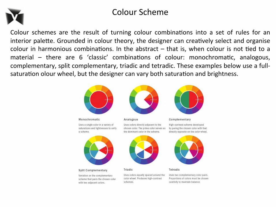
Colour schemes are the result of turning colour combina<ons into a set of rules for an interior paleYe. Grounded in colour theory, the designer can crea<vely select and organise colour in harmonious combina<ons. In the abstract – that is, when colour is not <ed to a material – there are 6 ‘classic’ combina<ons of colour: monochroma<c, analogous, complementary, split complementary, triadic and tetradic. These examples below use a full-‐satura<on olour wheel, but the designer can vary both satura<on and brightness.

Applying rules of contrast to an interior space Contrast is considered as a range of differences between the compared effects of colour interac<on. There are 7 varia<ons of contrast: 1. Contrast of Hue
2. Light-‐ Dark Contrast 3. Cold-‐Warm Contrast

4. Complementary Contrast 5. Simultaneous Contrast 6. Contrast of Satura<on 7. Contrast of Extension

Con$nual connec$vity through technology has reinforced our basic human desire to connect in the real world. Connect with the earth by feeling the soil between our fingers, connect with ourselves by taking $me to pause, connect with our heritage by relearning forgo=en skills, connect with our playful side by indulging in colour. How will you explore your connec$on? Watch Video hYps://www.youtube.com/watch?v=iObV7VEK4W8

1:COLOURS This year we’ll be seeing a diversity of colour like we haven’t seen in ages. Our aYen<on is has seYled gentle colours like muted pastels, smoky shades of grey, soP neutrals, metal hues, rich leather and marine tones along with at the opposite end of the spectrum vibrant jewel and fruit colours. Paint colours for the home s<ll revolve around sophis<cated basics with preference for cleaner whites, smokier neutrals and updated muted pastels. Feature walls are out, zone pain<ng schemes are in and beige is a thing of the past.

2:FABRICS AND PATTERN Prints and paYern are definitely back on the rise – visual impact is the key theme. On one side we see fluid looking prints, peacock feather paYerns, photographic images, graded dip dye designs, text, blurred images, florals and tropical prints. On the other we see a strong geometric designs, 3d paYerns, repeated forms, kaleidoscopic images and paYerns inspired by cells and molecules. Fabrics are about texture be it visual or otherwise. Velvet, textures and raw looking weaves are popular and the use of fabric for sofas and upholstery is back.

3:NATURAL WORLD Textures derived from nature, whether they are animal, mineral or vegetable are in. Think botany, insect prints, fossils, bone, wood, bark, stone and organic shapes. We are tending to like our woods looking raw, or if they are shiny – shown in a way that we can really appreciate them. We want materials and finishes to look authen<c and we are using them in more simple ways in order to appreciate their beauty. Addi<onally we are leaning towards steel, copper, pewter, gold and other metal accents in preference to just chrome and stainless steel.

4:MATTE FINISHES The popularity of maYe finishes is growing in modern décor as we seek to add differing depths of interest into our buildings and interiors. A maYe finish gives an object a raw, edgy look and also allows you to appreciate the overall form and material that an item is made of. This principle is crucial in modern design and it also harks back to our desire for natural and authen<c soPer finishes. This trend is growing in everything from tapware, ligh<ng, furniture, accessories, kitchens and bathrooms, right through to en<re rooms.

5:INDUSTRIAL DESIGN Industrial style pieces in the home have been a staple in the past few years, primarily in the form of ligh<ng and furniture. We are con<nuing to love the look and character of these pieces. The approach of blending the purpose of an item and a considered industrially designed form is set to make its way into other items of a more prac<cal nature within the home. There’s a move towards convenience, func<onality and longevity and we now want quality from items that are mass-‐produced to go along with character in our homes.
6:ORGANIC SHAPES To soPen the lines of our crisper and cleaner looking modern homes we are adding accents of less rigid and more organic inspired shapes. Graceful, rounded, expanded looking shapes con<nue to be very popular but we are seeing that trend taken a liYle further into the direc<on of droplet, hanging, dripping, pulled, “gloopy” looking forms that look like they almost just “happened” or grew in the space. This trend is coming through mostly in accent pieces such as ligh<ng, ceramics, glassware and accessories.

7:CRAFTED WITH CARE Our apprecia<on for items made by human hands and a learned skill is undergoing resurgence. CraP made items and those with a unique one off “handmade like” feel offer us the chance to have pieces that we perceive as “authen<c” in a widely mechanized and mass produced world. Whether its using tradi<onal techniques or crea<ng new ones “craP” is an expression of wan<ng to stay connected to what makes us human. Skills like binding, weaving, knoong, quil<ng and needlework will be evident in furnishings and accessories.

8:PHOTOGRAPHIC IMAGERY Social media and informa<on technology are beginning to have an effect on the way that we live and also the way that we appreciate seeing things around us. Photographic images and images that have been manipulated with “instagram like” soP filters to add a nostalgic dream like quality will be seen in wall art, soP furnishings and accessories. Advancements in digital prin<ng have made the possibili<es to use images unlimited. Artworks can now be whatever size you like, put wherever you want and designed to feature whatever takes your fancy.

9:MERGING OF CULTURES The influence of cultures from many different regions has been enriching our own for a long <me now. We are seeing new interpreta<ons of tradi<onal ethnic designs as they morph into unending new possibili<es. We see the influence not only in colour, texture and paYern but also in the “mix it all up” style of decora<on that we tend to use. Major influences come from Africa, Asia, The Middle East and Europe. We are now also tapping directly into the USA’s own pre-‐melted pot for new inspira<on.

10:ENVIRONMENT FRIENDLY IS MAINSTREAM Environmental considera<on is no longer something that just sits in the back of our heads. We recognise that the way that we live in the world and what we take from it ul<mately has an impact directly upon us. Environmentally friendly design, sustainability, passive homes, products that require less energy, reducing the running costs of our homes, new ligh<ng op<ons, repurposing, recycling, up-‐cycling and new hybrid materials are either standard or con<nue to emerge.