Embed Size (px)
Citation preview
Useful Ideas and Guidelines for Good Web Form Design
The input form is the main element for any website.it represent the
conversion point between user and customer or you can say success or
failure. That is why designers spend their quality time to these contact
forms and put efforts into bringing users to sign-up.
These web forms are part of your web design process. Various
techniques and elements can be used in Web forms to turn into
successful conversion points. In this article, we’ll present some
interesting examples and useful guidelines for Web form design.
One quality that almost always helps is a bit of quirkiness and fun. We also engaged in design and development of unique web forms that can make the whole process a bit more enjoyable and human.
JARAD JOHNSON
Jarad Johnson‘s contact form somewhat looks like a post card. The visual appearance of the form makes it stand out from the usual generic forms .
RED TIKI
Red Tiki’s uncommon look represent the company’s brand and identity. From the frame motif to the wooden character, this form looks nice and approachable. Little phrases like “This lovely form” and “We’re always keen to lend an ear” are fantastic ways to make the company more relatable.
APPLICOM
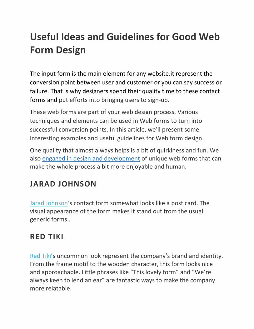
Applicom’s form has a clean and professional look. Styling the form like a letter — with a stamp, subtle paper texture, striped edge and handwritten addressee name, it demonstrates a certain level of personality and care.
SOPHIE HARDACH
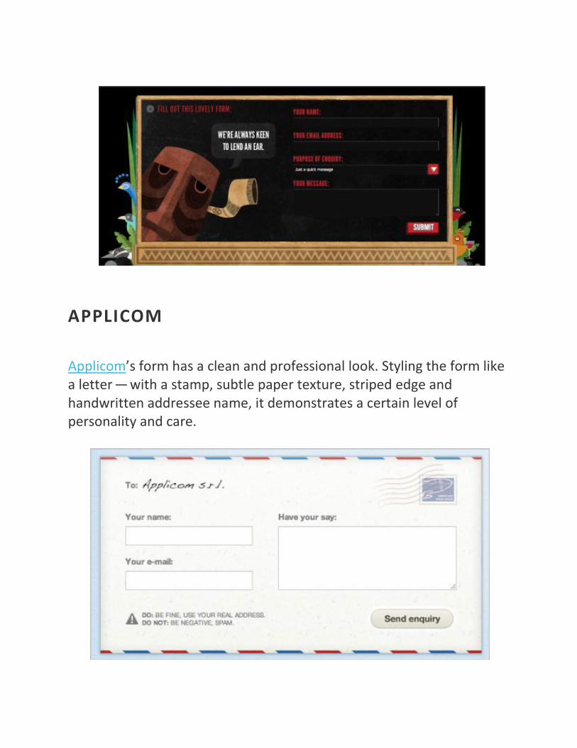
Sophie Hardach‘s form is another example of a post card idea implemented in a contact form. The input fields are a bit clearer than one would think, yet the “Submit”-button is a bit more difficult to find. The form is accessible. Excellent work !
TWO PAPERDOLLS
Two Paperdolls contact form looks messy. However, the form fits wonderfully to the overall design of the page which is a “We Are Hiring” page for designers with strong focus on typography.
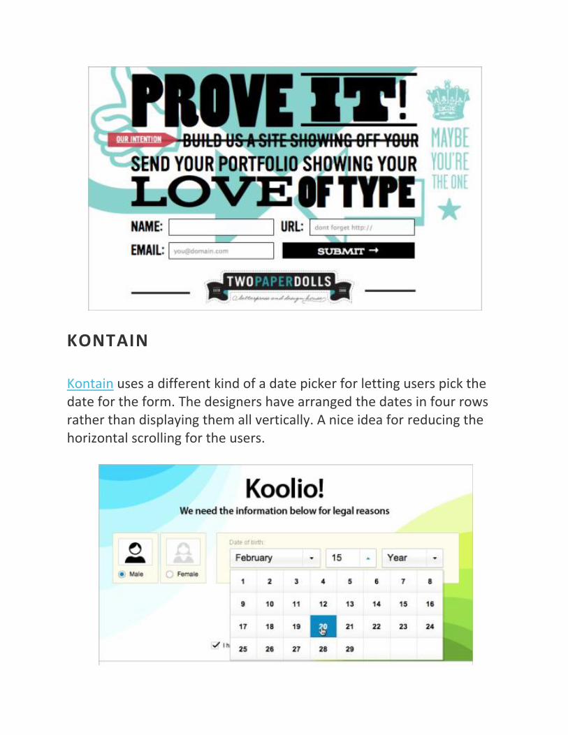
KONTAIN
Kontain uses a different kind of a date picker for letting users pick the date for the form. The designers have arranged the dates in four rows rather than displaying them all vertically. A nice idea for reducing the horizontal scrolling for the users.
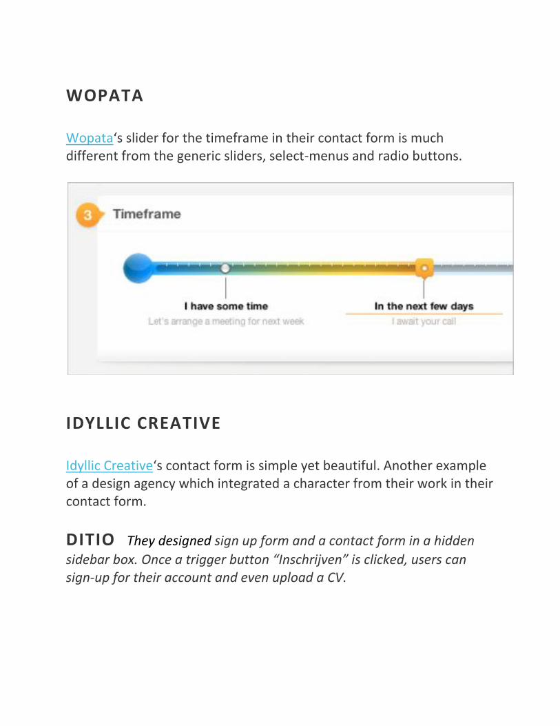
WOPATA
Wopata‘s slider for the timeframe in their contact form is much different from the generic sliders, select-menus and radio buttons.
IDYLLIC CREATIVE
Idyllic Creative‘s contact form is simple yet beautiful. Another example of a design agency which integrated a character from their work in their contact form.
DITIO They designed sign up form and a contact form in a hidden
sidebar box. Once a trigger button “Inschrijven” is clicked, users can sign-up for their account and even upload a CV.
Conclusion
The article covers some simple yet best examples that you can use to
create web forms for business websites. But to create a unique and
innovative web form design you need to spend some extra time on
your website or analyzing the other technical approaches that are not
hard to implement and will lead you to much higher conversion rates.
USEFUL SOURCES
“Sensible Forms: A Form Usability Checklist,” Brian Crescimanno Read up on some basic facts and rules for styling and setting up forms on your websites.
“Form Design: 11 Patterns For Accepting User Input,” Linda Bustos This article identifies which input patterns are useful and explains when hinting and prompting are useful.
“Best Practices for Web Form Design,” Luke Wroblewski