Embed Size (px)
Citation preview
Skills Development Journal
CD
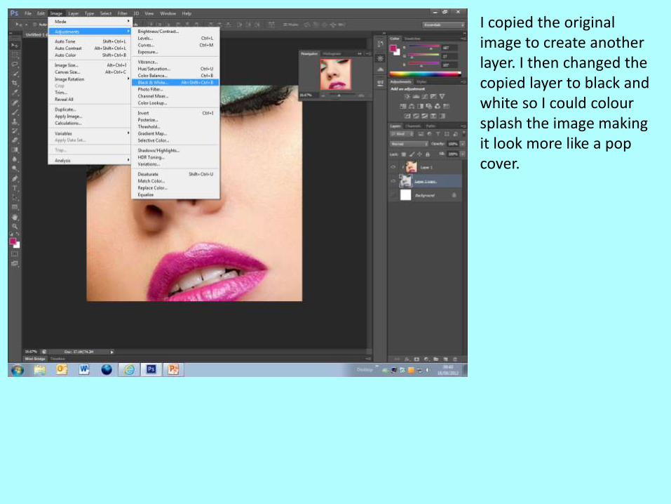
I copied the original image to create another layer. I then changed the copied layer to black and white so I could colour splash the image making it look more like a pop cover.
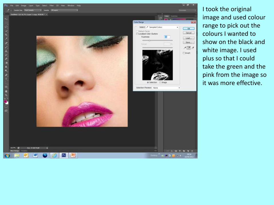
I took the original image and used colour range to pick out the colours I wanted to show on the black and white image. I used plus so that I could take the green and the pink from the image so it was more effective.
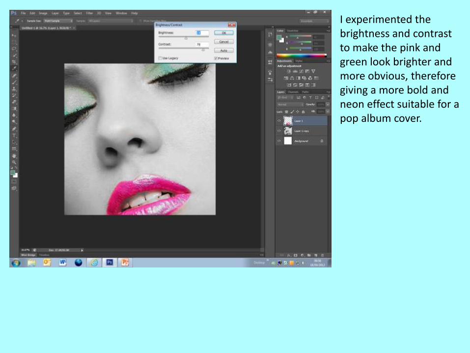
I experimented the brightness and contrast to make the pink and green look brighter and more obvious, therefore giving a more bold and neon effect suitable for a pop album cover.
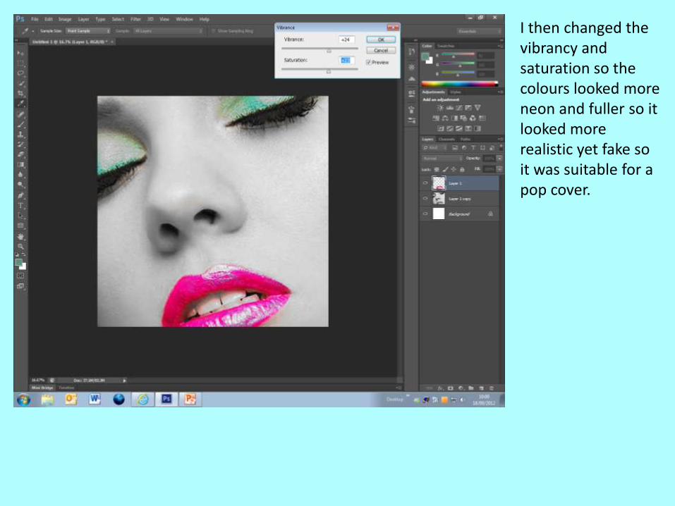
I then changed the vibrancy and saturation so the colours looked more neon and fuller so it looked more realistic yet fake so it was suitable for a pop cover.
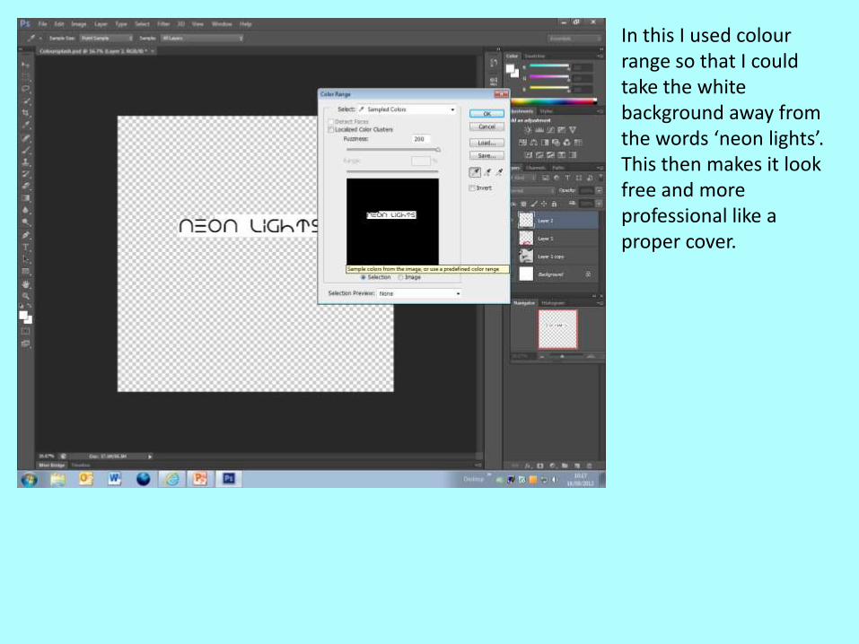
In this I used colour range so that I could take the white background away from the words ‘neon lights’. This then makes it look free and more professional like a proper cover.
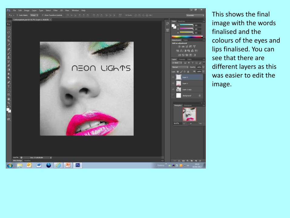
This shows the final image with the words finalised and the colours of the eyes and lips finalised. You can see that there are different layers as this was easier to edit the image.
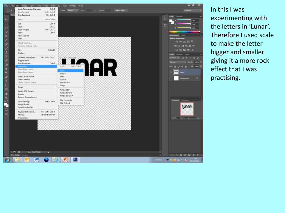
In this I was experimenting with the letters in ‘Lunar’. Therefore I used scale to make the letter bigger and smaller giving it a more rock effect that I was practising.
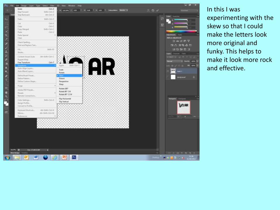
In this I was experimenting with the skew so that I could make the letters look more original and funky. This helps to make it look more rock and effective.
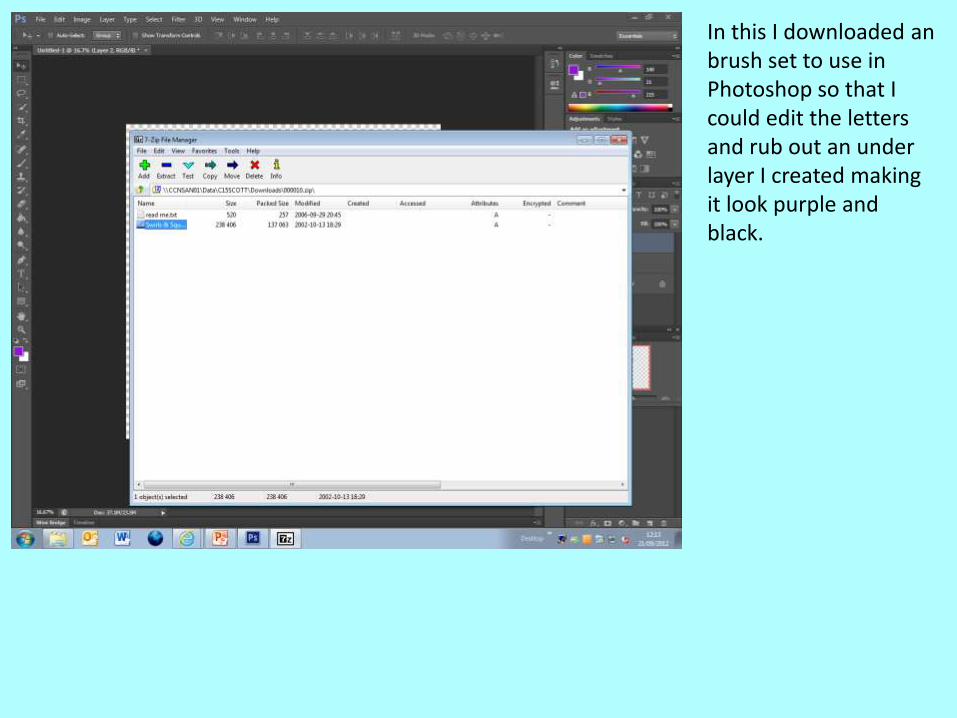
In this I downloaded an brush set to use in Photoshop so that I could edit the letters and rub out an under layer I created making it look purple and black.
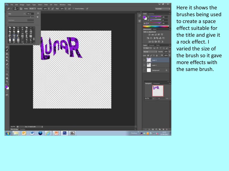
Here it shows the brushes being used to create a space effect suitable for the title and give it a rock effect. I varied the size of the brush so it gave more effects with the same brush.
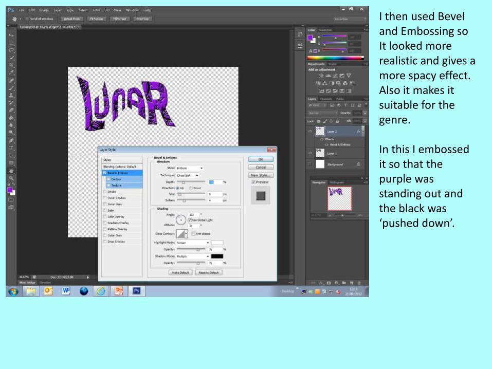
I then used Bevel and Embossing so It looked more realistic and gives a more spacy effect. Also it makes it suitable for the genre.
In this I embossed it so that the purple was standing out and the black was ‘pushed down’.
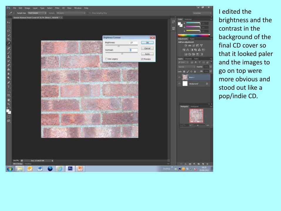
I edited the brightness and the contrast in the background of the final CD cover so that it looked paler and the images to go on top were more obvious and stood out like a pop/indie CD.
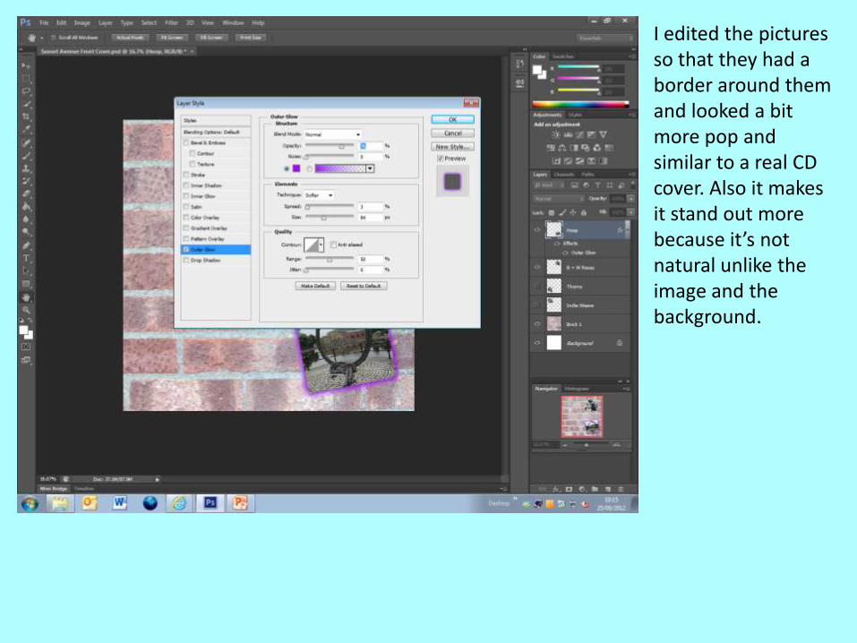
I edited the pictures so that they had a border around them and looked a bit more pop and similar to a real CD cover. Also it makes it stand out more because it’s not natural unlike the image and the background.
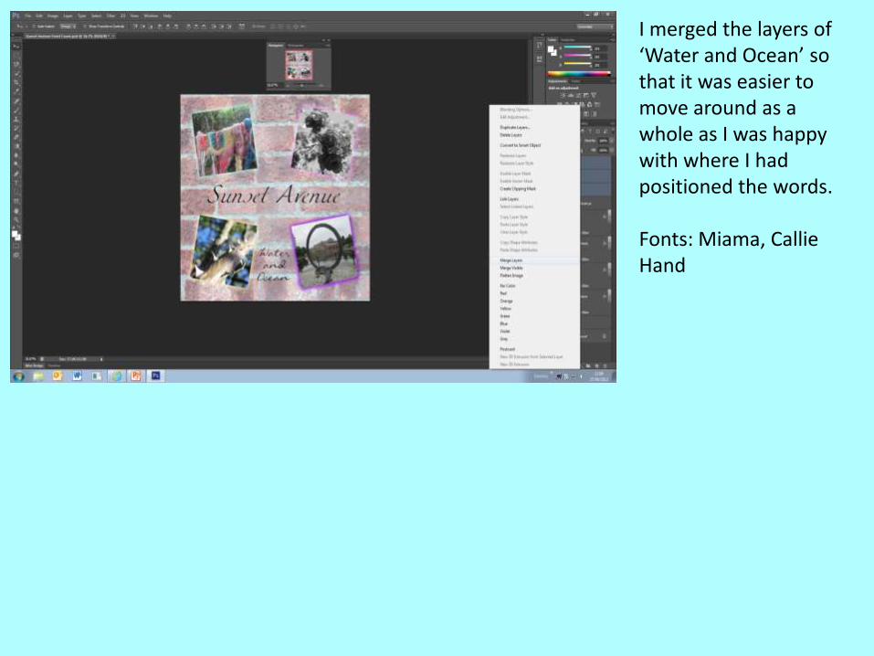
I merged the layers of ‘Water and Ocean’ so that it was easier to move around as a whole as I was happy with where I had positioned the words.
Fonts: Miama, Callie Hand
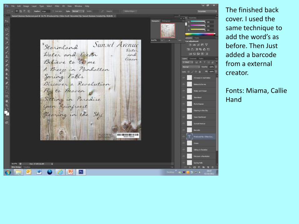
The finished back cover. I used the same technique to add the word’s as before. Then Just added a barcode from a external creator.
Fonts: Miama, Callie Hand


![Communication Skills [CMS]vidyalankar.org/file/diploma/SemII/Chem.pdfReference : 1. Text book of Communication Skills, (MSBTE Mumbai) MSBTE, Mumbai . 2. CD On Communication Skills,](https://img.pdfslide.us/doc/110x75/5b07d1e47f8b9a404d8b6654/communication-skills-cms-1-text-book-of-communication-skills-msbte-mumbai.jpg)