Embed Size (px)
Citation preview

portfolio
Brand Communication Designer2012 edition
SIRINSUNGKOBOL

Table ofContents
Curriculum Vitae 01
A01- A54
B01- B12
C01- C08
D01- D08
Brand Identity
Design Research
Graphic Design
Miscellaneous

Sirin Sungkobol 58/102 Thewet Mansion Krungkasem Rd. Bangkhunprom Pranakorn Bangkok 10200Tel. [email protected]
Education and Qualifications
2004 -2008 Faculty of Architecture, Chulalongkorn University Second Class Honors, B. ID. (Bachelor of Industrial Design) 3.42GPA Modules included : Interior Design, Product Design, Graphic Communication Design, Ceramic Design, Textile Design, Architectural Design, Color Study and Design, Human Factors in Design, Computer Application for Industrial Design, Computer for Industrial Design, Photographic Studio for Industrial Design, Principle of Marketing, Applied Industrial Economics, Introduction to Business Thesis in Interior Design B+ in “New Wedding Business Model & Wedding Fair”
1998-2003 Saint Francis Xavier Convent School Senior High School (Mathayom 6) 3.65GPA
Professional Experience
March 2008 - April 2008 Intern, This Design Co., Ltd, Bangkok (Supermachine Studio) Assisted in New Centerpoint at Central World Project, Samutsongkarm-Learning Center Project.
April 2008 - May 2008 Intern, RABbits Co., Ltd, Bangkok Assisted in Central World Christmas and New Year 2008 event, ELLE magazine event, Marie Claire event, Anywhere travel by Central World event, New amusement park at YOYO Land
October 2009 - February 2010 Graphic Designer, Archibrand Co., Ltd, Bangkok Created almost every design tool for client’s brand communication. Translated from brand story to brand manual book which included logo, main color, typeface, prints, stationary and web design guideline.
March 2010 - May 2011 Brand Communication Designer, Baramizi Co., Ltd, Bangkok Created almost every design tool for client’s brand communication. Translated from brand story to brand manual book which included logo, main color, typeface, prints, stationary and web design guideline. Coordinated closely with founders and Commercial Space Design Team. Actively solicited new clients and nurtured existing client accounts, ensured their needs and requirements were not only accommodated but surpassed. Achieved the project by managing outsources and participated as research team (such as recruiting the respondent, directing the focus group, interviewing, and observation), investigated data and synthesized the design strategy with company’s new service; BARAMIZI LAB (performing design research and trend spotting)
June 2011 - Now Co-Founder, Brand Manager, a’ la carte shop, Bangkok Created almost every marketing materials for brand communication. Translated from brand value to print ads, web banners, electronic posters by controlling mood and tone of design. Created the backdrop setting for monthly fashion shooting. Created the design elements of shop’s main contact point (such as front shop, window display, visual merchandise, shop decoration, website, facebook’s content). Manages sale strategies and customer services by creative based, initiated new service; PERSONAL STYLIST (analyzed and advised suitable outfit for customer’s shape)
Professional Training
June-September 2008 NEC- New Entrepreneurship Creation course Managed by Department of Industrial Promotion – DIP Ministry of Industry Thailand with KENAN Institute Asia How to start a business, how to write a business plan.
January 2011 Course Seminar - Marketing Essential Program via 7 Master Gurus Managed by BRANDAGE ESSENTIAL magazine Advertising Management, IMC, Branding Strategy,Competitive & Company Strategy, Brand Management, Positioning & Marketing Warfare, Marketing Strategy
Activities/ Positions of Responsibility
2004 Student President’s Assistance, Saint Francis Xavier Convent School
2005 Actor team; Faculty of Architecture annual stage show 2006 Participant (1st round finalist), EXAT Logo Design Award 1st Prize, 90th Anniversary of Chulalongkorn University Logo Design Award 1st Prize, Cotto Smart & Style Awards
2007 Design Director of Special Effect team; Faculty of Architecture annual stage show
2009 New Entrepreneurs Creation course
March - May 2009 Participated in design research project for “The effects of urban inhabitant’s gathering places on Thai cultural heritage : the inter-relations of human behavior and interior environmental design.” with Assist Prof. Dr. Praima Israsena Na Ayudhya and Assist Prof. Natthanee Niamsap
October 2011 Project coordinator, “Emergency portable toilet for flood victims” in flooding crisis 2012 at Faculty of Architecture Chulalongkorn University
a’ la cartewoman working wear fashion retail
‘ a’ la carte shop‘ is the shop that I and my partner had decided to start our clothing retail business. The shop is located at Siam Square, the most popular shopping area in Bangkok. I applied my work experience as a designer to create the new product to serve the consumer as well as business knowledge to develop the sale and marketing strategies for my fashion business.My main responsibility is to be a Brand Manager. I created almost every marketing materials for brand communication. I created print ads, web banners, electronic posters by translated from brand value to by controlling mood and tone of design. Moreover, I created the design elements of shop’s main contact point (such as front shop, window display, visual merchandise, shop decoration, website, facebook’s content). In addition, I designed the backdrop setting for monthly fashion shooting.
Year : since 2010Purpose : Creating and implementing brand value to communicate with customer.Scope of work : Brand Strategy Marketing Strategy Marketing materials design Setting design for photo shootingWebsite : www.alacartebkk.com www.facebook.com/ alacarte.shop

top Backdrop design for fashion shooting

top left New Year Card 2011top right New Year Card 2012
middle Marketing material: sale posterbottom right Marketing material: LookBook

top front shop and displaybottom interior decoration and visual merchandising


BRAND IDENTIY
A processfor brand identity design
clarifying strategy
Phase
“The brand identity process is a proven and disciplined method for creating and implementing an identity. Regardless of the nature of client and the complexity of the engagement, the process remains the same. What changes is the depth with which each phase is conducted, the length of time and the number of resources allocated, and the size of the team.”
In Baramizi, we always use this process without eliminating steps or reorganizing the process, in order to accelerate under-standing and acceptance of the investment of necessary time and resources, also, engender trust and confidence in the company. There are only 12-15 office employees in Baramizi because the founders want to concentrate on core function and cut costs by outsourcing the work. Consequently, I as a brand communication designer and design researcher assistant, have fully involved in all phases.
1
Clarify vision, goals and values.
Research stakehoders’ needs and perceptions.
Interview key management.
Evaluate existing brands and brand architecture.
Present audit readout.
Synthesize learnings.
Clarify brand strategy.
Develop a positioning platform.
Co-create brand attributes.
Achieve agreement.
Write a creative brief.
conducting research
1

managing assets
creating touchpoints
designing identity
Brainstorm big idea.
Design brand identity.
Explore applications.
Finalize brand architecture.
Present visual strategy.
Achieve agreement.
Finalize identity design.
Develop look and feel.
Prioritize and design applica-tions.
Design Program.
Apply brand architecture.
Build synergy around new brand.
Develop standards and guidelines.

LIGHTINGHOUSEAn expert lighting reseller and showroom
The client required a new brand identity that would reflect their status and brand concept. The brief was to create a brand concept and logo for the renew lighting company that provide the quality atmosphere from lighting and designed lamps, but not for the lamp shop. Baramizi was appointed as branding consultant after launched the first phase of this project. This is one of the most outstanding achievement of mine as I was assigned to be a part of project manager team and art director team.
For this project, we joined the small workshop with company owners and do some primary and secondary studies about the consumer’s perception, competitors study, and logo trend 2010 study. We found that many customers which most of them are designers always selected the lighting objects from Lightinghouse’s main competitor ;Lamptitude; despite the customers know Lightinghouse. Because, Lamptitude looks newer and always update.
After working closely with the client’s executives, we synthesized the brand strategy, from brand DNA to brand slogan, and translated them to the brand identity design.
Lightinghouse is a well-respected lighting distributor who has over 30 years of experience in the lighting industry.They offer an exclusive range of product from well-respected manufacturers with a wide variety of styles both in the field of interiors architectural and outdoor lighting. and comprehensive service encom-passing “Product Advice”, “Lighting Design” and “Cus-tomization” to ensure satisfaction for their customer.
Year : 2010Purpose : Creating and implementing new brand identity, graphic signage and environmental graphic in the showroom. Scope of work : Brand concept Brand Identity Signage system designAccomplishment : The company has already launched the new graphic identity in August 2010 and the renovated showroom has opened in March 2011. After sending the final works, clients have confidence in our organization to hire us for their next project: online marketing and booth design in Architect Fair 2011, Baan Lae Suan Fair 2012.Website : www.lightinghouse.co.th
A01

top Lighting house logo on front shop facade.middle and bottom atmosphere in showroom and lighting decoration.
A02
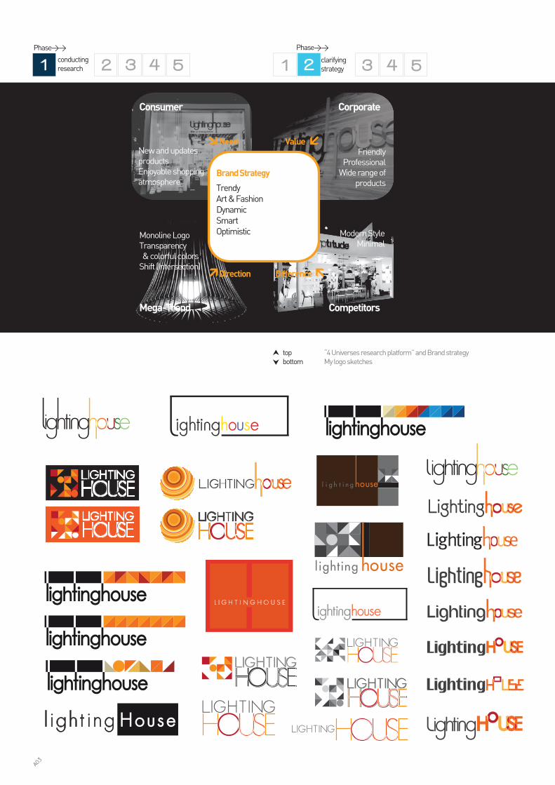
top “4 Universes research platform” and Brand strategybottom My logo sketches
Modern StyleMinimal
FriendlyProfessional
Wide range ofproducts
New and updatesproductsEnjoyable shopping atmosphere
Monoline LogoTransparency & colorful colorsShift (Intersection)
Competitors
CorporateConsumer
Difference
ValueNeed
Direction
Brand Strategy
Trendy Art & FashionDynamicSmartOptimistic
Mega-Trend
Phase>>
clarifying strategy
Phase>>
conducting research
A03
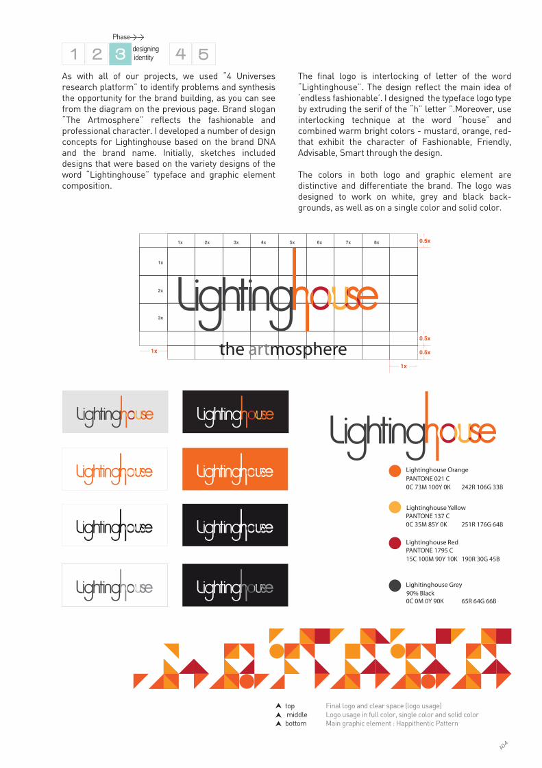
top Final logo and clear space (logo usage) middle Logo usage in full color, single color and solid colorbottom Main graphic element : Happithentic Pattern
As with all of our projects, we used “4 Universes research platform” to identify problems and synthesis the opportunity for the brand building, as you can see from the diagram on the previous page. Brand slogan “The Artmosphere” reflects the fashionable and professional character. I developed a number of design concepts for Lightinghouse based on the brand DNA and the brand name. Initially, sketches included designs that were based on the variety designs of the word “Lightinghouse” typeface and graphic element composition.
The final logo is interlocking of letter of the word “Lightinghouse”. The design reflect the main idea of ‘endless fashionable’. I designed the typeface logo type by extruding the serif of the “h” letter ”.Moreover, use interlocking technique at the word “house” and combined warm bright colors - mustard, orange, red- that exhibit the character of Fashionable, Friendly, Advisable, Smart through the design.
The colors in both logo and graphic element are distinctive and differentiate the brand. The logo was designed to work on white, grey and black back-grounds, as well as on a single color and solid color.
Phase>>
designing identity
Lightinghouse Orange PANTONE 021 C0C 73M 100Y 0K 242R 106G 33B
Lighitinghouse Grey90% Black
Lightinghouse YellowPANTONE 137 C0C 35M 85Y 0K 251R 176G 64B
Lightinghouse Red
15C 100M 90Y 10K 190R 30G 45B
0C 0M 0Y 90K 65R 64G 66B
PANTONE 1795 C
1x
1x
0.5x
0.5x
0.5x
1x
1x
2x
3x
2x 3x 4x 5x 6x 7x 8x
A04
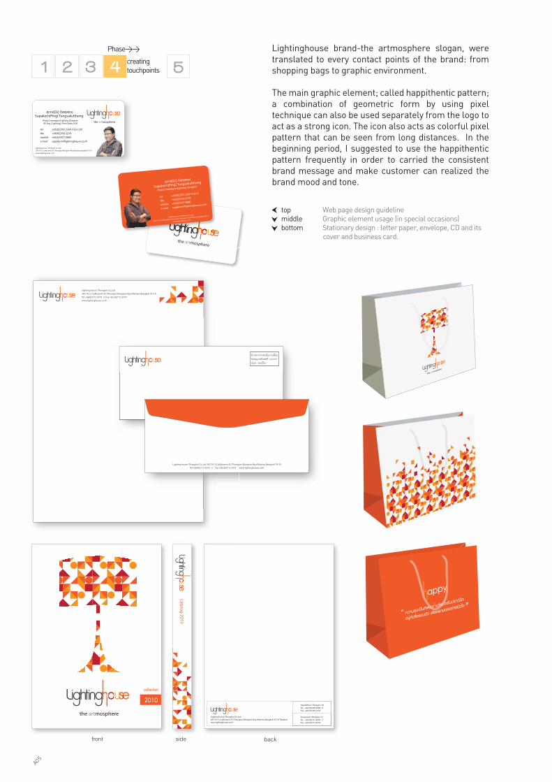
top Web page design guideline middle Graphic element usage (in special occasions)bottom Stationary design : letter paper, envelope, CD and its cover and business card.
Lightinghouse brand-the artmosphere slogan, were translated to every contact points of the brand: from shopping bags to graphic environment.
The main graphic element; called happithentic pattern; a combination of geometric form by using pixel technique can also be used separately from the logo to act as a strong icon. The icon also acts as colorful pixel pattern that can be seen from long distances. In the beginning period, I suggested to use the happithentic pattern frequently in order to carried the consistent brand message and make customer can realized the brand mood and tone.
Phase>>
creating touchpoints
Lighting house (Thonglor) Co.,Ltd.
387/10-12 Sukhumvit 55 (Thonglor) Klongton-Nua Wattana Bangkok 10110
Tel +66(0)2712 5970 - 3 Fax +66 (0)2712 5974
www.lightinghouse.co.th
Lighting house (Thonglor) Co.,Ltd. 387/10-12 Sukhumvit 55 (Thonglor) Klongton-Nua Wattana Bangkok 10110
Tel +66(0)2712 5970 - 3 Fax +66 (0)2712 5974 www.lightinghouse.co.th
the artmosphere
ÈØÀ¡Ã(»�§) ·Ñ่§Ê¡Øŷͧ
Project manager/Lighting DesignerSupakorn(Ping) Tungsakulthong
tel +66(0)2392 2260-9 Ext.3
fax +66(0)2392 2270
mobile +66(8)7077 0880
e-mail [email protected]
Lighting house (Thonglor) Co.,Ltd.
387/10-12 Sukhumvit 55 (Thonglor) Klongton-Nua Wattana Bangkok 10110
www.lightinghouse.co.th
ÈØÀ¡Ã(»�§) ·Ñ่§Ê¡Øŷͧ
Project manager/Lighting Designer M. Eng. (Lighting), Penn State, USA
Supakorn(Ping) Tungsakulthong
tel +66(0)2392 2260-9 Ext.330
fax +66(0)2392 2270
mobile +66(8)7077 0880
e-mail [email protected]
Lighting house (Thonglor) Co.,Ltd.
387/10-12 Sukhumvit 55 (Thonglor) Klongton-Nua Wattana Bangkok 10110
www.lightinghouse.co.th
front backside
A05
top Application of Happithentic pattern
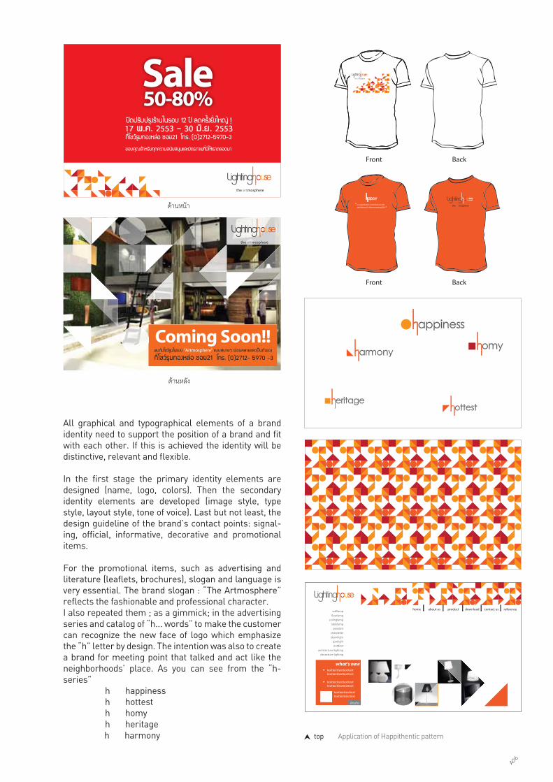
All graphical and typographical elements of a brand identity need to support the position of a brand and fit with each other. If this is achieved the identity will be distinctive, relevant and flexible.
In the first stage the primary identity elements are designed (name, logo, colors). Then the secondary identity elements are developed (image style, type style, layout style, tone of voice). Last but not least, the design guideline of the brand’s contact points: signal-ing, official, informative, decorative and promotional items.
For the promotional items, such as advertising and literature (leaflets, brochures), slogan and language is very essential. The brand slogan : “The Artmosphere” reflects the fashionable and professional character.I also repeated them ; as a gimmick; in the advertising series and catalog of “h... words” to make the customer can recognize the new face of logo which emphasize the “h” letter by design. The intention was also to create a brand for meeting point that talked and act like the neighborhoods’ place. As you can see from the “h- series” h happiness h hottest h homy h heritage h harmony
ดานหลัง
ดานหนา
home productabout us download referencecontact us
what’s newtexttexttexttexttexttexttexttexttexttext
texttexttexttexttexttexttexttext
texttexttexttexttexttexttexttexttexttext
อานตอ
walllamp�oorlamp
ceilinglamptablelamp
pendantchandelierdownlight
spotlightoutdoor
architectural lightingdecorative lighting
appiness
armony omy
ottesteritage
A06

left Mood board showed “Happithentic” brand value for space designbottom Lightinghouse booth, Architect fair,2011 showed design interpretation
To apply to concept of Happithentic which is brand value into space design, I has made a mood board to suggest interior designer how to apply the architecture element and material. The Happithentic mood board described the combination of synthesis-look material and nature-look material, proportion of material used, some design guidelines, as well as design look and feel.The combination of guideline determines the tone of voice of space design that are able to fulfill the functional, emotional and decorative purposes.
A07

top Signage design and showroom interior designmiddle Facase Design bottom Environmental graphic example
In order to facilitate the correct application of the identity across a widespread usage, the design team and I also issued conventionally printed interim guide-lines for the launch of the brand including the signage construction drawing for showroom. This helped to orchestrate the branding efforts undertaken by client’s in-house designer and manufacturers of branded mate-rials.
Phase>> managing assets
A08

BOWLINGMenswear
BOWLING, a Thai fashion business, have an experted in mens fashion for over 10 years. This brand started the business as being OEM factory. They make the shirt for many local brands in Thailand while they developed and launched their own brand; named Bowling. Nowsaday, there is highly competitive situation in Thailand fashion market because there are many new local brands in the market. The market share is separated by the the new competitors. As a result, the consumer can switch the brand easier.
The client wanted to unique them from the other brands by adding brand personality and brand value to communicate with customer who was the young generation and still keep the existing customer.
The client’s objectives focused on the new practical image of the brand.The executives thought that the fresh, growth and eco-friendly experience could not found in other term of the brand contact points. Moreover, every new competitors were elevated and developed their brand experience designs. As a consequence, customers have more other choices. What I learned most about this project was that, how to interpret the brand core value to the correct total brand experience. As the brand’s existing fans used to think that retail is not the matter, the advertising is.
In order to fulfill the aims and to gain an understanding of the job in hand, Baramizi evaluated the existing BOWLING and its competition, the company value, the global consumption and retail design trends, and the public’s needs and perception of BOWLING”.
Year : 2011Purpose : Rebranding by changing its logo and brand concept “Bowling”, the client wanted the new creation and implementing of brand identity and usages that can communicate brand value and increase competitive advantage.Scope of work : Design Research Brand Strategy Brand Identity Store Design PrototypeAccomplishment : After Bowling launched this new look of logo, there was bold and strong brand image which can communicate to its customers. They perceived the Bowling value and have active brand awarenessWebsite : www.bowling.co.th
A09

top TKO Logo placement and cartoon rate design
A10

AvoidComplicated Symbol
Historical Symbolunnatural looked materials
Creative fun experienceFriendly
Enjoyable
Fun (color)WarmSmart
DynamicInteractive life styleNature interveneHappyEasy Difference
Competitors
Value
Corporate
Needs
Consumer
Direction
Brand Strategy
Warm, caring,Friendly, Fresh,Fun, livelyCreative,Dynamic
Mega-Trend
It became clear that there is no design standard of sell corner in the department store. It had been have retailmanual book before we met the client but there was not enough design guideline which suit for department store’s regulation. There are too many variety and different styles of the store design. Either, the visual merchandising and product dirsplay method could not make impression to the shopper.
The observation also played the important role of this research. We observed 4 major stores in the important and crowded area of bangkok, also its 3 main competi-tors. The raw data (including the consumption trend and retail design trend research) are collected and analyzed by research team. Then the brand strategies and design team used these datas as resources for predicting the strategy and implementing the design. I involved in all phases.
top Brand positioning map
bottom “4 Universes research platform”
Phase>>
conducting research
Research Methodology : 1. Executive Interview2. Observation (eye tracking, customer experience)3. Trend analysis4. Competitive analysis
We began by researching the market and understand-ing the issue faced as well as conducting primary research among consumers. We observed consumer experience at the sell kiosk and collect the data of existing design in both BOWLING and its’ competitors.
Old
Young
FashionableFormal
A11
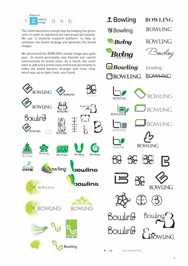
The client desired to change logo by keeping the green color in order to represent the new brand personality. We use “4 Universe research platform” to help us synthesis the brand strategy and generate the brand images.
We discovered the BOWLING’s brand image was quite poor. Its brand personality was blurred and cannot communicate its brand value. As a result, the client want to add some brand value and brand personality to make the brand become stronger and more clear which was up-to-date, fresh, eco-friend.
top Logo development
Phase>>
clarifying strategy
A12
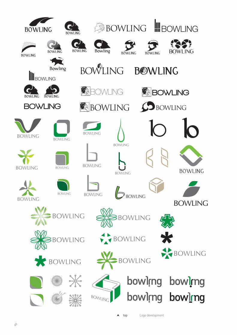
top Logo development
A13

The identity colors were chosen as the combination of green (which is the existing identity color). I adjust the shade and intensity of green color to become more lighten and add a gradation in the symbol. They also have positive environmental conditions and fulfill a number of practical requirements: visibility on livery, sufficient contrast between the element upon a back-ground and looks more dimensional.
The graphic identity was designed to work on light green and white background, as well as on a single color and solid color version.
Type style provides a brand with consistency. ‘PSL Kittitada’ combines friendly personality and liberal spirit. It also work well in both English and Thai language, both printed and digital form.
top The final logo design of BOWLINGbottom left The logo spacing guidelinebottom right The brand identity typeface and color
A14

Phase>>
creating touchpoints
top Application for stationaries and documentsbottom Design guideline for shopping bag
A brandmark alone does not make an identity or recogni-tion for the audience. A successful brand will extend well beyond its visual manifestation into the culture of the business (internal and external) and become the guiding principle for any from of customer interaction.
In the first stage, the primary identity elements are designed (name, logo, colors, identity, typeface). Then the second identity element are developed (image style, tone of voice, mood and tone). Finally, the design guide-line for essential brand’s contact points.
The official items (letterhead, stationary, forms), the decorative items (utensils, uniforms) and promotional items (advertisement, leaflets, brochure, posters) are developed. The combination of the type style and image style determines the tone of voice of these pieces of design. I tried to translate the brand personality: “Trendy, Credible, Cheerful, Lively” to the design language: sizing, placement, scale, keywords in every touch points.
บริษัท โกลเดน โบล จำกัด209/9-11 ซ. เจริญกรุง 91 ถ. เจริญกรุง แขวงพระยาไกร เขตบางคอแหลม กทม. 10120โทร : 0-2688-0730-2, 0-2289-4408, 0-2289-4425 แฟกซ : 0-2291-7785อีเมล : [email protected]
บริษัท โกลเดน โบล จำกัด209/9-11 ซ. เจริญกรุง 91 ถ. เจริญกรุง แขวงพระยาไกร เขตบางคอแหลม กทม. 10120โทร : 0-2688-0730-2, 0-2289-4408, 0-2289-4425 แฟกซ : 0-2291-7785อีเมล : [email protected]
A15

top Poster designbottom left Graphic wallbottom right Graphic guideline
A16

I was assigned to design the new design of BOWLING’s sale corner prototype with the space design team. I designed a lively graphic element and selected the new material for the logo wall in the corner.
A17
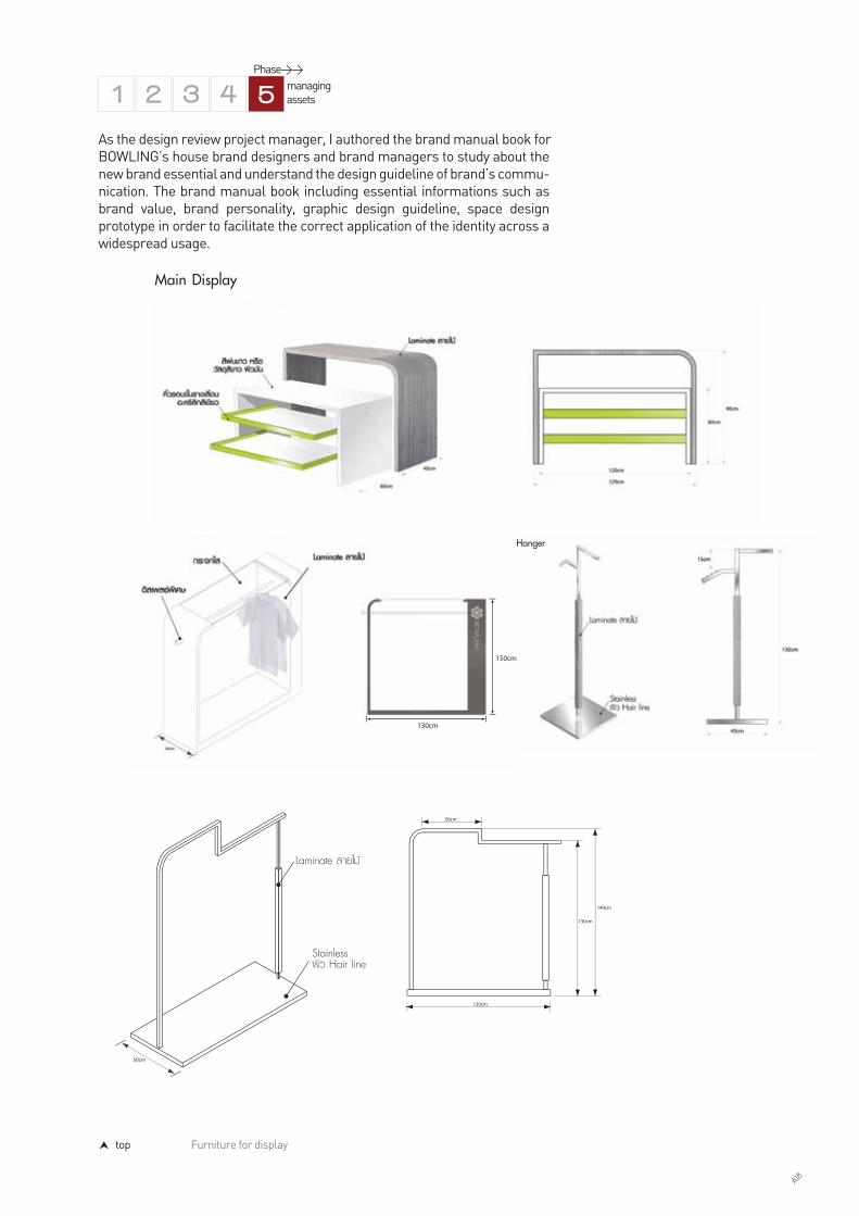
top Furniture for display
As the design review project manager, I authored the brand manual book forBOWLING’s house brand designers and brand managers to study about the new brand essential and understand the design guideline of brand’s commu-nication. The brand manual book including essential informations such as brand value, brand personality, graphic design guideline, space design prototype in order to facilitate the correct application of the identity across a widespread usage.
Phase>> managing assets
A18

top left Fashion stage designtop right Fashion backdrop and logo mania backdropbottom Sale corner new design
A19

TKO COMICSComic Publishing
TKO Comics was founded on December 8, 2006 in order to edit, produce and publish Thai version of Japanese comics (a.k.a. Manga) licensed from well-known Japa-nese publishers such as Shogakukan, Enterbrain, Gentosha Comics, Flex Comix, Kodansha, Kadokawa Shoten, etc. There are 2 types of TKO’s Manga. One is the Classic Manga which have deep and profound stories. Another is independent and specific stories which are stories about professional career such as chef, doctor, flight attendant, etc. The professional and expert of these Manga types can defined the segmenta-tion and positioning of TKO publishing to be the leader of grown up comics
Nonetheless, the executives thought that sale rate increase slowly because it is quite small and niche in this Manga’s fans. Manga reader prefer fun, exciting and easy story to understand because it can make them relax easier. Moreover, most of the Manga fans cannot recognize the identity of TKO Publishing, they can only remember the name of Manga that published by TKO. As a consequence, there is no brand awareness in customers.
The client wanted to rebrand by changing its logo and design elements. The solution - Acute Triangle concept - was built around the idea of “Book of Life”, and provided recognition and expression within a unified and coherent corporate identity. As a result, I illustrated the Brand symbol and identity graphic element: Asymmetrical Triangle which represent the philosophy of TKO - lifestyle comics - to used along with the logo and launch it on the new book sleeve and webpage.
What I learned most about this project was that, how to interpret the data from research conclusion to brand core value and create brand identity to com-municate total brand experience. As the brand’s existing fans used to realize the blur brand image and brand experience.
Year : 2011Purpose : Brand rereshing with changing its logo and brand positioning “TKO Comics”, the client wanted the new creation and implementing of brand identity and usages that can communicate brand value and increase competitive advantage.Scope of work : Consumer behavior research Design Research Brand IdentityAccomplishment : After TKO Comics launched this new look of logo, there was bold and strong brand image which can communicate toTKO fans. They perceived the TKO brand value and have active brand awarenessWebsite : www.tkocomics.co.th
A20

Avoid- Red color
- Iconic logo
Leader in grow up comicIndy comic
Quality and trust worthy
Incorporate with brand perceptionRealiableCopy right
Conceptual logo3D logoMinimal logo
Difference
Competitors
Value
Corporate
Needs
Consumer
Direction
Brand Strategy
Bold,Independent,Tangible,Imagination and livelyCreative,Sophiticate
Mega-Trend
Research Methodology : 1. Observation (eye tracking, customer experience, eth- nography) 2. Interview3. Trend analysis4. Competitive analysis
As with all of our projects, we started by researching the market and understanding the issue faced as well as conducting primary research among consumers. Observation and interview were used to formulate a view of consumers’ perceptions of TKO in the market. Consequently, we recruited both TKO’s fan and competitors’ fan. It became clear that a few publishing were recognized by logo and theme of selected stories. But, TKO was realized by only the theme of selected stories.
The interviewing show that there are 2 groups of TKO’s fan who have difference perception of TKO’s brand personality and brand value. One is perceive that TKO is 18-20 years old boy, action comic, strong, extreme. Another think that TKO is 6-7 years old kid, naughty.
As the report of research, consumer confuse in brand perception of TKO. Because, the design language of existing logo was not related to the theme of selected stories by TKO Publishing. Consequently, the client desired to rebrand TKO by changing the logo and visual element of TKO. The observation also played the important role of this research. We observed 4 major comic stores in bangkok, also secondary data of its 5 main competitors’ research. The raw data (including the consumption trend and logo design trend research) are collected and analyzed by research team. Then the brand strategies and design team used these datas as resources for predicting the strategy and implementing the design. I involved in all phases.
top 4 Universe platform
Phase>>
clarifying strategy
Phase>>
conducting research
A21

bottom Main identity element
top identity sketchesPhase>>
designing identity
As with all of our projects, we used “4 Universesresearch platform” to identify problems and synthesisthe opportunity for the brand building, as you can seefrom the diagram. Design strategy is to make the newlogo outstanding than others brand on the shelf.“Life style comic” reflects the lively and independent character. I developed a number of design concepts for Initially, sketches included designs that were based on the variety designs of the word “TKO” typeface and somegraphic element composition.
The final logo is the letter type. The design reflect the main idea of ‘book of life’ which TKO present brand in the unique, independent and powerful ways. I designed the typeface logo type by bevel the san serif of the “T”,”K” and “O” letter. Moreover, I use illusion technique at the letter “O” by combined mustard yellow triangle element over to letter “o” which illustrate the figure of books. The Character of Indy , Young, Ener-getic and Modern through the design.
A22
Phase>>
creating touchpoints
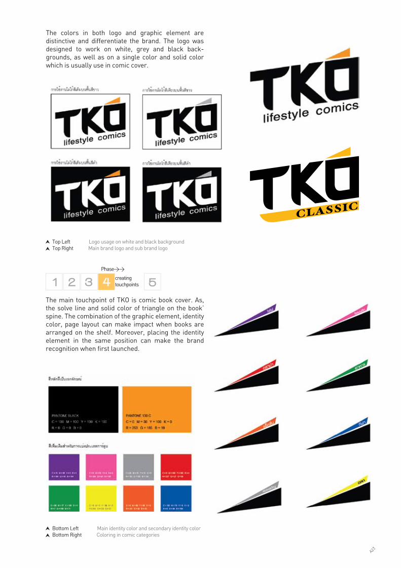
The colors in both logo and graphic element are distinctive and differentiate the brand. The logo was designed to work on white, grey and black back-grounds, as well as on a single color and solid color which is usually use in comic cover.
Bottom Left Main identity color and secondary identity colorBottom Right Coloring in comic categories
Top Left Logo usage on white and black backgroundTop Right Main brand logo and sub brand logo
The main touchpoint of TKO is comic book cover. As, the solve line and solid color of triangle on the book’ spine. The combination of the graphic element, identity color, page layout can make impact when books are arranged on the shelf. Moreover, placing the identity element in the same position can make the brand recognition when first launched.
A23

top The consistency of the white cover sleeve and the TKO new logomiddle The consistency of the black cover sleeve and the TKO new logobottom The consistency of the muti-color cover sleeve and the TKO new logo
A24

In order to facilitate the correct application of the identity across a wide-spread usage, the design team and I also issued conventionally printed interim guidelines for the launch of the brand including the logo usage instruction and other guideline designs such as website, brochure, market-ing material, etc. This helped to orchestrate the branding efforts undertaken by client’s in-house designer.
Phase>> managing assets
Top Website design guidelineBottom TKO booth is at Thailand Book Fair, Queen Sirikit National Convention Center
A25
Joom Zap Hut is the leader of Thai fusion food: mixed of Thai cultural values: especially i-saan style sukiyaki food. Joom Zap Hut consider about food research, fresh material sourcing, fresh cooking.The Joom Zap Hut’s uniqueness is providing the customer to choose and customize their own soup’s taste. They have more than 10 types of Thai Herds and Spices which make the customer can get the nutrition from the Herbs and Spices as well.
Joom Zap HutSelf self-cooking i-saan style suki-yaki restaurant
Year : 2010Purpose : Creating and implementing new brand identity that can communicate with young generation and still keep old customers. (for this project Baramizi was assigned to create graphic identity elements for restaurant’s atmosphere)Brand positioning: “Sparkle Foods/Flavourful to my taste (customized taste)”, the client wanted the new creation and implementing of brand identity and new retail prototype that can communicate brand value and increase competitive advantage.Scope of work : Graphic Identity Brand Atmosphere DesignAccomplishment : Jooom Zap Hut new brand design lunched in July 2011. As a result, the client had confidence to hire Baramizi for their next sub-brand rebranding project and retail prototype design project.Website : www.barbqplaza.com
As of today, Joom Zap Hut is one of the the biggest restaurant in boil and steam category and is considered the 3rd biggest casual dining restaurant in Thailand. Nature of business, “Joom Zap Hut”, is a self-cooking Thai I-Saan - Japanese contemporary style sukiyaki restaurant that customers can enjoy cooking by them-selves. To take part in cooking like this makes dining at here becomes an enjoyable experience for families and friends.
Nonetheless, the executives thought that the fresh, fun and friendly experience could not found in other term of the brand contact points. Moreover, every new com-petitors were elevated and developed their brand experience designs. As a consequence, customers have more other choices. What I learned most about this project was that, how to interpret the brand core value to the correct total brand experience. As the brand’s existing fans used to think that retail is not the matter, the food is.
In order to fulfil the aims and to gain an understanding of the job in hand, Baramizi evaluated the existing Joom Zap Hut and its competition, the company value, the global consumption and restaurant design trends, and the public’s needs and perception of Joom Zap Hut.
A37
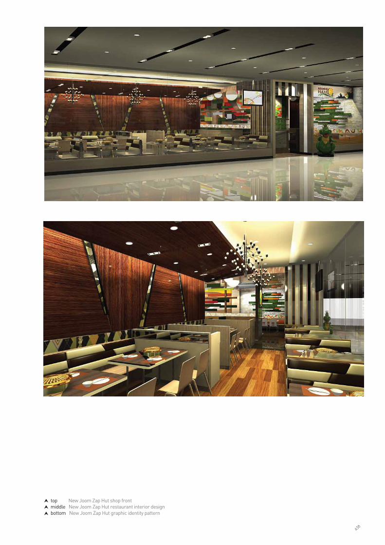
top New Joom Zap Hut shop frontmiddle New Joom Zap Hut restaurant interior designbottom New Joom Zap Hut graphic identity pattern
A38

Avoid-Traditional Style
Creative fun experienceFriendly
Enjoyable
Fun (customized taste)CreativeFamily, Friend
DynamicInteractive life styleNature interveneHappyEasy Difference
Competitors
Value
Corporate
Needs
Consumer
Direction
Brand Strategy
Chic, Friendly, Confident,Sincerity,Smart,Dynamic
Mega-Trend
As with all of our projects, we used “4 Universes research platform” to identify problems and synthesis the opportunity for the brand building, as you can see from the diagram. Design strategy is the using of variety of veneers (colors, texture, etc.) and playing with colors, shape & form, proportion design
Research Methodology : 1. Executive interview and photo collage workshop2. Trend analysis3. Competitive analysis
As with all of our projects, we started by researching the market and understanding the issue faced as well as conducting primary research among consumers. For this project - short time project- we set a workshop with the client to discuss new brand strategy and design concept together, by using “4 Universes research platform” like all of our projects. Photo collage workshop were used to formulate a view of new brand’ perceptions of Joom Zap Hut in the market.
From the photo collage map workshop, we can conclude the new brand’s image for Joom Zap Hut. The client wanted to rebrand with changing its logo by their in-house design team. The solution - Sparkling Boho concept - was built around the idea of “Sparkling Life, Flavorful to my taste ”, and provided recognition and expression within a unified and coherent corporate identity. As a result, I illustrated the identity graphic element: Joom Zap Hut ’s Sparkling Boho Graphic to used along with the logo and launch it with new retail prototype.
top “Design Trend conclusion graph ”bottom “4 Universes research platform”
Phase>>
clarifying strategy
Phase>>
conducting research
Simplicity Nature
Charm Authentic
Design
Modern
Prospective Contemporary
Traditional
Memory
Historical
Classic
Discovery
Travels
Ethnic
Somewhere else
A39

top Brand strategybottom “Joom Zap Hut Sparkling Boho graphic” and its design inspiration: little of eclectic style and geometrical offbeat motif
casual
Brighten Lively
Modern
NatureWarm
a little eclectic
Motif
Chic Uniqueness
Smart, Cool
A40

After almost a month of fact finding and analysing, we set a workshop with the client to discuss new brand strategy and design concept together, by using “4 Universes research platform” like all of our projects.
The design concept, “Sparkling Boho”, inspired from new Bohemian art combine with I-SAAN traditional motif: its sophisticated, a little luxury and independent spirit. I illustrated and developed the pattern that can communicate this idea as repeated it in the graphic environment used in the restaurants.
The logo alone does not make an identity. “Joom Zap Hut Sparkling boho graphic” are used besides the logo and applied them to a diverse range of relevant applications in order to assess the strength and flexibility of the design. The design guideline stage allowed me to explore the creative potential of an identity by simulating a branded world. The goal for the new identity was to explore the versatility of the “Joom Zap Hut Sparkling boho graphic” elements and to develop supportive design elements if necessary.
Phase>>
designing identity
top Joom Zap Hut Sparkling Boho Graphic implementation and sketches
A41

C 0, M 43, Y 97, K 17
C 7, M 0, Y 31, K 13
C 0, M 29, Y 91, K 0
C 0, M 16, Y 100, K 0
สีเน้ือ = Pantone 7422 C (Transparency = 40%)C0 ,M9, Y5, K0
C0 ,M0, Y0, K100
สีเขียวเขม = Pantone 582 C
สีดำ = Pantone Black
สีเขียวออน = Pantone 5787 C
สีน้ำตาล = Pantone 723 C
สีเหลืองทอง = Pantone 116 C
ตัวอักษรภาษาไทยสำหรับหัวเร่ือง
ตัวอักษรภาษาไทยสำหรับเน้ือความ
ตัวอักษรภาษาอังกฤษสำหรับหัวเร่ือง
ตัวอักษรภาษาอังกฤษสำหรับเน้ือความ
Kunlasatri¡ ¢ ¤ § ¨ © ª « ¬ Þ ® ¯ ° ± ² ³ ´ µ ¶ · ¸ ¹ º » ¼ ½ ¾ ¿ À Á Â Ã Å Ç È É Ê Ë Ì Í Î
Browallia UPC
ก ข ค ง จ ฉ ช ซ ฌ ญ ฎ ฏ ฐ ฑ ฒ ณ ด ต ถ ท ธ น บ ป ผ ฝ พ ฟ ภ ม
ย ร ล ว ศ ษ ส ห ฬ อ ฮ
KunlasatriA B C D E F G H I J K L M N O P Q R S T U V W X Y Z a b c d e f g h i j k l m n o p q r s t u v w x y z
Browallia UPC
A B C D E F G H I J K L M N O P Q R S T U V W X Y Z
a b c d e f g h i j k l m n o p q r s t u v w x y z
The identity colors were chosen as the combination of green (which is the existing identity color). They also have positive environmental conditions and fulfill a number of practical requirements: visibility on livery, sufficient contrast between the element upon a background. It is also a screen-safe color palette used on the worldwide web.
The graphic identity was designed to work on white, green and black backgrounds, as well as on a single color and solid color version.
Type style provides a brand with consistancy. ‘Kunlasatri’ combines Thai comtemporary spirit and chic personality. It also work well in both English and Thai language, both printed and digital form.
สีเต็ม
สี Grey Scale
สีเต็ม Transparency = 50% สีเดียว
สีเดียวบนพ้ืนหลังท่ีมีสี สีเรียบ (Solid one color)สีเดียว Transparency = 50%
สีเต็มบนพ้ืนหลังท่ีมีสี
top left The brand primary graphic identitytop right The brand color palettebottom The brand identity typeface
A42

top The brand identity usage, color usage guideline and design guideline in annual occasion
รายละเอียดการใชงานบนพ้ืนสี
- ตัวอยางการใชงานบนพ้ืนหลังสีตางๆ
ของลวดลายตนแบบ- ตัวอยางการใชงานบนพ้ืนหลังสีตางๆ
ของลวดลายตามเทศกาล
การปรับสีสามารถปรับไดตามอารมณของเทศกาลท่ีตองการใช ดังตัวอยาง
ตัวอยางการปรับสีลวดลายเพ่ือใชในเทศกาลตางๆ
ลวดลายสำหรับเทศกาลฤดูรอน ลวดลายสำหรับเทศกาลฤดูหนาว**การกระจายออกของลาย จะตองเก็บความ เปนกลุมลาย และความผสมผสานเอาไว
**การกระจายออกของลาย จะตองเก็บความ เปนกลุมลาย และความผสมผสานเอาไว
ลวดลายสำหรับหัวขอวันสงกรานต
ลวดลายสำหรับเทศกาลคริสตมาส ลวดลายสำหรับเทศกาลวาเลนไทน ลวดลายสำหรับเทศกาลตรุษจีน
casual
Brighten
Lively
Modern
NatureWarm
a little eclectic
Motififi
ChChC icUniqueness
Smart, Cool
Phase>>
creating touchpoints
A43

top The consistency of the Joom Zap Hut ’s interior designbottom The consistency of the Joom Zap Hut and BAR B Q Plaza’s shop
In order to facilitate the correct application of the identity across a wide-spread usage, the design team and I also issued conventionally printed interim guidelines for the launch of the brand including the signage construction drawing. This helped to orchestrate the branding efforts under-taken by client’s in-house designer, local design firms and manufacturers of branded materials.
Phase>> managing assets
A44
THE NINEA community mall on RamaIX road
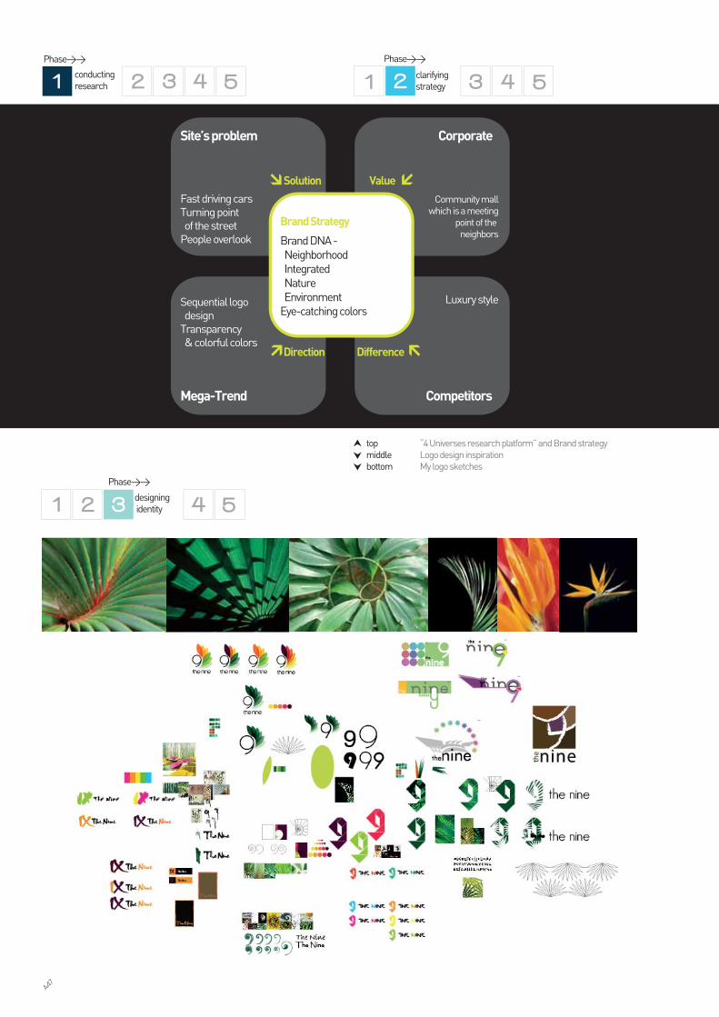
The Nine required a new brand identity that would reflect their status and project design concept. The brief was to create a brand concept and logo for this new community mall. Baramizi was appointed as branding consultant after winning a competitive pitch. This is one of the most outstanding achievement of mine as I was assigned to be a part of project manager team and art director team.
For this project, we begin with the small research about the site’s problem, competitors study, and logo trend 2010 study. The inspiration for the new brand identity was drawn from the tropical forest. Both colors and typographic style used for The Nine logo and brand communication evokes freshness and uniqueness from other shopping mall in Bangkok. The color of black is not normally associated with Thai shopping retails, but its use heightens the vibrancy and visibility of the color illustrations, unifying the elements of the identity and establish black as the common corporate color.
After working closely with the client’s executives, we synthesised the brand strategy, from brand DNA to brand slogan, and translated them to the brand identity design.
The Nine Neighborhood Center is located on 22,400 square metres land as the first Neighborhood Center on Rama IX road. The Nine will become a part of future route, Airport Rail Link, and will be the meeting point en route to Suvarnabhumi Airport and East side of Bang-kok. It is the semi open air lifestyle center in which the design and decoration are applied with Tropical Village concept, natural, and eco-friendly, compatible with the theme of the Project. The rental office building located in The Nine area is expecting to generate high traffic of customers as there will be up to 3,000 officers and visitors during working hours. The Nine becomes the new convergence of lifestyles that facilitate comfort, nature feeling, and cozy atmosphere for customers, as the meeting point for social gathering, shopping, and recreational places on Rama IX road.
Year : 2010Purpose : Creating and implementing new brand identity and graphic signage in the commu-nity mall. Scope of work : Brand concept Brand Identity Signage system designAccomplishment : After sending the final works, clients have confidence in our organization to hire us for their next project: corporate group rebranding. The Nine Neighborhood Center is opening in June 2011. Website : www.thenine.co.th/en
A45

top My first logo design sketch and retouched image that caused Baramizi won a competitive pitch. middle and bottom The final design of the identity and graphic signage outside and inside of the community mall.
A46
top “4 Universes research platform” and Brand strategymiddle Logo design inspirationbottom My logo sketches
Luxury style
Community mallwhich is a meeting
point of the neighbors
Fast driving carsTurning point of the streetPeople overlook
Sequential logo designTransparency & colorful colors
Competitors
CorporateSite’s problem
Difference
ValueSolution
Direction
Brand Strategy
Brand DNA - Neighborhood Integrated Nature EnvironmentEye-catching colors
Mega-Trend
Phase>>
clarifying strategy
Phase>>
designing identity
Phase>>
conducting research
A47

top Final logo and clear space (logo usage)bottom Logo usage in full color, single color and solid colorbottom The variety of graphic identity usage
As with all of our projects, we used “4 Universes research platform” to identify problems and synthesis the opportunity for the brand building, as you can see from the diagram on the previous page. Brand strategy is based on the project name’s spelling: N-I-N-E (Neighborhood/ Integrated/ Nature/ Environment). I developed a number of design concepts for The Nine brand mark based on the brand DNA and the brand name. Initial sketches included designs that were not based on the leaves elements.
The final logo incorporate the leaves encircled number nine. The design reflect the idea of ‘development, growth and integration’. I were inspired by beauty of the tropical plants: their patterns, shadow and shade. Moreover, I added a sequential design technique and tranparent bright colors that exhibit modern and fresh image, and convergence of various lifestyles.
The colors in both logo and graphic element are distinctive and differentiate the brand. The logo was designed to work on white, grey and black back-grounds, as well as on a single color and solid color.
Your place, your neighborhood.
A48

top Web page design guideline middle Graphic element usage (in special occasions)bottom Stationary design : letter paper, envelope, CD and its cover and business card.
the ninexx/xxx Rama IX Rd. Suanluang Bangkok 10250Tel : (66)2-620-7485-9 Fax: (66)2-620-7999 www.thenine.co.th
The Nine’s brand DNA, N-I-N-E (Neighborhood/ Integrated/ Nature/ Environment), were translated to every contact points of the brand: from signages to shopping bags.
The 5 overlapped leaves can also be used seperately from the logo, as a graphic element, to act as a strong icon. The icon also acts as colorful tropical forest that can be seen from long distances. Besides, it can be used in alternative colors in special occassions, for instance, the red-yello tone in Chinese’s new year event, the pink tone on Valentine’s day or any appropi-ate colors in annual events.
Modern Art exhibition Chinese’s New Year event
Earth day Valentine’s day
Phase>>
creating touchpoints
A49

top “Your” Advertisement design seriesbottom Advertisement design
All graphical and typophical elements of a brand identity need to support the position of a brand and fit with each other. If this is achieved the identity will be distinctive, relevant and flexible.
In the first stage the primary identity elements are designed (name, logo, colors). Then the secondary identity elements are developed (image style, type style, layout style, tone of voice). Last but not least, the design guideline of the brand’s contact points: signal-ling, official, informative, decorative and promotional items.
For the promotional items, such as advertising and literature (leaflets, brochures), slogan and language is very essential. The brand slogan : “Your place, your neighborhood” reflects the friendly and affable charac-ter. I also repeated them in the advertising series of “Your...” to make the customer feel closed to the services in the project. The intention was also to create a brand for meeting point that talked and act like the neighborhoods’ place. As you can see from the adver-tisement series... Your relaxation : Spa and wellness Your pleasure : Trendy shop Your discovery : Education, Book store Your savor : Coffee and bakery, Restaurant Your freshness : Supermarket
Your savor.รสสัมผัสของคุณ
ความสดชื่นของคุณYour freshness.
Your relaxation.วันผอนคลายของคุณ
Your discovery.การคนพบของคุณ
Your liveliest community mall on Rama IX road.
คอมมิวนิตี้มอลลหนึ่งเดียวในพระราม 9
Your pleasure.ความเบิกบานของคุณ
A50

top Signage system designbottom In-construction site wrap-up (artwork)
For the informative and signalling items like the signage system design, I used curves from the logo to create shape and form of them. Furthermore, I visualized the black background, the brand typeface (the alphabet and numerals) and the brand color palette to carried the consistent brand message. The combination of these elements determines the tone of voice of these pieces of design that are able to fulfill the functional, emotional and decorative purposes.
Now Open
market
west
village
East
village
ที่จอดรถ
ที่จอดรถใตดิน
ทางออก ถ.พระราม9 ซ.41
A51

top Signage design are in mock-up stage. The contractor is checking my design in real scale before final production.middle In-construction site wrap-up bottom Billboard
In order to facilitate the correct application of the identity across a widespread usage, the design team and I also issued conventionally printed interim guilde-lines for the launch of the brand including the signage construction drawing. This helped to orchestrate the branding efforts undertaken by client’s in-house designer and manufacturers of branded materials.
Phase>> managing assets
A52

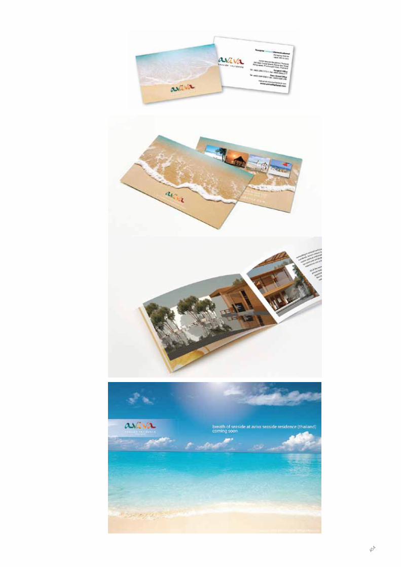
AVIVAlong stay resort
Aviva resort is located at Kho Krood, Prachuab Khiri Khan province, west of Thailand. The client wanted to develop the existeing resort business by repositioning and rename the resort. The client focused on lond stay resort for Scandinacia people. As a result, the new resort’s name is AVIVA that mean fresh, lively, spring-like. I designed the typography logo which illustrated the reflect effect of sunlight on the sea inside the word aviva. It repersented the concept of happiness, fresh-ness of people who come and stay their holiday at the resort. In addition, the color and interloging of circle unit in the logo repersented movement and enjoyment which can reflect the resort’s solgan - longivity happiness.
Year : 2011Purpose : Creating and implementing new brand identity for the new resort at Prachuab Khiri Khan province, west of Thailand.Scope of work : Brand strategy Brand Identity Marketing Material Design Website : www.avivathailand.com
A53
A54

B01
DESIGN RESEARCH
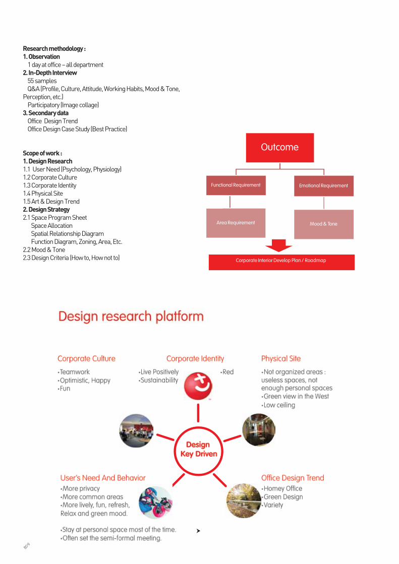
KFC vol.4Restaurant design evaluation
After the store renovation of KFC that abided by restaurant planning manual volume 4 has carried out for a while, KFC would like to evaluate the work based on consumers’ feedback (perception and satisfaction) towards this new volume and to study about the retail design developing system to improve KFC total brand experience. Consequently, the objectives of the project are 1) To evaluate the customer satisfaction for theKFC vol.4 store design both functional and emotional value in all customer contact points.
2) To compare between the KFC Vol.4 store design and McDonald’s store design. Ask for the consumer com-ments about the store design, strength and weakness of each contact point. The conclusion will be used to reinforce the strength and fix the weakness.
Year : 2011Purpose : To evaluate the customer satis-faction for the KFC vol.4 store design and compare between the KFC Vol.4 store design and McDonald’s store design.Scope of work : Design Research Research conclusion Design recommendation
B03

Analysis
Design strategyOn….2011
Implementation/ Action
Design researchTracking, Evaluate
A
Desigracking, e
gn researchg Evavav luate
gng, e
gng, e
Business development team must collect the data from -Design research-Design criteria-Brand objective-Marketing strategy 2011
Briefdesigners
top Retail evaluation processbottom Focus group
B04

Research Process Diagram
Methodology : Qualitative study the methodology consists of 3 parts
1: Focus group (main methodology)To study the customer satisfaction for the KFC Vol.4 store design then compare with McDonald’s. We recruit the target respondents from 2 sites to be the repre-sentative : ZeerRangsit and Esplanade Rattanathibet.a. To collect the data from the group discussion by Q&A. As the study is centered around the consumer experi-ence, which could be difficult to articulate or be at sub-conscious level, we will rely on special research meth-odologies / techniques in addition to normal Q&A focus group discussion b. Evaluation (Rating)c. Participatory (3D visualization scenario,Material)Time: Approximately 3 hours in each groupRD : 6groups of 8 people each
2 :Design trend study (supporting methodology) To study the consumption trends and design trends from 2009 global trend which will be the foundation of 2011 Thailand trends. Then use them as references for making the 3D visualization scenarios.
3 : In-store observation (supporting methodology) To study the behavior in the store of both KFC and McDonald’s Esplanade Rattanathibet.
top Rating and the scorebottom Research Process
��Overall Recheck•Mood & Tone• Perception
2. Details Recheck•Design Elements
3. Development Direction•Design Criteria
4. Magik•Mood & Tone•Design Technique
B05

top RD are comparing between the KFC Vol.4 store design and McDonald’s store design bottom RD are commmenting on the 3D visualization scenarios.
B06

My main responsibility was leading this project by managing research team (such as recruiting the respondent, inter-viewing, and questionaire and tools design), investigating data and synthesizing the design strategy.
top Methodology used in design researchmiddle In-depth interviewbottom left Out put example: wood veneer trend 2011bottom right Research tools example: Evolution of interior style
ImpulsedInterior
Decoration
BooksNewsSocial
TechnologyEconomy
Environment
BelieveBehaviorAttitude
Sale Volumn
Design Trend
Trend Framework studyConsumer (Designer)In-depth interview
Direction
InfluenceNeed
Popularity
Wood Veneer Trend
ColorPatternTextureOther decorative Items trend
Corporate
B07

Year : 2011Purpose : Explore the office design strategy Scope of work : Design research Design strategy Interior design (next phase)
COCA COLAASEANDesign research and space planning for their office renovation.
The objective of the project is to1. User Insight : to study user’s working behavior and to collect specific opinion from the user.
2. Explore the office design strategy : to create office renovation planning and to create the design strategy that include all the important contact points such as space planning, wall, ceiling, etc. The conclusion will shape the design key to answer the specific needs of user which are able to achieve the goal, while manag-ing the investment wisely and promote the corporate brand image in the same time.
B08
Research methodology : 1. Observation 1 day at office – all department2. In-Depth Interview 55 samples Q&A (Profile, Culture, Attitude, Working Habits, Mood & Tone, Perception, etc.) Participatory (Image collage)3. Secondary data Office Design Trend Office Design Case Study (Best Practice)
Scope of work : 1. Design Research1.1 User Need (Psychology, Physiology)1.2 Corporate Culture1.3 Corporate Identity1.4 Physical Site1.5 Art & Design Trend2. Design Strategy 2.1 Space Program Sheet Space Allocation Spatial Relationship Diagram Function Diagram, Zoning, Area, Etc.2.2 Mood & Tone2.3 Design Criteria (How to, How not to)
•••
••
• •
••
•••
•••
••
Corporate Interior Develop Plan / Roadmap
Outcome
Functional Requirement
Area Requirement
Emotional Requirement
Mood & Tone
B09
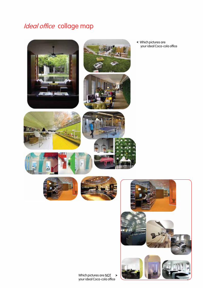
Ideal of�ce collage map
Which pictures are NOTyour ideal Coca-cola of�ce
Which pictures are your ideal Coca-cola of�ce
B10

Interior design program development chart
How?
How?
How?
1 2 3
2. is=? ought to be ?3. 4.
5.Step 1 : Research
What?
What?
What?
What?
What?
1.
Step 2 : Analysis(Goal statements)
Step 3 : Design Strategy (Area requirements, mood and tone)
Step 4 : Prioritize(base on possibility)
Step 5 : Design
Design goal statements
Functional goal statements1. Inspiring space : fun, challenging, dynamic feeling booster!2. Need more privacy but not an isolate space.3. Need more view.4. Encourage spontaneous informal collaboration
Emotional goal statements5. Represent Coca Cola’s brand : refresh the world, live positively, world class brand6. Lively, fun, refresh, homey, green mood & tone.
1.Inspiring space : fun, challenging, dynamic feeling booster!
2. More privacy: but not an isolate space!
3. More view
4. Encourage spontaneousinformal collaboration
5. Represent Coca Cola’s brand : refresh the world, live positively, world class brand 6. Lively,
fun,refresh, homey, green mood and tone
B11

••
B12

C01
GRAPHIC DESIGN
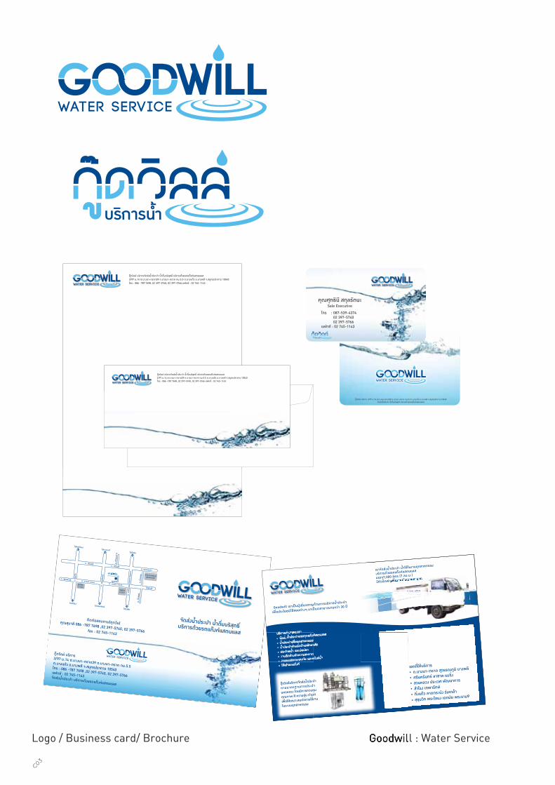
Logo / Business card/ Brochure Goodwill : Water Service Goodwill : Water Service
C03

Logo / Business card/ Brochure Pipat Intergroup: www.maxxwheel.com
พุฒิพัฒน พิพัฒนศิริกุลPuttipat Pipattanasirikulผูจัดการทั่วไป / General Manager
T 02-153-3456-7F 02-153-3458M 08-1901-1209 [email protected] www.maxxwheel.com
ศูนยอะไหลรังสิต 56/333 หมู6 ถนนพหลโยธิน ต. คลองหนึ่ง อ. คลองหลวง จ. ปทุมธานี 1212056/333 Moo 6, Phaholyothin Road, Klongnueng, Klongluang, Pathumthani, 12120
บริษัท พิพัฒน อินเตอรกรุป จำกัด
ศูนยจัดจำหนายกะทะลอ อะไหลรถกะบะและรถบรรทุกทุกประเภท ดวยคุณภาพสินคามาตรฐานระดับ ISO
We are main distributor for truck wheels & all kinds of truck spare parts
พนักงานฝายจัดซื้อ / Purchasing Executive
Phongkorn Ariyaamornpisal
พงษกรณ อริยอมรพิศาล
บริษัท พิพัฒน อินเตอรกรุป จำกัดศูนยอะไหลรังสิต 56/333 หมู6 ถนนพหลโยธิน ต. คลองหนึ่ง อ. คลองหลวง จ. ปทุมธานี 1212056/333 Moo 6, Phaholyothin Road, Klongnueng, Klongluang, Pathumthani, 12120
T 02-153-3456-7F 02-153-3458M [email protected]
C04
C04

gerbera
silverstergerbera
silverster
p l e n t y f l o w e r s p l e n t y h a p p i n e s sp l e n t y f l o w e r s p l e n t y h a p p i n e s s
p l e n t y f l o w e r s p l e n t y h a p p i n e s s
Bulk White Gerbera Daisy Flowers
have colorful daisy heads that
are nearlyflawless in form.
Our Gerberas are known
for their award winning premium
quality and long lasting vase life.
White Gerbera Daisies are bold
and beautiful fresh flowers that
would adorn any table
centerpiece, wedding bouquet
or flower arrangement.
Shipping included
in the price.
เยอบีราเปนไมดอกที่เจริญเติบโตรวดเร็ว
และแตกหนอเพิ่มจำนวนในกอขึ้นเรื่อย ๆ
จึงตองการปุยมาก แตถาขาดธาตุอาหาร
ก็จะแสดงอาการขาดธาตุอาหาร
ใหเห็นไดเร็วและชัดเจนที่ดอกกานดอก
และใบ จึงจำเปนตองใหปุยทั้งทางราก
และเสริมทางใบควบคูกันไปการใหปุย
เยอบีราแตละชวงจะไมเหมือนกัน
และไมเทากัน
instruction
gerberasilverster
gerberasilverster
special selected with care by
Kate H. MariamN.
especially for
http://www.dasada-happiness.com/Flower pot sleeve & bag
C05

บริษัท พีดีเอส เอ็นจีวี สเตชั่น จำกัด1168/76 ชั้น26 ลุมพินีทาวเวอร ถ.พระราม4แขวงทุงมหาเมฆ เขตสาทร กรุงเทพมหานคร
ธีรพันธ ฉอประเสริฐโชคTheeraphan ChoprachertchocChairman Tel 66+2999 9999Fax 66+2999 9999Mobile 668+9999 9999Email [email protected]
Logo & Brochure The Bay : Community Mall
C06

www.theprivilegeatbaycliff.comBayCliffDevelopment Co.,Ltd. 39/117-122 Prabaramee Road, Patong, Kathu, Phuket 83150
Theeraphan Choprachertchoc
Chairman
Tel 66+2999 9999
Fax 66+2999 9999
Mobile 668+999 9999
Email [email protected]
Theeraphan Choprachertchoc
Chairman
Tel 66+2999 9999
Fax 66+2999 9999
Mobile 668+999 9999
Email [email protected]
http://www.theprivilegeatbaycliff.com/Marketing Material
C07
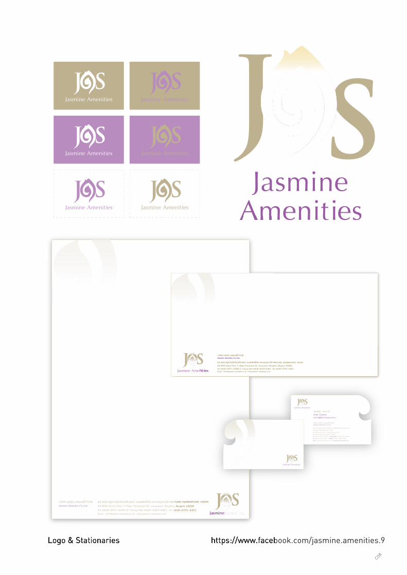
https://www.facebook.com/jasmine.amenities.9Logo & Stationaries https://www.facebook.com/jasmine.amenities.9Logo & Stationaries
บริษัท แจสมิน เอแมนนิตี้ จำกัด 43/830 หมูบานอัมรินทรนิเวศน1 ถนนพหลโยธิน แขวงอนุสาวรีย เขตบางเขน กรุเทพมหานคร 1022043/830 Amarin-Nivej 1 Village, Paholyothin Rd., Anusawaree, Bangkhen, Bangkok 10220Tel. 66(0)-2971-4350-2, (Chiang Mai) 66(0)-5343-2421 Fax 66(0)-2791-4351Email : [email protected] www.jasmine-amenities.co.th
Jasmine Amenities Co.,Ltd.
บริษัท แจสมิน เอแมนนิตี้ จำกัด
43/830 หมูบานอัมรินทรนิเวศน1 ถนนพหลโยธิน แขวงอนุสาวรีย เขตบางเขน กรุเทพมหานคร 1022043/830 Amarin-Nivej 1 Village, Paholyothin Rd., Anusawaree, Bangkhen, Bangkok 10220Tel. 66(0)-2971-4350-2, (Chiang Mai) 66(0)-5343-2421 Fax 66(0)-2791-4351Email : [email protected] www.jasmine-amenities.co.th
Jasmine Amenities Co.,Ltd.
43/830 หมูบานอัมรินทรนิเวศน1 ถนนพหลโยธิน แขวงอนุสาวรีย เขตบางเขน กรุเทพมหานคร 1022043/830 หมูบานอัมรินทรนิเวศน1 ถนนพหลโยธิน แขวงอนุสาวรีย เขตบางเขน กรุเทพมหานคร 1022043/830 Amarin-Nivej 1 Village, Paholyothin Rd., Anusawaree, Bangkhen, Bangkok 1022043/830 Amarin-Nivej 1 Village, Paholyothin Rd., Anusawaree, Bangkhen, Bangkok 10220Tel. 66(0)-2971-4350-2, (Chiang Mai) 66(0)-5343-2421 Fax 66(0)-2791-4351Tel. 66(0)-2971-4350-2, (Chiang Mai) 66(0)-5343-2421 Fax 66(0)-2791-4351
บริษัท แจสมิน เอแมนนิตี้ จำกัด บริษัท แจสมิน เอแมนนิตี้ จำกัด
43/830 หมูบานอัมรินทรนิเวศน1 ถนนพหลโยธิน แขวงอนุสาวรีย เขตบางเขน กรุเทพมหานคร 1022043/830 หมูบานอัมรินทรนิเวศน1 ถนนพหลโยธิน แขวงอนุสาวรีย เขตบางเขน กรุเทพมหานคร 1022043/830 Amarin-Nivej 1 Village, Paholyothin Rd., Anusawaree, Bangkhen, Bangkok 1022043/830 Amarin-Nivej 1 Village, Paholyothin Rd., Anusawaree, Bangkhen, Bangkok 10220Tel. 66(0)-2971-4350-2, (Chiang Mai) 66(0)-5343-2421 Fax 66(0)-2791-4351Tel. 66(0)-2971-4350-2, (Chiang Mai) 66(0)-5343-2421 Fax 66(0)-2791-4351Email : [email protected] www.jasmine-amenities.co.thEmail : [email protected] www.jasmine-amenities.co.th
Jasmine Amenities Co.,Ltd.Jasmine Amenities Co.,Ltd.
บริษัท แจสมิน เอแมนนิตี้ จำกัด
43/830 หมูบานอัมรินทรนิเวศน1 ถนนพหลโยธิน แขวงอนุสาวรียเขตบางเขน กรุเทพมหานคร 1022043/830 Amarin-Nivej 1 Village, Paholyothin Rd., Anusawaree, Bangkhen, Bangkok 10220Tel 66(0)-2971-4350-2, (Chiang Mai) 66(0)-5343-2421 Fax 66(0)-2791-4351 Mobile 66(0)8-1859-5490Email : [email protected] www.jasmine-amenities.co.th
Jasmine Amenities Co.,Ltd.
สมจิตร เลนวารีSomjit Lenwareeกรรการผูจัดการ Managing Director
C08

D01

MISCELLANEOUS

1st prize of Cotto's smart and style award
Temporary toilet for flood victims
Because of the severely Bangkok flood crisis in October 2011, I and my friends setted the event of making emer-gency toilet for flood victims at Faculty of Architecture Chulalongkorn University. We desired to use simply mate-rials and easy making method to make the emergency toilet. Because, we wanted to deliver it to the victims’ hands as fast as we can.
At the beginning, we wanted to make 200 emergency toilets in 2 days and delivered to the area that attack flood. We announced and asked for helping from our college friends by using social network - facebook. But, there is a very good respondence. We gained money for the sponsors and helping from public volunteers to help us make more toilet than the number we expected. Eventually, we extended the event and can delivered 6,740 sets of emergency toilet to over 40 flooding areas in Thailand. Moreover, this project was handed to the Flood Relief Operation of Chulalongkorn University to manage the project untill the situation relieved.
EMERGENCY TOILET
Year : 2011Subject : Project coordinator, “Emergency portable toilet for flood victims” in flooding crisis 2012
D03

30-years-traditional comedy
During the 3th year, I was a design director of special effect team of my faculty’s annual stage play. This 30-years-traditional comedy is the most reputable for creativity among student theaters. I had to manage almost 20 staffs of my production teams to set and run the special effect on the stage. This was one of the memora-ble experience for my personal development because it could strengthen my ability in shaping the idea how to sol ve the problems while working, process the best solution with all considered details and manage a team of students who came from different year. As a result, approximately 12,000 tickets were sold out for the 10 showings. Also, the executive board under my direction was able to gain the most profit in the faculty’s history (almost 1.5 million baht), which was donated to charities.
BOONCHU
Year : 2007Subject : Community work President and producer of the Faculty’s hStage Play
D04
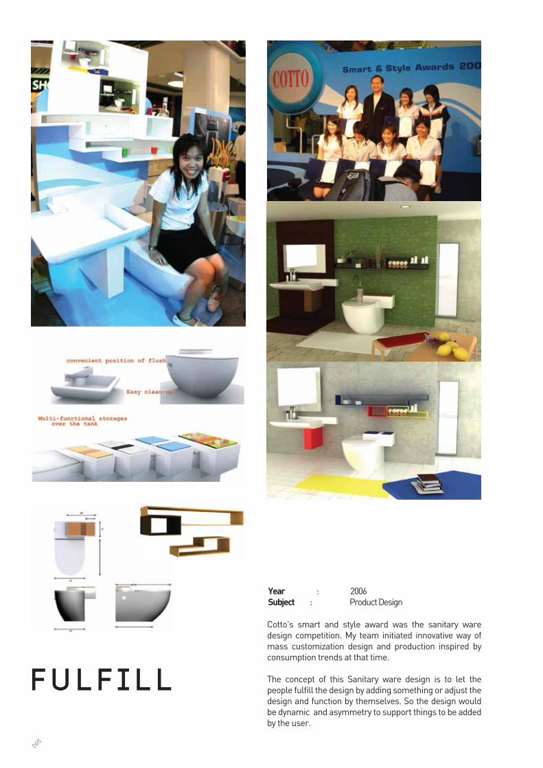
Cotto's smart and style award was the sanitary ware design competition. My team initiated innovative way of mass customization design and production inspired by consumption trends at that time.
The concept of this Sanitary ware design is to let the people fulfill the design by adding something or adjust the design and function by themselves. So the design would be dynamic and asymmetry to support things to be added by the user.
F u l F i l l
Year : 2006Subject : Product Design
D05
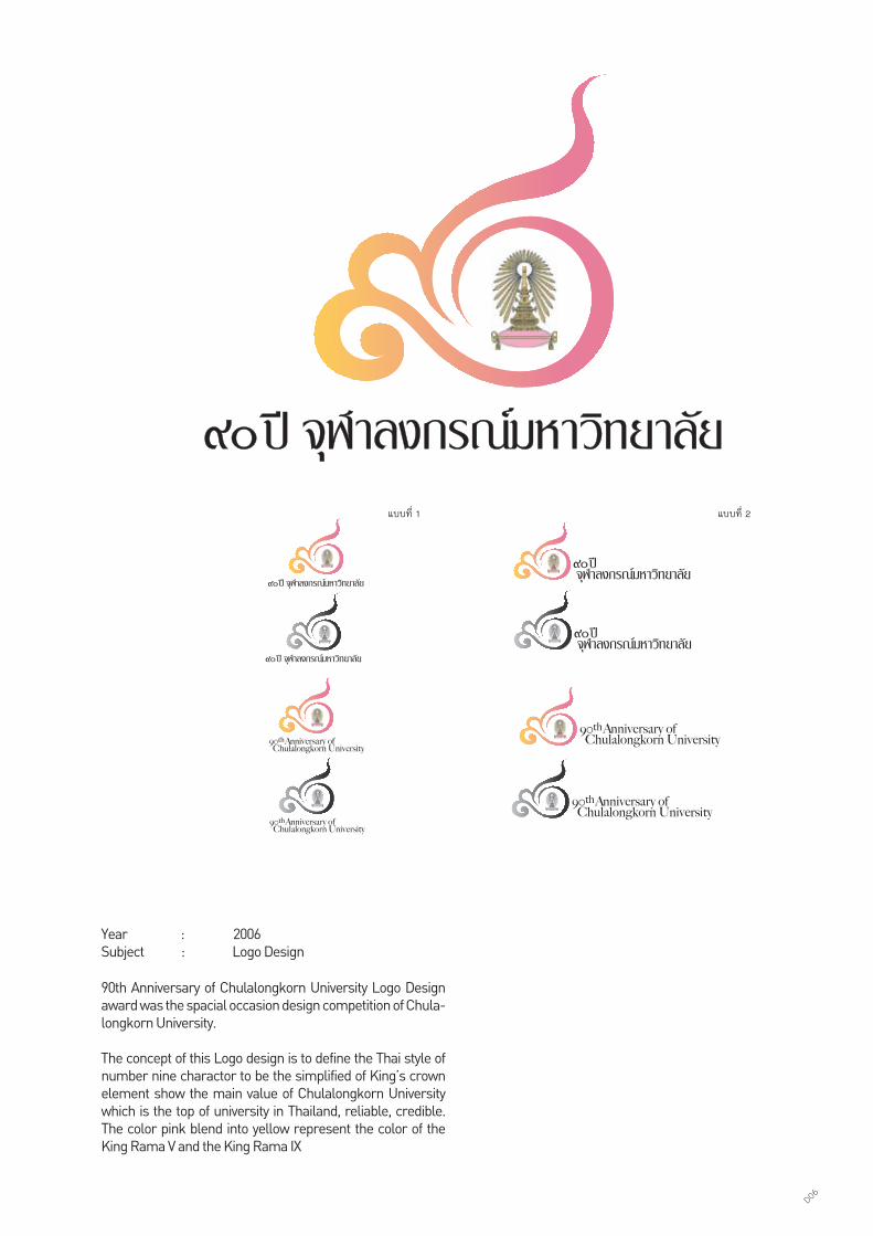
90th Anniversary of Chulalongkorn University Logo Design award was the spacial occasion design competition of Chula-longkorn University.
The concept of this Logo design is to define the Thai style of number nine charactor to be the simplified of King’s crown element show the main value of Chulalongkorn University which is the top of university in Thailand, reliable, credible. The color pink blend into yellow represent the color of the King Rama V and the King Rama IX
Year : 2006Subject : Logo Design
แบบที่ 2แบบที่ 1
D06

My interest
PHOTO SHOOTING
D07

My interest
PAINTING &ILLUSTRATION
D08