Embed Size (px)
Citation preview
EVALUATION: Q1 - In what ways does your media product; use, develope and challenge conventions of real media
products?
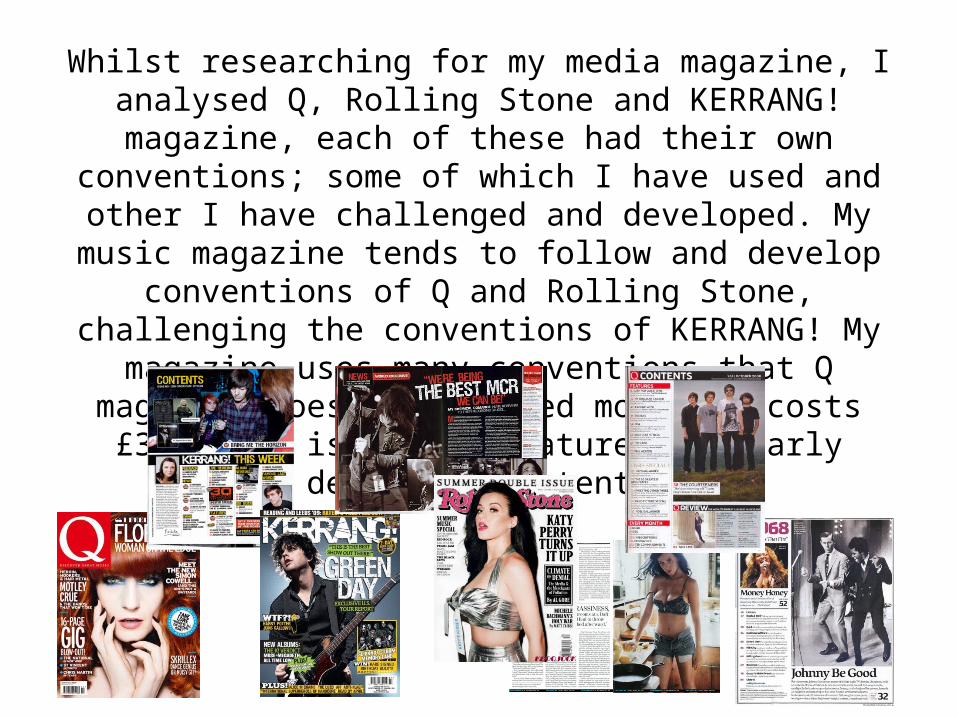
Whilst researching for my media magazine, I analysed Q, Rolling Stone and KERRANG! magazine, each of these had their own
conventions; some of which I have used and other I have challenged and developed. My music magazine tends to follow
and develop conventions of Q and Rolling Stone, challenging the conventions of KERRANG! My magazine uses many conventions that Q magazine does; its issued monthly, costs £3.50 per issue
and features similarly delivered content.
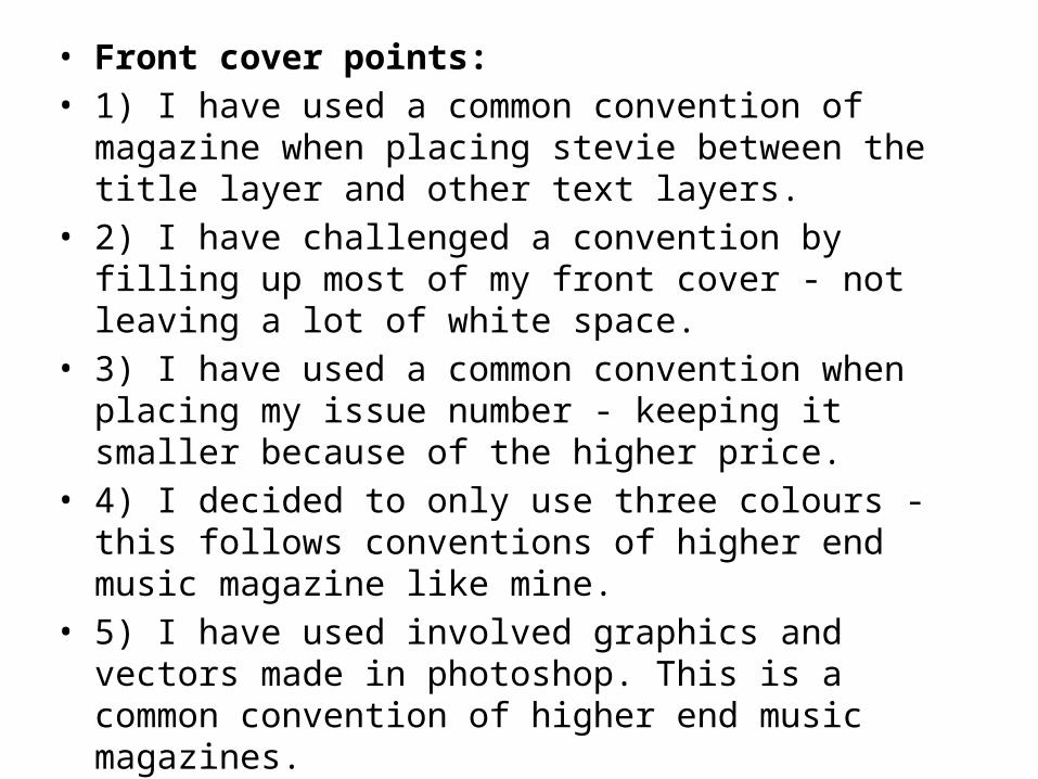
• Front cover points: • 1) I have used a common convention of magazine when
placing stevie between the title layer and other text layers. • 2) I have challenged a convention by filling up most of my
front cover - not leaving a lot of white space.• 3) I have used a common convention when placing my issue
number - keeping it smaller because of the higher price.• 4) I decided to only use three colours - this follows
conventions of higher end music magazine like mine.• 5) I have used involved graphics and vectors made in
photoshop. This is a common convention of higher end music magazines.
• 6) I have challenged/developed a convention by having the main image (stevie) to the side of the front cover - not in the middle.
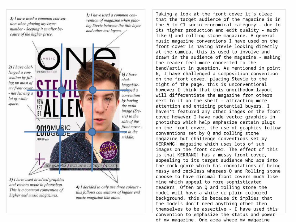
Taking a look at the front cover it’s clear that the target audience of the magazine is in the A to C1 socio economical category - due to its higher production and edit quality - much like Q and rolling stone magazine. A general music magazine conventions I have used on the front cover is having Stevie looking directly at the camera, this is used to involve and drawn in the audience of the magazine - making the reader feel more connected to the band/artist in question. As mentioned in point 6, I have challenged a composition convention on the front cover; placing Stevie to the right of the page, this is unconventional however I think that this unorthodox layout will differentiate the magazine from others next to it on the shelf - attracting more attention and enticing potential buyers. I haven’t featured any other images on the front cover however I have made vector graphics in photoshop which help emphasize certain plugs on the front cover, the use of graphics follow conventions set by Q and rolling stone magazine but challenge conventions set by KERRANG! magazine which uses lots of sub images on the front cover. The effect of this is that KERRANG! has a messy front cover, appealing to its target audience who are into the rock genre which has connotations of being messy and reckless whereas Q and Rolling stone choose to have minimal front covers much like mine which appeal to more sophisticated readers. Often on Q and rolling stone the model will have a white or plain coloured background, this is because it implies that the models don’t need anything other then themselves to be assertive - I have used this convention to emphasize the status and power of my magazine. One area where my magazine challenges conventions of Q magazine but conforms to KERRANG! and Rolling Stone magazine is with the masthead. My masthead stretches across the width of the front cover and it placed behind the image of Stevie. This shows integration and connection with the band/artist, which sells the magazine because it makes the reader believe that the magazine is close with the artist/band in question and will therefore have insider knowledge on them.
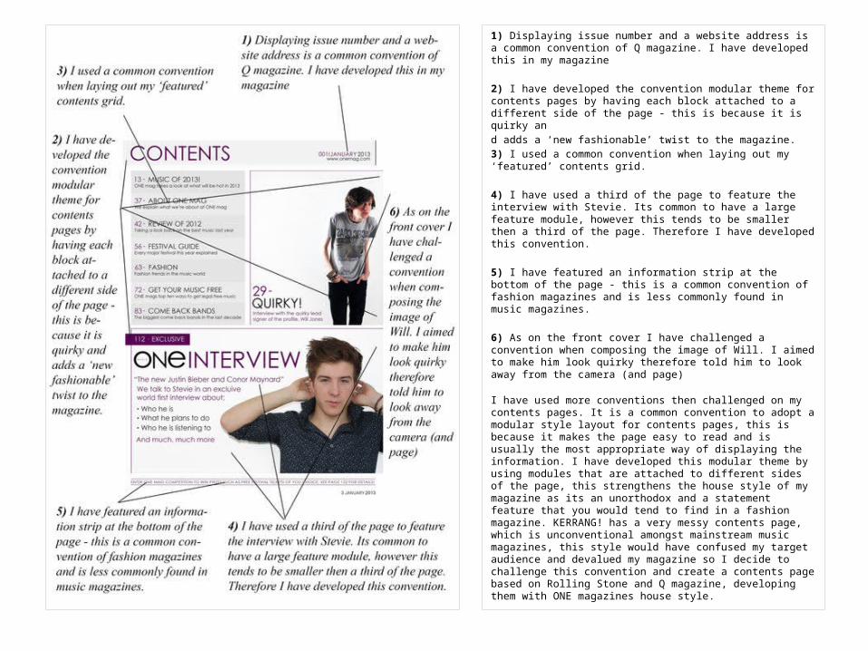
1) Displaying issue number and a website address is a common convention of Q magazine. I have developed this in my magazine
2) I have developed the convention modular theme for contents pages by having each block attached to a different side of the page - this is because it is quirky and adds a ‘new fashionable’ twist to the magazine. 3) I used a common convention when laying out my ‘featured’ contents grid.
4) I have used a third of the page to feature the interview with Stevie. Its common to have a large feature module, however this tends to be smaller then a third of the page. Therefore I have developed this convention.
5) I have featured an information strip at the bottom of the page - this is a common convention of fashion magazines and is less commonly found in music magazines.
6) As on the front cover I have challenged a convention when composing the image of Will. I aimed to make him look quirky therefore told him to look away from the camera (and page)
I have used more conventions then challenged on my contents pages. It is a common convention to adopt a modular style layout for contents pages, this is because it makes the page easy to read and is usually the most appropriate way of displaying the information. I have developed this modular theme by using modules that are attached to different sides of the page, this strengthens the house style of my magazine as its an unorthodox and a statement feature that you would tend to find in a fashion magazine. KERRANG! has a very messy contents page, which is unconventional amongst mainstream music magazines, this style would have confused my target audience and devalued my magazine so I decide to challenge this convention and create a contents page based on Rolling Stone and Q magazine, developing them with ONE magazines house style.
Double Page Spread • I have used more conventions then challenged on my contents
pages. It is a common convention to adopt a modular style layout for contents pages, this is because it makes the page easy to read and is usually the most appropriate way of displaying the information. I have developed this modular theme by using modules that are attached to different sides of the page, this strengthens the house style of my magazine as its an unorthodox and a statement feature that you would tend to find in a fashion magazine. KERRANG! has a very messy contents page, which is unconventional amongst mainstream music magazines, this style would have confused my target audience and devalued my magazine so I decide to challenge this convention and create a contents page based on Rolling Stone and Q magazine, developing them with ONE magazines house style.
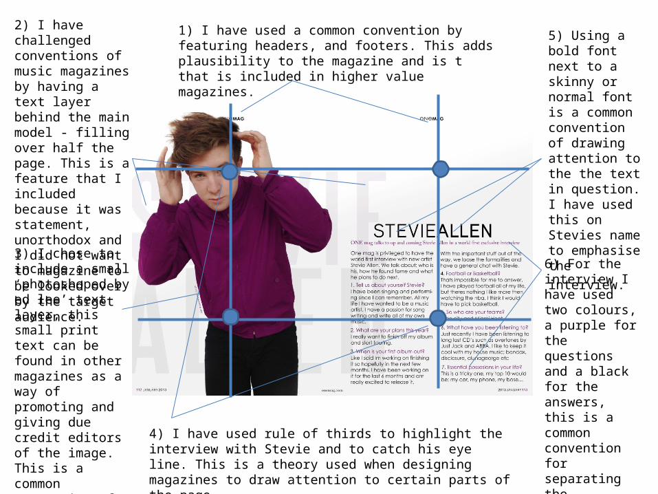
2) I have challenged conventions of music magazines by having a text layer behind the main model - filling over half the page. This is a feature that I included because it was statement, unorthodox and I did not want to magazine to be looked over by the target audience.
3) I chose to include a small ‘photoshoped by ed lee’ text layer, this small print text can be found in other magazines as a way of promoting and giving due credit editors of the image. This is a common convention of higher end music magazines so I chose to imitate it.
1) I have used a common convention by featuring headers, and footers. This adds plausibility to the magazine and is t that is included in higher value magazines.
5) Using a bold font next to a skinny or normal font is a common convention of drawing attention to the the text in question. I have used this on Stevies name to emphasise the interview.
6) For the interview I have used two colours, a purple for the questions and a black for the answers, this is a common convention for separating the questions from the answers in written interviews.
4) I have used rule of thirds to highlight the interview with Stevie and to catch his eye line. This is a theory used when designing magazines to draw attention to certain parts of the page.