Embed Size (px)
Citation preview


Since 2000, Sumo has been making an impact with branding, digital, print and advertising for forward thinking organisations including the BBC, The National Gallery, Qatar Museums Authority, National Trust and The Hepworth Wakefield.
Today, that impact is needed more than ever…
We believe that what defines our work is the impact it has for our clients.
Everything we do aims to have a positive impact, whether that is converting a passing interest into a purchase, a website hit into an actual visit or an appreciation into real involvement.
Creating that impact requires great creative ideas based on a well-considered strategy that respects the audience, understands the context and delivers the vision.
Balancing creativity with commercial accountability means our success has only been possible by creating impact for our clients.
IDEAS TO ACT UPONIt’s an approach that keeps us creatively ambitious, yet strategically focussed. We always aim to create great creative ideas that can appeal and inspire. But for us an idea is only clever when it stimulates action. It’s that objective that keeps us grounded, tactically astute and commercially driven.
SO HOW DO WE CREATE
IDEAS TO ACT UPON?A client writes his own brief. A designer can’t start without one. We need to be absolutely clear about what we want the audience to take out. How do we want them to respond and act?
TO UNDERSTAND A MAN
YOU MUST WALK FIVE
MILES IN HIS SHOESWe want to imagine your different audiences — even to become these people for a short while. We focus on real target audience insight, not marketing generalisations.
DESIGN DOESN’T
JUST IDENTIFY.
IT MUST SIGNIFYDesign is nothing without a message. We aim to encapsulate the true values and spirit of our client’s brand, and what makes it different.
GET A GOOD IDEA
AND STAY WITH ITDo it, and work at it until it’s done right. In our experience, a good creative idea requires persistence. We wrestle with an idea until it’s sharply honed and really well executed.
WE ALWAYS WANT
PEOPLE TO SAY
‘WE LOVE IT!’We rarely analyse in the real world. Our responses are usually emotive ones. Gut reactions are good because emotions give rise to action.
SARAH HANLEY
Creative Director
ADDRESS
Sumo 71 Westgate Road Newcastle upon Tyne NE1 1SG
TELEPHONE
0191 261 9894
WEBSITE
www.sumodesign.co.uk
WORKING WITH SUMO

WHO WE WORK WITH

CHALLENGEThe Museum of East Anglian Life is the largest independent museum in East of England. Based in the heart of Stowmarket, the museum is a key part of the local community. With 80 acres of countryside, 25 historic buildings, 45,000 objects and rare breed animals, the museum has a diverse offer to communicate.
Over the past few years the museum has also emerged as a social enterprise providing training, skills development and care programmes, so they found themselves with a need to communicate to clients and delivery partners as well as visitors and the community.
We were commissioned by them to work with them to establish their brand positioning and new identity.
IDEAWe needed to know as much as possible about the organisation, their audiences and their potential audiences, so we undertook a series of workshops with the team.
We found the museum was a place where people grow, from their experience, from the training programmes, from the things they learn. So growth was an important part of the brand essence. “People grow with us through history’ was established as the essence of the museum. This reflected not only people visiting and training with the organisation, but staff could get behind it, it meant something to them as they grow with the museum.
CASE STUDY
MUSEUM OF EAST ANGLIAN LIFE
REBRANDING A MUSEUM

RESPONSETo reach out to a broad audience and communicate the diversity of the collection, we created a flexible identity that comes to life with a palette of words. The museum has so much to say, so we adapted the logo to fit with words relating to different themes.
The museum is lucky enough to have a working traditional letterpress, so we could use the skills of the people connected with the museum to create the unique typographic identity.
The texture of the typography also transfers to imagery and colour blocks creating a multi-layered visual language which can engage with all of their audiences, including teachers and educational audiences.
REFERENCEJohn Lanagan Museum Manager
ADDRESS
Museum of East Anglian Life Ilife Way Stowmarket Suffolk IP14 1DL
TELEPHONE
01449 612229

CHALLENGEFounded in 1891 as a living memorial to the life and poetry of William Wordsworth, The Wordsworth Trust is an authority on British Romanticism, providing the full context for understanding and celebrating this major cultural movement in history.
The Trust is passionate about the work it does and wanted to share that passion by increasing its audience, communicating the depth of its offer and revitalising the brand. Creating a brand which would appeal to a wide audience whilst keeping academic integrity was paramount to its success.
IDEAGetting to the heart of the Trust through thorough research and workshops with various staff members allowed us to truly understand the organisation. With a core essence of ‘Sharing inspiration from the past, for the future’ the new brand increased the Trusts audience reach.
We created an identity which makes reference to the inspiration behind one of Wordsworths most famous poems and plays on the strength of the association between the daffodil and the poet in the mind of the general public. It also flags up a major theme in his work – nature – and gives the Trust ownership of an iconic symbol from the history of Wordsworth.
CASE STUDY
THE WORDSWORTH TRUST
CREATING AN IDENTITY FOR WIDER APPEAL

RESPONSEThe new brand allows the Trust to communicate with many different audiences through our audiences, and to talk about its wider work and academic worth. A comprehensive set of guidelines was created to ensure consistency as the new brand rolls out, and for all future applications.
Since the rebrand, the organisation has a renewed drive and common purpose and change has been visible, with programming, merchandise and events all changing to be brought in line with their new brand ethos. We await visitor numbers.
“ The difference between SUMO and other design agencies is that they are focused on how a brand will actually work, not just on how it looks.”
Paul Kleian Head of Marketing & Communications
REFERENCEPaul Kleian Head of Marketing & Communications
ADDRESS
The Wordsworth Trust Dove Cottage Grasmere Cumbria LA22 9SH
TELEPHONE
01539 435 544

CHALLENGEOn the last Friday of each month the Natural History Museum (NHM)opens its doors in the evening to welcome an audience who would like to visit the museum later and combine it with a social night out by offering admission to the museum alongside live music and food and drink.
Sponsored by Mastercard we were approached by the Natural History Museum to create a new identity for the evening programme, ensuring it would sit alongside both the Mastercard and NHM logo. With the competition from the rest of London’s nightlife how could we create an identity which would appeal to this audience?
IDEAThe new sub brand for the Natural History Museum was created; After Hours. With the tagline ‘Explore the museum in a different light’ the After Hours brand brings together a photographic style with the After Hours identity in the NHM typeface. The letter O in ‘Hours’ was cleverly highlighted and shifted to reflect the sun going down, showing the museum coming to life after hours.
CASE STUDY
NATURAL HISTORY MUSEUM AFTER HOURS
BRANDING EVENING EVENTS IN A CROWDED CULTURAL LANDSCAPE

RESPONSEThe new brand has been well received by the Natural History Museum and its audience for evening events. Every month the After Hours events are a sell out and the evening programme is going from strength to strength on the London circuit.
Visitor numbers increased by 31% from 2011-2012 when the new creative was introduced.
REFERENCEJennifer Bailey Head of Marketing
ADDRESS
Natural History Museum Cromwell Road London SW7 5BD
TELEPHONE
020 7942 5886
Visitor numbers increased by 31% from 2011-2012 when the new creative was introduced.

CHALLENGEEstablished in 1977 to improve public access to the arts, The Harley Foundation is a charitable trust. Based in the ducal estate of Welbeck, the Foundation runs the award-winning Harley Gallery, an education programme and three sets of artists’ studios.
With plans in the offing to create a new gallery space to showcase The Portland Collections coupled with a desire to appeal to a younger audience, the trustees decided it was a good time to address the brand for the venues and activities of the Foundation.
IDEAWe held 2 workshop sessions, one with trustees of the Foundation and another with staff and estate managers to fully understand their vision. In terms of the activities we discovered the architecture of the brand had many strands, consisting of the Foundation, the Gallery, the Shop and the Artist Studios. The overarching themes from the workshop were the mix of the contemporary and the historic, being inspired by the past to make their mark on the future.
With this in mind we developed a unique typographic treatment combining a timeless and classic serif typeface with a bold, minimal sans serif to create a wordmark with broad appeal. A dynamic two tone visual language was developed to communicate the brand across a wide range of materials.
CASE STUDY
THE HARLEY GALLERY
GALLERY REBRAND

A B C D E F G H I J K L M N O P Q R S T U V W X Y Z ., : ! ?0123456789
HARLEYDISPLAY
A CUSTOM TYPEFACE
RESPONSEThe brand will start to roll out in 2014, signalling the 20th birthday of the gallery. We look forward to seeing the response to the new brand and await audience numbers.
“ We’re delighted to have worked with Sumo. The team have got to know The Harley Gallery inside out and upside down – so we’ve been completely confident to place our brand in their hands! An easy, inspiring and effective process. Thank you. ”
Rebecca Wombell Marketing Manager
REFERENCERebecca Wombell Marketing Manager
ADDRESS
The Harley GalleryWelbeckWorksopNottinghamshireS80 3LW
TELEPHONE
01909 501 700

CHALLENGEThe University of Cambridge Museums and Gardens venues consist of 11 museums and the Botanical Gardens. The University’s collections are a world-class resource for researchers, students and members of the public.
As individual museums the venues all look after their own communications, but there was little cross-promotion or cohesive messaging collaboratively.
Our challenge was to develop an umbrella visual language to promote the museums and gardens as a joint offer.
IDEAAn eclectic mix of images from across the 12 venues were combined with witty and playful copylines to reflect the real breadth of museums that visitors could experience.
Playing on themes to surprise and intrigue visitors about collections they may never have thought they could see in Cambridge, in one day. The concept has an academic yet experiential feel to enhance Cambridge’s academic tone yet with an accessible feel to engage with visitors and residents alike.
CASE STUDY
UNIVERSITY OF CAMBRIDGE MUSEUMS & GARDEN
MARKETING A GROUP OF MUSEUMS IN A COHESIVE STYLE

From Arctic Exploration
to artistic inspiration
Curating Cambridgecelebrating our stuff, our stories, our city
Thursday 23 October – Sunday 23 November 2014
RESPONSEThe concept is currently rolling out across a range of materials, the first being a project for ‘Twilight at the Museums’ as well as the recent completion of a set of guidelines to be used by all venues.
REFERENCEVerity Sanderson Marketing and Press Coordinator
ADDRESS
University of Cambridge Museums Officec/o The Fitzwilliam MuseumTrumpington StreetCambridgeCB2 1RB
TELEPHONE
07872 410663

CHALLENGECreswell Crags is both a scheduled monument and a site of specific scientific interest. An existing museum and visitor attraction, in 2007 Creswell Heritage Trust raised funding to develop a £9m Museum and Education Centre on the site to tell the story of Ice Age Britain and Creswell Crags.
However, to the general public the site was no always evident or recognised. This represented a major opportunity to make the Crags a focus for landscape identity and help develop a sense of place amongst local communities, as well as to develop a significant tourism asset for the region.
IDEALike all projects we work on, we wanted to get to the heart of the project, understand what it stood for and how we could convey that. A series of workshops were developed which brought together the board, management team and staff of Creswell Crags to help us identify the brand’s essence and associated values.
We developed four brand pillars: authenticity, accessibility, sustainability and spirit. Building upon this foundation, our core message is that Creswell Crags is an inspirational place, in landscape and human history. This uniqueness makes it a powerful means of ‘Inspiring People.’
CASE STUDY
CRESWELL CRAGS
CREATING AN IDENTITY FOR A NEW VISITOR ATTRACTION

www.creswellcrags.org.uk
by Britain’s oldest art galleryBE INSPIRED
RESPONSEThe strategy steered the creation of our new identity. It uses four ‘man-made’ marks taken from Creswell Crags’ cave art, some of the earliest evidence of art in Britain. This combined with our specially created typeface form a powerful, elemental total marque. The copy and imagery continue the ‘inspiring’ theme across the full range of marketing materials.
The new brand underpins the site’s national and international prominence as well as assisting with the wider regeneration of the region.
“ What impressed me about Sumo is the sensitive way the team has listened to our needs...the resulting brand shows a thoughtful combination of their creativity with our aspirations.”
Ian Wall Director
REFERENCEIan Wall Director
ADDRESS
Creswell Crags Crags Road Welbeck Worksop Notts S80 3LH
TELEPHONE
01909 720378
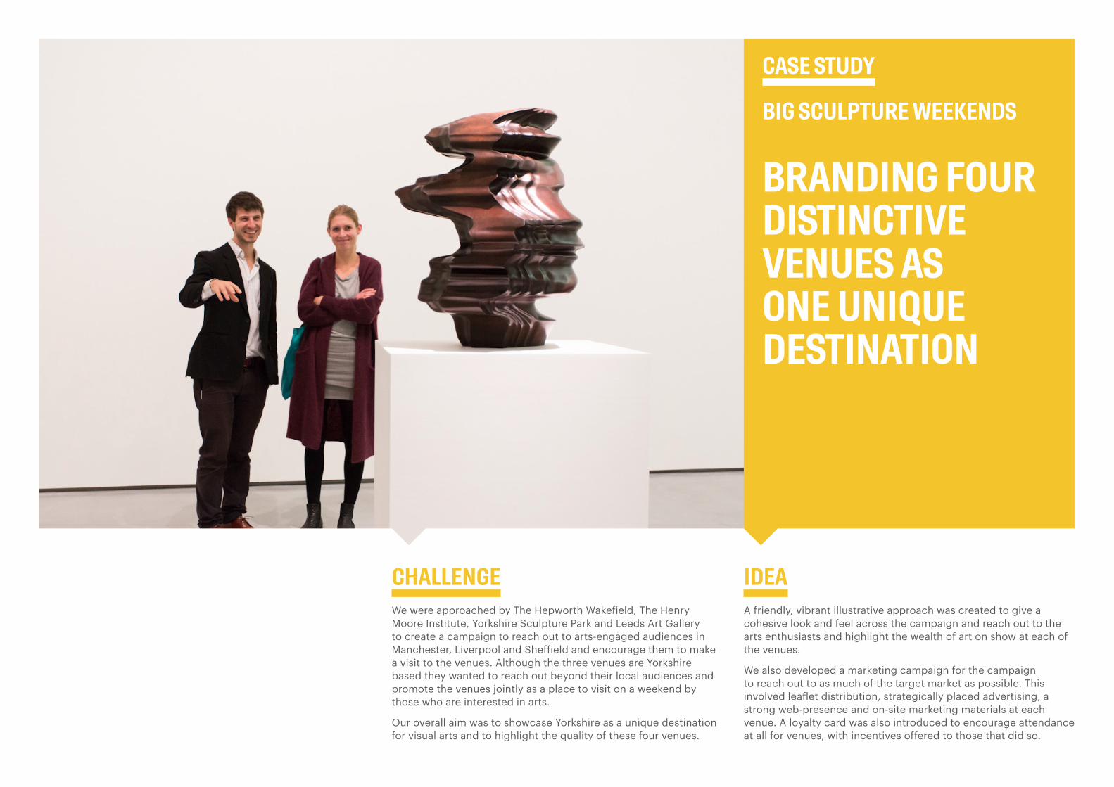
CHALLENGEWe were approached by The Hepworth Wakefield, The Henry Moore Institute, Yorkshire Sculpture Park and Leeds Art Gallery to create a campaign to reach out to arts-engaged audiences in Manchester, Liverpool and Sheffield and encourage them to make a visit to the venues. Although the three venues are Yorkshire based they wanted to reach out beyond their local audiences and promote the venues jointly as a place to visit on a weekend by those who are interested in arts.
Our overall aim was to showcase Yorkshire as a unique destination for visual arts and to highlight the quality of these four venues.
IDEAA friendly, vibrant illustrative approach was created to give a cohesive look and feel across the campaign and reach out to the arts enthusiasts and highlight the wealth of art on show at each of the venues.
We also developed a marketing campaign for the campaign to reach out to as much of the target market as possible. This involved leaflet distribution, strategically placed advertising, a strong web-presence and on-site marketing materials at each venue. A loyalty card was also introduced to encourage attendance at all for venues, with incentives offered to those that did so.
CASE STUDY
BIG SCULPTURE WEEKENDS
BRANDING FOUR DISTINCTIVE VENUES AS ONE UNIQUE DESTINATION

RESPONSEAs the project was part funded by Arts Council England, it was essential to evaluate the success of the campaign. We used a sign up system online which then allowed us to request information from visitors, as well as on site questionnaires.
The results were impressive with 50% of people saying they visited all 4 venues and over 75% of visitors said the campaign motivated them to visit. Nearly 90% of visitors said they would visit the venues after visiting as part of Big Sculpture Weekends.
The success of the campaign attracted attention and sponsorship from Welcome to Yorkshire allowing us to evolve the campaign for a second year and build on the success.
REFERENCENina Rogers Marketing Manager
ADDRESS
Yorkshire Sculpture ParkWest BrettonWakefieldWF4 4LG
50% of people said they visited all 4 venues and over 75% of visitors said the campaign motivated them to visit.
Nearly 90% of visitors said they would visit the venues after visiting as part of Big Sculpture Weekends.

CHALLENGEThe Hepworth Wakefield opened in 2011 and with ten gallery spaces is one of the largest purpose-built gallery spaces outside of London. The gallery celebrates the work of Barbara Hepworth who was born and raised in Wakefield with a unique display of forty sculptures, previously unseen. The sculptures are complimented by works by some of the UK’s best known artists, houses in the bold and modern galleries.
Following a national pitch, we were asked to work with The Hepworth Wakefield to create an eye-catching, intriguing and memorable launch campaign, to inform, create awareness and encourage attendance at the gallery.
IDEAWe took our inspiration for the campaign from the iconic shape of the building, which instantly stood out as a dramatic, bold marque, which would be memorable for the audience and become very recognisable as being the Hepworth Wakefield shape.
Our initial teaser campaign, used the shape and intriguing straplines to play on the curiosity of the audience, but not give too much away. We wanted to create an air of mystery about the campaign, which then developed to reveal more about the gallery opening and the exhibitions.
CASE STUDY
THE HEPWORTH WAKEFIELD LAUNCH CAMPAIGN
LAUNCHING A NEW ART GALLERY IN YORKSHIRE

RESPONSEThe campaign was rolled out across a vast array of marketing materials from 48-sheet posters and leaflet drops in Wakefield to draw a local audience, to an underground campaign and national railway campaign to reach a wider audience and finally niche arts marketing in specialist publications to encourage attendance from art lovers looking to seek out new experiences.
In the first month following the launch the gallery received 100,000 visitors! Naturally the gallery were thrilled.
REFERENCEHolly Latham Head of Marketing & Communications
ADDRESS
The Hepworth Wakefield Wakefield West Yorkshire WF1 5AW
TELEPHONE
01924 247 360
In the first month following the launch the gallery received 100,000 visitors.
A total of 511,781 in their first year, generating approximately £10m of tourism spend in the area.

CHALLENGEHow do you create a brand identity that links the past, present and future? Something that signifies, not merely identifies, and helps to express the unique heritage of one of Britain’s most beautiful and distinctive areas.
The Shetland Museum and Archives was an ambitious £11.6m cultural venue in Lerwick which houses over 3,000 artefacts central to the Islands’ history. The venue is the natural starting point for anyone who wants to know more about Shetland’s heritage and culture.
IDEAWe believed a venue that reflected such a highly distinctive and cohesive community demanded a proposition that had its roots firmly in Shetland. It would have been folly to create something that was in any sense contrived or falsely imposed. Our solution is simple, powerful and, above all, totally relevant to Shetland. It helps to unite three traditionally distinct heritage elements, namely Museum Artefacts, Archival Collections and Heritage Sites, into one emotive and appealing story for all ages.
The distinctive, angular shape of our identity was inspired by various aspects of Shetland life. In part, by the museum’s timber-clad Boat Hall. Its unusual sloping walls were conceived as abstract sails, echoing the sail shape of the old Shetland Herring Drifters.
CASE STUDY
SHETLAND MUSEUMS AND ARCHIVES
CREATING A BRAND IDENTITY FOR A NEW CULTURAL VENUE

What’s on at theShetland Museumand Archives
Early Peopleof Shetland
A guide to artefacts in theShetland Museum and Archives
Your guide to up and coming exhibitionsin the Shetland Museum and Archives
What’s on at theShetland Museumand Archives
Early Peopleof Shetland
A guide to artefacts in theShetland Museum and Archives
Your guide to up and coming exhibitionsin the Shetland Museum and Archives
Discover your pastat the new ShetlandMuseum and Archives
INFORMATION: 01595 695057
Shetland Museum and Archives,Hays Dock, Lerwick, ShetlandZE1 0EL, UK.
www.shetlandmuseumandarchives.orginfo@shetlandmuseumandarchives.org
RESPONSEThe identity was an immediate hit with stakeholders and visitors alike and we worked very closely with the project team to roll the brand out. The new brand was consistently applied and interpreted across literature, promotional materials, website, signage, interiors and merchandise, as well as a number of interpretive panels to be displayed across
Following its opening in June 2007, local and national interest was intense. In fact, first year visitor targets were met in only three months.
They now welcome over 83,000 visitors a year.
REFERENCEJohn MacKenzie Project Manager
ADDRESS
Shetland Amenity Trust Garthspool Lerwick ZE1 0NQ
TELEPHONE
01595 694688
“ All the way through the project we felt that this was not simply another job to SUMO — they showed a genuine enthusiasm and a firm commitment to our ideas. Our confidence that the physical distance between the Shetland Islands and Newcastle would cause no problems was well placed, and indeed this had no relevance or effect on the smooth running on the project. We are simply delighted.”
John MacKenzie Project Manager for the Shetland Museum and Archives

THANK YOU
CONTACT
Sarah HanleyCreative Director
ADDRESS
Sumo 71 Westgate Road Newcastle upon Tyne NE1 1SG
TELEPHONE
0191 261 9894
WEBSITE
www.sumodesign.co.uk
![THE POWER OF BRANDING - American Museum …americanmuseummembership.org/.../files/The_power_of_branding.pdf · “The Guggenheim is at the forefront [of museum branding]…What the](https://img.pdfslide.us/doc/110x75/5ab7efdd7f8b9ac60e8c3424/the-power-of-branding-american-museum-amer-the-guggenheim-is-at-the-forefront.jpg)