Embed Size (px)
Citation preview
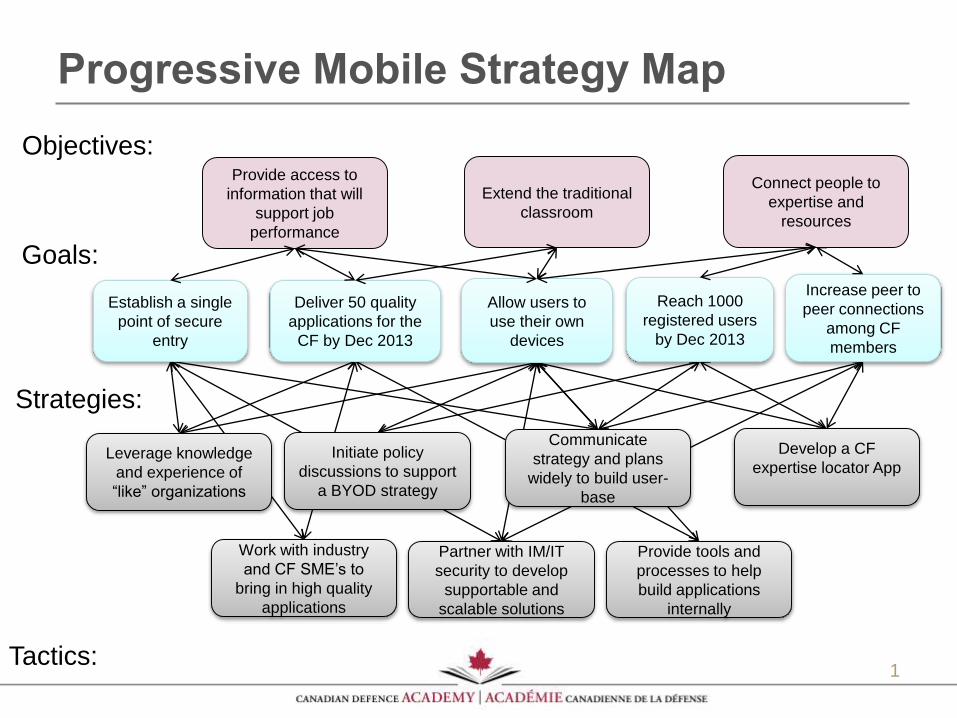
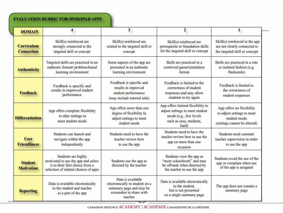
Progressive Mobile Strategy Map
1
Objectives:
Goals:
Strategies:
Tactics:
Provide access to
information that will
support job
performance
Extend the traditional
classroom
Connect people to
expertise and
resources
Increase peer to
peer connections
among CF
members
Deliver 50 quality
applications for the
CF by Dec 2013
Reach 1000
registered users
by Dec 2013
Allow users to
use their own
devices
Establish a single
point of secure
entry
Leverage knowledge
and experience of
“like” organizations
Initiate policy
discussions to support
a BYOD strategy
Partner with IM/IT
security to develop
supportable and
scalable solutions
Work with industry
and CF SME’s to
bring in high quality
applications
Communicate
strategy and plans
widely to build user-
base
Provide tools and
processes to help
build applications
internally
Develop a CF
expertise locator App

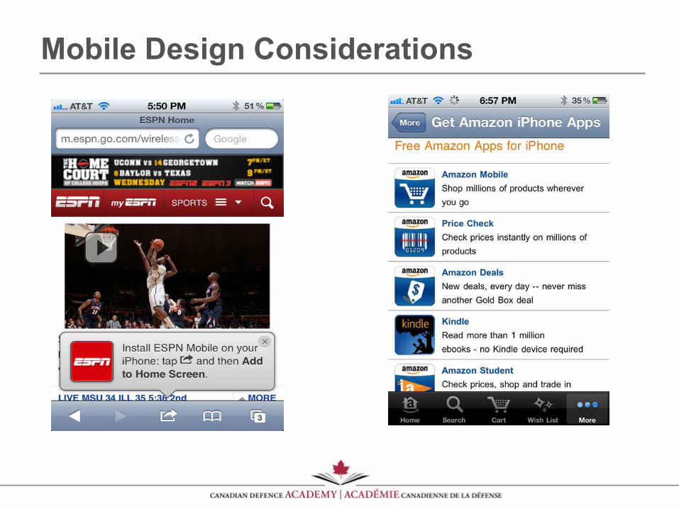
Mobile Design Considerations
LCdr Remi Tremblay
CDA Learning Technologies
Outline
• Mobile Design Concepts / Terms
• Design Considerations for the Mobile Web
• So you want to build an app …
• Practical Guidelines and Technical Considerations
• What about mobile learning?
• Resources / Conclusion
Responsive design
• Responsive design, as originally outlined is based on three core techniques:
• A flexible grid—making sure that the underlying page grid scales nicely with screen resolution rather than using fixed pixel dimensions
• Flexible images—images that work well within a flexible grid
• CSS media queries—using CSS styling tailored to ranges of resolutions or types of device
• By using these techniques it is possible to serve a single HTML document to a wide range of devices and expect a reasonable result: with a bit of hackery to support older browsers, sites built using this technique will typically work well on all desktop browsers and most smartphones.
Mobile First Responsive Design
• A number of people have pointed out that responsive design may make more sense if used in an inverted manner: if you design your site such that the default rendering of a page is mobile-friendly some of the issues with responsive design appear to go away. In particular, the issue with unnecessarily large images being downloaded by mobile devices can be solved with this approach.
• Mobile-first responsive design is a compelling update to the original set of techniques, but not without its problems:
• Again, it achieves only resolution independence, does not facilitate content adaptation
• It requires that the desktop site be redesigned from scratch also, though you could argue that this is a good thing.
• In summary, if your goal is to create a mobile website, mobile-first progressive design is the only really useful variant of responsive design, since it is truly able to scale from low-end devices all the way to desktop browsers.
Progressive Enhancement
• The idea behind progressive enhancement is to serve a single base page to every device, with associated JavaScript enhancement logic.
• If the device is very rudimentary, it will ignore or fail to run the JavaScript and be left with a reasonable low-end experience; if the device is a smartphone or desktop browser the JavaScript code will add functionality progressively to the page, until it is built up to the optimal level for the device in question.
• In theory there is no upper bound to the richness that can be layered onto the base, and you could scale page richness smoothly from feature phone to desktop browser.
Progressive Enhancement
• PE is the approach used by the just-released jQuery Mobile library. In effect, PE moves the logic of content adaptation from the server to the client. This approach has two problems:
• The progressive build-up that is at the core of this technique necessarily takes time to execute, and this delay is very much dependent on the device in question, and possibly the network. As an example, certain models of Blackberry support the requisite JavaScript in theory, but in practice run it too slowly to be useful.
• Again, as with previous techniques, using a single base HTML file across a number of use-cases feels like a limiting approach.
Server-Side Adaptation
• Server-side adaptation is a technique that has been in use since the dawn of the mobile web, over twelve years ago. It relies on a device detection library or database installed on the web server (or a remote web service) to detect the device accessing the web site and return its capabilities.
•This set of capabilities allows the web developer to fine-tune the resulting page to match the device's capabilities with a very high level of control. Due to the device detection involved, this technique of adapting to the device is sometimes called "browser sniffing".
•Despite the claims of its detractors, browser sniffing is extremely reliable and accurate, with good solutions typically reporting in excess of 99.5% accuracy in detecting devices in the wild.
Server-Side Adaptation
• Server-side adaptation is not without its problems,
however. There are two main issues:
• It requires the web developer to use a device
detection solution which needs to be kept up to date.
Most device detection solutions are now commercial.
• It doesn't assist you in utilising real-time information
from the browser to help you better serve the context
of the user e.g. using GPS coordinates or device
orientation to better tailor the information that you
serve to the user
Hybrid Approach
• Combines elements of server-side adaptation and
progressive enhancement. In essence, this
approach works by delivering an initial page based
on server-side adaptation principles, but then
enhances the result by capturing device properties
via client-side JavaScript, and using the captured
information to fine-tune subsequent pages
delivered to the device.
Hybrid Approach
• You get the benefits of high-speed server-side adaptation, combined with the ability to fine-tune the results based on properties sourced from the device itself. The user gets an initial page that is well-suited to the device, with no performance overhead, and subsequent visits to pages on the site may improve on this experience.
• It is relatively complex to implement. This complexity is due to two factors:
• 1) you need to implement a database to store the browser-sourced properties and,
• 2) you need to build the JavaScript to extract these properties from the browser and get them into this database.
• On first visit, a full round-trip is required between the server and the browser before you get to benefit from the properties sourced from the browser. This delay can be removed on subsequent requests by using cookies.
Recommendation
In summary, if all you want to do is make sure that your
site works on a few high end mobile devices, and you
don't care particularly about catering for the mobile web
user, try the progressive enhancement approach, or the
mobile-first responsive design. If the use cases for your
site are limited this might actually work quite well.
Recommendation
If, on the other hand, you want to deliver a full
designed-for-mobile experience or you want to cater for
all mobile devices out there and not just smartphones,
you don't really have a choice: server-side adaptation or
a hybrid approach is the only solution that will work.
There is a reason why essentially all of the top internet
brands use this approach.
Mobile Design Considerations
9 Best Design Practices for the Mobile Web
Mobile detection: When people visit your main website there should be a script that checks if they are using a mobile browser. If so, they should be redirected to your mobile site.
Ability to switch from mobile to full site: Unless you are confident that your mobile site completely replicates the functionality and content of your desktop site, there should be a link on your mobile site to switch back to your desktop site.
9 Best Design Practices for the Mobile Web
Button size: The buttons on your mobile site should be uniform in shape and color, and stand out from the rest of the content on the page. You’ll want buttons to be large enough for people to hit easily, at least 30 x 30 pixels.
Easily clickable links: Ease of use in clicking is important with text links as well. If two links are placed near each other (either horizontally or vertically), there should be enough space between them to not make accidental selections.
9 Best Design Practices for the Mobile Web
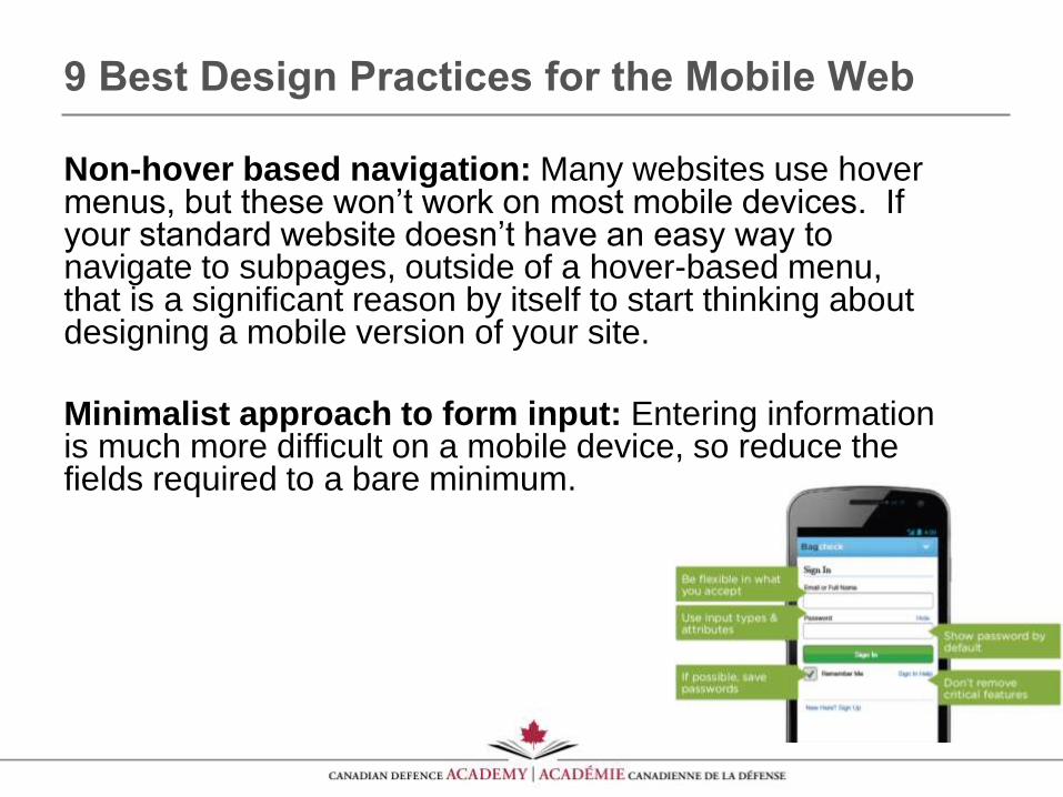
Non-hover based navigation: Many websites use hover menus, but these won’t work on most mobile devices. If your standard website doesn’t have an easy way to navigate to subpages, outside of a hover-based menu, that is a significant reason by itself to start thinking about designing a mobile version of your site.
Minimalist approach to form input: Entering information is much more difficult on a mobile device, so reduce the fields required to a bare minimum.
9 Best Design Practices for the Mobile Web
Form usability: Many of the best practices of desktop site design become even more important on a mobile form. For example, all checkboxes and radio buttons should allow users to select the text labels next to them, rather than only allowing people to click on the button / box.
Large images containing text: If you have a large image, be aware that it will be sized down significantly on a mobile device, and any text contained within it may no longer be readable (think infographics, for example)… or will require a lot of zooming and panning! Images should be designed to resize without breaking.
9 Best Design Practices for the Mobile Web
• Links to files: If there are links to files on the
website, those files shouldn’t be essential to any
primary user tasks. (An example of this is downloading
and filling in a word document registration form that
needs to be emailed in.)
• File types should be clearly indicated near the file
download links, as well as an indication of file size
(especially for larger files).
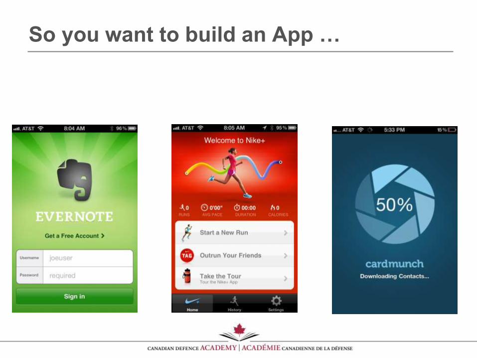
So you want to build an App …
Purpose & Organization
• Define your purpose. What is your app: purpose, goals, and most important elements? The purpose of an app has a huge impact on how it is built. Write out one sentence that communicates what your app is all about.
• Collect information about the tactical goals, tools, and friction points associated with the purpose of your app. Do user research, and make sure key members of team participate. This research gives you context for your design.
• Decide on and organize the content of your application. Functional places and goals uncovered during research provide a guide for structuring the flow of your app.
•Making a diagram of functional places and goals that includes key content and actions can give you an overview of the app you’re building.
Interaction & Visual Design
• Start with the top-level screen of your app. It’s the entry point of your app and where people will spend the most time. Ask: What will help people be successful? Use your research to decide.
• Add an action bar at the top with branding, key actions, rest in a “more” option. Lower-level screens allow you to: browse deeper into data, edit data, consume data, etc.
• Tablet-sized interfaces can allow you to cut down on jumping back and forth between screens (pogo-sticking).
• Make simple images that illustrate the content and features in your app. Many people use wireframes because they are lightweight, low fidelity sketches of what will be on each screen.
Interaction & Visual Design
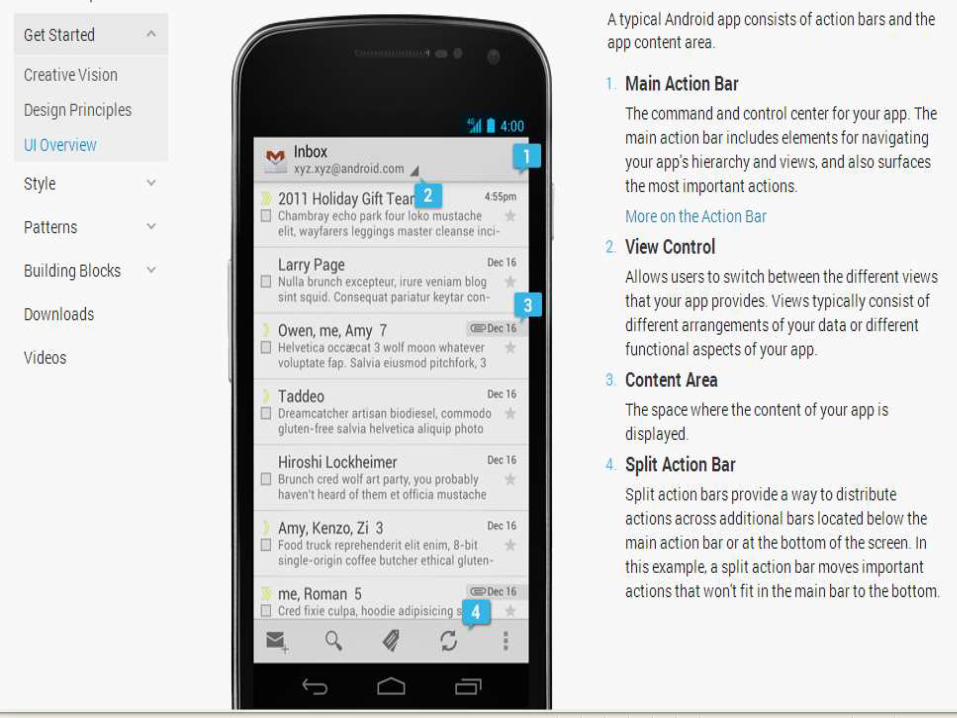
• Android’s Design Guide has a number of stencils available as vector art for the core building blocks inside Android including UI elements, icons, and fonts.
• The Design Guide also has key information about design principles, app structure, and building block.
• Action Bar: navigation, identity, views, and actions are integrated in this pattern. Using this pattern will help people use your app as system apps use this pattern heavily so people are already familiar with it.
Interaction & Visual Design
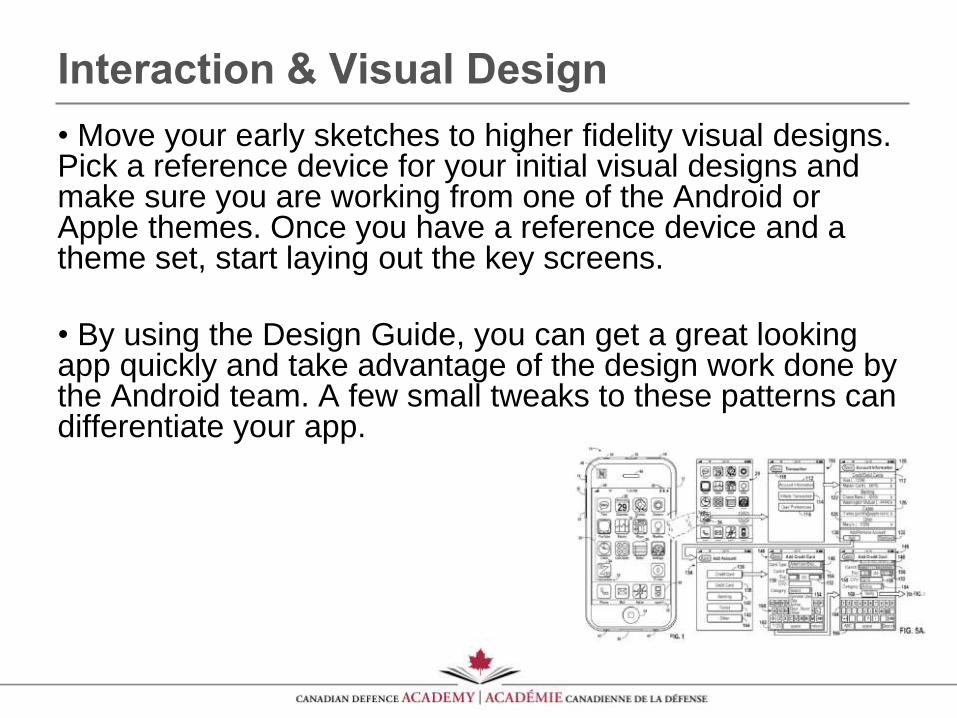
• Move your early sketches to higher fidelity visual designs. Pick a reference device for your initial visual designs and make sure you are working from one of the Android or Apple themes. Once you have a reference device and a theme set, start laying out the key screens.
• By using the Design Guide, you can get a great looking app quickly and take advantage of the design work done by the Android team. A few small tweaks to these patterns can differentiate your app.
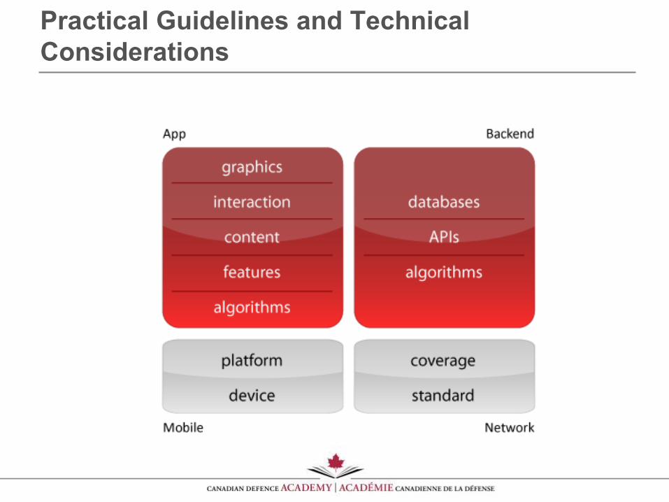
Practical Guidelines and Technical
Considerations
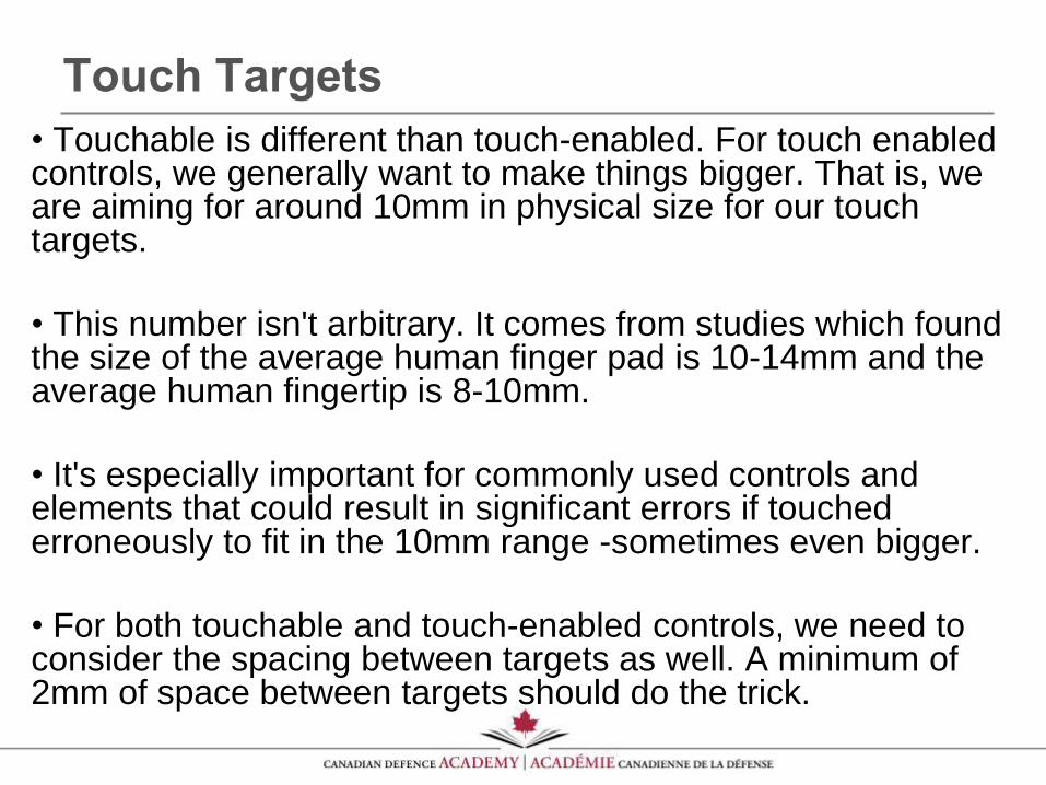
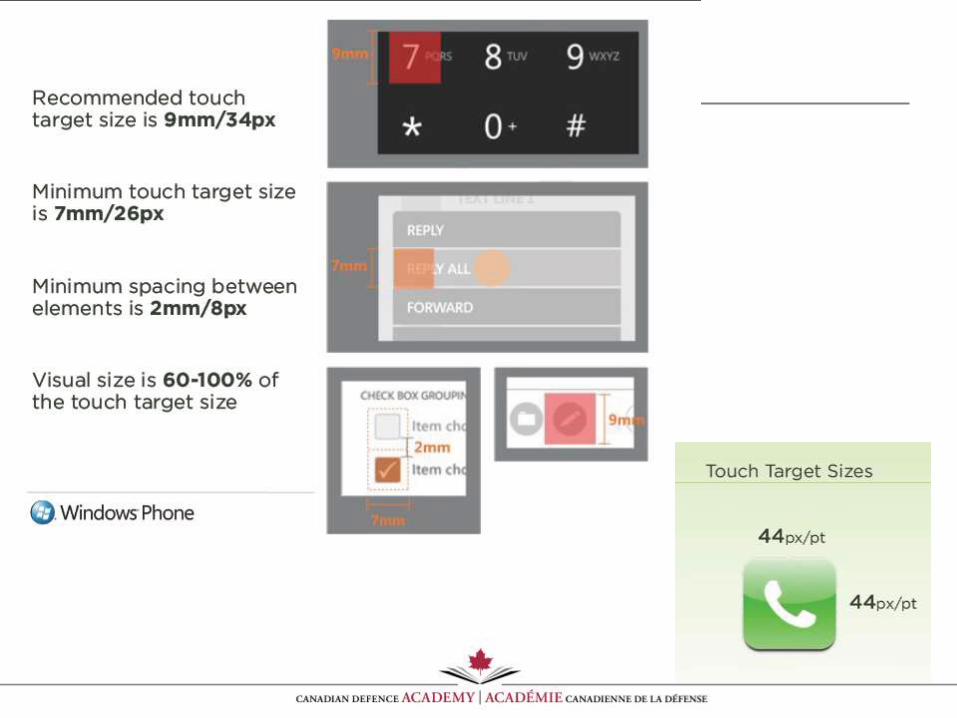
Touch Targets
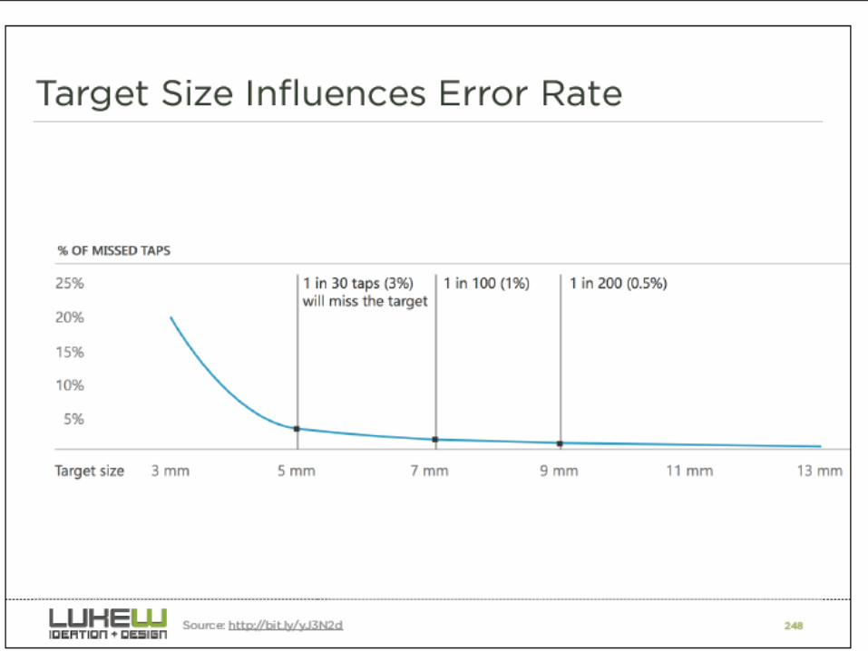
• Touchable is different than touch-enabled. For touch enabled controls, we generally want to make things bigger. That is, we are aiming for around 10mm in physical size for our touch targets.
• This number isn't arbitrary. It comes from studies which found the size of the average human finger pad is 10-14mm and the average human fingertip is 8-10mm.
• It's especially important for commonly used controls and elements that could result in significant errors if touched erroneously to fit in the 10mm range -sometimes even bigger.
• For both touchable and touch-enabled controls, we need to consider the spacing between targets as well. A minimum of 2mm of space between targets should do the trick.
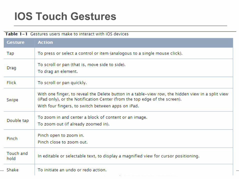
IOS Touch Gestures
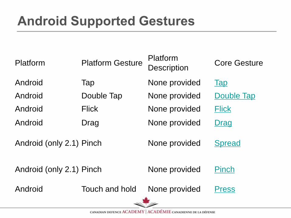
Android Supported Gestures
Platform Platform GesturePlatform
DescriptionCore Gesture
Android Tap None provided Tap
Android Double Tap None provided Double Tap
Android Flick None provided Flick
Android Drag None provided Drag
Android (only 2.1) Pinch None provided Spread
Android (only 2.1) Pinch None provided Pinch
Android Touch and hold None provided Press
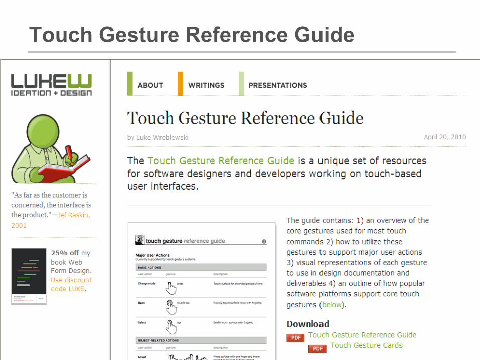
Touch Gesture Reference Guide
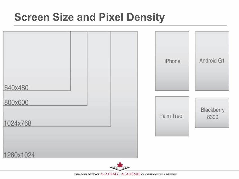
Screen Size and Pixel Density
•Predictable hardware configurations
•Relatively few resolutions and aspect ratios:
(480x320, 960x640, 1024x768, 2048x1536)
•Closed platform
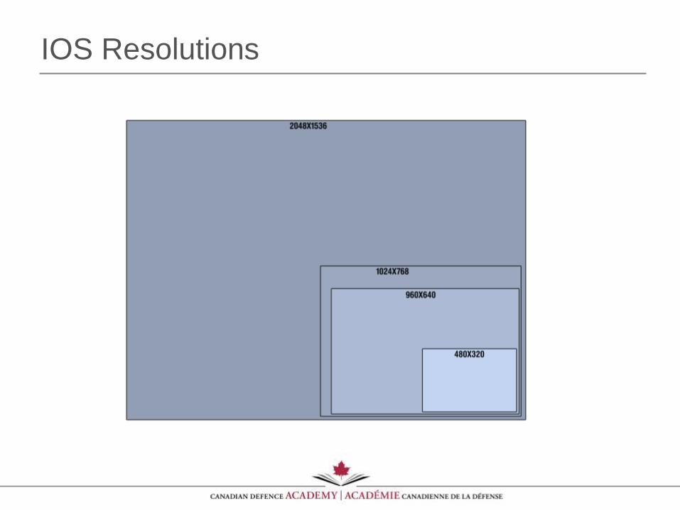
IOS Resolutions
•Diverse hardware (CPU, GPU, memory, storage)
•Numerous device resolutions and aspect ratios: (240x300, 320x240, 320x480, 360x640, 480x640, 480x800, 480x854, 540x960, 640x960, 800x400, 800x600, 1024x600, 1024x768, 1280x720, 1280x800)
•Disparate UI experiences & limitations
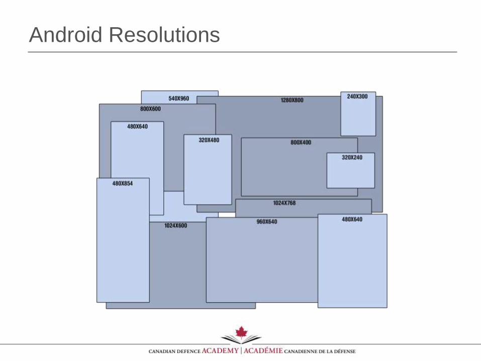
Android Resolutions
Recommendation
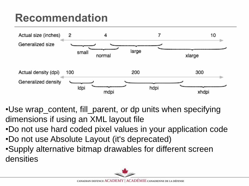
•Use wrap_content, fill_parent, or dp units when specifying
dimensions if using an XML layout file
•Do not use hard coded pixel values in your application code
•Do not use Absolute Layout (it's deprecated)
•Supply alternative bitmap drawables for different screen
densities
Optimising for High Pixel Density Displays
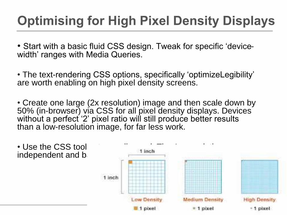
• Start with a basic fluid CSS design. Tweak for specific ‘device-width’ ranges with Media Queries.
• The text-rendering CSS options, specifically ‘optimizeLegibility’ are worth enabling on high pixel density screens.
• Create one large (2x resolution) image and then scale down by 50% (in-browser) via CSS for all pixel density displays. Devices without a perfect ‘2’ pixel ratio will still produce better results than a low-resolution image, for far less work.
• Use the CSS tools at your disposal. They're resolution independent and bandwidth friendly.
Video Playback
• The underlying issue is processing power. Today's desktop computers and laptops are powerful enough to decode just about any video format and size. Sometimes they can do it in hardware, meaning the graphics card (GPU) decodes the video. If a format is not supported by the hardware, desktops can fallback to software decoding. At that point, the player software itself will decode the video frames. Software decoding is slower than hardware decoding, but either option works.
• Phones, netbooks and tablets on the other hand are not that powerful yet. Most are only able to do hardware decoding of video. It means the range of supported formats is narrowed down to what the GPU chip supports. Additionally, devices generally have an upper limit on the frame size of the video. For example, while the iPhone 4 supports HD video (1280x720 pixels), older models only supported video up to about 480x270 pixels
Recommendation
• Container format: MP4, headers at the beginning of the file (for seeking)
•Video format: H.264, Baseline profile, 480x270 pixels, around 400/600 kbps (kilobits per second)
• Audio format: AAC, Low Complexity profile, 44.1 kHz stereo, 96 kbps
• It is important to realize these settings do not result in the perfect transcode. Both H.264 and AAC support higher-quality profiles that result into smaller files (but more decoding complexity).
• More Info: http://blog.zencoder.com/2010/09/30/how-to-encode-video-for-mobile-use/
Font Size and Readability
•Readability is one of the most important aspects to consider when you are designing your application.
•iOS font size Apple uses a 20 pt font for titles and button labels, 17 pt for list labels, 16 pt for text, 13 pt for the top bar, 12 pt for the App icons and 10 pt for the dock.
•It is recommended that you don't go below 13 pt for short and rather unimportant snippets, and 15 pt for normal body text. Also, you should work with high contrast if you want to provide good readability in bright sunlight or, if there are a lot of reflections on the screen.
Android Hint for Fonts
Specify all your fonts using dips (e.g. 14dp) rather than pixels (e.g. 14px) and you won't need to worry about screen density. Android will scale your fonts (and layout) accordingly.
dp Density-independent Pixels - an abstract unit that is based on the physical density of the screen. These units are relative to a 160 dpi (dots per inch) screen, so 160dp is always one inch regardless of the screen density. The ratio of dp-to-pixel will change with the screen density, but not necessarily in direct proportion. You should use these units when specifying view dimensions in your layout, so the UI properly scales to render at the same actual size on different screens.
sp Scale-independent Pixels - this is like the dp unit, but it is also scaled by the user's font size preference. It is recommend you use this unit when specifying font sizes, so they will be adjusted for both the screen density and the user's preference.
What about Mobile Learning?
M-Learning Design Guidelines
• Keep it short: in our view, e-learning courses do not port well ‘as is’ to mobile devices. Recognising that mobile learners on probably on the move and may be fitting learning around other things, we believe in keeping any individual module to 5-10 minutes maximum.
• Keep it simple: Screen size restrictions mean that we need to keep the number of options and interactions on the screen to a minimum for usability. We typically aim to have no more than 1-2 options at any one time available to the user.
• Make the most of media: one of the great advantages that modern smart phones bring is the ability to integrate rich media well. Our designs make full use of this and use audio, video and animations where relevant to illustrate learning points.
M-Learning Design Guidelines•Use the features: Mobile devices enable us to do a lot more then receive learning. We can communicate with each other, upload information, use geo location to get place-specific guidance, create and share your own content e.g. photos, audio, video, SMS and text – yes even make phone calls!
•Keep it current: Updating mobile learning is relatively simple, and it’s a great way to push updates on product knowledge, legislation and key information to learners - they’re more likely to check their phone for 2 minutes for a quick refresher than to go into the LMS to find it.
•Blend with the rest: Mobile learning in our view is often best deployed as part of a blend. For example, our Health and Safety e-learning mobile app is designed to complement our Health and Safety e-learning module. It is designed to provide fast access to key information and to act as performance support tool.
Resources
•http://developer.android.com/design/get-started/principles.html
•iOS Human Interface Guidelines describes the guidelines and principles that help you design a superlative user interface and user experience for your iOS app.
•http://msdn.microsoft.com/en-us/library/windows/desktop/cc872774.aspx
•http://www.tripwiremagazine.com/2012/10/mobile-apps-inspiration-design-patterns.html
Cross Platform Development Considerations
One major factor that cross-platform developers need to be aware of — whether you use a framework or not — is app design. Designing an app for the iPhone is different than designing one for Android; The UI and UX conventions are different, and touch points and menus work in different ways.
A good cross-platform application looks at home on whatever platform it is used on. A bad cross-platform tries to look identical everywhere. For instance, if your Android app has navigation controls at the bottom of the screen, iPhone style, you're doing it wrong.