Embed Size (px)
Citation preview
GET STARTED
3 In-Cell Alternatives for Using Charts in Excel
OFFICE 2016. EXPLAINED.

Use Sparklines to create graphic in-cell charts
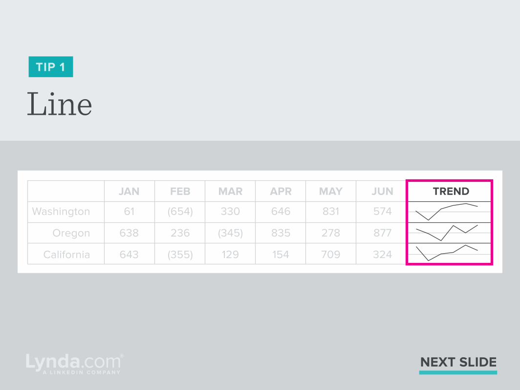
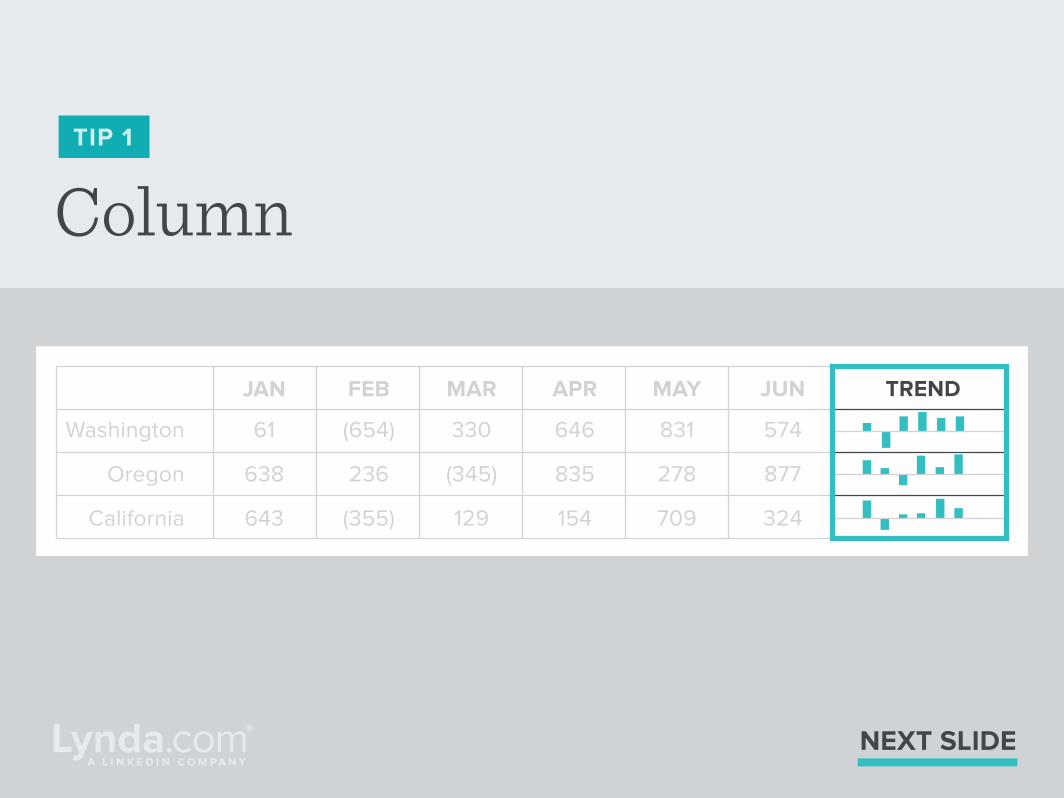
TIP 1
Sparklines are great to give you (or your audience) the big
picture quickly without the fuss of a full-fledged chart. There
are three types of in-cell Sparkline charts you can create. To
add one of these three Sparklines, go to the Insert tab and
click the button for the Sparkline you want to use.
NEXT SLIDE
NEXT SLIDE
Washington
Oregon
California
JAN
61
638
643
FEB
(654)
236
(355)
MAR
330
(345)
129
APR
646
835
154
MAY
831
278
709
JUN TREND
574
877
324
LineTIP 1
NEXT SLIDE
Washington
Oregon
California
JAN
61
638
643
FEB
(654)
236
(355)
MAR
330
(345)
129
APR
646
835
154
MAY
831
278
709
JUN TREND
574
877
324
ColumnTIP 1

Win/Loss
NEXT SLIDE
Washington
Oregon
California
JAN
61
638
643
FEB
(654)
236
(355)
MAR
330
(345)
129
APR
646
835
154
MAY
831
278
709
JUN TREND
574
877
324
TIP 1
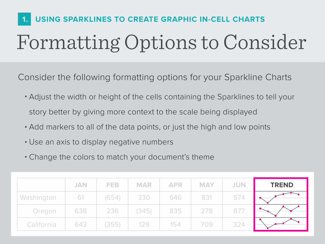
Formatting Options to Consider1. USING SPARKLINES TO CREATE GRAPHIC IN-CELL CHARTS
Consider the following formatting options for your Sparkline Charts
Adjust the width or height of the cells containing the Sparklines to tell your
story better by giving more context to the scale being displayed
Add markers to all of the data points, or just the high and low points
Use an axis to display negative numbers
Change the colors to match your document’s theme
•
•
•
•
Washington
Oregon
California
JAN
61
638
643
FEB
(654)
236
(355)
MAR
330
(345)
129
APR
646
835
154
MAY
831
278
709
JUN TREND
574
877
324
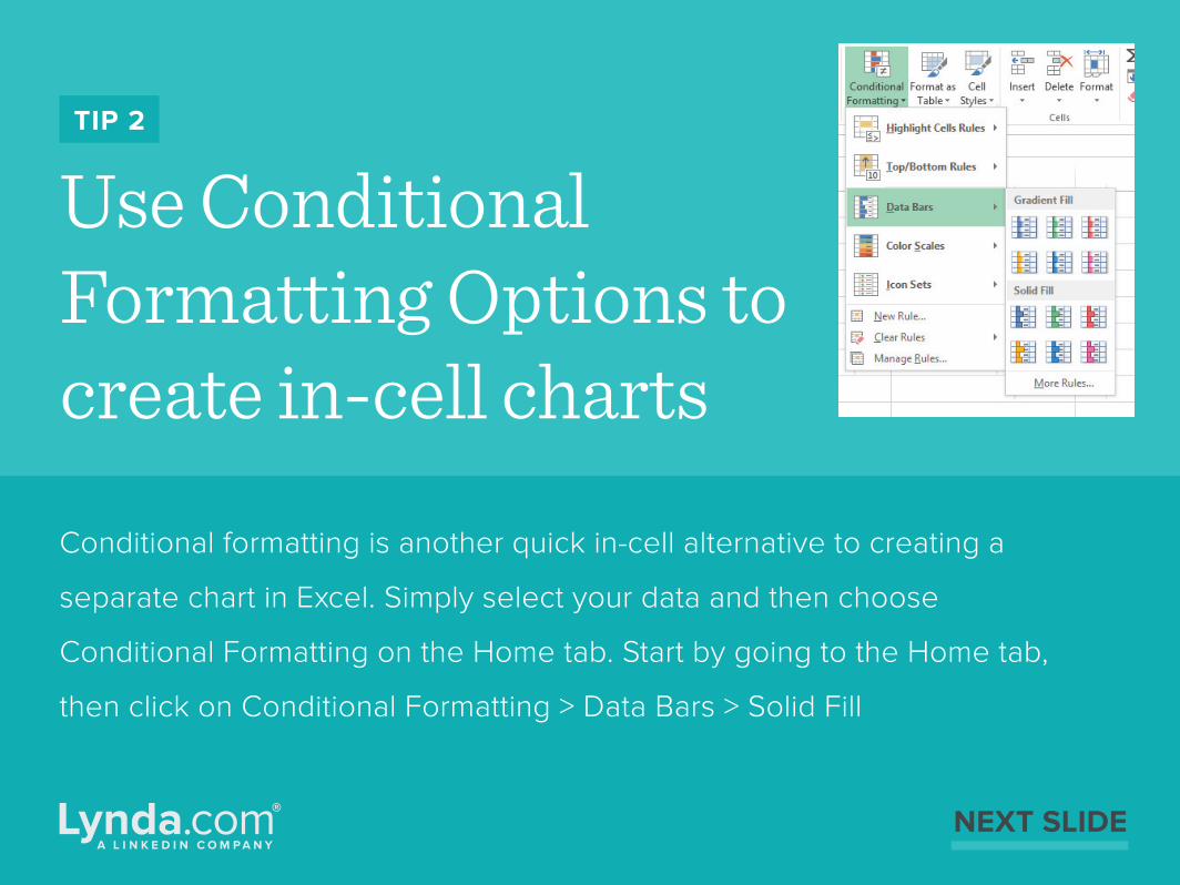
Use Conditional Formatting Options to create in-cell charts
TIP 2
Conditional formatting is another quick in-cell alternative to creating a
separate chart in Excel. Simply select your data and then choose
Conditional Formatting on the Home tab. Start by going to the Home tab,
then click on Conditional Formatting > Data Bars > Solid Fill
NEXT SLIDE
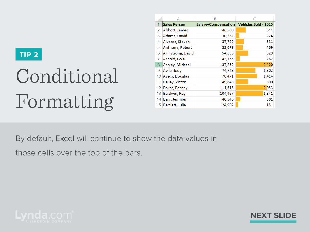
Conditional Formatting
TIP 2
By default, Excel will continue to show the data values in
those cells over the top of the bars.
NEXT SLIDE

If you just want to see the
bars, go back to the
Conditional Formatting
menu and choose
Manage Rules. Then click
Edit Rules and check the
box “Show Bar Only.”
NEXT SLIDE
Quick tip!
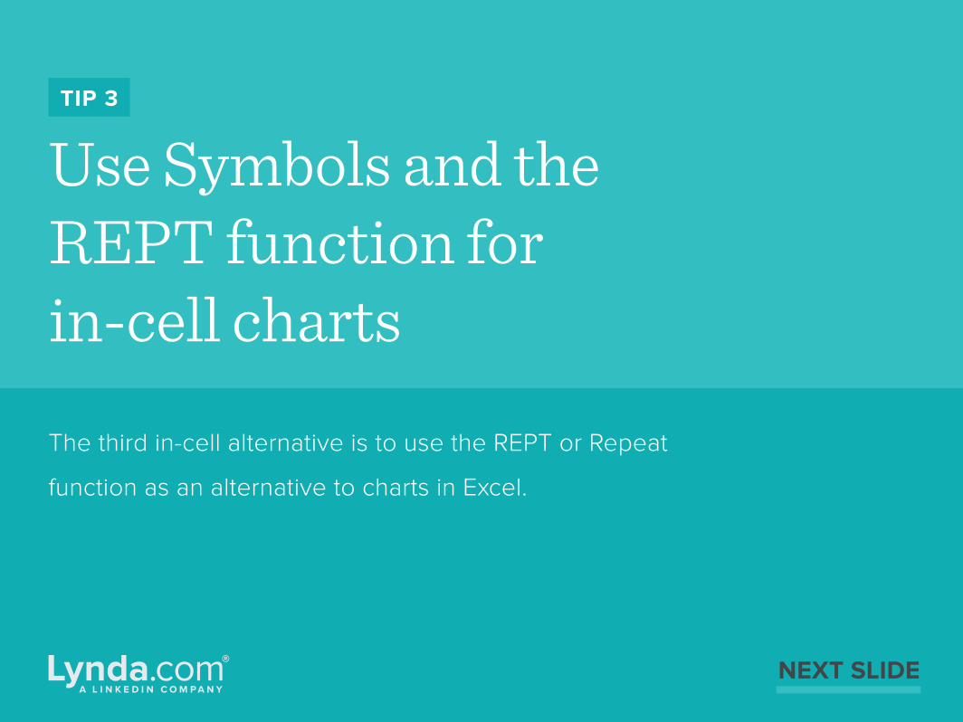
Use Symbols and the REPT function for in-cell charts
TIP 3
The third in-cell alternative is to use the REPT or Repeat
function as an alternative to charts in Excel.
NEXT SLIDE
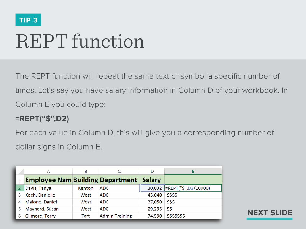
REPT functionTIP 3
The REPT function will repeat the same text or symbol a specific number of
times. Let’s say you have salary information in Column D of your workbook. In
Column E you could type:
=REPT(“$”,D2)
For each value in Column D, this will give you a corresponding number of
dollar signs in Column E.
NEXT SLIDE
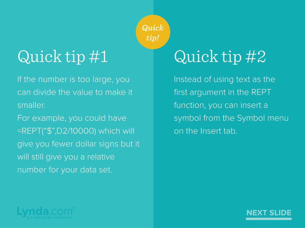
If the number is too large, you
can divide the value to make it
smaller.
For example, you could have
=REPT(“$”,D2/10000) which will
give you fewer dollar signs but it
will still give you a relative
number for your data set.
Quick tip #1Instead of using text as the
first argument in the REPT
function, you can insert a
symbol from the Symbol menu
on the Insert tab.
Quick tip #2
NEXT SLIDE
Quicktip!

FOR MORE TIPS ON GETTING THE MOST OUT OF EXCEL, VISITLYNDA.COM/EXCELTIPS