Embed Size (px)
Citation preview

DATA VISUALIZATION:
FINDING PICTURES IN NUMBERS
Pratap Vardhan, Data Scientist, Gramener
@PratapVardhan


A DATA VISUALISATION
CHALLENGE
You will see 3 questions. You have 30 seconds. Try it!
Your timer starts now

HOW MANY NUMBERS ARE ABOVE 100? 1
23 32 71 72 58 87 11 77 70 16
17 21 56 44 68 51 84 20 60 40
37 8 107 14 12 41 69 14 18 71
62 55 59 64 33 55 71 58 103 92
101 56 45 34 43 15 73 78 6 93
39 53 22 26 26 94 60 82 99 74
11 12 36 67 70 71 97 59 73 99
75 74 69 69 51 48 2 66 92 98
15 10 41 58 104 94 92 84 74 82
12 52 10 57 33 77 88 81 81 91
15 56 25 30 21 7 66 66 78 87
29 23 5 34 11 96 74 99 99 88
37 10 43 15 50 71 65 60 101 98
46 34 19 102 57 70 95 84 63 91
3 34 39 37 60 81 65 63 9 71
48 46 25 50 22 64 91 76 71 79

HOW MANY NUMBERS ARE BELOW 10? 2
23 32 71 72 58 87 11 77 70 16
17 21 56 44 68 51 84 20 60 40
37 8 107 14 12 41 69 14 18 71
62 55 59 64 33 55 71 58 103 92
101 56 45 34 43 15 73 78 6 93
39 53 22 26 26 94 60 82 99 74
11 12 36 67 70 71 97 59 73 99
75 74 69 69 51 48 2 66 92 98
15 10 41 58 104 94 92 84 74 82
12 52 10 57 33 77 88 81 81 91
15 56 25 30 21 7 66 66 78 87
29 23 5 34 11 96 74 99 99 88
37 10 43 15 50 71 65 60 101 98
46 34 19 102 57 70 95 84 63 91
3 34 39 37 60 81 65 63 9 71
48 46 25 50 22 64 91 76 71 79

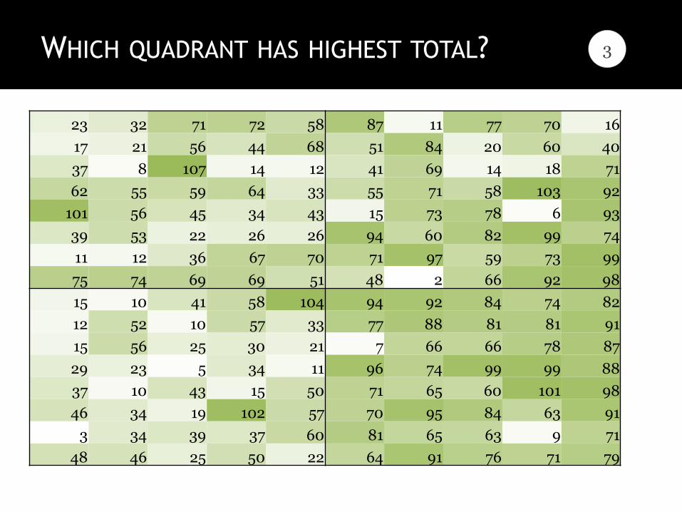
WHICH QUADRANT HAS HIGHEST TOTAL? 3
23 32 71 72 58 87 11 77 70 16
17 21 56 44 68 51 84 20 60 40
37 8 107 14 12 41 69 14 18 71
62 55 59 64 33 55 71 58 103 92
101 56 45 34 43 15 73 78 6 93
39 53 22 26 26 94 60 82 99 74
11 12 36 67 70 71 97 59 73 99
75 74 69 69 51 48 2 66 92 98
15 10 41 58 104 94 92 84 74 82
12 52 10 57 33 77 88 81 81 91
15 56 25 30 21 7 66 66 78 87
29 23 5 34 11 96 74 99 99 88
37 10 43 15 50 71 65 60 101 98
46 34 19 102 57 70 95 84 63 91
3 34 39 37 60 81 65 63 9 71
48 46 25 50 22 64 91 76 71 79

The same questions again. But with a few visual cues. See how long it takes now.
Your timer starts now
A DATA VISUALISATION
CHALLENGE

HOW MANY NUMBERS ARE ABOVE 100? 1
23 32 71 72 58 87 11 77 70 16
17 21 56 44 68 51 84 20 60 40
37 8 107 14 12 41 69 14 18 71
62 55 59 64 33 55 71 58 103 92
101 56 45 34 43 15 73 78 6 93
39 53 22 26 26 94 60 82 99 74
11 12 36 67 70 71 97 59 73 99
75 74 69 69 51 48 2 66 92 98
15 10 41 58 104 94 92 84 74 82
12 52 10 57 33 77 88 81 81 91
15 56 25 30 21 7 66 66 78 87
29 23 5 34 11 96 74 99 99 88
37 10 43 15 50 71 65 60 101 98
46 34 19 102 57 70 95 84 63 91
3 34 39 37 60 81 65 63 9 71
48 46 25 50 22 64 91 76 71 79

HOW MANY NUMBERS ARE BELOW 10? 2
23 32 71 72 58 87 11 77 70 16
17 21 56 44 68 51 84 20 60 40
37 8 107 14 12 41 69 14 18 71
62 55 59 64 33 55 71 58 103 92
101 56 45 34 43 15 73 78 6 93
39 53 22 26 26 94 60 82 99 74
11 12 36 67 70 71 97 59 73 99
75 74 69 69 51 48 2 66 92 98
15 10 41 58 104 94 92 84 74 82
12 52 10 57 33 77 88 81 81 91
15 56 25 30 21 7 66 66 78 87
29 23 5 34 11 96 74 99 99 88
37 10 43 15 50 71 65 60 101 98
46 34 19 102 57 70 95 84 63 91
3 34 39 37 60 81 65 63 9 71
48 46 25 50 22 64 91 76 71 79
WHICH QUADRANT HAS HIGHEST TOTAL?
23 32 71 72 58 87 11 77 70 16
17 21 56 44 68 51 84 20 60 40
37 8 107 14 12 41 69 14 18 71
62 55 59 64 33 55 71 58 103 92
101 56 45 34 43 15 73 78 6 93
39 53 22 26 26 94 60 82 99 74
11 12 36 67 70 71 97 59 73 99
75 74 69 69 51 48 2 66 92 98
15 10 41 58 104 94 92 84 74 82
12 52 10 57 33 77 88 81 81 91
15 56 25 30 21 7 66 66 78 87
29 23 5 34 11 96 74 99 99 88
37 10 43 15 50 71 65 60 101 98
46 34 19 102 57 70 95 84 63 91
3 34 39 37 60 81 65 63 9 71
48 46 25 50 22 64 91 76 71 79
3

YOU WILL BE SHOWN A SET OF NUMBERS
ALONG WITH A SUMMARY (AVERAGE, ETC)
CAN YOU MAKE SENSE OF THE FIGURES?
WHY VISUALISE?

So is the variance in sales. Variance in price is the same.
Average sales is the same too. Average price is the same.
Take a look at the sales report
alongside. A company has
branches in 4 cities, and each
branch changes the product
price every month. This leads to
a corresponding change in the
sales.
Here is the performance of the
4 branches with their monthly
price and sales for each month.
Looking at the average, the four
branches have an identical
performance.
2010 Boston Chicago Detroit New York
Month Price Sales Price Sales Price Sales Price Sales
Jan 10.0 8.04 10.0 9.14 10.0 7.46 8.0 6.58
Feb 8.0 6.95 8.0 8.14 8.0 6.77 8.0 5.76
Mar 13.0 7.58 13.0 8.74 13.0 12.74 8.0 7.71
Apr 9.0 8.81 9.0 8.77 9.0 7.11 8.0 8.84
May 11.0 8.33 11.0 9.26 11.0 7.81 8.0 8.47
Jun 14.0 9.96 14.0 8.10 14.0 8.84 8.0 7.04
Jul 6.0 7.24 6.0 6.13 6.0 6.08 8.0 5.25
Aug 4.0 4.26 4.0 3.10 4.0 5.39 19.0 12.50
Sep 12.0 10.84 12.0 9.13 12.0 8.15 8.0 5.56
Oct 7.0 4.82 7.0 7.26 7.0 6.42 8.0 7.91
Nov 5.0 5.68 5.0 4.74 5.0 5.73 8.0 6.89
Average 9.0 7.50 9.0 7.50 9.0 7.50 9.0 7.50
Variance 10.0 3.75 10.0 3.75 10.0 3.75 10.0 3.75
DO THESE FOUR CITIES LOOK IDENTICAL TO YOU?
DO YOU AGREE?

ARE THEY REALLY IDENTICAL? CHECK AGAIN…
But in fact, the four cities are
totally different in behaviour.
Boston’s sales has generally
increased with price.
Detroit has a nearly perfect
increase in sales with price,
except for one aberration.
Chicago shows a decline in sales
beyond a price of 10.
New York’s sales fluctuates
despite a nearly constant price.
Boston Chicago
New York Detroit

We handle terabyte-size data via non-traditional analytics and visualise it in real-time.
Gramener visualises
your data
Gramener transforms your data into concise dashboards
that make your business problem & solution visually obvious. We help you find insights quickly, based on cognitive research, and our visualisations guide you towards actionable decisions.
A data analytics and visualisation company

INDIAN ODI BATTING GRAMENER.COM/CRICKET/


100 Y
EA
RS
OF
IND
IA’S
WEA
TH
ER
1901
1911
1921
1931
1941
1951
1961
1971
1981
1991
2001
Jan Feb Mar Apr May Jun Jul Aug Sep Oct Nov Dec

19 S
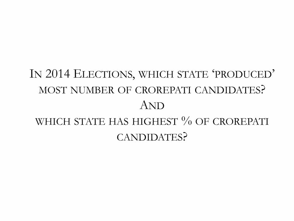
IN 2014 ELECTIONS, WHICH STATE ‘PRODUCED’ MOST NUMBER OF CROREPATI CANDIDATES?
AND
WHICH STATE HAS HIGHEST % OF CROREPATI
CANDIDATES?
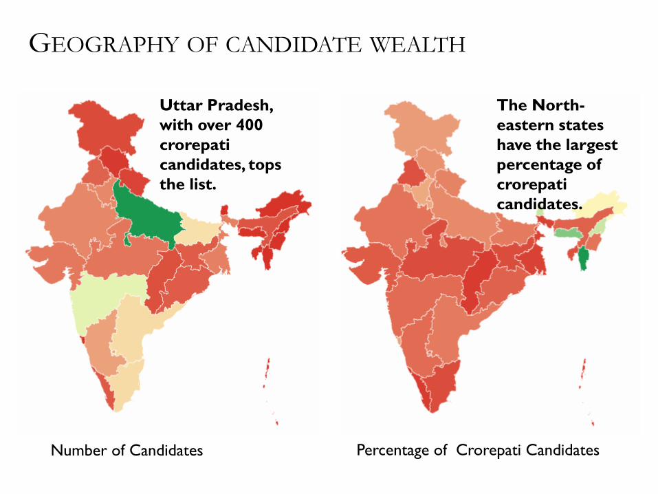
GEOGRAPHY OF CANDIDATE WEALTH
Uttar Pradesh, with over 400 crorepati candidates, tops the list.
The North-eastern states have the largest percentage of crorepati candidates.
Number of Candidates Percentage of Crorepati Candidates

AMONG THE MAINSTREAM
PARTIES, WHICH PARTY HAS
HIGHEST % OF CRIMINAL
CANDIDATES?

CRIMINAL CASES
MNS seems like a winner here. Closely followed by RJD, MDMK
Size: Number of candidates Color: % of criminal candidates
23 S


AND, ONE MORE THING..
NAMESAKES OF 2014
ELECTIONS

CHANDU LALS OF MAHASAMUND
Winner’s Margin: 1,217 votes
Namesakes' polled: 60,000+ votes

MOST OF WHAT I DO TODAY IS
VISUALISING DATA ANOMALIES YOU DON’T NEED SOPHISTICATED ANALYSES FOR THIS
IT CAN BE EASY TO SPOT THEM

EDUCATION
PREDICTING MARKS
What determines a child’s marks?
Do girls score better than boys?
Does the choice of subject matter?
Does the medium of instruction matter?
Does community or religion matter?
Does their birthday matter?
Does the first letter of their name matter?

LET’S LOOK AT 15 YEARS OF US BIRTH DATA This is a dataset (1975 – 1990) that has
been around for several years, and has
been studied extensively. Yet, a
visualization can reveal patterns that
are neither obvious nor well known.
For example,
• Are birthdays uniformly distributed?
• Do doctors or parents exercise the C-section option to move dates?
• Is there any day of the month that has unusually high or low births?
• Are there any months with relatively high or low births?
Very high births in September.
But this is fairly well known.
Most conceptions happen during
the winter holiday season
Relatively few births during the
Christmas and Thanksgiving
holidays, as well as New Year and
Independence Day.
Most people prefer not
to have children on the
13th of any month, given
that it’s an unlucky day
Some special days like April
Fool’s day are avoided, but Valentine’s Day is quite popular
More births Fewer births … on average, for each day of the year (from 1975 to 1990)

THE PATTERN IN INDIA IS QUITE DIFFERENT This is a birth date dataset that’s obtained from school admission data
for over 10 million children. When we
compare this with births in the US, we
see none of the same patterns.
For example,
• Is there an aversion to the 13th or is there a local cultural nuance?
• Are holidays avoided for births?
• Which months have a higher propensity for births, and why?
• Are there any patterns not found in the US data?
Very few children are born in the
month of August, and thereafter.
Most births are concentrated in
the first half of the year
We see a large number of
children born on the 5th, 10th,
15th, 20th and 25th of each month
– that is, round numbered dates
Such round numbered patterns a
typical indication of fraud. Here,
birthdates are brought forward
to aid early school admission
More births Fewer births … on average, for each day of the year (from 2007 to 2013)

THIS ADVERSELY IMPACTS CHILDREN’S MARKS It’s a well established fact that older children tend to do better at school in
most activities. Since many children
have had their birth dates brought
forward, these younger children suffer.
The average marks of children “born” on the 1st, 5th, 10th, 15th etc. of the
month tend to score lower marks.
• Are holidays avoided for births?
• Which months have a higher propensity for births, and why?
• Are there any patterns not found in the US data?
Higher marks Lower marks … on average, for children born on a given day of the year (from 2007 to 2013)
Children “born” on round numbered days score lower marks on average, due to a higher proportion of younger children
32
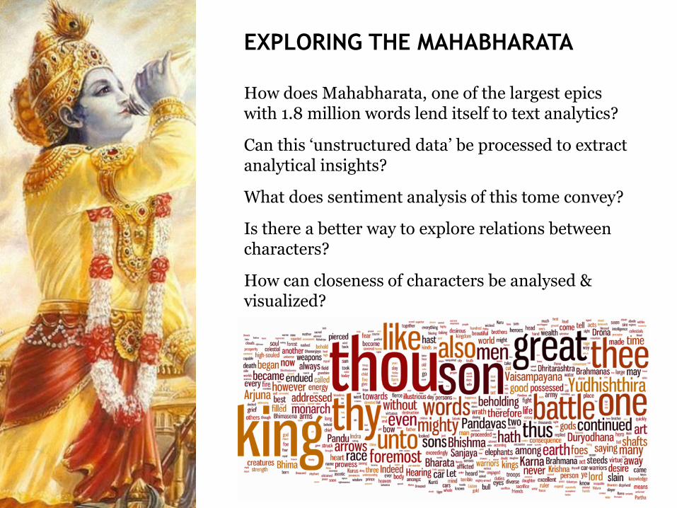
EXPLORING THE MAHABHARATA
How does Mahabharata, one of the largest epics with 1.8 million words lend itself to text analytics?
Can this ‘unstructured data’ be processed to extract analytical insights?
What does sentiment analysis of this tome convey?
Is there a better way to explore relations between characters?
How can closeness of characters be analysed & visualized?


MMS SPEECHES https://gramener.com/speechopedia

AAP DONATIONS https://gramener.com/aapdonations

FLAGS OF THE WORLD https://gramener.com/flags

CALVIN AND HOBBES

DETECTING FRAUD
“ We know meter readings are
incorrect, for various reasons.
We don’t, however, have the concrete proof we need to start the
process of meter reading
automation.
Part of our problem is the volume
of data that needs to be analysed.
The other is the inexperience in
tools or analyses to identify such
patterns.
ENERGY UTILITY

BILLING FRAUD AT AN ENERGY UTILITY
This plot shows the frequency of all meter readings from
Apr-2010 to Mar-2011. An unusually large number of
readings are aligned with the slab boundaries.
Below is a simple histogram (or frequency distribution) of usage levels.
Each bar represents the number of customers with a customers with a
specific bill amount (in units, or KWh).
Tariffs are based on the usage slab. Someone with 101 units is billed in
full at a higher tariff than someone with 100 units. So people have a
strong incentive to stay at or within a slab boundary.
An energy utility (with over 50 million
subscribers) had 10 years worth of
customer billing data available.
Most fraud detection software failed to
load the data, and sampled data
revealed little or no insight.
This can happen in one of two ways.
First, people may be monitoring their
usage very carefully, and turn of their
lights and fans the instant their usage
hits the slab boundary.
Or, more realistically, there’s probably some level of corruption involved, where customers pay a small sum to the meter reading staff
to ensure that it stays exactly at the slab boundary, giving them the
advantage of a lower price.

LINKS
Github: https://github.com/pratapvardhan Elections: https://gramener.com/election/ Speechopedia: https://gramener.com/speechopedia/ AAP: https://gramener.com/aapdonations/ Cricket: https://gramener.com/cricket/ Flags: https://gramener.com/flags/

Try it! All you need is some data and some curiosity to…
VISUALISE DATA YOURSELF!
@PratapVardhan
+91-837-460-9651


![Sequential Document Visualization Based on Hierarchical ... · Descriptive pictures Fig. 1 Three main components of our approach technique of sequential document visualization[9]](https://img.pdfslide.us/doc/110x75/604bae59b1bbf03310719835/sequential-document-visualization-based-on-hierarchical-descriptive-pictures.jpg)