Embed Size (px)
Citation preview
www.unglobalpulse.org • [email protected] • 2015 1
DA TA VISUALISATION AND INTERACTIVE MAPPING TO SUPPORT RESPONSE TO DISEASE OUTBREAK
PARTNERS: WORLD HEALTH ORGANIZATION, UGANDAN MINISTRY OF HEALTH PROGRAMME AREA: PUBLIC HEALTH
BACKGROUND
Pulse Lab Kampala has established an on-going collaboration with the
Ministry of Health in Uganda, in coordination with WHO, to strengthen
disease response.
After a typhoid outbreak occurred in Uganda from January-May
2015, Pulse Lab Kampala was invited to join the National Task
Force in response to the outbreak.
The Ugandan Ministry of Health’s district health information system
contained structured weekly statistics from 5,991 health centres
across the country. It therefore had substantial detail about the typhoid
outbreak.
However, with the available static mapping tools it was difficult to
obtain a full picture of the outbreak to inform response. Pulse Lab
Kampala utilized advanced analytics technologies to help present
dynamic information about the disease outbreak visually in an effort to
aid decision-making.
INTERACTIVE MAPPING OF HEALTH DATA
AND EPIDEMIC RISK FACTORS
Data collected at the health centres where typhoid cases were
treated contained the home and work locations of individuals
reported to have had the disease. These locations were recorded
as free text, and as a result, location names were sometimes
spelled differently. For example “Namugona”, “Namugoona”,
“Namungoona”, “Namungona” were all used to refer to the same
location. In order to solve this challenge, automatic methods to
convert the names of locations to longitude/latitude data were
developed using geo-referencing tools (GeoNames, OpenStreetMap
and Google Maps).
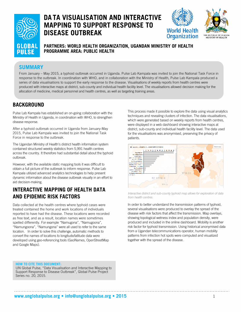
This process made it possible to explore the data using visual analytics
techniques and revealing clusters of infection. The data visualisations,
which were generated based on weekly reports from health centres,
were displayed in a web dashboard showing interactive maps at
district, sub-county and individual health facility level. The data used
for the visualisations was anonymised, preserving the privacy of
patients.
Interactive district and sub-county typhoid map allows for exploration of data
from health centres.
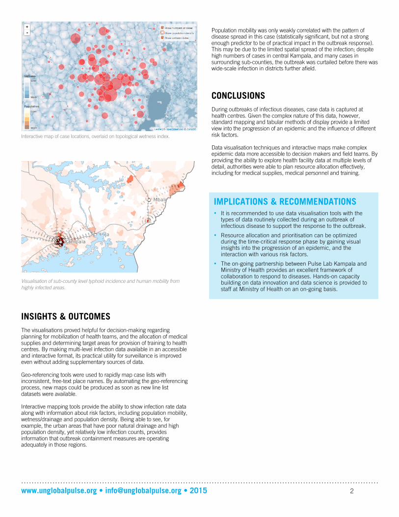
In order to better understand the transmission patterns of typhoid,
several visualisations were produced to overlay the spread of the
disease with risk factors that affect the transmission. Map overlays,
showing topological wetness index and population density, were
produced and included in the online dashboard. Mobility is another
risk factor for typhoid transmission. Using historical anonymised data
from a Ugandan telecommunications operator, human mobility
patterns from infection hot spots were computed and visualized
together with the spread of the disease.
HOW TO CITE THIS DOCUMENT: UN Global Pulse, “Data Visualisation and Interactive Mapping to Support Response to Disease Outbreak”, Global Pulse Project Series no. 20, 2015.
SUMMARY From January – May 2015, a typhoid outbreak occurred in Uganda. Pulse Lab Kampala was invited to join the National Task Force in
response to the outbreak. In coordination with WHO, and in collaboration with the Ministry of Health, Pulse Lab Kampala produced a
series of data visualisations to support the early response to the disease. Visualisations of weekly reports from health centres were
produced with interactive maps at district, sub-county and individual health facility level. The visualisations allowed decision making for the
allocation of medicine, medical personnel and health centres, as well as targeting training areas.
www.unglobalpulse.org • [email protected] • 2015 2
Interactive map of case locations, overlaid on topological wetness index.
Visualisation of sub-county level typhoid incidence and human mobility from
highly infected areas.
INSIGHTS & OUTCOMES
The visualisations proved helpful for decision-making regarding planning for mobilization of health teams, and the allocation of medical supplies and determining target areas for provision of training to health centres. By making multi-level infection data available in an accessible and interactive format, its practical utility for surveillance is improved even without adding supplementary sources of data. Geo-referencing tools were used to rapidly map case lists with inconsistent, free-text place names. By automating the geo-referencing process, new maps could be produced as soon as new line list datasets were available. Interactive mapping tools provide the ability to show infection rate data along with information about risk factors, including population mobility, wetness/drainage and population density. Being able to see, for example, the urban areas that have poor natural drainage and high population density, yet relatively low infection counts, provides information that outbreak containment measures are operating adequately in those regions.
Population mobility was only weakly correlated with the pattern of disease spread in this case (statistically significant, but not a strong enough predictor to be of practical impact in the outbreak response). This may be due to the limited spatial spread of the infection; despite high numbers of cases in central Kampala, and many cases in surrounding sub-counties, the outbreak was curtailed before there was wide-scale infection in districts further afield.
CONCLUSIONS
During outbreaks of infectious diseases, case data is captured at health centres. Given the complex nature of this data, however, standard mapping and tabular methods of display provide a limited view into the progression of an epidemic and the influence of different risk factors. Data visualisation techniques and interactive maps make complex epidemic data more accessible to decision makers and field teams. By providing the ability to explore health facility data at multiple levels of detail, authorities were able to plan resource allocation effectively, including for medical supplies, medical personnel and training.
IMPLICATIONS & RECOMMENDATIONS
• It is recommended to use data visualisation tools with the types of data routinely collected during an outbreak of infectious disease to support the response to the outbreak.
• Resource allocation and prioritisation can be optimized during the time-critical response phase by gaining visual insights into the progression of an epidemic, and the interaction with various risk factors.
• The on-going partnership between Pulse Lab Kampala and Ministry of Health provides an excellent framework of collaboration to respond to diseases. Hands-on capacity building on data innovation and data science is provided to staff at Ministry of Health on an on-going basis.


![multivariate interactive visualisation of data for multi ...pvbuelow/publication/pdf/CS3G-6_1518.pdf · Buelow [24]) and data visualisation techniques for design exploration (Chaszar](https://img.pdfslide.us/doc/110x75/5fe511f99d1c65431a5847c7/multivariate-interactive-visualisation-of-data-for-multi-pvbuelowpublicationpdfcs3g-61518pdf.jpg)


![Interactive Visualisation of Spins and Clusters in Regular ...dpplayne/Papers/cstn-110.pdf · tion into fully interactive virtual reality systems [17]. While this goal is still some](https://img.pdfslide.us/doc/110x75/5f1ab669e71a065f563ec58a/interactive-visualisation-of-spins-and-clusters-in-regular-dpplaynepaperscstn-110pdf.jpg)