Embed Size (px)
Citation preview

Reece Bahia

In what ways does your media product use,
develop or challenge and conventions or real media
products?


As it is shown here that I have followed one of the conventions that has been used by the real media product producer. I took this idea on board when I researched into similar products and I took ideas of what I would try to use in my media product. I believe that it is useful to show somewhere in the trailer what the movie is going to be called so that the audience know what they are watching. Also, it is also useful for he audience to know if the producers have made other movies and if the other movie was interesting to watch then the audience may like to watch this movie trailer/movie. I have tweaked my text as I want the ‘Just Leave’ in bright red colours so that it would stand out from the black background and that the font that has been used on the text is clear so that it is clear enough for the audience to read what is available on the page. I have made ‘Outraged’ bigger than the other text so the audience can clearly identify what the trailer is called. I have also met another convention of a real media product as the background behind the text is black and this is done effectively as the background outlines evilness and it works with the colour of the text. I did this as my storyline outlines evilness and my text colour is white and red as it stands out better than any other colour.

As it is shown here that I have followed a convention that has been used by a real media institution. I took this idea on board when I looked at this when I was researching into similar products. I tried this idea with my characters and happily enough it worked. I did this by a still shot as this actually worked with the ‘Bend it like Beckham’ scene that was used in the trailer and I feel that it was not necessary to use the pan effect on this shot. The only thing I changed was, in ‘Bend it like Beckham’ the character falls on the floor in which it causes tension between the two team and I did not want this and this is why my character stays on his feet in which it flows onto the next shot. When ‘Bend it like Beckham’ have produced this scene, they have chosen to include other characters in the background, I have also done this as it adds the effect to the scene as I wanted to make it to an effective surrounding to make it look professional.
I did not follow the conventions of a real media product as I did not feel that it was effective enough for it to work on my trailer. The convention that I did not follow was the short snapshots within the trailer as I tried this effect on my trailer but I feel that the idea that I had in mind worked better with my storyline and sound. I also took into consideration of my research and planning into similar media products as when I was researching, I looked at many different trailers and most of the trailers were not short and snappy scenes. Also I produced a questionnaire for my fellow students to fill out whether or not the short and snappy scenes within the trailer were better than the longer scenes were better for my trailer. I concluded the results and it resulted that my fellow students preferred the longer scenes were better for my trailer and this is the idea I had in mind. Furthermore, I looked at the trailers that was the same genre that I was going to be producing a trailer on and it was shown that they had longer scene shots that was shown to the audience and this is what I wanted to happen in my trailer.
As it is shown that I have followed the convention of real media product. I did this as a real media product is made by professionals so I would take inspiration from this so that my trailer can be half as good as a professional trailer. I followed the convention of the effect of the use of dip to black between each scene of the trailer. I used this effect as it is very effective between the use of scenes as there is no straight cut between the scenes. It also leads it nicely into the next scene. With the use of dip to black it slows the trailer down a little which is effective in the use of a longer shot time of the scene. It worked really well when I researched into the similar products and so I tried it on my trailer and it works really well with my scenes.

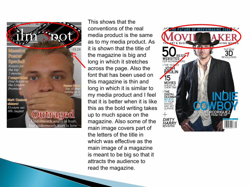
This shows that the conventions of the real media product is the same as to my media product. As it is shown that the title of the magazine is big and long in which it stretches across the page. Also the font that has been used on this magazine is thin and long in which it is similar to my media product and I feel that it is better when it is like this as the bold writing takes up to much space on the magazine. Also some of the main image covers part of the letters of the title in which was effective as the main image of a magazine is meant to be big so that it attracts the audience to read the magazine.

This shows that the conventions of the real media product is the same as to my media product. As it is shown that the articles are placed in the same manner as a real media product. I took this inspiration on board when I looked into similar products and I saw this when I came across it. I like this idea as the articles are placed and aligned to the left in which the layout of the magazine is effective. I also liked the way that the main articles are much larger than the others. Also the article on the left hand side of the page is effective in the way that it is placed as it does not cover the main attraction point on his face. This is why I originally took this idea on board as the layout of the articles on the page was very effective as it works well around the main image.

As it is shown from the above is that my media product is similar to the real media product. This shows that I have followed the conventions of a real media product as the size of the image that has been used on real media product is the same size as my image on my product. I feel that the size of the image is effective as it will attract the audience and the way that the real media producers have laid out the page is similar into what I have produced. The only aspect that is different is the way that I have directed my character to do in the image but this does not effect the convention as it is situated in the same place on the page.
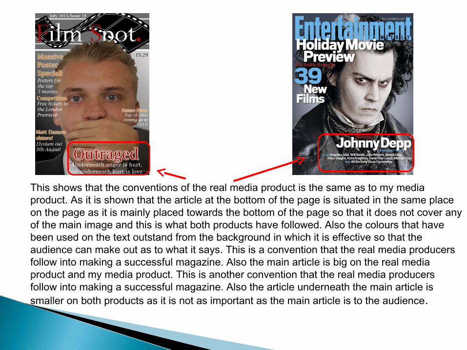
This shows that the conventions of the real media product is the same as to my media product. As it is shown that the article at the bottom of the page is situated in the same place on the page as it is mainly placed towards the bottom of the page so that it does not cover any of the main image and this is what both products have followed. Also the colours that have been used on the text outstand from the background in which it is effective so that the audience can make out as to what it says. This is a convention that the real media producers follow into making a successful magazine. Also the main article is big on the real media product and my media product. This is another convention that the real media producers follow into making a successful magazine. Also the article underneath the main article is smaller on both products as it is not as important as the main article is to the audience.


As it is shown above that the title of the movie is situated at the top of the page. The reason I placed the movie title at the top of the page is that it will attract the audience into knowing what the movie is named, this may the reason as to why the real media product has done the same. Also the font that has been used on this poster for the title looks similar to my font that has been used, this is convention that all media product producers follow as the font has to be clear and effective in which my media product and the real media product is. Also the size of both titles are similar as they both film the top of the page in which it has to as titles are always big on the page for the audience to see this.

As it is shown from this is that I have followed the conventions of a real media product. This is done by the placement of the main image on the front cover of the page, I took inspiration from the real media product poster as I liked the way that the character was situated in the poster. I also had the idea to add bullying words around him in which this image and the way that it was going to be placed on the page would have been effective. The only thing that I did not follow is that the size of the image on the real media product is bigger in which I already decided when I looked at this poster was that I was not going to be making my image that big. Also the producers of the real media product have placed a quote at the top of the page, I liked this idea and took this on board and incorporated this into my media product but I did not follow the convention of the way that it is situated on the page as I aligned my quote to the left.