Embed Size (px)
Citation preview
T8 - Publication Analysis & Development
Henry Buckham
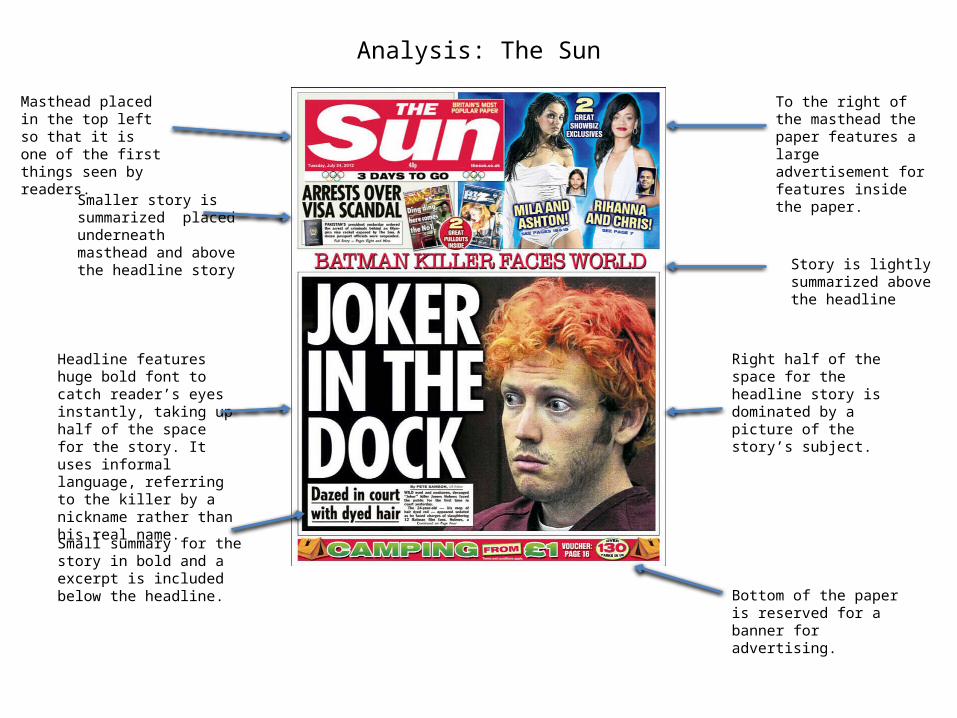
Analysis: The Sun
To the right of the masthead the paper features a large advertisement for features inside the paper.
Masthead placed in the top left so that it is one of the first things seen by readers.
Smaller story is summarized placed underneath masthead and above the headline story
Headline features huge bold font to catch reader’s eyes instantly, taking up half of the space for the story. It uses informal language, referring to the killer by a nickname rather than his real name.
Small summary for the story in bold and a excerpt is included below the headline.
Right half of the space for the headline story is dominated by a picture of the story’s subject.
Bottom of the paper is reserved for a banner for advertising.
Story is lightly summarized above the headline
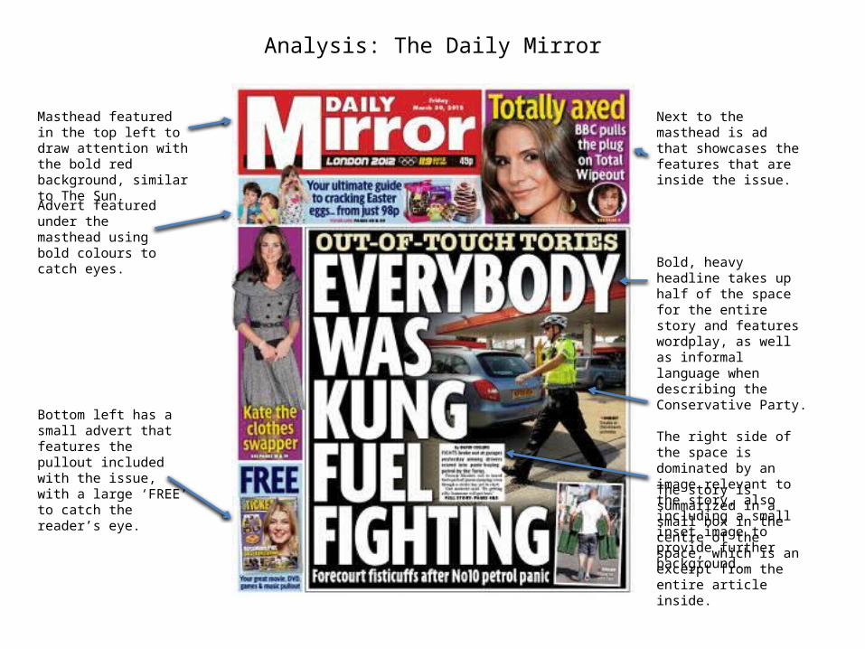
Analysis: The Daily Mirror
Masthead featured in the top left to draw attention with the bold red background, similar to The Sun.
Advert featured under the masthead using bold colours to catch eyes.
Bold, heavy headline takes up half of the space for the entire story and features wordplay, as well as informal language when describing the Conservative Party. The right side of the space is dominated by an image relevant to the story, also including a small inset image to provide further background.
The story is summarized in a small box in the centre of the space, which is an excerpt from the entire article inside.
Bottom left has a small advert that features the pullout included with the issue, with a large ‘FREE’ to catch the reader’s eye.
Next to the masthead is ad that showcases the features that are inside the issue.
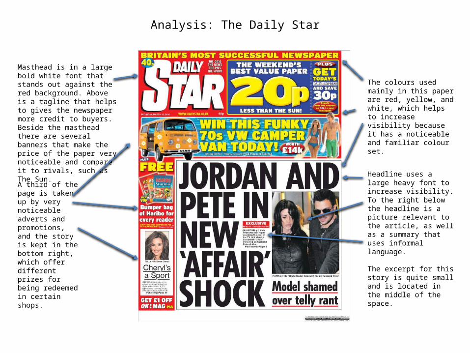
Analysis: The Daily Star
Masthead is in a large bold white font that stands out against the red background. Above is a tagline that helps to gives the newspaper more credit to buyers. Beside the masthead there are several banners that make the price of the paper very noticeable and compare it to rivals, such as The Sun.
A third of the page is taken up by very noticeable adverts and promotions, and the story is kept in the bottom right, which offer different prizes for being redeemed in certain shops.
Headline uses a large heavy font to increase visibility. To the right below the headline is a picture relevant to the article, as well as a summary that uses informal language.
The excerpt for this story is quite small and is located in the middle of the space.
The colours used mainly in this paper are red, yellow, and white, which helps to increase visibility because it has a noticeable and familiar colour set.
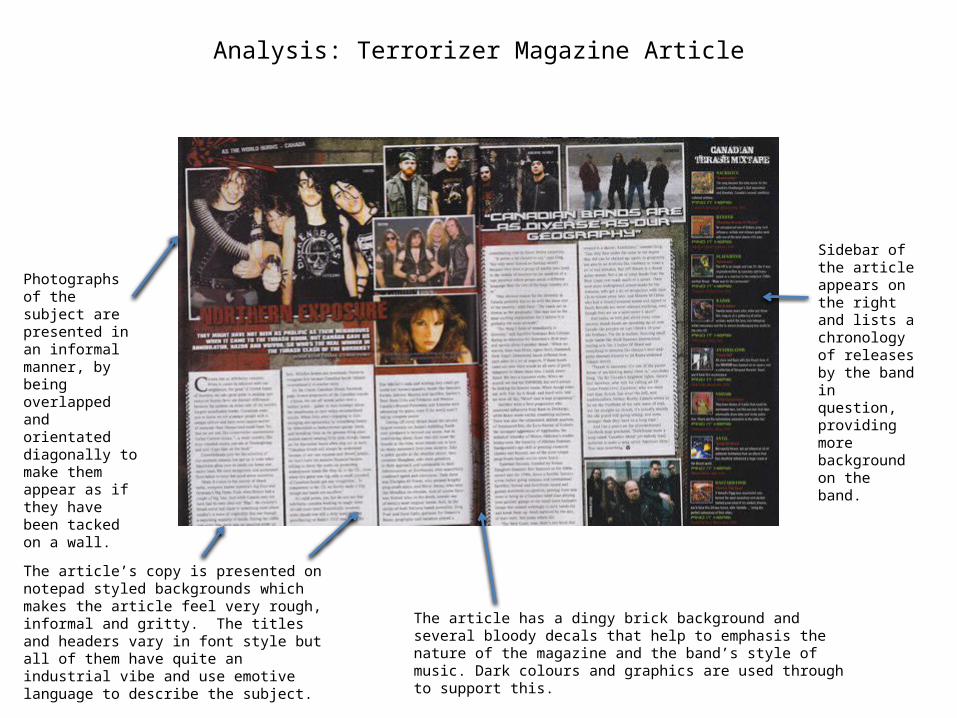
Analysis: Terrorizer Magazine Article
Photographs of the subject are presented in an informal manner, by being overlapped and orientated diagonally to make them appear as if they have been tacked on a wall.
The article’s copy is presented on notepad styled backgrounds which makes the article feel very rough, informal and gritty. The titles and headers vary in font style but all of them have quite an industrial vibe and use emotive language to describe the subject.
Sidebar of the article appears on the right and lists a chronology of releases by the band in question, providing more background on the band.
The article has a dingy brick background and several bloody decals that help to emphasis the nature of the magazine and the band’s style of music. Dark colours and graphics are used through to support this.
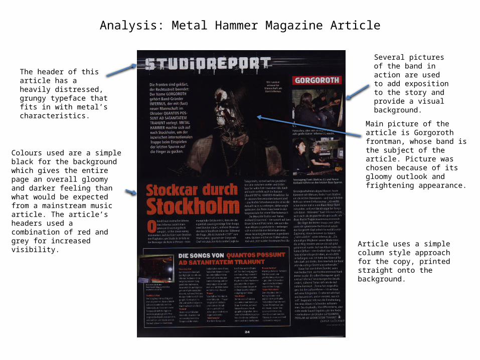
Analysis: Metal Hammer Magazine Article
Several pictures of the band in action are used to add exposition to the story and provide a visual background.
The header of this article has a heavily distressed, grungy typeface that fits in with metal’s characteristics.
Colours used are a simple black for the background which gives the entire page an overall gloomy and darker feeling than what would be expected from a mainstream music article. The article’s headers used a combination of red and grey for increased visibility.
Main picture of the article is Gorgoroth frontman, whose band is the subject of the article. Picture was chosen because of its gloomy outlook and frightening appearance.
Article uses a simple column style approach for the copy, printed straight onto the background.
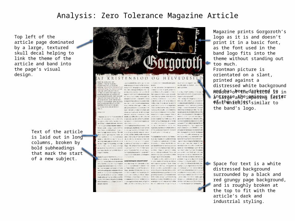
Analysis: Zero Tolerance Magazine Article
Top left of the article page dominated by a large, textured skull decal helping to link the theme of the article and band into the page’s visual design.
Magazine prints Gorgoroth’s logo as it is and doesn’t print it in a basic font, as the font used in the band logo fits into the theme without standing out too much.Frontman picture is orientated on a slant, printed against a distressed white background and has been darkened to increase the ominous factor of the subject.
Text of the article is laid out in long columns, broken by bold subheadings that mark the start of a new subject.
Header of the article is in a large and imposing serif font which is similar to the band’s logo.
Space for text is a white distressed background surrounded by a black and red grungy page background, and is roughly broken at the top to fit with the article’s dark and industrial styling.
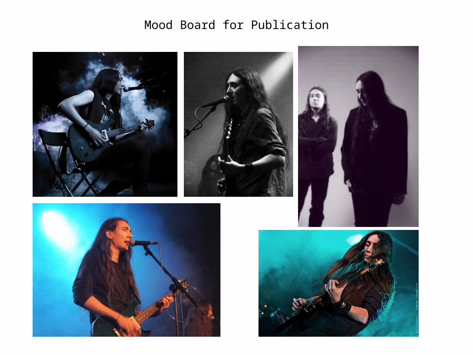
Mood Board for Publication
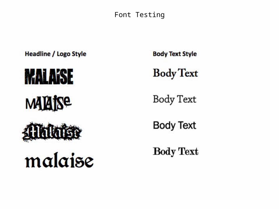
Font Testing
Headline / Logo Style
Malaise
Malaise
Malaisemalaise
Body Text Style
Body Text
Body Text
Body Text
Body Text
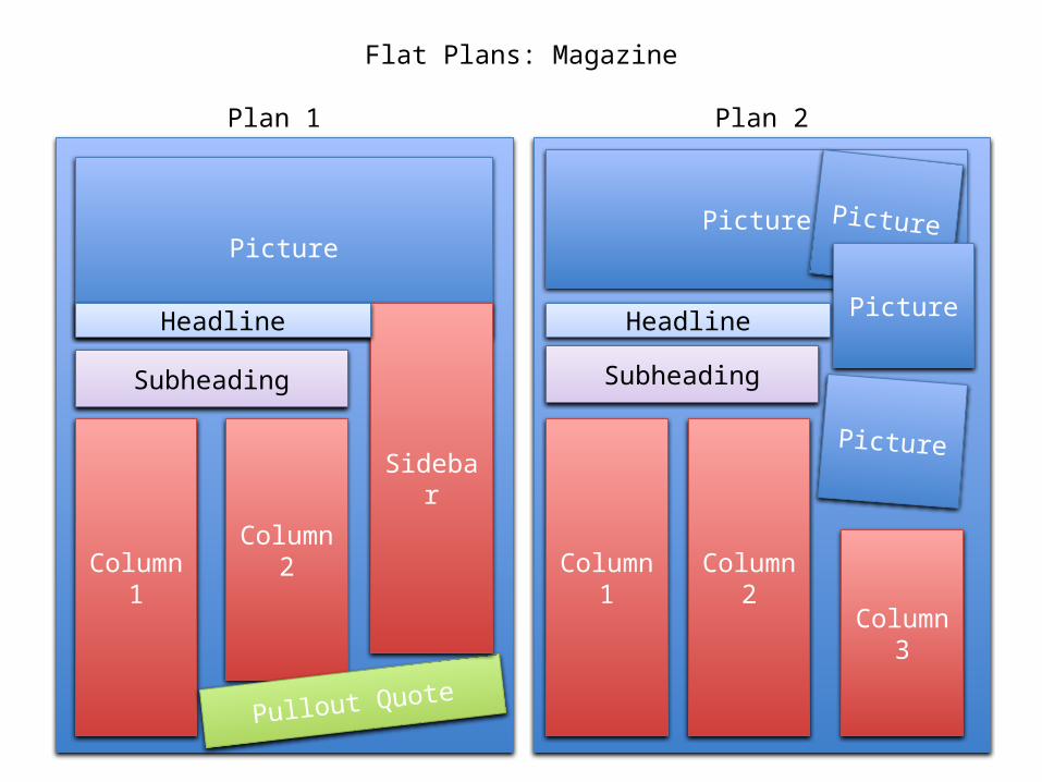
Flat Plans: Magazine
Column 2Column 1
Picture
Pullout Quote
Sidebar
Subheading
Headline
Plan 1 Plan 2
Picture
Picture Picture
PictureHeadline
Subheading
Column 1 Column 2
Column 3
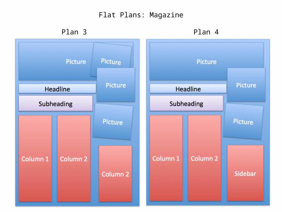
Flat Plans: Magazine
Plan 3 Plan 4