Embed Size (px)
Citation preview

Marketing And PR
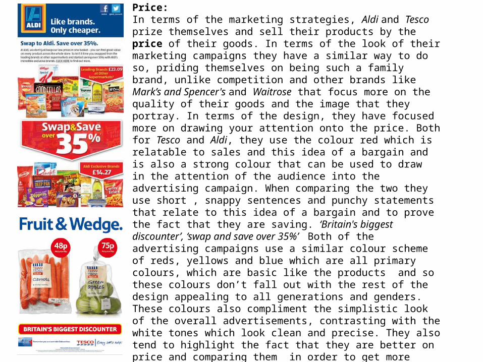
Price:In terms of the marketing strategies, Aldi and Tesco prize themselves and sell their products by the price of their goods. In terms of the look of their marketing campaigns they have a similar way to do so, priding themselves on being such a family brand, unlike competition and other brands like Mark’s and Spencer's and Waitrose that focus more on the quality of their goods and the image that they portray. In terms of the design, they have focused more on drawing your attention onto the price. Both for Tesco and Aldi, they use the colour red which is relatable to sales and this idea of a bargain and is also a strong colour that can be used to draw in the attention of the audience into the advertising campaign. When comparing the two they use short , snappy sentences and punchy statements that relate to this idea of a bargain and to prove the fact that they are saving. ‘Britain's biggest discounter’, ‘swap and save over 35%’ Both of the advertising campaigns use a similar colour scheme of reds, yellows and blue which are all primary colours, which are basic like the products and so these colours don’t fall out with the rest of the design appealing to all generations and genders. These colours also compliment the simplistic look of the overall advertisements, contrasting with the white tones which look clean and precise. They also tend to highlight the fact that they are better on price and comparing them in order to get more customers. There are also external links featured upon these advertisements, with links to Twitter and Facebook on the Aldi advertisement, which is appropriate, as it relates to a young audience, who utilise social media means as a way of communicating, therefore, it is a free form of advertising for the company, as people may decide to follow or like the pages posed by the company through digital means. Also, on the Tesco advertisement, there is an image of the Clubcard, which may encourage people to have loyalty to the company, therefore, they will spend more money there. This is a clever marketing technique.

Quality: The term ‘quality over price’ refers to the supermarkets Marks and Spencer's and Waitrose. It is clear that both of these advertisements do not issue the price of the product that is featured on them, instead they issue language such as “Quality” and “Eat Well” focusing ironically on the ‘quality’ of the product, as opposed to the price that it retails at. Another comparison is that they both use white font, which is effective, as it stands out from the dark background and will initially catch the attention of the viewer. High-key lighting is also used upon both of the images, which emphasises the appearance of the food, therefore, this is a clever marketing technique, as the consumer of the product will be convinced to purchase it, solely on the appearance of the stated food product. Also, the logos of each of the companies are featured, which is useful, as it informs the consumer of what they are going to expect, as M&S and Waitrose are rather high-class supermarkets that are primarily targeted towards an upper middle class audience, as the food is quite expensive. There is a significant amount of emphasis on the image of the company, with the food featured that looks of a high standard, however, both companies use the element of quality well, as they do not feature the price whatsoever, as it is irrelevant if the standard of the food is great. Although, even though both advertisements utilise a white, san-serif font, the amount of text used is different, as the Waitrose campaign uses just the title and the slogan, whilst the M&S advertisement features an explanation as well, which makes the campaign seem more detailed, however, the consumer, may not want to view an extended amount of text, as they may find that it tedious and therefore, they will have no interest in viewing the promotional piece of material any further. The Waitrose advertisement addresses the point quickly, which will interest the audience much more than that of the M&S one.

Image; Both of these drinks focus more on the image of their brand rather than the price, as you can tell from this advertising material and the design behind this. As both Vitamin Water and Innocent Smoothies are very similar in design. Looking at the Innocent Smoothies the actual image of the product is important as well as the surrounding of this as they are showing the audience what goodness goes into their drinks. Making these fruits look as appetising as possible. Showing the ingredients to one side and the drink that is created on the other. Targeting those who tend to lead a healthy lifestyle, as well as those influenced by the lifestyle and ethics of hippies, because of these drinks being very natural related. These types of drinks also like to highlight and make sure that the audience are aware of the content that goes into these drinks by the text that is used such as the words ‘we crush all of this… into this’ as a way of illustrating the point. In terms of the background design both of these posters they have used two different approaches a white background which helps to draw your attention into the poster focusing on the product in the centre. Using a plain background also reflects the simplicity of the drink and the clean and healthy look. To contrast this, Innocent have looked at using the background taken from the countryside, which reflects the outdoors and the ideas behind healthiness and being active. The green of this advertising campaign also compliments the ideas of nature and the environment which work well with the inspiration,. Also, the fact they have used a summers day reflects the summery sort of drink that this is. In terms of the colour scheme, they have used a lot of colours associated with fruit, and are also primary colours that don’t target a specific gender or age, by using multiple fruits in the design emphases how healthy they are and the amount that goes into these drinks.

Value: These two advertisements have several similarities, but also inhabit a sense of contrast between them as well. The Premier Inn and Travelodge advertisement both feature a price, which is rather blatant in stature, with “£29” and £19” being highlighted in order to catch the attention of the audience and to promote that both of these companies as being value for money. The Premier Inn print poster does not feature the logo or slogan for the company, however, the audience will be able to tell that this campaign is related to this particular hotel chain, as comedian Lenny Henry appears on it and he is known for promoting this company, which shows that they use celebrity endorsement as a way of promoting their organisation. Also, they utilise a colour scheme of purple, which is iconic of the company, therefore, the audience will be able to relate to this element as well. In contrast, the Travelodge use a teddy bear as a way of promoting their company and it has become their mascot, which will make the advertisement appeal to a young, child audience as well, as this specific item is associated with this type of audience specifically. High-key lighting has been used on the Premier Inn campaign, which makes it look bright and eye-catching, which the viewer will pick up on. However, the Travelodge advertisement is rather dark, utilises low-key lighting, which is effective, as it sets a professional tone to the poster and makes the bold, vibrant logo stand out, which is the main focal point of the campaign in conjunction with the price. The font used for both of the hotel advertisements is very similar, as it is presented in the form of a standard san-serif font, which appeals to most age groups and is readable for the viewer. Also, the fact that the Travelodge advertisement features a link to the website is effective, as it includes an E-media element to it, even though it is a print advertisement. This shows that this particular company want to appeal to a younger audience, who use this platform primarily, which makes the poster have a ‘digital’ outlook in a way, which makes it more appealing to a wide range of individuals.
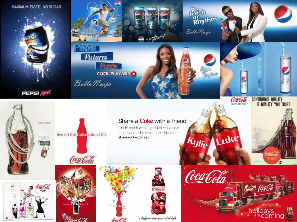

Market and Competition:
Both Coca Cola and Pepsi are companies that are in a similar market and can be seen to be in competition with each other because they create the same type of product which is a carbonated drink. They both use primary colours as their main colour scheme, with blue and red, which are rather simplistic but effective at the same time. Also, they are both bright which catches the attention of the primary target audience of both of the products which range from the ages of 14-30.
Furthermore, in terms of the strategies that have been used, Coca Cola has created a number of different drinks i.e. diet, light and zero. As well as experimenting with the design on the can/bottle, collaborating with Marc Jacobs and sharing a Coca Cola with a friend. In order for Coca Cola to beat there main competitor, Pepsi, they have to always come up with new and inventive ideas regarding how they could promote their drink by initiating their ‘Share a Coke’ campaign, where consumers could pick out a bottle in the hope of finding their own name. This sold very well and became popular, which put much pressure on Pepsi. It is notable that this type of marketing technique is effective in catching the attention of the audience, as it is different and the fact that someone could obtain a ‘personalised’ bottle made Coca Cola a commodity at the time and it was also an incentive for a consumer to purchase a bottle of it.
Moreover, Beyoncé promotes Pepsi, where she did an advertisement featuring her song ‘Grown Woman’ in the background of it, this is a form of celebrity endorsement which is commonly found in the advertising campaigns of beverages, such as Lucozade having Tinie Tempah featured upon one of their bottles. Both Pepsi and Coca Cola have recognizable and distinct mantras which the audience can identity with and they will be able to realise that those particular advertisements are linked to Coca Cola and Pepsi because they have been seen before. They also feature the can within the poster which means that both companies want there target audience to be familiar with there the packaging of there particular brand.

Marketing and Competition.Converse and Vans are both leading shoe companies that have a primary target audience of teenagers and young adults for the purpose of casual wear or sporting activities such as skateboarding. Because of the competition between these brands each company has to stand out and have their own unique selling point. Such as Vans they have branched out into a number of different areas creating different events related to the urban lifestyle of the audience. It involves music, skateboarding and expressive art. From the original Vans, a number of different collections have been created including there; classics, California, surf and snow and customised shoes, which give people a chance to personalise their own pair of Vans. This brand is universal because their products are sold worldwide, which highlights their popularity. They primarily sell shoes, but now have branched into accessories such as backpacks and sunglasses, as well as featuring seasonal goods such as snow clothing in women's, men's and kids wear. They also have links to social media sites such as Facebook and Twitter that will attract the attention of the young primary audience, as they can initially ‘Like’ their Facebook page, which is a free form of advertising in a way.
Furthermore, in contrast with this, the Converse website do not feature any links to social media, even though they both have the same target audience, which makes the Vans sit more suited to the primary viewer. However, they do have similarities in the sense that Converse shoes also have different style categories much like Vans, which include All Stars, Jack Purcell, Converse Cons and Customised Converse. The Converse webpage includes offers such as ‘3 laces for $5’ and ‘free shipping’, which will interest the viewer, and they may be convinced to purchase from there, as a deal has been issued, which contrasts with that from Vans, who do not feature any form of sale or offer on their website. Another similarity would be that Converse also has a women's, men's and kids section, much like Vans, which is useful as it shows a sense of variety between the products that they issue. Accessories are also sold on the Converse website, such as phone cases and hats, which makes it more diverse as a brand. It is notable that Converse also issue gift cards for presents that people can buy, as well as featuring a unique element that is not found in the Vans shoe range, where they have collaborated with DC Comics to make superhero/villain shoes designs, which will appeal to those who are fans of comic books, which makes them the secondary audience of Converse itself. Both companies do not issue advertisement posters because they focus more on the E-media side due to the fact that the primary target audience for these shoes are teenagers, who relate to this platform more than print and broadcast.