Embed Size (px)
Citation preview

OCR Media Studies – AS Level
Unit G321: Foundation Portfolio in Media
Preliminary Task and Log Book
Name: Eleanor MasonCandidate Number: 6692Center Name: St. Paul’s Catholic CollegeCenter Number: 64770
Music Magazine – Production
Preliminary Task and Log Book
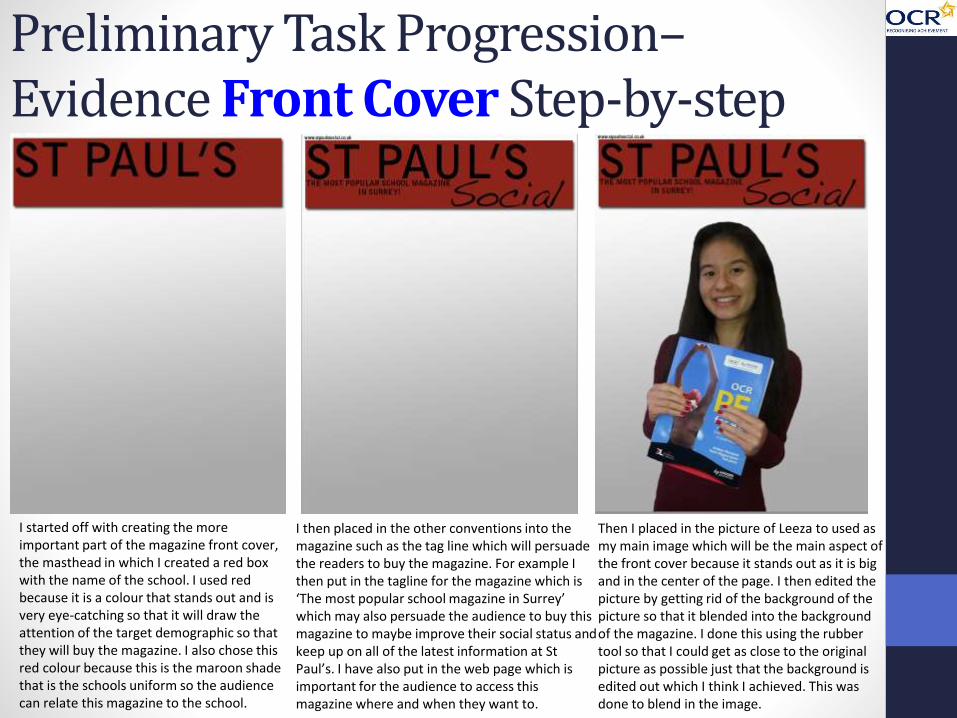
Preliminary Task Progression–Evidence Front Cover Step-by-step
I started off with creating the more important part of the magazine front cover, the masthead in which I created a red box with the name of the school. I used red because it is a colour that stands out and is very eye-catching so that it will draw the attention of the target demographic so that they will buy the magazine. I also chose this red colour because this is the maroon shade that is the schools uniform so the audience can relate this magazine to the school.
I then placed in the other conventions into the magazine such as the tag line which will persuade the readers to buy the magazine. For example I then put in the tagline for the magazine which is ‘The most popular school magazine in Surrey’ which may also persuade the audience to buy this magazine to maybe improve their social status and keep up on all of the latest information at St Paul’s. I have also put in the web page which is important for the audience to access this magazine where and when they want to.
Then I placed in the picture of Leeza to used as my main image which will be the main aspect of the front cover because it stands out as it is big and in the center of the page. I then edited the picture by getting rid of the background of the picture so that it blended into the background of the magazine. I done this using the rubber tool so that I could get as close to the original picture as possible just that the background is edited out which I think I achieved. This was done to blend in the image.

Preliminary Task Progression–Evidence Front Cover Step-by-step
At this stage I inserted aspects such as the promotion/puff so that this persuaded the target audience to buy the magazine, I decided to colour this in yellow because it is an eye catching colour that stands out against the red/maroon colour that I have used as my main colour in these magazine pages. I also added a barcode into the magazine as that is a key aspect that is included on all existing magazines so I needed it in order for it to be bought.
I then put in all the cover lines to attract the audience to my magazine, so if there was an article that attracted them to this magazine then they would more likely buy the magazine for that article. I included articles such as the exam results for example to maybe encourage other students to want to find out this information if they are completing their exams after so that they can see how to improve. I created these cover lines using the text tool.
Finally, I created these red/maroon boxes around the cover lines to make them stand out more and to keep with the colour scheme of my magazine. I created these boxes using the shape tool and colouredthem in using the eye dropper tool to get the right colour and the paint bucket tool to put the colour onto the shape. This is then the completed front cover for my school magazine as it has included all the necessary conventions for a magazine.

Preliminary Task Progression–Evidence Contents Page Step-by-step
For my contents page I started off with the same style by repeating the layout of the masthead and the convergence in order to create continuity between the pages so that the consumer finds it easy to navigate between the pages and that they all link. I also used the same gradient background because I though it made it look more 3D rather than just having it plain white. I done this using the gradient effect when double clicking on the layer which I think added a nice touch.
Then I added all of the pictures that I wanted to use for my contents page and my articles. I took these on my phone and they all like to the relevant articles which creates the visual representation of the articles which also makes it easier to navigate around the page. I edited one of the photos using the rubber tool to quickly edit out the background that was on the image. I made the cluster of the images so that it left room for the editorial and the articles with the information about each part.
Next I added the page numbers that linked to the article on the images so that it was clear to see which pictures actually linked to which articles which is a nice aspect to have. I then added the news articles with all the smaller cover lines that had a small bit of information about each article which I think is also a key convention that is needed on the contents page so that the consumer know what a general idea of what the article is about and where to find that article, I done this using the text tool.

Preliminary Task Progression–Evidence Contents Page Step-by-step
I then added in the extra information about the current and up and coming events that were taking place in the school so that the consumer can easily find out this key information in the magazine and it is easy to actually find the page that this information will be on in more detail. I created this text using the text tool and using the existing fonts that were already inserted onto Photoshop, I used a basic font so that the writing was easy to read and it was clear to the reader what the articles were about which is a key aspect that is needed on the contents page.
Finally, I added my editorial which I first wrote up on a word document so that I didn’t make and grammar and spelling errors. I created this using the pen tool so that the editorial fit around the image that I used to show who the magazine is made by. I also included the social networking logos, creating convergence so that it made it easy for the consumer to access any other information elsewhere. Throughout my editorial I have used first person so that the reader feels like I am talking to them and feel more involved. This is the completed contents page for my school magazine.

Genre Research
Billboard Magazine is an American music magazine which is centred in New York City, and is owned by Prometheus Global Media. It was published on November 1st 1894 and it is well-known as being among the oldest trade magazines in the world.This magazine tracks the newest records and singles on the charts; its primary chart is Billboard Hot 100 and Billboard 200. The magazine ranks the hottest records in various genres; song rankings are based on digital download sales, radio airplay, and internet streaming, while albums are based wholly on sales.
Billboard magazine caters to everyone's taste in music due to its universal and diverse range of genres that are followed through the magazine articles. Billboard magazine doesn’t have a specific genre to its name because this magazine follows every genre as it focuses on the top selling singles and albums whether that be in the pop genre to the reggae genre meaning that this magazine doesn’t focus on a specific audience, and that this magazine sales are at a maximum as it is a universal magazine.
The main genres that this magazine usually focuses on the most is pop, R&B/Hip-Hop, Country, Latin and K-Pop.
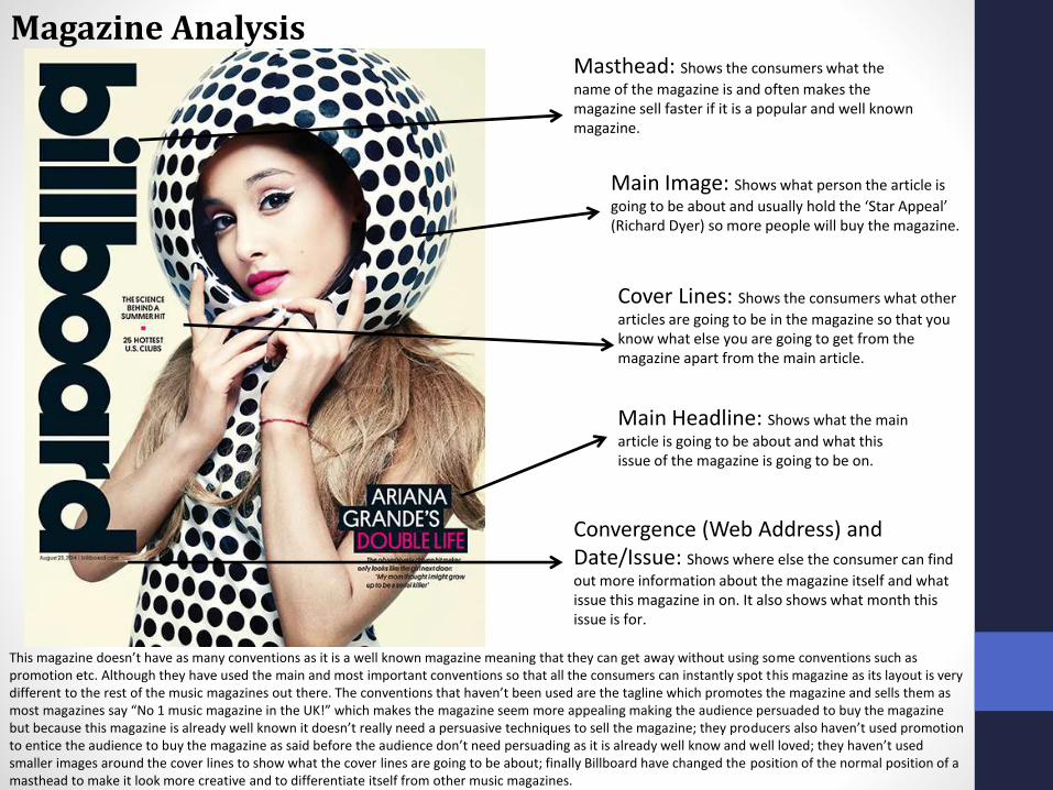
Main Headline: Shows what the main
article is going to be about and what this issue of the magazine is going to be on.
Main Image: Shows what person the article is
going to be about and usually hold the ‘Star Appeal’ (Richard Dyer) so more people will buy the magazine.
Masthead: Shows the consumers what the
name of the magazine is and often makes the magazine sell faster if it is a popular and well known magazine.
Cover Lines: Shows the consumers what other
articles are going to be in the magazine so that you know what else you are going to get from the magazine apart from the main article.
Convergence (Web Address) and Date/Issue: Shows where else the consumer can find
out more information about the magazine itself and what issue this magazine in on. It also shows what month this issue is for.
This magazine doesn’t have as many conventions as it is a well known magazine meaning that they can get away without using some conventions such as promotion etc. Although they have used the main and most important conventions so that all the consumers can instantly spot this magazine as its layout is very different to the rest of the music magazines out there. The conventions that haven’t been used are the tagline which promotes the magazine and sells them as most magazines say “No 1 music magazine in the UK!” which makes the magazine seem more appealing making the audience persuaded to buy the magazine but because this magazine is already well known it doesn’t really need a persuasive techniques to sell the magazine; they producers also haven’t used promotion to entice the audience to buy the magazine as said before the audience don’t need persuading as it is already well know and well loved; they haven’t used smaller images around the cover lines to show what the cover lines are going to be about; finally Billboard have changed the position of the normal position of a masthead to make it look more creative and to differentiate itself from other music magazines.
Magazine Analysis

Main Headline: Shows what the main
article is going to be about and what this issue of the magazine is going to be on.
Main Image: Shows what person the article is
going to be about and usually hold the ‘Star Appeal’ (Richard Dyer) so more people will buy the magazine.
Masthead: Shows the consumers what the
name of the magazine is and often makes the magazine sell faster if it is a popular and well known magazine.
Cover Lines: Shows the consumers what other
articles are going to be in the magazine so that you know what else you are going to get from the magazine apart from the main article.
Convergence (Web Address) and Date/Issue: Shows where else the consumer can find
out more information about the magazine itself and what issue this magazine in on. It also shows what month this issue is for.
This magazine has lots of conventions used on the front cover. It has used a bold red colour for the masthead and continued to use a navy blue colour as the background, this is very effective because the red stands out a lot against all the other conventions even though most of the masthead is covered by the main image. This magazine had also used more conventions then most because it has included the unique scanning code which links to an online version of this magazine which creates the convergence between the hard copy of the magazine and the online version. Another aspect of the front cover that is very attractive and appealing is the image that is used, it is very clear and it is the main focus of the front cover this is because it takes up the majority of the page and it overlaps even on the masthead. Also, because this magazine is very well known it doesn’t need a strap line to persuade readers into buying the magazine because it sells itself, they also haven’t used promotion to sell the magazine because as I said before it isn’t needed as it sells itself because its so popular.
Magazine Analysis (Different Example)

Target AudienceThe target audience for Billboard magazine can be denoted from the readership of 16 years old to about 30 years old (Hartley) of all genders because Billboard magazine uses celebrities from all types of genres that are current and up and coming artists that appeal to the younger generations as well as the older generations who are/would like to be up to date with the current artists that are on the top of the chart which is an example for ‘social climbers’ (Maslow) who like to be up to date on the most current successful artists. Billboard can also appeal to people all over the world who enjoy listening to all genres of music for example people in the UK, America, Australia (Hartley) etc. Also people that enjoy listening to their favorite artists will buy this magazine and it will appeal to this people as they will want to know about their favorite artist that they can form a ‘personal relationship’ (Katz) with as they will be intrigued to know what's happening in that celebrity’s life. However, the target audience for Billboard magazine can vary each week due to the fact that this magazine caters to a lot of peoples taste in music depending on each week what the top artists and music is as Billboard focuses on the the current top sellers in all genres.
From the research completed into this media product, I think the unique selling point for Billboard magazine is that this magazine doesn’t stick to a specific genre making this magazine allow the readers to no only branch out on the genres that they like but it allows the magazine to have maximum readership as it also uses ‘star appeal’ (Richard Dyer) and the ‘female gaze’ (Diana Saco) and ‘male gaze’ (Laura Mulvey) of both male and female artists on the cover/main image to appeal to both the male and female gender. Also I think that another USP of Billboard magazine is that the masthead of the magazine has now changed position onto the side of the magazine making the magazine stand out from other magazines as it is very unique and can be used as an identifier to differentiate the magazine from others.
Unique Selling Point (USP)
BillboardReaders
Percentage
Between the ages of 25-54
71%
Collegegraduates
82%
Post degreegraduates
27.5%
Director level or above
65%
Keep the annual double year end issue for over a year
37%

Publisher Research
Editor Danyel Smith
Frequency Weekly
Circulation 16,327
First Issue 1894
Company Prometheus Global Media
Language English
Prometheus Global Media is the publishing company for Billboard magazine. Prometheus Global Media is a New York City-based business-to-business media company. The company was formed in December 2009 by the sale of the entertainment and media division of Nielsen Company to a private equity-backed group led by Pluribus Capital Management and Guggenheim Partners.
Prometheus Global Media publish many other magazine such as The Hollywood Reporter and Back stage within the entertainment section; they also publish Film Journal International and Insidesocialgames. Prometheus Global Media publishing agency describes itself as "a leading publisher of music and entertainment titles". The readership for The Hollywood Reporter and Film Journal International have similar demographics because they are still aimed at both the younger generation and the older generation but they are in different genres meaning that not only do the other magazines attract the same age range but they also attract a wider audience, who like film/current films for example.