Embed Size (px)
Citation preview
Evaluation question 1
In what ways does your media product use,
develop or challenge forms and conventions of
real media products?
All three of my media products use and develop forms and conventions of real media products.
I did this so as to make each product believable and authentic looking without making it exactly the same as existing magazines.
Before even starting my planning I looked into the codes and conventions of everything I would be producing to allow me to make decisions about which conventions to adhere to and which to challenge.
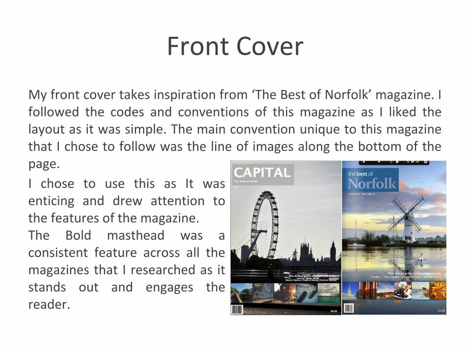
Front Cover
My front cover takes inspiration from ‘The Best of Norfolk’ magazine. I followed the codes and conventions of this magazine as I liked the layout as it was simple. The main convention unique to this magazine that I chose to follow was the line of images along the bottom of the page. I chose to use this as It was enticing and drew attention to the features of the magazine. The Bold masthead was a consistent feature across all the magazines that I researched as it stands out and engages the reader.

Contents Page
For my contents page I took inspiration from a copy of Time Out magazine. I kept the style similar but the main features such as the images and text were significantly different. However I challenged the convention of having bright colours by keeping
the colour scheme grey, blue and white. Like the time out cover, I included a section of ‘regulars’ and a comment from the editor which allows the reader to feel a personal connection to the magazine.
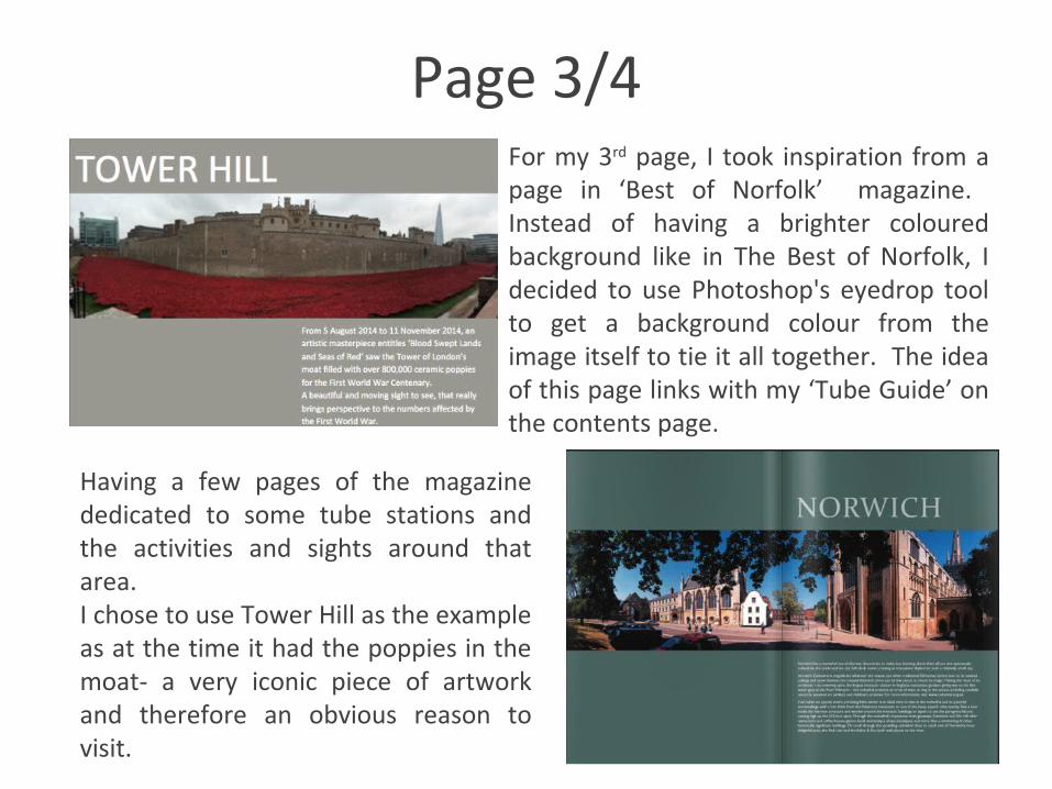
Page 3/4For my 3rd page, I took inspiration from a page in ‘Best of Norfolk’ magazine. Instead of having a brighter coloured background like in The Best of Norfolk, I decided to use Photoshop's eyedrop tool to get a background colour from the image itself to tie it all together. The idea of this page links with my ‘Tube Guide’ on the contents page.
Having a few pages of the magazine dedicated to some tube stations and the activities and sights around that area.I chose to use Tower Hill as the example as at the time it had the poppies in the moat- a very iconic piece of artwork and therefore an obvious reason to visit.
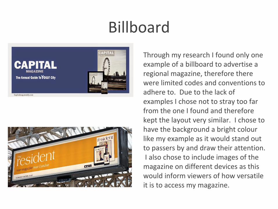
Billboard
Through my research I found only one example of a billboard to advertise a regional magazine, therefore there were limited codes and conventions to adhere to. Due to the lack of examples I chose not to stray too far from the one I found and therefore kept the layout very similar. I chose to have the background a bright colour like my example as it would stand out to passers by and draw their attention. I also chose to include images of the magazine on different devices as this would inform viewers of how versatile it is to access my magazine.
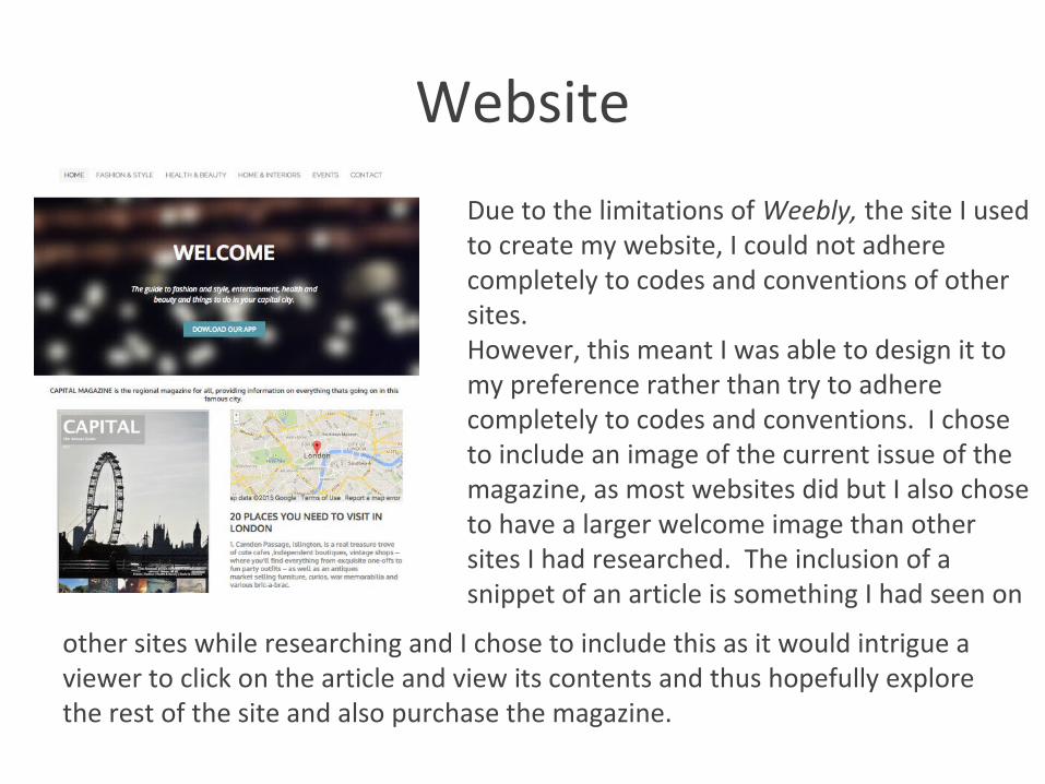
Website
Due to the limitations of Weebly, the site I used to create my website, I could not adhere completely to codes and conventions of other sites.However, this meant I was able to design it to my preference rather than try to adhere completely to codes and conventions. I chose to include an image of the current issue of the magazine, as most websites did but I also chose to have a larger welcome image than other sites I had researched. The inclusion of a snippet of an article is something I had seen on
other sites while researching and I chose to include this as it would intrigue a viewer to click on the article and view its contents and thus hopefully explore the rest of the site and also purchase the magazine.