Embed Size (px)
Citation preview
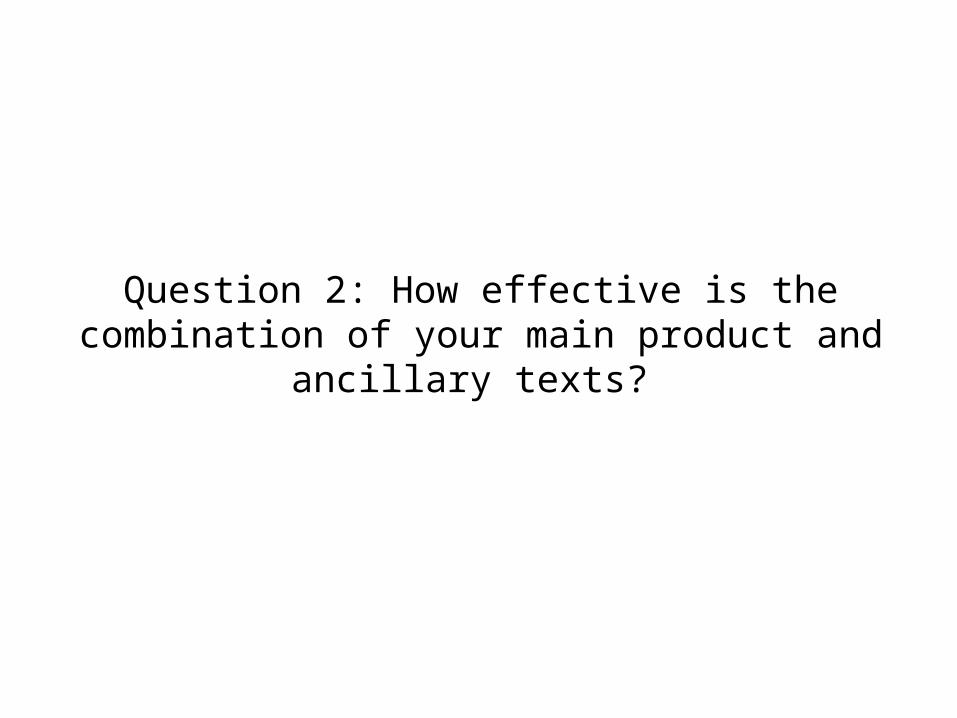
Question 2: How effective is the combination of your main product and ancillary texts?
The task
For our A2 production we had to create a music video of our chosen genre, ours being dance/pop. Alongside this we had to create a range of ancillary tasks to compliment our work. This task involved creating a poster to advertise our chosen music video as well as a digipak to hypothetically go on sales in retail. With the two texts combined with our video it created a marketing campaign for our music video.
Throughout my research for A2 I look into a variety of digipaks to give me a better understanding of what our work needed to include helping me understand the use of codes and conventions within.
I have come to the understanding the digipaks have a theme running throughout, whether that be colour, font, typography etc. The front cover and inner pages are often featured with the artists picture allowing the audience to focus solely on the given artist.
Also, within the dance genre if the artist is female in our case they are the singer is more than often sexualised referring back to Laura Mulvey’s male gaze theory. We went with this convention as our artist is portrayed in a sexual manner wearing low cut clothing.
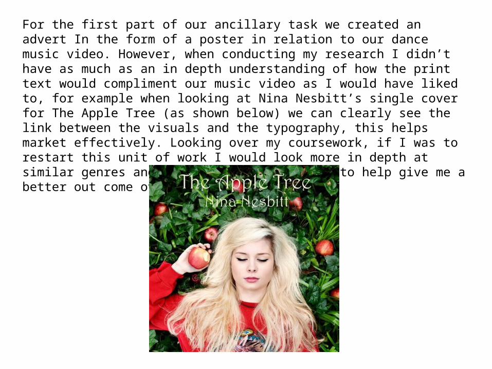
For the first part of our ancillary task we created an advert In the form of a poster in relation to our dance music video. However, when conducting my research I didn’t have as much as an in depth understanding of how the print text would compliment our music video as I would have liked to, for example when looking at Nina Nesbitt’s single cover for The Apple Tree (as shown below) we can clearly see the link between the visuals and the typography, this helps market effectively. Looking over my coursework, if I was to restart this unit of work I would look more in depth at similar genres and compare videos to print to help give me a better out come over all.
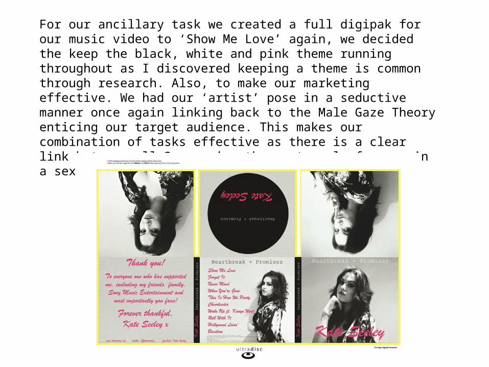
For our ancillary task we created a full digipak for our music video to ‘Show Me Love’ again, we decided the keep the black, white and pink theme running throughout as I discovered keeping a theme is common through research. Also, to make our marketing effective. We had our ‘artist’ pose in a seductive manner once again linking back to the Male Gaze Theory enticing our target audience. This makes our combination of tasks effective as there is a clear link between all 3 carrying the portrayal of woman in a sexual manner throughout.
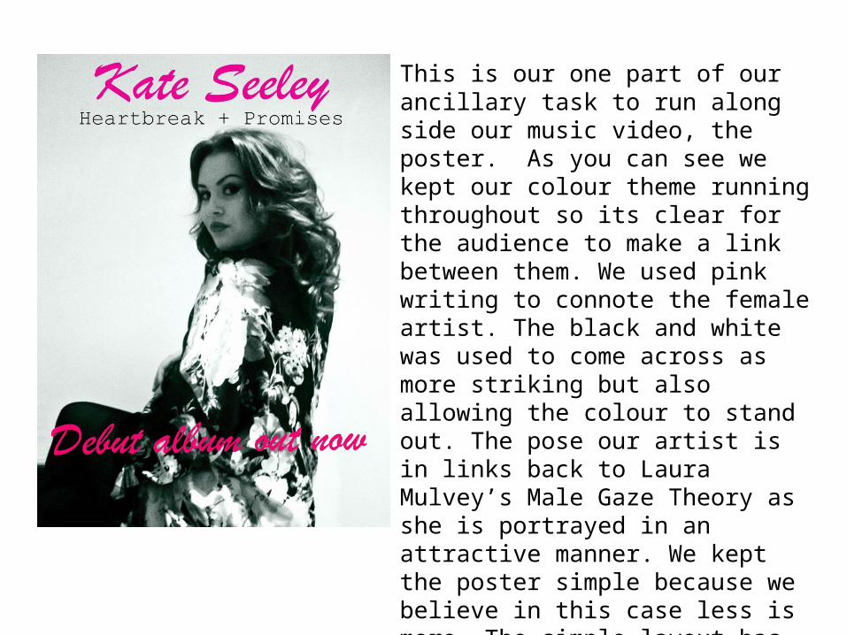
This is our one part of our ancillary task to run along side our music video, the poster. As you can see we kept our colour theme running throughout so its clear for the audience to make a link between them. We used pink writing to connote the female artist. The black and white was used to come across as more striking but also allowing the colour to stand out. The pose our artist is in links back to Laura Mulvey’s Male Gaze Theory as she is portrayed in an attractive manner. We kept the poster simple because we believe in this case less is more. The simple layout has connotations of being modern which is what dance music is this is why we included as little text as possible.