Embed Size (px)
Citation preview

Digipak Analysis

Blink – 182 (Take Off Your Pants and Jacket)
The name album name “Take Off Your Pants and Jacket” correlates with the images which are displayed on the front cover of the album. The images represent the album.The digipak consists of a generic black background along with the three images depicting the following: a plane, a pair of trousers and a jacket. The plane which is displayed represents the “Take Off” aspect. The discs become unique as they can be seen as collectables due to the particular design of the discs.The album is representative towards the pop/punk genre for the simplistic black cover integrated with the bursts of colour.
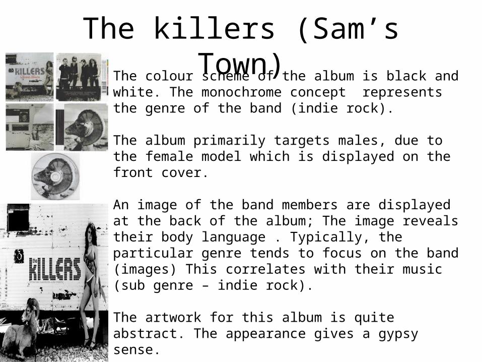
The killers (Sam’s Town)The colour scheme of the album is black and white. The monochrome concept represents the genre of the band (indie rock).
The album primarily targets males, due to the female model which is displayed on the front cover.
An image of the band members are displayed at the back of the album; The image reveals their body language . Typically, the particular genre tends to focus on the band (images) This correlates with their music (sub genre – indie rock).
The artwork for this album is quite abstract. The appearance gives a gypsy sense.
When We Were Young: “He doesn’t look a thing like Jesus” “Your prayers they’re not fables” The lyrics have biblical references .
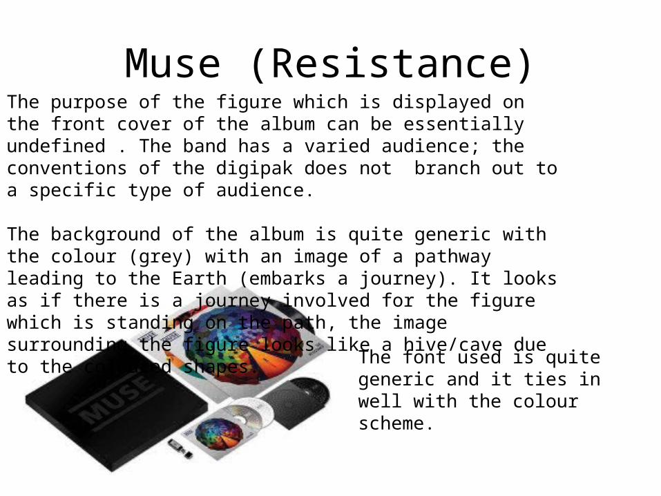
Muse (Resistance)The purpose of the figure which is displayed on the front cover of the album can be essentially undefined . The band has a varied audience; the conventions of the digipak does not branch out to a specific type of audience.
The background of the album is quite generic with the colour (grey) with an image of a pathway leading to the Earth (embarks a journey). It looks as if there is a journey involved for the figure which is standing on the path, the image surrounding the figure looks like a hive/cave due to the coloured shapes.
The font used is quite generic and it ties in well with the colour scheme.

Interior Covers•The inside covers have photographs of the band members. The photographs are slightly blurred and are taken in black and white. This relates to the artistic and serious side of the band,
•The colour scheme (black and white) relates to the mood. This gives connotations of the music and genre.

The bands logo is written in between two horizontal lines. This creates a theme for the band.
The design of the CD corresponds with the front cover. The front cover of the album is colourful, whereas the colour scheme for the disc is dark. This could arouse a more serious tone for the band.

Back CoverThe blurred image of the band takes up the majority of space on the cover. This creates a brand image and presents an established image for the audience.
The song list has the same colour scheme which is displayed on the front cover of the album cover and the rest of the current cover is black and white.
There are high buildings displayed in the background of the image. The distance between the buildings and the band creates a sense of dominance for the band as they’re larger than the buildings .