Embed Size (px)
Citation preview
UNDERSTANDING THE MODERN PIXEL
STEVEN MEYERSEPTEMBER 2016
PHOENIX MOBILE & IOT FESTIVAL

2
STEVEN MEYER• Experience• • Currently the Lead User Experience Designer for K-
12 Learning Services at Pearson• • Previously worked for O’Reilly Auto Parts on their
B2B ecommerce website that generated ~500 million annually
• • Experience ranges from startups to Fortune 500 companies
• Education• • Master of Science, Technology (MSTech),
concentration in Graphic Information Technology, Arizona State University
• • Certificate, User Experience and Customer-Centered Design, California State University, Fullerton
https://www.linkedin.com/in/stevenmeyer1
3
THE PIXEL(PICTURE ELEMENT)
4
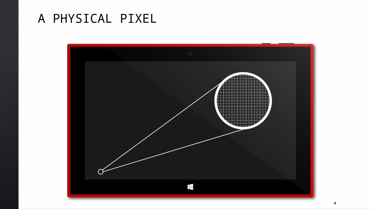
A PHYSICAL PIXEL
5
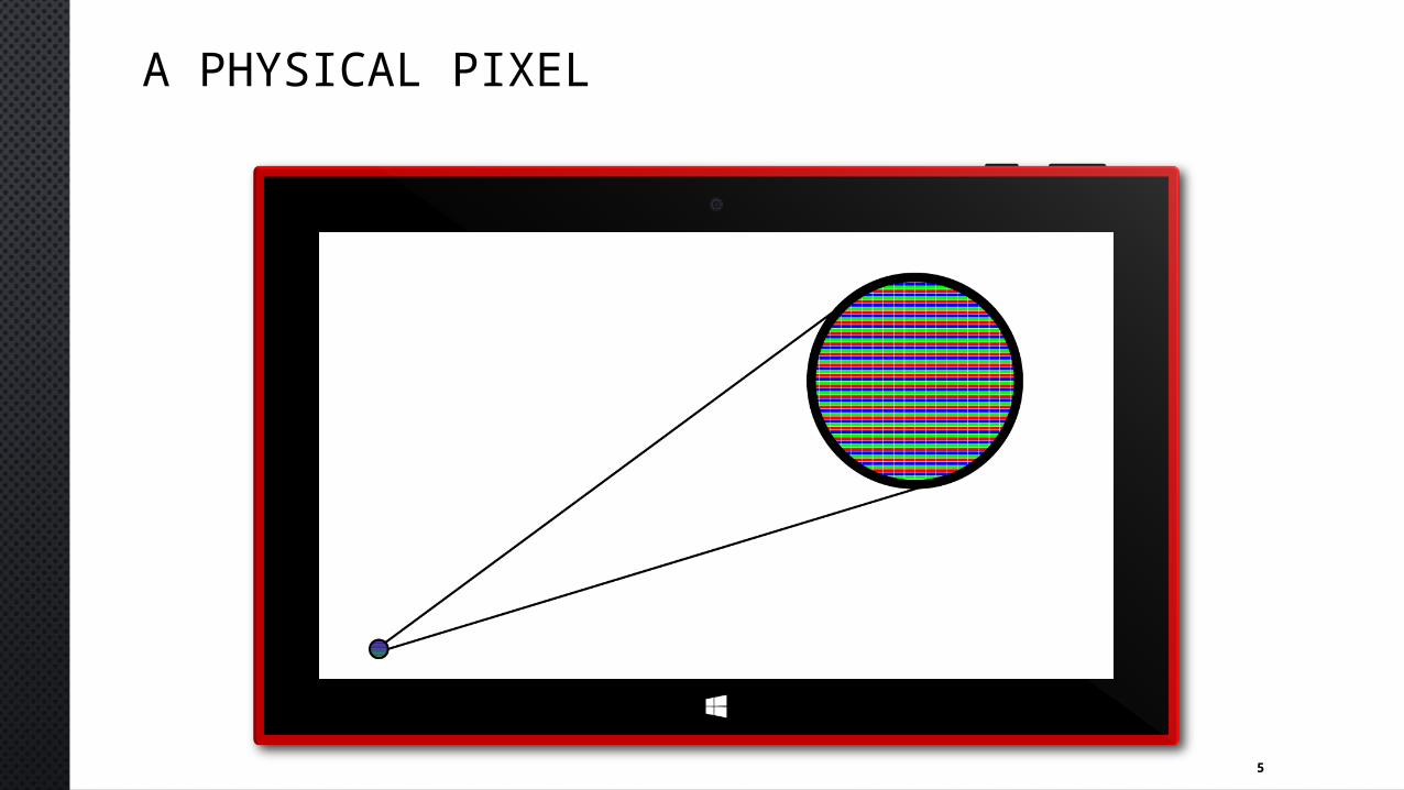
A PHYSICAL PIXEL
6
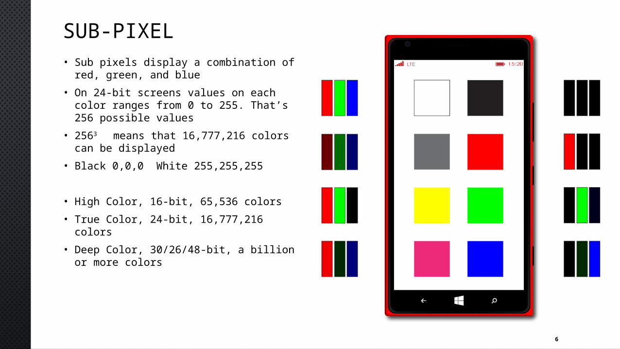
SUB-PIXEL• Sub pixels display a combination of red,
green, and blue• On 24-bit screens values on each color
ranges from 0 to 255. That’s 256 possible values
• 2563 means that 16,777,216 colors can be displayed
• Black 0,0,0 White 255,255,255
• High Color, 16-bit, 65,536 colors• True Color, 24-bit, 16,777,216 colors• Deep Color, 30/26/48-bit, a billion or
more colors
7
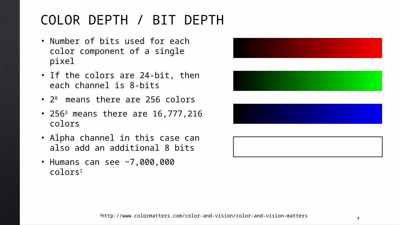
COLOR DEPTH / BIT DEPTH• Number of bits used for each color
component of a single pixel• If the colors are 24-bit, then each
channel is 8-bits• 28 means there are 256 colors• 2563 means there are 16,777,216
colors• Alpha channel in this case can also
add an additional 8 bits• Humans can see ~7,000,000 colors1
1http://www.colormatters.com/color-and-vision/color-and-vision-matters
8
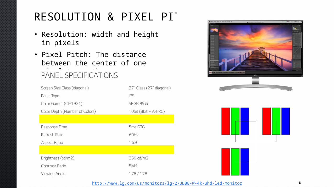
RESOLUTION & PIXEL PITCH• Resolution: width and height in
pixels• Pixel Pitch: The distance between
the center of one pixel to another
http://www.lg.com/us/monitors/lg-27UD88-W-4k-uhd-led-monitor
9
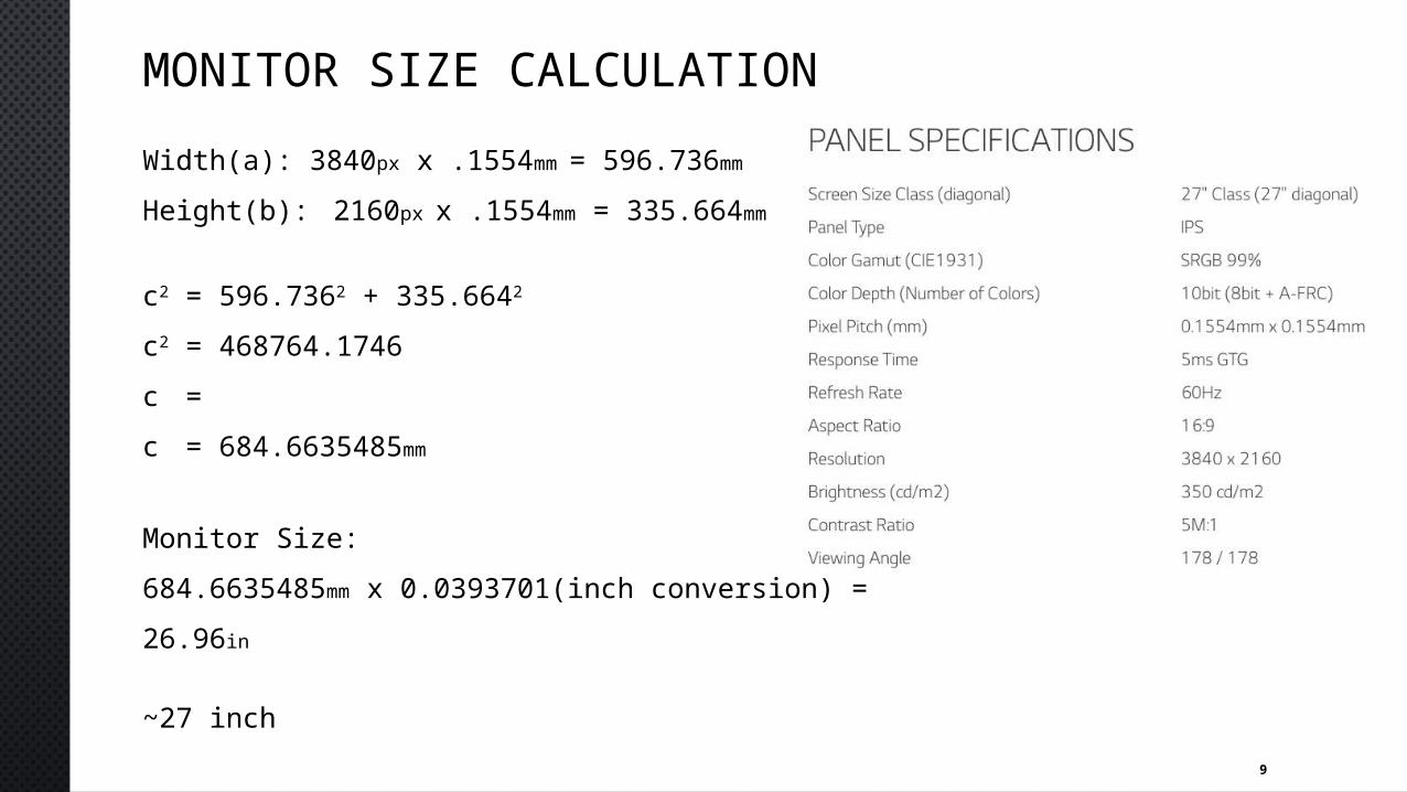
MONITOR SIZE CALCULATIONWidth(a): 3840px x .1554mm = 596.736mm
Height(b): 2160px x .1554mm = 335.664mm
c2 = 596.7362 + 335.6642
c2 = 468764.1746c = c = 684.6635485mm
Monitor Size: 684.6635485mm x 0.0393701(inch conversion) = 26.96in
~27 inch
10
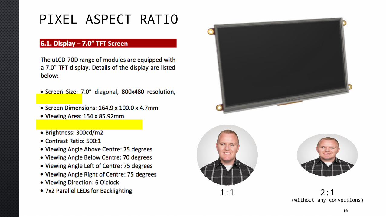
PIXEL ASPECT RATIO
2:1(without any conversions)
1:1
11
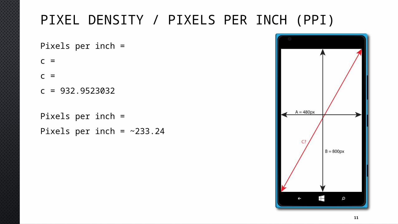
PIXEL DENSITY / PIXELS PER INCH (PPI)Pixels per inch = c = c = c = 932.9523032
Pixels per inch = Pixels per inch = ~233.24
12
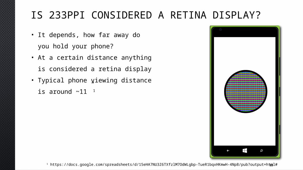
IS 233PPI CONSIDERED A RETINA DISPLAY?• It depends, how far away do you
hold your phone?• At a certain distance anything is
considered a retina display• Typical phone viewing distance is
around ~11” 1
1 https://docs.google.com/spreadsheets/d/15eHA7NU3Z6TXfzlM7OdWLgbp-TueR1bqxHKmwH-4Np8/pub?output=html#
13
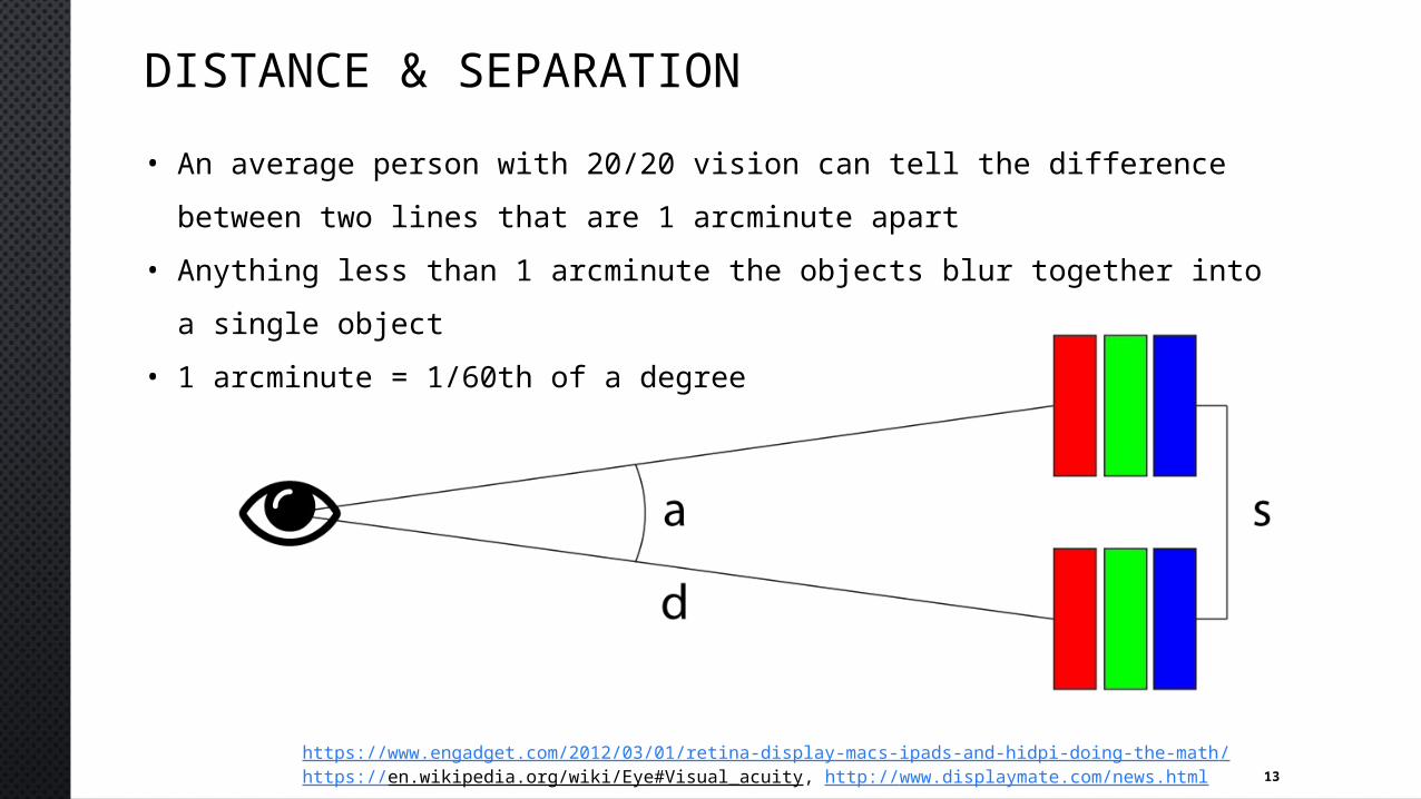
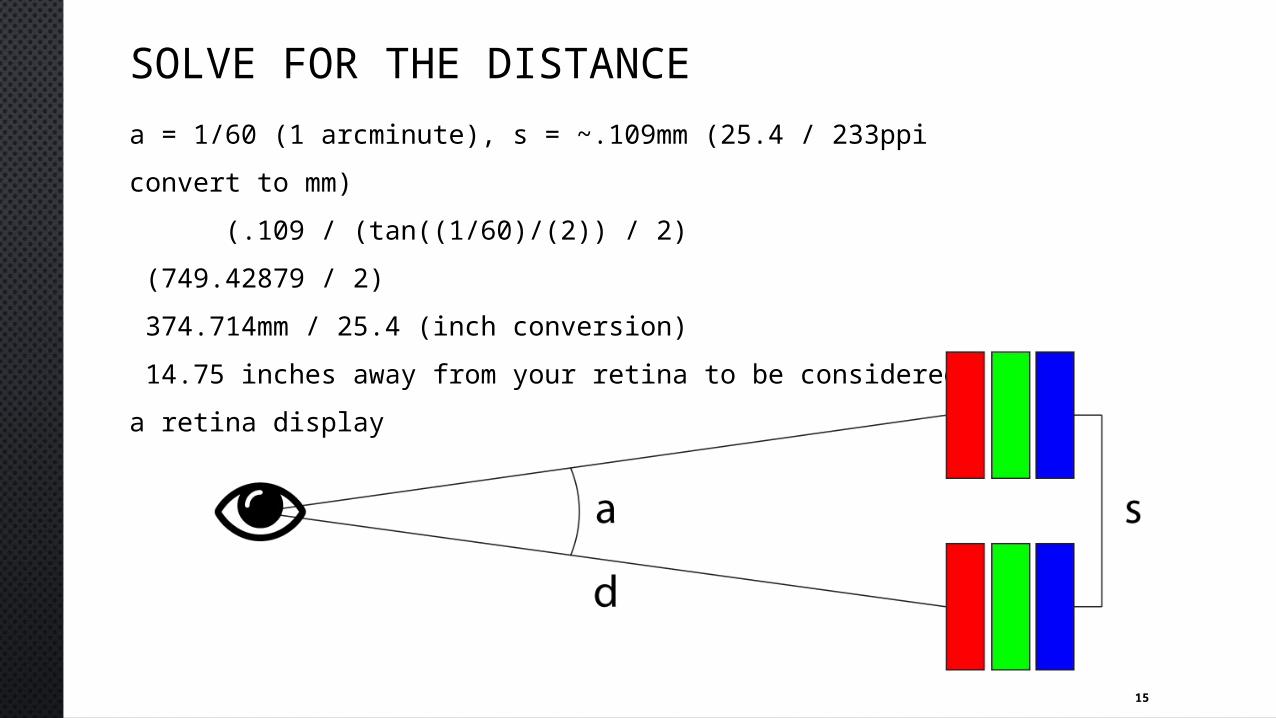
DISTANCE & SEPARATION• An average person with 20/20 vision can tell the difference between two
lines that are 1 arcminute apart• Anything less than 1 arcminute the objects blur together into a single
object• 1 arcminute = 1/60th of a degree
https://www.engadget.com/2012/03/01/retina-display-macs-ipads-and-hidpi-doing-the-math/https://en.wikipedia.org/wiki/Eye#Visual_acuity, http://www.displaymate.com/news.html
14
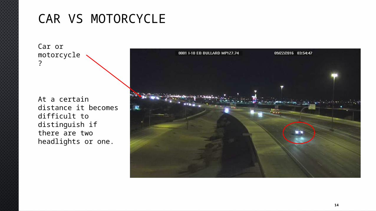
CAR VS MOTORCYCLECar or motorcycle?
At a certain distance it becomes difficult to distinguish if there are two headlights or one.
15
SOLVE FOR THE DISTANCEa = 1/60 (1 arcminute), s = ~.109mm (25.4 / 233ppi convert to mm) (.109 / (tan((1/60)/(2)) / 2) (749.42879 / 2) 374.714mm / 25.4 (inch conversion) 14.75 inches away from your retina to be considereda retina display
16
CHALLENGE PROBLEMARE THE FOLLOWING DISPLAYS CONSIDERED RETINA DISPLAYS FOR
THEIR INTENDED USE?
17
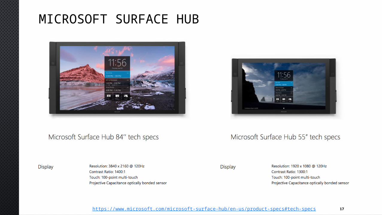
MICROSOFT SURFACE HUB
https://www.microsoft.com/microsoft-surface-hub/en-us/product-specs#tech-specs

18
USE CASES
https://www.microsoft.com/microsoft-surface-hub/en-us/product-specs#tech-specs
19
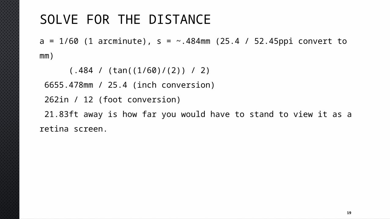
SOLVE FOR THE DISTANCEa = 1/60 (1 arcminute), s = ~.484mm (25.4 / 52.45ppi convert to mm) (.484 / (tan((1/60)/(2)) / 2) 6655.478mm / 25.4 (inch conversion) 262in / 12 (foot conversion) 21.83ft away is how far you would have to stand to view it as a retina screen.
20
CHALLENGE PROBLEMUSERS OBSERVING FROM A DISTANCE WILL BENEFIT AS SEEN IN
SOME OF THE PICTURES, BUT NOT USERS THAT ARE UP CLOSE INTERACTING WITH THE DISPLAY.
21
SCALING FOR CONSISTENCY
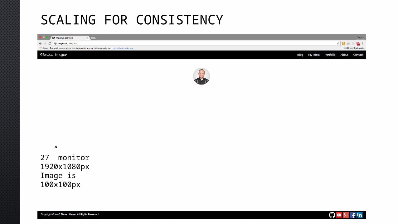
27” monitor1920x1080pxImage is 100x100px
22
SCALING FOR CONSISTENCY
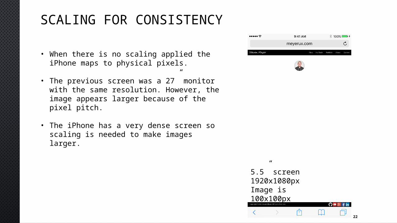
• When there is no scaling applied the iPhone maps to physical pixels.
• The previous screen was a 27” monitor with the same resolution. However, the image appears larger because of the pixel pitch.
• The iPhone has a very dense screen so scaling is needed to make images larger.
5.5” screen1920x1080pxImage is 100x100px
23
SCALING FOR CONSISTENCY
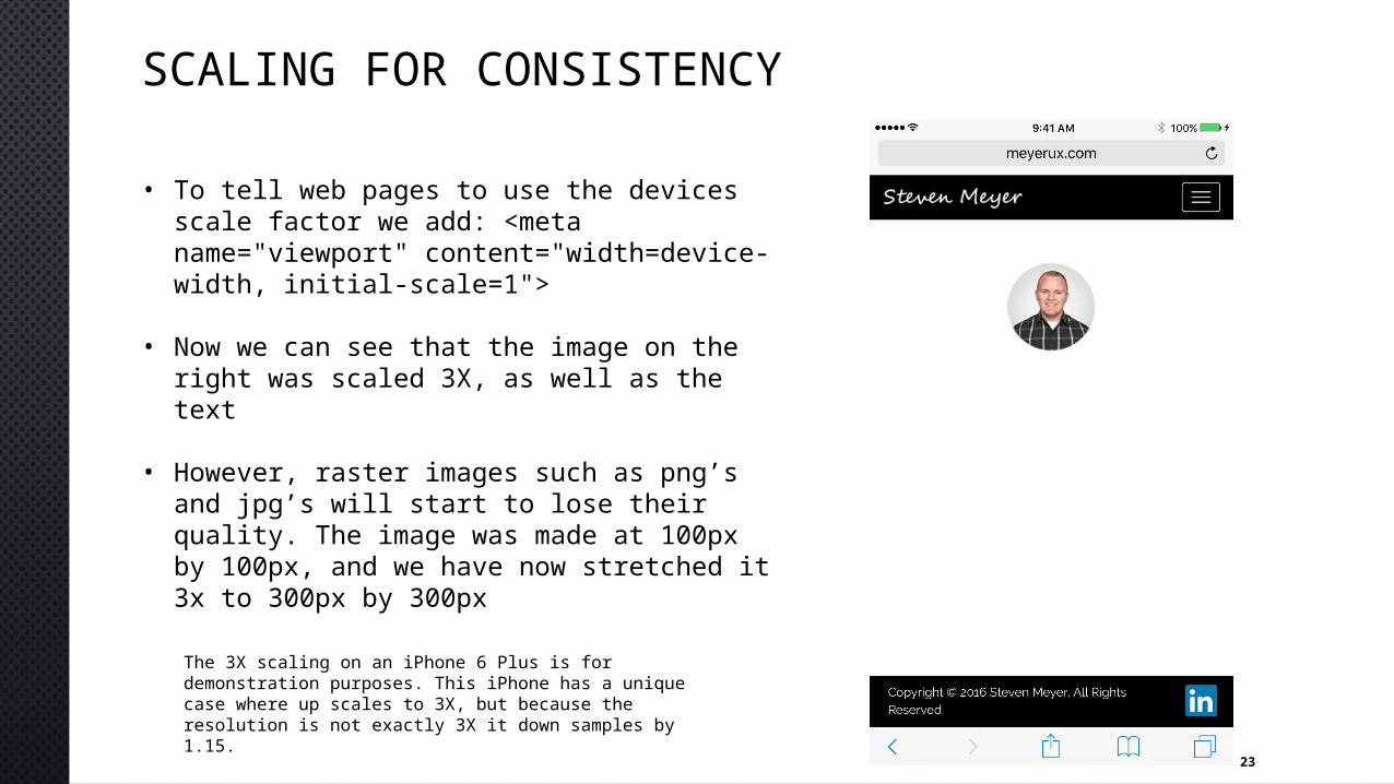
• To tell web pages to use the devices scale factor we add: <meta name="viewport" content="width=device-width, initial-scale=1">
• Now we can see that the image on the right was scaled 3X, as well as the text
• However, raster images such as png’s and jpg’s will start to lose their quality. The image was made at 100px by 100px, and we have now stretched it 3x to 300px by 300px
The 3X scaling on an iPhone 6 Plus is for demonstration purposes. This iPhone has a unique case where up scales to 3X, but because the resolution is not exactly 3X it down samples by 1.15.
24
RESIZING IMAGES
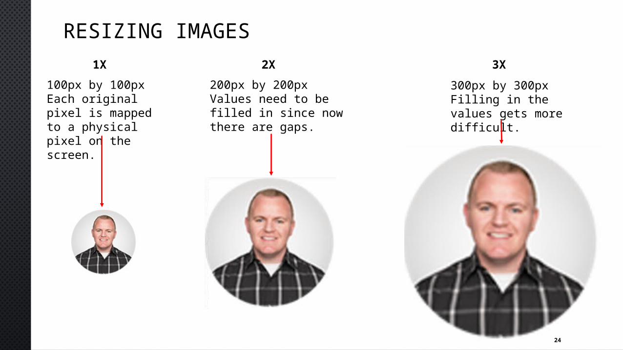
100px by 100pxEach original pixel is mapped to a physical pixel on the screen.
200px by 200pxValues need to be filled in since now there are gaps.
300px by 300pxFilling in the values gets more difficult.
1X 2X 3X
25
UNIQUE SIZES
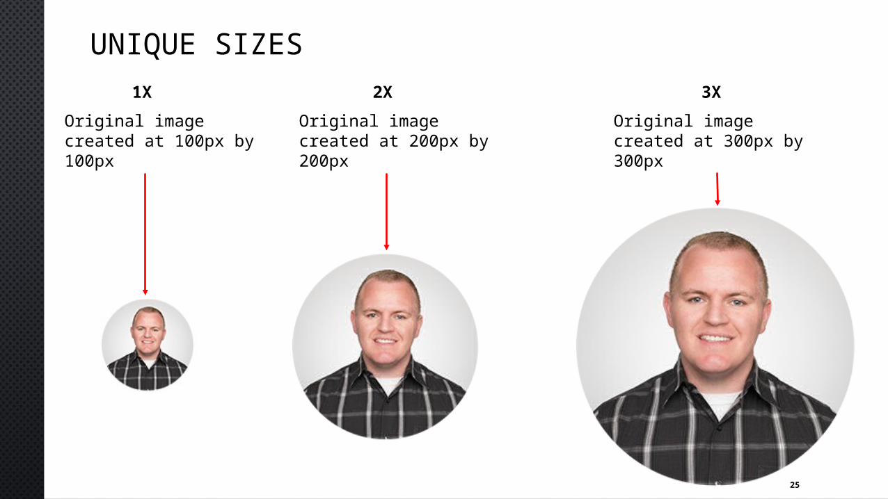
Original image created at 100px by 100px
Original image created at 200px by 200px
Original image created at 300px by 300px
1X 2X 3X
26
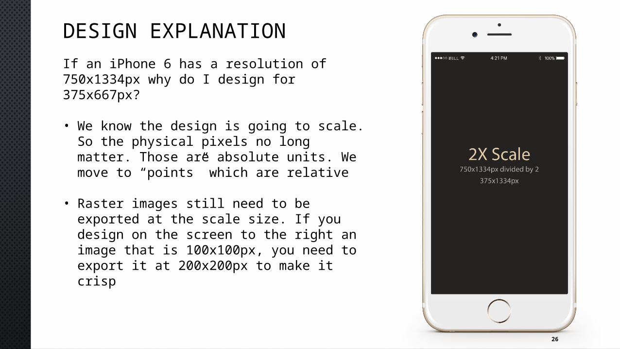
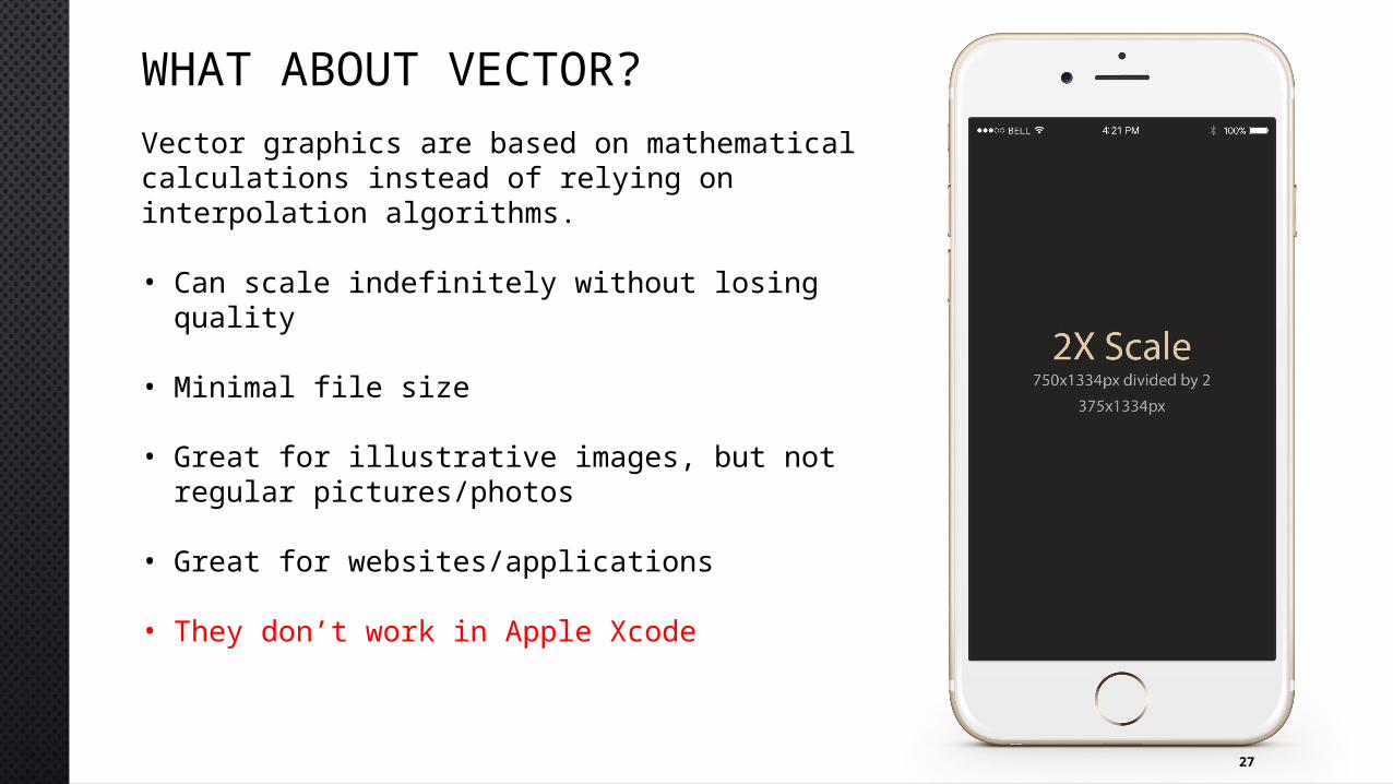
DESIGN EXPLANATIONIf an iPhone 6 has a resolution of 750x1334px why do I design for 375x667px?
• We know the design is going to scale. So the physical pixels no long matter. Those are absolute units. We move to “points” which are relative
• Raster images still need to be exported at the scale size. If you design on the screen to the right an image that is 100x100px, you need to export it at 200x200px to make it crisp
27
WHAT ABOUT VECTOR?Vector graphics are based on mathematical calculations instead of relying on interpolation algorithms.
• Can scale indefinitely without losing quality
• Minimal file size
• Great for illustrative images, but not regular pictures/photos
• Great for websites/applications
• They don’t work in Apple Xcode
28
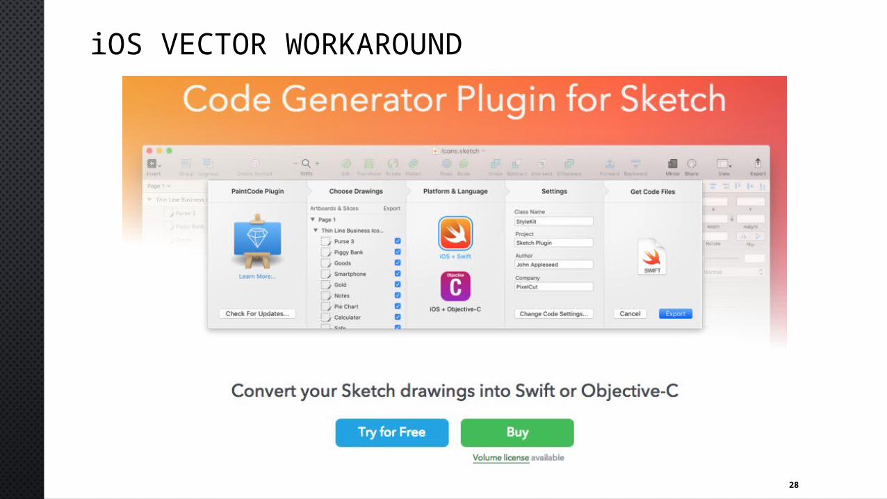
iOS VECTOR WORKAROUND
29
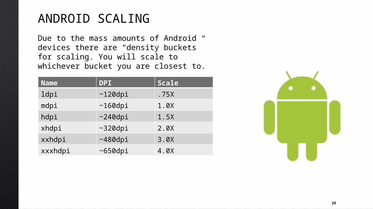
ANDROID SCALINGDue to the mass amounts of Android devices there are “density buckets” for scaling. You will scale to whichever bucket you are closest to.Name DPI Scaleldpi ~120dpi .75Xmdpi ~160dpi 1.0Xhdpi ~240dpi 1.5Xxhdpi ~320dpi 2.0Xxxhdpi ~480dpi 3.0Xxxxhdpi ~650dpi 4.0X
30
ANDROID DPOn this platform instead of points as the relative measurement we use density-independent pixels (dp).
px = dp * (dpi / 160)
px(pixels), dp(density independent pixels), dpi(dots per inch)
Why 160? 160dpi is the baseline for when these values are mapped 1:1 on physical pixels. It is the 1X scaling factor.
31
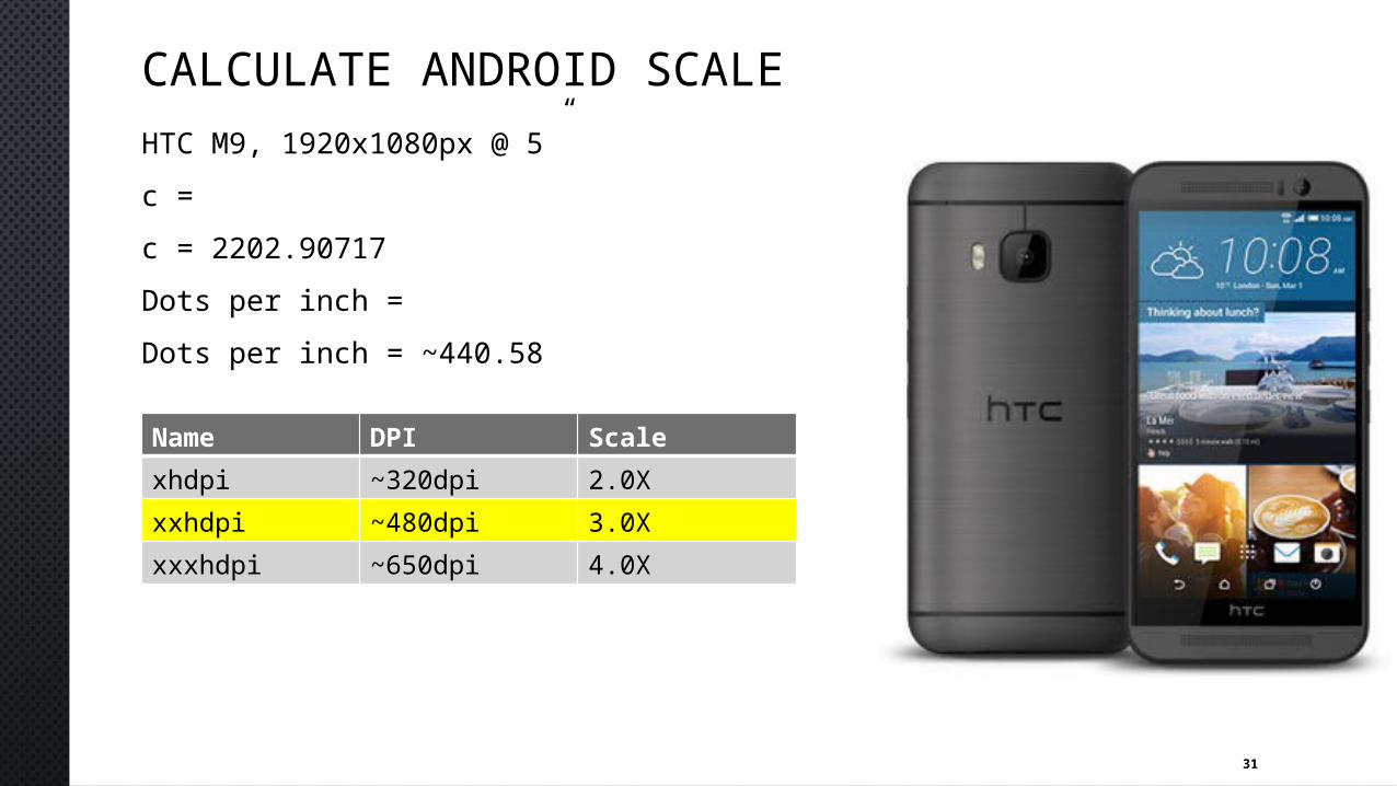
CALCULATE ANDROID SCALEHTC M9, 1920x1080px @ 5”c = c = 2202.90717Dots per inch = Dots per inch = ~440.58
Name DPI Scalexhdpi ~320dpi 2.0Xxxhdpi ~480dpi 3.0Xxxxhdpi ~650dpi 4.0X
32
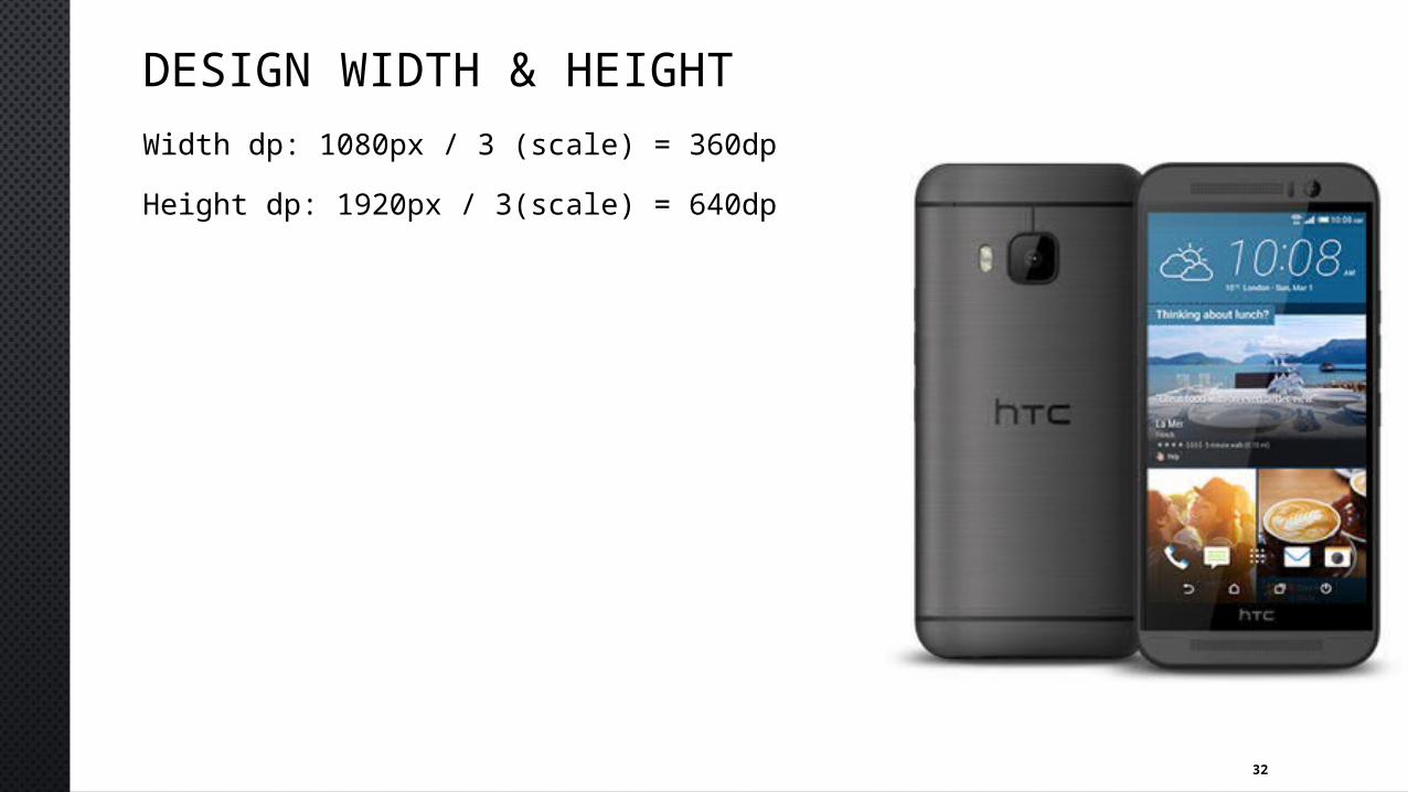
DESIGN WIDTH & HEIGHTWidth dp: 1080px / 3 (scale) = 360dpHeight dp: 1920px / 3(scale) = 640dp
33
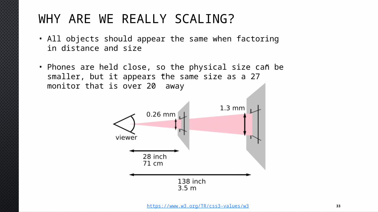
WHY ARE WE REALLY SCALING?• All objects should appear the same when factoring in
distance and size
• Phones are held close, so the physical size can be smaller, but it appears the same size as a 27” monitor that is over 20” away
https://www.w3.org/TR/css3-values/w3

34
QUESTIONS?


