Embed Size (px)
DESCRIPTION
Citation preview

Let’s warm up !

Let’s start with some basics
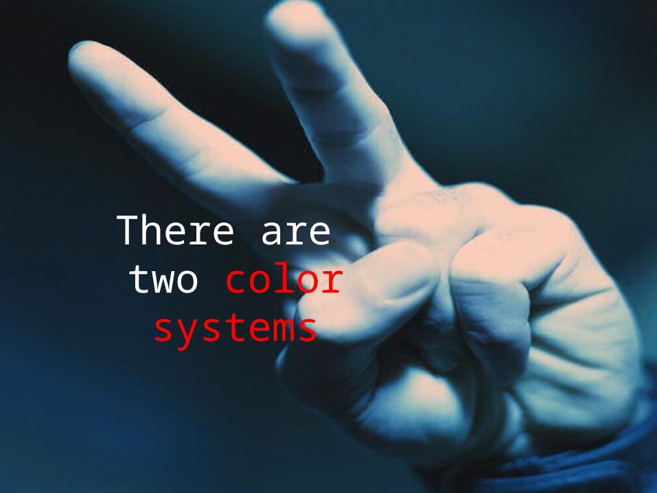
There are two color systems
Additive Subtractive
red + green + blue = white magenta + yellow + cyan = black

UI designers use the additive system

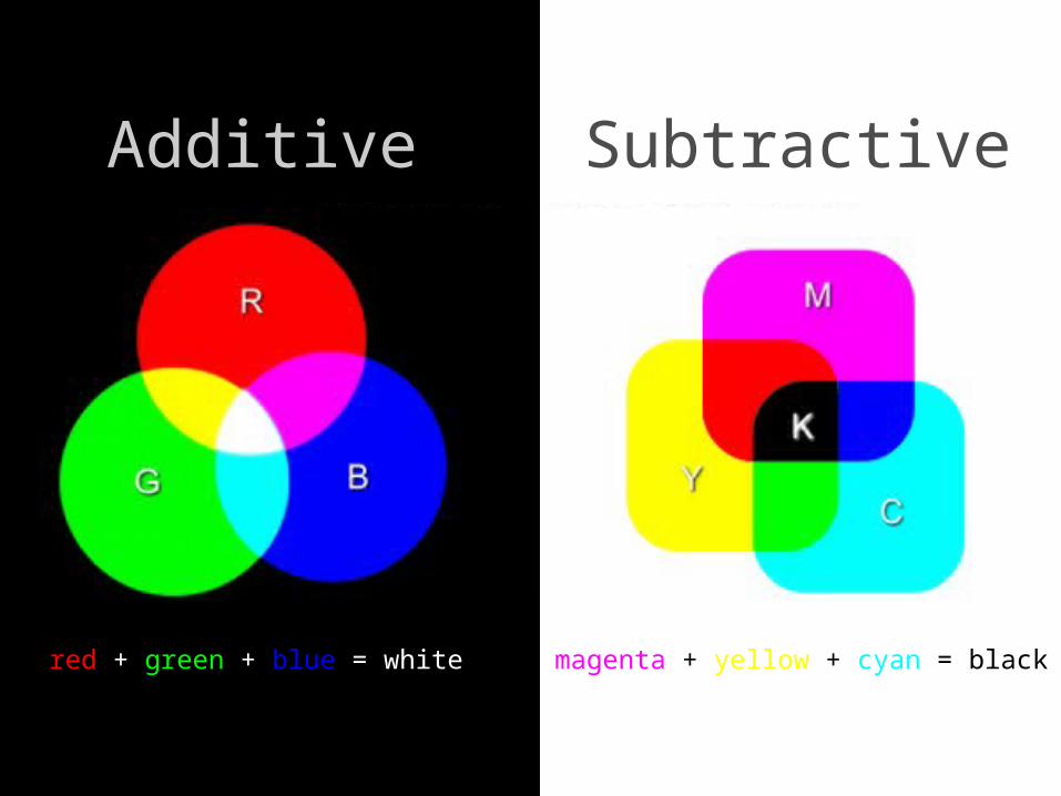
What is this jargon ?
huebrilliancesaturation
Huename and properties of a color that enables it to be perceived
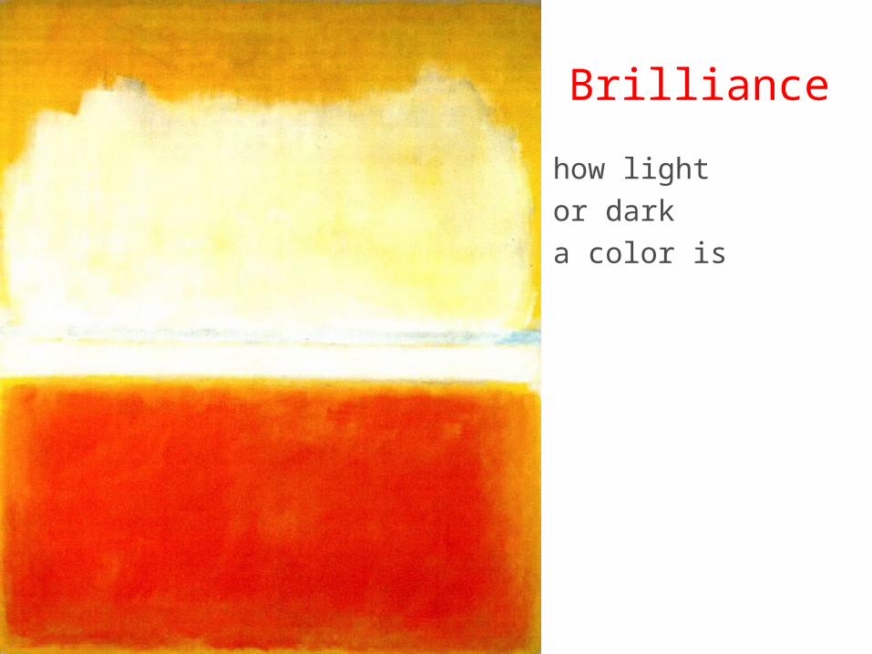
Brilliancehow lightor darka color is
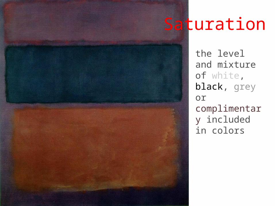
the level and mixture of white, black, grey or complimentary included in colors
Saturation
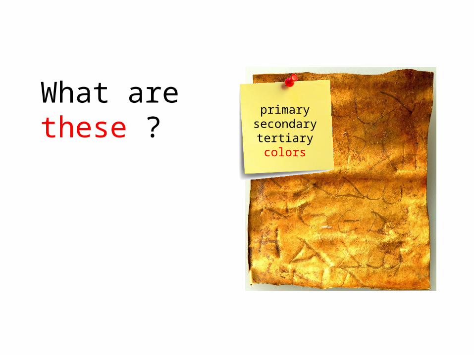
What are these ? primary
secondarytertiarycolors
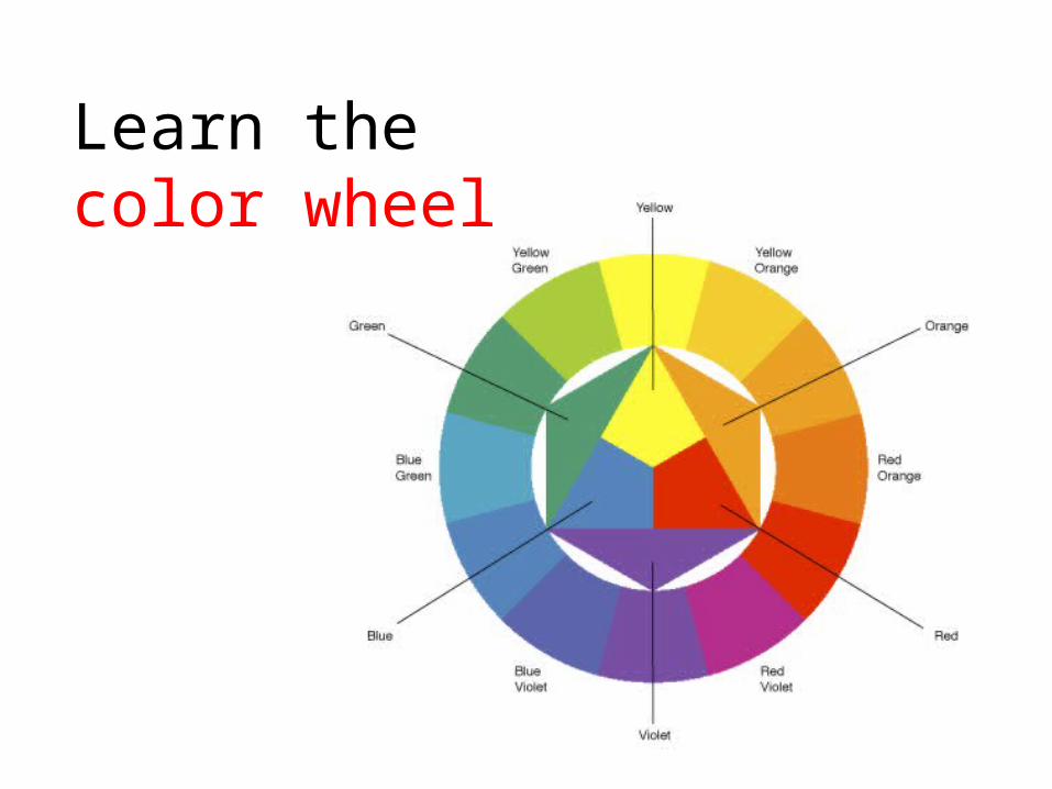
Learn the color wheel
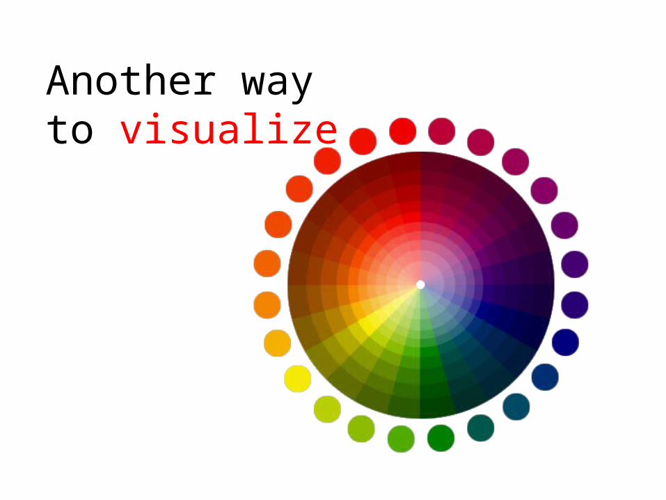
Another way to visualize
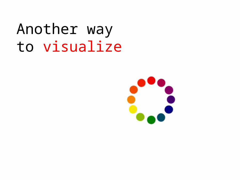
Another way to visualize
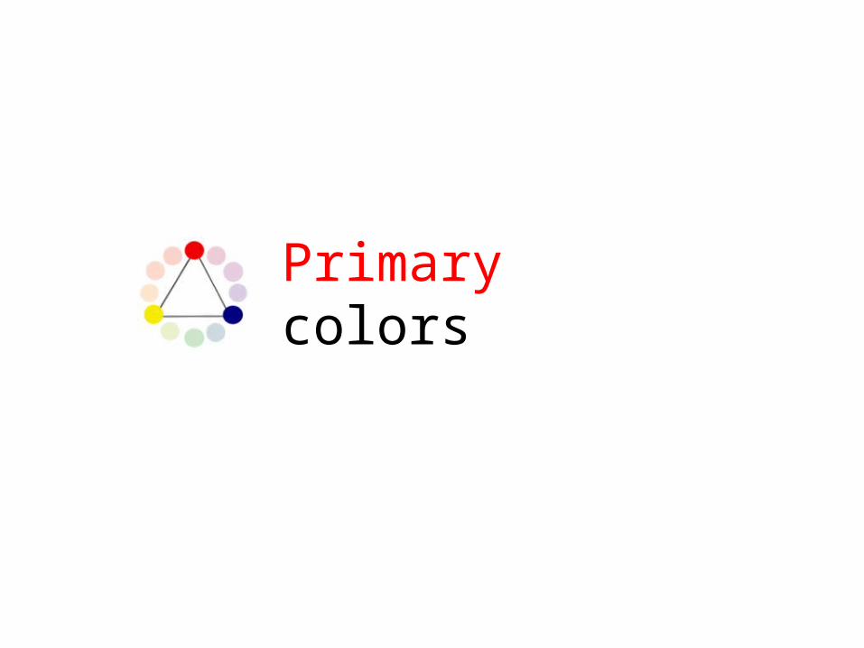
Primary colors

Secondary colors

Tertiary colors

Analogous colors
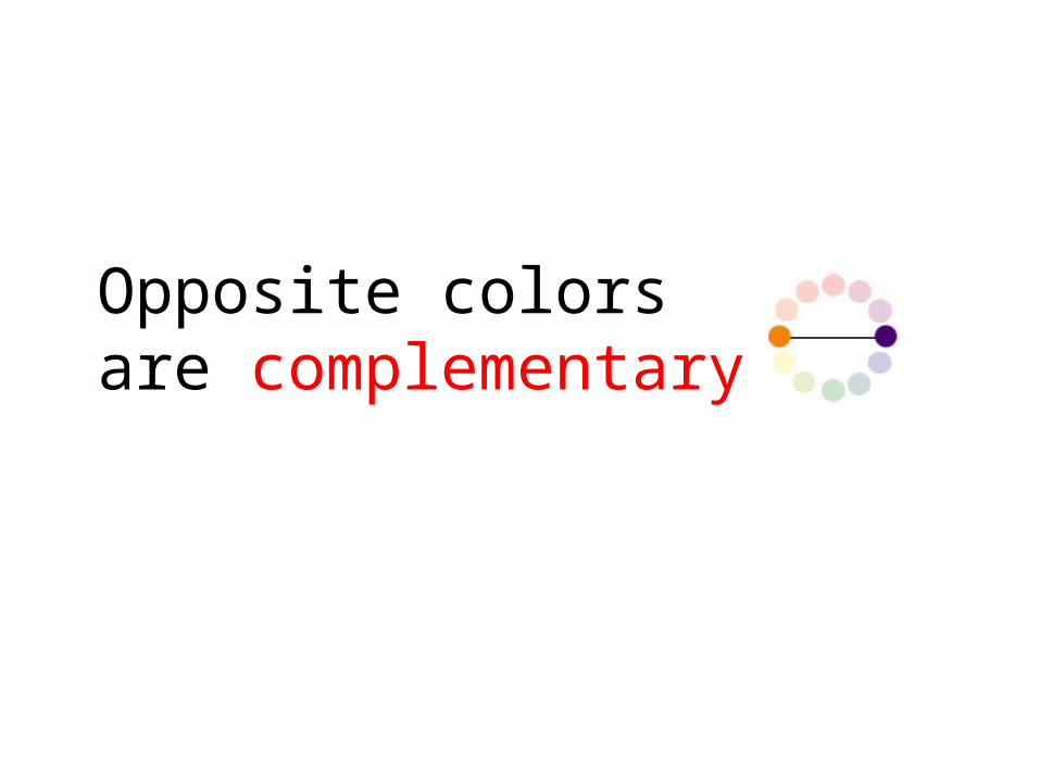
Opposite colors are complementary
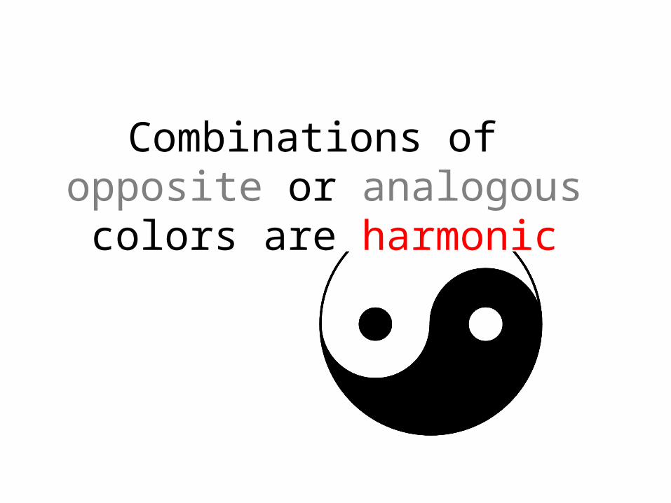
Combinations of opposite or analogous colors are harmonic

Now you know the jargon too!

Wasn’t it additive ?
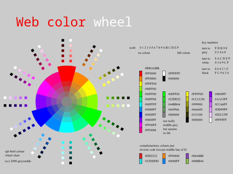
Web color wheel
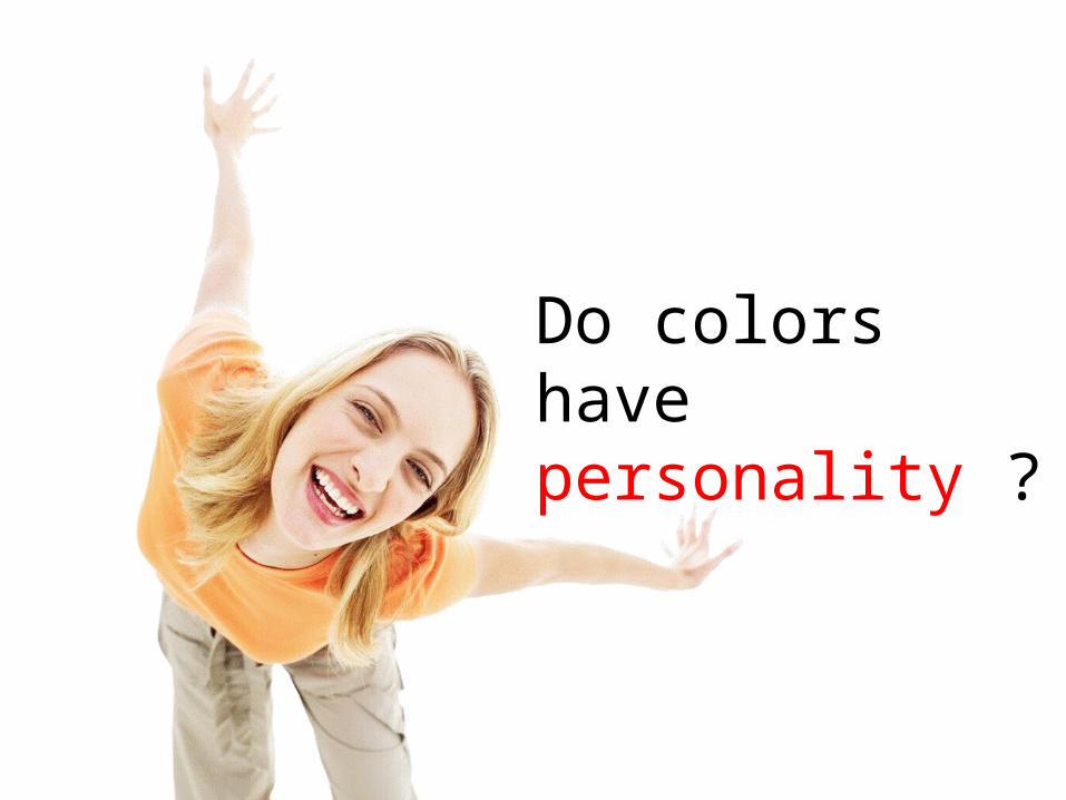
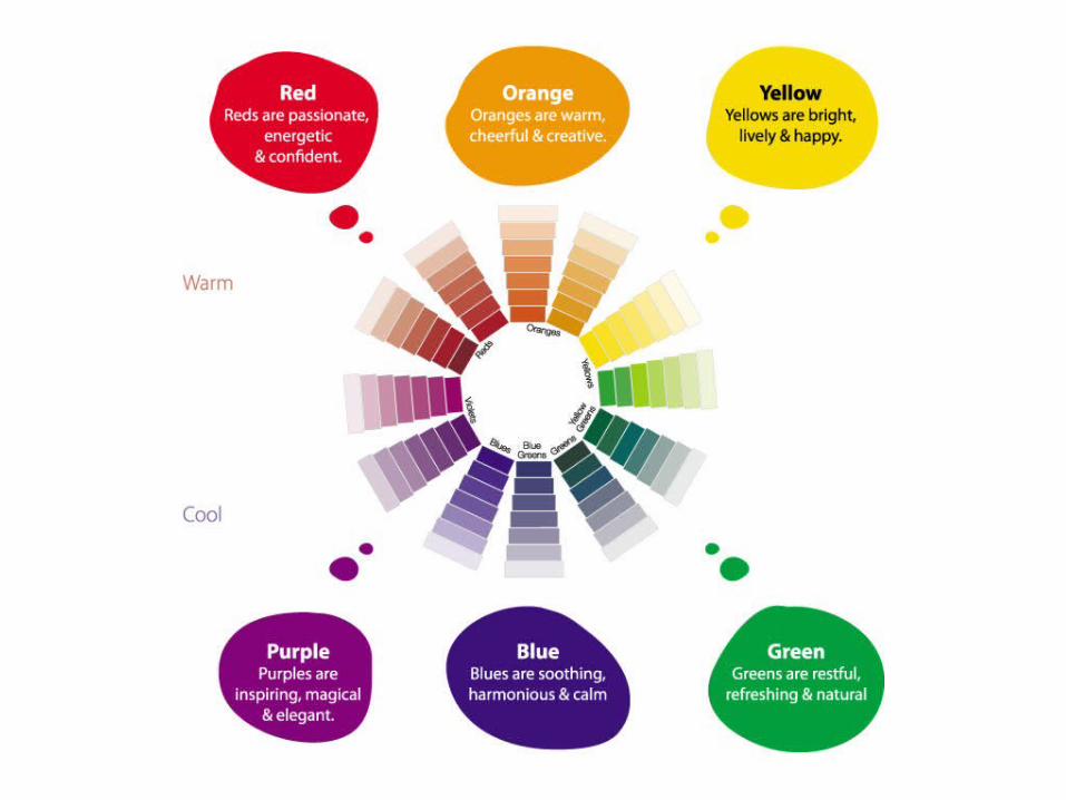
Do colors have personality ?
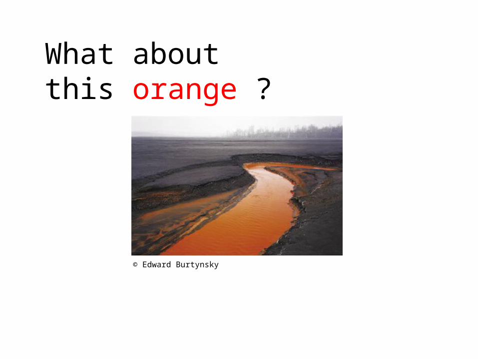
© Edward Burtynsky
What about this orange ?
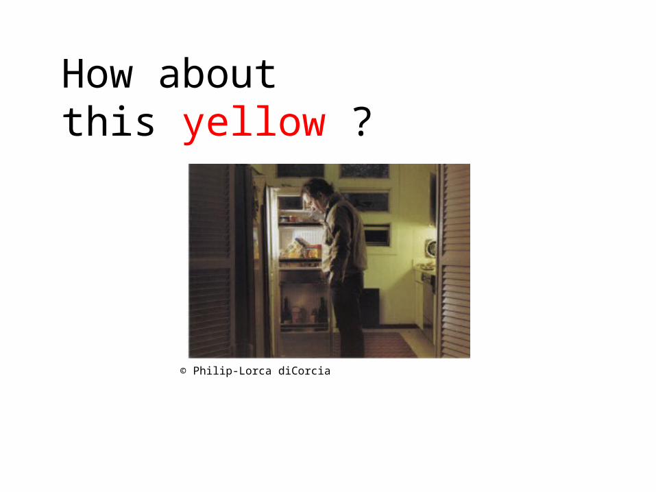
© Philip-Lorca diCorcia
How about this yellow ?
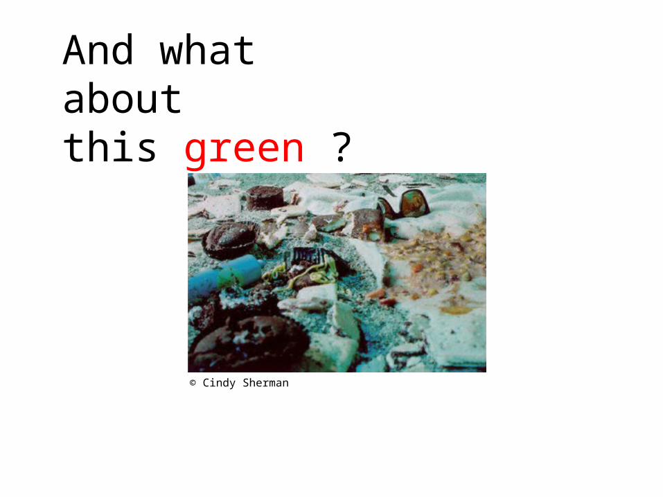
© Cindy Sherman
And what about
this green ?

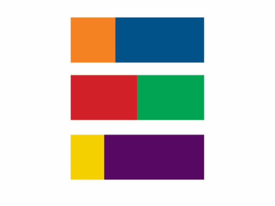
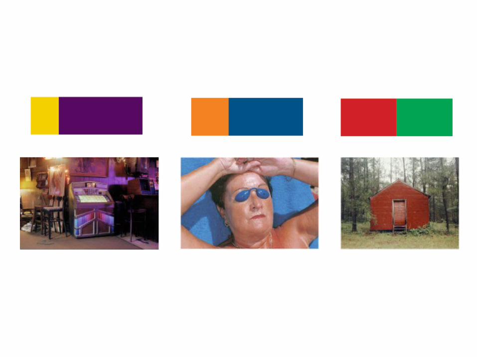
It’s about relationships
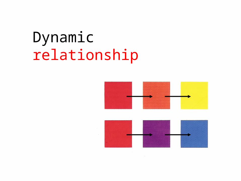
Dynamic relationship
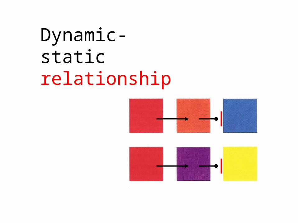
Dynamic-static relationship
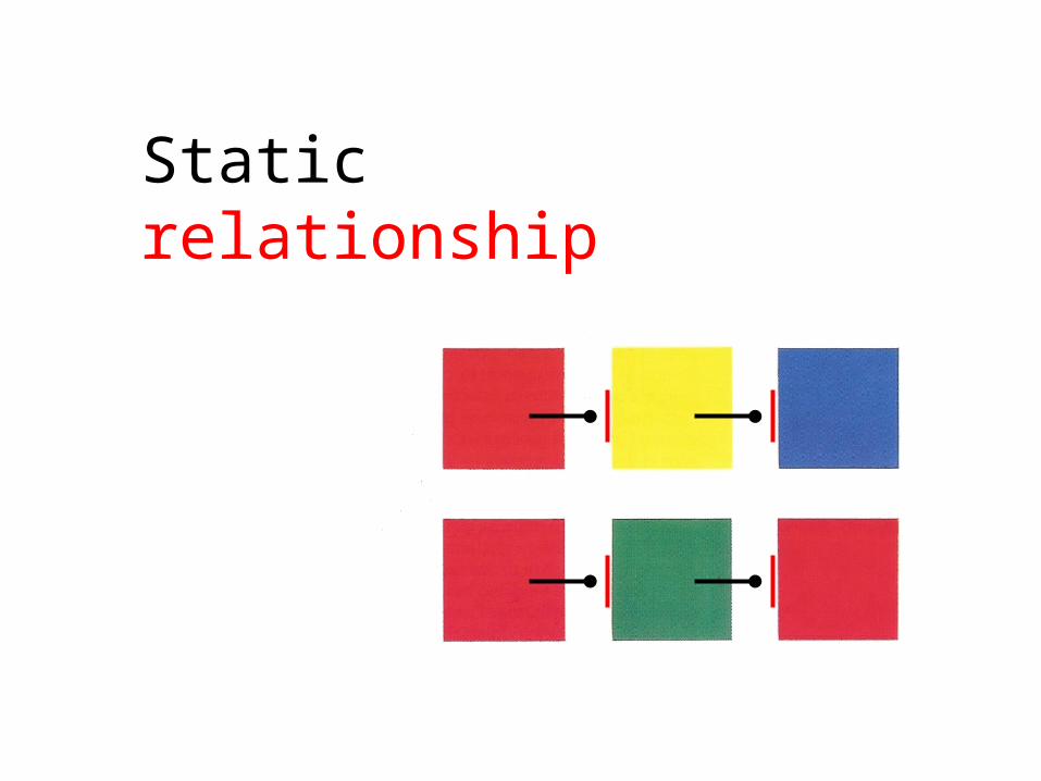
Static relationship

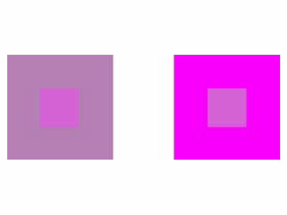
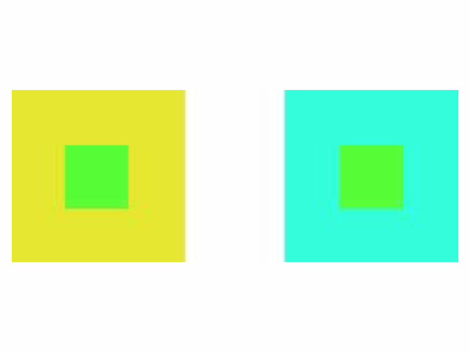
It’s a matter of contrast

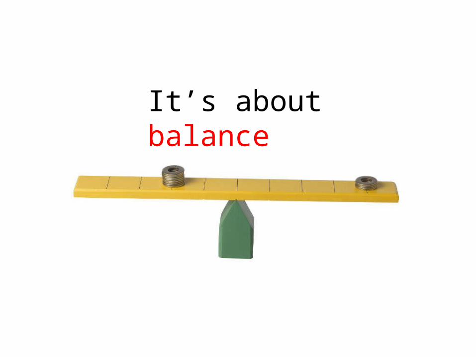
It’s about balance

Think with your eyes !

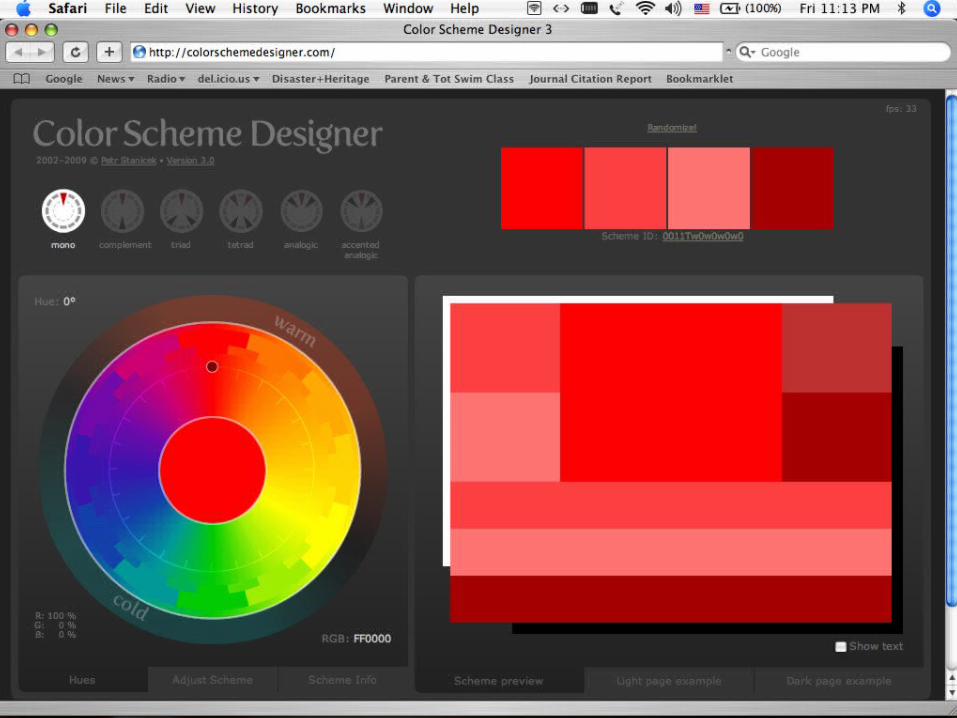
Color palette tips & tools
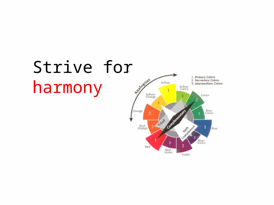
Strive for harmony
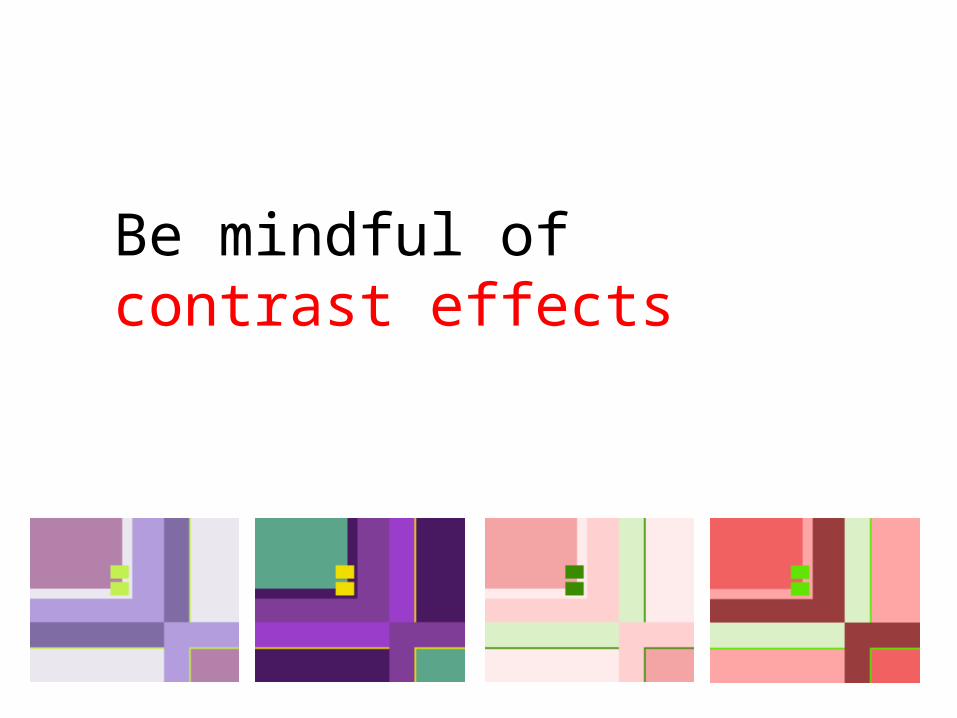
Be mindful of contrast effects
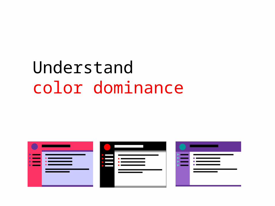
Understand color dominance

Rules of thumbfor UI designers
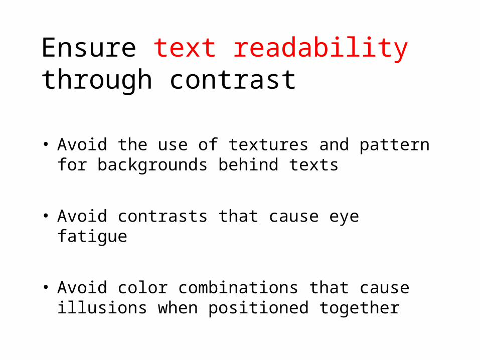
Ensure text readability through contrast
• Avoid the use of textures and pattern for backgrounds behind texts
• Avoid contrasts that cause eye fatigue
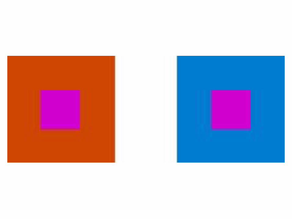
• Avoid color combinations that cause illusions when positioned together
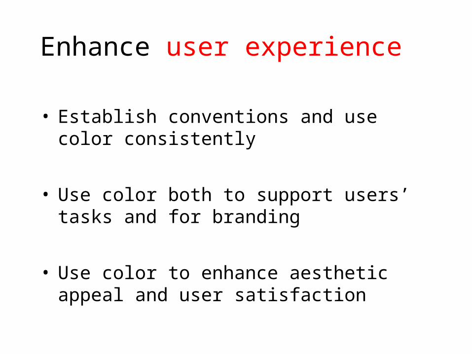
Enhance user experience
• Establish conventions and use color consistently
• Use color both to support users’ tasks and for branding
• Use color to enhance aesthetic appeal and user satisfaction
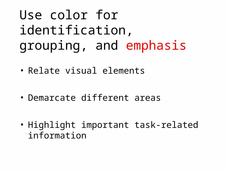
Use color for identification, grouping, and emphasis
• Relate visual elements
• Demarcate different areas
• Highlight important task-related information
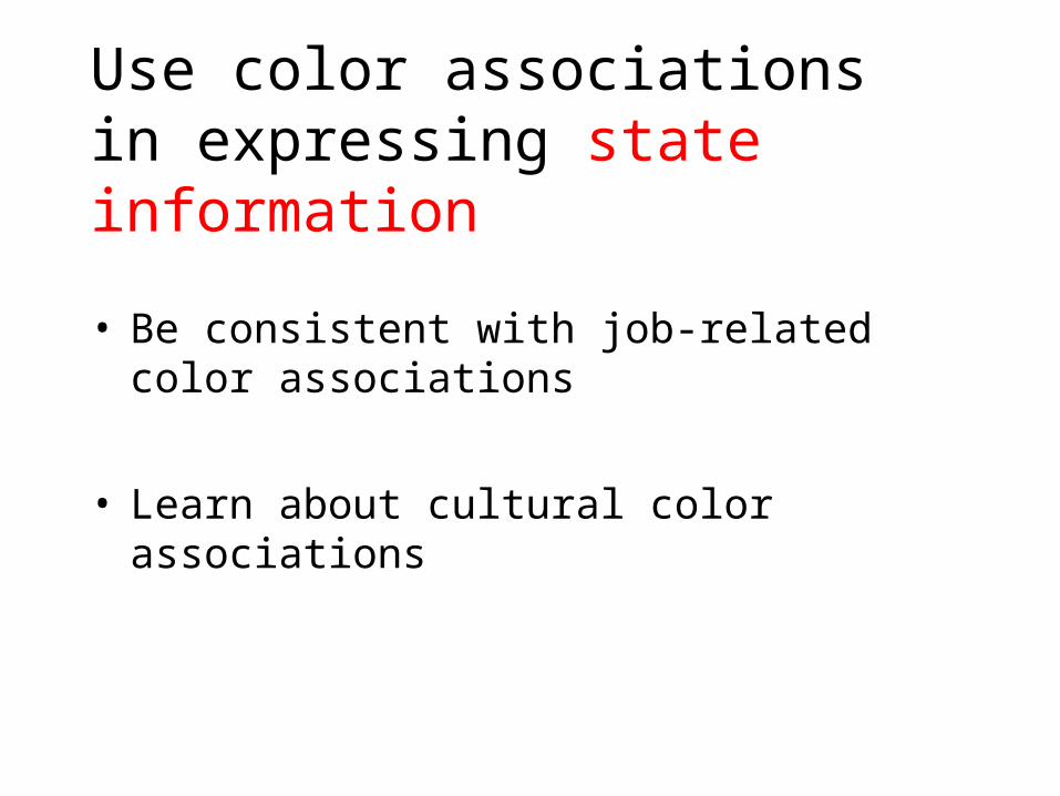
Use color associations in expressing state information
• Be consistent with job-related color associations
• Learn about cultural color associations
Indicate availability using color or value
• For links
• For controls
• For icons
• For windows

Some good readings
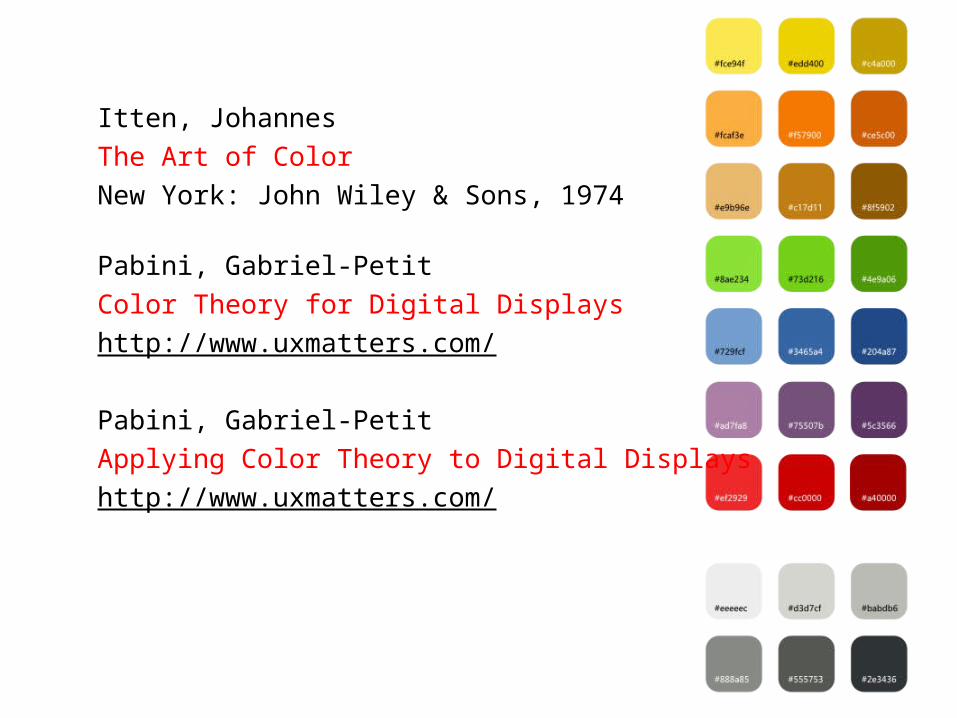
Itten, JohannesThe Art of ColorNew York: John Wiley & Sons, 1974
Pabini, Gabriel-PetitColor Theory for Digital Displayshttp://www.uxmatters.com/
Pabini, Gabriel-PetitApplying Color Theory to Digital Displayshttp://www.uxmatters.com/

Slides available at