Embed Size (px)
DESCRIPTION
With data you can tell important and compelling stories, if done right. In this session, we will review a few guidelines on how to create communicative visualizations and how this can be implemented in Excel and Reporting Services. Because SSRS is often underestimated, we'll finish off with some eye-catchers.
Citation preview
Get More Out Of Your
Data VisualizationsKoen Verbeeck
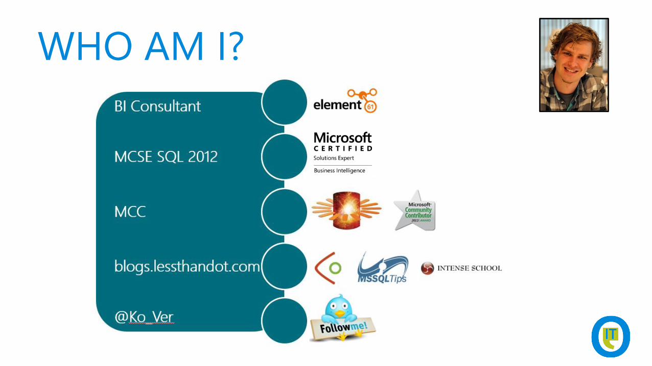
WHO AM I?
AGENDA
• guidelines on data visualization
• showing off with SSRS
AGENDA
• guidelines on data visualization
• showing off with SSRS

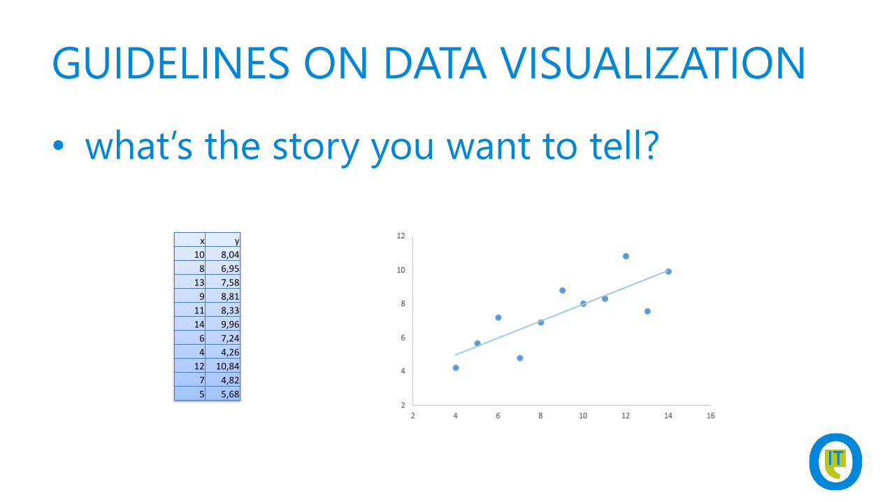
GUIDELINES ON DATA VISUALIZATION
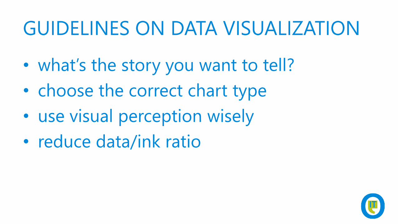
• what’s the story you want to tell?
• choose the correct chart type
• use visual perception wisely
• reduce data/ink ratio
GUIDELINES ON DATA VISUALIZATION
• what’s the story you want to tell?
x y
10 8,04
8 6,95
13 7,58
9 8,81
11 8,33
14 9,96
6 7,24
4 4,26
12 10,84
7 4,82
5 5,68
GUIDELINES ON DATA VISUALIZATION
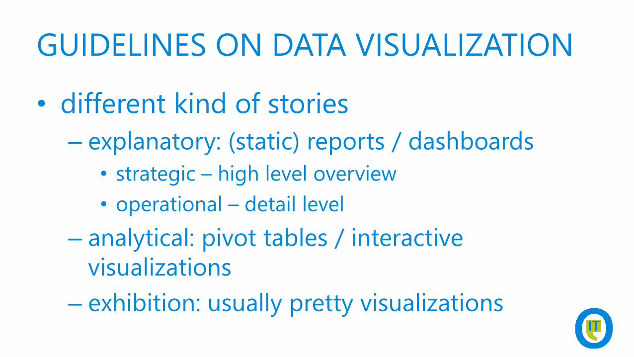
• different kind of stories
– explanatory: (static) reports / dashboards
• strategic – high level overview
• operational – detail level
– analytical: pivot tables / interactive
visualizations
– exhibition: usually pretty visualizations
GUIDELINES ON DATA VISUALIZATION
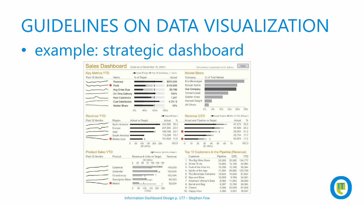
• example: strategic dashboard
Information Dashboard Design p. 177 – Stephen Few
GUIDELINES ON DATA VISUALIZATION
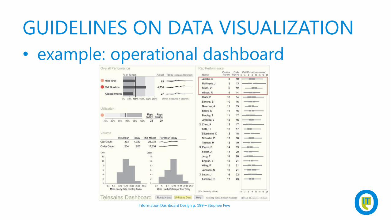
• example: operational dashboard
Information Dashboard Design p. 199 – Stephen Few
GUIDELINES ON DATA VISUALIZATION
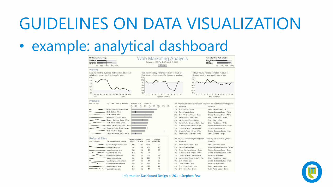
• example: analytical dashboard
Information Dashboard Design p. 201 – Stephen Few
GUIDELINES ON DATA VISUALIZATION
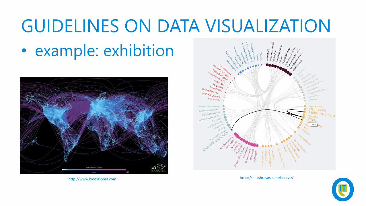
• example: exhibition
http://www.biodiaspora.com http://seekshreyas.com/beerviz/
GUIDELINES ON DATA VISUALIZATION
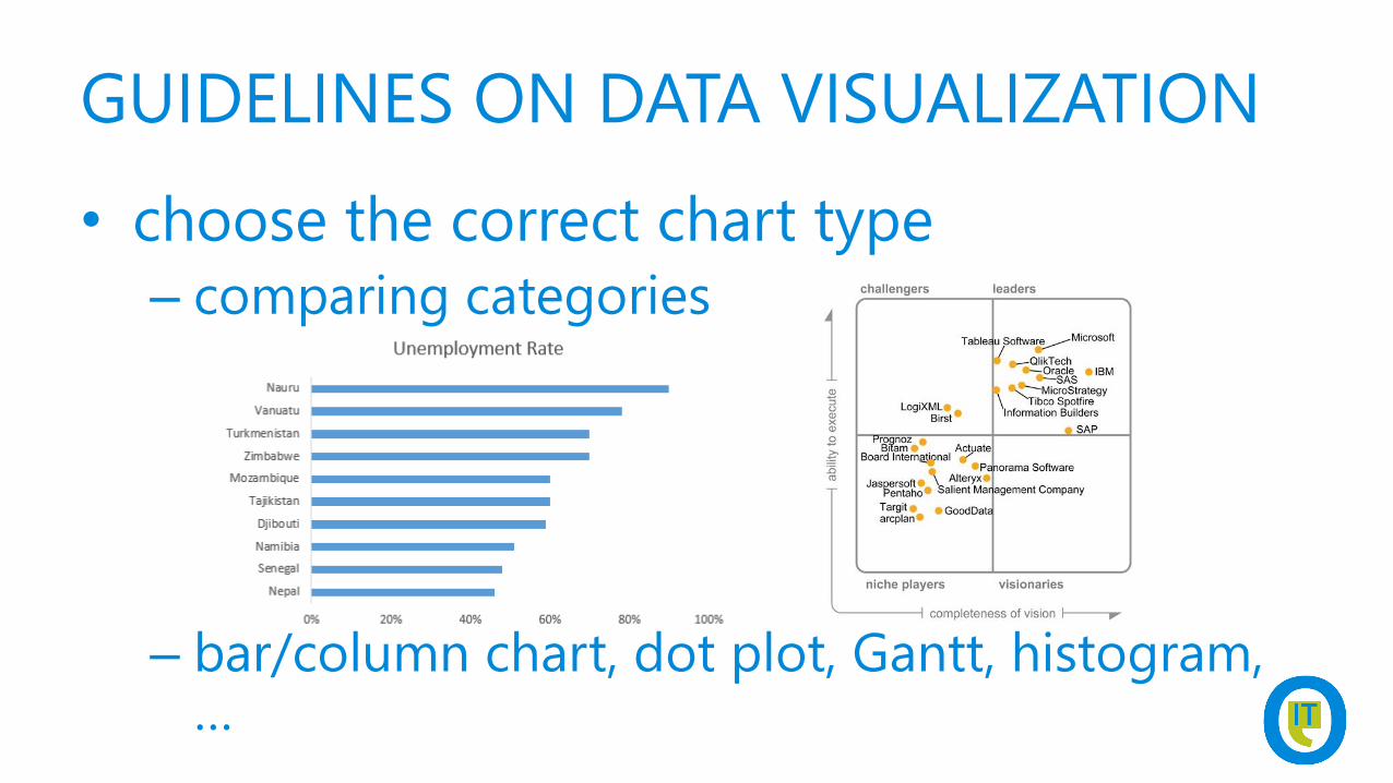
• choose the correct chart type
– comparing categories
– bar/column chart, dot plot, Gantt, histogram, …
GUIDELINES ON DATA VISUALIZATION
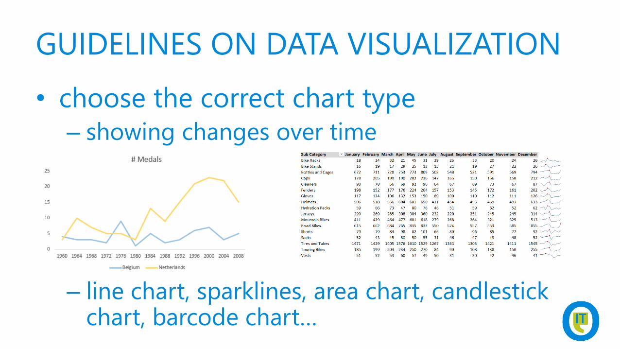
• choose the correct chart type
– showing changes over time
– line chart, sparklines, area chart, candlestick chart, barcode chart…
DEMOCREATE SPARKLINES AND DATA
BARS IN EXCEL
GUIDELINES ON DATA VISUALIZATION
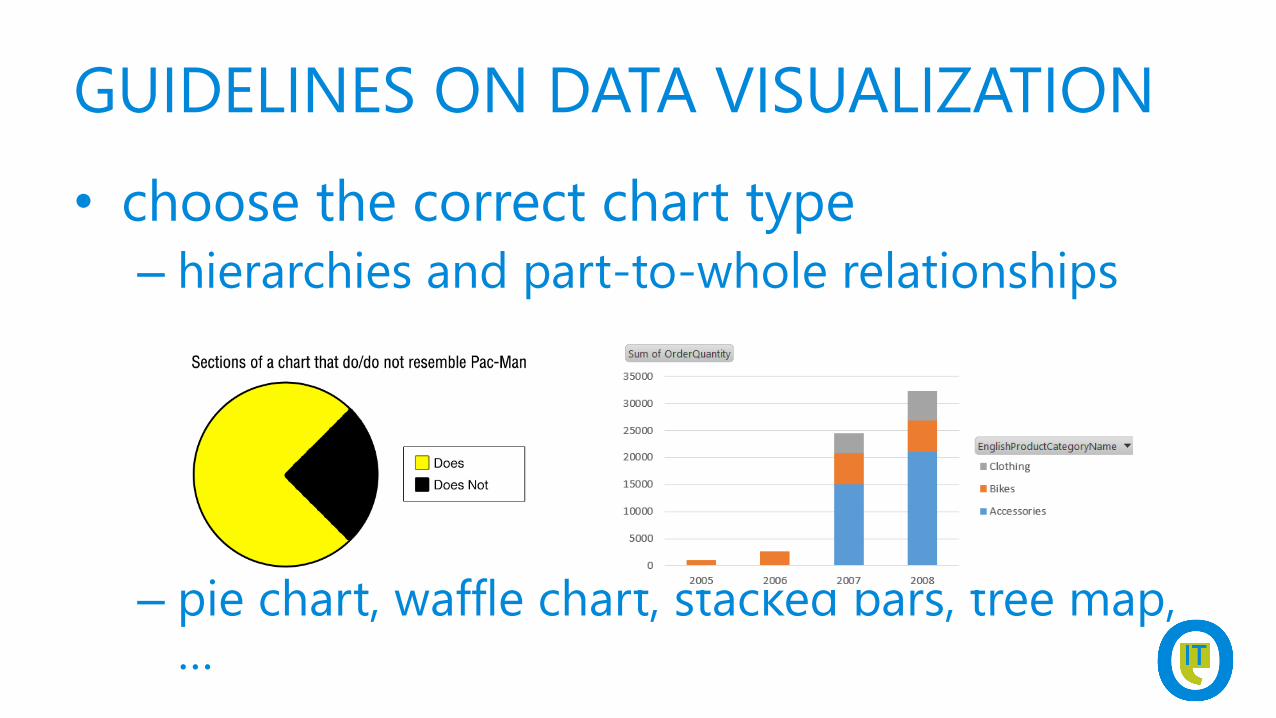
• choose the correct chart type
– hierarchies and part-to-whole relationships
– pie chart, waffle chart, stacked bars, tree map, …
GUIDELINES ON DATA VISUALIZATION
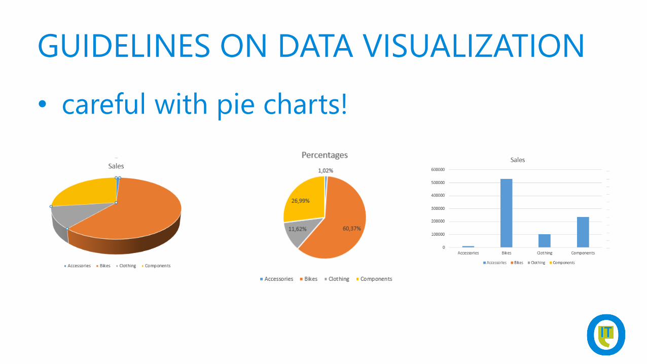
• careful with pie charts!

DEMOCREATE A DECENT PIE CHART IN
SSRS
GUIDELINES ON DATA VISUALIZATION
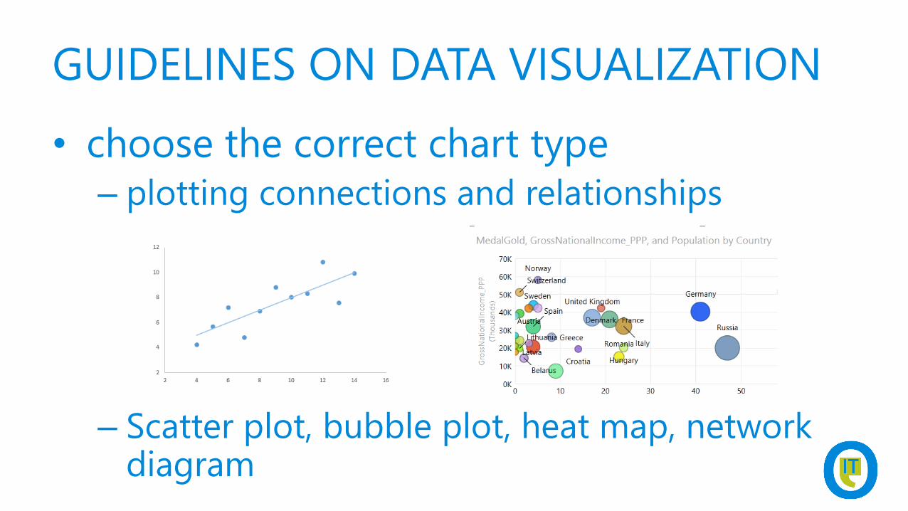
• choose the correct chart type
– plotting connections and relationships
– Scatter plot, bubble plot, heat map, network diagram
GUIDELINES ON DATA VISUALIZATION
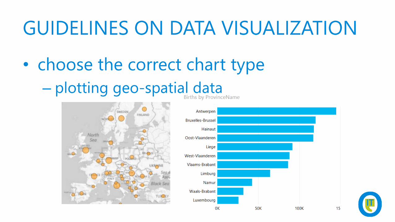
• choose the correct chart type
– plotting geo-spatial data
GUIDELINES ON DATA VISUALIZATION
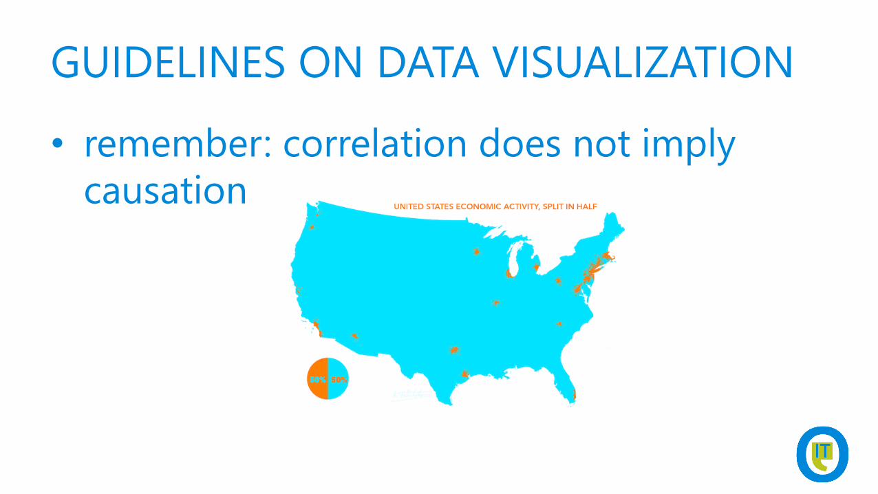
• remember: correlation does not imply
causation
GUIDELINES ON DATA VISUALIZATION
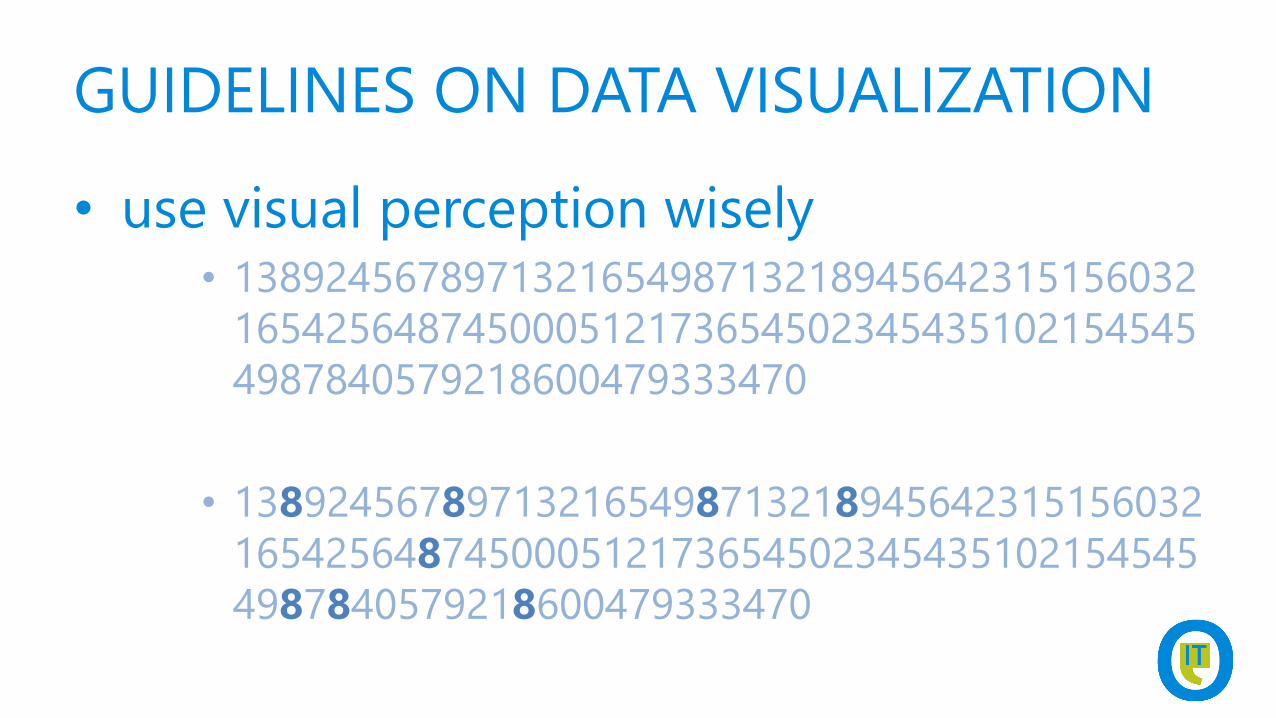
• use visual perception wisely• 138924567897132165498713218945642315156032
165425648745000512173654502345435102154545
4987840579218600479333470
• 138924567897132165498713218945642315156032
165425648745000512173654502345435102154545
4987840579218600479333470
GUIDELINES ON DATA VISUALIZATION
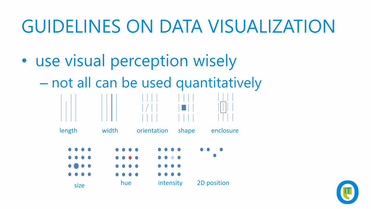
• use visual perception wisely
– not all can be used quantitatively
length width orientation shape enclosure
size hue intensity 2D position
GUIDELINES ON DATA VISUALIZATION
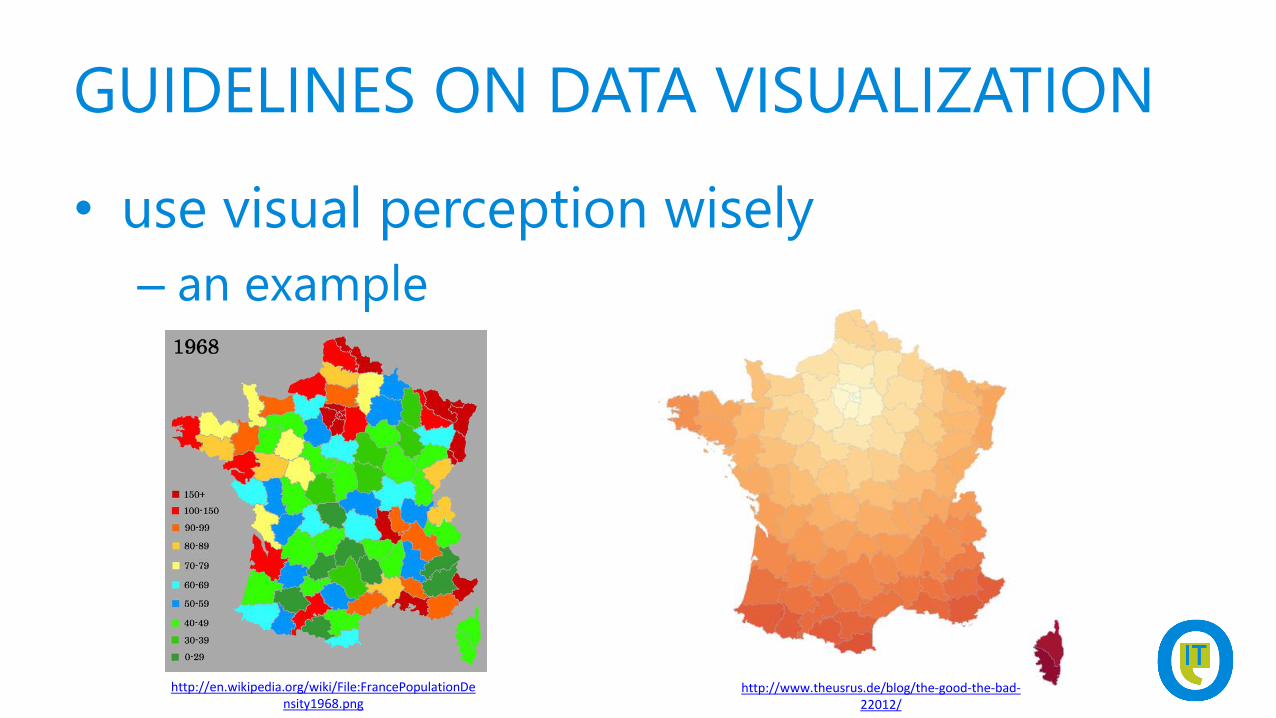
• use visual perception wisely
– an example
http://en.wikipedia.org/wiki/File:FrancePopulationDensity1968.png
http://www.theusrus.de/blog/the-good-the-bad-22012/
GUIDELINES ON DATA VISUALIZATION
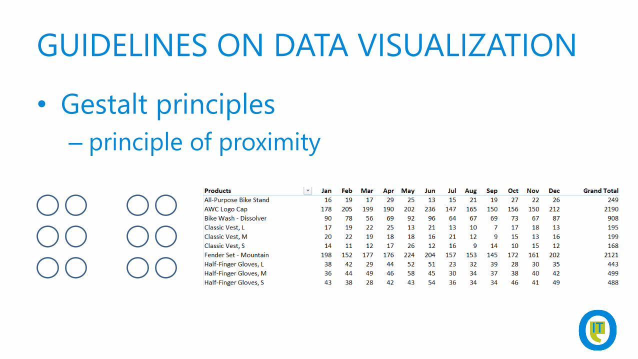
• Gestalt principles
– principle of proximity
GUIDELINES ON DATA VISUALIZATION
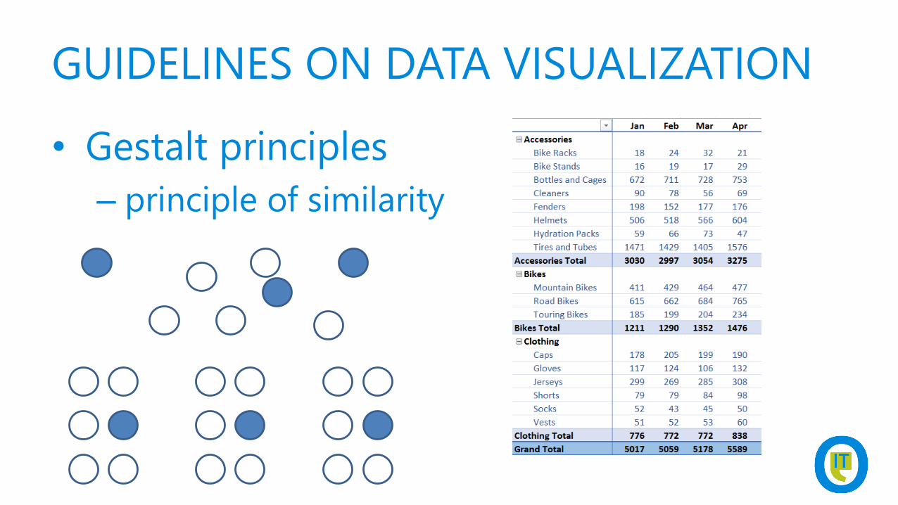
• Gestalt principles
– principle of similarity
GUIDELINES ON DATA VISUALIZATION
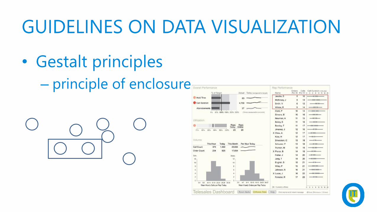
• Gestalt principles
– principle of enclosure
GUIDELINES ON DATA VISUALIZATION
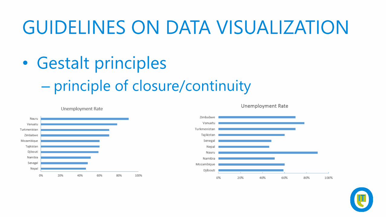
• Gestalt principles
– principle of closure/continuity
GUIDELINES ON DATA VISUALIZATION
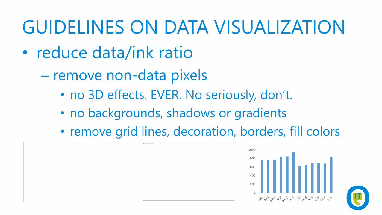
• reduce data/ink ratio
– remove non-data pixels
• no 3D effects. EVER. No seriously, don’t.
• no backgrounds, shadows or gradients
• remove grid lines, decoration, borders, fill colors
GUIDELINES ON DATA VISUALIZATION
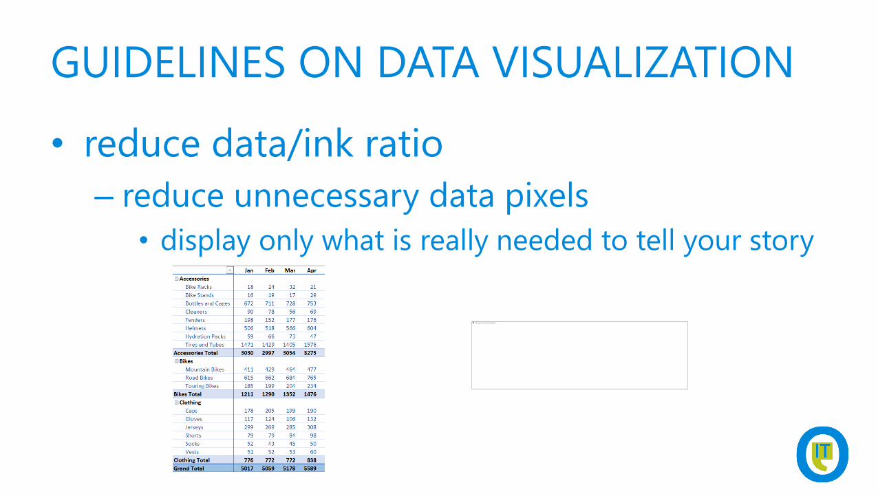
• reduce data/ink ratio
– reduce unnecessary data pixels
• display only what is really needed to tell your story
GUIDELINES ON DATA VISUALIZATION
• reduce data/ink ratio
– highlight most import pixels
GUIDELINES ON DATA VISUALIZATION
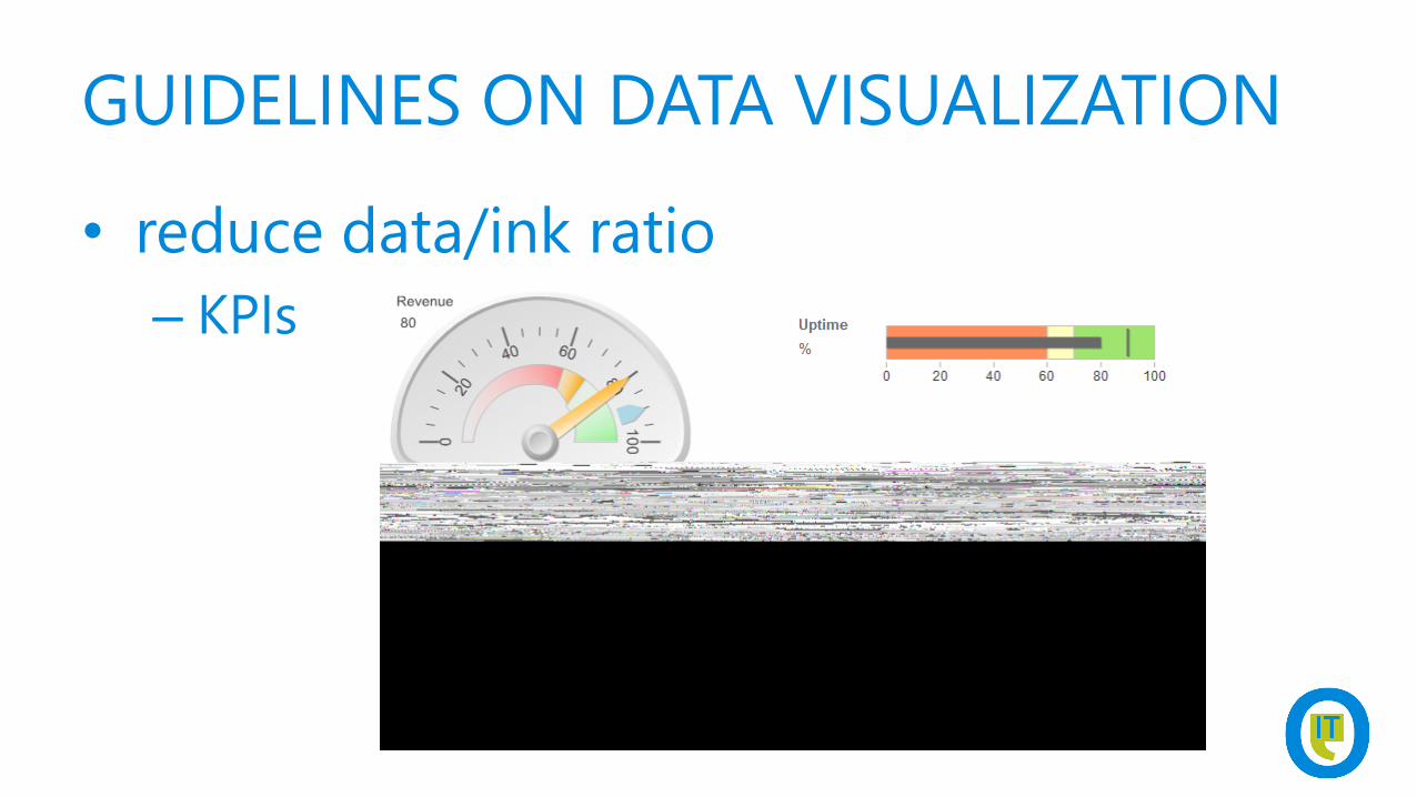
• reduce data/ink ratio
– KPIs
DEMOCREATE BULLET GRAPH IN SSRS
GUIDELINES ON DATA VISUALIZATION
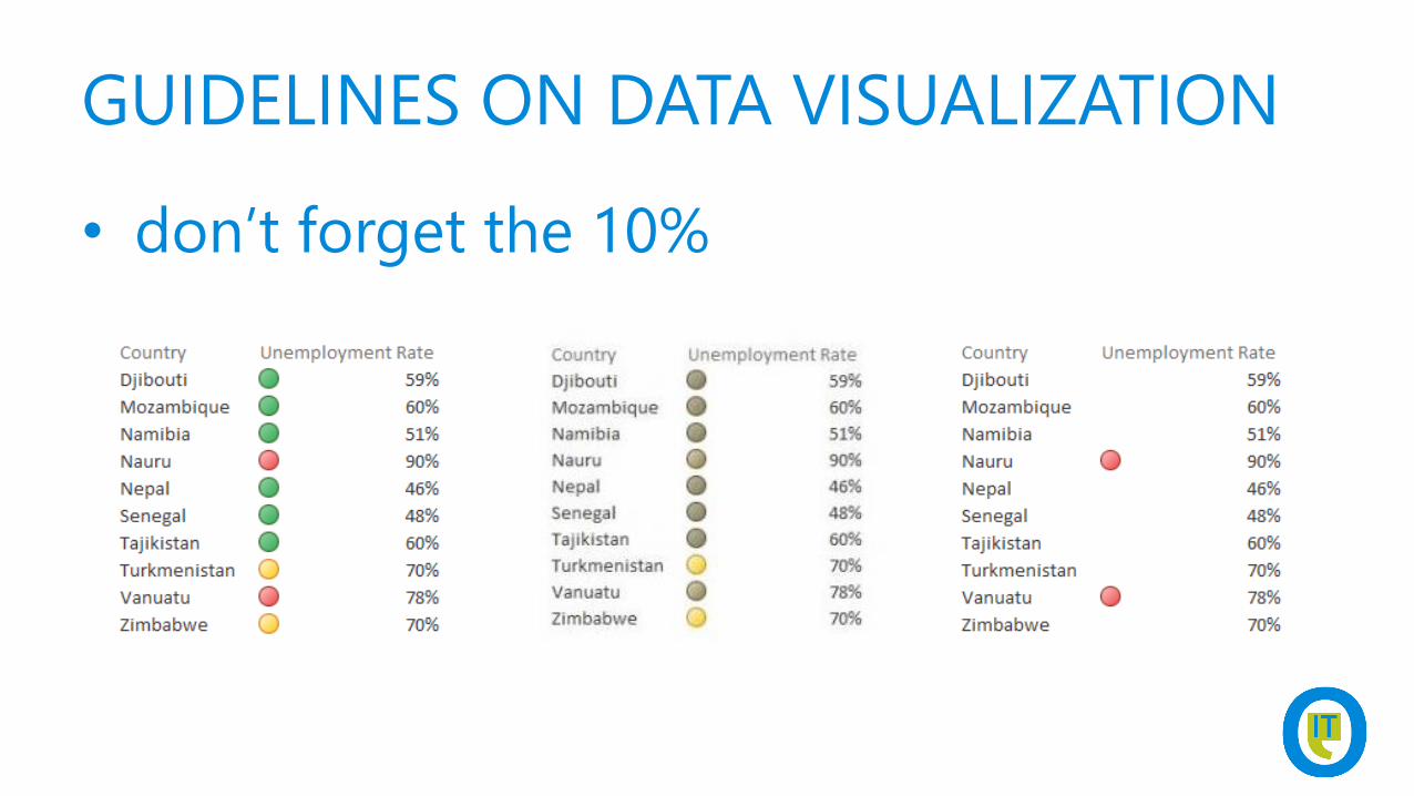
• don’t forget the 10%
GUIDELINES ON DATA VISUALIZATION
• what’s the story you want to tell?
• choose the correct chart type
• use visual perception wisely
• reduce data/ink ratio
GUIDELINES ON DATA VISUALIZATION
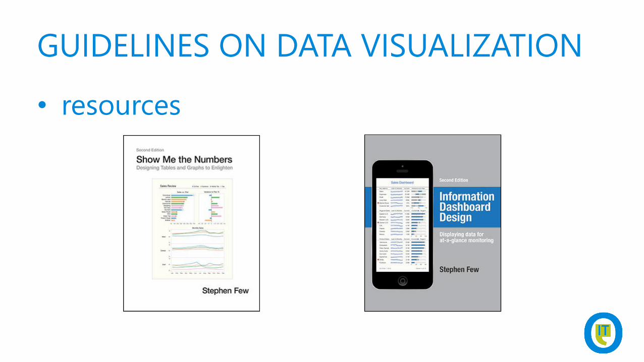
• resources
AGENDA
• guidelines on Data Visualization
• showing off with SSRS
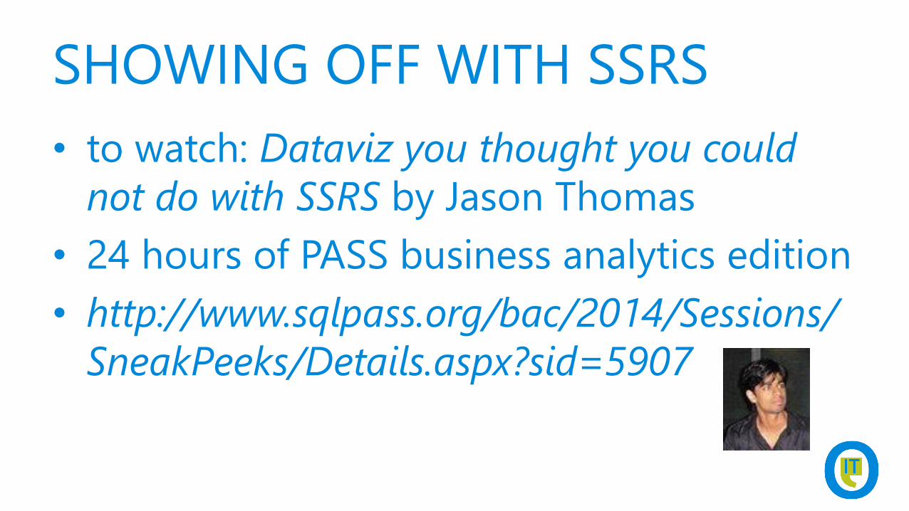
SHOWING OFF WITH SSRS
• to watch: Dataviz you thought you could
not do with SSRS by Jason Thomas
• 24 hours of PASS business analytics edition
• http://www.sqlpass.org/bac/2014/Sessions/
SneakPeeks/Details.aspx?sid=5907
SHOWING OFF WITH SSRS

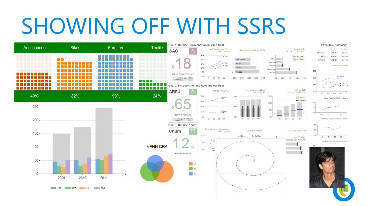
DEMOSHOW SOME FUN STUFF IN SSRS


Follow Technet Belgium
@technetbelux
Subscribe to the TechNet newsletter
aka.ms/benews
Be the first to know

THANKS FOR LISTENING

Belgium’s biggest IT PRO Conference