Embed Size (px)
Citation preview
INTERNAL USE ONLY
2015-02-06
SAP Screen Personas Style Guide
Content
1 How to use this document. . . . . . . . . . . . . . . . . . . . . . . . . . . . . . . . . . . . . . . . . . . . . . . . . . . . . . . . 51.1 Screen Size Optimization. . . . . . . . . . . . . . . . . . . . . . . . . . . . . . . . . . . . . . . . . . . . . . . . . . . . . . . . . . 61.2 Fiori Color Palette. . . . . . . . . . . . . . . . . . . . . . . . . . . . . . . . . . . . . . . . . . . . . . . . . . . . . . . . . . . . . . . 6
2 GENERAL UI CONCEPTS. . . . . . . . . . . . . . . . . . . . . . . . . . . . . . . . . . . . . . . . . . . . . . . . . . . . . . . . . 92.1 Simplicity. . . . . . . . . . . . . . . . . . . . . . . . . . . . . . . . . . . . . . . . . . . . . . . . . . . . . . . . . . . . . . . . . . . . . 92.2 Consistency. . . . . . . . . . . . . . . . . . . . . . . . . . . . . . . . . . . . . . . . . . . . . . . . . . . . . . . . . . . . . . . . . . . 92.3 Navigation. . . . . . . . . . . . . . . . . . . . . . . . . . . . . . . . . . . . . . . . . . . . . . . . . . . . . . . . . . . . . . . . . . . .10
Backstepping. . . . . . . . . . . . . . . . . . . . . . . . . . . . . . . . . . . . . . . . . . . . . . . . . . . . . . . . . . . . . . . 10Exit to Homescreen. . . . . . . . . . . . . . . . . . . . . . . . . . . . . . . . . . . . . . . . . . . . . . . . . . . . . . . . . . .10Scrolling & Page Fold. . . . . . . . . . . . . . . . . . . . . . . . . . . . . . . . . . . . . . . . . . . . . . . . . . . . . . . . . . 11
2.4 Text & typography. . . . . . . . . . . . . . . . . . . . . . . . . . . . . . . . . . . . . . . . . . . . . . . . . . . . . . . . . . . . . . 112.5 Images & Iconography. . . . . . . . . . . . . . . . . . . . . . . . . . . . . . . . . . . . . . . . . . . . . . . . . . . . . . . . . . . 122.6 Meta-functions. . . . . . . . . . . . . . . . . . . . . . . . . . . . . . . . . . . . . . . . . . . . . . . . . . . . . . . . . . . . . . . . 13
Help functions. . . . . . . . . . . . . . . . . . . . . . . . . . . . . . . . . . . . . . . . . . . . . . . . . . . . . . . . . . . . . . 13Search & Filter functions. . . . . . . . . . . . . . . . . . . . . . . . . . . . . . . . . . . . . . . . . . . . . . . . . . . . . . . 14
3 PAGE LAYOUTS. . . . . . . . . . . . . . . . . . . . . . . . . . . . . . . . . . . . . . . . . . . . . . . . . . . . . . . . . . . . . . . 153.1 LaunchPad. . . . . . . . . . . . . . . . . . . . . . . . . . . . . . . . . . . . . . . . . . . . . . . . . . . . . . . . . . . . . . . . . . . 15
LaunchPad - Background. . . . . . . . . . . . . . . . . . . . . . . . . . . . . . . . . . . . . . . . . . . . . . . . . . . . . . .16LaunchPad - Header. . . . . . . . . . . . . . . . . . . . . . . . . . . . . . . . . . . . . . . . . . . . . . . . . . . . . . . . . . 16LaunchPad - Tile. . . . . . . . . . . . . . . . . . . . . . . . . . . . . . . . . . . . . . . . . . . . . . . . . . . . . . . . . . . . . 21LaunchPad - Tile Grouping. . . . . . . . . . . . . . . . . . . . . . . . . . . . . . . . . . . . . . . . . . . . . . . . . . . . . 26Launchpad - Footer. . . . . . . . . . . . . . . . . . . . . . . . . . . . . . . . . . . . . . . . . . . . . . . . . . . . . . . . . . 29
3.2 BasicPage. . . . . . . . . . . . . . . . . . . . . . . . . . . . . . . . . . . . . . . . . . . . . . . . . . . . . . . . . . . . . . . . . . . .29BasicPage layout. . . . . . . . . . . . . . . . . . . . . . . . . . . . . . . . . . . . . . . . . . . . . . . . . . . . . . . . . . . . 30BasicPage - Background. . . . . . . . . . . . . . . . . . . . . . . . . . . . . . . . . . . . . . . . . . . . . . . . . . . . . . . 34BasicPage - Header. . . . . . . . . . . . . . . . . . . . . . . . . . . . . . . . . . . . . . . . . . . . . . . . . . . . . . . . . . 36BasicPage - Footer. . . . . . . . . . . . . . . . . . . . . . . . . . . . . . . . . . . . . . . . . . . . . . . . . . . . . . . . . . . 40
3.3 PopupPage. . . . . . . . . . . . . . . . . . . . . . . . . . . . . . . . . . . . . . . . . . . . . . . . . . . . . . . . . . . . . . . . . . . 45PopupPage layout. . . . . . . . . . . . . . . . . . . . . . . . . . . . . . . . . . . . . . . . . . . . . . . . . . . . . . . . . . . 46
4 CONTAINERS. . . . . . . . . . . . . . . . . . . . . . . . . . . . . . . . . . . . . . . . . . . . . . . . . . . . . . . . . . . . . . . . 554.1 CollapsibleContainer. . . . . . . . . . . . . . . . . . . . . . . . . . . . . . . . . . . . . . . . . . . . . . . . . . . . . . . . . . . . 55
CollapsibleContainer - on BasicPage layout. . . . . . . . . . . . . . . . . . . . . . . . . . . . . . . . . . . . . . . . . .574.2 FioriPanel. . . . . . . . . . . . . . . . . . . . . . . . . . . . . . . . . . . . . . . . . . . . . . . . . . . . . . . . . . . . . . . . . . . . 59
FioriPanel - on BasicPage layout. . . . . . . . . . . . . . . . . . . . . . . . . . . . . . . . . . . . . . . . . . . . . . . . . . 61FioriPanel - in TabControl container. . . . . . . . . . . . . . . . . . . . . . . . . . . . . . . . . . . . . . . . . . . . . . . 64
2I N T E R N A L U S E O N L Y© 2015 SAP SE or an SAP affiliate company. All rights reserved.
SAP Screen Personas Style GuideContent
4.3 GroupBox. . . . . . . . . . . . . . . . . . . . . . . . . . . . . . . . . . . . . . . . . . . . . . . . . . . . . . . . . . . . . . . . . . . . 67
4.4 ScrollableContainer. . . . . . . . . . . . . . . . . . . . . . . . . . . . . . . . . . . . . . . . . . . . . . . . . . . . . . . . . . . . . 68
4.5 SplitterContainer. . . . . . . . . . . . . . . . . . . . . . . . . . . . . . . . . . . . . . . . . . . . . . . . . . . . . . . . . . . . . . .69
4.6 StretchableContainer. . . . . . . . . . . . . . . . . . . . . . . . . . . . . . . . . . . . . . . . . . . . . . . . . . . . . . . . . . . 69
4.7 TabControl. . . . . . . . . . . . . . . . . . . . . . . . . . . . . . . . . . . . . . . . . . . . . . . . . . . . . . . . . . . . . . . . . . . 70
TabControl - Default Value. . . . . . . . . . . . . . . . . . . . . . . . . . . . . . . . . . . . . . . . . . . . . . . . . . . . . . 71
TabControl - on BasicPage layout. . . . . . . . . . . . . . . . . . . . . . . . . . . . . . . . . . . . . . . . . . . . . . . . .72
TabControl - on PopupPage layout. . . . . . . . . . . . . . . . . . . . . . . . . . . . . . . . . . . . . . . . . . . . . . . . 73
TabControl - inside a CollapsibleContainer. . . . . . . . . . . . . . . . . . . . . . . . . . . . . . . . . . . . . . . . . . 74
5 CONTENT. . . . . . . . . . . . . . . . . . . . . . . . . . . . . . . . . . . . . . . . . . . . . . . . . . . . . . . . . . . . . . . . . . . 765.1 Form. . . . . . . . . . . . . . . . . . . . . . . . . . . . . . . . . . . . . . . . . . . . . . . . . . . . . . . . . . . . . . . . . . . . . . . 76
Form - Default Values. . . . . . . . . . . . . . . . . . . . . . . . . . . . . . . . . . . . . . . . . . . . . . . . . . . . . . . . . 77
Form - on BasicPage layout. . . . . . . . . . . . . . . . . . . . . . . . . . . . . . . . . . . . . . . . . . . . . . . . . . . . . 80
Form (with FioriPanel). . . . . . . . . . . . . . . . . . . . . . . . . . . . . . . . . . . . . . . . . . . . . . . . . . . . . . . . 83
Form - on PopupPage layout. . . . . . . . . . . . . . . . . . . . . . . . . . . . . . . . . . . . . . . . . . . . . . . . . . . . 86
Form - in TabControl. . . . . . . . . . . . . . . . . . . . . . . . . . . . . . . . . . . . . . . . . . . . . . . . . . . . . . . . . .89
5.2 SystemMessage. . . . . . . . . . . . . . . . . . . . . . . . . . . . . . . . . . . . . . . . . . . . . . . . . . . . . . . . . . . . . . . 92
SystemMessage - on PopupPage layout. . . . . . . . . . . . . . . . . . . . . . . . . . . . . . . . . . . . . . . . . . . . 92
5.3 Table. . . . . . . . . . . . . . . . . . . . . . . . . . . . . . . . . . . . . . . . . . . . . . . . . . . . . . . . . . . . . . . . . . . . . . . 95
Table - default values. . . . . . . . . . . . . . . . . . . . . . . . . . . . . . . . . . . . . . . . . . . . . . . . . . . . . . . . . 97
Table - on BasicPage layout. . . . . . . . . . . . . . . . . . . . . . . . . . . . . . . . . . . . . . . . . . . . . . . . . . . . .98
Table - on PopupPage layout. . . . . . . . . . . . . . . . . . . . . . . . . . . . . . . . . . . . . . . . . . . . . . . . . . . 102
Table - inside a TabControl. . . . . . . . . . . . . . . . . . . . . . . . . . . . . . . . . . . . . . . . . . . . . . . . . . . . 105
6 CONTROLS. . . . . . . . . . . . . . . . . . . . . . . . . . . . . . . . . . . . . . . . . . . . . . . . . . . . . . . . . . . . . . . . . 1106.1 Button. . . . . . . . . . . . . . . . . . . . . . . . . . . . . . . . . . . . . . . . . . . . . . . . . . . . . . . . . . . . . . . . . . . . . .110
LaunchButton & ScriptButton. . . . . . . . . . . . . . . . . . . . . . . . . . . . . . . . . . . . . . . . . . . . . . . . . . .110
6.2 Checkbox. . . . . . . . . . . . . . . . . . . . . . . . . . . . . . . . . . . . . . . . . . . . . . . . . . . . . . . . . . . . . . . . . . . 110
Checkbox list (with FioriPanel) - on BasicPage layout. . . . . . . . . . . . . . . . . . . . . . . . . . . . . . . . . . 111
6.3 Image. . . . . . . . . . . . . . . . . . . . . . . . . . . . . . . . . . . . . . . . . . . . . . . . . . . . . . . . . . . . . . . . . . . . . . 112
Clickable Icons. . . . . . . . . . . . . . . . . . . . . . . . . . . . . . . . . . . . . . . . . . . . . . . . . . . . . . . . . . . . . 113
6.4 Label. . . . . . . . . . . . . . . . . . . . . . . . . . . . . . . . . . . . . . . . . . . . . . . . . . . . . . . . . . . . . . . . . . . . . . . 113
Label - Default Values. . . . . . . . . . . . . . . . . . . . . . . . . . . . . . . . . . . . . . . . . . . . . . . . . . . . . . . . .113
Label vs TextBox. . . . . . . . . . . . . . . . . . . . . . . . . . . . . . . . . . . . . . . . . . . . . . . . . . . . . . . . . . . . 114
6.5 OkCodeBox. . . . . . . . . . . . . . . . . . . . . . . . . . . . . . . . . . . . . . . . . . . . . . . . . . . . . . . . . . . . . . . . . . 114
6.6 StatusBar. . . . . . . . . . . . . . . . . . . . . . . . . . . . . . . . . . . . . . . . . . . . . . . . . . . . . . . . . . . . . . . . . . . 115
6.7 TextBox. . . . . . . . . . . . . . . . . . . . . . . . . . . . . . . . . . . . . . . . . . . . . . . . . . . . . . . . . . . . . . . . . . . . . 115
TextBox - Default Values. . . . . . . . . . . . . . . . . . . . . . . . . . . . . . . . . . . . . . . . . . . . . . . . . . . . . . 115
6.8 Text Editors. . . . . . . . . . . . . . . . . . . . . . . . . . . . . . . . . . . . . . . . . . . . . . . . . . . . . . . . . . . . . . . . . . 117
6.9 Toolbar. . . . . . . . . . . . . . . . . . . . . . . . . . . . . . . . . . . . . . . . . . . . . . . . . . . . . . . . . . . . . . . . . . . . . 117
SAP Screen Personas Style GuideContent
I N T E R N A L U S E O N L Y© 2015 SAP SE or an SAP affiliate company. All rights reserved. 3
6.10 UserArea. . . . . . . . . . . . . . . . . . . . . . . . . . . . . . . . . . . . . . . . . . . . . . . . . . . . . . . . . . . . . . . . . . . . 117
4I N T E R N A L U S E O N L Y© 2015 SAP SE or an SAP affiliate company. All rights reserved.
SAP Screen Personas Style GuideContent
1 How to use this document
The purpose of this document is to provide guidance for consistent visual design of SAP Screen Personas flavors. It's assumed that the reader has already received adequate training with the tool & understands the basic concepts involved in using SAP Screen Personas to improve the visual appearance of the SAP GUI.
All the non-default values needed for reproducing the desired visual effects are described in tables, using the exact order & terminology that appears in the SAP Screen Personas tool. Most of the required mathematical calculations are already done. The consultant who is implementing the flavors only needs to compare each onscreen UI element with the layout descriptions in this document and type in the non-default values exactly as they are written.
The standard workflow for improving a transaction using this document...
1. Read the GENERAL UI CONCEPTS section before attempting to create any new flavors or edit any of the existing screens.
2. For each transaction / flavor: interview the end-users to develop a detailed understanding of how they use the transaction in their daily work.
3. For each SAP GUI screen: hide any fields, buttons, labels, etc that users have identified as unnecessary or unused.
4. Compare the remaining UI elements on screen with the layout diagrams & example screens to find the closest possible match.
5. Start with the PAGE LAYOUTS section... select the overall page layout that is the best match and use the instructions to recreate the overall page layout.
6. Next, focus on re-locating and re-sizing the large containers using instructions in the CONTAINERS section to create a sturdy framework for organizing the page content.
7. Align and optimize the remaining content on screen by following instructions in the CONTENT section.8. The CONTROLS section provides some detailed recommendations for different types of UI controls and may
help in resolving smaller details of the screen design.
SAP Screen Personas Style GuideHow to use this document
I N T E R N A L U S E O N L Y© 2015 SAP SE or an SAP affiliate company. All rights reserved. 5
1.1 Screen Size Optimization
The layouts described in this document have been created with a minimum screen resolution of 1280px (width) x 800px (height), also known as WXGA.
The ACTUAL usable screen space for displaying content in a Screen Personas flavor at this resolution is roughly...
● Personas 2.0 = 1200px x 550px● Personas 3.0 = 1248px x 624px (1500pt x 195pt)
This is because a portion of the total screen space is taken up by the web browser that SAP Screen Personas is being displayed inside of (for example, Internet Explorer or Safari). Results will vary depending on the user's web browser and its configuration of toolbars and add-ons.
Notice that for some users with larger display screens, there will be some additional empty space on the right side or bottom of the screen. However, by keeping the content of the flavors inside this smaller "display-safe" area (whenever possible or practical), we can ensure that even the users with smaller screens will not experience any excessive need for extra scrolling. All layouts in this document are designed to easily fit within the "display-safe" area.
Most of the layouts can be made taller than the max height of the "display-safe" area, if necessary - for example, if the original SAP GUI page has an unusually large amount of content. But this should be avoided whenever possible, because users with smaller monitors will need to scroll down to view off-screen content at the bottom of the long page.
The layouts should NEVER be made wider than the max width of the "display-safe" area, because this would add an additional horizontal scroll bar when viewed on smaller screens, making navigation much more difficult for users.
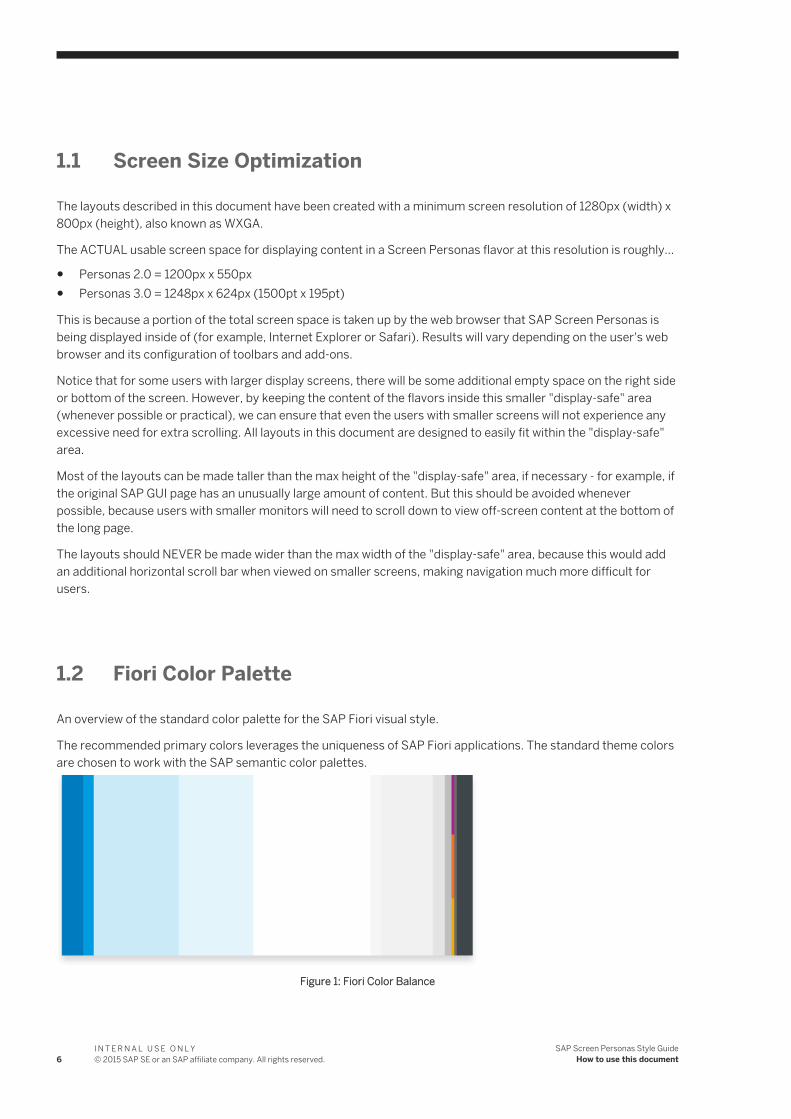
1.2 Fiori Color Palette
An overview of the standard color palette for the SAP Fiori visual style.
The recommended primary colors leverages the uniqueness of SAP Fiori applications. The standard theme colors are chosen to work with the SAP semantic color palettes.
Figure 1: Fiori Color Balance
6I N T E R N A L U S E O N L Y© 2015 SAP SE or an SAP affiliate company. All rights reserved.
SAP Screen Personas Style GuideHow to use this document
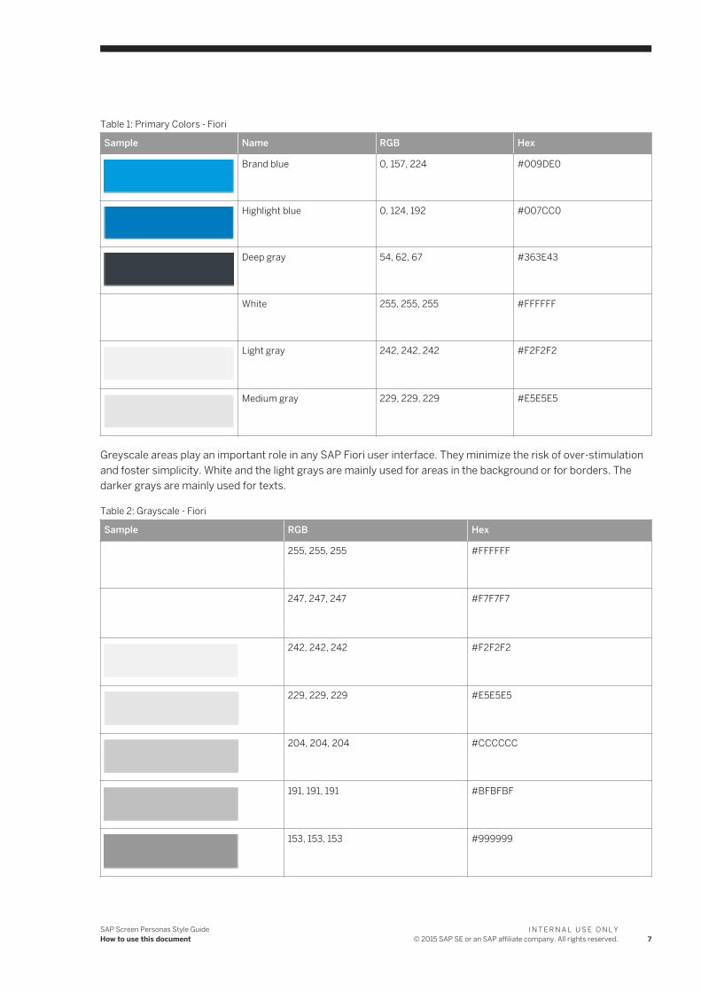
Table 1: Primary Colors - Fiori
Sample Name RGB Hex
Brand blue 0, 157, 224 #009DE0
Highlight blue 0, 124, 192 #007CC0
Deep gray 54, 62, 67 #363E43
White 255, 255, 255 #FFFFFF
Light gray 242, 242, 242 #F2F2F2
Medium gray 229, 229, 229 #E5E5E5
Greyscale areas play an important role in any SAP Fiori user interface. They minimize the risk of over-stimulation and foster simplicity. White and the light grays are mainly used for areas in the background or for borders. The darker grays are mainly used for texts.
Table 2: Grayscale - Fiori
Sample RGB Hex
255, 255, 255 #FFFFFF
247, 247, 247 #F7F7F7
242, 242, 242 #F2F2F2
229, 229, 229 #E5E5E5
204, 204, 204 #CCCCCC
191, 191, 191 #BFBFBF
153, 153, 153 #999999
SAP Screen Personas Style GuideHow to use this document
I N T E R N A L U S E O N L Y© 2015 SAP SE or an SAP affiliate company. All rights reserved. 7
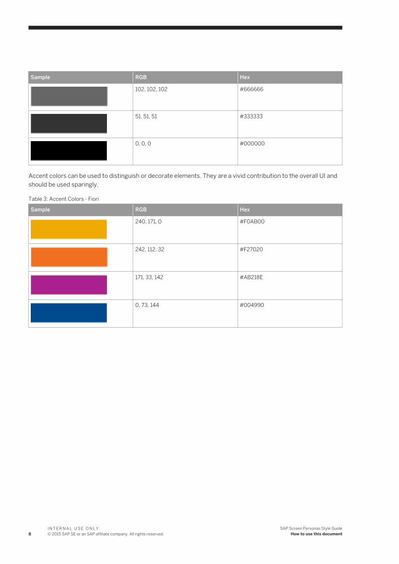
Sample RGB Hex
102, 102, 102 #666666
51, 51, 51 #333333
0, 0, 0 #000000
Accent colors can be used to distinguish or decorate elements. They are a vivid contribution to the overall UI and should be used sparingly.
Table 3: Accent Colors - Fiori
Sample RGB Hex
240, 171, 0 #F0AB00
242, 112, 32 #F27020
171, 33, 142 #AB218E
0, 73, 144 #004990
8I N T E R N A L U S E O N L Y© 2015 SAP SE or an SAP affiliate company. All rights reserved.
SAP Screen Personas Style GuideHow to use this document
2 GENERAL UI CONCEPTS
In this section of the style guide, you will find guidelines relating to some veral general UI concepts.
Although this style guide contains some very specific instructions about standard page layouts and the correct size and placement of different types of content, there is still a great deal of flexibility and "artistic interpretation" left to the designer of the individual flavors. Try to keep these general guidelines in mind when making decisions related to each concept in the following chapters.
2.1 Simplicity
Keep it simple!
● Help the user to focus on what is most important.● Make essential functions obvious and easy to use, while removing functions that are irrelevant to the current
user activity.● Rarely used functions or less-important functions that are not directly related to the current user activity
should be consolidated and hidden behind menus or options list, rather than overloading the user by giving too many choices at once.
● Give relevant feedback along the way, but eliminate irrelevant information that competes for the user's attention.
● Be efficient with the UI elements that are displayed on screen.● Avoid needless repetition or re-stating obvious information that the user already knows.
2.2 Consistency
Be consistent!
● Things that look similar should have similar functions. Buttons with similar icons or labels should have similar functions. Text fields with similar icons or labels should have similar content.
● Be aware of patterns and realize that users will evaluate new screens they encounter based on what they already have learned from previous screens.
● Inconsistency causes confusion, because the system doesn't react in the way the end user would expect it to react.
● A natural sequence of events should occur from top to bottom and from left to right. Most important information should be at top of screen. Additional information or task steps should be presented to the user in a logical sequence.
SAP Screen Personas Style GuideGENERAL UI CONCEPTS
I N T E R N A L U S E O N L Y© 2015 SAP SE or an SAP affiliate company. All rights reserved. 9
2.3 Navigation
Keep navigation simple and logical!
Maintain a task-oriented and user-centered navigation principle that relates to the real-life sequence of events the user must perform in order to accomplish the desired task.
The UI navigation is the method by which the user moves forward and backward in a task sequence. It's imporant for usability that the navigation principles relate to the end user's perception of the task, rather than the underlying UI architecture or technology behind the system.
As a general rule, the main navigation (ie, actions that move forward and back in the normal task sequence) should be placed in the Header bar. Additional navigation that are NOT part of the main task flow (ie, optional steps, settings, shortcuts to other task sequences or additional features) should all be
2.3.1 Backstepping
Backstepping is the act of going backwards in a user scenario, rather than continuing forward towards the intended goal or outcome of the user scenario. Usually, this is done by using an option for Back, Cancel or Exit.
Standard SAP GUI transactions typically have separate buttons for Back, Cancel and Exit on EVERY page. Frequently at least two of these buttons (and sometimes all three) will lead to exactly the same page or have the same end result, even though the logic behind each of them (or, the hidden explanation) is very different.
Guideline: Always strive to eliminate duplicate buttons that lead to the same page or have the same end result.
Design rationale: If the buttons for Back, Cancel and Exit all lead to the same page (ie, have the same end result) then there is NO reason to have all of them... they are duplicates that clutter and confuse the UI.
Tip: The Exit button typically serves the same function as the Home button (in the page header), while the Back & Cancel buttons in SAP GUI frequently have end results that are identical to each other.
2.3.2 Exit to Homescreen
Guideline: It should be possible to exit to Homescreen and cancel the ongoing action from any screen within a flavor.
In the Fiori visual style, this is accomplished with a "Home" button in the top-left corner of every screen (in the page Header element).
Design rationale: The user should never be in a situation where they don't have an "easy way out" or "panic button" to cancel the ongoing process without saving and return to a "safe" and familiar starting point. The user should always be able to find this "panic button" in the same location on every screen.
10I N T E R N A L U S E O N L Y© 2015 SAP SE or an SAP affiliate company. All rights reserved.
SAP Screen Personas Style GuideGENERAL UI CONCEPTS
2.3.3 Scrolling & Page Fold
Guideline: All types of scrolling should be minimized or eliminated if at all possible.
Guideline: If vertical scrolling beomces necessary, it is better to rely on the internet browser's scrolling mechanism (ie, global scroll bar), rather than allowing user to scroll independently in different containers with separate scroll bars.
Design rationale: One global scroll bar (for the entire page, included as part of the web browser) is simpler to control and easier for user to understand than having multiple separate scroll bars (for the individual containers).
Tip: In the current version of Screen Personas, hidden content that is placed outside of the currently displayed screen area will also cause scrollbars to appear. When you hide unwanted content, keep it inside of the main 1200x550 minimum display area.
2.4 Text & typography
Use clear and simple language to communicate information to the user.
Guideline: The default font for all texts is Arial. Usage of other fonts should be avoided, in order to maintain a consistent user experience with maximum readability.
Guideline: All texts that appear on screen are displayed in "Normal" style. In other words, the italic and bold options for text are typically not used in Fiori styled flavors.
Guideline: In general, important texts or user input are always displayed in black or very dark gray color. Less important text is shown in a more neutral gray color. This ensures that the most important information on the screen has the highest contrast and seems to stand out in foreground, while less important text has lower contrast and seems to fade into the background.
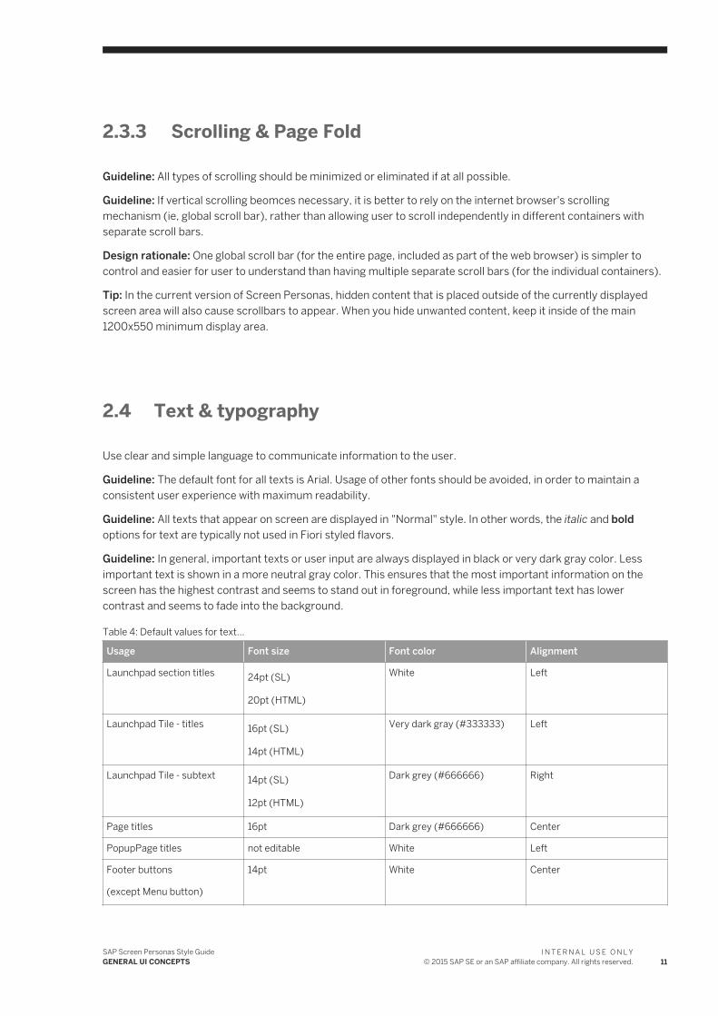
Table 4: Default values for text...
Usage Font size Font color Alignment
Launchpad section titles 24pt (SL)
20pt (HTML)
White Left
Launchpad Tile - titles 16pt (SL)
14pt (HTML)
Very dark gray (#333333) Left
Launchpad Tile - subtext 14pt (SL)
12pt (HTML)
Dark grey (#666666) Right
Page titles 16pt Dark grey (#666666) Center
PopupPage titles not editable White Left
Footer buttons
(except Menu button)
14pt White Center
SAP Screen Personas Style GuideGENERAL UI CONCEPTS
I N T E R N A L U S E O N L Y© 2015 SAP SE or an SAP affiliate company. All rights reserved. 11
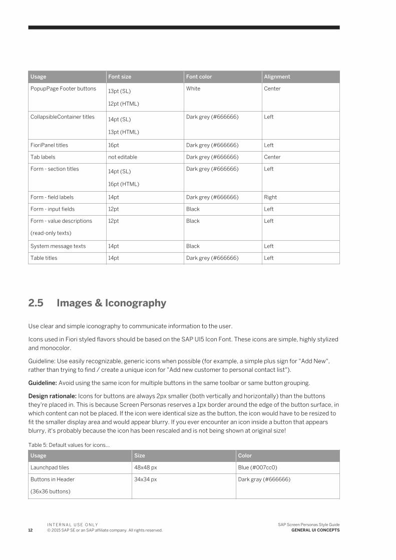
Usage Font size Font color Alignment
PopupPage Footer buttons 13pt (SL)
12pt (HTML)
White Center
CollapsibleContainer titles 14pt (SL)
13pt (HTML)
Dark grey (#666666) Left
FioriPanel titles 16pt Dark grey (#666666) Left
Tab labels not editable Dark grey (#666666) Center
Form - section titles 14pt (SL)
16pt (HTML)
Dark grey (#666666) Left
Form - field labels 14pt Dark grey (#666666) Right
Form - input fields 12pt Black Left
Form - value descriptions
(read-only texts)
12pt Black Left
System message texts 14pt Black Left
Table titles 14pt Dark grey (#666666) Left
2.5 Images & Iconography
Use clear and simple iconography to communicate information to the user.
Icons used in Fiori styled flavors should be based on the SAP UI5 Icon Font. These icons are simple, highly stylized and monocolor.
Guideline: Use easily recognizable, generic icons when possible (for example, a simple plus sign for "Add New", rather than trying to find / create a unique icon for "Add new customer to personal contact list").
Guideline: Avoid using the same icon for multiple buttons in the same toolbar or same button grouping.
Design rationale: Icons for buttons are always 2px smaller (both vertically and horizontally) than the buttons they're placed in. This is because Screen Personas reserves a 1px border around the edge of the button surface, in which content can not be placed. If the icon were identical size as the button, the icon would have to be resized to fit the smaller display area and would appear blurry. If you ever encounter an icon inside a button that appears blurry, it's probably because the icon has been rescaled and is not being shown at original size!
Table 5: Default values for icons...
Usage Size Color
Launchpad tiles 48x48 px Blue (#007cc0)
Buttons in Header
(36x36 buttons)
34x34 px Dark gray (#666666)
12I N T E R N A L U S E O N L Y© 2015 SAP SE or an SAP affiliate company. All rights reserved.
SAP Screen Personas Style GuideGENERAL UI CONCEPTS
Usage Size Color
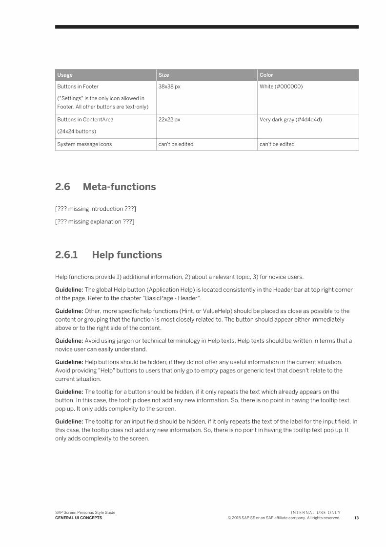
Buttons in Footer
("Settings" is the only icon allowed in Footer. All other buttons are text-only)
38x38 px White (#000000)
Buttons in ContentArea
(24x24 buttons)
22x22 px Very dark gray (#4d4d4d)
System message icons can't be edited can't be edited
2.6 Meta-functions
[??? missing introduction ???]
[??? missing explanation ???]
2.6.1 Help functions
Help functions provide 1) additional information, 2) about a relevant topic, 3) for novice users.
Guideline: The global Help button (Application Help) is located consistently in the Header bar at top right corner of the page. Refer to the chapter "BasicPage - Header".
Guideline: Other, more specific help functions (Hint, or ValueHelp) should be placed as close as possible to the content or grouping that the function is most closely related to. The button should appear either immediately above or to the right side of the content.
Guideline: Avoid using jargon or technical terminology in Help texts. Help texts should be written in terms that a novice user can easily understand.
Guideline: Help buttons should be hidden, if they do not offer any useful information in the current situation. Avoid providing "Help" buttons to users that only go to empty pages or generic text that doesn't relate to the current situation.
Guideline: The tooltip for a button should be hidden, if it only repeats the text which already appears on the button. In this case, the tooltip does not add any new information. So, there is no point in having the tooltip text pop up. It only adds complexity to the screen.
Guideline: The tooltip for an input field should be hidden, if it only repeats the text of the label for the input field. In this case, the tooltip does not add any new information. So, there is no point in having the tooltip text pop up. It only adds complexity to the screen.
SAP Screen Personas Style GuideGENERAL UI CONCEPTS
I N T E R N A L U S E O N L Y© 2015 SAP SE or an SAP affiliate company. All rights reserved. 13
2.6.2 Search & Filter functions
[??? missing introduction ???]
[??? missing explanation ???]
14I N T E R N A L U S E O N L Y© 2015 SAP SE or an SAP affiliate company. All rights reserved.
SAP Screen Personas Style GuideGENERAL UI CONCEPTS
3 PAGE LAYOUTS
In this section, you will find detailed instructions about how to organize the overall structure of a screen.
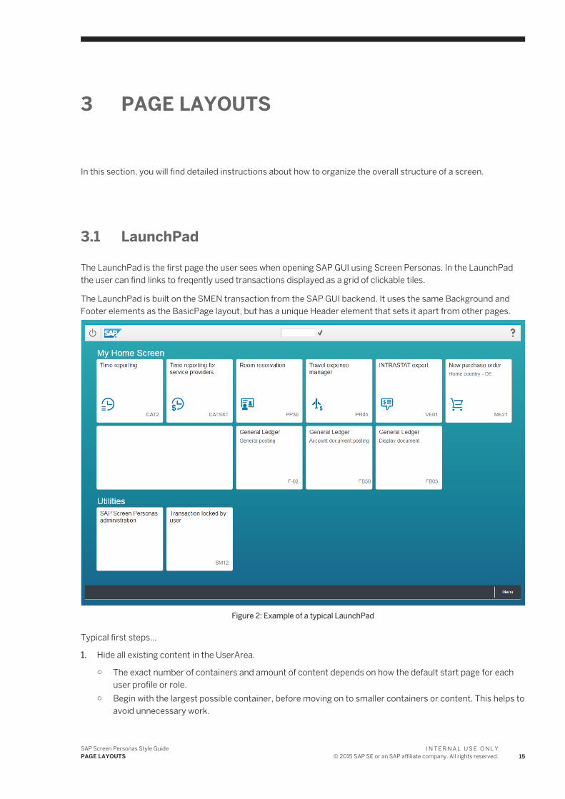
3.1 LaunchPad
The LaunchPad is the first page the user sees when opening SAP GUI using Screen Personas. In the LaunchPad the user can find links to freqently used transactions displayed as a grid of clickable tiles.
The LaunchPad is built on the SMEN transaction from the SAP GUI backend. It uses the same Background and Footer elements as the BasicPage layout, but has a unique Header element that sets it apart from other pages.
Figure 2: Example of a typical LaunchPad
Typical first steps...
1. Hide all existing content in the UserArea.
○ The exact number of containers and amount of content depends on how the default start page for each user profile or role.
○ Begin with the largest possible container, before moving on to smaller containers or content. This helps to avoid unnecessary work.
SAP Screen Personas Style GuidePAGE LAYOUTS
I N T E R N A L U S E O N L Y© 2015 SAP SE or an SAP affiliate company. All rights reserved. 15
○ Make sure that you have also hidden all empty containers. The empty containers are not visible for end users in run-time mode, but can cause extra work when you begin to add new content of the UserArea.
2. Move the following controls from the default Toolbar onto the main UserArea, for reuse in the new LaunchPad...
○ "Execute" button○ Transaction code input field (=OKCodeField)○ "Log off" button○ "Help" button
3. Hide the default Toolbars and Titlebar.
○ The default Toolbar does not contain any functions that are typically used by end users in a Fiori styled LaunchPad.
○ The remaining functions in the default Toolbar will be accessible from the Menu button in the new LaunchPad.
3.1.1 LaunchPad - Background
How to define the background image for the LaunchPad layout...
Table 6:
CONTROL PROPERTY VALUE
Screen background (pattern)
ControlType UserArea
Background image Fiori_Gradient.png
Mode (SL) Stretch
Stretch (HTML) Stretch
Position (SL) Center / Center
Alignment (HTML) Center / Center
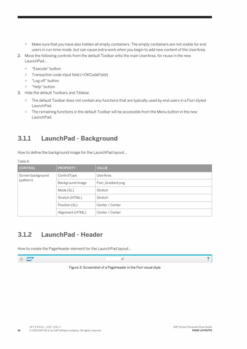
3.1.2 LaunchPad - Header
How to create the PageHeader element for the LaunchPad layout...
Figure 3: Screenshot of a PageHeader in the Fiori visual style
16I N T E R N A L U S E O N L Y© 2015 SAP SE or an SAP affiliate company. All rights reserved.
SAP Screen Personas Style GuidePAGE LAYOUTS
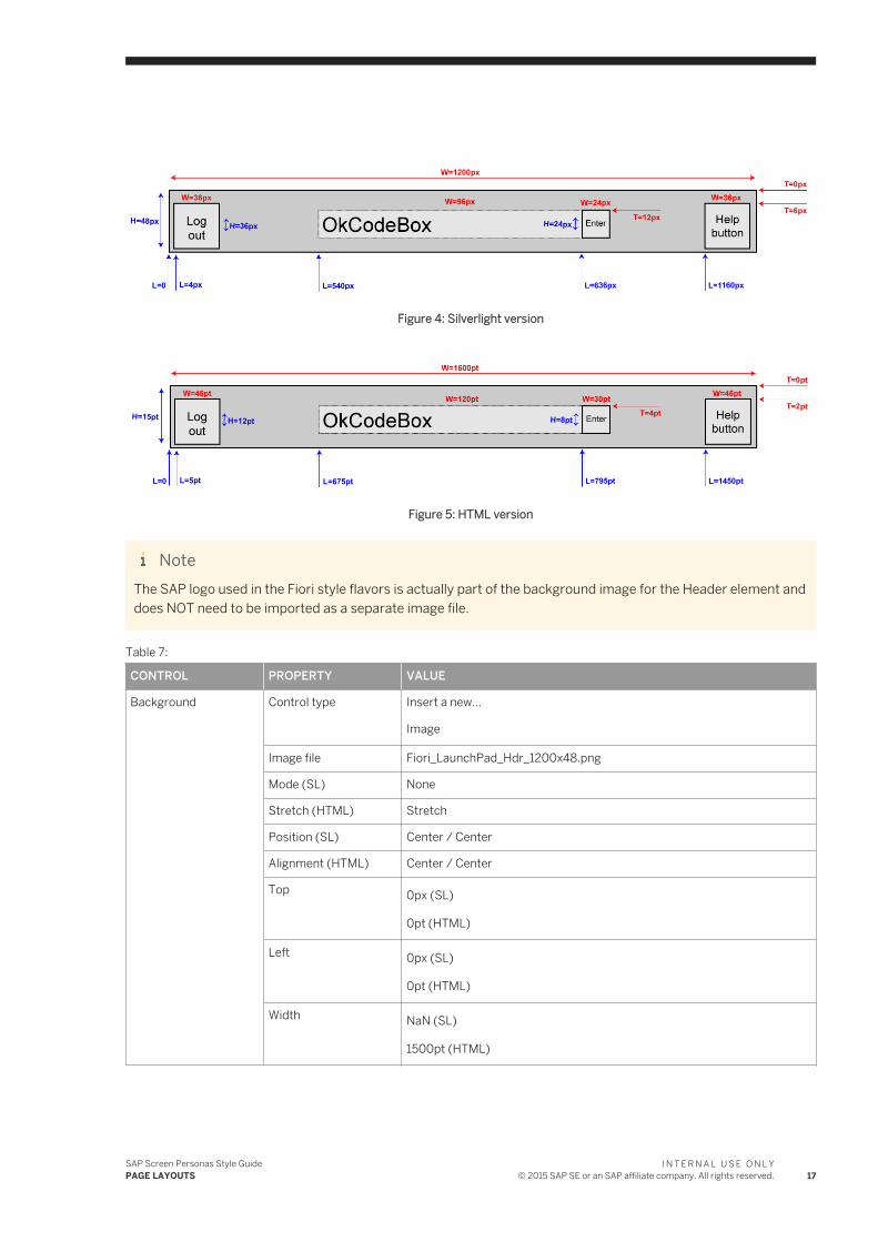
Figure 4: Silverlight version
Figure 5: HTML version
NoteThe SAP logo used in the Fiori style flavors is actually part of the background image for the Header element and does NOT need to be imported as a separate image file.
Table 7:
CONTROL PROPERTY VALUE
Background Control type Insert a new...
Image
Image file Fiori_LaunchPad_Hdr_1200x48.png
Mode (SL) None
Stretch (HTML) Stretch
Position (SL) Center / Center
Alignment (HTML) Center / Center
Top 0px (SL)
0pt (HTML)
Left 0px (SL)
0pt (HTML)
Width NaN (SL)
1500pt (HTML)
SAP Screen Personas Style GuidePAGE LAYOUTS
I N T E R N A L U S E O N L Y© 2015 SAP SE or an SAP affiliate company. All rights reserved. 17
CONTROL PROPERTY VALUE
Height NaN (SL)
15pt (HTML)
HorizontAlignment (SL)
Center
VerticalAlignment (SL) Center
Zindex (SL) -10
Notethis ensures that this control appears BEHIND all other content
Send backward (HTML)
Send to back
"Log off" button Control type Edit the existing button...
ses[0]/wnd[0]/tbar[0]/btn[15]
Add icon Fiori_34x34_gray_Log.png
Icon background Transparent
Top 6px (SL)
2pt (HTML)
Left 4px (SL)
5pt (HTML)
Width 36px (SL)
45pt (HTML)
Height 36px (SL)
12pt (HTML)
BackColor (SL) Transparent
Fill color (HTML) No color
BorderColor (SL) Transparent
Border style (HTML) No border
Tooltip Log out
Help button Control type Edit the existing...
Button
ses[0]/wnd[0]/tbar[0]/btn[1]
Add icon Fiori_34x34_gray_QuestionMark.png
Icon background Transparent
18I N T E R N A L U S E O N L Y© 2015 SAP SE or an SAP affiliate company. All rights reserved.
SAP Screen Personas Style GuidePAGE LAYOUTS
CONTROL PROPERTY VALUE
Top 6px (SL)
2pt (HTML)
Left 1160px (SL)
1450pt (HTML)
Width 36px (SL)
45pt (HTML)
Height 36px (SL)
12pt (HTML)
BackColor (SL) Transparent
Fill color (HTML) No color
BorderColor (SL) Transparent
Border style (HTML) No border
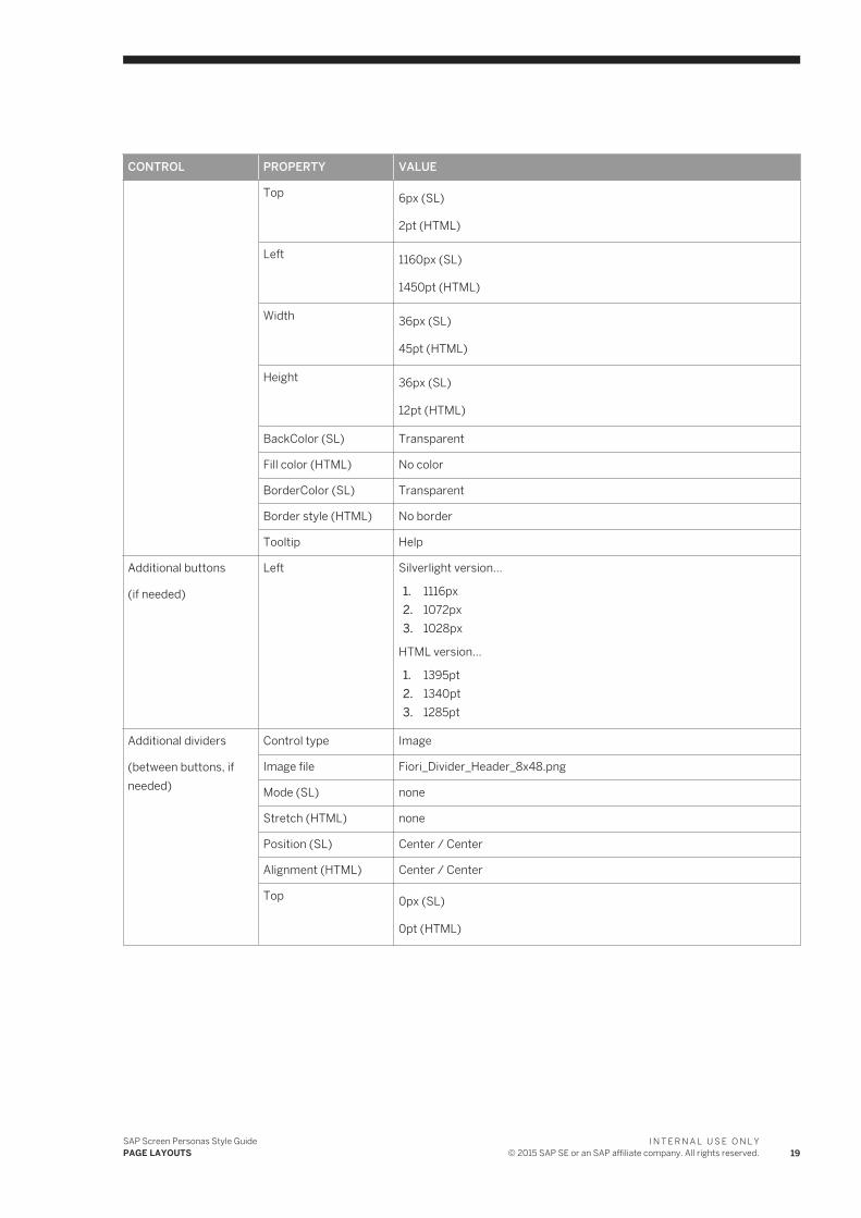
Tooltip Help
Additional buttons
(if needed)
Left Silverlight version...
1. 1116px2. 1072px3. 1028px
HTML version...
1. 1395pt2. 1340pt3. 1285pt
Additional dividers
(between buttons, if needed)
Control type Image
Image file Fiori_Divider_Header_8x48.png
Mode (SL) none
Stretch (HTML) none
Position (SL) Center / Center
Alignment (HTML) Center / Center
Top 0px (SL)
0pt (HTML)
SAP Screen Personas Style GuidePAGE LAYOUTS
I N T E R N A L U S E O N L Y© 2015 SAP SE or an SAP affiliate company. All rights reserved. 19
CONTROL PROPERTY VALUE
Left Silverlight version...
1. 1152px2. 1108px3. 1020px
HTML version...
1. 1440pt2. 1385pt3. 1330pt
Width NaN (SL)
10pt (HTML)
Height NaN (SL)
15pt (HTML)
HorizontAlignment (SL)
Center
Stretch (SL) None
VerticalAlignment (SL) Center
Transaction code prompt
Control type OkCodeBox
ses[0]/wnd[0]/tbar[0]/okcd
Top 12px (SL)
4pt (HTML)
Left 540px (SL)
675pt (HTML)
Width 96px (SL)
120pt (HTML)
Height 24px (SL)
8pt (HTML)
FontSize 12pt
Tooltip Enter a valid transaction code
Enter button Control type Button
ses[0]/wnd[0]/tbar[0]/btn[0]
Add icon Fiori_22x22_gray_Accept.png
Icon background Transparent
20I N T E R N A L U S E O N L Y© 2015 SAP SE or an SAP affiliate company. All rights reserved.
SAP Screen Personas Style GuidePAGE LAYOUTS
CONTROL PROPERTY VALUE
Top 12px (SL)
4pt (HTML)
Left 636px (SL)
795pt (HTML)
Width 24px (SL)
30pt (HTML)
Height 24px (SL)
8pt (HTML)
BackColor (SL) Transparent
Fill color (HTML) No color
BorderColor (SL) Transparent
Border style (HTML) No border
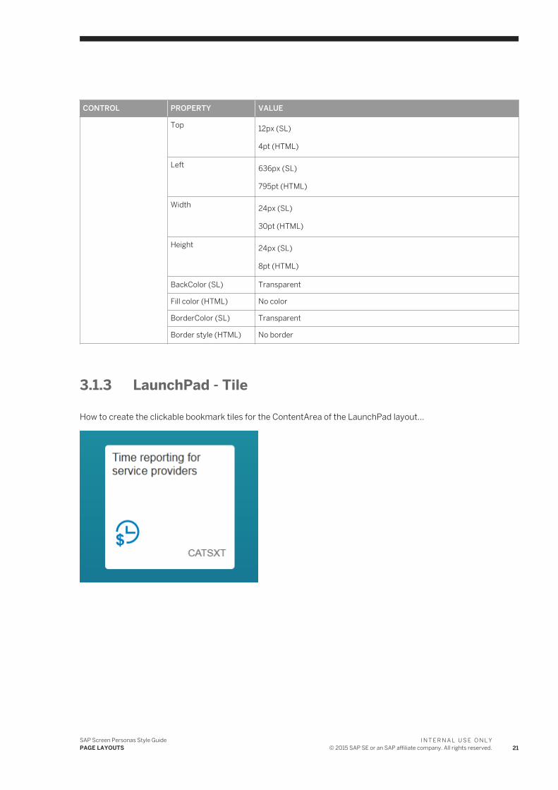
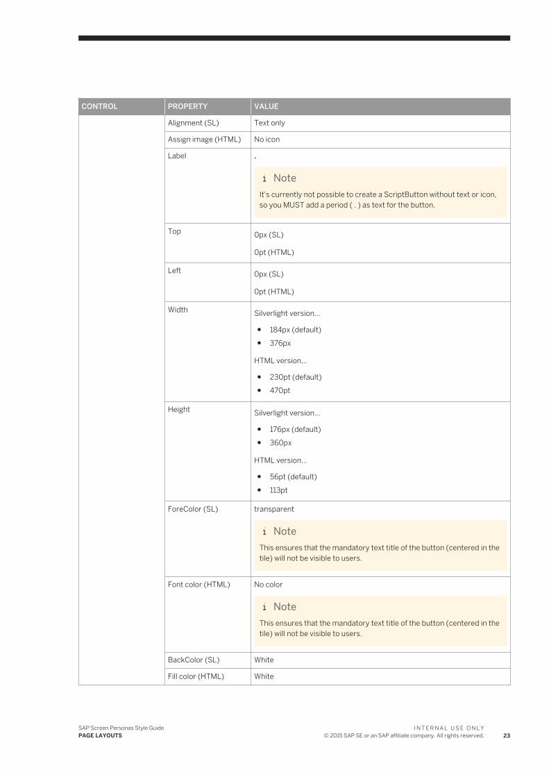
3.1.3 LaunchPad - Tile
How to create the clickable bookmark tiles for the ContentArea of the LaunchPad layout...
SAP Screen Personas Style GuidePAGE LAYOUTS
I N T E R N A L U S E O N L Y© 2015 SAP SE or an SAP affiliate company. All rights reserved. 21
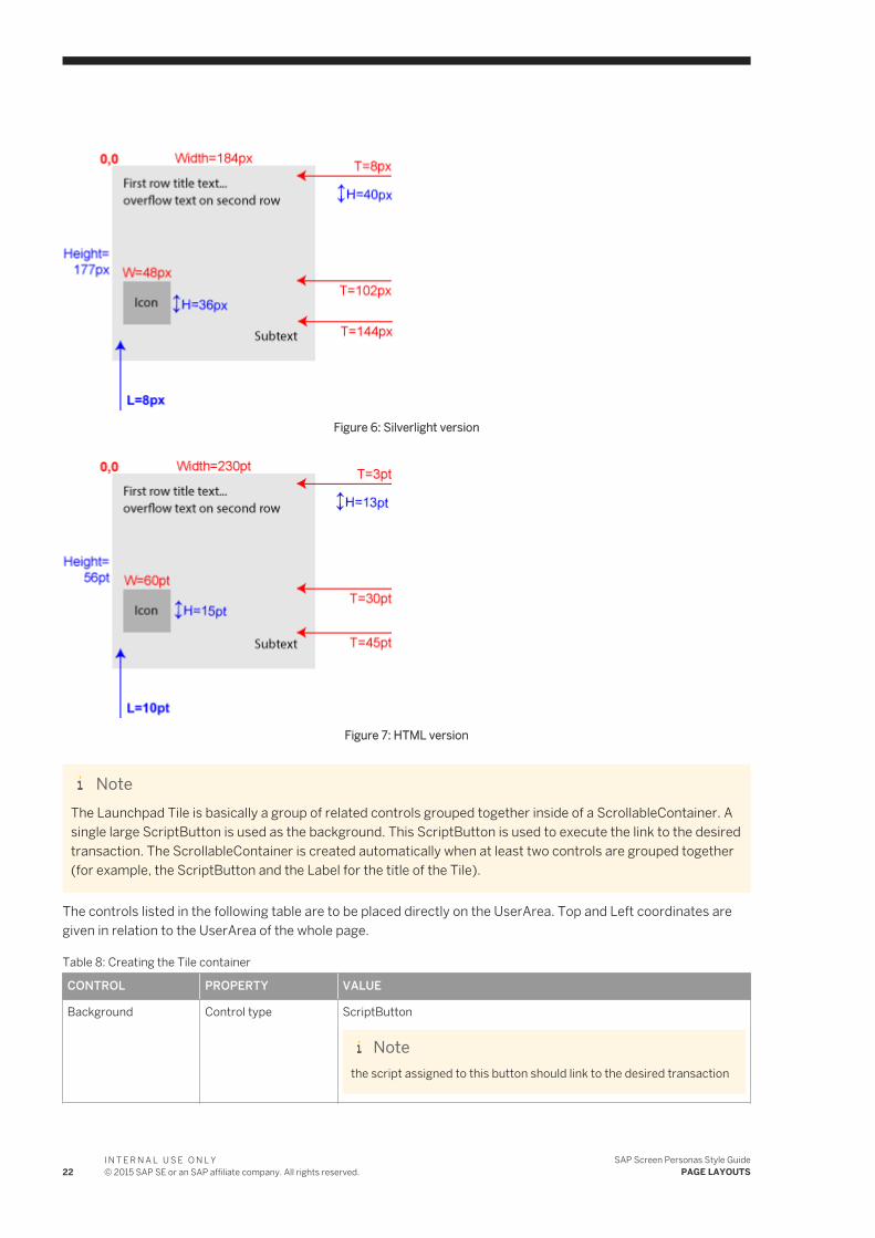
Figure 6: Silverlight version
Figure 7: HTML version
NoteThe Launchpad Tile is basically a group of related controls grouped together inside of a ScrollableContainer. A single large ScriptButton is used as the background. This ScriptButton is used to execute the link to the desired transaction. The ScrollableContainer is created automatically when at least two controls are grouped together (for example, the ScriptButton and the Label for the title of the Tile).
The controls listed in the following table are to be placed directly on the UserArea. Top and Left coordinates are given in relation to the UserArea of the whole page.
Table 8: Creating the Tile container
CONTROL PROPERTY VALUE
Background Control type ScriptButton
Notethe script assigned to this button should link to the desired transaction
22I N T E R N A L U S E O N L Y© 2015 SAP SE or an SAP affiliate company. All rights reserved.
SAP Screen Personas Style GuidePAGE LAYOUTS
CONTROL PROPERTY VALUE
Alignment (SL) Text only
Assign image (HTML) No icon
Label .
NoteIt's currently not possible to create a ScriptButton without text or icon, so you MUST add a period ( . ) as text for the button.
Top 0px (SL)
0pt (HTML)
Left 0px (SL)
0pt (HTML)
Width Silverlight version...
● 184px (default)● 376px
HTML version...
● 230pt (default)● 470pt
Height Silverlight version...
● 176px (default)● 360px
HTML version...
● 56pt (default)● 113pt
ForeColor (SL) transparent
NoteThis ensures that the mandatory text title of the button (centered in the tile) will not be visible to users.
Font color (HTML) No color
NoteThis ensures that the mandatory text title of the button (centered in the tile) will not be visible to users.
BackColor (SL) White
Fill color (HTML) White
SAP Screen Personas Style GuidePAGE LAYOUTS
I N T E R N A L U S E O N L Y© 2015 SAP SE or an SAP affiliate company. All rights reserved. 23
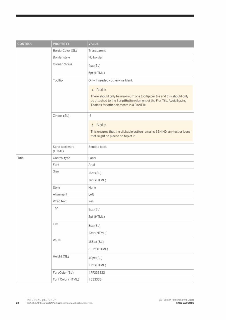
CONTROL PROPERTY VALUE
BorderColor (SL) Transparent
Border style No border
CornerRadius 4px (SL)
5pt (HTML)
Tooltip Only if needed - otherwise blank
NoteThere should only be maximum one tooltip per tile and this should only be attached to the ScriptButton element of the FioriTile. Avoid having Tooltips for other elements in a FioriTile.
ZIndex (SL) -5
NoteThis ensures that the clickable button remains BEHIND any text or icons that might be placed on top of it.
Send backward (HTML)
Send to back
Title Control type Label
Font Arial
Size 16pt (SL)
14pt (HTML)
Style None
Alignment Left
Wrap text Yes
Top 8px (SL)
3pt (HTML)
Left 8px (SL)
10pt (HTML)
Width 166px (SL)
210pt (HTML)
Height (SL) 40px (SL)
13pt (HTML)
ForeColor (SL) #FF333333
Font Color (HTML) #333333
24I N T E R N A L U S E O N L Y© 2015 SAP SE or an SAP affiliate company. All rights reserved.
SAP Screen Personas Style GuidePAGE LAYOUTS
CONTROL PROPERTY VALUE
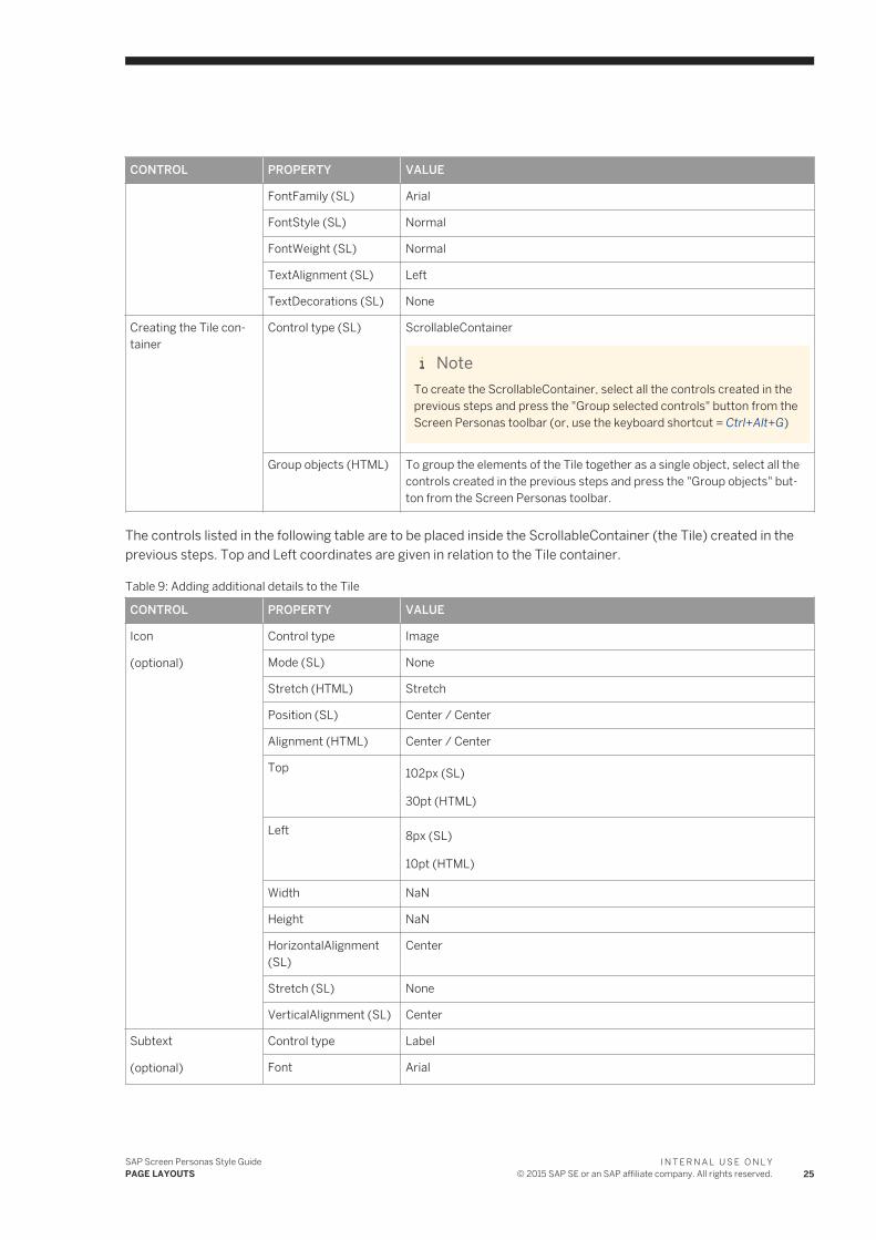
FontFamily (SL) Arial
FontStyle (SL) Normal
FontWeight (SL) Normal
TextAlignment (SL) Left
TextDecorations (SL) None
Creating the Tile container
Control type (SL) ScrollableContainer
NoteTo create the ScrollableContainer, select all the controls created in the previous steps and press the "Group selected controls" button from the Screen Personas toolbar (or, use the keyboard shortcut = Ctrl+Alt+G)
Group objects (HTML) To group the elements of the Tile together as a single object, select all the controls created in the previous steps and press the "Group objects" button from the Screen Personas toolbar.
The controls listed in the following table are to be placed inside the ScrollableContainer (the Tile) created in the previous steps. Top and Left coordinates are given in relation to the Tile container.
Table 9: Adding additional details to the Tile
CONTROL PROPERTY VALUE
Icon
(optional)
Control type Image
Mode (SL) None
Stretch (HTML) Stretch
Position (SL) Center / Center
Alignment (HTML) Center / Center
Top 102px (SL)
30pt (HTML)
Left 8px (SL)
10pt (HTML)
Width NaN
Height NaN
HorizontalAlignment (SL)
Center
Stretch (SL) None
VerticalAlignment (SL) Center
Subtext
(optional)
Control type Label
Font Arial
SAP Screen Personas Style GuidePAGE LAYOUTS
I N T E R N A L U S E O N L Y© 2015 SAP SE or an SAP affiliate company. All rights reserved. 25
CONTROL PROPERTY VALUE
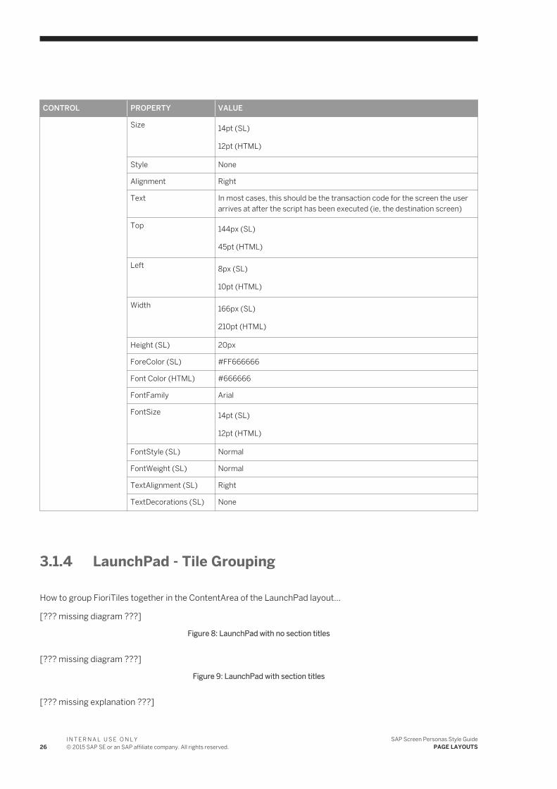
Size 14pt (SL)
12pt (HTML)
Style None
Alignment Right
Text In most cases, this should be the transaction code for the screen the user arrives at after the script has been executed (ie, the destination screen)
Top 144px (SL)
45pt (HTML)
Left 8px (SL)
10pt (HTML)
Width 166px (SL)
210pt (HTML)
Height (SL) 20px
ForeColor (SL) #FF666666
Font Color (HTML) #666666
FontFamily Arial
FontSize 14pt (SL)
12pt (HTML)
FontStyle (SL) Normal
FontWeight (SL) Normal
TextAlignment (SL) Right
TextDecorations (SL) None
3.1.4 LaunchPad - Tile Grouping
How to group FioriTiles together in the ContentArea of the LaunchPad layout...
[??? missing diagram ???]
Figure 8: LaunchPad with no section titles
[??? missing diagram ???]
Figure 9: LaunchPad with section titles
[??? missing explanation ???]
26I N T E R N A L U S E O N L Y© 2015 SAP SE or an SAP affiliate company. All rights reserved.
SAP Screen Personas Style GuidePAGE LAYOUTS
Note(SL) Maintain 8px gap between Tiles on all sides.
Note(HTML) Maintain 10pt gap between Tiles on all sides.
NoteIn order to avoid vertical scrolling on smaller display hardware, you should avoid having more than approximately 3 rows of tiles in LaunchPad. After the 3rd row of tiles, the users will need to scroll down to find the Menu button in the Footer element when using smaller displays.
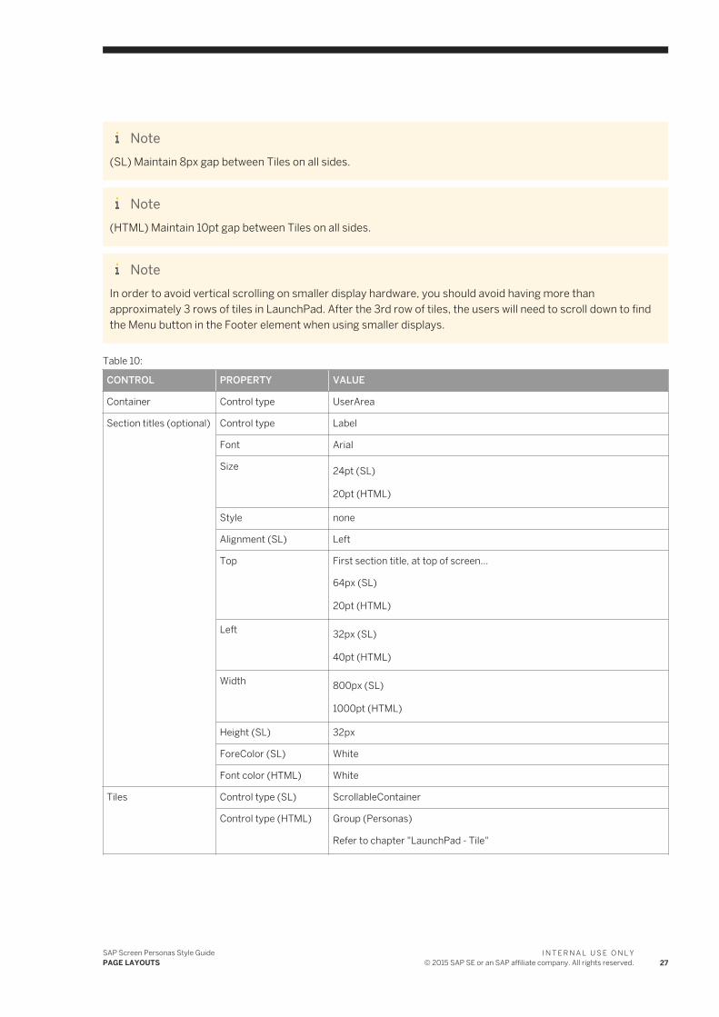
Table 10:
CONTROL PROPERTY VALUE
Container Control type UserArea
Section titles (optional) Control type Label
Font Arial
Size 24pt (SL)
20pt (HTML)
Style none
Alignment (SL) Left
Top First section title, at top of screen...
64px (SL)
20pt (HTML)
Left 32px (SL)
40pt (HTML)
Width 800px (SL)
1000pt (HTML)
Height (SL) 32px
ForeColor (SL) White
Font color (HTML) White
Tiles Control type (SL) ScrollableContainer
Control type (HTML) Group (Personas)
Refer to chapter "LaunchPad - Tile"
SAP Screen Personas Style GuidePAGE LAYOUTS
I N T E R N A L U S E O N L Y© 2015 SAP SE or an SAP affiliate company. All rights reserved. 27
CONTROL PROPERTY VALUE
Top
-No section titles
Silverlight version...
● 1st row: 80px● 2nd row: 264px● 3rd row: 448px● 4th row: 632px● 5th row: 816px
HTML version...
● 1st row: 25pt● 2nd row: 83pt● 3rd row: 140pt● 4th row: 198pt
Top
-After 1st section title
Silverlight version...
● 1st row: 96px● 2nd row: 280px● 3rd row: 464px● 4th row: 648px● 5th row: 832px
HTML version...
● 1st row: 30pt● 2nd row: 88pt● 3rd row: 145pt● 4th row: 203pt
Top
-After 2nd section title
Silverlight version...
● 2nd row: 320px● 3rd row: 504px● 4th row: 688px● 5th row: 872px
HTML version...
● 2nd row: 100pt● 3rd row: 158pt● 4th row: 215pt● 5th row: 273pt
Top
-After 3rd section title
Silverlight version...
● 3rd row: 544px● 4th row: 728px● 5th row: 912px
HTML version...
● 3rd row: 170pt● 4th row: 228pt● 5th row: 285pt
28I N T E R N A L U S E O N L Y© 2015 SAP SE or an SAP affiliate company. All rights reserved.
SAP Screen Personas Style GuidePAGE LAYOUTS
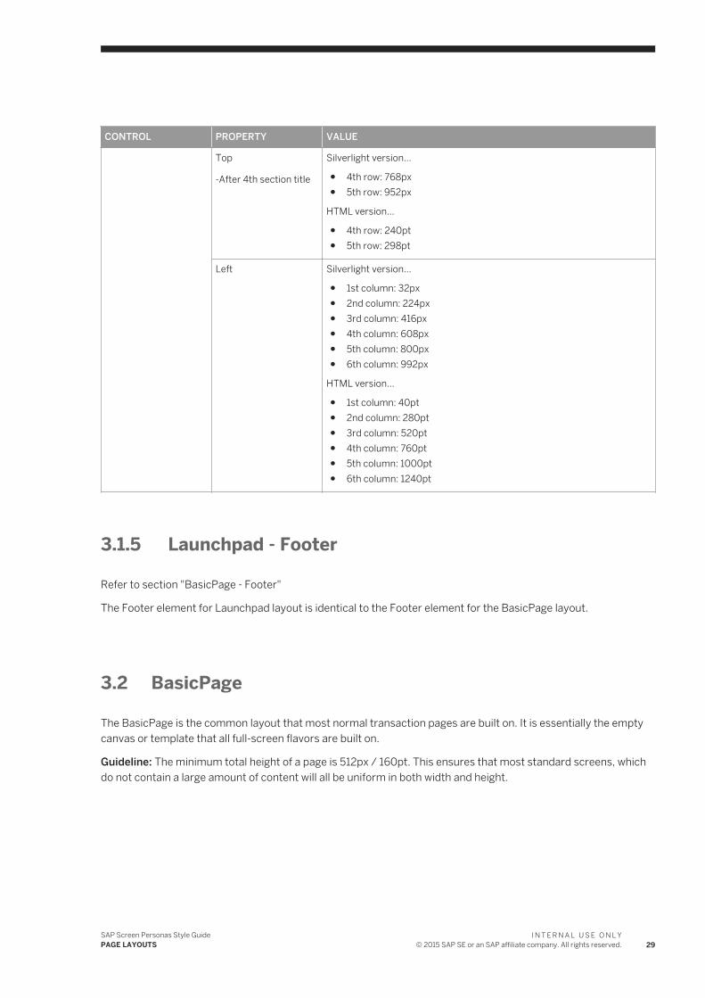
CONTROL PROPERTY VALUE
Top
-After 4th section title
Silverlight version...
● 4th row: 768px● 5th row: 952px
HTML version...
● 4th row: 240pt● 5th row: 298pt
Left Silverlight version...
● 1st column: 32px● 2nd column: 224px● 3rd column: 416px● 4th column: 608px● 5th column: 800px● 6th column: 992px
HTML version...
● 1st column: 40pt● 2nd column: 280pt● 3rd column: 520pt● 4th column: 760pt● 5th column: 1000pt● 6th column: 1240pt
3.1.5 Launchpad - Footer
Refer to section "BasicPage - Footer"
The Footer element for Launchpad layout is identical to the Footer element for the BasicPage layout.
3.2 BasicPage
The BasicPage is the common layout that most normal transaction pages are built on. It is essentially the empty canvas or template that all full-screen flavors are built on.
Guideline: The minimum total height of a page is 512px / 160pt. This ensures that most standard screens, which do not contain a large amount of content will all be uniform in both width and height.
SAP Screen Personas Style GuidePAGE LAYOUTS
I N T E R N A L U S E O N L Y© 2015 SAP SE or an SAP affiliate company. All rights reserved. 29
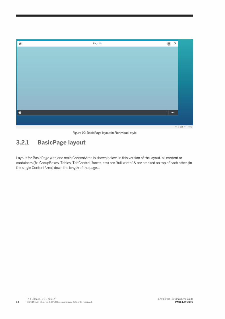
Figure 10: BasicPage layout in Fiori visual style
3.2.1 BasicPage layout
Layout for BasicPage with one main ContentArea is shown below. In this version of the layout, all content or containers (fx, GroupBoxes, Tables, TabControl, forms, etc) are "full-width" & are stacked on top of each other (in the single ContentArea) down the length of the page...
30I N T E R N A L U S E O N L Y© 2015 SAP SE or an SAP affiliate company. All rights reserved.
SAP Screen Personas Style GuidePAGE LAYOUTS
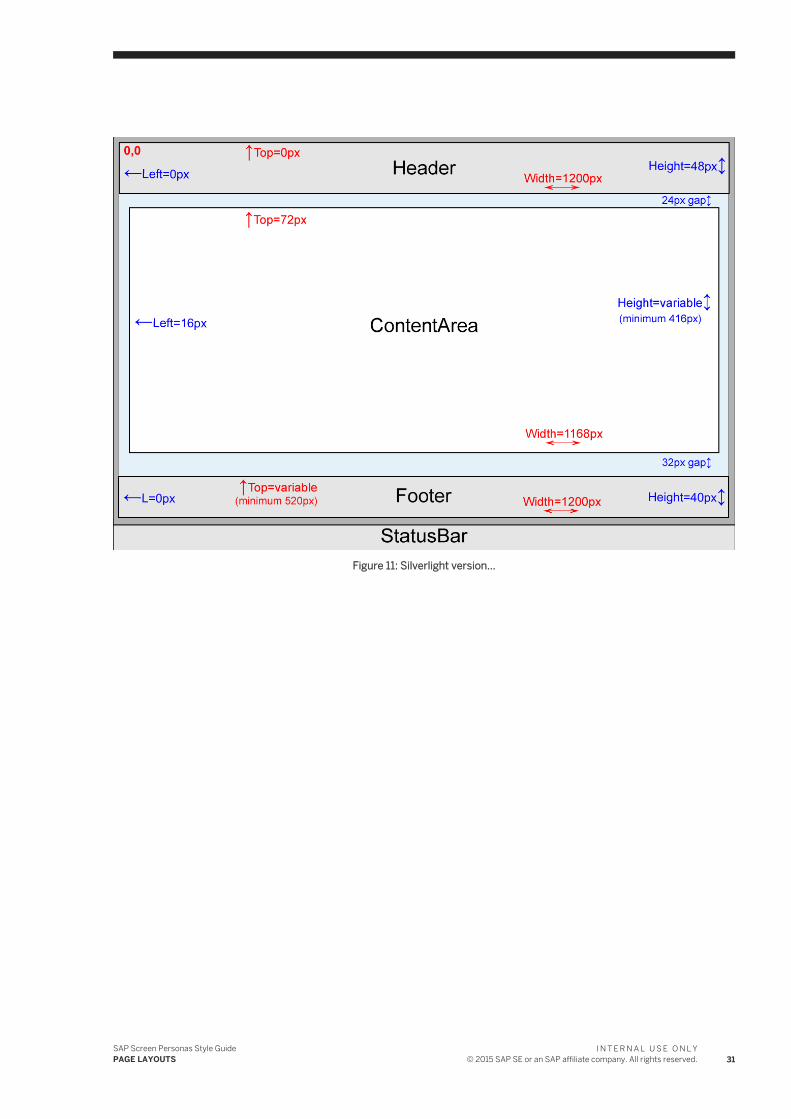
Figure 11: Silverlight version...
SAP Screen Personas Style GuidePAGE LAYOUTS
I N T E R N A L U S E O N L Y© 2015 SAP SE or an SAP affiliate company. All rights reserved. 31
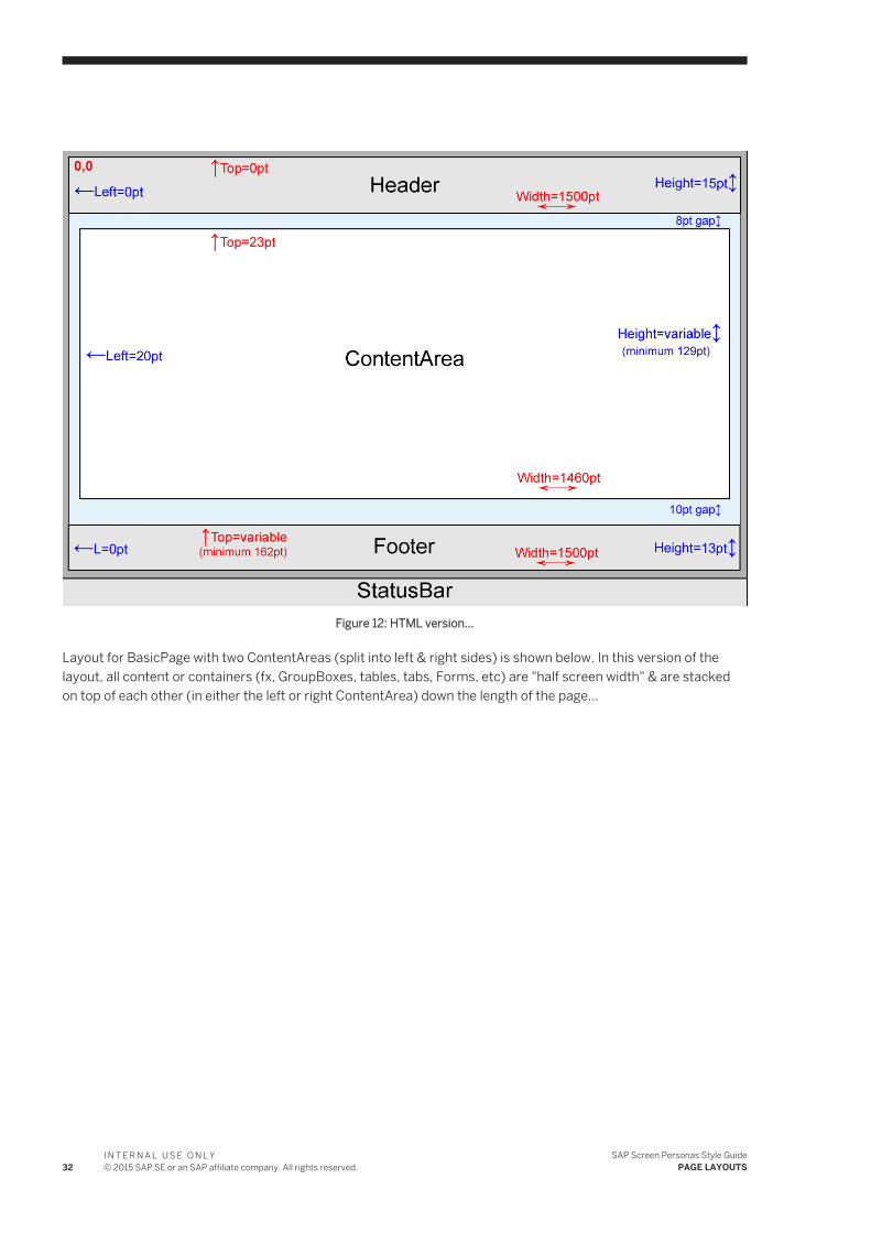
Figure 12: HTML version...
Layout for BasicPage with two ContentAreas (split into left & right sides) is shown below. In this version of the layout, all content or containers (fx, GroupBoxes, tables, tabs, Forms, etc) are "half screen width" & are stacked on top of each other (in either the left or right ContentArea) down the length of the page...
32I N T E R N A L U S E O N L Y© 2015 SAP SE or an SAP affiliate company. All rights reserved.
SAP Screen Personas Style GuidePAGE LAYOUTS
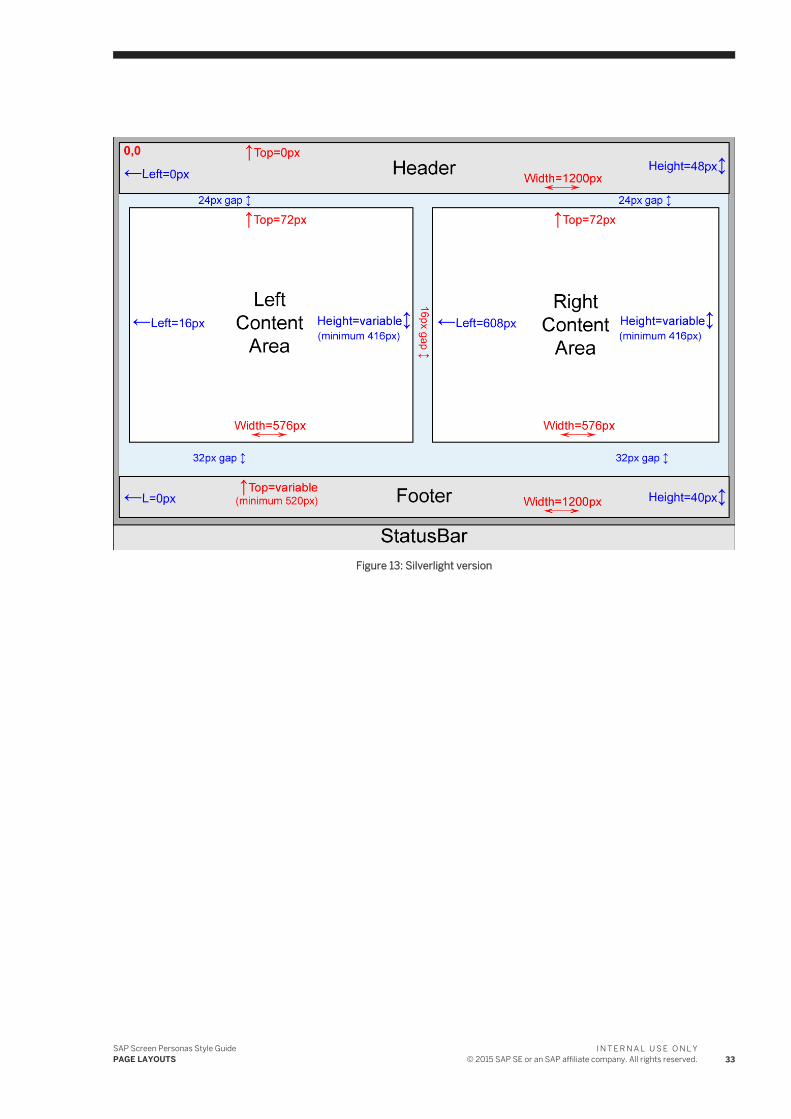
Figure 13: Silverlight version
SAP Screen Personas Style GuidePAGE LAYOUTS
I N T E R N A L U S E O N L Y© 2015 SAP SE or an SAP affiliate company. All rights reserved. 33
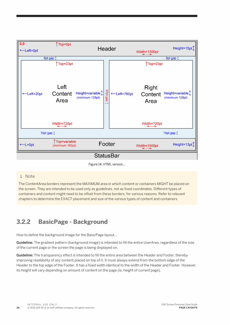
Figure 14: HTML version...
NoteThe ContentArea borders represent the MAXIMUM area in which content or containers MIGHT be placed on the screen. They are intended to be used only as guidelines, not as fixed coordinates. Different types of containers and content might need to be offset from these borders, for various reasons. Refer to relevant chapters to determine the EXACT placement and size of the various types of content and containers.
3.2.2 BasicPage - Background
How to define the background image for the BasicPage layout...
Guideline: The gradient pattern (background image) is intended to fill the entire UserArea, regardless of the size of the current page or the screen the page is being displayed on.
Guideline: The transparency effect is intended to fill the entire area between the Header and Footer, thereby improving readability of any content placed on top of it. It must always extend from the bottom edge of the Header to the top edge of the Footer. It has a fixed width identical to the width of the Header and Footer. However, its height will vary depending on amount of content on the page (ie, height of current page).
34I N T E R N A L U S E O N L Y© 2015 SAP SE or an SAP affiliate company. All rights reserved.
SAP Screen Personas Style GuidePAGE LAYOUTS
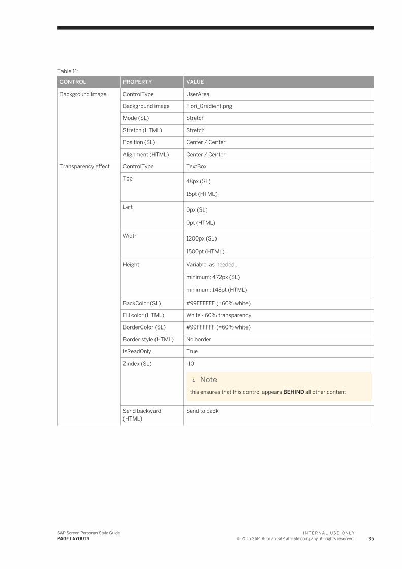
Table 11:
CONTROL PROPERTY VALUE
Background image ControlType UserArea
Background image Fiori_Gradient.png
Mode (SL) Stretch
Stretch (HTML) Stretch
Position (SL) Center / Center
Alignment (HTML) Center / Center
Transparency effect ControlType TextBox
Top 48px (SL)
15pt (HTML)
Left 0px (SL)
0pt (HTML)
Width 1200px (SL)
1500pt (HTML)
Height Variable, as needed...
minimum: 472px (SL)
minimum: 148pt (HTML)
BackColor (SL) #99FFFFFF (=60% white)
Fill color (HTML) White - 60% transparency
BorderColor (SL) #99FFFFFF (=60% white)
Border style (HTML) No border
IsReadOnly True
Zindex (SL) -10
Notethis ensures that this control appears BEHIND all other content
Send backward (HTML)
Send to back
SAP Screen Personas Style GuidePAGE LAYOUTS
I N T E R N A L U S E O N L Y© 2015 SAP SE or an SAP affiliate company. All rights reserved. 35
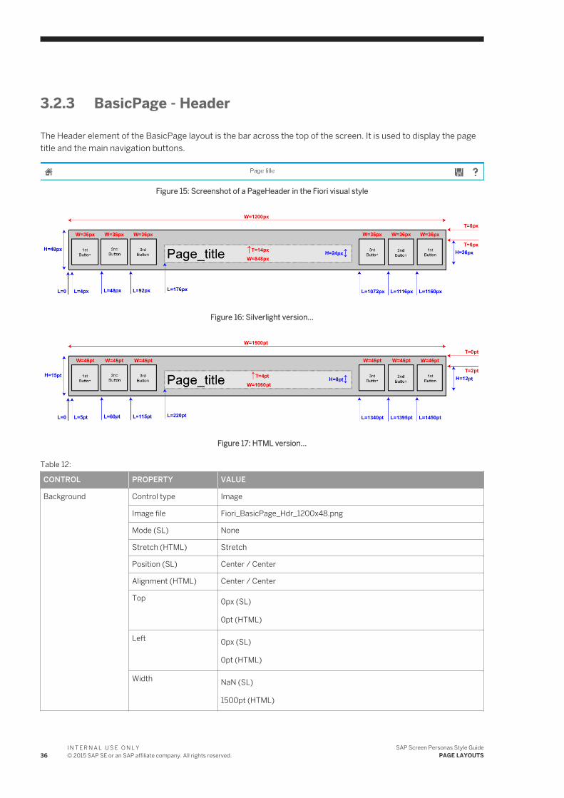
3.2.3 BasicPage - Header
The Header element of the BasicPage layout is the bar across the top of the screen. It is used to display the page title and the main navigation buttons.
Figure 15: Screenshot of a PageHeader in the Fiori visual style
Figure 16: Silverlight version...
Figure 17: HTML version...
Table 12:
CONTROL PROPERTY VALUE
Background Control type Image
Image file Fiori_BasicPage_Hdr_1200x48.png
Mode (SL) None
Stretch (HTML) Stretch
Position (SL) Center / Center
Alignment (HTML) Center / Center
Top 0px (SL)
0pt (HTML)
Left 0px (SL)
0pt (HTML)
Width NaN (SL)
1500pt (HTML)
36I N T E R N A L U S E O N L Y© 2015 SAP SE or an SAP affiliate company. All rights reserved.
SAP Screen Personas Style GuidePAGE LAYOUTS
CONTROL PROPERTY VALUE
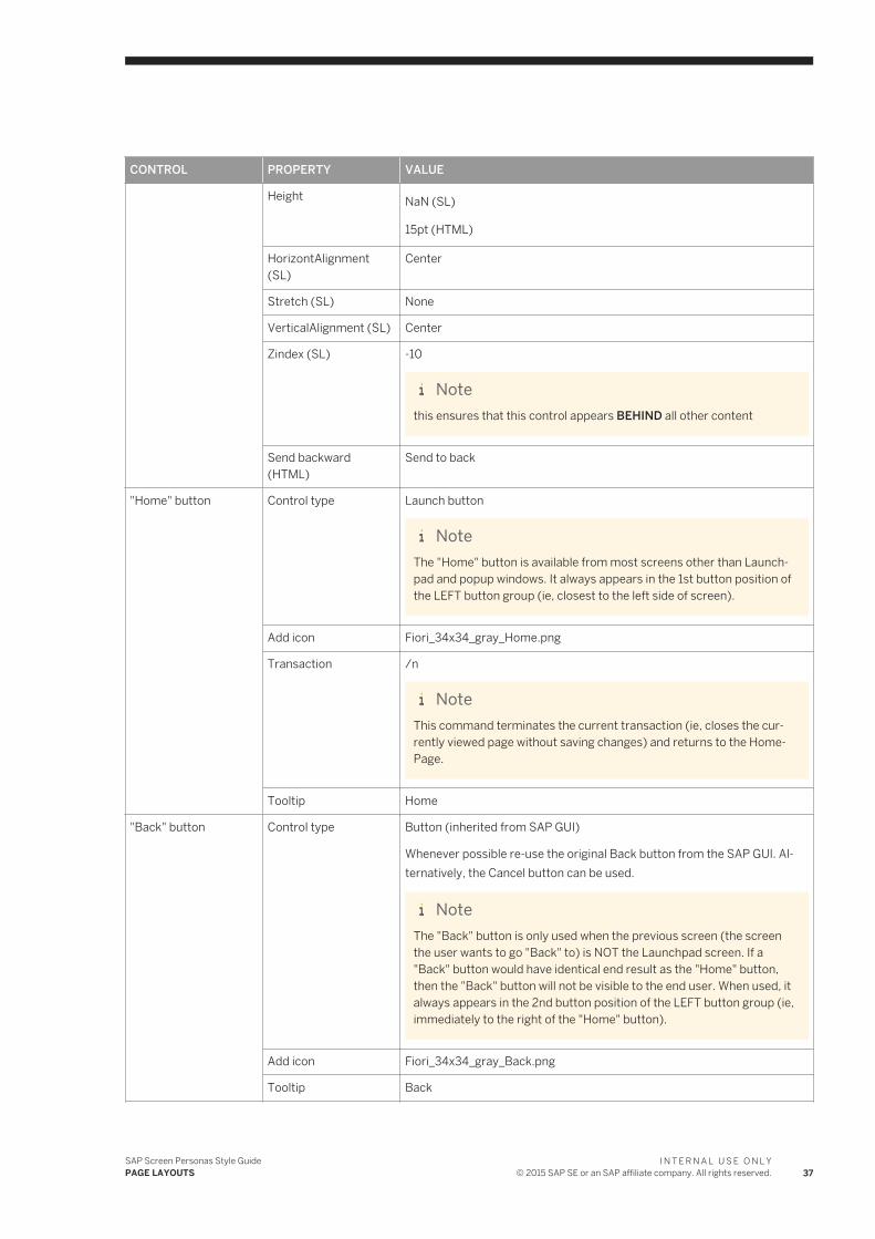
Height NaN (SL)
15pt (HTML)
HorizontAlignment (SL)
Center
Stretch (SL) None
VerticalAlignment (SL) Center
Zindex (SL) -10
Notethis ensures that this control appears BEHIND all other content
Send backward (HTML)
Send to back
"Home" button Control type Launch button
NoteThe "Home" button is available from most screens other than Launchpad and popup windows. It always appears in the 1st button position of the LEFT button group (ie, closest to the left side of screen).
Add icon Fiori_34x34_gray_Home.png
Transaction /n
NoteThis command terminates the current transaction (ie, closes the currently viewed page without saving changes) and returns to the HomePage.
Tooltip Home
"Back" button Control type Button (inherited from SAP GUI)
Whenever possible re-use the original Back button from the SAP GUI. Alternatively, the Cancel button can be used.
NoteThe "Back" button is only used when the previous screen (the screen the user wants to go "Back" to) is NOT the Launchpad screen. If a "Back" button would have identical end result as the "Home" button, then the "Back" button will not be visible to the end user. When used, it always appears in the 2nd button position of the LEFT button group (ie, immediately to the right of the "Home" button).
Add icon Fiori_34x34_gray_Back.png
Tooltip Back
SAP Screen Personas Style GuidePAGE LAYOUTS
I N T E R N A L U S E O N L Y© 2015 SAP SE or an SAP affiliate company. All rights reserved. 37
CONTROL PROPERTY VALUE
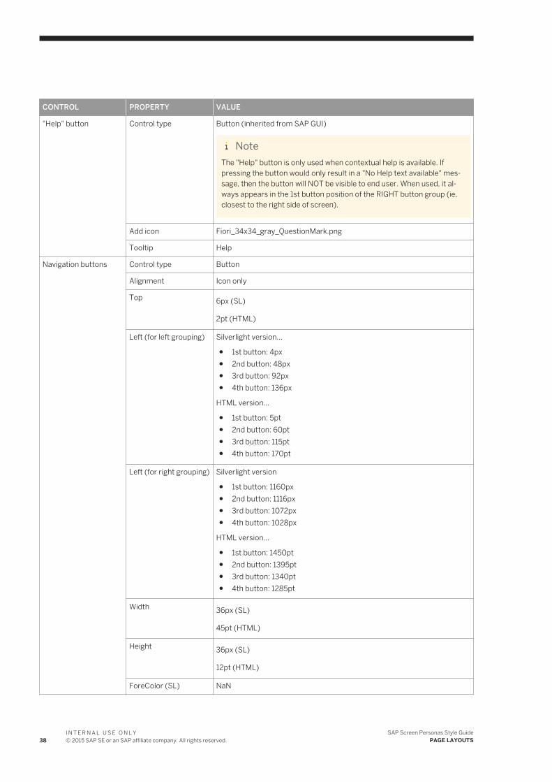
"Help" button Control type Button (inherited from SAP GUI)
NoteThe "Help" button is only used when contextual help is available. If pressing the button would only result in a "No Help text available" message, then the button will NOT be visible to end user. When used, it always appears in the 1st button position of the RIGHT button group (ie, closest to the right side of screen).
Add icon Fiori_34x34_gray_QuestionMark.png
Tooltip Help
Navigation buttons Control type Button
Alignment Icon only
Top 6px (SL)
2pt (HTML)
Left (for left grouping) Silverlight version...
● 1st button: 4px● 2nd button: 48px● 3rd button: 92px● 4th button: 136px
HTML version...
● 1st button: 5pt● 2nd button: 60pt● 3rd button: 115pt● 4th button: 170pt
Left (for right grouping) Silverlight version
● 1st button: 1160px● 2nd button: 1116px● 3rd button: 1072px● 4th button: 1028px
HTML version...
● 1st button: 1450pt● 2nd button: 1395pt● 3rd button: 1340pt● 4th button: 1285pt
Width 36px (SL)
45pt (HTML)
Height 36px (SL)
12pt (HTML)
ForeColor (SL) NaN
38I N T E R N A L U S E O N L Y© 2015 SAP SE or an SAP affiliate company. All rights reserved.
SAP Screen Personas Style GuidePAGE LAYOUTS
CONTROL PROPERTY VALUE
Font color (HTML) No color
BackColor (SL) Transparent
Fill color (HTML) No color
BorderColor (SL) Transparent
Border style (HTML) No border
Dividers Control type Image
Image file Fiori_Divider_Header_8x48.png
Mode (SL) none
Stretch (HTML) Stretch
Position (SL) Center / Center
Alignment (HTML) Center / Center
Top 0px (SL)
0pt (HTML)
Left (left grouping) Silverlight version...
1. 40px2. 88px3. 128px
HTML version...
1. 50pt2. 105pt3. 160pt
Left (right grouping) Silverlight version
1. 1152px2. 1108px3. 1064px
HTML version...
1. 1440pt2. 1385pt3. 1330pt
Width NaN (SL)
10pt (HTML)
Height NaN (SL)
15pt (HTML)
Stretch (SL) None
HorizontAlignment (SL)
Center
SAP Screen Personas Style GuidePAGE LAYOUTS
I N T E R N A L U S E O N L Y© 2015 SAP SE or an SAP affiliate company. All rights reserved. 39
CONTROL PROPERTY VALUE
VerticalAlignment (SL) Center
Page title Control type Label
Font Arial
Size 16pt
Style Normal
Alignment Center
Text ● Default: "Page title"● On page launch: copy the SAP GUI page title from ses[0]/wnd[0]/title
Left 176px (SL)
220pt (HTML)
Top 14px (SL)
4pt (HTML)
Width 848px (SL)
1060pt (HTML)
Height (SL) 24px
ForeColor (SL) #FF666666
Font color (HTML) #666666
FontSize (SL) 16pt
FontWeight (SL) Normal
TextAlignment (SL) Center
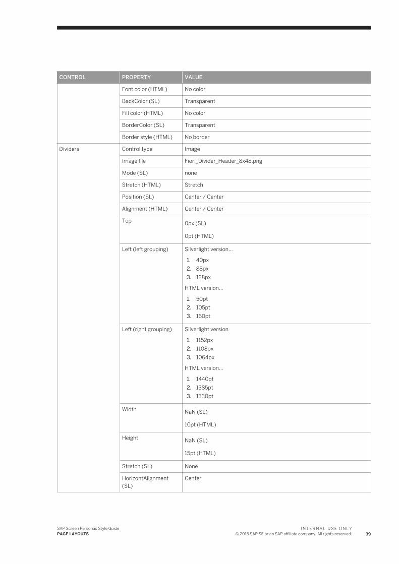
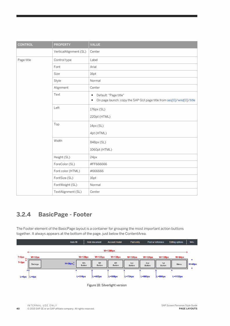
3.2.4 BasicPage - Footer
The Footer element of the BasicPage layout is a container for grouping the most important action buttons together. It always appears at the bottom of the page, just below the ContentArea.
Figure 18: Silverlight version
40I N T E R N A L U S E O N L Y© 2015 SAP SE or an SAP affiliate company. All rights reserved.
SAP Screen Personas Style GuidePAGE LAYOUTS
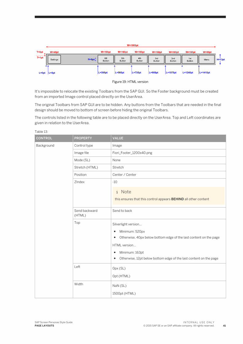
Figure 19: HTML version
It's impossible to relocate the existing Toolbars from the SAP GUI. So the Footer background must be created from an imported Image control placed directly on the UserArea.
The original Toolbars from SAP GUI are to be hidden. Any buttons from the Toolbars that are needed in the final design should be moved to bottom of screen before hiding the original Toolbars.
The controls listed in the following table are to be placed directly on the UserArea. Top and Left coordinates are given in relation to the UserArea.
Table 13:
CONTROL PROPERTY VALUE
Background Control type Image
Image file Fiori_Footer_1200x40.png
Mode (SL) None
Stretch (HTML) Stretch
Position Center / Center
ZIndex -10
Notethis ensures that this control appears BEHIND all other content
Send backward (HTML)
Send to back
Top Silverlight version...
● Minimum: 520px● Otherwise, 40px below bottom edge of the last content on the page
HTML version...
● Minimum: 163pt● Otherwise, 12pt below bottom edge of the last content on the page
Left 0px (SL)
0pt (HTML)
Width NaN (SL)
1500pt (HTML)
SAP Screen Personas Style GuidePAGE LAYOUTS
I N T E R N A L U S E O N L Y© 2015 SAP SE or an SAP affiliate company. All rights reserved. 41
CONTROL PROPERTY VALUE
Height NaN (SL)
13pt (HTML)
VerticalAlignment Center
HorizontAlignment Center
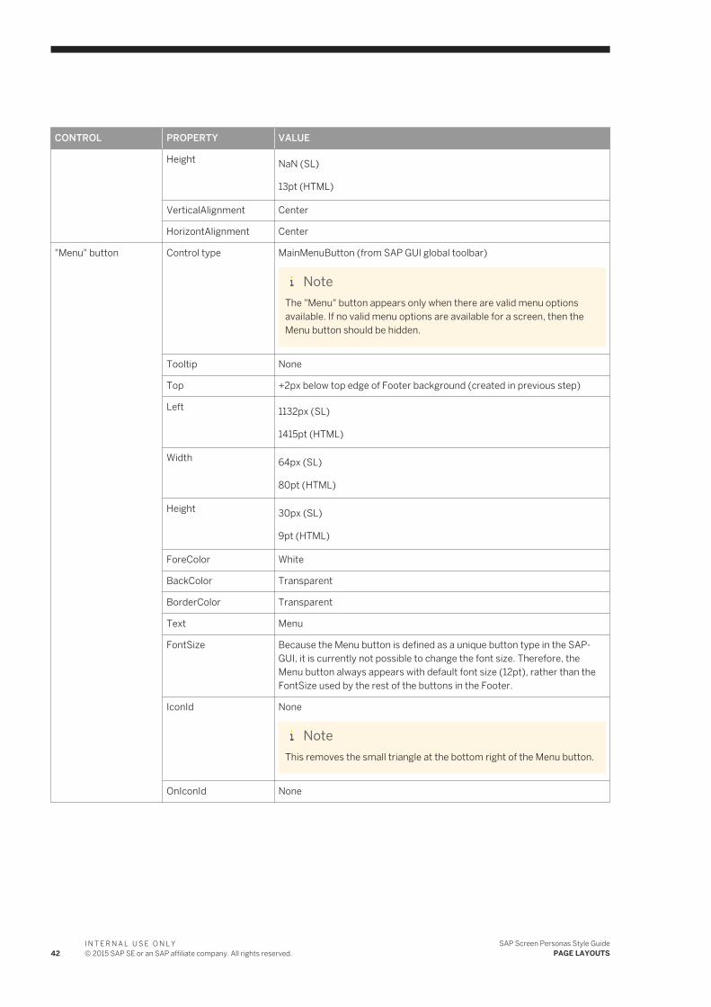
"Menu" button Control type MainMenuButton (from SAP GUI global toolbar)
NoteThe "Menu" button appears only when there are valid menu options available. If no valid menu options are available for a screen, then the Menu button should be hidden.
Tooltip None
Top +2px below top edge of Footer background (created in previous step)
Left 1132px (SL)
1415pt (HTML)
Width 64px (SL)
80pt (HTML)
Height 30px (SL)
9pt (HTML)
ForeColor White
BackColor Transparent
BorderColor Transparent
Text Menu
FontSize Because the Menu button is defined as a unique button type in the SAPGUI, it is currently not possible to change the font size. Therefore, the Menu button always appears with default font size (12pt), rather than the FontSize used by the rest of the buttons in the Footer.
IconId None
NoteThis removes the small triangle at the bottom right of the Menu button.
OnIconId None
42I N T E R N A L U S E O N L Y© 2015 SAP SE or an SAP affiliate company. All rights reserved.
SAP Screen Personas Style GuidePAGE LAYOUTS
CONTROL PROPERTY VALUE
Action buttons Control type Buttons (inherited from SAP GUI), ScriptButtons and LaunchButtons
NoteThe action buttons for the Footer bar should ONLY perform functions that apply to the whole screen. If any action applies to content of just one container on the screen (for example, a table), or only applies to one item out of many shown on the screen, then the button should be placed in the ContentArea (close to the content it affects), rather than in the Footer bar.
"Settings" button Control type Button (inherited from SAP GUI)
NoteThe "Settings" button appears only when there are useful settings available for the current transaction. If no useful settings are available, then the Settings button should be hidden. Whenever possible, re-use the appropriate button (for example, "Settings" or "Services for object") from the previously existing SAP GUI screen.
Tooltip Settings
Top +2px below top edge of Footer background (created in previous step)
Left 4px (SL)
5pt (HTML)
Creating the Footer container
Control type ScrollableContainer
NoteTo create the ScrollableContainer, select all of the controls that were just created and then press the "Group selected controls" button in the Screen Personas toolbar (or, use the keyboard shortcut = Ctrl+Alt+G)
The controls listed in the following table are to be placed inside the ScrollableContainer which was created in the previous steps. Top and Left coordinates are given in relation to the ScrollableContainer.
Table 14:
CONTROL PROPERTY VALUE
Action buttons Control type Button
Alignment Text only
Text a descriptive label for the button, preferrably with verb-noun format (maximum 14 letters long)
Top 2px (SL)
1pt (HTML)
SAP Screen Personas Style GuidePAGE LAYOUTS
I N T E R N A L U S E O N L Y© 2015 SAP SE or an SAP affiliate company. All rights reserved. 43
CONTROL PROPERTY VALUE
Left Additional buttons are added as needed, starting from the right...
Silverlight version:
● 1st = 996px● 2nd = 860px● 3rd = 732px● 4th = 604px● 5th = 476px● 6th = 348px● 7th = 220px
HTML version:
● 1st = 1245pt● 2nd = 1075pt● 3rd = 915pt● 4th = 755pt● 5th = 595pt● 6th = 435pt● 7th = 275pt
Width 128px (SL)
160pt (HTML)
Height 30px (SL)
9pt (HTML)
ForeColor White
BackColor Transparent
BorderColor Transparent
IconId (SL) none (text only)
FontSize 14pt
Dividers Control type Image
Image file Fiori_Divider_Footer_8x40.png
Mode (SL) None
Stretch (HTML) Stretch
Position (SL) Center / Center
Alignment (HTML) Center / Center
ZIndex (SL) 100
Notethis ensures that this control appears IN FRONT OF all other content
Bring forward (HTML) Bring to front
44I N T E R N A L U S E O N L Y© 2015 SAP SE or an SAP affiliate company. All rights reserved.
SAP Screen Personas Style GuidePAGE LAYOUTS
CONTROL PROPERTY VALUE
Top 0px (SL)
0pt (HTML)
Left Dividers are added as needed, between buttons or groups of buttons...
Silverlight version:
● 1st = 988px● 2nd = 852px● 3rd = 716px● 4th = 580px● 5th = 444px● 6th = 308px● 7th = 172px
HTML version:
● 1st = 1235pt● 2nd = 1065pt● 3rd = 895pt● 4th = 725pt● 5th = 555pt● 6th = 385pt● 7th = 215pt
Width NaN (SL)
10pt (HTML)
Height NaN (SL)
13 pt (HTML)
VerticalAlignment (SL) Center
HorizontAlignment (SL)
Center
3.3 PopupPage
A PopupPage (or ModalWindow) is a page that does not fill the entire UserArea and opens directly on top of an already existing page. The previous page becomes dimmed in the pabkground, while the new page (the "pop up") appears to float above it.
In technical terms, a PopupPage is a ModalWindow control from the SAP GUI. It is currently impossible to create a new ModalWindow control in SAP Screen Personas. But, it is fully supported to edit already existing ModalWindows from the original SAP GUI.
It is impossible to directly assign the size or placement of a ModalWindow on the UserArea. The window is always centered inside the current UserArea borders and its height & width adjust automatically to fit the content. So,
SAP Screen Personas Style GuidePAGE LAYOUTS
I N T E R N A L U S E O N L Y© 2015 SAP SE or an SAP affiliate company. All rights reserved. 45
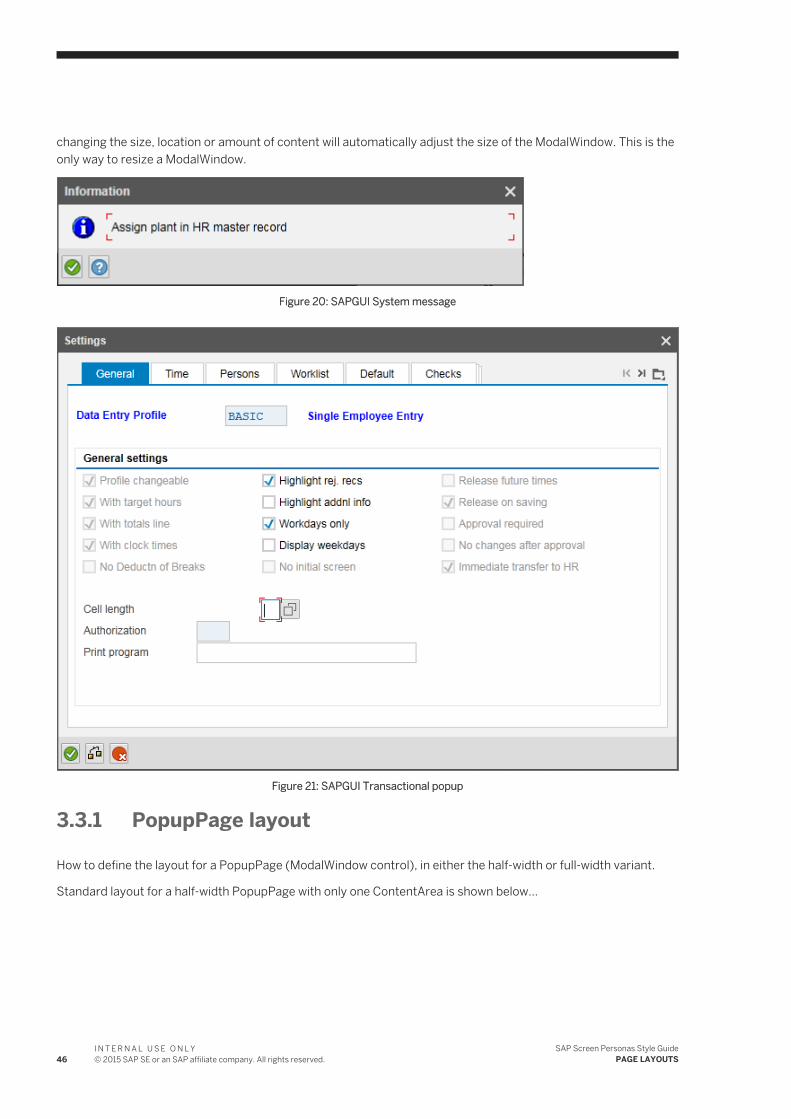
changing the size, location or amount of content will automatically adjust the size of the ModalWindow. This is the only way to resize a ModalWindow.
Figure 20: SAPGUI System message
Figure 21: SAPGUI Transactional popup
3.3.1 PopupPage layout
How to define the layout for a PopupPage (ModalWindow control), in either the half-width or full-width variant.
Standard layout for a half-width PopupPage with only one ContentArea is shown below...
46I N T E R N A L U S E O N L Y© 2015 SAP SE or an SAP affiliate company. All rights reserved.
SAP Screen Personas Style GuidePAGE LAYOUTS
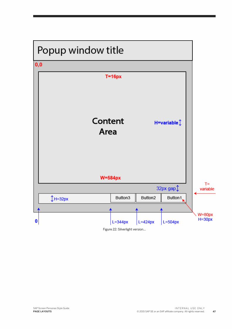
Figure 22: Silverlight version...
SAP Screen Personas Style GuidePAGE LAYOUTS
I N T E R N A L U S E O N L Y© 2015 SAP SE or an SAP affiliate company. All rights reserved. 47
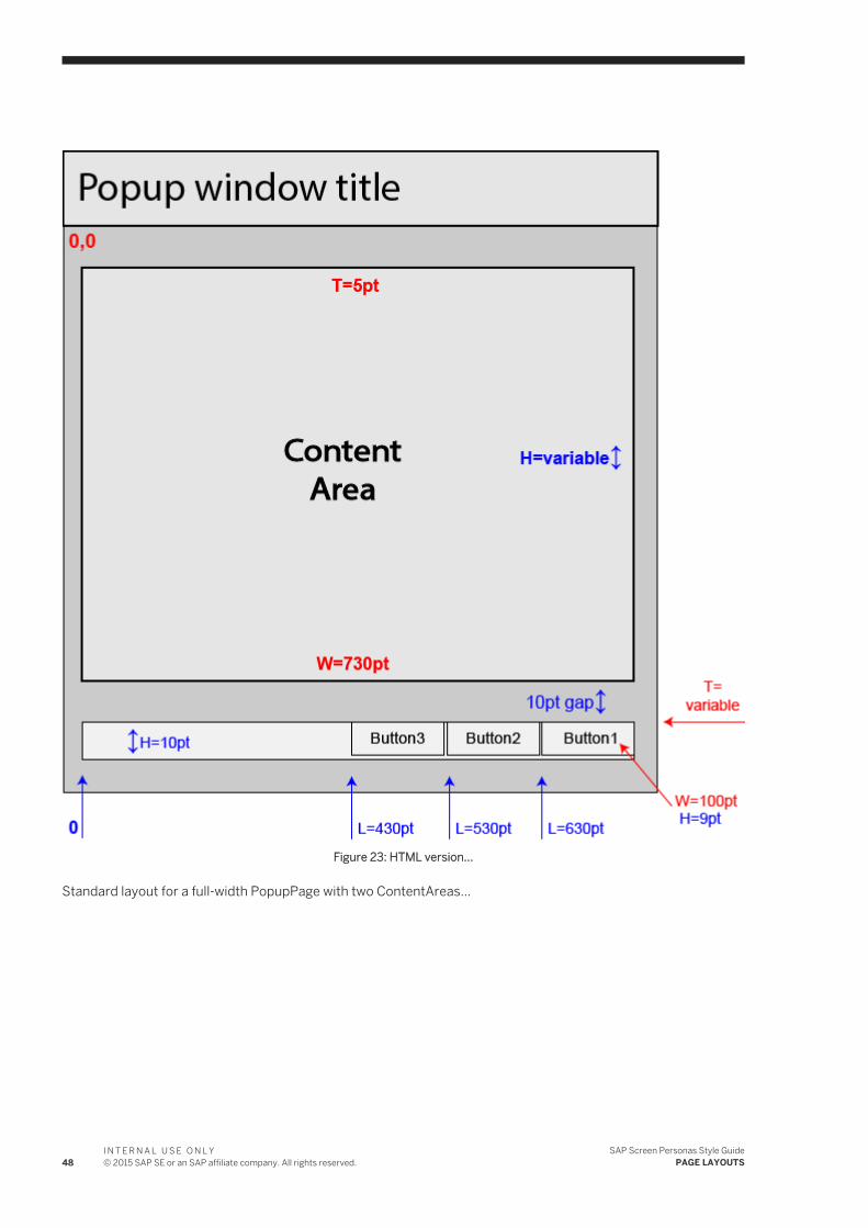
Figure 23: HTML version...
Standard layout for a full-width PopupPage with two ContentAreas...
48I N T E R N A L U S E O N L Y© 2015 SAP SE or an SAP affiliate company. All rights reserved.
SAP Screen Personas Style GuidePAGE LAYOUTS
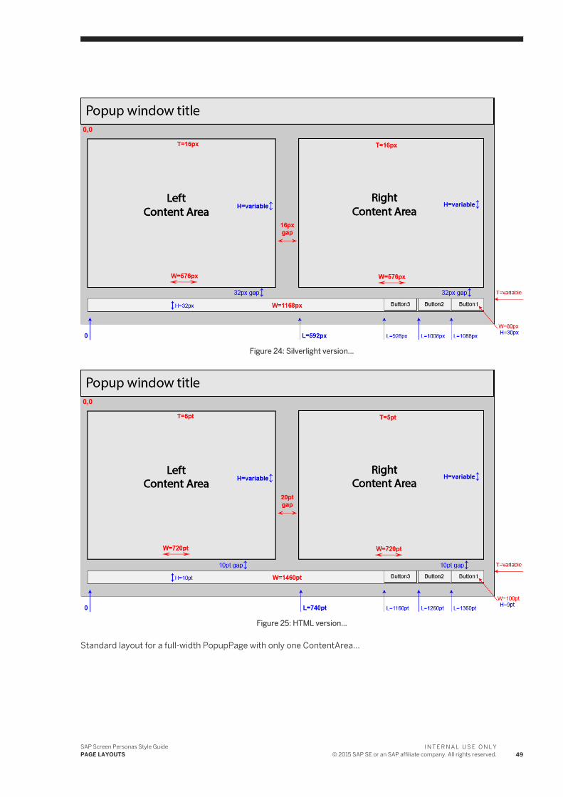
Figure 24: Silverlight version...
Figure 25: HTML version...
Standard layout for a full-width PopupPage with only one ContentArea...
SAP Screen Personas Style GuidePAGE LAYOUTS
I N T E R N A L U S E O N L Y© 2015 SAP SE or an SAP affiliate company. All rights reserved. 49
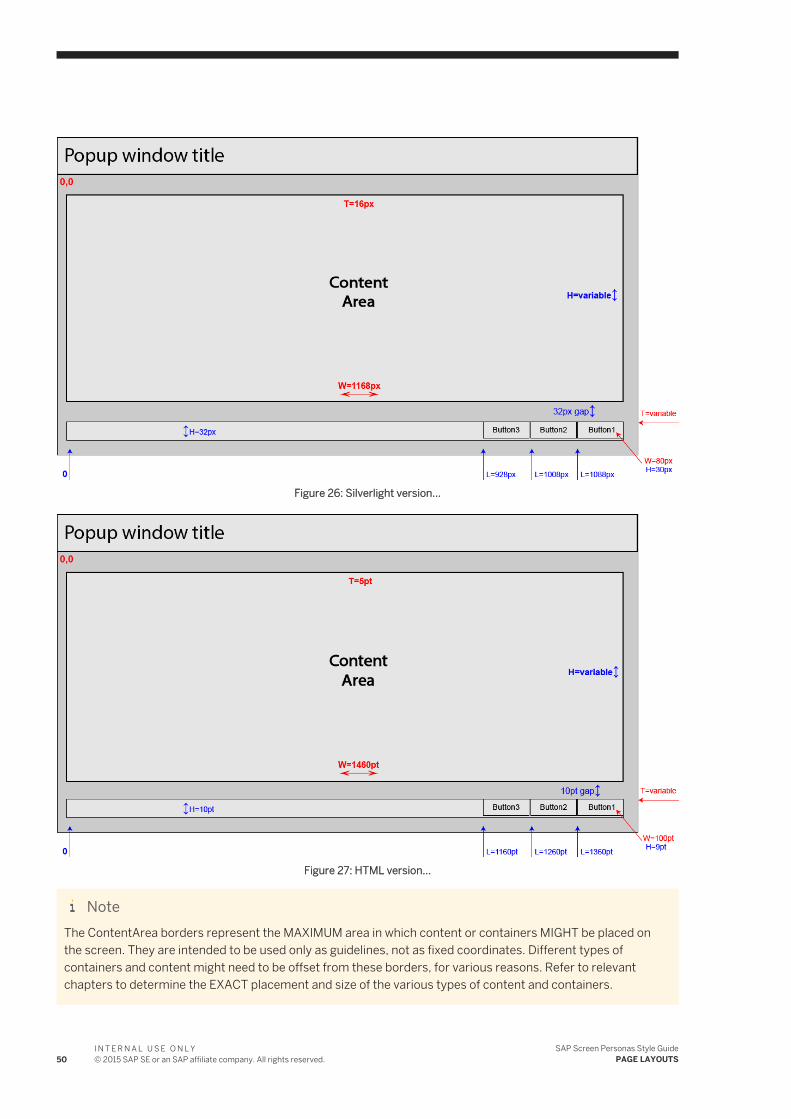
Figure 26: Silverlight version...
Figure 27: HTML version...
NoteThe ContentArea borders represent the MAXIMUM area in which content or containers MIGHT be placed on the screen. They are intended to be used only as guidelines, not as fixed coordinates. Different types of containers and content might need to be offset from these borders, for various reasons. Refer to relevant chapters to determine the EXACT placement and size of the various types of content and containers.
50I N T E R N A L U S E O N L Y© 2015 SAP SE or an SAP affiliate company. All rights reserved.
SAP Screen Personas Style GuidePAGE LAYOUTS
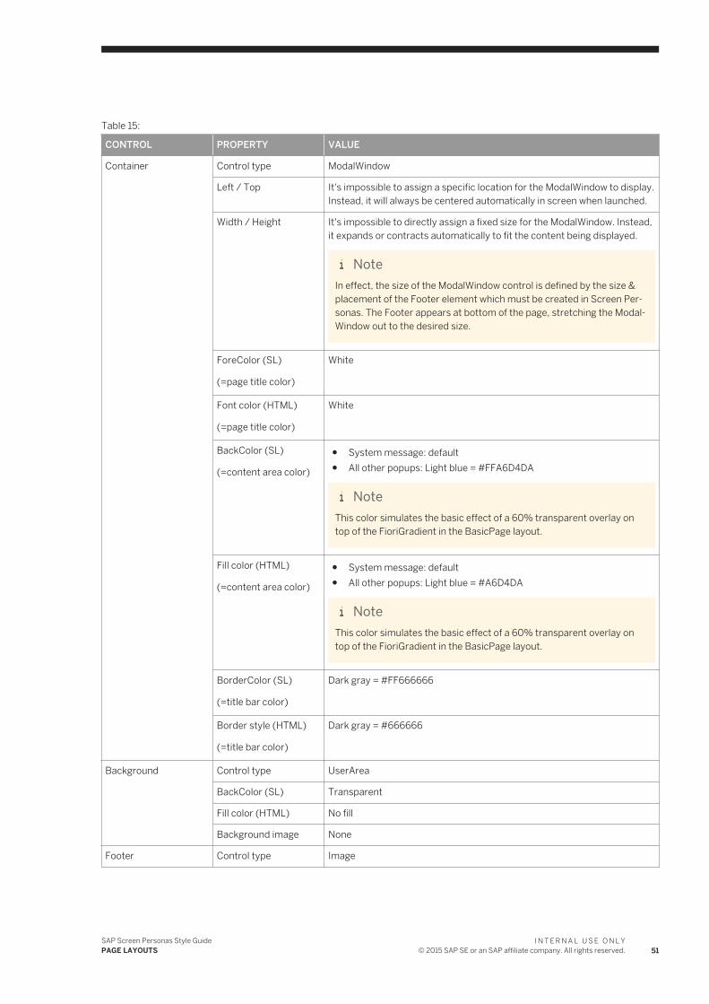
Table 15:
CONTROL PROPERTY VALUE
Container Control type ModalWindow
Left / Top It's impossible to assign a specific location for the ModalWindow to display. Instead, it will always be centered automatically in screen when launched.
Width / Height It's impossible to directly assign a fixed size for the ModalWindow. Instead, it expands or contracts automatically to fit the content being displayed.
NoteIn effect, the size of the ModalWindow control is defined by the size & placement of the Footer element which must be created in Screen Personas. The Footer appears at bottom of the page, stretching the ModalWindow out to the desired size.
ForeColor (SL)
(=page title color)
White
Font color (HTML)
(=page title color)
White
BackColor (SL)
(=content area color)
● System message: default● All other popups: Light blue = #FFA6D4DA
NoteThis color simulates the basic effect of a 60% transparent overlay on top of the FioriGradient in the BasicPage layout.
Fill color (HTML)
(=content area color)
● System message: default● All other popups: Light blue = #A6D4DA
NoteThis color simulates the basic effect of a 60% transparent overlay on top of the FioriGradient in the BasicPage layout.
BorderColor (SL)
(=title bar color)
Dark gray = #FF666666
Border style (HTML)
(=title bar color)
Dark gray = #666666
Background Control type UserArea
BackColor (SL) Transparent
Fill color (HTML) No fill
Background image None
Footer Control type Image
SAP Screen Personas Style GuidePAGE LAYOUTS
I N T E R N A L U S E O N L Y© 2015 SAP SE or an SAP affiliate company. All rights reserved. 51
CONTROL PROPERTY VALUE
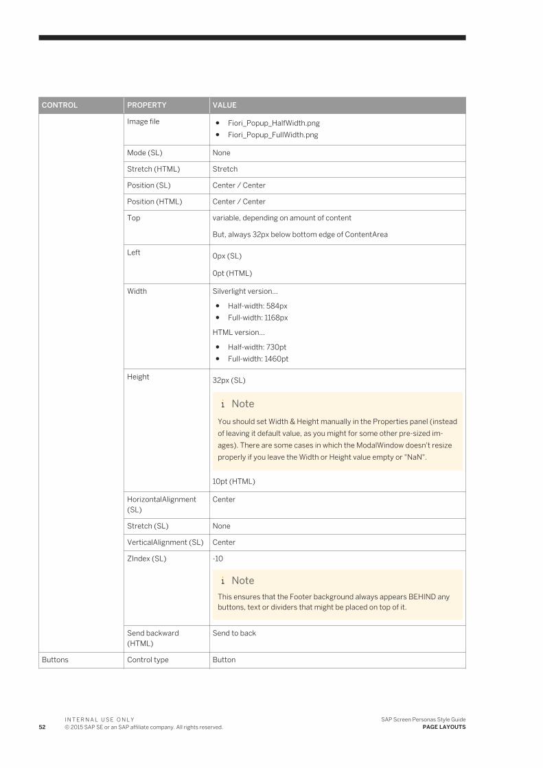
Image file ● Fiori_Popup_HalfWidth.png● Fiori_Popup_FullWidth.png
Mode (SL) None
Stretch (HTML) Stretch
Position (SL) Center / Center
Position (HTML) Center / Center
Top variable, depending on amount of content
But, always 32px below bottom edge of ContentArea
Left 0px (SL)
0pt (HTML)
Width Silverlight version...
● Half-width: 584px● Full-width: 1168px
HTML version...
● Half-width: 730pt● Full-width: 1460pt
Height 32px (SL)
NoteYou should set Width & Height manually in the Properties panel (instead of leaving it default value, as you might for some other pre-sized images). There are some cases in which the ModalWindow doesn't resize properly if you leave the Width or Height value empty or "NaN".
10pt (HTML)
HorizontalAlignment (SL)
Center
Stretch (SL) None
VerticalAlignment (SL) Center
ZIndex (SL) -10
NoteThis ensures that the Footer background always appears BEHIND any buttons, text or dividers that might be placed on top of it.
Send backward (HTML)
Send to back
Buttons Control type Button
52I N T E R N A L U S E O N L Y© 2015 SAP SE or an SAP affiliate company. All rights reserved.
SAP Screen Personas Style GuidePAGE LAYOUTS
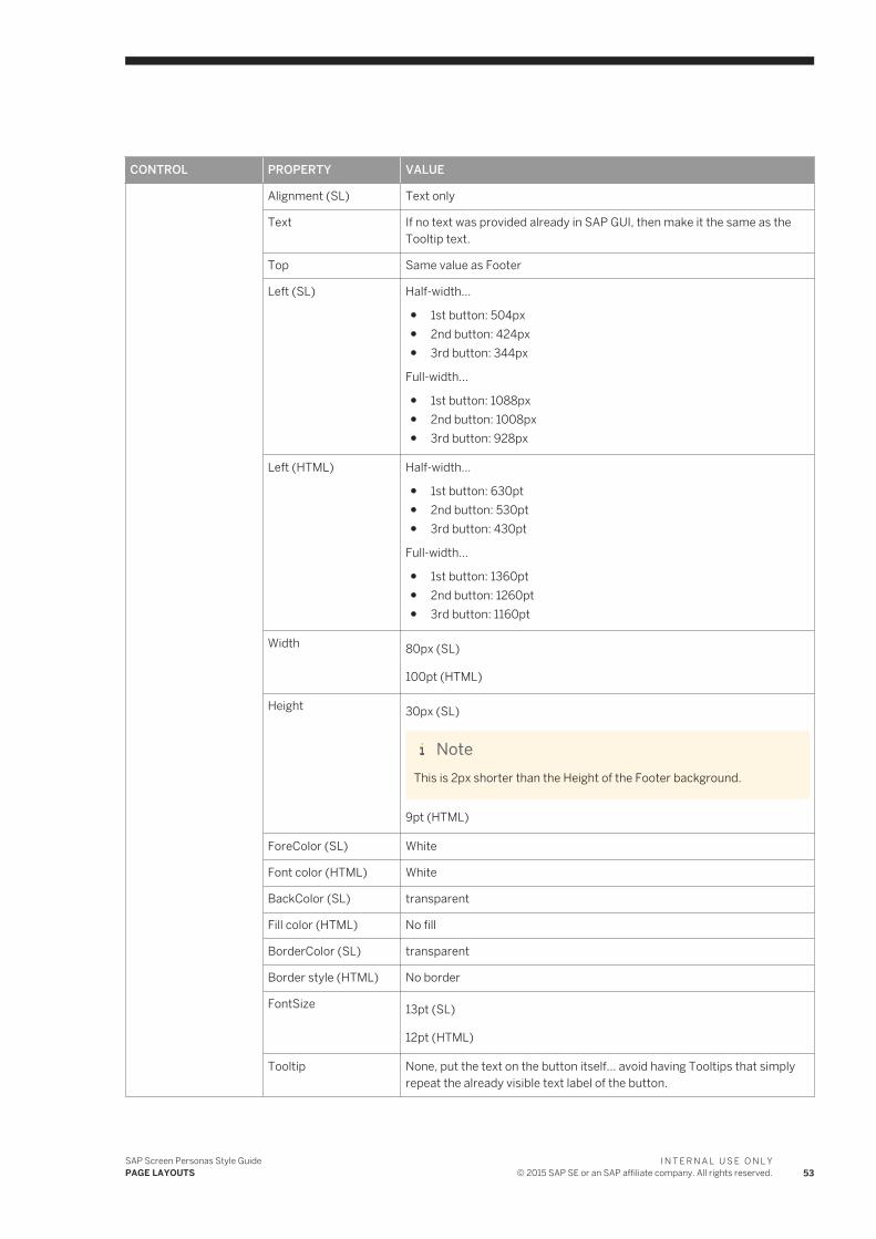
CONTROL PROPERTY VALUE
Alignment (SL) Text only
Text If no text was provided already in SAP GUI, then make it the same as the Tooltip text.
Top Same value as Footer
Left (SL) Half-width...
● 1st button: 504px● 2nd button: 424px● 3rd button: 344px
Full-width...
● 1st button: 1088px● 2nd button: 1008px● 3rd button: 928px
Left (HTML) Half-width...
● 1st button: 630pt● 2nd button: 530pt● 3rd button: 430pt
Full-width...
● 1st button: 1360pt● 2nd button: 1260pt● 3rd button: 1160pt
Width 80px (SL)
100pt (HTML)
Height 30px (SL)
NoteThis is 2px shorter than the Height of the Footer background.
9pt (HTML)
ForeColor (SL) White
Font color (HTML) White
BackColor (SL) transparent
Fill color (HTML) No fill
BorderColor (SL) transparent
Border style (HTML) No border
FontSize 13pt (SL)
12pt (HTML)
Tooltip None, put the text on the button itself... avoid having Tooltips that simply repeat the already visible text label of the button.
SAP Screen Personas Style GuidePAGE LAYOUTS
I N T E R N A L U S E O N L Y© 2015 SAP SE or an SAP affiliate company. All rights reserved. 53
CONTROL PROPERTY VALUE
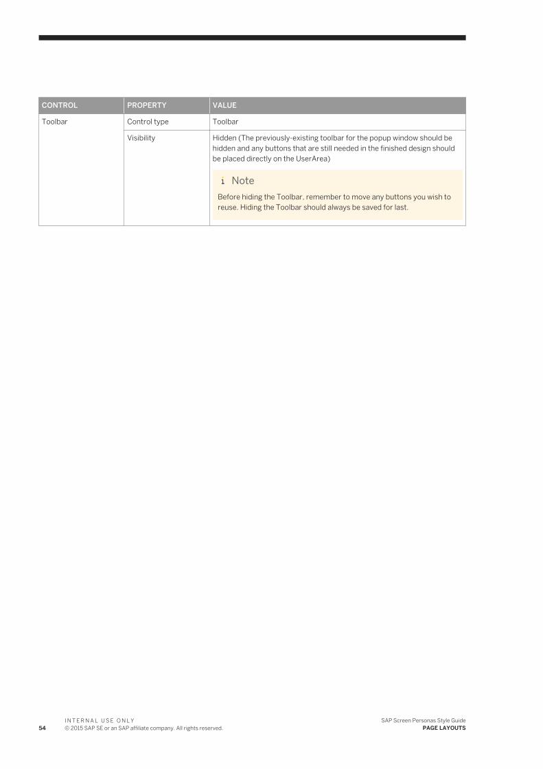
Toolbar Control type Toolbar
Visibility Hidden (The previously-existing toolbar for the popup window should be hidden and any buttons that are still needed in the finished design should be placed directly on the UserArea)
NoteBefore hiding the Toolbar, remember to move any buttons you wish to reuse. Hiding the Toolbar should always be saved for last.
54I N T E R N A L U S E O N L Y© 2015 SAP SE or an SAP affiliate company. All rights reserved.
SAP Screen Personas Style GuidePAGE LAYOUTS
4 CONTAINERS
This section will define and explain the concept of Containers [??? missing introduction ???]
[??? missing explanation ???]
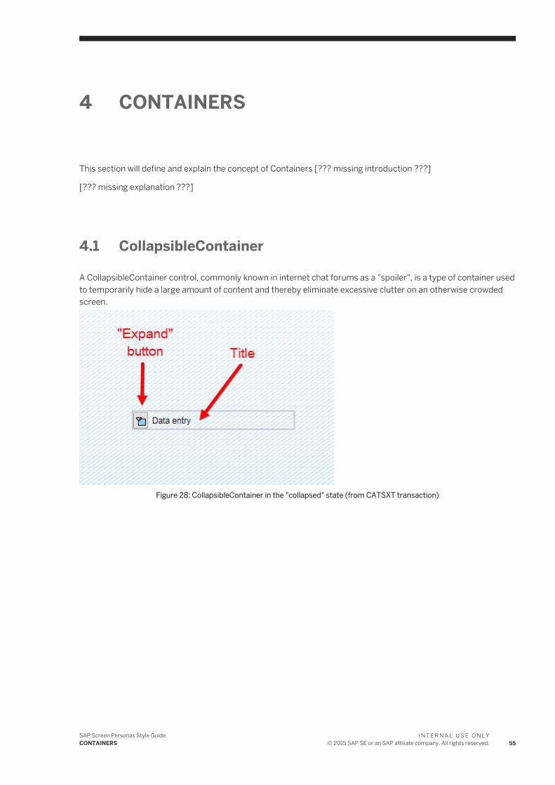
4.1 CollapsibleContainer
A CollapsibleContainer control, commonly known in internet chat forums as a "spoiler", is a type of container used to temporarily hide a large amount of content and thereby eliminate excessive clutter on an otherwise crowded screen.
Figure 28: CollapsibleContainer in the "collapsed" state (from CATSXT transaction)
SAP Screen Personas Style GuideCONTAINERS
I N T E R N A L U S E O N L Y© 2015 SAP SE or an SAP affiliate company. All rights reserved. 55
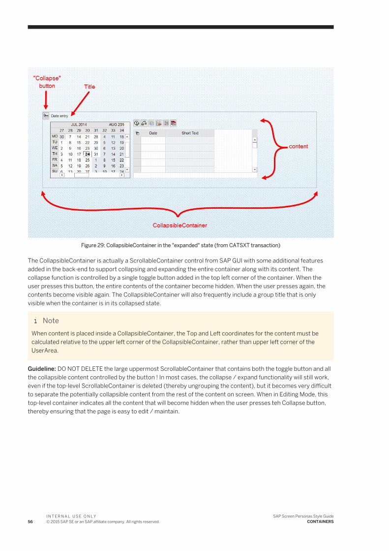
Figure 29: CollapsibleContainer in the "expanded" state (from CATSXT transaction)
The CollapsibleContainer is actually a ScrollableContainer control from SAP GUI with some additional features added in the back-end to support collapsing and expanding the entire container along with its content. The collapse function is controlled by a single toggle button added in the top left corner of the container. When the user presses this button, the entire contents of the container become hidden. When the user presses again, the contents become visible again. The CollapsibleContainer will also frequently include a group title that is only visible when the container is in its collapsed state.
NoteWhen content is placed inside a CollapsibleContainer, the Top and Left coordinates for the content must be calculated relative to the upper left corner of the CollapsibleContainer, rather than upper left corner of the UserArea.
Guideline: DO NOT DELETE the large uppermost ScrollableContainer that contains both the toggle button and all the collapsible content controlled by the button ! In most cases, the collapse / expand functionality will still work, even if the top-level ScrollableContainer is deleted (thereby ungrouping the content), but it becomes very difficult to separate the potentially collapsible content from the rest of the content on screen. When in Editing Mode, this top-level container indicates all the content that will become hidden when the user presses teh Collapse button, thereby ensuring that the page is easy to edit / maintain.
56I N T E R N A L U S E O N L Y© 2015 SAP SE or an SAP affiliate company. All rights reserved.
SAP Screen Personas Style GuideCONTAINERS
4.1.1 CollapsibleContainer - on BasicPage layout
How to align a CollapsibleContainer to fit the BasicPage layout...
Table 16:
CONTROL PROPERTY VALUE
Container Control type ScrollableContainer (BUT, with some additional features added)
Top Silverlight version...
● Topmost container: 72px● Additional containers: +24px below bottom edge of previous content
HTML version...
● Topmost container: 25pt● Additional containers: +8pt below bottom edge of previous content
Left 16px (SL)
20pt (HTML)
Width 1168px (SL)
1460pt (HTML)
NoteUnlike GroupBoxes, CollapsibleContainers should ALWAYS be full-width and are NEVER half-width.
Height Silverlight version...
● Collapsed: 32px● Expanded: Variable, depending on amount of content (add 24px
empty space below bottom edge of content)
HTML version...
● Collapsed: 10pt● Expanded: Variable, depending on amount of content (add 8pt empty
space below bottom edge of content)
BorderColor Default (the color of the border also affects color of scroll bars, so BorderColor should NEVER be white or transparent)
BackColor Transparent
Toggle button (collapse / expand)
Control type Button
Top 4px (SL)
1pt (HTML)
Left 4px (SL)
5pt (HTML)
SAP Screen Personas Style GuideCONTAINERS
I N T E R N A L U S E O N L Y© 2015 SAP SE or an SAP affiliate company. All rights reserved. 57
CONTROL PROPERTY VALUE
Width 24px (SL)
30pt (HTML)
Height 24px (SL)
8pt (HTML)
Add icon ● Fiori_22x22_gray_Expand● Fiori_22x22_gray_Collapse
Title Control type Label (if no other title or introductory navigation controls already exist in SAP GUI, add a text label that describes the contents of the whole CollapsibleContainer)
Font Arial
Size 14pt (SL)
13pt (HTML)
Style none
Alignment (SL) Left
Top 0px (SL)
0pt (HTML)
Left 28px (SL)
35pt (HTML)
Width 300px (SL)
375pt (HTML)
Height 24px (SL)
8pt (HTML)
Text If a Label is added to the expanded version, the text should be the same as for the Label of the collapsed version. In the SAP GUI, it's frequently the case that there's only a text label (title) existing for the collapsed state. Ideally, we want identical Labels for Both states.
ForeColor (SL) #FF666666
Font color (HTML) #666666
BackColor (SL) Transparent
Background color (HTML)
No color
Proportional font (SL) True
FontSize (SL) 14pt
58I N T E R N A L U S E O N L Y© 2015 SAP SE or an SAP affiliate company. All rights reserved.
SAP Screen Personas Style GuideCONTAINERS
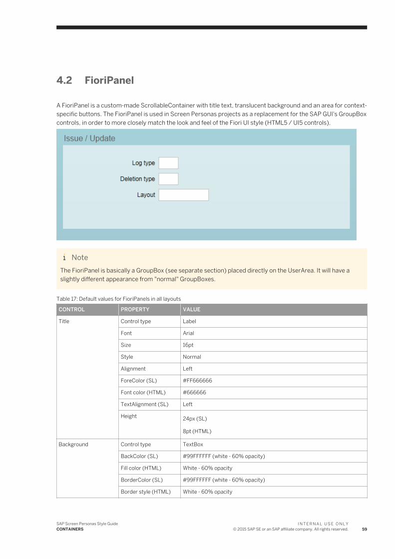
4.2 FioriPanel
A FioriPanel is a custom-made ScrollableContainer with title text, translucent background and an area for context-specific buttons. The FioriPanel is used in Screen Personas projects as a replacement for the SAP GUI's GroupBox controls, in order to more closely match the look and feel of the Fiori UI style (HTML5 / UI5 controls).
NoteThe FioriPanel is basically a GroupBox (see separate section) placed directly on the UserArea. It will have a slightly different appearance from "normal" GroupBoxes.
Table 17: Default values for FioriPanels in all layouts
CONTROL PROPERTY VALUE
Title Control type Label
Font Arial
Size 16pt
Style Normal
Alignment Left
ForeColor (SL) #FF666666
Font color (HTML) #666666
TextAlignment (SL) Left
Height 24px (SL)
8pt (HTML)
Background Control type TextBox
BackColor (SL) #99FFFFFF (white - 60% opacity)
Fill color (HTML) White - 60% opacity
BorderColor (SL) #99FFFFFF (white - 60% opacity)
Border style (HTML) White - 60% opacity
SAP Screen Personas Style GuideCONTAINERS
I N T E R N A L U S E O N L Y© 2015 SAP SE or an SAP affiliate company. All rights reserved. 59
CONTROL PROPERTY VALUE
Height (SL) Depending on number of rows in the form...
● 1 row: 72px● 2 rows: 104px● 3 rows: 136px● 4 rows: 168px● 5 rows: 200px● 6 rows: 232px● 7 rows: 264px● 8 rows: 296px● 9rows: 328px● 10rows: 360px● 11rows: 392px● 12rows: 424px
Height (HTML) Depending on number of rows in the form...
● 1 row: 23pt● 2 rows: 33pt● 3 rows: 43pt● 4 rows: 53pt● 5 rows: 63pt● 6 rows: 73pt● 7 rows: 83pt● 8 rows: 93pt● 9rows: 103pt● 10rows: 113pt● 11rows: 123pt● 12rows: 133pt
IsReadOnly True
ZIndex (SL) -10
Notethis ensures that this control appears BEHIND all other content.
Send backwards (HTML)
Send to back
Creating the FioriPanel container
Control type ScrollableContainer
NoteTo create the ScrollableContainer, select all the controls created in the previous steps and press the "Group selected controls" button from the Screen Personas toolbar (or, use the keyboard shortcut = Ctrl+Alt+G)
60I N T E R N A L U S E O N L Y© 2015 SAP SE or an SAP affiliate company. All rights reserved.
SAP Screen Personas Style GuideCONTAINERS
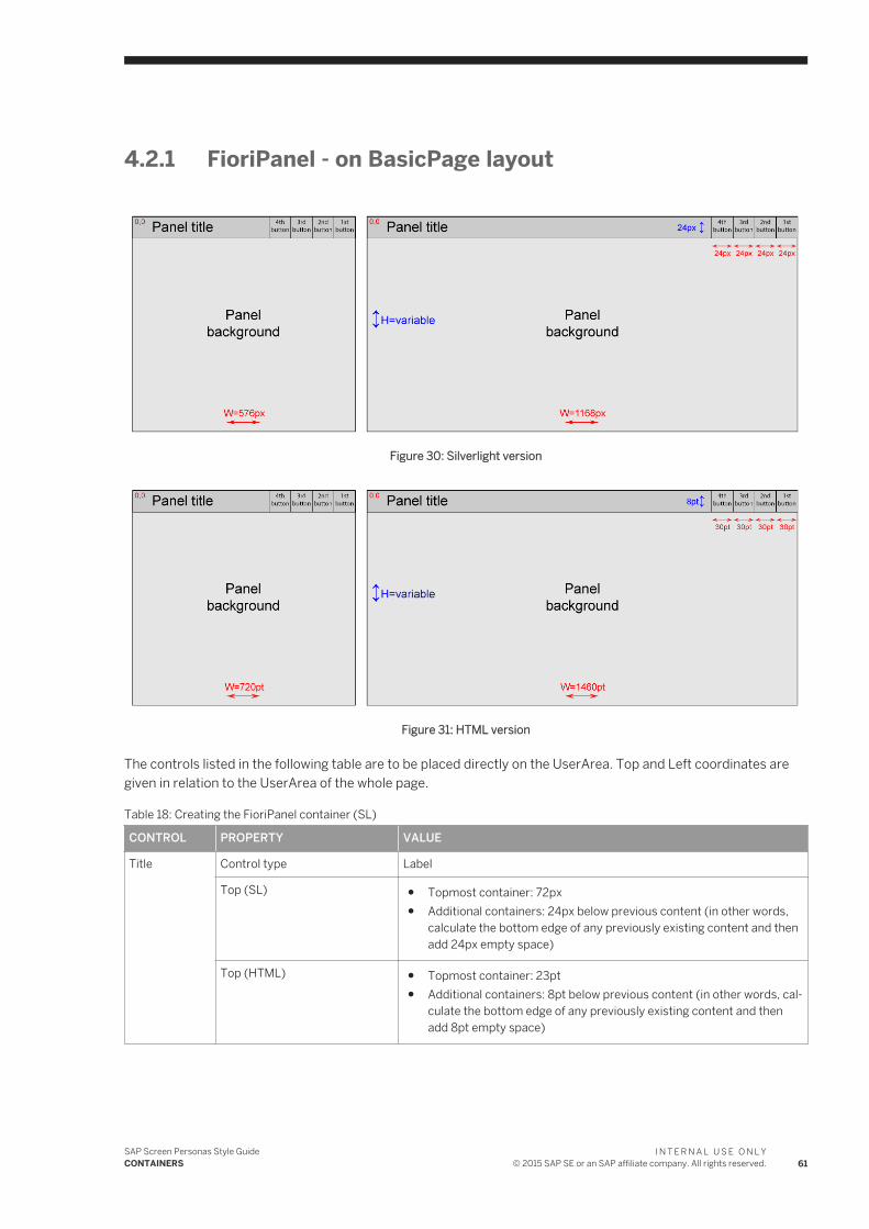
4.2.1 FioriPanel - on BasicPage layout
Figure 30: Silverlight version
Figure 31: HTML version
The controls listed in the following table are to be placed directly on the UserArea. Top and Left coordinates are given in relation to the UserArea of the whole page.
Table 18: Creating the FioriPanel container (SL)
CONTROL PROPERTY VALUE
Title Control type Label
Top (SL) ● Topmost container: 72px● Additional containers: 24px below previous content (in other words,
calculate the bottom edge of any previously existing content and then add 24px empty space)
Top (HTML) ● Topmost container: 23pt● Additional containers: 8pt below previous content (in other words, cal
culate the bottom edge of any previously existing content and then add 8pt empty space)
SAP Screen Personas Style GuideCONTAINERS
I N T E R N A L U S E O N L Y© 2015 SAP SE or an SAP affiliate company. All rights reserved. 61
CONTROL PROPERTY VALUE
Left Silverlight version...
● Left ContentArea: 16px● Right ContentArea: 608px
HTML version...
● Left ContentArea: 20pt● Right ContentArea: 760pt
Width Silverlight version...
● Half-width: 576px● Full-width: 1168px
HTML version...
● Half-width: 720pt● Full-width: 1460pt
Background Control type TextBox
Top Top of Label control +24px (SL)
Top of Label control +8pt (HTML)
NoteThe top edge of the TextBox control is aligned with the bottom edge of the Label control.
Left Same value as the Label you just created
Width Same value as the Label you just created
Creating the FioriPanel container
Control type ScrollableContainer
NoteTo create the ScrollableContainer, select all the controls created in the previous steps and press the "Group selected controls" button from the Screen Personas toolbar (or, use the keyboard shortcut = Ctrl+Alt+G)
The controls listed in the following table are to be placed inside the ScrollableContainer of a FioriPanel. Top and Left coordinates are given in relation to the ScrollableContainer of the FioriPanel and NOT relevant to the UserArea of the whole page.
Table 19: Adding buttons to the FioriPanel
CONTROL PROPERTY VALUE
Container Control type FioriPanel
Buttons Control type ● Button● ScriptButton● LaunchButton
Top 0px
62I N T E R N A L U S E O N L Y© 2015 SAP SE or an SAP affiliate company. All rights reserved.
SAP Screen Personas Style GuideCONTAINERS
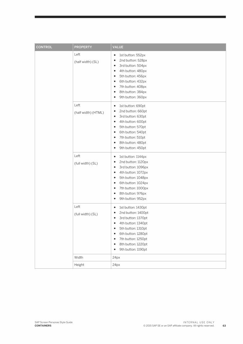
CONTROL PROPERTY VALUE
Left
(half width) (SL)
● 1st button: 552px● 2nd button: 528px● 3rd button: 504px● 4th button: 480px● 5th button: 456px● 6th button: 432px● 7th button: 408px● 8th button: 384px● 9th button: 360px
Left
(half width) (HTML)
● 1st button: 690pt● 2nd button: 660pt● 3rd button: 630pt● 4th button: 600pt● 5th button: 570pt● 6th button: 540pt● 7th button: 510pt● 8th button: 480pt● 9th button: 450pt
Left
(full width) (SL)
● 1st button: 1144px● 2nd button: 1120px● 3rd button: 1096px● 4th button: 1072px● 5th button: 1048px● 6th button: 1024px● 7th button: 1000px● 8th button: 976px● 9th button: 952px
Left
(full width) (SL)
● 1st button: 1430pt● 2nd button: 1400pt● 3rd button: 1370pt● 4th button: 1340pt● 5th button: 1310pt● 6th button: 1280pt● 7th button: 1250pt● 8th button: 1220pt● 9th button: 1190pt
Width 24px
Height 24px
SAP Screen Personas Style GuideCONTAINERS
I N T E R N A L U S E O N L Y© 2015 SAP SE or an SAP affiliate company. All rights reserved. 63
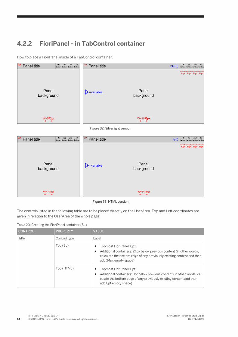
4.2.2 FioriPanel - in TabControl container
How to place a FioriPanel inside of a TabControl container.
Figure 32: Silverlight version
Figure 33: HTML version
The controls listed in the following table are to be placed directly on the UserArea. Top and Left coordinates are given in relation to the UserArea of the whole page.
Table 20: Creating the FioriPanel container (SL)
CONTROL PROPERTY VALUE
Title Control type Label
Top (SL) ● Topmost FioriPanel: 0px● Additional containers: 24px below previous content (in other words,
calculate the bottom edge of any previously existing content and then add 24px empty space)
Top (HTML) ● Topmost FioriPanel: 0pt● Additional containers: 8pt below previous content (in other words, cal
culate the bottom edge of any previously existing content and then add 8pt empty space)
64I N T E R N A L U S E O N L Y© 2015 SAP SE or an SAP affiliate company. All rights reserved.
SAP Screen Personas Style GuideCONTAINERS
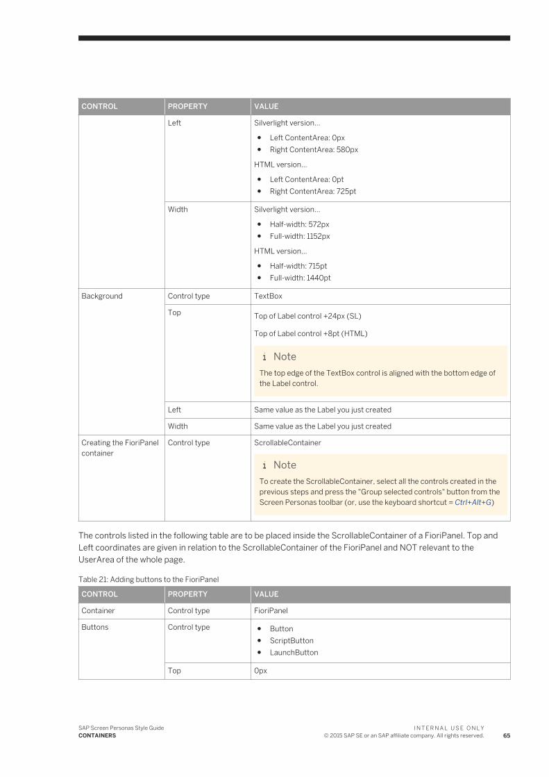
CONTROL PROPERTY VALUE
Left Silverlight version...
● Left ContentArea: 0px● Right ContentArea: 580px
HTML version...
● Left ContentArea: 0pt● Right ContentArea: 725pt
Width Silverlight version...
● Half-width: 572px● Full-width: 1152px
HTML version...
● Half-width: 715pt● Full-width: 1440pt
Background Control type TextBox
Top Top of Label control +24px (SL)
Top of Label control +8pt (HTML)
NoteThe top edge of the TextBox control is aligned with the bottom edge of the Label control.
Left Same value as the Label you just created
Width Same value as the Label you just created
Creating the FioriPanel container
Control type ScrollableContainer
NoteTo create the ScrollableContainer, select all the controls created in the previous steps and press the "Group selected controls" button from the Screen Personas toolbar (or, use the keyboard shortcut = Ctrl+Alt+G)
The controls listed in the following table are to be placed inside the ScrollableContainer of a FioriPanel. Top and Left coordinates are given in relation to the ScrollableContainer of the FioriPanel and NOT relevant to the UserArea of the whole page.
Table 21: Adding buttons to the FioriPanel
CONTROL PROPERTY VALUE
Container Control type FioriPanel
Buttons Control type ● Button● ScriptButton● LaunchButton
Top 0px
SAP Screen Personas Style GuideCONTAINERS
I N T E R N A L U S E O N L Y© 2015 SAP SE or an SAP affiliate company. All rights reserved. 65
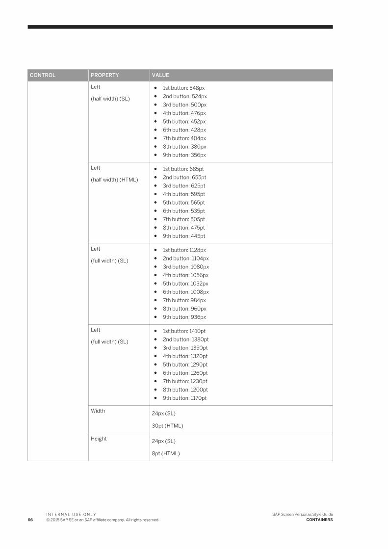
CONTROL PROPERTY VALUE
Left
(half width) (SL)
● 1st button: 548px● 2nd button: 524px● 3rd button: 500px● 4th button: 476px● 5th button: 452px● 6th button: 428px● 7th button: 404px● 8th button: 380px● 9th button: 356px
Left
(half width) (HTML)
● 1st button: 685pt● 2nd button: 655pt● 3rd button: 625pt● 4th button: 595pt● 5th button: 565pt● 6th button: 535pt● 7th button: 505pt● 8th button: 475pt● 9th button: 445pt
Left
(full width) (SL)
● 1st button: 1128px● 2nd button: 1104px● 3rd button: 1080px● 4th button: 1056px● 5th button: 1032px● 6th button: 1008px● 7th button: 984px● 8th button: 960px● 9th button: 936px
Left
(full width) (SL)
● 1st button: 1410pt● 2nd button: 1380pt● 3rd button: 1350pt● 4th button: 1320pt● 5th button: 1290pt● 6th button: 1260pt● 7th button: 1230pt● 8th button: 1200pt● 9th button: 1170pt
Width 24px (SL)
30pt (HTML)
Height 24px (SL)
8pt (HTML)
66I N T E R N A L U S E O N L Y© 2015 SAP SE or an SAP affiliate company. All rights reserved.
SAP Screen Personas Style GuideCONTAINERS
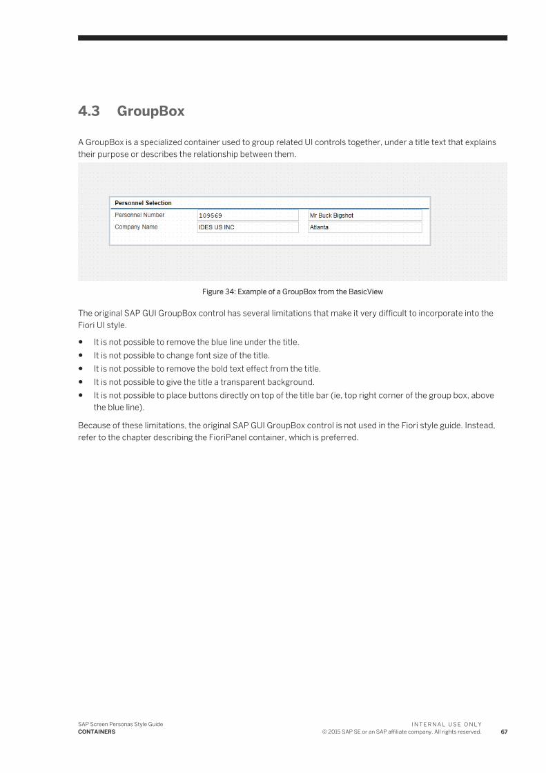
4.3 GroupBox
A GroupBox is a specialized container used to group related UI controls together, under a title text that explains their purpose or describes the relationship between them.
Figure 34: Example of a GroupBox from the BasicView
The original SAP GUI GroupBox control has several limitations that make it very difficult to incorporate into the Fiori UI style.
● It is not possible to remove the blue line under the title.● It is not possible to change font size of the title.● It is not possible to remove the bold text effect from the title.● It is not possible to give the title a transparent background.● It is not possible to place buttons directly on top of the title bar (ie, top right corner of the group box, above
the blue line).
Because of these limitations, the original SAP GUI GroupBox control is not used in the Fiori style guide. Instead, refer to the chapter describing the FioriPanel container, which is preferred.
SAP Screen Personas Style GuideCONTAINERS
I N T E R N A L U S E O N L Y© 2015 SAP SE or an SAP affiliate company. All rights reserved. 67
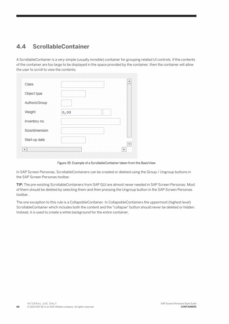
4.4 ScrollableContainer
A ScrollableContainer is a very simple (usually invisible) container for grouping related UI controls. If the contents of the container are too large to be displayed in the space provided by the container, then the container will allow the user to scroll to view the contents.
Figure 35: Example of a ScrollableContainer taken from the BasicView
In SAP Screen Personas, ScrollableContainers can be created or deleted using the Group / Ungroup buttons in the SAP Screen Personas toolbar.
TIP: The pre-existing ScrollableContainers from SAP GUI are almost never needed in SAP Screen Personas. Most of them should be deleted by selecting them and then pressing the Ungroup button in the SAP Screen Personas toolbar.
The one exception to this rule is a CollapsibleContainer. In CollapsibleContainers the uppermost (highest level) ScrollableContainer which includes both the content and the "collapse" button should never be deleted or hidden. Instead, it is used to create a white background for the entire container.
68I N T E R N A L U S E O N L Y© 2015 SAP SE or an SAP affiliate company. All rights reserved.
SAP Screen Personas Style GuideCONTAINERS
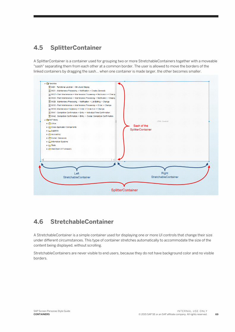
4.5 SplitterContainer
A SplitterContainer is a container used for grouping two or more StretchableContainers together with a moveable "sash" separating them from each other at a common border. The user is allowed to move the borders of the linked containers by dragging the sash... when one container is made larger, the other becomes smaller.
4.6 StretchableContainer
A StretchableContainer is a simple container used for displaying one or more UI controls that change their size under different circumstances. This type of container stretches automatically to accommodate the size of the content being displayed, without scrolling.
StretchableContainers are never visible to end users, because they do not have background color and no visible borders.
SAP Screen Personas Style GuideCONTAINERS
I N T E R N A L U S E O N L Y© 2015 SAP SE or an SAP affiliate company. All rights reserved. 69
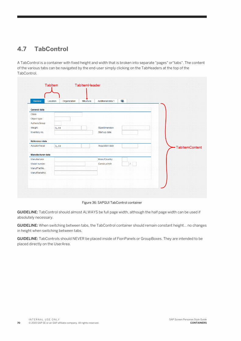
4.7 TabControl
A TabControl is a container with fixed height and width that is broken into separate "pages" or"tabs". The content of the various tabs can be navigated by the end-user simply clicking on the TabHeaders at the top of the TabControl.
Figure 36: SAPGUI TabControl container
GUIDELINE: TabControl should almost ALWAYS be full page width, although the half page width can be used if absolutely necessary.
GUIDELINE: When switching between tabs, the TabControl container should remain constant height... no changes in height when switching between tabs.
GUIDELINE: TabControls should NEVER be placed inside of FioriPanels or GroupBoxes. They are intended to be placed directly on the UserArea.
70I N T E R N A L U S E O N L Y© 2015 SAP SE or an SAP affiliate company. All rights reserved.
SAP Screen Personas Style GuideCONTAINERS
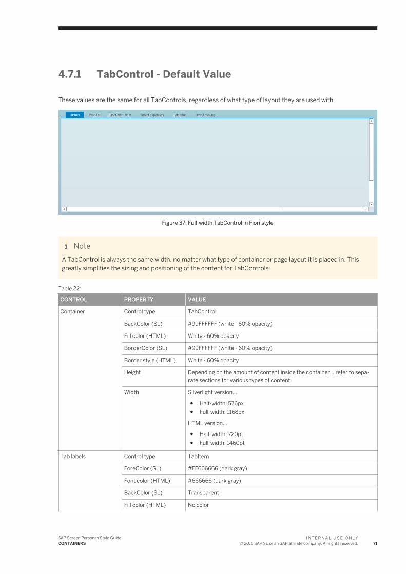
4.7.1 TabControl - Default Value
These values are the same for all TabControls, regardless of what type of layout they are used with.
Figure 37: Full-width TabControl in Fiori style
NoteA TabControl is always the same width, no matter what type of container or page layout it is placed in. This greatly simplifies the sizing and positioning of the content for TabControls.
Table 22:
CONTROL PROPERTY VALUE
Container Control type TabControl
BackColor (SL) #99FFFFFF (white - 60% opacity)
Fill color (HTML) White - 60% opacity
BorderColor (SL) #99FFFFFF (white - 60% opacity)
Border style (HTML) White - 60% opacity
Height Depending on the amount of content inside the container... refer to separate sections for various types of content.
Width Silverlight version...
● Half-width: 576px● Full-width: 1168px
HTML version...
● Half-width: 720pt● Full-width: 1460pt
Tab labels Control type TabItem
ForeColor (SL) #FF666666 (dark gray)
Font color (HTML) #666666 (dark gray)
BackColor (SL) Transparent
Fill color (HTML) No color
SAP Screen Personas Style GuideCONTAINERS
I N T E R N A L U S E O N L Y© 2015 SAP SE or an SAP affiliate company. All rights reserved. 71
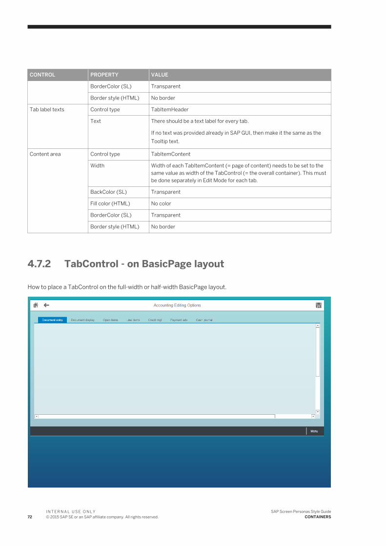
CONTROL PROPERTY VALUE
BorderColor (SL) Transparent
Border style (HTML) No border
Tab label texts Control type TabItemHeader
Text There should be a text label for every tab.
If no text was provided already in SAP GUI, then make it the same as the Tooltip text.
Content area Control type TabItemContent
Width Width of each TabItemContent (= page of content) needs to be set to the same value as width of the TabControl (= the overall container). This must be done separately in Edit Mode for each tab.
BackColor (SL) Transparent
Fill color (HTML) No color
BorderColor (SL) Transparent
Border style (HTML) No border
4.7.2 TabControl - on BasicPage layout
How to place a TabControl on the full-width or half-width BasicPage layout.
72I N T E R N A L U S E O N L Y© 2015 SAP SE or an SAP affiliate company. All rights reserved.
SAP Screen Personas Style GuideCONTAINERS
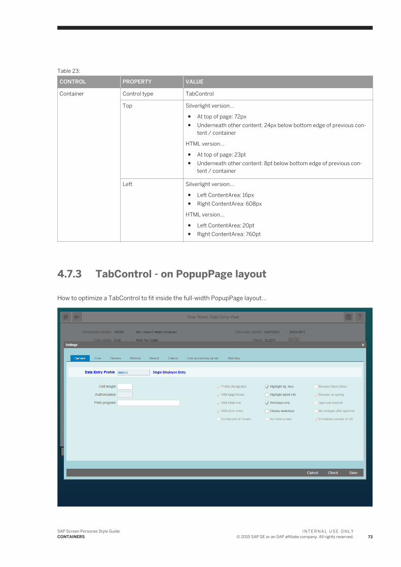
Table 23:
CONTROL PROPERTY VALUE
Container Control type TabControl
Top Silverlight version...
● At top of page: 72px● Underneath other content: 24px below bottom edge of previous con
tent / container
HTML version...
● At top of page: 23pt● Underneath other content: 8pt below bottom edge of previous con
tent / container
Left Silverlight version...
● Left ContentArea: 16px● Right ContentArea: 608px
HTML version...
● Left ContentArea: 20pt● Right ContentArea: 760pt
4.7.3 TabControl - on PopupPage layout
How to optimize a TabControl to fit inside the full-width PopupPage layout...
SAP Screen Personas Style GuideCONTAINERS
I N T E R N A L U S E O N L Y© 2015 SAP SE or an SAP affiliate company. All rights reserved. 73
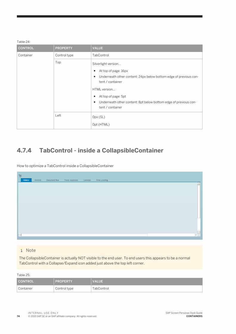
Table 24:
CONTROL PROPERTY VALUE
Container Control type TabControl
Top Silverlight version...
● At top of page: 16px● Underneath other content: 24px below bottom edge of previous con
tent / container
HTML version...
● At top of page: 5pt● Underneath other content: 8pt below bottom edge of previous con
tent / container
Left 0px (SL)
0pt (HTML)
4.7.4 TabControl - inside a CollapsibleContainer
How to optimize a TabControl inside a CollapsibleContainer
NoteThe CollapsibleContainer is actually NOT visible to the end user. To end users this appears to be a normal TabControl with a Collapse/Expand icon added just above the top left corner.
Table 25:
CONTROL PROPERTY VALUE
Container Control type TabControl
74I N T E R N A L U S E O N L Y© 2015 SAP SE or an SAP affiliate company. All rights reserved.
SAP Screen Personas Style GuideCONTAINERS
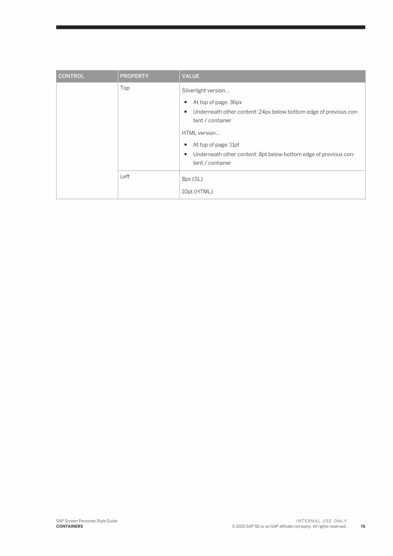
CONTROL PROPERTY VALUE
Top Silverlight version...
● At top of page: 36px● Underneath other content: 24px below bottom edge of previous con
tent / container
HTML version...
● At top of page: 11pt● Underneath other content: 8pt below bottom edge of previous con
tent / container
Left 8px (SL)
10pt (HTML)
SAP Screen Personas Style GuideCONTAINERS
I N T E R N A L U S E O N L Y© 2015 SAP SE or an SAP affiliate company. All rights reserved. 75
5 CONTENT
This section will define and explain the concept of Content, when creating Fiori styled flavors.
Content consists of various controls that display or capture some important information to/from end users. These controls have to be grouped together in some logical way that gives meaning and context to them. Typically, the controls are grouped together using Containers which further illustrates how the controls are related to each other.
5.1 Form
A Form is a vertical list of related user input fields. The Form also contains all the labels & descriptive texts necessary to help users understand the purpose and correct function of the input fields.
Forms are frequently built inside a half-width GroupBox, but might also be put directly on the UserArea or inside other types of containers. The input fields are all related to the same topic, which is described in the GroupBox title.
Forms are used for capturing user input, either by creating a new record or by displaying a saved record for the user to edit.
By putting all the Form fields inside a GroupBox (rather than directly on the UserArea), the content will stand out visually from the colored background (because the GroupBox background is always white or translucent) and will be easier to maintain by the developer.
Forms can be half-width, with a single column of input fields in each GroupBox. This is the most common layout for forms, because it's the easiest for users to read.
Or, Forms can be full-width, with two separate columns of input fields in each GroupBox.
The full-width layout is usually only used if there is only one Form (for example, a Header section), which is immediately followed by a full-width Table or TabControl.
The full-width layout can also be used on rare occasions if there is only one Form which is very large (more than 12 rows) and could not have been easily broken up into smaller topics (=multiple GroupBoxes).
76I N T E R N A L U S E O N L Y© 2015 SAP SE or an SAP affiliate company. All rights reserved.
SAP Screen Personas Style GuideCONTENT
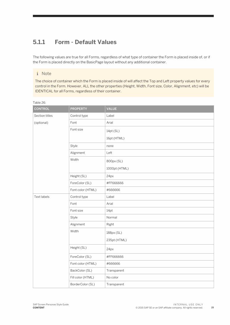
5.1.1 Form - Default Values
The following values are true for all Forms, regardless of what type of container the Form is placed inside of, or if the Form is placed directly on the BasicPage layout without any additional container.
NoteThe choice of container which the Form is placed inside of will affect the Top and Left property values for every control in the Form. However, ALL the other properties (Height, Width, Font size, Color, Alignment, etc) will be IDENTICAL for all Forms, regardless of their container.
Table 26:
CONTROL PROPERTY VALUE
Section titles
(optional)
Control type Label
Font Arial
Font size 14pt (SL)
16pt (HTML)
Style none
Alignment Left
Width 800px (SL)
1000pt (HTML)
Height (SL) 24px
ForeColor (SL) #FF666666
Font color (HTML) #666666
Text labels Control type Label
Font Arial
Font size 14pt
Style Normal
Alignment Right
Width 188px (SL)
235pt (HTML)
Height (SL) 24px
ForeColor (SL) #FF666666
Font color (HTML) #666666
BackColor (SL) Transparent
Fill color (HTML) No color
BorderColor (SL) Transparent
SAP Screen Personas Style GuideCONTENT
I N T E R N A L U S E O N L Y© 2015 SAP SE or an SAP affiliate company. All rights reserved. 77
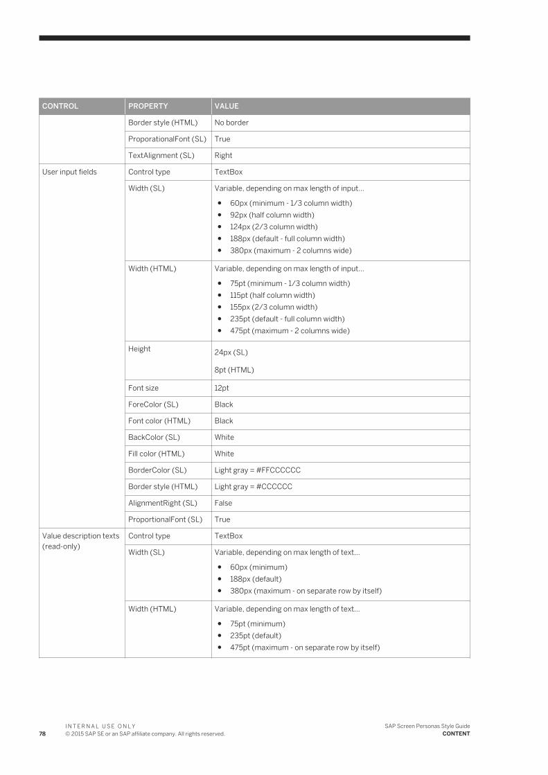
CONTROL PROPERTY VALUE
Border style (HTML) No border
ProporationalFont (SL) True
TextAlignment (SL) Right
User input fields Control type TextBox
Width (SL) Variable, depending on max length of input...
● 60px (minimum - 1/3 column width)● 92px (half column width)● 124px (2/3 column width)● 188px (default - full column width)● 380px (maximum - 2 columns wide)
Width (HTML) Variable, depending on max length of input...
● 75pt (minimum - 1/3 column width)● 115pt (half column width)● 155px (2/3 column width)● 235pt (default - full column width)● 475pt (maximum - 2 columns wide)
Height 24px (SL)
8pt (HTML)
Font size 12pt
ForeColor (SL) Black
Font color (HTML) Black
BackColor (SL) White
Fill color (HTML) White
BorderColor (SL) Light gray = #FFCCCCCC
Border style (HTML) Light gray = #CCCCCC
AlignmentRight (SL) False
ProportionalFont (SL) True
Value description texts (read-only)
Control type TextBox
Width (SL) Variable, depending on max length of text...
● 60px (minimum)● 188px (default)● 380px (maximum - on separate row by itself)
Width (HTML) Variable, depending on max length of text...
● 75pt (minimum)● 235pt (default)● 475pt (maximum - on separate row by itself)
78I N T E R N A L U S E O N L Y© 2015 SAP SE or an SAP affiliate company. All rights reserved.
SAP Screen Personas Style GuideCONTENT
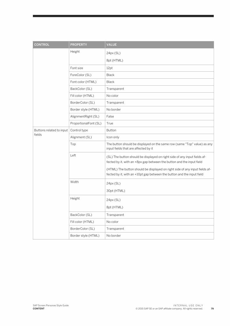
CONTROL PROPERTY VALUE
Height 24px (SL)
8pt (HTML)
Font size 12pt
ForeColor (SL) Black
Font color (HTML) Black
BackColor (SL) Transparent
Fill color (HTML) No color
BorderColor (SL) Transparent
Border style (HTML) No border
AlignmentRight (SL) False
ProportionalFont (SL) True
Buttons related to input fields
Control type Button
Alignment (SL) Icon only
Top The button should be displayed on the same row (same "Top" value) as any input fields that are affected by it
Left (SL) The button should be displayed on right side of any input fields affected by it, with an +8px gap between the button and the input field
(HTML) The button should be displayed on right side of any input fields affected by it, with an +10pt gap between the button and the input field
Width 24px (SL)
30pt (HTML)
Height 24px (SL)
8pt (HTML)
BackColor (SL) Transparent
Fill color (HTML) No color
BorderColor (SL) Transparent
Border style (HTML) No border
SAP Screen Personas Style GuideCONTENT
I N T E R N A L U S E O N L Y© 2015 SAP SE or an SAP affiliate company. All rights reserved. 79
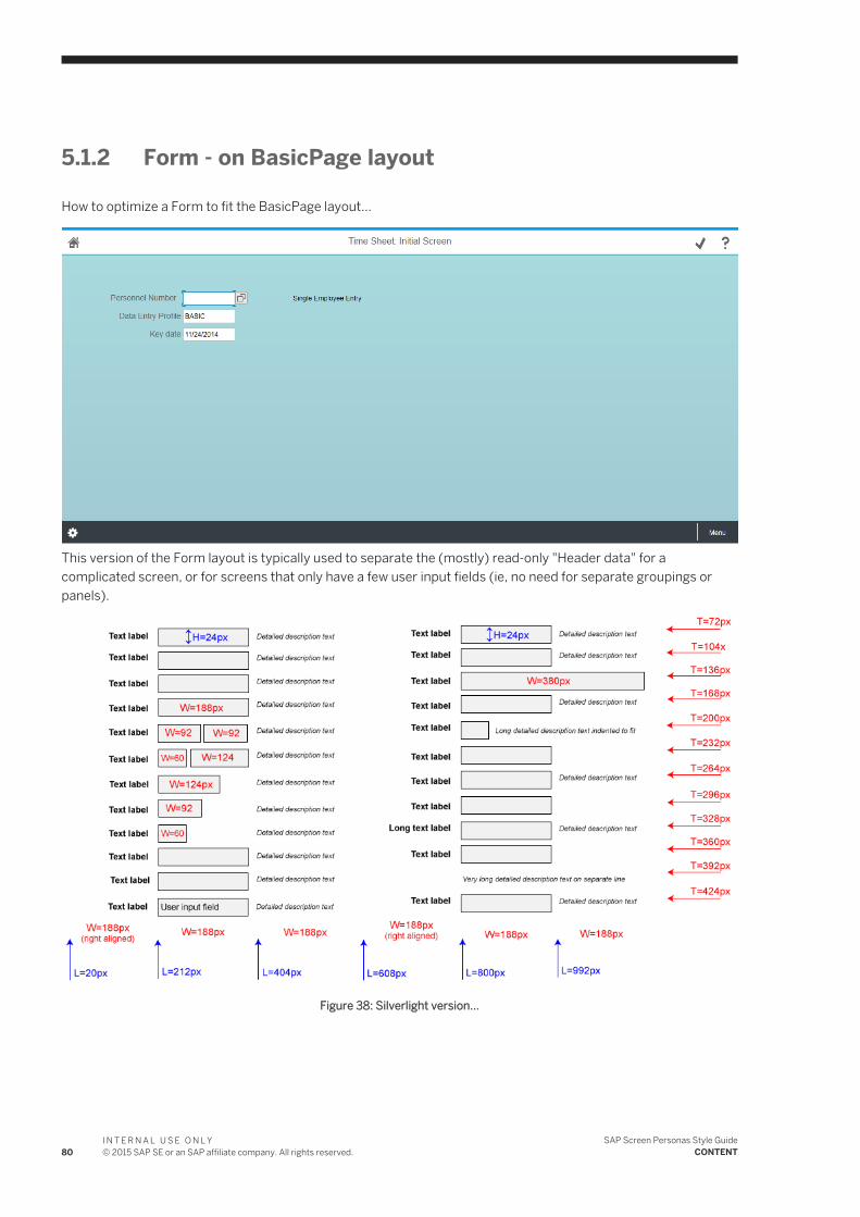
5.1.2 Form - on BasicPage layout
How to optimize a Form to fit the BasicPage layout...
This version of the Form layout is typically used to separate the (mostly) read-only "Header data" for a complicated screen, or for screens that only have a few user input fields (ie, no need for separate groupings or panels).
Figure 38: Silverlight version...
80I N T E R N A L U S E O N L Y© 2015 SAP SE or an SAP affiliate company. All rights reserved.
SAP Screen Personas Style GuideCONTENT

Figure 39: HTML version...
The controls listed in the following table are to be placed directly on the UserArea of the BasicPage layout. Top and Left coordinates are given in relation to the UserArea (ie, without any container).
Table 27:
CONTROL PROPERTY VALUE
Container Control type UserArea
Section title (optional) Control type Label
Top (SL) ● 1st row: 72px● 2nd row: 104px● 3rd row: 136px● 4th row: 168px● 5th row: 200px● 6th row: 232px● 7th row: 264px● 8th row: 296px● 9th row: 328px● 10th row: 360px● 11th row: 392px● 12th row: 424px
SAP Screen Personas Style GuideCONTENT
I N T E R N A L U S E O N L Y© 2015 SAP SE or an SAP affiliate company. All rights reserved. 81
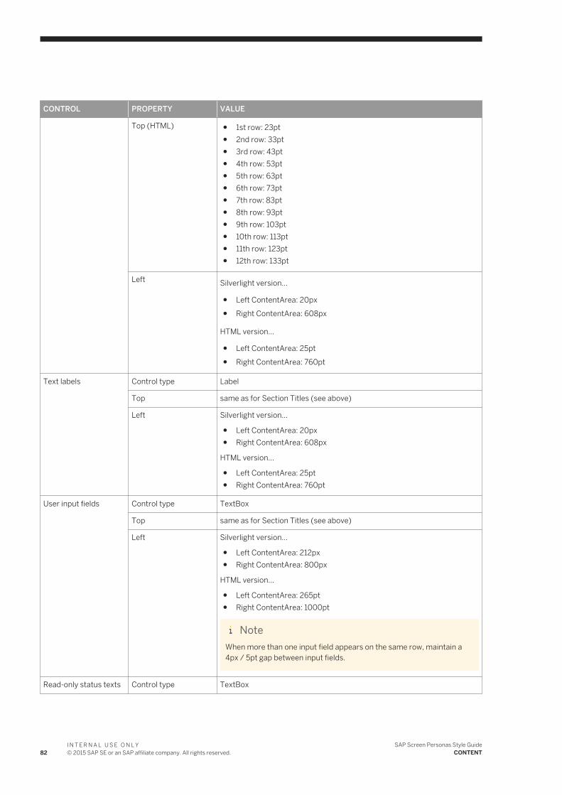
CONTROL PROPERTY VALUE
Top (HTML) ● 1st row: 23pt● 2nd row: 33pt● 3rd row: 43pt● 4th row: 53pt● 5th row: 63pt● 6th row: 73pt● 7th row: 83pt● 8th row: 93pt● 9th row: 103pt● 10th row: 113pt● 11th row: 123pt● 12th row: 133pt
Left Silverlight version...
● Left ContentArea: 20px● Right ContentArea: 608px
HTML version...
● Left ContentArea: 25pt● Right ContentArea: 760pt
Text labels Control type Label
Top same as for Section Titles (see above)
Left Silverlight version...
● Left ContentArea: 20px● Right ContentArea: 608px
HTML version...
● Left ContentArea: 25pt● Right ContentArea: 760pt
User input fields Control type TextBox
Top same as for Section Titles (see above)
Left Silverlight version...
● Left ContentArea: 212px● Right ContentArea: 800px
HTML version...
● Left ContentArea: 265pt● Right ContentArea: 1000pt
NoteWhen more than one input field appears on the same row, maintain a 4px / 5pt gap between input fields.
Read-only status texts Control type TextBox
82I N T E R N A L U S E O N L Y© 2015 SAP SE or an SAP affiliate company. All rights reserved.
SAP Screen Personas Style GuideCONTENT
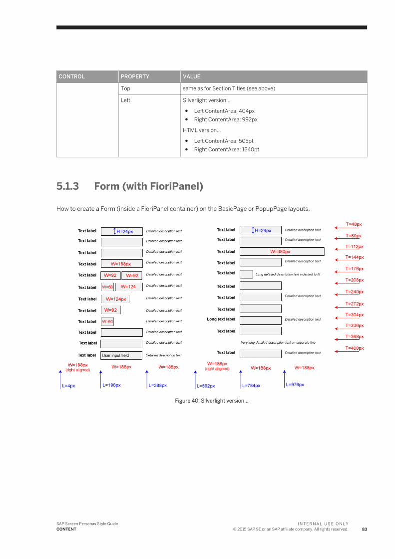
CONTROL PROPERTY VALUE
Top same as for Section Titles (see above)
Left Silverlight version...
● Left ContentArea: 404px● Right ContentArea: 992px
HTML version...
● Left ContentArea: 505pt● Right ContentArea: 1240pt
5.1.3 Form (with FioriPanel)
How to create a Form (inside a FioriPanel container) on the BasicPage or PopupPage layouts.
Figure 40: Silverlight version...
SAP Screen Personas Style GuideCONTENT
I N T E R N A L U S E O N L Y© 2015 SAP SE or an SAP affiliate company. All rights reserved. 83
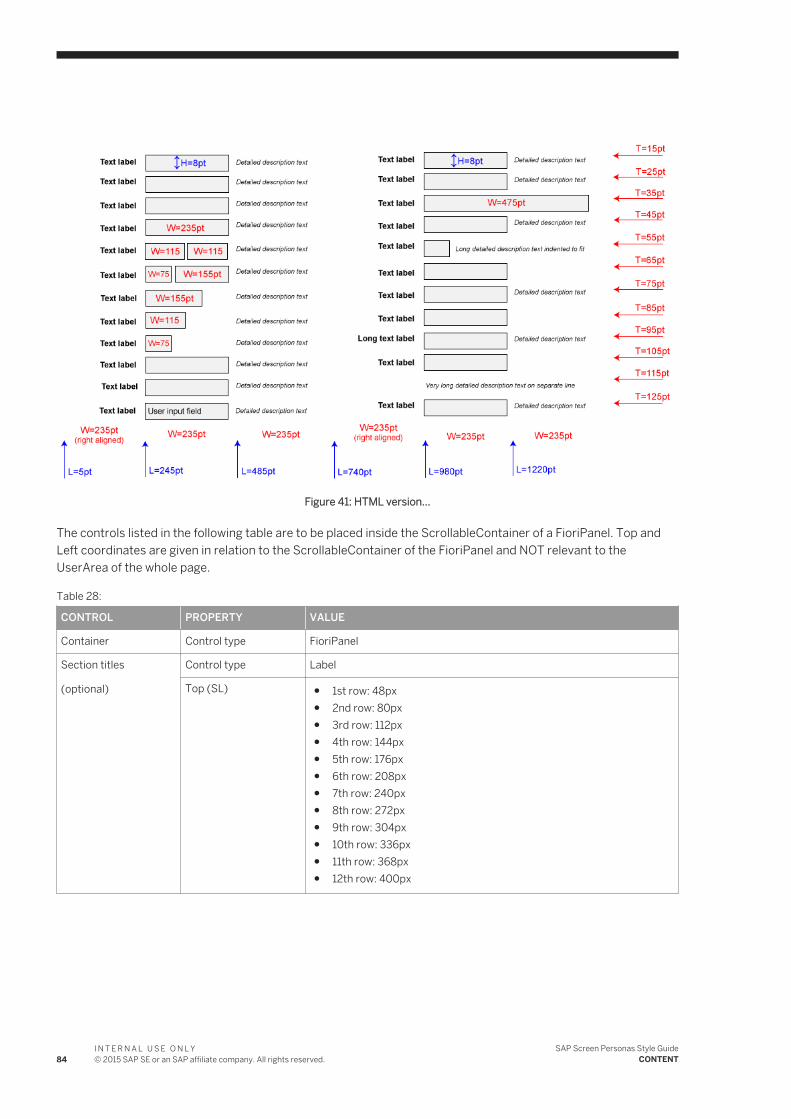
Figure 41: HTML version...
The controls listed in the following table are to be placed inside the ScrollableContainer of a FioriPanel. Top and Left coordinates are given in relation to the ScrollableContainer of the FioriPanel and NOT relevant to the UserArea of the whole page.
Table 28:
CONTROL PROPERTY VALUE
Container Control type FioriPanel
Section titles
(optional)
Control type Label
Top (SL) ● 1st row: 48px● 2nd row: 80px● 3rd row: 112px● 4th row: 144px● 5th row: 176px● 6th row: 208px● 7th row: 240px● 8th row: 272px● 9th row: 304px● 10th row: 336px● 11th row: 368px● 12th row: 400px
84I N T E R N A L U S E O N L Y© 2015 SAP SE or an SAP affiliate company. All rights reserved.
SAP Screen Personas Style GuideCONTENT
CONTROL PROPERTY VALUE
Top (HTML) ● 1st row: 15pt● 2nd row: 25pt● 3rd row: 35pt● 4th row: 45pt● 5th row: 55pt● 6th row: 65pt● 7th row: 75pt● 8th row: 85pt● 9th row: 95pt● 10th row: 105pt● 11th row: 115pt● 12th row: 125pt
Left 4px (SL)
5pt (HTML)
Text labels Control type Label
Top same as for Section Titles (see above)
Left Silverlight version...
● Left ContentArea: 4px● Right ContentArea: 592px
HTML version...
● Left ContentArea: 5pt● Right ContentArea: 740pt
Input fields Control type TextBox
Top same as for Section Titles (see above)
Left Silverlight version...
● Left ContentArea: 196px● Right ContentArea: 784px
HTML version...
● Left ContentArea: 245pt● Right ContentArea: 980pt
NoteWhen more than one input field appears on the same row, maintain a 4px / 5pt gap between input fields.
Value description texts (read-only)
Control type TextBox
Top same as for Section Titles (see above)
SAP Screen Personas Style GuideCONTENT
I N T E R N A L U S E O N L Y© 2015 SAP SE or an SAP affiliate company. All rights reserved. 85
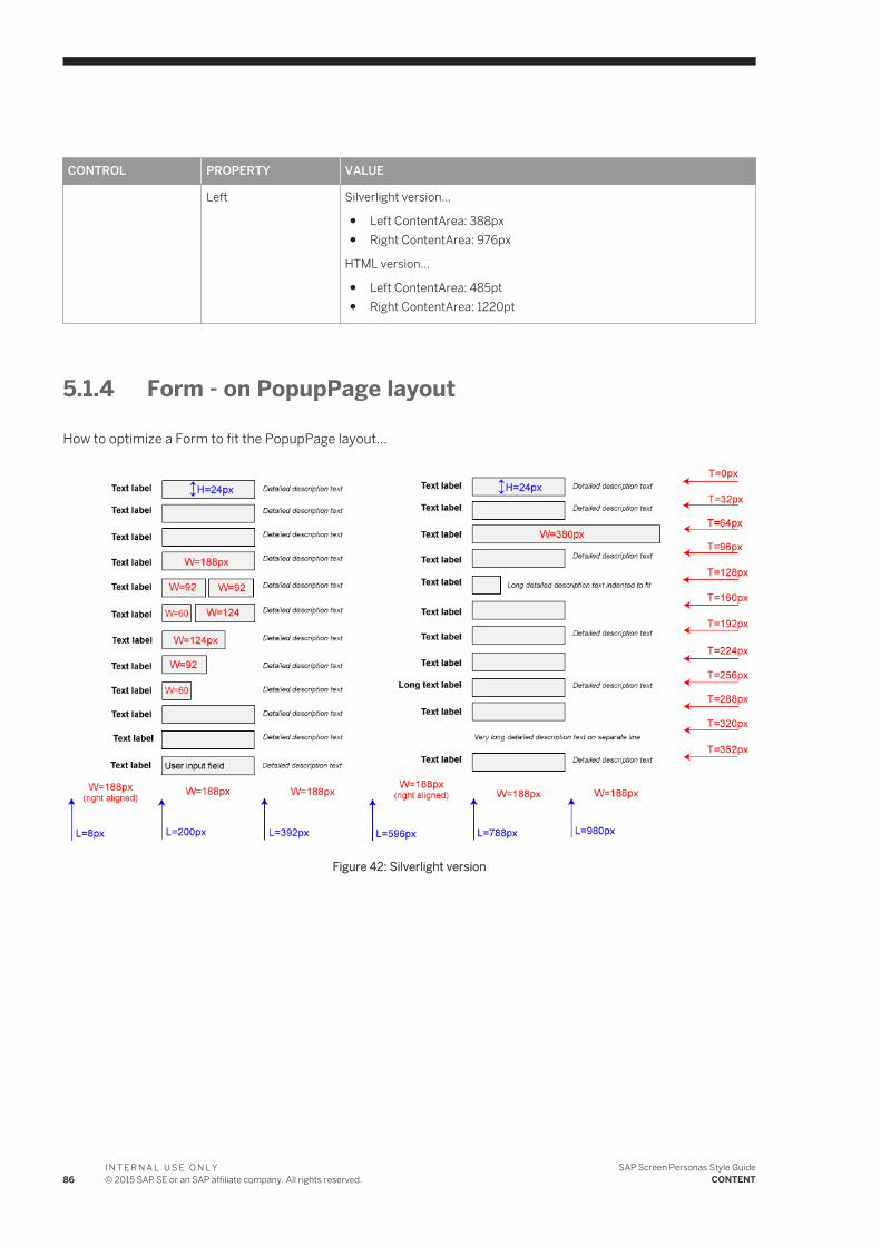
CONTROL PROPERTY VALUE
Left Silverlight version...
● Left ContentArea: 388px● Right ContentArea: 976px
HTML version...
● Left ContentArea: 485pt● Right ContentArea: 1220pt
5.1.4 Form - on PopupPage layout
How to optimize a Form to fit the PopupPage layout...
Figure 42: Silverlight version
86I N T E R N A L U S E O N L Y© 2015 SAP SE or an SAP affiliate company. All rights reserved.
SAP Screen Personas Style GuideCONTENT
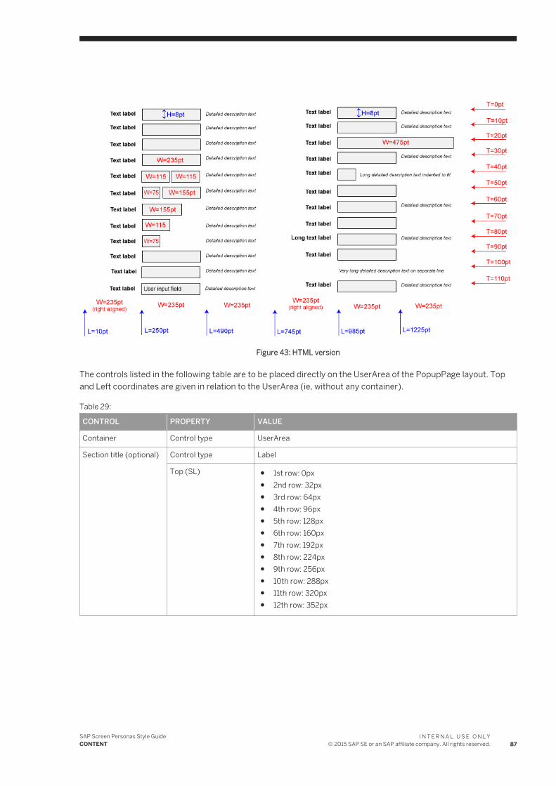
Figure 43: HTML version
The controls listed in the following table are to be placed directly on the UserArea of the PopupPage layout. Top and Left coordinates are given in relation to the UserArea (ie, without any container).
Table 29:
CONTROL PROPERTY VALUE
Container Control type UserArea
Section title (optional) Control type Label
Top (SL) ● 1st row: 0px● 2nd row: 32px● 3rd row: 64px● 4th row: 96px● 5th row: 128px● 6th row: 160px● 7th row: 192px● 8th row: 224px● 9th row: 256px● 10th row: 288px● 11th row: 320px● 12th row: 352px
SAP Screen Personas Style GuideCONTENT
I N T E R N A L U S E O N L Y© 2015 SAP SE or an SAP affiliate company. All rights reserved. 87

CONTROL PROPERTY VALUE
Top (HTML) ● 1st row: 0pt● 2nd row: 10pt● 3rd row: 20pt● 4th row: 30pt● 5th row: 40pt● 6th row: 50pt● 7th row: 60pt● 8th row: 70pt● 9th row: 80pt● 10th row: 90pt● 11th row: 100pt● 12th row: 110pt
Left Silverlight version...
● Left ContentArea: 20px● Right ContentArea: 608px
HTML version...
● Left ContentArea: 25pt● Right ContentArea: 760pt
Text labels Control type Label
Top same as for Section Titles (see above)
Left Silverlight version...
● Left ContentArea: 8px● Right ContentArea: 596px
HTML version...
● Left ContentArea: 10pt● Right ContentArea: 745pt
User input fields Control type TextBox
Top same as for Section Titles (see above)
Left Silverlight version...
● Left ContentArea: 200px● Right ContentArea: 788px
HTML version...
● Left ContentArea: 250pt● Right ContentArea: 985pt
NoteWhen more than one input field appears on the same row, maintain a 4px / 5pt gap between input fields.
Read-only status texts Control type TextBox
88I N T E R N A L U S E O N L Y© 2015 SAP SE or an SAP affiliate company. All rights reserved.
SAP Screen Personas Style GuideCONTENT
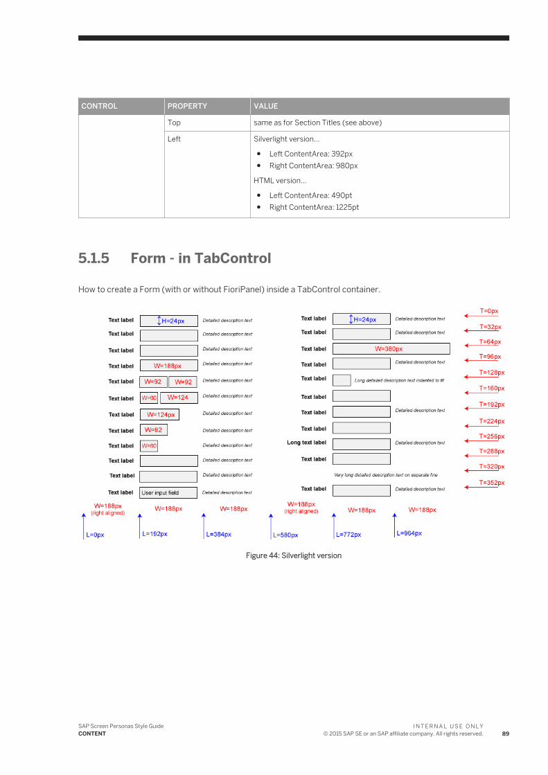
CONTROL PROPERTY VALUE
Top same as for Section Titles (see above)
Left Silverlight version...
● Left ContentArea: 392px● Right ContentArea: 980px
HTML version...
● Left ContentArea: 490pt● Right ContentArea: 1225pt
5.1.5 Form - in TabControl
How to create a Form (with or without FioriPanel) inside a TabControl container.
Figure 44: Silverlight version
SAP Screen Personas Style GuideCONTENT
I N T E R N A L U S E O N L Y© 2015 SAP SE or an SAP affiliate company. All rights reserved. 89
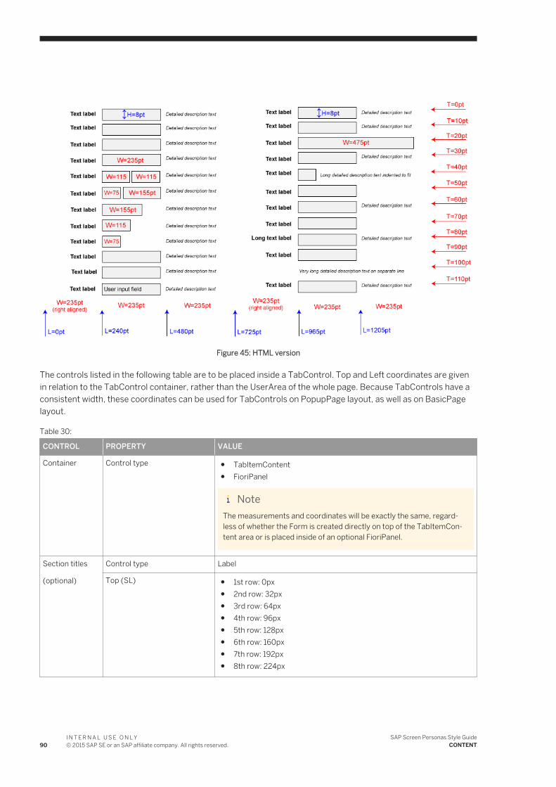
Figure 45: HTML version
The controls listed in the following table are to be placed inside a TabControl. Top and Left coordinates are given in relation to the TabControl container, rather than the UserArea of the whole page. Because TabControls have a consistent width, these coordinates can be used for TabControls on PopupPage layout, as well as on BasicPage layout.
Table 30:
CONTROL PROPERTY VALUE
Container Control type ● TabItemContent● FioriPanel
NoteThe measurements and coordinates will be exactly the same, regardless of whether the Form is created directly on top of the TabItemContent area or is placed inside of an optional FioriPanel.
Section titles
(optional)
Control type Label
Top (SL) ● 1st row: 0px● 2nd row: 32px● 3rd row: 64px● 4th row: 96px● 5th row: 128px● 6th row: 160px● 7th row: 192px● 8th row: 224px
90I N T E R N A L U S E O N L Y© 2015 SAP SE or an SAP affiliate company. All rights reserved.
SAP Screen Personas Style GuideCONTENT
CONTROL PROPERTY VALUE
Top (HTML) ● 1st row: 0pt● 2nd row: 40pt● 3rd row: 80pt● 4th row: 120pt● 5th row: 160pt● 6th row: 200pt● 7th row: 240pt● 8th row: 280pt
Left 0px (SL)
0pt (HTML)
Text labels Control type Label
Top same as for Section Titles (see above)
Left Silverlight version...
● Left ContentArea: 0px● Right ContentArea: 580px
HTML version...
● Left ContentArea: 0pt● Right ContentArea: 725pt
Input fields Control type TextBox
Top same as for Section Titles (see above)
Left Silverlight version...
● Left ContentArea: 192px● Right ContentArea: 772px
HTML version...
● Left ContentArea: 240pt● Right ContentArea: 965pt
NoteWhen more than one input field appears on the same row, maintain a 4px / 5pt gap between input fields.
Value description texts (read-only)
Control type TextBox
Top same as for Section Titles (see above)
Left Silverlight version...
● Left ContentArea: 384px● Right ContentArea: 964px
HTML version...
● Left ContentArea: 480pt● Right ContentArea: 1205pt
SAP Screen Personas Style GuideCONTENT
I N T E R N A L U S E O N L Y© 2015 SAP SE or an SAP affiliate company. All rights reserved. 91
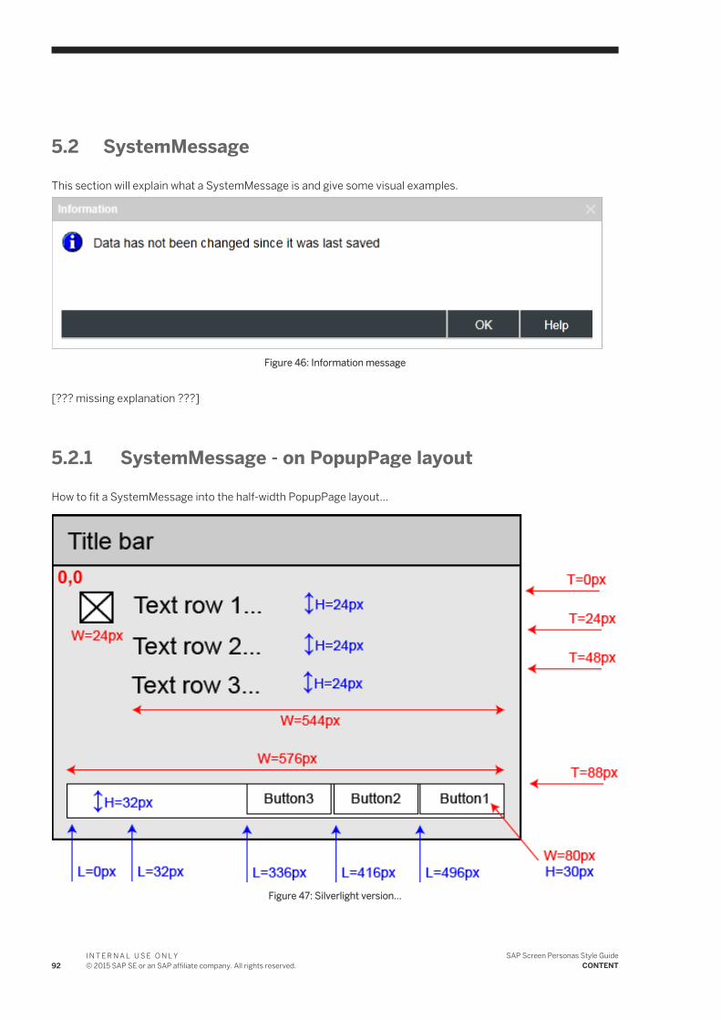
5.2 SystemMessage
This section will explain what a SystemMessage is and give some visual examples.
Figure 46: Information message
[??? missing explanation ???]
5.2.1 SystemMessage - on PopupPage layout
How to fit a SystemMessage into the half-width PopupPage layout...
Figure 47: Silverlight version...
92I N T E R N A L U S E O N L Y© 2015 SAP SE or an SAP affiliate company. All rights reserved.
SAP Screen Personas Style GuideCONTENT
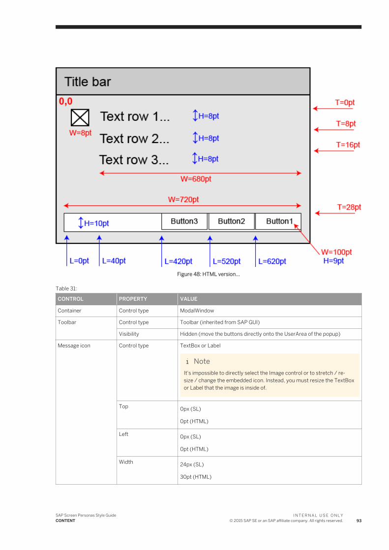
Figure 48: HTML version...
Table 31:
CONTROL PROPERTY VALUE
Container Control type ModalWindow
Toolbar Control type Toolbar (inherited from SAP GUI)
Visibility Hidden (move the buttons directly onto the UserArea of the popup)
Message icon Control type TextBox or Label
NoteIt's impossible to directly select the Image control or to stretch / resize / change the embedded icon. Instead, you must resize the TextBox or Label that the image is inside of.
Top 0px (SL)
0pt (HTML)
Left 0px (SL)
0pt (HTML)
Width 24px (SL)
30pt (HTML)
SAP Screen Personas Style GuideCONTENT
I N T E R N A L U S E O N L Y© 2015 SAP SE or an SAP affiliate company. All rights reserved. 93
CONTROL PROPERTY VALUE
Height 24px (SL)
8pt (HTML)
Message texts Control type TextBox
NoteEach row of text is a separate TextBox control. There could be as many as 3 separate TextBoxes and the property values need to be set individually for each of them.
Top Silverlight version...
● 1st row: 0px● 2nd row: 24px● 3rd row: 48px
HTML version...
● 1st row: 0pt● 2nd row: 8pt● 3rd row: 16pt
Left 32px (SL)
40pt (HTML)
Width 544px (SL)
680pt (HTML)
Height 24px (SL)
8pt (HTML)
FontSize 14pt
ForeColor (SL) Black
Font color (HTML) Black
BackColor (SL) Transparent
Background color (HTML)
No color
Footer Control type Image
Image file Fiori_Popup_HalfWidth.png
Mode (SL) None
Stretch (HTML) Stretch
Top 88px (SL)
28pt (HTML)
94I N T E R N A L U S E O N L Y© 2015 SAP SE or an SAP affiliate company. All rights reserved.
SAP Screen Personas Style GuideCONTENT
CONTROL PROPERTY VALUE
Left 0px (SL)
0pt (HTML)
Width NaN (SL)
710pt (HTML)
Height NaN (SL)
10pt (HTML)
Buttons Control type Button
Top 88px (SL)
28pt (HTML)
Left Silverlight version...
● 1st button: 496px● 2nd button: 416px● 3rd button: 336px
Silverlight version...
● 1st button: 620pt● 2nd button: 520pt● 3rd button: 420pt
Width 80px (SL)
100pt (HTML)
Height 30px (SL)
9pt (HTML)
ForeColor (SL) White
Font color (HTML) White
BackColor (SL) Transparent
Background color (HTML)
No color
5.3 Table
A Table is either a TableView or TableTreeView SAP GUI control, plus any additional text labels, buttons or other controls related to the TableView or TableTreeView.
TableView, GridView and TableTreeView are different varieties of tables found in the original SAPGUI. Throughout this style guide, these different screen elements will be referred to collectively as "Tables".
TableView is a type of table typically used for displaying large amounts of data from a database.
SAP Screen Personas Style GuideCONTENT
I N T E R N A L U S E O N L Y© 2015 SAP SE or an SAP affiliate company. All rights reserved. 95
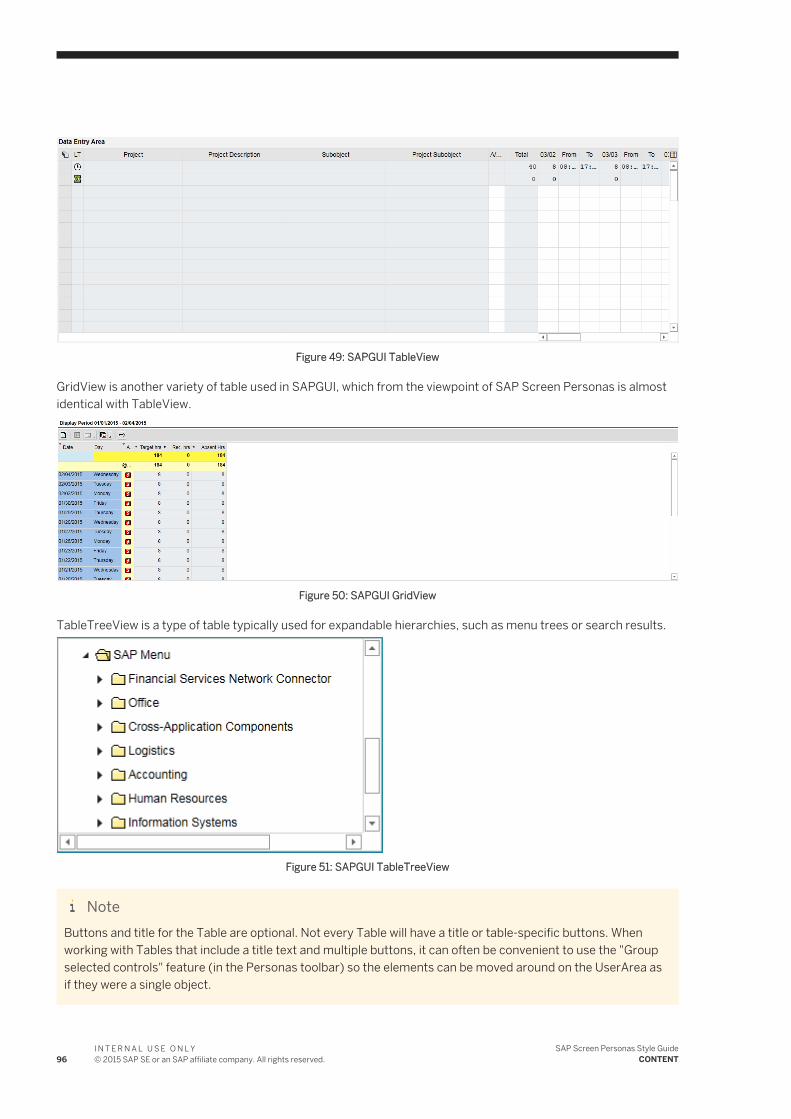
Figure 49: SAPGUI TableView
GridView is another variety of table used in SAPGUI, which from the viewpoint of SAP Screen Personas is almost identical with TableView.
Figure 50: SAPGUI GridView
TableTreeView is a type of table typically used for expandable hierarchies, such as menu trees or search results.
Figure 51: SAPGUI TableTreeView
NoteButtons and title for the Table are optional. Not every Table will have a title or table-specific buttons. When working with Tables that include a title text and multiple buttons, it can often be convenient to use the "Group selected controls" feature (in the Personas toolbar) so the elements can be moved around on the UserArea as if they were a single object.
96I N T E R N A L U S E O N L Y© 2015 SAP SE or an SAP affiliate company. All rights reserved.
SAP Screen Personas Style GuideCONTENT
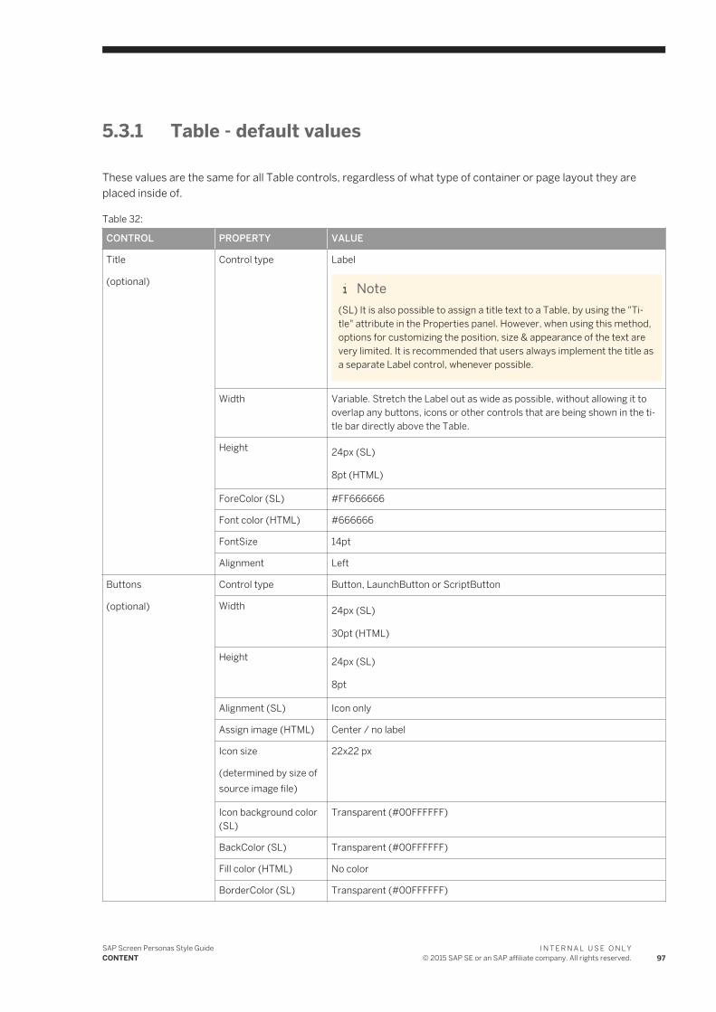
5.3.1 Table - default values
These values are the same for all Table controls, regardless of what type of container or page layout they are placed inside of.
Table 32:
CONTROL PROPERTY VALUE
Title
(optional)
Control type Label
Note(SL) It is also possible to assign a title text to a Table, by using the "Title" attribute in the Properties panel. However, when using this method, options for customizing the position, size & appearance of the text are very limited. It is recommended that users always implement the title as a separate Label control, whenever possible.
Width Variable. Stretch the Label out as wide as possible, without allowing it to overlap any buttons, icons or other controls that are being shown in the title bar directly above the Table.
Height 24px (SL)
8pt (HTML)
ForeColor (SL) #FF666666
Font color (HTML) #666666
FontSize 14pt
Alignment Left
Buttons
(optional)
Control type Button, LaunchButton or ScriptButton
Width 24px (SL)
30pt (HTML)
Height 24px (SL)
8pt
Alignment (SL) Icon only
Assign image (HTML) Center / no label
Icon size
(determined by size of source image file)
22x22 px
Icon background color (SL)
Transparent (#00FFFFFF)
BackColor (SL) Transparent (#00FFFFFF)
Fill color (HTML) No color
BorderColor (SL) Transparent (#00FFFFFF)
SAP Screen Personas Style GuideCONTENT
I N T E R N A L U S E O N L Y© 2015 SAP SE or an SAP affiliate company. All rights reserved. 97
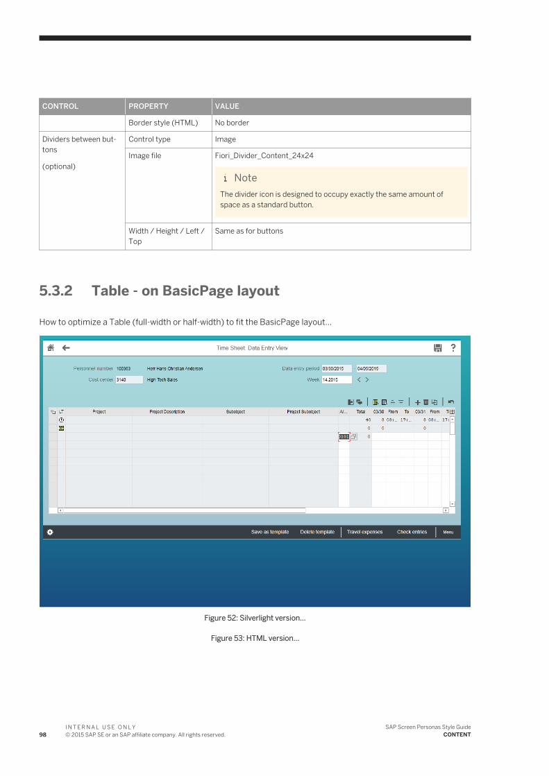
CONTROL PROPERTY VALUE
Border style (HTML) No border
Dividers between buttons
(optional)
Control type Image
Image file Fiori_Divider_Content_24x24
NoteThe divider icon is designed to occupy exactly the same amount of space as a standard button.
Width / Height / Left / Top
Same as for buttons
5.3.2 Table - on BasicPage layout
How to optimize a Table (full-width or half-width) to fit the BasicPage layout...
Figure 52: Silverlight version...
Figure 53: HTML version...
98I N T E R N A L U S E O N L Y© 2015 SAP SE or an SAP affiliate company. All rights reserved.
SAP Screen Personas Style GuideCONTENT
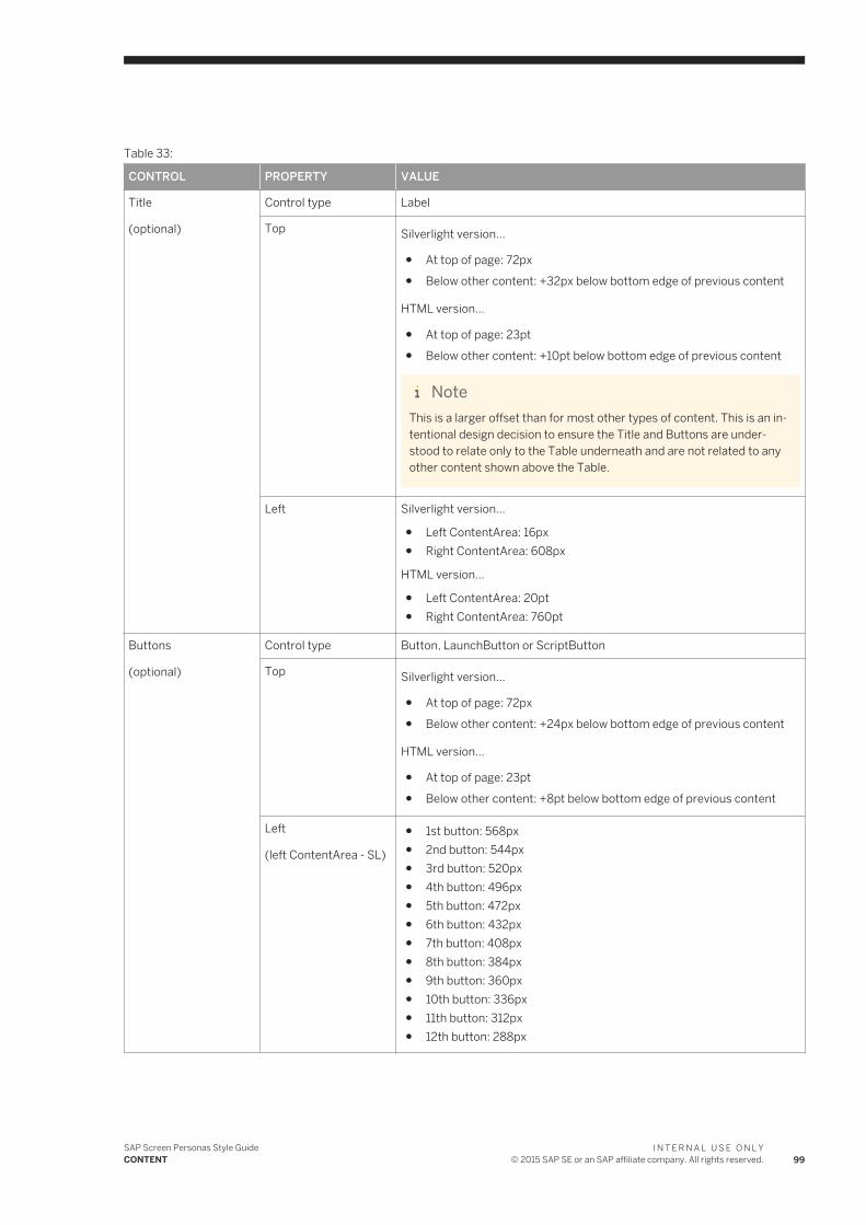
Table 33:
CONTROL PROPERTY VALUE
Title
(optional)
Control type Label
Top Silverlight version...
● At top of page: 72px● Below other content: +32px below bottom edge of previous content
HTML version...
● At top of page: 23pt● Below other content: +10pt below bottom edge of previous content
NoteThis is a larger offset than for most other types of content. This is an intentional design decision to ensure the Title and Buttons are understood to relate only to the Table underneath and are not related to any other content shown above the Table.
Left Silverlight version...
● Left ContentArea: 16px● Right ContentArea: 608px
HTML version...
● Left ContentArea: 20pt● Right ContentArea: 760pt
Buttons
(optional)
Control type Button, LaunchButton or ScriptButton
Top Silverlight version...
● At top of page: 72px● Below other content: +24px below bottom edge of previous content
HTML version...
● At top of page: 23pt● Below other content: +8pt below bottom edge of previous content
Left
(left ContentArea - SL)
● 1st button: 568px● 2nd button: 544px● 3rd button: 520px● 4th button: 496px● 5th button: 472px● 6th button: 432px● 7th button: 408px● 8th button: 384px● 9th button: 360px● 10th button: 336px● 11th button: 312px● 12th button: 288px
SAP Screen Personas Style GuideCONTENT
I N T E R N A L U S E O N L Y© 2015 SAP SE or an SAP affiliate company. All rights reserved. 99

CONTROL PROPERTY VALUE
Left
(left ContentArea - HTML)
● 1st button: 710pt● 2nd button: 680pt● 3rd button: 650pt● 4th button: 620pt● 5th button: 590pt● 6th button: 560pt● 7th button: 530pt● 8th button: 500pt● 9th button: 470pt● 10th button: 440pt● 11th button: 410pt● 12th button: 380pt
Left
(right ContentArea - SL)
● 1st button: 1160px● 2nd button: 1136px● 3rd button: 1112px● 4th button: 1088px● 5th button: 1064px● 6th button: 1040px● 7th button: 1016px● 8th button: 992px● 9th button: 968px● 10th button: 944px● 11th button: 920px● 12th button: 896px
Left
(right ContentArea - HTML)
● 1st button: 1450pt● 2nd button: 1420pt● 3rd button: 1390pt● 4th button: 1360pt● 5th button: 1330pt● 6th button: 1300pt● 7th button: 1270pt● 8th button: 1240pt● 9th button: 1210pt● 10th button: 1180pt● 11th button: 1150pt● 12th button: 1120pt
Content Control type ● Calendar● GridView● TableView● TableTreeView
100I N T E R N A L U S E O N L Y© 2015 SAP SE or an SAP affiliate company. All rights reserved.
SAP Screen Personas Style GuideCONTENT
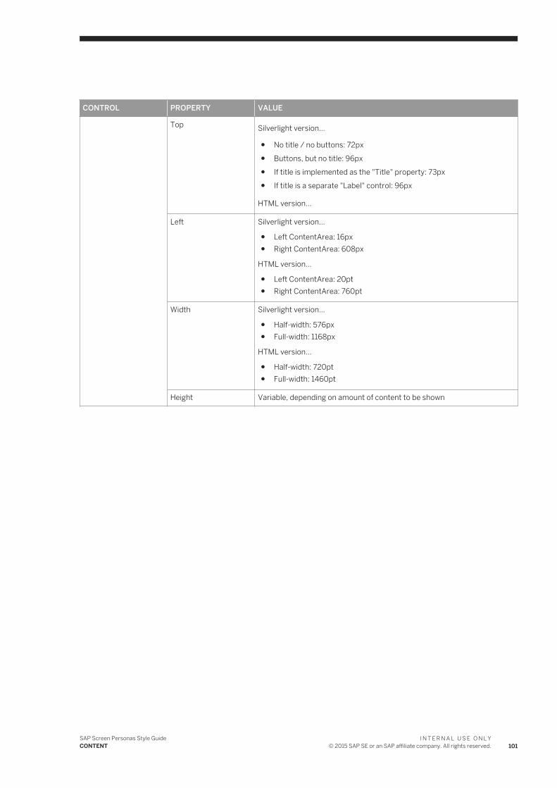
CONTROL PROPERTY VALUE
Top Silverlight version...
● No title / no buttons: 72px● Buttons, but no title: 96px● If title is implemented as the "Title" property: 73px● If title is a separate "Label" control: 96px
HTML version...
Left Silverlight version...
● Left ContentArea: 16px● Right ContentArea: 608px
HTML version...
● Left ContentArea: 20pt● Right ContentArea: 760pt
Width Silverlight version...
● Half-width: 576px● Full-width: 1168px
HTML version...
● Half-width: 720pt● Full-width: 1460pt
Height Variable, depending on amount of content to be shown
SAP Screen Personas Style GuideCONTENT
I N T E R N A L U S E O N L Y© 2015 SAP SE or an SAP affiliate company. All rights reserved. 101
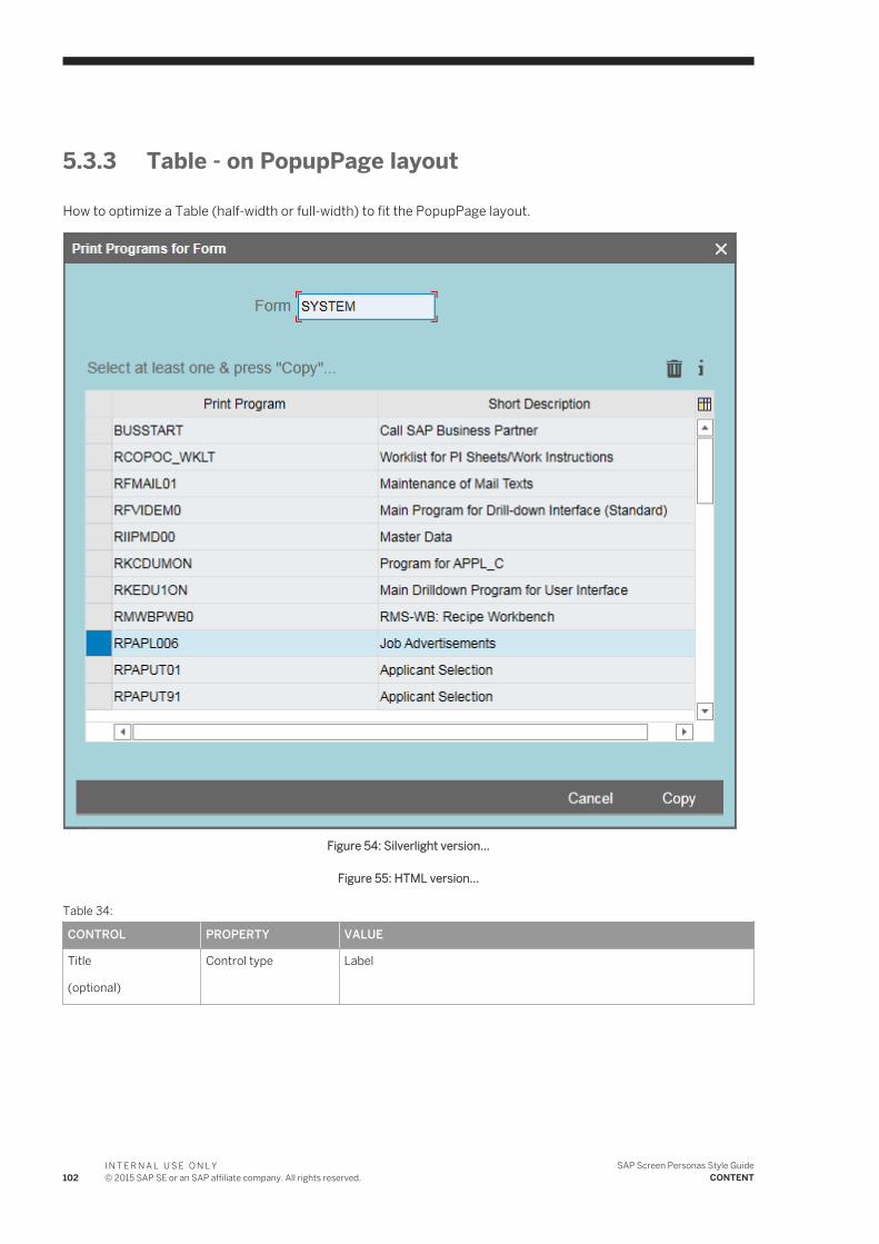
5.3.3 Table - on PopupPage layout
How to optimize a Table (half-width or full-width) to fit the PopupPage layout.
Figure 54: Silverlight version...
Figure 55: HTML version...
Table 34:
CONTROL PROPERTY VALUE
Title
(optional)
Control type Label
102I N T E R N A L U S E O N L Y© 2015 SAP SE or an SAP affiliate company. All rights reserved.
SAP Screen Personas Style GuideCONTENT
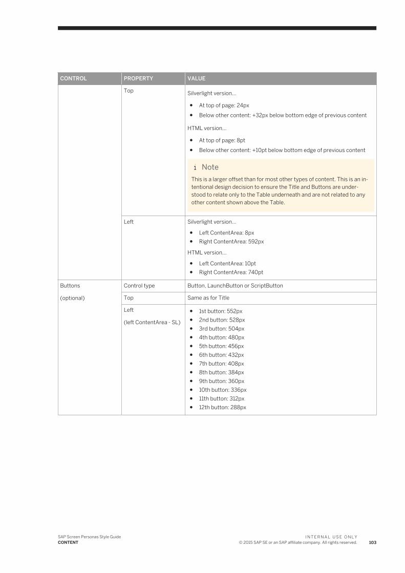
CONTROL PROPERTY VALUE
Top Silverlight version...
● At top of page: 24px● Below other content: +32px below bottom edge of previous content
HTML version...
● At top of page: 8pt● Below other content: +10pt below bottom edge of previous content
NoteThis is a larger offset than for most other types of content. This is an intentional design decision to ensure the Title and Buttons are understood to relate only to the Table underneath and are not related to any other content shown above the Table.
Left Silverlight version...
● Left ContentArea: 8px● Right ContentArea: 592px
HTML version...
● Left ContentArea: 10pt● Right ContentArea: 740pt
Buttons
(optional)
Control type Button, LaunchButton or ScriptButton
Top Same as for Title
Left
(left ContentArea - SL)
● 1st button: 552px● 2nd button: 528px● 3rd button: 504px● 4th button: 480px● 5th button: 456px● 6th button: 432px● 7th button: 408px● 8th button: 384px● 9th button: 360px● 10th button: 336px● 11th button: 312px● 12th button: 288px
SAP Screen Personas Style GuideCONTENT
I N T E R N A L U S E O N L Y© 2015 SAP SE or an SAP affiliate company. All rights reserved. 103

CONTROL PROPERTY VALUE
Left
(right ContentArea - SL)
● 1st button: 1136px● 2nd button: 1112px● 3rd button: 1088px● 4th button: 1064px● 5th button: 1040px● 6th button: 1016px● 7th button: 992px● 8th button: 968px● 9th button: 944px● 10th button: 920px● 11th button: 896px● 12th button: 872px
Left
(left ContentArea - HTML)
● 1st button: 690pt● 2nd button: 660pt● 3rd button: 630pt● 4th button: 600pt● 5th button: 570pt● 6th button: 540pt● 7th button: 510pt● 8th button: 480pt● 9th button: 450pt● 10th button: 420pt● 11th button: 390pt● 12th button: 360pt
Left
(right ContentArea - HTML)
● 1st button: 1420pt● 2nd button: 1390pt● 3rd button: 1360pt● 4th button: 1330pt● 5th button: 1300pt● 6th button: 1270pt● 7th button: 1240pt● 8th button: 1210pt● 9th button: 1180pt● 10th button: 1150pt● 11th button: 1120pt● 12th button: 1090pt
Content Control type ● Calendar● GridView● TableView● TableTreeView
104I N T E R N A L U S E O N L Y© 2015 SAP SE or an SAP affiliate company. All rights reserved.
SAP Screen Personas Style GuideCONTENT
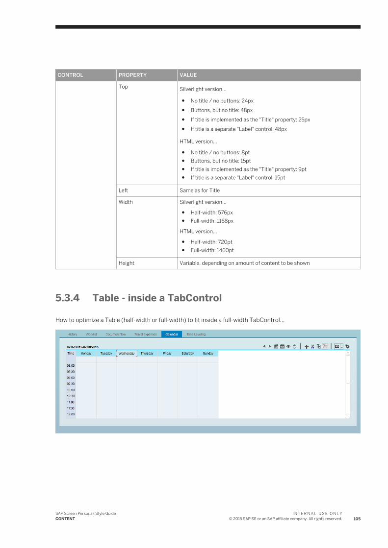
CONTROL PROPERTY VALUE
Top Silverlight version...
● No title / no buttons: 24px● Buttons, but no title: 48px● If title is implemented as the "Title" property: 25px● If title is a separate "Label" control: 48px
HTML version...
● No title / no buttons: 8pt● Buttons, but no title: 15pt● If title is implemented as the "Title" property: 9pt● If title is a separate "Label" control: 15pt
Left Same as for Title
Width Silverlight version...
● Half-width: 576px● Full-width: 1168px
HTML version...
● Half-width: 720pt● Full-width: 1460pt
Height Variable, depending on amount of content to be shown
5.3.4 Table - inside a TabControl
How to optimize a Table (half-width or full-width) to fit inside a full-width TabControl...
SAP Screen Personas Style GuideCONTENT
I N T E R N A L U S E O N L Y© 2015 SAP SE or an SAP affiliate company. All rights reserved. 105
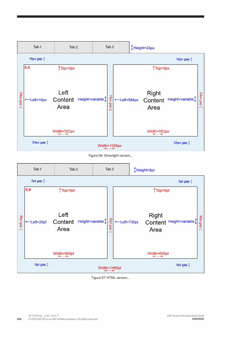
Figure 56: Silverlight version...
Figure 57: HTML version...
106I N T E R N A L U S E O N L Y© 2015 SAP SE or an SAP affiliate company. All rights reserved.
SAP Screen Personas Style GuideCONTENT
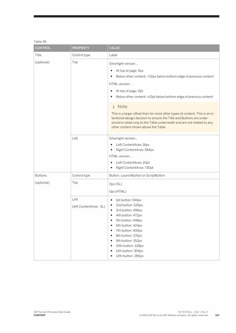
Table 35:
CONTROL PROPERTY VALUE
Title
(optional)
Control type Label
Top Silverlight version...
● At top of page: 0px● Below other content: +32px below bottom edge of previous content
HTML version...
● At top of page: 0pt● Below other content: +10pt below bottom edge of previous content
NoteThis is a larger offset than for most other types of content. This is an intentional design decision to ensure the Title and Buttons are understood to relate only to the Table underneath and are not related to any other content shown above the Table.
Left Silverlight version...
● Left ContentArea: 16px● Right ContentArea: 584px
HTML version...
● Left ContentArea: 20pt● Right ContentArea: 730pt
Buttons
(optional)
Control type Button, LaunchButton or ScriptButton
Top 0px (SL)
0pt (HTML)
Left
(left ContentArea - SL)
● 1st button: 544px● 2nd button: 520px● 3rd button: 496px● 4th button: 472px● 5th button: 448px● 6th button: 424px● 7th button: 400px● 8th button: 376px● 9th button: 352px● 10th button: 328px● 11th button: 304px● 12th button: 280px
SAP Screen Personas Style GuideCONTENT
I N T E R N A L U S E O N L Y© 2015 SAP SE or an SAP affiliate company. All rights reserved. 107
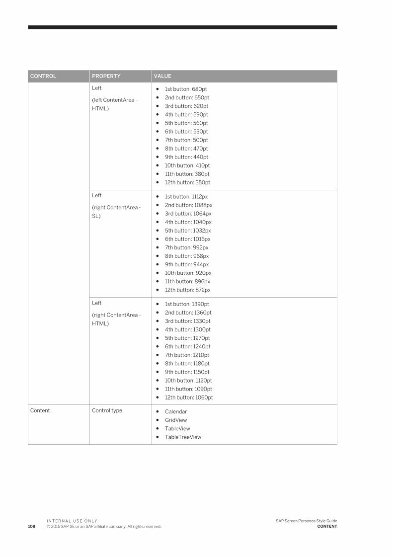
CONTROL PROPERTY VALUE
Left
(left ContentArea - HTML)
● 1st button: 680pt● 2nd button: 650pt● 3rd button: 620pt● 4th button: 590pt● 5th button: 560pt● 6th button: 530pt● 7th button: 500pt● 8th button: 470pt● 9th button: 440pt● 10th button: 410pt● 11th button: 380pt● 12th button: 350pt
Left
(right ContentArea - SL)
● 1st button: 1112px● 2nd button: 1088px● 3rd button: 1064px● 4th button: 1040px● 5th button: 1032px● 6th button: 1016px● 7th button: 992px● 8th button: 968px● 9th button: 944px● 10th button: 920px● 11th button: 896px● 12th button: 872px
Left
(right ContentArea - HTML)
● 1st button: 1390pt● 2nd button: 1360pt● 3rd button: 1330pt● 4th button: 1300pt● 5th button: 1270pt● 6th button: 1240pt● 7th button: 1210pt● 8th button: 1180pt● 9th button: 1150pt● 10th button: 1120pt● 11th button: 1090pt● 12th button: 1060pt
Content Control type ● Calendar● GridView● TableView● TableTreeView
108I N T E R N A L U S E O N L Y© 2015 SAP SE or an SAP affiliate company. All rights reserved.
SAP Screen Personas Style GuideCONTENT
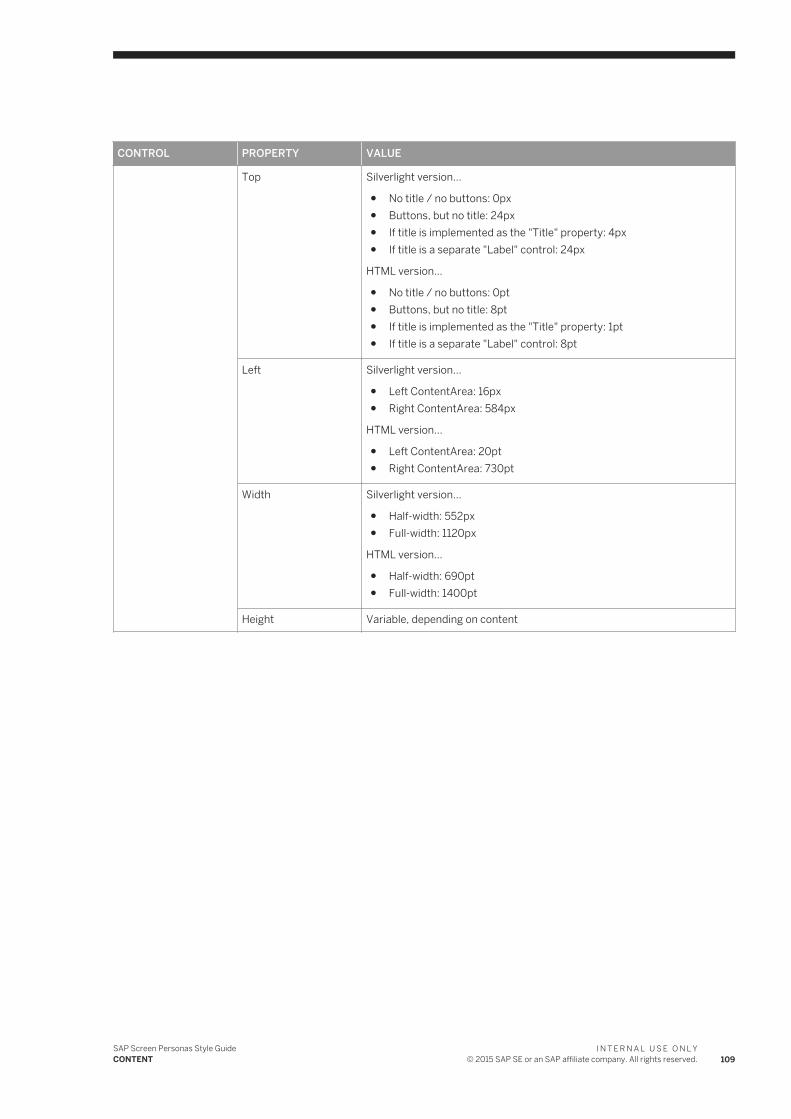
CONTROL PROPERTY VALUE
Top Silverlight version...
● No title / no buttons: 0px● Buttons, but no title: 24px● If title is implemented as the "Title" property: 4px● If title is a separate "Label" control: 24px
HTML version...
● No title / no buttons: 0pt● Buttons, but no title: 8pt● If title is implemented as the "Title" property: 1pt● If title is a separate "Label" control: 8pt
Left Silverlight version...
● Left ContentArea: 16px● Right ContentArea: 584px
HTML version...
● Left ContentArea: 20pt● Right ContentArea: 730pt
Width Silverlight version...
● Half-width: 552px● Full-width: 1120px
HTML version...
● Half-width: 690pt● Full-width: 1400pt
Height Variable, depending on content
SAP Screen Personas Style GuideCONTENT
I N T E R N A L U S E O N L Y© 2015 SAP SE or an SAP affiliate company. All rights reserved. 109
6 CONTROLS
The Controls section discusses special requirements and recommendations for specific types of UI controls used in SAP Screen Personas. Here you will find very detailed guidelines about how to use the different controls, which are the building blocks for creating the UI.
[??? missing explanation ???]
6.1 Button
In SAP Screen Personas, a Button is a certain type of control which performs a specific function when pressed. The Button has a label (text, icon or both) and will become highlighted when hovering over it with a mouse (to indicate that it is pressable).
6.1.1 LaunchButton & ScriptButton
A LaunchButton is a SAP Screen Personas control that launches a transaction or menu command when pressed.
A ScriptButton is a SAP Screen Personas control that launches a script when pressed.
Below, you can see examples of a LaunchButton and ScriptButton, as they appear when first created and placed on the UserArea (before any customization is done)...
Guideline: Don't use the standard button icons... either hide the icon or replace it with a more meaningful function-specific icon that informs the user about what the button actually does in the current context.
Design rationale: Users don't care if the button is a LaunchButton or a ScriptButton or a normal Button control from the SAP GUI screens. Users only care about what the button DOES for them. So, the default button icons are meaningless to end users and needlessly clutter the screen. It is better to simplify the visual complexity of the screen, so teh meaningful information is easily noticed & consumed by users.
6.2 Checkbox
A Checkbox is a control used to toggle a setting between two different states: "active" (box is checked) and "not active" (box is not checked).
It is currently not possible to move the text label for a Checkbox to the left side of the box.
Guideline: There is some flexibility about where and how to place checkboxes, depending on the surrounding context. But in general, they should be placed directly beneath any other content they are closely related to.
110I N T E R N A L U S E O N L Y© 2015 SAP SE or an SAP affiliate company. All rights reserved.
SAP Screen Personas Style GuideCONTROLS
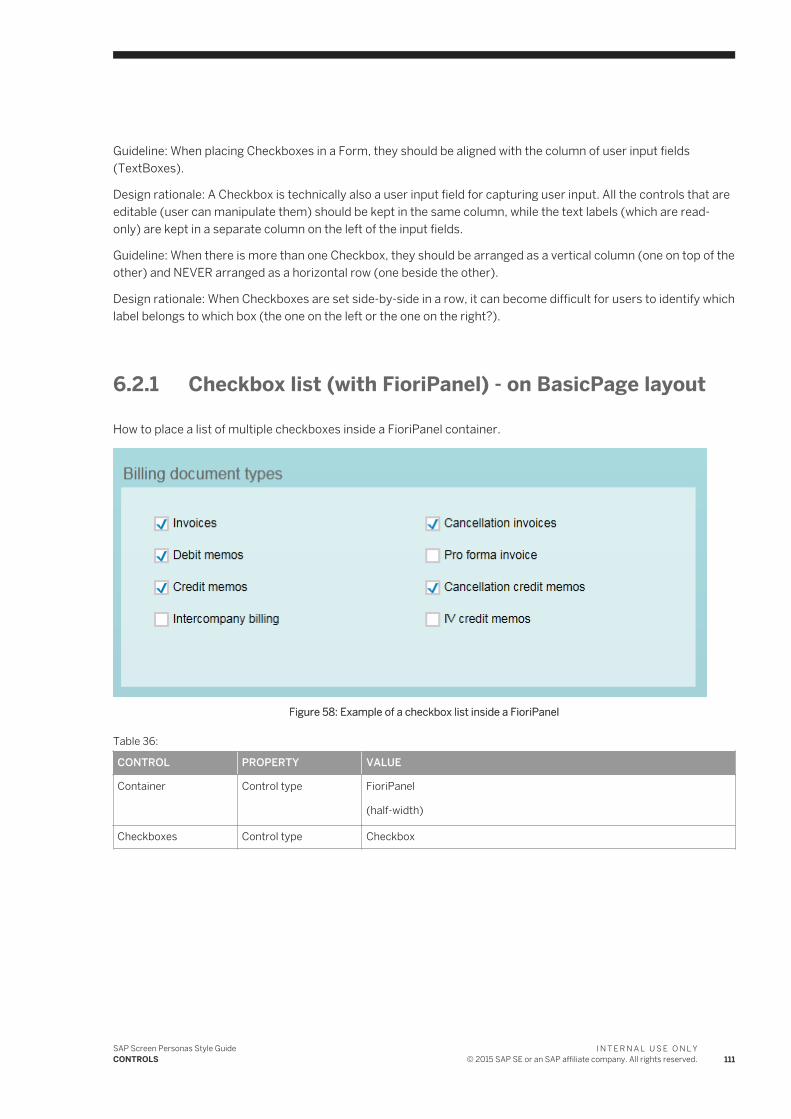
Guideline: When placing Checkboxes in a Form, they should be aligned with the column of user input fields (TextBoxes).
Design rationale: A Checkbox is technically also a user input field for capturing user input. All the controls that are editable (user can manipulate them) should be kept in the same column, while the text labels (which are read-only) are kept in a separate column on the left of the input fields.
Guideline: When there is more than one Checkbox, they should be arranged as a vertical column (one on top of the other) and NEVER arranged as a horizontal row (one beside the other).
Design rationale: When Checkboxes are set side-by-side in a row, it can become difficult for users to identify which label belongs to which box (the one on the left or the one on the right?).
6.2.1 Checkbox list (with FioriPanel) - on BasicPage layout
How to place a list of multiple checkboxes inside a FioriPanel container.
Figure 58: Example of a checkbox list inside a FioriPanel
Table 36:
CONTROL PROPERTY VALUE
Container Control type FioriPanel
(half-width)
Checkboxes Control type Checkbox
SAP Screen Personas Style GuideCONTROLS
I N T E R N A L U S E O N L Y© 2015 SAP SE or an SAP affiliate company. All rights reserved. 111
CONTROL PROPERTY VALUE
Top (SL) ● 1st row: 48px● 2nd row: 80px● 3rd row: 112px● 4th row: 144px● 5th row: 176px● 6th row: 208px● 7th row: 240px● 8th row: 272px● 9th row: 304px● 10th row: 336px● 11th row: 368px● 12th row: 400px
Top (HTML) ● 1st row: 15pt● 2nd row: 25pt● 3rd row: 35pt● 4th row: 45pt● 5th row: 55pt● 6th row: 65pt● 7th row: 75pt● 8th row: 85pt● 9th row: 95pt● 10th row: 105pt● 11th row: 115pt● 12th row: 125pt
Left Silverlight version...
● Left column: 32px● Right column: 304px
HTML version...
● Left column: 40pt● Right column: 380pt
Height 24px (SL)
8pt (HTML)
Width 240px (SL)
300pt (HTML)
6.3 Image
An Image is a graphics file (in PNG format) which has been inserted into a SAP Screen Personas flavor.
112I N T E R N A L U S E O N L Y© 2015 SAP SE or an SAP affiliate company. All rights reserved.
SAP Screen Personas Style GuideCONTROLS
6.3.1 Clickable Icons
A Clickable Icon is an uploaded Image that performs a certain function when the user clicks on it, just as if the image was a Button control.
The functionality linked to the clickable icon is controlled by the PushOnClick property for the Image. Usually the PushOnClick property is populated by the unique control ID of a button that performs the desired functionality. When the user clicks on the icon, it simulates a push on the linked Button in the back end.
Tip: Clickable icons are generally not as intuitive as actual "buttons", because the user might not recognize that it is possible to click on the image / icon. If you have a mix of traditional buttons an dclickable images / icons all on the same page, the user will probably NOT realize that clicking on the images will actually accomplish anything. Instead, the user will have a tendency to only use the traditional (easily recognized) buttons which are OBVIOUSLY meant to be clicked. Clickable images that do NOT look like a button should only be used in very special cases, where the function behind the button is not critical to main task being performed.
6.4 Label
A Label is a control that displays a read-only text. Labels are usually used in conjunction with other linked controls (most commonly, TextBoxes) to communicate a name, title or other descriptive information for the linked control.
A Label should always be placed above or to the left of the object that it is referring to (such as a TextBox or other type of user input field).
6.4.1 Label - Default Values
Table 37:
PROPERTY VALUE
Font Arial
Size 14pt
Style None
Alignment Left
ForeColor #FF666666
BackColor Transparent
ProporationalFont True
FontFamily Arial
FontSize 14pt
FontWeight Normal
FontStyle Normal
SAP Screen Personas Style GuideCONTROLS
I N T E R N A L U S E O N L Y© 2015 SAP SE or an SAP affiliate company. All rights reserved. 113
PROPERTY VALUE
TextDecorations None
TextAlignment Left
6.4.2 Label vs TextBox
Sometimes in the SAP GUI, you will encounter what appear to be text Labels (read-only introductory texts used to label another control or group of controls) that were actually implemented in the legacy software as TextBox controls.
As a general rule, Labels are read-only OUTPUT fields, while TextBoxes are user INPUT fields. The main differences between these two types of UI controls in SAP Screen Personas tool are...
● Labels are ALWAYS read-only, while TextBoxes are USUALLY editable but OCCASIONALLY made read-only.● Labels can be given bold or italic font, while the font options for TextBoxes are much more limited.
[??? missing illustration ???]
Easy solution: treat the existing control as if it were a Label (instead of a TextBox), but you will NOT be able to set the font style to "bold" (not supported by TextBoxes). This easy solution frequently will work without end users ever noticing the inconsistency, as long as all the other "labels" on the same page also happen to be TextBoxes.
Difficult solution: Create a new Label control and link it to the display text of the hidden TextBox (so it displays the same text). Move the old TextBox out of the way (to an empty space on screen) and hide it. Put the new Label in the same location that was previously occupied by the (now hidden) TextBox.
6.5 OkCodeBox
The OkCodeBox, or Transaction Code Prompt is a user input field which allows users to input the name of a transaction and jump directly to it from the current transaction.
The OkCodeBox is inherited from the SAP GUI backend and it is currently not possible to create one in SAP Screen Personas.
Guideline: It should be hidden in all transaction pages outside of the LaunchPage / Dashboards. Instead users will be required to return to teh LandingPage or Dashboard if they need to jump to another transaction.
Design rationale: In SAP Screen Personas, the OkCodeBox is almost never needed. It provides a shortcut that circumvents the normal prescribed UI flow in a user scenario. Shortcuts to any relevant or useful functions are usually provided through the available Buttons or contextual menu options. The OkCodeBox only provides additional access to completely unrelated transactions and functionalities.
114I N T E R N A L U S E O N L Y© 2015 SAP SE or an SAP affiliate company. All rights reserved.
SAP Screen Personas Style GuideCONTROLS
6.6 StatusBar
The StatusBar is a SAP GUI control used to communicate important system status messages to the user. It is permanently located in a fixed location at the bottom of the screen.
StatusBars are inherited from the SAP GUI backend and it is currently not possible to create a StatusBar in SAP Screen Personas.
It is currently not possible to move the StatusBar to another location or change its size. Instead, it has an infinite width (to fill the entire width of the screen) and fills a height of approximately 24px at the very bottom of the screen, below the bottom edge of the UserArea.
It is currently not possible to change the font size or style of the texts displayed in the StatusBar.
Guideline: The StatusBar (BackColor and BorderColor) is always colored using the primary brand-specific color. The text shown inside the StatusBar (ForeColor) will always be set to Default color.
Design rationale: Some types of status message are shown with colored texts. Setting the ForeColor to a non-default color will interfere with this color-coding of system messages.
6.7 TextBox
A TextBox is a user input field intended for capturing text or numerical input.
Tip: TextBoxes are easily created in SAP Screen Personas and can be assigned a permanent BackColor and BorderColor, even when there is no text being displayed inside them. This makes read-only TextBoxes a good method of creating simple colored shapes, instead of importing graphics files as Images.
6.7.1 TextBox - Default Values
Table 38: TextBox used as an input field
PROPERTY VALUE
ZIndex Irrelevant, as long as it is a positive value
IsEnabled True
Width Depending on max length of text...
●
Height 24px (SL)
8pt (HTML)
ForeColor Black
BackColor White
SAP Screen Personas Style GuideCONTROLS
I N T E R N A L U S E O N L Y© 2015 SAP SE or an SAP affiliate company. All rights reserved. 115
PROPERTY VALUE
BorderColor #FF666666
ProportionalFont True (for phone numbers or other long numbers with special characters, this property can be set to FALSE, but only if it improves readability)
AlignmentRight False
FontSize 14pt
Table 39: TextBox used as a read-only status text for another input field
PROPERTY VALUE
ZIndex Irrelevant, as long as it is a positive value
IsEnabled True
Width Depending on max length of text...
●
Height 24px
ForeColor #FF666666
BackColor transparent
BorderColor transparent
ProportionalFont True
IsReadOnly True
AlignmentRight False
FontSize 12pt
Table 40: TextBox used as a colored background for other content
PROPERTY VALUE
ZIndex -10 (this ensures that this control appears BEHIND whatever content is placed on top of it)
Tooltip none
IsEnabled True
ForeColor transparent
BackColor #99FFFFFF
BorderColor #99FFFFFF
ProportionalFont True
IsReadOnly True
AlignmentRight False
FontSize NaN
116I N T E R N A L U S E O N L Y© 2015 SAP SE or an SAP affiliate company. All rights reserved.
SAP Screen Personas Style GuideCONTROLS
6.8 Text Editors
[??? missing introduction ???]
[??? missing explanation ???]
6.9 Toolbar
A Toolbar is a container control, inherited from the SAP GUI back end, that's used to group buttons together.
There are usually at least two standard Toolbars in every transaction page (one for global functions and one for application-specific functions) and one Toolbar at the bottom of every popup page.
It is currently impossible to create a Toolbar in SAP Screen Personas.
Guideline: In most cases, the Toolbars from the original SAP GUI screens should be hidden. Any buttons or content from the Toolbars that is necessary or DIRECTLY relevant for the user scenario can be moved into the UserArea as part of the page layout.
Design rationale: Toolbars currently offer limited options for aligning the buttons placed inside them. Usually, the buttons are simply pushed as far to the left as possible (left-aligned) with only a minimal spacing between them (approximately 4px). It's difficult to make the buttons align with the overall page layout or to show subgroupings, hierarchies or relationships between the buttons in the Toolbars.
Tip: The hidden Toolbars from the SAP GUI are useful containers for gathering together any buttons that need to be hidden from users in SAP Screen Personas flavors (for example ScriptButtons that are used to link automated fucntionality to an event or to other controls.)
6.10 UserArea
The UserArea is inherited from the SAP GUI back end and is an infinite empty area for displaying content between the Toolbar (at the top of the screen) and the StatusBar (at the bottom of the screen).
There is always only one UserArea in each SAP Screen Personas screen. It is impossible to ever hide or resize the UserArea with SAP Screen Personas, or to create a new UserArea.
SAP Screen Personas Style GuideCONTROLS
I N T E R N A L U S E O N L Y© 2015 SAP SE or an SAP affiliate company. All rights reserved. 117
Important Disclaimers and Legal Information
Coding SamplesAny software coding and/or code lines / strings ("Code") included in this documentation are only examples and are not intended to be used in a productive system environment. The Code is only intended to better explain and visualize the syntax and phrasing rules of certain coding. SAP does not warrant the correctness and completeness of the Code given herein, and SAP shall not be liable for errors or damages caused by the usage of the Code, unless damages were caused by SAP intentionally or by SAP's gross negligence.
AccessibilityThe information contained in the SAP documentation represents SAP's current view of accessibility criteria as of the date of publication; it is in no way intended to be a binding guideline on how to ensure accessibility of software products. SAP in particular disclaims any liability in relation to this document. This disclaimer, however, does not apply in cases of wilful misconduct or gross negligence of SAP. Furthermore, this document does not result in any direct or indirect contractual obligations of SAP.
Gender-Neutral LanguageAs far as possible, SAP documentation is gender neutral. Depending on the context, the reader is addressed directly with "you", or a gender-neutral noun (such as "sales person" or "working days") is used. If when referring to members of both sexes, however, the third-person singular cannot be avoided or a gender-neutral noun does not exist, SAP reserves the right to use the masculine form of the noun and pronoun. This is to ensure that the documentation remains comprehensible.
Internet HyperlinksThe SAP documentation may contain hyperlinks to the Internet. These hyperlinks are intended to serve as a hint about where to find related information. SAP does not warrant the availability and correctness of this related information or the ability of this information to serve a particular purpose. SAP shall not be liable for any damages caused by the use of related information unless damages have been caused by SAP's gross negligence or willful misconduct. All links are categorized for transparency (see: http://help.sap.com/disclaimer).
118I N T E R N A L U S E O N L Y© 2015 SAP SE or an SAP affiliate company. All rights reserved.
SAP Screen Personas Style GuideImportant Disclaimers and Legal Information
SAP Screen Personas Style GuideImportant Disclaimers and Legal Information
I N T E R N A L U S E O N L Y© 2015 SAP SE or an SAP affiliate company. All rights reserved. 119
www.sap.com/contactsap
© 2015 SAP SE or an SAP affiliate company. All rights reserved.No part of this publication may be reproduced or transmitted in any form or for any purpose without the express permission of SAP SE or an SAP affiliate company. The information contained herein may be changed without prior notice.Some software products marketed by SAP SE and its distributors contain proprietary software components of other software vendors. National product specifications may vary.These materials are provided by SAP SE or an SAP affiliate company for informational purposes only, without representation or warranty of any kind, and SAP or its affiliated companies shall not be liable for errors or omissions with respect to the materials. The only warranties for SAP or SAP affiliate company products and services are those that are set forth in the express warranty statements accompanying such products and services, if any. Nothing herein should be construed as constituting an additional warranty.SAP and other SAP products and services mentioned herein as well as their respective logos are trademarks or registered trademarks of SAP SE (or an SAP affiliate company) in Germany and other countries. All other product and service names mentioned are the trademarks of their respective companies.Please see http://www.sap.com/corporate-en/legal/copyright/index.epx for additional trademark information and notices.