Embed Size (px)
Citation preview
Double Page Spread Analysis
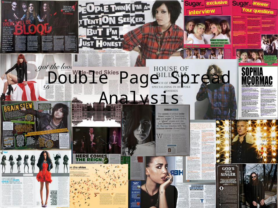
Analysing layout
• You must consider…– Basic layout – can you see a ‘grid’?– Column width and positioning– Font and type size– Use of space– Colours– Use of images– Page numbers– Branding– Captions– How image and text are integrated
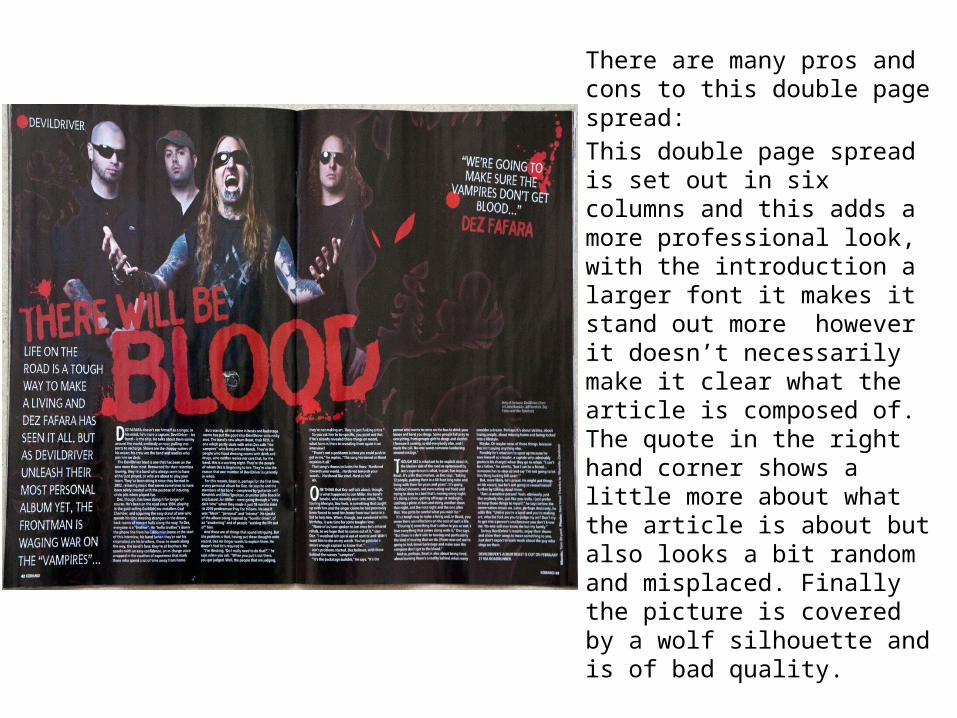
There are many pros and cons to this double page spread: This double page spread is set out in six columns and this adds a more professional look, with the introduction a larger font it makes it stand out more however it doesn’t necessarily make it clear what the article is composed of. The quote in the right hand corner shows a little more about what the article is about but also looks a bit random and misplaced. Finally the picture is covered by a wolf silhouette and is of bad quality.
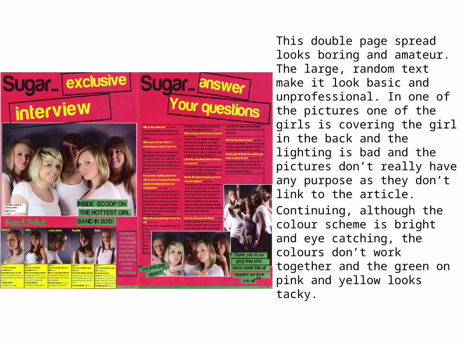
This double page spread looks boring and amateur. The large, random text make it look basic and unprofessional. In one of the pictures one of the girls is covering the girl in the back and the lighting is bad and the pictures don’t really have any purpose as they don’t link to the article.Continuing, although the colour scheme is bright and eye catching, the colours don’t work together and the green on pink and yellow looks tacky.
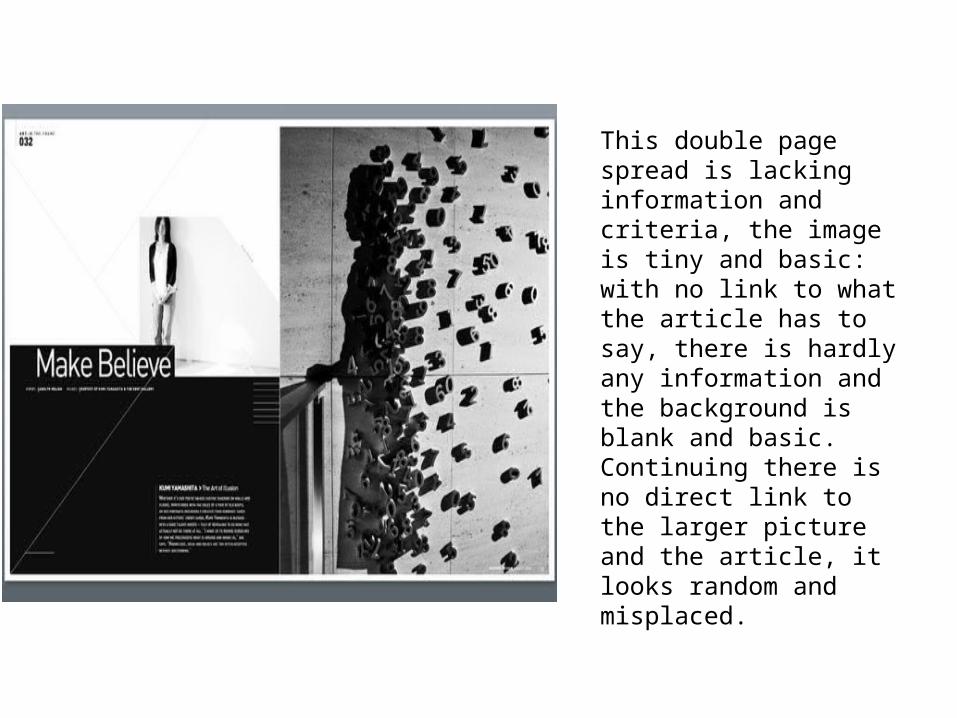
This double page spread is lacking information and criteria, the image is tiny and basic: with no link to what the article has to say, there is hardly any information and the background is blank and basic. Continuing there is no direct link to the larger picture and the article, it looks random and misplaced.