Embed Size (px)
Citation preview
No designer or design software required!
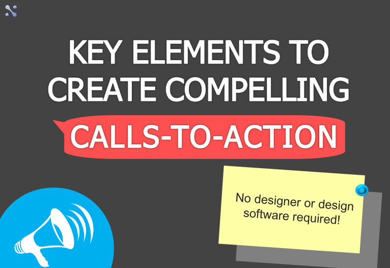
We are surrounded by Buttons from everywhere. We’re bound to use buttons to use any device; be it turning on the TV or the air conditioner. The main functionality of such buttons is
that we use them because we want to perform some action.
Any button that contains an invitation to perform an action may be called a CTA button.
The most commonly used types of call-to-action
buttons:
The most commonly used types of call-to-action
buttons:
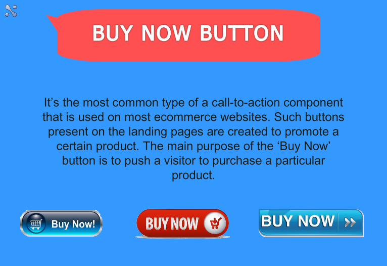
It’s the most common type of a call-to-action component that is used on most ecommerce websites. Such buttons present on the landing pages are created to promote a
certain product. The main purpose of the ‘Buy Now’ button is to push a visitor to purchase a particular
product.
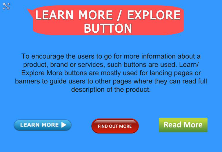
To encourage the users to go for more information about a product, brand or services, such buttons are used. Learn/
Explore More buttons are mostly used for landing pages or banners to guide users to other pages where they can read full
description of the product.
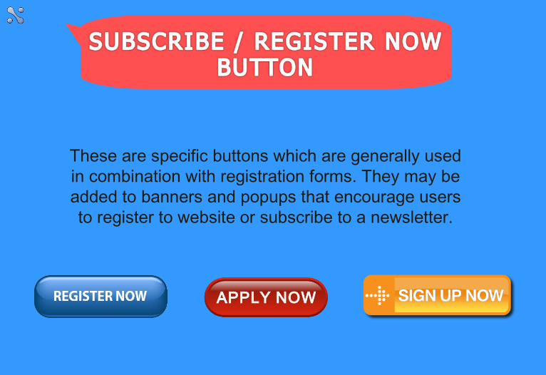
These are specific buttons which are generally used in combination with registration forms. They may be added to banners and popups that encourage users to register to website or subscribe to a newsletter.
1. Where do you place that call to action?
Michael Aagaard provided a test for a B2C landing page where he changed the position of a call-to-action button and placed it below the fold. The results were unexpected: conversions increased by 304%.
Another good idea is having several call-to-action buttons across a long landing page.
Using a few CTA for a landing page that relies on scrolling can be a great idea.
2. What text should you include in the call to action?
Buttons like “Free trial” or “Demo” don’t appeal to customers. They don’t push people to act.
Adding a verb that refers to users and really calls them to act is the best way to go about CTAs. Also, use of personal pronouns, like Me, You, Yours, Us, is very helpful to add a personal touch. Try creating a personalized custom CTA that will set you apart of your rivals, drive
users attention and make them wanna click that button.
3. What colors do the button and text need to be?
Using contrasting colors is the easiest solution. But avoid choosing too bright colors for buttons and text. Darker text on a lighter background is an evergreen classic while lighter text on
a darker button may evoke a strong emotional reaction.
4. What button shapes work?
While the rectangular elements speak of traditionalism, reliability, and balance; the circular elements produce
friendly, soft and comforting atmosphere. Keep in mind to make the CTA buttons look clickable.
5. How big should your call to action button be?
When it comes to CTA buttons, oversized buttons create a feeling of pressure and seem too “aggressive” for users. Therefore, choosing the CTA button size wisely is highly
recommended.
One must also not forget about the Responsiveness of a CTA button. The CTA button should not only look well-balanced with the remaining design of the website but also be comfortable to
use on smaller screens.
These are some easy tips for making your CTA buttons work. You can either use just
a few of them or a whole batch. The choice is totally yours but don’t forget to test your picks before sticking to a set of CTA buttons on your webpage design.
These are some easy tips for making your CTA buttons work. You can either use just
a few of them or a whole batch. The choice is totally yours but don’t forget to test your picks before sticking to a set of CTA buttons on your webpage design.
THANK YOU!THANK YOU!
FOR MORE INFORMATION, VISIT
US AT: www.neuronimbus.com
Facebook:
www.facebook.com/neuronimbus
Twitter: @neuronimbus