Embed Size (px)
Citation preview
Construction and Development Cover
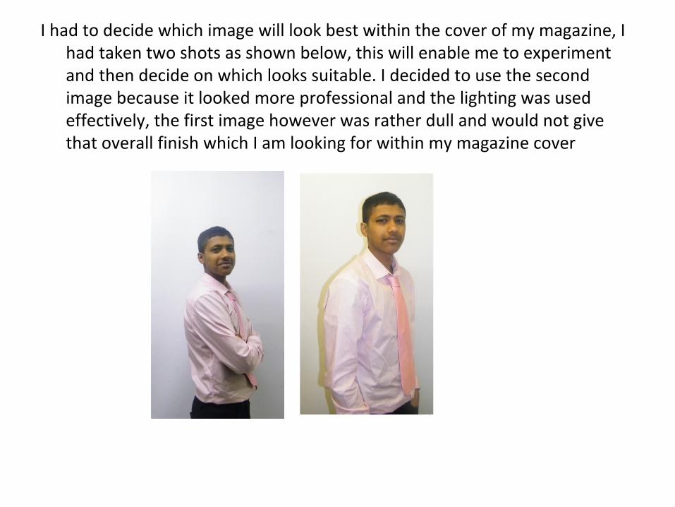
I had to decide which image will look best within the cover of my magazine, I had taken two shots as shown below, this will enable me to experiment and then decide on which looks suitable. I decided to use the second image because it looked more professional and the lighting was used effectively, the first image however was rather dull and would not give that overall finish which I am looking for within my magazine cover
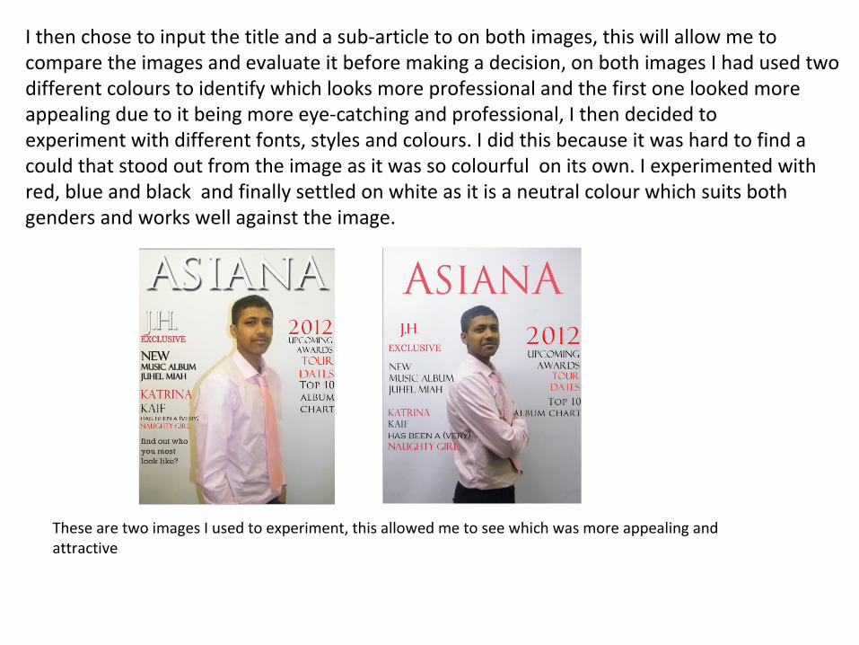
I then chose to input the title and a sub-article to on both images, this will allow me to compare the images and evaluate it before making a decision, on both images I had used two different colours to identify which looks more professional and the first one looked more appealing due to it being more eye-catching and professional, I then decided to experiment with different fonts, styles and colours. I did this because it was hard to find a could that stood out from the image as it was so colourful on its own. I experimented with red, blue and black and finally settled on white as it is a neutral colour which suits both genders and works well against the image.
These are two images I used to experiment, this allowed me to see which was more appealing and attractive
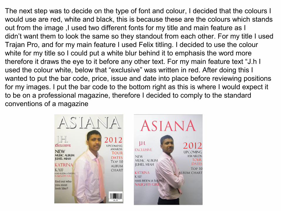
The next step was to decide on the type of font and colour, I decided that the colours I would use are red, white and black, this is because these are the colours which stands out from the image ,I used two different fonts for my title and main feature as I didn’t want them to look the same so they standout from each other. For my title I used Trajan Pro, and for my main feature I used Felix titling. I decided to use the colour white for my title so I could put a white blur behind it to emphasis the word more therefore it draws the eye to it before any other text. For my main feature text “J.h I used the colour white, below that “exclusive” was written in red. After doing this I wanted to put the bar code, price, issue and date into place before reviewing positions for my images. I put the bar code to the bottom right as this is where I would expect it to be on a professional magazine, therefore I decided to comply to the standard conventions of a magazine
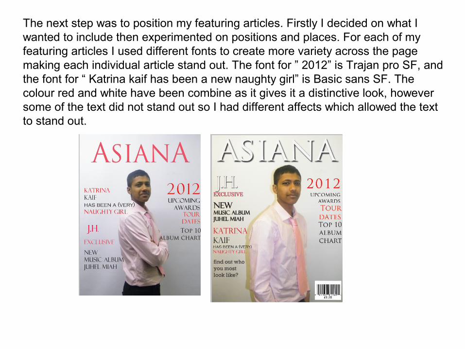
The next step was to position my featuring articles. Firstly I decided on what I wanted to include then experimented on positions and places. For each of my featuring articles I used different fonts to create more variety across the page making each individual article stand out. The font for ” 2012” is Trajan pro SF, and the font for “ Katrina kaif has been a new naughty girl” is Basic sans SF. The colour red and white have been combine as it gives it a distinctive look, however some of the text did not stand out so I had different affects which allowed the text to stand out.
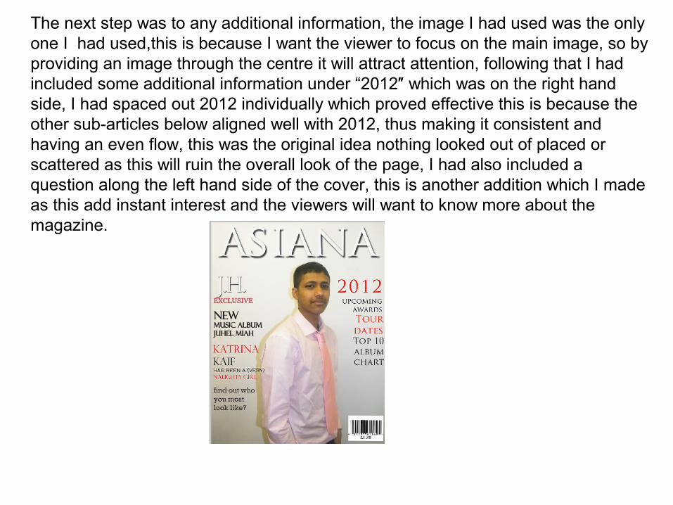
The next step was to any additional information, the image I had used was the only one I had used,this is because I want the viewer to focus on the main image, so by providing an image through the centre it will attract attention, following that I had included some additional information under “2012″ which was on the right hand side, I had spaced out 2012 individually which proved effective this is because the other sub-articles below aligned well with 2012, thus making it consistent and having an even flow, this was the original idea nothing looked out of placed or scattered as this will ruin the overall look of the page, I had also included a question along the left hand side of the cover, this is another addition which I made as this add instant interest and the viewers will want to know more about the magazine.

The next step was to any additional information, the image I had used was the only one I had used,this is because I want the viewer to focus on the main image, so by providing an image through the centre it will attract attention, following that I had included some additional information under “2012″ which was on the right hand side, I had spaced out 2012 individually which proved effective this is because the other sub-articles below aligned well with 2012, thus making it consistent and having an even flow, this was the original idea nothing looked out of placed or scattered as this will ruin the overall look of the page, I had also included a question along the left hand side of the cover, this is another addition which I made as this add instant interest and the viewers will want to know more about the magazine.